

A canary color palette is one of the fastest ways to make a design feel brighter, friendlier, and more attention-grabbing—without going full neon. It’s ideal when you want optimism and clarity in branding, UI, or seasonal visuals.
Below are 20 canary color palette ideas with HEX codes, plus practical tips for pairing canary yellow with neutrals, blues, greens, and deeper accent tones.
In this article
- Why Canary Palettes Work So Well
-
- sunlit canary
- canary and charcoal
- citrus cream
- meadow canary
- canary sky
- retro canary pop
- minimal canary sand
- tropical canary leaf
- canary denim
- canary lavender
- canary copper
- canary slate
- playful canary confetti
- canary espresso
- soft canary blush
- canary seafoam
- canary plum night
- canary clay studio
- canary mint gelato
- canary ink editorial
- What Colors Go Well with Canary?
- How to Use a Canary Color Palette in Real Designs
- Create Canary Palette Visuals with AI
Why Canary Palettes Work So Well
Canary yellow reads as energetic and optimistic, which makes it a strong choice for designs that need quick attention—like CTAs, badges, highlights, and hero sections. It brings warmth without the heaviness you can get from deeper golds or oranges.
It also pairs easily: canary can sit on soft creams for airy minimal looks, or pop hard against charcoal and navy for modern, high-contrast UI. That flexibility is why it works across branding, packaging, and interfaces.
When used with grounded neutrals (slate, sand, espresso browns), canary stays bright but feels controlled and premium. The key is giving it enough “quiet space” so it looks intentional rather than overwhelming.
20+ Canary Color Palette Ideas (with HEX Codes)
1) Sunlit Canary
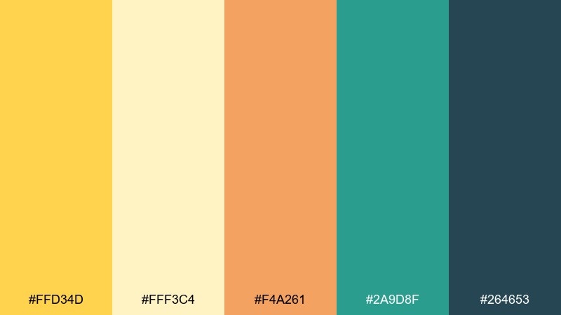
HEX: #FFD34D #FFF3C4 #F4A261 #2A9D8F #264653
Mood: warm, optimistic, airy
Best for: lifestyle branding, hero banners, cheerful social posts
Warm and optimistic, like morning light spilling across a bright studio. The buttery yellow feels friendly, while teal and deep blue-green add crisp contrast for headlines and buttons. Use the cream tone as a breathable background to keep the palette from feeling too loud. Tip: reserve the darkest shade for text so the yellow can stay clean and luminous.
Image example of sunlit canary generated using media.io

Media.io is an online AI studio for creating and editing video, image, and audio in your browser.

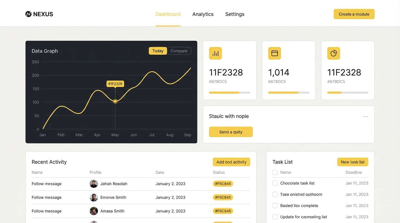
2) Canary and Charcoal
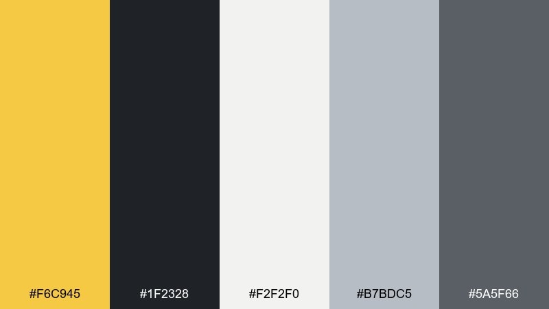
HEX: #F6C945 #1F2328 #F2F2F0 #B7BDC5 #5A5F66
Mood: modern, bold, confident
Best for: UI dashboards, tech landing pages, data cards
Modern and confident, like sharp signage under city lights. Canary pops against charcoal, giving you instant hierarchy for CTAs and key metrics. Keep the grays for panels and dividers so the interface feels structured, not busy. Tip: apply yellow sparingly to active states and primary actions for maximum clarity.
Image example of canary and charcoal generated using media.io
3) Citrus Cream
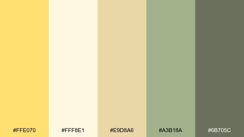
HEX: #FFE070 #FFF8E1 #E9D8A6 #A3B18A #6B705C
Mood: soft, natural, comforting
Best for: wellness packaging, cafe menus, skincare labels
Soft and comforting, like citrus zest folded into warm cream. The muted green and olive-brown tones give the yellow a calm, botanical backbone. It works beautifully on matte labels, menu covers, and minimal product photography. Tip: print the yellow as a highlight band and let the deeper olive carry your typography.
Image example of citrus cream generated using media.io
4) Meadow Canary
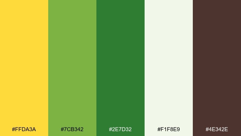
HEX: #FFDA3A #7CB342 #2E7D32 #F1F8E9 #4E342E
Mood: fresh, outdoorsy, energizing
Best for: spring event posters, eco campaigns, farmers market flyers
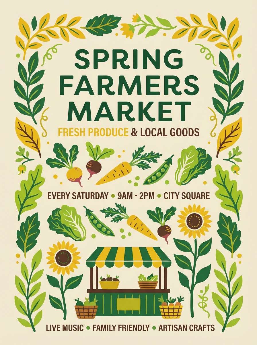
Fresh and outdoorsy, like a bright meadow after rain. These canary color combinations feel lively without turning neon, thanks to the layered greens and soft off-white. Use the brown as a grounding accent for dates, locations, and small print on posters. Tip: pair the yellow with the deepest green for high-contrast headings that still feel natural.
Image example of meadow canary generated using media.io
5) Canary Sky
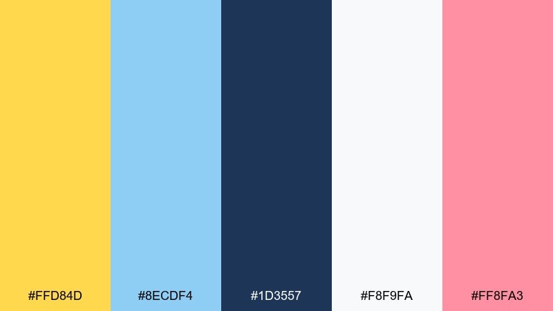
HEX: #FFD84D #8ECDF4 #1D3557 #F8F9FA #FF8FA3
Mood: playful, breezy, upbeat
Best for: kids brand visuals, app onboarding screens, cheerful illustrations
Playful and breezy, like kites against a clear sky. The soft blue cools the yellow, while the navy brings readability for UI labels and titles. A touch of pink adds charm for badges, stickers, or small decorative shapes. Tip: keep most screens white and use the yellow as the guiding highlight color.
Image example of canary sky generated using media.io
6) Retro Canary Pop
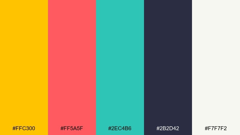
HEX: #FFC300 #FF5A5F #2EC4B6 #2B2D42 #F7F7F2
Mood: retro, loud, high-energy
Best for: music posters, streetwear drops, bold social ads
Retro and loud, like a vintage record sleeve with fresh ink. Canary brings the punch, while coral and teal create that classic pop contrast. Use the near-black for type and outlines so the bright accents stay crisp. Tip: lean into big shapes and limited text to keep the design feeling intentional, not chaotic.
Image example of retro canary pop generated using media.io

7) Minimal Canary Sand
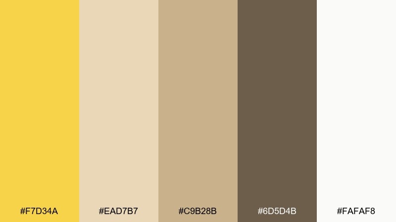
HEX: #F7D34A #EAD7B7 #C9B28B #6D5D4B #FAFAF8
Mood: minimal, earthy, refined
Best for: interior mood boards, artisan brands, portfolio sites
Minimal and refined, like sunlit linen and warm sand. The yellow reads as a soft highlight rather than the whole story, making it easy to use in sophisticated layouts. Pair the beige tones with dark brown typography for a grounded, editorial feel. Tip: keep textures subtle and let spacing do most of the design work.
Image example of minimal canary sand generated using media.io
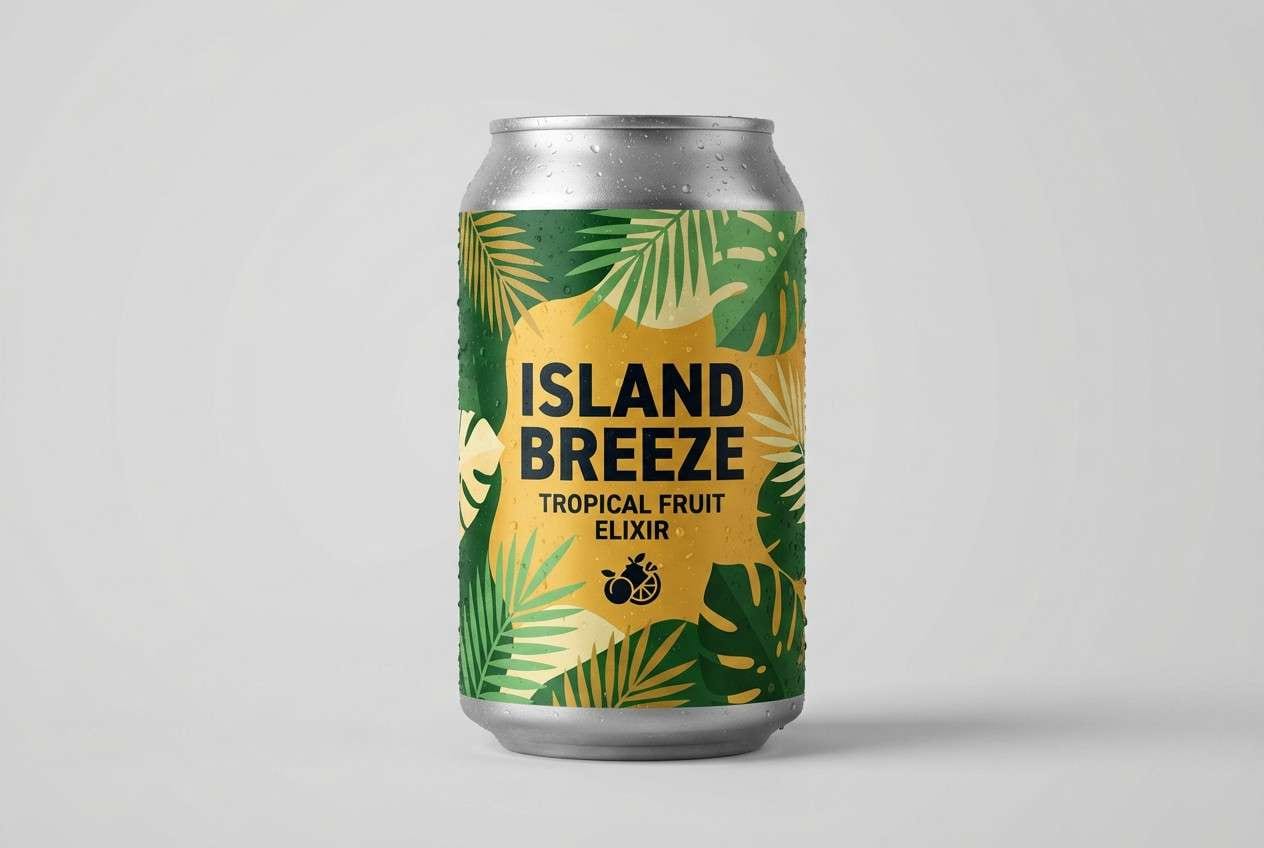
8) Tropical Canary Leaf
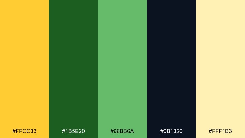
HEX: #FFCC33 #1B5E20 #66BB6A #0B1320 #FFF1B3
Mood: tropical, vibrant, lush
Best for: travel promos, resort ads, tropical product packaging
Tropical and lush, like bright fruit against dense leaves. The deep greens make the yellow feel sunlit rather than fluorescent, and the near-black adds dramatic contrast. Use the pale yellow for soft backgrounds on banners and packaging sleeves. Tip: pick one green as the main supporting tone and keep the second green for accents and icons.
Image example of tropical canary leaf generated using media.io
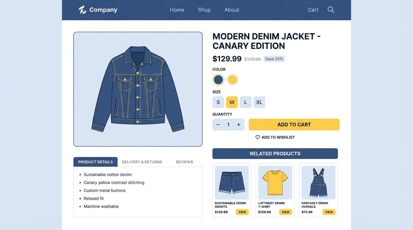
9) Canary Denim
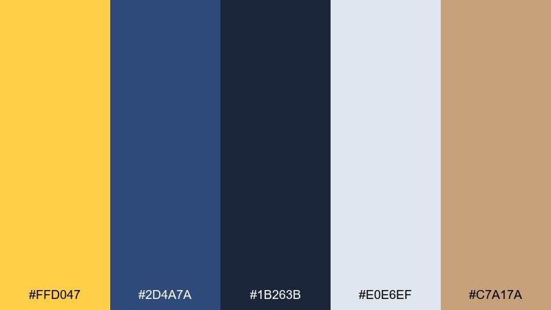
HEX: #FFD047 #2D4A7A #1B263B #E0E6EF #C7A17A
Mood: casual, trustworthy, contemporary
Best for: ecommerce UI, product feature sections, startup branding
Casual and trustworthy, like a favorite denim jacket with a sunny pin. This canary color scheme pairs best when navy handles structure and the yellow handles moments of emphasis. The pale blue-gray keeps large areas calm, especially for product pages and long-scroll layouts. Tip: use yellow for prices, ratings, and key CTAs, while navy anchors navigation and body text.
Image example of canary denim generated using media.io
10) Canary Lavender
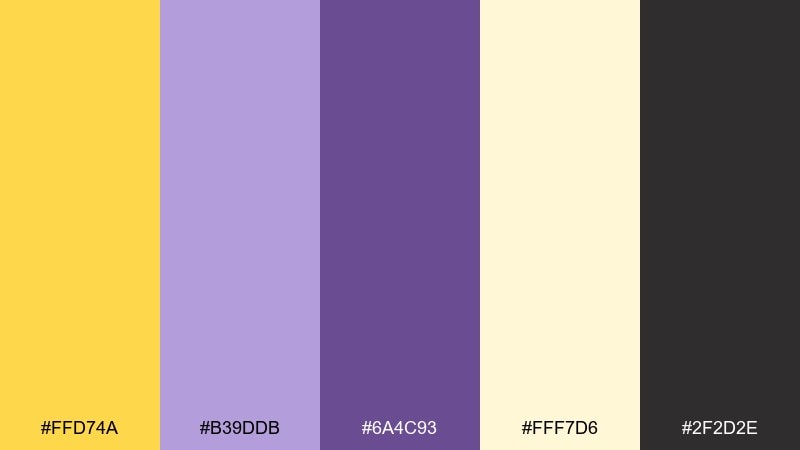
HEX: #FFD74A #B39DDB #6A4C93 #FFF7D6 #2F2D2E
Mood: dreamy, creative, gentle
Best for: beauty launches, creator branding, pastel social templates
Dreamy and creative, like wildflowers in late-afternoon light. Yellow and lavender make a charming contrast that feels modern without being loud. Use the near-black for sharp text so the pastels stay airy and readable. Tip: keep lavender for larger blocks and let yellow appear as small highlights on buttons, icons, and stickers.
Image example of canary lavender generated using media.io
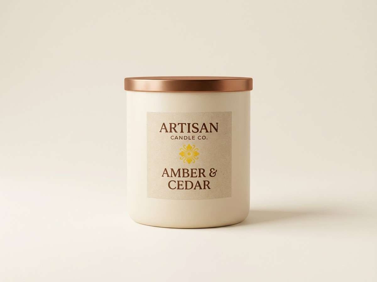
11) Canary Copper
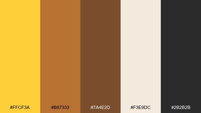
HEX: #FFCF3A #B87333 #7A4E2D #F3E9DC #2B2B2B
Mood: warm, premium, handcrafted
Best for: coffee branding, candle labels, artisan packaging
Warm and premium, like polished copper beside a golden glow. The brown tones make the yellow feel rich and tactile, ideal for craft products and heritage-style branding. Use the cream background to keep labels readable and let copper act as an accent foil color. Tip: combine the darkest shade with yellow for logos that stay legible at small sizes.
Image example of canary copper generated using media.io
12) Canary Slate
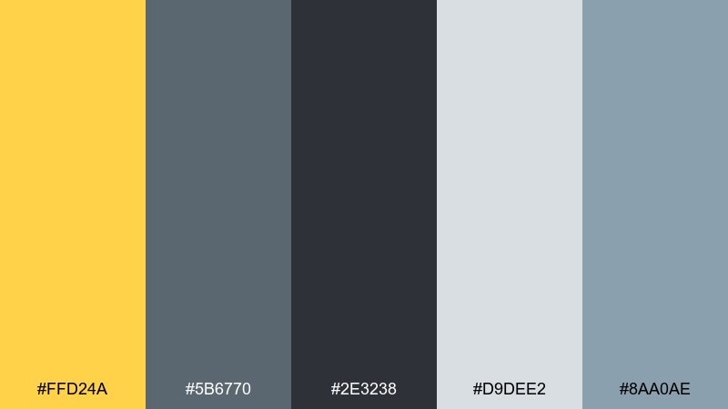
HEX: #FFD24A #5B6770 #2E3238 #D9DEE2 #8AA0AE
Mood: clean, professional, focused
Best for: SaaS UI kits, reports, corporate slide decks
Clean and professional, like a well-lit office with sharp notes on the wall. Slate grays give structure, while yellow adds just enough energy for key highlights. Use the light gray as your main canvas to avoid glare in long-form decks and reports. Tip: keep charts in grays and reserve yellow for the one metric you want remembered.
Image example of canary slate generated using media.io

13) Playful Canary Confetti
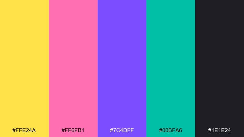
HEX: #FFE24A #FF6FB1 #7C4DFF #00BFA6 #1E1E24
Mood: fun, youthful, expressive
Best for: party invites, sticker packs, playful app branding
Fun and expressive, like confetti bursting over a dark stage. The bright accents work best in small doses, with the deep near-black keeping everything readable. Use yellow and teal as your primary duo, then sprinkle pink and violet for delight moments. Tip: keep backgrounds dark for maximum punch and use simple icon shapes to avoid visual clutter.
Image example of playful canary confetti generated using media.io

14) Canary Espresso
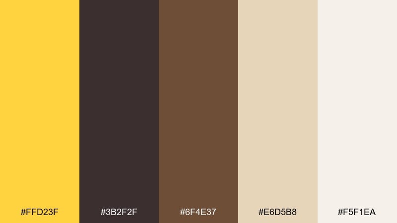
HEX: #FFD23F #3B2F2F #6F4E37 #E6D5B8 #F5F1EA
Mood: cozy, grounded, inviting
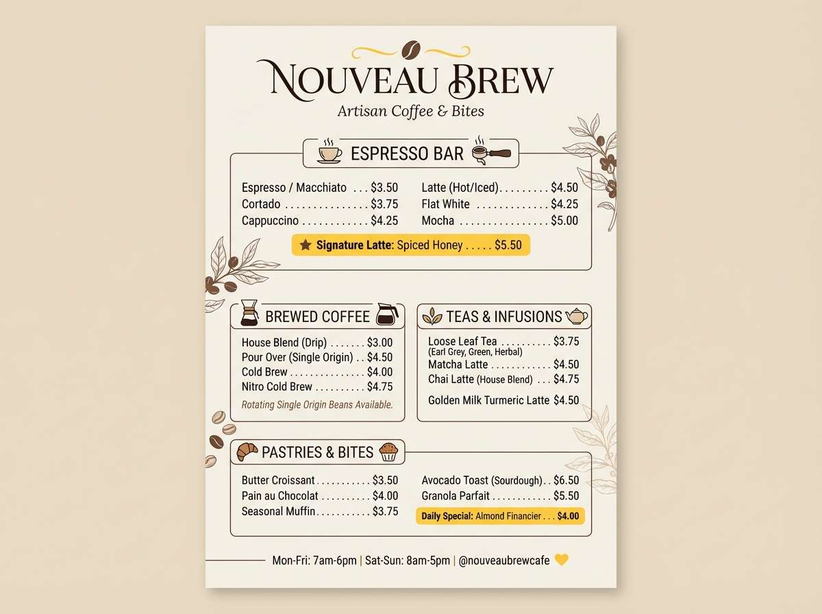
Best for: coffee shop menus, bakery branding, rustic websites
Cozy and grounded, like espresso crema under warm pendant lights. The browns give the yellow a delicious, toasted feel that suits menus and product cards. Use the light neutrals for readability and let yellow mark specials or callouts. Tip: keep photos warm-toned so the palette feels consistent from print to web.
Image example of canary espresso generated using media.io
15) Soft Canary Blush
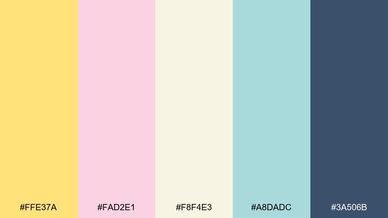
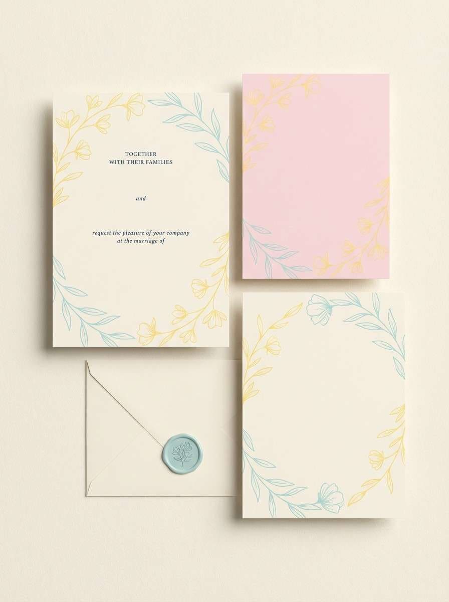
HEX: #FFE37A #FAD2E1 #F8F4E3 #A8DADC #3A506B
Mood: sweet, airy, romantic
Best for: wedding stationery, baby shower invites, gentle brand kits
Sweet and airy, like pastel petals and soft sunlight. The blush and aqua keep the yellow delicate, while the deep blue grounds your type and monograms. This canary color palette works beautifully for invitations, RSVP cards, and subtle social announcements. Tip: print on textured paper and use the deep blue sparingly to keep everything light and elegant.
Image example of soft canary blush generated using media.io
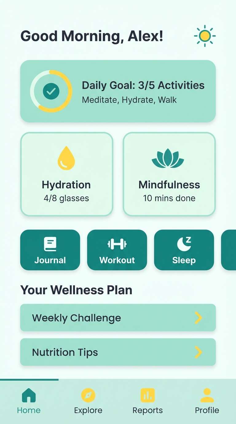
16) Canary Seafoam
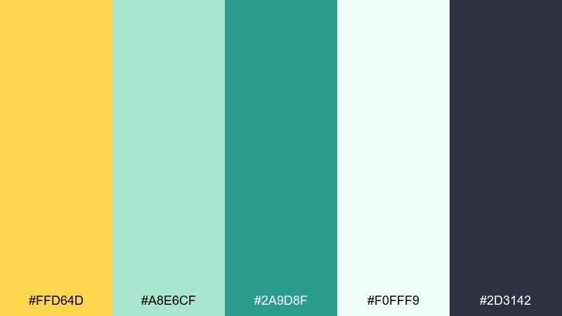
HEX: #FFD64D #A8E6CF #2A9D8F #F0FFF9 #2D3142
Mood: fresh, clean, coastal
Best for: spa branding, wellness apps, beachy promos
Fresh and coastal, like seafoam over warm sand. The minty tones keep the yellow feeling clean and modern, ideal for wellness and spa visuals. Use the near-white as your main background and the navy for readable body text. Tip: choose either mint or teal as the main secondary color and let the other act as a supporting accent.
Image example of canary seafoam generated using media.io
17) Canary Plum Night
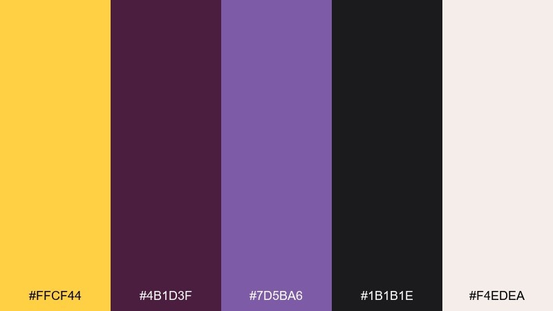
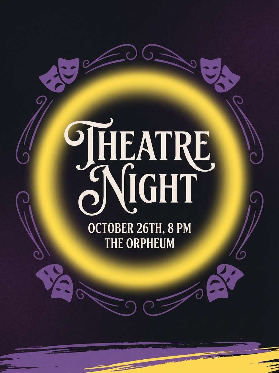
HEX: #FFCF44 #4B1D3F #7D5BA6 #1B1B1E #F4EDEA
Mood: dramatic, artistic, luxe
Best for: night event flyers, theatre posters, creative branding
Dramatic and luxe, like velvet curtains lit by a golden spotlight. Plum and violet give the yellow a jewel-like glow, perfect for posters that need to feel premium. Use the near-black for large background areas and keep the cream for small text blocks or ticket details. Tip: add subtle gradients between plum and violet to create depth without adding extra colors.
Image example of canary plum night generated using media.io
18) Canary Clay Studio
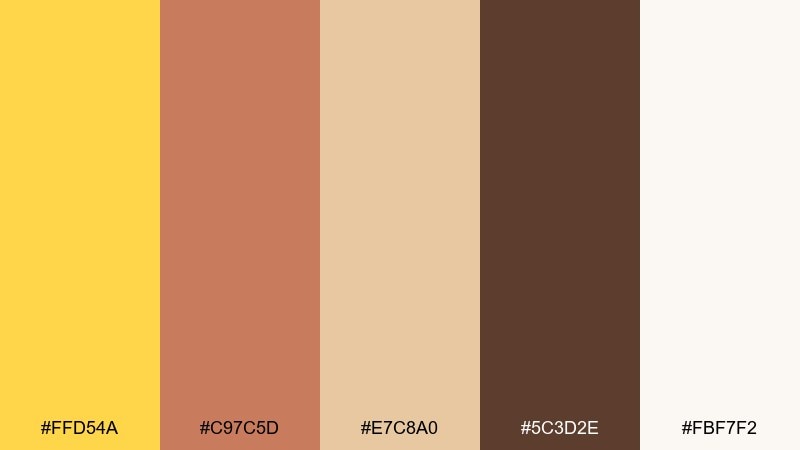
HEX: #FFD54A #C97C5D #E7C8A0 #5C3D2E #FBF7F2
Mood: handmade, warm, creative
Best for: ceramics branding, workshop posters, maker websites
Handmade and warm, like a ceramics studio with sun on drying clay. These canary color combinations feel grounded when you let the earthy terracotta lead and keep yellow for highlights. Use the soft cream as your main background to mimic paper and natural materials. Tip: pair the dark brown with yellow for stamps, logos, and workshop dates that need to pop.
Image example of canary clay studio generated using media.io

19) Canary Mint Gelato
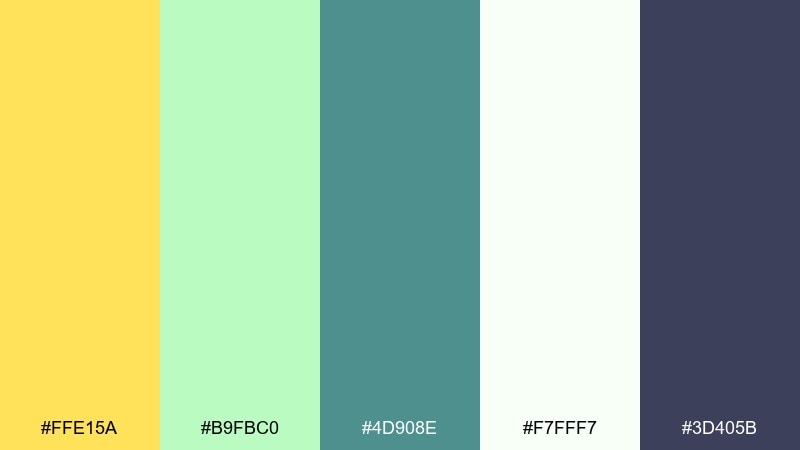
HEX: #FFE15A #B9FBC0 #4D908E #F7FFF7 #3D405B
Mood: sweet, fresh, modern
Best for: summer promos, dessert packaging, playful landing pages
Sweet and fresh, like gelato in a sunlit display case. The mint green keeps the yellow light, while the deep slate adds a clean modern edge. Use the near-white for roomy backgrounds and let teal handle secondary buttons and icons. Tip: keep product photos bright and neutral so the color accents stay the hero.
Image example of canary mint gelato generated using media.io
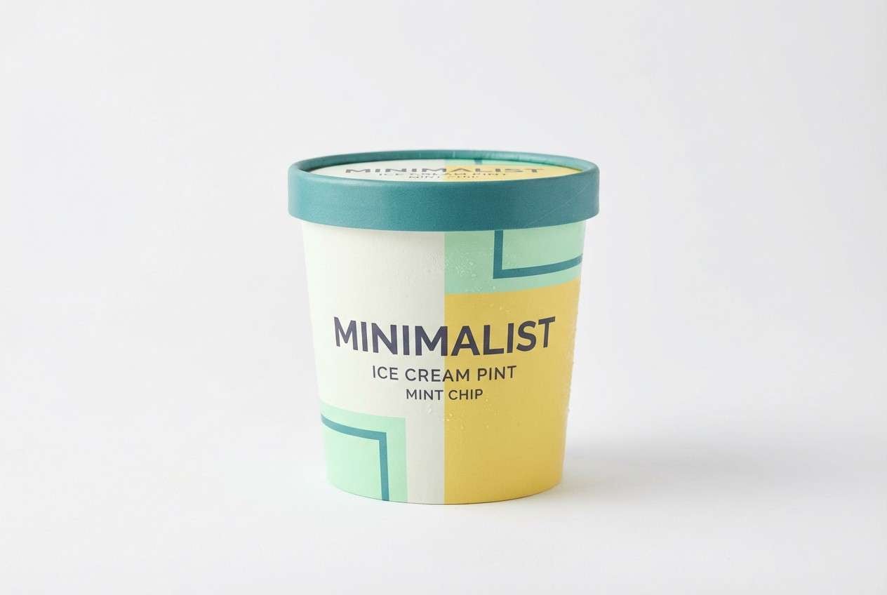
20) Canary Ink Editorial
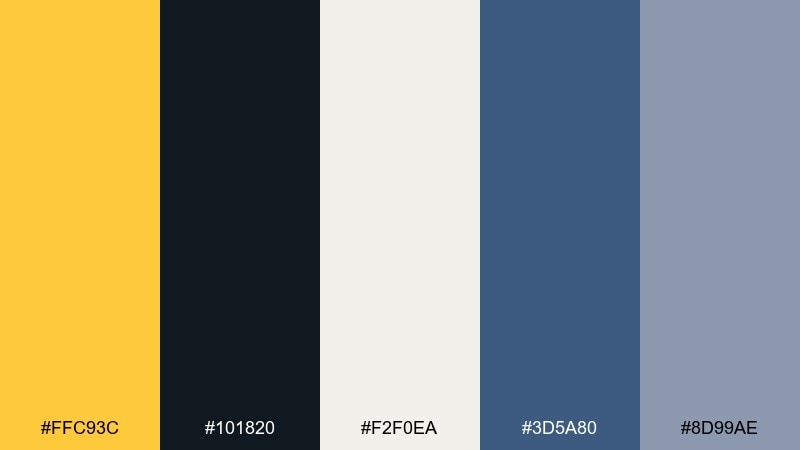
HEX: #FFC93C #101820 #F2F0EA #3D5A80 #8D99AE
Mood: editorial, smart, timeless
Best for: magazine layouts, newsletters, thought-leadership branding
Editorial and timeless, like ink on warm paper with a bright marker tab. This canary color palette is ideal when you want serious typography with a single optimistic accent. Let the paper tone dominate, keep navy-blue for secondary headings, and use yellow only for callouts or section labels. Tip: maintain generous margins so the accent feels curated rather than decorative.
Image example of canary ink editorial generated using media.io
What Colors Go Well with Canary?
Canary pairs best with deep anchors (charcoal, navy, near-black) when you need contrast and readability. This combo is common in dashboards, landing pages, and editorial layouts where yellow acts as a high-visibility highlight.
For softer, lifestyle-friendly looks, combine canary with warm creams, sand beiges, and light grays to keep the palette breathable. Botanical greens and seafoam mints also help canary feel fresh rather than intense.
If you want a more expressive canary color scheme, add playful accents like coral, blush pink, lavender, or violet—then keep typography dark so the palette stays legible.
How to Use a Canary Color Palette in Real Designs
Use canary as an accent first: buttons, icons, active states, tags, prices, and key numbers. Let neutrals (off-white, light gray, slate) carry most backgrounds so the yellow looks clean and intentional.
For branding and packaging, canary works well as a signature “recognition” color—paired with a stable dark tone for your logo and type. In print, slightly softer yellows often reproduce more reliably than ultra-bright ones.
In UI, keep accessibility in mind: canary is usually not suitable for body text on white. Use dark text over light backgrounds, and treat canary as a highlight layer for emphasis and navigation cues.
Create Canary Palette Visuals with AI
If you want to see your canary color palette ideas in context, generate quick mockups like hero banners, packaging, posters, or onboarding screens. Visualizing the palette helps you judge contrast, balance, and whether the yellow reads more “soft” or “punchy.”
With Media.io, you can turn a prompt into styled visuals in minutes, then iterate by swapping canary shades, adjusting the background neutral, or changing the supporting accent color.
Start with one palette above, copy the prompt, and tweak subject matter (UI, packaging, poster) while keeping the HEX-driven color direction consistent.
Canary Color Palette FAQs
-
What is canary yellow in HEX?
Common canary-like HEX values include bright golden yellows such as #FFD34D, #FFDA3A, and #FFC300. The exact “canary yellow” depends on whether you want a softer buttery tone or a punchier, more saturated yellow. -
What colors go best with canary yellow?
High-contrast anchors like charcoal, navy, and near-black pair especially well with canary for UI and typography. For softer palettes, use cream, sand, and light gray, plus supporting greens or mints for a fresh feel. -
Is canary yellow good for branding?
Yes—canary is memorable and upbeat, making it great for brands that want energy, warmth, or friendliness. It works best when balanced with a stable neutral or dark color for logos and text. -
How do I keep a canary color scheme from feeling too loud?
Give canary more negative space and limit it to highlights (CTAs, tags, headers). Use neutrals for backgrounds and let a single dark tone handle most typography to keep the design clean. -
Can I use canary yellow for text in UI?
Usually not for long text—yellow on white has poor readability. Instead, use dark text (navy/charcoal) on light backgrounds, and apply canary for buttons, indicators, and emphasized elements. -
What is a modern canary palette for dashboards?
Try pairing canary with charcoal and structured grays (for example: #F6C945 with #1F2328 and light grays). Use yellow only for primary actions, active states, and standout metrics. -
How can I generate canary palette images quickly?
Use Media.io text-to-image: describe the design (poster, packaging, UI), include your key colors, and iterate with small prompt edits. This makes it easy to test multiple canary color combinations before committing to a final direction.


