A black blue gray color palette is a go-to for modern interfaces, premium branding, and calm interiors because it balances authority (black), trust (blue), and versatility (gray).
Below are 20 moody-to-crisp black blue gray color combinations with HEX codes, plus practical tips and AI prompts you can reuse to generate matching visuals.
In this article
- Why Black Blue Gray Palettes Work So Well
-
- midnight harbor
- graphite azure
- steelwave minimal
- stormcloud office
- arctic night ui
- denim concrete
- cobalt smoke
- slate blueprint
- foggy pier
- digital steel
- museum evening
- winter transit
- inkstone studio
- harborline branding
- quiet monochrome
- blueprint poster
- nautical terminal
- smoky cobalt packaging
- rainy day editorial
- nightshift dashboard
- What Colors Go Well with Black Blue Gray?
- How to Use a Black Blue Gray Color Palette in Real Designs
- Create Black Blue Gray Palette Visuals with AI
Why Black Blue Gray Palettes Work So Well
Black, blue, and gray naturally create clear hierarchy: darks define structure, grays support readability, and blue signals action and trust. That makes this trio especially effective for UI where states, emphasis, and navigation must be instantly understood.
These tones also feel “finished” and premium. Black and charcoal convey authority, while blue adds a modern, tech-forward edge—without needing loud saturation.
Finally, black blue gray color schemes are flexible across media. You can run them in dark mode, light layouts, print, or interiors, then introduce a warm neutral (like cream) to soften the mood when needed.
20+ Black Blue Gray Color Palette Ideas (with HEX Codes)
1) Midnight Harbor
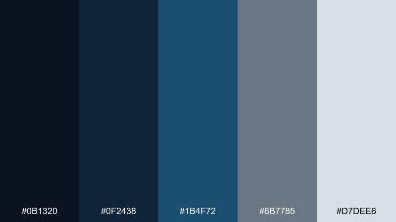
HEX: #0b1320 #0f2438 #1b4f72 #6b7785 #d7dee6
Mood: moody, refined, coastal
Best for: fintech landing page UI
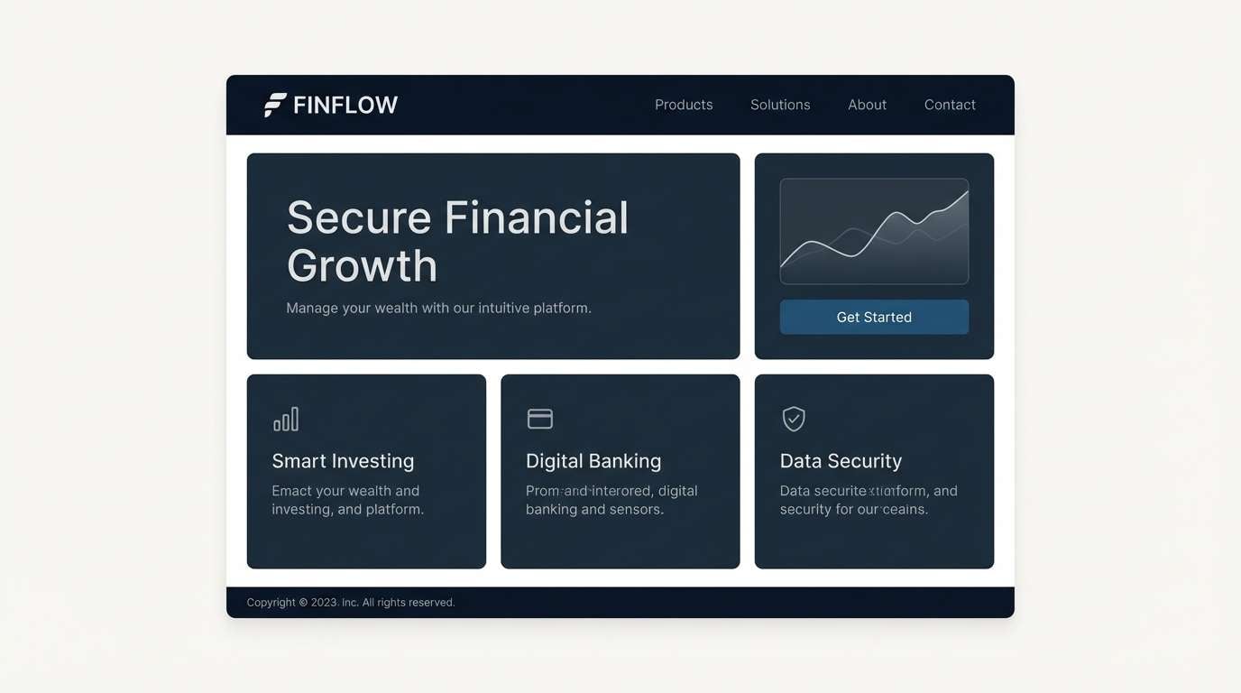
Moody harbor lights and deep water reflections set a refined, confident tone. This black blue gray color palette feels trustworthy for fintech and SaaS, especially when you keep the background dark and let the lighter gray do the readability work. Pair it with crisp white space and a warm accent like cream for buttons or key stats. Tip: reserve the bright blue for one primary CTA to avoid visual noise.
Image example of midnight harbor generated using media.io
Media.io is an online AI studio for creating and editing video, image, and audio in your browser.

2) Graphite Azure
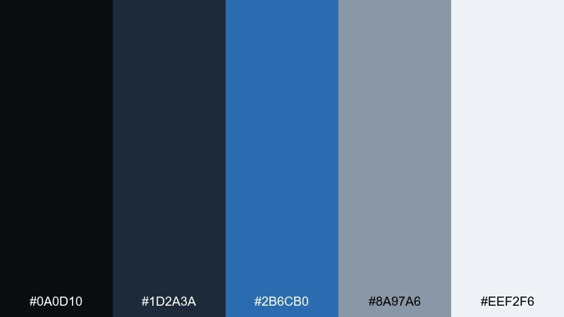
HEX: #0a0d10 #1d2a3a #2b6cb0 #8a97a6 #eef2f6
Mood: sleek, techy, high-contrast
Best for: app dashboard UI
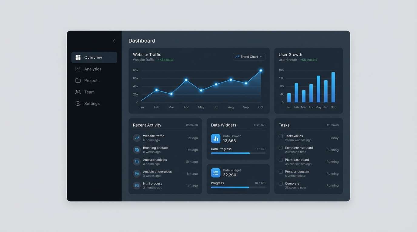
Sleek graphite shadows with a clean azure pop create a sharp, modern feel. It works well for dashboards where hierarchy matters, with darker panels for structure and pale grays for breathing room. Pair with simple icons and thin dividers to keep the interface crisp. Tip: use the azure as the only saturated element for charts and active states.
Image example of graphite azure generated using media.io
3) Steelwave Minimal
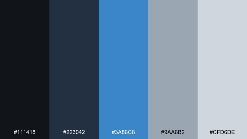
HEX: #111418 #223042 #3a86c8 #9aa6b2 #cfd6de
Mood: minimal, calm, contemporary
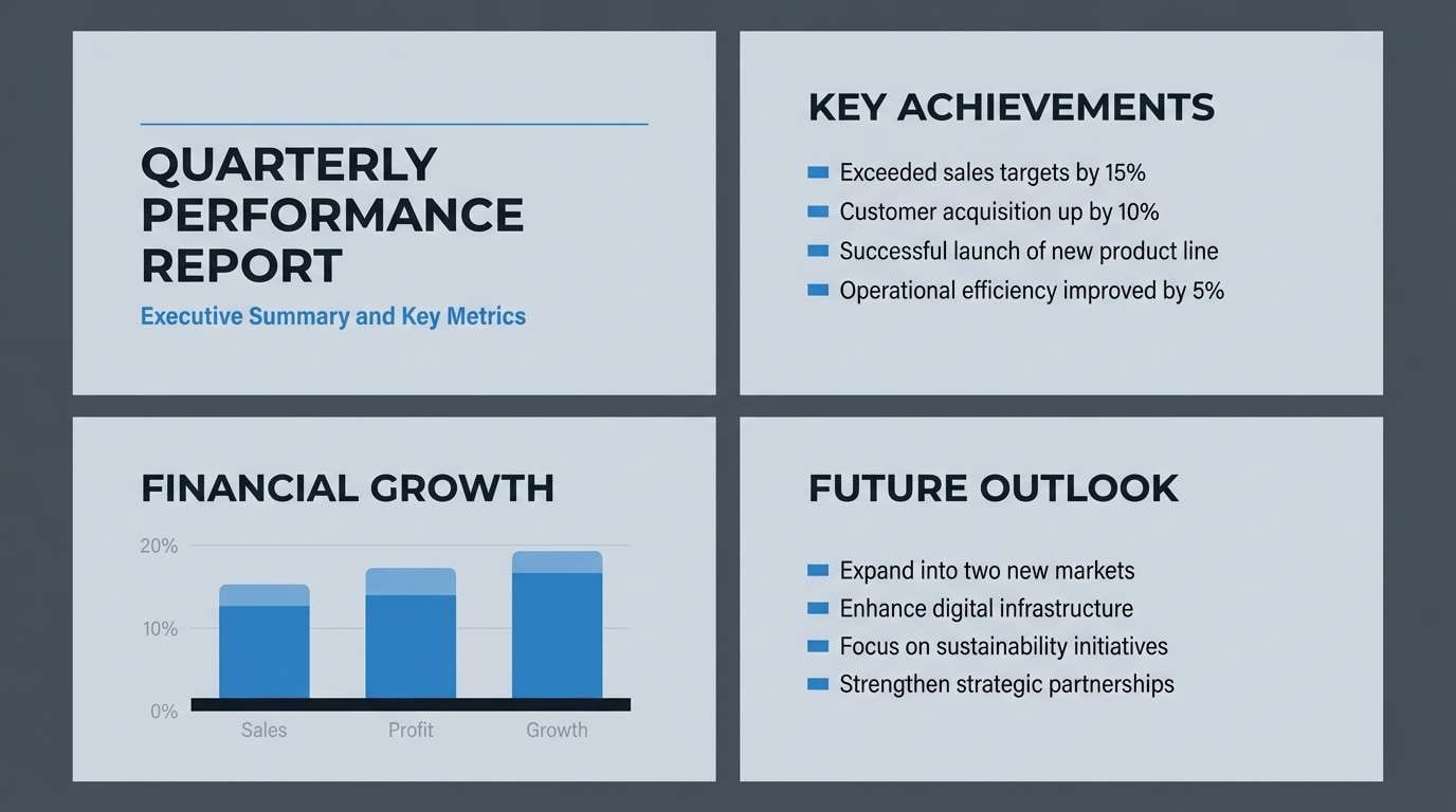
Best for: presentation slide deck
Calm steel tones with a gentle blue current feel modern without shouting. The mix is ideal for slide decks, especially when you want charts to be readable and professional. Pair with plenty of negative space and geometric shapes rather than photos. Tip: keep headlines in near-black and use the mid-gray for body text to reduce glare on projectors.
Image example of steelwave minimal generated using media.io
4) Stormcloud Office
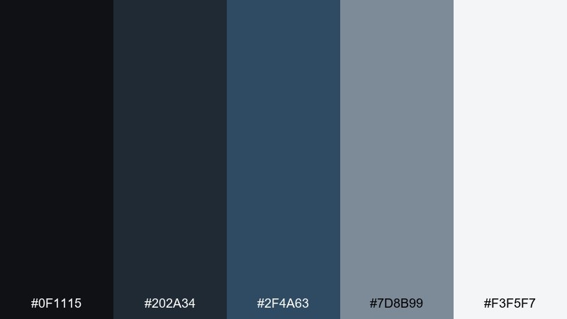
HEX: #0f1115 #202a34 #2f4a63 #7d8b99 #f3f5f7
Mood: professional, grounded, understated
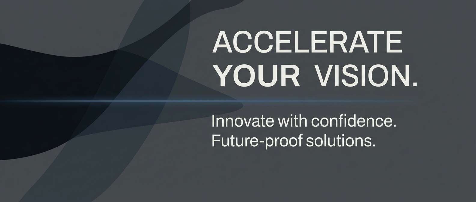
Best for: corporate website hero banner
Grounded stormcloud neutrals bring a steady, credible presence. Use this set for corporate hero sections where type and messaging should lead, supported by subtle blue depth. Pair with monochrome photography and a soft off-white background to keep it approachable. Tip: add a thin blue underline or rule to guide the eye without overpowering the copy.
Image example of stormcloud office generated using media.io
5) Arctic Night UI
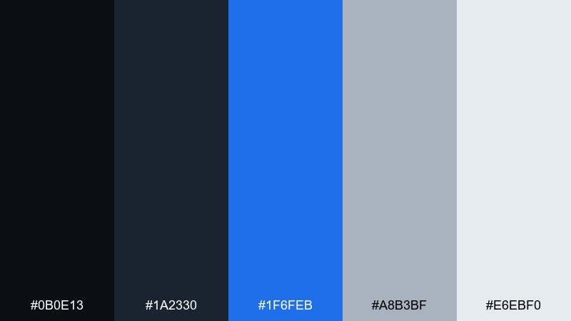
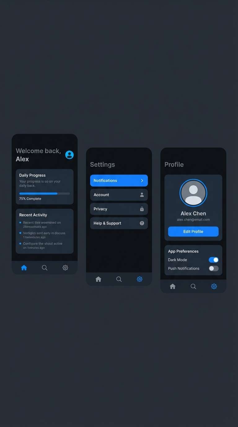
HEX: #0b0e13 #1a2330 #1f6feb #a8b3bf #e6ebf0
Mood: crisp, nocturnal, high-clarity
Best for: dark mode mobile app UI
Crisp arctic highlights against night-dark panels feel clean and fast. The strong blue reads as interactive, making it great for dark mode navigation, toggles, and links. Pair with simple line icons and restrained shadows to avoid muddiness. Tip: use the light gray for text instead of pure white to reduce eye strain.
Image example of arctic night ui generated using media.io
6) Denim Concrete
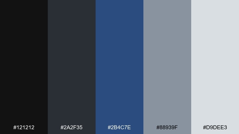
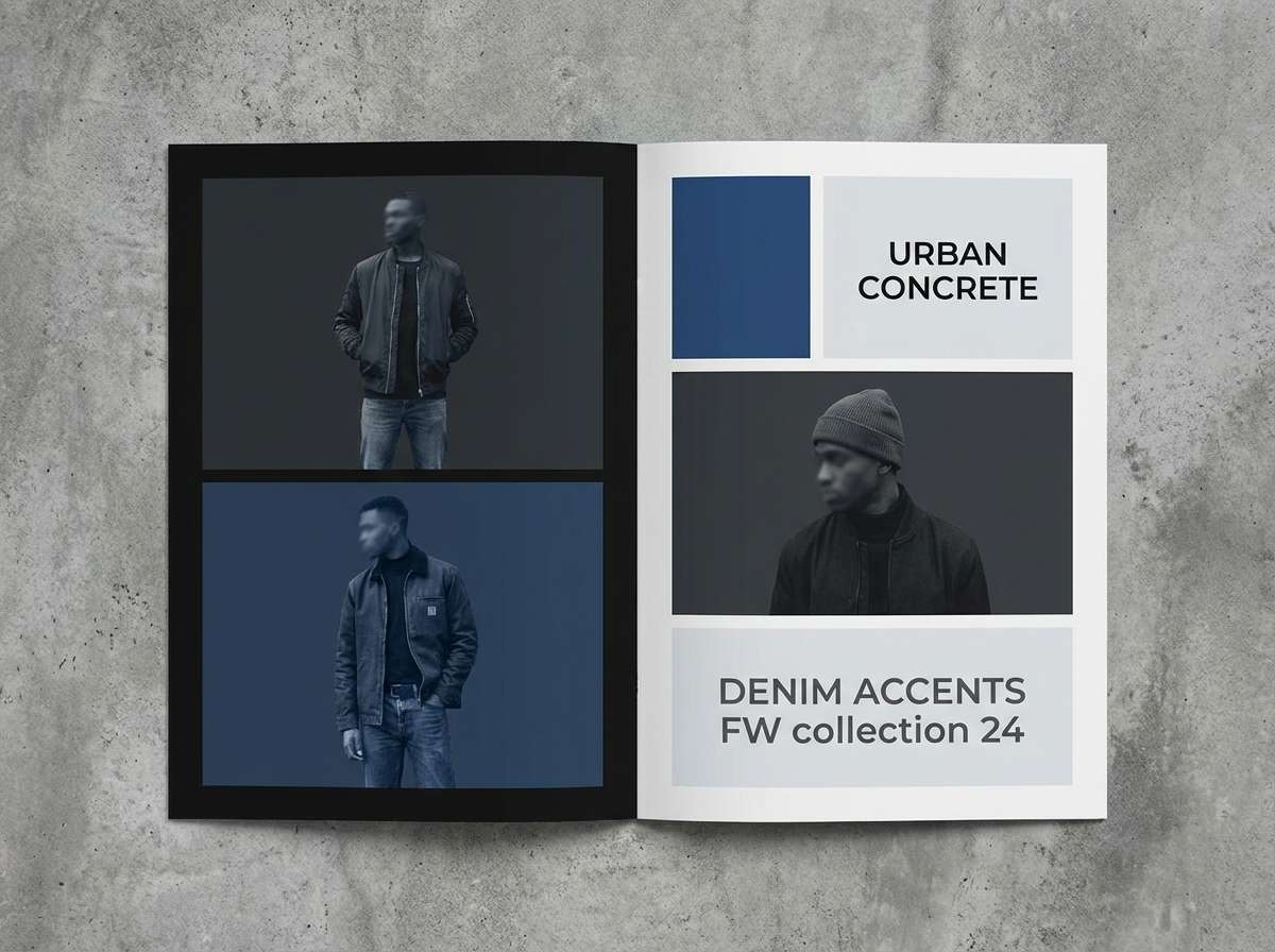
HEX: #121212 #2a2f35 #2b4c7e #88939f #d9dee3
Mood: urban, practical, balanced
Best for: streetwear lookbook layout
Urban concrete grays with denim depth feel practical and style-forward. This mix suits lookbooks and catalogs where you want a cool, modern backdrop for product photography. It also reads well in print when the mid-grays carry the layout and the blue is used sparingly. Tip: keep captions in the lighter gray and reserve the blue for section headers only.
Image example of denim concrete generated using media.io
7) Cobalt Smoke
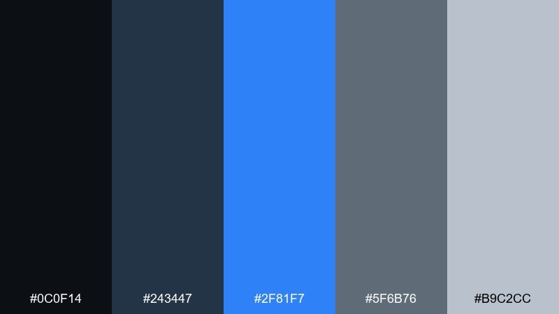
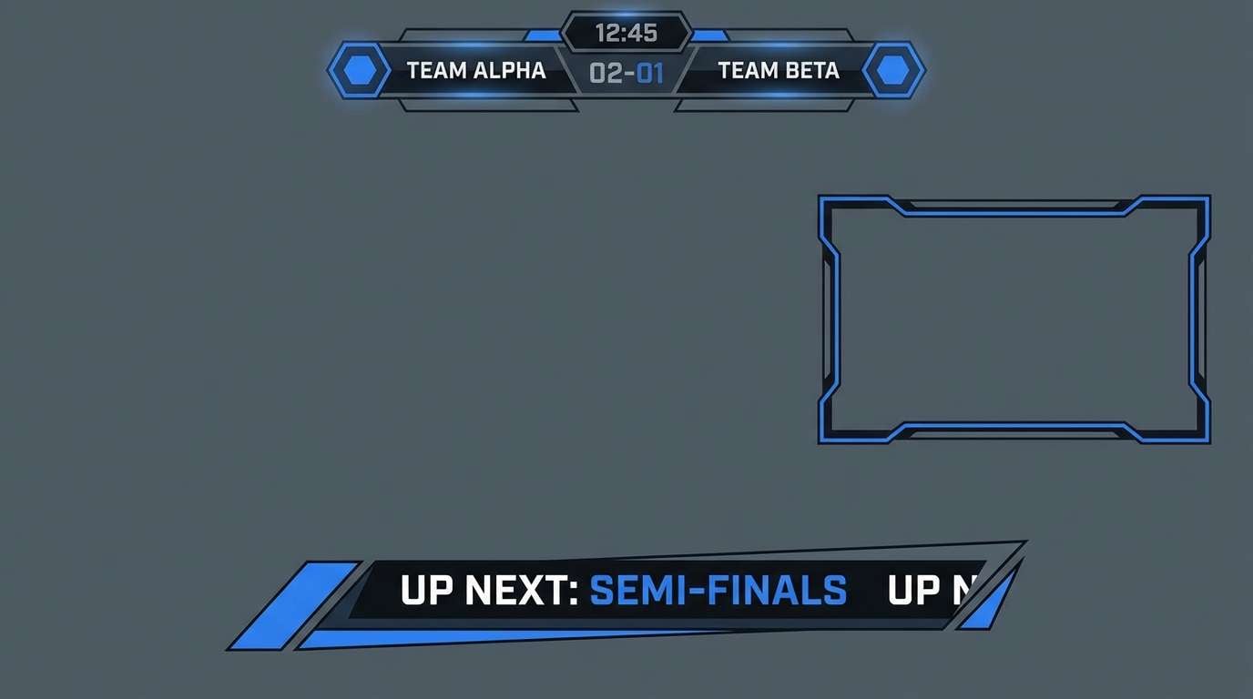
HEX: #0c0f14 #243447 #2f81f7 #5f6b76 #b9c2cc
Mood: energetic, smoky, modern
Best for: esports stream overlay
Smoky darks with a cobalt hit feel energetic and competitive. Use it for overlays, scoreboards, and lower thirds where contrast needs to be instant. Pair with bold condensed type and angular separators for a sharper edge. Tip: keep the bright blue to 10 to 15 percent of the layout so it still feels special.
Image example of cobalt smoke generated using media.io
8) Slate Blueprint
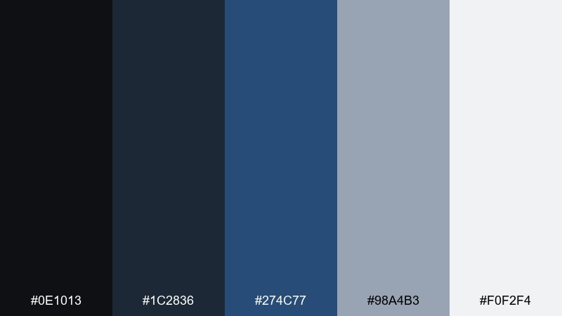
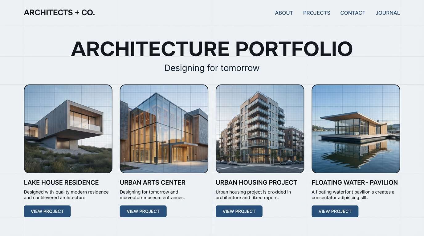
HEX: #0e1013 #1c2836 #274c77 #98a4b3 #f0f2f4
Mood: structured, intelligent, calm
Best for: architecture portfolio website
Structured slate and blueprint blue evoke precision and planning. It fits architecture and engineering portfolios where layouts must feel clean, measured, and easy to scan. Pair with thin grid lines and generous margins to reinforce the blueprint vibe. Tip: use the lightest tone as a page background and the darkest for navigation for an elegant frame.
Image example of slate blueprint generated using media.io
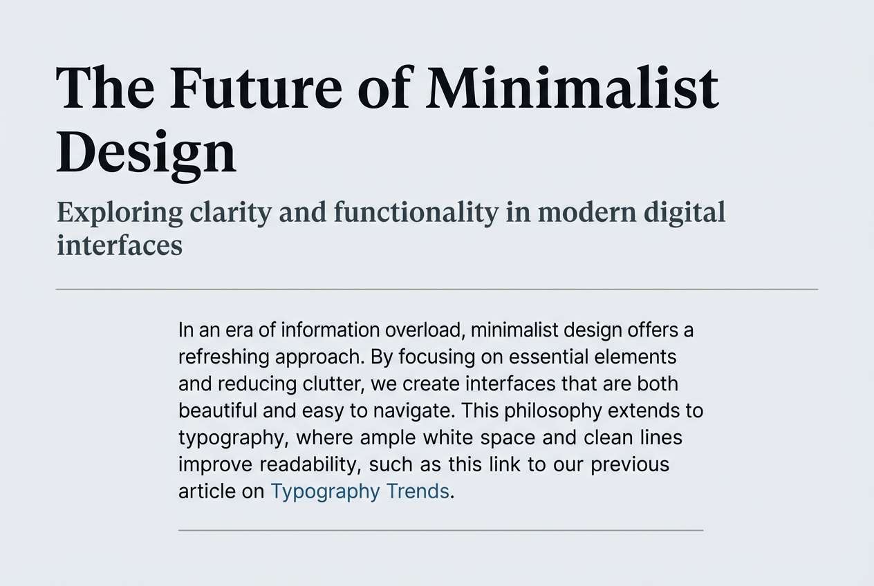
9) Foggy Pier
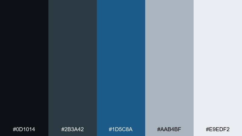
HEX: #0d1014 #2b3a42 #1d5c8a #aab4bf #e9edf2
Mood: misty, quiet, approachable
Best for: blog header and typography system
Misty pier grays with softened ocean blue feel quiet and readable. This set is strong for blogs and long-form pages where comfort matters more than drama. Pair with warm paper-like backgrounds and subtle line art for a softer editorial touch. Tip: use the mid-gray for secondary text and keep links in the blue for consistent navigation cues.
Image example of foggy pier generated using media.io
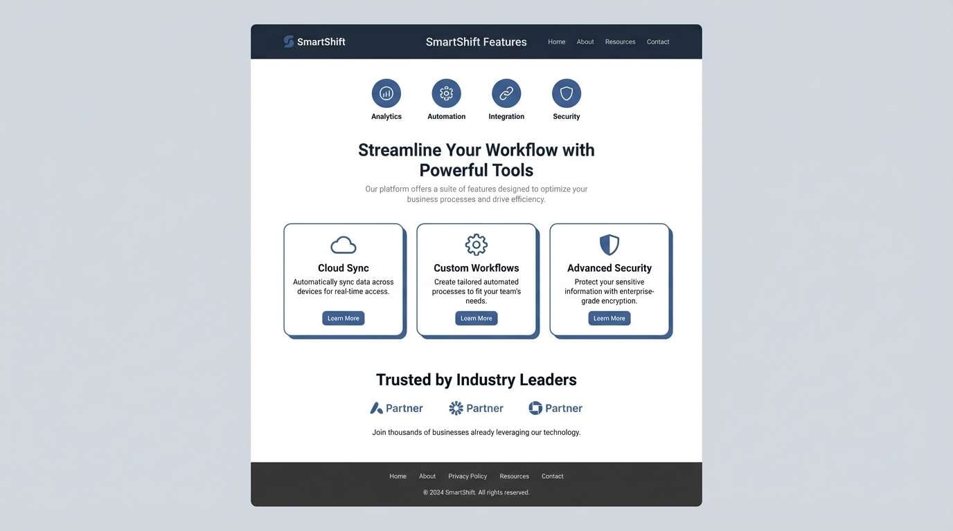
10) Digital Steel
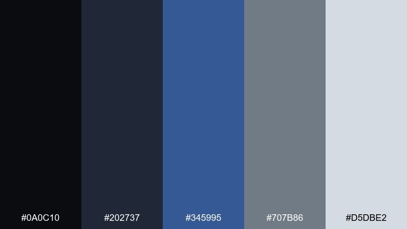
HEX: #0a0c10 #202737 #345995 #707b86 #d5dbe2
Mood: clean, technical, modern
Best for: SaaS product feature page
Clean technical tones feel like brushed metal and polished glass. Use them on feature pages where icons, diagrams, and screenshots need a calm frame. Pair with a single warm accent, like a muted cream badge, to humanize the layout. Tip: keep the background light and use the darkest shade only for headings and key labels.
Image example of digital steel generated using media.io
11) Museum Evening
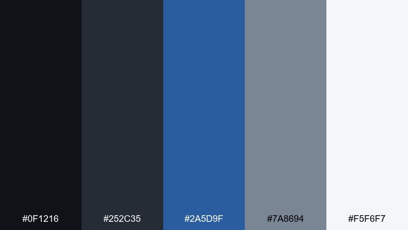
HEX: #0f1216 #252c35 #2a5d9f #7a8694 #f5f6f7
Mood: cultured, elegant, subdued
Best for: event invitation flyer
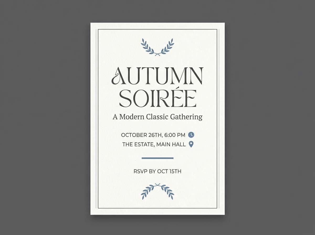
Cultured evening tones feel like a quiet gallery with spotlighted details. This palette works beautifully for invitations where typography should feel premium and calm. Pair with thin rules, small caps, and lots of white space for a museum-like layout. Tip: set the background in off-white and use the blue only for date and location emphasis.
Image example of museum evening generated using media.io
12) Winter Transit
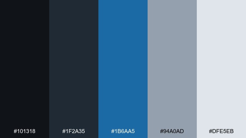
HEX: #101318 #1f2a35 #1b6aa5 #94a0ad #dfe5eb
Mood: cool, punctual, metropolitan
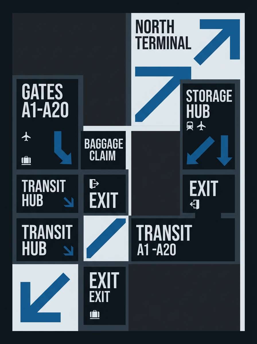
Best for: wayfinding poster design
Cool transit tones feel punctual and metropolitan, like signage on a winter commute. They suit wayfinding posters and informational graphics where contrast and clarity are non-negotiable. Pair with geometric arrows and a strict grid to keep everything legible at distance. Tip: use the blue for directional elements and the gray range for copy and background blocks.
Image example of winter transit generated using media.io
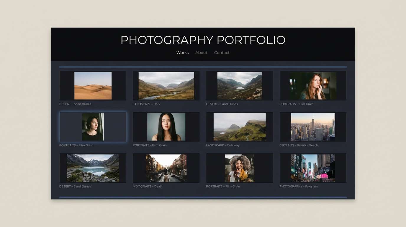
13) Inkstone Studio
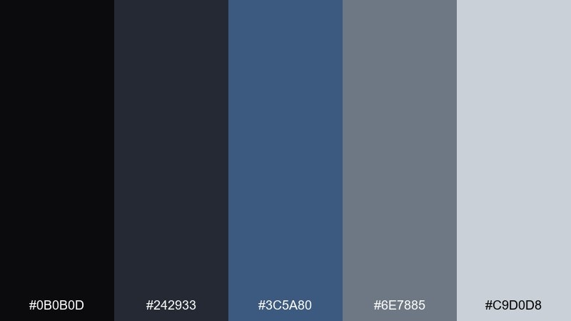
HEX: #0b0b0d #242933 #3c5a80 #6e7885 #c9d0d8
Mood: creative, grounded, modern-classic
Best for: photography portfolio layout
Inkstone shadows with muted blue notes feel creative and grounded. Use it for photo portfolios where the frame should be dark, minimal, and distraction-free. Pair with grayscale photography and subtle hover states to keep the focus on imagery. Tip: keep margins generous and let the light gray handle captions and metadata.
Image example of inkstone studio generated using media.io
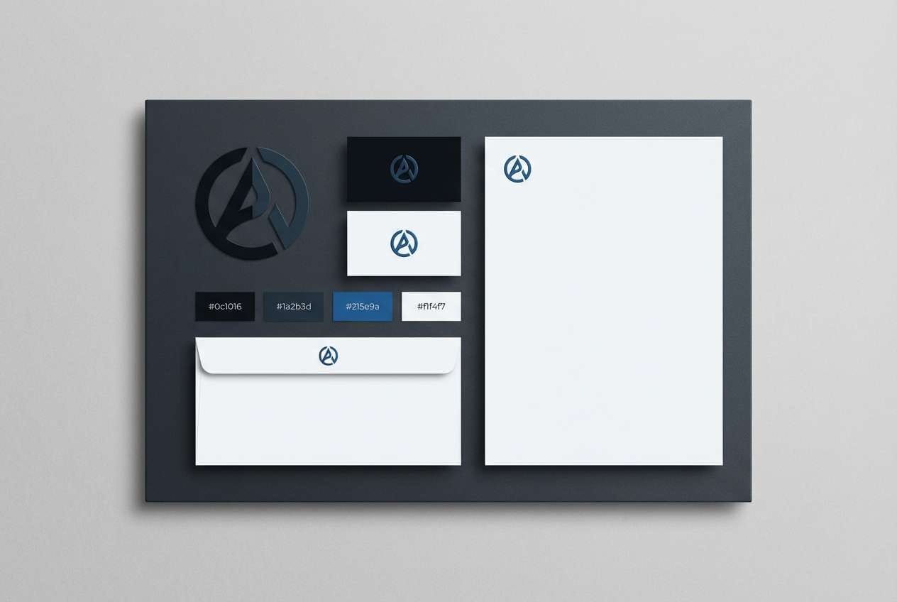
14) Harborline Branding
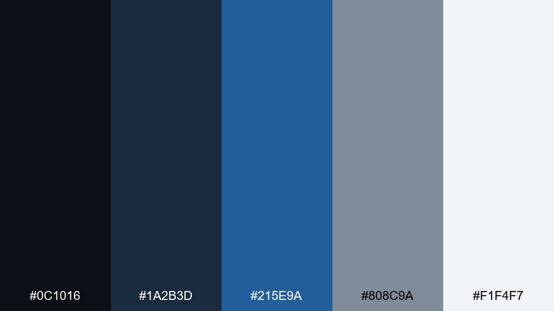
HEX: #0c1016 #1a2b3d #215e9a #808c9a #f1f4f7
Mood: trustworthy, polished, premium
Best for: brand identity board
Polished harbor tones communicate trust, stability, and quiet confidence. This black blue gray color palette is a strong fit for brand identity systems, from logos to stationery, because it holds up in both digital and print. Pair with a single warm neutral like cream or sand to add approachability. Tip: test the grays on uncoated paper so they do not shift too cold.
Image example of harborline branding generated using media.io
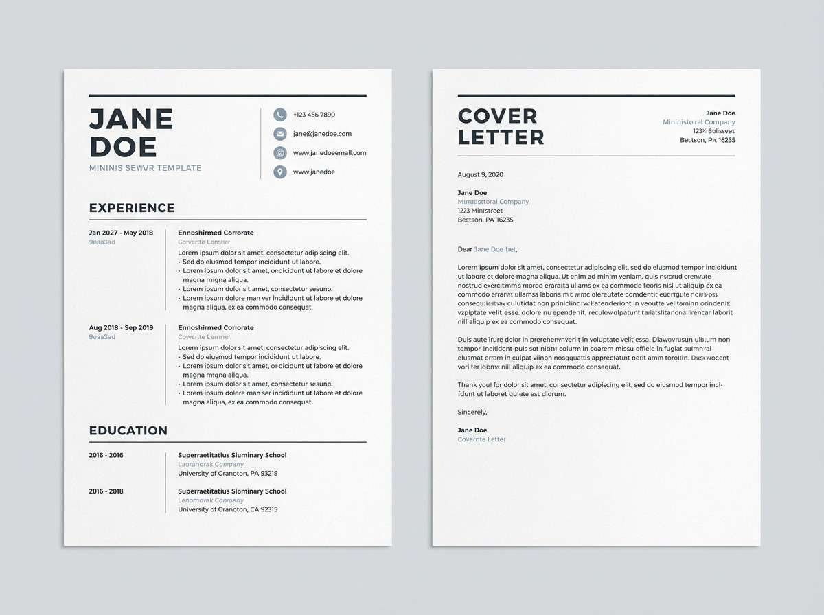
15) Quiet Monochrome
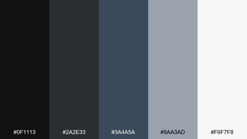
HEX: #0f1113 #2a2e33 #3a4a5a #9aa3ad #f6f7f8
Mood: quiet, minimalist, balanced
Best for: resume and cover letter template
Quiet monochrome layers feel calm and focused, like a well-edited document. They are ideal for resumes where typography, spacing, and hierarchy must be crystal clear. Pair with one subtle blue-gray rule for section separation and keep everything else neutral. Tip: avoid heavy fills and rely on weight, size, and spacing to do the work.
Image example of quiet monochrome generated using media.io
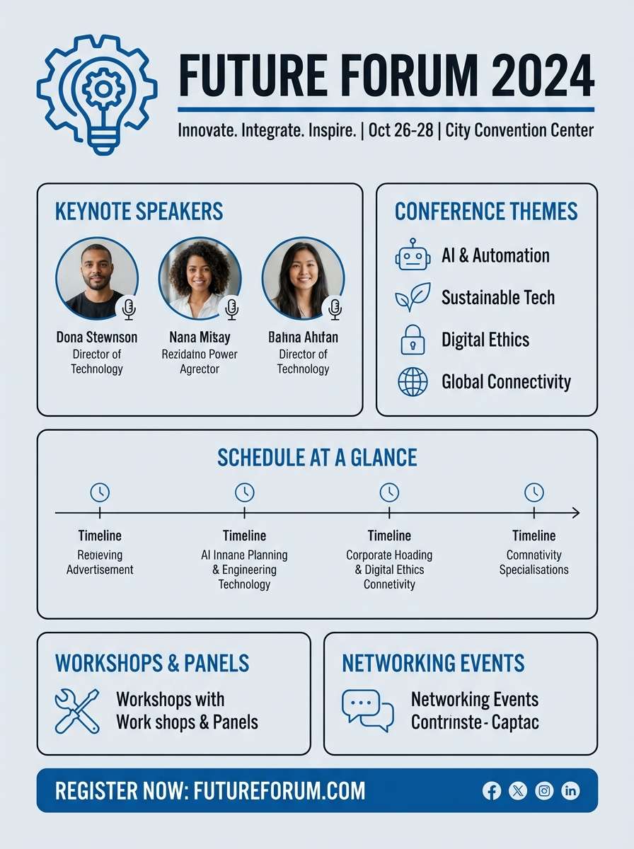
16) Blueprint Poster
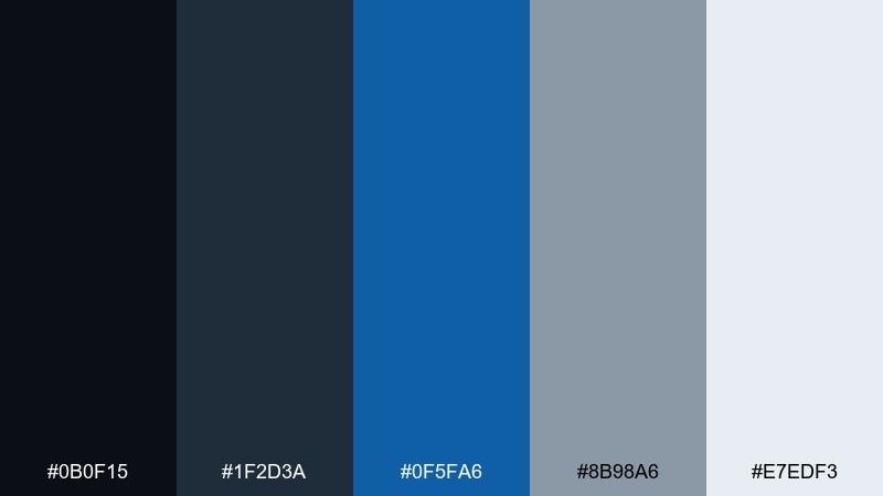
HEX: #0b0f15 #1f2d3a #0f5fa6 #8b98a6 #e7edf3
Mood: bold, graphic, structured
Best for: conference poster
Bold blueprint blues over structured dark neutrals feel smart and directional. This set is excellent for conference posters where you need strong sectioning and instant readability. Pair with sans-serif typography and simple iconography to keep it modern. Tip: use the lightest shade as the background and treat the blue as a spotlight for tracks or speakers.
Image example of blueprint poster generated using media.io
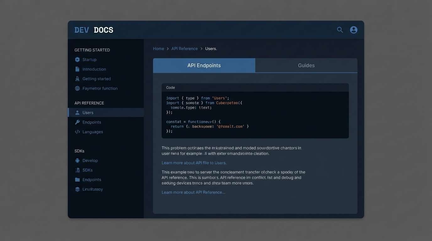
17) Nautical Terminal
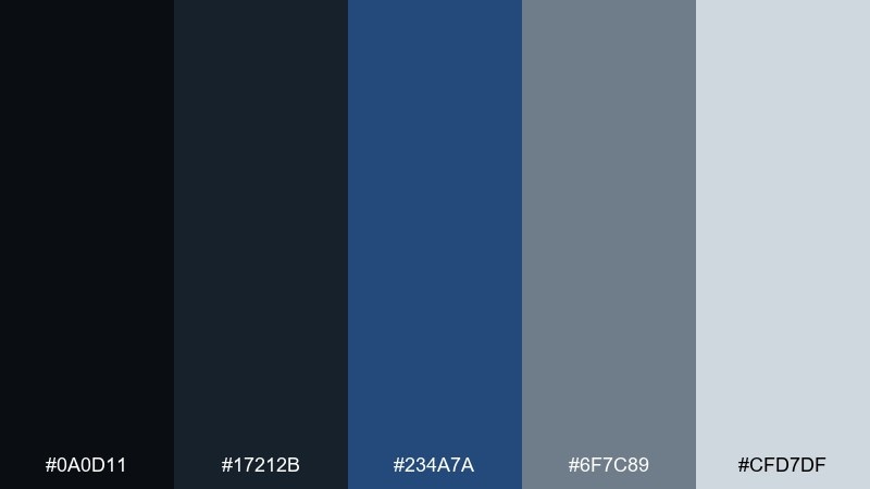
HEX: #0a0d11 #17212b #234a7a #6f7c89 #cfd7df
Mood: nautical, tech-forward, steady
Best for: developer documentation site
Nautical depth with terminal-like darks feels steady and technical. Use it for documentation sites where code blocks, navigation, and headings need clear separation. Pair with a monospace accent for code and keep the blue to links, tabs, and focus states. Tip: make code backgrounds a touch lighter than the page so blocks stand out without harsh contrast.
Image example of nautical terminal generated using media.io
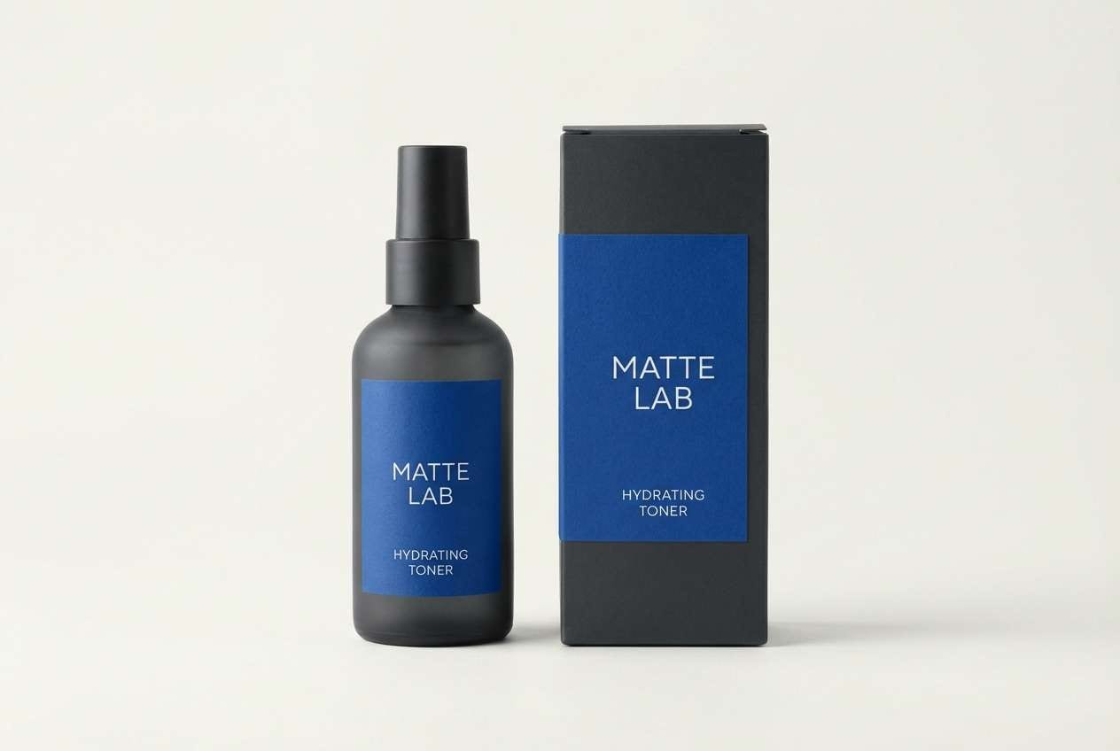
18) Smoky Cobalt Packaging
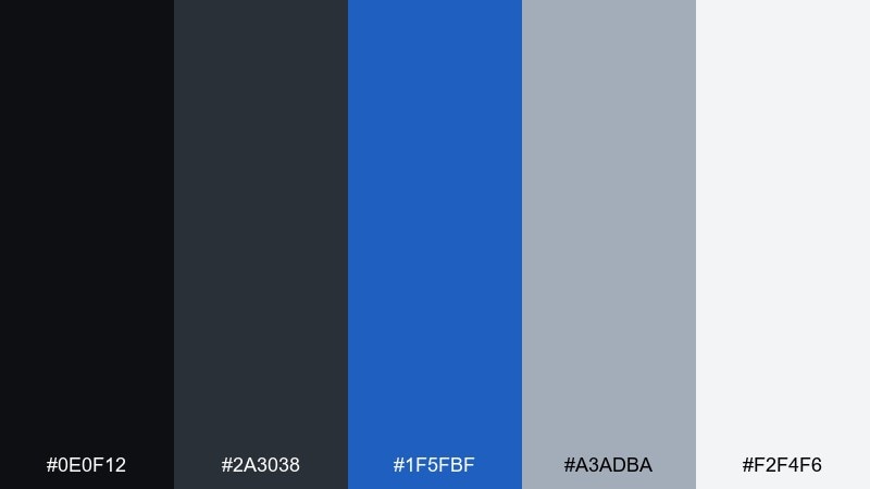
HEX: #0e0f12 #2a3038 #1f5fbf #a3adba #f2f4f6
Mood: premium, bold, modern
Best for: grooming product packaging
Premium smoky neutrals with cobalt energy feel modern and masculine without being harsh. These tones work well on grooming packaging where matte darks signal quality and the blue adds a fresh edge. Pair with minimal typography and a soft-touch finish for a tactile look. Tip: print the cobalt as a spot color or foil accent for a controlled, high-end highlight.
Image example of smoky cobalt packaging generated using media.io
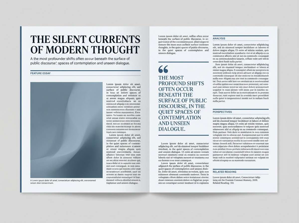
19) Rainy Day Editorial
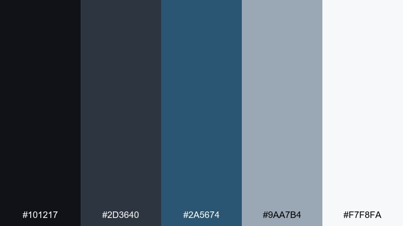
HEX: #101217 #2d3640 #2a5674 #9aa7b4 #f7f8fa
Mood: soft, thoughtful, editorial
Best for: magazine article layout
Soft rainy-day neutrals feel thoughtful and quietly stylish. They are ideal for magazine layouts where long reads need gentle contrast and a calm rhythm. Pair with serif headlines and light blue subhead rules to create an editorial cadence. Tip: keep image captions in the mid-gray so the page stays airy and consistent.
Image example of rainy day editorial generated using media.io
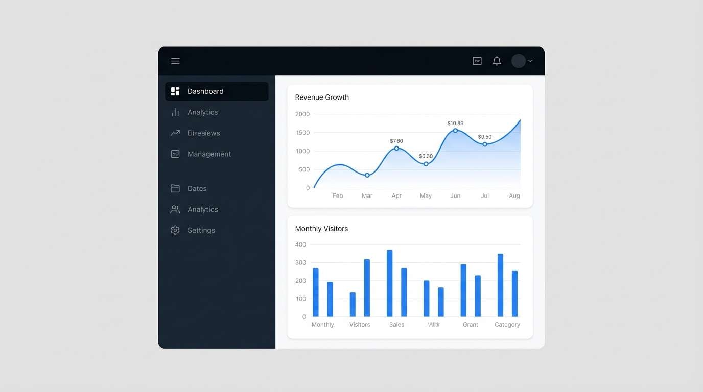
20) Nightshift Dashboard
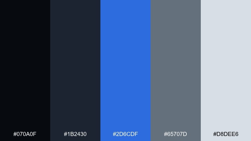
HEX: #070a0f #1b2430 #2d6cdf #65707d #d8dee6
Mood: focused, modern, data-driven
Best for: analytics dashboard UI
Focused nightshift tones feel like a control room built for decisions. Among black blue gray color combinations, this one shines for analytics because the contrast keeps charts readable while staying easy on the eyes. Pair with neutral data visualizations and use the blue for selected filters, active tabs, and key trend lines. Tip: limit bright blue to one series per chart to keep comparisons clear.
Image example of nightshift dashboard generated using media.io
What Colors Go Well with Black Blue Gray?
Warm neutrals are the easiest upgrade: cream, ivory, sand, and warm beige soften the “tech” feel and make dark layouts more inviting. They’re excellent for buttons, badges, and background panels.
For sharper contrast, add bright white sparingly (especially for type and highlights) and keep most body text in light gray to reduce glare. If you need a second accent, muted metals (silver, pewter) and desaturated greens can complement the cool base without competing with the blue.
When in doubt, keep saturation limited: one primary blue accent, one warm neutral, and the rest in blacks/grays for a controlled, premium look.
How to Use a Black Blue Gray Color Palette in Real Designs
Start with roles instead of percentages: assign near-black to navigation and headers, dark slate to surfaces/cards, mid-gray to secondary text, and a light gray/off-white to backgrounds. Then designate one blue as the interactive color (links, active tabs, selected states).
In branding, test the palette in both digital and print contexts. Grays can shift under different lighting and paper stock, so validate your charcoal and mid-gray before finalizing stationery or packaging.
For interiors, treat blue as the “depth” color (accent wall, cabinetry, textiles), while grays and blacks anchor hardware and fixtures. Add cream lighting or wood tones to prevent the room from feeling cold.
Create Black Blue Gray Palette Visuals with AI
If you already have HEX codes, you can turn them into consistent UI mockups, posters, brand boards, and packaging concepts with AI—fast. The key is to describe the layout clearly and explicitly include your color values in the prompt.
Use one palette at a time and specify where the blue should appear (CTA, links, charts, borders). This keeps the output clean and avoids accidental extra colors.
Black Blue Gray Color Palette FAQs
-
What mood does a black blue gray color scheme create?
Most black blue gray palettes feel modern, controlled, and trustworthy. Depending on how light your grays are and how saturated the blue is, the vibe can shift from moody and premium (dark, muted) to crisp and techy (high-contrast, brighter blue). -
Which HEX color works best as a primary CTA blue?
Use a single saturated blue from your set (for example #1f6feb or #2d6cdf) as the primary CTA and interactive state color. Keep other blues more muted, or avoid them, so the CTA remains the most noticeable element. -
Is black blue gray good for dark mode UI?
Yes—this trio is a natural fit for dark mode because you can build surfaces with charcoal/slate, keep text in soft light grays, and reserve blue for links, toggles, and active states to maintain clarity. -
How do I keep black blue gray designs from looking too cold?
Add a warm neutral accent like cream or ivory for buttons, highlights, or background panels. Warm lighting, subtle gradients, and slightly warmer grays also help soften the overall temperature. -
What’s the best background color: pure black or dark gray?
Dark gray is usually more usable than pure black because it reduces harsh contrast and makes shadows and cards easier to distinguish. Reserve pure black for small areas (logos, key headers) or when you need a dramatic frame. -
Can I use black blue gray palettes for print branding?
Yes, but test your grays on the intended paper stock. Cool grays may shift on uncoated paper, and deep charcoals can print lighter than expected—so run proofs if the brand relies on a specific premium feel. -
How many colors should I use from a 5-color palette?
In most real designs, 3–4 is enough: one dark base, one surface color, one text gray, and one blue accent. Keep the fifth (often the lightest) for backgrounds or spacing to improve readability.
Next: Cream Color Palette
