

Blue light gray is the kind of neutral that instantly makes layouts feel cleaner, calmer, and more modern—without reading as cold or flat. It carries a subtle blue undertone that pairs naturally with white space, deep navy type, and soft warm accents.
Below are 20+ blue light gray color palette ideas with HEX codes you can use for UI systems, branding, packaging, and interiors—plus AI prompts you can plug into Media.io to generate matching visuals.
In this article
- Why Blue Light Gray Color Schemes Work So Well
-
- misty harbor
- cloudline studio
- arctic linen
- slate whisper
- coastal concrete
- winter denim
- frosted eucalyptus
- steel blue minimal
- rainy day office
- icy lavender haze
- powder blue quartz
- silver sky editorial
- nordic kitchen
- calm tech dashboard
- museum wallwash
- seaside poster print
- soft utility packaging
- blue smoke wedding
- glacier game ui
- evening fog lounge
- quiet blueprint
- snowy citrus accent
- What Colors Go Well with Blue Light Gray?
- How to Use a Blue Light Gray Color Palette in Real Designs
- Create Blue Light Gray Palette Visuals with AI
Why Blue Light Gray Color Schemes Work So Well
Blue light gray sits in the sweet spot between “clean neutral” and “cool accent.” It reads professional and structured, yet softer than pure gray—so it’s easier on the eyes in UI and long-form content.
Because it naturally supports high contrast with navy/charcoal, it’s great for accessibility and typography-heavy layouts. You can keep interfaces airy while still making headings, CTAs, and data visuals feel crisp.
It also pairs beautifully with warmth. A small amount of beige, sand, caramel, or blush keeps the palette from feeling sterile, especially in branding, packaging, and interiors.
20+ Blue Light Gray Color Palette Ideas (with HEX Codes)
1) Misty Harbor
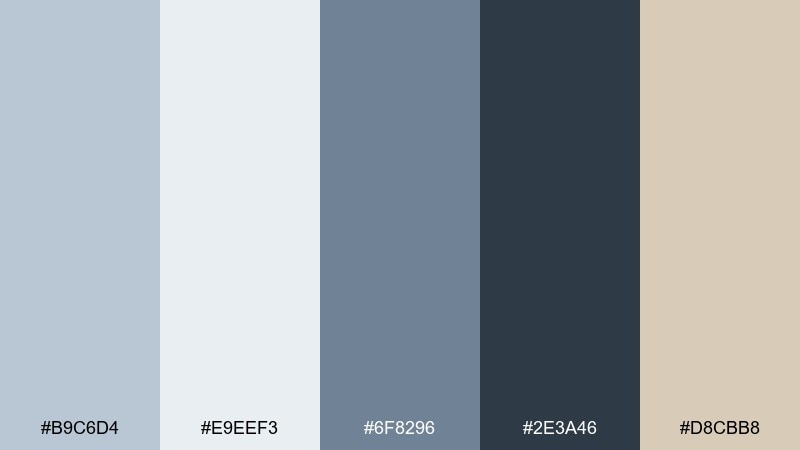
HEX: #B9C6D4 #E9EEF3 #6F8296 #2E3A46 #D8CBB8
Mood: calm, coastal, refined
Best for: website hero sections and lifestyle branding
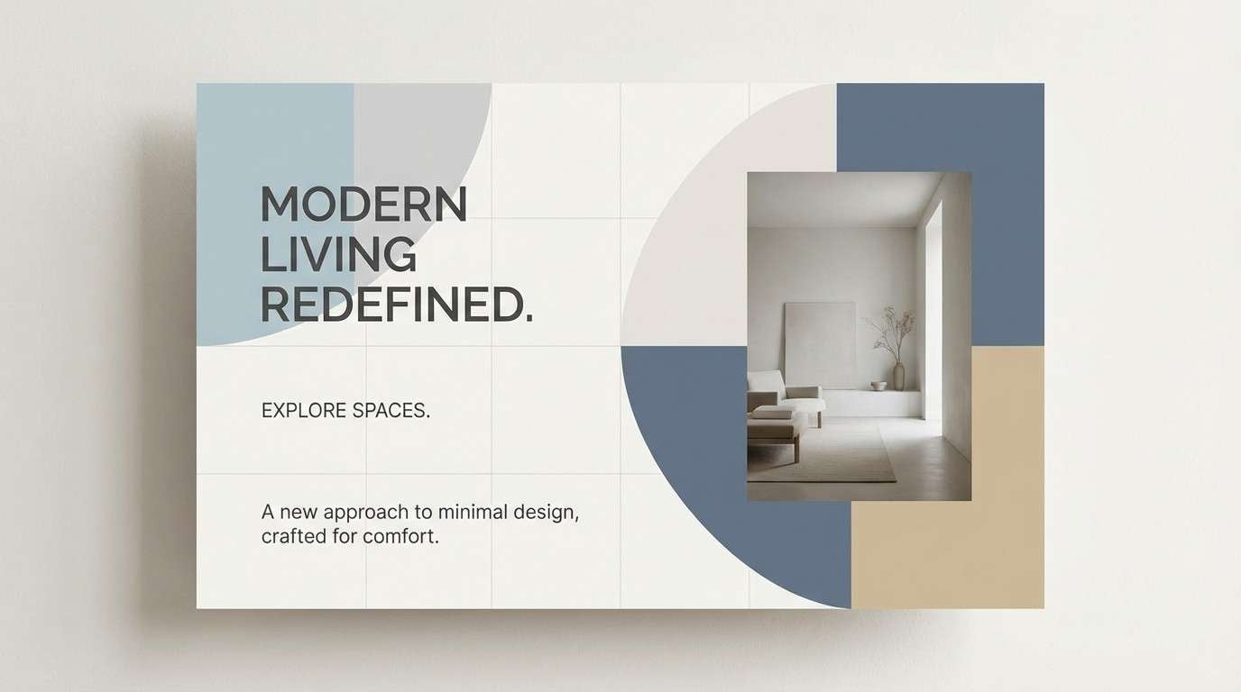
Calm and coastal like early fog rolling over a marina, these tones feel clean without turning cold. The blue light gray color palette works beautifully for hero banners, clean navigation, and soft product photography backdrops. Pair it with warm beige accents to keep the neutrals from feeling sterile, and use the deep charcoal for crisp type. Tip: reserve the darkest shade for headings and CTAs so the layout stays airy.
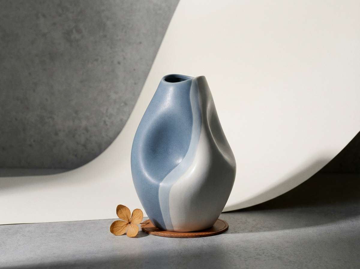
Image example of misty harbor generated using media.io
Media.io is an online AI studio for creating and editing video, image, and audio in your browser.

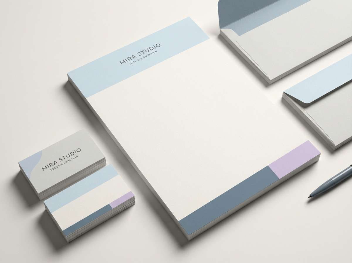
2) Cloudline Studio
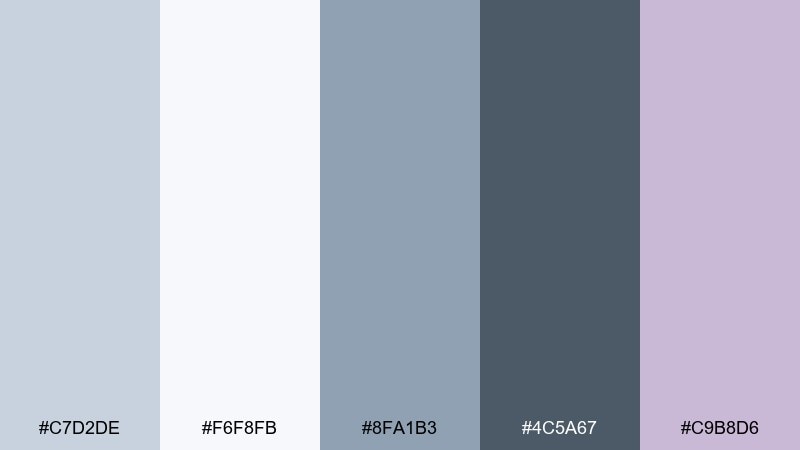
HEX: #C7D2DE #F6F8FB #8FA1B3 #4C5A67 #C9B8D6
Mood: soft, airy, studio-clean
Best for: brand identity systems and stationery
Soft and airy like daylight in a photo studio, this mix keeps everything polished and modern. The pale base gives logos room to breathe, while the slate and graphite add structure for type and marks. Pair the lavender tint with matte paper textures for a premium feel. Tip: use the mid blue gray as the main brand neutral and keep the darkest tone for small details like rules and icons.
Image example of cloudline studio generated using media.io
3) Arctic Linen
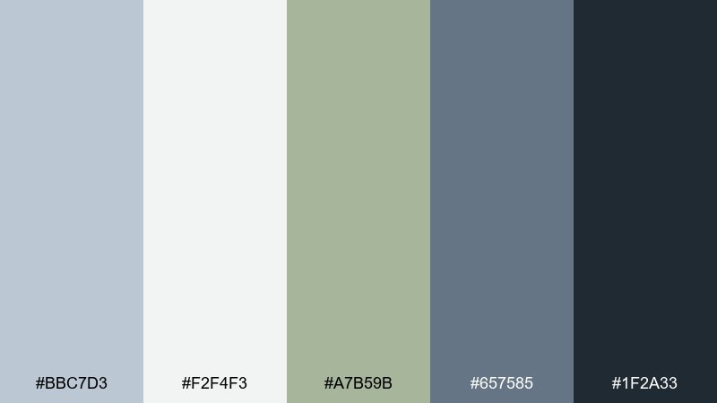
HEX: #BBC7D3 #F2F4F3 #A7B59B #657585 #1F2A33
Mood: fresh, natural, understated
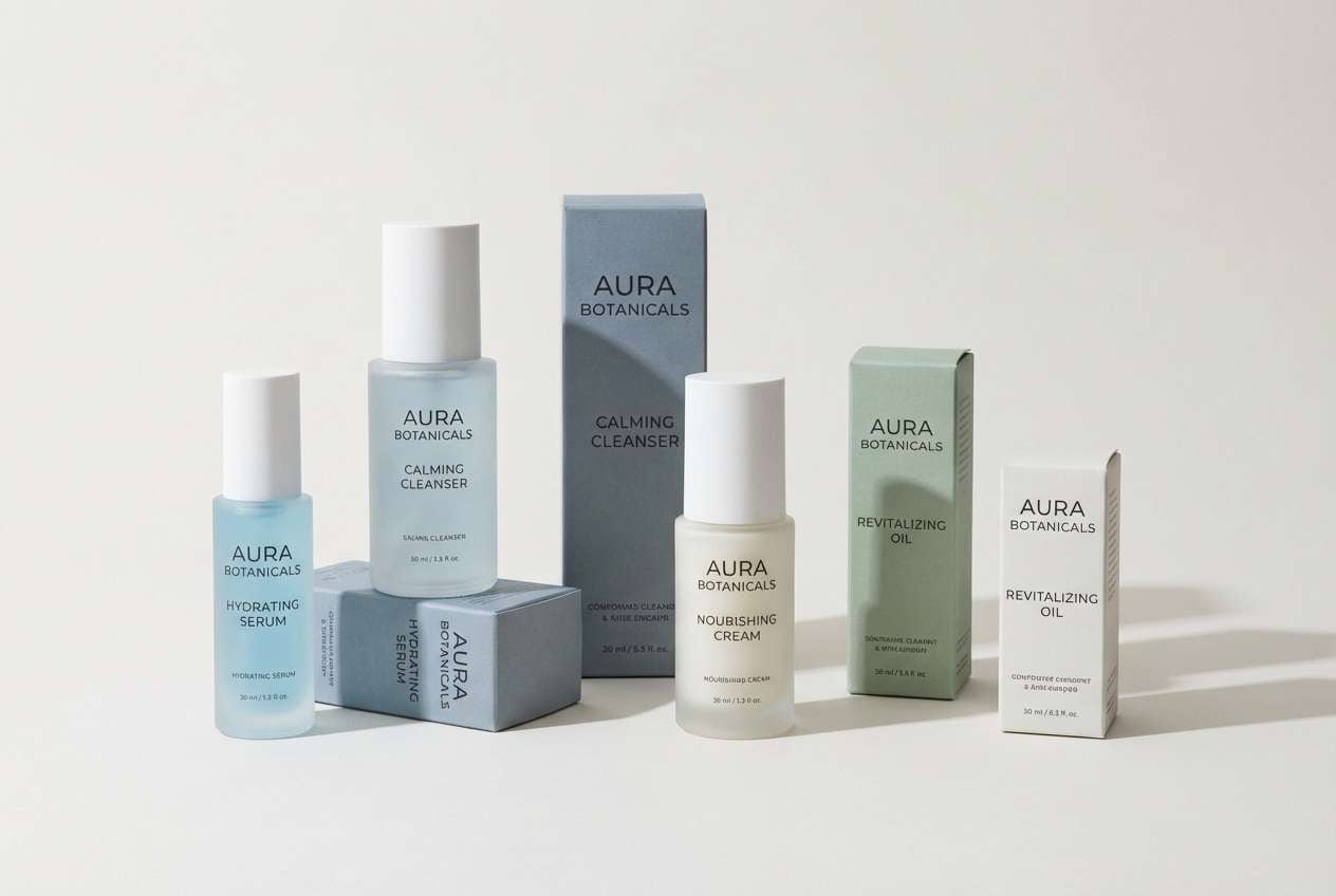
Best for: skincare packaging and wellness sites
Fresh and understated, it feels like crisp air and clean linen with a hint of herbs. The sage note softens the cool grays, making it ideal for calm wellness messaging and ingredient-led layouts. Pair it with uncoated textures and simple sans-serif typography for clarity. Tip: keep the green as a secondary accent so the overall look stays light and breathable.
Image example of arctic linen generated using media.io
4) Slate Whisper
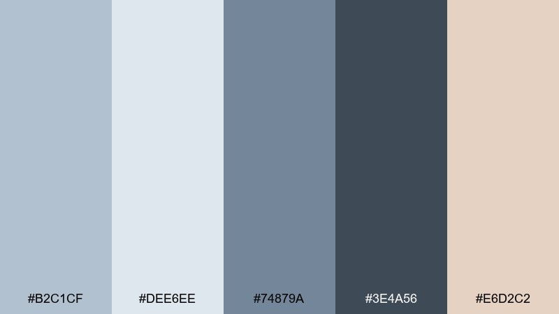
HEX: #B2C1CF #DEE6EE #74879A #3E4A56 #E6D2C2
Mood: quiet, modern, architectural
Best for: editorial layouts and presentations
Quiet and architectural, these shades evoke stone, paper, and soft shadow. They shine in slide decks and long-form editorial where readability matters as much as tone. Add the warm cream as a subtle highlight for pull quotes or section breaks. Tip: keep body text in the deep slate and use the lighter grays for margins and spacing to avoid glare.
Image example of slate whisper generated using media.io
5) Coastal Concrete
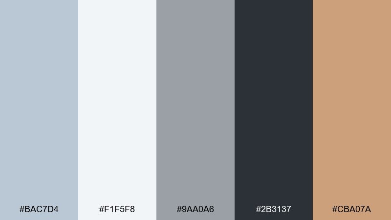
HEX: #BAC7D4 #F1F5F8 #9AA0A6 #2B3137 #CBA07A
Mood: urban-coastal, grounded, confident
Best for: product ads for modern home goods
Grounded and confident, it brings to mind concrete promenades by the sea. These blue light gray color combinations look sharp for modern home goods, especially when you want a clean base with a warm, crafted accent. Pair the caramel note with brushed metal or wood to add depth. Tip: let the warm accent appear in small, repeated moments like buttons, price tags, or callouts.
Image example of coastal concrete generated using media.io
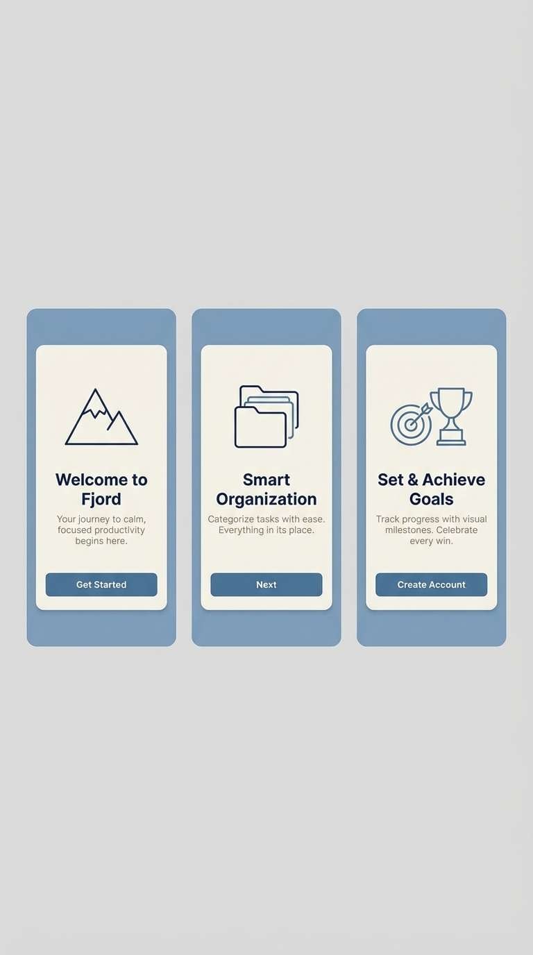
6) Winter Denim
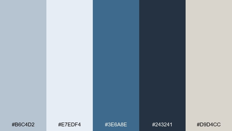
HEX: #B6C4D2 #E7EDF4 #3E6A8E #243241 #D9D4CC
Mood: cool, casual, dependable
Best for: app onboarding screens
Cool and dependable, it feels like worn denim against a winter sky. The deep blue brings clarity for primary actions, while the pale tones keep onboarding screens friendly and uncluttered. Pair it with rounded UI components and generous line spacing to reinforce the casual vibe. Tip: use the navy for your main CTA and keep secondary actions in the mid blue to avoid visual noise.
Image example of winter denim generated using media.io
7) Frosted Eucalyptus
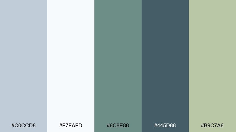
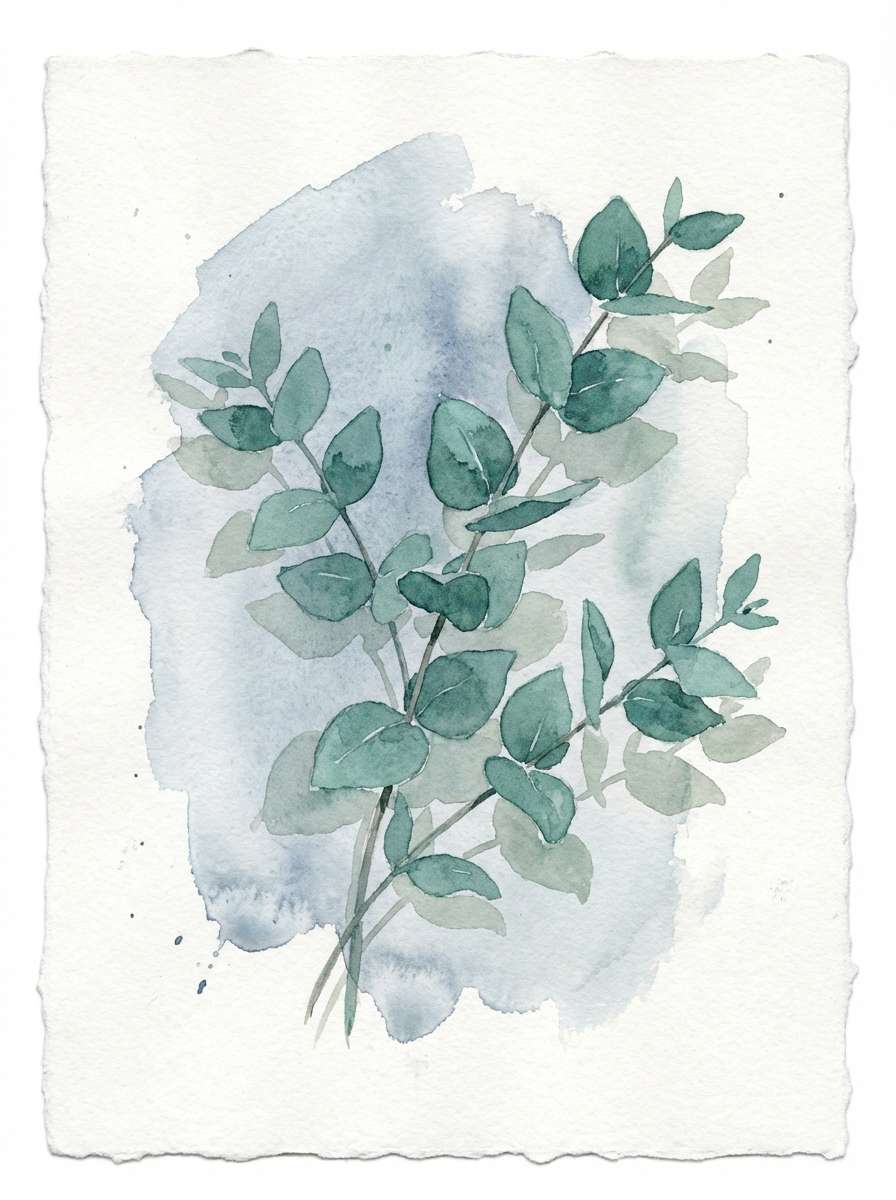
HEX: #C0CCD8 #F7FAFD #6C8E86 #445D66 #B9C7A6
Mood: spa-like, botanical, soothing
Best for: botanical illustrations and wellness blog headers
Spa-like and soothing, it resembles eucalyptus leaves dusted with morning frost. The green-blue tones bring a gentle botanical note without overpowering the light base. Pair it with watercolor textures and thin-line illustrations for a calm, editorial feel. Tip: keep the lightest tone as negative space so the botanical accents look intentional, not busy.
Image example of frosted eucalyptus generated using media.io
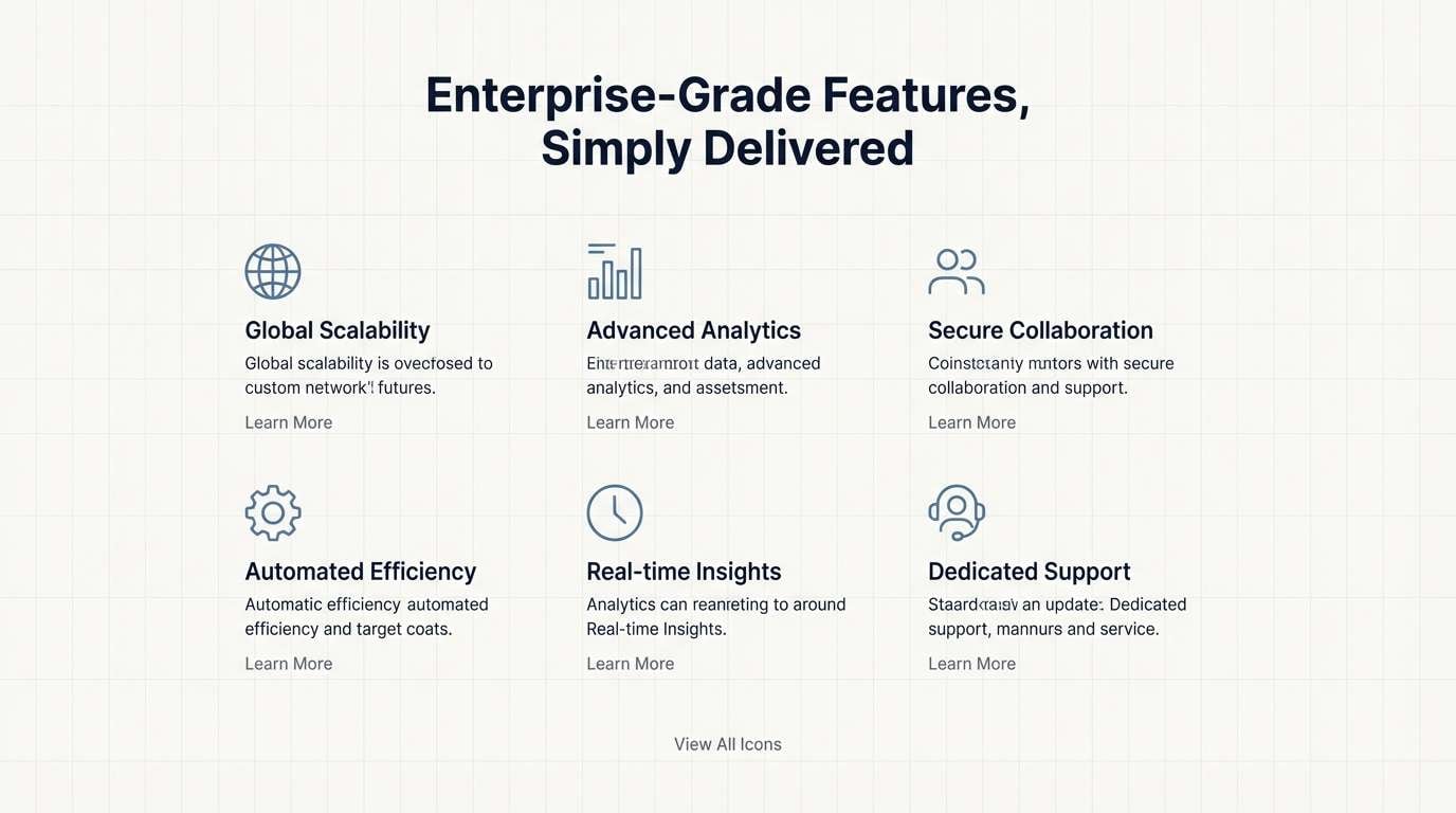
8) Steel Blue Minimal
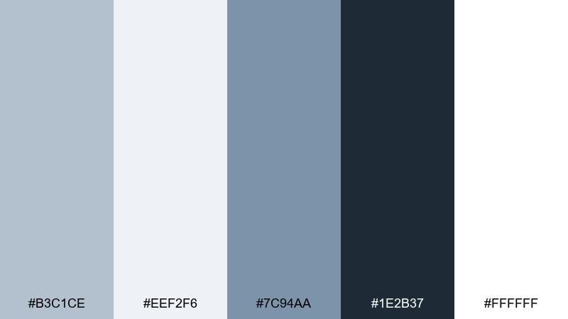
HEX: #B3C1CE #EEF2F6 #7C94AA #1E2B37 #FFFFFF
Mood: minimal, crisp, tech-forward
Best for: SaaS landing pages and icon systems
Minimal and tech-forward, it reads like polished steel under soft daylight. The white and pale gray create a clean canvas, while the steel blue makes icons and micro-illustrations pop. Pair it with simple geometric shapes and consistent stroke weights for a cohesive system. Tip: keep the darkest tone for navigation and key labels to maintain strong contrast.
Image example of steel blue minimal generated using media.io
9) Rainy Day Office
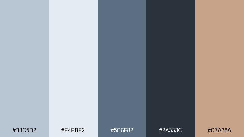
HEX: #B8C5D2 #E4EBF2 #5C6F82 #2A333C #C7A38A
Mood: focused, professional, quietly warm
Best for: corporate dashboards and reports
Focused and professional, it feels like a rainy window view in a calm office. A blue light gray color combination like this keeps data-heavy screens legible while still feeling human. Pair it with subtle dividers and warm tan highlights for key metrics or alerts. Tip: use the mid gray-blue for chart elements so the navy can stay reserved for totals and headers.
Image example of rainy day office generated using media.io
10) Icy Lavender Haze
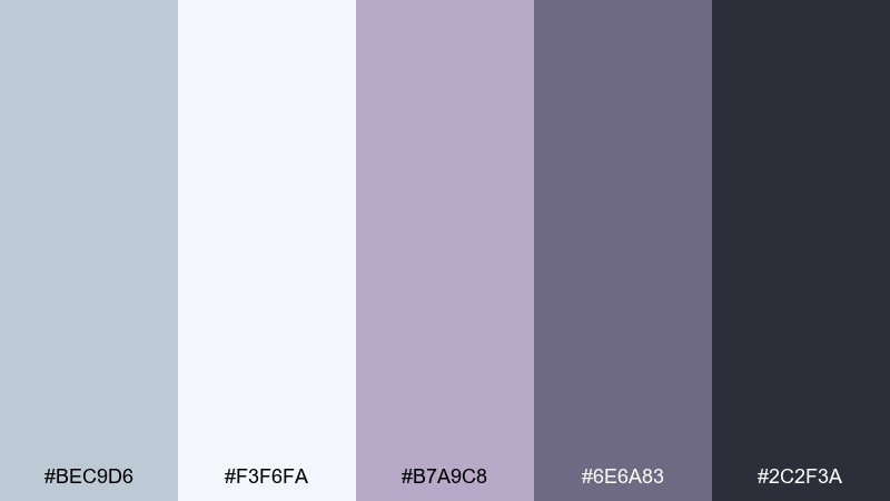
HEX: #BEC9D6 #F3F6FA #B7A9C8 #6E6A83 #2C2F3A
Mood: dreamy, modern, slightly romantic
Best for: music cover art and social templates
Dreamy and modern, it looks like dusk haze with a lavender chill. The violet-gray adds personality without fighting the cool base, which makes it great for social templates and cover art typography. Pair it with soft gradients and minimal line art for a contemporary feel. Tip: keep the darkest tone for titles and let the lavender sit behind as a glow or shadow.
Image example of icy lavender haze generated using media.io
11) Powder Blue Quartz
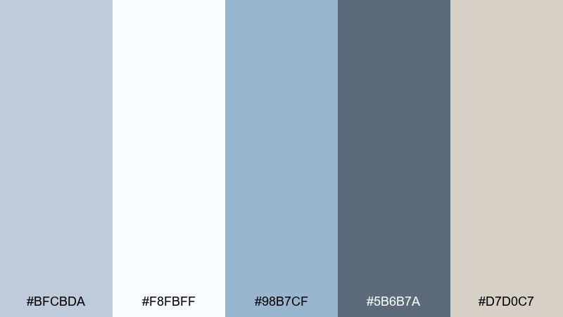
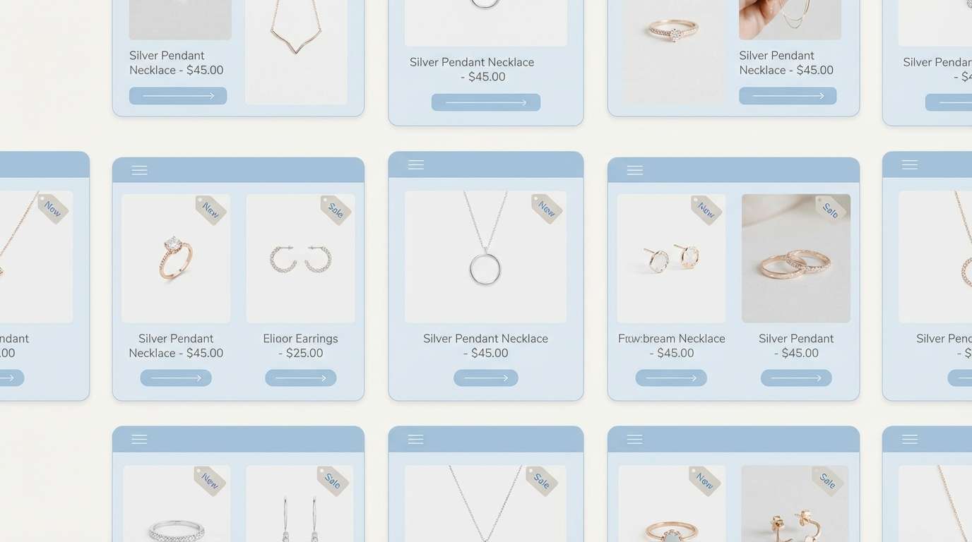
HEX: #BFCBDA #F8FBFF #98B7CF #5B6B7A #D7D0C7
Mood: light, clean, quietly luxurious
Best for: jewelry ecommerce and product grids
Light and quietly luxurious, it evokes quartz reflections on a bright countertop. The powder blue adds freshness to product grids while the cool grays keep attention on photography. Pair it with thin borders and soft drop shadows for a high-end storefront feel. Tip: use the warmer neutral as a background for badges like new or limited to avoid harsh contrast.
Image example of powder blue quartz generated using media.io
12) Silver Sky Editorial
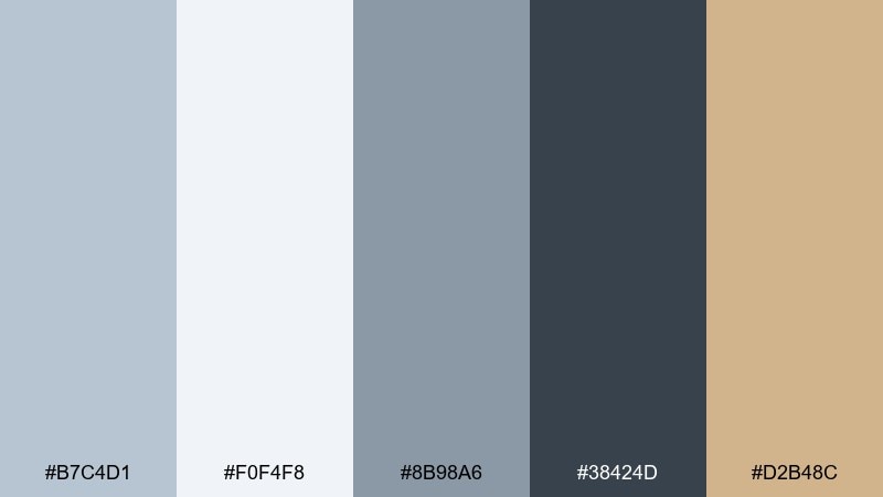
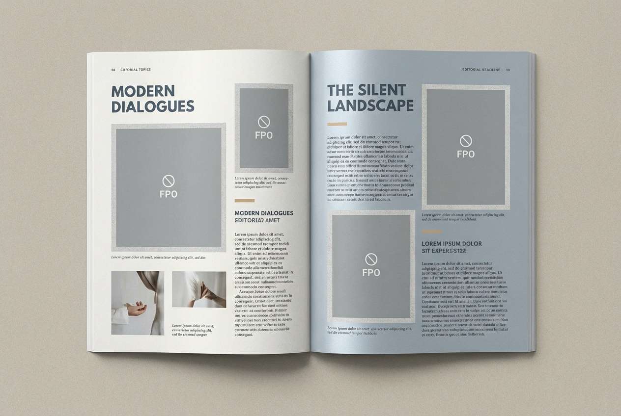
HEX: #B7C4D1 #F0F4F8 #8B98A6 #38424D #D2B48C
Mood: editorial, polished, modern classic
Best for: magazine features and portfolio sites
Polished and modern classic, it feels like a silver sky over city rooftops. Use this blue light gray color palette for editorial pages where image captions, pull quotes, and hierarchy need to look intentional. Pair it with warm sand accents to soften sharp lines and keep the layout approachable. Tip: set secondary text in the mid gray to reduce contrast fatigue on long reads.
Image example of silver sky editorial generated using media.io
13) Nordic Kitchen
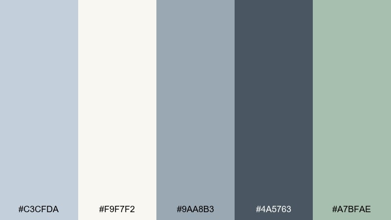
HEX: #C3CFDA #F9F7F2 #9AA8B3 #4A5763 #A7BFAE
Mood: scandinavian, cozy-clean, practical
Best for: kitchen interior mood boards
Cozy-clean and practical, it channels a bright Nordic kitchen with painted cabinets and pale counters. The creamy white warms the cool grays, and the soft green adds a natural touch without turning rustic. Pair it with light wood textures and matte metals for a balanced look. Tip: use the mid gray for cabinetry and the lightest tones for walls to keep the room open.
Image example of nordic kitchen generated using media.io
14) Calm Tech Dashboard
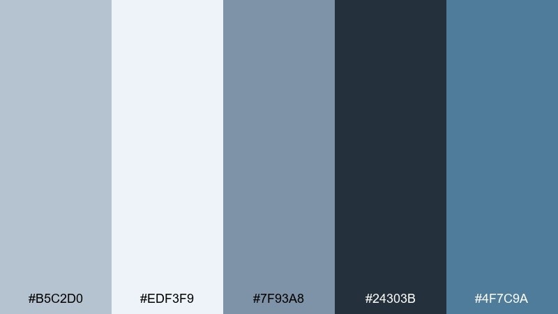
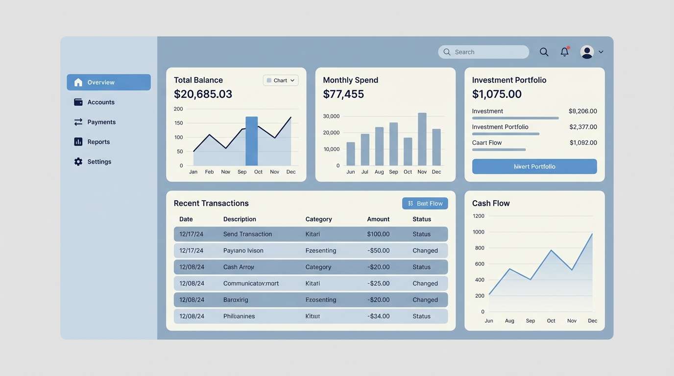
HEX: #B5C2D0 #EDF3F9 #7F93A8 #24303B #4F7C9A
Mood: calm, organized, trustworthy
Best for: fintech dashboards and data tables
Calm and organized, it feels like orderly spreadsheets with a breath of sky. The blue light gray color scheme helps dense tables stay readable, while the brighter blue keeps key actions obvious. Pair it with subtle row striping and consistent iconography for clarity. Tip: apply the accent blue only to interactive elements so users immediately know where to click.
Image example of calm tech dashboard generated using media.io
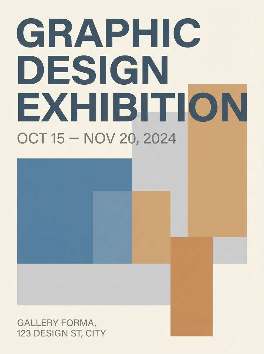
15) Museum Wallwash
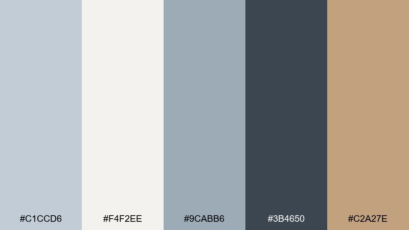
HEX: #C1CCD6 #F4F2EE #9CABB6 #3B4650 #C2A27E
Mood: gallery-like, quiet, elevated
Best for: art portfolios and exhibition posters
Gallery-like and quiet, it resembles museum walls under soft spotlights. The cool neutrals let artwork and photography take center stage, while the warm tan gives just enough warmth for captions and labels. Pair it with generous margins and restrained typography to maintain the curated feel. Tip: keep backgrounds in the lightest tones and use the darkest shade sparingly for titles only.
Image example of museum wallwash generated using media.io
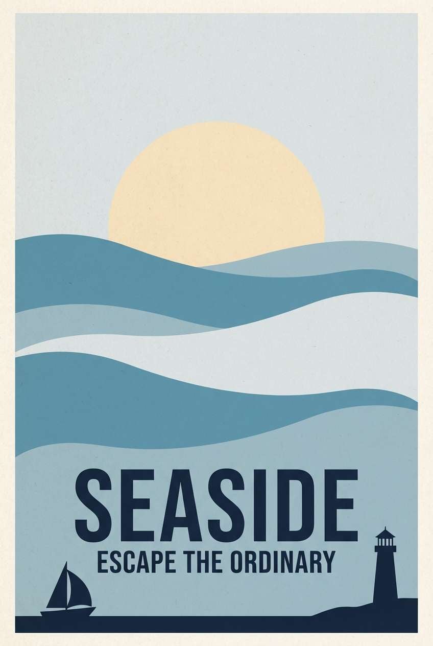
16) Seaside Poster Print
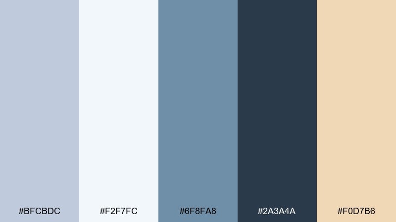
HEX: #BFCBDC #F2F7FC #6F8FA8 #2A3A4A #F0D7B6
Mood: bright, breezy, graphic
Best for: travel posters and wall art prints
Bright and breezy, it evokes sea spray, pale sky, and sunlit paper. The stronger blue adds punch for shapes and headings, while the warm cream keeps the design friendly. Pair it with bold, simplified illustration styles for a classic travel-poster vibe. Tip: limit the dark navy to outlines and type so the print stays light from a distance.
Image example of seaside poster print generated using media.io
17) Soft Utility Packaging
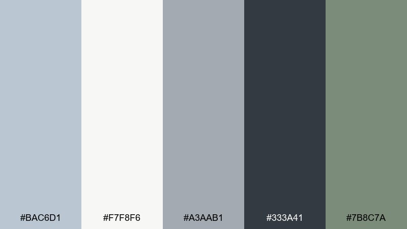
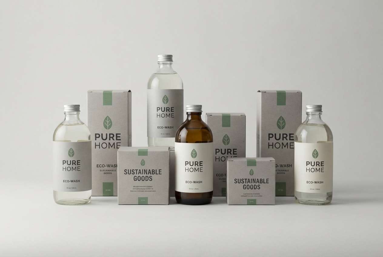
HEX: #BAC6D1 #F7F8F6 #A3AAB1 #333A41 #7B8C7A
Mood: practical, clean, eco-minded
Best for: household product packaging
Practical and clean, it feels like well-designed utility goods with a softer edge. The gray stack keeps labels readable, and the muted green supports an eco-minded message without shouting. Pair it with simple icons and a clear information hierarchy for trust. Tip: use the darkest shade for ingredient lists and safety text to meet contrast needs.
Image example of soft utility packaging generated using media.io
18) Blue Smoke Wedding
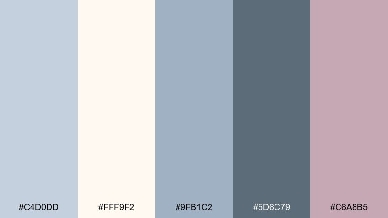
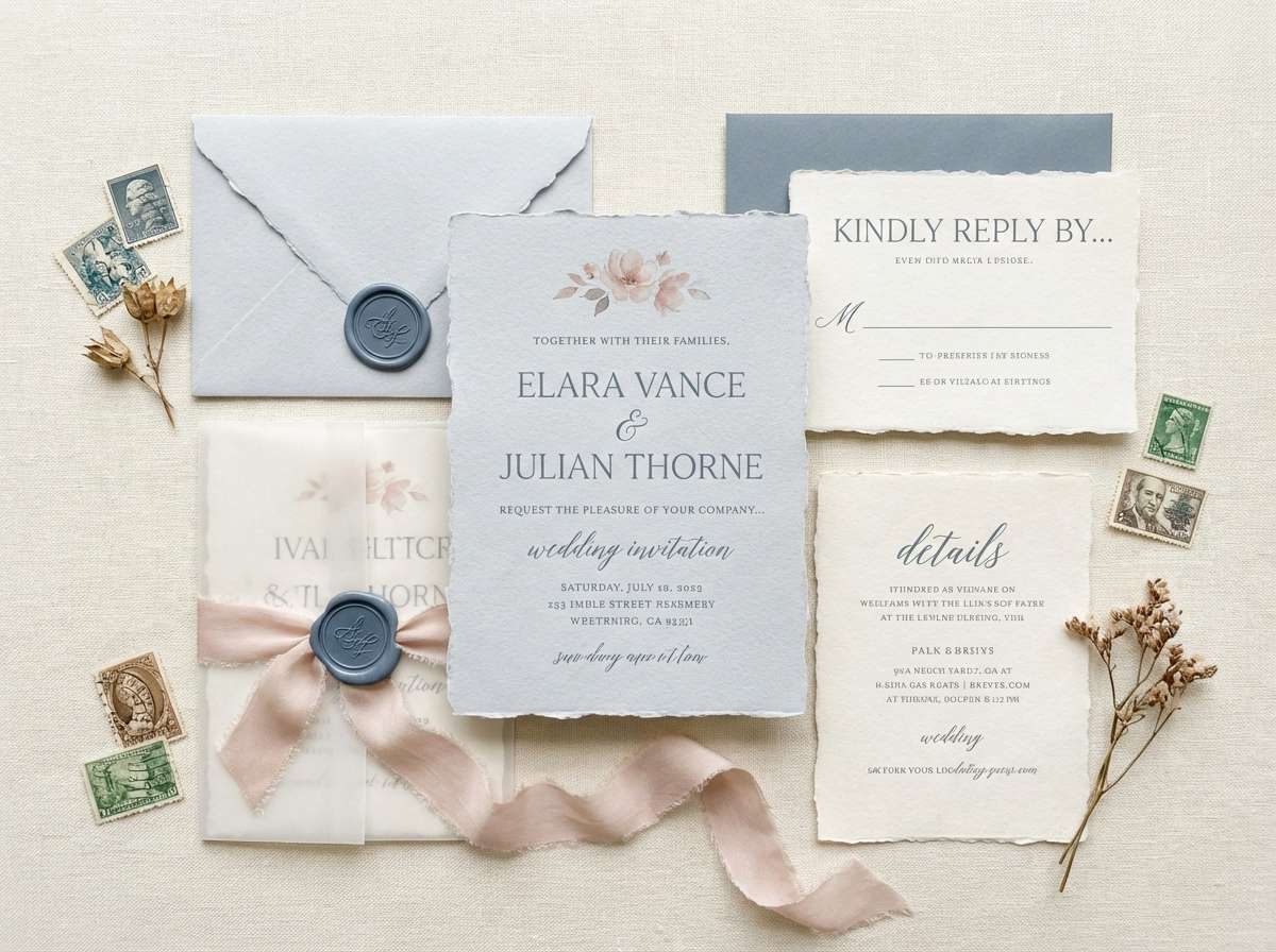
HEX: #C4D0DD #FFF9F2 #9FB1C2 #5D6C79 #C6A8B5
Mood: romantic, soft, elegant
Best for: wedding invitations and RSVP cards
Romantic and soft, it suggests blue smoke, cream paper, and a blush floral accent. These blue light gray color combinations are perfect for invitations that feel modern yet timeless. Pair it with serif typography and minimal line flourishes, then keep the blush limited to names or key details. Tip: print the lightest tones as paper choice and use the darker shades for ink to avoid washed-out text.
Image example of blue smoke wedding generated using media.io
19) Glacier Game UI
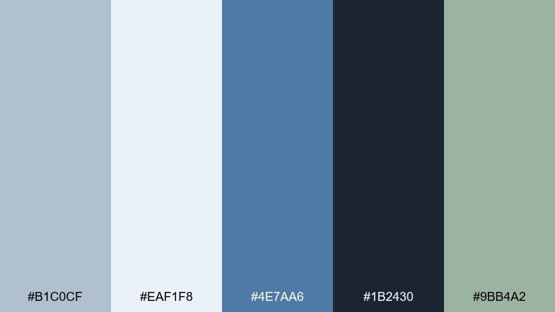
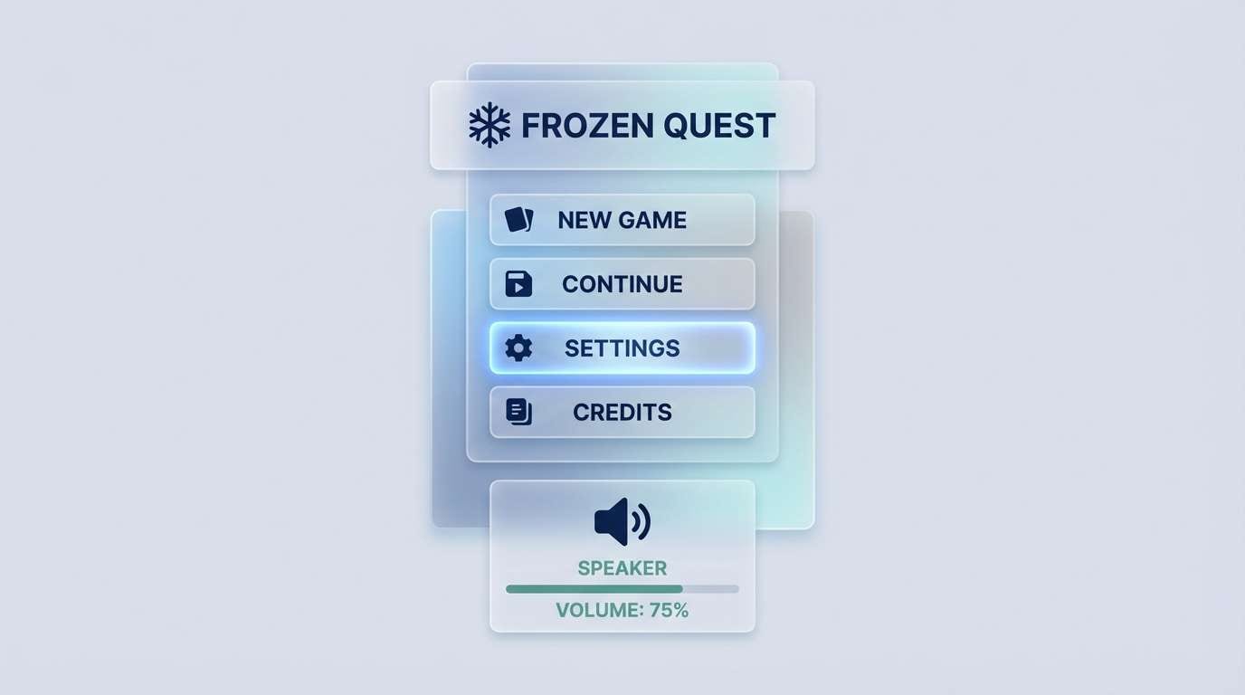
HEX: #B1C0CF #EAF1F8 #4E7AA6 #1B2430 #9BB4A2
Mood: icy, sharp, energetic
Best for: game menus and HUD interfaces
Icy and sharp, it feels like glacier light with a punch of electric blue. The darker navy supports strong contrast for HUD elements, while the teal-green keeps highlights fresh instead of neon. Pair it with glassy panels and subtle gradients for a modern game menu look. Tip: keep the accent blue for selected states only so the interface stays readable during motion.
Image example of glacier game ui generated using media.io
20) Evening Fog Lounge
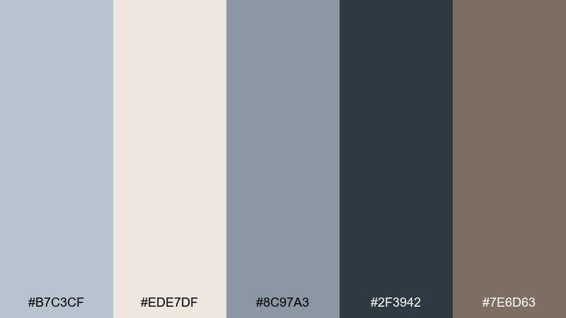
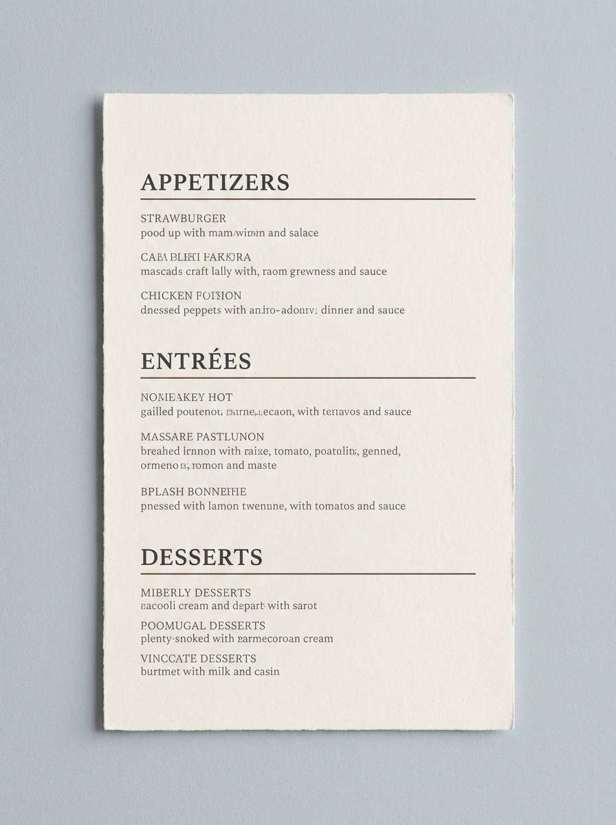
HEX: #B7C3CF #EDE7DF #8C97A3 #2F3942 #7E6D63
Mood: moody, sophisticated, cozy
Best for: restaurant branding and menus
Moody and sophisticated, it evokes an evening lounge wrapped in fog and warm candlelight. The soft gray base keeps menus elegant, while the espresso-brown accent adds appetite and comfort. Pair it with textured paper stock and understated iconography for a premium vibe. Tip: use the darkest shade for section headers and keep body copy in the mid gray to feel refined, not harsh.
Image example of evening fog lounge generated using media.io
21) Quiet Blueprint
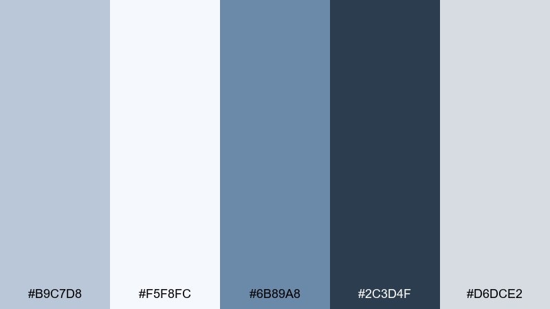
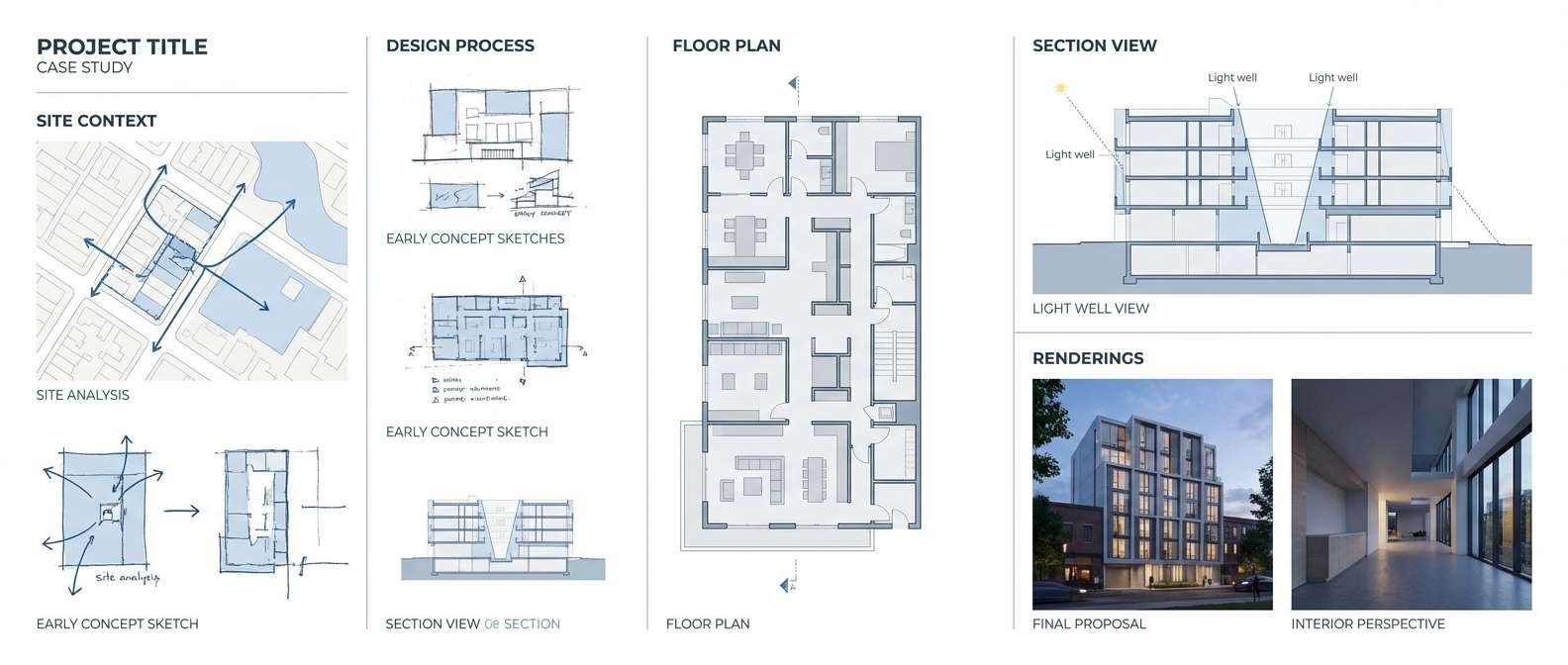
HEX: #B9C7D8 #F5F8FC #6B89A8 #2C3D4F #D6DCE2
Mood: precise, calm, engineered
Best for: architecture portfolios and case studies
Precise and calm, it recalls blueprint lines softened by daylight. The stronger blue is ideal for diagrams and callouts, while the pale tones keep case studies readable. Pair it with thin grid lines and consistent spacing to emphasize craft. Tip: keep diagram strokes in the mid blue and reserve the darkest tone for titles and navigation.
Image example of quiet blueprint generated using media.io
22) Snowy Citrus Accent
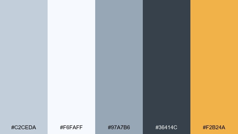
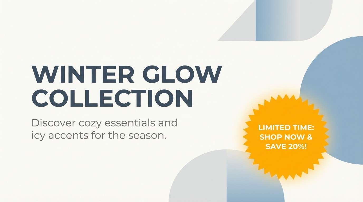
HEX: #C2CEDA #F6FAFF #97A7B6 #36414C #F2B24A
Mood: fresh, optimistic, high-contrast
Best for: campaign banners and promotional graphics
Fresh and optimistic, it feels like clean snow with a bright slice of citrus. The warm amber accent adds instant energy to otherwise cool neutrals, making it great for promotions and limited-time offers. Pair it with bold sans-serif type and plenty of negative space so the accent stays punchy. Tip: use the amber for one focal element per banner, such as the button or the discount badge.
Image example of snowy citrus accent generated using media.io
What Colors Go Well with Blue Light Gray?
Blue light gray pairs naturally with crisp whites, charcoal, and navy—giving you clean contrast for typography and UI elements. If you want a more premium feel, add warm neutrals like sand, cream, taupe, or caramel to soften the cool undertone.
For color accents, muted greens (sage, eucalyptus, teal-gray) keep things calm and modern, while lavender-gray or dusty blush adds personality without turning loud. For high-impact moments, a single warm accent (amber or terracotta) makes CTAs and badges pop.
In practice, blue light gray works best when you choose one “temperature counterweight”: either a warm paper-like neutral or an organic green. That balance prevents the palette from feeling too icy.
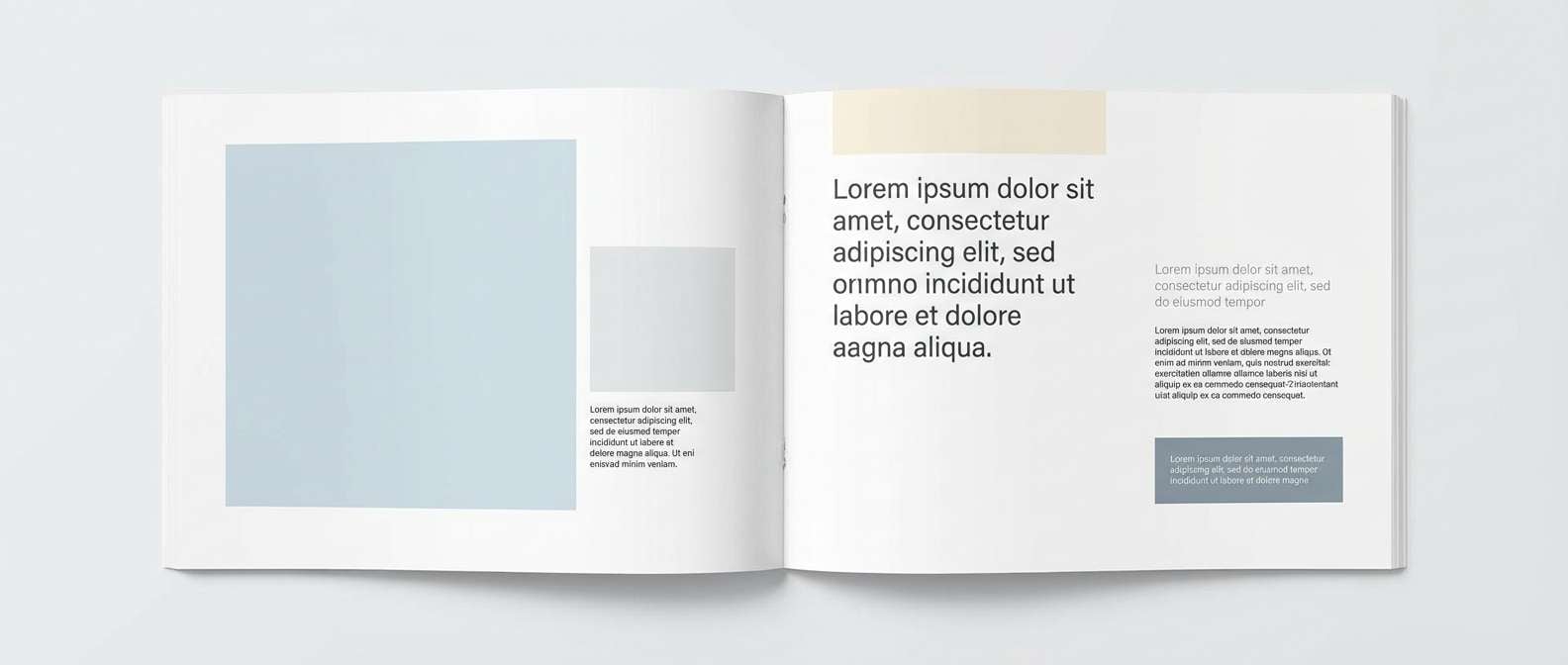
How to Use a Blue Light Gray Color Palette in Real Designs
In UI design, treat blue light gray as your main surface color (app background, panels, cards) and rely on deep slate/charcoal for text. Keep one stronger blue for interactive states (links, toggles, selected tabs) so usability stays obvious.
For branding and print, blue light gray is great as a “quiet luxury” base—especially with uncoated stock, soft gradients, or minimal linework. Use a warm accent for seals, highlights, or small graphic details to keep the identity approachable.
In interiors, think of blue light gray on walls or cabinetry paired with creamy whites and natural textures (wood, linen, brushed metal). The result feels bright and open, but still grounded.
Create Blue Light Gray Palette Visuals with AI
If you want to preview how a palette looks in a real layout—like a dashboard, poster, packaging mockup, or hero section—generate quick concept images with AI. This helps you validate contrast, mood, and accent placement before you design anything high-fidelity.
Start with one of the prompts above, then swap in your palette’s vibe words (e.g., “coastal,” “architectural,” “spa-like”) and specify the format you need (16:9 banner, 1:1 post, 3:4 poster). Keep the darkest shade reserved for type so the overall composition stays airy.
Blue Light Gray Color Palette FAQs
-
What is blue light gray?
Blue light gray is a light gray with a subtle blue undertone. It reads cooler than standard gray and often feels airy, modern, and clean—especially on screens and in minimalist interiors. -
Is blue light gray a good background color for websites?
Yes. Blue light gray works well as a background because it’s softer than pure white and helps UI components stand out. Pair it with deep charcoal/navy text to maintain strong readability and contrast. -
What accent colors look best with blue light gray?
Warm neutrals (cream, sand, caramel), muted greens (sage, eucalyptus), and soft purples (lavender-gray) are dependable accents. For punchy CTAs, use a single warm hue like amber. -
How do I keep a blue light gray palette from feeling cold?
Add one warm element—such as beige, cream, or tan—and use it in small repeated touches (badges, dividers, highlights). Natural textures (paper, linen, wood) also help counter the cool undertone. -
What text color is best on blue light gray?
Deep slate, charcoal, or navy typically provides the best contrast while staying harmonious with the cool base. Avoid very light gray text, which can reduce legibility and fail accessibility checks. -
Is blue light gray suitable for branding?
It’s a strong choice for modern, premium, or tech-forward branding because it feels neutral but distinctive. Combine it with one signature accent color and consistent dark typography to build clear brand recognition. -
Can I use blue light gray in promotional designs?
Yes—use it as a clean foundation, then add one high-contrast accent (like amber or a stronger blue) for the focal element. This keeps banners and promos readable while still feeling energetic.
Next: Sap Green Color Palette


