

A botanical color palette blends leafy greens, soft neutrals, and earthy accents to create designs that feel natural, calm, and trustworthy. It’s a go-to choice for eco branding, wellness UI, editorial layouts, and packaging that needs a grounded tone.
Below are 20+ botanical palette ideas with HEX codes, plus practical pairing tips for light and dark backgrounds and AI prompts you can reuse to generate on-brand visuals fast.
In this article
- Why Botanical Palettes Work So Well
-
- fern canopy
- mossy path
- herb garden
- wildflower press
- eucalyptus steam
- terracotta pot
- rainforest shadow
- citrus blossom
- sage linen
- botanical ink
- pollen dust
- forest clay
- olive grove
- seedpod neutral
- spring hothouse
- compost cream
- aloe glow
- midnight ivy
- peatland fog
- garden party
- basil and bone
- orchid shade
- juniper dusk
- What Colors Go Well with Botanical?
- How to Use a Botanical Color Palette in Real Designs
- Create Botanical Palette Visuals with AI
Why Botanical Palettes Work So Well
Botanical palettes feel instantly familiar because they echo what we see outdoors: foliage greens, bark browns, clay oranges, and sun-warmed creams. That natural reference makes the color story feel “right” even in modern, minimal layouts.
They’re also highly flexible. You can push them airy and premium with off-whites and sage, or cinematic and bold with near-black greens and foggy teals—without leaving the botanical theme.
Most importantly, botanical colors support readability and hierarchy. Deep greens and warm charcoals make strong anchors for type, while pale stone and cream tones keep interfaces and print layouts open and breathable.
20+ Botanical Color Palette Ideas (with HEX Codes)
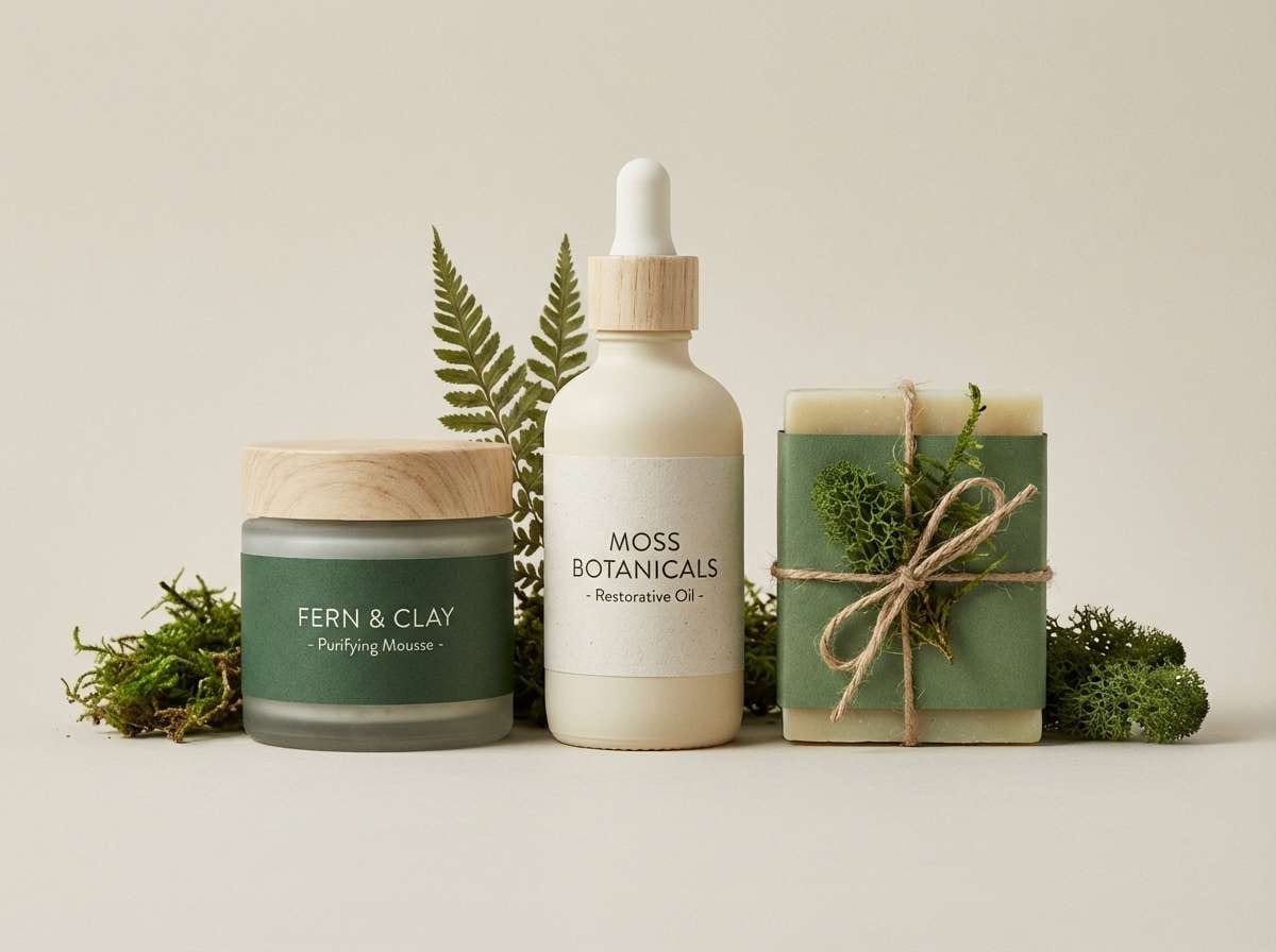
1) Fern Canopy
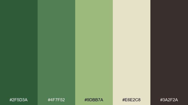
HEX: #2f5d3a #4f7f52 #9dbb7a #e6e2c8 #3a2f2a
Mood: fresh, grounded, quietly lush
Best for: eco skincare branding and labels
Fresh canopy greens and warm bark browns feel like a shaded trail after rain. Use the deep green as your anchor, then let the pale cream carry whitespace for a clean, premium look. The mid greens work beautifully for icons, patterns, and ingredient callouts. Tip: keep body text in the dark bark tone to avoid harsh black while staying readable.
Image example of fern canopy generated using media.io
Media.io is an online AI studio for creating and editing video, image, and audio in your browser.

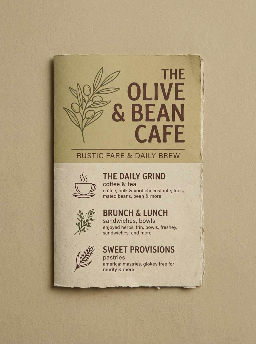
2) Mossy Path
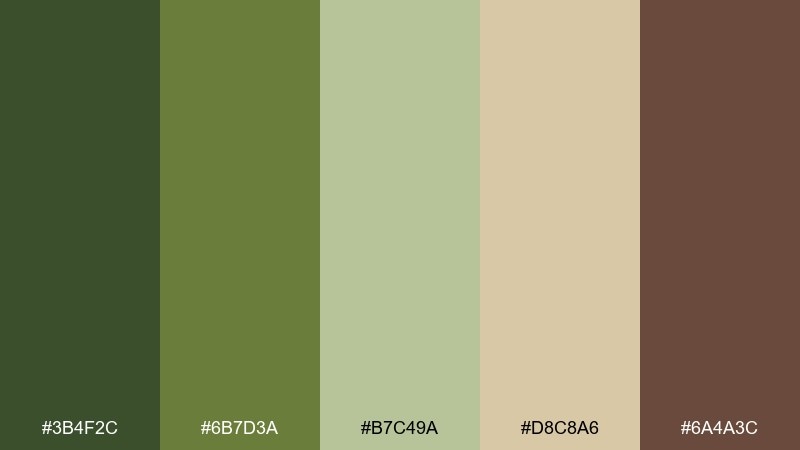
HEX: #3b4f2c #6b7d3a #b7c49a #d8c8a6 #6a4a3c
Mood: earthy, calm, tactile
Best for: rustic cafe menu design
Earthy moss and clay tones evoke hand-thrown ceramics and forest-floor textures. Pair the darker olive with warm tan for section headers, then use the pale sage for background blocks that feel soft rather than stark. The cocoa brown makes a friendly alternative to pure black for typography. Tip: add subtle grain or paper texture to lean into the handcrafted feel.
Image example of mossy path generated using media.io
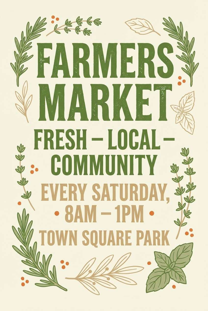
3) Herb Garden
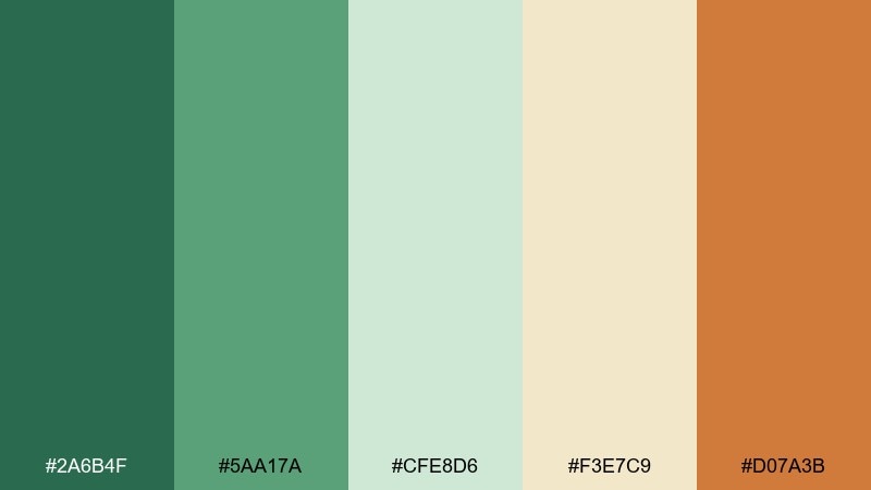
HEX: #2a6b4f #5aa17a #cfe8d6 #f3e7c9 #d07a3b
Mood: bright, aromatic, cheerful
Best for: farmers market poster
Bright herb greens with a citrusy orange accent feel like crushed mint and sun-warmed soil. These botanical color combinations shine in headlines and price tags, especially when the orange is used sparingly as a spotlight. Keep the creamy beige as the base to prevent the greens from looking too loud. Tip: limit the orange to one key element per section to preserve a natural balance.
Image example of herb garden generated using media.io
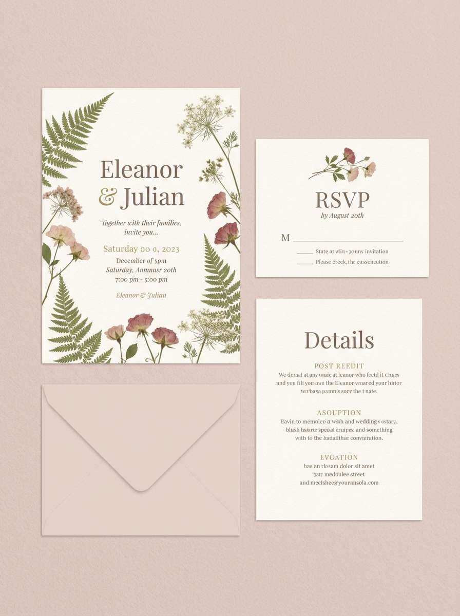
4) Wildflower Press
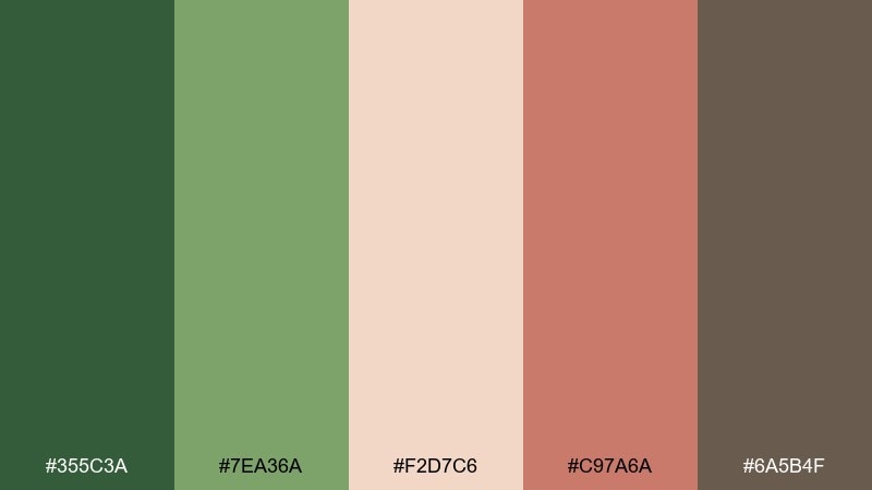
HEX: #355c3a #7ea36a #f2d7c6 #c97a6a #6a5b4f
Mood: romantic, soft, nostalgic
Best for: wedding invitation suite
Pressed petals and meadow greens create a tender, vintage mood. Use the blush and dusty rose for names and key details, while the evergreen grounds the layout. The warm taupe keeps body text gentle and cohesive with the paper-like background. Tip: choose an uncoated stock and add a subtle embossed floral border for extra charm.
Image example of wildflower press generated using media.io
5) Eucalyptus Steam
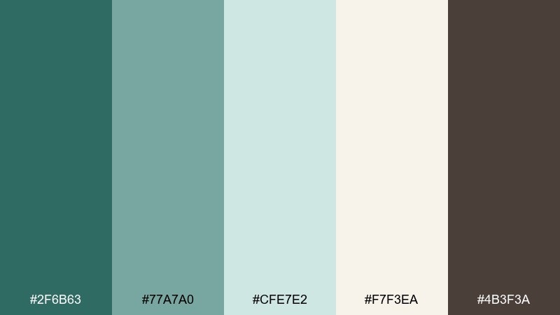
HEX: #2f6b63 #77a7a0 #cfe7e2 #f7f3ea #4b3f3a
Mood: spa-like, airy, restorative
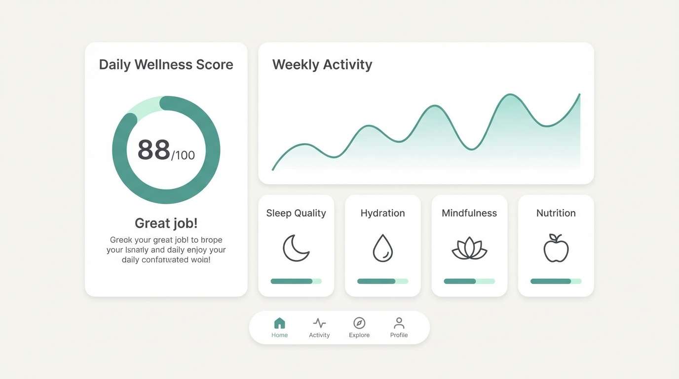
Best for: wellness app UI mockup
Cool eucalyptus teal and misty mint feel like a quiet spa towel warmed by steam. Let the off-white handle most surfaces, then reserve the deeper teal for navigation and primary buttons. The soft mint is ideal for cards, progress states, and calming illustrations. Tip: keep contrast high by pairing the teal with the warm charcoal for labels and small text.
Image example of eucalyptus steam generated using media.io
6) Terracotta Pot
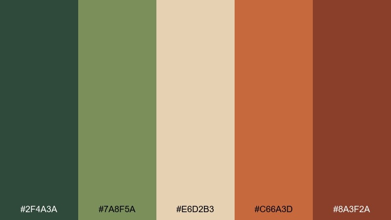
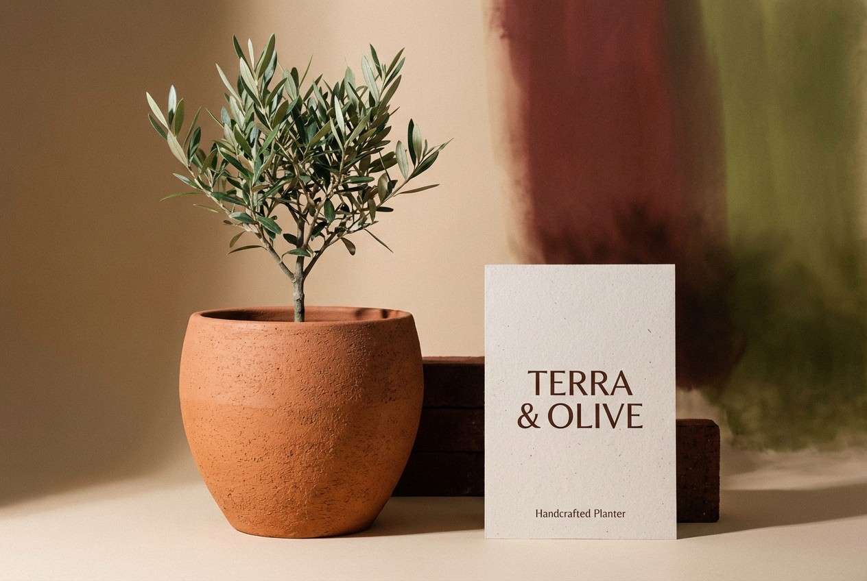
HEX: #2f4a3a #7a8f5a #e6d2b3 #c66a3d #8a3f2a
Mood: sunbaked, cozy, Mediterranean
Best for: home decor product ad
Sunbaked clay and olive greens bring to mind greenhouse shelves and terracotta planters. Use the warm terracotta as the hero color for product highlights, then soften the scene with sandy beige. The deeper brick tone adds weight for badges and small graphic details. Tip: keep photography warm and slightly desaturated so the colors feel natural, not loud.
Image example of terracotta pot generated using media.io
7) Rainforest Shadow
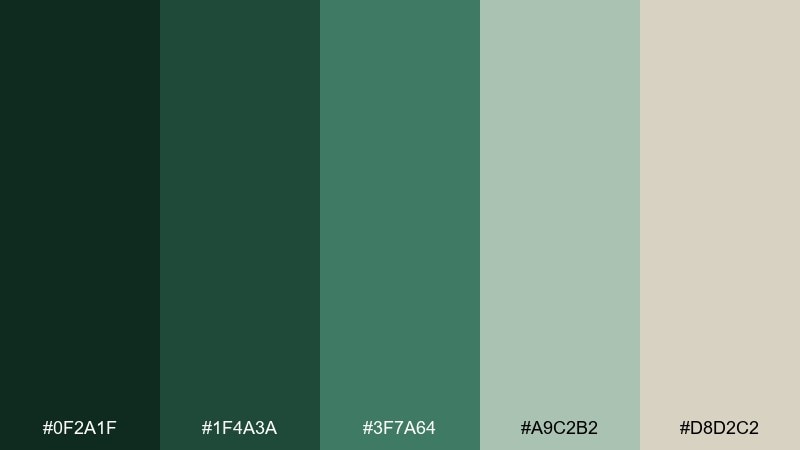
HEX: #0f2a1f #1f4a3a #3f7a64 #a9c2b2 #d8d2c2
Mood: moody, deep, cinematic
Best for: outdoor brand website hero
Deep jungle shades and foggy greens create a dramatic, story-driven feel. Make the near-black green your background for hero sections, then layer lighter teal-greens for overlays and UI chips. The pale stone tone works well for type and small UI lines without looking stark. Tip: add a subtle gradient from dark to mid green to keep large areas from feeling flat.
Image example of rainforest shadow generated using media.io

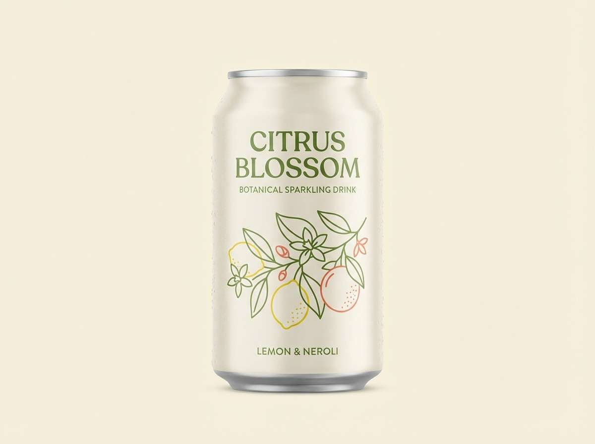
8) Citrus Blossom
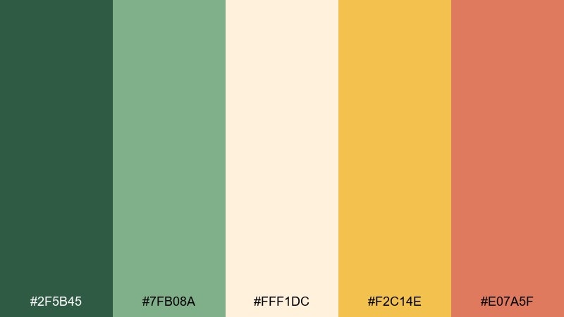
HEX: #2f5b45 #7fb08a #fff1dc #f2c14e #e07a5f
Mood: sunny, zesty, friendly
Best for: natural beverage can design
Zesty citrus yellow with leafy greens feels like a bright morning in an orchard. This botanical color scheme works best when the cream stays dominant, letting yellow pop on badges and flavor notes. Use the coral as a small secondary accent for limited editions or callouts. Tip: keep the green slightly darker in print so it holds up against the warm highlights.
Image example of citrus blossom generated using media.io
9) Sage Linen
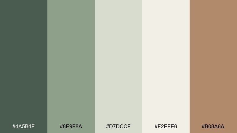
HEX: #4a5b4f #8e9f8a #d7dccf #f2efe6 #b08a6a
Mood: minimal, airy, sophisticated
Best for: interior design portfolio site
Soft sage and linen neutrals feel calm, editorial, and quietly upscale. Use the near-white as the main canvas, then bring in sage for navigation and section dividers. The warm caramel tone adds a tasteful accent for buttons or small highlights without stealing focus. Tip: pair with clean photography and generous margins to keep everything breathing.
Image example of sage linen generated using media.io
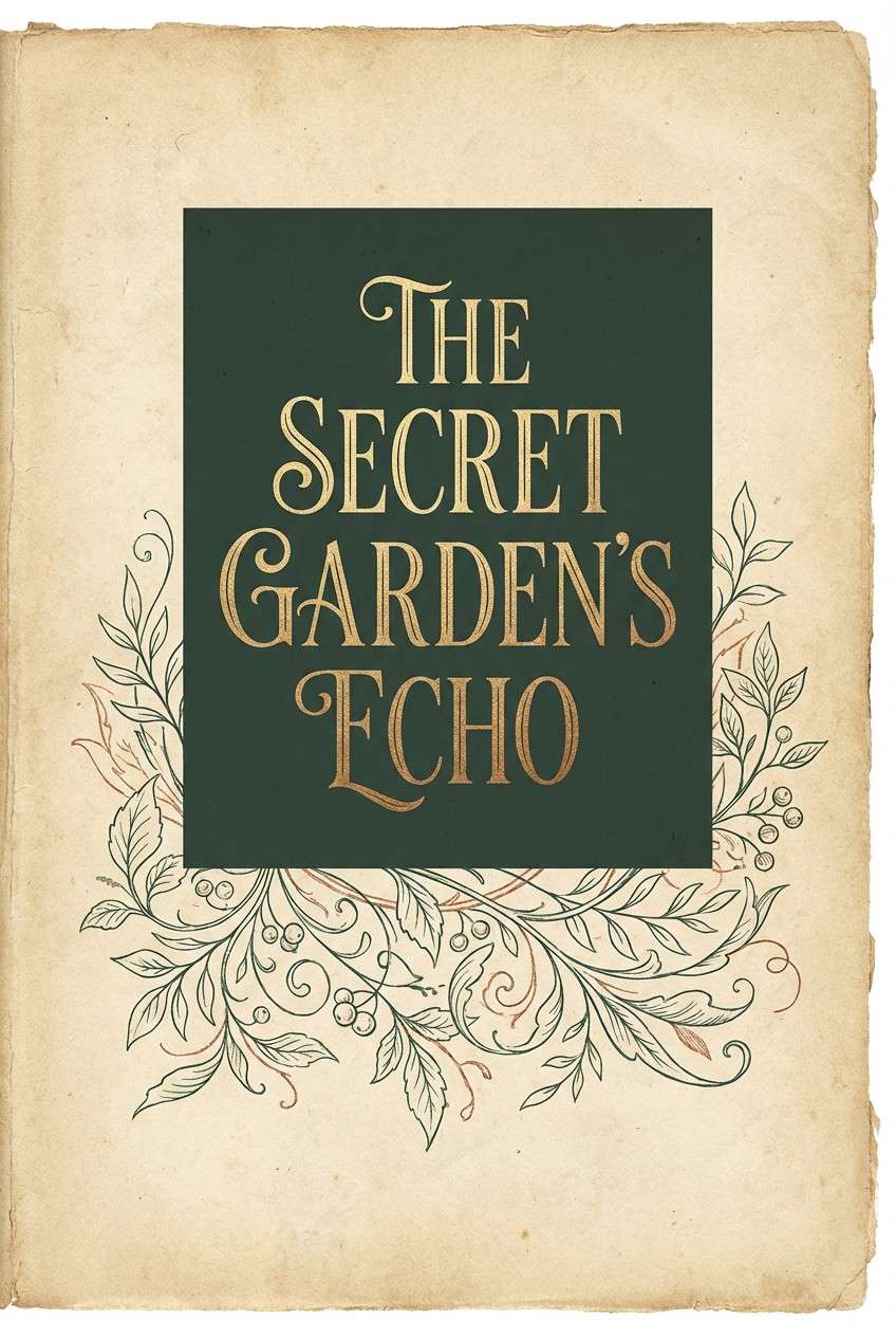
10) Botanical Ink
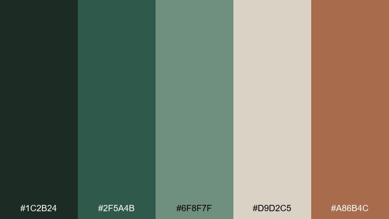
HEX: #1c2b24 #2f5a4b #6f8f7f #d9d2c5 #a86b4c
Mood: scholarly, refined, slightly antique
Best for: book cover design
Inky greens and parchment beige evoke field notes, old herbarium pages, and pressed leaves. Use the dark ink tone for the title background and the parchment for typography to keep it legible and classic. The muted copper works best as a thin rule, foil-stamp accent, or small emblem. Tip: try a subtle paper grain behind the parchment tone for extra authenticity.
Image example of botanical ink generated using media.io
11) Pollen Dust
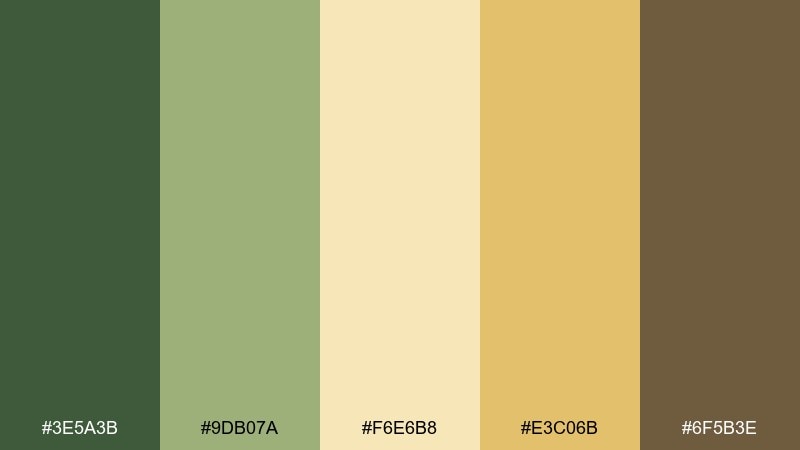
HEX: #3e5a3b #9db07a #f6e6b8 #e3c06b #6f5b3e
Mood: warm, optimistic, gentle
Best for: spring sale email header
Warm pollen yellows with leafy greens feel like late afternoon sun in a garden. Let the pale butter tone carry the background so the deeper green can frame headlines and buttons. The honey gold works well for discount tags and subtle gradients. Tip: keep shadows soft and avoid harsh black outlines to maintain the airy vibe.
Image example of pollen dust generated using media.io

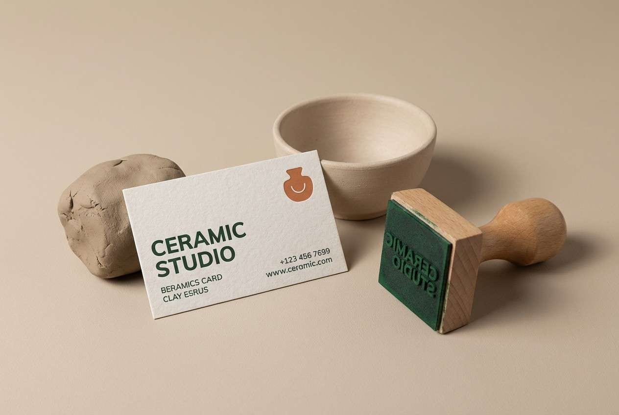
12) Forest Clay
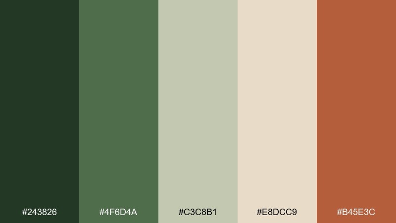
HEX: #243826 #4f6d4a #c3c8b1 #e8dcc9 #b45e3c
Mood: rooted, artisanal, modern rustic
Best for: ceramic studio brand kit
Forest greens and soft clay neutrals feel handmade but polished. This botanical color palette is strong for logos and stamps, especially when the dark green leads and the clay orange stays as a small signature accent. Use the pale beige for stationery and packaging inserts to keep it light. Tip: print the clay accent as a spot color to keep it rich and consistent.
Image example of forest clay generated using media.io
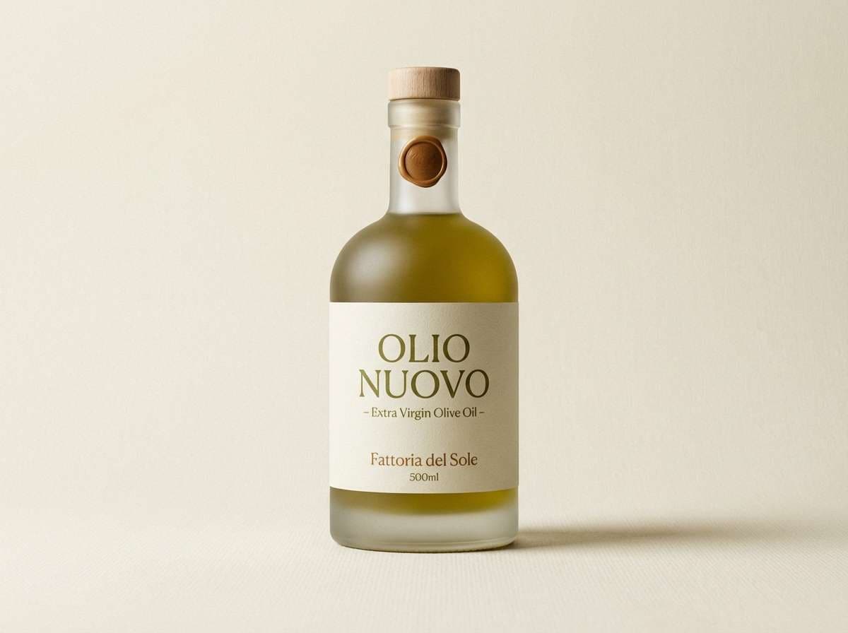
13) Olive Grove
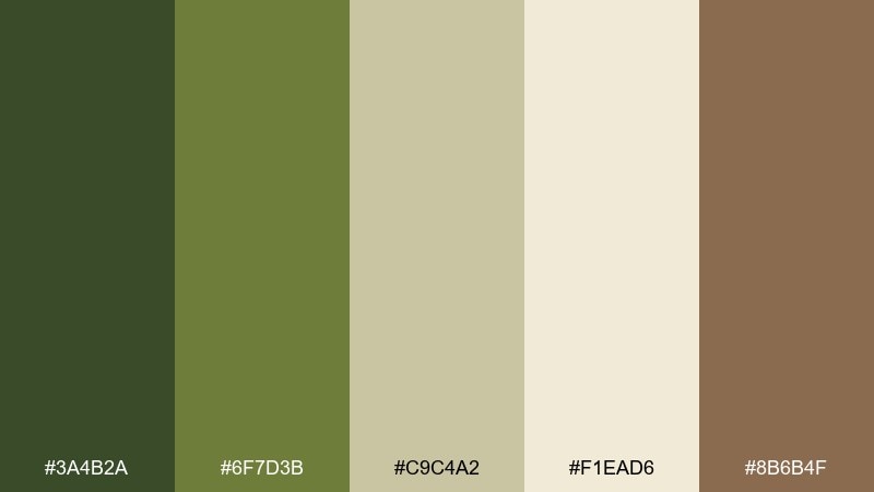
HEX: #3a4b2a #6f7d3b #c9c4a2 #f1ead6 #8b6b4f
Mood: sunlit, savory, grounded
Best for: olive oil packaging
Olive greens and sun-bleached neutrals evoke stone villas and quiet groves. Use the darkest olive for the label mark and key text, then keep the cream as the primary field for a premium look. The warm brown adds a natural, food-friendly warmth for secondary type and seals. Tip: pair with a simple leaf illustration and lots of negative space for shelf clarity.
Image example of olive grove generated using media.io
14) Seedpod Neutral
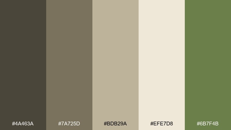
HEX: #4a463a #7a725d #bdb29a #efe7d8 #6b7f4b
Mood: quiet, natural, understated
Best for: minimalist presentation template
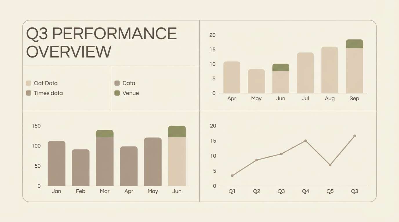
Seedpod browns and soft oat neutrals feel calm, stable, and professional. Use the light cream for slide backgrounds, then bring in the olive green only for key data points or section labels. The mid taupe tones make great chart fills and table stripes without visual noise. Tip: keep accent usage under 10 percent so the deck stays clean and confident.
Image example of seedpod neutral generated using media.io
15) Spring Hothouse
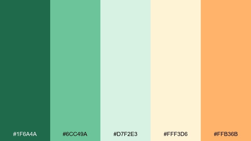
HEX: #1f6a4a #6cc49a #d7f2e3 #fff3d6 #ffb36b
Mood: sprightly, bright, playful
Best for: kids gardening workshop flyer
Sprightly mint and greenhouse green feel like seedlings under glass. Use the bright mint for big shapes and friendly icons, then let the creamy yellow keep the layout warm. The soft orange is perfect for dates, prices, or a single attention-grabbing badge. Tip: keep illustrations simple and rounded so the energy reads fun, not chaotic.
Image example of spring hothouse generated using media.io

16) Compost Cream
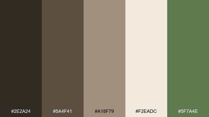
HEX: #2e2a24 #5a4f41 #a18f79 #f2eadc #5f7a4e
Mood: cozy, earthy, honest
Best for: sustainable food blog theme
Rich compost browns and creamy neutrals feel hearty, grounded, and homey. Make the cream your reading background, then use the dark soil tones for headings and navigation for strong contrast. A small hit of muted green keeps the look fresh without leaning too rustic. Tip: choose warm photography and keep link colors in the green for a natural cue.
Image example of compost cream generated using media.io
17) Aloe Glow
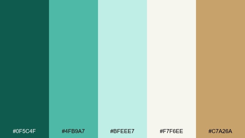
HEX: #0f5c4f #4fb9a7 #bfeee7 #f7f6ee #c7a26a
Mood: clean, modern, refreshing
Best for: cosmetic product landing page
Cool aloe teals with a hint of warm gold feel clean and science-forward, like a bright lab meets a spa. Use the deep teal for CTAs and key UI controls, while the pale aqua supports section backgrounds and ingredient callouts. The subtle gold makes a great accent for ratings, seals, or micro-animations. Tip: keep gradients gentle and prioritize flat color blocks for a crisp, modern finish.
Image example of aloe glow generated using media.io
18) Midnight Ivy
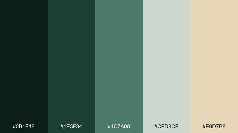
HEX: #0b1f18 #1e3f34 #4c7a68 #cfd8cf #e6d7b8
Mood: mysterious, elegant, nocturnal
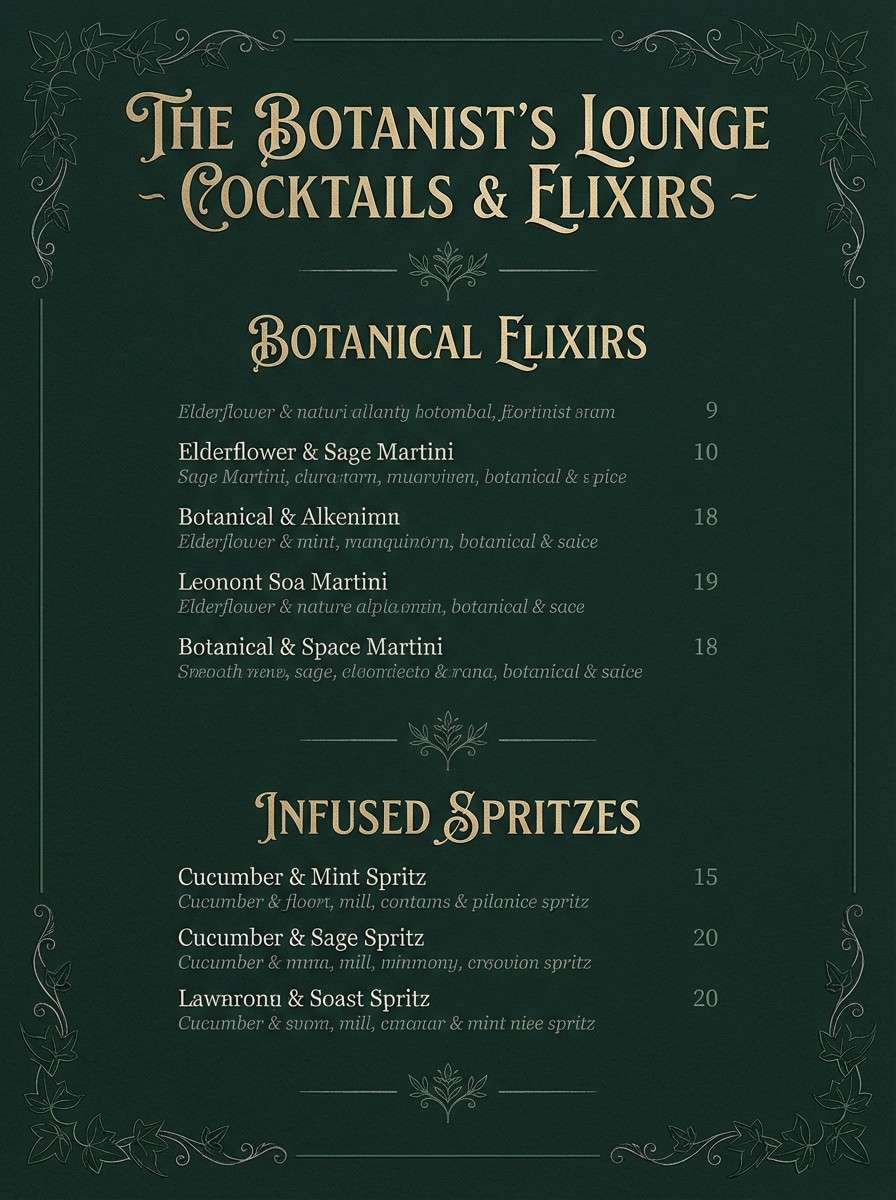
Best for: botanical bar menu
Midnight ivy greens and pale leaf tones feel like a candlelit conservatory. Use the near-black green as the menu base, then set text in the soft gray-green for a refined contrast. The warm champagne beige is best as a small highlight for signatures or featured cocktails. Tip: keep icon lines thin and avoid bright whites to preserve the night-garden mood.
Image example of midnight ivy generated using media.io
19) Peatland Fog
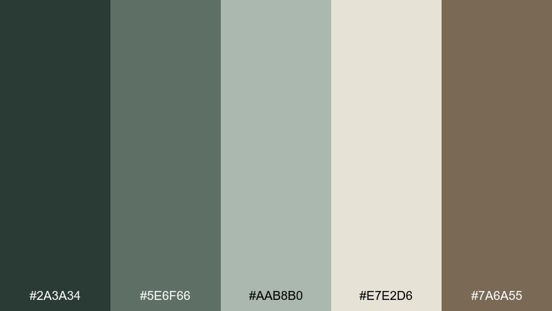
HEX: #2a3a34 #5e6f66 #aab8b0 #e7e2d6 #7a6a55
Mood: muted, misty, contemplative
Best for: editorial magazine spread
Misty peat greens and stone neutrals feel quiet and editorial, like fog rolling over wetlands. This botanical color palette is ideal for long-form layouts where readability matters, using the pale stone for pages and the darker greens for headings. The warm taupe adds a human touch to pull quotes and page numbers. Tip: use lots of whitespace and a strict grid so the muted tones look intentional, not dull.
Image example of peatland fog generated using media.io
20) Garden Party
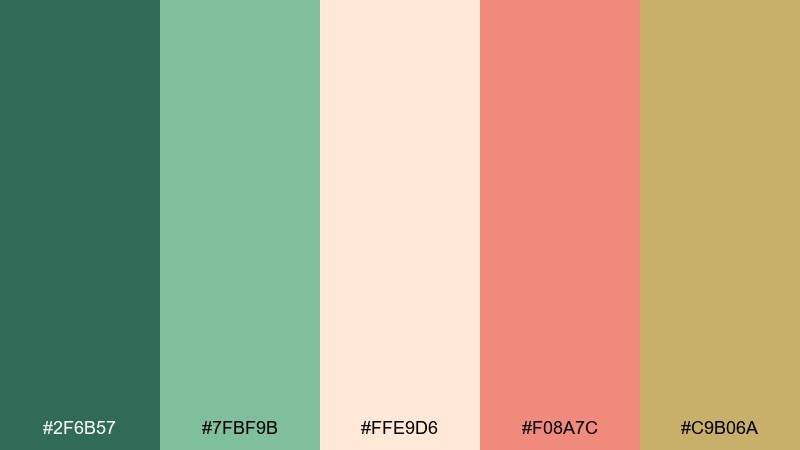
HEX: #2f6b57 #7fbf9b #ffe9d6 #f08a7c #c9b06a
Mood: festive, warm, approachable
Best for: summer event invitation
Minty greens with peach and coral feel like a lively patio gathering with fresh blooms. These botanical color combinations work best when green sets the structure and the peach tones appear in small celebratory bursts. Use the soft gold for borders, icons, or subtle patterns that tie everything together. Tip: keep the background light and let one accent color lead per section for a polished invite.
Image example of garden party generated using media.io

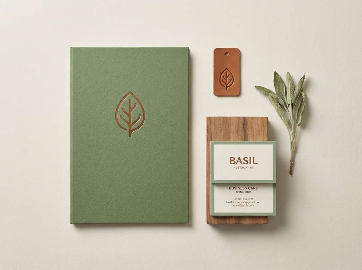
21) Basil and Bone
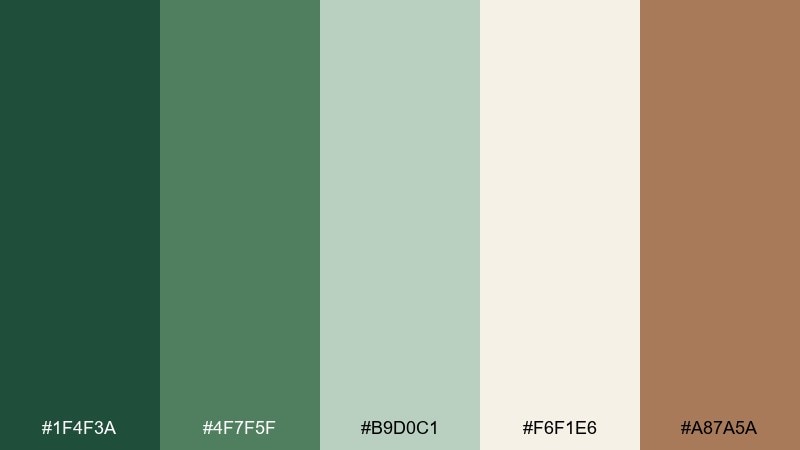
HEX: #1f4f3a #4f7f5f #b9d0c1 #f6f1e6 #a87a5a
Mood: clean, organic, modern classic
Best for: restaurant brand identity
Basil greens and bone-white neutrals feel crisp, culinary, and confident. Use the deepest green for the logo and storefront touchpoints, then keep the bone tone as your primary background across menus and web. The warm brown adds a subtle handcrafted note for secondary marks and patterns. Tip: pair with simple line illustrations of herbs to reinforce the food story without clutter.
Image example of basil and bone generated using media.io
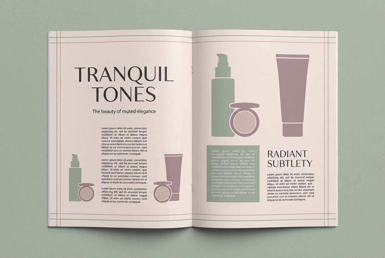
22) Orchid Shade
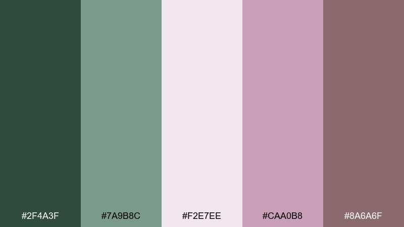
HEX: #2f4a3f #7a9b8c #f2e7ee #caa0b8 #8a6a6f
Mood: delicate, modern, slightly romantic
Best for: beauty editorial layout
Muted orchid pinks with cool green-gray feel like petals in soft window light. Use the pale blush as the page base, then set headlines in the dark green-gray for a contemporary contrast. The dusty mauve is perfect for pull quotes, section tabs, and small graphic blocks. Tip: keep imagery minimal and use a strict column grid so the pastels look editorial, not sweet.
Image example of orchid shade generated using media.io
23) Juniper Dusk
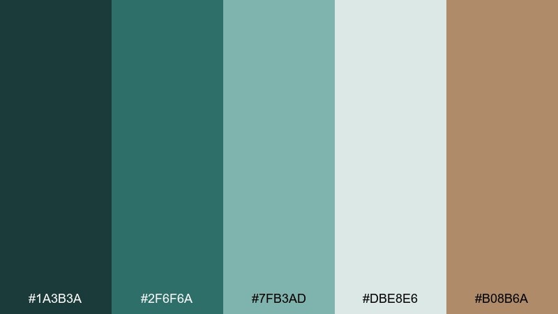
HEX: #1a3b3a #2f6f6a #7fb3ad #dbe8e6 #b08b6a
Mood: cool, composed, quietly premium
Best for: fintech dashboard UI
Cool juniper teals and frosted tints feel steady and modern, like dusk settling over evergreen needles. Use the deepest teal for navigation and key data labels, while the light icy tone keeps dashboards readable. The warm tan accent can highlight alerts or primary actions without introducing harsh color. Tip: reserve the accent for one action type so the UI stays calm and trustworthy.
Image example of juniper dusk generated using media.io

What Colors Go Well with Botanical?
Botanical greens pair best with warm neutrals (cream, bone, oat, linen) because they keep the look organic and let the greens feel lush instead of neon. For text and structure, warm charcoals and bark browns often read more natural than pure black.
If you want contrast, use sun accents like pollen yellow, soft gold, or terracotta—then keep them limited to highlights (badges, buttons, price tags). For a cooler direction, lean into eucalyptus and juniper teals with misty blue-greens for a clean, spa-like mood.
How to Use a Botanical Color Palette in Real Designs
Start with one anchor green (for navigation, headings, or key shapes), then choose a light neutral as your primary background to maintain clarity. Add one mid-tone for UI states or secondary sections, and keep accents (orange, coral, gold) for moments that need attention.
In print, slightly deepen greens so they hold up against warm paper stocks, and consider subtle texture (grain, uncoated paper, soft gradients) to reinforce the nature-forward feel. For digital UI, prioritize contrast for small text by pairing deep greens with warm charcoal or dark taupe.
Create Botanical Palette Visuals with AI
If you already have HEX codes, you can generate matching mockups, posters, menus, and UI scenes by describing the palette’s mood plus where each color should dominate (background, accents, typography). This keeps outputs consistent across a brand system.
Use the included prompts as templates: swap the product type (label, app, invitation) while keeping the same color direction and lighting style. You’ll get faster iterations with fewer off-brand results.
Botanical Color Palette FAQs
-
What is a botanical color palette?
A botanical color palette is a nature-inspired scheme built around plant-like greens and grounded neutrals (cream, taupe, bark brown), sometimes with floral or fruit accents like terracotta, coral, or pollen yellow. -
What is the main botanical green in this palette set?
A strong anchor shade is #2f5d3a, a deep fern green that works well for logos, headers, navigation, and other high-contrast brand elements. -
Are botanical palettes good for websites and apps?
Yes. Botanical palettes are excellent for UI because they provide calm surfaces (off-whites, pale sages) and strong anchors (deep greens/charcoals) for readable typography and clear button hierarchy. -
How do I keep botanical colors from looking too dark?
Make a light neutral (like cream or stone) your main background, then reserve deep greens for structure (nav, headings). Use mid greens for supporting blocks and keep accents small. -
What accent colors work best with botanical greens?
Terracotta, warm gold, honey yellow, and muted coral are reliable accents. They add warmth and energy while still feeling natural when used sparingly. -
What’s the best botanical palette for print packaging?
Try Fern Canopy, Olive Grove, or Terracotta Pot. They balance strong greens with warm neutrals that look premium on uncoated stocks and matte finishes. -
Can I generate botanical-themed mockups with AI using these HEX ideas?
Yes. Use a prompt that specifies the scene (e.g., skincare label, menu, UI), calls out dominant colors (deep green + cream), and sets lighting/texture (matte paper, soft studio light) for consistent results.
Next: Ube Color Palette


