

Blush raspberry is the sweet spot between confident berry and soft blush—warm enough to feel welcoming, yet saturated enough to look premium. It’s a versatile direction for branding, UI, invites, packaging, and editorial layouts.
Below are 20 ready-to-use blush raspberry color palette ideas with HEX codes, plus tips for pairing neutrals and accents so your designs stay balanced and readable.
In this article
- Why Blush Raspberry Palettes Work So Well
-
- rose sorbet neutrals
- velvet berry night
- parisian blush cafe
- dusty rose workspace ui
- raspberry clay and linen
- spring peony garden
- berry milkshake pop
- raspberry ember autumn
- soft berry baby shower
- raspberry and sage balance
- minimal berry interface
- raspberry denim editorial
- berry cocoa dessert
- radiant raspberry bridal
- raspberry sunrise gradient
- mauve berry monochrome
- raspberry marble spa
- bold berry pop art
- raspberry and pearl minimal
- raspberry terrace evening
- What Colors Go Well with Blush Raspberry?
- How to Use a Blush Raspberry Color Palette in Real Designs
- Create Blush Raspberry Palette Visuals with AI
Why Blush Raspberry Palettes Work So Well
Blush raspberry palettes feel instantly “designed” because they combine a romantic, approachable pink base with a deeper berry anchor that adds contrast and sophistication. That balance helps projects look warm without slipping into overly sweet or childish territory.
They also translate well across mediums: on screens, blush and off-white can create airy UI surfaces; in print, raspberry accents hold up beautifully for stamps, seals, and headings. With the right dark neutral, typography stays crisp and legible.
Finally, blush raspberry plays nicely with both warm and cool companions—creams, taupes, charcoals, sages, and even muted blues—so it’s easy to adapt the same core palette to different seasons, audiences, and brand personalities.
20+ Blush Raspberry Color Palette Ideas (with HEX Codes)
1) Rose Sorbet Neutrals
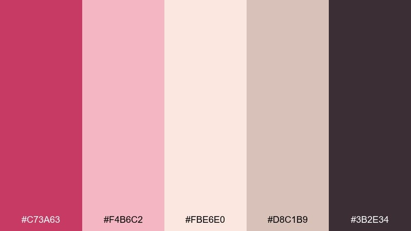
HEX: #C73A63 #F4B6C2 #FBE6E0 #D8C1B9 #3B2E34
Mood: romantic, soft, polished
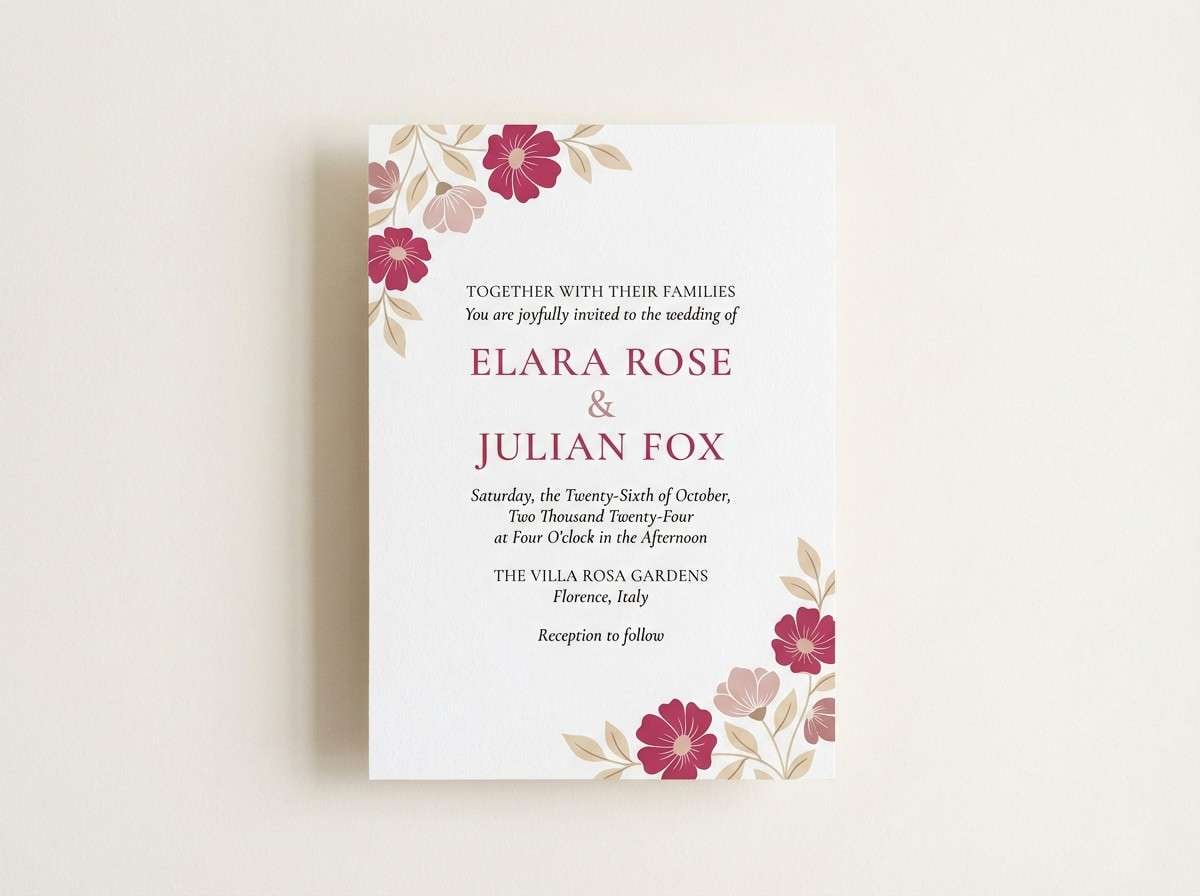
Best for: wedding invitation suite
Romantic and airy like rose sorbet on fine paper, this mix feels gentle but still grown-up. Use it for invitations, RSVP cards, and envelope liners where blush tints need a grounding accent. Pair the deep plum-charcoal with cream for typography, and keep raspberry as the wax seal or monogram highlight. Tip: print the lightest tone as the background and reserve the darkest for small text to maintain legibility.
Image example of rose sorbet neutrals generated using media.io
Media.io is an online AI studio for creating and editing video, image, and audio in your browser.

2) Velvet Berry Night
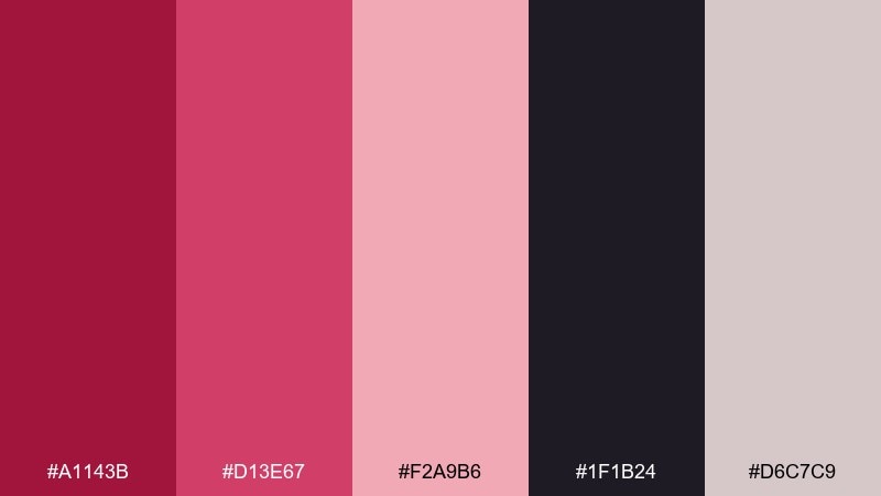
HEX: #A1143B #D13E67 #F2A9B6 #1F1B24 #D6C7C9
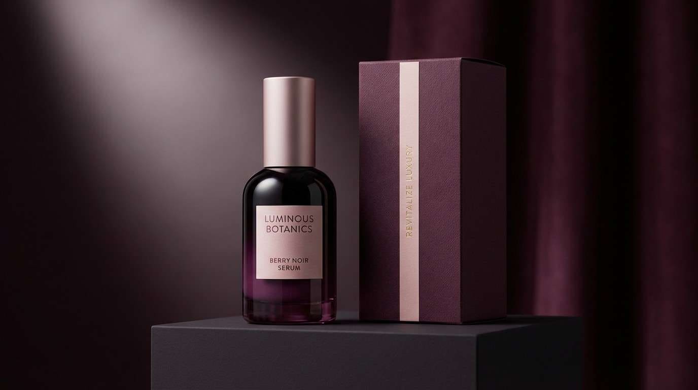
Mood: luxurious, dramatic, modern
Best for: luxury skincare product ad
Velvety and dramatic, these tones feel like candlelight hitting berry silk. They shine in premium product ads where contrast and depth sell quality fast. Let the near-black carry the background while the brighter berry becomes the hero stripe or cap color. Tip: use the pale pink only for small glow highlights so the overall look stays high-end, not sugary.
Image example of velvet berry night generated using media.io
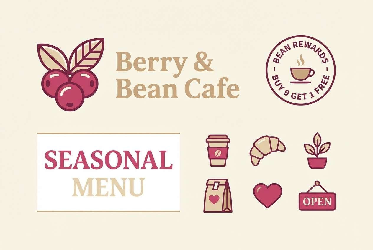
3) Parisian Blush Cafe
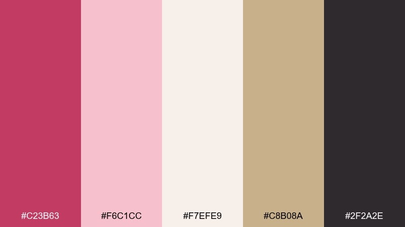
HEX: #C23B63 #F6C1CC #F7EFE9 #C8B08A #2F2A2E
Mood: chic, cozy, European
Best for: cafe branding and menu design
Chic and cozy like a tiny patisserie on a rainy street, these tones feel inviting without being loud. The blush raspberry color palette works beautifully for cafe logos, menu sections, and loyalty cards. Pair the warm beige with cream for paper-like space, then use the dark espresso tone for type and icons. Tip: keep the berry shade for one standout element per layout, like prices or a signature stamp.
Image example of parisian blush cafe generated using media.io
4) Dusty Rose Workspace UI
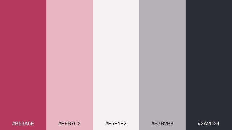
HEX: #B53A5E #E9B7C3 #F5F1F2 #B7B2B8 #2A2D34
Mood: calm, focused, professional
Best for: analytics dashboard UI mockup
Calm and focused, these dusty tones resemble a tidy desk at sunrise. They fit dashboard interfaces where charts need clarity but the brand still wants warmth. Use the near-white as the canvas, gray-lilac for cards, and raspberry for active states like toggles or progress bars. Tip: reserve the dark slate for text and axes so data stays readable on softer surfaces.
Image example of dusty rose workspace ui generated using media.io

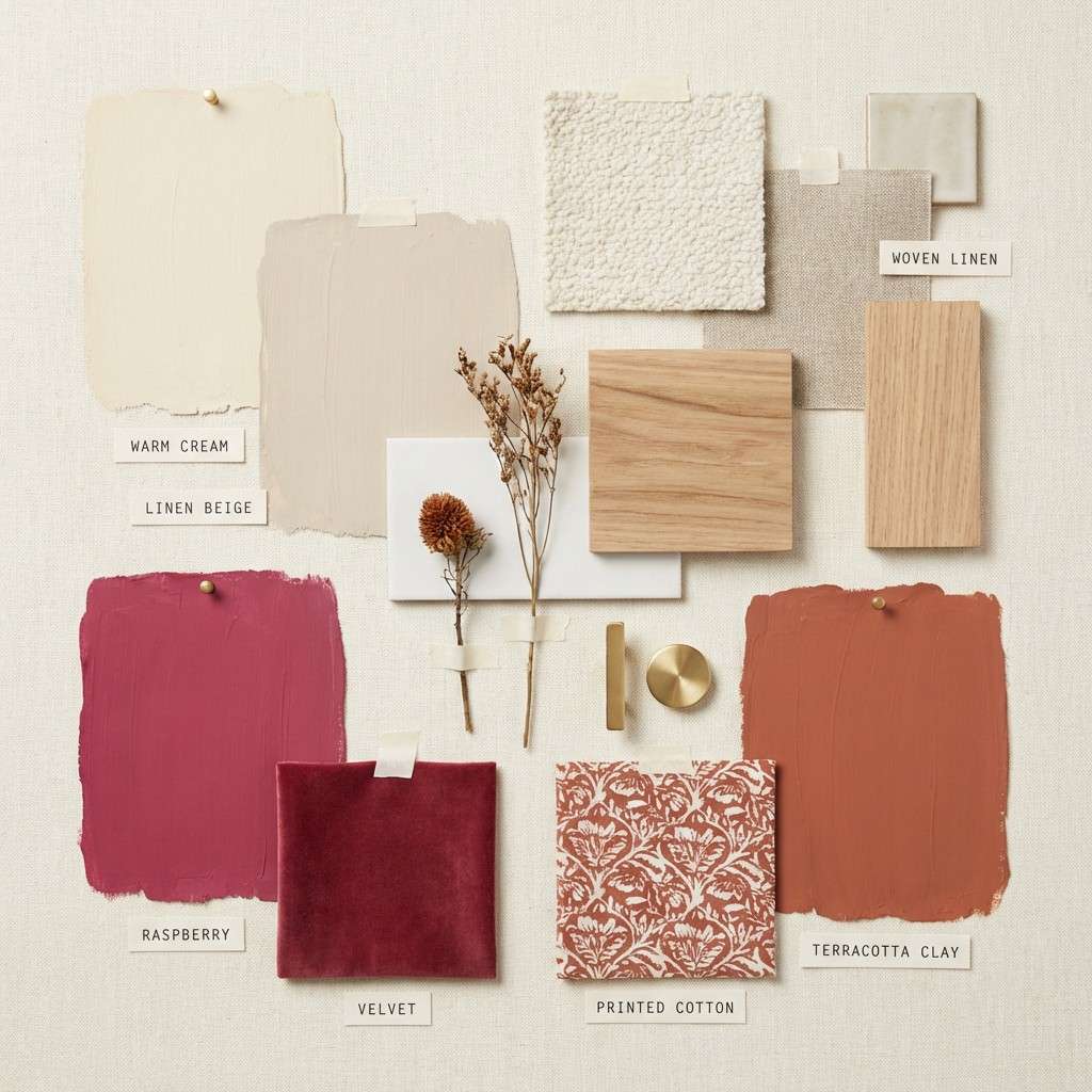
5) Raspberry Clay and Linen
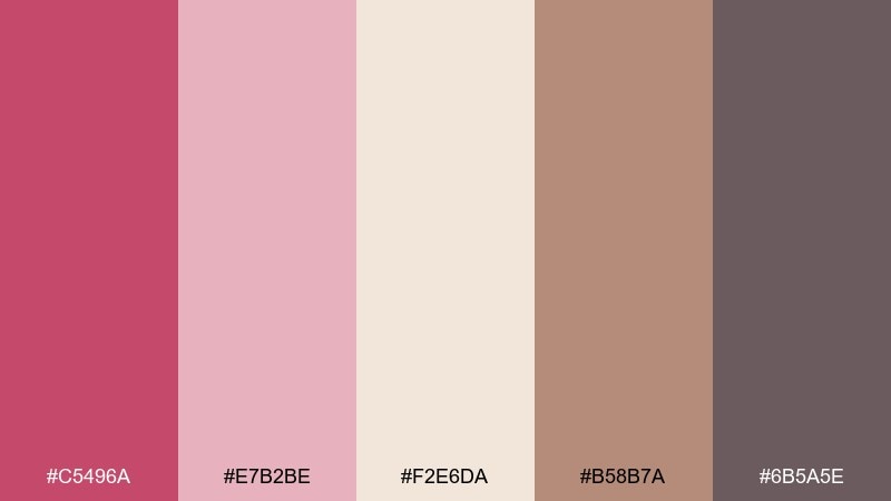
HEX: #C5496A #E7B2BE #F2E6DA #B58B7A #6B5A5E
Mood: earthy, warm, artisan
Best for: interior paint and textile mood board
Earthy and warm, this palette feels like clay pots, linen curtains, and a bowl of summer berries. It suits interior mood boards, paint selections, and textile planning where you want a rosy accent without losing the organic vibe. Pair the terracotta-brown with cream for a grounded base, then bring in berry for throw pillows or art prints. Tip: sample the two light tones together on the wall to avoid undertone clashes under warm lighting.
Image example of raspberry clay and linen generated using media.io
6) Spring Peony Garden
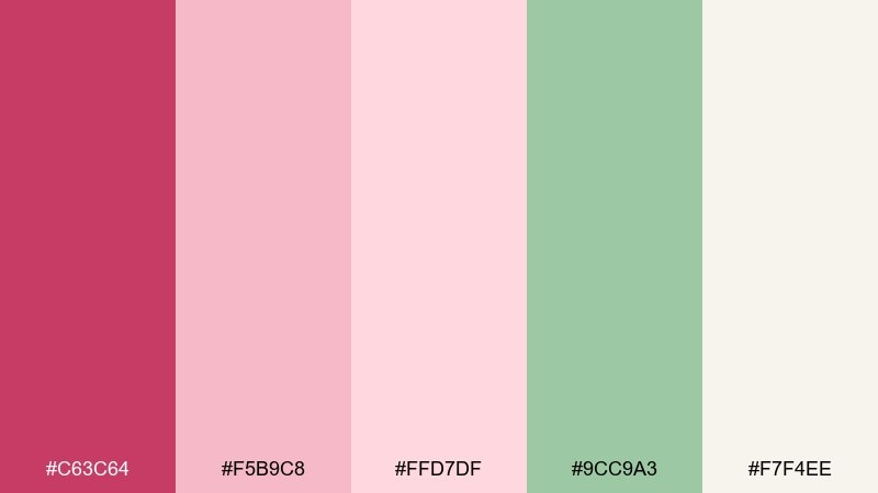
HEX: #C63C64 #F5B9C8 #FFD7DF #9CC9A3 #F7F4EE
Mood: fresh, floral, uplifting
Best for: botanical watercolor poster
Fresh and floral, it evokes peony petals, new leaves, and light filtering through a garden fence. These blush raspberry color combinations are ideal for spring posters, stationery, and seasonal campaign art. Keep the green as a restrained stem-and-leaf accent so the pinks stay dominant and airy. Tip: add plenty of cream negative space to make the watercolor textures feel crisp rather than busy.
Image example of spring peony garden generated using media.io
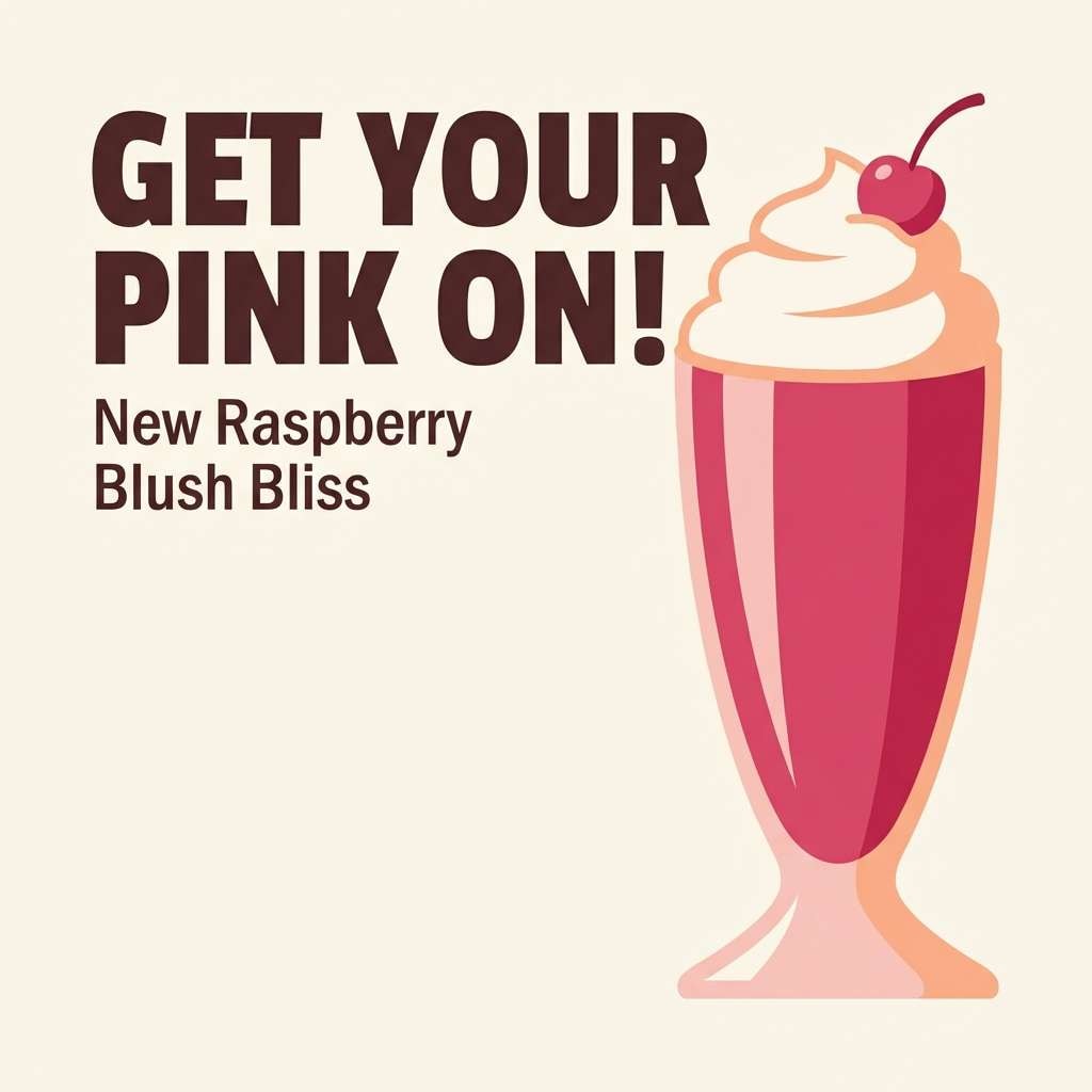
7) Berry Milkshake Pop
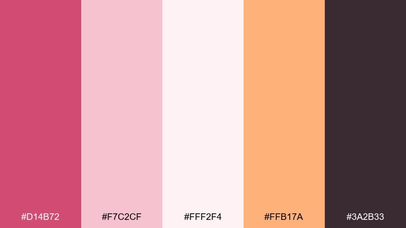
HEX: #D14B72 #F7C2CF #FFF2F4 #FFB17A #3A2B33
Mood: playful, sweet, energetic
Best for: social promo graphic for a cafe special
Playful and sweet, these tones feel like a strawberry-raspberry milkshake with a warm peach swirl. They work well for social promos, limited-time offers, and bold callouts that need instant appetite appeal. Use raspberry for the headline, peach for price tags, and keep the cream tone behind product silhouettes. Tip: add one dark outline color for contrast so small text stays sharp on pastel fields.
Image example of berry milkshake pop generated using media.io
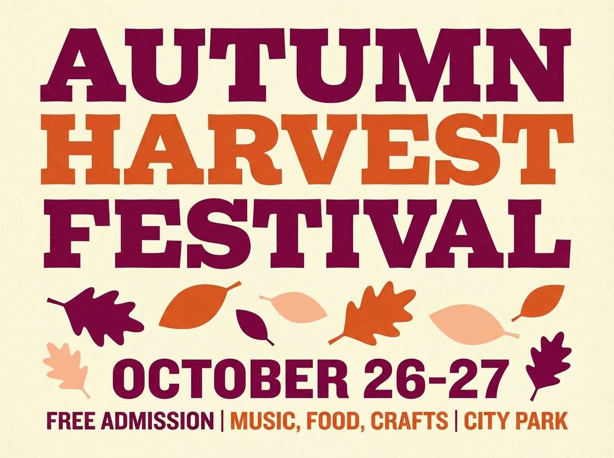
8) Raspberry Ember Autumn
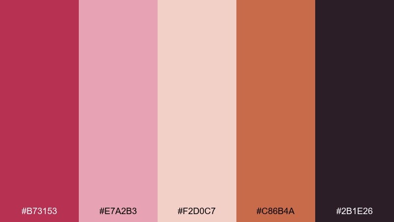
HEX: #B73153 #E7A2B3 #F2D0C7 #C86B4A #2B1E26
Mood: cozy, rustic, bold
Best for: fall festival flyer
Cozy and bold, it recalls mulled berries, knit scarves, and late-afternoon light. Use it for autumn flyers, local event posters, and seasonal menus where warmth matters. Pair the ember-orange with the deeper berry for headers, and keep the pale peach as breathing room around text blocks. Tip: avoid using all dark tones together; let one warm light shade separate sections for easy scanning.
Image example of raspberry ember autumn generated using media.io
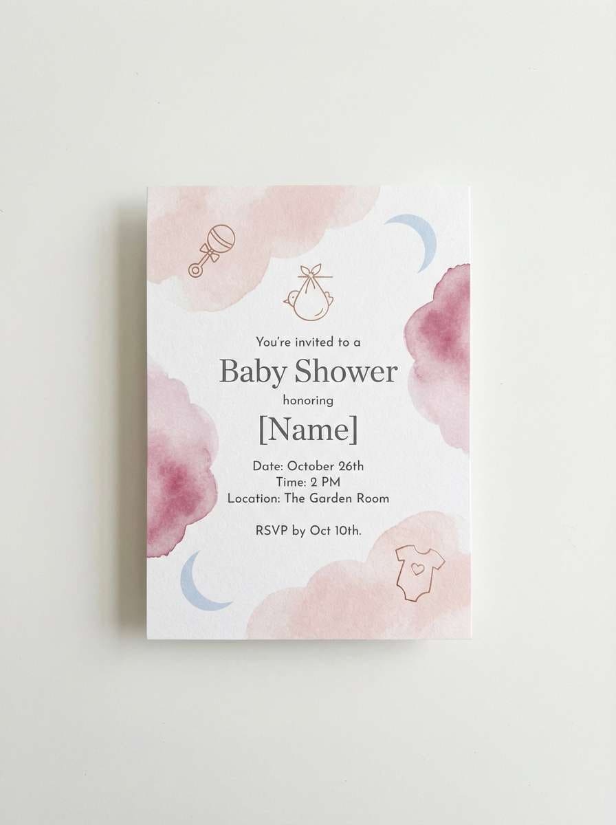
9) Soft Berry Baby Shower
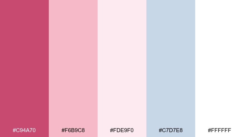
HEX: #C94A70 #F6B9C8 #FDE9F0 #C7D7E8 #FFFFFF
Mood: gentle, sweet, airy
Best for: baby shower invitation
Gentle and airy, these colors feel like cotton candy clouds with a whisper of cool blue. They fit baby shower invites, thank-you cards, and party signage that needs a soft, welcoming tone. Use the pale pink as the base, then add berry for the name and date, with light blue for tiny icons or borders. Tip: keep the white space generous so the design stays calm and not overly decorative.
Image example of soft berry baby shower generated using media.io
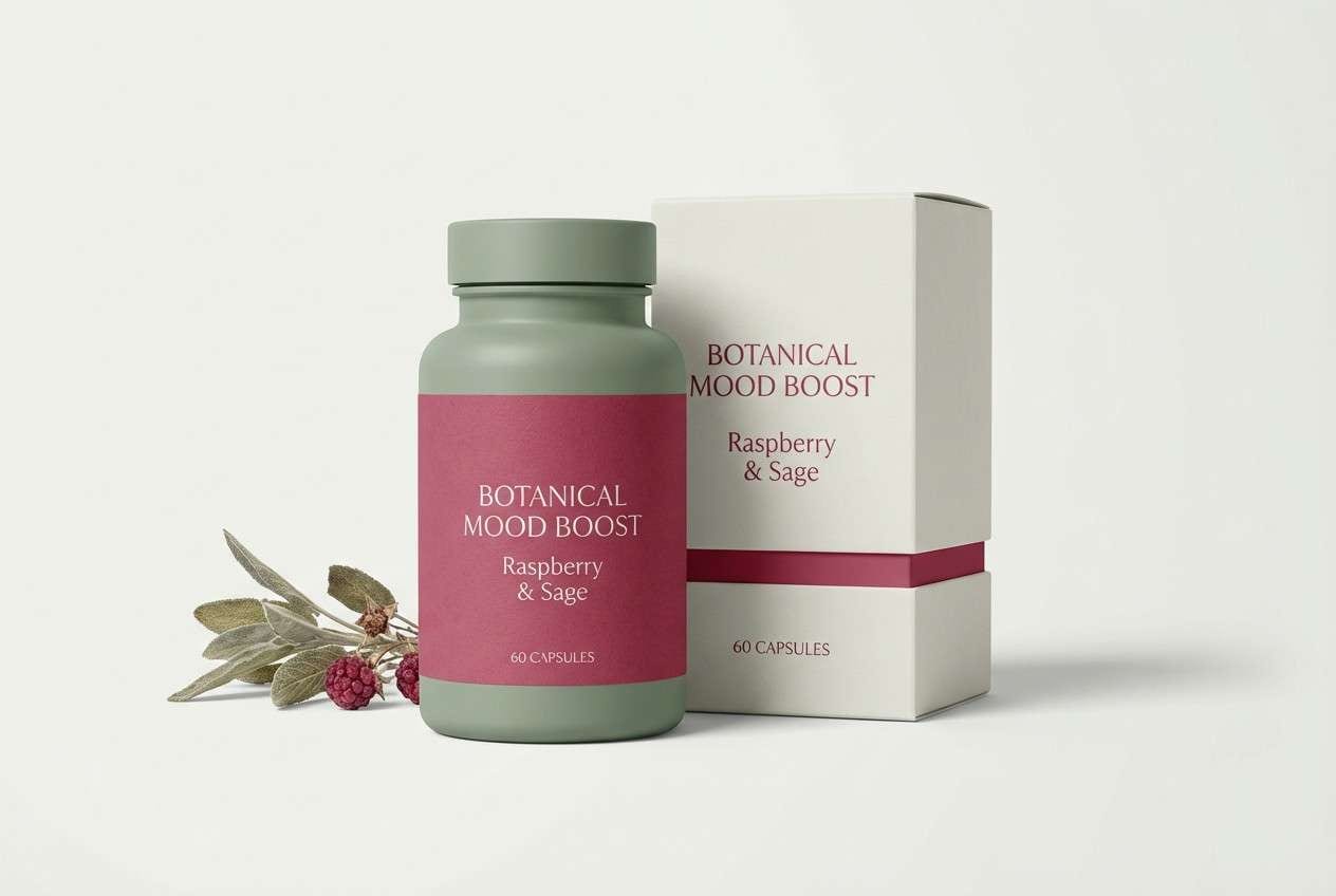
10) Raspberry and Sage Balance
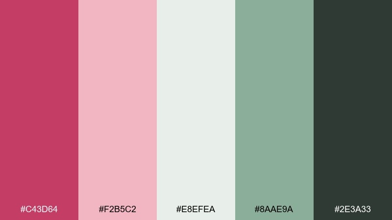
HEX: #C43D64 #F2B5C2 #E8EFEA #8AAE9A #2E3A33
Mood: fresh, grounded, wellness
Best for: wellness brand packaging
Fresh and grounded, this pairing feels like berries and herbs in a spa-infused drink. It suits wellness packaging, clean-label products, and modern apothecary branding. Let sage and off-white dominate the surface, then use raspberry as a seal, stripe, or key benefit highlight. Tip: print the green slightly muted and matte to keep the overall look calm and premium.
Image example of raspberry and sage balance generated using media.io
11) Minimal Berry Interface
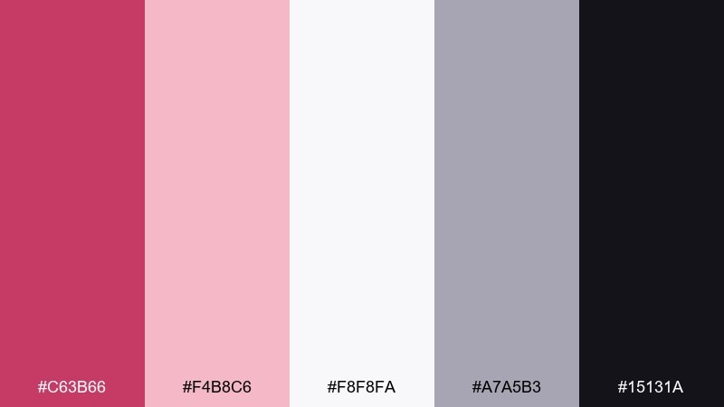
HEX: #C63B66 #F4B8C6 #F8F8FA #A7A5B3 #15131A
Mood: sleek, minimal, confident
Best for: app onboarding UI screens
Sleek and confident, it feels like a modern app with a soft blush glow. A blush raspberry color scheme like this is great for onboarding screens, paywalls, and sign-in flows where one accent guides attention. Use the off-white for panels, the deep ink for type, and raspberry for primary buttons and progress dots. Tip: keep accent usage consistent across steps so the user always knows what to tap next.
Image example of minimal berry interface generated using media.io
12) Raspberry Denim Editorial
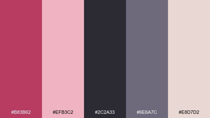
HEX: #B83B62 #EFB3C2 #2C2A33 #6E6A7C #E8D7D2
Mood: fashion-forward, moody, refined
Best for: fashion magazine layout
Fashion-forward and slightly moody, these tones feel like berry lipstick against charcoal denim. They work well for editorial spreads, lookbooks, and brand stories that need both softness and edge. Use charcoal for headlines, blush for background blocks, and berry as the pull-quote or section marker. Tip: keep photos in grayscale or warm-neutral so the accent color stays in control.
Image example of raspberry denim editorial generated using media.io
13) Berry Cocoa Dessert
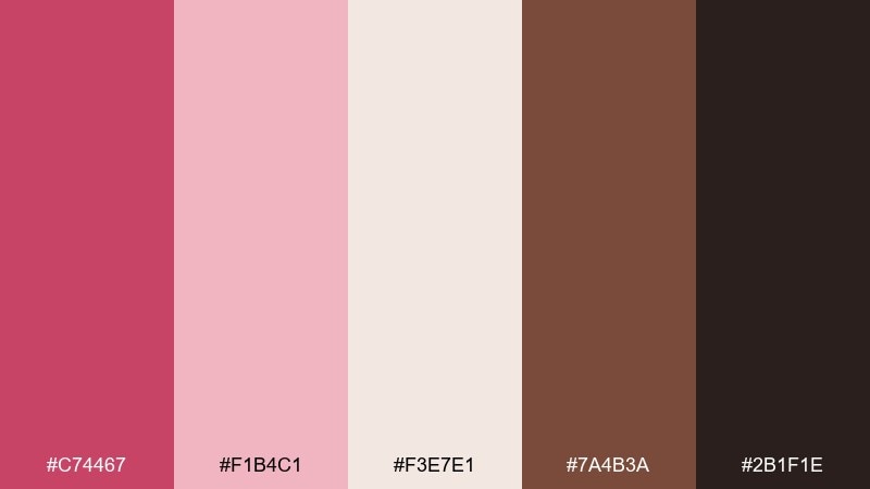
HEX: #C74467 #F1B4C1 #F3E7E1 #7A4B3A #2B1F1E
Mood: rich, cozy, appetizing
Best for: bakery packaging labels
Rich and cozy, it suggests berry jam layered over cocoa cake. These tones are perfect for bakery labels, coffee sleeves, and dessert gift boxes that need a handcrafted feel. Pair cocoa brown with cream for the main label, then use berry for flavor badges or stamp marks. Tip: use the deepest brown for small text so ingredients and weights stay easy to read.
Image example of berry cocoa dessert generated using media.io
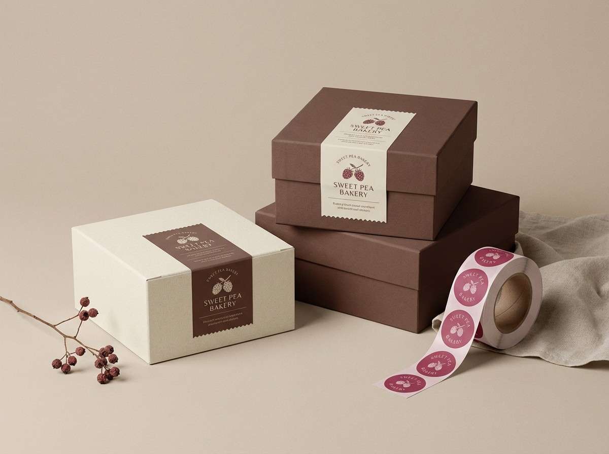
14) Radiant Raspberry Bridal
HEX: #CC3E68 #F6B0C2 #FFE7EC #E7D6C5 #4A2D33
Mood: glam, romantic, luminous
Best for: bridal makeup lookbook poster
Glam and luminous, it evokes satin ribbons, soft blush, and a bold raspberry lip. The blush raspberry color palette fits bridal lookbooks, beauty posters, and salon promos that need romance with structure. Pair the warm beige with pale pink for the background, then use the deep plum for headers and pricing. Tip: keep skin-tone imagery warm-neutral so the pinks read elegant, not fluorescent.
Image example of radiant raspberry bridal generated using media.io

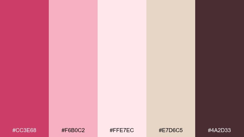
15) Raspberry Sunrise Gradient
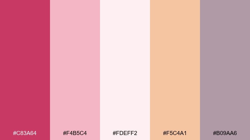
HEX: #C83A64 #F4B5C4 #FDEFF2 #F5C4A1 #B09AA6
Mood: optimistic, light, contemporary
Best for: landing page hero section
Optimistic and light, it feels like sunrise spilling across a soft gradient. It works for landing pages, newsletter headers, and product launches that want warmth without shouting. Use a blush-to-cream gradient behind the hero copy and keep raspberry for the primary CTA. Tip: keep supporting UI elements in the muted mauve-gray so the button remains the clearest focal point.
Image example of raspberry sunrise gradient generated using media.io
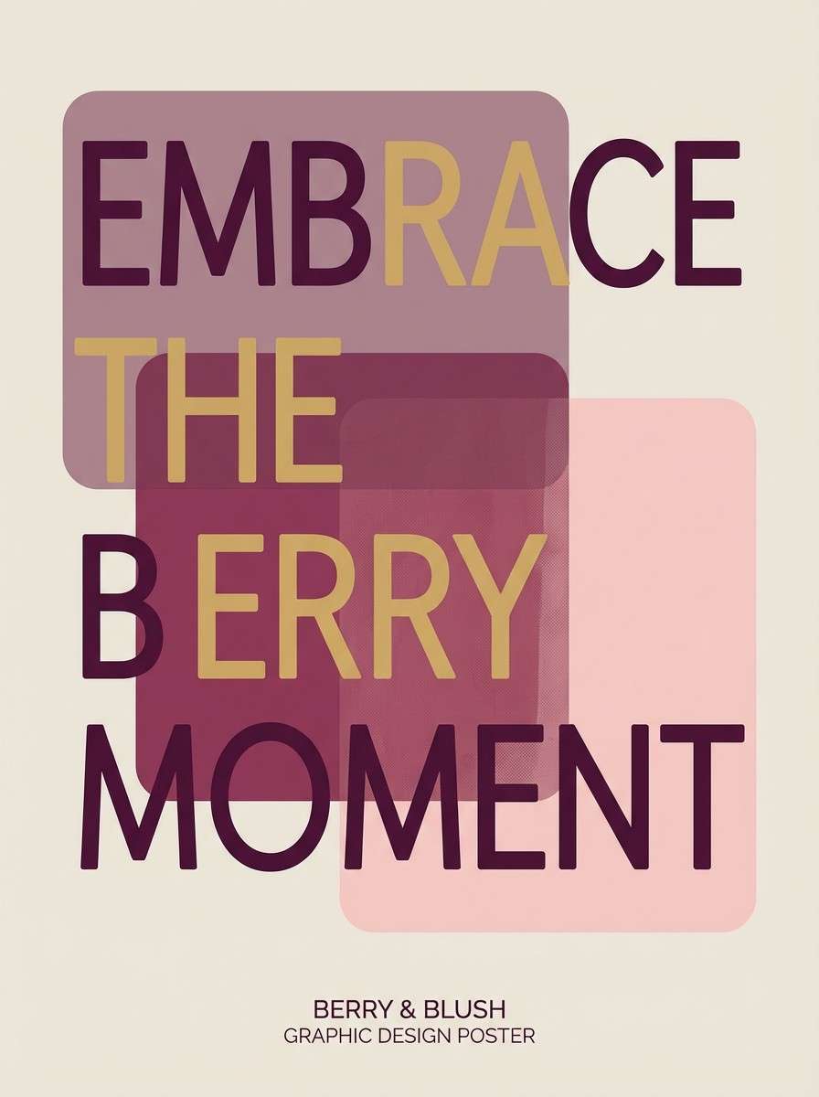
16) Mauve Berry Monochrome
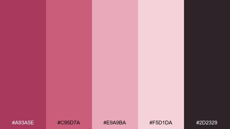
HEX: #A93A5E #C95D7A #E9A9BA #F5D1DA #2D2329
Mood: artsy, soft, tonal
Best for: typography poster
Artsy and tonal, this set reads like layered mauve ink washes. It suits typography posters, quote prints, and album-style graphics where subtle shifts do most of the work. Use the darkest shade for type, then stack the mid tones as blocks or oversized letterforms. Tip: stay mostly monochrome and introduce contrast through scale and spacing, not extra colors.
Image example of mauve berry monochrome generated using media.io
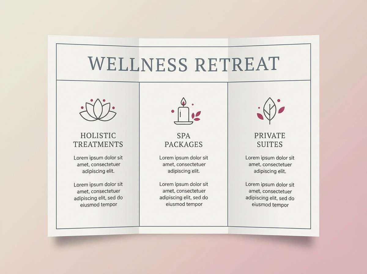
17) Raspberry Marble Spa
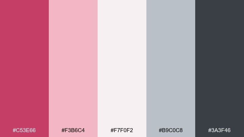
HEX: #C53E66 #F3B6C4 #F7F0F2 #B9C0C8 #3A3F46
Mood: serene, clean, upscale
Best for: spa brochure design
Serene and clean, it brings to mind pale marble, warm towels, and a hint of rose oil. These tones fit spa brochures, service menus, and membership cards where calm is the selling point. Use the soft gray-blue as a quiet divider color, and keep raspberry for small highlights like section tabs or appointment buttons. Tip: choose thin typography weights and plenty of margin to match the airy feel.
Image example of raspberry marble spa generated using media.io
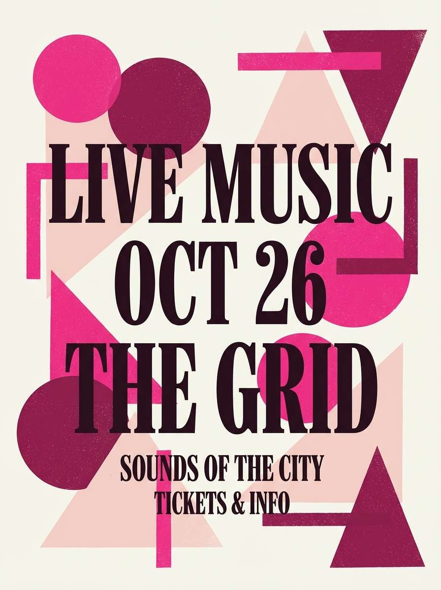
18) Bold Berry Pop Art
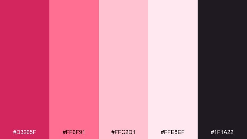
HEX: #D3265F #FF6F91 #FFC2D1 #FFE8EF #1F1A22
Mood: bold, punchy, youthful
Best for: music event poster
Bold and punchy, it feels like pop-art prints and bright stage lights. Try this blush raspberry color combination for music posters, DJ night promos, and energetic drop announcements. Use the hot pink as the headline color, then anchor everything with near-black for details and venue info. Tip: keep the background in the palest tint so the saturated shades do not vibrate against each other.
Image example of bold berry pop art generated using media.io
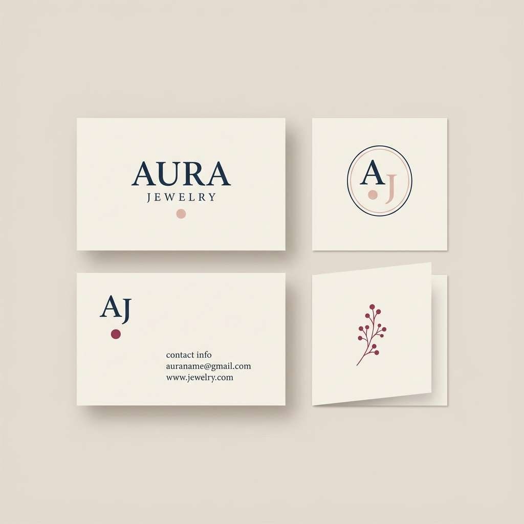
19) Raspberry and Pearl Minimal
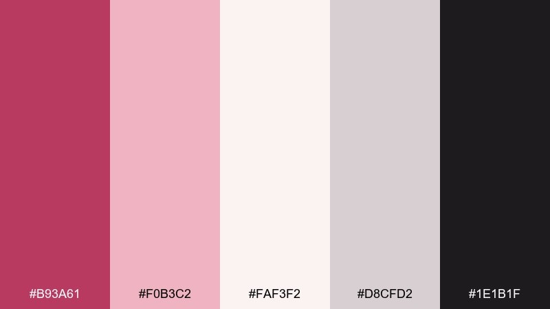
HEX: #B93A61 #F0B3C2 #FAF3F2 #D8CFD2 #1E1B1F
Mood: minimal, elegant, timeless
Best for: jewelry brand logo and business card
Minimal and timeless, this mix feels like pearl sheen with a berry satin ribbon. It is a strong fit for jewelry branding, business cards, and thank-you inserts where refinement matters. Let pearl-cream dominate, use berry for a tiny emblem or monogram, and keep the deep ink for type. Tip: emboss or foil the berry element for a premium touch without adding more color.
Image example of raspberry and pearl minimal generated using media.io
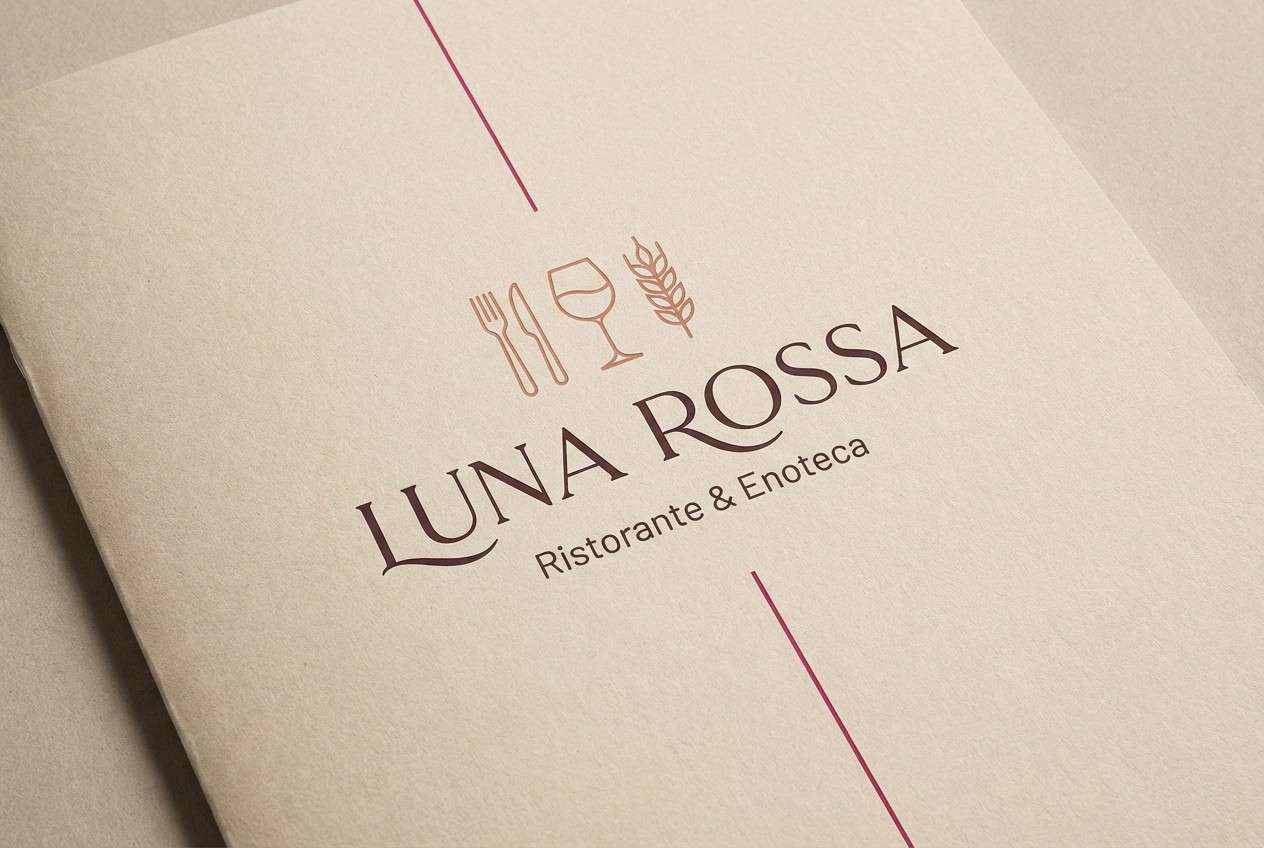
20) Raspberry Terrace Evening
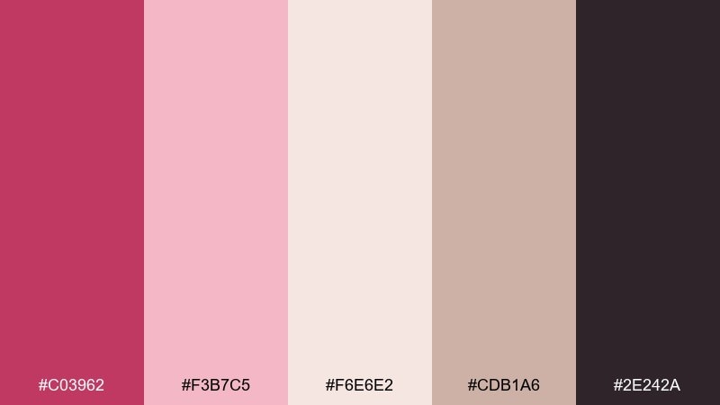
HEX: #C03962 #F3B7C5 #F6E6E2 #CDB1A6 #2E242A
Mood: romantic, warm, intimate
Best for: restaurant menu cover design
Romantic and intimate, it suggests an evening terrace, candle glow, and berry-forward desserts. These blush raspberry color combinations work especially well on menu covers and wine lists where warmth should feel curated. Pair the deep cocoa tone with soft blush for titles, and keep beige as the paper-like base so everything stays readable. Tip: use raspberry sparingly on section dividers or icons to guide the eye without overwhelming the page.
Image example of raspberry terrace evening generated using media.io
What Colors Go Well with Blush Raspberry?
Blush raspberry pairs beautifully with creamy whites, warm taupes, and pearl-like neutrals when you want a soft, elevated look. These tones keep the palette romantic while providing enough “paper” space for layouts to breathe.
For contrast and legibility, anchor it with espresso, charcoal, or near-black—especially in UI, packaging labels, and posters. Dark neutrals prevent pink-heavy designs from looking washed out.
For accents, muted greens (sage, eucalyptus), dusty blue-grays, and warm peaches can add freshness or energy without fighting the berry core. Keep accents restrained so raspberry stays the hero.
How to Use a Blush Raspberry Color Palette in Real Designs
Start with a dominant background neutral (off-white, cream, or pale blush), then choose one mid-tone blush for surfaces or blocks, and reserve the deepest berry for emphasis. This creates hierarchy without relying on extra colors.
In branding and packaging, use raspberry as a “seal” color—logos, badges, flavor tags, or a single stripe—while neutrals handle most of the label. In digital products, keep raspberry consistent for primary actions (CTAs, active states) so users learn the system quickly.
If you’re printing, test undertones under your lighting: blush can lean peachy or cool, and that affects how taupes and grays read. A quick proof helps avoid a palette that feels mismatched once it’s on paper.
Create Blush Raspberry Palette Visuals with AI
If you want to see how a blush raspberry palette looks on a menu cover, skincare ad, UI mockup, or invitation suite, generating a few concept visuals can save hours of manual exploration. It’s also a fast way to test mood—soft vs. dramatic, minimal vs. playful—before you commit.
With Media.io, you can turn prompts into styled images that match your palette direction, then iterate quickly by adjusting scene type, lighting, typography style, or composition. This is especially useful when you need multiple campaign variations that still feel on-brand.
Pick one of the prompts above, swap in your product type or layout format, and generate a set of options until the vibe feels right.
Blush Raspberry Color Palette FAQs
-
What is a blush raspberry color?
Blush raspberry is a pink-berry hue that sits between soft blush pink and deeper raspberry red. It reads warm, romantic, and modern, especially when paired with cream or charcoal neutrals. -
Is blush raspberry good for branding?
Yes. It’s expressive enough to feel distinctive, but still versatile across packaging, web, and social. For a premium look, combine it with off-white plus a dark neutral for typography. -
What neutral colors pair best with blush raspberry?
Off-white, warm cream, pearl, beige, taupe, and soft greige pair especially well. For contrast, charcoal, espresso, and near-black keep layouts crisp and readable. -
What accent colors work with blush raspberry?
Muted sage or eucalyptus green, dusty blue-gray, and warm peach/coral accents are reliable choices. Use accents sparingly so the berry tone remains the focal point. -
How do I keep blush raspberry designs from looking too “sweet”?
Add a dark anchor (charcoal/ink) and limit the light pinks to background or highlights. Matte textures, minimal layouts, and restrained accent use also help the palette feel more grown-up. -
Which blush raspberry palette is best for UI design?
Try “Dusty Rose Workspace UI” or “Minimal Berry Interface.” Both prioritize off-whites and slate/dark text for accessibility, with raspberry reserved for active states and primary buttons. -
Can I generate blush raspberry mockups with AI?
Yes. Use Media.io’s text-to-image tool with a clear layout prompt (e.g., “menu cover,” “dashboard UI,” “packaging label”) and specify blush raspberry as the dominant accent plus your preferred neutrals.
Next: Peridot Color Palette


