

A blue rust color palette pairs cool oceanic blues with oxidized, earthy warmth—an easy way to make designs feel both modern and human.
Whether you’re building a brand system, a UI, or a print layout, this navy-and-rust mix creates contrast, hierarchy, and a memorable accent without looking trendy for trend’s sake.
In this article
- Why Blue and Rust Color Schemes Work So Well
-
- coastal foundry
- canyon harbor
- vintage workwear
- desert dusk interface
- stormy brick
- ink and terracotta
- museum minimal
- nordic pier
- retro route map
- ceramic studio
- twilight ledger
- seaside warehouse
- warm denim neutrals
- rusted lighthouse
- copper circuit ui
- bookshop editorial
- autumn coast wedding
- industrial loft interior
- harbor night market
- artisan coffee wrap
- oxide blueprint
- slate and sienna pairing
- What Colors Go Well with Blue Rust?
- How to Use a Blue Rust Color Palette in Real Designs
- Create Blue Rust Palette Visuals with AI
Why Blue and Rust Color Schemes Work So Well
Blue brings calm structure, while rust adds warmth and personality—so the overall look feels balanced instead of cold or overly playful. That contrast makes it easy to build strong hierarchy across headlines, buttons, and highlights.
Rust is also naturally “accent-friendly”: it pops against navy and steel blue, but still reads grounded and mature. This is why navy and rust combinations work across both premium branding and everyday templates.
Finally, blue and rust schemes pair well with practical neutrals (cream, greige, charcoal), which helps your layouts stay readable and consistent across web, print, and product surfaces.
20+ Blue Rust Color Palette Ideas (with HEX Codes)
1) Coastal Foundry
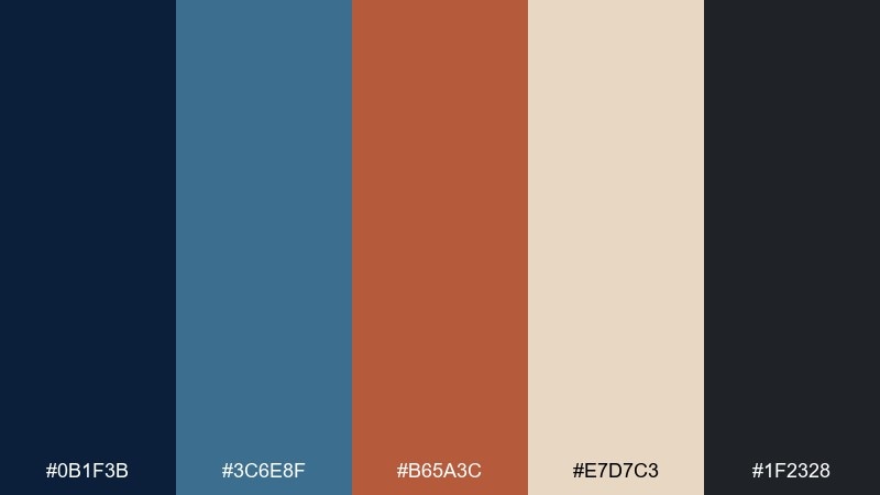
HEX: #0B1F3B #3C6E8F #B65A3C #E7D7C3 #1F2328
Mood: industrial, coastal, grounded
Best for: brand identity and stationery
Industrial calm meets sea air, like weathered steel beside a harbor wall. The deep navy anchors layouts while the rust note adds warm character without feeling loud. Pair with lots of breathing room and clean typography for a modern look. Tip: use the rust tone for seals, dividers, or a single key icon to keep it premium.
Image example of coastal foundry generated using media.io
Media.io is an online AI studio for creating and editing video, image, and audio in your browser.

2) Canyon Harbor
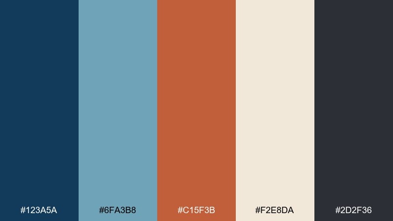
HEX: #123A5A #6FA3B8 #C15F3B #F2E8DA #2D2F36
Mood: adventurous, airy, sun-warmed
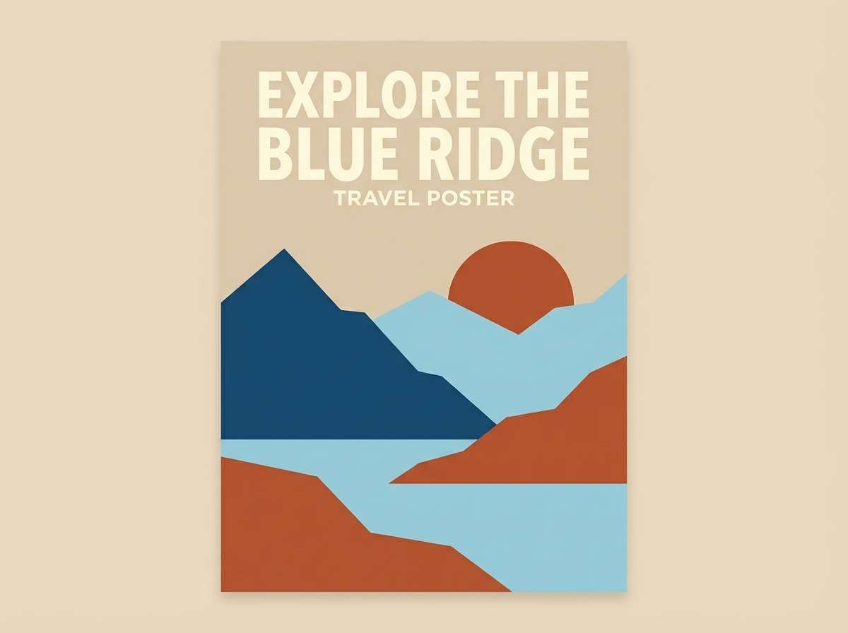
Best for: travel posters and social ads
Sunlit cliffs and cool water tones make this feel optimistic and outdoorsy. This blue rust color palette works best when the pale cream takes the background and the darker blues handle headlines. Add the rust as a focal badge or call to action for instant depth. Tip: keep gradients subtle so the vintage vibe stays crisp.
Image example of canyon harbor generated using media.io
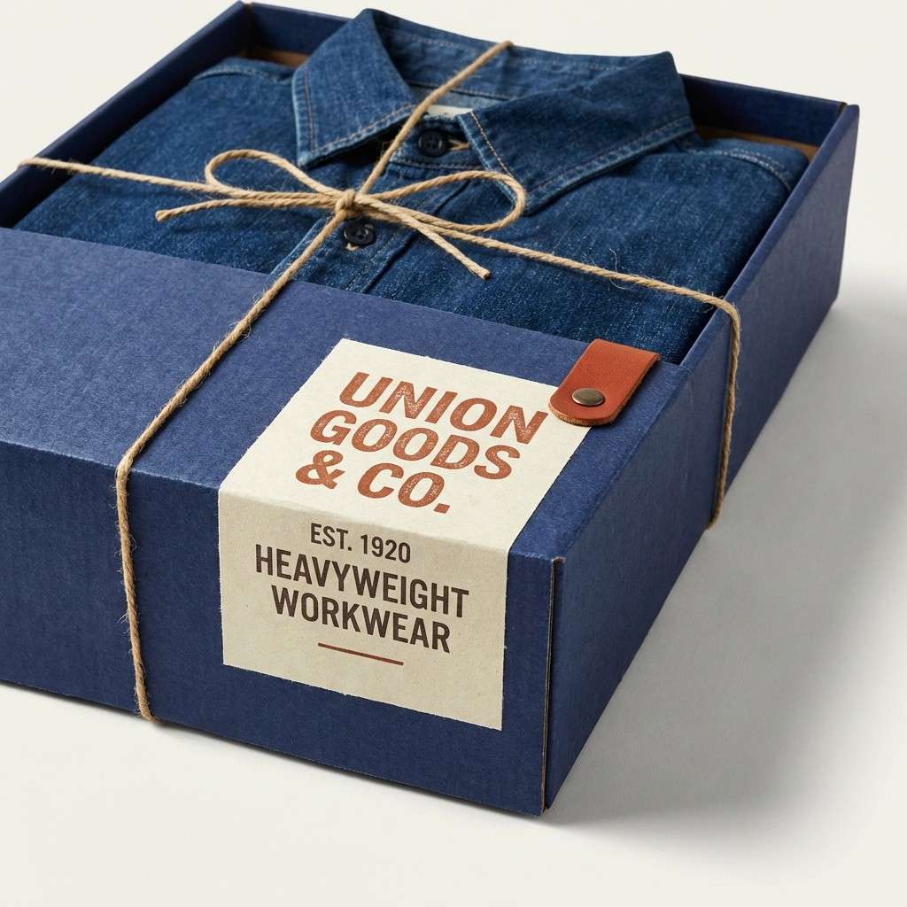
3) Vintage Workwear
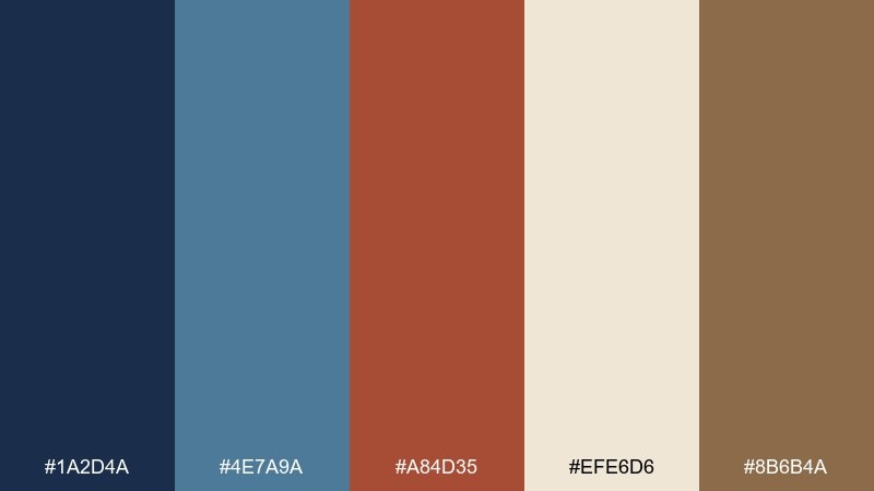
HEX: #1A2D4A #4E7A9A #A84D35 #EFE6D6 #8B6B4A
Mood: heritage, rugged, trustworthy
Best for: workwear packaging and labels
Worn denim and burnished metal give this mix a dependable, handcrafted feel. The indigo base reads classic while the rust and tan tones add warmth that feels lived-in. Use the cream for label space and let the darker blue carry product names. Tip: add subtle paper texture or a stamp-style mark to reinforce the heritage mood.
Image example of vintage workwear generated using media.io
4) Desert Dusk Interface
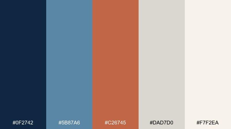
HEX: #0F2742 #5B87A6 #C26745 #DAD7D0 #F7F2EA
Mood: calm, modern, refined
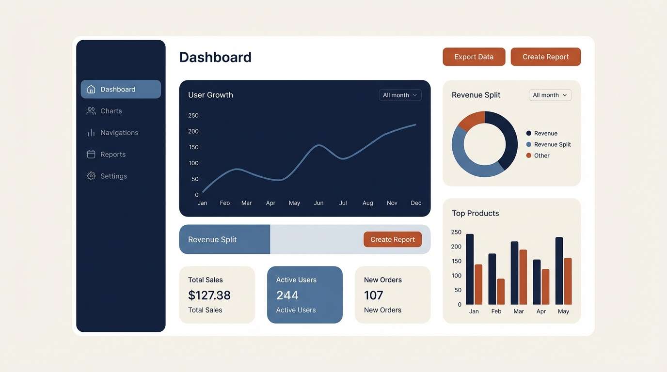
Best for: dashboard UI and data visuals
Quiet dusk blues with a sunbaked rust highlight feel focused and polished. These blue and rust color combinations shine in UI when the light neutrals do most of the work and the darker blue becomes navigation. Reserve rust for primary buttons, alerts, or chart emphasis. Tip: keep contrast high by pairing the rust with off-white, not mid-gray.
Image example of desert dusk interface generated using media.io
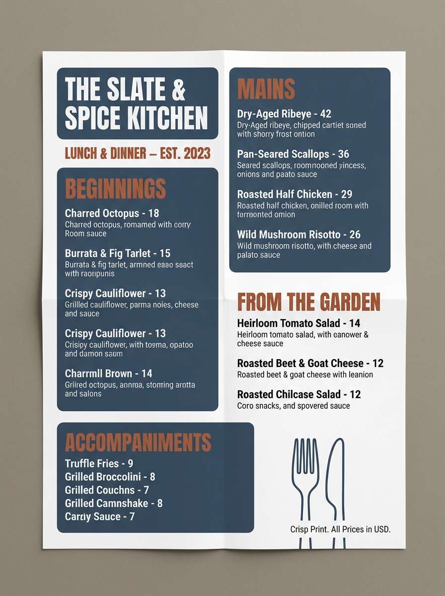
5) Stormy Brick
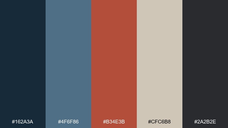
HEX: #162A3A #4F6F86 #B34E3B #CFC6B8 #2A2B2E
Mood: moody, urban, confident
Best for: restaurant menus and signage
Rainy city blues and brick warmth create a bold, streetwise tone. Use the stormy blues for large blocks and type, then let rust act as the appetite-driving accent. The warm greige keeps the palette from feeling too cold under low light. Tip: try rust for section headers and a thin rule line for a clean, modern menu rhythm.
Image example of stormy brick generated using media.io
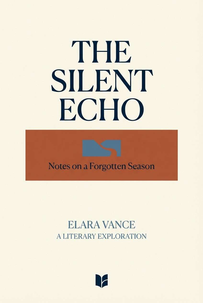
6) Ink and Terracotta
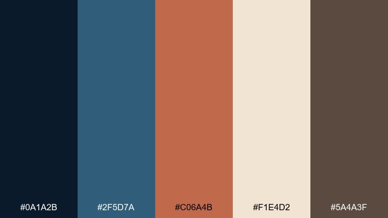
HEX: #0A1A2B #2F5D7A #C06A4B #F1E4D2 #5A4A3F
Mood: literary, warm, intimate
Best for: book covers and podcast art
Inky shadows with terracotta warmth feel like a late-night reading nook. The near-black blue makes titles look premium, while the clay rust brings approachable energy. Pair with serif typography and a soft cream field to keep it timeless. Tip: add a single rust shape behind the title to boost legibility without harsh outlines.
Image example of ink and terracotta generated using media.io
7) Museum Minimal

HEX: #10243A #6C8FA6 #A94F3A #F6F0E6 #3A3F45
Mood: clean, cultured, understated
Best for: exhibition posters and programs
Quiet gallery blues and a restrained rust accent feel curated and modern. Let the ivory background dominate for that museum-white space, then use slate blue for body copy. The rust works best as a small stamp, date line, or key symbol. Tip: keep margins generous and align elements precisely to sell the minimal aesthetic.
Image example of museum minimal generated using media.io
8) Nordic Pier
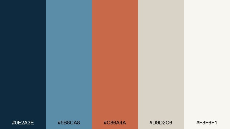
HEX: #0E2A3E #5B8CA8 #C86A4A #D9D2C6 #F8F6F1
Mood: fresh, breezy, modern
Best for: website hero sections
Crisp sea-breeze blues with a warm rust pop evoke painted docks and bright morning light. This blue and rust color scheme feels especially clean when the off-white becomes the main canvas. Use the deepest blue for navigation and headings, and save rust for one hero button. Tip: keep imagery cool-toned so the rust stays the unmistakable focal point.
Image example of nordic pier generated using media.io
9) Retro Route Map
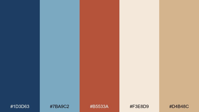
HEX: #1D3D63 #7BA9C2 #B5533A #F3E8D9 #D4B48C
Mood: playful, nostalgic, sunny
Best for: infographics and map designs
Old-school road trips come to mind, with soft blues and a dusty rust marker tone. The sandy tan adds vintage warmth without pushing the palette into yellow-heavy territory. Use the darker blue for text and boundaries, and let rust guide attention to key points. Tip: keep icons simple and rounded to match the retro feel.
Image example of retro route map generated using media.io
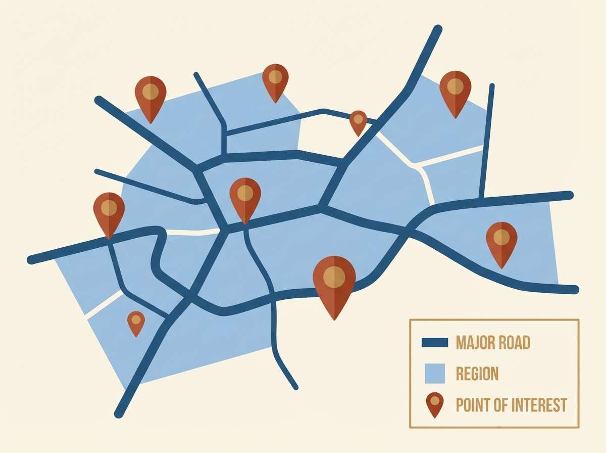
10) Ceramic Studio
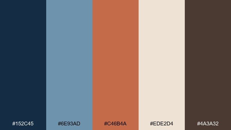
HEX: #152C45 #6E93AD #C46B4A #EDE2D4 #4A3A32
Mood: artisan, tactile, calm
Best for: handmade product packaging
Glazed blues and clay rust tones feel tactile, like a pottery shelf in warm afternoon light. The cream and cocoa neutrals make it easy to keep packaging clean and readable. Use rust for seals, ribbons, or a brand mark, then anchor copy in the deep blue. Tip: matte finishes and subtle embossing pair beautifully with these earthy tones.
Image example of ceramic studio generated using media.io
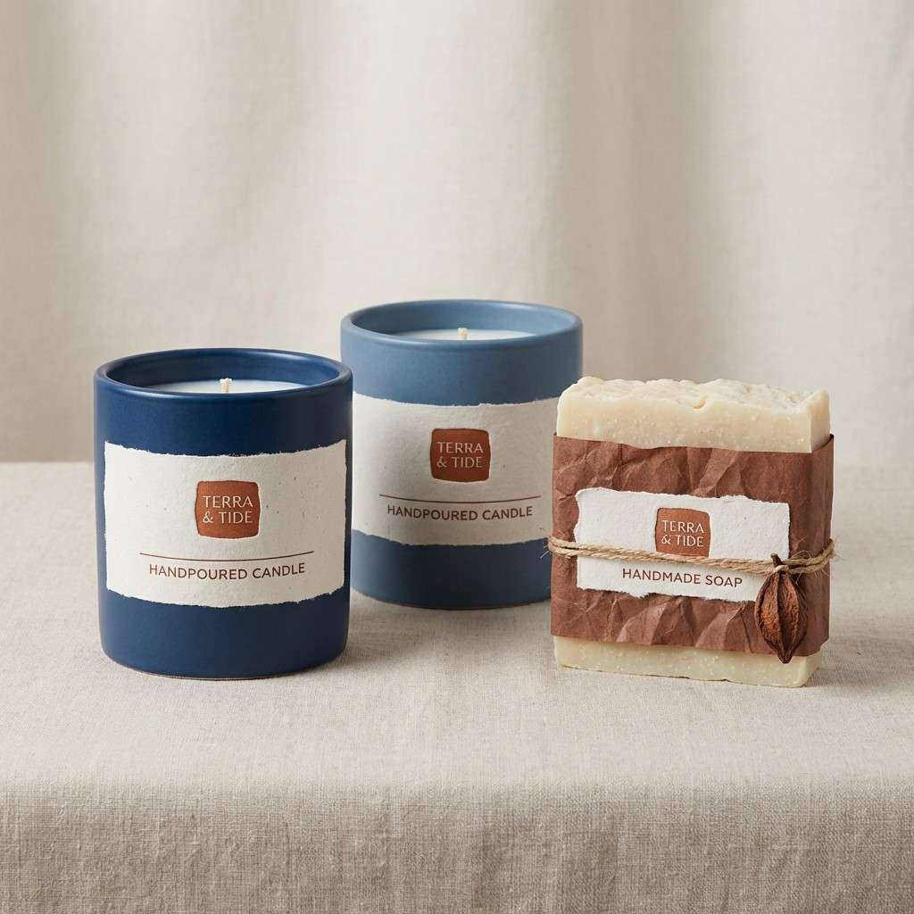
11) Twilight Ledger
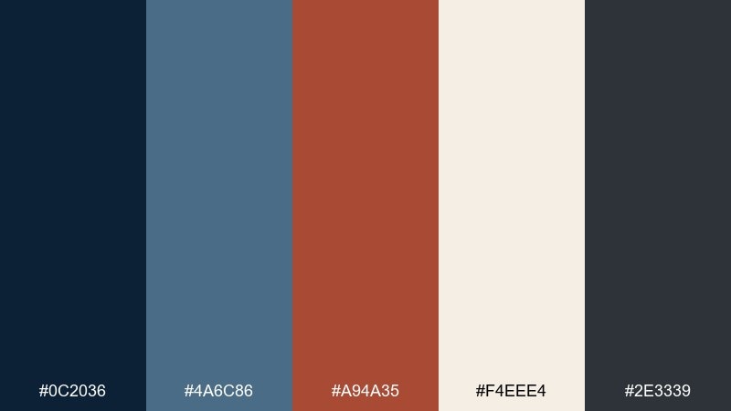
HEX: #0C2036 #4A6C86 #A94A35 #F4EEE4 #2E3339
Mood: serious, elegant, trustworthy
Best for: finance presentations and reports
Twilight blues with a restrained rust note feel confident and data-forward. The dark tones bring authority, while the warm accent keeps charts from looking sterile. Use the ivory for slide backgrounds to maintain contrast and reduce eye strain. Tip: apply rust to one data series or a key callout box so insights stand out instantly.
Image example of twilight ledger generated using media.io
12) Seaside Warehouse

HEX: #0E2F4B #4F7E98 #BB5B3F #D7D0C6 #1B1E22
Mood: industrial, bold, modern
Best for: streetwear lookbooks
Warehouse steel and sea-worn paint create a bold, modern edge. The cool blues make photos feel crisp, while rust adds that gritty highlight for typography and tags. Pair with monochrome imagery or desaturated photography for maximum cohesion. Tip: keep rust to 10 to 15 percent coverage so it reads like a deliberate accent, not a wash.
Image example of seaside warehouse generated using media.io
13) Warm Denim Neutrals
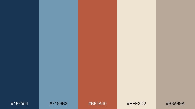
HEX: #183554 #7199B3 #B85A40 #EFE3D2 #B8A89A
Mood: soft, approachable, everyday
Best for: lifestyle blogs and templates
Soft denim blues with warm oatmeal neutrals feel friendly and lived-in. The rust note keeps the mix from looking overly cool, especially on long-form pages. Pair with warm photography, linen textures, and minimal icon sets. Tip: use the denim blue for headings and links, and reserve rust for hover states and small badges.
Image example of warm denim neutrals generated using media.io
14) Rusted Lighthouse

HEX: #081E33 #5E89A8 #C15E41 #F7F1E7 #2A2D33
Mood: dramatic, maritime, timeless
Best for: album covers and posters
Dark ocean blues with a rust flare feel cinematic, like a lighthouse beam cutting through fog. The warm off-white gives type space to breathe without losing the moody tone. Use rust sparingly for a title highlight or a single graphic shape. Tip: add subtle grain and keep contrast strong to preserve that dramatic print look.
Image example of rusted lighthouse generated using media.io
15) Copper Circuit UI
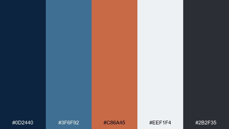
HEX: #0D2440 #3F6F92 #C86A45 #EEF1F4 #2B2F35
Mood: techy, sharp, modern
Best for: SaaS UI and landing pages
Cool tech blues with a coppery rust accent feel fast and intentional. These blue-rust tones make a strong blue rust color combination for product interfaces where clarity matters. Keep surfaces light and use the darker blue for navigation and primary text. Tip: apply rust to one action hierarchy only, like primary buttons, so the UI stays consistent.
Image example of copper circuit ui generated using media.io
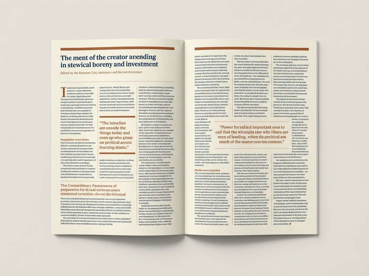
16) Bookshop Editorial
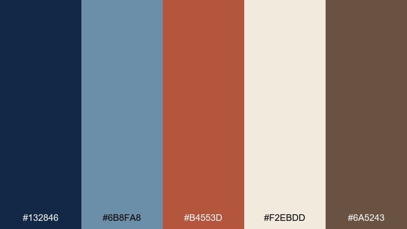
HEX: #132846 #6B8FA8 #B4553D #F2EBDD #6A5243
Mood: classic, cozy, editorial
Best for: magazine layouts and newsletters
Cozy bookshop blues with a rust headline tone feel smart and inviting. The paper-like cream keeps layouts readable, while the brown adds warmth for dividers and captions. Pair with serif headlines and generous leading for a print-first vibe. Tip: use rust on pull quotes or section numbers to guide the reader through long pages.
Image example of bookshop editorial generated using media.io
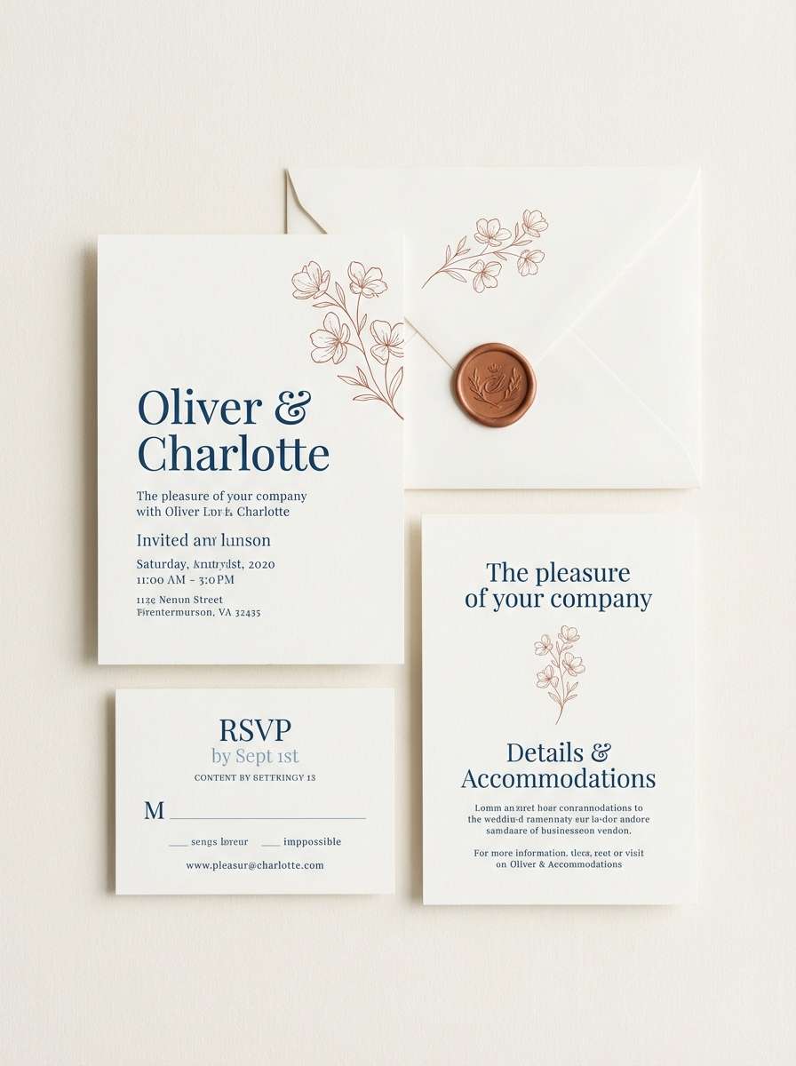
17) Autumn Coast Wedding
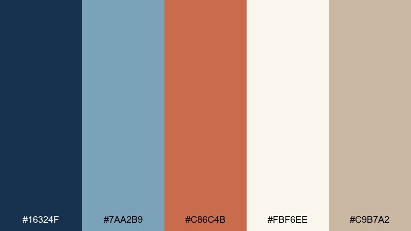
HEX: #16324F #7AA2B9 #C86C4B #FBF6EE #C9B7A2
Mood: romantic, warm, breezy
Best for: wedding invitations and signage
Breezy coastal blues with an autumn rust accent feel romantic without being overly sweet. The soft ivory keeps invites bright, while the warm greige helps balance photos and floral elements. Pair with delicate line art and a refined serif for names. Tip: print the rust in foil or letterpress for a small, memorable luxe moment.
Image example of autumn coast wedding generated using media.io
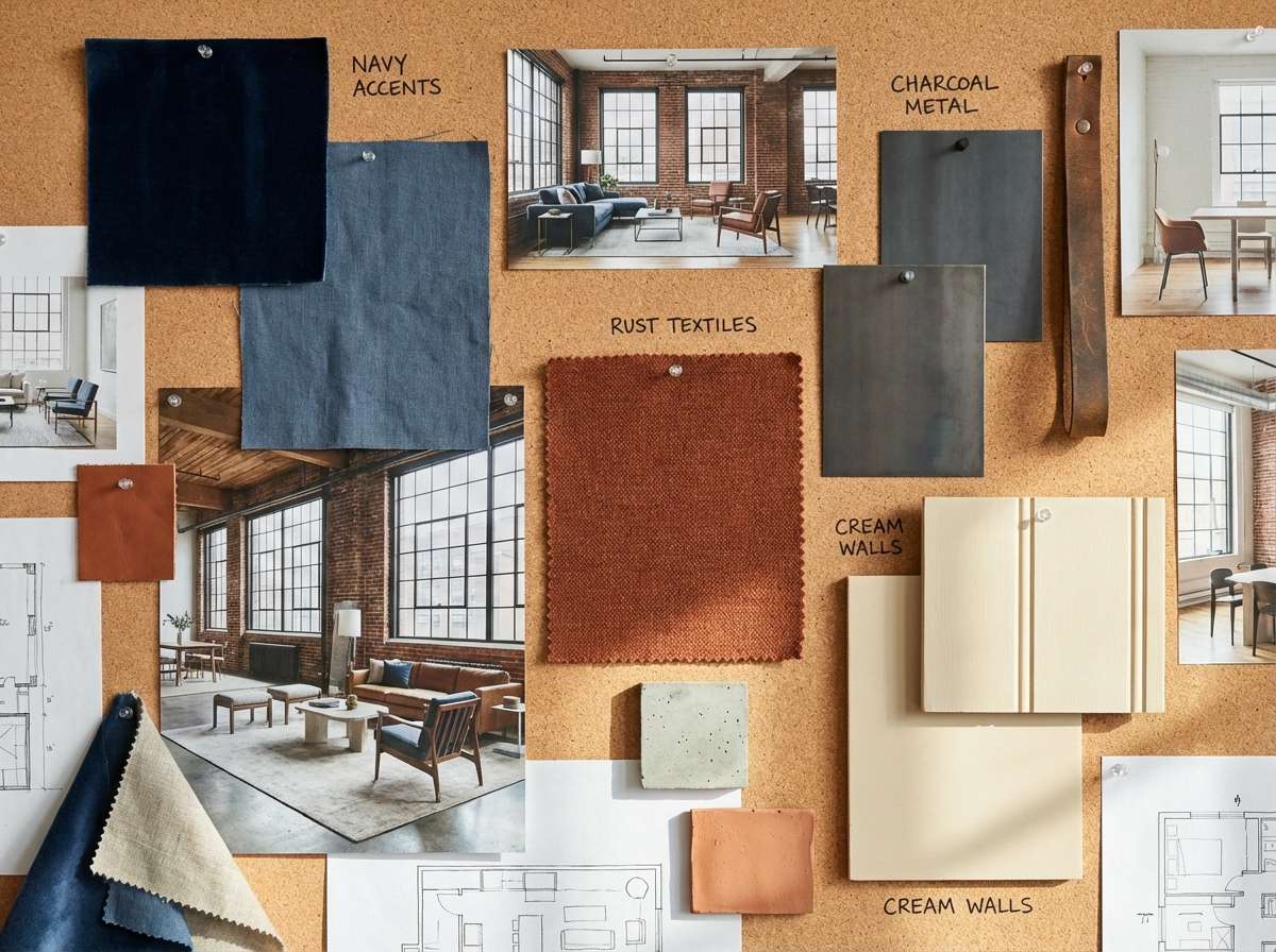
18) Industrial Loft Interior

HEX: #0F2236 #557D97 #B85A42 #E6DDCF #2A2B2E
Mood: urban, cozy, balanced
Best for: interior design mood boards
Urban blues and warm rust feel like exposed brick beside painted cabinetry. The cream and charcoal create a comfortable base that suits loft spaces and modern apartments. Use the mid blue on large surfaces and bring rust in through textiles, art, or a single statement chair. Tip: repeat the rust tone in at least two small places so it feels intentional, not accidental.
Image example of industrial loft interior generated using media.io
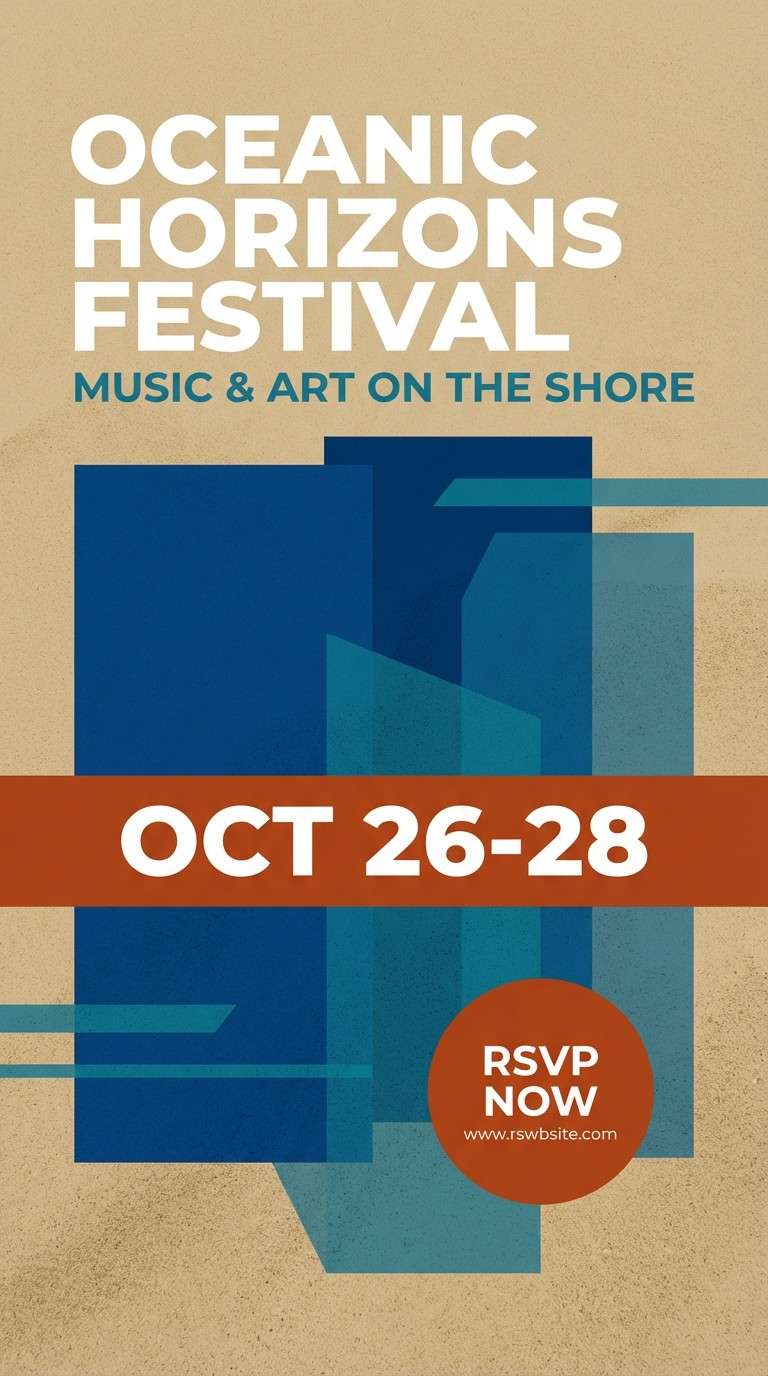
19) Harbor Night Market
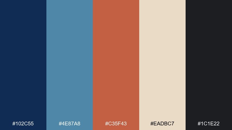
HEX: #102C55 #4E87A8 #C35F43 #EADBC7 #1C1E22
Mood: lively, modern, night-time
Best for: event flyers and promos
Night-market blues with a warm rust spark feel energetic and contemporary. The darker tones make type pop, while the pale sand keeps the design from getting heavy. Use rust for dates, tickets, or key icons to guide the eye fast. Tip: try big blocks of deep blue with one rust gradient strip for a punchy flyer layout.
Image example of harbor night market generated using media.io
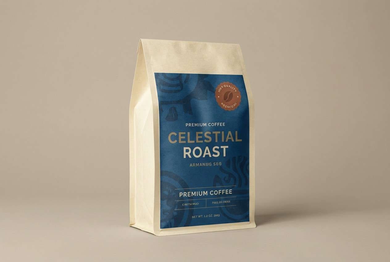
20) Artisan Coffee Wrap
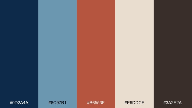
HEX: #0D2A4A #6C97B1 #B6553F #E9DDCF #3A2E2A
Mood: crafted, warm, premium
Best for: coffee bag packaging and ads
Roastery warmth meets cool blue calm, like a cafe at sunrise. The chocolate brown and rust notes feel rich and handcrafted, while the blues keep the look modern. Use the lighter neutral for label readability and reserve the darkest blue for a premium brand lockup. Tip: add a single rust stripe or badge to unify multiple roast variants.
Image example of artisan coffee wrap generated using media.io
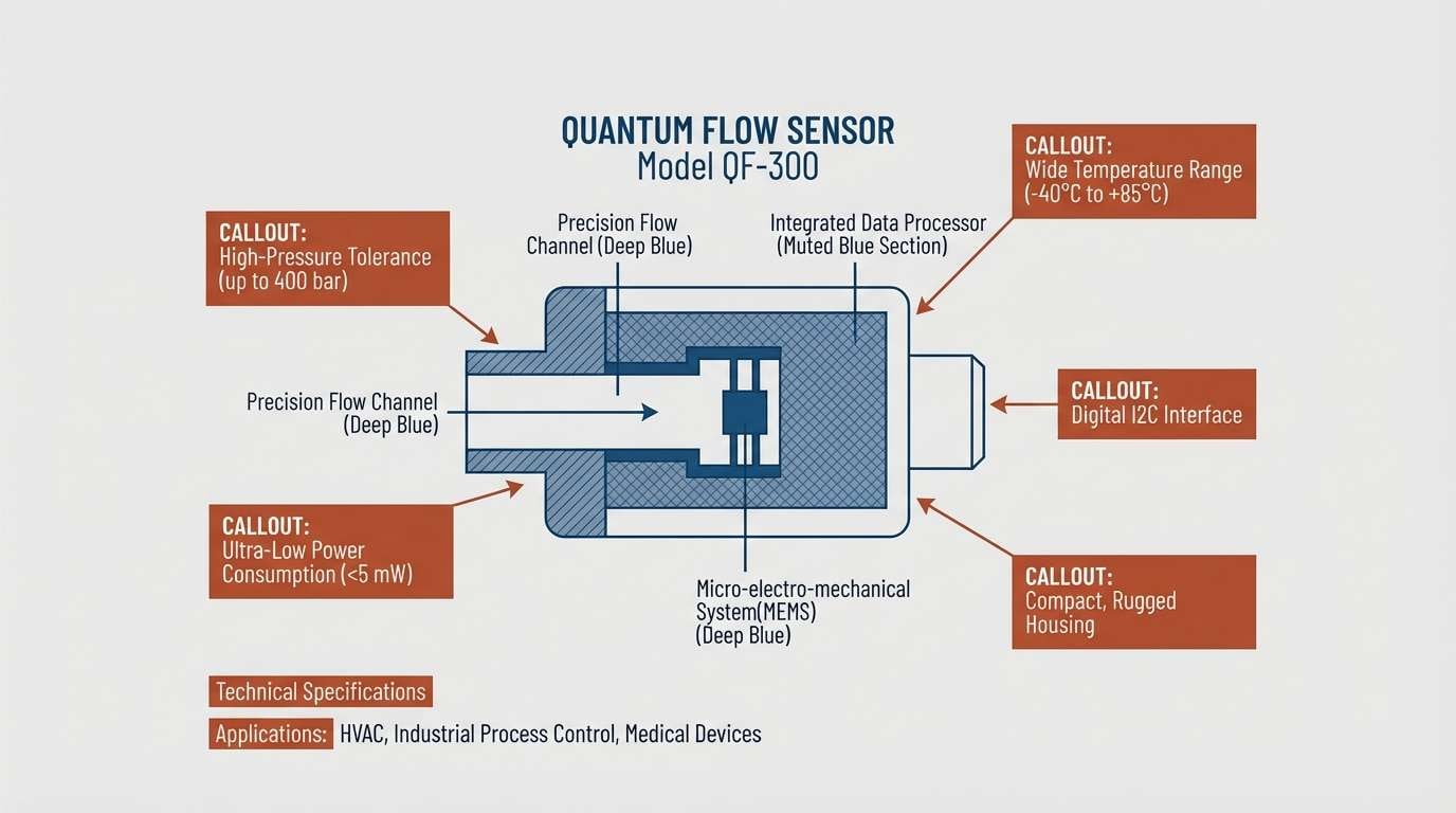
21) Oxide Blueprint
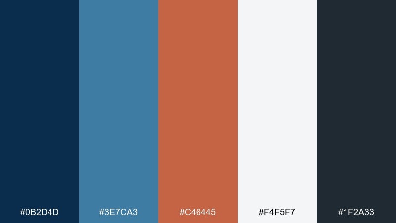
HEX: #0B2D4D #3E7CA3 #C46445 #F4F5F7 #1F2A33
Mood: precise, engineered, confident
Best for: product one-pagers and tech diagrams
Blueprint blues with an oxide rust accent feel engineered and crisp. As a blue rust color palette, it keeps technical layouts readable while still adding warmth and personality. Let the pale gray act as the canvas, then use rust for callouts, arrows, or key labels. Tip: avoid using rust for long text blocks, and keep it to highlights for maximum clarity.
Image example of oxide blueprint generated using media.io
22) Slate and Sienna Pairing
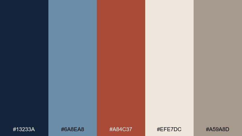
HEX: #13233A #6A8EA8 #A84C37 #EFE7DC #A59A8D
Mood: balanced, mature, versatile
Best for: branding systems and guidelines
Slate blues and sienna rust feel balanced, like stone and clay in the same landscape. The neutrals make the palette flexible across web, print, and packaging without constant tweaking. Use the mid blue for secondary UI states and the rust for emphasis that still feels tasteful. Tip: document a strict accent ratio so teams use the warm tone consistently across assets.
Image example of slate and sienna pairing generated using media.io
What Colors Go Well with Blue Rust?
Neutrals are the easiest win: warm ivory, cream, greige, and paper whites keep the palette breathable and let the rust accent feel intentional. Charcoal or near-black also strengthens contrast for typography-heavy layouts.
For richer combinations, try adding sand/tan tones for a vintage feel, or a slate gray-blue for a more technical, “blueprint” mood. If you want a softer look, use muted dusty blues instead of bright cyan.
When in doubt, keep rust as the smallest color by coverage and let blues carry the system—especially in UI, where consistency and readability matter most.
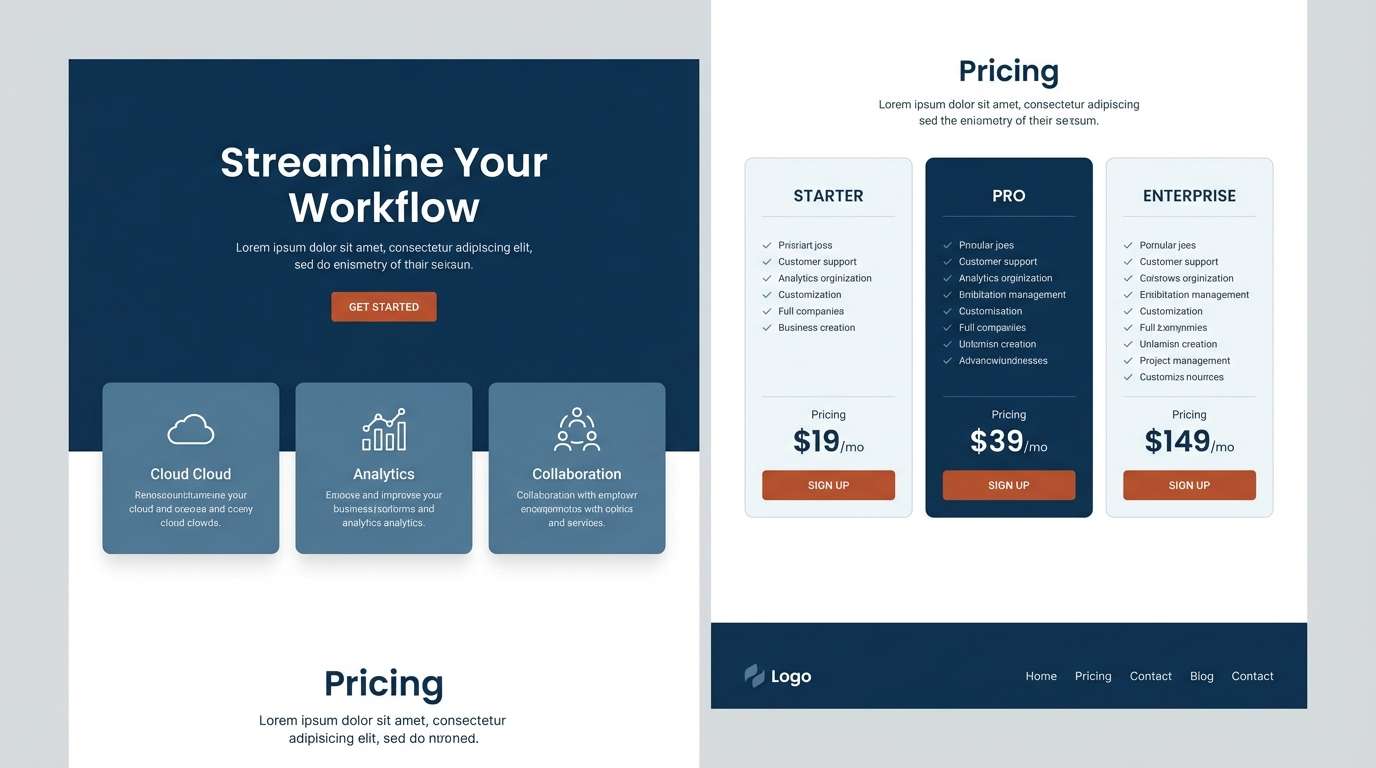
How to Use a Blue Rust Color Palette in Real Designs
Start with roles: pick one deep blue for headings/nav, one mid blue for secondary elements, one light neutral for backgrounds, and one rust for emphasis (buttons, badges, chart highlights). This prevents the warm accent from taking over.
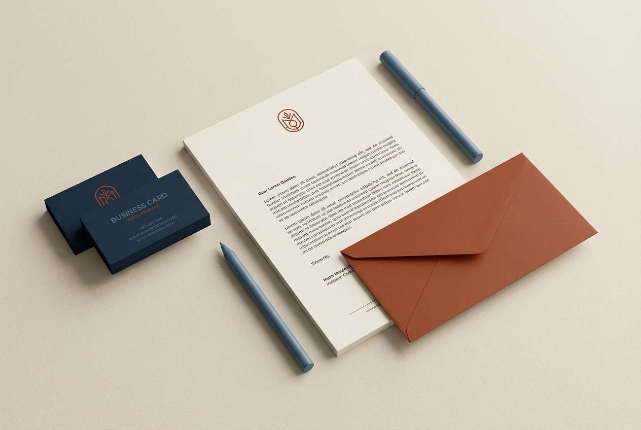
For branding, rust works well on seals, icons, dividers, and packaging details—small places where warmth reads premium. In interiors, echo rust in at least two touchpoints (textile + art, or chair + rug) to make it feel cohesive.
For digital layouts, test contrast early: rust on off-white is usually more legible than rust on mid-gray. Use the darker blues for body text when you want a softer alternative to pure black.
Create Blue Rust Palette Visuals with AI
If you want to see how blue rust colors look in context—on a landing page, label, poster, or interior mood board—generate quick mockups before committing to production.
With Media.io’s text-to-image, you can paste a prompt, define a style (vector, editorial, realistic), and iterate until the balance of navy and rust feels right for your project.
Use the prompts above as starting points, then swap in your product type, typography vibe, or layout format to match your brand.
Blue Rust Color Palette FAQs
-
What is a blue rust color palette?
A blue rust color palette combines cool blues (navy, steel, slate, or denim) with a warm rust/terracotta accent, usually supported by neutral creams, greiges, or charcoals for balance. -
Is navy and rust a good combination for branding?
Yes. Navy signals trust and stability, while rust adds approachability and character. Together they create strong contrast for logos, packaging, and brand systems without feeling overly bright. -
How do I keep rust from overpowering the design?
Treat rust as an accent color: use it for CTAs, badges, icons, or one chart series. Let blues and neutrals cover most of the layout so rust reads like a deliberate highlight. -
What neutral background works best with rust orange and blue?
Warm off-whites and paper creams typically work best because they enhance the earthy warmth of rust and still provide clean contrast with deep blues. -
Can I use a blue rust palette in UI design?
Absolutely. Use deep blue for navigation and primary text, light neutrals for surfaces, and rust for primary buttons, alerts, and key data emphasis. Always verify contrast for accessibility. -
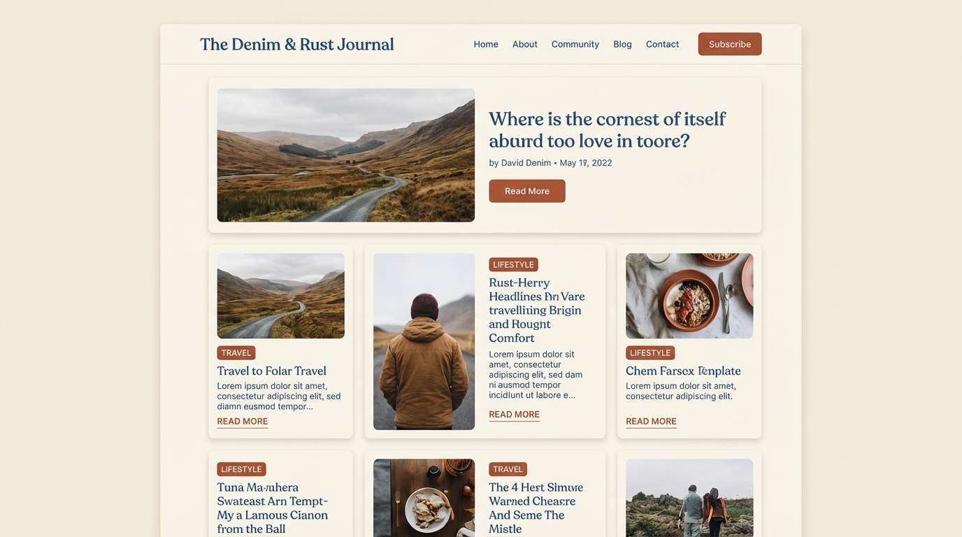
What type of photos match a muted blue palette with rust accents?
Desaturated, cool-toned photos pair well because the rust accent stays the focal point. Maritime, industrial, travel, and editorial imagery styles are especially compatible. -
Which hex codes are most common in blue rust schemes?
Common choices include a deep navy (e.g., #0B1F3B or #081E33), a muted mid blue (e.g., #5B87A6), a rust/terracotta (e.g., #C26745), and a cream/off-white background (e.g., #F7F2EA).


