

Blue raspberry is a bold, “icy-sweet” blue that instantly feels energetic, digital, and attention-grabbing. It’s perfect when you want designs to look modern, playful, or neon-lit—without losing clarity.
Below are 20+ blue raspberry color palette ideas with HEX codes, plus practical ways to apply them across branding, UI, packaging, posters, and more.
In this article
- Why Blue Raspberry Palettes Work So Well
-
- electric berry pop
- icy slush glow
- midnight razz depth
- cotton candy wave
- tech neon frost
- aqua raspberry breeze
- lavender blue punch
- steel blueberry minimal
- sunset berry spark
- arctic soda tint
- indigo jelly night
- skyberry cream
- pixel arcade blue
- oceanberry calm
- blueberry ink editorial
- frosted mint berry
- raspberry ice cream shop
- cosmic berry gradient
- denim berry everyday
- sapphire berry luxe
- berry blue neutral balance
- berry bloom watercolor
- What Colors Go Well with Blue Raspberry?
- How to Use a Blue Raspberry Color Palette in Real Designs
- Create Blue Raspberry Palette Visuals with AI
Why Blue Raspberry Palettes Work So Well
Blue raspberry palettes sit in a high-impact zone: they’re bright enough to feel exciting, yet cool enough to stay clean and tech-forward. That makes them a natural fit for UI, posters, and product visuals that need instant “pop.”
They also pair well with both extremes—inky navies for depth and near-whites for space—so you can control readability without sacrificing color personality. Add a violet or magenta accent and the whole look becomes more dynamic.
Most importantly, blue raspberry color combinations translate across mediums: gradients for digital polish, flat fills for crisp branding, and neon accents for nightlife or gaming aesthetics.
20+ Blue Raspberry Color Palette Ideas (with HEX Codes)
1) Electric Berry Pop
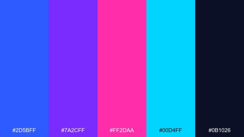
HEX: #2D5BFF #7A2CFF #FF2DAA #00D4FF #0B1026
Mood: energetic and punchy
Best for: music poster graphics
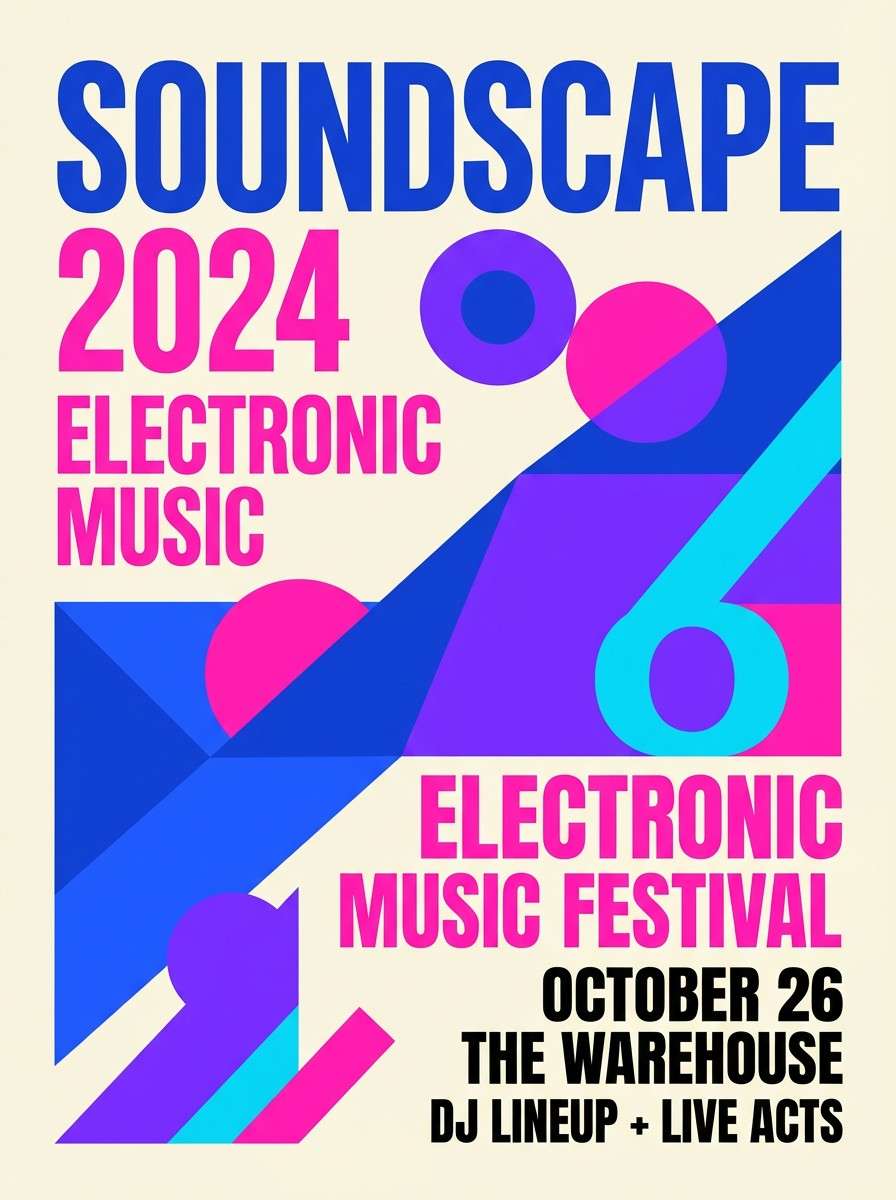
Electric and glossy, like a neon slush under blacklight. Use the deep navy as your anchor, then let the hot pink and electric blue do the loud work. It shines on posters, event graphics, and bold social tiles where contrast matters. Tip: keep type mostly white or near-white and reserve pink for calls to action.
Image example of electric berry pop generated using media.io
Media.io is an online AI studio for creating and editing video, image, and audio in your browser.

2) Icy Slush Glow
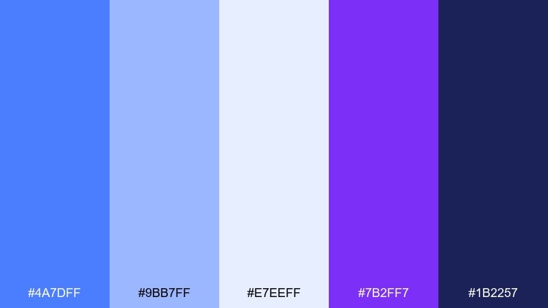
HEX: #4A7DFF #9BB7FF #E7EEFF #7B2FF7 #1B2257
Mood: cool and luminous
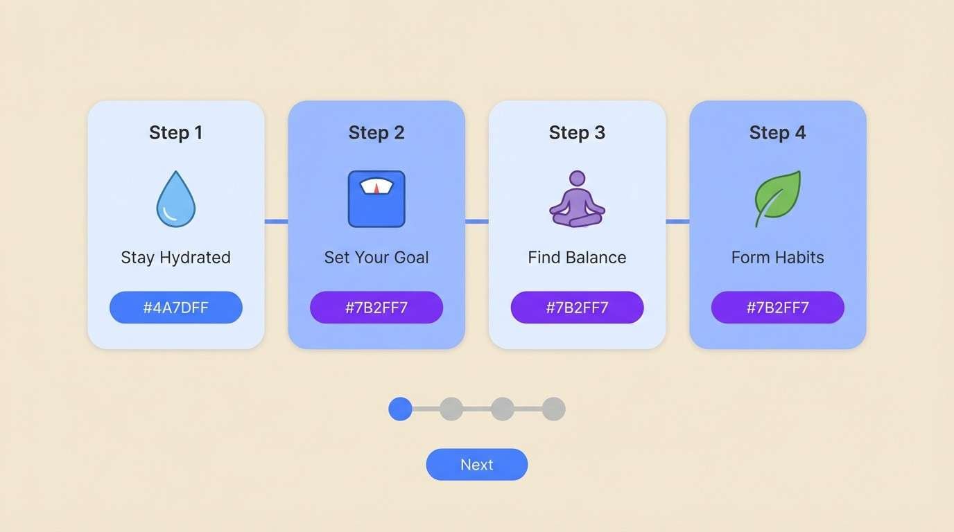
Best for: wellness app onboarding UI
Clean and frosty, like crushed ice with a violet glow. The pale tints keep screens airy while the saturated purple-blue adds focus for buttons and highlights. It works especially well for onboarding flows, feature callouts, and gentle gradients. Tip: use the near-white as the main canvas and limit the darkest navy to nav bars and headers.
Image example of icy slush glow generated using media.io
3) Midnight Razz Depth
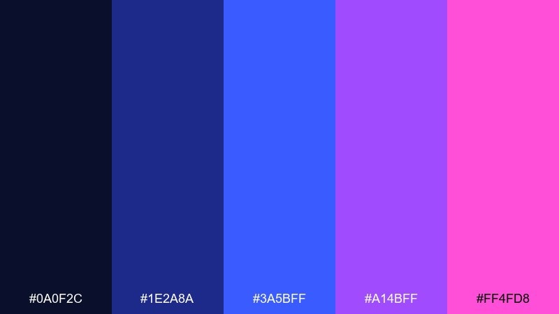
HEX: #0A0F2C #1E2A8A #3A5BFF #A14BFF #FF4FD8
Mood: moody and dramatic
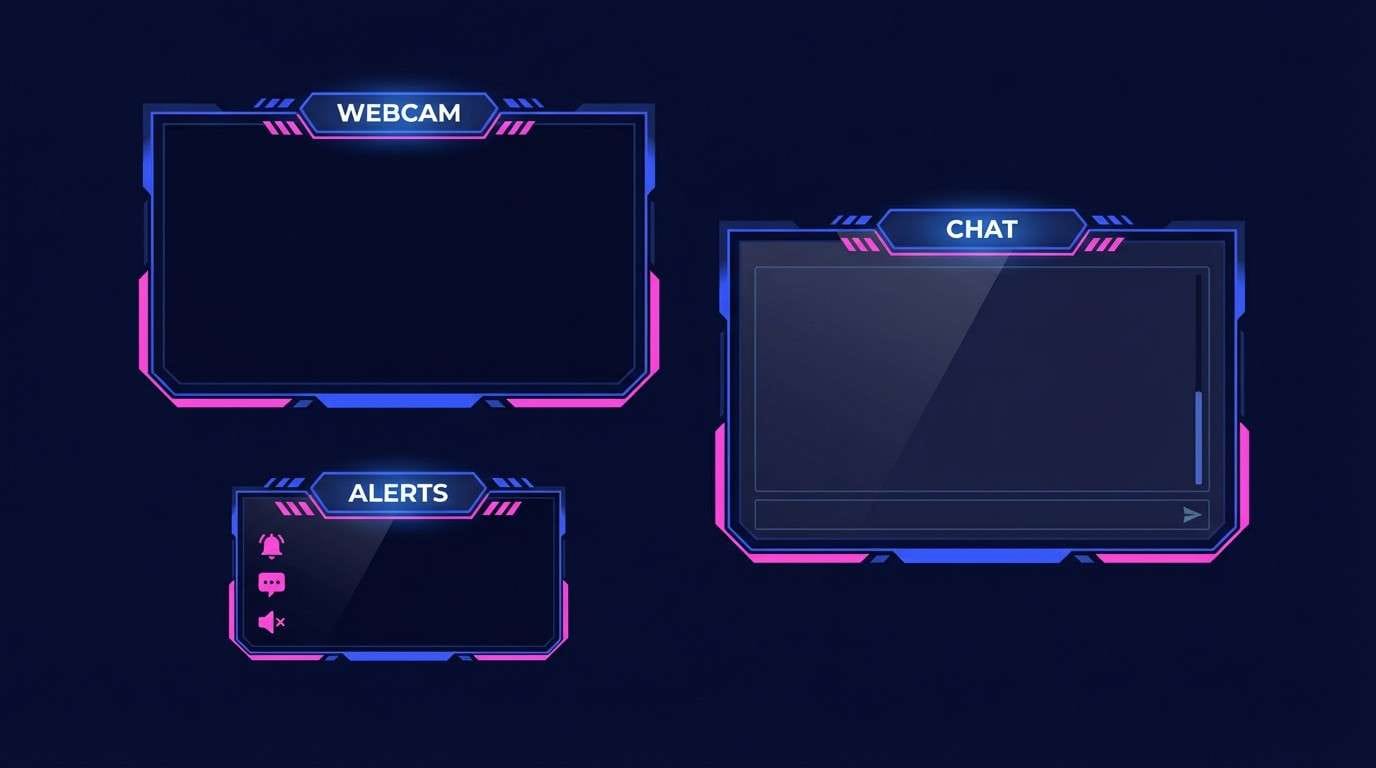
Best for: gaming stream overlay
Dark and electric, like city lights reflected on wet asphalt. The near-black base keeps overlays readable while the bright blue and magenta create instant energy around alerts. Great for gaming streams, esports banners, and nighttime promos. Tip: place magenta only on key moments like subscriber alerts to avoid visual fatigue.
Image example of midnight razz depth generated using media.io
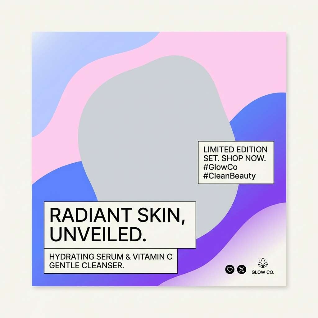
4) Cotton Candy Wave
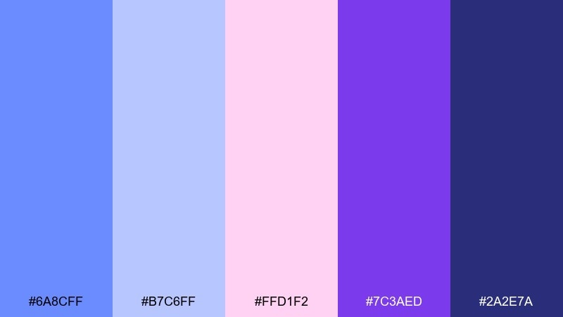
HEX: #6A8CFF #B7C6FF #FFD1F2 #7C3AED #2A2E7A
Mood: playful and soft
Best for: beauty brand social posts
Sweet and breezy, like cotton candy drifting through a cool sky. Pair the pastel blue and blush pink for friendly backgrounds, then add violet for crisp accents. It fits beauty promos, lifestyle carousels, and creator templates that need softness without fading out. Tip: keep gradients subtle and use violet as your contrast color for headings.
Image example of cotton candy wave generated using media.io
5) Tech Neon Frost
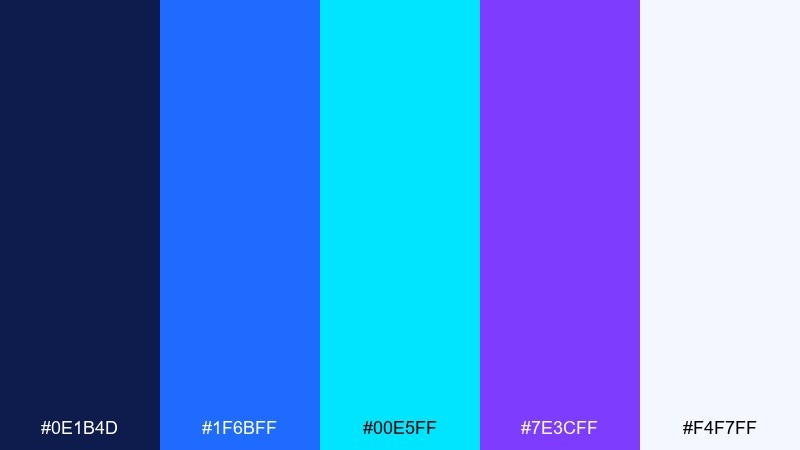
HEX: #0E1B4D #1F6BFF #00E5FF #7E3CFF #F4F7FF
Mood: futuristic and crisp
Best for: SaaS landing page hero
Sharp and high-tech, like an LED strip on icy glass. These tones make a blue raspberry color palette that feels modern without turning chaotic, thanks to the bright off-white for breathing room. Use the navy for sections, the neon cyan for highlights, and violet for secondary actions. Tip: keep gradients limited to hero areas and stick to solid fills for UI components.
Image example of tech neon frost generated using media.io

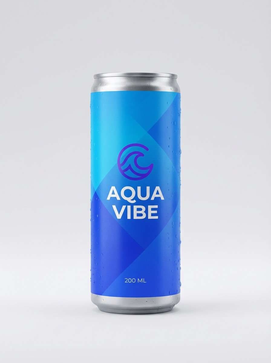
6) Aqua Raspberry Breeze
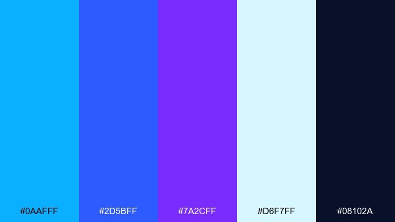
HEX: #0AAFFF #2D5BFF #7A2CFF #D6F7FF #08102A
Mood: fresh and airy
Best for: summer beverage packaging
Bright and refreshing, like a cold fizzy drink on a hot day. The airy ice-blue keeps the look clean while the electric blue and violet bring flavor and depth. Ideal for beverage labels, cans, and splashy promo ads with crisp contrast. Tip: use the darkest navy only for fine print so the front stays light and thirst-quenching.
Image example of aqua raspberry breeze generated using media.io
7) Lavender Blue Punch
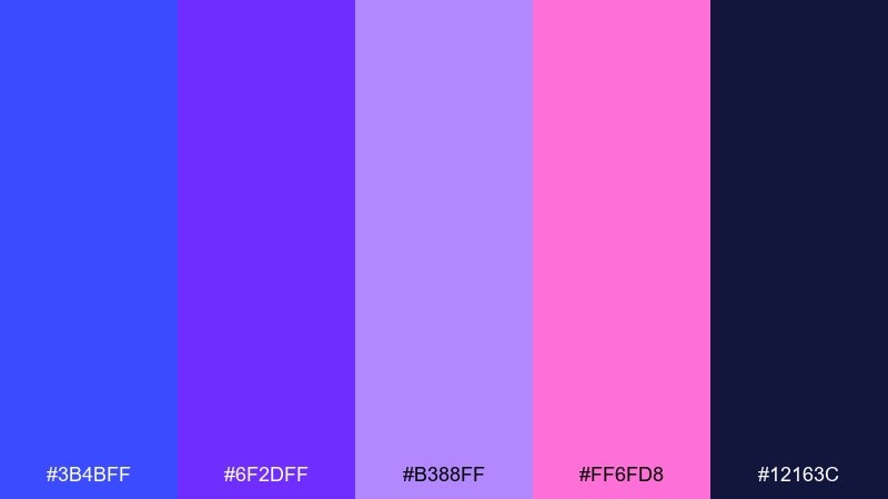
HEX: #3B4BFF #6F2DFF #B388FF #FF6FD8 #12163C
Mood: bold and creative
Best for: album cover artwork
Vivid and expressive, like a synth chord with a floral edge. The lavender and hot pink add personality while the deep navy keeps it grounded and legible. Use it for cover art, creator merch, and punchy thumbnails that need to stand out in a grid. Tip: keep one dominant hue per layout and use pink only as a spotlight.
Image example of lavender blue punch generated using media.io

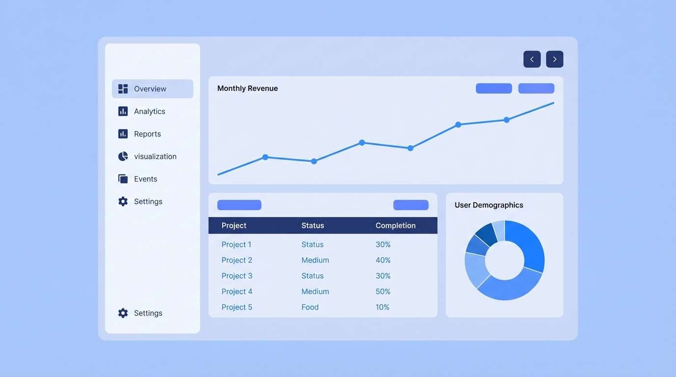
8) Steel Blueberry Minimal
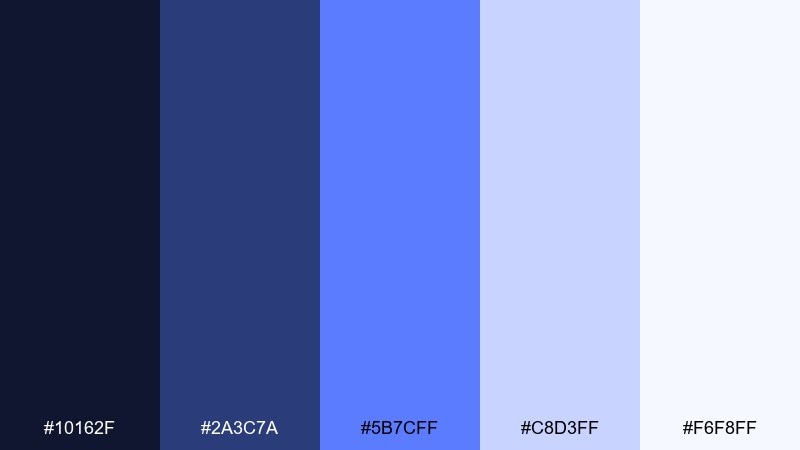
HEX: #10162F #2A3C7A #5B7CFF #C8D3FF #F6F8FF
Mood: calm and professional
Best for: dashboard UI theme
Polished and steady, like brushed steel with a berry tint. The soft periwinkle tones keep dense data screens from feeling heavy while the darker blues handle structure and hierarchy. Perfect for dashboards, admin panels, and analytics reports where clarity matters most. Tip: use the mid-blue for charts and reserve the darkest shade for text and dividers.
Image example of steel blueberry minimal generated using media.io
9) Sunset Berry Spark
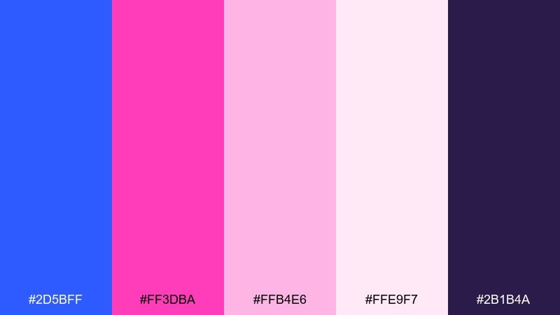
HEX: #2D5BFF #FF3DBA #FFB4E6 #FFE9F7 #2B1B4A
Mood: romantic and lively
Best for: wedding afterparty flyer
Flirty and celebratory, like sunset light bouncing off glitter. The pale pinks create a soft base while electric blue brings an unexpected pop that feels modern. Great for party flyers, RSVP cards, and playful wedding-weekend graphics. Tip: keep the background light and let the blue act as your signature accent color.
Image example of sunset berry spark generated using media.io

10) Arctic Soda Tint
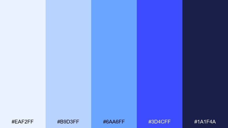
HEX: #EAF2FF #B9D3FF #6AA6FF #3D4CFF #1A1F4A
Mood: light and refreshing
Best for: newsletter template design
Crisp and bubbly, like soda foam over ice. The pale blues keep long reads comfortable while the stronger cobalt adds clear hierarchy for buttons and links. Use it for newsletters, blog headers, and email promos that need a clean, friendly tone. Tip: set links in cobalt and keep body text in the deepest shade for accessibility.
Image example of arctic soda tint generated using media.io
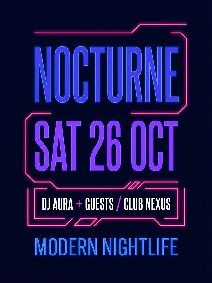
11) Indigo Jelly Night
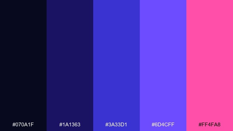
HEX: #070A1F #1A1363 #3A33D1 #6D4CFF #FF4FA8
Mood: mysterious and glossy
Best for: nightclub event poster
Inky and vibrant, like indigo jelly under neon signage. The deep base makes bright purples and pinks feel richer and more cinematic. It works for nightlife posters, DJ lineups, and high-impact digital ads. Tip: use glow effects sparingly and keep type blocks aligned to maintain readability.
Image example of indigo jelly night generated using media.io
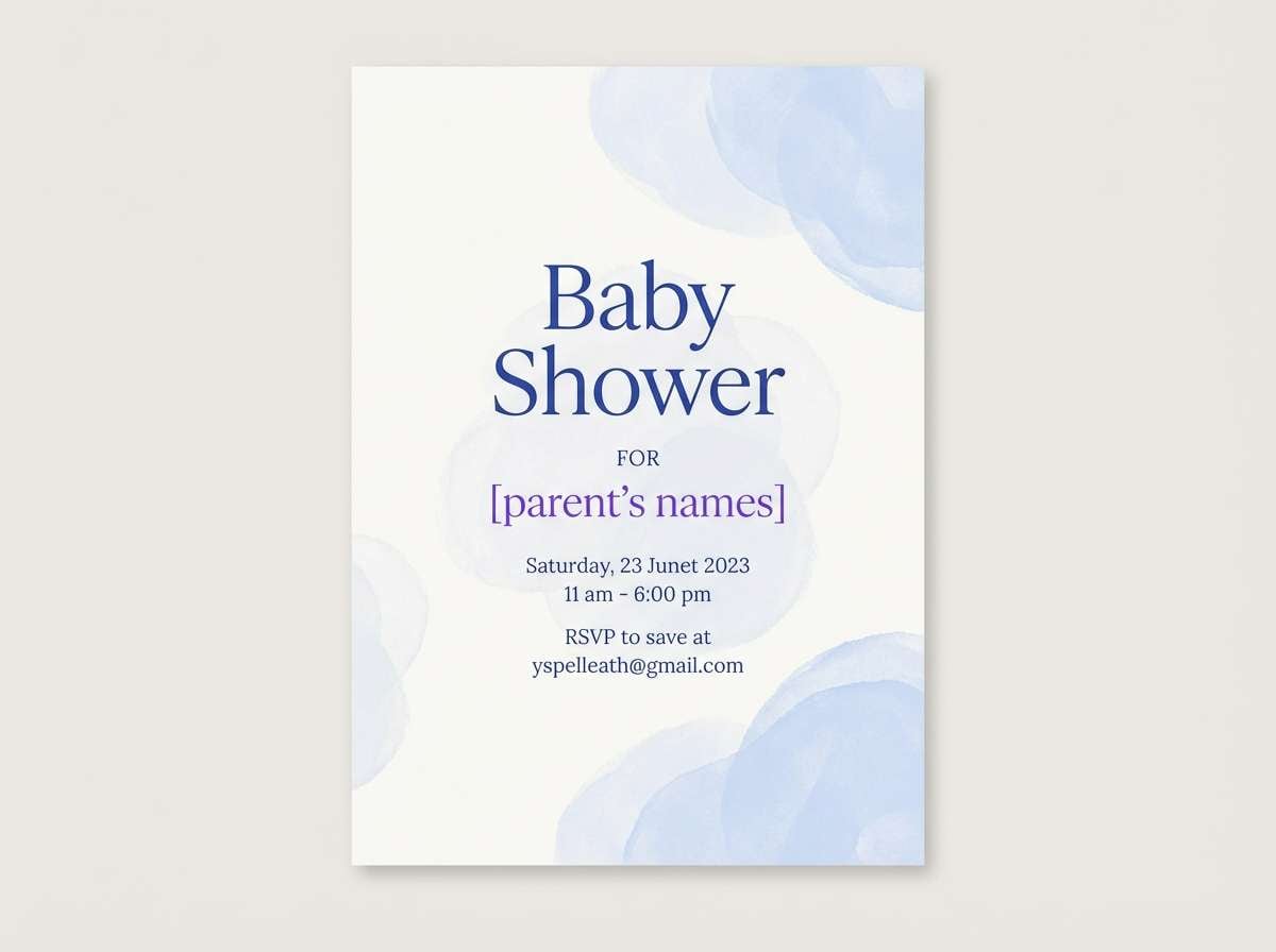
12) Skyberry Cream
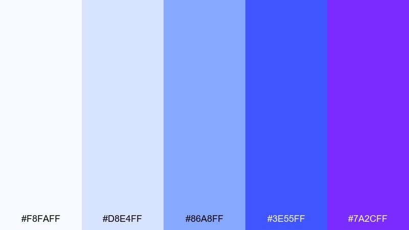
HEX: #F8FAFF #D8E4FF #86A8FF #3E55FF #7A2CFF
Mood: soft and optimistic
Best for: baby shower invitation
Gentle and uplifting, like a clouded sky with a berry swirl. The creamy off-white and pale blue create an easy backdrop for script fonts and simple illustrations. Ideal for invitations, announcements, and keepsake prints that need a modern pastel feel. Tip: keep the darkest violet for names and dates to preserve the delicate tone.
Image example of skyberry cream generated using media.io
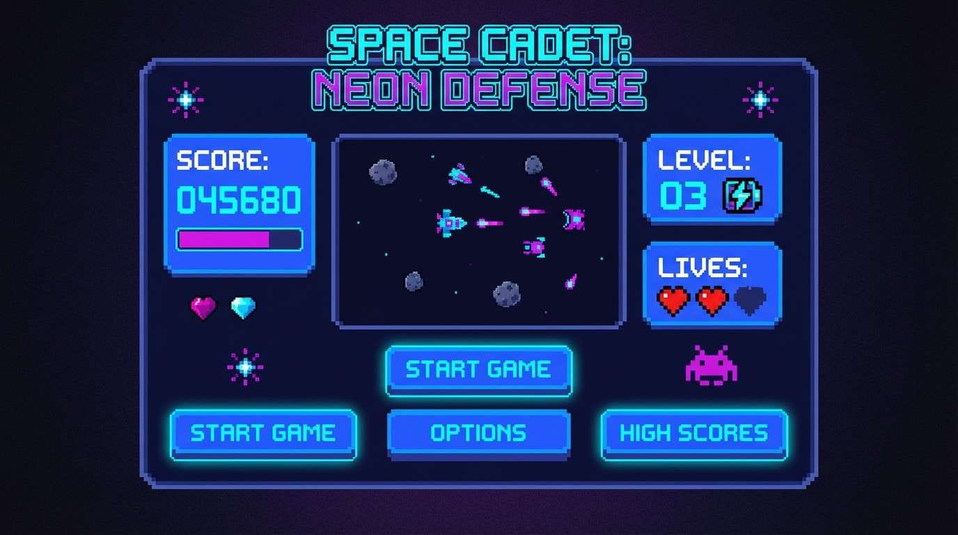
13) Pixel Arcade Blue
HEX: #151A3A #2D5BFF #00D4FF #7A2CFF #FF2DAA
Mood: retro and high-energy
Best for: arcade game UI screens
Bouncy and nostalgic, like an arcade cabinet glow in a dark room. Cyan and magenta make the interface feel game-ready, while navy keeps the layout disciplined. Use it for game menus, badge systems, and playful microinteractions. Tip: limit cyan to interactive states so users instantly understand what is clickable.
Image example of pixel arcade blue generated using media.io
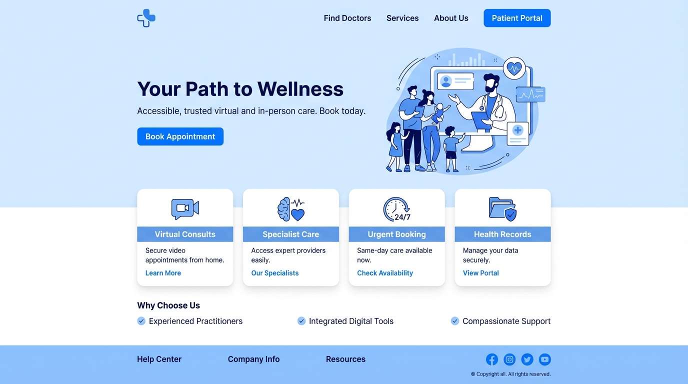
14) Oceanberry Calm
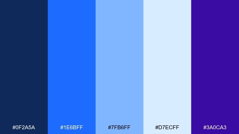
HEX: #0F2A5A #1E6BFF #7FB6FF #D7ECFF #3A0CA3
Mood: calm and trustworthy
Best for: healthcare web design
Steady and reassuring, like deep water under a clear sky. The lighter blues keep pages open and friendly, while the indigo adds a confident accent for key actions. Great for healthcare sites, patient portals, and service pages that need clarity without coldness. Tip: use the palest tint for section backgrounds to guide the eye down the page.
Image example of oceanberry calm generated using media.io
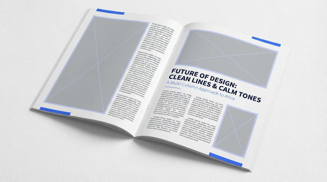
15) Blueberry Ink Editorial
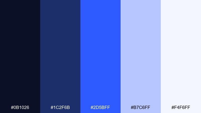
HEX: #0B1026 #1C2F6B #2D5BFF #B7C6FF #F4F6FF
Mood: editorial and refined
Best for: magazine feature layout
Crisp and ink-like, like a fresh print spread with cobalt highlights. The off-white and pale periwinkle support long reads, while the saturated blue makes pull quotes and section headers pop. Perfect for editorial layouts, annual reports, and content-heavy presentations. Tip: keep margins generous and use the darkest shade for body text to maintain readability.
Image example of blueberry ink editorial generated using media.io
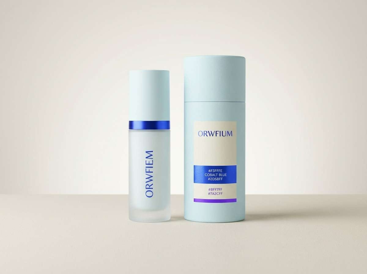
16) Frosted Mint Berry
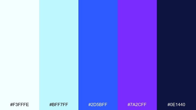
HEX: #F3FFFE #BFF7FF #2D5BFF #7A2CFF #0E1440
Mood: clean and upbeat
Best for: skincare product ad
Fresh and spa-like, like chilled water with a berry twist. The pale minty tint keeps the look hygienic and modern, while the blue and violet add premium contrast. Use it for skincare ads, landing pages, and packaging where clean claims need visual support. Tip: keep the background nearly white and use the strongest blue only on the product name and key benefits.
Image example of frosted mint berry generated using media.io
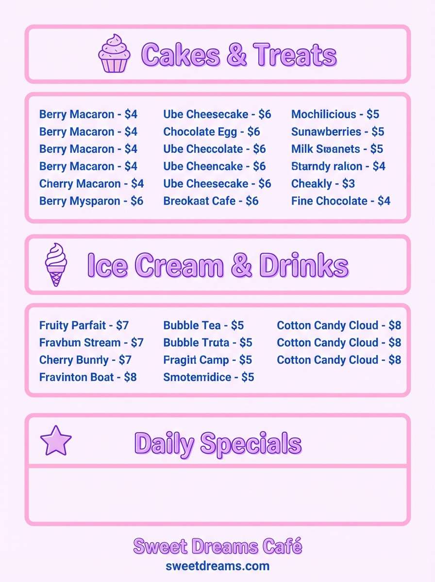
17) Raspberry Ice Cream Shop
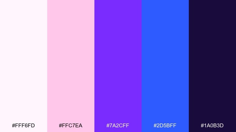
HEX: #FFF6FD #FFC7EA #7A2CFF #2D5BFF #1A0B3D
Mood: sweet and inviting
Best for: dessert shop menu poster
Creamy and fun, like an ice cream counter with berry syrup drips. The soft pink base makes menus feel friendly, while violet and blue add structure for categories and prices. Great for dessert shops, seasonal promos, and playful signage. Tip: use the darkest shade for item names and keep accents on icons and separators.
Image example of raspberry ice cream shop generated using media.io
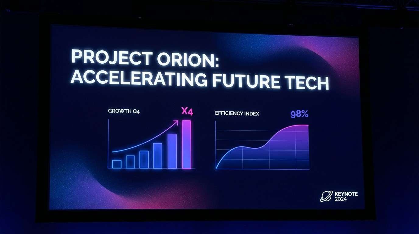
18) Cosmic Berry Gradient
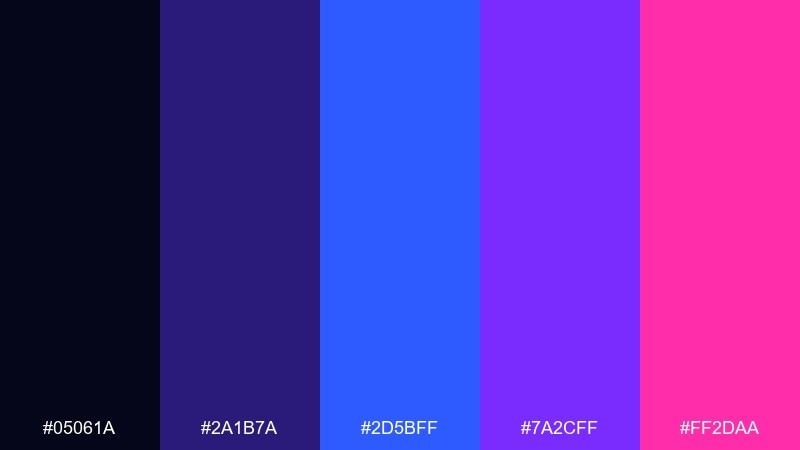
HEX: #05061A #2A1B7A #2D5BFF #7A2CFF #FF2DAA
Mood: cosmic and intense
Best for: tech conference keynote slide theme
Galactic and magnetic, like a nebula fading from cobalt to magenta. These blue raspberry color combinations deliver instant depth for stage screens, especially when you lean on dark backgrounds and bright accents. Use blue for titles, violet for section dividers, and pink for key metrics. Tip: avoid busy textures and keep diagrams simple so the gradient glow stays elegant.
Image example of cosmic berry gradient generated using media.io
19) Denim Berry Everyday
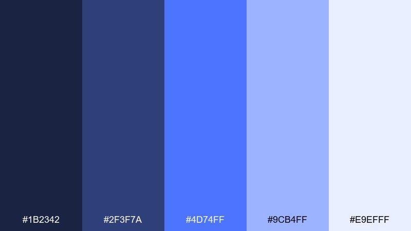
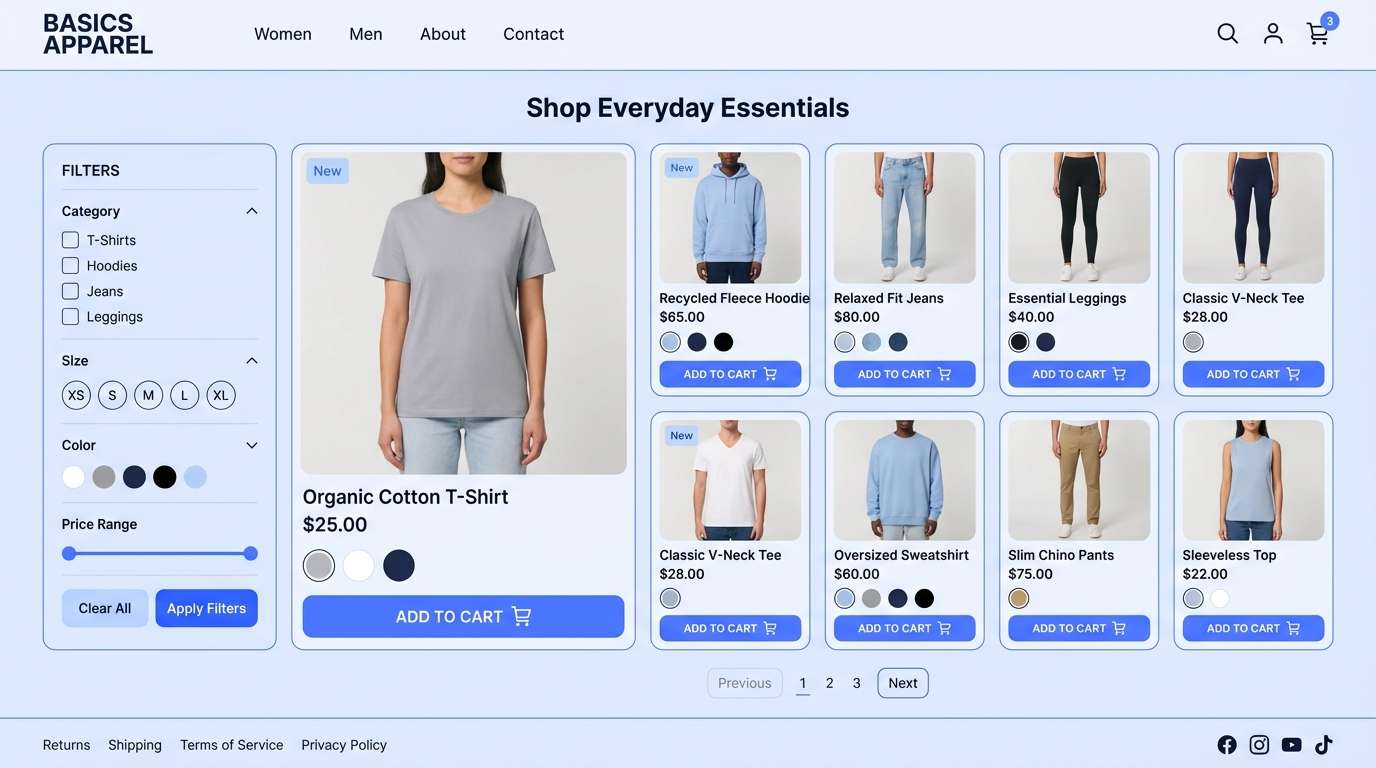
HEX: #1B2342 #2F3F7A #4D74FF #9CB4FF #E9EFFF
Mood: casual and approachable
Best for: ecommerce UI for basics apparel
Relaxed and wearable, like denim washed into a berry-toned blue. The mid blues feel familiar and trustworthy, while the pale tint keeps product grids clean. Ideal for ecommerce layouts, product cards, and filters where you want calm focus. Tip: use the medium blue for primary buttons and keep backgrounds light to spotlight photography.
Image example of denim berry everyday generated using media.io
20) Sapphire Berry Luxe
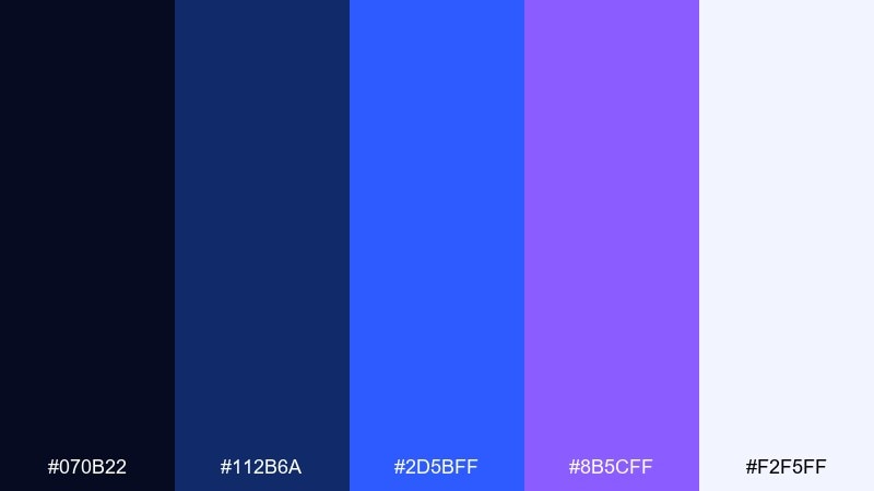
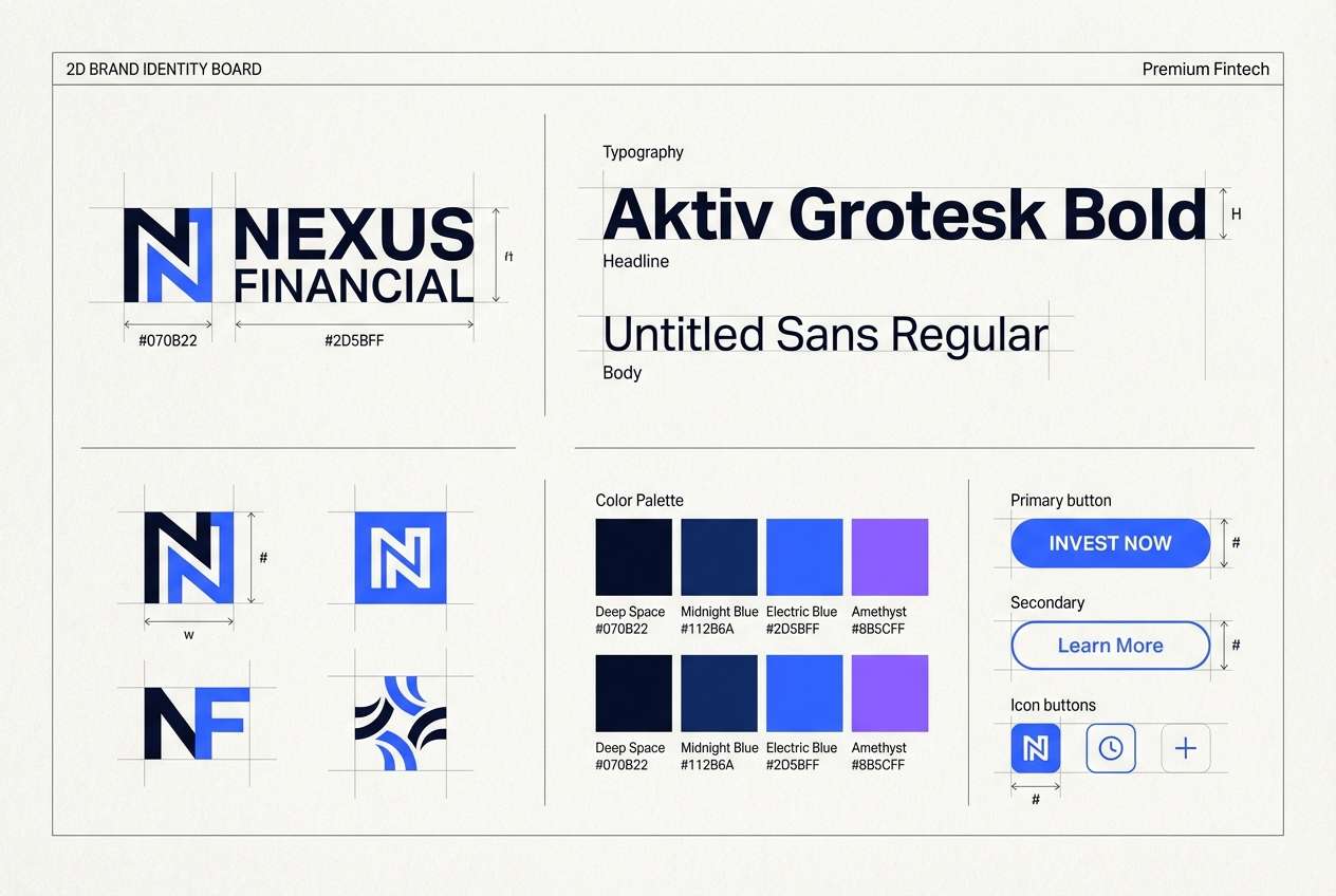
HEX: #070B22 #112B6A #2D5BFF #8B5CFF #F2F5FF
Mood: luxurious and confident
Best for: premium fintech branding board
Glossy and premium, like sapphire glass with a violet edge. The dark foundation builds trust, while the bright blue and lilac accent feel modern and forward-looking. Use it for fintech branding, pitch decks, and high-end web sections where you want authority and polish. Tip: keep accents tight to icons and highlights, and let negative space do the heavy lifting.
Image example of sapphire berry luxe generated using media.io
21) Berry Blue Neutral Balance
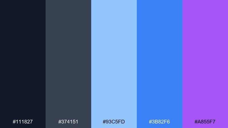
HEX: #111827 #374151 #93C5FD #3B82F6 #A855F7
Mood: balanced and modern
Best for: startup pitch deck
Modern and grounded, like a clean office with a vibrant blue accent wall. The grays keep charts and dense text organized, while the blues and violet add personality to headers and data points. Great for pitch decks, reports, and product roadmaps where clarity comes first. Tip: use gray for body text and let the two brightest colors signal highlights and wins.
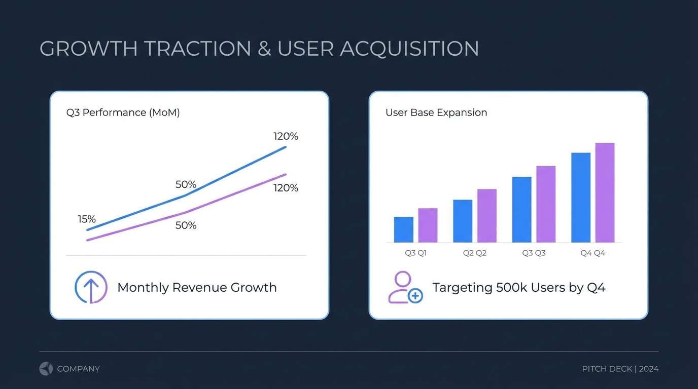
Image example of berry blue neutral balance generated using media.io
22) Berry Bloom Watercolor
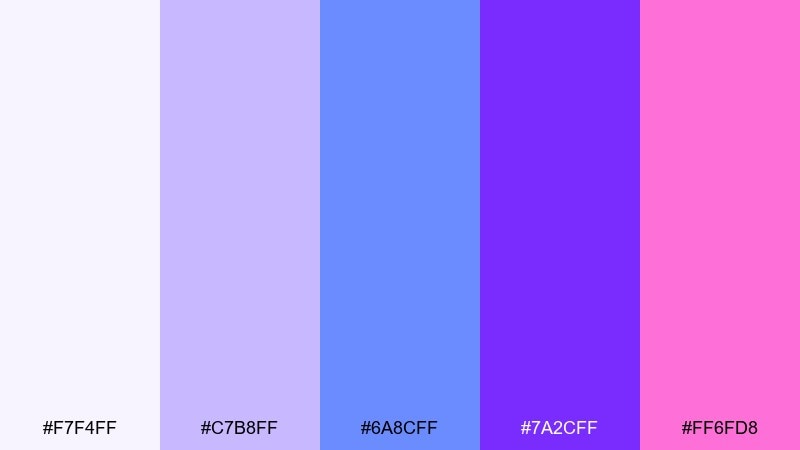
HEX: #F7F4FF #C7B8FF #6A8CFF #7A2CFF #FF6FD8
Mood: dreamy and artistic
Best for: spring botanical illustration
Dreamy and delicate, like watercolor petals bleeding into a cool twilight sky. Lavender and periwinkle create soft washes, while the violet and pink add focal blooms. Use it for botanical prints, seasonal stationery, and gentle digital illustrations. Tip: keep outlines minimal and let layered washes build depth.
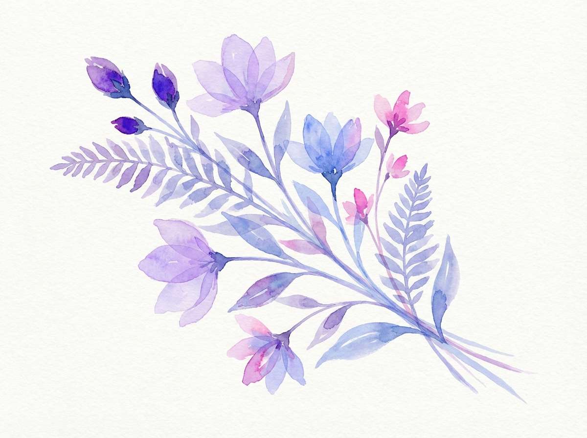
Image example of berry bloom watercolor generated using media.io
What Colors Go Well with Blue Raspberry?
Blue raspberry works especially well with deep navies and near-whites because they control contrast: navy adds structure and seriousness, while off-white keeps the palette breathable and modern.
For extra flavor, pair it with violet, lilac, and magenta to push a neon/cosmic vibe, or use icy cyan and mint tints for a fresher, cleaner feel. If you need a more “business” tone, bring in cool grays to calm the brightness without dulling it.
When in doubt, choose one dominant blue, one light background tint, one dark anchor, and one accent (pink or cyan) so the design stays readable and intentional.
How to Use a Blue Raspberry Color Palette in Real Designs
In branding, use blue raspberry as the signature accent (logos, icons, highlights) and rely on dark navy or charcoal for typography so your identity stays premium and legible. For packaging, keep the front panel light and icy, then reserve neon pink or cyan for key claims.
In UI, blue raspberry is excellent for primary buttons, active states, and links—just balance it with generous white space and softer tints for surfaces. For charts and dashboards, assign the brightest hues to “focus” data only, and keep supporting elements in muted blues/gray-blues.
For posters and social graphics, combine a dark base with electric accents, but limit the number of “glow” colors per layout to avoid visual noise.
Create Blue Raspberry Palette Visuals with AI
If you already have HEX codes, you can quickly turn a blue raspberry palette into real-looking posters, UI mockups, labels, and brand boards using AI. This helps you test moods (neon, pastel, luxe, minimal) before committing to production design.
Start with one palette, describe the design type (poster, landing page hero, packaging, invitation), then add lighting/style cues like “clean vector,” “premium studio photo,” or “minimal UI.” Keep prompts simple and iterate by swapping only one color role at a time.
Use Media.io’s text-to-image tool to generate cohesive visuals that match your palette direction.
Blue Raspberry Color Palette FAQs
-
What is a blue raspberry color palette?
A blue raspberry color palette is a set of bright, cool blues (often electric or icy) paired with supporting tones like navy, violet, cyan, and sometimes pink to create a bold, modern “candy-neon” look. -
Is blue raspberry a real fruit color?
Not exactly. “Blue raspberry” is a flavor concept, and the color is a stylized, highly saturated blue used to signal that flavor in candy, drinks, and pop visuals. -
What HEX code is “blue raspberry”?
There isn’t one official HEX code, but common blue raspberry-style picks include electric blues like #2D5BFF or brighter cyan-leaning blues like #0AAFFF, depending on the mood you want. -
What colors pair best with blue raspberry?
Deep navy or near-black for contrast, off-white/ice tints for clean space, and violet/magenta or cyan for energetic accents. Cool grays also work well for more professional layouts. -
How do I keep blue raspberry designs readable?
Use a dark anchor (navy/charcoal) for text, keep backgrounds light or very dark (not mid-tone), and limit neon accents to buttons, highlights, and calls to action. -
Is a blue raspberry palette good for UI design?
Yes—especially for tech, gaming, wellness, and creator products. Use blue raspberry for interactive states (primary buttons, links) and rely on pale tints for surfaces to reduce eye strain. -
How can I generate blue raspberry palette images quickly?
Use a text-to-image tool like Media.io: pick your five HEX colors, describe the layout (poster/UI/packaging), and iterate by adjusting one accent at a time (pink vs cyan vs violet) until the mood fits.


