

Blue pastel green palettes blend airy blues with soft, plant-like greens to create a calm look that still feels modern. They’re popular for UI, branding, and interiors because they’re easy on the eyes and instantly “clean.”
Below you’ll find 20 curated blue pastel green color palette ideas with HEX codes, mood notes, and real-use pairing tips—plus AI prompts you can reuse to generate matching visuals in minutes.
In this article
- Why Blue Pastel Green Palettes Work So Well
-
- seaside mint haze
- cloudy lagoon
- powder blue garden
- ice matcha minimal
- harbor glass
- baby sprout sky
- oceanfoam stationery
- frosted eucalyptus
- retro poolside pop
- arctic aloe ui
- misty canal editorial
- quiet teal morning
- dewdrop ceramic
- coastal sage neutrals
- glacier pear gradient
- minted denim basics
- lagoon lemon accent
- blueberry matcha bento
- rainwashed fern
- snowy seafoam icons
- What Colors Go Well with Blue Pastel Green?
- How to Use a Blue Pastel Green Color Palette in Real Designs
- Create Blue Pastel Green Palette Visuals with AI
Why Blue Pastel Green Palettes Work So Well
Blue and green sit next to each other on the color wheel, so they naturally feel harmonious. When you move them into pastel territory, the result is even smoother—less visual tension, more calm.
This pairing also signals “fresh + trustworthy” at the same time: blue brings clarity and reliability, while pastel green adds a gentle, natural cue. That’s why it shows up so often in wellness, fintech, and modern lifestyle brands.
Because the tones are light, these palettes leave room for typography, icons, and product imagery. Add one deeper teal or slate accent and you get instant hierarchy without losing the soft mood.
20+ Blue Pastel Green Color Palette Ideas (with HEX Codes)
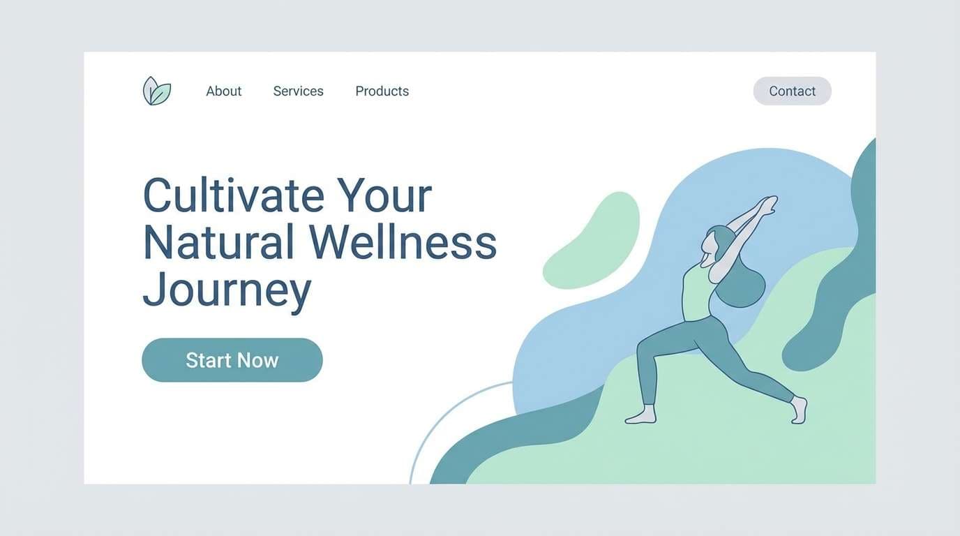
1) Seaside Mint Haze
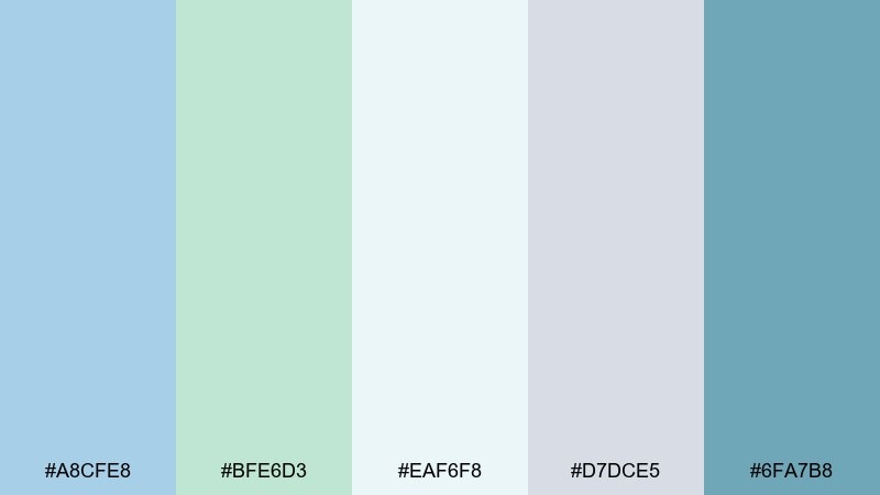
HEX: #A8CFE8 #BFE6D3 #EAF6F8 #D7DCE5 #6FA7B8
Mood: airy, coastal, calm
Best for: wellness brand landing page UI
Airy and coastal like sea glass in morning fog, these tones feel instantly calm and breathable. Use the pale blue and mint as your main surfaces, then bring in the deeper teal for buttons and links. It works beautifully for wellness, skincare, and meditation brands where trust matters. Pair with lots of white space and thin line icons for a clean, modern finish.
Image example of seaside mint haze generated using media.io
Media.io is an online AI studio for creating and editing video, image, and audio in your browser.

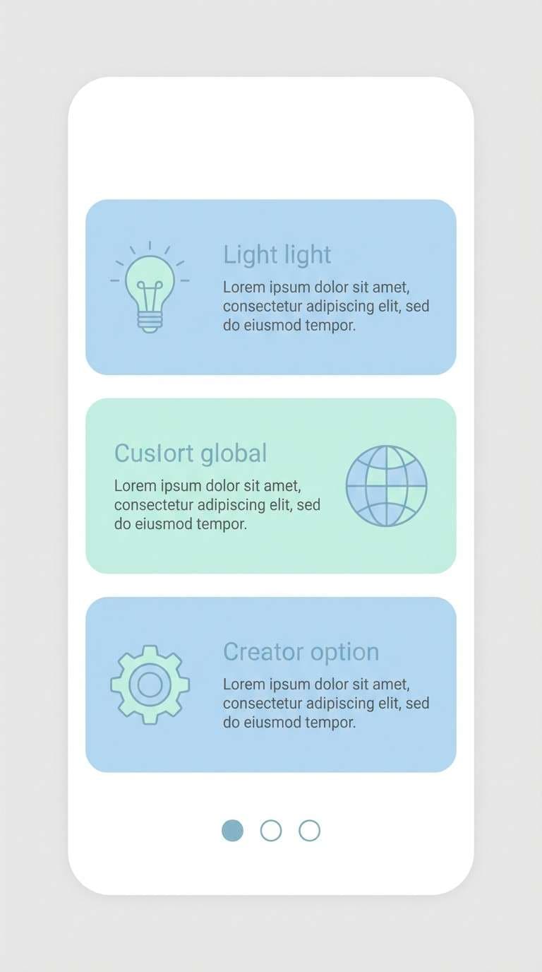
2) Cloudy Lagoon
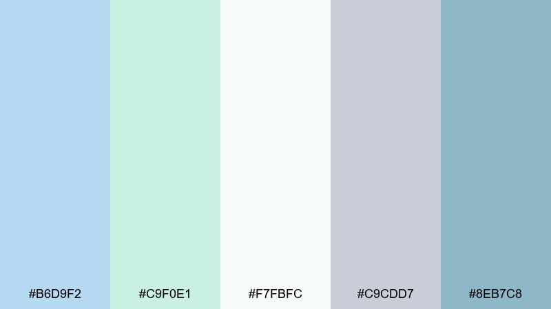
HEX: #B6D9F2 #C9F0E1 #F7FBFC #C9CDD7 #8EB7C8
Mood: dreamy, light, friendly
Best for: mobile app onboarding screens
Dreamy and light like clouds over a quiet lagoon, this set keeps everything approachable. Let the soft blue carry backgrounds, while the mint supports cards and highlights without looking loud. It is a strong fit for onboarding, habit trackers, and kids-safe apps where comfort beats contrast. Add the gray-lilac as a text and divider color to keep typography readable.
Image example of cloudy lagoon generated using media.io
3) Powder Blue Garden
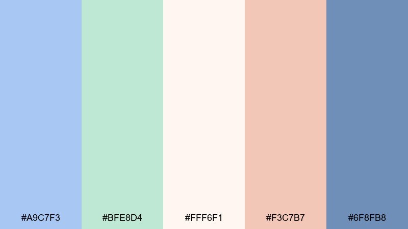
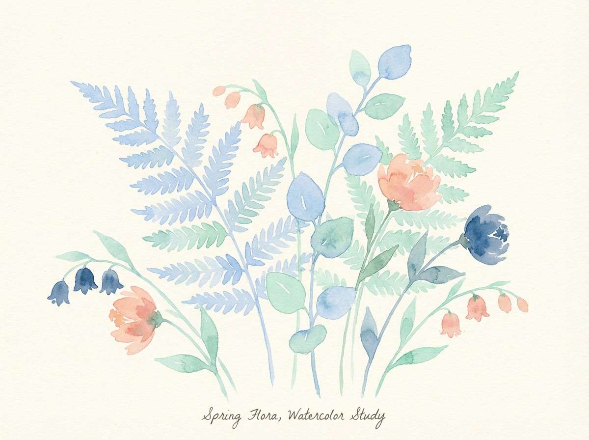
HEX: #A9C7F3 #BFE8D4 #FFF6F1 #F3C7B7 #6F8FB8
Mood: fresh, springy, romantic
Best for: watercolor botanical illustration
Fresh and springy like petals after rain, these hues feel soft yet alive. The warm blush and cream keep the cool notes from turning icy, creating blue pastel green color combinations that suit seasonal launches. Use the deeper slate-blue sparingly for stems, outlines, and type. For a cohesive look, repeat the mint in leaf clusters and reserve the peach for focal blooms.
Image example of powder blue garden generated using media.io
4) Ice Matcha Minimal
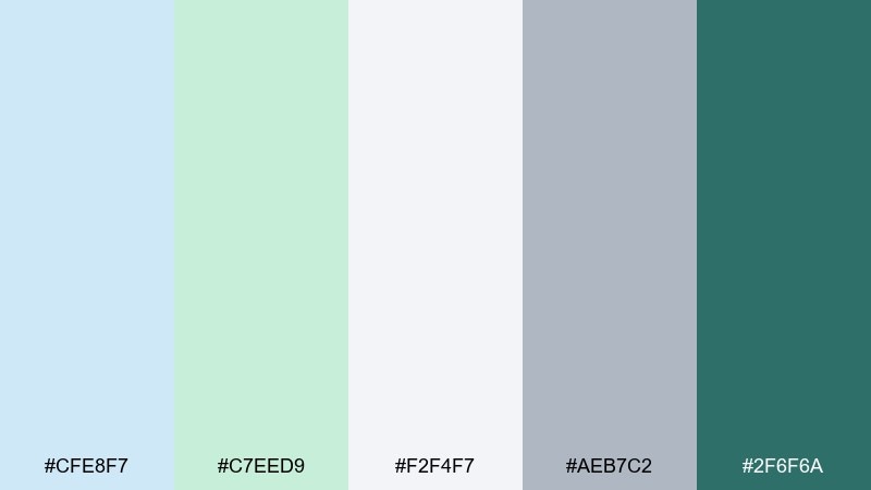
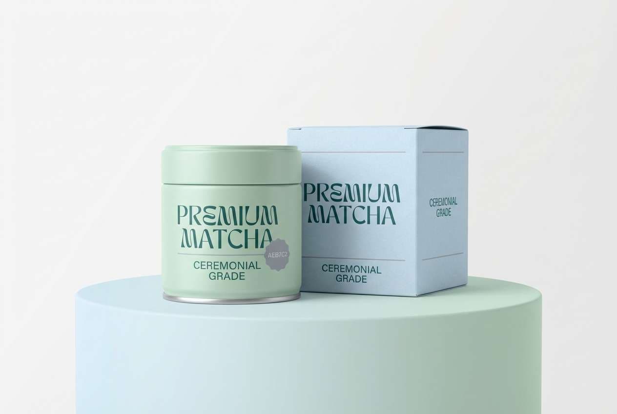
HEX: #CFE8F7 #C7EED9 #F2F4F7 #AEB7C2 #2F6F6A
Mood: clean, modern, refreshing
Best for: matcha product packaging
Clean and refreshing like iced matcha on a bright counter, this palette leans modern and minimal. Put the pale tones on the main label and let the dark teal handle logos, nutrition facts, and barcodes. It is ideal for health foods, supplements, and eco-friendly goods that need a premium feel without black-heavy designs. Keep finishes matte and use one high-contrast spot color area for legibility.
Image example of ice matcha minimal generated using media.io
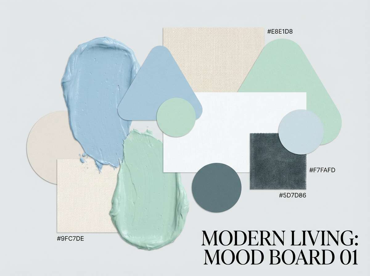
5) Harbor Glass
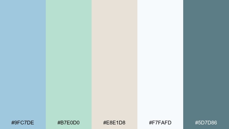
HEX: #9FC7DE #B7E0D0 #E8E1D8 #F7FAFD #5D7D86
Mood: tranquil, sophisticated, balanced
Best for: interior design mood board
Tranquil and sophisticated like harbor water against weathered stone, these tones feel balanced and grown-up. Use the warm greige as a grounding neutral, then layer blue and soft green in textiles and accent decor. It fits coastal interiors, boutique hotels, and calm home office styling. A helpful tip is to repeat the deep slate as hardware or frame color to keep the room from feeling too airy.
Image example of harbor glass generated using media.io
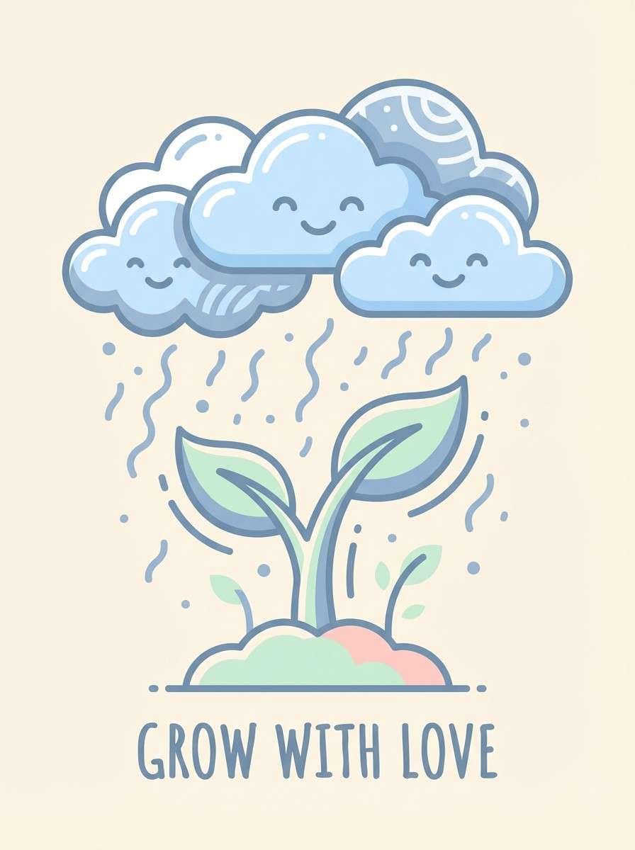
6) Baby Sprout Sky
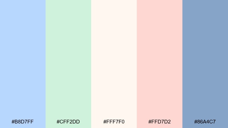
HEX: #B8D7FF #CFF2DD #FFF7F0 #FFD7D2 #86A4C7
Mood: gentle, playful, comforting
Best for: nursery wall art poster
Gentle and playful like a baby blanket under a bright window, these colors read comforting and safe. The creamy base keeps everything soft, while the blush adds a sweet accent without going loud. It is perfect for nursery posters, milestone cards, and baby shower keepsakes. Use the muted periwinkle for outlines and lettering so the design stays readable from across the room.
Image example of baby sprout sky generated using media.io
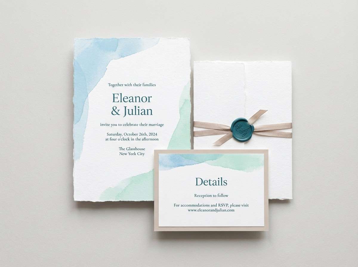
7) Oceanfoam Stationery
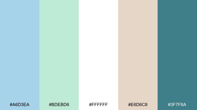
HEX: #A6D3EA #BDEBD6 #FFFFFF #E6D6C8 #3F7F8A
Mood: serene, elegant, celebratory
Best for: wedding invitation suite
Serene and elegant like ocean foam drifting onto sand, this set feels celebratory without being flashy. Use the white as breathing room, then bring in the mint for borders and the sky-blue for headers. It works well for beach weddings, garden ceremonies, and modern minimalist invites. Print tip: lean on the darker teal for names and dates to preserve crisp contrast.
Image example of oceanfoam stationery generated using media.io
8) Frosted Eucalyptus
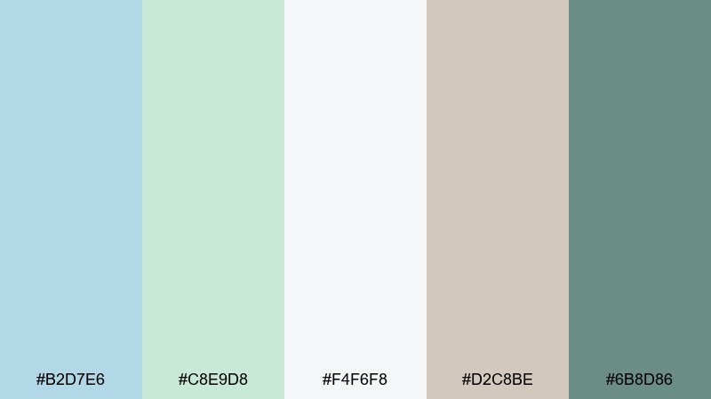
HEX: #B2D7E6 #C8E9D8 #F4F6F8 #D2C8BE #6B8D86
Mood: spa-like, muted, restful
Best for: spa menu flyer
Spa-like and muted like frosted eucalyptus leaves, this mix feels instantly restful. Use the pale blue for section blocks, the soft green for pricing highlights, and the dusty sage for headings. It suits massage menus, yoga studios, and boutique salons that want a calm, premium tone. Keep imagery minimal and use plenty of line spacing so the flyer stays airy.
Image example of frosted eucalyptus generated using media.io

9) Retro Poolside Pop
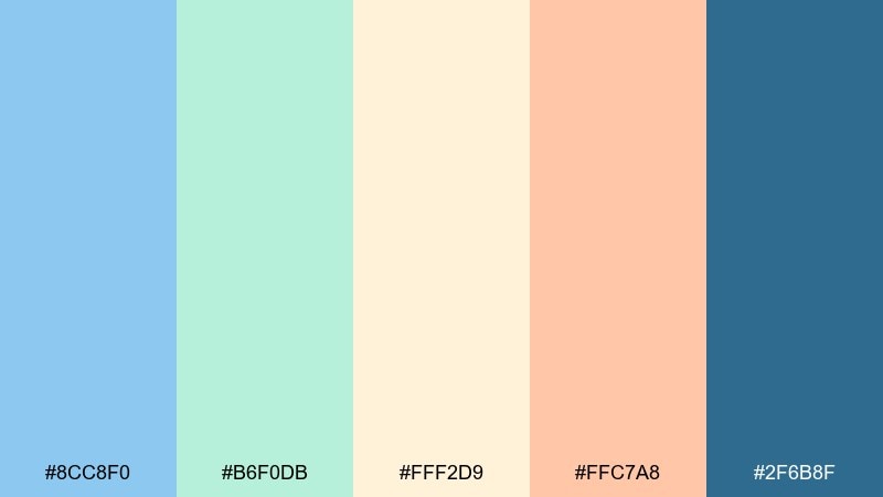
HEX: #8CC8F0 #B6F0DB #FFF2D9 #FFC7A8 #2F6B8F
Mood: sunny, retro, upbeat
Best for: social media promo post
Sunny and retro like a poolside postcard, these hues feel upbeat and summery. The peach and cream warm up the cool tones, creating a blue pastel green color combination that stands out without turning neon. Use the deep blue for bold pricing or short headlines, and keep secondary text on cream blocks for clarity. For best results, limit gradients and lean into simple shapes and thick borders.
Image example of retro poolside pop generated using media.io

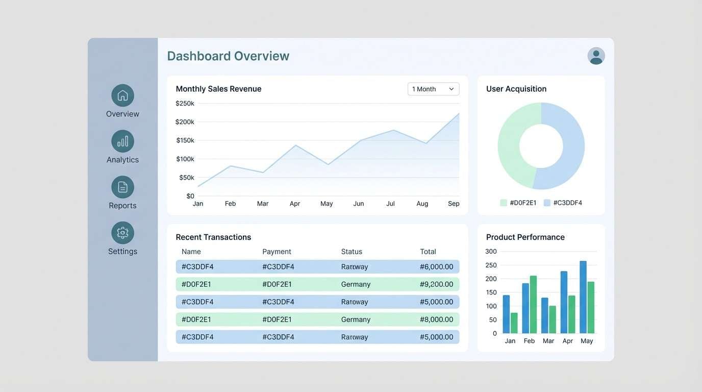
10) Arctic Aloe UI
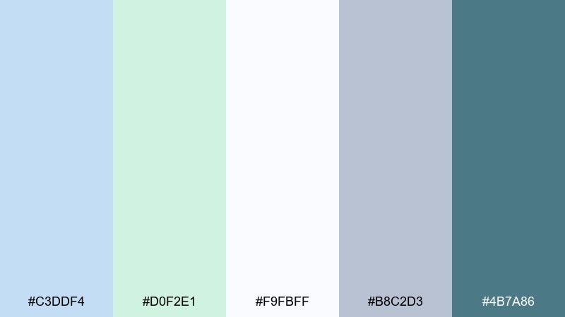
HEX: #C3DDF4 #D0F2E1 #F9FBFF #B8C2D3 #4B7A86
Mood: cool, organized, dependable
Best for: analytics dashboard UI
Cool and organized like an arctic breeze, these tones feel dependable and professional. Use the off-white for the main canvas, then reserve blue and mint for charts, active states, and tags. It is a smart choice for dashboards, admin panels, and SaaS reports that need calm focus. Tip: use the steel gray for gridlines and secondary labels to avoid visual noise.
Image example of arctic aloe ui generated using media.io
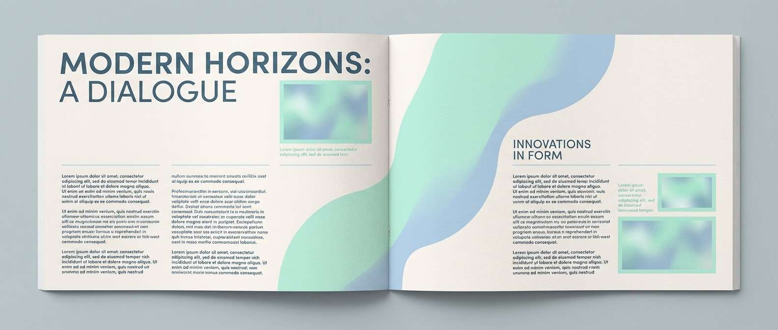
11) Misty Canal Editorial
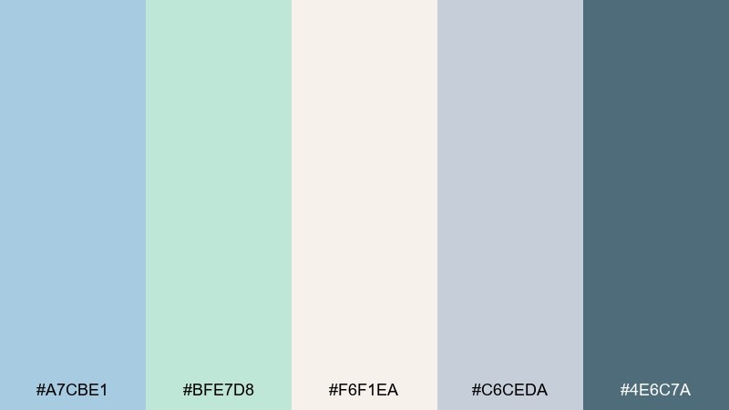
HEX: #A7CBE1 #BFE7D8 #F6F1EA #C6CEDA #4E6C7A
Mood: quiet, cultured, editorial
Best for: magazine spread layout
Quiet and cultured like a misty canal morning, these tones feel editorial and refined. The warm paper-like neutral makes long reads comfortable, while blue and mint add gentle section contrast. It is ideal for travel features, lifestyle zines, and lookbooks that need a soft mood. Keep photography cool-toned and use the deep slate for pull quotes and page numbers.
Image example of misty canal editorial generated using media.io
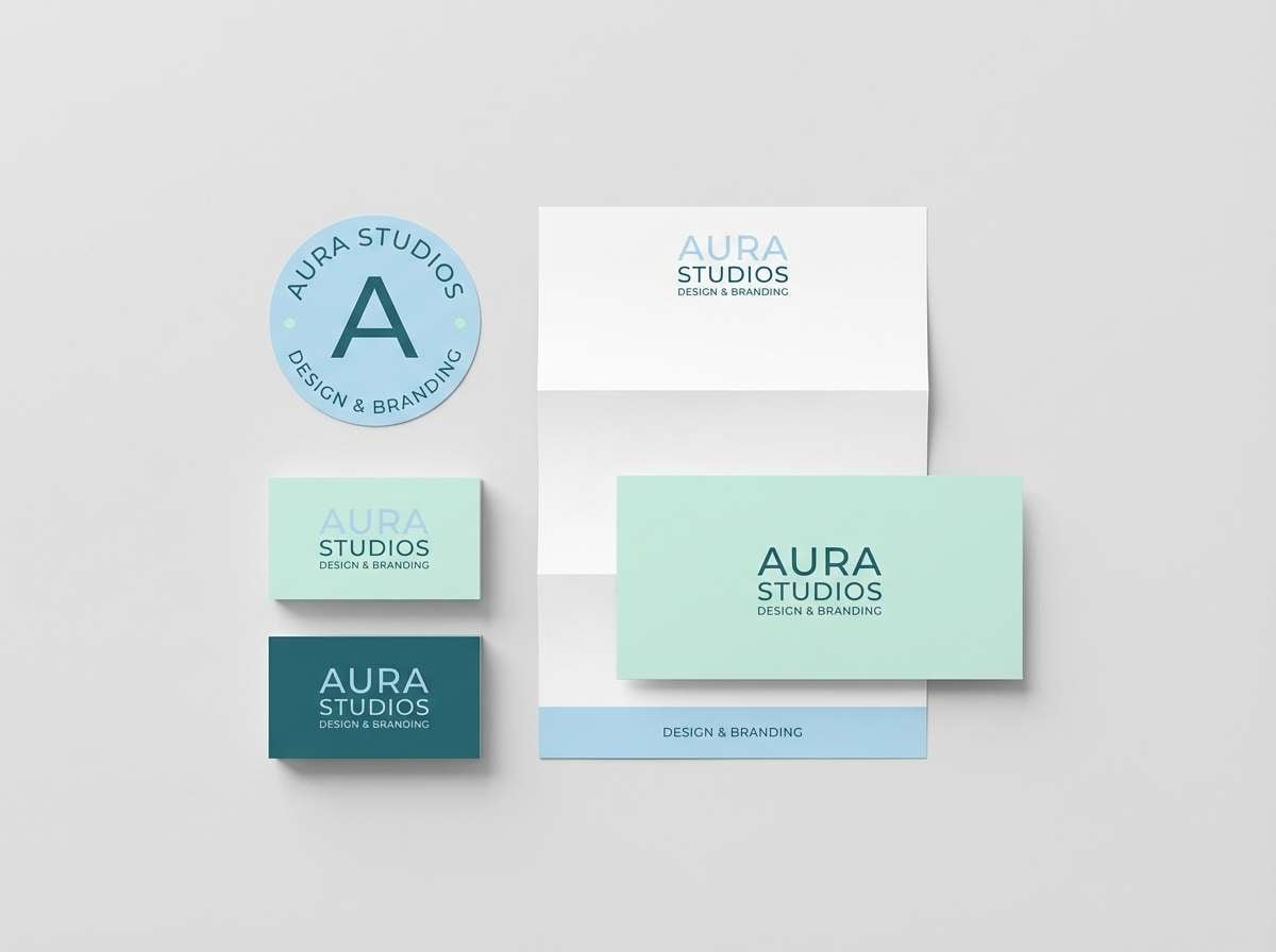
12) Quiet Teal Morning
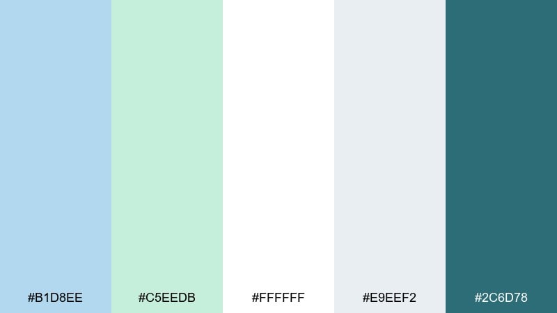
HEX: #B1D8EE #C5EEDB #FFFFFF #E9EEF2 #2C6D78
Mood: calm, trustworthy, modern
Best for: brand identity kit
Calm and trustworthy like a quiet morning by the window, these shades feel modern and clear. The light blue and mint make a polished foundation, while the deep teal adds instant authority for logos and taglines. This blue pastel green color palette is a strong match for health tech, coaching, and clean finance brands. Usage tip: keep the dark teal to one or two core elements so the identity stays light.
Image example of quiet teal morning generated using media.io
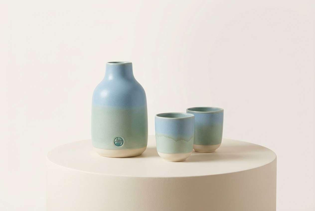
13) Dewdrop Ceramic
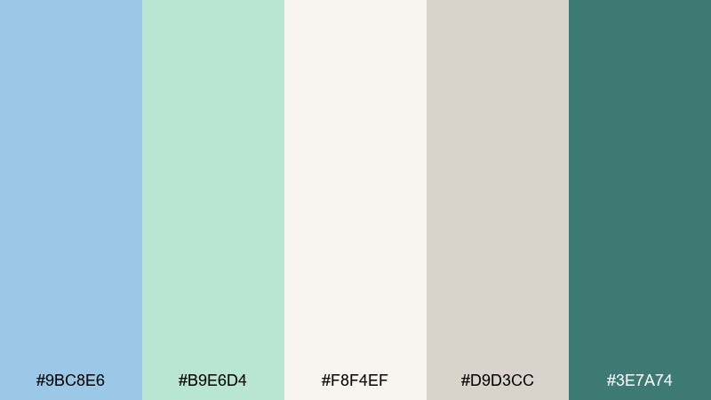
HEX: #9BC8E6 #B9E6D4 #F8F4EF #D9D3CC #3E7A74
Mood: handcrafted, soft, artisanal
Best for: ceramic product ad
Handcrafted and soft like dewdrops on glazed pottery, these colors feel artisanal and warm. Let the creamy neutral dominate the background so the blue and mint read like gentle material tints. It works well for home goods ads, small-batch ceramics, and maker branding. Add the darker teal as a small stamp mark or headline to create a premium focal point.
Image example of dewdrop ceramic generated using media.io
14) Coastal Sage Neutrals
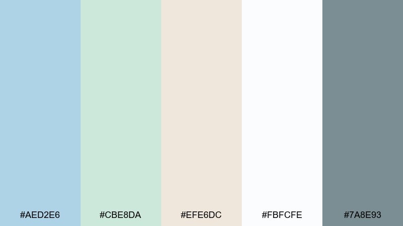
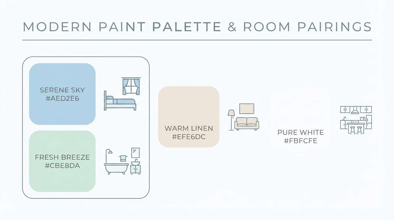
HEX: #AED2E6 #CBE8DA #EFE6DC #FBFCFE #7A8E93
Mood: natural, grounded, breezy
Best for: paint swatch infographic
Natural and grounded like driftwood and sage on a breezy shore, these tones feel easy to live with. The mix reads as a blue pastel green color scheme that stays soft even when used in larger blocks. It is great for paint swatch posts, renovation guides, and interior infographics where clarity matters. Tip: use the warm beige for titles and margins so the cool hues do not feel sterile.
Image example of coastal sage neutrals generated using media.io
15) Glacier Pear Gradient
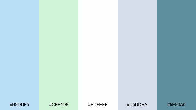
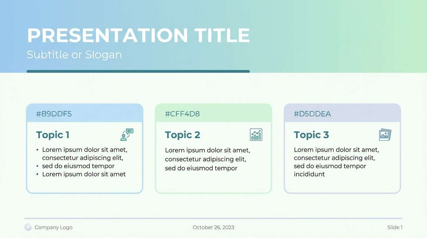
HEX: #B9DDF5 #CFF4D8 #FDFEFF #D5DDEA #5E90A0
Mood: bright, optimistic, tech-clean
Best for: presentation slide template
Bright and optimistic like sun on a glacier, these hues feel tech-clean without being cold. Use the pale blue as the hero gradient base and the mint for callouts, tags, and key metrics. It is ideal for pitch decks, product updates, and keynote templates that need a fresh tone. Keep charts simple and rely on the deeper teal for axis labels and emphasis.
Image example of glacier pear gradient generated using media.io
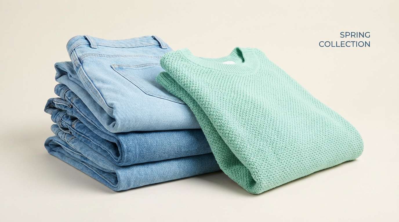
16) Minted Denim Basics
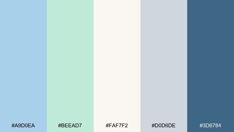
HEX: #A9D0EA #BEEAD7 #FAF7F2 #D0D6DE #3D6784
Mood: casual, crisp, everyday
Best for: fashion e-commerce banner
Casual and crisp like denim with a fresh mint tee, these tones feel everyday and wearable. The creamy neutral keeps product details clean, while the deeper blue anchors CTAs and pricing. It works for seasonal fashion drops, capsule wardrobes, and minimalist streetwear shops. Use mint sparingly as a highlight so the banner still feels timeless, not overly sweet.
Image example of minted denim basics generated using media.io
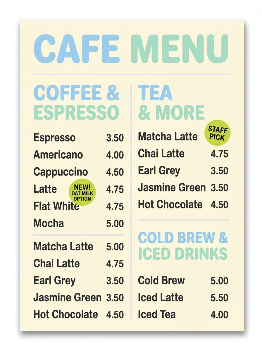
17) Lagoon Lemon Accent
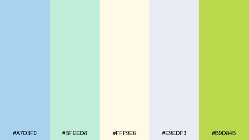
HEX: #A7D3F0 #BFEED8 #FFF9E6 #E9EDF3 #B9D84B
Mood: zesty, fresh, friendly
Best for: cafe menu board design
Zesty and fresh like citrus in sparkling water, this mix feels friendly and bright. The lemony accent adds punch to the softer blues and greens, making blue pastel green color combinations that work well for specials and highlights. Use the pale cream for the menu background, then place the lime on prices or badges to guide the eye. Keep body text in a dark neutral for readability while the accent does the attention work.
Image example of lagoon lemon accent generated using media.io
18) Blueberry Matcha Bento
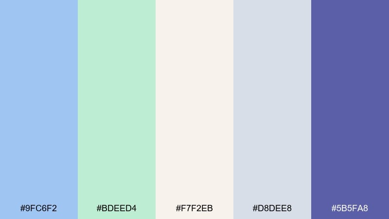
HEX: #9FC6F2 #BDEED4 #F7F2EB #D8DEE8 #5B5FA8
Mood: cute, clean, contemporary
Best for: food packaging label design
Cute and clean like a neatly packed bento, this set feels contemporary and playful. The blueberry-purple adds a smart twist that keeps the pastels from feeling too nursery-like. It is great for snack labels, meal prep brands, and café takeaway packaging. Use the purple for flavor names and the mint for nutrition highlights to create clear hierarchy.
Image example of blueberry matcha bento generated using media.io
19) Rainwashed Fern
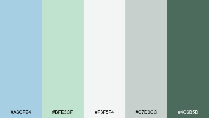
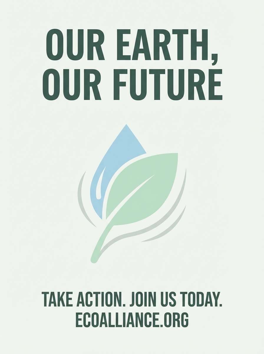
HEX: #A6CFE4 #BFE3CF #F3F5F4 #C7D0CC #4C6B5D
Mood: earthy, hopeful, calm
Best for: eco nonprofit poster
Earthy and hopeful like ferns after a rain shower, these tones feel calm with purpose. Use the soft gray-white as the base, then bring in mint for sections and the deep forest tone for headlines. It is a strong fit for sustainability campaigns, community cleanups, and educational posters. Keep imagery simple and high-contrast so the message stays clear at a distance.
Image example of rainwashed fern generated using media.io
20) Snowy Seafoam Icons
HEX: #BDE0F6 #CCF2E3 #FFFFFF #DDE4EE #5B7C8A
Mood: light, tidy, friendly
Best for: icon set for UI
Light and tidy like fresh snow with a seafoam tint, this palette keeps UI elements friendly. Use the pale blue and mint as soft background tiles, then draw icon strokes in the muted slate for contrast. It is ideal for onboarding icon sets, settings menus, and feature grids. Tip: keep stroke weight consistent and avoid heavy shadows so the set stays crisp.
Image example of snowy seafoam icons generated using media.io

What Colors Go Well with Blue Pastel Green?
Neutrals are the easiest match: crisp white, soft ivory, and light greige keep blue pastel green looking fresh instead of “babyish.” For text and UI outlines, pick a muted slate or deep teal rather than pure black to maintain the soft vibe.
Warm accents add balance. Blush, peach, sand, and warm cream make the cool tones feel welcoming—great for invitations, lifestyle branding, and interior palettes.
If you want more energy, use a single punchy accent in small doses: lemon-lime, coral, or a berry-purple. One high-contrast color can handle badges, prices, or key CTAs without overpowering the pastels.
How to Use a Blue Pastel Green Color Palette in Real Designs
Start with roles: use the lightest shade for the main background, the second-lightest for cards/sections, and reserve the deepest teal or slate for primary buttons and headings. This keeps hierarchy clear while preserving the calm mood.
In branding, aim for restraint—pastels work best when you repeat them consistently. Limit your accent color to one “attention job” (links, CTA, or labels) so the design doesn’t feel scattered.
For print (menus, flyers, invitations), contrast matters more than you expect. Test your typography on the lightest swatches and use the darkest palette color for names, dates, prices, and legal text.
Create Blue Pastel Green Palette Visuals with AI
If you already have HEX codes, you can turn them into on-brand mockups fast by generating visuals with a consistent prompt style (UI, packaging, poster, or editorial). This is especially useful for pitch decks, mood boards, and quick A/B creative testing.
On Media.io, paste a prompt, describe the layout you want, and specify your blue pastel green tones as dominant colors with one darker accent for readability. Keep the background plain if you want clean, reusable assets.
Try generating multiple variations (different ratios, typography styles, or lighting) and keep what matches your brand guidelines best.
Blue Pastel Green Color Palette FAQs
-
What does a blue pastel green palette communicate in branding?
It usually signals calm, cleanliness, and trust. Pastel blue leans reliable and clear, while pastel green adds a natural, gentle “fresh” cue—common in wellness, health, and modern lifestyle brands. -
Which text color works best on pastel blue and pastel green backgrounds?
Use a deep teal, slate, or charcoal rather than pure black for a softer look. If you need maximum accessibility, pick the darkest accent in your palette and test contrast (especially for small UI text). -
How do I keep a pastel palette from looking too childish?
Add a grounded neutral (greige, warm beige, or soft gray) and include one deeper anchor color (teal/slate/forest). Keep saturation low and use clean typography to make it feel more premium. -
What accent colors pair well with blue pastel green?
Warm accents like blush, peach, sand, and cream balance the cool tones. For a bolder twist, use small pops of coral, lemon-lime, or berry-purple for badges, highlights, or CTAs. -
Is blue pastel green a good color scheme for UI design?
Yes—it's comfortable for long sessions and works well for dashboards, onboarding, and wellness apps. Just ensure interactive states (buttons, links, charts) use a darker accent for clear hierarchy. -
Can I use these palettes for interior paint and decor?
Absolutely. Use the lightest colors on walls, bring blue and mint into textiles or accent pieces, and repeat a deeper slate/teal in hardware, frames, or rugs to avoid an overly “washed out” room. -
How can I generate matching images for a specific palette?
Use Media.io’s text-to-image and include your dominant HEX colors plus one darker accent in the prompt. Specify the design type (UI mockup, packaging, invitation, poster) and keep the background plain for cleaner results.


