

Flamingo pink is a modern, high-energy pink that can feel playful, romantic, or even tech-forward depending on what you pair it with.
Below are 20 curated flamingo pink palette combos with HEX codes, plus practical tips for using warm blush tones with neutrals and contrast colors.
In this article
- Why Flamingo Pink Palettes Work So Well
-
- sunset flamingo
- palm beach sorbet
- neon flamingo night
- blush and oat
- flamingo and sage
- rosy terracotta
- cotton candy sky
- ballet studio
- tropical punch
- pearl and champagne
- modern monochrome pink
- flamingo mint gelato
- rose quartz tech
- vintage postcard
- aperol spritz pink
- plum velvet
- desert flamingo
- flamingo and cobalt pop
- cherry blossom minimal
- midnight carnival
- What Colors Go Well with Flamingo Pink?
- How to Use a Flamingo Pink Color Palette in Real Designs
- Create Flamingo Pink Palette Visuals with AI
Why Flamingo Pink Palettes Work So Well
Flamingo pink sits in a sweet spot: it’s bold enough to catch attention, but it can soften into elegant blush when you add pale tints and warm neutrals.
Because it’s naturally warm, it pairs beautifully with creams, oat tones, tan, and chocolate browns for an inviting feel, or with deep plum and near-black for dramatic contrast.
It also plays surprisingly well with cool partners like teal, mint, cobalt, and soft grays—giving you modern, high-clarity palettes that work for UI, branding, and events.
20+ Flamingo Pink Color Palette Ideas (with HEX Codes)
1) Sunset Flamingo
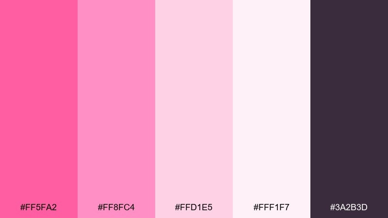
HEX: #FF5FA2 #FF8FC4 #FFD1E5 #FFF1F7 #3A2B3D
Mood: playful, romantic, glossy
Best for: beauty brand social media promo
Playful sunset glamour comes through in bright pinks softened by airy blush and a deep plum base. It works beautifully for makeup launches, TikTok promos, and punchy cover images where you want instant energy. Pair the plum with the lightest tint for readable type, then use the hottest pink as a call to action. Tip: keep backgrounds near #FFF1F7 so product photos stay clean and premium.
Image example of sunset flamingo generated using media.io

Media.io is an online AI studio for creating and editing video, image, and audio in your browser.

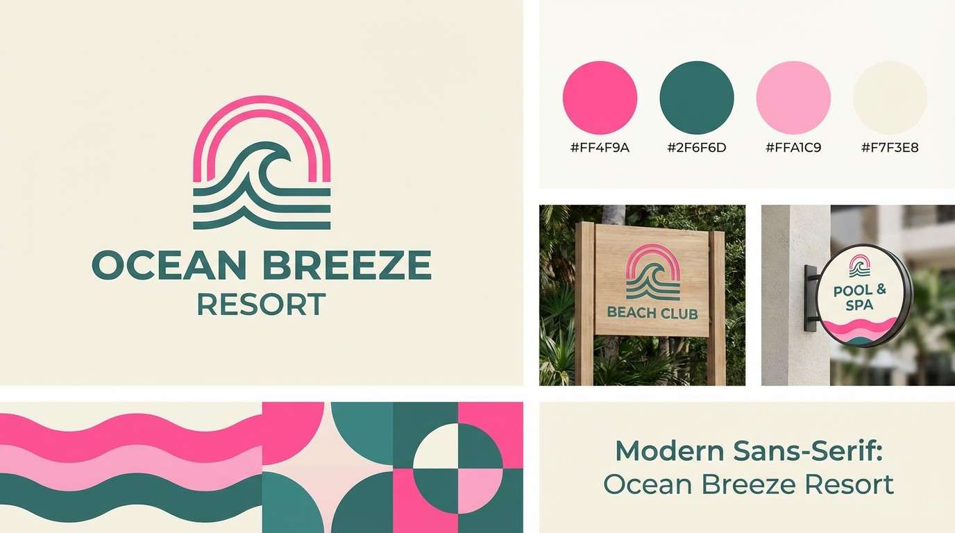
2) Palm Beach Sorbet
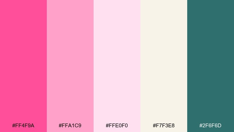
HEX: #FF4F9A #FFA1C9 #FFE0F0 #F7F3E8 #2F6F6D
Mood: breezy, coastal, upbeat
Best for: beach resort branding and signage
Breezy coastal sweetness feels like poolside umbrellas and sorbet in the sun. These flamingo pink color combinations shine in resort logos, wayfinding, and summer campaigns, especially when the teal anchors the layout. Pair #2F6F6D with #F7F3E8 for crisp contrast, then sprinkle #FF4F9A for highlights. Tip: use the light pinks for large areas and reserve the bold pink for directional icons.
Image example of palm beach sorbet generated using media.io
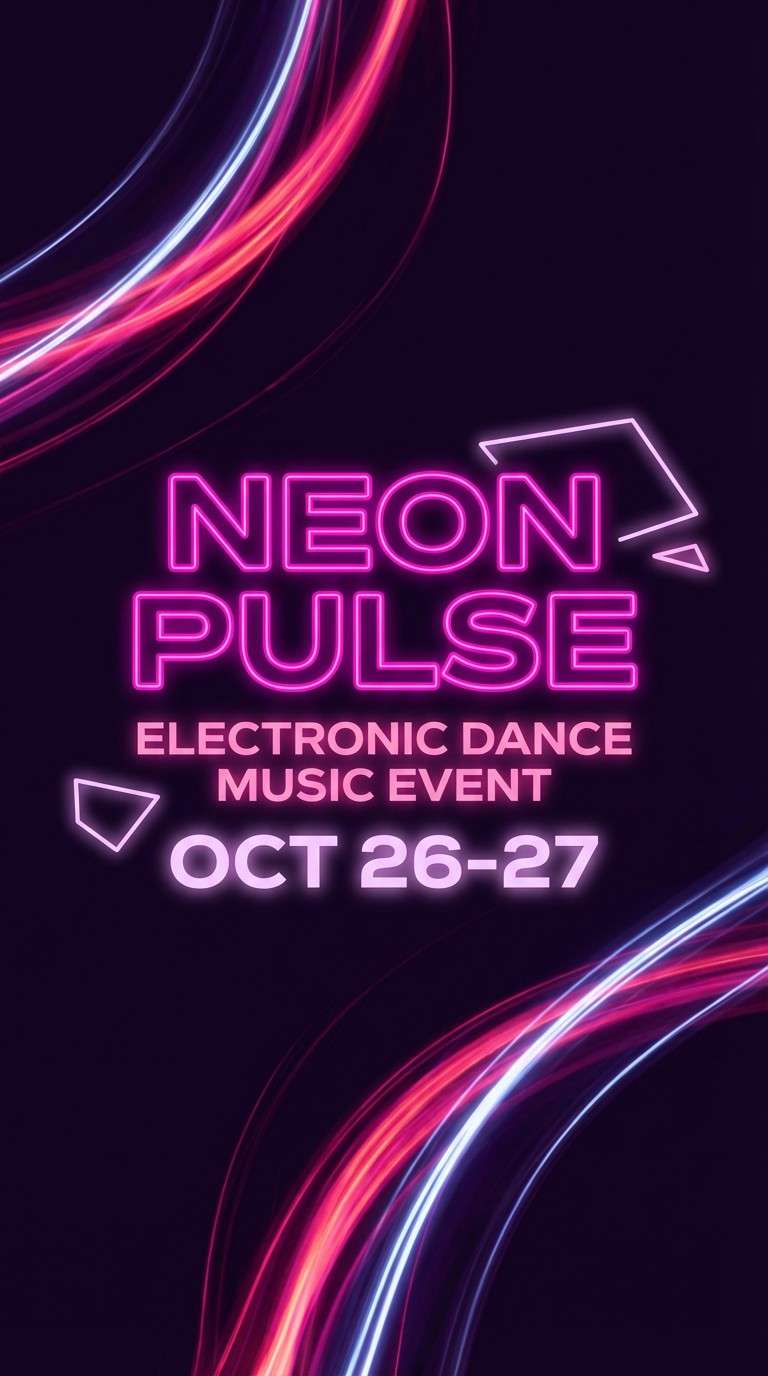
3) Neon Flamingo Night
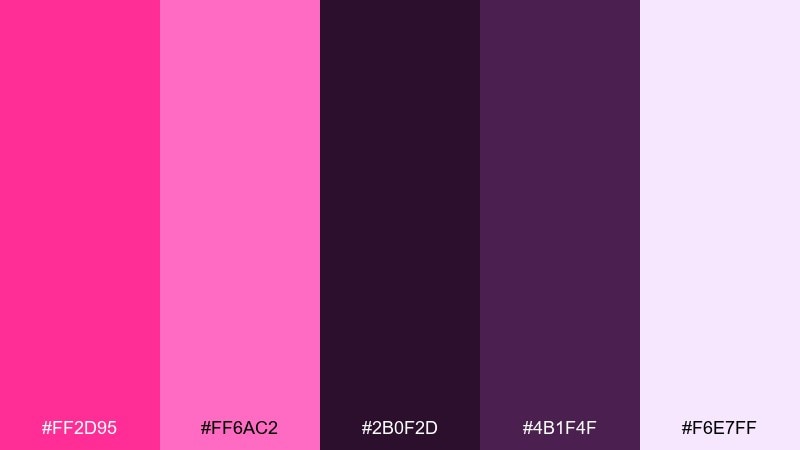
HEX: #FF2D95 #FF6AC2 #2B0F2D #4B1F4F #F6E7FF
Mood: electric, nightlife, bold
Best for: nightclub event poster
Electric nightclub vibes hit fast with neon pinks against inky violet shadows. The dark purples make the brights glow, so it is ideal for DJ lineups, late-night promos, and neon-themed parties. Pair #FF2D95 with #F6E7FF for high-impact headlines, then keep body text on the deep background for legibility. Tip: add subtle gradients between the two pinks to mimic LED light spill.
Image example of neon flamingo night generated using media.io
4) Blush and Oat
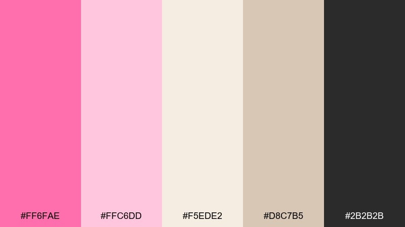
HEX: #FF6FAE #FFC6DD #F5EDE2 #D8C7B5 #2B2B2B
Mood: soft, cozy, minimalist
Best for: wedding invitation suite
Soft blush warmth feels like linen paper, candlelight, and gentle florals. A flamingo pink color palette like this is perfect for modern weddings, bridal showers, and tasteful stationery where elegance matters more than saturation. Pair #2B2B2B type with #F5EDE2 for a calm base, then use #FF6FAE sparingly for monograms or borders. Tip: print with a slightly textured stock so the neutrals look richer.
Image example of blush and oat generated using media.io
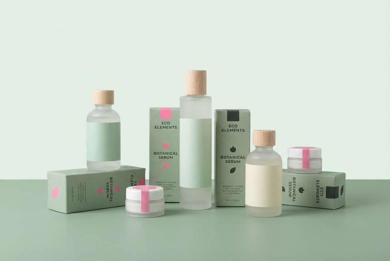
5) Flamingo and Sage
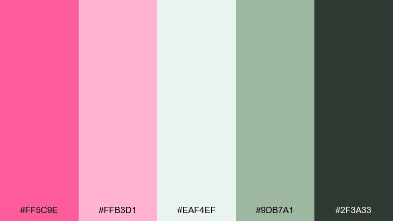
HEX: #FF5C9E #FFB3D1 #EAF4EF #9DB7A1 #2F3A33
Mood: fresh, natural, balanced
Best for: eco skincare packaging
Fresh garden calm comes through with rosy pinks layered over airy greens and soft shadows. It fits eco skincare, wellness packaging, and calm product pages where you want a gentle pop without shouting. Pair the sage tones with cream-like #EAF4EF for labels, then use #FF5C9E for seals or key benefits. Tip: keep finishes matte so the greens stay earthy and the pink reads refined.
Image example of flamingo and sage generated using media.io
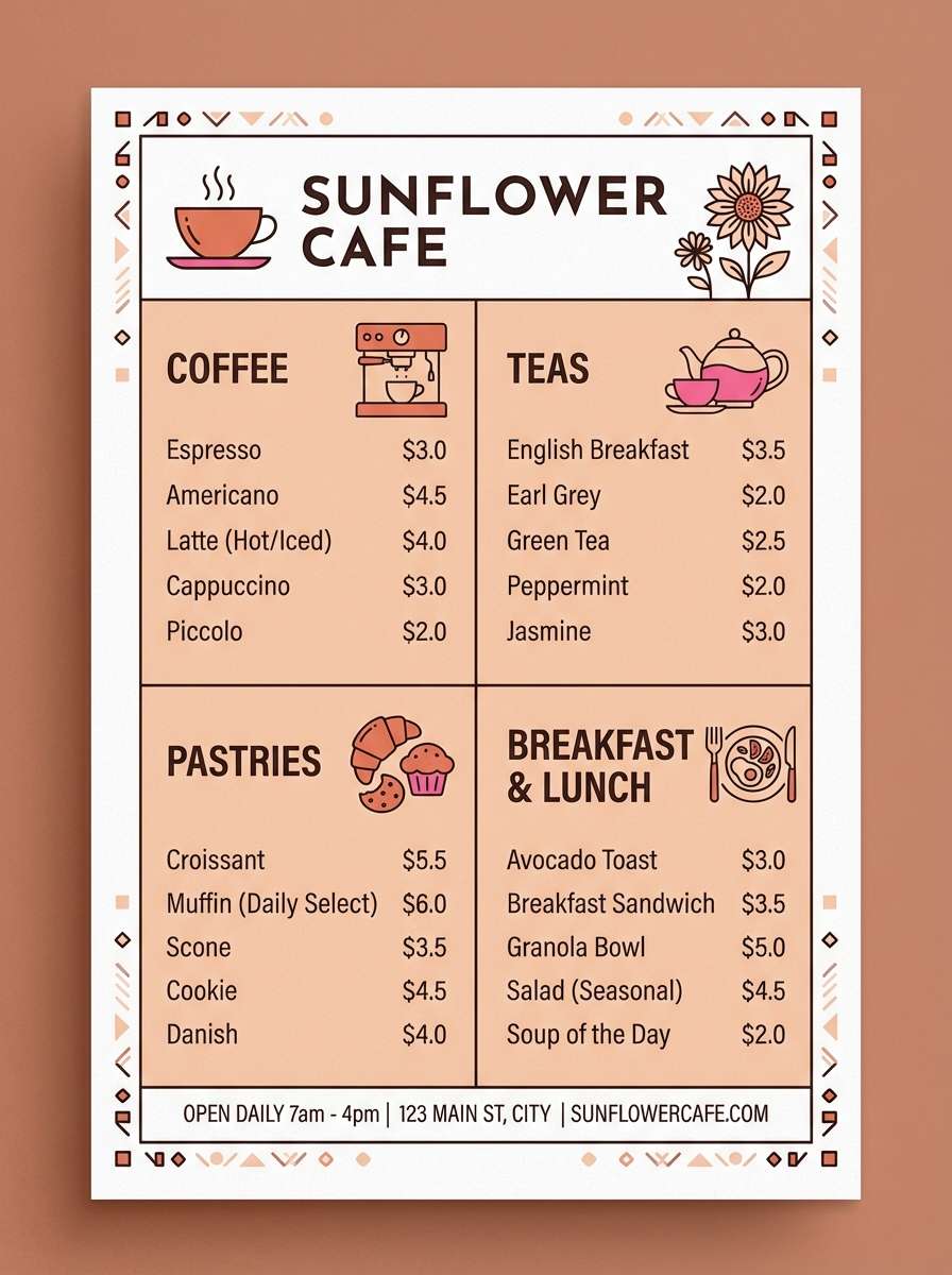
6) Rosy Terracotta
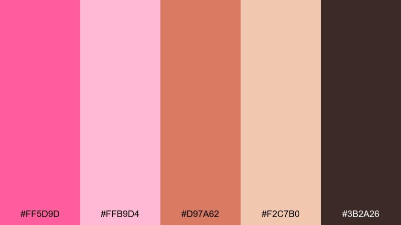
HEX: #FF5D9D #FFB9D4 #D97A62 #F2C7B0 #3B2A26
Mood: warm, artisanal, inviting
Best for: cafe menu design
Warm, handcrafted charm feels like clay cups and sunlit pastries. The terracotta notes ground the pinks, making it great for cafe menus, bakery branding, and seasonal promos. Pair #3B2A26 with #F2C7B0 for readable text blocks, then use #FF5D9D for price tags or special highlights. Tip: limit the bright pink to small accents so the earthy tones stay in control.
Image example of rosy terracotta generated using media.io
7) Cotton Candy Sky
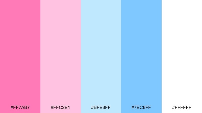
HEX: #FF7AB7 #FFC2E1 #BFE8FF #7EC8FF #FFFFFF
Mood: dreamy, light, optimistic
Best for: kids birthday flyer
Dreamy, airy sweetness evokes a pastel sky and carnival cotton candy. As a flamingo pink color scheme, it is a natural fit for kids flyers, playful promos, and cheerful classroom graphics. Pair the blues with white space for clarity, then use #FF7AB7 on headings to keep everything upbeat. Tip: add rounded shapes and big margins so the pastels do not feel cluttered.
Image example of cotton candy sky generated using media.io

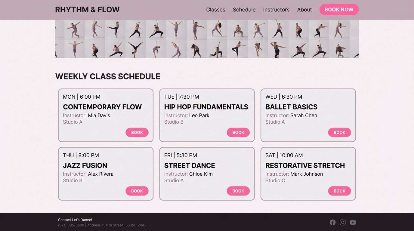
8) Ballet Studio
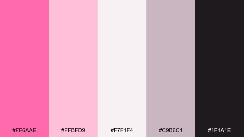
HEX: #FF6AAE #FFBFD9 #F7F1F4 #C9B6C1 #1F1A1E
Mood: graceful, airy, refined
Best for: dance studio website UI
Graceful softness feels like tulle, warm studio lights, and quiet confidence. The muted grays keep the pinks sophisticated, so it works well for booking pages, class schedules, and membership portals. Pair #1F1A1E text over #F7F1F4 for crisp readability, then use #FF6AAE for primary buttons. Tip: keep card backgrounds in the pale range to maintain a lightweight, elegant UI.
Image example of ballet studio generated using media.io
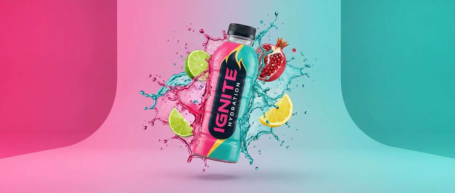
9) Tropical Punch
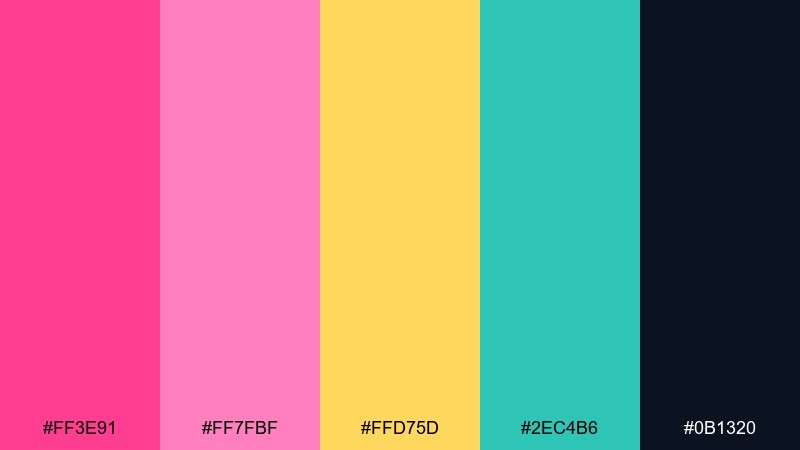
HEX: #FF3E91 #FF7FBF #FFD75D #2EC4B6 #0B1320
Mood: energetic, sunny, sporty
Best for: sports drink product ad
High-energy tropical punch vibes feel like a beach run and a cold sip afterward. The teal and yellow give the pink a sporty edge, making it strong for product ads, email headers, and launch banners. This flamingo pink color combination pops most when #0B1320 is used for bold type and shadows. Tip: keep the yellow for small bursts so it reads like sunlight, not a full background.
Image example of tropical punch generated using media.io
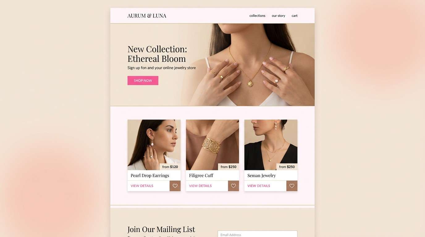
10) Pearl and Champagne
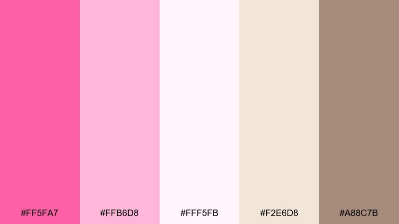
HEX: #FF5FA7 #FFB6D8 #FFF5FB #F2E6D8 #A88C7B
Mood: luxurious, gentle, polished
Best for: jewelry ecommerce landing page
Luxurious softness reads like pearls on satin with a subtle rosy glow. The champagne neutrals keep everything upscale, ideal for jewelry, boutique fashion, and elegant gifting pages. Pair #A88C7B with #FFF5FB for refined text and dividers, then use #FF5FA7 for small interactive accents. Tip: avoid heavy shadows and let the warm neutrals do the work.
Image example of pearl and champagne generated using media.io
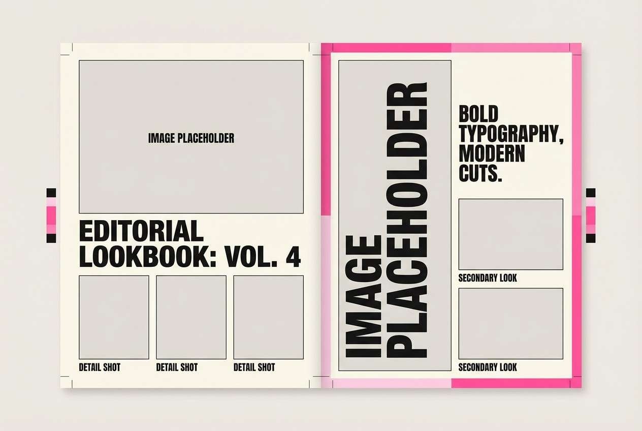
11) Modern Monochrome Pink
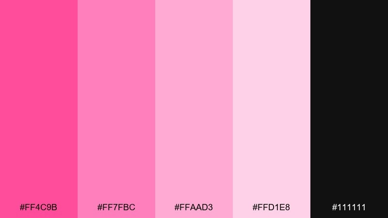
HEX: #FF4C9B #FF7FBC #FFAAD3 #FFD1E8 #111111
Mood: confident, modern, high-contrast
Best for: streetwear brand lookbook
Confident modern edge comes from stacked pink tones punched up by near-black contrast. It is great for streetwear lookbooks, bold hero sections, and editorial-style promos where typography leads. Pair #111111 with the palest pink for clean copy blocks, then use #FF4C9B as the standout accent on tags and buttons. Tip: keep imagery neutral or grayscale so the pink hierarchy stays crisp.
Image example of modern monochrome pink generated using media.io
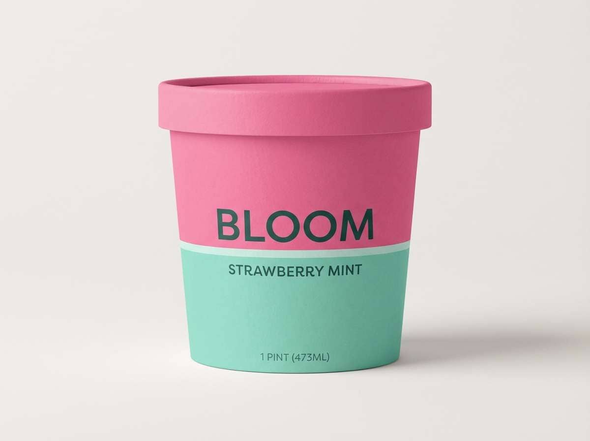
12) Flamingo Mint Gelato
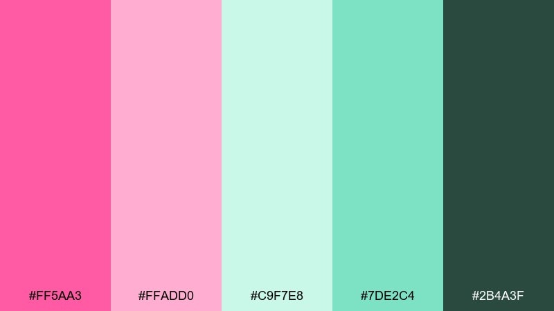
HEX: #FF5AA3 #FFADD0 #C9F7E8 #7DE2C4 #2B4A3F
Mood: refreshing, sweet, modern
Best for: ice cream packaging
Refreshing gelato sweetness feels light, clean, and a little playful. The mint greens cool the pink so it stays modern for food packaging, dessert ads, and cafe signage. Pair #2B4A3F with #C9F7E8 for ingredient panels, then use #FF5AA3 for flavor names. Tip: keep the darkest green only for text so the pack stays airy.
Image example of flamingo mint gelato generated using media.io
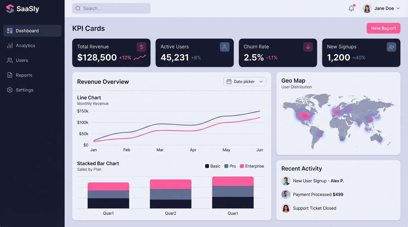
13) Rose Quartz Tech
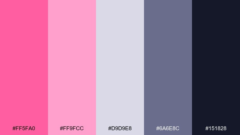
HEX: #FF5FA0 #FF9FCC #D9D9E8 #6A6E8C #151828
Mood: sleek, calm, futuristic
Best for: SaaS dashboard UI
Sleek rose quartz vibes feel futuristic without becoming cold. A flamingo pink color palette like this is ideal for SaaS dashboards, fintech widgets, and analytics views that need warmth and trust. Pair #151828 with #D9D9E8 for structure, then use #FF9FCC for highlights and active states. Tip: reserve #FF5FA0 for one primary action to avoid visual noise in data-heavy screens.
Image example of rose quartz tech generated using media.io
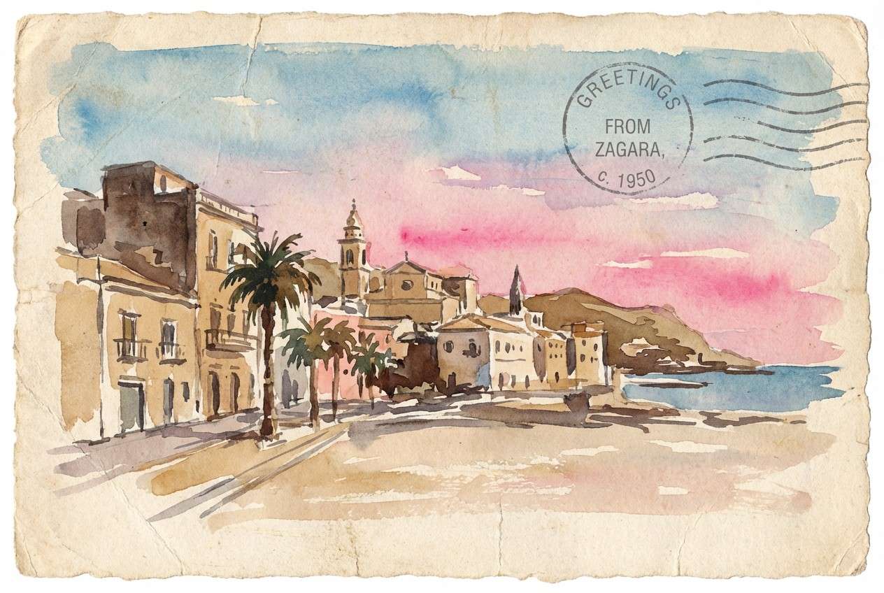
14) Vintage Postcard
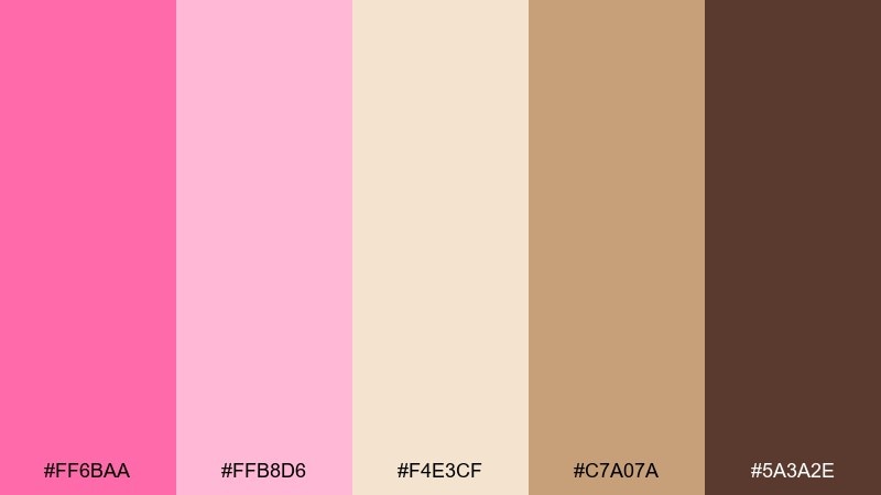
HEX: #FF6BAA #FFB8D6 #F4E3CF #C7A07A #5A3A2E
Mood: nostalgic, warm, travel-inspired
Best for: travel postcard illustration
Nostalgic warmth feels like sun-faded postcards and sandy boardwalks. The tan and brown tones make the pink feel vintage, perfect for travel prints, souvenir branding, and retro-style ads. Pair #F4E3CF as the paper base, then use #C7A07A for borders and stamps. Tip: add grain and slightly off-white backgrounds so the palette looks authentically aged.
Image example of vintage postcard generated using media.io
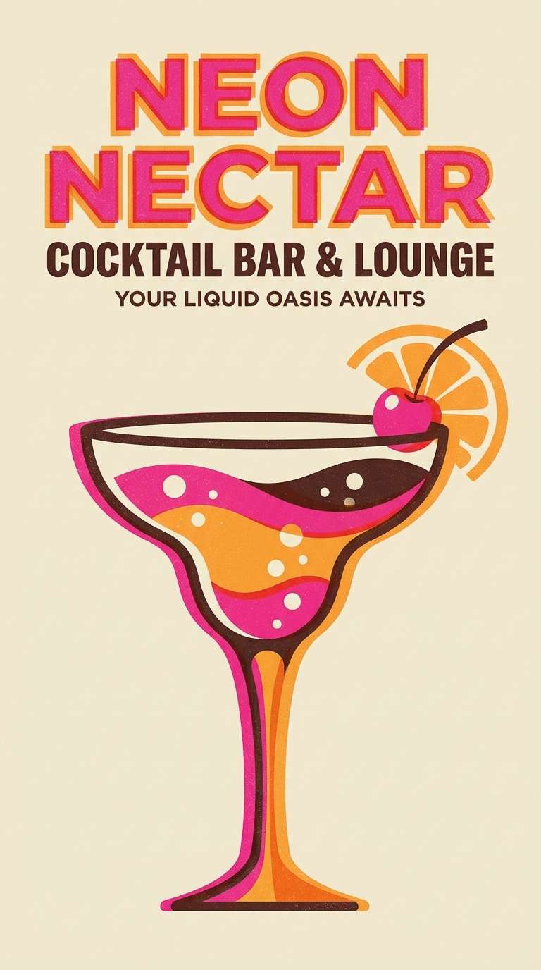
15) Aperol Spritz Pink
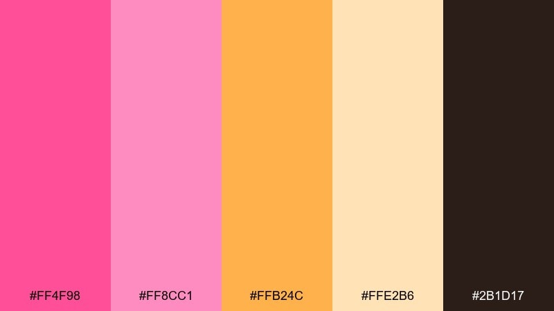
HEX: #FF4F98 #FF8CC1 #FFB24C #FFE2B6 #2B1D17
Mood: summery, zesty, celebratory
Best for: summer cocktail bar poster
Summery zest feels like citrus slices, bubbly spritz, and golden-hour patios. These flamingo pink color combinations sing on bar posters, happy-hour menus, and event promos where warmth sells the vibe. Pair #2B1D17 with #FFE2B6 for readable details, then let #FF4F98 and #FFB24C drive the headline energy. Tip: use the orange as a secondary accent so the pink still owns the spotlight.
Image example of aperol spritz pink generated using media.io
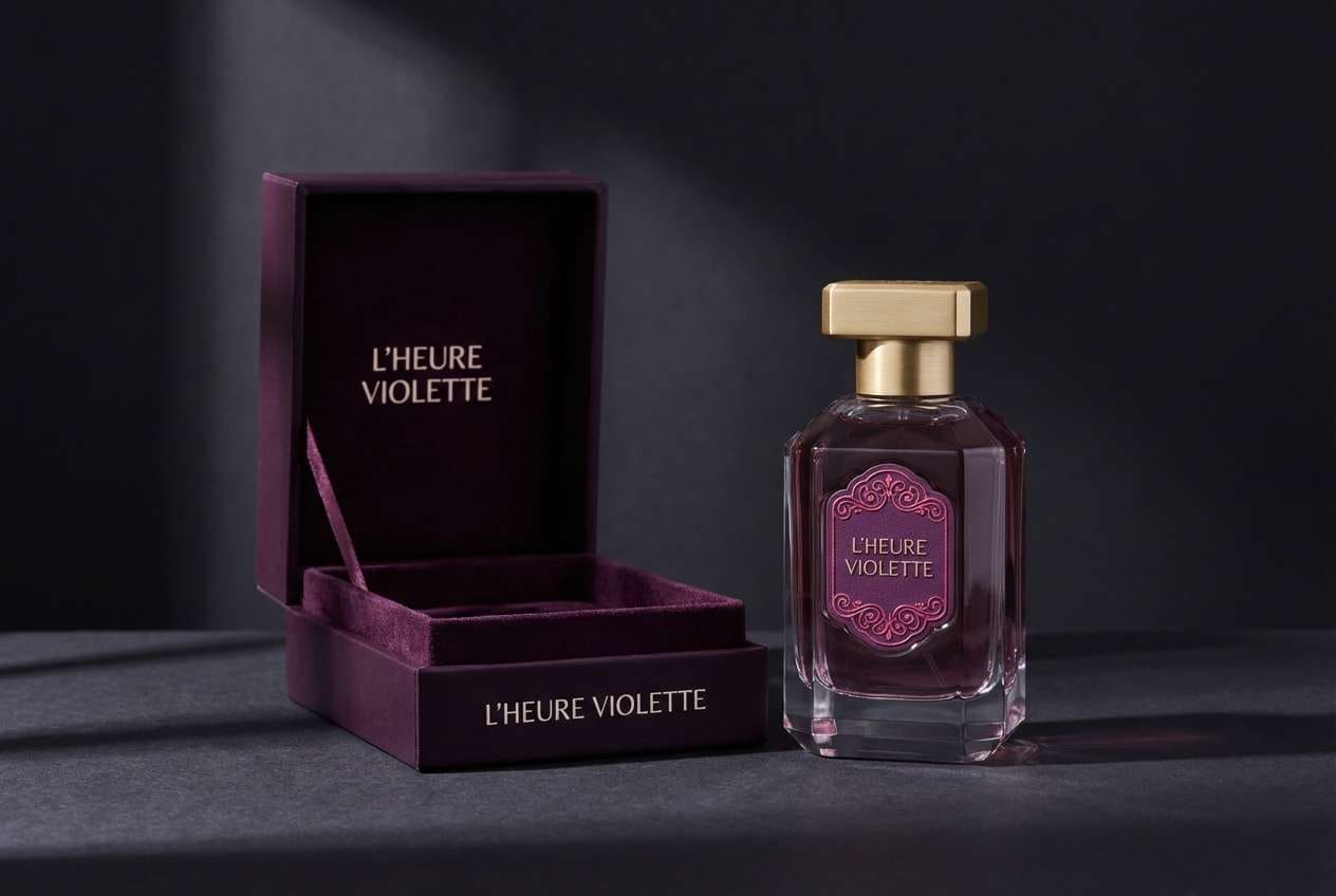
16) Plum Velvet
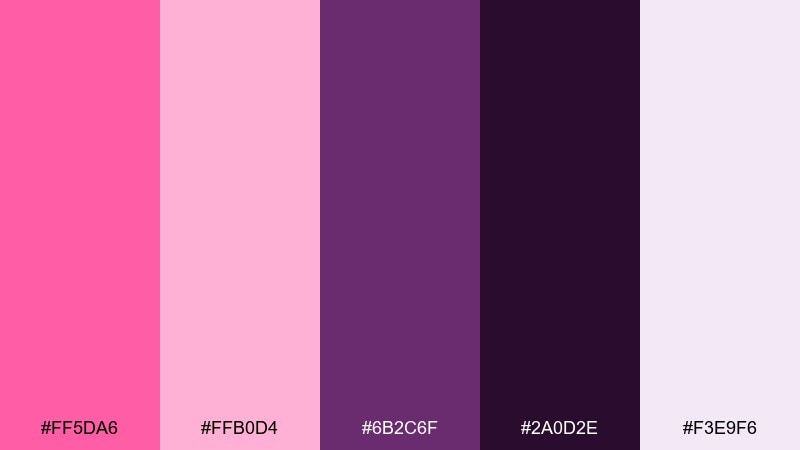
HEX: #FF5DA6 #FFB0D4 #6B2C6F #2A0D2E #F3E9F6
Mood: dramatic, luxe, romantic
Best for: luxury perfume packaging
Dramatic velvet romance feels rich, nighttime, and a little mysterious. The deep purples elevate the pink into a luxury lane, great for perfume, candles, and premium gift boxes. Pair #2A0D2E with #F3E9F6 for elegant contrast, then add #FF5DA6 as a small foil-like accent. Tip: use embossing or spot varnish on the darkest tone for a high-end finish.
Image example of plum velvet generated using media.io
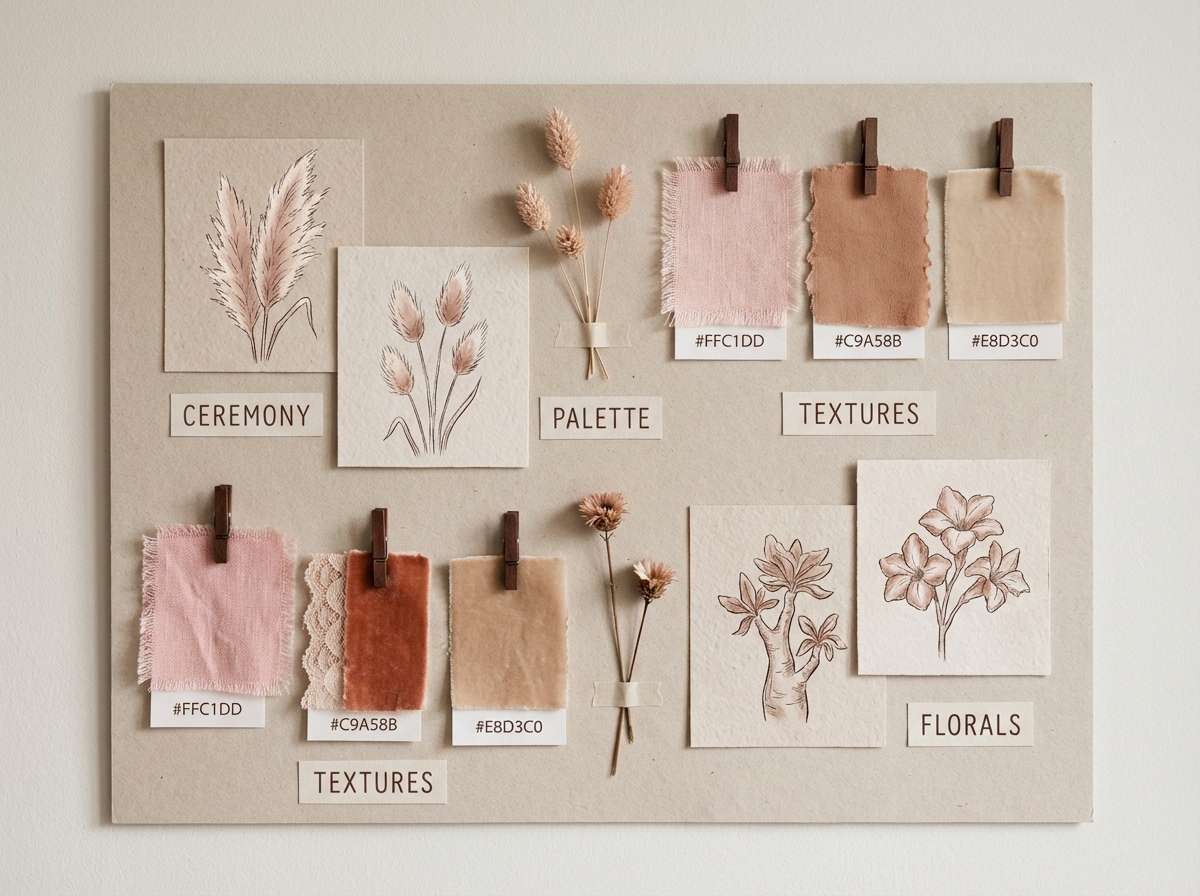
17) Desert Flamingo

HEX: #FF6AAA #FFC1DD #E8D3C0 #C9A58B #3D2E25
Mood: earthy, soft, boho
Best for: boho wedding mood board
Earthy softness feels like desert sunsets, dried florals, and warm sand. The browns and tans mute the pink into a boho-friendly direction for mood boards, wedding styling, and lifestyle branding. Pair #E8D3C0 with #3D2E25 for text and frames, then use #FF6AAA as a floral accent. Tip: mix matte textures and organic shapes to keep the palette grounded.
Image example of desert flamingo generated using media.io
18) Flamingo and Cobalt Pop
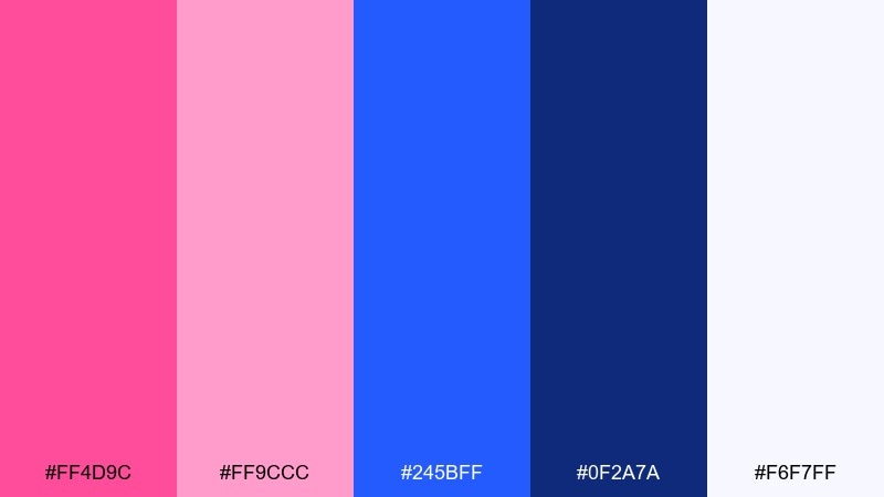
HEX: #FF4D9C #FF9CCC #245BFF #0F2A7A #F6F7FF
Mood: bold, energetic, modern
Best for: tech conference hero banner
Bold pop contrast feels like stage lights and crisp keynote slides. A flamingo pink color combination with cobalt brings instant tech energy to hero banners, speaker promos, and sponsor panels. Pair #0F2A7A with #F6F7FF for legible body copy, then alternate #FF4D9C and #245BFF for buttons and badges. Tip: keep gradients subtle so the pairing stays sharp and modern.
Image example of flamingo and cobalt pop generated using media.io

19) Cherry Blossom Minimal
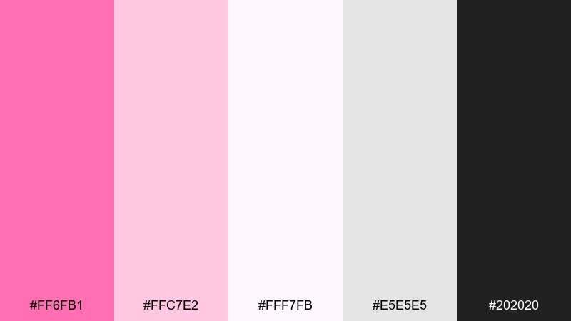
HEX: #FF6FB1 #FFC7E2 #FFF7FB #E5E5E5 #202020
Mood: clean, delicate, modern
Best for: minimal app onboarding UI
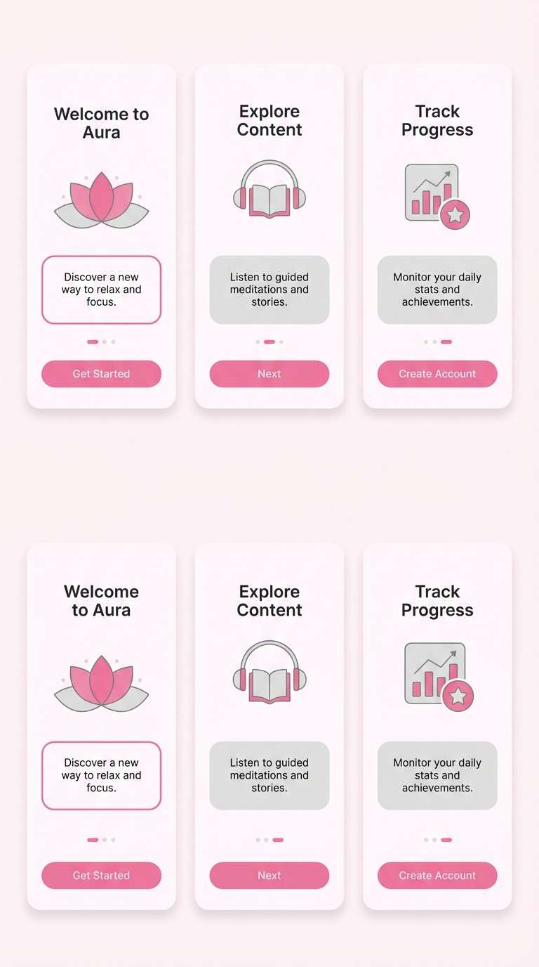
Clean cherry-blossom softness feels quiet, friendly, and airy. A flamingo pink color palette in this minimal range is perfect for onboarding screens, wellness apps, and modern templates where white space does the heavy lifting. Pair #202020 with #FFF7FB for ultra-readable copy, then use #FF6FB1 for the single primary button. Tip: keep illustrations line-based so the light grays and pinks remain the focus.
Image example of cherry blossom minimal generated using media.io
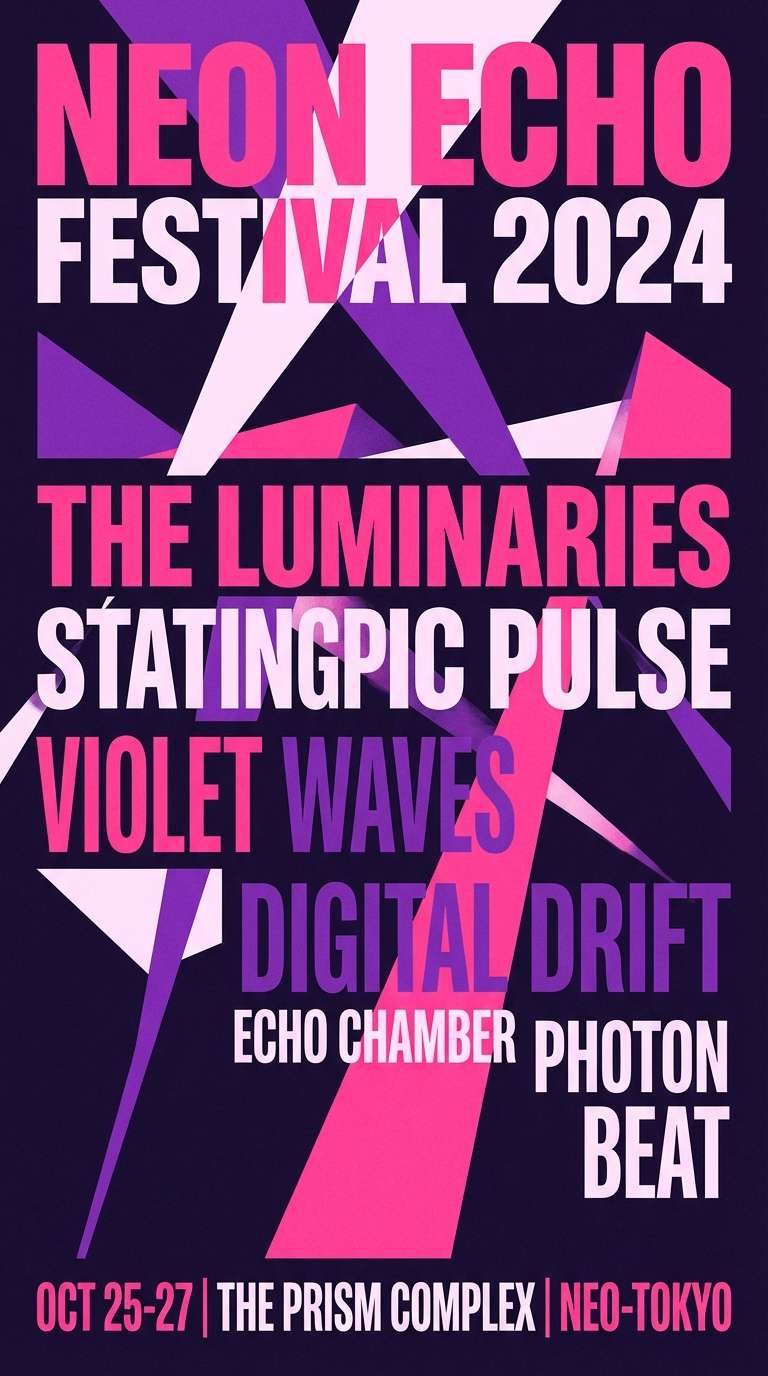
20) Midnight Carnival
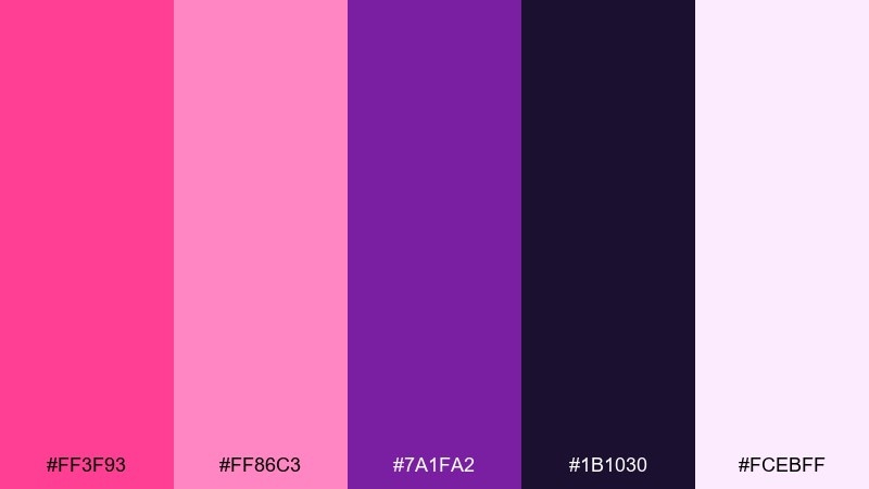
HEX: #FF3F93 #FF86C3 #7A1FA2 #1B1030 #FCEBFF
Mood: festive, dramatic, electric
Best for: music festival poster
Festive midnight drama feels like carnival lights, fog machines, and a packed crowd. The purple shadows let the pinks glow, making it ideal for festival posters, tour dates, and merch drops. Pair #FCEBFF for small text blocks and schedule details, then keep headlines in #FF3F93 for maximum punch. Tip: use the violet as a framing color so the layout feels intentional, not chaotic.
Image example of midnight carnival generated using media.io
What Colors Go Well with Flamingo Pink?
Flamingo pink looks instantly polished with warm neutrals like ivory, oat, champagne, tan, and cocoa because they keep the brightness feeling intentional rather than loud.
For contrast, pair it with deep tones like near-black, plum, or midnight violet to make the pink glow—especially in posters, hero sections, and bold CTA-driven layouts.
For a fresh modern vibe, try cool partners like teal, mint, sage, powder blue, or cobalt. These hues balance the warmth of pink and help interfaces and brand systems feel crisp.
How to Use a Flamingo Pink Color Palette in Real Designs
Start by deciding the role of flamingo pink: primary brand color, accent color, or CTA-only color. Most layouts stay cleaner when the brightest pink is used in small, high-impact areas.
Build hierarchy with tints. Use pale blush for backgrounds, mid pinks for cards or tags, and reserve the hottest pink for buttons, icons, or pricing highlights.
Always test readability. Dark text on blush backgrounds is usually safest, while white text works best on deep plum, violet, or near-black anchors rather than on bright pink.
Create Flamingo Pink Palette Visuals with AI
If you already have HEX codes, you can turn them into real design-ready visuals by generating posters, brand boards, UI mockups, and product scenes that match your palette.
With Media.io, you can paste a prompt, specify dominant colors, and iterate quickly until the layout and lighting feel right for your brand, event, or interface.
Use one palette per concept draft, then A/B test variations by swapping only the accent color (for example, teal vs. cobalt) to keep comparisons fair.
Flamingo Pink Color Palette FAQs
-
What is a flamingo pink color palette?
A flamingo pink color palette is a set of coordinated colors built around bright, warm pink tones (often paired with blush tints, neutrals, and one contrasting anchor color) to create consistent branding or UI. -
Is flamingo pink better as a primary or accent color?
It depends on the mood. For minimalist brands and UI, flamingo pink usually works best as an accent or CTA color. For beauty, fashion, and event posters, it can be a primary color when balanced with light blush backgrounds or deep anchors. -
What neutral colors match flamingo pink?
Warm whites, ivory, oat, champagne, beige, and soft gray match flamingo pink especially well. These neutrals reduce visual noise and make the pink feel more premium. -
What are high-contrast pairings for flamingo pink?
Near-black, deep plum, midnight purple, and navy create strong contrast and make flamingo pink appear brighter. These combinations are great for headlines, posters, and bold hero sections. -
What cool colors balance flamingo pink in UI design?
Teal, mint, sage, powder blue, and cobalt are reliable cool partners. They balance flamingo pink’s warmth and help dashboards, onboarding screens, and product pages look modern and structured. -
How do I keep flamingo pink from feeling too loud?
Use pale blush or off-white for large backgrounds, add one dark anchor for typography, and reserve the brightest pink for small emphasis areas like buttons, badges, or icons. -
Can I generate flamingo pink palette visuals with AI?
Yes. Include your HEX codes (or “dominant colors”) in the prompt, specify the layout type (poster, UI, packaging), and iterate by changing only one variable at a time to keep results consistent.
Next: Awesome Color Palette


