

Blue magenta is a high-energy pairing that blends the trust and clarity of blue with magenta’s expressive punch. It’s a go-to for modern interfaces, bold branding, and vibrant print where you want instant attention without losing structure.
Below are 24 blue and magenta color palette ideas with HEX codes, plus practical guidance for contrast, hierarchy, and real-world use across UI, marketing, and packaging.
In this article
- Why Blue and Magenta Combinations Work So Well
-
- neon nightfall
- orchid city lights
- berry aurora
- cosmic gradient
- velvet arcade
- sapphire fuchsia minimal
- midnight punch
- lilac byte
- electric bloom
- hologram wave
- royal pop editorial
- twilight cosmetics
- candy tech ui
- deep space bouquet
- plum neon signage
- ocean orchid calm
- magenta blueprint
- festival poster mix
- ink and petal
- sunset nebula
- violet transit
- prism romance
- quantum pop
- night orchid gradient
- What Colors Go Well with Blue Magenta?
- How to Use a Blue and Magenta Combination in Real Designs
- Create Blue and Magenta Palette Visuals with AI
Why Blue and Magenta Combinations Work So Well
Blue and magenta sit in a sweet spot between logic and emotion: blue signals stability and clarity, while magenta delivers excitement and personality. Together, they create a dynamic contrast that reads as modern and intentional.
This combo also supports strong hierarchy. You can let blue handle primary structure (navigation, headings, key surfaces) and reserve magenta for moments that must stand out (CTAs, alerts, highlights) without overloading the layout.
Because the pairing naturally suggests gradients (blue → violet → magenta), it’s ideal for hero sections, posters, and packaging where smooth transitions add depth and premium polish.
20+ Blue and Magenta Color Palette Ideas (with HEX Codes)
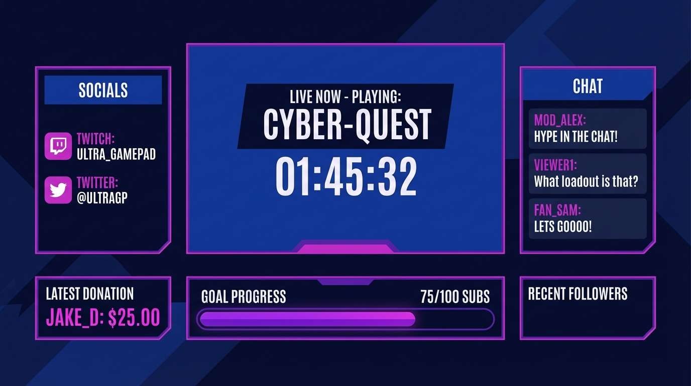
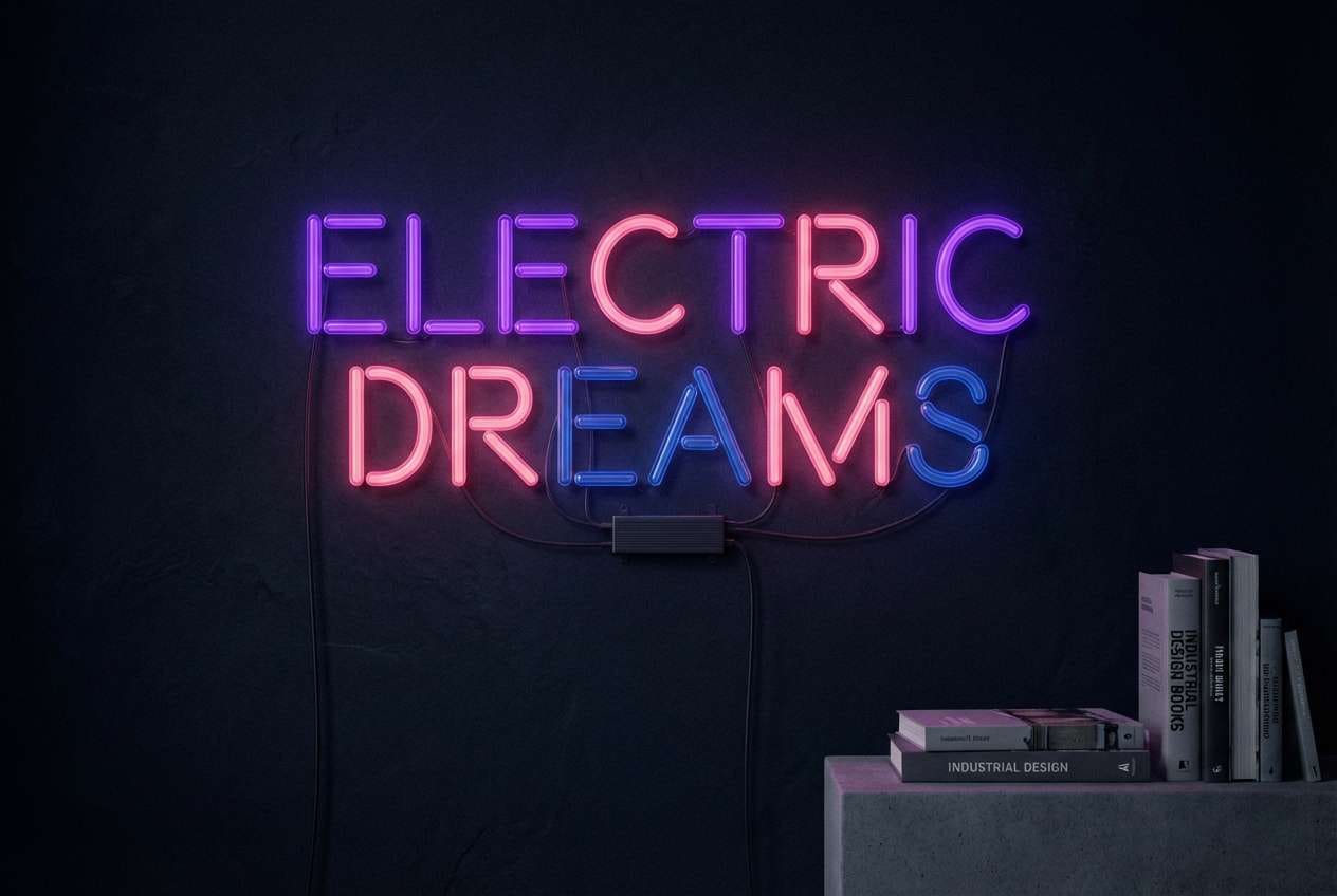
1) Neon Nightfall
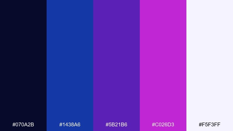
HEX: #070A2B #1438A6 #5B21B6 #C026D3 #F5F3FF
Mood: electric, nocturnal, high-contrast
Best for: gaming stream overlay UI
Electric and nocturnal, this blue and magenta combination feels like neon signage glowing against a midnight sky. The deep navy anchors the brighter violet and magenta so the accents stay punchy instead of chaotic. Use it for stream overlays, esports banners, and bold UI states, then add soft off-white for readable text. Tip: reserve magenta for calls to action and alerts to keep visual hierarchy clear.
Image example of neon nightfall generated using media.io
Media.io is an online AI studio for creating and editing video, image, and audio in your browser.

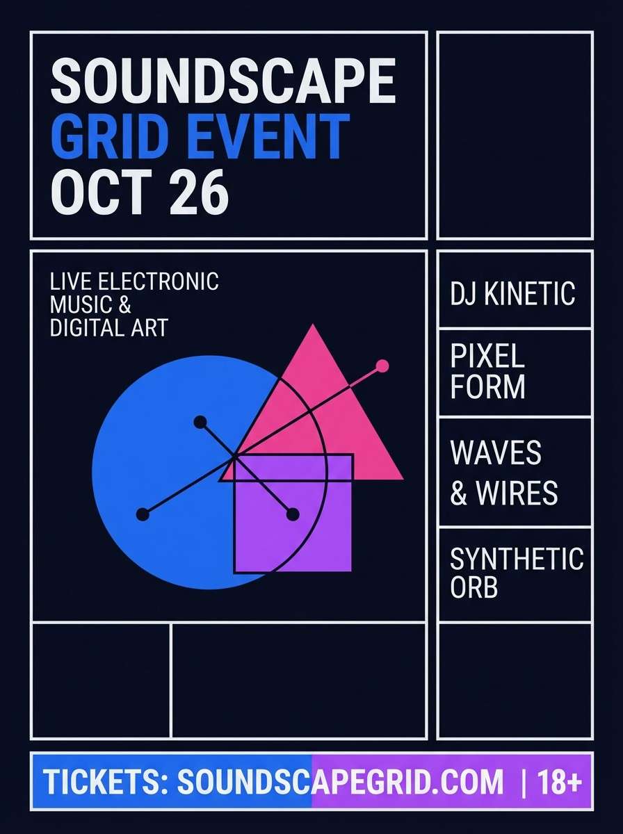
2) Orchid City Lights
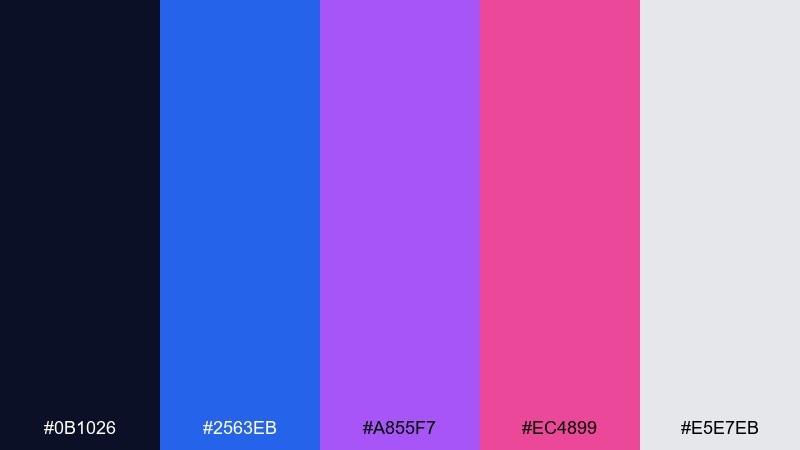
HEX: #0B1026 #2563EB #A855F7 #EC4899 #E5E7EB
Mood: urban, glossy, energetic
Best for: music event poster
Urban and glossy, this blue and magenta color palette evokes city lights reflecting on wet pavement. Bright blue and orchid create a lively rhythm, while soft gray keeps the typography and grids from feeling too loud. It shines on posters, social promos, and nightlife flyers with chunky type and geometric shapes. Tip: set the background to near-black and use gray for body copy to avoid halation around the neon hues.
Image example of orchid city lights generated using media.io
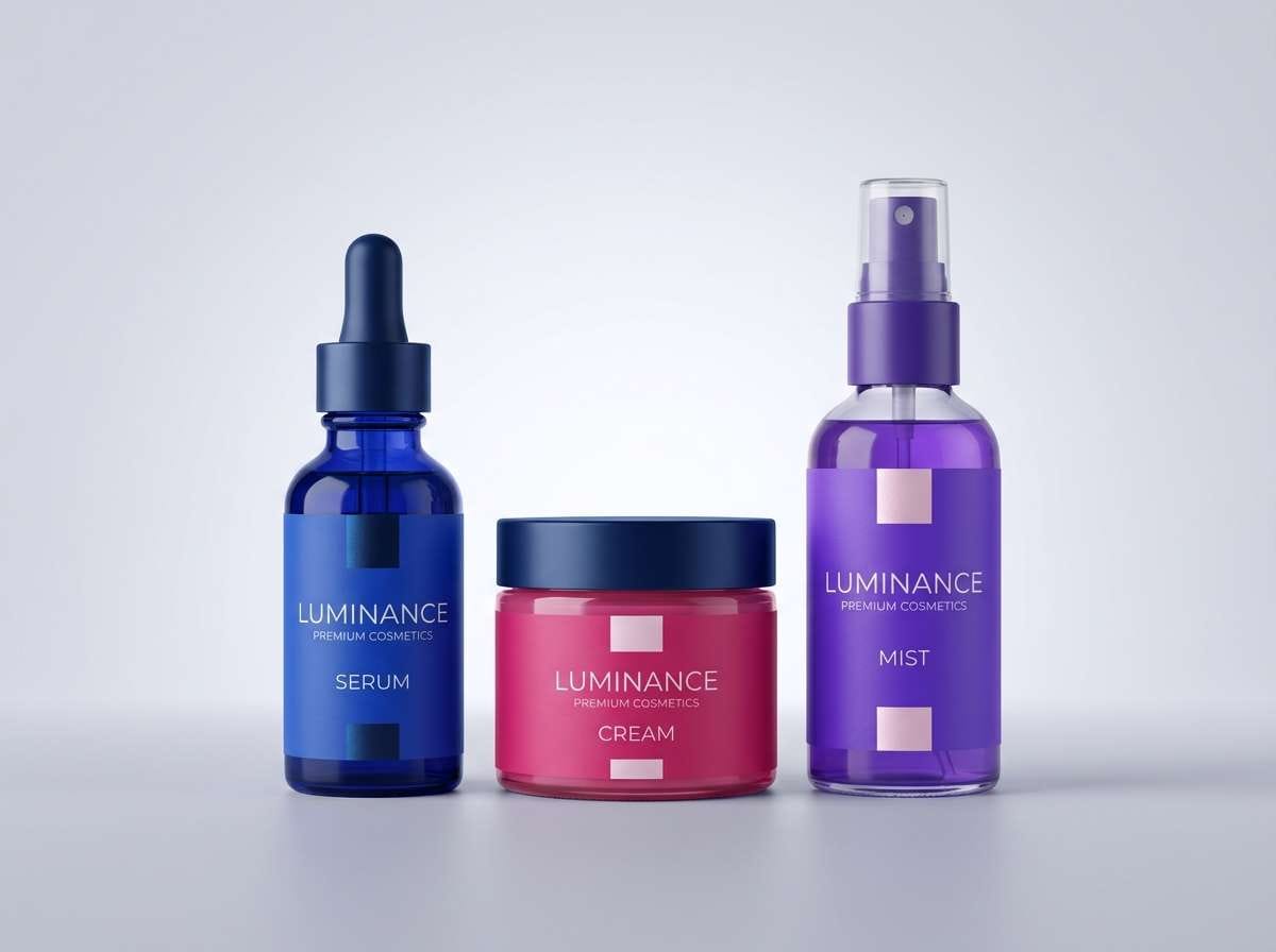
3) Berry Aurora
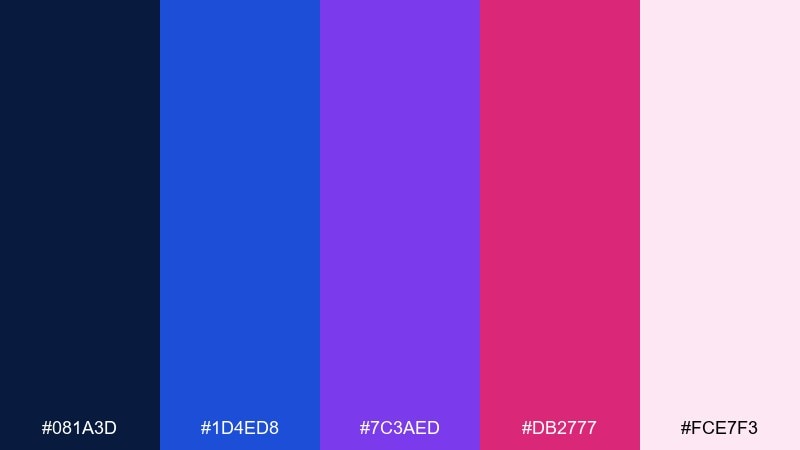
HEX: #081A3D #1D4ED8 #7C3AED #DB2777 #FCE7F3
Mood: dreamy, luminous, romantic
Best for: beauty brand packaging
Dreamy and luminous, it resembles an aurora with berry-pink ribbons across deep blue. These blue and magenta color combinations work beautifully on glossy labels where gradients and metallic foils add depth. Pair with minimal black text and a soft blush background for a premium look. Tip: keep the hottest pink to small highlights like seals, caps, or scent notes.
Image example of berry aurora generated using media.io
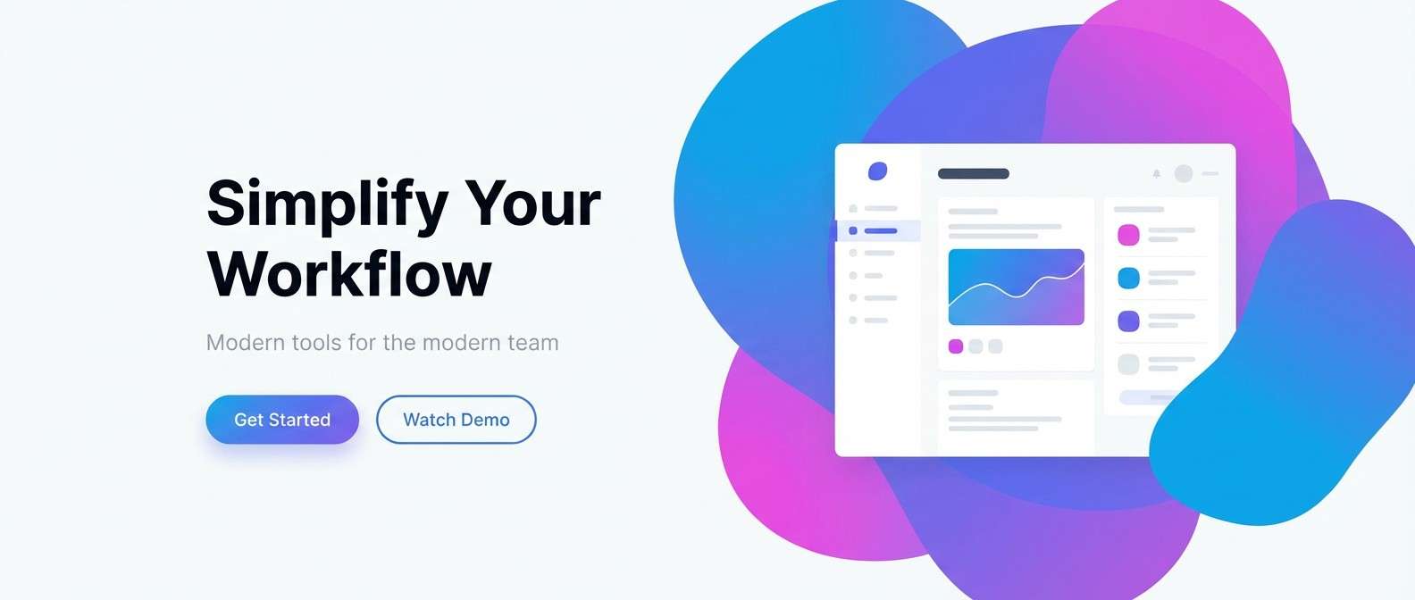
4) Cosmic Gradient
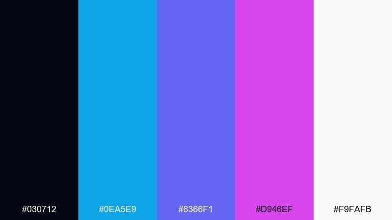
HEX: #030712 #0EA5E9 #6366F1 #D946EF #F9FAFB
Mood: futuristic, airy, luminous
Best for: SaaS landing page hero
Futuristic and airy, it reads like a smooth gradient drifting through space. Cyan-blue lifts the palette while indigo and magenta add depth for headlines and hero shapes. It works best on landing pages with lots of whitespace and a single strong gradient focal area. Tip: use the near-black only for small UI elements so the page stays light and modern.
Image example of cosmic gradient generated using media.io
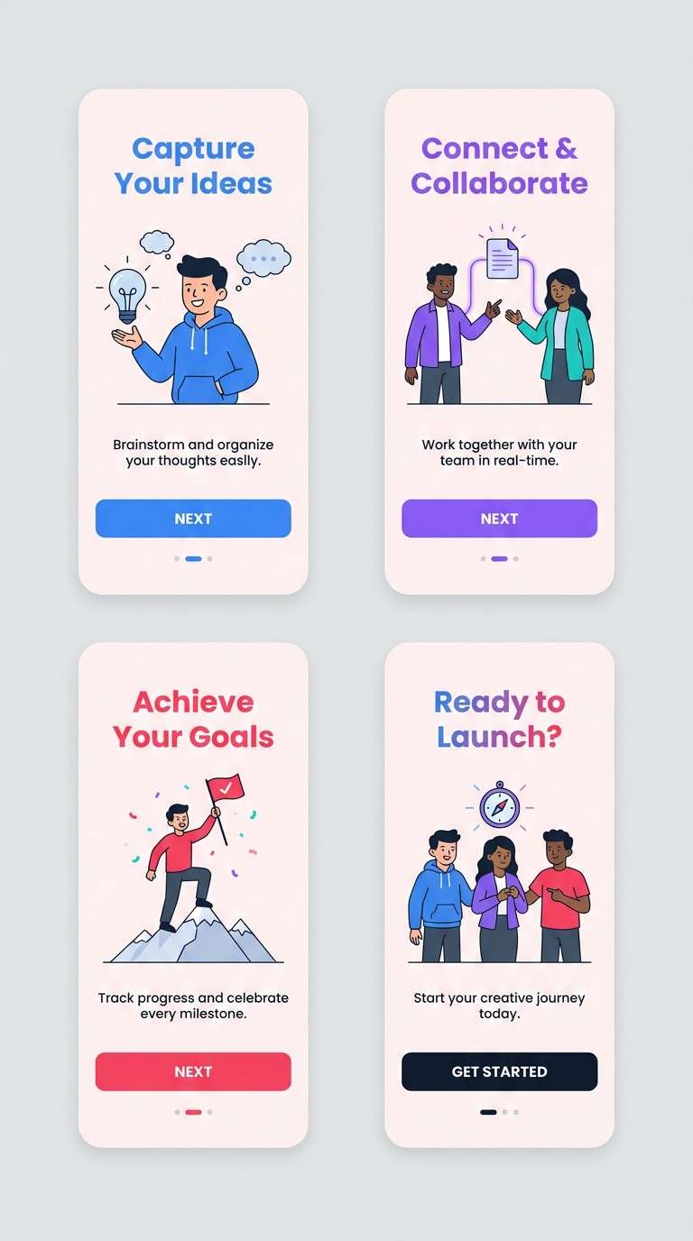
5) Velvet Arcade
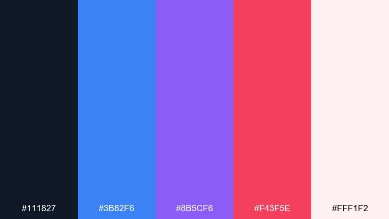
HEX: #111827 #3B82F6 #8B5CF6 #F43F5E #FFF1F2
Mood: playful, bold, retro-modern
Best for: mobile app onboarding screens
Playful and bold, the combination of magenta and blue feels like an arcade carpet updated for a modern app. The cool blue sets trust, while violet and hot pink bring motion to illustrations and iconography. Use it for onboarding, feature callouts, and animated micro-interactions with lots of rounded shapes. Tip: keep body text on the pale pink so the saturated accents can stay vibrant without hurting readability.
Image example of velvet arcade generated using media.io
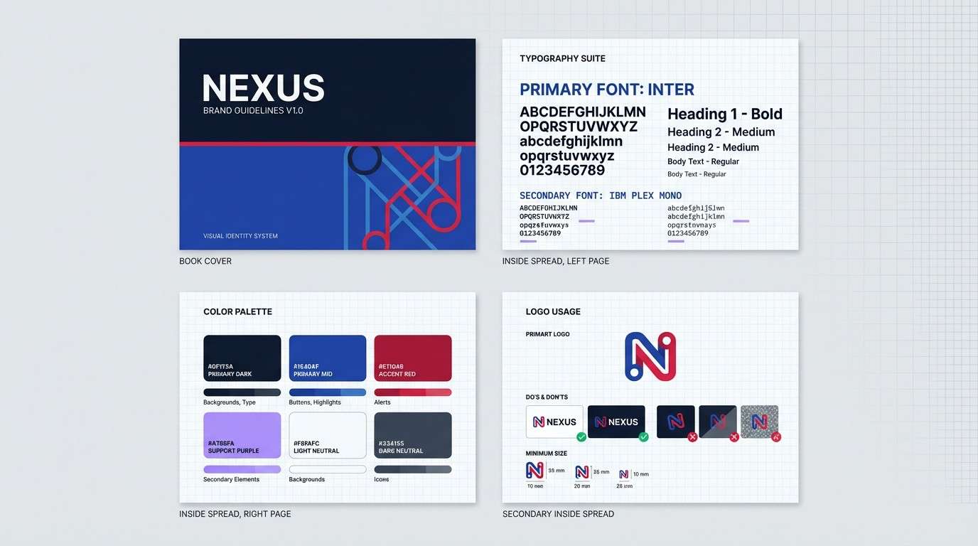
6) Sapphire Fuchsia Minimal
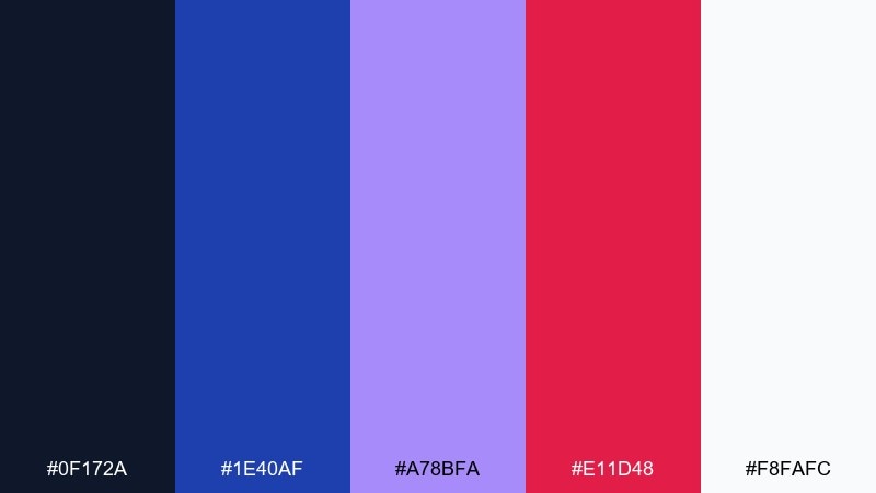
HEX: #0F172A #1E40AF #A78BFA #E11D48 #F8FAFC
Mood: sleek, editorial, controlled
Best for: modern brand guideline deck
Sleek and editorial, this blue magenta color palette suggests sharp tailoring with a fuchsia pocket square. Deep sapphire and near-black create a serious base, while lilac and fuchsia add personality in small doses. Use it for brand guideline decks, identity systems, and clean presentations with strong typographic hierarchy. Tip: apply fuchsia to only one element per slide, like section dividers or key metrics, for a refined look.
Image example of sapphire fuchsia minimal generated using media.io
7) Midnight Punch
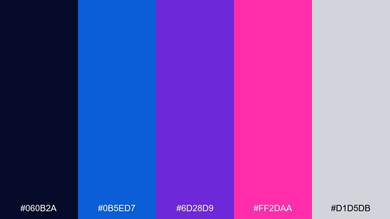
HEX: #060B2A #0B5ED7 #6D28D9 #FF2DAA #D1D5DB
Mood: intense, flashy, energetic
Best for: sports promo banner ads
Intense and flashy, it feels like a spotlight hit with a magenta punch. The saturated pink pops hardest when the background stays very dark and the type is set in light gray. It is great for promo banners, limited-time offers, and bold social ads that need instant impact. Tip: use diagonal shapes in blue and purple to guide the eye toward the magenta CTA.
Image example of midnight punch generated using media.io

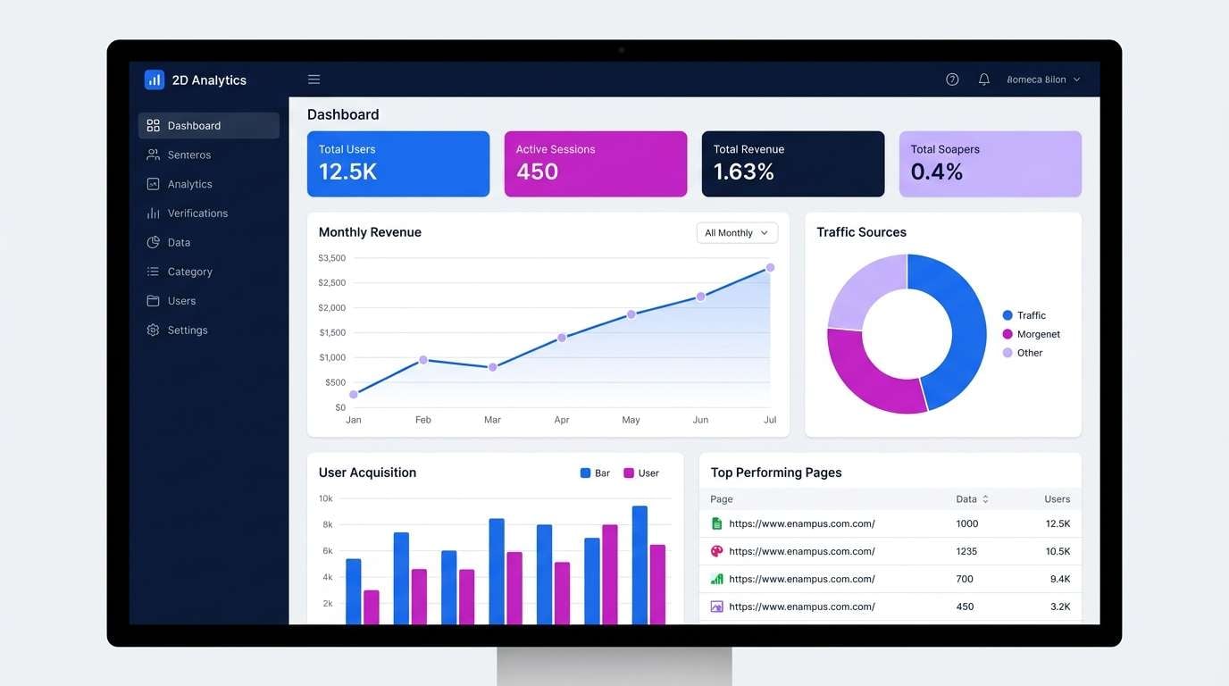
8) Lilac Byte
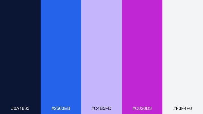
HEX: #0A1633 #2563EB #C4B5FD #C026D3 #F3F4F6
Mood: clean, techy, friendly
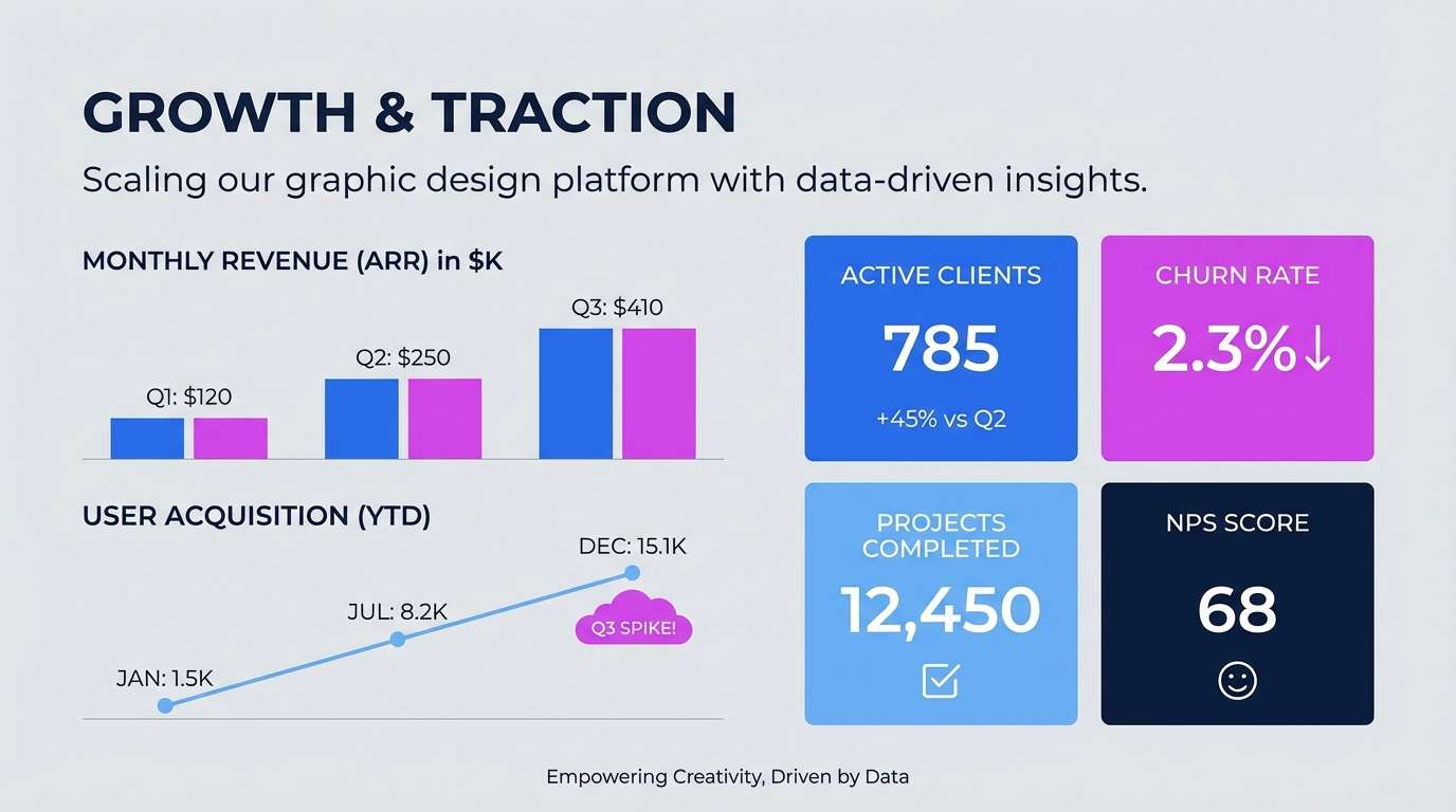
Best for: dashboard data visualization
Clean and techy, this blue and magenta combination looks like crisp charts against a night-mode interface. Blue handles primary series, while lilac and magenta separate secondary metrics without needing extra clutter. Use it in analytics dashboards, KPI widgets, and comparison charts with consistent line weights. Tip: keep magenta for highlights like selected states or outliers so the story stays focused.
Image example of lilac byte generated using media.io
9) Electric Bloom
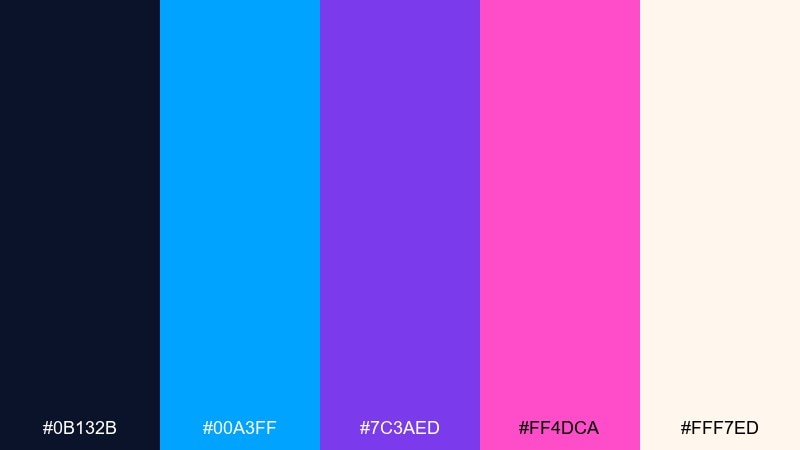
HEX: #0B132B #00A3FF #7C3AED #FF4DCA #FFF7ED
Mood: bright, optimistic, youthful
Best for: spring illustration set
Bright and optimistic, it feels like neon petals opening under a twilight sky. The creamy off-white softens the high-voltage accents and gives illustrations room to breathe. Use it for sticker packs, spring campaign graphics, and playful vector botanicals. Tip: let blue lead on stems and outlines, then drop magenta in small blossoms for sparkle.
Image example of electric bloom generated using media.io
10) Hologram Wave
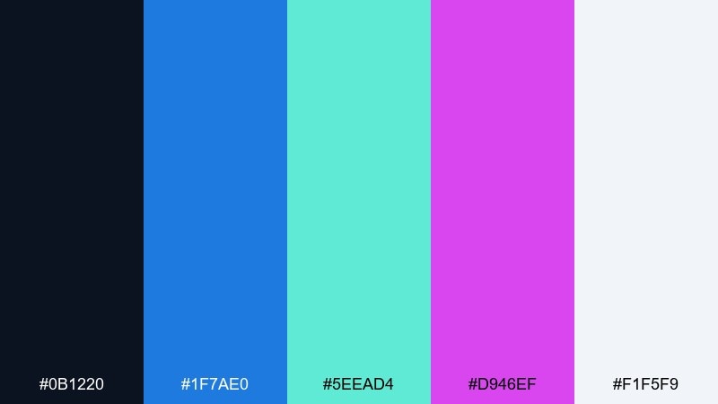
HEX: #0B1220 #1F7AE0 #5EEAD4 #D946EF #F1F5F9
Mood: fresh, iridescent, modern
Best for: tech product ad creative
Fresh and iridescent, these blue and magenta combinations suggest a hologram ripple across polished glass. Teal adds a cool twist that keeps the magenta from feeling too candy-sweet, while slate white keeps layouts clean. Use it for product ads, feature panels, and motion graphics with soft gradients. Tip: blend teal into blue for backgrounds and keep magenta on the product name or key badge.
Image example of hologram wave generated using media.io
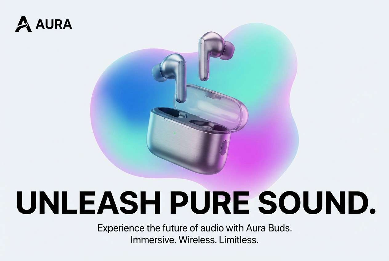
11) Royal Pop Editorial
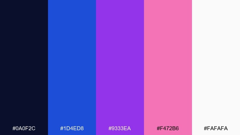
HEX: #0A0F2C #1D4ED8 #9333EA #F472B6 #FAFAFA
Mood: stylish, confident, magazine-ready
Best for: editorial magazine spread
Stylish and confident, it reads like a fashion spread with a pop-color accent. Royal blue and purple hold the structure, while soft pink lifts pull quotes and callouts. Use it for editorial layouts, lookbooks, and content-heavy pages that still need personality. Tip: keep imagery cool-toned and use pink only for editorial highlights to avoid visual noise.
Image example of royal pop editorial generated using media.io
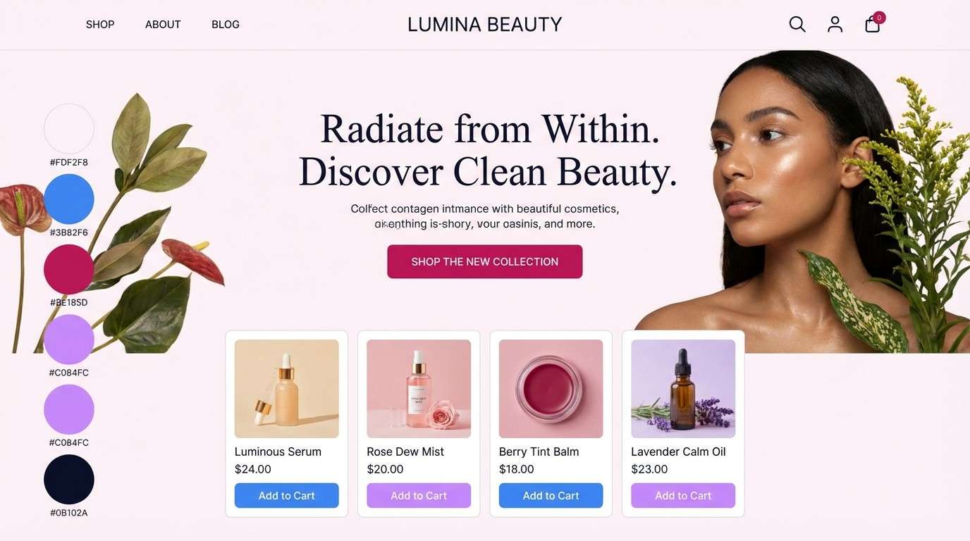
12) Twilight Cosmetics
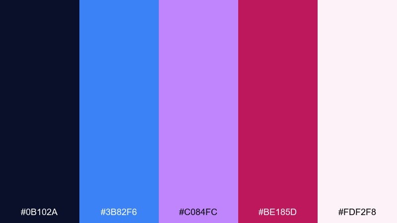
HEX: #0B102A #3B82F6 #C084FC #BE185D #FDF2F8
Mood: sensual, soft-glow, luxe
Best for: cosmetics ecommerce hero
Sensual and soft-glow, this magenta blue combination feels like lipstick shimmer in twilight. The lighter pink background supports product photography while blue and violet create trustworthy structure for buttons and navigation. It is ideal for ecommerce heroes, product launch pages, and gift sets that need a luxe vibe. Tip: use the wine-magenta only on price tags or limited-edition badges to keep it premium.
Image example of twilight cosmetics generated using media.io
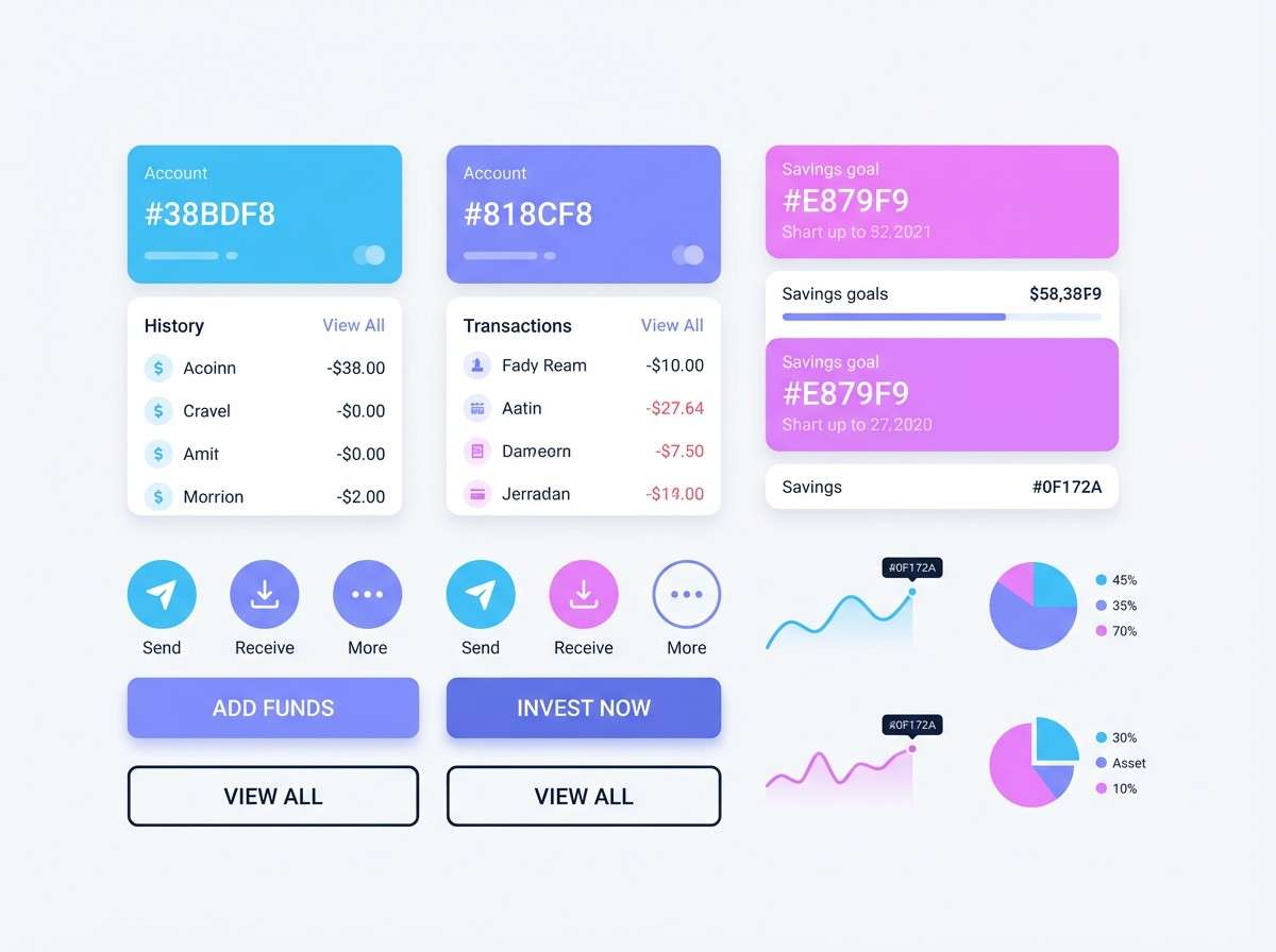
13) Candy Tech UI
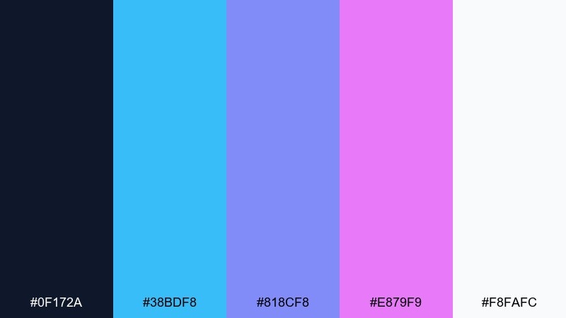
HEX: #0F172A #38BDF8 #818CF8 #E879F9 #F8FAFC
Mood: light, playful, app-friendly
Best for: fintech app UI kit
Light and playful, this blue and magenta combination resembles candy-coated gradients with a tech edge. Sky blue and periwinkle handle primary surfaces, while pink-violet works as a friendly accent for toggles and highlights. Use it for UI kits, fintech apps, and onboarding flows that should feel approachable. Tip: set cards on off-white and keep saturated accents for interactive elements only.
Image example of candy tech ui generated using media.io
14) Deep Space Bouquet
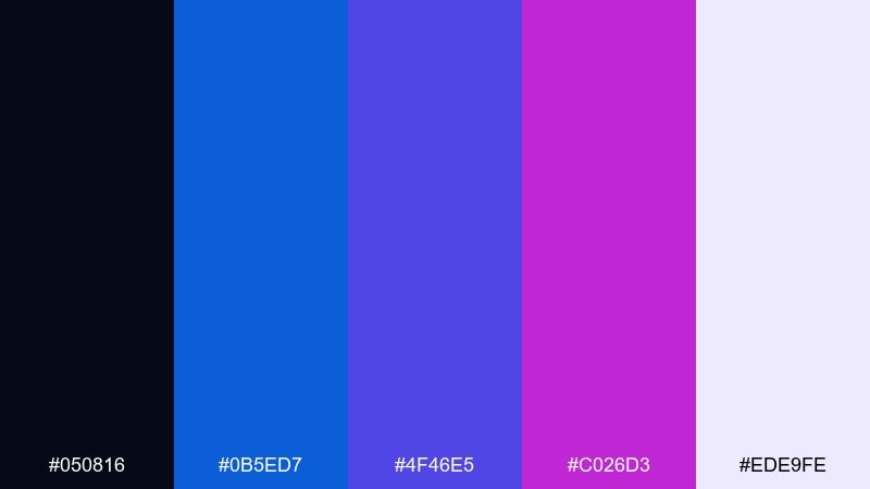
HEX: #050816 #0B5ED7 #4F46E5 #C026D3 #EDE9FE
Mood: mysterious, floral, cinematic
Best for: album cover artwork
Mysterious and cinematic, it suggests flowers floating in deep space. The indigo-to-magenta range creates instant drama for type and abstract shapes on square formats. Use this blue magenta color palette for album covers, podcast art, and digital singles where contrast needs to read at thumbnail size. Tip: keep the background nearly black and add a soft lilac glow behind the title for depth.
Image example of deep space bouquet generated using media.io
15) Plum Neon Signage
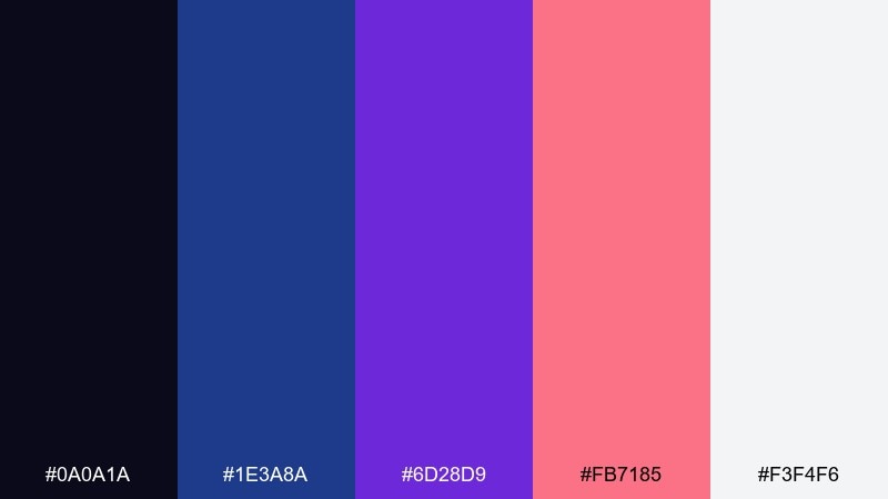
HEX: #0A0A1A #1E3A8A #6D28D9 #FB7185 #F3F4F6
Mood: nightlife, bold, punchy
Best for: restaurant neon sign mockup
Nightlife-bold, it brings to mind a plum neon sign buzzing outside a late-night spot. The deep blue adds stability while warm pink softens the electric purple so it feels inviting. Use this blue and magenta color palette for restaurant promos, signage concepts, and menu covers with strong contrast. Tip: keep backgrounds very dark and use light gray for secondary text so the neon hues stay the star.
Image example of plum neon signage generated using media.io
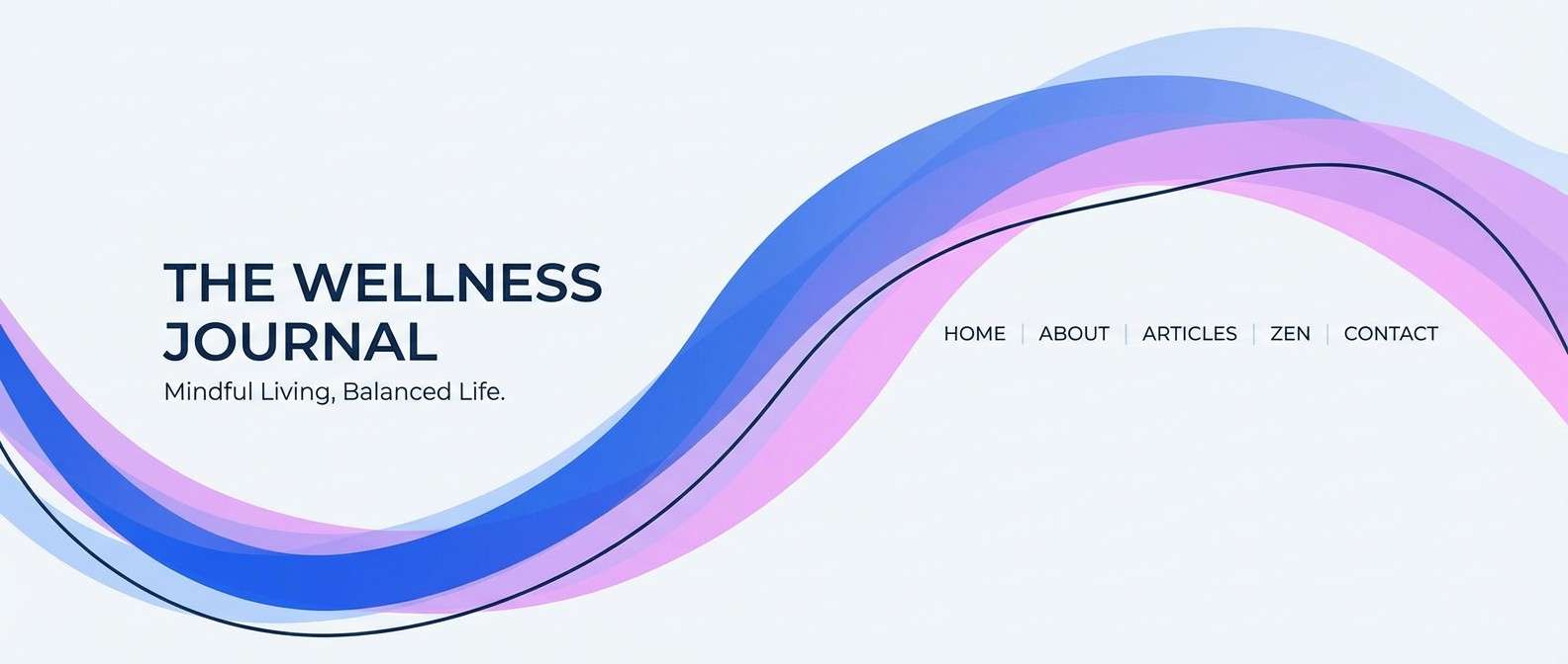
16) Ocean Orchid Calm
HEX: #0B2447 #1D4ED8 #A5B4FC #F0ABFC #F8FAFC
Mood: calm, soothing, airy
Best for: wellness blog header
Calm and airy, it feels like ocean air meeting orchid petals. The softer tints make it easy to layer photography, icons, and long-form typography without strain. Use it for wellness headers, gentle brand identities, and calming dashboards. Tip: set most backgrounds in off-white and let the deeper blue handle nav and section titles for clarity.
Image example of ocean orchid calm generated using media.io
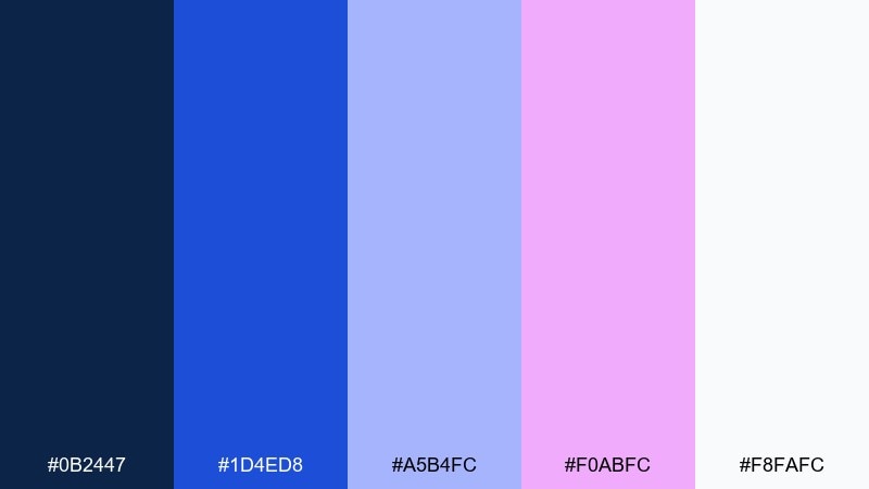
17) Magenta Blueprint
HEX: #0A1B3D #2563EB #60A5FA #D946EF #E5E7EB
Mood: structured, bright, professional
Best for: startup pitch deck charts
Structured and bright, it looks like a clean blueprint with a surprising magenta marker. These blue and magenta color combinations keep charts distinct while still feeling cohesive in a deck. Use it for pitch slides, infographics, and performance dashboards where color needs to encode meaning. Tip: assign blue to core metrics and magenta to growth highlights so the narrative is instantly readable.
Image example of magenta blueprint generated using media.io
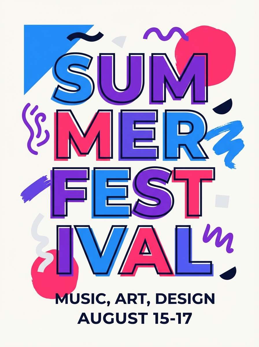
18) Festival Poster Mix
HEX: #0B1026 #3B82F6 #7C3AED #F43F5E #F9FAFB
Mood: festive, loud, youthful
Best for: summer festival flyer
Festive and loud, it captures the rush of a summer lineup announcement. The blue and violet hold the layout together, while the coral-magenta gives instant headline energy. Use it for flyers, IG stories, and event schedules with layered type and bold shapes. Tip: keep the background light for legibility and add one dark block behind the main date to lock focus.
Image example of festival poster mix generated using media.io
19) Ink and Petal
HEX: #0B0F1A #1E40AF #5B21B6 #E11D48 #F5F5F4
Mood: moody, artistic, dramatic
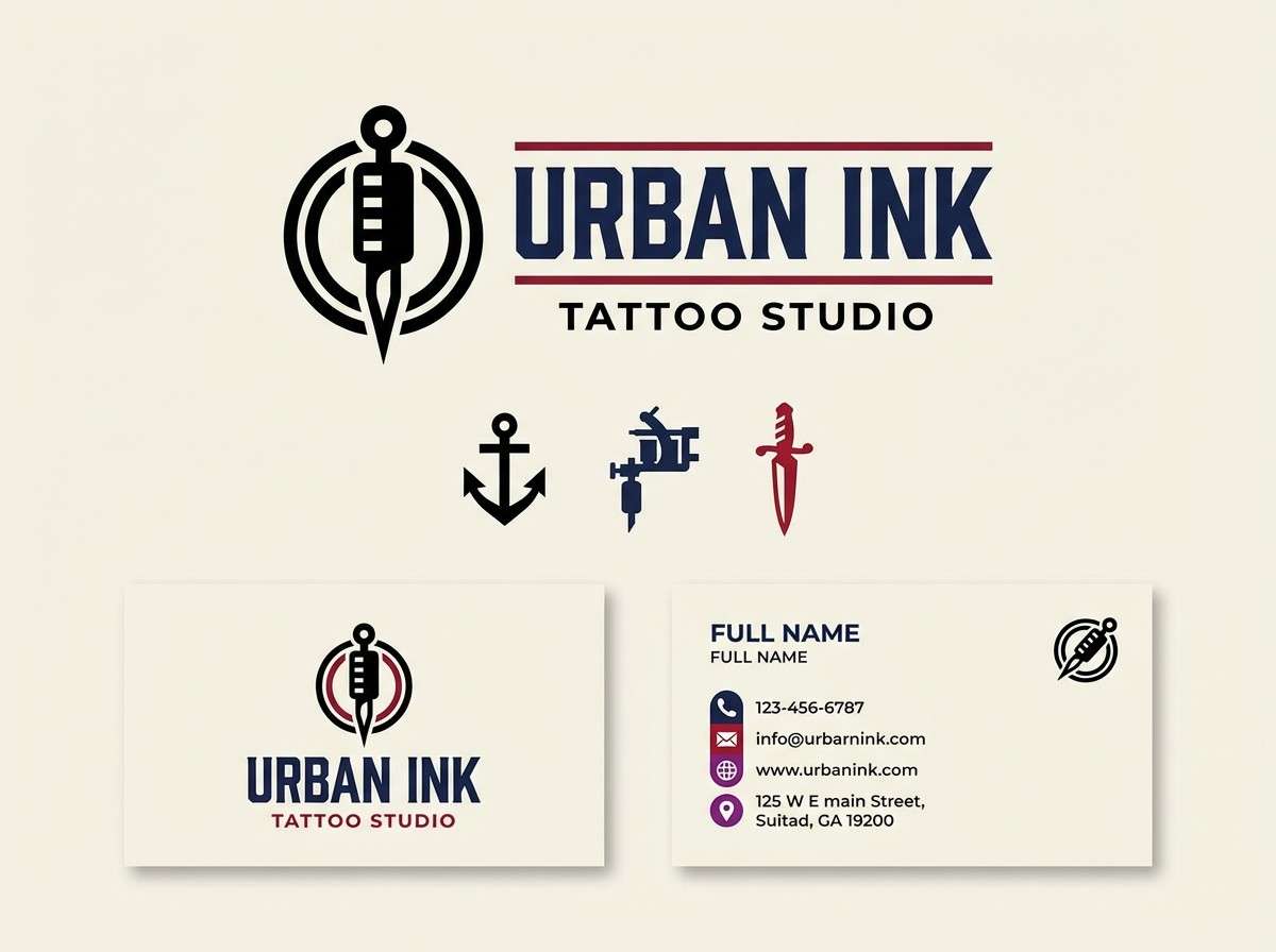
Best for: tattoo studio branding
Moody and artistic, the blue and magenta set blends ink-dark shadows with petal-bright color hits. The saturated red-magenta works best as an accent against deep blue and violet for a dramatic mark. Use it for tattoo studios, alternative fashion, or bold creator branding with heavy contrast. Tip: keep the logo in a single dark tone and let magenta appear in supporting graphics like stamps or social frames.
Image example of ink and petal generated using media.io
20) Sunset Nebula
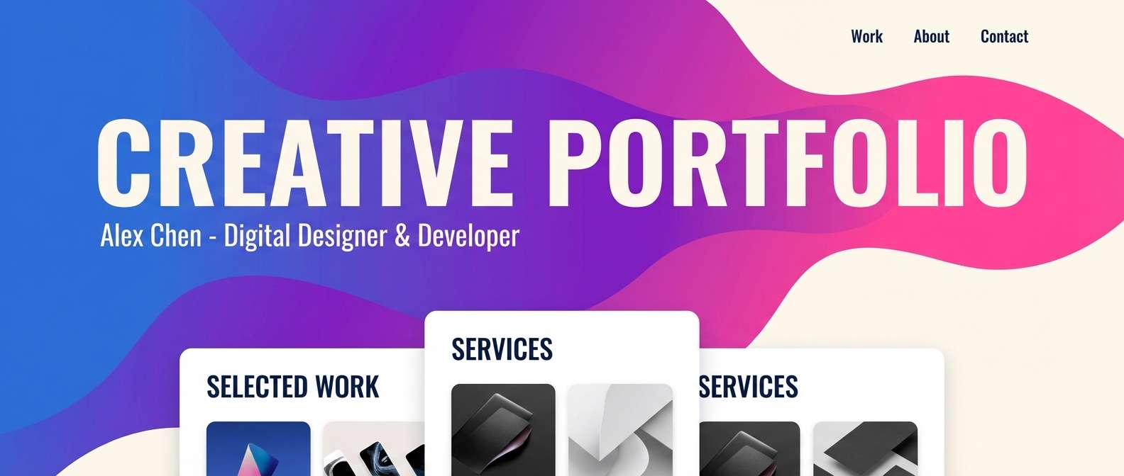
HEX: #0A1633 #2D6CDF #7E22CE #FF3EA5 #FFF7ED
Mood: radiant, cosmic, warm-cool
Best for: creative portfolio homepage
Radiant and cosmic, it feels like a sunset dissolving into a nebula. The warm pink-magenta adds human energy to the cooler blues and purple, making it great for personal brands. Use it for portfolio homepages, case study headers, and animated gradients. Tip: pick one dominant gradient direction and reuse it across sections for a cohesive, signature look.
Image example of sunset nebula generated using media.io
21) Violet Transit
HEX: #0B102A #155EEF #6E56CF #D946EF #F1F5F9
Mood: fast, sleek, contemporary
Best for: public transit app UI
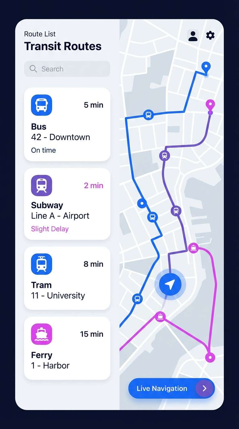
Fast and sleek, it suggests moving lights and quick stops in a modern city. Blue leads the interface for trust, while violet and magenta emphasize route changes and key actions. Use this blue magenta color palette for navigation-heavy apps, maps, and timetables where clarity matters. Tip: keep magenta only for the primary action and current route, then rely on blue for everything else.
Image example of violet transit generated using media.io
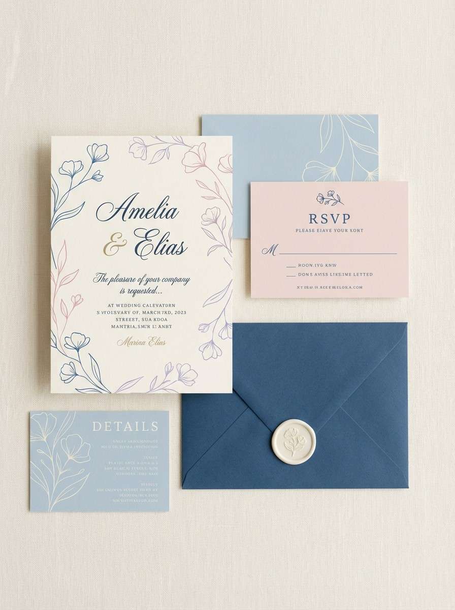
22) Prism Romance
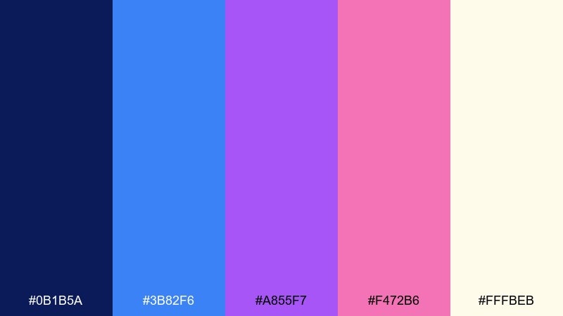
HEX: #0B1B5A #3B82F6 #A855F7 #F472B6 #FFFBEB
Mood: romantic, soft, sparkling
Best for: wedding invitation suite
Romantic and softly sparkling, this blue and magenta combination feels like a prism catching light on satin fabric. The cream background keeps the brighter hues elegant, while blue and violet add a modern edge to traditional layouts. Use it for invitations, save-the-dates, and bridal shower stationery with delicate line art. Tip: print with a matte cream stock and use magenta-pink only on names or monograms for a refined finish.
Image example of prism romance generated using media.io
23) Quantum Pop
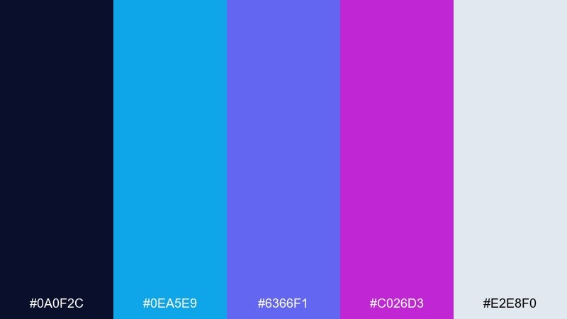
HEX: #0A0F2C #0EA5E9 #6366F1 #C026D3 #E2E8F0
Mood: bold, modern, experimental
Best for: creative conference branding
Bold and experimental, it feels like ideas colliding in a bright lecture hall. The cyan-blue keeps things crisp while indigo and magenta bring the punch needed for signage and stage screens. Use it for conference branding, speaker cards, and session tracks with color-coded systems. Tip: assign each track one dominant hue and keep the rest as supporting gradients for consistency.
Image example of quantum pop generated using media.io
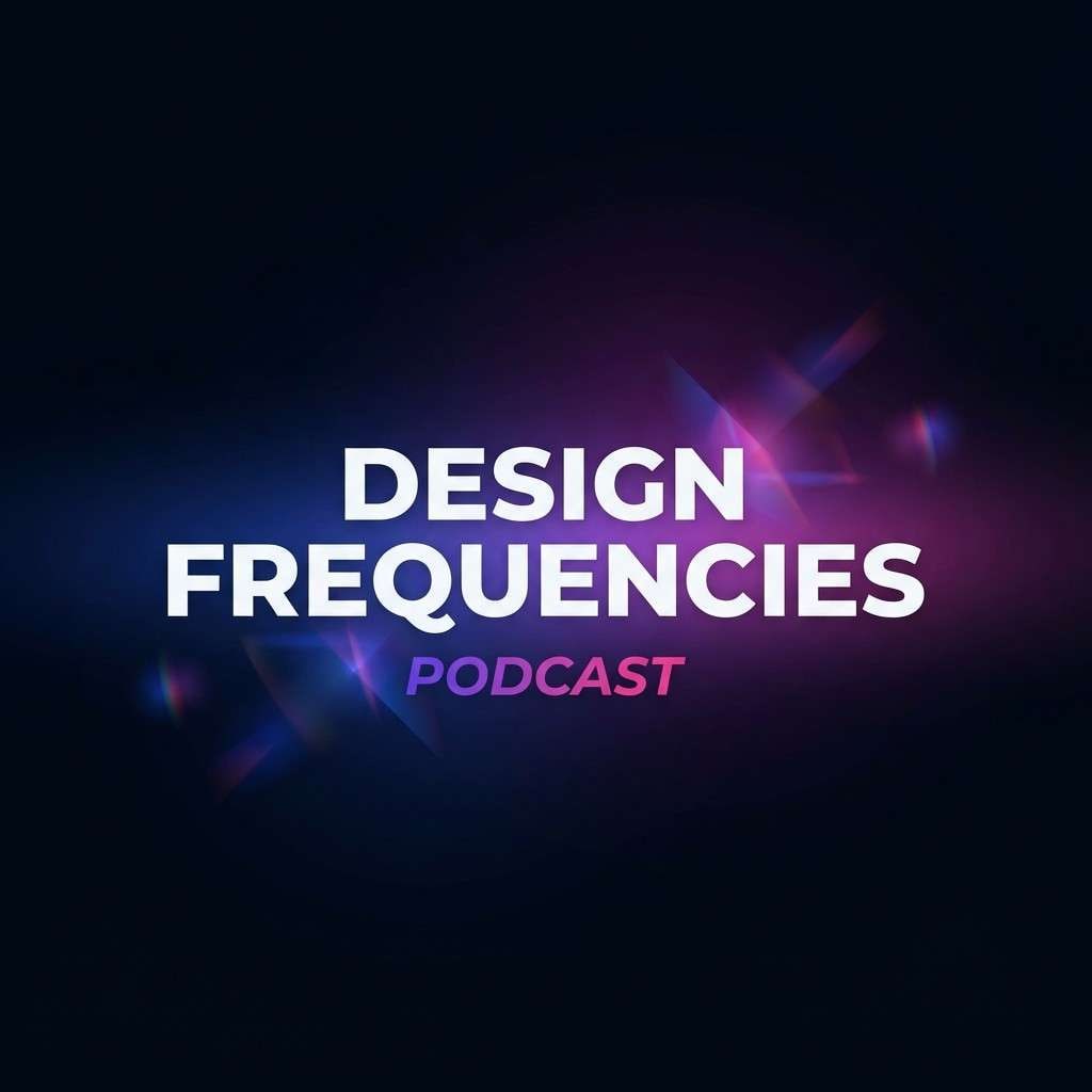
24) Night Orchid Gradient
HEX: #040815 #1E3A8A #7C3AED #EC4899 #F8FAFC
Mood: dramatic, elegant, vivid
Best for: podcast cover art
Dramatic and elegant, it looks like an orchid-lit stage in the dark. The navy base makes the pink-magenta glow feel cinematic, while violet bridges the transition for gradients. Use these blue magenta color combinations for podcast covers, YouTube thumbnails, and creator avatars that must pop at small sizes. Tip: keep the title in off-white with a subtle violet shadow for instant readability.
Image example of night orchid gradient generated using media.io
What Colors Go Well with Blue Magenta?
Neutrals are the easiest way to make blue magenta palettes feel usable: off-white, soft gray, and near-black keep the saturated hues readable and prevent visual fatigue. In UI, neutrals also create clear spacing for typography and data.
Cool bridges like violet, indigo, and lilac smooth transitions between blue and magenta, especially in gradients or layered shapes. For a fresher twist, add a touch of teal or cyan to keep magenta from feeling overly sweet.
For warmer balance in print or branding, pair with cream, sand, or muted peach—these tones soften the neon edge while still letting magenta act as a standout accent.
How to Use a Blue and Magenta Combination in Real Designs
Start by assigning roles: blue for structure (headers, navigation, primary surfaces), and magenta for emphasis (CTA, badges, active states). This keeps the look bold but controlled, especially in product UI and dashboards.
Manage contrast intentionally. Put saturated magenta on darker bases for maximum pop, and use off-white or light gray for long-form text to reduce glare. If you’re printing, test on paper—magenta can shift depending on stock and coating.
Keep gradients consistent. Choose one gradient direction (e.g., blue → violet → magenta) and repeat it across hero blocks, buttons, or key visuals so the identity feels cohesive instead of random.
Create Blue Magenta Palette Visuals with AI
If you already have HEX codes, you can turn them into polished mockups fast by generating UI heroes, posters, packaging, and brand scenes that follow your palette. This is especially helpful when you need multiple concepts for A/B tests or client reviews.
In Media.io, describe the layout (poster, dashboard, landing page hero), set the mood (neon, editorial, calm), and include your HEX colors as “dominant colors” to guide the output. Save the strongest results as a repeatable visual direction for your brand.
Next: Dark Tan Color Palette


