

Dark tan is the kind of warm neutral that instantly makes a design feel grounded, premium, and human. It’s earthy without looking dated, and it pairs easily with both crisp light neutrals and deeper, moodier accents.
Below are 20+ curated dark tan color palette ideas (with HEX codes) you can use for branding, interiors, UI, packaging, and social graphics—plus AI prompts to generate matching visuals in Media.io.
In this article
- Why Dark Tan Palettes Work So Well
-
- desert lodge
- cocoa linen
- bronze canyon
- antique saddle
- dune minimal
- mocha clay
- walnut cream
- sepia studio
- caramel smoke
- toffee terracotta
- sandstone spa
- harvest wheat
- cedar whisper
- oat latte
- brass and bark
- vintage map
- autumn suede
- trail mix neutral
- clay and eucalyptus
- museum sepia
- golden leather
- night market tan
- cinnamon archive
- What Colors Go Well with Dark Tan?
- How to Use a Dark Tan Color Palette in Real Designs
- Create Dark Tan Palette Visuals with AI
Why Dark Tan Palettes Work So Well
Dark tan sits in a sweet spot between brown and beige: warm enough to feel welcoming, but neutral enough to support typography, photography, and product visuals. That balance makes it a reliable foundation color for modern brands and interfaces.
It also creates “soft contrast” when paired with creams and off-whites—meaning layouts stay readable without looking harsh. Add an espresso or near-black for structure, and you get a polished hierarchy that works across web and print.
Finally, dark tan plays well with muted greens, slate teals, and dusty grays, which helps you avoid an overly sepia look. With the right accents, it can feel rustic, editorial, luxury, or minimal.
20+ Dark Tan Color Palette Ideas (with HEX Codes)
1) Desert Lodge
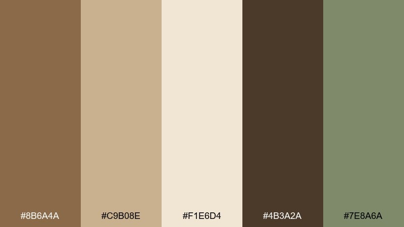
HEX: #8B6A4A #C9B08E #F1E6D4 #4B3A2A #7E8A6A
Mood: warm, grounded, rustic
Best for: cabin rental branding and landing pages
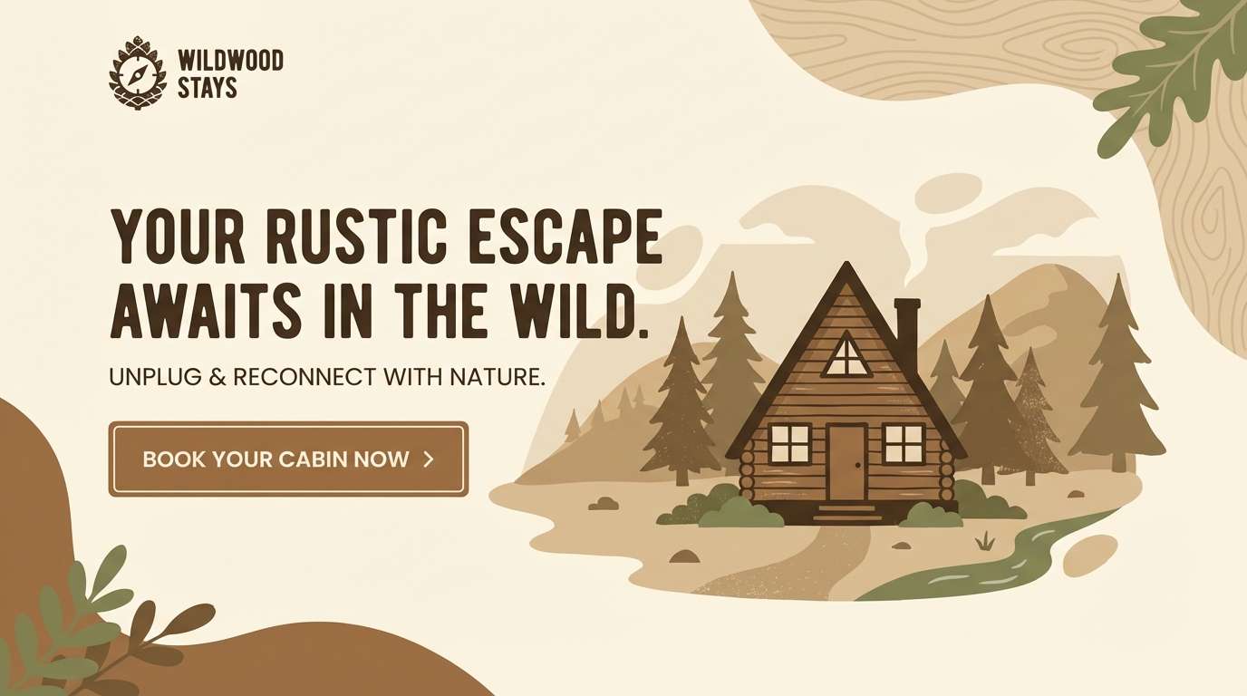
Warm and grounded like sun-baked wood, leather chairs, and dusty trail air. The dark tan color palette sets an inviting base, while cream keeps layouts breathable and deep espresso adds contrast for headers. Sage-green works as a calm accent for buttons, badges, or icons. Tip: use the espresso sparingly to avoid making the page feel heavy.
Image example of desert lodge generated using media.io
Media.io is an online AI studio for creating and editing video, image, and audio in your browser.

2) Cocoa Linen
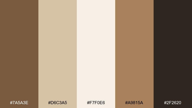
HEX: #7A5A3E #D6C3A5 #F7F0E6 #A9815A #2F2620
Mood: soft, cozy, editorial
Best for: lifestyle blog typography and headers
Soft and cozy, like linen curtains and cocoa powder on a warm drink. These dark tan color combinations read beautifully behind serif headlines and long-form text, with near-black used for crisp body copy. Add the caramel tone for pull quotes, dividers, or subtle highlights. Tip: keep the linen and cream as your main canvas to maintain an airy editorial feel.
Image example of cocoa linen generated using media.io
3) Bronze Canyon
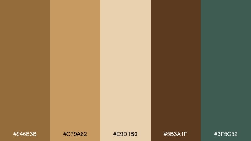
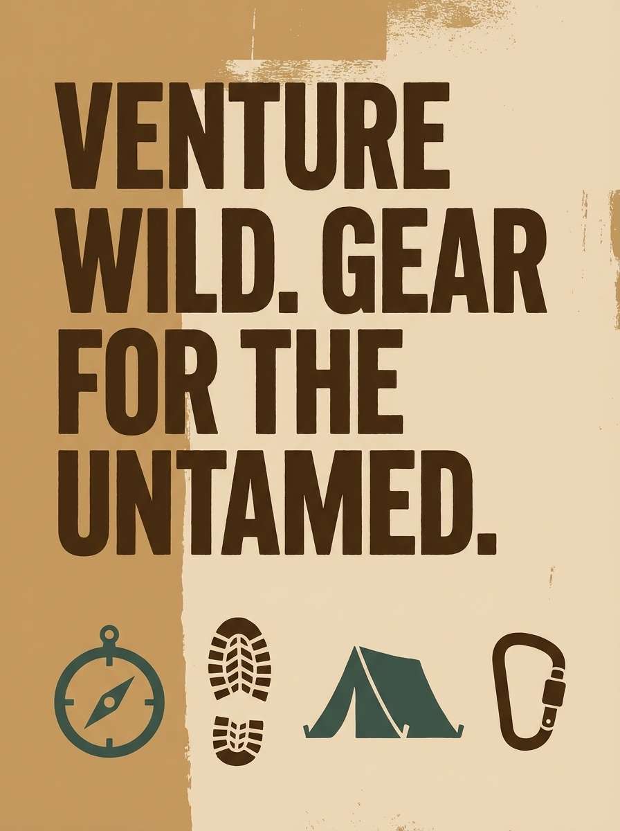
HEX: #946B3B #C79A62 #E9D1B0 #5B3A1F #3F5C52
Mood: adventurous, sunlit, rugged
Best for: outdoor gear poster design
Adventurous and sunlit, like canyon walls at golden hour and worn hiking boots. Bronze and caramel deliver strong warmth, while the deep brown creates bold type contrast. A muted teal-green keeps the palette feeling modern rather than overly sepia. Tip: set the poster background in the pale sand tone so the headline pops without harsh edges.
Image example of bronze canyon generated using media.io
4) Antique Saddle
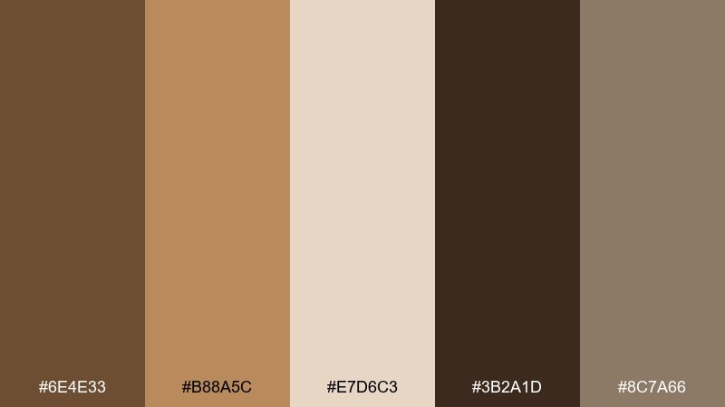
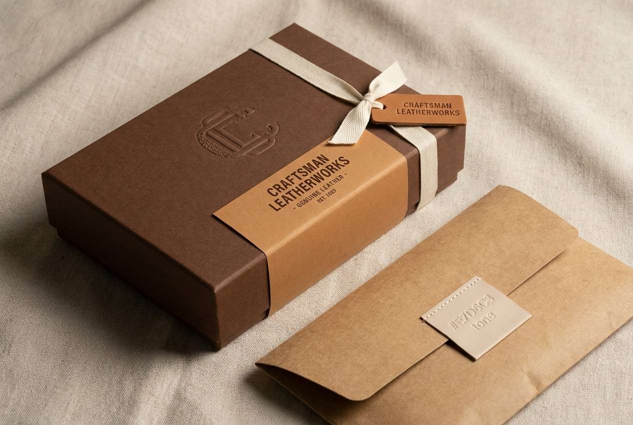
HEX: #6E4E33 #B88A5C #E7D6C3 #3B2A1D #8C7A66
Mood: heritage, classic, masculine
Best for: leather goods packaging and labels
Heritage and classic, like an antique saddle and a well-kept workshop bench. Dark tan and saddle browns feel premium on kraft textures, with deep umber anchoring logos and stamps. The muted taupe smooths transitions for secondary text and icons. Tip: emboss the logo in the deepest brown for a high-end finish without adding extra colors.
Image example of antique saddle generated using media.io
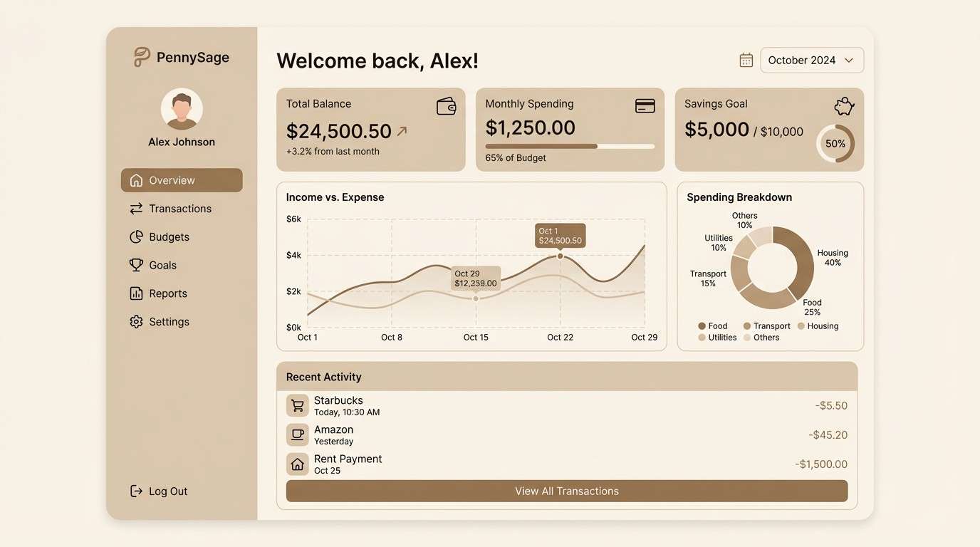
5) Dune Minimal
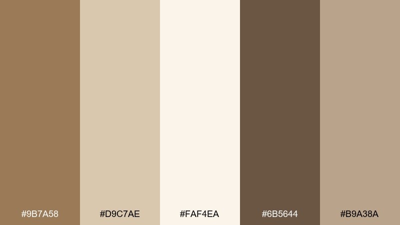
HEX: #9B7A58 #D9C7AE #FAF4EA #6B5644 #B9A38A
Mood: clean, modern, calm
Best for: minimal UI kit for finance apps
Clean and calm, like smooth dunes and soft shadows on stone. The tan base works well for cards and panels, while near-white keeps the UI light and modern. Use the deeper brown for navigation and key numbers, and reserve the mid-taupe for borders and disabled states. Tip: pair with plenty of spacing to avoid a muddy look in dense dashboards.
Image example of dune minimal generated using media.io
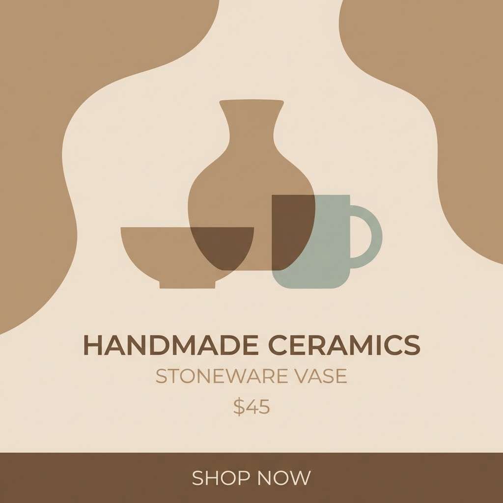
6) Mocha Clay
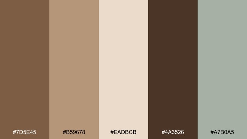
HEX: #7D5E45 #B59678 #EADBCB #4A3526 #A7B0A5
Mood: earthy, artisan, soothing
Best for: ceramics shop Instagram posts
Earthy and artisan, like fresh clay on a wheel and matte-glazed mugs drying in sunlight. Warm browns set a handmade tone, while the pale beige gives you space for product names and prices. The cool gray-green keeps the feed from feeling too monochrome. Tip: use the darkest mocha for your logo mark so every post stays consistent.
Image example of mocha clay generated using media.io
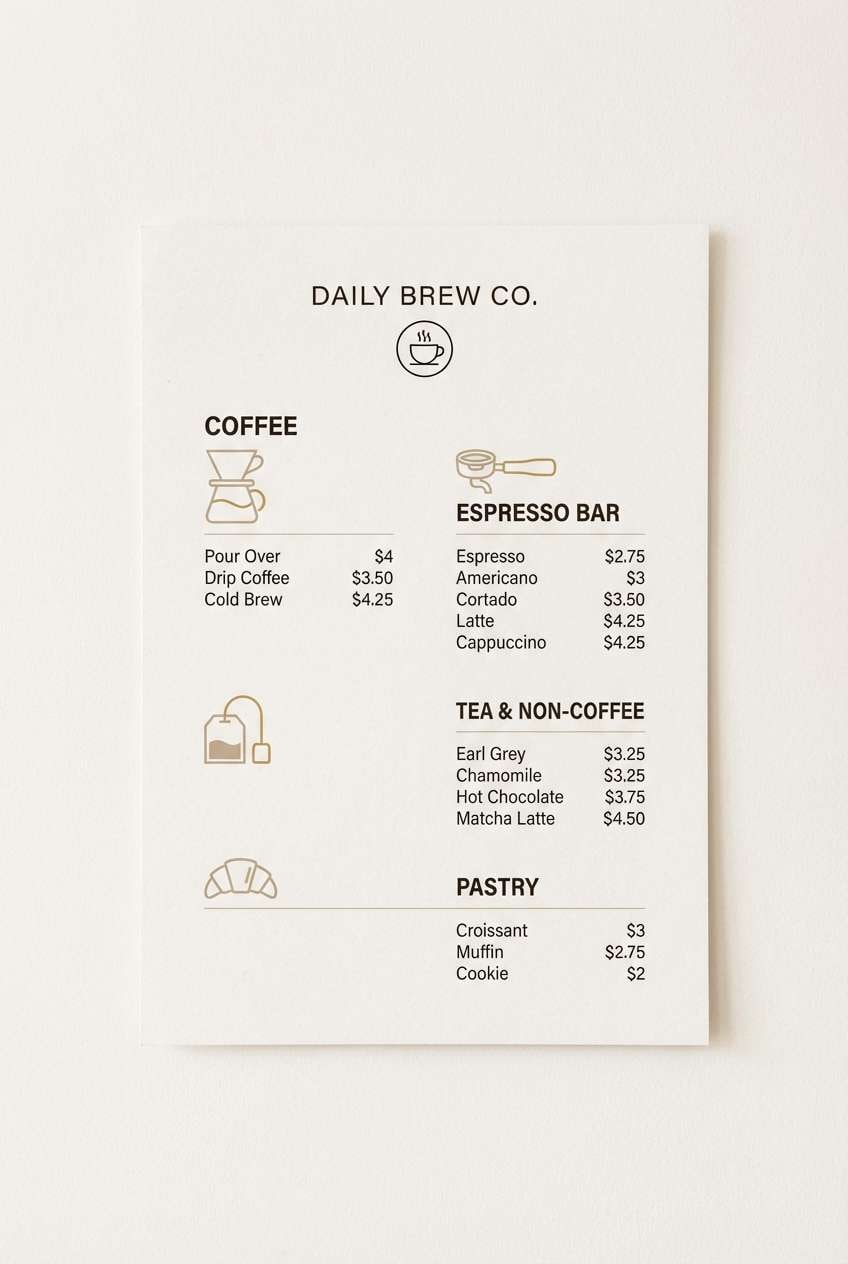
7) Walnut Cream
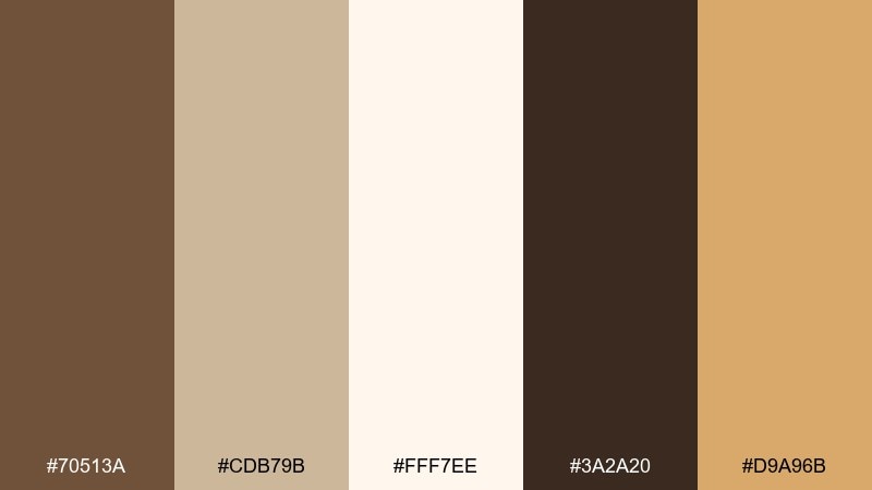
HEX: #70513A #CDB79B #FFF7EE #3A2A20 #D9A96B
Mood: welcoming, upscale, sunny
Best for: coffee shop menu design
Welcoming and upscale, like walnut wood counters and steamed milk foam. Cream and off-white keep the menu easy to scan, while deep brown makes section headers feel confident. A honey-gold accent draws attention to specials or seasonal drinks without shouting. Tip: apply the honey tone to small icons and price highlights, not large blocks.
Image example of walnut cream generated using media.io
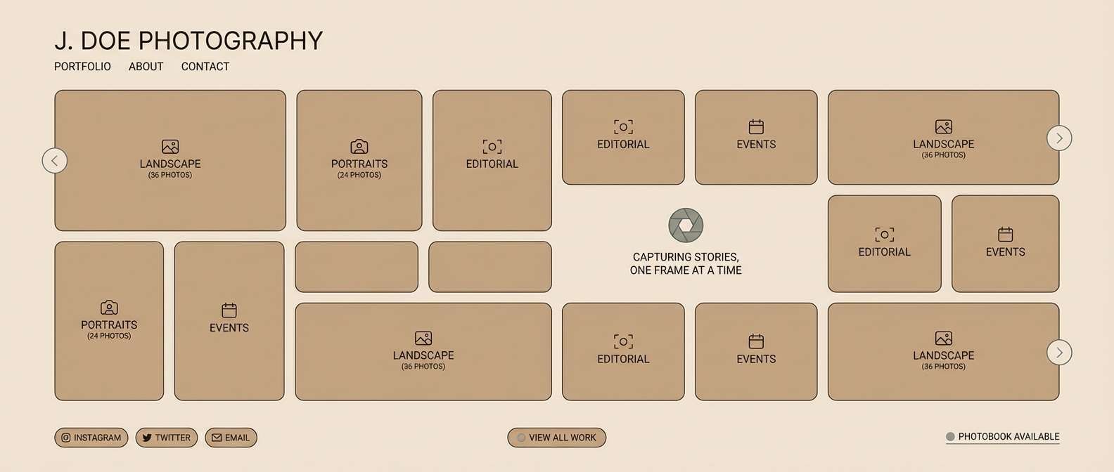
8) Sepia Studio
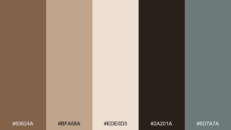
HEX: #83624A #BFA58A #EDE0D3 #2A201A #6D7A7A
Mood: professional, balanced, calm
Best for: portfolio website for photographers
Professional and balanced, like a sepia contact sheet and a quiet studio wall. The warm neutrals frame imagery without stealing attention, while charcoal-brown delivers readable navigation. A muted slate-teal works for links and hover states when you want a subtle modern edge. Tip: keep backgrounds in the lightest beige so photos remain the hero.
Image example of sepia studio generated using media.io
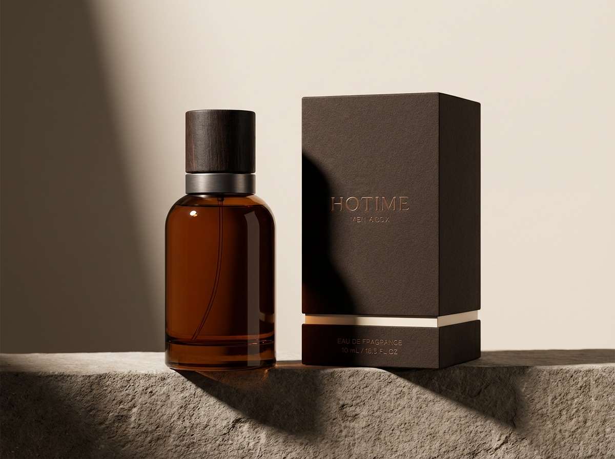
9) Caramel Smoke
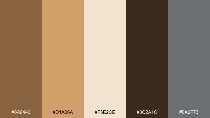
HEX: #8A6440 #D1A06A #F3E2CE #3C2A1C #6A6F73
Mood: moody, modern, dramatic
Best for: men's fragrance product ad
Moody and modern, like caramelized amber under soft smoke. These dark tan color combinations feel luxe when paired with a near-black base for bold typography. The cool smoke-gray prevents the ad from reading too warm and helps metallic elements look sharper. Tip: spotlight the product with a light beige gradient so the bottle silhouette stands out.
Image example of caramel smoke generated using media.io
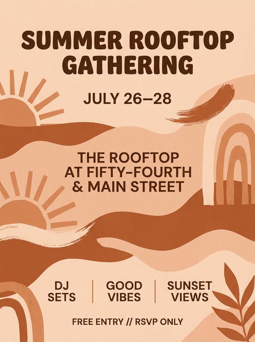
10) Toffee Terracotta
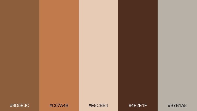
HEX: #8D5E3C #C07A4B #E8CBB4 #4F2E1F #B7B1A8
Mood: sun-kissed, boho, lively
Best for: summer event flyer design
Sun-kissed and boho, like terracotta planters on a patio at dusk. The toffee and terracotta tones bring energy, while pale sand keeps type legible for dates and locations. Use the deep cocoa brown for the main headline and the soft stone-gray for secondary details. Tip: set shapes in large warm blocks, then keep the text area clean and light.
Image example of toffee terracotta generated using media.io
11) Sandstone Spa
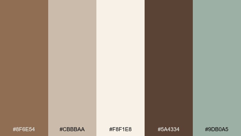
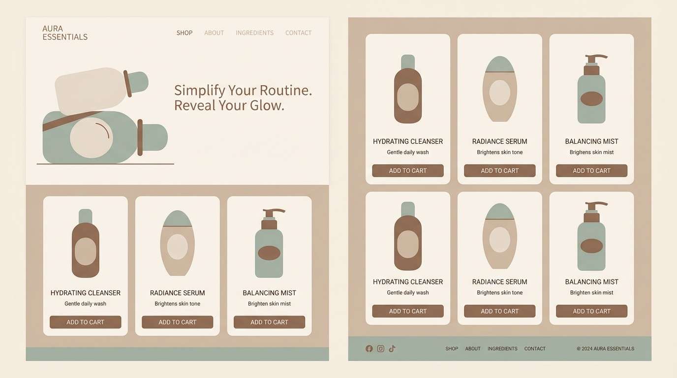
HEX: #8F6E54 #CBBBAA #F8F1E8 #5A4334 #9DB0A5
Mood: serene, clean, restorative
Best for: skincare website and product pages
Serene and restorative, like warm sandstone and a quiet spa robe. The light neutrals create a clean skincare backdrop, while the darker tan gives structure to headers and product cards. A gentle green-gray adds a fresh, botanical hint without turning the layout minty. Tip: use the green-gray only for small UI cues like toggles and badges.
Image example of sandstone spa generated using media.io
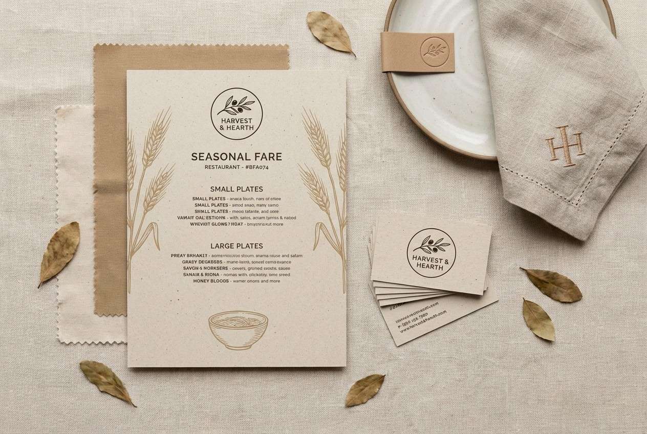
12) Harvest Wheat
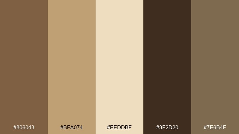
HEX: #806043 #BFA074 #EEDDBF #3F2D20 #7E6B4F
Mood: wholesome, autumnal, rustic
Best for: farm-to-table restaurant branding
Wholesome and autumnal, like wheat sheaves, burlap, and a late harvest table. The darker brown anchors logos and signage, while wheat and cream tones keep printed materials friendly. Keep the olive-brown muted for stamps, icons, or menu dividers. Tip: choose uncoated paper stocks to make these tones feel even warmer in print.
Image example of harvest wheat generated using media.io
13) Cedar Whisper
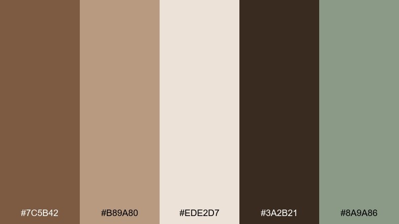
HEX: #7C5B42 #B89A80 #EDE2D7 #3A2B21 #8A9A86
Mood: quiet, natural, mindful
Best for: yoga studio poster and signage
Quiet and mindful, like cedar boards and slow morning light. The warm tans feel grounding for wellness messaging, while the deep brown gives you crisp readability from a distance. A soft green brings a subtle nature cue that pairs well with minimalist line art. Tip: keep the poster mostly light, and place the dark type in a centered column for calm hierarchy.
Image example of cedar whisper generated using media.io
14) Oat Latte
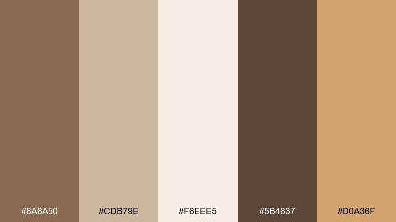
HEX: #8A6A50 #CDB79E #F6EEE5 #5B4637 #D0A36F
Mood: friendly, modern, comforting
Best for: app onboarding screens
Friendly and comforting, like an oat latte with a smooth crema top. Soft beige backgrounds make onboarding text feel approachable, while darker brown keeps buttons and titles clear. A honey accent adds warmth to progress indicators and highlights. Tip: limit the honey to one key element per screen so the flow stays calm.
Image example of oat latte generated using media.io
15) Brass and Bark
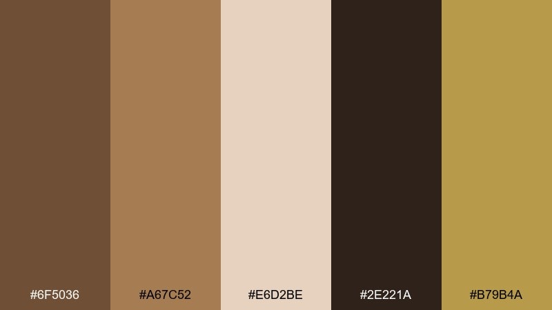
HEX: #6F5036 #A67C52 #E6D2BE #2E221A #B79B4A
Mood: vintage, bold, confident
Best for: craft beer label and can design
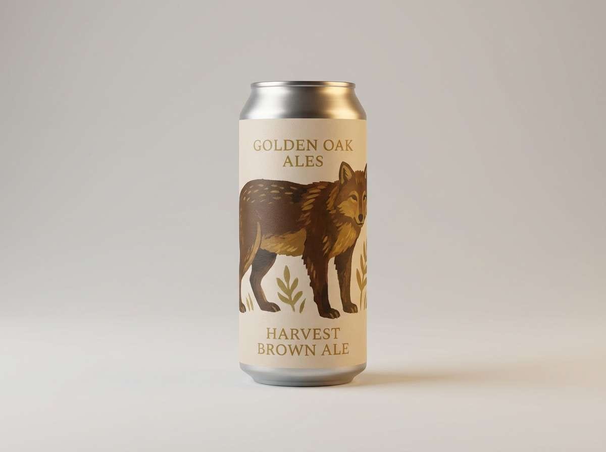
Vintage and confident, like brass fixtures against dark bark textures. The deep brown makes type and badge shapes look solid, while tan and beige keep the label readable at a glance. Brass-gold adds a punchy highlight for awards, batch numbers, or limited editions. Tip: use the gold only on small elements so it reads as metallic, not mustard.
Image example of brass and bark generated using media.io
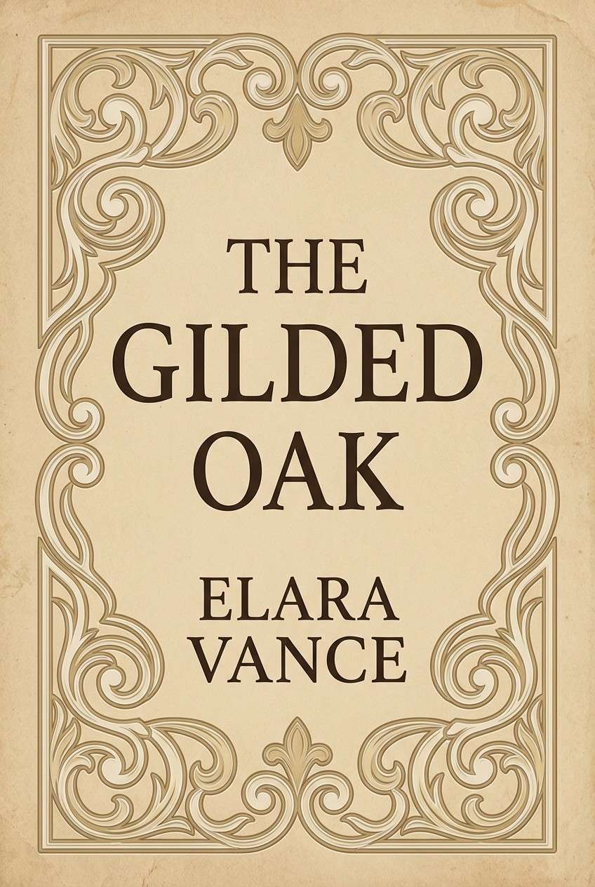
16) Vintage Map
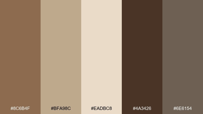
HEX: #8C6B4F #BFA98C #EADBC8 #4A3426 #6E6154
Mood: nostalgic, academic, classic
Best for: book cover design for historical fiction
Nostalgic and academic, like a folded map with inked borders and aged paper. The parchment tones make a perfect canvas for typography, while the dark brown frames the title and author name. A gray-brown accent can be used for small ornaments, lines, and chapter marks. Tip: add subtle grain or paper texture so the palette feels authentically printed.
Image example of vintage map generated using media.io
17) Autumn Suede
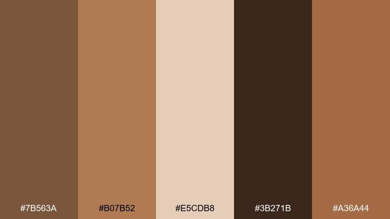
HEX: #7B563A #B07B52 #E5CDB8 #3B271B #A36A44
Mood: warm, stylish, seasonal
Best for: fashion lookbook layout
Warm and stylish, like suede boots and late-October light. The tan-to-caramel range creates a cohesive lookbook backdrop that flatters product imagery and typography. Deep espresso defines headings, while the terracotta-brown can highlight prices or collection names. Tip: keep the palette mostly neutral and use the terracotta as a repeating accent for rhythm.
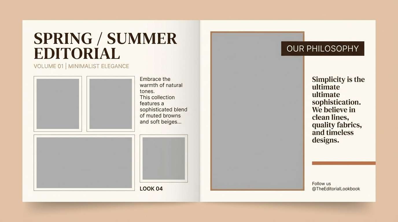
Image example of autumn suede generated using media.io
18) Trail Mix Neutral
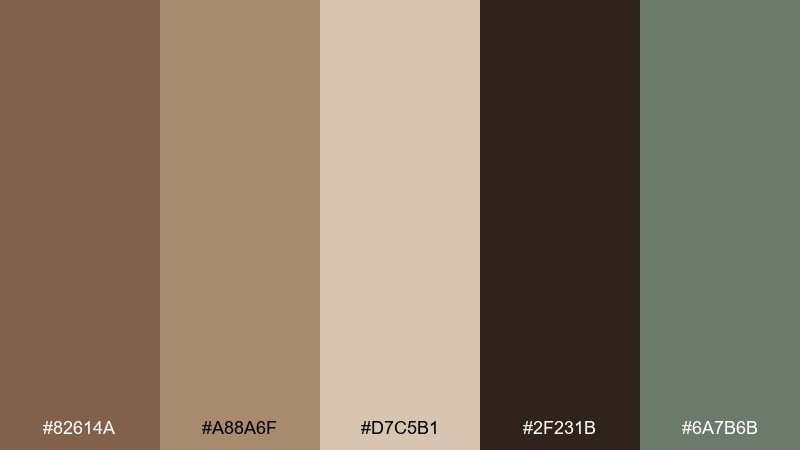
HEX: #82614A #A88A6F #D7C5B1 #2F231B #6A7B6B
Mood: practical, outdoorsy, balanced
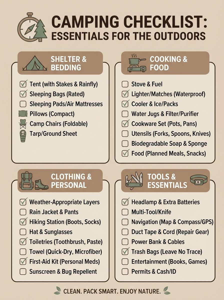
Best for: camping checklist infographic
Practical and outdoorsy, like a trail mix bag and a worn canvas pack. Mid tan tones keep the infographic friendly, while dark brown ensures strong contrast for labels and icons. The muted green supports categories and callouts without competing with the main text. Tip: use the light beige for the background and reserve the darkest tone for headers only.
Image example of trail mix neutral generated using media.io
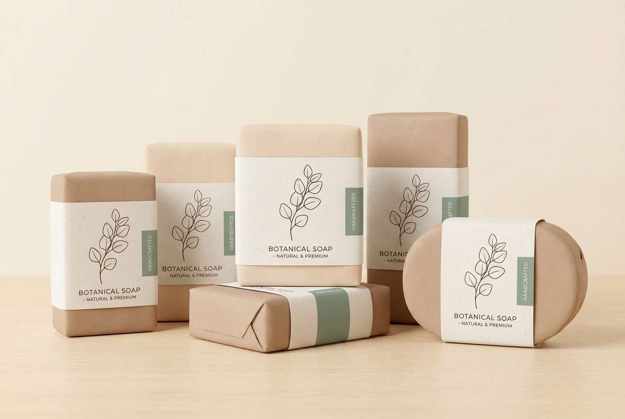
19) Clay and Eucalyptus
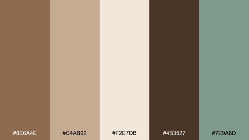
HEX: #8E6A4E #C4AB92 #F2E7DB #4B3527 #7E9A8D
Mood: fresh, earthy, airy
Best for: botanical packaging for soap
Fresh and earthy, like clay pots beside eucalyptus leaves. The warm neutrals make packaging feel gentle and handmade, while the cool green adds a clean botanical note. Deep brown grounds the label copy and keeps it legible on light stocks. Tip: pair the green with simple line illustrations to keep the look modern, not rustic.
Image example of clay and eucalyptus generated using media.io
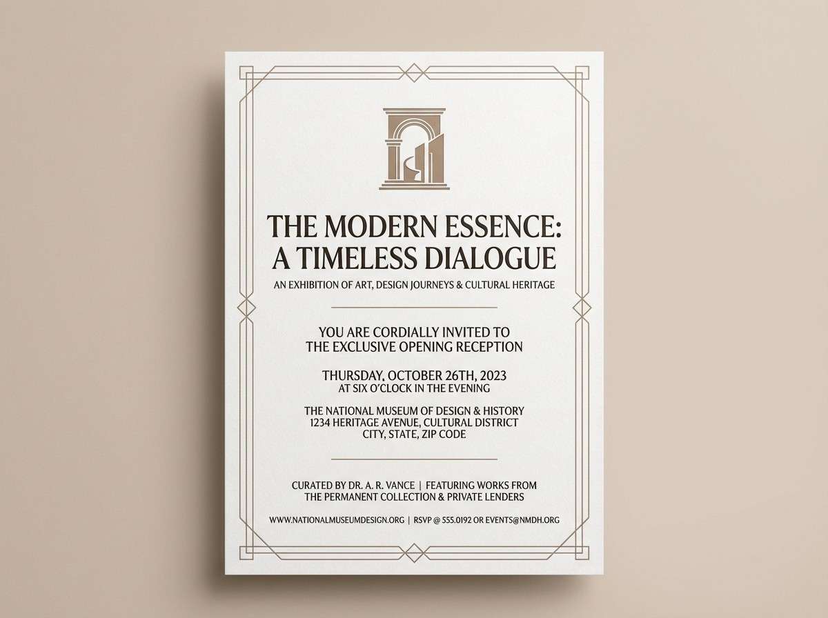
20) Museum Sepia
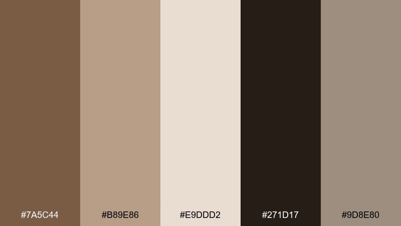
HEX: #7A5C44 #B89E86 #E9DDD2 #271D17 #9D8E80
Mood: refined, quiet, cultured
Best for: museum exhibition invitation
Refined and cultured, like sepia photographs in a quiet gallery. The pale paper tone is ideal for invitations, while espresso-black handles event details with sharp clarity. Mid tans add warmth to borders and typographic ornaments without feeling dated. Tip: keep ornamentation minimal and let the whitespace do the luxury work.
Image example of museum sepia generated using media.io
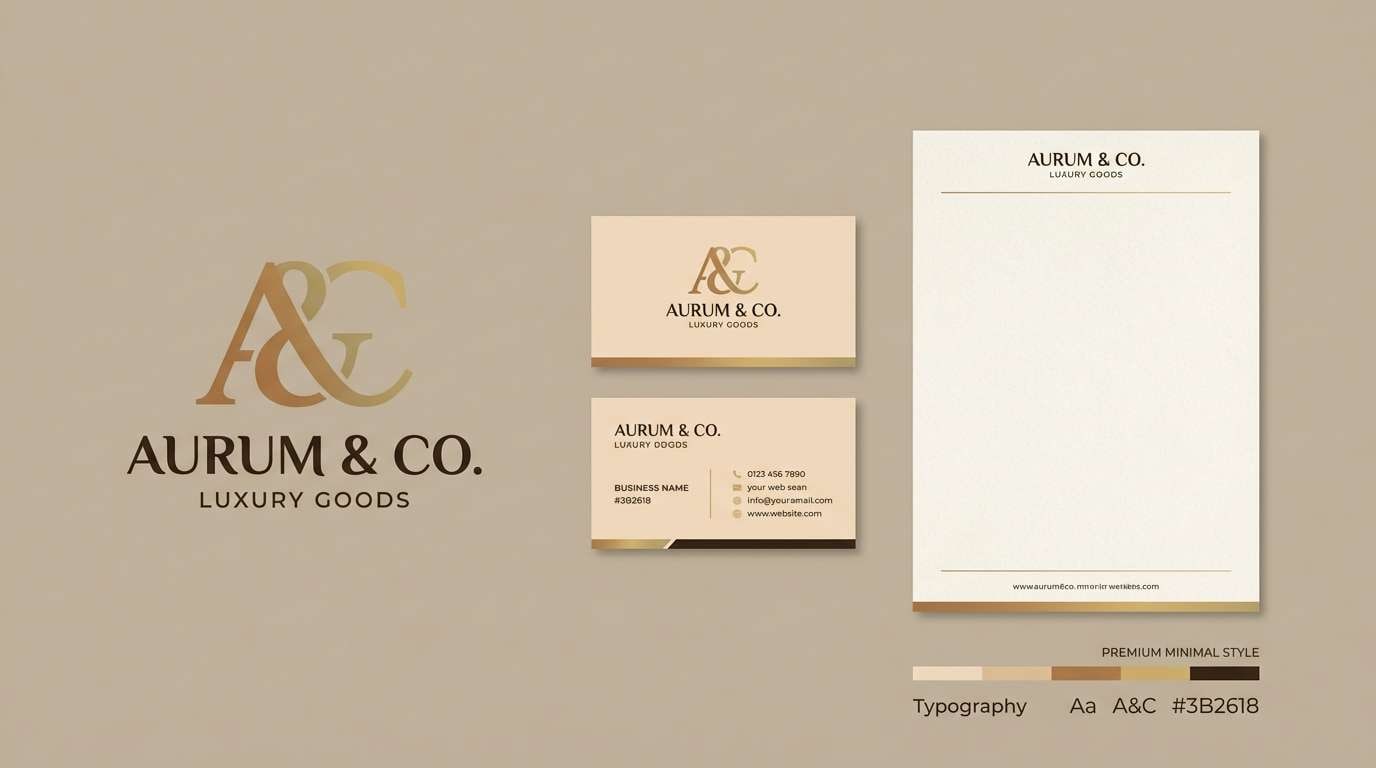
21) Golden Leather
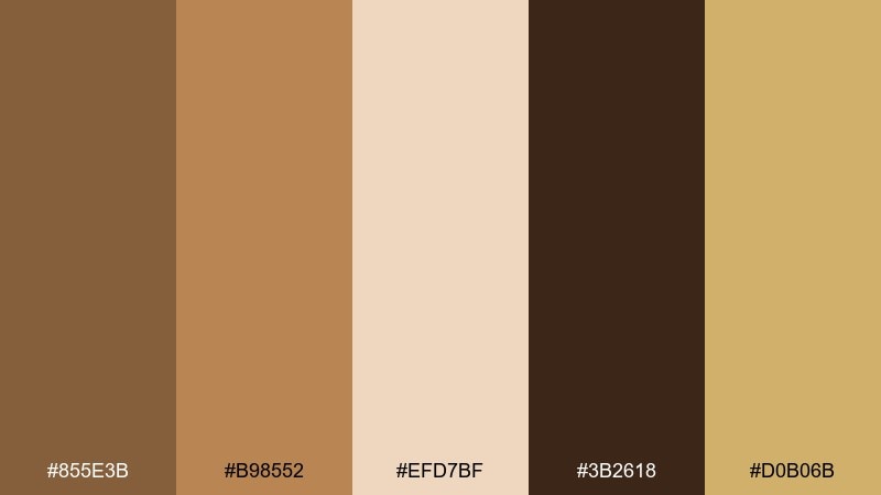
HEX: #855E3B #B98552 #EFD7BF #3B2618 #D0B06B
Mood: premium, warm, confident
Best for: luxury brand identity system
Premium and confident, like golden leather under spotlighted display cases. The tan and caramel core creates an elegant base for stationery, while the deep brown gives logos instant authority. A muted gold ties everything together for seals, foil accents, and highlights. Tip: for digital, emulate foil with subtle gradients and keep gold use under 10 percent.
Image example of golden leather generated using media.io
22) Night Market Tan
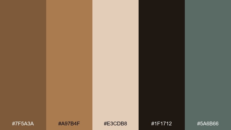
HEX: #7F5A3A #A97B4F #E3CDB8 #1F1712 #5A6B66
Mood: urban, warm, slightly edgy
Best for: restaurant social ad carousel
Urban and warm, like street lights reflecting on wood tables at a night market. The near-black gives dramatic contrast for bold offers, while tan and beige keep food photography frames feeling appetizing. A muted green-gray supports icons and CTA elements without becoming too colorful. Tip: use the darkest tone as a consistent strip across slides for quick recognition.
Image example of night market tan generated using media.io

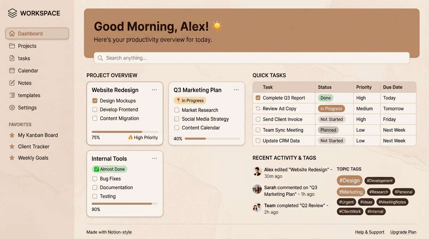
23) Cinnamon Archive
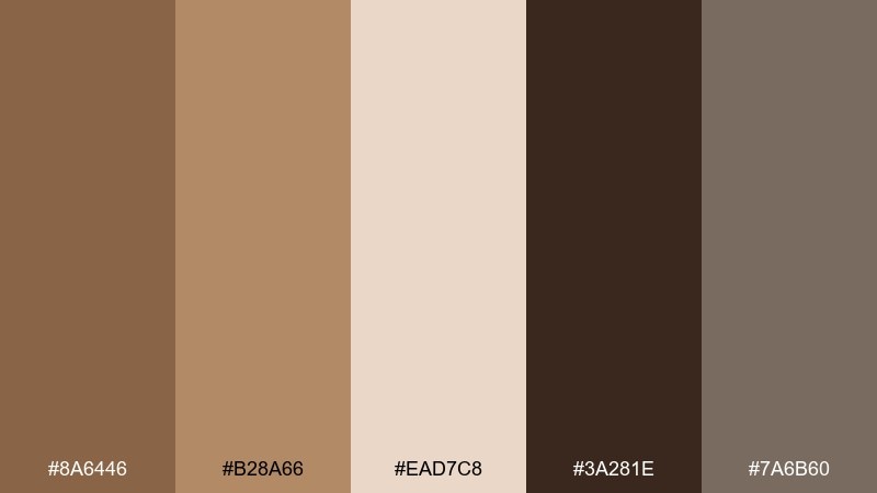
HEX: #8A6446 #B28A66 #EAD7C8 #3A281E #7A6B60
Mood: nostalgic, warm, tidy
Best for: Notion-style dashboard template
Nostalgic and tidy, like cinnamon folders and neatly labeled archives. This dark tan color palette supports long sessions with low glare backgrounds and high-contrast text. Use the mid tan for tags and section headers, and keep the gray-brown for dividers and subtle UI borders. Tip: stick to two font weights so the warm neutrals do not feel cluttered.
Image example of cinnamon archive generated using media.io
What Colors Go Well with Dark Tan?
Dark tan pairs best with light neutrals like cream, off-white, and warm beige because they keep the overall look airy while preserving that cozy warmth. This is a go-to combination for editorial layouts, product pages, and interiors.
For modern contrast, add espresso brown, charcoal, or near-black in small doses—navigation, headers, key labels, and outlines. It sharpens readability without making the palette feel cold.
If you want color, muted greens (sage, eucalyptus), slate teal, and smoke gray are especially compatible. They keep the scheme grounded and contemporary, rather than overly orange or sepia.
How to Use a Dark Tan Color Palette in Real Designs
Start with a clear role system: use the lightest tone for background, mid tans for surfaces (cards, sections), and the darkest brown for text and structure. This keeps contrast predictable and prevents “muddy” screens when content gets dense.
In branding and packaging, dark tan reads premium when paired with minimal typography and generous whitespace. If you’re using gold or honey accents, keep them small so they feel like highlights rather than main blocks of color.
For social and marketing creatives, anchor each layout with one consistent dark element (a headline bar or footer strip), then let tan and cream do the heavy lifting. The result feels cohesive even across multiple posts.
Create Dark Tan Palette Visuals with AI
If you already have HEX codes but need matching visuals, AI can help you generate on-brand mockups, UI screens, flyers, and packaging concepts fast. The prompts above are designed to keep the palette dominant while still producing clean, usable compositions.
In Media.io, you can paste a prompt, define your aspect ratio, and guide the output with your main tan, light neutrals, and one accent (like sage or slate). That’s usually enough to get consistent results across a full set of designs.
Once you like a direction, iterate by swapping only one element at a time (background tone, accent color, or layout type) to build a cohesive series.
Dark Tan Color Palette FAQs
-
What is a dark tan color (in simple terms)?
Dark tan is a warm, brown-leaning neutral that sits between tan and light brown. It often feels earthy and cozy while still working as a “neutral base” in modern palettes. -
Is dark tan good for website backgrounds?
Yes—especially when you use a light cream/off-white for the main background and keep dark tan for sections, cards, or headers. For readability, pair it with espresso or near-black text. -
What accent colors look best with dark tan?
Muted greens (sage/eucalyptus), slate teal, smoke gray, honey-gold, and deep espresso are reliable accents. They add contrast without fighting the warm undertone of tan. -
How do I keep a tan palette from looking muddy?
Increase value contrast: use a very light neutral (cream) plus one distinctly dark tone (espresso/charcoal). Then keep mid tones for small surfaces and borders, not entire screens. -
Which dark tan palette is best for luxury branding?
Try palettes that include deep brown plus a controlled gold accent—like “Golden Leather.” Use gold sparingly for seals, foil-style highlights, or small UI indicators. -
Can dark tan work in modern UI design?
Absolutely. Palettes like “Dune Minimal” and “Cinnamon Archive” are built for UI: light neutrals for background, darker browns for typography, and mid tans for components and dividers. -
How can I generate matching palette images quickly?
Use Media.io text-to-image with prompts that specify your dominant HEX colors and a clean layout type (UI mockup, poster, packaging). Keep the palette list in the prompt so the model follows your tones.


