

Royal blue is a confident, classic hue that instantly signals clarity, trust, and energy. In digital UI, print, and branding, it holds contrast well and stays vibrant across many surfaces.
Below are modern royal blue color palette ideas with HEX codes, plus practical pairing tips and AI prompts you can reuse to generate consistent visuals for your projects.
In this article
- Why Royal Blue Palettes Work So Well
-
- crown jewel contrast
- midnight silk
- coastal regatta
- neon arcade blue
- heritage navy blend
- royal garden party
- satin and sand
- winter gala lights
- tech blueprint
- vintage porcelain
- berry royale
- museum wall
- sunset sport
- calm clinic
- indigo ink
- brass and velvet
- minimal portfolio
- festival flag
- quiet library
- skyline nightlife
- ceramic calm
- tropical royal pop
- What Colors Go Well with Royal Blue?
- How to Use a Royal Blue Color Palette in Real Designs
- Create Royal Blue Palette Visuals with AI
Why Royal Blue Palettes Work So Well
Royal blue sits in a “sweet spot” between friendly and authoritative. It’s bolder than many navies, but still professional enough for SaaS, finance, healthcare, and premium consumer brands.
Because it’s naturally high in chroma, royal blue anchors layouts without needing heavy outlines. Pair it with near-black inks for legibility, or soften it with warm ivories and beiges for a more human, editorial feel.
It also plays nicely with accents: gold for luxury, teal for freshness, pinks for lifestyle, and oranges for momentum. That flexibility makes royal blue color combinations easy to scale from a single landing page to a full design system.
20+ Royal Blue Color Palette Ideas (with HEX Codes)
1) Crown Jewel Contrast
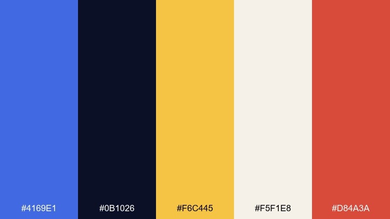
HEX: #4169E1 #0B1026 #F6C445 #F5F1E8 #D84A3A
Mood: regal, high-contrast, energetic
Best for: branding for premium products
Regal and punchy, this mix feels like polished medals on deep velvet. Use it when you want authority with a pop of celebratory warmth. The gold works best as a highlight on buttons, badges, or key numbers, while ivory keeps layouts breathable. For a clean finish, reserve the red for small calls to action rather than large blocks.
Image example of crown jewel contrast generated using media.io
Media.io is an online AI studio for creating and editing video, image, and audio in your browser.

2) Midnight Silk
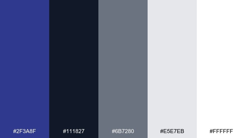
HEX: #2F3A8F #111827 #6B7280 #E5E7EB #FFFFFF
Mood: sleek, editorial, understated
Best for: saas dashboards and data-heavy UI
Sleek and quiet, it reads like satin fabric under low light. The deep blue anchors navigation and headers without feeling harsh. Pair the grays for tables and secondary text, then keep white for generous negative space. Tip: use the darkest tone only for top bars so charts and cards stay legible.
Image example of midnight silk generated using media.io
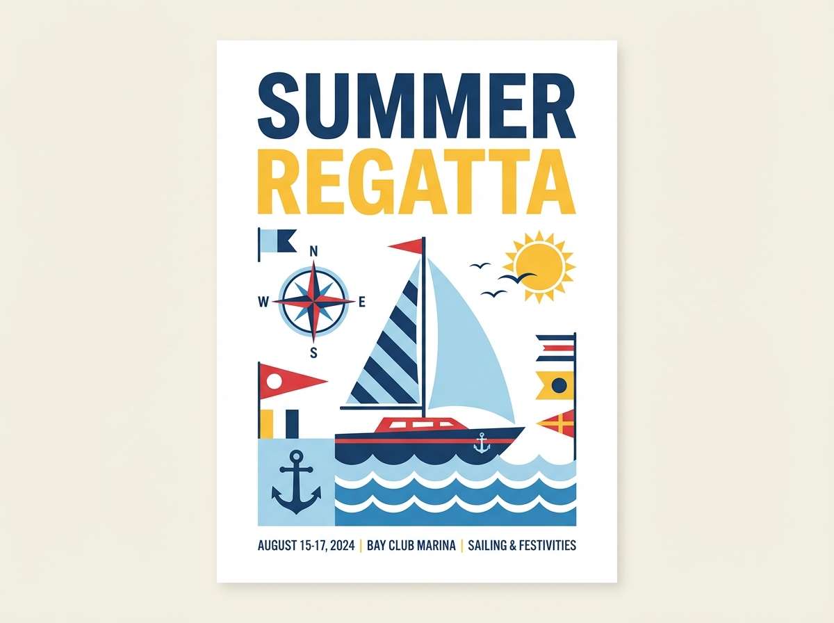
3) Coastal Regatta
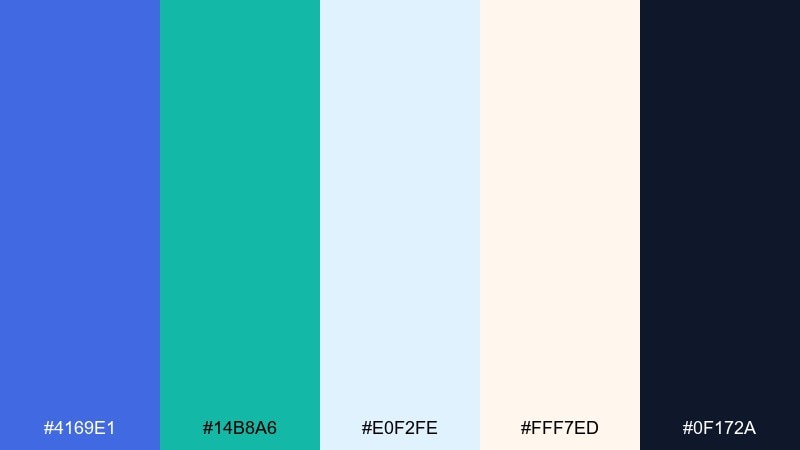
HEX: #4169E1 #14B8A6 #E0F2FE #FFF7ED #0F172A
Mood: fresh, sporty, breezy
Best for: summer event posters and tickets
Fresh and sporty, it feels like sails cutting through bright coastal air. Teal brings motion while soft sky tones keep the palette light and approachable. Use the navy for type and icon strokes so the airy colors do not wash out. For a bold focal point, place royal blue next to teal in headlines and directional arrows.
Image example of coastal regatta generated using media.io
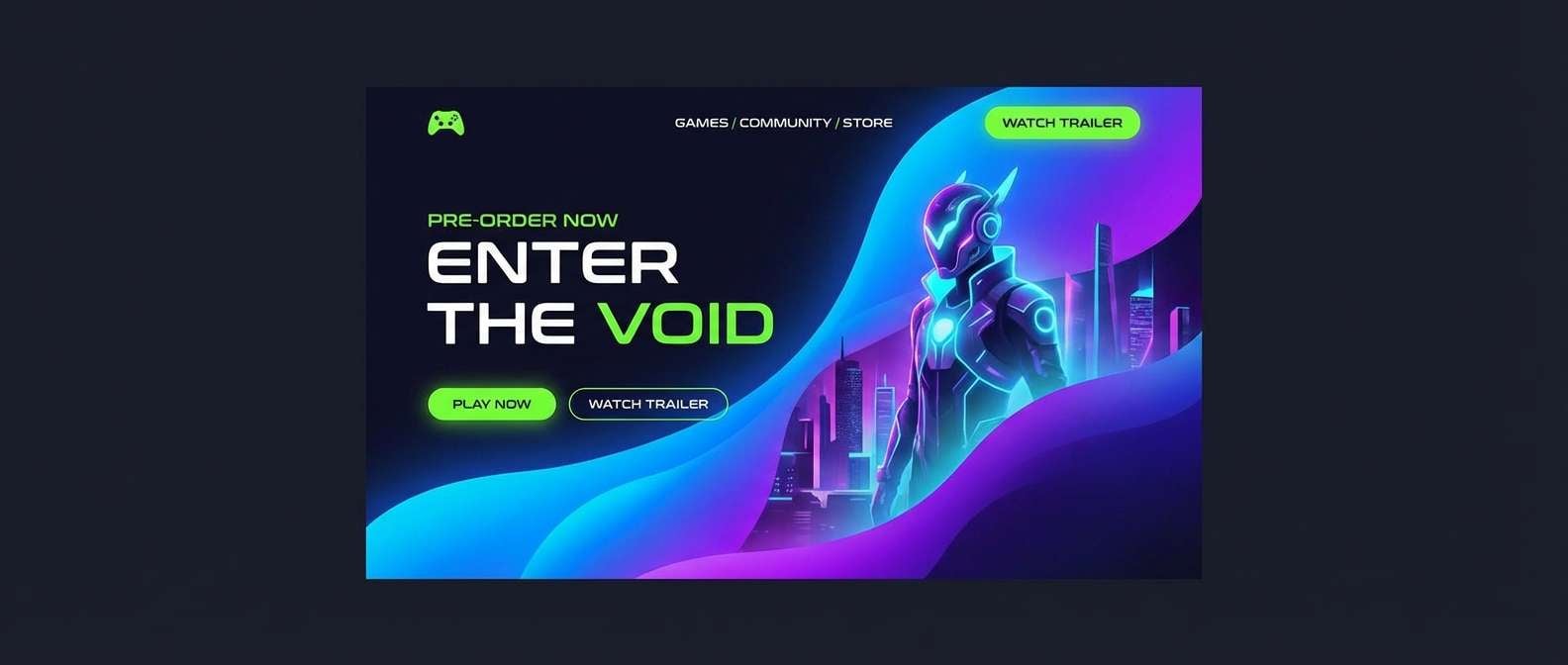
4) Neon Arcade Blue
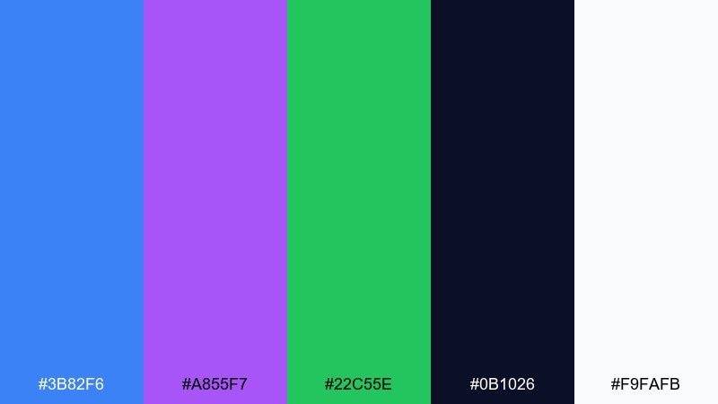
HEX: #3B82F6 #A855F7 #22C55E #0B1026 #F9FAFB
Mood: playful, electric, youthful
Best for: gaming landing pages
Playful and electric, it evokes arcade lights against a midnight wall. The bright accents shine best when you limit them to interactive states, tags, and micro-illustrations. Keep the background near-black for drama, and use off-white for comfortable reading. Tip: assign one neon per feature section so the page feels curated, not chaotic.
Image example of neon arcade blue generated using media.io
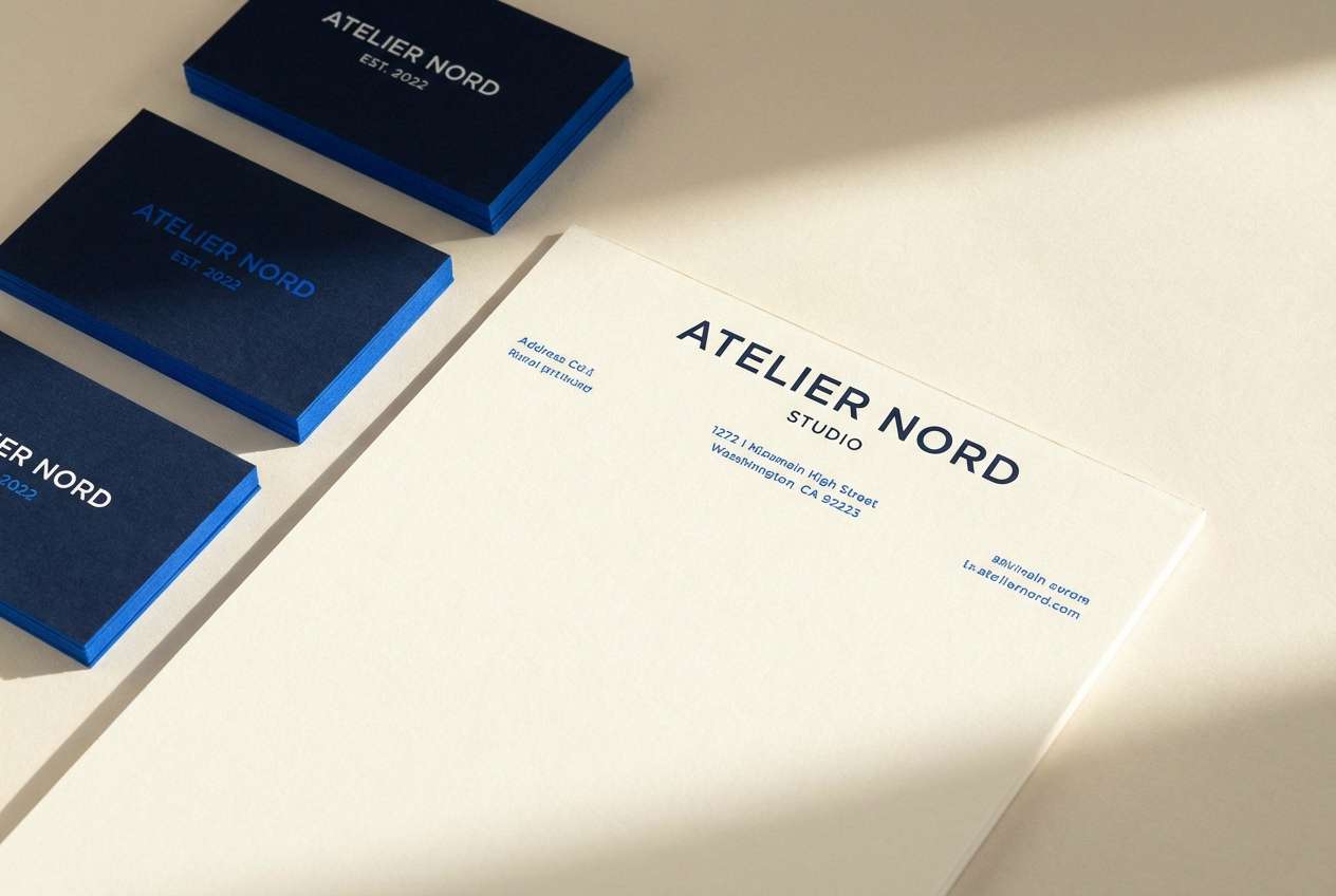
5) Heritage Navy Blend
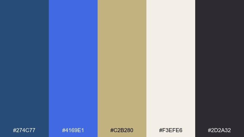
HEX: #274C77 #4169E1 #C2B280 #F3EFE6 #2D2A32
Mood: classic, trustworthy, refined
Best for: law firm or finance brand identity
Classic and trustworthy, it feels like a well-worn blazer with a crisp pocket square. The tan and ivory soften the blues, giving you a premium look without feeling cold. Use the darker ink tone for long-form text and the brighter blue for links and section dividers. This royal blue color scheme works especially well with serif headlines and subtle line icons.
Image example of heritage navy blend generated using media.io
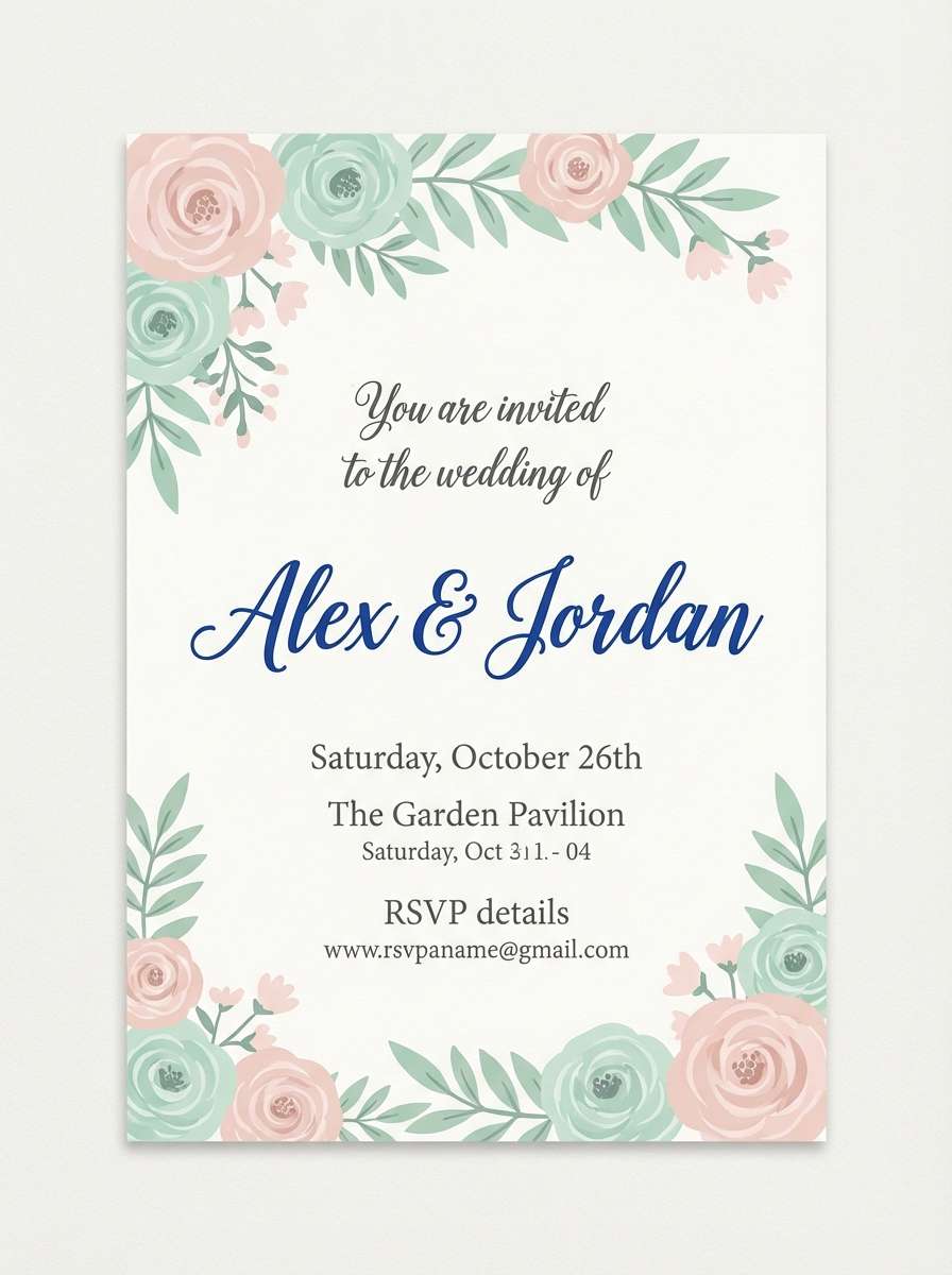
6) Royal Garden Party
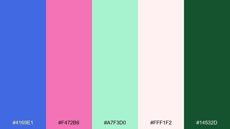
HEX: #4169E1 #F472B6 #A7F3D0 #FFF1F2 #14532D
Mood: romantic, cheerful, springlike
Best for: wedding invitations and floral stationery
Romantic and bright, it brings to mind petals scattered on a sunlit table. The mint and blush keep the blues from feeling formal, making it great for celebrations and lifestyle design. Use green for small botanical details and keep royal blue for names or monograms. Tip: print blush as a background wash and let the blue carry the hierarchy.
Image example of royal garden party generated using media.io
7) Satin and Sand
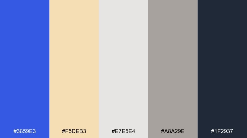
HEX: #3659E3 #F5DEB3 #E7E5E4 #A8A29E #1F2937
Mood: calm, warm, minimal
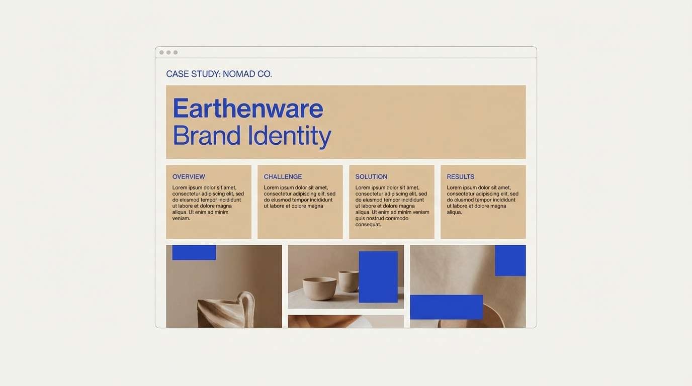
Best for: portfolio websites and case studies
Calm and warm, it feels like blue satin laid over sunlit sand. The wheat tone makes the blue look richer, while the stone grays keep everything grounded. Use the light neutrals for section backgrounds and bring the blue in for headings and key links. Tip: keep body text in charcoal to avoid the washed-out look of mid-gray on beige.
Image example of satin and sand generated using media.io
8) Winter Gala Lights
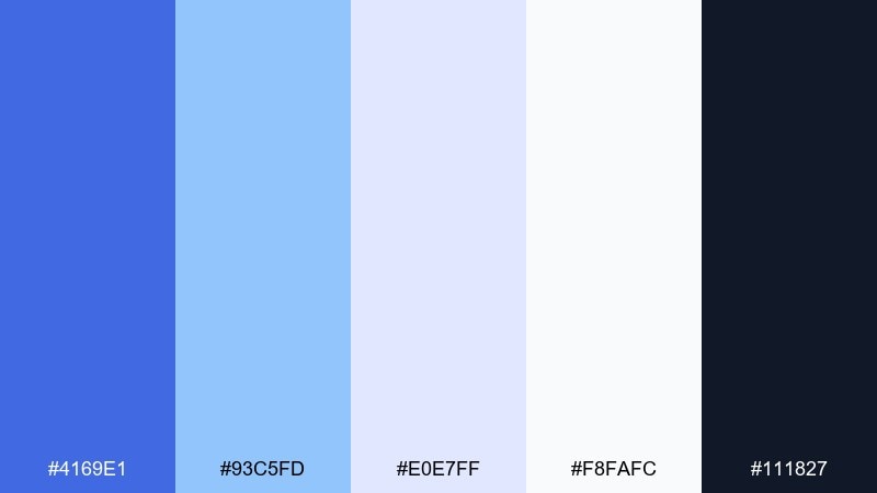
HEX: #4169E1 #93C5FD #E0E7FF #F8FAFC #111827
Mood: crisp, luminous, elegant
Best for: holiday campaign banners
Crisp and luminous, it resembles ice-blue reflections under city lights. Layer the lighter blues for gradients and soft shadows, then use the darkest tone to sharpen type and icons. It works beautifully for seasonal promos, hero banners, and refined announcements. Tip: add subtle grain or a faint glow around royal blue elements to keep the palette from feeling flat.
Image example of winter gala lights generated using media.io

9) Tech Blueprint
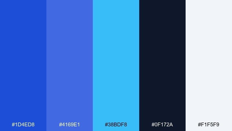
HEX: #1D4ED8 #4169E1 #38BDF8 #0F172A #F1F5F9
Mood: technical, focused, modern
Best for: developer docs and product UI
Technical and focused, it looks like crisp blueprint ink on clean paper. Use the deep navy for code blocks and sidebars, then reserve the brighter blues for links, tabs, and active states. The pale background keeps long reading sessions comfortable. One smart usage tip is to keep icons in a single blue tint so the UI feels consistent across pages.
Image example of tech blueprint generated using media.io
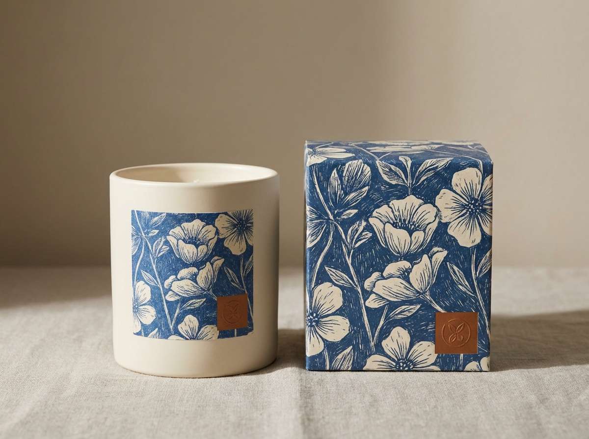
10) Vintage Porcelain

HEX: #2B4C9A #4169E1 #F4F1EA #C7D2FE #7C2D12
Mood: nostalgic, delicate, artful
Best for: boutique packaging and labels
Nostalgic and delicate, it recalls painted porcelain with a tiny warm glaze detail. The off-white and periwinkle tones keep the blues soft, while the cinnamon accent adds a handcrafted finish. Use the brown sparingly for seal marks, icons, or a thin border line. For a premium feel, pair it with textured paper stock and minimal typography.
Image example of vintage porcelain generated using media.io
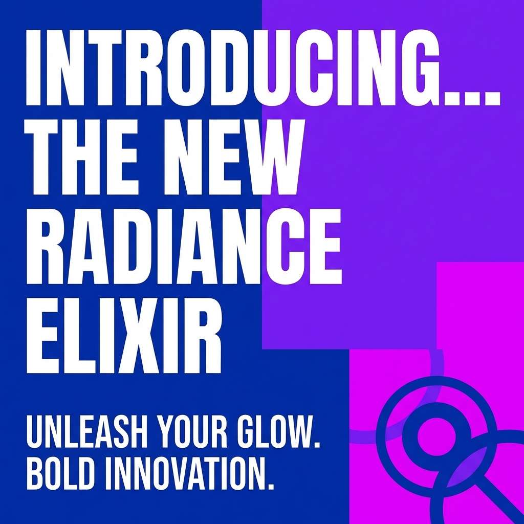
11) Berry Royale
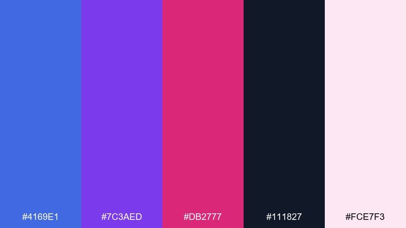
HEX: #4169E1 #7C3AED #DB2777 #111827 #FCE7F3
Mood: bold, glamorous, nightlife
Best for: beauty promos and social ads
Bold and glamorous, it feels like velvet lighting in a late-night lounge. Magenta and violet make the blue read more luxurious, perfect for beauty launches or statement visuals. Keep the near-black for copy and the pale pink for breathing room. Tip: use one high-saturation accent per ad so the headline stays the hero.
Image example of berry royale generated using media.io
12) Museum Wall
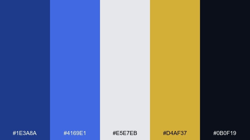
HEX: #1E3A8A #4169E1 #E5E7EB #D4AF37 #0B0F19
Mood: dramatic, curated, premium
Best for: editorial layouts and lookbooks
Dramatic and curated, it evokes framed art against a dark gallery wall. The gold accent reads like a small plaque detail, adding instant prestige. Use light gray for body copy blocks and keep the darkest tone for margins and headlines. This royal blue color palette shines when you limit gold to rules, page numbers, and tiny highlights.
Image example of museum wall generated using media.io
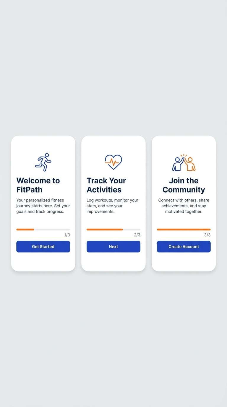
13) Sunset Sport
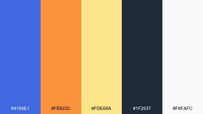
HEX: #4169E1 #FB923C #FDE68A #1F2937 #F8FAFC
Mood: active, upbeat, outdoorsy
Best for: fitness app onboarding screens
Active and upbeat, it feels like a bright sunset after a clean training session. Orange and amber add warmth and momentum, while the dark slate keeps copy readable. Use the warm tones for progress indicators and highlights, not full backgrounds. Tip: keep buttons in royal blue and use orange only for success states to avoid confusion.
Image example of sunset sport generated using media.io
14) Calm Clinic
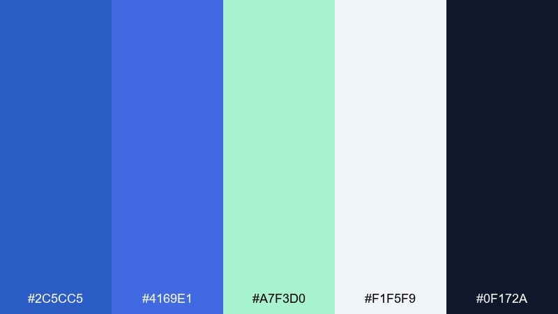
HEX: #2C5CC5 #4169E1 #A7F3D0 #F1F5F9 #0F172A
Mood: reassuring, clean, professional
Best for: healthcare websites and patient portals
Reassuring and clean, it reads like fresh air in a bright waiting room. The mint adds a gentle wellness cue without turning overly playful. Use the light slate as the main canvas, then bring in blue for navigation and form focus states. For accessibility, keep text in the dark ink tone and use mint only as a supporting accent.
Image example of calm clinic generated using media.io
15) Indigo Ink
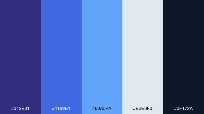
HEX: #312E81 #4169E1 #60A5FA #E2E8F0 #0F172A
Mood: confident, academic, precise
Best for: online course platforms
Confident and precise, it feels like ink on a well-organized notebook. The layered blues give you clear hierarchy for tabs, lessons, and progress elements. Use the pale slate for cards and the darkest tone for long reading text. Tip: keep the brightest blue for active states so navigation stays instantly scannable.
Image example of indigo ink generated using media.io

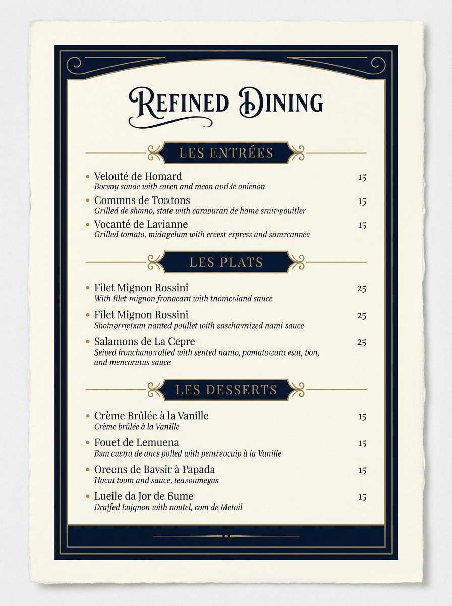
16) Brass and Velvet
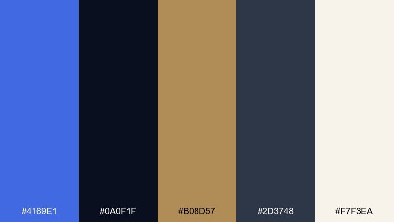
HEX: #4169E1 #0A0F1F #B08D57 #2D3748 #F7F3EA
Mood: luxurious, moody, sophisticated
Best for: hotel and restaurant menus
Luxurious and moody, it suggests brass fixtures against deep velvet seating. The warm metallic hue adds sophistication without shouting, especially in fine-dining or hospitality design. Use ivory for menu paper or content panels, and keep navy for headlines and section rules. Tip: set the brass tone for prices and small separators to guide the eye subtly.
Image example of brass and velvet generated using media.io
17) Minimal Portfolio
HEX: #4169E1 #F8FAFC #E5E7EB #374151 #111827
Mood: modern, crisp, no-nonsense
Best for: designer portfolios and resumes
Modern and crisp, it feels like a sharp suit with a single bright pocket accent. The neutral ramp is ideal for typography-first pages where work samples should lead. Use royal blue for links, active filters, and small badges, then let white carry most sections. Tip: keep imagery framed by light gray so the blue never competes with your projects.
Image example of minimal portfolio generated using media.io
18) Festival Flag
HEX: #4169E1 #EF4444 #F59E0B #10B981 #F9FAFB
Mood: festive, bold, friendly
Best for: community flyers and announcements
Festive and friendly, it reads like colorful flags fluttering over a bright street fair. The warm and cool accents give you plenty of options for categories, schedules, and callouts. Keep the background white so the colors stay clean and accessible. If you want quick impact, place royal blue next to red for one of those punchy royal blue color combinations that grabs attention fast.
Image example of festival flag generated using media.io
19) Quiet Library
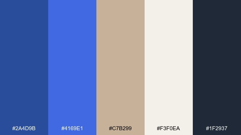
HEX: #2A4D9B #4169E1 #C7B299 #F3F0EA #1F2937
Mood: cozy, intellectual, grounded
Best for: book covers and long-read blogs
Cozy and grounded, it evokes a quiet reading nook with linen pages and deep blue spines. The warm beige keeps the design approachable for long-form content. Use the darker text tone for readability, and save the brighter blue for pull quotes and link styles. Tip: add a thin beige border around blue blocks to soften the contrast on screens.
Image example of quiet library generated using media.io
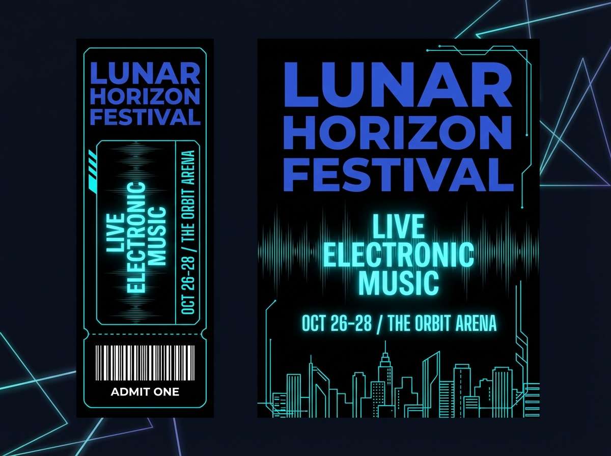
20) Skyline Nightlife
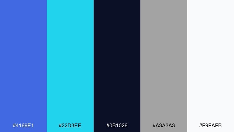
HEX: #4169E1 #22D3EE #0B1026 #A3A3A3 #F9FAFB
Mood: urban, sharp, futuristic
Best for: music event promos and tickets
Urban and sharp, it looks like neon reflections on glass at midnight. Cyan brings a futuristic edge while the deep background keeps everything dramatic. Use the light gray for supporting copy and reserve white for dates, venues, and key details. Tip: keep gradients subtle, and use cyan only for highlights so the composition stays clean.
Image example of skyline nightlife generated using media.io
21) Ceramic Calm
HEX: #4169E1 #94A3B8 #E2E8F0 #FAFAF9 #0F172A
Mood: soft, modern, airy
Best for: product UI for productivity tools
Soft and airy, it feels like matte ceramic surfaces with a crisp blue glaze. The cool grays make the primary blue stand out without turning loud. Use the near-white for main panels, then apply royal blue to primary actions and selected states. One simple tip: keep secondary buttons in gray outlines so the interface stays calm under heavy use.
Image example of ceramic calm generated using media.io
22) Tropical Royal Pop
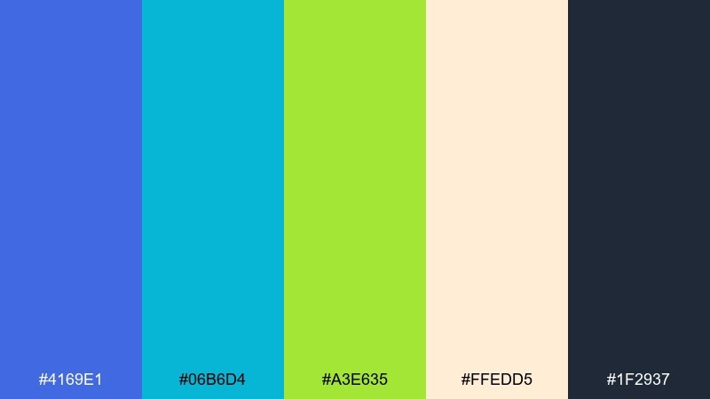
HEX: #4169E1 #06B6D4 #A3E635 #FFEDD5 #1F2937
Mood: bright, upbeat, summery
Best for: travel ads and email headers
Bright and upbeat, it conjures turquoise water and lime zest against a bold blue sky. The warm peach background keeps it friendly for marketing and lifestyle visuals. Use charcoal for body copy and place royal blue in the headline zone for strong recognition. This royal blue color palette benefits from plenty of whitespace so the tropical accents feel intentional, not noisy.
Image example of tropical royal pop generated using media.io
What Colors Go Well with Royal Blue?
Royal blue pairs naturally with clean neutrals like white, ivory, cool grays, and near-black inks—these keep typography readable and let the blue feel intentional rather than overpowering.
For accents, warm metallics (gold/brass) add a premium tone, while teal/cyan adds freshness and motion. Pink and magenta push royal blue toward glamorous, lifestyle aesthetics, and orange/amber creates energetic, sporty contrast.
If you want a calmer look, bring in beige, wheat, or warm off-white; they make royal blue feel richer and more editorial, especially for long-form pages and print layouts.
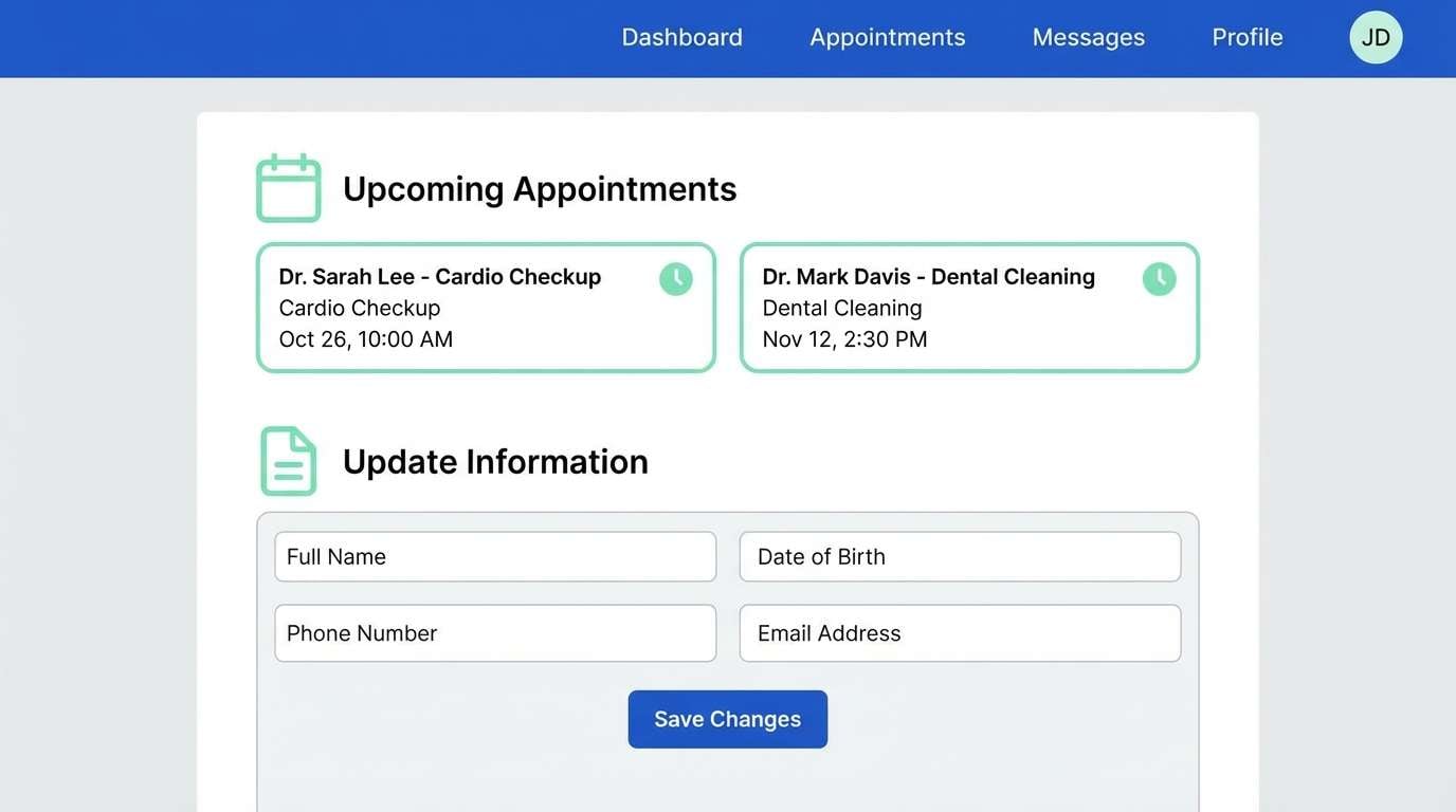
How to Use a Royal Blue Color Palette in Real Designs
Use royal blue as the “primary action” color: buttons, selected tabs, links, and key highlights. Then build a neutral base (white/near-white) so the UI stays legible and scalable across pages.
Keep high-saturation accents limited and consistent: pick one accent for states (success, warning, promo) and reuse it everywhere. This avoids the common issue where royal blue plus multiple brights starts to look noisy.
For print and branding, test on real materials. Royal blue can shift slightly across coated vs. uncoated stock, so pair it with stable neutrals (ivory/charcoal) to maintain hierarchy even when the blue varies.
Create Royal Blue Palette Visuals with AI
When you need quick mockups—posters, packaging, social ads, or UI hero sections—AI generation helps you validate a royal blue palette before committing to full design production.
Start with one palette, describe the scene (product shot, dashboard, invitation), then specify how each color is used (background, typography, accents). Keep prompts consistent across variations so your visuals look like a cohesive set.
With Media.io, you can generate multiple styles fast, compare contrast and mood, then refine prompts until the colors and lighting match your brand direction.
Royal Blue Color Palette FAQs
-
What is the HEX code for royal blue?
A common web-friendly royal blue HEX is #4169E1. It’s bright, saturated, and widely used for links, buttons, and brand accents. -
Is royal blue good for branding?
Yes. Royal blue communicates trust and confidence while still feeling modern. It works especially well for tech, finance, education, and premium consumer products when balanced with neutrals. -
What neutral colors pair best with royal blue?
White, ivory, light gray, slate, and near-black are the safest choices. They protect readability and help royal blue stand out without overwhelming the layout. -
What are the best accent colors with royal blue?
Gold/brass for luxury, teal/cyan for freshness, magenta/pink for lifestyle and glam, and orange/amber for energetic, sporty designs. -
How do I keep a royal blue palette from looking too loud?
Use royal blue as the main highlight and keep other saturated colors limited to small UI states or tiny print details. Increase whitespace and rely on grays/ivories for most surfaces. -
Is royal blue accessible for UI text and buttons?
Royal blue can be very accessible when paired correctly. Use dark ink tones for body text, and check contrast for button text (often white on royal blue works well, but verify with a contrast checker). -
Can I generate royal blue palette mockups with AI?
Yes. Use a consistent prompt template describing the design type (e.g., dashboard, poster, packaging) and specify where royal blue and accents appear for repeatable, brand-consistent results.
Next: Teal Red Color Palette


