

Blue and lilac sit in that sweet spot between calm blue and romantic lavender, making it a versatile base for modern design systems and brand identities.
Below are 20 curated lilac and blue combinations with HEX codes, plus prompts you can use to generate matching visuals with Media.io.
In this article
- Why Lilac and Blue Color Combinations Work So Well
-
- misty lilac sky
- periwinkle cloud
- iris dusk
- blue lilac bouquet
- powder violet minimal
- neon lilac night
- lavender frost
- hydrangea tea
- soft orbit
- amethyst breeze
- pastel circuit
- lilac denim
- crystal fade gradient
- twilight orchid
- silver petal
- skyline mauve
- berry lilac pop
- frosted plum
- quiet violet gray
- ocean lilac glow
- What Colors Go Well with Blue Lilac?
- How to Use a Lilac and Blue Combination in Real Designs
- Create Lilac and Blue Palette Visuals with AI
Why Lilac and Blue Color Combinations Work So Well
Lilac blue blends the trust and clarity of blue with the softness of lavender, creating a look that feels both professional and emotionally warm. It’s especially effective when you want “calm premium” without going sterile.
Because most lilac and blue ccombinations include airy tints plus one or two deeper indigo anchors, they’re easy to scale across UI states, print layouts, and brand systems. You get gentle backgrounds, readable type, and clear CTA contrast from the same family.
They also pair smoothly with neutrals, metallics, and modern typography, which helps the combination stay timeless. Whether you lean dreamy pastel or moody neon, blue lilac adapts without losing cohesion.
20+ Lilac and Blue Color Combinations (with HEX Codes)
1) Misty Lilac Sky
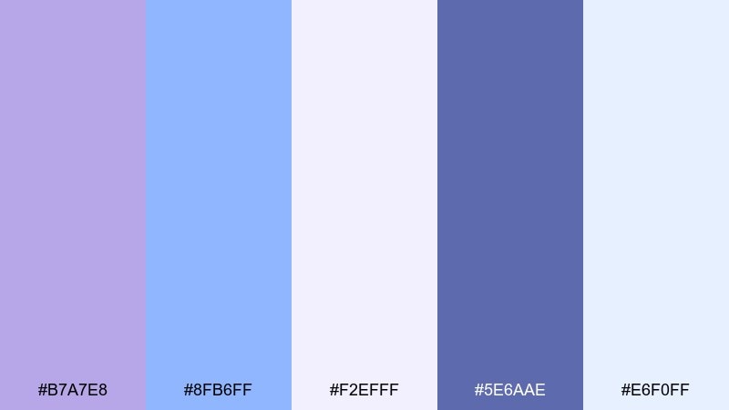
HEX: #B7A7E8 #8FB6FF #F2EFFF #5E6AAE #E6F0FF
Mood: airy, calm, dreamy
Best for: app onboarding screens
Airy and weightless, these lilac and blue tones feel like early morning clouds with a hint of violet haze. Use the pale tints for backgrounds and reserve the indigo for headings and CTAs to keep contrast accessible. Pair with clean whites and soft rounded icons for a friendly first-run experience. Tip: apply the lilac as a subtle gradient behind key illustrations to guide attention without visual noise.
Image example of misty lilac sky generated using media.io
Media.io is an online AI studio for creating and editing video, image, and audio in your browser.

2) Periwinkle Cloud
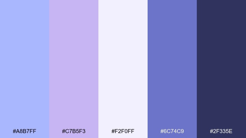
HEX: #A8B7FF #C7B5F3 #F2F0FF #6C74C9 #2F335E
Mood: polished, techy, serene
Best for: SaaS dashboard UI
Polished and tranquil, this lilac and blue color palette reads like periwinkle fog drifting over a quiet skyline. Use the near-white lavender for tables and panels, then bring in the deeper navy for navigation and data labels. The mid periwinkle works well for charts and active states without feeling loud. Tip: keep saturation low in graphs and use the dark navy only for the highest-priority metrics.
Image example of periwinkle cloud generated using media.io
3) Iris Dusk
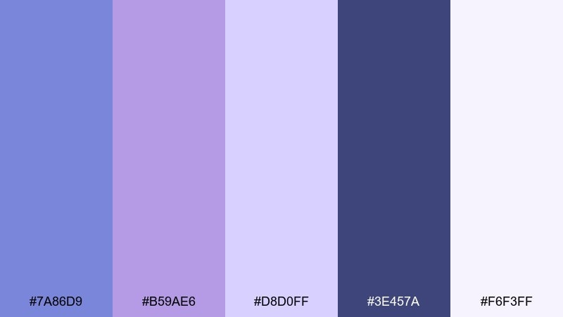
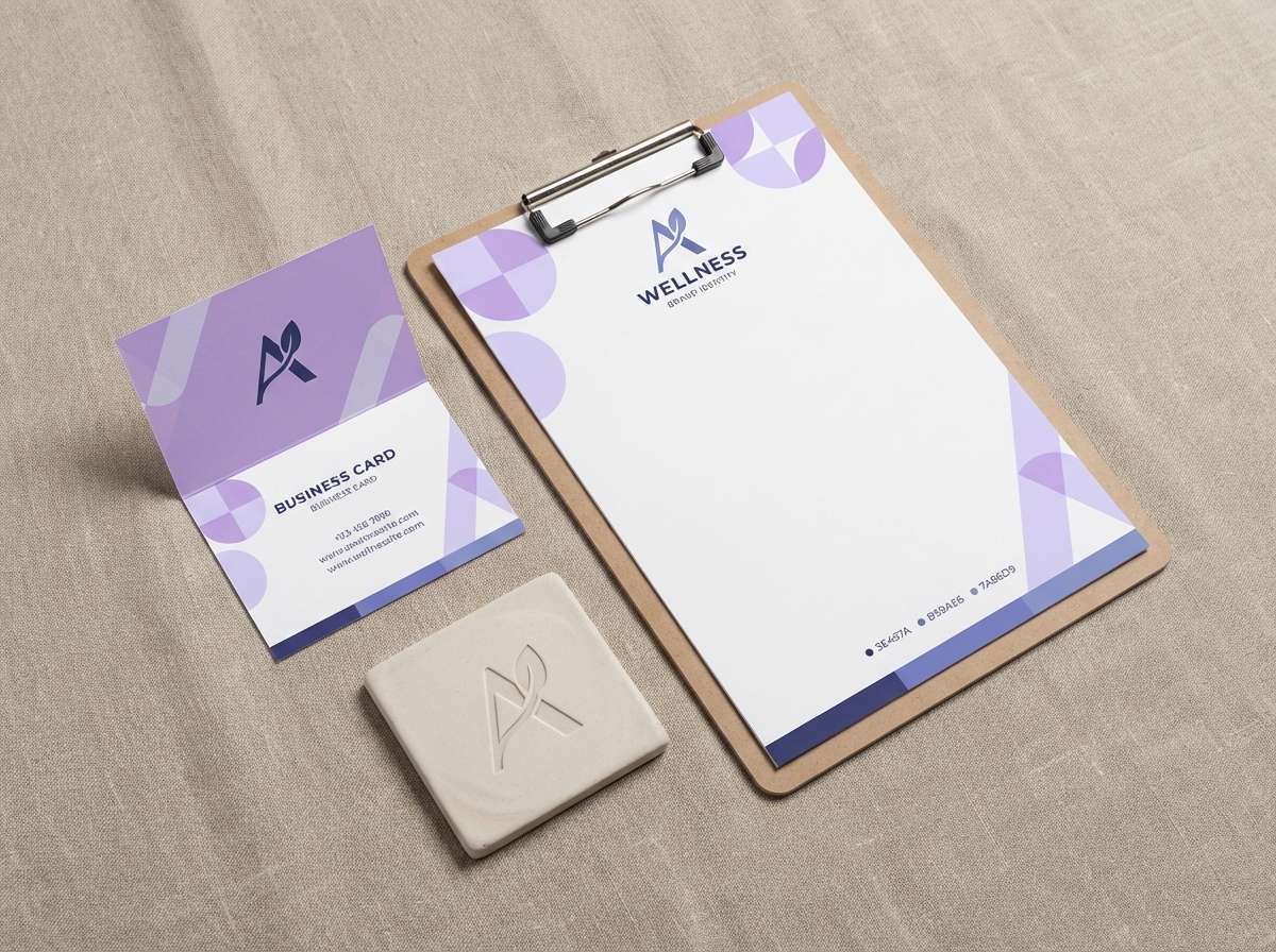
HEX: #7A86D9 #B59AE6 #D8D0FF #3E457A #F6F3FF
Mood: soothing, premium, slightly moody
Best for: branding for a wellness studio
Soothing with a dusk-like depth, the lilac and blue color combination evokes iris petals against a deepening sky. Lean on the soft lavender tints for open space, then use the inky indigo for logos and signage where you need authority. For a cohesive identity, keep photography cool-toned and let this blue lilac color palette handle the emotional warmth through gentle violet. Tip: choose matte finishes so the darker shade feels calm, not harsh.
Image example of iris dusk generated using media.io
4) Blue Lilac Bouquet
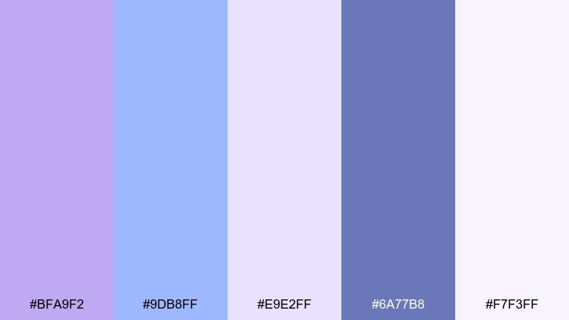
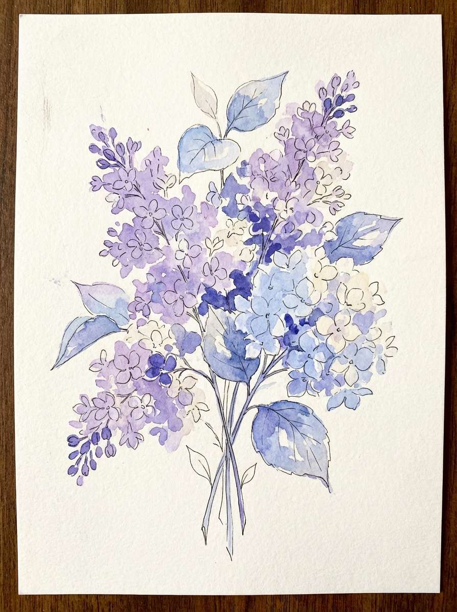
HEX: #BFA9F2 #9DB8FF #E9E2FF #6A77B8 #F7F3FF
Mood: romantic, springy, delicate
Best for: watercolor botanical illustration
Romantic and springy, the blue lilac color combination brings to mind hydrangeas and lilacs painted in soft washes. Let the pastel tints build petals and sky, then outline only with the muted indigo so the illustration stays light. Pair with cream paper textures and minimal typography for a gallery-ready feel. Tip: keep edges soft and reserve the darker shade for centers and stems to add depth.
Image example of blue lilac bouquet generated using media.io
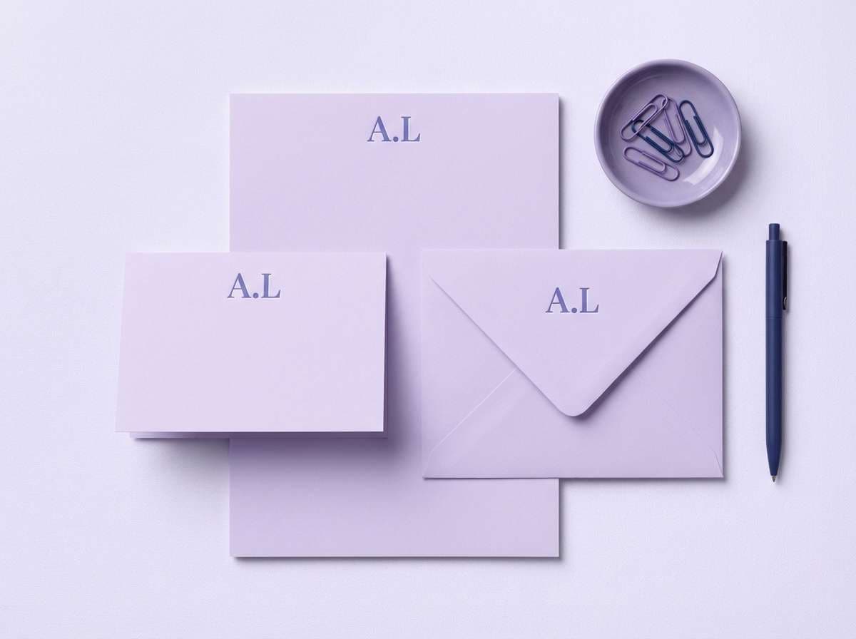
5) Powder Violet Minimal
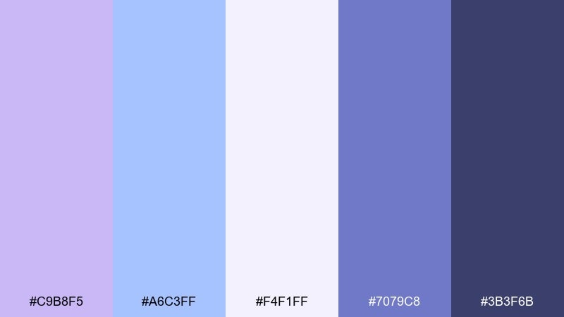
HEX: #C9B8F5 #A6C3FF #F4F1FF #7079C8 #3B3F6B
Mood: clean, minimal, modern-soft
Best for: stationery and note cards
Clean and minimal, this lilac and blue color palette feels like crisp cotton paper tinted with violet dust. Use the palest shade as the base stock color, then print lines and small icons in the mid indigo for a refined look. The deeper navy works best for names, monograms, or a single bold header. Tip: choose plenty of margins and keep the lilac as a whisper rather than a block of color.
Image example of powder violet minimal generated using media.io
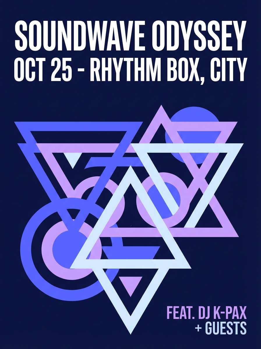
6) Neon Lilac Night
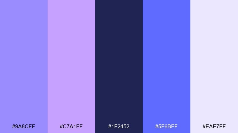
HEX: #9A8CFF #C7A1FF #1F2452 #5F6BFF #EAE7FF
Mood: bold, nocturnal, energetic
Best for: music event poster
Bold and nocturnal, it suggests city lights reflecting on wet pavement with a violet glow. Build a dark base with the navy, then let electric periwinkle and lilac carry the typography and key shapes. This blue lilac color scheme works especially well with geometric patterns and condensed fonts. Tip: limit bright accents to the headline and date so the poster stays readable from a distance.
Image example of neon lilac night generated using media.io
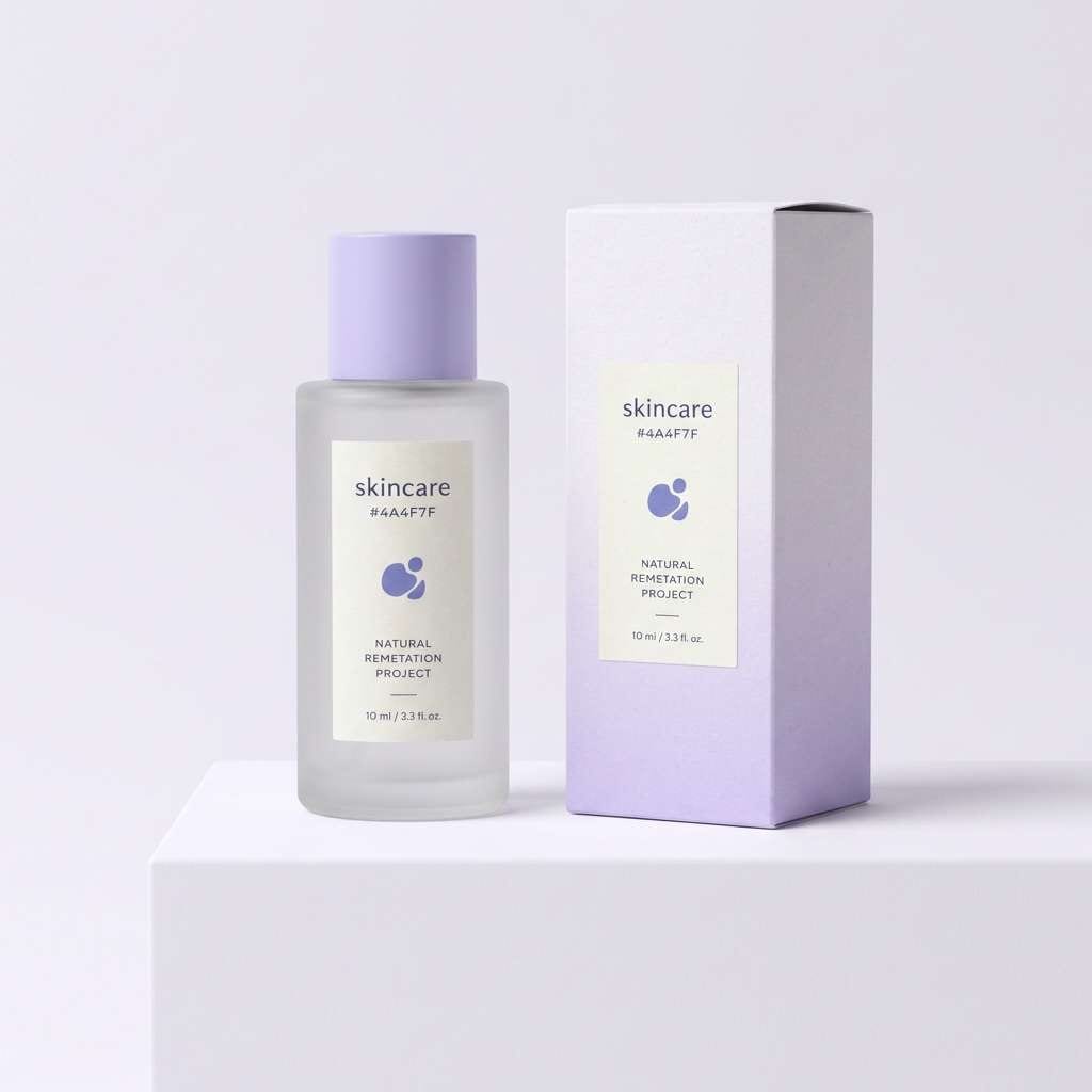
7) Lavender Frost
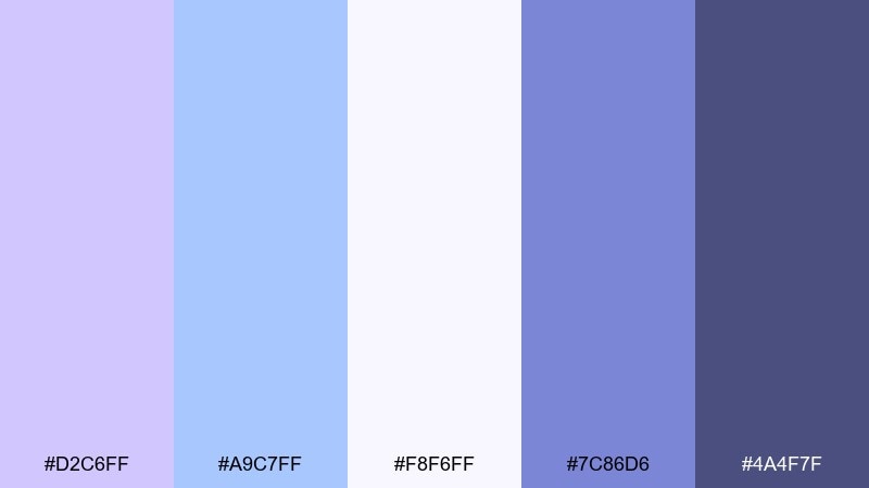
HEX: #D2C6FF #A9C7FF #F8F6FF #7C86D6 #4A4F7F
Mood: fresh, clean, spa-like
Best for: skincare packaging and labels
Fresh and spa-like, this lilac and blue color combination reads like chilled lavender water with a cool blue rinse. Use the near-white base for bottles and cartons, then apply the mid indigo to ingredient lines for a clinical, trustworthy finish. Pair with silver foil or satin varnish to elevate the light lilac without making it sugary. Tip: keep the brand mark in the darker shade to maintain legibility on curved packaging.
Image example of lavender frost generated using media.io
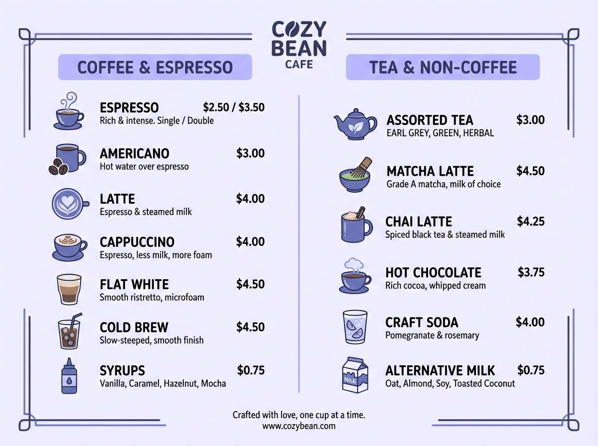
8) Hydrangea Tea
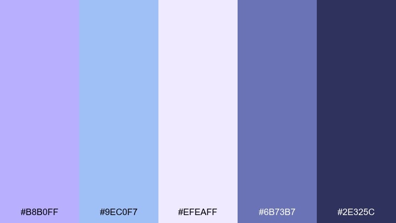
HEX: #B8B0FF #9EC0F7 #EFEAFF #6B73B7 #2E325C
Mood: cozy, inviting, gentle
Best for: cafe menu design
Cozy and gentle, it feels like a quiet tea shop with hydrangeas on the counter. Let the pale lavender hold the menu background, then use the deeper shades for section headers and pricing for easy scanning. Pair with warm paper textures and simple illustrations to keep it welcoming. Tip: highlight seasonal items with the periwinkle so they stand out without looking promotional.
Image example of hydrangea tea generated using media.io
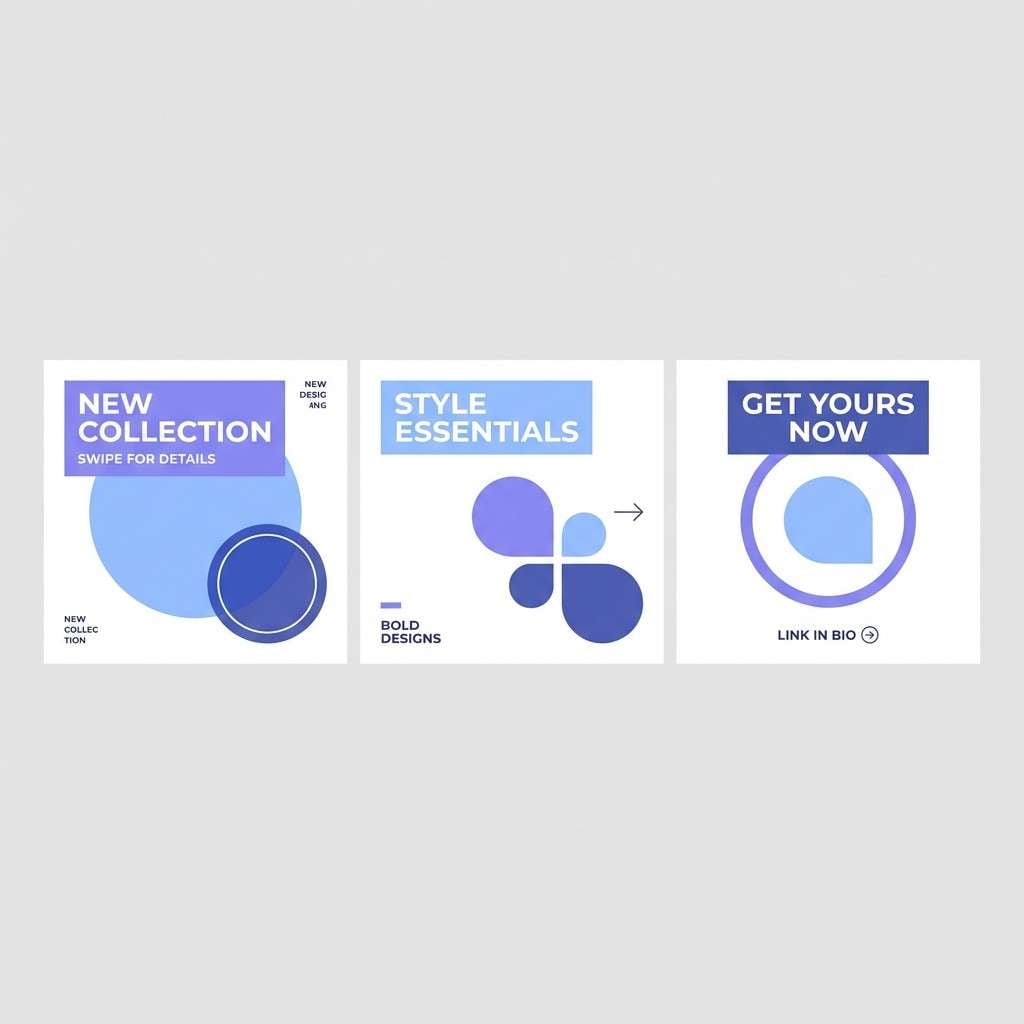
9) Soft Orbit
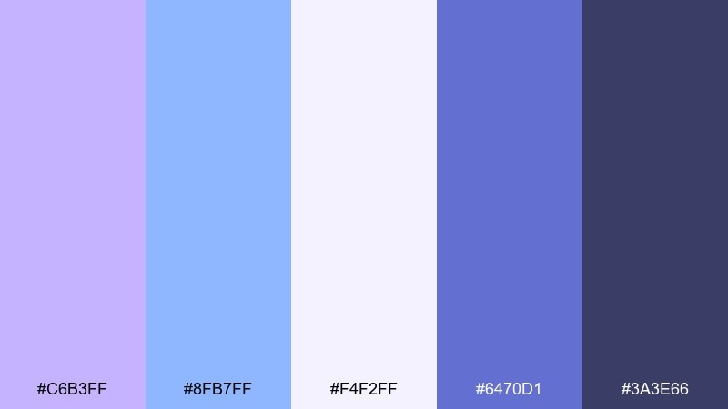
HEX: #C6B3FF #8FB7FF #F4F2FF #6470D1 #3A3E66
Mood: playful, light, modern
Best for: social media carousel templates
Playful and light, it gives off a soft orbit vibe like planets made of pastel chalk. Use the pale base for breathing room, then alternate lilac and blue panels to create rhythm across slides. These blue lilac color combinations shine with simple shapes, stickers, and short punchy headlines. Tip: keep body text in the dark slate and reserve the brighter blue for buttons or swipe cues.
Image example of soft orbit generated using media.io
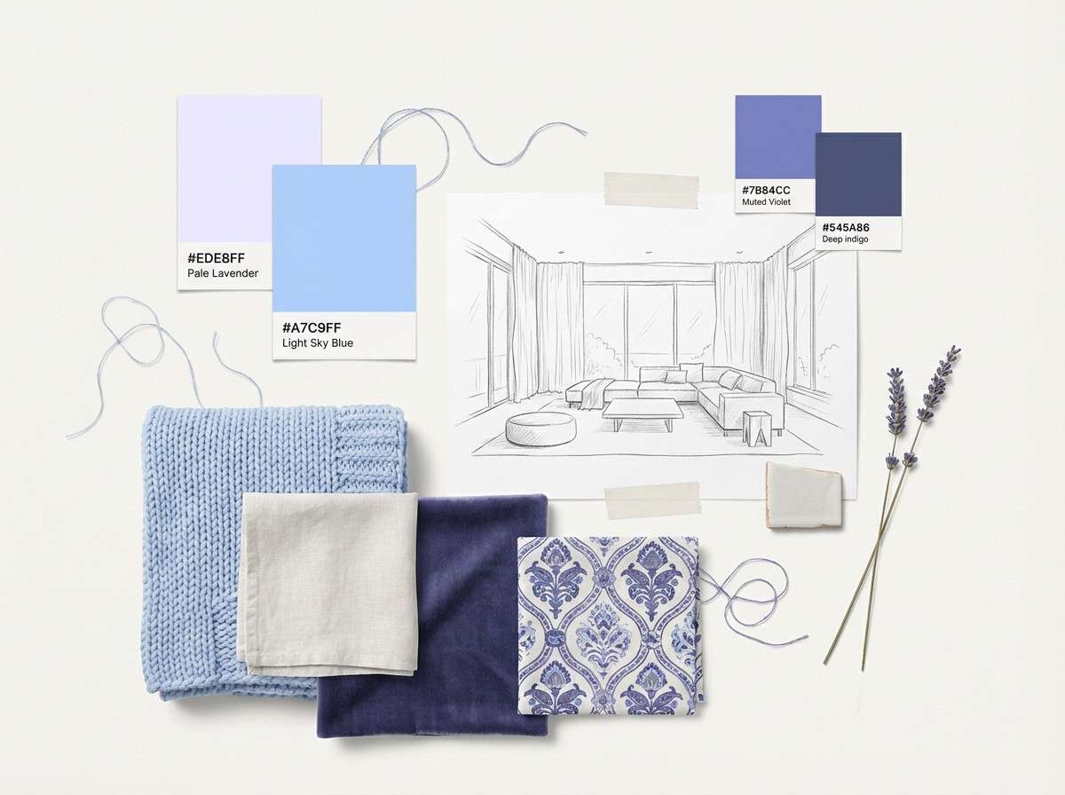
10) Amethyst Breeze
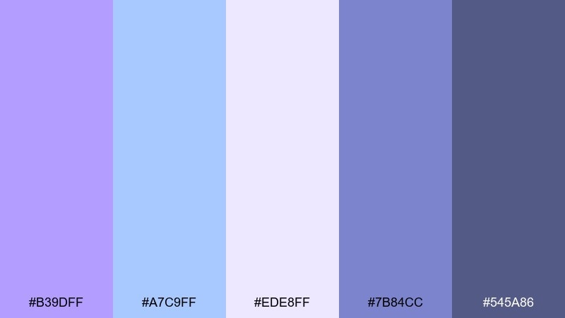
HEX: #B39DFF #A7C9FF #EDE8FF #7B84CC #545A86
Mood: relaxed, airy, contemporary
Best for: interior design moodboard
Relaxed and airy, this lilac and blue color palette resembles sunlit drapery with a faint amethyst tint. Use the softest shades for wall paint and textiles, then ground the room with slate accents in lighting or cabinetry. Pair with pale oak, brushed steel, and plenty of natural light for a contemporary look. Tip: repeat the mid indigo twice in small decor items to create cohesion without darkening the space.
Image example of amethyst breeze generated using media.io
11) Pastel Circuit
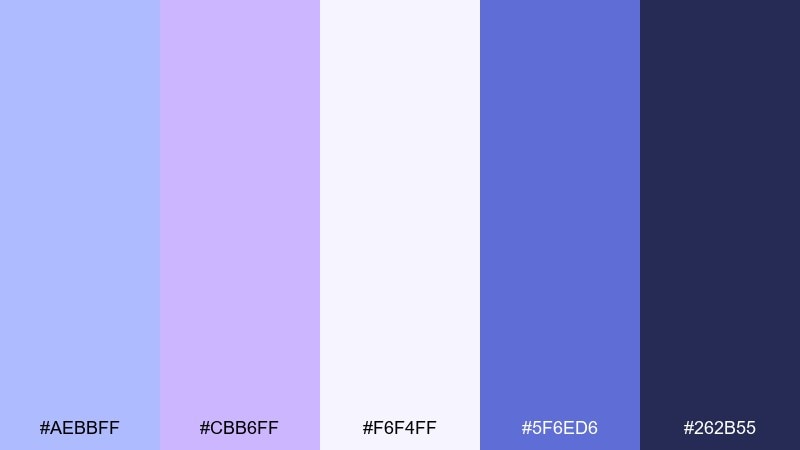
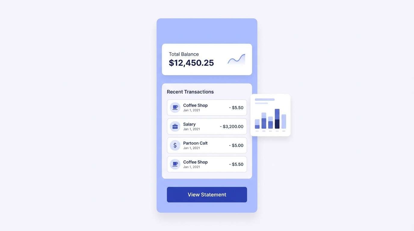
HEX: #AEBBFF #CBB6FF #F6F4FF #5F6ED6 #262B55
Mood: smart, calm, high-trust
Best for: fintech app UI
Smart and calm, the blue lilac color combination feels like clean circuitry drawn in pastel ink. Use the near-white background to keep screens bright, then rely on the deeper navy for numbers and critical actions. The mid blue is great for selected states and progress indicators without triggering alarm tones. Tip: reserve the lilac for supportive UI elements like tags, tooltips, or savings goals.
Image example of pastel circuit generated using media.io
12) Lilac Denim
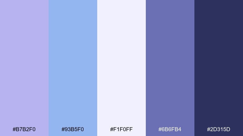
HEX: #B7B2F0 #93B5F0 #F1F0FF #6B6FB4 #2D315D
Mood: casual, cool, modern
Best for: e-commerce banner design
Casual and cool, this lilac and blue color combination blends like washed denim with a lilac undertone. Use the pale background for product clarity, then frame offers with the periwinkle and denim-blue shades. Pair with neutral product photography and simple sans-serif type to keep the focus on the items. Tip: set the CTA button in the deeper navy to stand out without shouting.
Image example of lilac denim generated using media.io

13) Crystal Fade Gradient
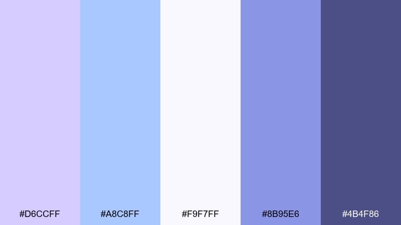
HEX: #D6CCFF #A8C8FF #F9F7FF #8B95E6 #4B4F86
Mood: ethereal, modern, glossy
Best for: abstract gradient poster
Ethereal and glossy, it looks like light passing through a crystal prism. Build a smooth gradient from pale lavender to sky blue, then add a single darker accent for type. Pair with minimal shapes and lots of negative space for a gallery-poster feel. Tip: keep grain subtle so the gradient stays soft rather than noisy.
Image example of crystal fade gradient generated using media.io
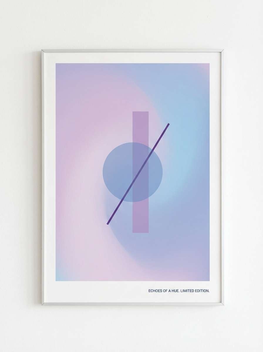
14) Twilight Orchid
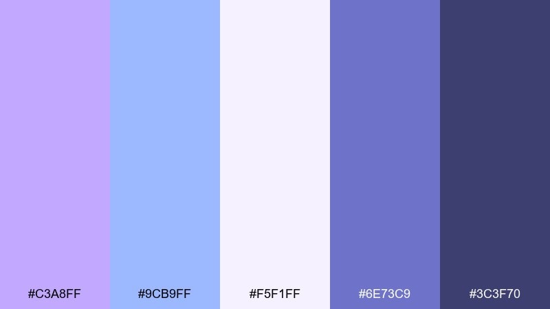
HEX: #C3A8FF #9CB9FF #F5F1FF #6E73C9 #3C3F70
Mood: romantic, elegant, softly dramatic
Best for: wedding invitation suite
Romantic with a soft dramatic edge, this lilac and blue combination recalls orchids at twilight under cool candlelight. Use the lightest tint for the paper base, then print names and key details in the deeper indigo for classic contrast. For a refined blue lilac color combination, pair it with delicate line florals and a warm ivory envelope liner. Tip: keep embellishments minimal and let typography spacing do the luxury work.
Image example of twilight orchid generated using media.io
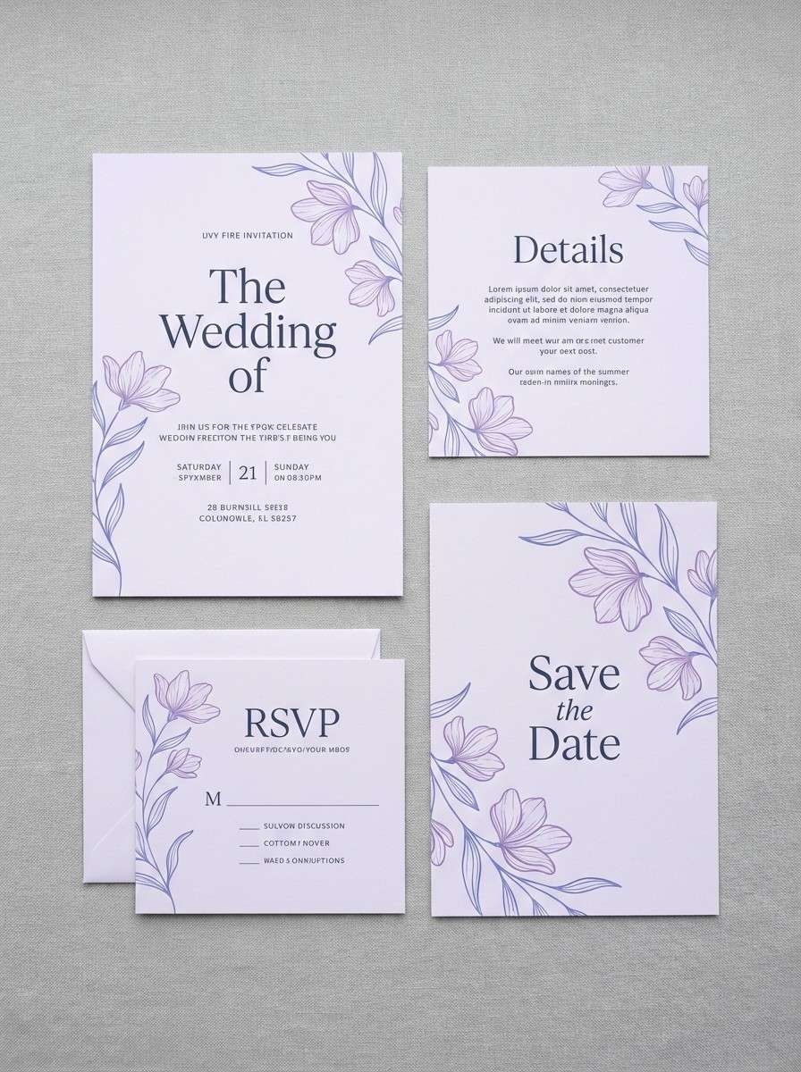
15) Silver Petal
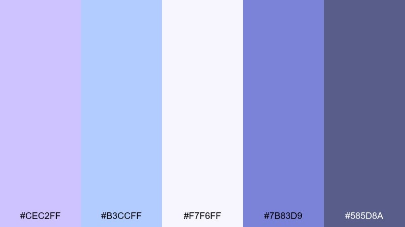
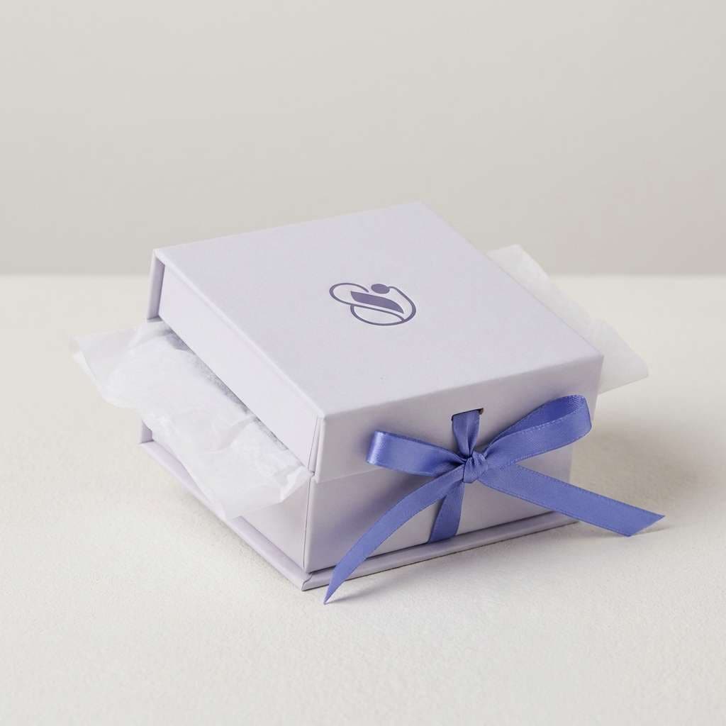
HEX: #CEC2FF #B3CCFF #F7F6FF #7B83D9 #585D8A
Mood: delicate, upscale, clean
Best for: jewelry brand packaging
Delicate and upscale, it feels like silver petals dusted with cool lilac. Keep boxes and tissue in the pale shades, then use the mid indigo for a small logo stamp or ribbon detail. Pair with metallic foils and soft-touch finishes for a premium unboxing moment. Tip: use the darker slate sparingly, only for small text or inside-lid messaging.
Image example of silver petal generated using media.io
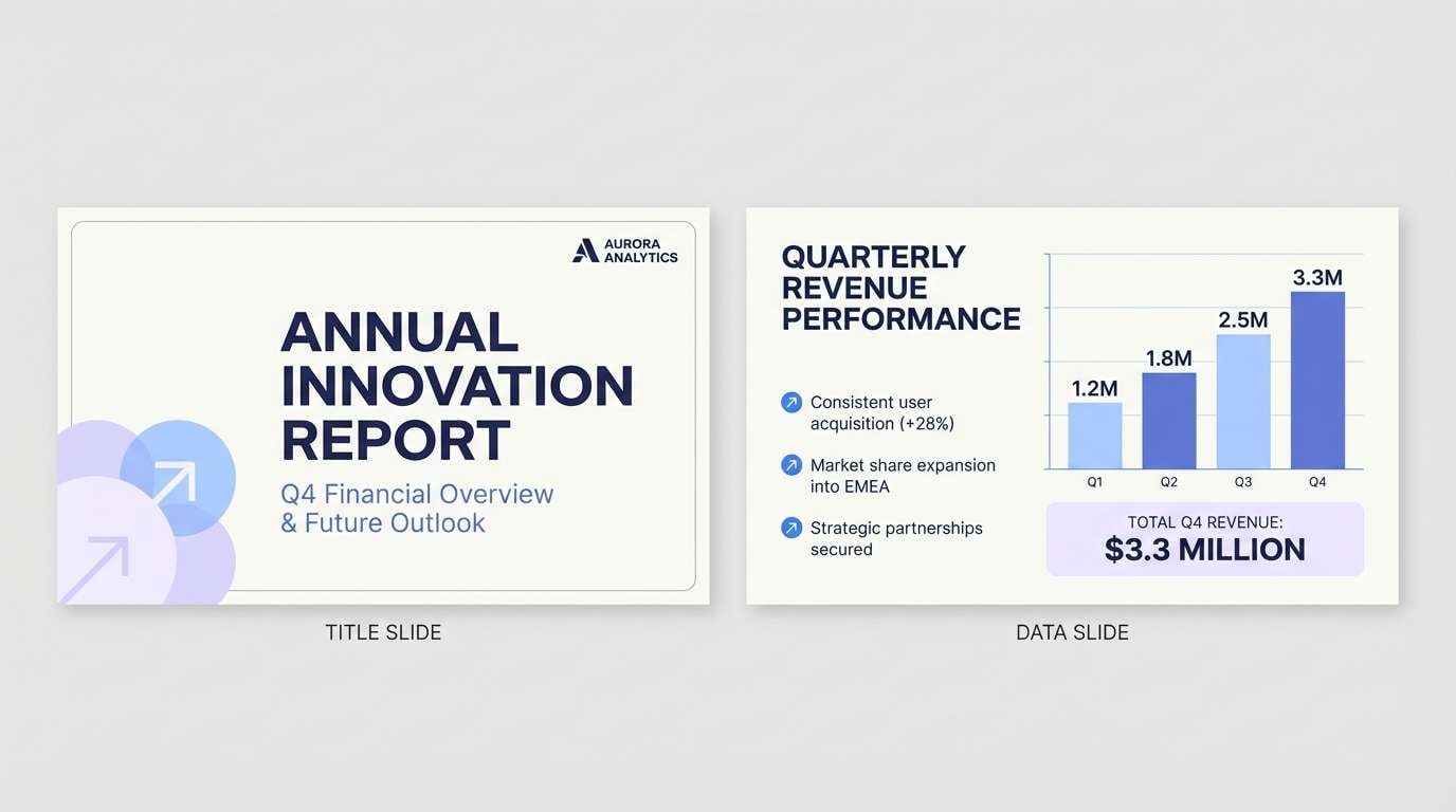
16) Skyline Mauve
HEX: #BCAEFF #9BBFFF #F3F0FF #6A7BD0 #2B2F57
Mood: professional, calm, contemporary
Best for: presentation slide deck
Professional and calm, it resembles a mauve-tinted skyline at blue hour. Use the pale base for most slides, then apply the mid blue to charts and callouts for clarity. The deep navy is ideal for section dividers and headline text to keep the deck crisp in meeting rooms. Tip: limit accent shapes to one per slide so the palette stays sophisticated.
Image example of skyline mauve generated using media.io
17) Berry Lilac Pop
HEX: #B8A2FF #85B5FF #F6F3FF #6B62E6 #3A2F6E
Mood: fun, vibrant, youthful
Best for: podcast cover art
Fun and vibrant, the palette feels like a berry-lilac pop against cool blue highlights. Use the brighter indigo-purple for the show title and let the soft lilac keep the background friendly. Pair with bold sans-serif type and a simple illustrated icon for instant recognizability at thumbnail size. Tip: test readability at small scale and push contrast with the dark violet if needed.
Image example of berry lilac pop generated using media.io

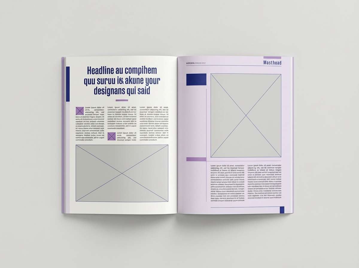
18) Frosted Plum
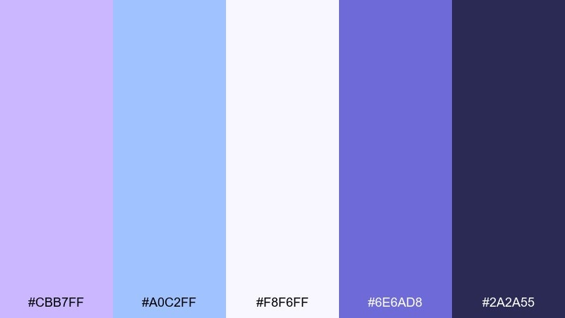
HEX: #CBB7FF #A0C2FF #F8F6FF #6E6AD8 #2A2A55
Mood: editorial, refined, cool
Best for: editorial magazine layout
Refined and cool, the combination of lilac and blue reads like frosted plum layered over a bright winter sky. Use the pale tones for generous margins and image captions, then anchor headlines with the deep navy. For fashion and culture pages, blue lilac color combinations pair beautifully with grayscale photography and minimal rules. Tip: keep accent blocks small and use the mid indigo for pull quotes to create a clear reading path.
Image example of frosted plum generated using media.io
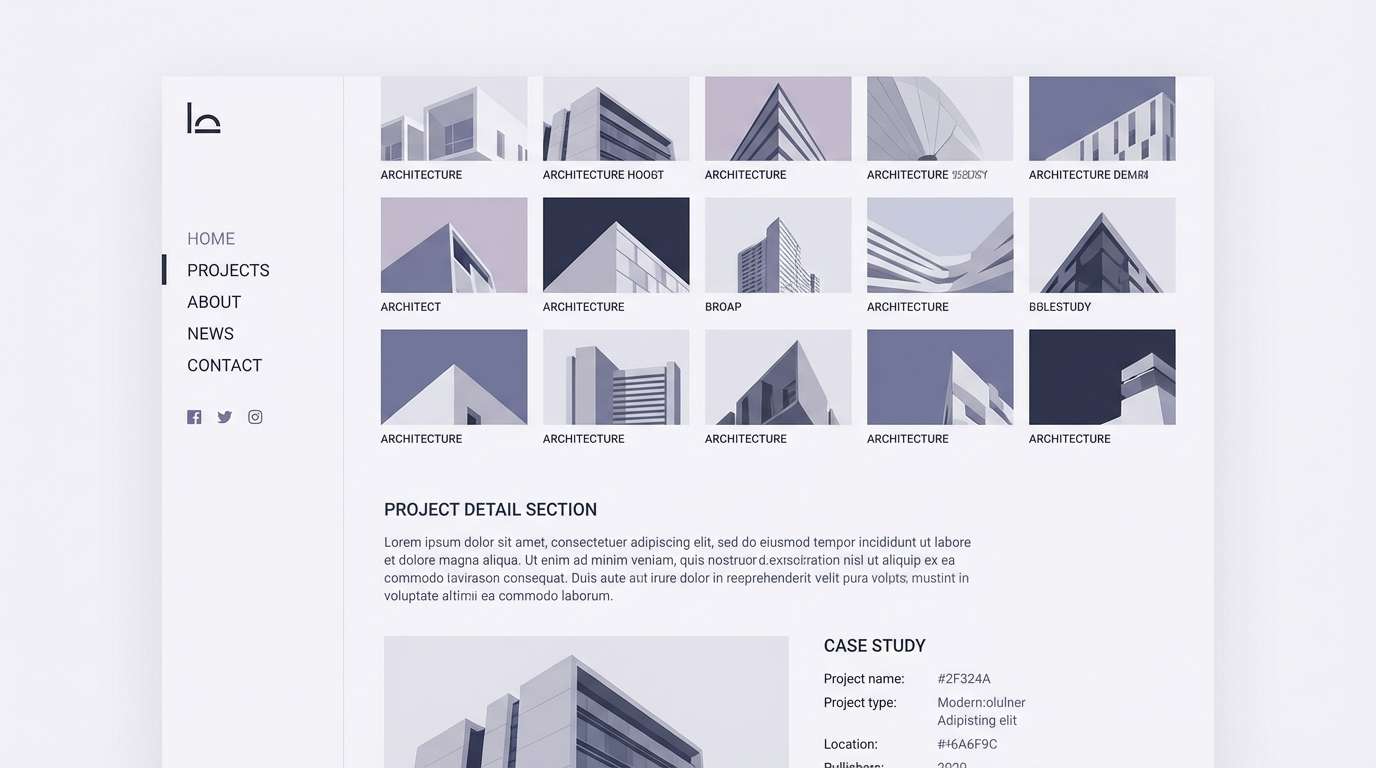
19) Quiet Violet Gray
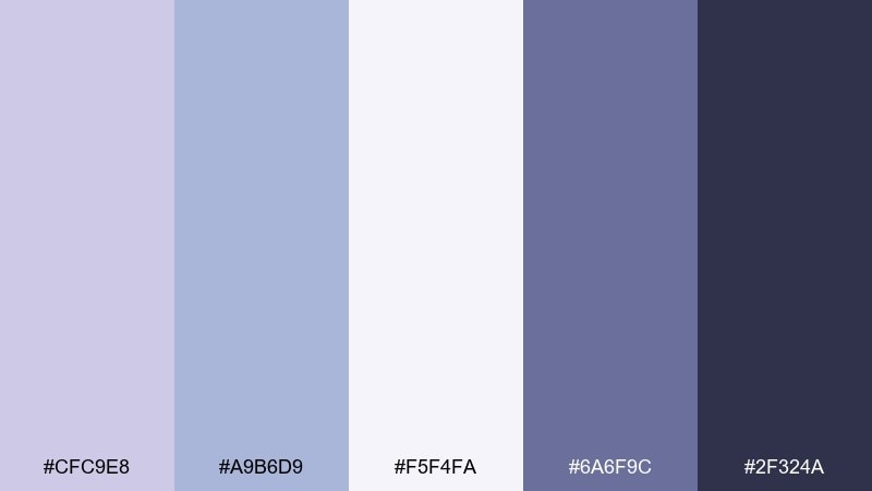
HEX: #CFC9E8 #A9B6D9 #F5F4FA #6A6F9C #2F324A
Mood: muted, architectural, understated
Best for: architecture portfolio website
Muted and architectural, it feels like violet-gray concrete washed by a cool sky. Use the almost-white tone for page backgrounds, then set navigation and captions in the charcoal for clarity. The mid gray-lilac works well for section breaks and subtle overlays on project photos. Tip: keep accent color use consistent across links and hover states for a tidy, professional rhythm.
Image example of quiet violet gray generated using media.io
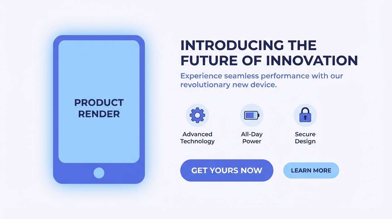
20) Ocean Lilac Glow
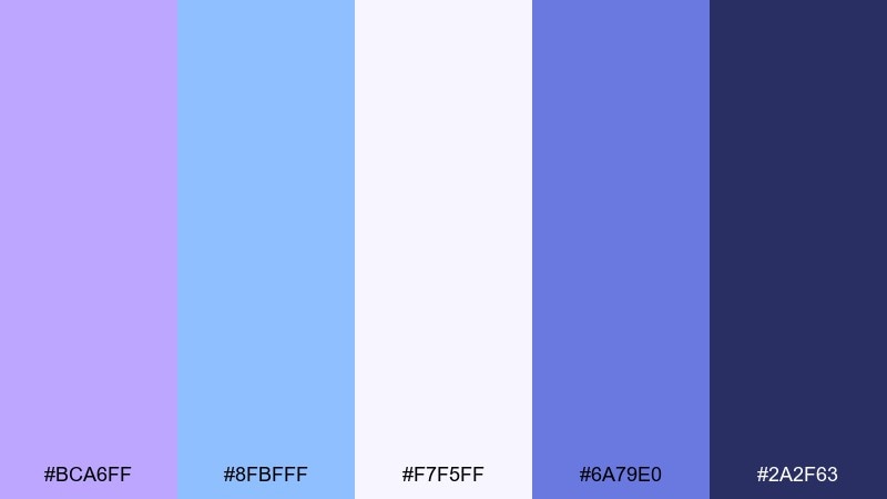
HEX: #BCA6FF #8FBFFF #F7F5FF #6A79E0 #2A2F63
Mood: fresh, confident, modern
Best for: product launch landing page
Fresh and confident, it suggests an ocean glow with lilac light on the horizon. Use the pale background to keep the layout airy, then highlight key sections with soft blue panels and lilac gradients. A blue lilac color palette like this pairs well with minimalist product renders and plenty of whitespace. Tip: set the primary CTA in the deep navy and add a faint lilac shadow to make it feel clickable without turning neon.
Image example of ocean lilac glow generated using media.io
What Colors Go Well with Blue Lilac?
Blue lilac pairs beautifully with crisp neutrals like white, soft ivory, and cool light gray to keep layouts bright and modern. For typography and UI contrast, deep navy, charcoal, and ink-indigo are the most reliable anchors.
If you want extra warmth, add muted blush, dusty rose, or champagne-beige in small doses—these create a gentle “romantic tech” feel without turning overly sweet. For a sleek premium look, silver and chrome accents also work well with lilac-blue undertones.
For bolder combinations, try a controlled pop like electric periwinkle, cobalt, or even a restrained neon violet on top of a dark base. Keep the bright accent limited to CTAs or headlines for readability.
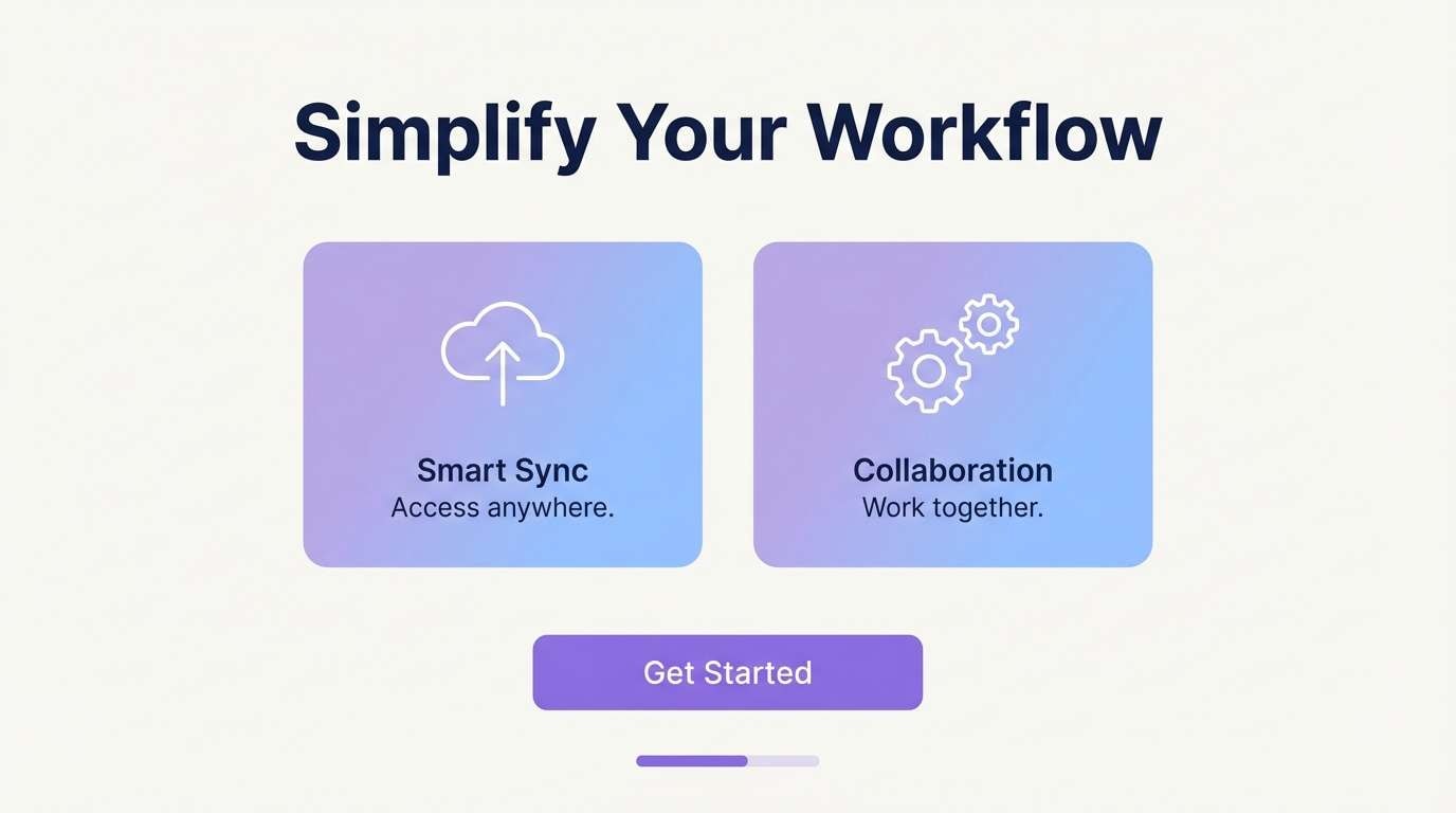
How to Use a Lilac and Blue Combination in Real Designs
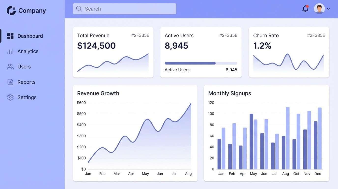
In UI, use the lightest lilac or lavender-white as your primary background, then assign a mid periwinkle/blue for interactive states (tabs, hovers, progress). Reserve the darkest navy/indigo for critical text, navigation, and primary buttons.
In print (packaging, invitations, stationery), blue lilac shines when you lean on negative space and use the darker shade sparingly for names, titles, and fine rules. Matte stocks and soft-touch finishes keep the palette feeling calm and premium.
For branding, keep photography cool-toned and let lilac handle the emotional tone. A consistent indigo anchor across logo, type, and UI components helps the system stay cohesive across platforms.
Create Lilac and Blue Palette Visuals with AI
If you already have HEX codes, you can turn them into consistent visuals by describing a layout (poster, UI, packaging) and calling out which colors should dominate. This makes it easier to present moodboards, client concepts, or brand directions fast.
Try reusing the prompts above and swapping subjects (e.g., “landing page” to “mobile app screen”) while keeping the same dominant colors. You’ll get on-brand variations without rebuilding from scratch.
Lilac and Blue Color Combination FAQs
-
What is blue lilac, exactly?
Blue lilac is a soft blue-purple tone that leans cooler than classic lavender and often resembles periwinkle with a lilac haze. It’s commonly used in modern pastel palettes for a calm, airy feel. -
Is blue lilac good for branding?
Yes—blue lilac can communicate serenity, care, and polish, which fits wellness, beauty, lifestyle, and tech brands. Use a deep indigo or navy companion color for logos and type so the identity stays readable. -
What text color is most readable on blue lilac backgrounds?
Deep navy, charcoal, or very dark indigo typically provide the best contrast and accessibility on blue lilac tints. For very pale lilac backgrounds, near-black text is safest for long-form reading. -
What colors complement blue lilac for accents?
Great accent options include blush pink, dusty rose, cool silver, and soft sky blue. For a bolder look, use electric periwinkle or saturated violet sparingly on top of dark navy. -
Can I use blue lilac in a SaaS or fintech UI without looking too playful?
Yes—keep saturation low, use lavender-white panels, and anchor the UI with a strong navy for navigation and key metrics. Use blue lilac mainly for highlights, selected states, and supportive UI elements. -
How do I keep a blue lilac palette from looking washed out?
Include at least one dark anchor (navy/indigo) and one mid-tone for structure, then reserve the palest tints for backgrounds. Small, consistent contrast choices (buttons, headings) make the palette feel crisp. -
How can I generate matching blue lilac visuals quickly?
Use an AI image generator and specify your dominant HEX colors, the layout type (poster/UI/packaging), and a clean background. Media.io lets you iterate quickly by reusing the same prompt with small subject changes.


