

Pink lavender is the sweet spot between romantic blush and calm violet. It reads soft and modern at the same time, which makes it a favorite for branding, UI, and lifestyle design.
Below are 20 airy pink lavender color palette ideas (with HEX codes), plus practical pairing tips and AI prompts you can reuse to generate matching visuals.
In this article
- Why Pink Lavender Palettes Work So Well
-
- cotton candy lilac
- orchid mist
- rose quartz and lavender
- pastel parfait
- velvet mauve night
- soft peony studio
- lavender blush minimal
- spring wisteria garden
- antique ribbon
- neon pastel pop
- dusty romance
- cloudy lilac latte
- ballet slipper tech
- mauve clay neutral
- berry sorbet accent
- lavender fog workspace
- cottage bouquet
- futuristic lilac grid
- rosewater serif
- twilight petal matte
- What Colors Go Well with Pink Lavender?
- How to Use a Pink Lavender Color Palette in Real Designs
- Create Pink Lavender Palette Visuals with AI
Why Pink Lavender Palettes Work So Well
Pink lavender palettes balance warmth (pink) with calm sophistication (lavender), so they feel welcoming without becoming overly cute. That makes them flexible for both personal and professional aesthetics.
They also support great hierarchy: pale blush and near-white create breathable backgrounds, mid lavenders add structure, and deep plum/charcoal anchors typography for readability.
Because the hue sits between pink and purple, it pairs naturally with neutrals, cool blues, and muted greens—helpful when you need contrast for UI states, editorial layouts, or event stationery.
20+ Pink Lavender Color Palette Ideas (with HEX Codes)
1) Cotton Candy Lilac
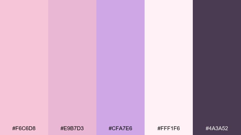
HEX: #F6C6D8 #E9B7D3 #CFA7E6 #FFF1F6 #4A3A52
Mood: dreamy, sweet, airy
Best for: beauty brand packaging and labels
Dreamy and sugar-soft, these tones feel like whipped cream, petals, and a hint of dusk. Use the pale blush and lilac as your main fields, then anchor typography with the deep plum for readability. It shines on cosmetic boxes, jar labels, and minimalist product ads, especially with matte finishes. Tip: keep line art and text in the darkest shade and reserve the near-white for negative space so the pastels stay clean.
Image example of cotton candy lilac generated using media.io
Media.io is an online AI studio for creating and editing video, image, and audio in your browser.

2) Orchid Mist

HEX: #F2B3C7 #D8B4F8 #BFA2D6 #F7F3FF #6B5C7A
Mood: calm, modern, cloudlike
Best for: app onboarding screens and hero sections
Calm and misty, the blush-to-orchid transition feels like a quiet sunrise behind frosted glass. Let the near-white and soft lavender carry backgrounds, while the muted violet handles icons and dividers. It works well for wellness apps, journaling tools, and gentle SaaS onboarding flows. Tip: use the deeper gray-violet only for primary buttons and headings to keep the UI breathable.
Image example of orchid mist generated using media.io
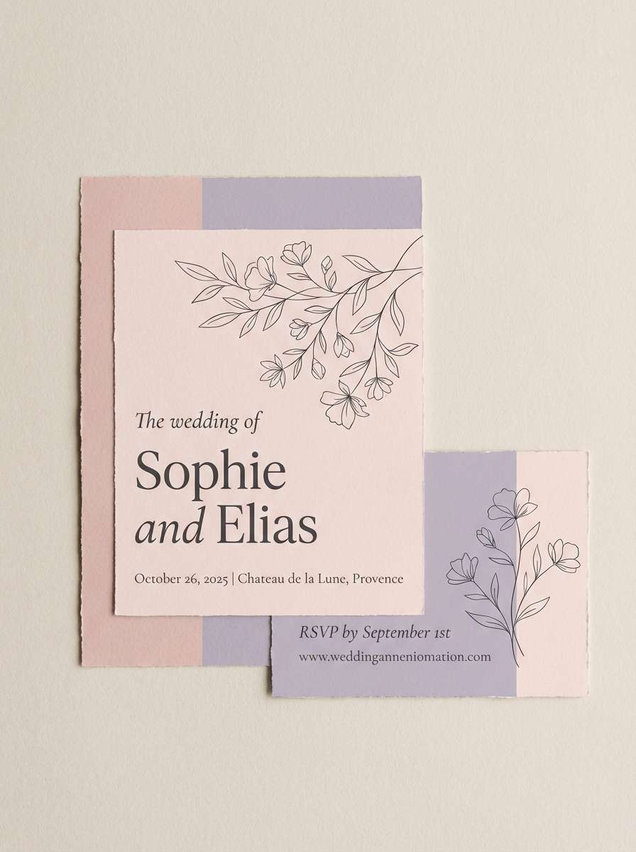
3) Rose Quartz and Lavender
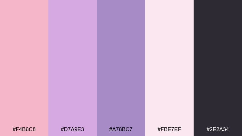
HEX: #F4B6C8 #D7A9E3 #A78BC7 #FBE7EF #2E2A34
Mood: romantic, elegant, timeless
Best for: wedding invitations and stationery suites
Romantic and polished, this mix evokes rose quartz crystals, lilac silk ribbons, and candlelit details. As a pink lavender color palette, it looks best when the light blush leads and the mid lavender supports headings and monograms. Use the charcoal-plum for fine serif type, wax seal stamps, or venue details to avoid washed-out text. Tip: add subtle paper texture and keep florals sparse so the color story stays the star.
Image example of rose quartz and lavender generated using media.io
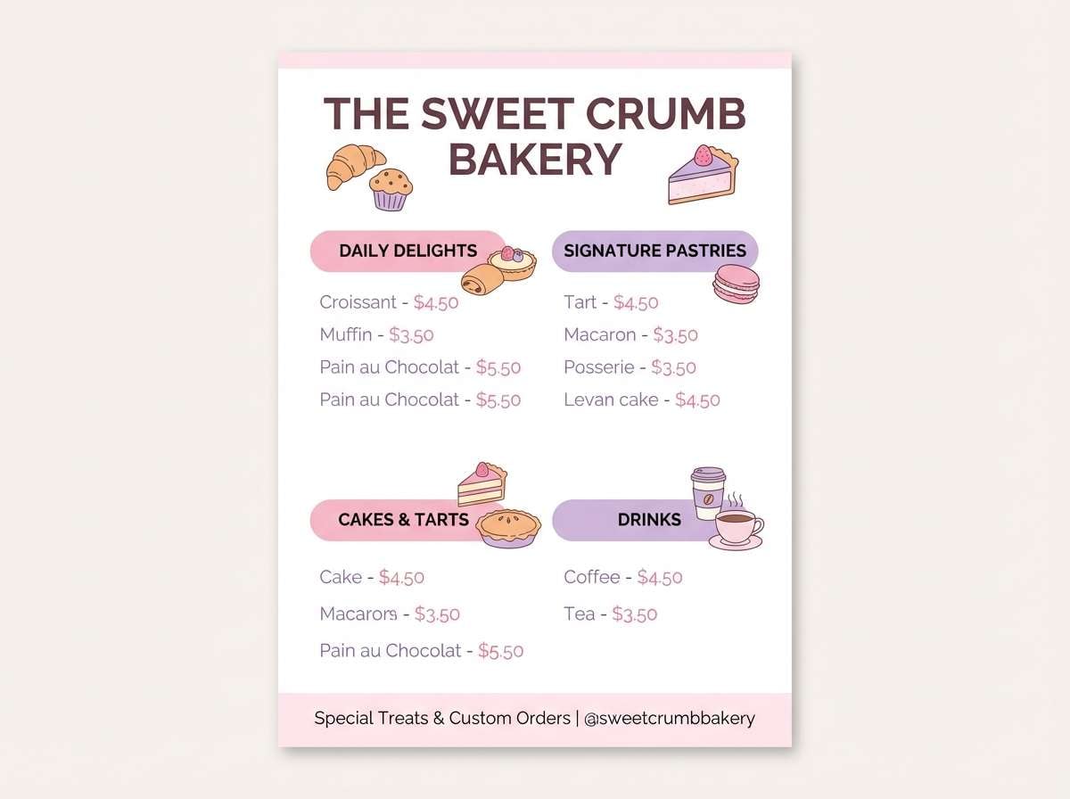
4) Pastel Parfait
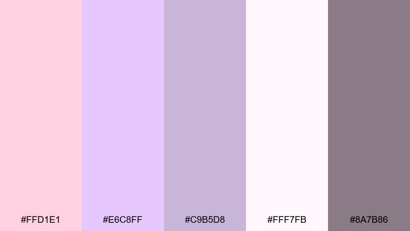
HEX: #FFD1E1 #E6C8FF #C9B5D8 #FFF7FB #8A7B86
Mood: playful, light, friendly
Best for: bakery menu flyers and dessert promos
Playful and creamy, these pastels read like macarons, whipped frosting, and soft sprinkles. Use the brighter pink as a highlight for prices or callouts, while the pale lavender keeps the layout smooth and balanced. Great for café menus, seasonal dessert promotions, and cute loyalty cards. Tip: keep backgrounds very light and use the warm gray for body text so the sweets stay legible.
Image example of pastel parfait generated using media.io
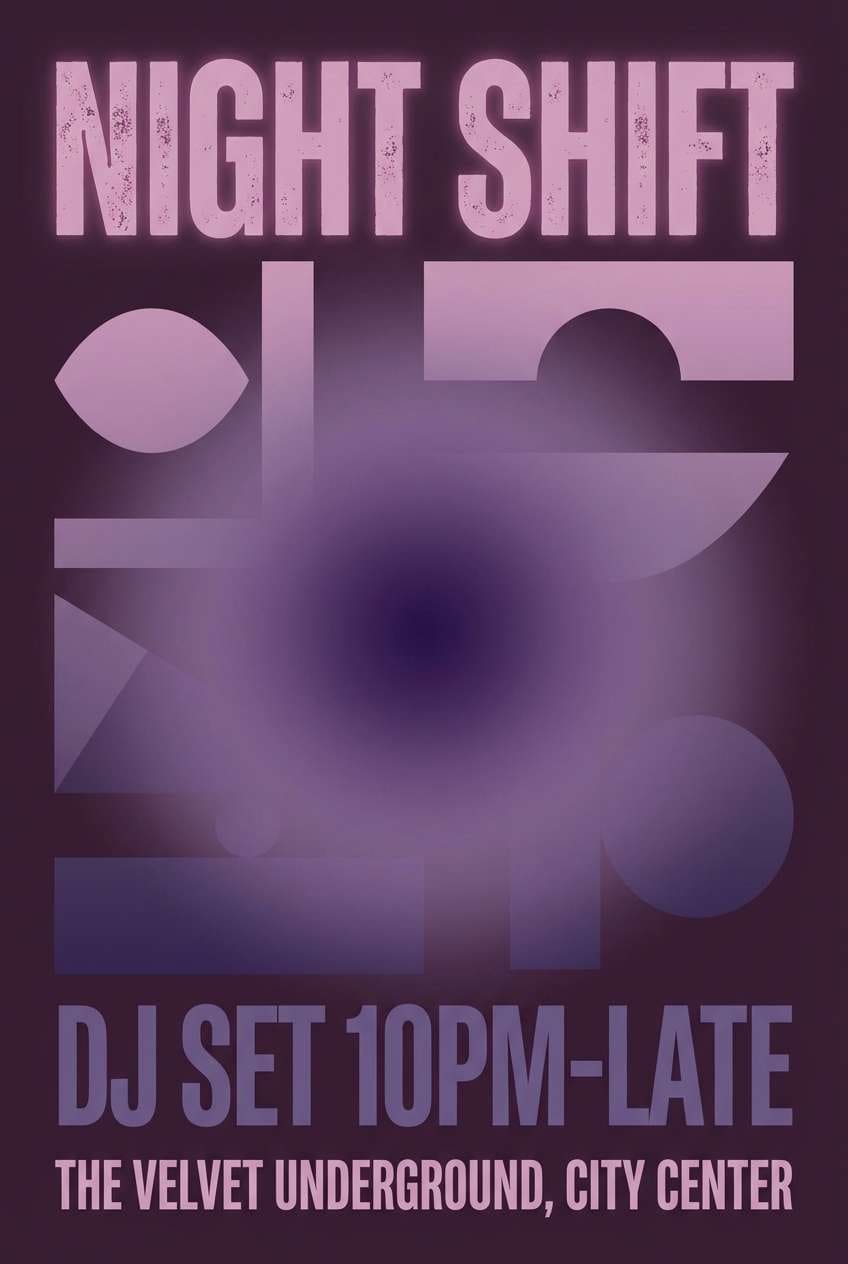
5) Velvet Mauve Night
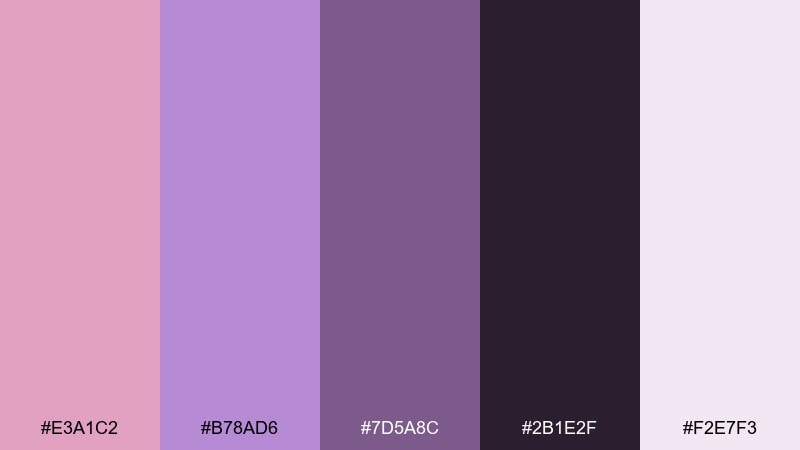
HEX: #E3A1C2 #B78AD6 #7D5A8C #2B1E2F #F2E7F3
Mood: moody, luxe, dramatic
Best for: nightlife event posters and album art
Moody and velvety, this set feels like purple stage lights on satin and deep shadows between curtains. Build contrast by placing the pale lilac against the near-black plum, then add mauve as a gradient glow. Ideal for party posters, DJ lineups, or music cover art where you want soft color with real punch. Tip: use a single bold typeface and let the gradient do the drama instead of extra effects.
Image example of velvet mauve night generated using media.io
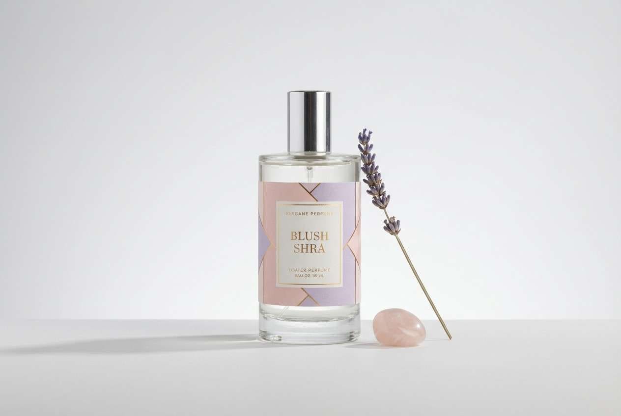
6) Soft Peony Studio
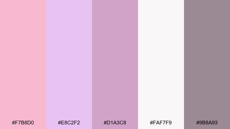
HEX: #F7B8D0 #E8C2F2 #D1A3C8 #FAF7F9 #9B8A93
Mood: soft, premium, feminine
Best for: perfume ads and product photography
Soft and premium, it suggests peony petals, powdery notes, and clean studio light. Let the pale background and blush carry most of the frame, then add lavender for brand accents and ribbons. Perfect for fragrance, skincare, and lifestyle product ads where subtlety feels expensive. Tip: keep props minimal and use one mid-tone (mauve) for a single focal element like a cap or label band.
Image example of soft peony studio generated using media.io
7) Lavender Blush Minimal
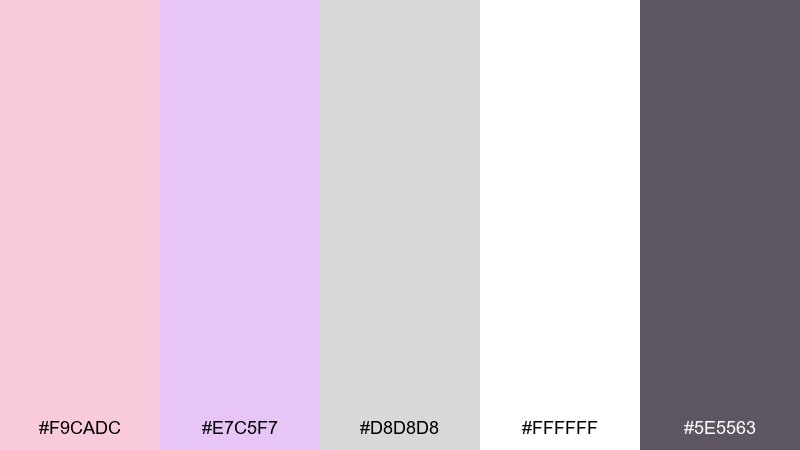
HEX: #F9CADC #E7C5F7 #D8D8D8 #FFFFFF #5E5563
Mood: clean, minimal, airy
Best for: SaaS landing pages and UI kits
Clean and weightless, these tones feel like crisp linen with a whisper of blush and lilac. The light neutrals make spacing and grids look intentional, while the gray-violet keeps text sharp. Use it for modern landing pages, dashboard shells, and component libraries where softness still needs structure. Tip: reserve the lavender for active states and micro-interactions so the interface stays calm.
Image example of lavender blush minimal generated using media.io
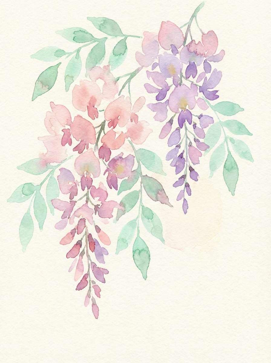
8) Spring Wisteria Garden
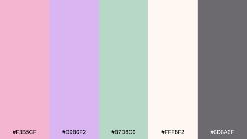
HEX: #F3B5CF #D9B6F2 #B7D8C6 #FFF8F2 #6D6A6F
Mood: fresh, botanical, lighthearted
Best for: watercolor florals and seasonal prints
Fresh and botanical, it brings to mind wisteria blooms, new leaves, and soft morning air. The minty green gives the pinks a lively counterpoint without turning the look too sugary. Use it for spring posters, garden-themed packaging, or art prints that need a gentle natural twist. Tip: keep outlines in the warm gray and let the watercolor edges stay loose for a hand-painted feel.
Image example of spring wisteria garden generated using media.io
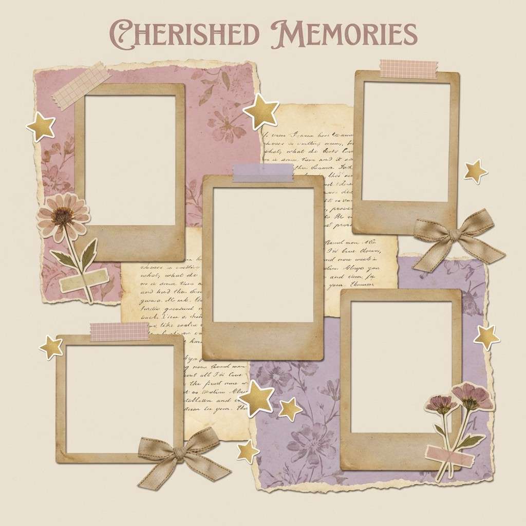
9) Antique Ribbon

HEX: #E9AFC5 #CFA5DF #B89BB2 #F1E2E8 #7C6B75
Mood: nostalgic, cozy, vintage
Best for: scrapbook templates and memory books
Nostalgic and cozy, these dusty pastels feel like vintage ribbon, pressed flowers, and faded postcards. The muted mauve ties everything together so photos and journaling blocks look cohesive. Great for scrapbook kits, journaling pages, and printable planners with a soft retro mood. Tip: use the medium mauve for frames and stickers, and keep large areas in the light blush to avoid a heavy page.
Image example of antique ribbon generated using media.io
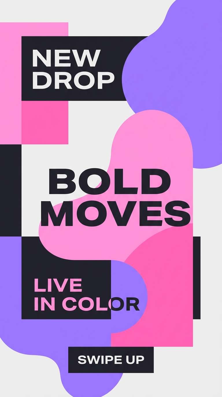
10) Neon Pastel Pop
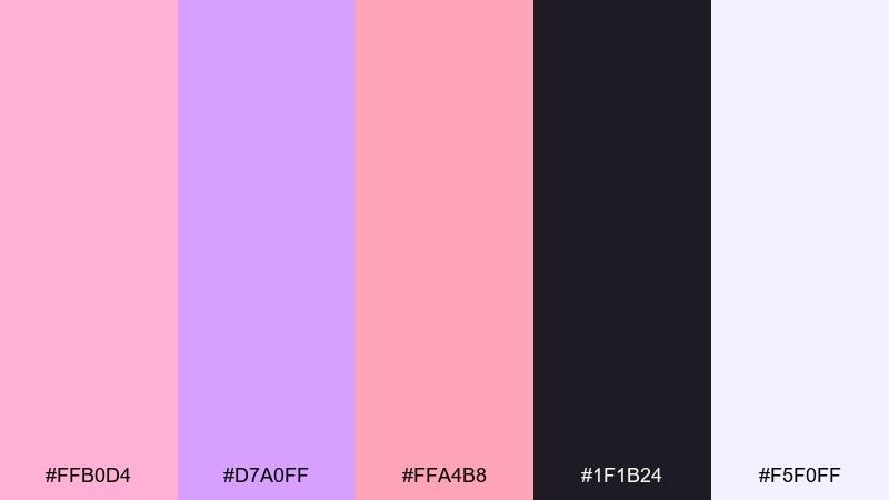
HEX: #FFB0D4 #D7A0FF #FFA4B8 #1F1B24 #F5F0FF
Mood: bold, youthful, energetic
Best for: social story promos and creator graphics
Bold and candy-bright, it feels like pop music, glossy stickers, and late-night edits. The dark ink tone makes neon-ish pink and violet pop without losing legibility on small screens. Use it for story templates, flash sale announcements, and creator promos where you want instant attention. Tip: keep text in the dark shade and limit gradients to one area so the layout stays punchy, not chaotic.
Image example of neon pastel pop generated using media.io
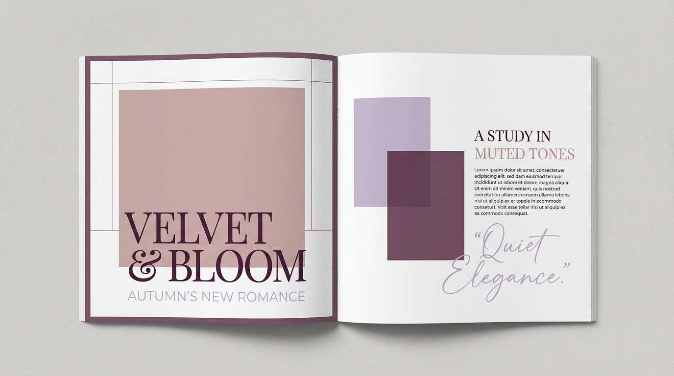
11) Dusty Romance

HEX: #E6A6BE #C9A7E8 #B9A0B0 #F6EEF2 #3F3440
Mood: editorial, refined, romantic
Best for: magazine spreads and lookbook pages
Refined and romantic, this set reads like an editorial shoot with soft focus and tailored styling. The dusty mid-tones help photos blend into the layout without fighting headlines. If you are exploring pink lavender color combinations for print, this mix keeps pages sophisticated rather than overly sweet. Tip: pair it with plenty of whitespace and one strong serif, and use the deep plum only for section titles and pull quotes.
Image example of dusty romance generated using media.io
12) Cloudy Lilac Latte
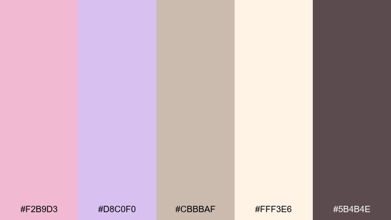
HEX: #F2B9D3 #D8C0F0 #CBBBAF #FFF3E6 #5B4B4E
Mood: warm, cozy, approachable
Best for: cafe menus and seasonal specials
Warm and cozy, it suggests steamed milk foam with a lilac twist and a blush pastry on the side. The beige-tan note keeps the palette grounded and food-friendly. Use it for café menus, tabletop signage, and Instagram carousels for seasonal drinks. Tip: keep backgrounds creamy and let lavender appear in small highlights like icons, borders, or stamp-style badges.
Image example of cloudy lilac latte generated using media.io
13) Ballet Slipper Tech

HEX: #F8BFD7 #E2B6F4 #9FA7D9 #FDFBFF #2A2F3A
Mood: modern, gentle, tech-forward
Best for: analytics dashboards and fintech UI
Modern and gentle, these tones feel like satin ballet slippers meeting sleek interface panels. The cool periwinkle-blue note adds clarity for charts and states without stealing the soft mood. Use it for dashboards, settings screens, and data cards where you want approachable tech. Tip: apply the darkest navy-gray to numbers and labels, and keep charts to two accent colors for instant scanning.
Image example of ballet slipper tech generated using media.io
14) Mauve Clay Neutral
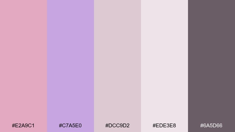
HEX: #E2A9C1 #C7A5E0 #DCC9D2 #EDE3E8 #6A5D66
Mood: muted, earthy, sophisticated
Best for: interior moodboards and brand identity boards
Muted and earthy, this mix evokes clay ceramics, dusty petals, and soft linen textiles. It is ideal when you want pastels that feel grown-up rather than sugary. Use it on moodboards, identity presentations, and minimal packaging concepts, pairing well with walnut wood tones and off-white paper. Tip: keep contrast intentional by using the deep warm gray for headings and thin dividers.
Image example of mauve clay neutral generated using media.io
15) Berry Sorbet Accent
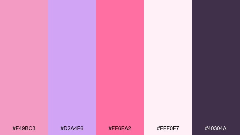
HEX: #F49BC3 #D2A4F6 #FF6FA2 #FFF0F7 #40304A
Mood: fun, vibrant, confident
Best for: cosmetics promo banners and web headers
Fun and confident, the berry accent feels like sorbet, lip tint, and glossy editorial lighting. Use the hot pink sparingly as a call-to-action or price tag, while the lavender and blush handle large areas. Great for campaign banners, promo headers, and product drop announcements. Tip: stick to one bold shape system (pills, circles, or angled blocks) so the bright accent looks intentional.
Image example of berry sorbet accent generated using media.io

16) Lavender Fog Workspace
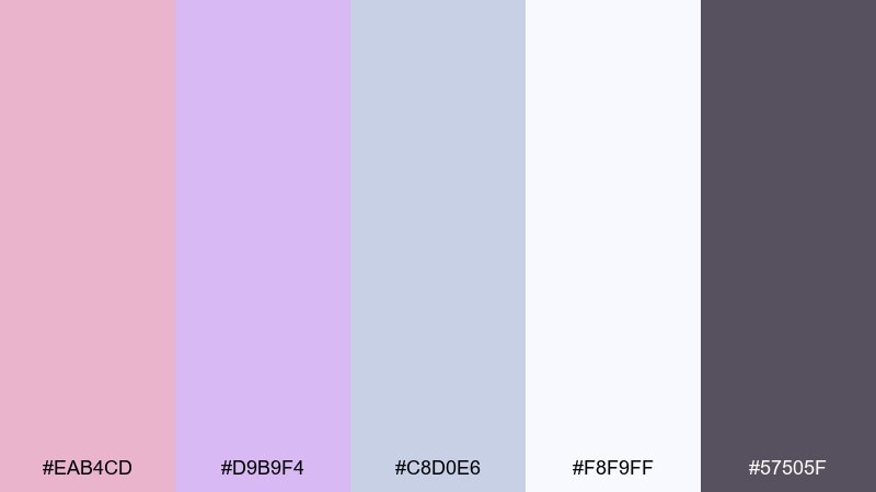
HEX: #EAB4CD #D9B9F4 #C8D0E6 #F8F9FF #57505F
Mood: focused, calm, professional
Best for: slide decks and workshop templates
Focused and calm, it feels like a quiet workspace with soft daylight and tidy notes. The cool gray-blue adds structure for charts, tables, and callout boxes without breaking the gentle vibe. This pink lavender color scheme works beautifully for presentations, training decks, and course materials where clarity matters. Tip: use the deepest gray for headings only, and keep body text on the near-white for long-read comfort.
Image example of lavender fog workspace generated using media.io
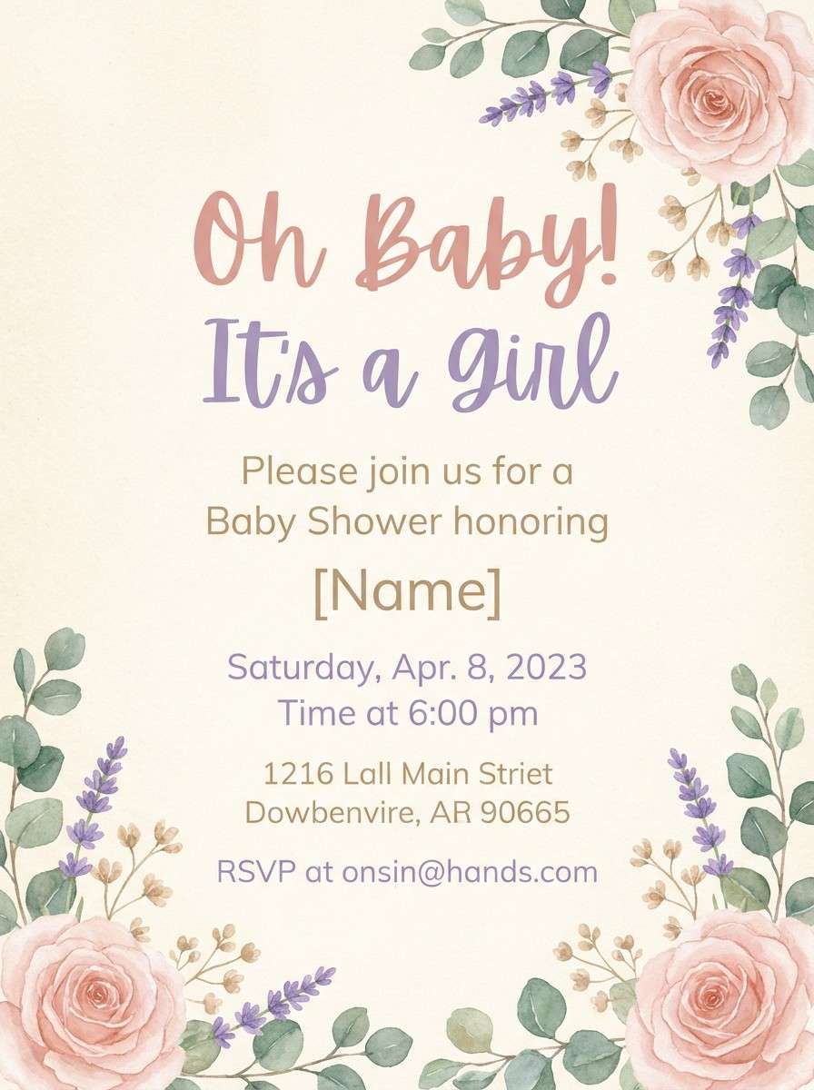
17) Cottage Bouquet
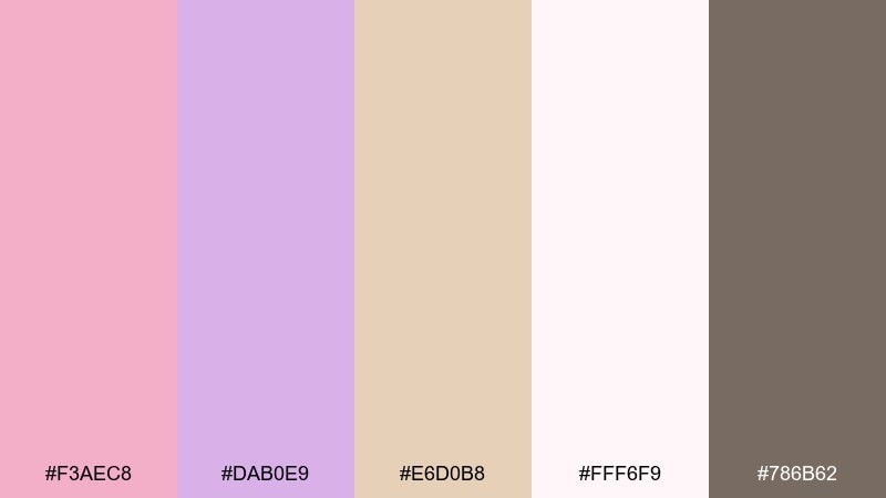
HEX: #F3AEC8 #DAB0E9 #E6D0B8 #FFF6F9 #786B62
Mood: sweet, rustic, welcoming
Best for: baby shower invitations and party signage
Sweet and rustic, these tones recall cottage bouquets, kraft paper tags, and soft cotton. The warm beige gives the pastels a handmade, cozy feel that suits intimate gatherings. Use it for baby showers, brunch invites, and party signage, pairing well with floral illustrations and natural textures. Tip: keep the beige as a secondary block color and use the brown-gray for dates and locations to stay readable.
Image example of cottage bouquet generated using media.io
18) Futuristic Lilac Grid
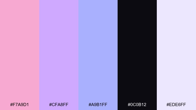
HEX: #F7A9D1 #CFA8FF #A9B1FF #0C0B12 #EDE6FF
Mood: sleek, futuristic, high-contrast
Best for: music player UI and motion-ready layouts
Sleek and futuristic, it feels like neon light bouncing off a dark studio wall. The deep near-black makes the lilac and pink glow, while the periwinkle helps create hierarchy for controls. Use it for music player interfaces, streaming promos, or motion graphics where contrast is key. Tip: keep gradients subtle and apply the lightest lilac as a soft halo behind key UI elements.
Image example of futuristic lilac grid generated using media.io
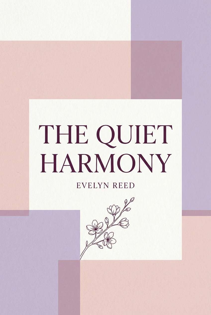
19) Rosewater Serif

HEX: #F2B0C8 #E0B9F6 #C3A6C8 #FFFAFD #2D2431
Mood: literary, elegant, soft
Best for: book covers and author branding
Literary and elegant, these shades feel like rosewater paper, lilac ink, and quiet bookstores. If you are comparing pink lavender color combinations for publishing, this one supports expressive typography without overpowering the title. Use it for book covers, poetry zines, and author brand assets, especially with classic serifs and generous margins. Tip: keep the background near-white and place the darkest tone only in the title and spine text for crisp contrast.
Image example of rosewater serif generated using media.io
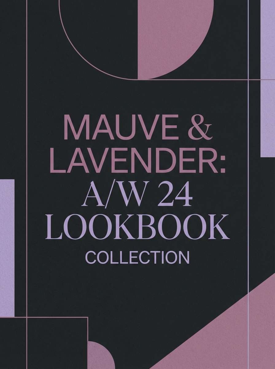
20) Twilight Petal Matte
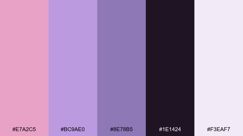
HEX: #E7A2C5 #BC9AE0 #8E78B5 #1E1424 #F3EAF7
Mood: mysterious, romantic, fashion-forward
Best for: fashion lookbooks and campaign covers
Mysterious and romantic, it recalls twilight skies, matte petals, and velvet-lined jewelry boxes. The darker base shade makes the lilac and mauve feel editorial and high-end. Use it for lookbook covers, fashion campaigns, and premium brand posts where you want softness with edge. Tip: let one mid purple dominate large blocks, then use the deep shade for a single strong headline to avoid a muddy mix.
Image example of twilight petal matte generated using media.io
What Colors Go Well with Pink Lavender?
Neutrals are the easiest match: soft white, warm gray, taupe, and charcoal-plum keep pink lavender looking grown-up and legible. For text, aim for deep plum, near-black, or cool navy rather than mid-gray to avoid a washed-out feel.
For fresher contrast, pair pink lavender with muted greens (mint, sage, eucalyptus) or cool grays/blues (periwinkle, steel blue). These tones reduce “candy” vibes and make the palette feel more natural or more tech-forward depending on saturation.
If you want energy, add one bright accent only—berry pink, neon violet, or a crisp cerulean/blue—then keep the rest of the palette airy. This gives you a clear CTA color for web and social designs.
How to Use a Pink Lavender Color Palette in Real Designs
For branding and packaging, let the light blush or near-white do most of the work, then use lavender for secondary blocks (labels, ribbons, borders). Anchor the system with a single dark tone for logos and typography so the brand stays readable across print and screens.
For UI, use pink lavender as an accent rather than a constant background: active states, badges, focus rings, and card headers are ideal. Keep form fields and long-read areas neutral to preserve clarity and accessibility.
For weddings and events, combine soft pink lavender with paper texture, minimal florals, and a strong type hierarchy. Use the darkest shade for dates/locations and reserve the palest tones for negative space and calm elegance.
Create Pink Lavender Palette Visuals with AI
If you already have HEX codes, the fastest way to preview a pink lavender color palette is to generate mockups that match your use case—packaging, social posts, UI screens, invites, and more. This helps you see contrast and mood before you commit to a full design system.
In Media.io, you can paste or adapt the prompts above, then iterate quickly by changing keywords like “matte,” “premium,” “minimal,” or “neon” to shift the vibe while keeping your color story consistent.
Pink Lavender Color Palette FAQs
-
What is the HEX code for a classic pink lavender?
A commonly used pink lavender reference is #E9B7D3, which sits between blush pink and soft lavender for an airy, modern feel. -
Is pink lavender better as a background or an accent color?
It works best as a soft background or secondary surface (cards, panels, large areas), while a darker plum/charcoal handles text and key UI actions for contrast. -
What colors pair well with pink lavender for a modern look?
Try white/near-white, warm gray, deep plum, plus one cool counterpoint like periwinkle or a structured gray-blue for a cleaner modern vibe. -
What colors pair well with pink lavender for weddings?
Pair it with cream, champagne beige, sage/eucalyptus, and charcoal-plum for typography. This keeps invitations romantic but readable. -
How do I keep pink lavender palettes from looking too sweet?
Reduce saturation, add dusty mid-tones (mauve, warm gray), and introduce a grounding dark (plum/near-black). Also use more whitespace and fewer decorative elements. -
What’s a good high-contrast text color on pink lavender?
Use deep tones like #2E2A34, #2D2431, or #1F1B24. Mid-gray often looks low-contrast against pastel lavender-pinks. -
Can I use pink lavender for a tech or SaaS brand?
Yes—use it as a friendly accent with a neutral base (white/light gray) and a navy-gray for text. Add a cool support color (periwinkle/gray-blue) for charts and UI clarity.


