

A blue dark brown color palette blends cool clarity with grounded warmth, making it a versatile choice for modern brands, cozy interiors, and polished digital UI.
Below are 20 curated blue-and-brown combinations with HEX codes, plus practical tips and AI prompts you can use to generate matching visuals.
In this article
Why Blue Dark Brown Palettes Work So Well
Blue brings trust, structure, and calm—especially when you lean into deeper navies. Dark brown adds warmth and tactility, which keeps the overall look from feeling cold or overly corporate.
Together, they create a high-end contrast that still feels natural: think ink and leather, ocean and wood, denim and walnut. This is why blue-and-brown palettes perform well across both digital design and physical materials like packaging, signage, and interiors.
Another advantage is legibility: deep blues and near-black browns support strong typography, while warm creams and gray-beiges keep layouts readable without harsh, stark white.
20+ Blue Dark Brown Color Palette Ideas (with HEX Codes)
1) Midnight Espresso
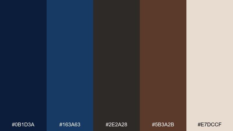
HEX: #0B1D3A #163A63 #2E2A28 #5B3A2B #E7DCCF
Mood: moody, refined, cozy
Best for: luxury branding and coffee packaging
Moody midnight blues with espresso browns feel like a late-night cafe and polished leather. Use the deep navy for your main brand color, then ground layouts with dark roast brown for type and trims. The creamy neutral keeps it premium and readable on labels and web headers. Tip: foil-stamp the brown on the navy for a subtle luxury finish.
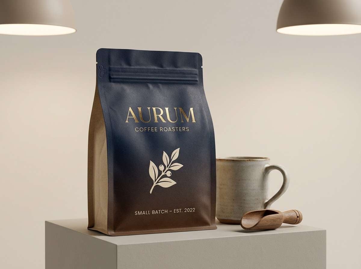
Image example of midnight espresso generated using media.io
Media.io is an online AI studio for creating and editing video, image, and audio in your browser.

2) Harbor Cocoa
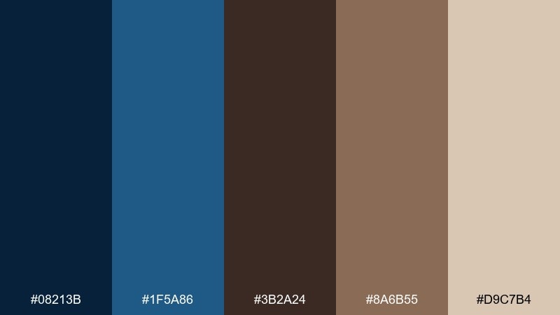
HEX: #08213B #1F5A86 #3B2A24 #8A6B55 #D9C7B4
Mood: nautical, warm, grounded
Best for: coastal home decor and living room styling
Nautical blues and cocoa browns evoke weathered docks, rope, and warm lamplight. These blue dark brown color combinations work beautifully on walls, textiles, and wood finishes where you want calm without feeling cold. Pair with natural fibers like linen and jute to amplify the coastal warmth. Tip: keep the lighter beige on large surfaces and use the darkest navy for accents like frames or built-ins.
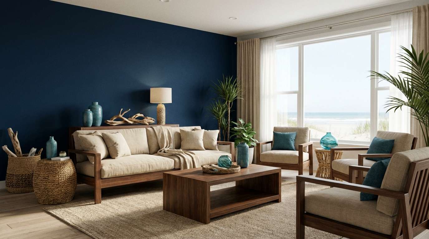
Image example of harbor cocoa generated using media.io
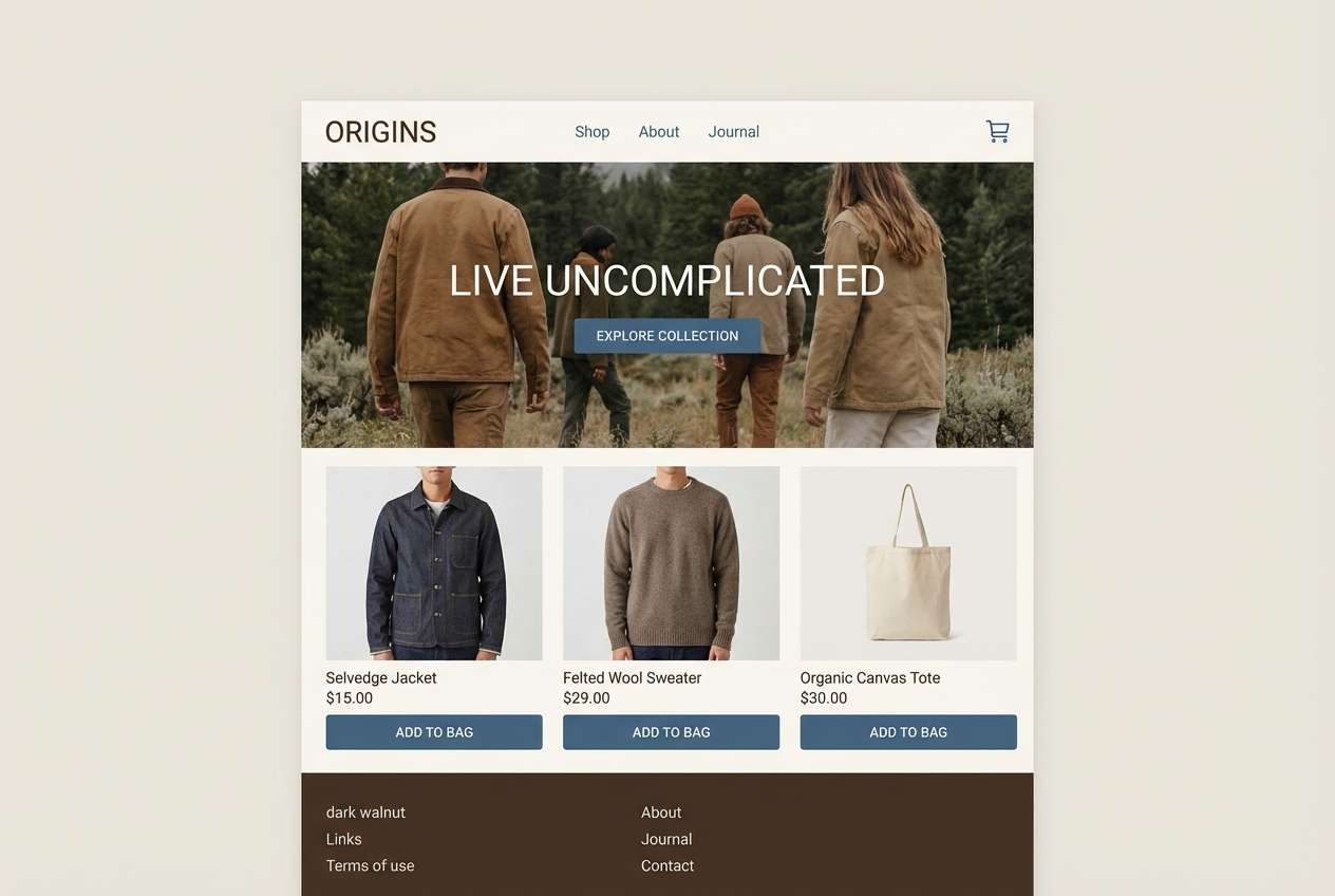
3) Denim Walnut
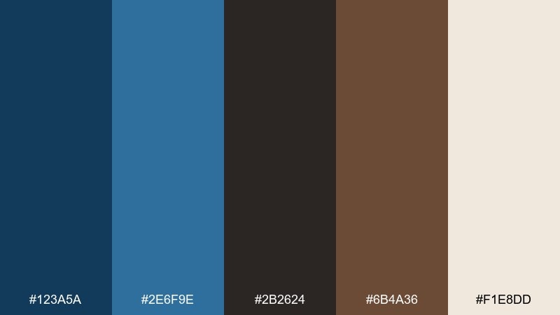
HEX: #123A5A #2E6F9E #2B2624 #6B4A36 #F1E8DD
Mood: casual, approachable, modern
Best for: ecommerce product pages and lifestyle brands
Denim blues with walnut browns feel casual, familiar, and quietly modern. Use the mid-blue for buttons and highlights, while the near-black brown supports headings and price text with a softer edge than pure black. The warm off-white helps product photos look clean without turning stark. Tip: reserve the brighter blue for CTAs only to keep the page calm and focused.
Image example of denim walnut generated using media.io
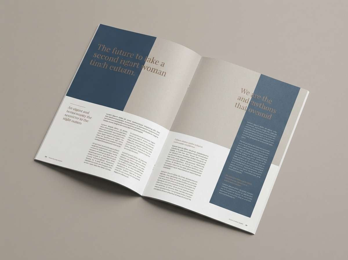
4) Stormy Mocha
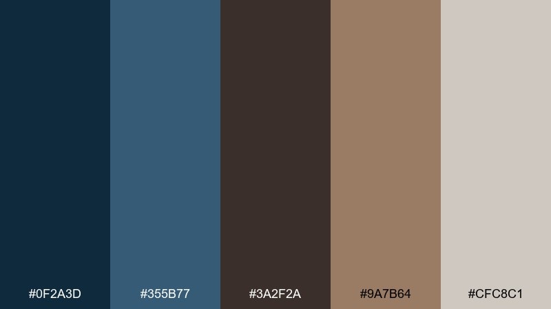
HEX: #0F2A3D #355B77 #3A2F2A #9A7B64 #CFC8C1
Mood: stormy, calm, sophisticated
Best for: editorial layouts and magazine features
Stormy blues layered with mocha browns suggest rain on glass and steamed ceramic mugs. The muted mid-blue is ideal for pull quotes and section dividers, while mocha tones add warmth to headlines and captions. Keep backgrounds in the soft gray-beige so spreads feel airy and legible. Tip: use generous line spacing with the darker brown to maintain a refined, editorial rhythm.
Image example of stormy mocha generated using media.io
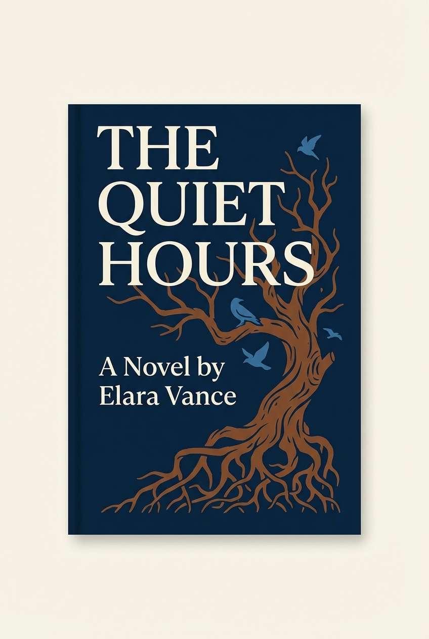
5) Ink Chestnut
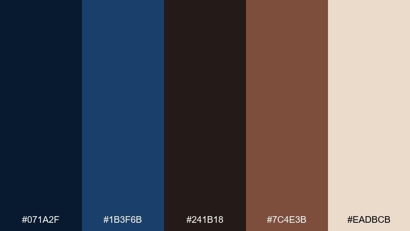
HEX: #071A2F #1B3F6B #241B18 #7C4E3B #EADBCB
Mood: dramatic, classic, bookish
Best for: book covers and podcast artwork
Inky navy and chestnut brown read like fountain pen strokes and old library shelves. The contrast is strong enough for bold titles, especially when you set type in cream against the darkest blue. Add chestnut as a framing color or illustration fill to keep the composition warm. Tip: keep the mid-blue minimal so the cover stays dramatic rather than busy.
Image example of ink chestnut generated using media.io
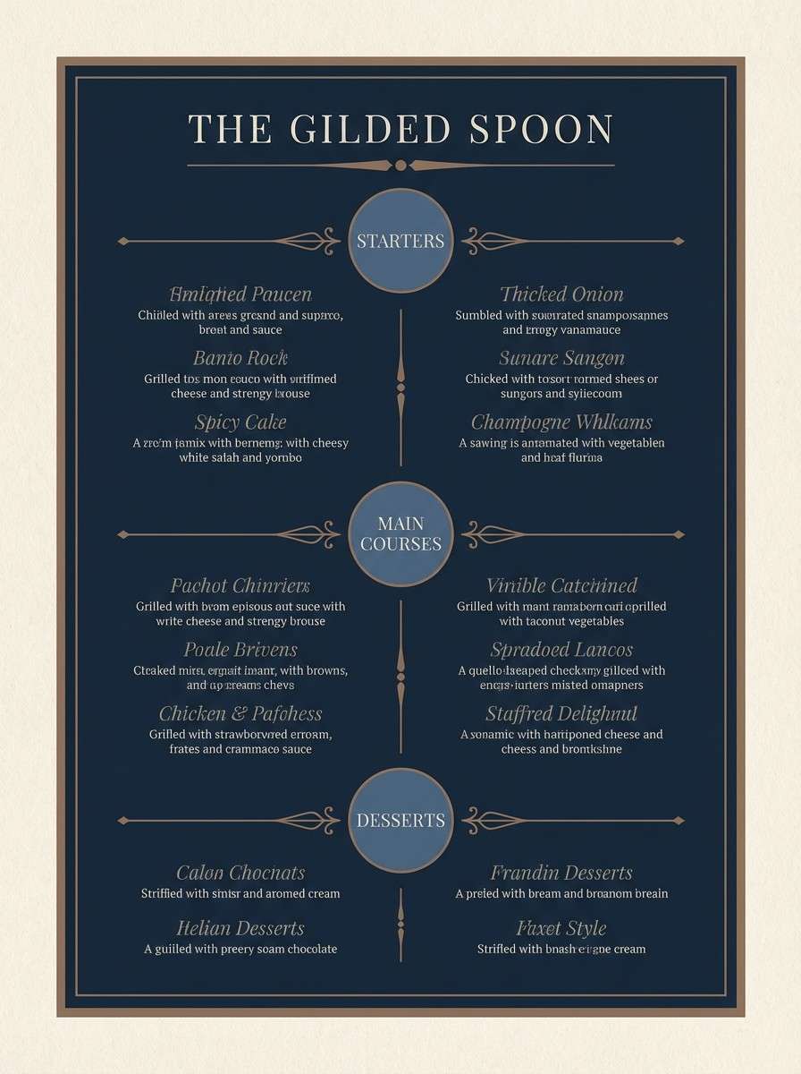
6) Deep Sea Truffle
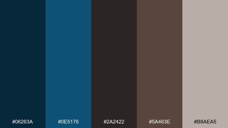
HEX: #06263A #0E5176 #2A2422 #5A463E #B8AEA5
Mood: deep, earthy, atmospheric
Best for: restaurant menus and cocktail bars
Deep-sea blues paired with truffle browns feel intimate, earthy, and slightly mysterious. Use the darkest blue as a menu background and set body text in the warm gray for easy reading under low light. Bring in the lighter blue for section headers or drink icons to guide the eye. Tip: choose matte paper or a chalkboard texture to make the browns feel richer.
Image example of deep sea truffle generated using media.io
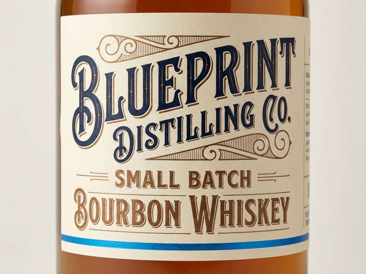
7) Blueprint Bourbon

HEX: #0C2C59 #2A76B8 #2B1F1A #6A3F2B #F3E6D6
Mood: confident, crafted, bold
Best for: craft spirits branding and label systems
Bold blueprint blues with bourbon browns bring a crafted, workshop vibe with real confidence. This blue dark brown color palette shines on bottle labels where you want tradition plus a modern edge. Pair it with engraved-style line art and a warm cream base to keep details sharp. Tip: use the bright blue as a single accent stripe so it reads premium, not sporty.
Image example of blueprint bourbon generated using media.io
8) Sapphire Timber
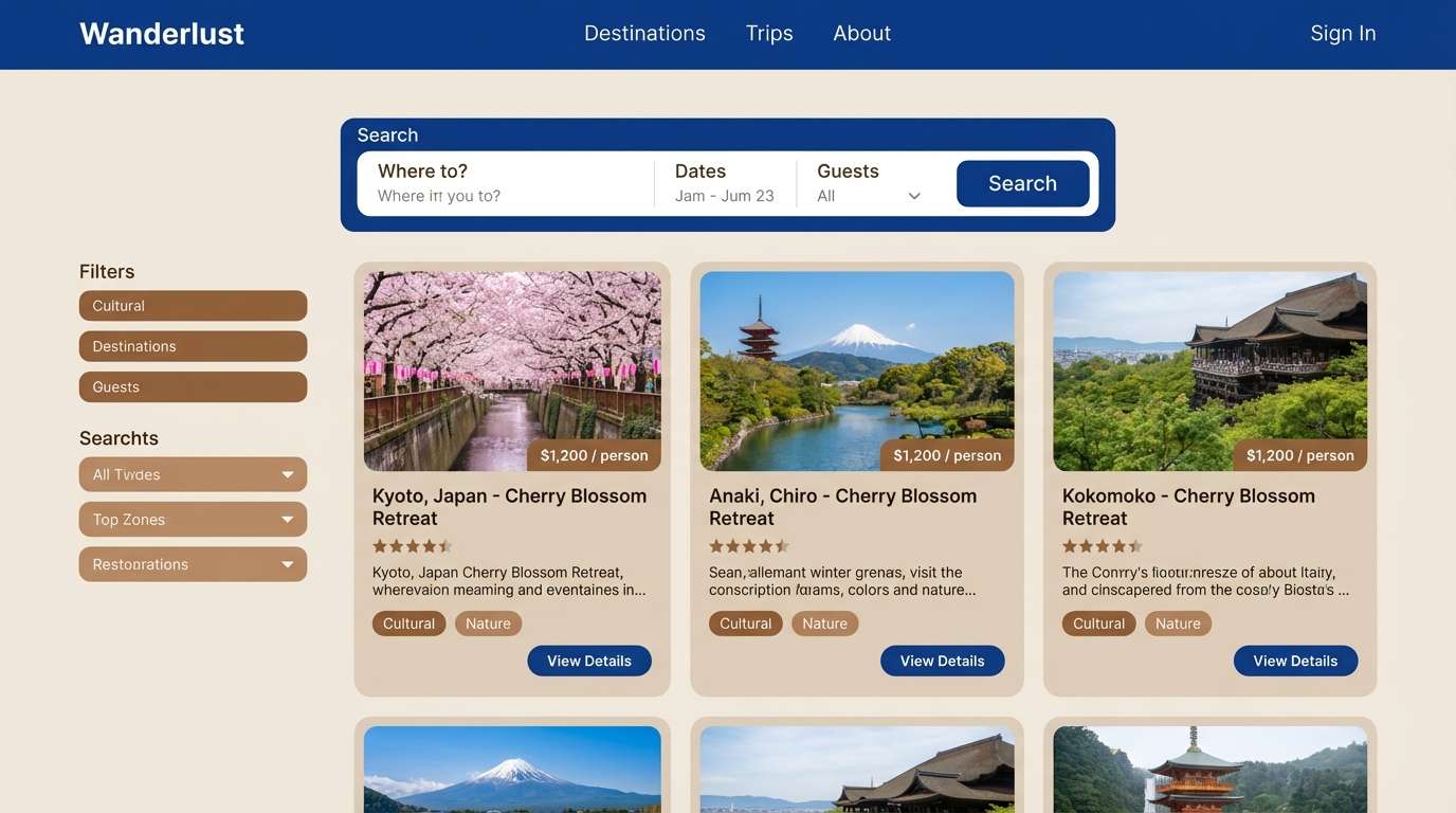
HEX: #0A2A4A #1F66A5 #2D2420 #8B6A52 #DCD2C5
Mood: outdoorsy, clean, dependable
Best for: travel sites and cabin rental listings
Sapphire blues and timber browns suggest clear mountain air, sturdy cabins, and crisp mornings. Use the blue range for navigation and links, then bring in the warm browns for badges, pricing highlights, or map pins. The soft neutral works well as a background behind photography-heavy layouts. Tip: keep buttons in the brighter blue and reserve the darker navy for headers to reduce visual noise.
Image example of sapphire timber generated using media.io
9) Twilight Leather
HEX: #111E3A #3A5E86 #1F1714 #704C3B #EFE2D4
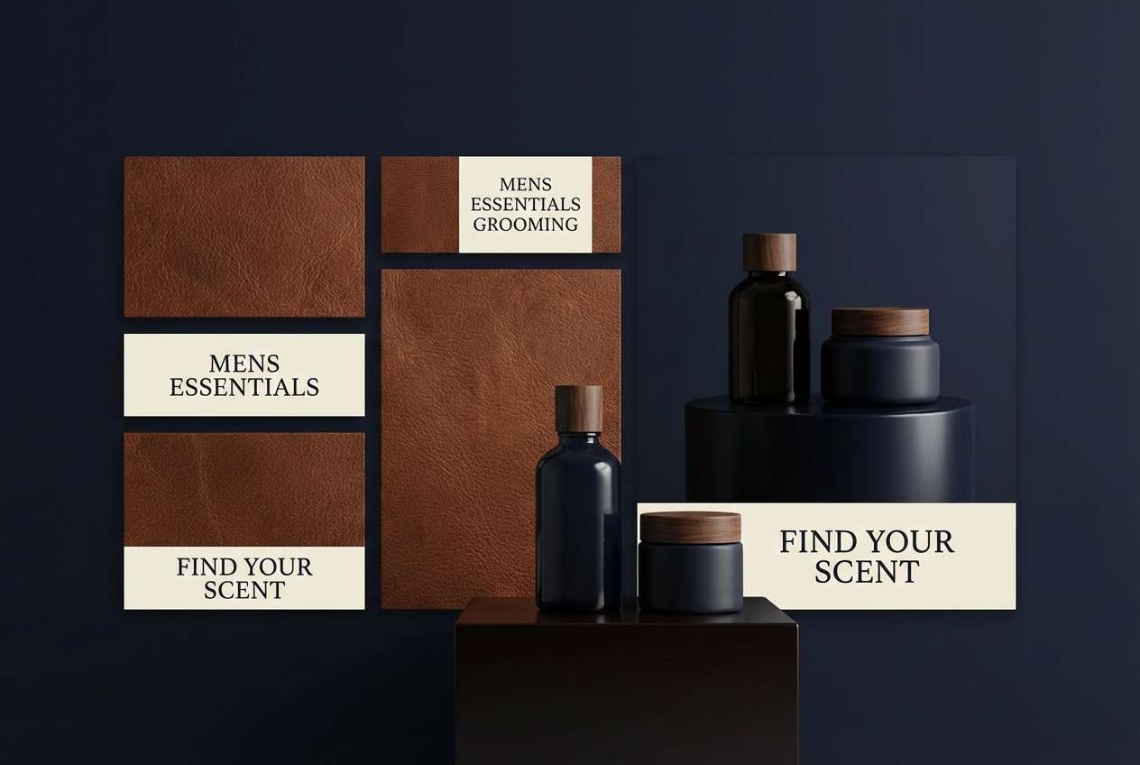
Mood: sleek, masculine, premium
Best for: mens grooming ads and product pages
Twilight navy with leather brown feels sleek, premium, and quietly masculine. The dark base supports high-contrast product shots, while the leather tone brings warmth to callouts and ingredient icons. Add cream as negative space so the design does not get heavy. Tip: use subtle gradients only within the blues to keep the overall look polished.
Image example of twilight leather generated using media.io
10) Navy Bark
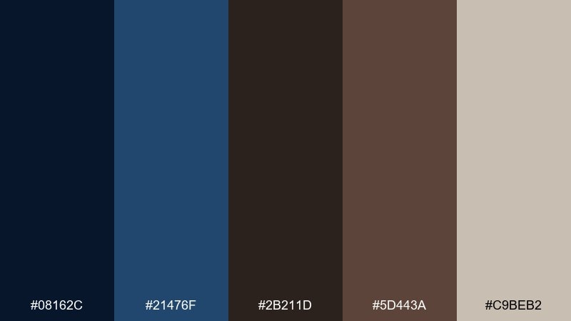
HEX: #08162C #21476F #2B211D #5D443A #C9BEB2
Mood: natural, steady, understated
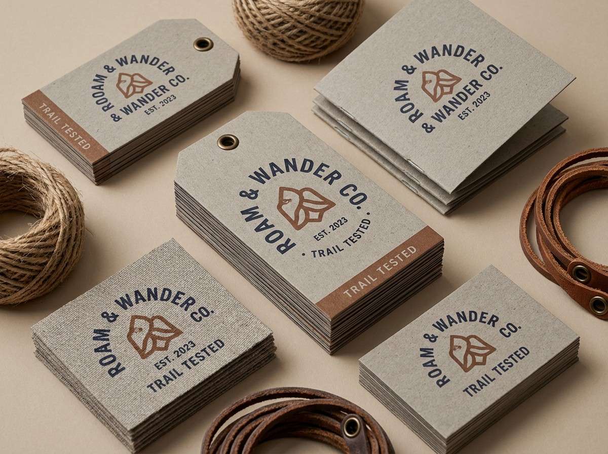
Best for: outdoor apparel branding and hang tags
Navy and bark browns feel like forest trails at dusk, grounded and dependable. Use the dark navy for primary marks and the bark tones for secondary labels, stitching details, or tag borders. The warm gray neutral keeps typography readable on recycled paper stocks. Tip: add texture through paper grain rather than extra colors to keep the palette honest and rugged.
Image example of navy bark generated using media.io
11) Rainy Pier
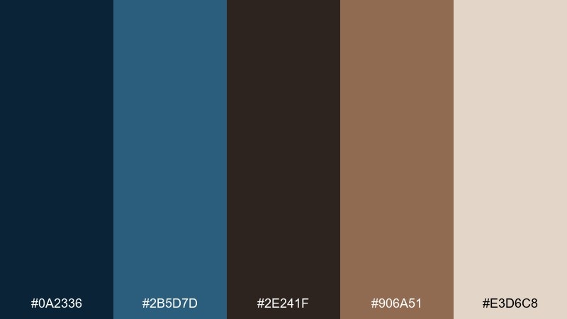
HEX: #0A2336 #2B5D7D #2E241F #906A51 #E3D6C8
Mood: cinematic, calm, nostalgic
Best for: movie posters and event flyers
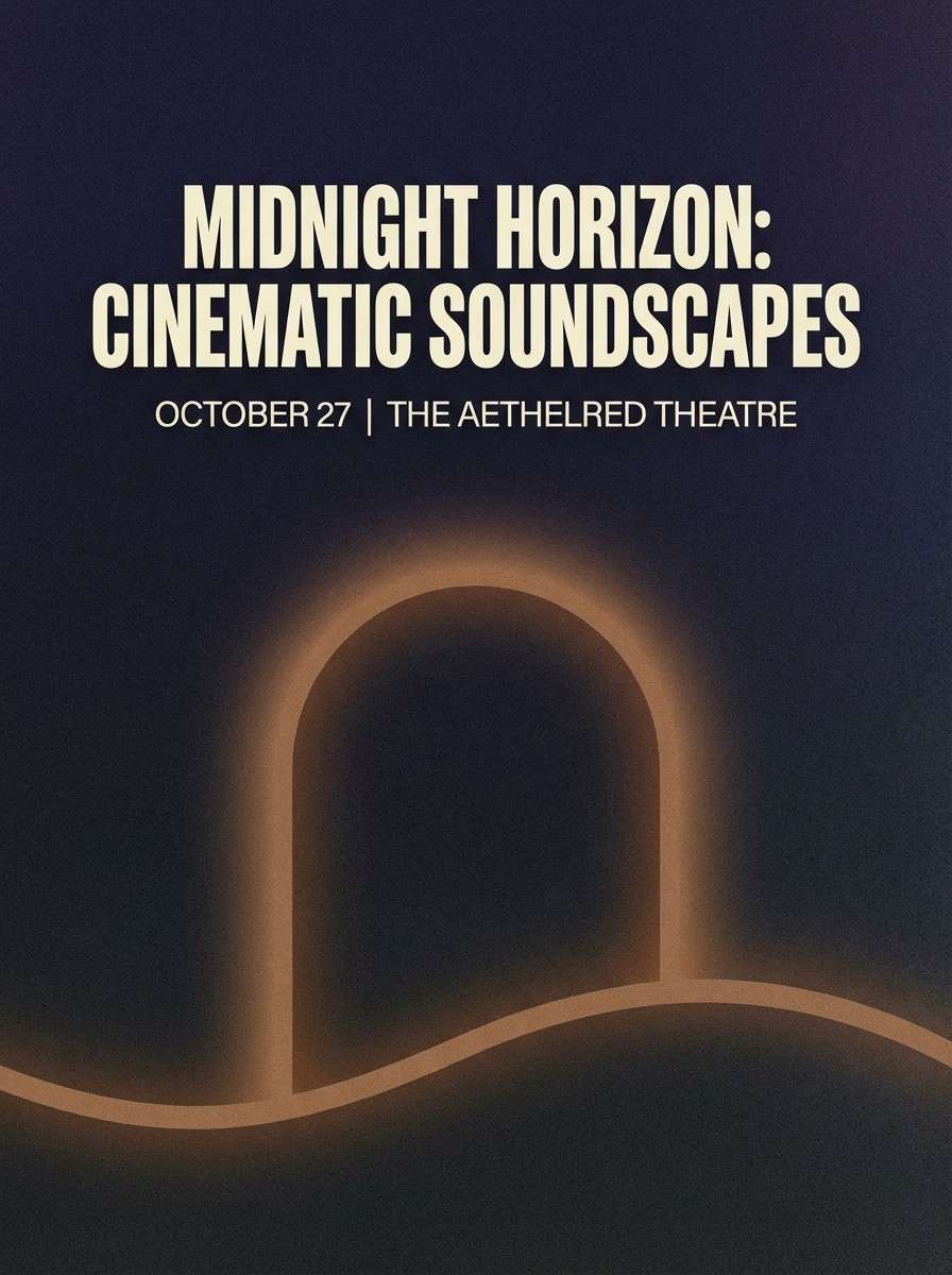
Cinematic blues and weathered browns recall a rainy pier, streetlights, and reflective water. These blue dark brown color combinations are strong for posters because the dark tones create instant depth. Pair with condensed typography in cream for maximum legibility from a distance. Tip: keep imagery in cool shadows and use the warm brown only for a single focal highlight.
Image example of rainy pier generated using media.io
12) Cosmic Cacao

HEX: #0B1430 #2E4D8C #231A17 #6E4B3C #B9B0A7
Mood: mysterious, techy, elegant
Best for: SaaS dashboards and analytics UI
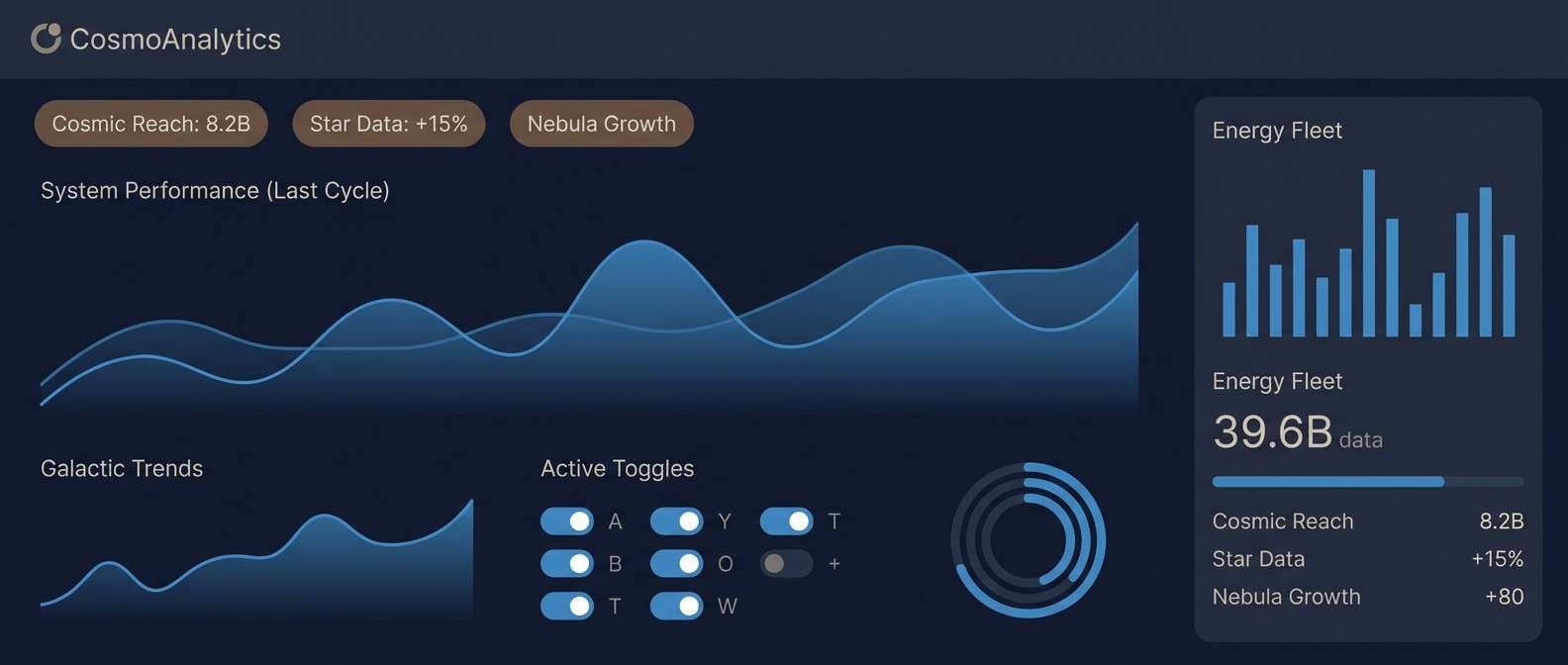
Cosmic navy with cacao browns feels like a night sky over warm city lights. Use the darkest blue for the app shell, then bring in the mid-blue for charts and active states. Brown works surprisingly well for secondary badges and micro-highlights where you want warmth without shouting. Tip: keep card backgrounds slightly lighter than the shell to preserve hierarchy.
Image example of cosmic cacao generated using media.io
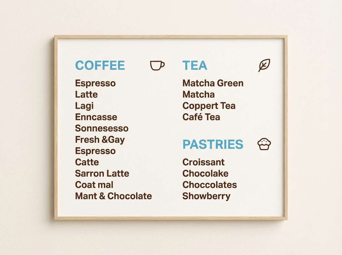
13) Arctic Roast
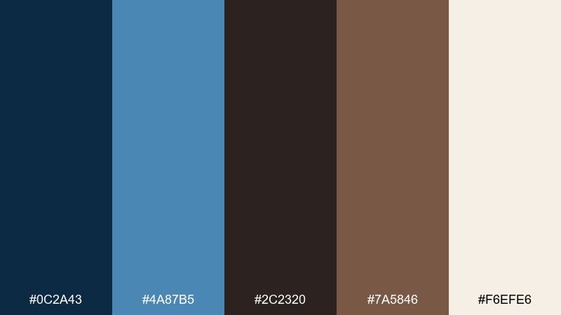
HEX: #0C2A43 #4A87B5 #2C2320 #7A5846 #F6EFE6
Mood: fresh, cozy, balanced
Best for: cafe interiors and menu boards
Fresh arctic blues with roasted browns balance crispness and comfort, like cold air outside a warm cafe. This blue dark brown color scheme works well on menu boards, where the light background keeps pricing and items easy to scan. Pair with pale wood and simple line icons for a clean, modern feel. Tip: use the brighter blue for category headers and the roast brown for item names to guide reading.
Image example of arctic roast generated using media.io
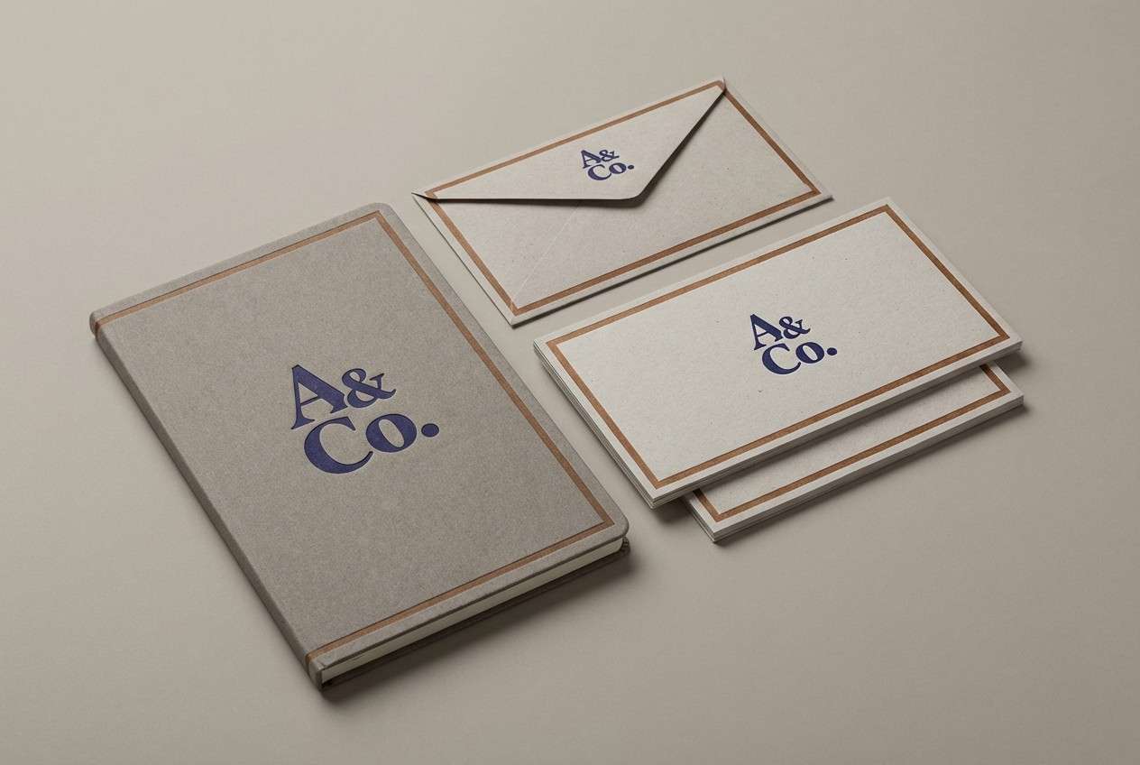
14) Vintage Indigo Wood
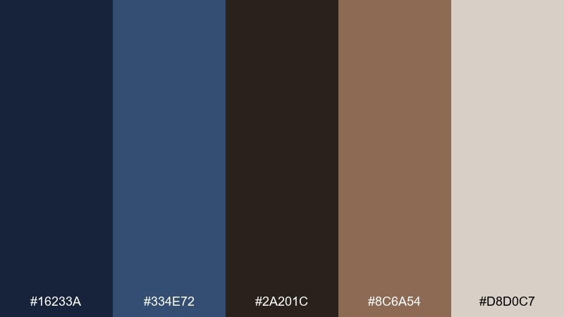
HEX: #16233A #334E72 #2A201C #8C6A54 #D8D0C7
Mood: heritage, calm, timeless
Best for: heritage logos and stationery sets
Vintage indigo with warm wood browns feels timeless, like letterpress ink on textured paper. Use indigo for monograms and seals, and save the medium blue for lines and secondary marks. The wood tones add warmth to envelopes, business cards, and packaging inserts. Tip: print the browns slightly lighter than screen to avoid muddy results on uncoated stock.
Image example of vintage indigo wood generated using media.io
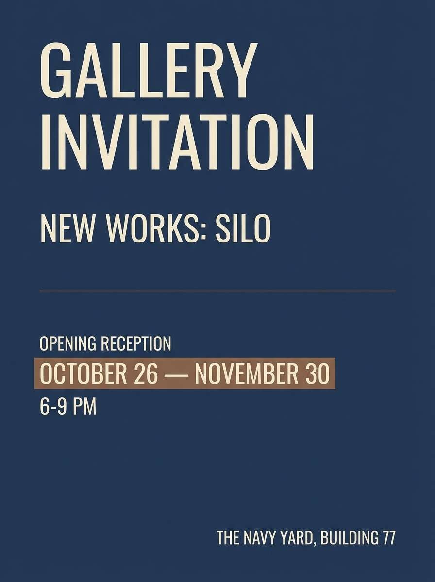
15) Museum Night
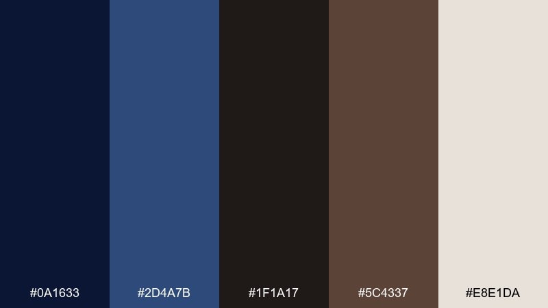
HEX: #0A1633 #2D4A7B #1F1A17 #5C4337 #E8E1DA
Mood: artful, quiet, upscale
Best for: gallery invitations and exhibit posters
Quiet museum-night blues and soft browns feel artful and upscale, like dim halls and spotlit frames. Use the navy as the dominant ground, then set exhibition details in the pale neutral for sharp readability. Brown is perfect for small directional accents, dates, or curator names. Tip: leave plenty of negative space so the design feels curated, not crowded.
Image example of museum night generated using media.io
16) Slate Brownstone
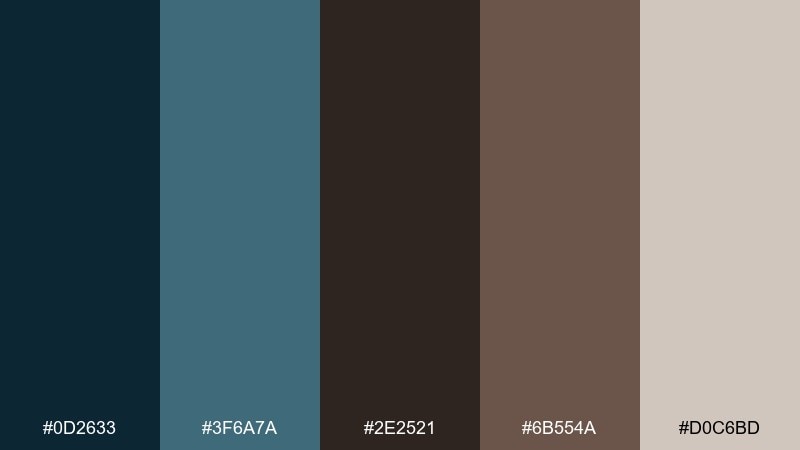
HEX: #0D2633 #3F6A7A #2E2521 #6B554A #D0C6BD
Mood: urban, mature, composed
Best for: architecture portfolios and studio websites
Slate blue and brownstone tones feel urban and composed, like city facades after rain. Set navigation and headings in the darkest tones for authority, then use the muted blue for links and hover states. The warm gray background keeps project photos and floor plans from looking overly cold. Tip: use the brown as a thin grid line color to subtly structure case studies.
Image example of slate brownstone generated using media.io

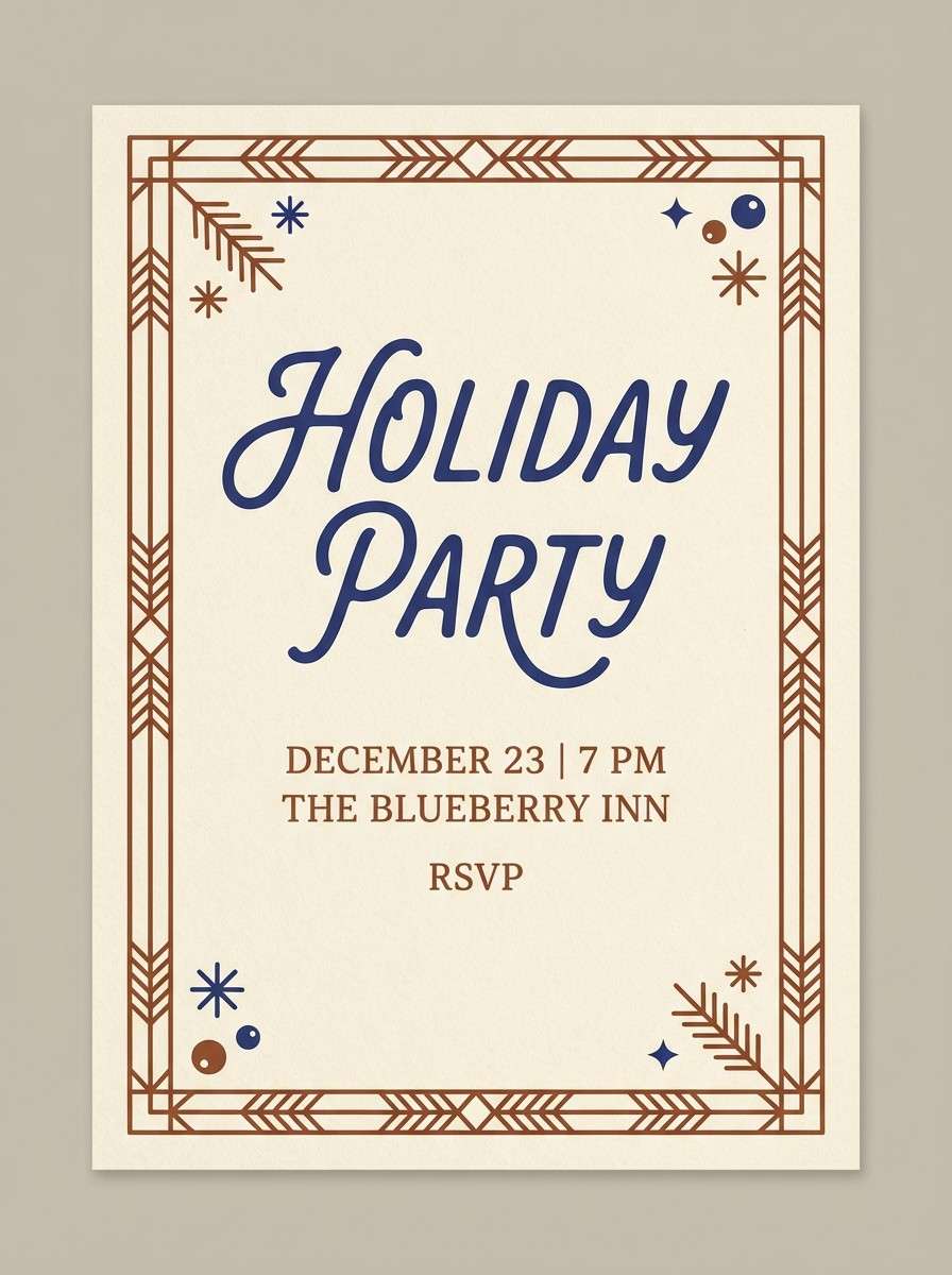
17) Blueberry Brandy
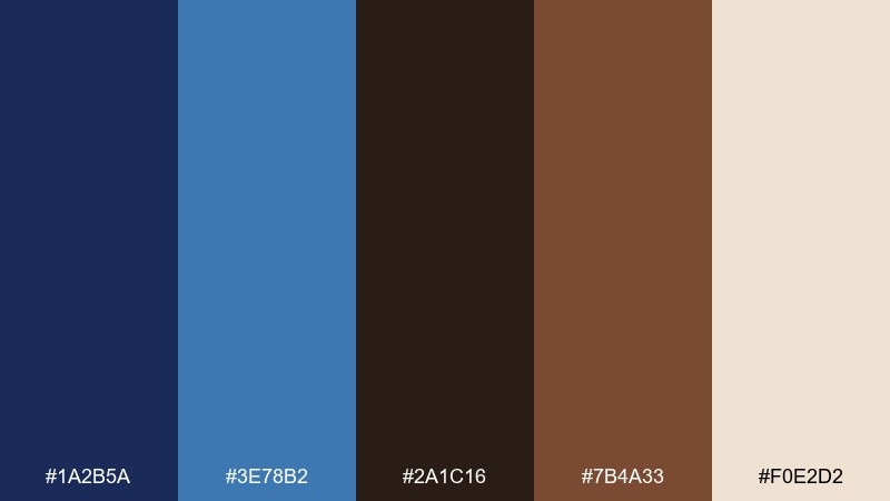
HEX: #1A2B5A #3E78B2 #2A1C16 #7B4A33 #F0E2D2
Mood: rich, festive, inviting
Best for: holiday party invitations and drink promos
Rich blueberry blues with brandy browns feel festive and inviting without turning flashy. These blue dark brown color combinations look great on invitations where you want warmth, depth, and a hint of celebration. Pair with cream paper textures and a touch of metallic ink if printing. Tip: keep the layout simple and let one bold headline in blue do the heavy lifting.
Image example of blueberry brandy generated using media.io
18) Cobalt Cedar

HEX: #0D2E63 #2E74D4 #2A211C #6C4D3A #E6D9CB
Mood: energetic, modern, confident
Best for: tech branding and app landing pages
Cobalt energy against cedar brown feels modern, confident, and a little daring. Use the bright blue for key actions and hero highlights, while the dark navy anchors headers and footers. Cedar adds warmth to icons, illustrations, and testimonial cards so the page feels human. Tip: limit the bright blue to one action style to keep conversion elements unmistakable.
Image example of cobalt cedar generated using media.io

19) Noir Latte
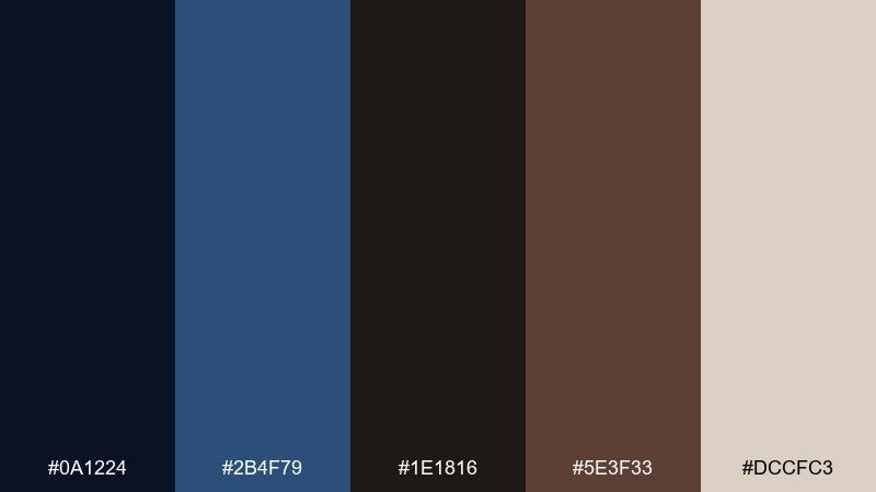
HEX: #0A1224 #2B4F79 #1E1816 #5E3F33 #DCCFC3
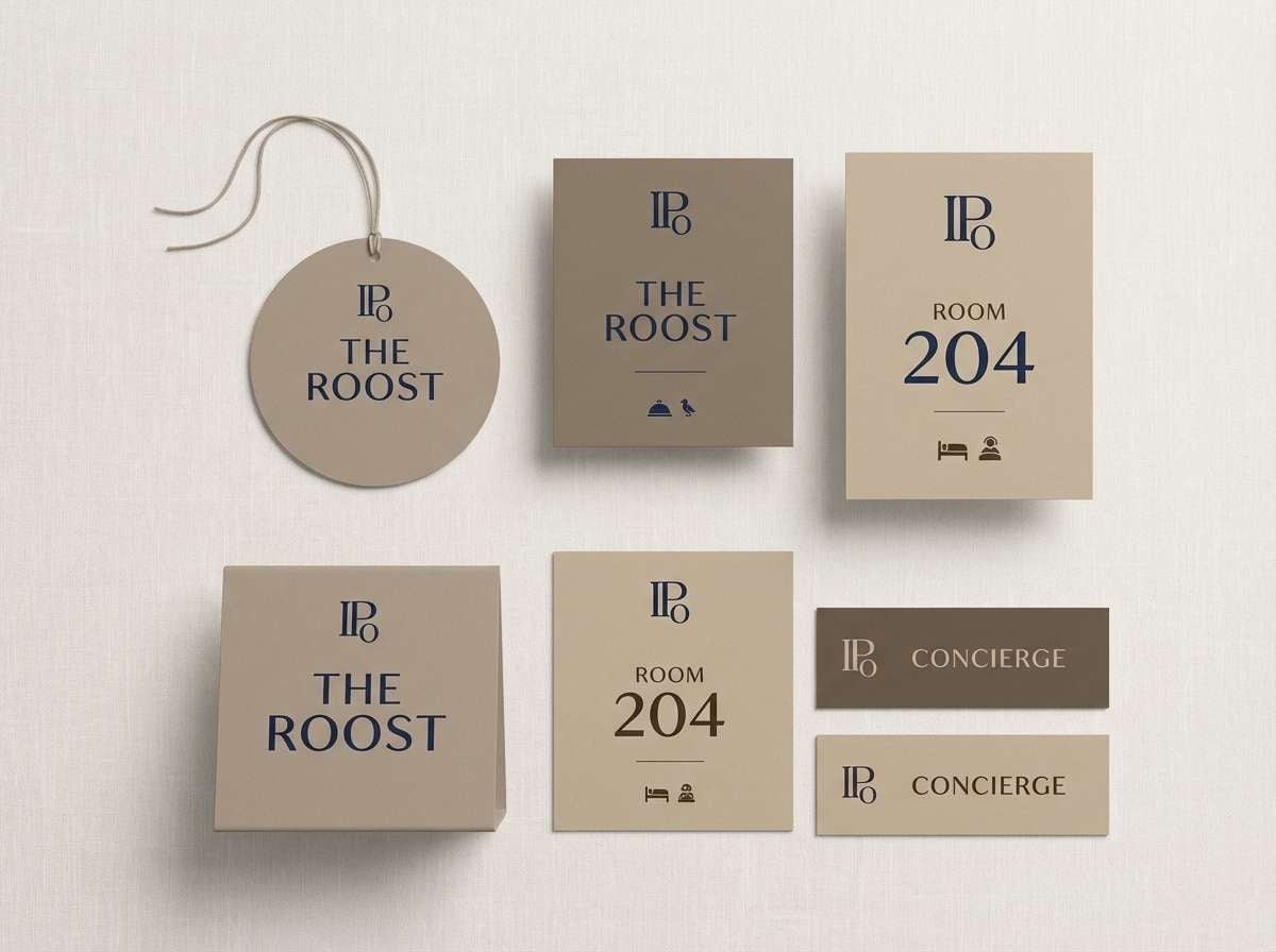
Mood: minimal, intimate, upscale
Best for: boutique hotel branding and signage
Noir blues and latte browns create an intimate, upscale mood like a softly lit lobby. Use the near-black tones for signage type and the muted blue for directional cues or room numbers. The warm neutral helps the whole system feel welcoming rather than severe. Tip: increase letter spacing on dark signage to improve readability at distance.
Image example of noir latte generated using media.io
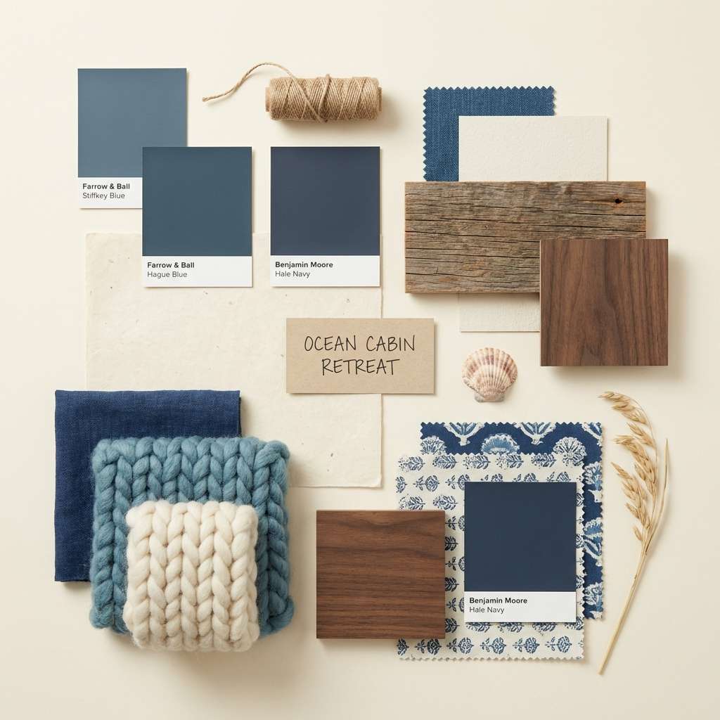
20) Ocean Cabin

HEX: #082A44 #2C6B8F #2A231F #7C5D49 #EEE5DA
Mood: relaxed, rustic, breathable
Best for: Pinterest-style interior mood boards
Ocean blues with cabin browns feel relaxed and rustic, like driftwood beside calm water. Use the lighter blue for airy textiles and paint accents, while the browns work best in wood furniture and warm lighting. The creamy neutral ties everything together for a breathable mood board. Tip: repeat the brown in small decor items so the space feels cohesive, not heavy.
Image example of ocean cabin generated using media.io
What Colors Go Well with Blue Dark Brown?
Warm neutrals are the easiest match: cream, oatmeal, beige, and greige smooth the transition between deep blues and dark browns while keeping things readable and premium.
For accents, muted metallics (brass, bronze, soft gold) add a crafted feel, while cool accents like teal or slate can modernize the blues without fighting the browns.
If you need a brighter pop, use a controlled highlight color (like a cleaner cobalt or a soft terracotta) sparingly—ideally for CTAs, badges, or small decorative elements.
How to Use a Blue Dark Brown Color Palette in Real Designs
Start by assigning roles: use the darkest navy as your anchor (headers, backgrounds, hero sections), then bring in dark brown for typography or trim where you want warmth without losing contrast.
Let the light neutral do the heavy lifting for readability. In web and UI, it’s ideal for surfaces (cards, content areas) so photography and product shots feel natural instead of stark.
Keep saturation in check: these palettes look most expensive when blues stay deep and browns stay earthy. Use the brighter blue (when included) as a single “action” color for links and primary buttons.
Create Blue Dark Brown Palette Visuals with AI
If you already have HEX codes but need matching visuals (mockups, posters, UI scenes, mood boards), generating examples with AI can speed up exploration and keep concepts consistent.
Use prompts that mention material cues (leather, walnut, matte paper, navy ink) and lighting (soft daylight, studio lighting) to reinforce the blue-and-brown mood.
Once you like a direction, iterate by changing only one variable at a time—such as “more negative space” or “minimal accent stripe”—so the palette stays coherent.
Blue Dark Brown Color Palette FAQs
-
What does a blue dark brown color palette communicate?
It typically communicates trust and stability (blue) paired with warmth and craft (dark brown). The combination often feels premium, grounded, and mature. -
Is blue and dark brown a good combination for branding?
Yes—especially for luxury, heritage, outdoors, food & beverage, and hospitality brands. Use a deep navy as the primary brand color and let brown act as a supporting accent or typography tone. -
Which background color works best with blue and dark brown?
Creams, warm off-whites, and greige backgrounds work best because they keep contrast high while preventing the palette from feeling too heavy or overly dark. -
How do I keep blue-and-brown designs from looking too dark?
Increase the proportion of light neutral, limit the darkest tones to headers/footers, and add spacing. You can also use a mid-blue for dividers and UI states instead of adding more colors. -
What accent colors pair well with blue dark brown palettes?
Muted brass/bronze, soft teal, slate, and warm terracotta accents all work well. Keep accents small so the navy and brown remain the main story. -
Are blue dark brown palettes good for UI and dashboards?
Yes. Dark navies make strong shells, while warm browns can be used for secondary badges and highlights. Ensure accessibility with sufficient contrast and use warm neutrals for readable text surfaces. -
How can I generate matching visuals for my palette quickly?
Use an AI text-to-image tool and include both color cues (navy, espresso brown, warm cream) and material/lighting cues (matte paper, studio lighting). Then refine composition and accents while keeping the palette consistent.
Next: Rainbow Color Palette


