

A rainbow color palette is the fastest way to signal energy, variety, and optimism—perfect when you want a design to feel instantly alive.
Below are 20+ curated rainbow palette ideas with HEX codes, mood notes, and practical pairing tips for branding, UI, posters, and playful illustrations.
In this article
- Why Rainbow Palettes Work So Well
-
- prism pop
- cotton candy arc
- neon spectrum night
- pastel parade
- retro candy stripe
- sunset to sea
- storybook brights
- minimal rainbow accents
- citrus splash
- jewel tone arc
- spring garden ribbon
- tech gradient beam
- classroom cheer
- pride parade bold
- cozy rainbow neutrals
- ice cream sprinkles
- ocean spray spectrum
- artisan market
- cosmic aurora
- modern marker set
- clean spectrum grid
- playroom primary mix
- What Colors Go Well with Rainbow?
- How to Use a Rainbow Color Palette in Real Designs
- Create Rainbow Palette Visuals with AI
Why Rainbow Palettes Work So Well
Rainbow color schemes naturally create contrast and hierarchy, which makes key elements (like CTAs, headlines, and category labels) easier to spot quickly.
They also communicate variety—great for brands that want to feel inclusive, creative, playful, or “all-in-one” without relying on a single signature hue.
With the right balance of neutrals, spacing, and saturation, rainbow palettes can be surprisingly readable and professional, not just loud.
20+ Rainbow Color Palette Ideas (with HEX Codes)
1) Prism Pop
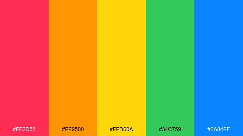
HEX: #ff2d55 #ff9500 #ffd60a #34c759 #0a84ff
Mood: bold, upbeat, modern
Best for: streetwear poster design
Bold and upbeat like stage lights hitting a glass prism, these tones feel loud in the best way. Use it for streetwear drops, event posters, and punchy social graphics where contrast is the point. Pair with black or off-white type, and keep gradients simple to avoid visual noise. Tip: let one color own the headline and use the rest as smaller accents or icons.
Image example of prism pop generated using media.io
Media.io is an online AI studio for creating and editing video, image, and audio in your browser.

2) Cotton Candy Arc
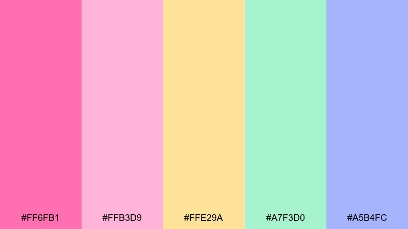
HEX: #ff6fb1 #ffb3d9 #ffe29a #a7f3d0 #a5b4fc
Mood: sweet, airy, gentle
Best for: baby shower invitation
Sweet and airy like cotton candy drifting through a sunny fair, these pastels feel friendly and soft. They work beautifully for baby showers, kids birthdays, and lighthearted invites where you want warmth without intensity. Pair with creamy whites and a rounded sans serif to keep it approachable. Tip: use the lavender as a subtle border color to tie the whole layout together.
Image example of cotton candy arc generated using media.io
3) Neon Spectrum Night
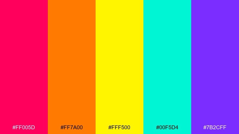
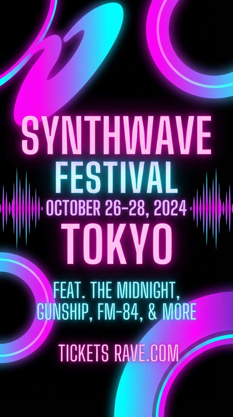
HEX: #ff005d #ff7a00 #fff500 #00f5d4 #7b2cff
Mood: electric, nightlife, high energy
Best for: music festival flyer
Electric and nocturnal, these neons read like a club sign buzzing against the dark. They are made for festival flyers, DJ lineups, and motion graphics where you want instant impact. Anchor the layout with deep charcoal or pure black and reserve the brightest yellow for key details. Tip: add a soft glow only to one or two elements so the design stays sharp.
Image example of neon spectrum night generated using media.io
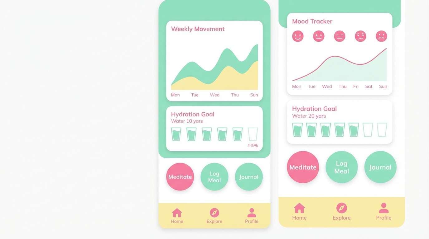
4) Pastel Parade
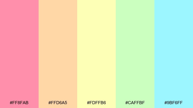
HEX: #ff8fab #ffd6a5 #fdffb6 #caffbf #9bf6ff
Mood: calm, optimistic, friendly
Best for: wellness app UI
Calm and optimistic like a slow morning walk under soft skies, these colors keep screens feeling breathable. As a rainbow color palette for wellness UI, it supports friendly onboarding, habit tracking, and gentle progress states. Pair it with lots of white space and a cool gray for text to protect readability. Tip: limit saturation in large panels and push brighter tones into buttons and badges.
Image example of pastel parade generated using media.io
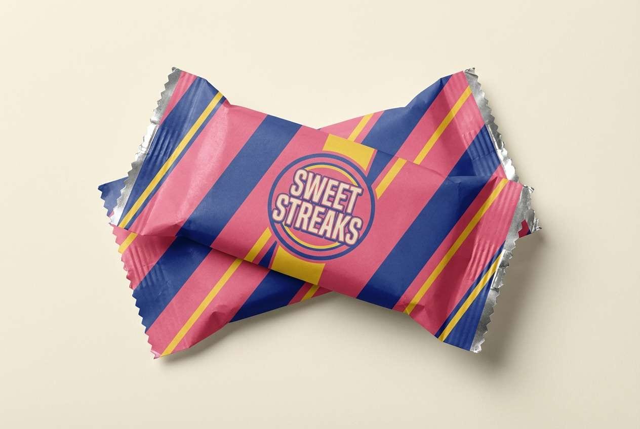
5) Retro Candy Stripe
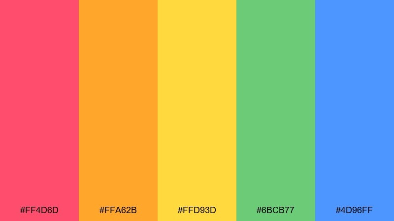
HEX: #ff4d6d #ffa62b #ffd93d #6bcB77 #4d96ff
Mood: playful, retro, punchy
Best for: candy packaging design
Playful and retro like a striped candy wrapper from a corner shop, these tones feel instantly nostalgic. Use them for packaging, stickers, and bold labels where you want quick shelf recognition. Pair with a warm cream background and chunky display fonts for that classic vibe. Tip: keep stripes to two dominant colors and let the rest support as small icons or flavor cues.
Image example of retro candy stripe generated using media.io
6) Sunset to Sea
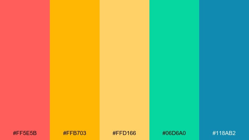
HEX: #ff5e5b #ffb703 #ffd166 #06d6a0 #118ab2
Mood: adventurous, summery, uplifting
Best for: travel landing page hero
Adventurous and summery, it feels like sunset melting into a clear ocean horizon. These hues fit travel landing pages, tour promos, and destination highlights where warmth needs a cool counterbalance. Pair with sandy neutrals and crisp photography to keep it believable. Tip: use teal for primary buttons and reserve coral for limited-time badges.
Image example of sunset to sea generated using media.io

7) Storybook Brights
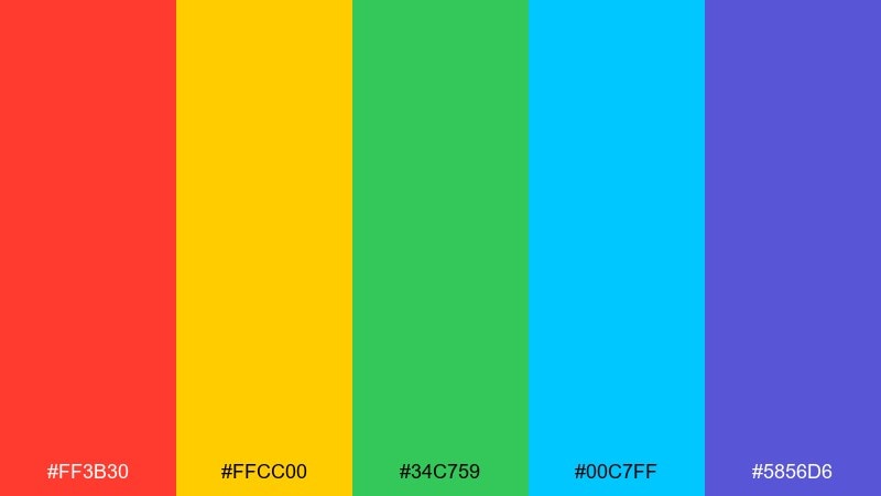
HEX: #ff3b30 #ffcc00 #34c759 #00c7ff #5856d6
Mood: cheerful, animated, kid-friendly
Best for: children's book cover illustration
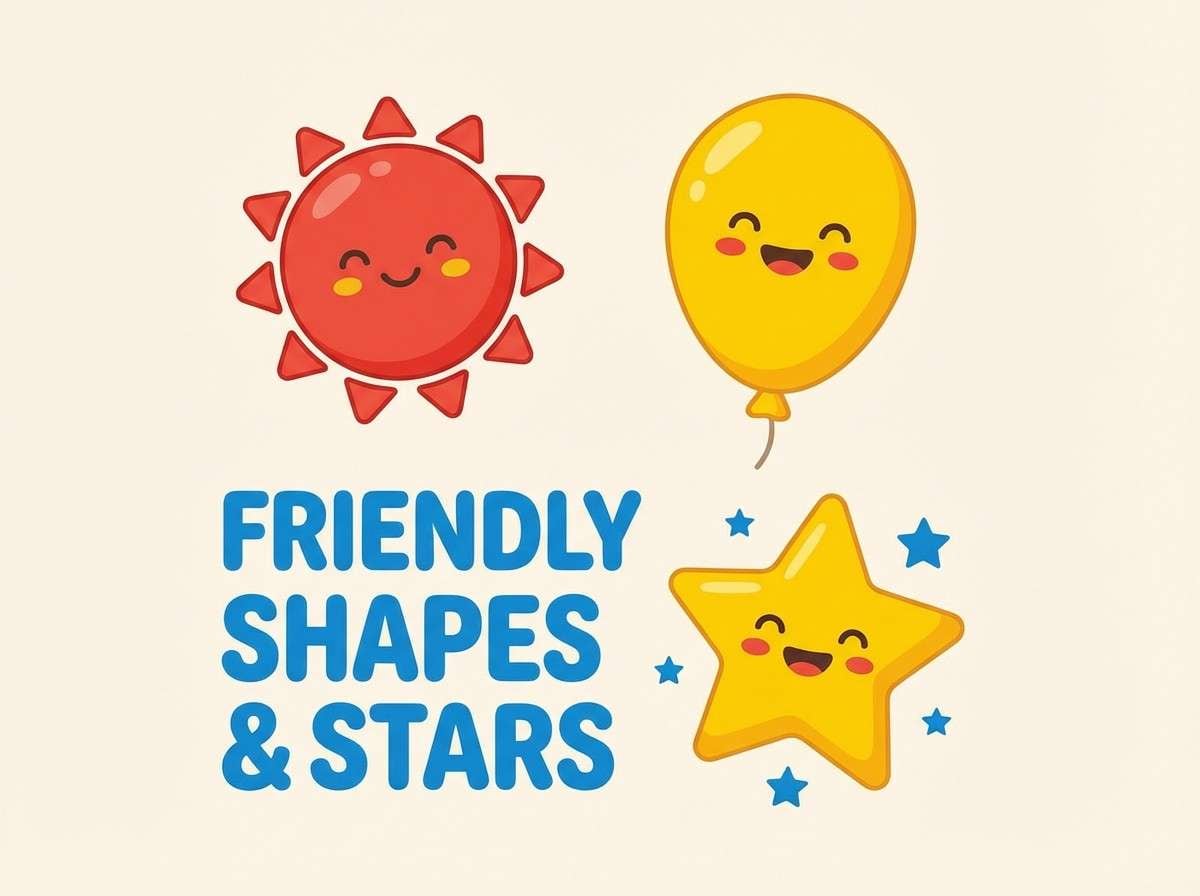
Cheerful and animated, these brights evoke storytime characters and big imagination. The rainbow color combinations are ideal for kids covers, classroom posters, and playful mascots that need clear color-coding. Pair with simple shapes and thick outlines so the palette stays readable at a glance. Tip: keep backgrounds light and push the red into focal elements like titles or characters.
Image example of storybook brights generated using media.io
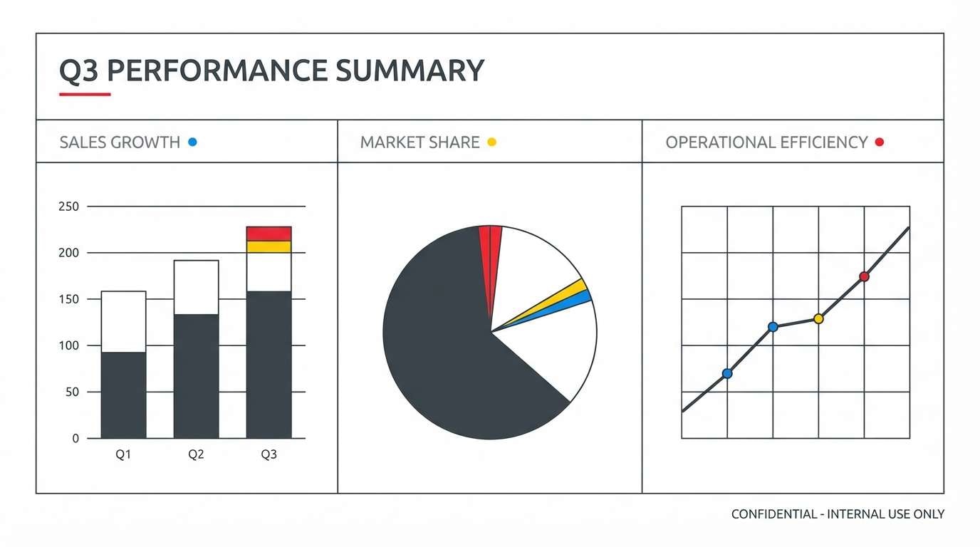
8) Minimal Rainbow Accents
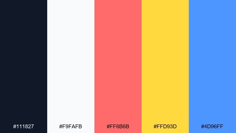
HEX: #111827 #f9fafb #ff6b6b #ffd93d #4d96ff
Mood: clean, confident, professional
Best for: corporate presentation template
Clean and confident, it feels like a crisp slide deck with just enough color to keep people awake. Use the dark ink tone for headings, white for breathing room, and bring in color only for charts or section markers. Pair with a modern sans serif and consistent spacing for a premium look. Tip: assign one accent per section so the deck stays organized and scannable.
Image example of minimal rainbow accents generated using media.io
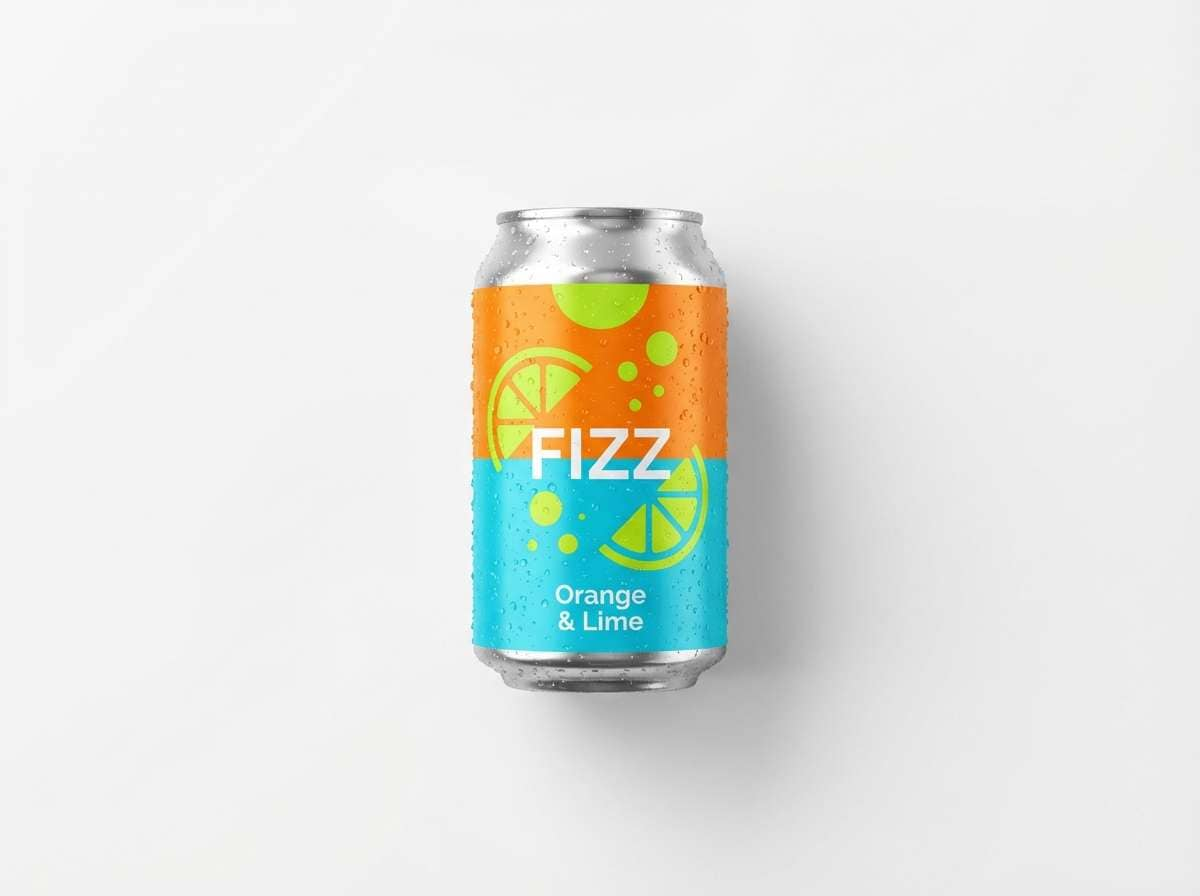
9) Citrus Splash
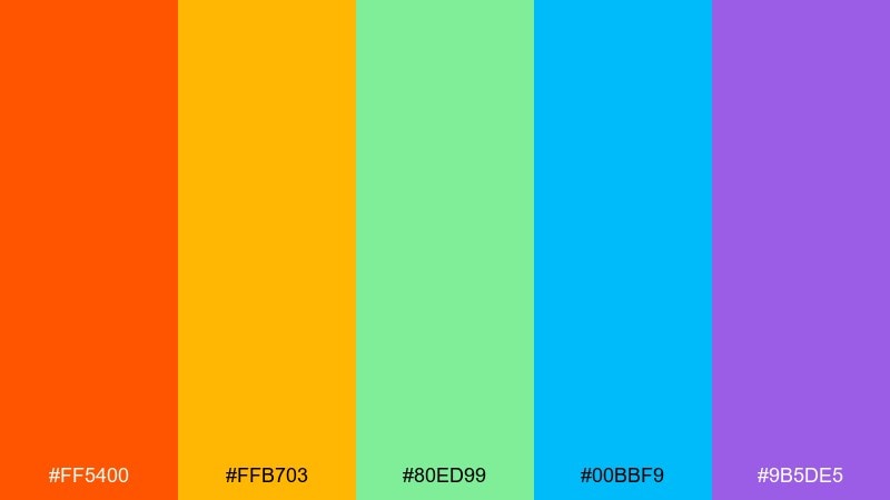
HEX: #ff5400 #ffb703 #80ed99 #00bbf9 #9b5de5
Mood: fresh, punchy, energetic
Best for: sparkling drink product ad
Fresh and punchy, it suggests fizzy citrus, crushed ice, and a burst of flavor. These tones suit beverage ads, summer launches, and bold packaging where you want a thirst-quenching feel. Pair with white space and glossy highlights to emphasize freshness. Tip: let orange lead and keep purple as a small premium cue for flavor variety.
Image example of citrus splash generated using media.io
10) Jewel Tone Arc
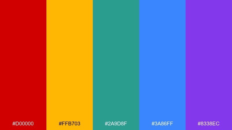
HEX: #d00000 #ffb703 #2a9d8f #3a86ff #8338ec
Mood: luxurious, dramatic, editorial
Best for: fashion editorial spread
Luxurious and dramatic, these jewel tones feel like velvet, gemstones, and spotlighted runway moments. They fit fashion editorials, premium lookbooks, and statement covers that need depth. Pair with lots of black, high-contrast imagery, and restrained color blocks. Tip: use gold as a thin rule line or small callout to elevate the whole spread.
Image example of jewel tone arc generated using media.io
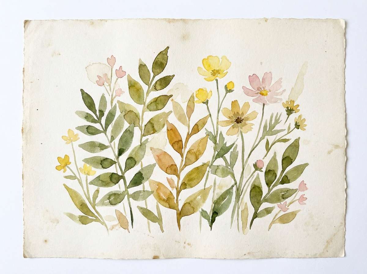
11) Spring Garden Ribbon
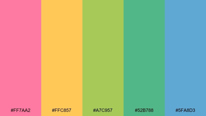
HEX: #ff7aa2 #ffc857 #a7c957 #52b788 #5fa8d3
Mood: fresh, botanical, sunny
Best for: watercolor botanical print
Fresh and botanical, it recalls new leaves, warm sunlight, and petals after rain. These hues are great for spring posters, stationery, and gentle packaging for skincare or tea. Pair with textured paper whites and hand-drawn linework for a natural finish. Tip: use the blue as a quiet shadow tone to add depth without turning muddy.
Image example of spring garden ribbon generated using media.io
12) Tech Gradient Beam
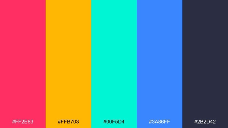
HEX: #ff2e63 #ffb703 #00f5d4 #3a86ff #2b2d42
Mood: futuristic, clean, high contrast
Best for: SaaS website hero banner
Futuristic and clean, it feels like a light beam cutting through a dark interface. As a rainbow color palette for SaaS, it works well for hero gradients, feature highlights, and conversion-focused CTAs. Pair with deep slate backgrounds and simple iconography for a sharp, techy finish. Tip: keep gradients to two colors at a time and use the charcoal for type legibility.
Image example of tech gradient beam generated using media.io

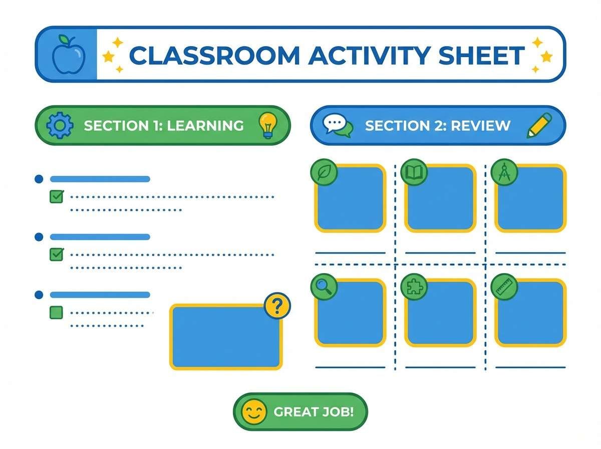
13) Classroom Cheer
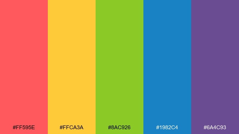
HEX: #ff595e #ffca3a #8ac926 #1982c4 #6a4c93
Mood: friendly, structured, motivating
Best for: worksheet and classroom handouts
Friendly and structured, it brings the energy of a bright classroom wall without feeling chaotic. Use it for worksheets, learning charts, and printable activities where categories need clear color cues. Pair with black text and simple borders so the page stays easy to read. Tip: reserve purple for rewards or key answers to guide attention.
Image example of classroom cheer generated using media.io
14) Pride Parade Bold
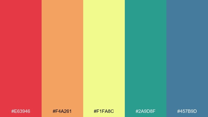
HEX: #e63946 #f4a261 #f1fa8c #2a9d8f #457b9d
Mood: celebratory, confident, inclusive
Best for: social media campaign post
Celebratory and confident, it feels like banners waving in the sun and music rolling down the street. These rainbow color combinations are strong for campaign posts, community events, and awareness graphics that need clarity at small sizes. Pair with high-contrast type and bold shapes to keep the message readable on mobile. Tip: choose one dominant hue for the headline bar and let the rest support as stripes or stickers.
Image example of pride parade bold generated using media.io
15) Cozy Rainbow Neutrals
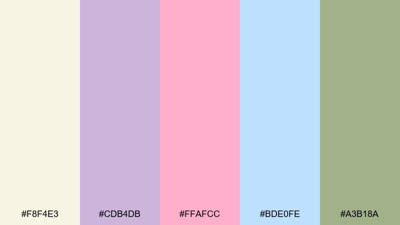
HEX: #f8f4e3 #cdb4db #ffafcc #bde0fe #a3b18a
Mood: cozy, soft, homey
Best for: home decor mood board
Cozy and soft, it suggests linen textures, sunlit rooms, and gentle color in the corners. These tones work for home decor boards, lifestyle blogs, and calm branding that prefers whispery accents. Pair with warm neutrals, natural wood, and minimal typography for a relaxed feel. Tip: keep pink and lavender as small touches and let the cream carry the background.
Image example of cozy rainbow neutrals generated using media.io
16) Ice Cream Sprinkles
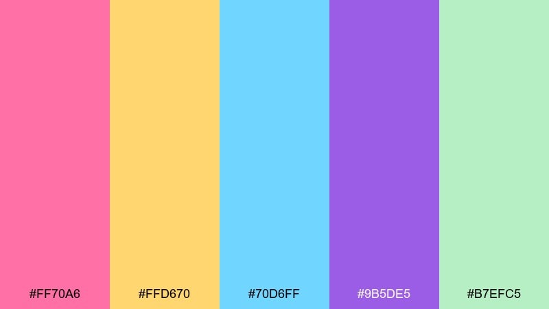
HEX: #ff70a6 #ffd670 #70d6ff #9b5de5 #b7efc5
Mood: fun, sugary, carefree
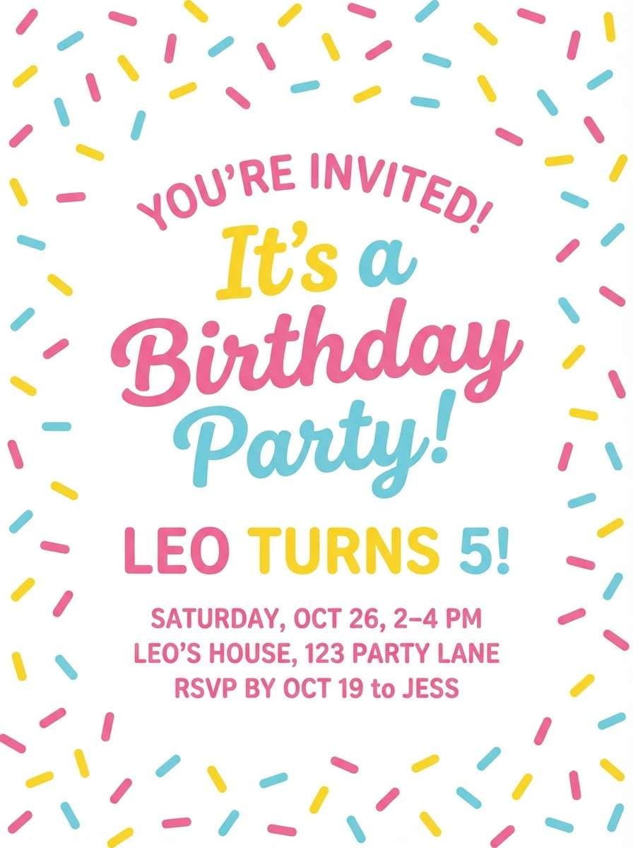
Best for: birthday party invitation
Fun and sugary, it brings to mind sprinkles, frosting swirls, and party confetti. Use it for birthday invites, dessert branding, and playful stickers where a light tone is essential. Pair with rounded fonts and simple icons like stars or cherries. Tip: keep the mint as a background wash to make the brighter sprinkles pop.
Image example of ice cream sprinkles generated using media.io
17) Ocean Spray Spectrum
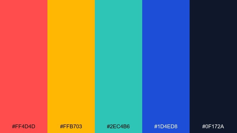
HEX: #ff4d4d #ffb703 #2ec4b6 #1d4ed8 #0f172a
Mood: sporty, crisp, high contrast
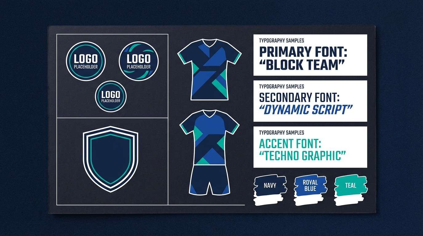
Best for: sports team brand kit
Sporty and crisp, it feels like ocean spray and stadium lights on a cool night. Use it for team kits, esports banners, and bold brand assets where contrast has to work fast. Pair with strong sans typography and plenty of dark navy space for a pro finish. Tip: choose one warm and one cool as primaries, then keep the rest for highlights and stats.
Image example of ocean spray spectrum generated using media.io
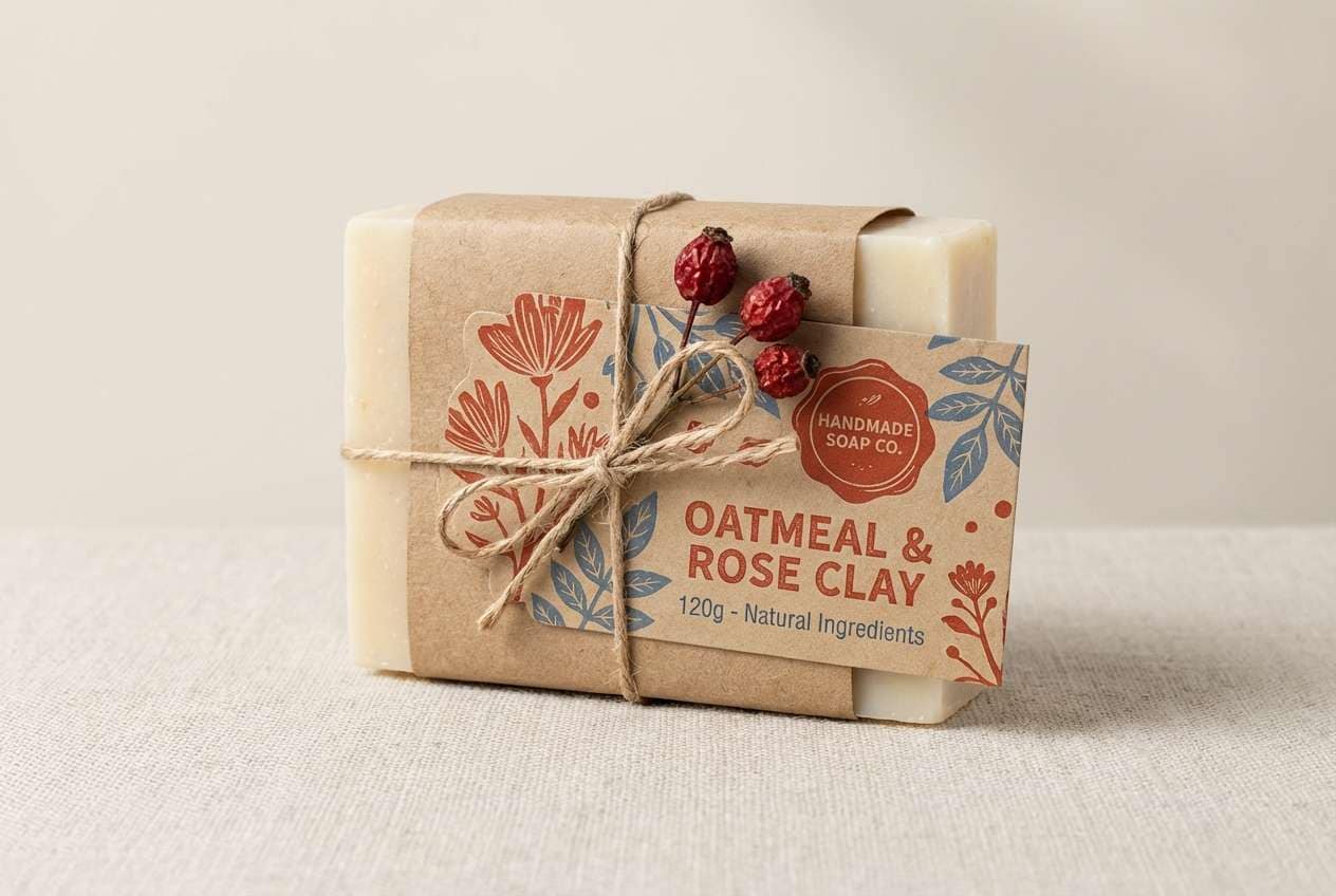
18) Artisan Market
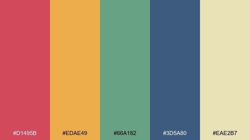
HEX: #d1495b #edae49 #66a182 #3d5a80 #eae2b7
Mood: handcrafted, warm, grounded
Best for: handmade soap packaging
Handcrafted and warm, it brings up paper labels, spice stalls, and handmade goods. These grounded tones suit soap packaging, candle labels, and small-batch food brands that want color without looking flashy. Pair with kraft textures and serif type for an artisanal feel. Tip: keep the cream as the label base and use red as a small stamp for brand recognition.
Image example of artisan market generated using media.io
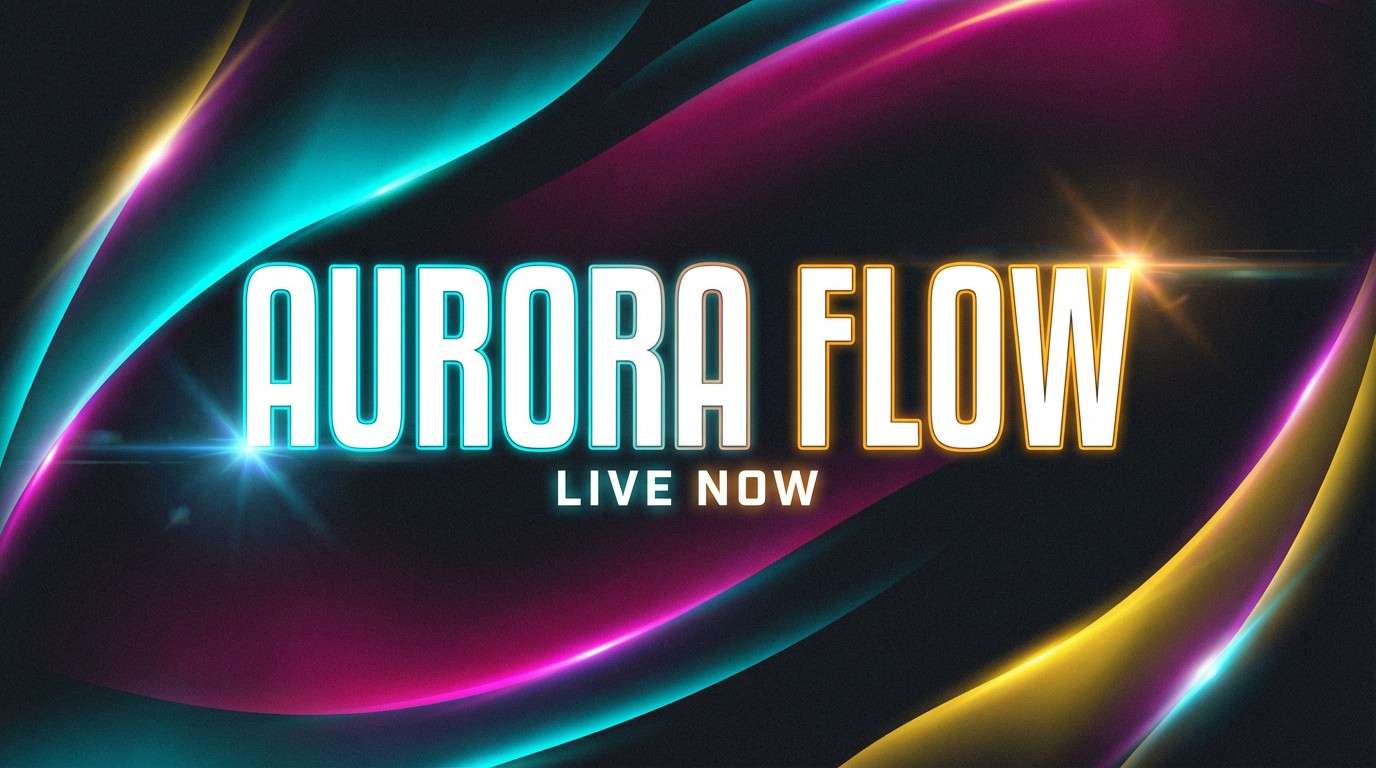
19) Cosmic Aurora
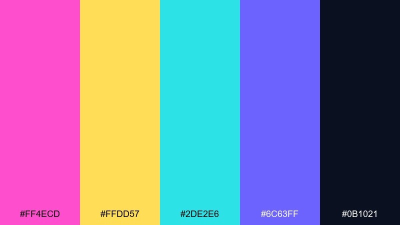
HEX: #ff4ecd #ffdd57 #2de2e6 #6c63ff #0b1021
Mood: dreamy, cosmic, luminous
Best for: streaming thumbnail design
Dreamy and cosmic, it looks like an aurora rippling across a deep night sky. These colors fit streaming thumbnails, album covers, and sci-fi promos that need glow and depth. Pair with dark backgrounds, soft gradients, and minimal text for instant legibility. Tip: keep cyan and magenta as the main glow colors and let yellow act as a small starburst highlight.
Image example of cosmic aurora generated using media.io
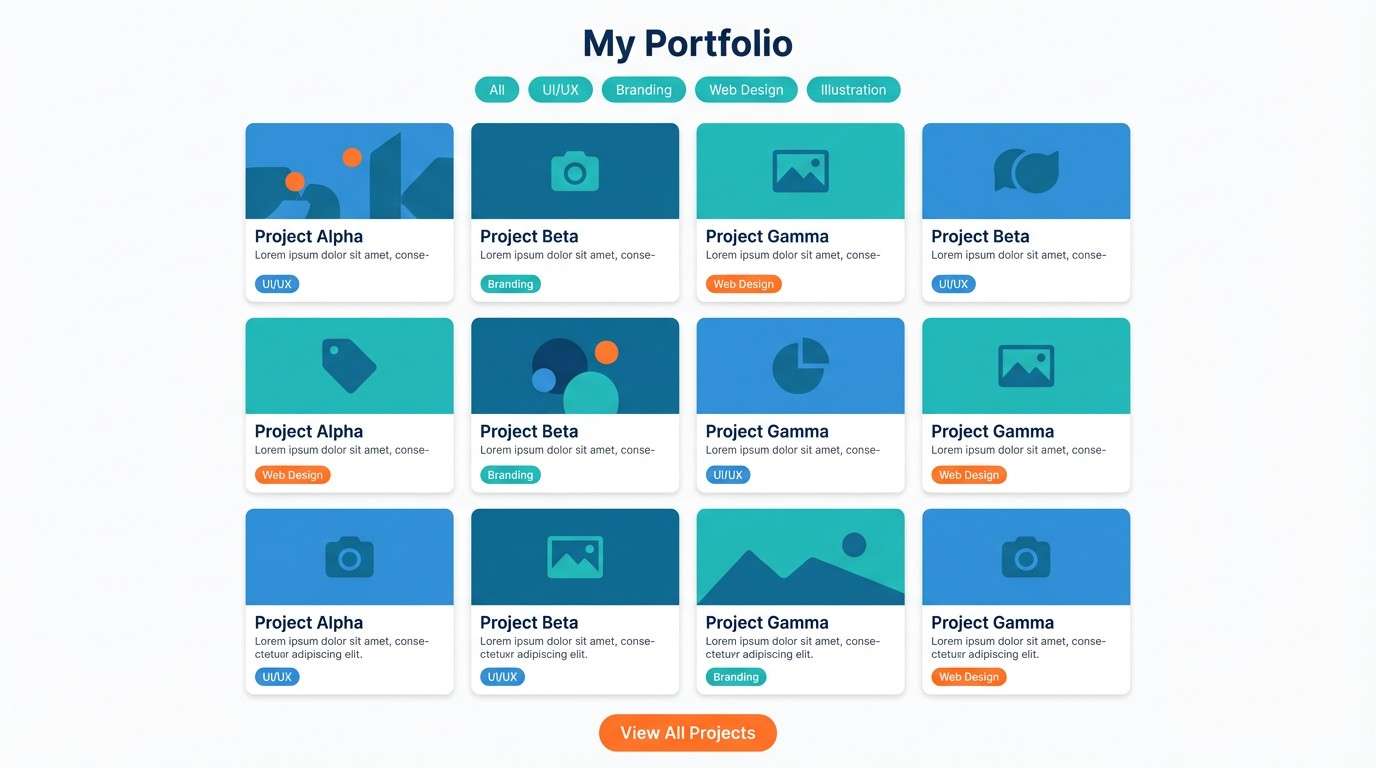
20) Modern Marker Set
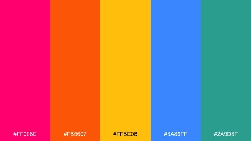
HEX: #ff006e #fb5607 #ffbe0b #3a86ff #2a9d8f
Mood: creative, confident, contemporary
Best for: portfolio website sections
Creative and confident, it feels like fresh marker strokes on a clean sketchbook page. Use these tones for portfolio sections, case study callouts, and playful infographics that still need a modern edge. Pair with a neutral UI base and consistent spacing so the color does the storytelling. Tip: pick one signature hue for navigation and rotate the others per project category.
Image example of modern marker set generated using media.io
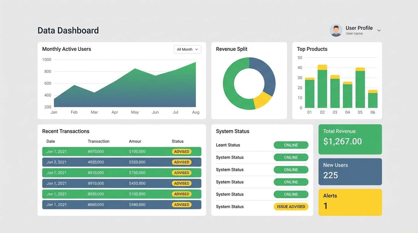
21) Clean Spectrum Grid
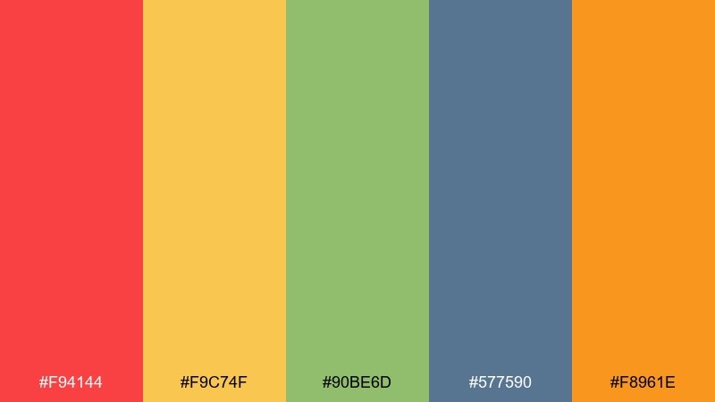
HEX: #f94144 #f9c74f #90be6d #577590 #f8961e
Mood: organized, bright, practical
Best for: data dashboard UI
Organized and bright, it reads like a tidy grid of color-coded insights. The rainbow color scheme is especially useful for dashboards, analytics views, and admin tools where categories must be distinct. Pair with soft grays for surfaces and use color only for charts, status pills, and key numbers. Tip: standardize meaning early, such as green for success and red for alerts, and keep it consistent across screens.
Image example of clean spectrum grid generated using media.io
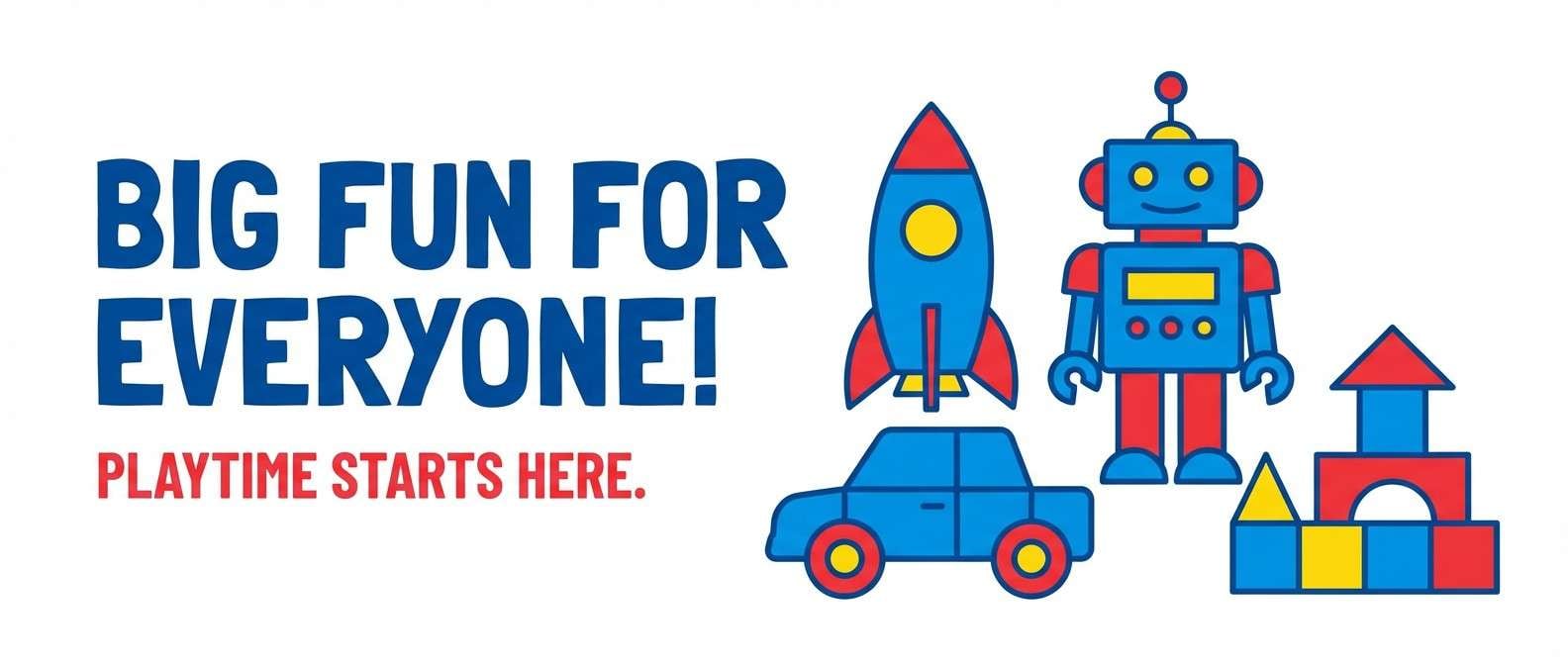
22) Playroom Primary Mix
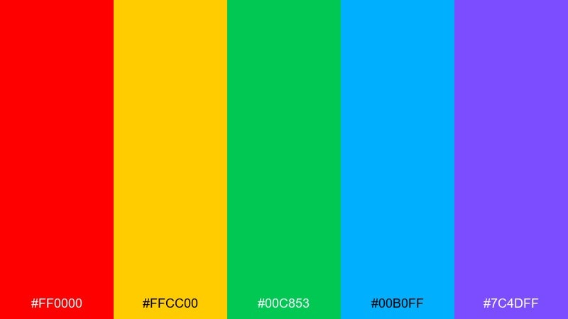
HEX: #ff0000 #ffcc00 #00c853 #00b0ff #7c4dff
Mood: playful, bold, high clarity
Best for: toy store web banner
Playful and bold, it evokes building blocks, toy bins, and bright signage you can spot from across the room. Use it for toy store banners, kids apps, and any design that needs high clarity at a distance. Pair with plenty of white and simple shapes so the colors do not compete. Tip: use blue as the main base and bring in the other hues as big, readable badges.
Image example of playroom primary mix generated using media.io
What Colors Go Well with Rainbow?
Neutrals are the easiest match: white, off-white, charcoal, and near-black help a rainbow palette breathe and keep text readable.
For a softer look, pair rainbow colors with warm creams, light grays, and muted browns—this reduces visual noise while keeping the playful “multi-color” personality.
If you want maximum punch, use deep navy or black as a base and let one or two rainbow hues take the spotlight, with the rest acting as accents.
How to Use a Rainbow Color Palette in Real Designs
Start with a neutral foundation (backgrounds, surfaces, typography), then assign each rainbow color a job—CTA, highlights, tags, icons, charts—so the system stays consistent.
Limit how many saturated colors appear at once in large areas. In UI and branding, rainbow works best when you control density: big neutral space, small high-impact accents.
When using gradients, keep them simple (two colors at a time) and preserve contrast for text by placing type on solid panels or darker overlays.
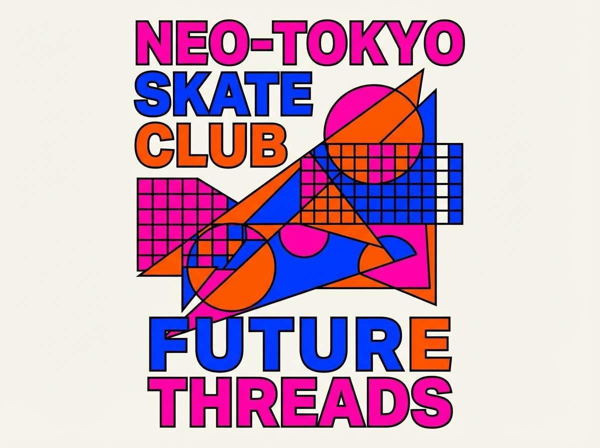
Create Rainbow Palette Visuals with AI
If you already have HEX codes, you can turn them into on-brand posters, mockups, thumbnails, and UI concepts by prompting an image generator with clear subject + style + background notes.
For consistent results, repeat the same composition and typography rules, and only swap the color direction (for example: “dominant cyan and magenta with yellow highlights”).
Use Media.io to generate rainbow palette visuals fast, then iterate by adjusting saturation, contrast, and which color leads the layout.
Rainbow Color Palette FAQs
-
What is a rainbow color palette?
A rainbow color palette is a multicolor scheme that spans warm-to-cool hues (often red, orange, yellow, green, blue, and purple). In design, it’s used to communicate energy, variety, and clear category separation. -
How do I keep a rainbow palette from looking messy?
Use neutrals for most of the layout (backgrounds and text), then apply rainbow colors as accents with defined roles (CTA, labels, icons, chart series). Also limit how many saturated colors appear in large blocks at the same time. -
What are the best background colors for rainbow designs?
White, off-white, light gray, charcoal, and near-black are the safest options. They create breathing room and keep rainbow hues vibrant without fighting for attention. -
Which rainbow colors should be primary vs. accent?
Pick one “leader” hue that matches the mood (teal for trustworthy, coral for friendly, blue for tech), then use 1–2 supporting colors. Keep the remaining hues for small accents like badges, tags, and illustrations. -
Is a rainbow palette good for UI and dashboards?
Yes—especially for categories and status indicators—if you define meaning and stay consistent across screens. For accessibility, ensure sufficient contrast for text and avoid relying on color alone to convey important information. -
How can I build a rainbow gradient that looks modern?
Use two-color gradients rather than blending the entire spectrum at once, and anchor the design with a dark or neutral base. Keep gradient areas large and simple, and avoid adding too many competing textures. -
Can I generate rainbow palette images with AI using these HEX codes?
Yes. Add color direction to your prompt (dominant colors + accent colors), specify a clean background, and keep the style consistent (vector, editorial, UI mockup, studio shot). Media.io makes it easy to iterate quickly.


