

A Beauty and the Beast color palette is all about romance and contrast: candlelit gold against inky shadows, rose reds against soft ivory, and heritage woods with a regal twist.
These swatches help you translate that fairytale mood into modern design—whether you’re building invitations, branding, packaging, or a polished UI.
In this article
- Why Beauty and the Beast Color Schemes Work So Well
-
- enchanted rose glow
- gilded ballroom
- candlelit castle
- provincial morning
- beast midnight
- feather duster pastels
- stained glass jewel
- winter courtyard
- antique mirror
- french blue and gold
- garden hedge
- tea time porcelain
- beast study leather
- rose petal lace
- opera curtain
- clockwork brass
- spellbook ink
- sunrise village
- royal crest
- quiet ballroom neutrals
- What Colors Go Well with Beauty and the Beast?
- How to Use a Beauty and the Beast Color Palette in Real Designs
- Create Beauty and the Beast Palette Visuals with AI
Why Beauty and the Beast Color Schemes Work So Well
Beauty and the Beast-inspired color schemes blend warm, luminous highlights (gold, brass, candle-amber) with deep, cinematic anchors (charcoal, navy, espresso). That high-contrast formula creates instant hierarchy—perfect for headlines, monograms, and hero sections.
They also balance romance with structure. Rose, wine, and blush shades bring emotion, while parchment, cream, and stone neutrals keep layouts readable and modern.
Finally, these colors translate across mediums: foil on paper, metallic inks on packaging, and tasteful “gold” UI accents that feel premium rather than flashy.
20+ Beauty and the Beast Color Palette Ideas (with HEX Codes)
1) Enchanted Rose Glow
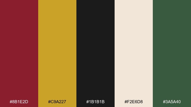
HEX: #8B1E2D #C9A227 #1B1B1B #F2E6D8 #3A5A40
Mood: romantic, dramatic, storybook
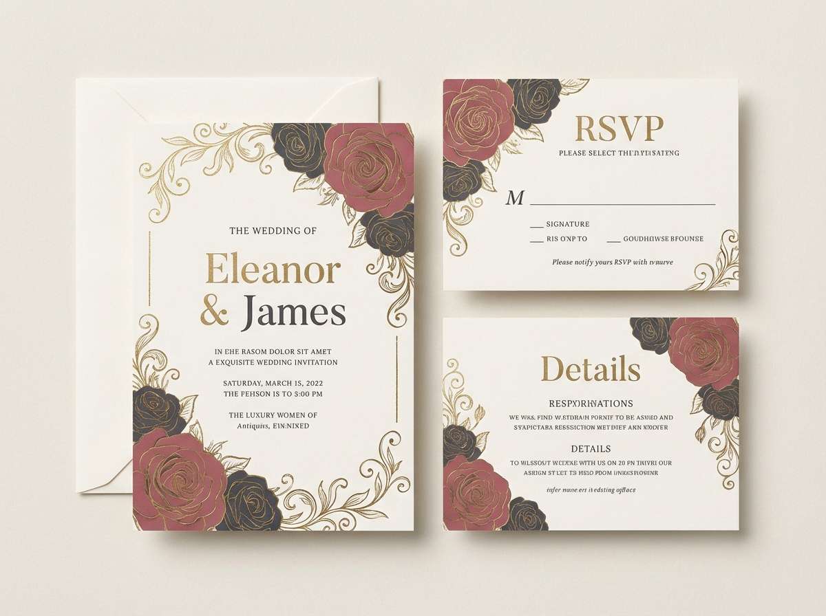
Best for: wedding invitation suite
Romantic and candlelit, these Beauty and the Beast tones feel like velvet petals against antique gold. The contrast between deep rose, charcoal, and ivory keeps the layout elegant instead of overly sweet. Use this beauty and the beast color palette on invitations, menus, and monograms, then echo the gold in foil or embossing. Tip: keep the green as a tiny accent for stems or borders so the red stays dominant.
Image example of enchanted rose glow generated using media.io
Media.io is an online AI studio for creating and editing video, image, and audio in your browser.

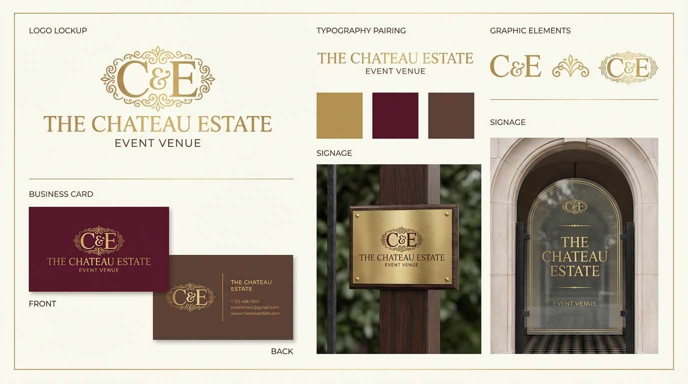
2) Gilded Ballroom
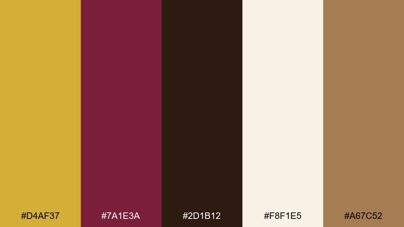
HEX: #D4AF37 #7A1E3A #2D1B12 #F8F1E5 #A67C52
Mood: opulent, warm, celebratory
Best for: brand identity for an event venue
Opulent and warm, this mix evokes chandeliers, polished wood, and soft spotlight glow. Pair the gold with cream for spacious breathing room, then let the wine shade handle headlines and badges. It works beautifully on venue branding, brochures, and signage where you want instant luxury cues. Tip: use the brown as a grounding background for gold typography to avoid glare.
Image example of gilded ballroom generated using media.io
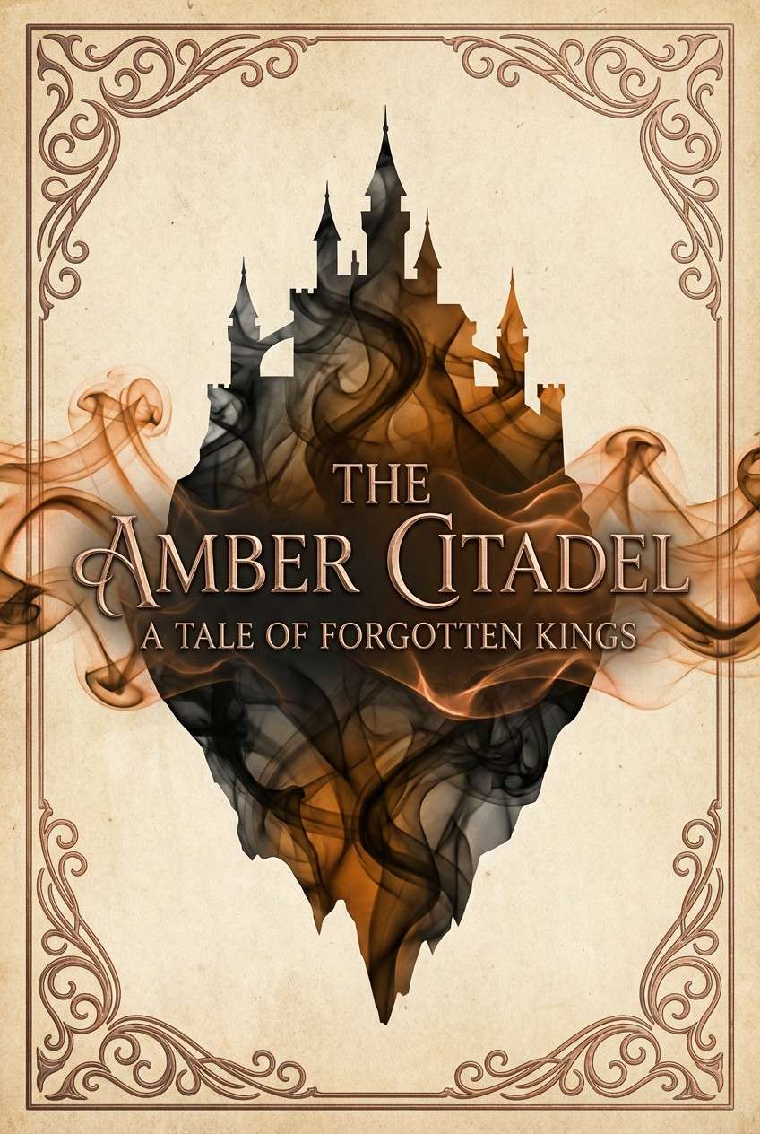
3) Candlelit Castle
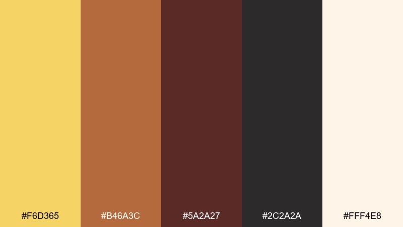
HEX: #F6D365 #B46A3C #5A2A27 #2C2A2A #FFF4E8
Mood: moody, cozy, cinematic
Best for: book cover design
Moody and cozy, these Beauty and the Beast colors look like flame reflections on stone halls and carved wood. The warm amber and copper pop best against the smoky near-black, while cream keeps the type readable. Use it for fantasy covers, chapter cards, or audiobook thumbnails where contrast matters at small sizes. Tip: reserve the brightest amber for the title to mimic candlelight.
Image example of candlelit castle generated using media.io
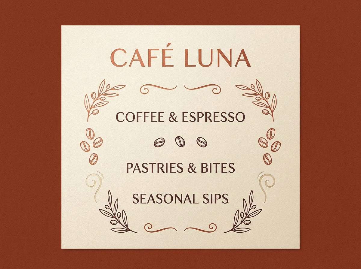
4) Provincial Morning
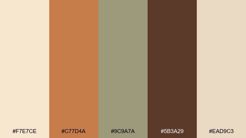
HEX: #F7E7CE #C77D4A #9C9A7A #5B3A29 #EAD9C3
Mood: gentle, rustic, welcoming
Best for: cafe menu design
Gentle and rustic, this palette feels like sunlit bread baskets, linen aprons, and a calm village street. The terracotta and cocoa add appetite and warmth, while the champagne tones keep the page airy. It suits cafe menus, bakery packaging, and local market flyers. Tip: use the sage-gray for dividers and secondary text so the browns stay rich.
Image example of provincial morning generated using media.io
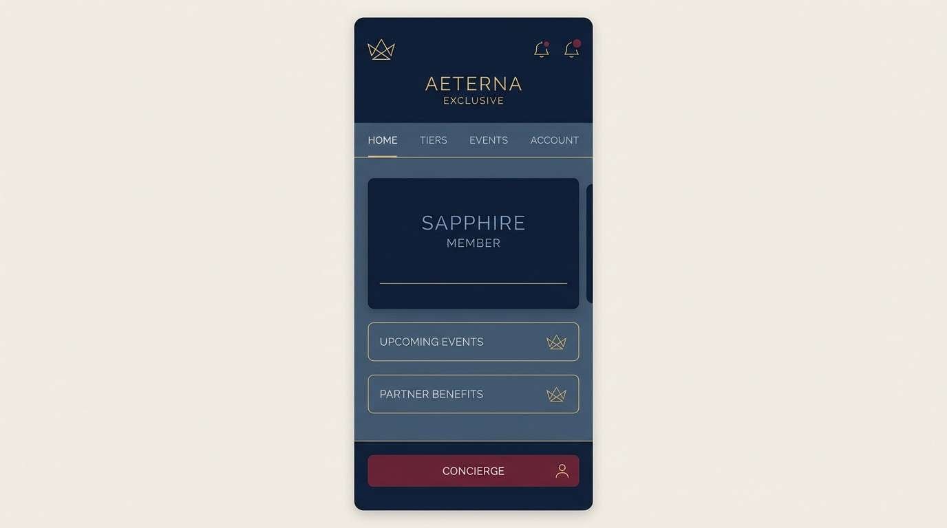
5) Beast Midnight
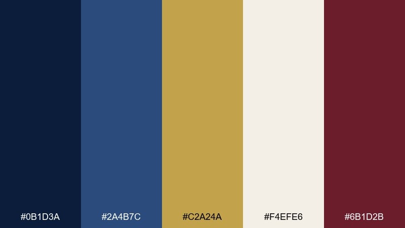
HEX: #0B1D3A #2A4B7C #C2A24A #F4EFE6 #6B1D2B
Mood: regal, mysterious, confident
Best for: app UI for a luxury membership
Regal and mysterious, these tones read like midnight velvet with a glint of brass. The navy pair creates depth for navigation, while bone keeps cards and inputs crisp. Use it for luxury UI, dashboards, or subscription screens where premium trust is key. Tip: apply the gold only to active states and icons to keep the interface refined.
Image example of beast midnight generated using media.io
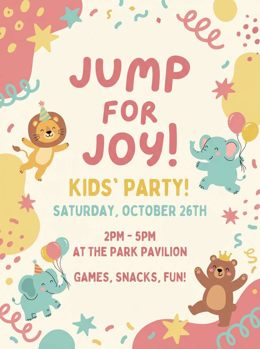
6) Feather Duster Pastels
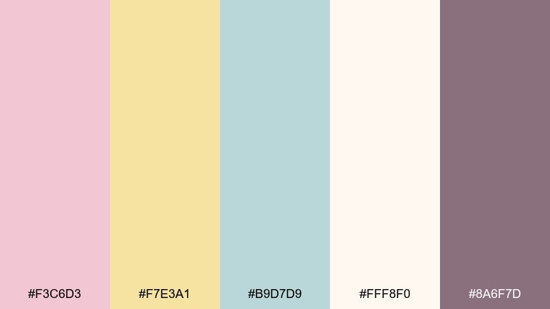
HEX: #F3C6D3 #F7E3A1 #B9D7D9 #FFF8F0 #8A6F7D
Mood: playful, light, charming
Best for: kids party flyer
Playful and light, these pastels feel like confetti, ribbon, and soft giggles in a sunlit room. Let the blush and butter yellow do the heavy lifting, while the dusty mauve anchors headings. It works for kids flyers, craft class promos, and cheerful social posts. Tip: keep the background creamy so the pastel shapes stay readable.
Image example of feather duster pastels generated using media.io
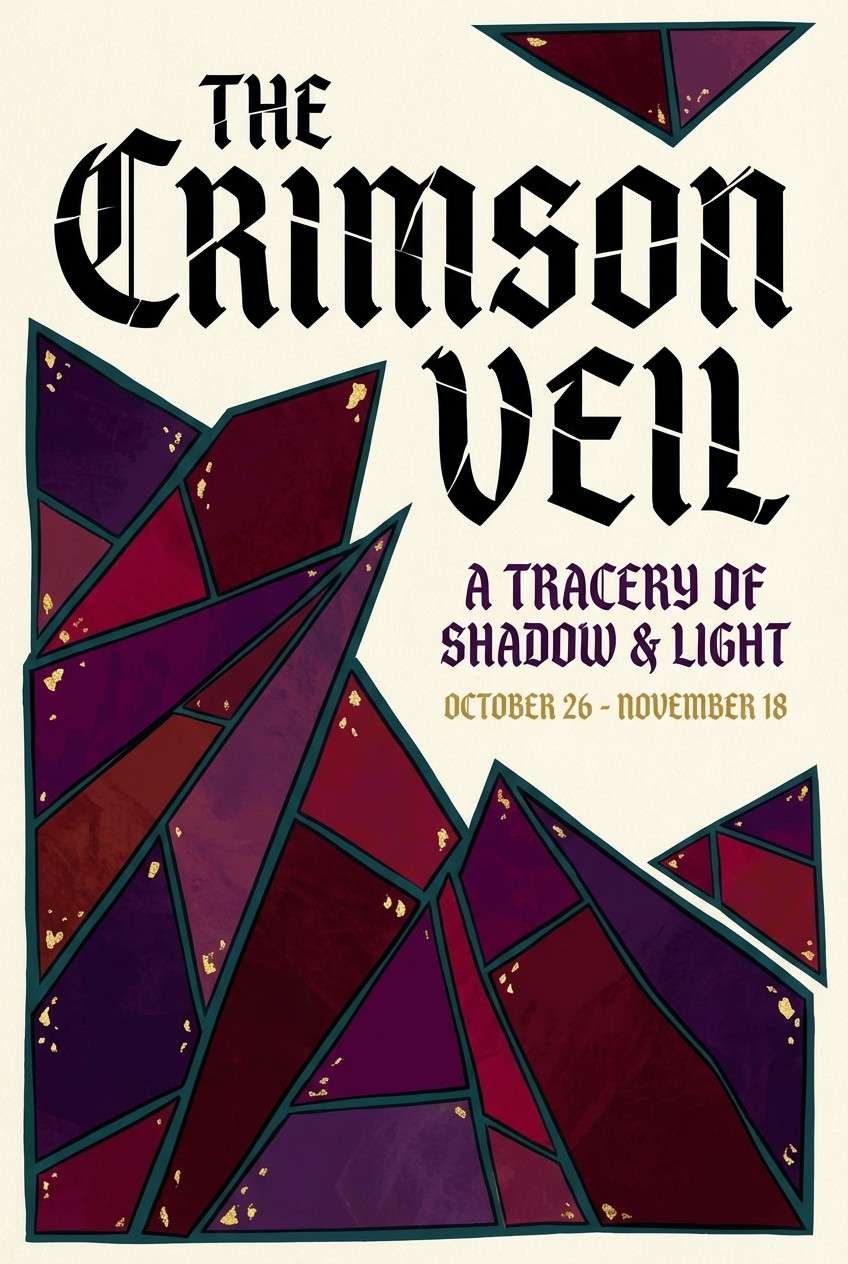
7) Stained Glass Jewel
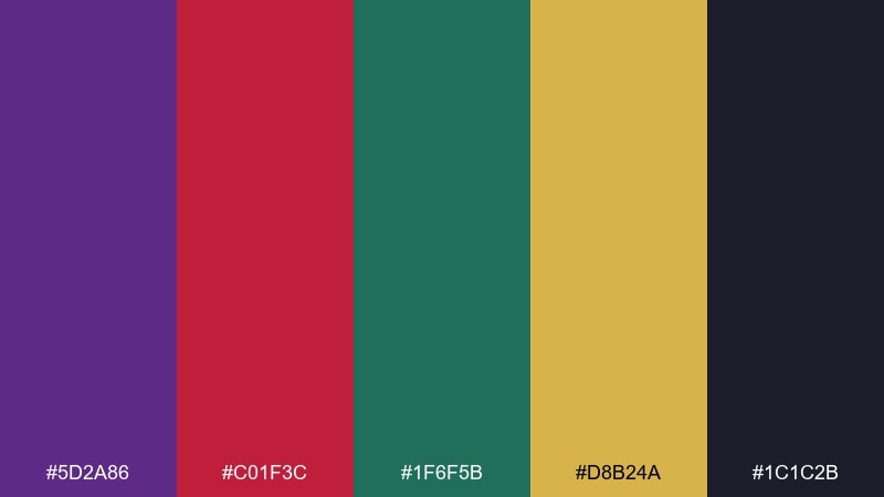
HEX: #5D2A86 #C01F3C #1F6F5B #D8B24A #1C1C2B
Mood: jewel-toned, bold, theatrical
Best for: theater poster
Jewel-toned and theatrical, these shades echo stained glass panels and dramatic curtain calls. The beauty and the beast color combination of purple, crimson, and deep teal is bold, so balance it with the inky near-black for negative space. Use it on posters, playbills, and ticket graphics where you want instant impact. Tip: reserve the gold for credits and key dates to keep the layout crisp.
Image example of stained glass jewel generated using media.io
8) Winter Courtyard
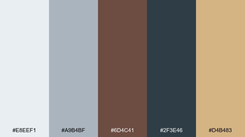
HEX: #E8EEF1 #A9B4BF #6D4C41 #2F3E46 #D4B483
Mood: cool, quiet, refined
Best for: editorial blog header
Cool and quiet, this Beauty and the Beast color palette feels like crisp air, stone paths, and a warm scarf at dusk. Use the icy neutrals for backgrounds and grids, then let the deep blue-gray carry typography. The tan accent gives just enough warmth for buttons or pull quotes. Tip: keep photography slightly desaturated so it matches the calm temperature.
Image example of winter courtyard generated using media.io
9) Antique Mirror
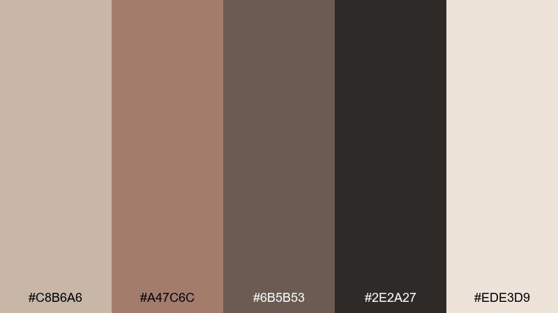
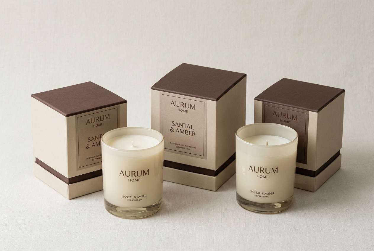
HEX: #C8B6A6 #A47C6C #6B5B53 #2E2A27 #EDE3D9
Mood: vintage, muted, sophisticated
Best for: product packaging for candles
Vintage and muted, these tones look like aged frames, soft reflections, and worn velvet. The warm taupes and dark espresso create a premium base for labels and typography. Use it for candle packaging, apothecary products, and minimalist gift sets. Tip: print the darkest shade in matte ink and add a subtle gloss spot on the lighter neutrals for depth.
Image example of antique mirror generated using media.io
10) French Blue and Gold
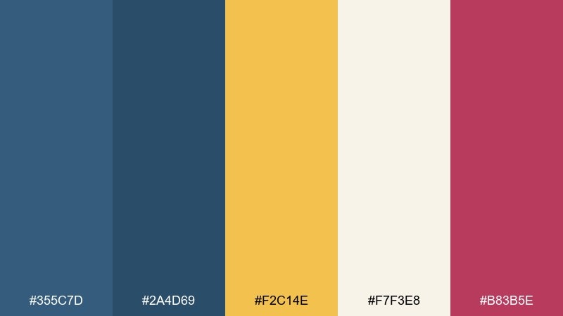
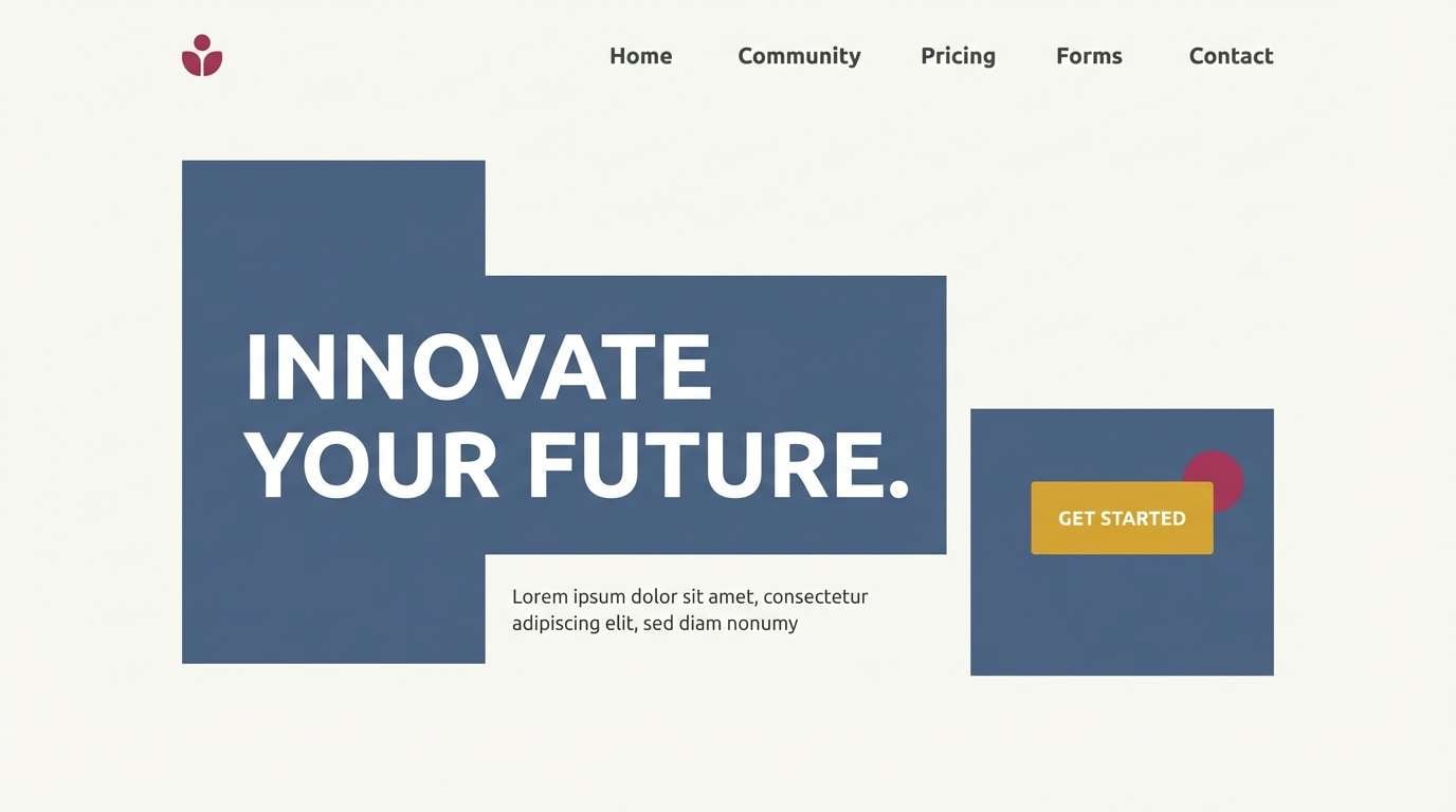
HEX: #355C7D #2A4D69 #F2C14E #F7F3E8 #B83B5E
Mood: classic, polished, modern
Best for: website hero section
Classic and polished, the blues feel tailored while the gold adds a warm, celebratory edge. Keep the hero area light with the soft off-white, then layer blue panels for structure and hierarchy. It is a strong fit for service websites, portfolios, and refined ecommerce. Tip: use the pink-berry tone sparingly for a single call to action so it stands out.
Image example of french blue and gold generated using media.io
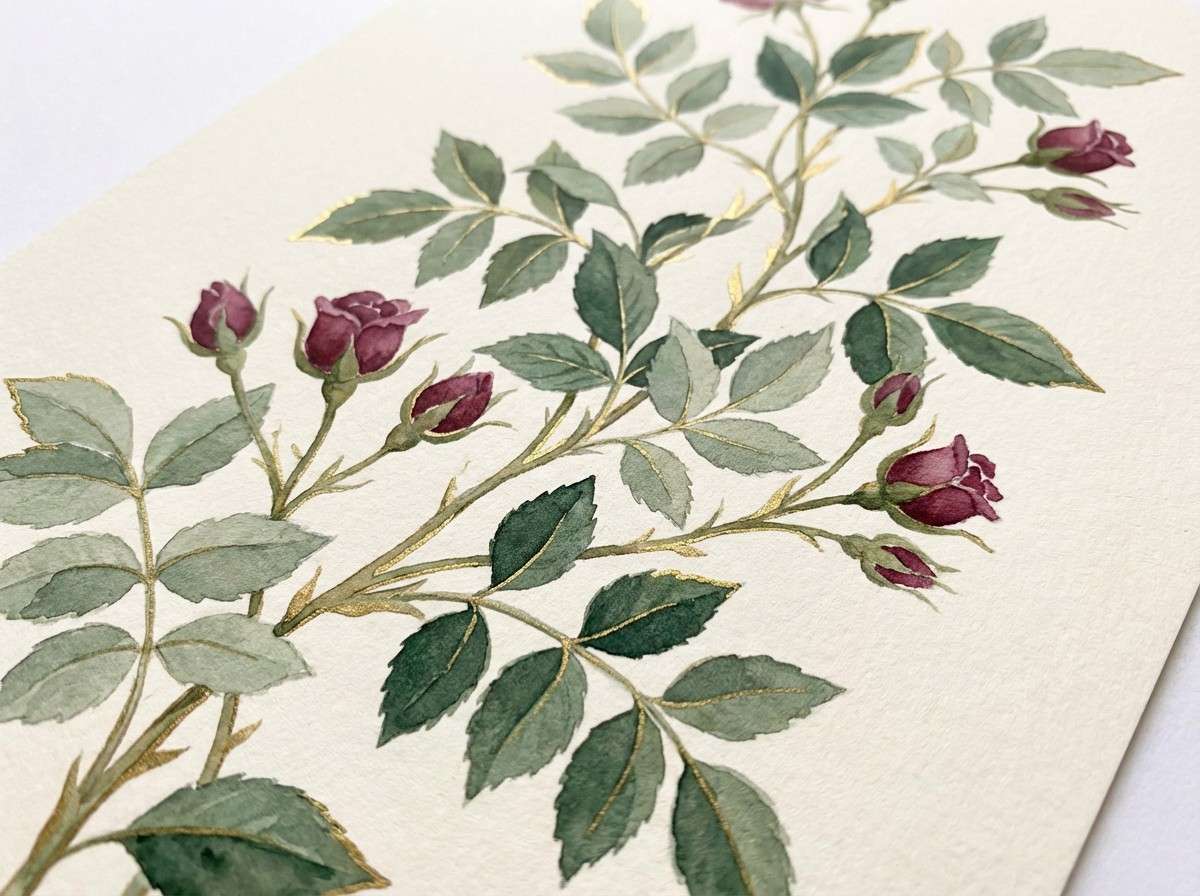
11) Garden Hedge
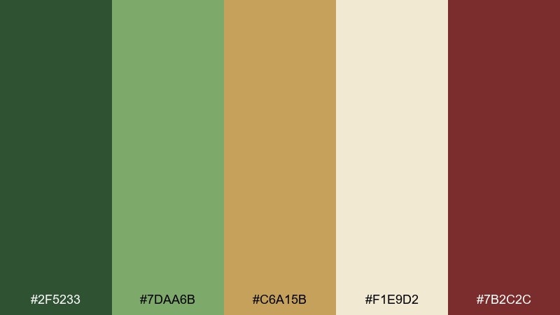
HEX: #2F5233 #7DAA6B #C6A15B #F1E9D2 #7B2C2C
Mood: natural, grounded, romantic
Best for: botanical illustration print
Natural and grounded, these greens suggest clipped hedges and hidden paths with a hint of romance. The Beauty and the Beast color schemes here shine when you treat gold as sunlight and the burgundy as a flower accent. Use it for botanical prints, stationery, and garden event materials. Tip: paint the cream as the paper tone and let the darker green define stems and shadows.
Image example of garden hedge generated using media.io
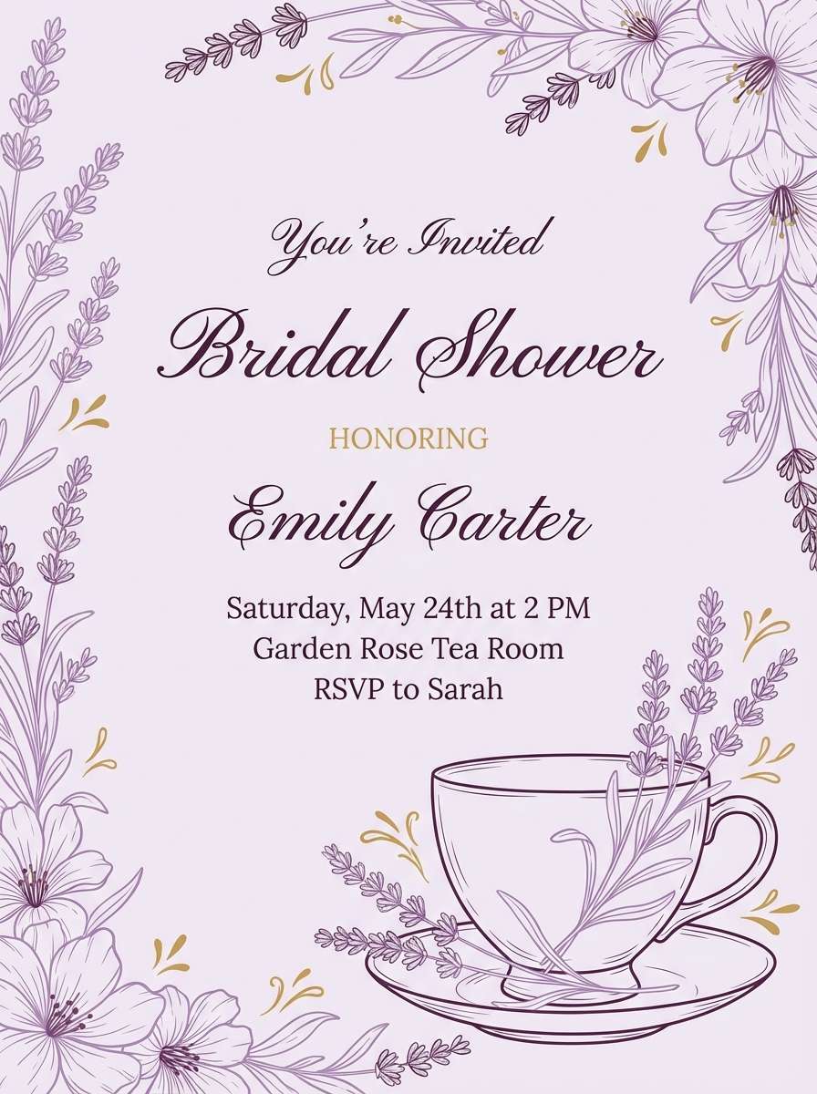
12) Tea Time Porcelain
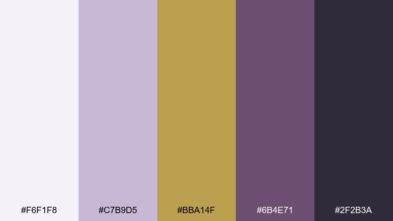
HEX: #F6F1F8 #C7B9D5 #BBA14F #6B4E71 #2F2B3A
Mood: delicate, refined, whimsical
Best for: bridal shower invite
Delicate and refined, these Beauty and the Beast shades feel like porcelain glaze with a soft metallic trim. Lavender and plum make elegant typography choices, while pale lilac keeps the page airy. Use it for bridal showers, afternoon tea invites, and feminine brand kits. Tip: add gold only as a thin border or icon set so the pastel mood stays light.
Image example of tea time porcelain generated using media.io
13) Beast Study Leather
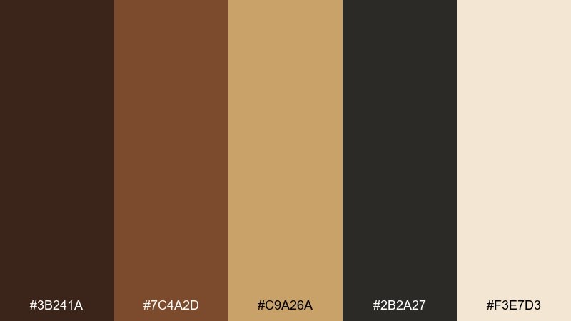
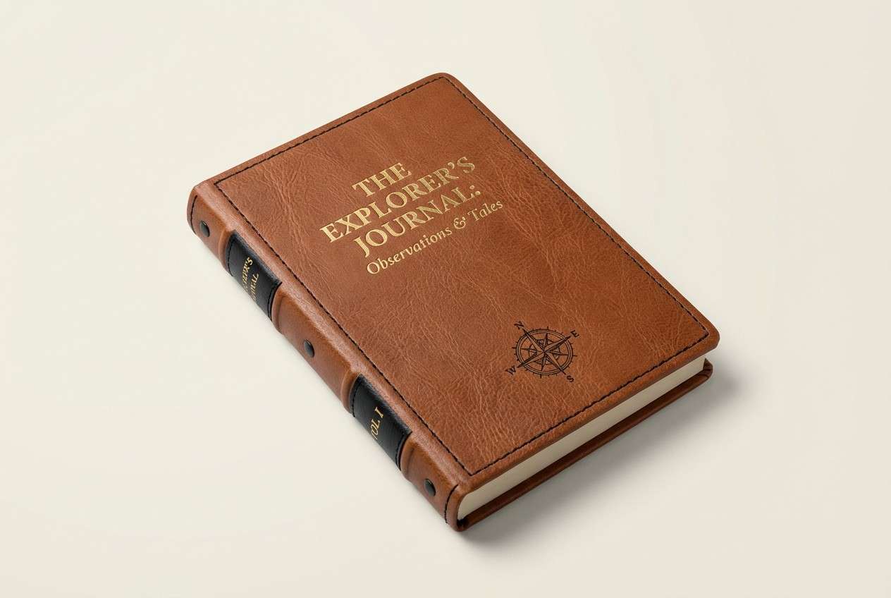
HEX: #3B241A #7C4A2D #C9A26A #2B2A27 #F3E7D3
Mood: scholarly, warm, timeless
Best for: notebook cover design
Scholarly and warm, these tones evoke worn leather bindings, gilded page edges, and a quiet reading nook. Let the cream act as the page color, then build structure with cocoa and near-black. It fits notebooks, journals, and academic branding that wants a heritage vibe. Tip: use the gold as a stamped title for a premium finish.
Image example of beast study leather generated using media.io
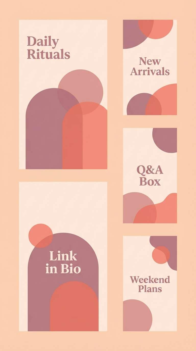
14) Rose Petal Lace
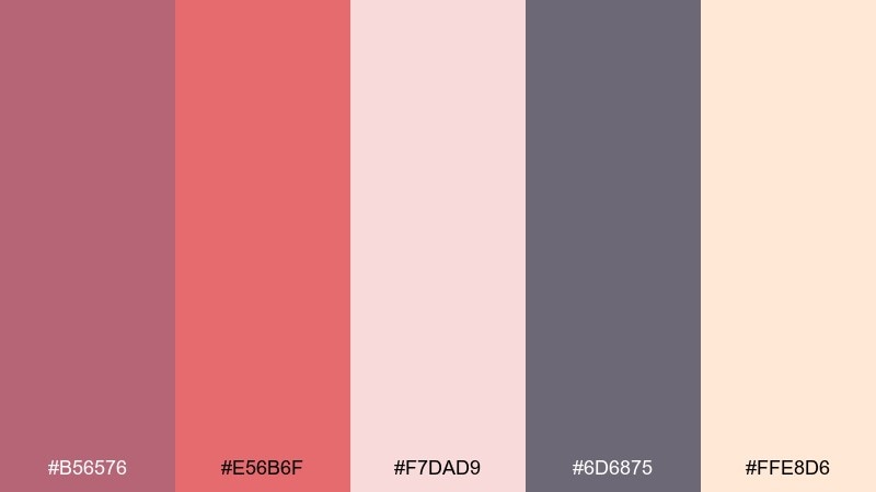
HEX: #B56576 #E56B6F #F7DAD9 #6D6875 #FFE8D6
Mood: soft, romantic, modern vintage
Best for: instagram story templates
Soft and romantic, these pinks feel like pressed petals and lace trim without turning saccharine. Use the dusty mauve for text, blush for panels, and the pale peach as a clean base. It is ideal for story templates, boutique promos, and lifestyle highlights. Tip: keep one strong block of mauve per slide to maintain legibility over gradients.
Image example of rose petal lace generated using media.io
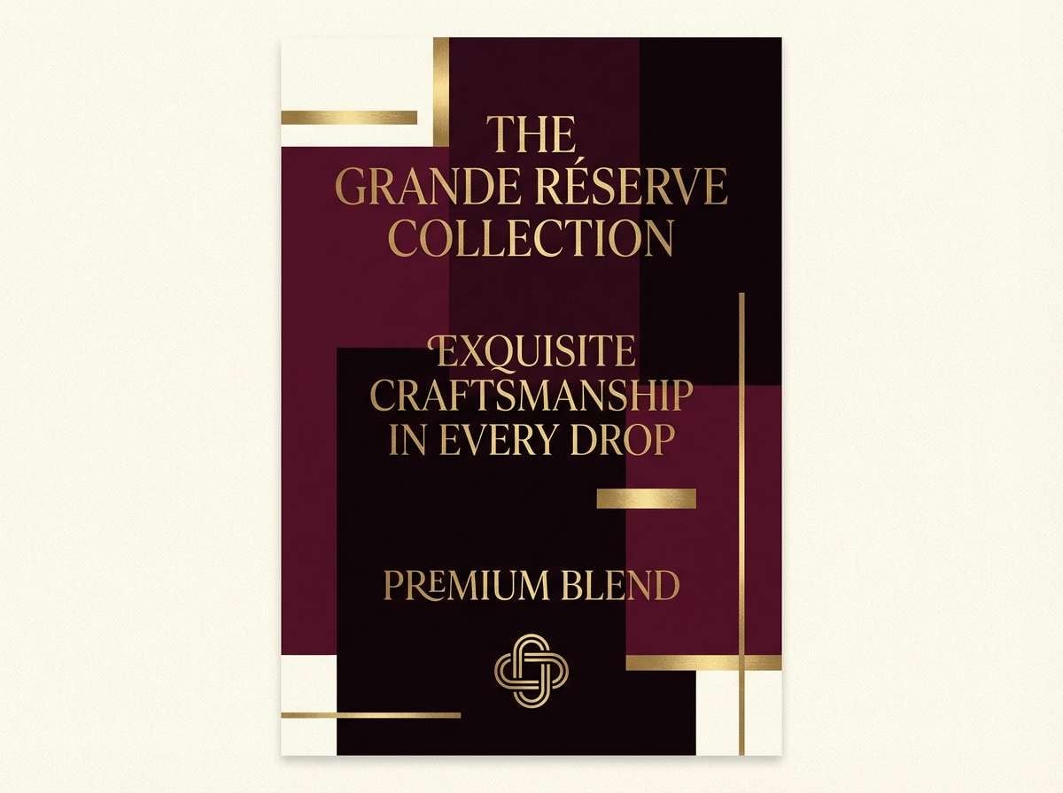
15) Opera Curtain
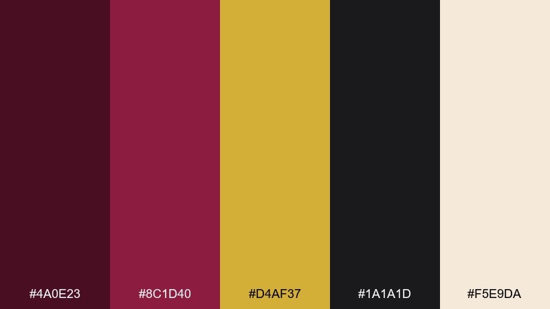
HEX: #4A0E23 #8C1D40 #D4AF37 #1A1A1D #F5E9DA
Mood: dramatic, luxurious, high contrast
Best for: premium product ad poster
Dramatic and luxurious, the deep wines read like heavy curtains pulled back to reveal gold light. High contrast between near-black and cream makes type and product callouts sharp. Use this Beauty and the Beast color palette for premium ads, limited editions, and campaign key art. Tip: place the gold as a thin rim light or border so it feels intentional, not noisy.
Image example of opera curtain generated using media.io
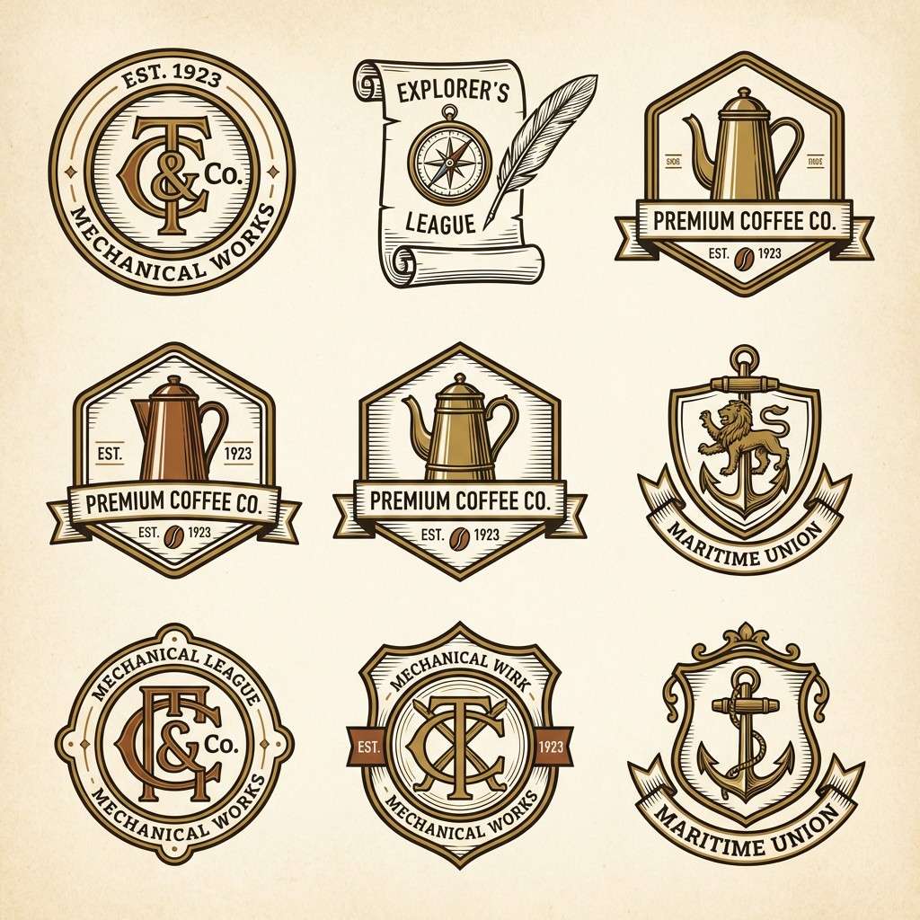
16) Clockwork Brass
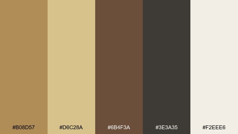
HEX: #B08D57 #D6C28A #6B4F3A #3E3A35 #F2EEE6
Mood: heritage, mechanical, cozy
Best for: vintage logo and badge set
Heritage and mechanical, these browns and brasses feel like gears, clocks, and warm lamplight. The pale neutral keeps badges readable while the darker brown defines outlines and stamps. Use this Beauty and the Beast color palette for vintage logos, maker marks, and craft packaging where texture matters. Tip: add subtle grain to the background and keep the light brass for highlights only.
Image example of clockwork brass generated using media.io
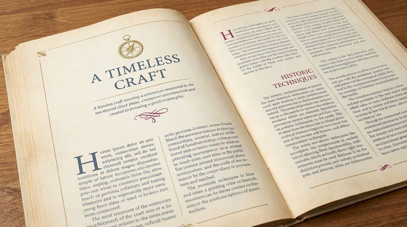
17) Spellbook Ink
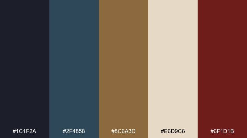
HEX: #1C1F2A #2F4858 #8C6A3D #E6D9C6 #6F1D1B
Mood: mysterious, intellectual, vintage
Best for: editorial magazine spread
Mysterious and intellectual, these hues feel like ink stains, aged paper, and brass clasps. Use the parchment tone for the page, then lean on the deep blue-gray for body copy and captions. This Beauty and the Beast color scheme suits magazine spreads, longform blog layouts, and reading-heavy design systems. Tip: keep the wine tone for pull quotes only, so it reads as a deliberate accent.
Image example of spellbook ink generated using media.io
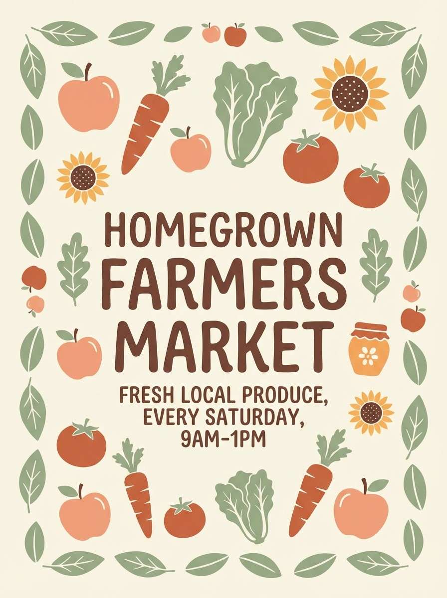
18) Sunrise Village
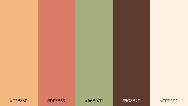
HEX: #F2B880 #D97B66 #A6B07E #5C3B2E #FFF1E1
Mood: optimistic, friendly, rustic
Best for: farmers market poster
Optimistic and friendly, these Beauty and the Beast colors look like early sun on rooftops and warm baked goods. The peachy base keeps the poster bright, while the cocoa shade gives structure for headers and pricing. Use it for community events, markets, and handmade product promos. Tip: set key information in cocoa on cream blocks to keep it legible from a distance.
Image example of sunrise village generated using media.io
19) Royal Crest
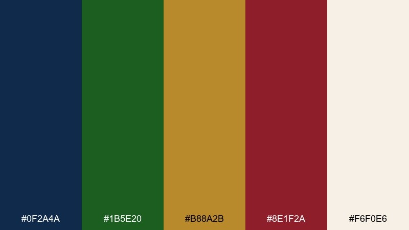
HEX: #0F2A4A #1B5E20 #B88A2B #8E1F2A #F6F0E6
Mood: regal, bold, ceremonial
Best for: family crest style monogram
Regal and ceremonial, this mix feels like banners, crests, and polished metalwork. Use navy as the field color, then layer green and wine as supporting sections with gold line work. It works for monograms, club branding, and formal stationery where tradition matters. Tip: keep the cream as negative space around the crest so the details do not crowd.
Image example of royal crest generated using media.io
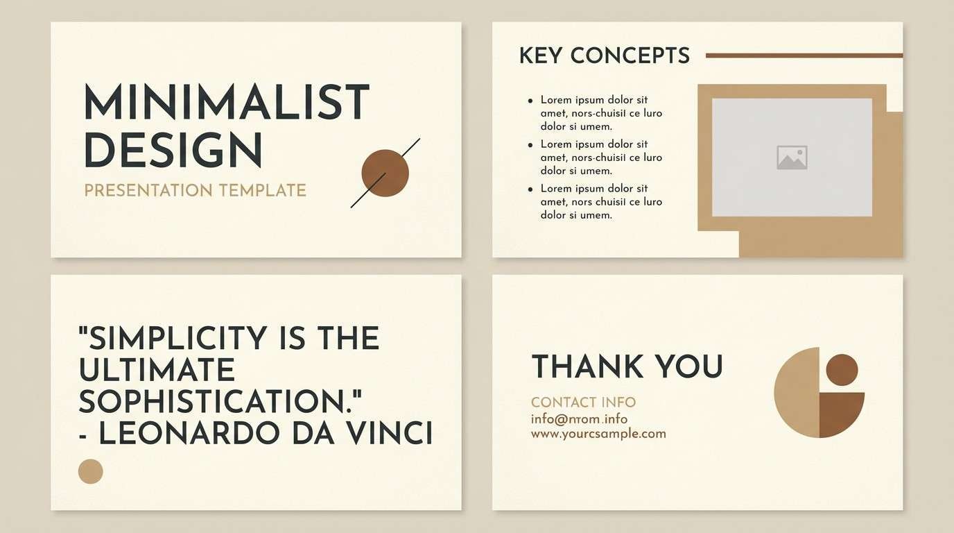
20) Quiet Ballroom Neutrals
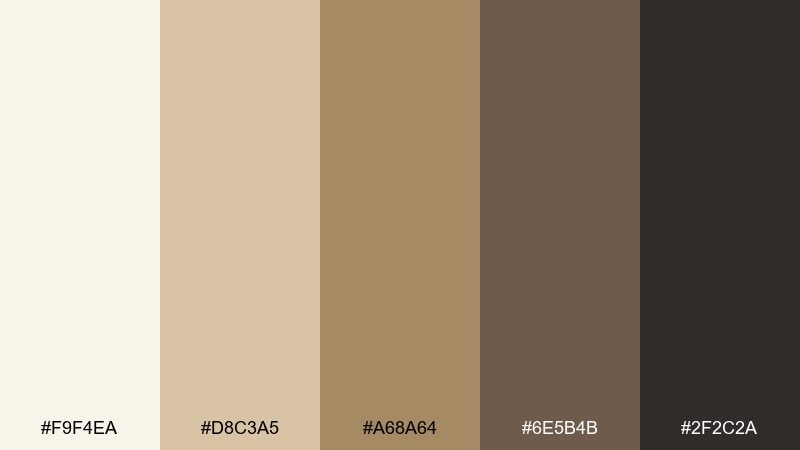
HEX: #F9F4EA #D8C3A5 #A68A64 #6E5B4B #2F2C2A
Mood: calm, elegant, understated
Best for: minimal presentation template
Calm and elegant, these neutrals evoke linen drapes, warm stone, and polished wood in soft light. Use the lightest cream for slide backgrounds, then build hierarchy with tan headings and dark charcoal for body text. It is a safe, timeless choice for decks, proposals, and portfolios. Tip: add one high-contrast charcoal title slide per section to keep the rhythm clear.
Image example of quiet ballroom neutrals generated using media.io
What Colors Go Well with Beauty and the Beast?
Beauty and the Beast color combinations look best when you pair a romantic “hero” shade (rose, wine, burgundy) with a luminous metallic-like accent (antique gold, brass, honey amber) and then ground everything with a dark neutral (charcoal, ink navy, espresso).
For balance, add an airy base like ivory, parchment, or warm cream. If you want a fresh twist, a muted botanical green can work as a minimal accent—think stems, borders, icons, or secondary UI states.
When in doubt: keep gold sparse, keep neutrals generous, and let one saturated color carry the emotional mood.
How to Use a Beauty and the Beast Color Palette in Real Designs
Start with roles, not equal usage: choose one background neutral, one primary text/dark anchor, one hero color for emphasis, and one metallic-like accent for highlights. This prevents the palette from turning costume-like.
In print, gold reads best as foil, embossing, or a restrained “brass” ink rather than a flat neon yellow. In digital UI, treat gold as a state color—active tabs, icons, badges—so it feels premium and controlled.
For branding and packaging, pair rich wines and navies with lots of negative space. A single ornate flourish (border, monogram, crest linework) can sell the fairytale vibe without overwhelming modern layouts.
Create Beauty and the Beast Palette Visuals with AI
If you want to see these swatches in context, generate quick mockups like invitation suites, book covers, posters, and hero sections. Visuals help you test contrast, mood, and readability before committing to a full design.
With Media.io’s text-to-image tool, you can paste a prompt, describe the layout, and iterate variations fast—great for early concepting, client options, or mood boards.
Beauty and the Beast Color Palette FAQs
-
What is a Beauty and the Beast color palette?
It’s a romantic, storybook-leaning scheme built around deep rose or wine, warm antique gold/brass, and grounding dark neutrals like charcoal or navy—usually softened with ivory or parchment. -
What are the most iconic Beauty and the Beast colors?
Rose red, gilded gold, candlelight amber, deep navy/charcoal, and soft ivory are the most recognizable “enchanted castle” tones. -
How do I keep a Beauty and the Beast palette from looking too themed?
Use one hero color and keep the rest mostly neutral. Apply gold sparingly (borders, icons, foil accents) and rely on cream/charcoal for most backgrounds and text. -
What neutral works best with romantic red and gold?
Warm ivory, parchment, and cream are the safest options because they preserve the candlelit feel while maintaining readability and a premium look. -
Can I use these palettes for modern UI design?
Yes—anchor the interface with navy/charcoal, use bone/cream for surfaces, and reserve gold for active states and small icon highlights to keep it refined. -
What’s a good alternative to bright yellow “gold” on screens?
Choose muted brass tones (like #C2A24A or #B88A2B) and pair them with dark backgrounds; it reads more metallic and less neon. -
How can I quickly preview a palette on invitations, posters, or packaging?
Use an AI mockup generator like Media.io text-to-image: describe your format (invite, label, UI) and specify the palette’s mood to produce concept visuals in minutes.
Next: Victorian Color Palette


