

Victorian color palettes blend jewel tones, antique metals, and softened neutrals to create designs that feel rich, historic, and intentional. They’re perfect when you want elegance without looking overly modern.
Below are 20+ curated Victorian color scheme ideas with HEX codes, plus practical pairing tips and AI prompts you can reuse for interiors, branding, invitations, and UI.
In this article
- Why Victorian Palettes Work So Well
-
- velvet parlor
- brass & burgundy
- sage conservatory
- damask rose
- library mahogany
- peacock salon
- coal & cream
- ink & parchment
- aubergine teatime
- foggy thames
- botanical etching
- gilded frame
- hearthside plaid
- porcelain blue
- carriage lantern
- opera garnet
- lace & lilac
- garden gate
- midnight railway
- sepia portrait
- tapestry emerald
- mourning violet
- What Colors Go Well with Victorian?
- How to Use a Victorian Color Palette in Real Designs
- Create Victorian Palette Visuals with AI
Why Victorian Palettes Work So Well
Victorian palettes feel instantly “designed” because they’re built on strong contrast: deep, inky bases; warm metallic accents; and creamy, paper-like highlights. That structure makes layouts readable while still feeling ornamental.
They also balance nostalgia and polish. Jewel tones (burgundy, emerald, aubergine, teal) bring drama, while muted neutrals (parchment, linen, stone) keep modern projects from looking costume-like.
Finally, Victorian color schemes pair well with typography. Serifs, small caps, thin rules, and border motifs all look natural against antique tones—so branding and editorial work can feel premium without extra effects.
20+ Victorian Color Palette Ideas (with HEX Codes)
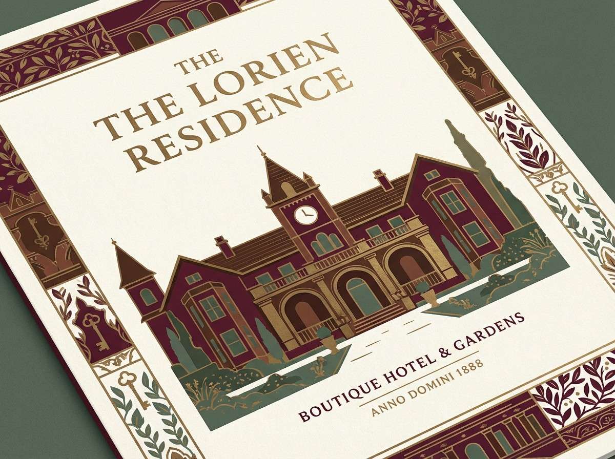
1) Velvet Parlor
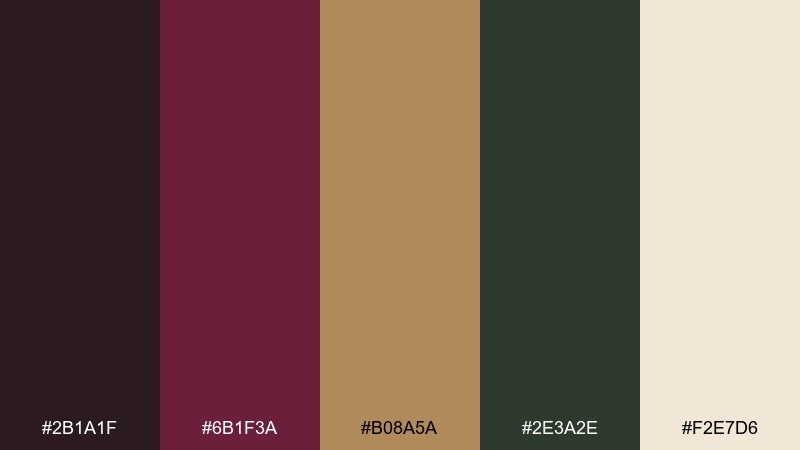
HEX: #2B1A1F #6B1F3A #B08A5A #2E3A2E #F2E7D6
Mood: moody, luxurious, candlelit
Best for: boutique hotel branding and brochures
Moody velvet reds and smoky greens evoke a candlelit parlor with polished wood and brass details. This victorian color palette works beautifully on covers, menus, and brand marks where you want a rich first impression. Pair it with cream space and simple serif typography to keep it from feeling heavy. Usage tip: reserve the deep wine for headlines and use the warm brass tone for rules, icons, or foiling effects.
Image example of velvet parlor generated using media.io
Media.io is an online AI studio for creating and editing video, image, and audio in your browser.

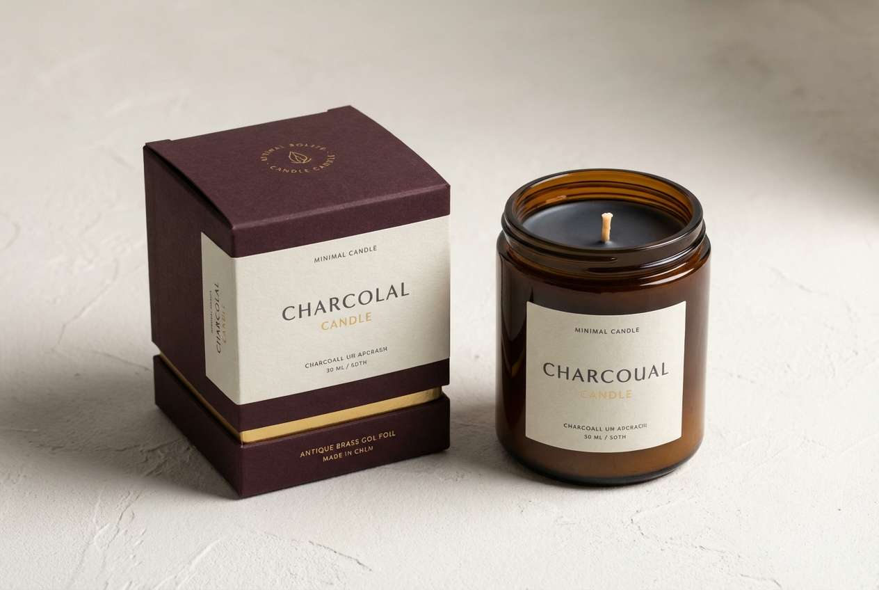
2) Brass & Burgundy
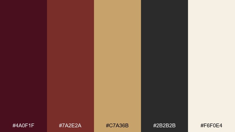
HEX: #4A0F1F #7A2E2A #C7A36B #2B2B2B #F6F0E4
Mood: dramatic, refined, warm
Best for: luxury candle packaging and product ads
Burgundy and antique brass feel like lamplight catching on metal trim and stained glass. The dark neutral grounds the palette so the gold reads premium instead of loud. Use the cream as negative space for ingredients and scent notes, and keep the accent brass to small areas like seals and borders. Tip: print the gold as a warm matte ink if foil is not available to maintain the vintage mood.
Image example of brass & burgundy generated using media.io
3) Sage Conservatory
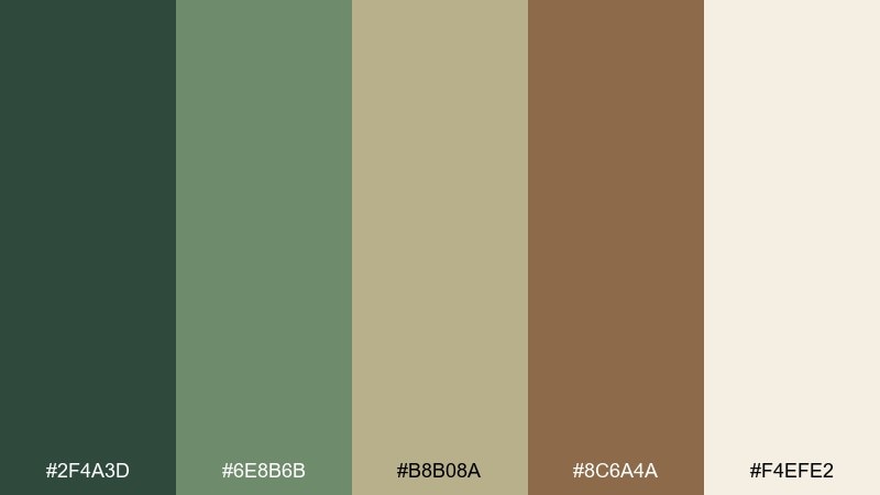
HEX: #2F4A3D #6E8B6B #B8B08A #8C6A4A #F4EFE2
Mood: fresh, botanical, quietly antique
Best for: botanical art prints and spring illustrations
Soft sage greens and sun-warmed linen tones suggest a glass conservatory filled with ferns. The muted brown adds a natural anchor that keeps the greens from turning too modern. Use the light cream as paper texture and let the deeper green handle outlines and title text. Tip: limit the mid-sage to large shapes so the palette stays airy and readable.
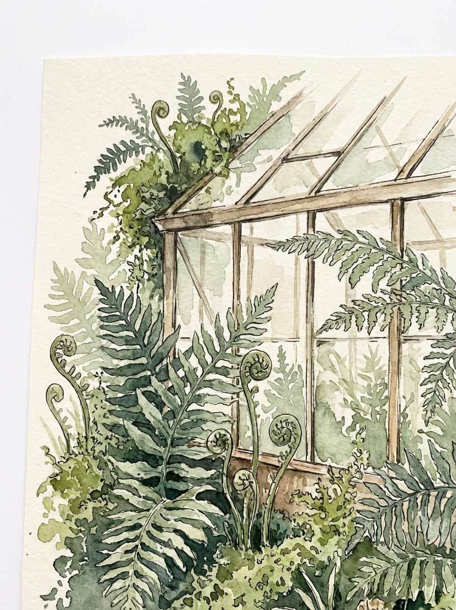
Image example of sage conservatory generated using media.io
4) Damask Rose
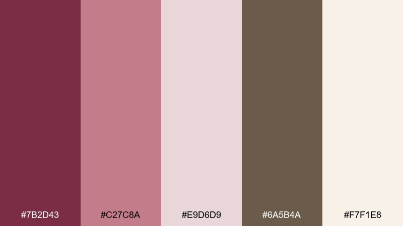
HEX: #7B2D43 #C27C8A #E9D6D9 #6A5B4A #F7F1E8
Mood: romantic, soft, heirloom
Best for: wedding invitations and stationery sets
Powdery rose and dusty mauve feel like damask wallpaper and pressed petals. The cocoa-brown note adds definition for type without needing harsh black. Keep the palest pink as the main field and use the deeper wine for names and key details. Tip: add a thin border in the warm brown to frame the layout and prevent the blush tones from washing out.
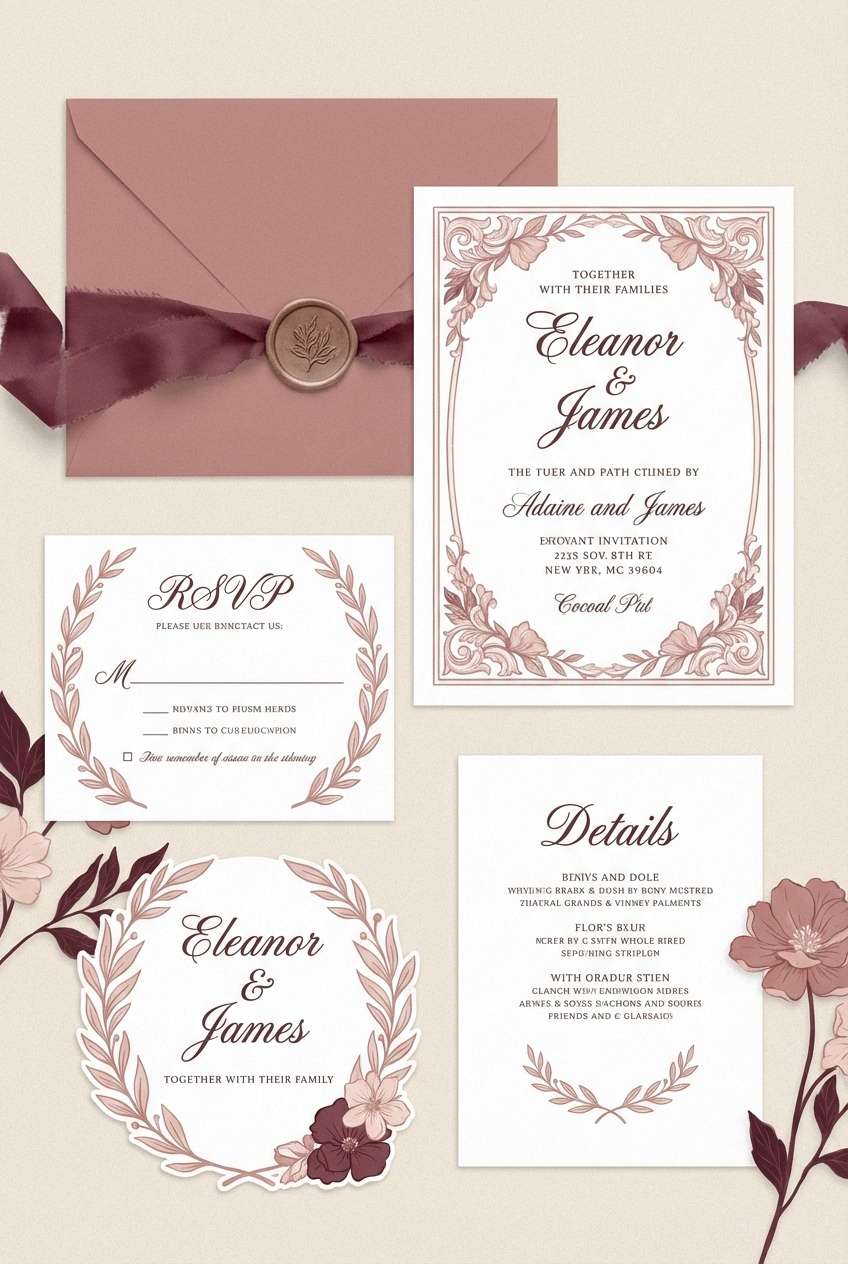
Image example of damask rose generated using media.io
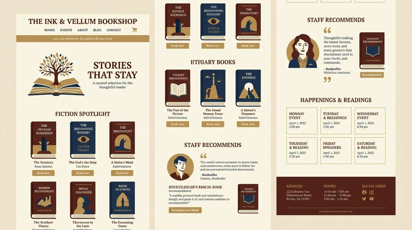
5) Library Mahogany
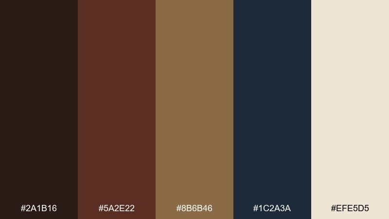
HEX: #2A1B16 #5A2E22 #8B6B46 #1C2A3A #EFE5D5
Mood: scholarly, classic, grounded
Best for: bookstore website UI and reading apps
Dark wood browns and ink navy bring to mind stacked shelves, leather spines, and quiet study rooms. Use the cream as the primary UI canvas to keep text comfortable and accessible. The navy is ideal for navigation and links, while the brass-tan works as a subtle highlight for buttons. Tip: avoid pure black type and instead lean on the deep brown for a softer, period-appropriate feel.
Image example of library mahogany generated using media.io
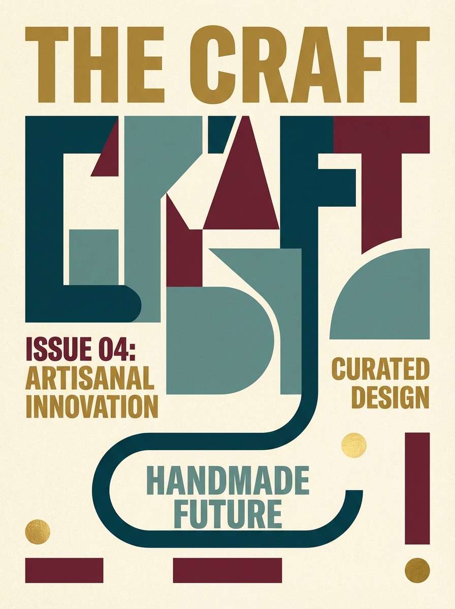
6) Peacock Salon
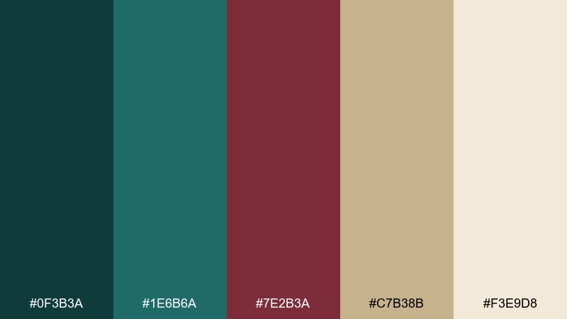
HEX: #0F3B3A #1E6B6A #7E2B3A #C7B38B #F3E9D8
Mood: opulent, artistic, jewel-toned
Best for: fashion lookbooks and editorial covers
Teal and deep merlot feel like peacock feathers, embroidered upholstery, and lacquered details. These victorian color combinations shine in layouts that need contrast without looking harsh. Let teal carry the big blocks and use merlot sparingly for callouts or issue numbers. Tip: keep backgrounds creamy to prevent the jewel tones from overpowering photography or illustration.
Image example of peacock salon generated using media.io
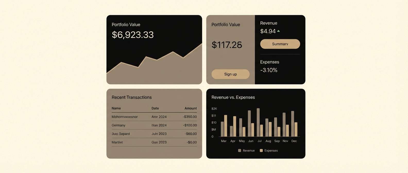
7) Coal & Cream
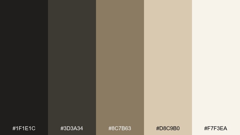
HEX: #1F1E1C #3D3A34 #8C7B63 #D8C9B0 #F7F3EA
Mood: minimal, calm, heritage
Best for: finance dashboards and professional UI
Coal blacks and parchment creams create a disciplined, understated mood with a historic edge. The warm mid-browns prevent the interface from feeling cold while still staying neutral. Use the darkest tone for primary text and the lighter tans for cards and dividers. Tip: keep contrast high for accessibility, and save the warm taupe for interactive states like hover and focus.
Image example of coal & cream generated using media.io
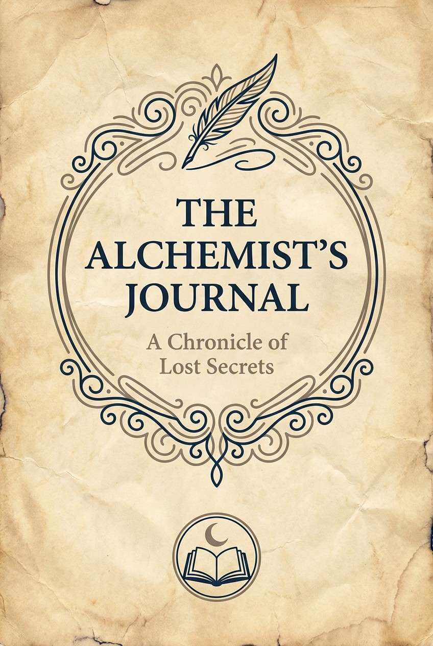
8) Ink & Parchment
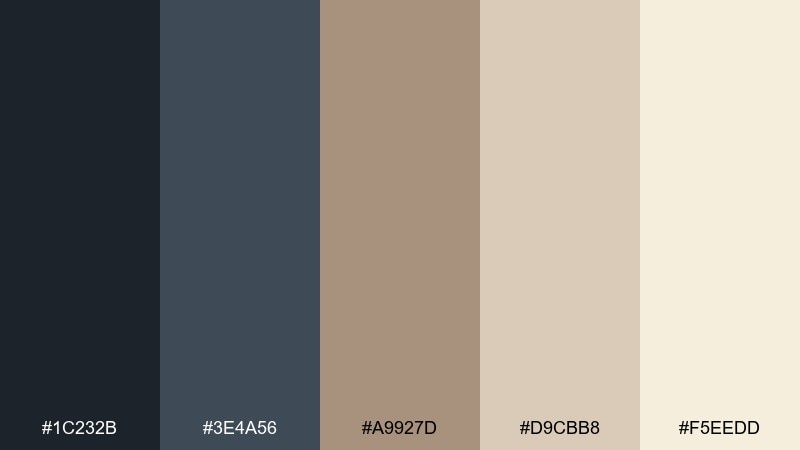
HEX: #1C232B #3E4A56 #A9927D #D9CBB8 #F5EEDD
Mood: literary, archival, elegant
Best for: book covers and print layouts
Cool inky blues on warm parchment evoke handwritten letters and well-loved journals. The muted neutrals provide a natural hierarchy for title, author, and subtitles. Use the darkest ink for the main title, and reserve the mid-ink for secondary typography and rules. Tip: add a subtle paper-grain texture so the creamy tones feel tactile instead of flat.
Image example of ink & parchment generated using media.io
9) Aubergine Teatime
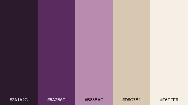
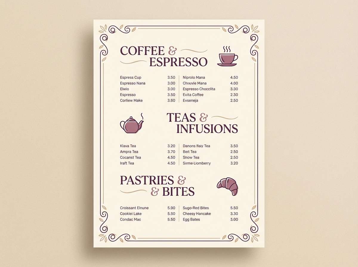
HEX: #2A1A2C #5A2B5F #B88BAF #D8C7B1 #F6EFE6
Mood: cozy, whimsical, vintage-sweet
Best for: cafe menus and dessert branding
Aubergine and soft mauve feel like a teacup set beside plum jam and linen napkins. The beige and cream keep the purple family approachable for everyday menus. Use aubergine for section headers and the blush tone for highlights like specials or price badges. Tip: if printing, keep the lightest cream as the background so the purples stay rich and clean.
Image example of aubergine teatime generated using media.io
10) Foggy Thames
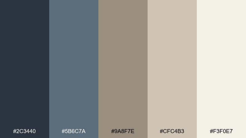
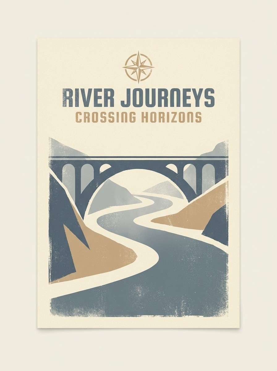
HEX: #2C3440 #5B6C7A #9A8F7E #CFC4B3 #F3F0E7
Mood: misty, muted, atmospheric
Best for: travel posters and moody backgrounds
Cool slate blues and foggy neutrals suggest river mist, stone bridges, and overcast skies. The beige note adds warmth so the palette does not drift into icy gray. Use the dark slate for silhouettes and type, and let the pale tones create depth with layered gradients. Tip: keep saturation low across elements to preserve that hazy, cinematic softness.
Image example of foggy thames generated using media.io
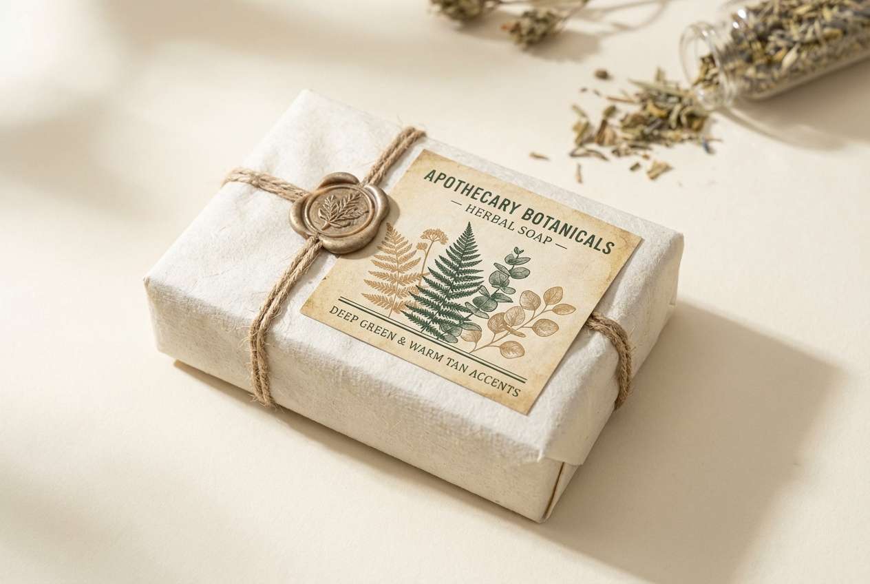
11) Botanical Etching
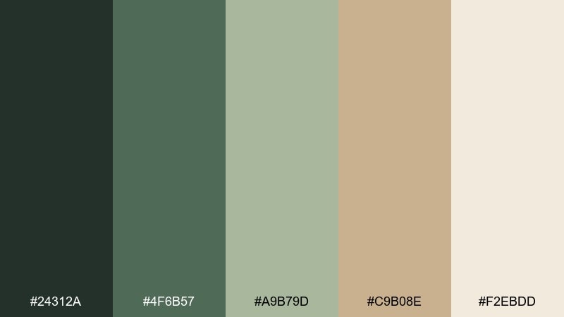
HEX: #24312A #4F6B57 #A9B79D #C9B08E #F2EBDD
Mood: natural, detailed, heritage
Best for: soap labels and apothecary packaging
Deep green and soft herb tones feel like an old botanical plate tucked into a drawer. The warm tan gives the mix a handcrafted, apothecary finish. Use the cream as the label base, then layer fine linework in the darkest green for an etched look. Tip: keep one accent color only, so the design reads like a single-ink illustration with gentle tinting.
Image example of botanical etching generated using media.io
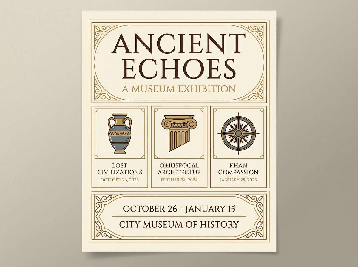
12) Gilded Frame
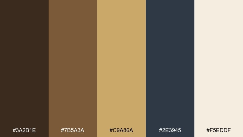
HEX: #3A2B1E #7B5A3A #C9A86A #2E3945 #F5EDDF
Mood: formal, curated, museum-like
Best for: museum flyers and exhibition branding
Warm browns and antique gold recall ornate frames, varnished wood, and quiet gallery halls. The blue-gray provides a modern counterweight that keeps the gold from feeling too rustic. Use gold for borders, dividers, and small seals, and set most text in the deep brown for a classic look. Tip: choose uncoated paper stocks to make the metallic tones feel softer and more historical.
Image example of gilded frame generated using media.io
13) Hearthside Plaid
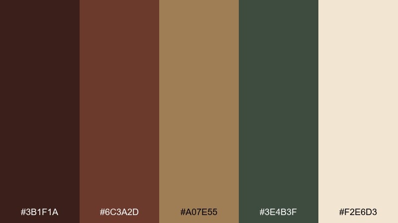
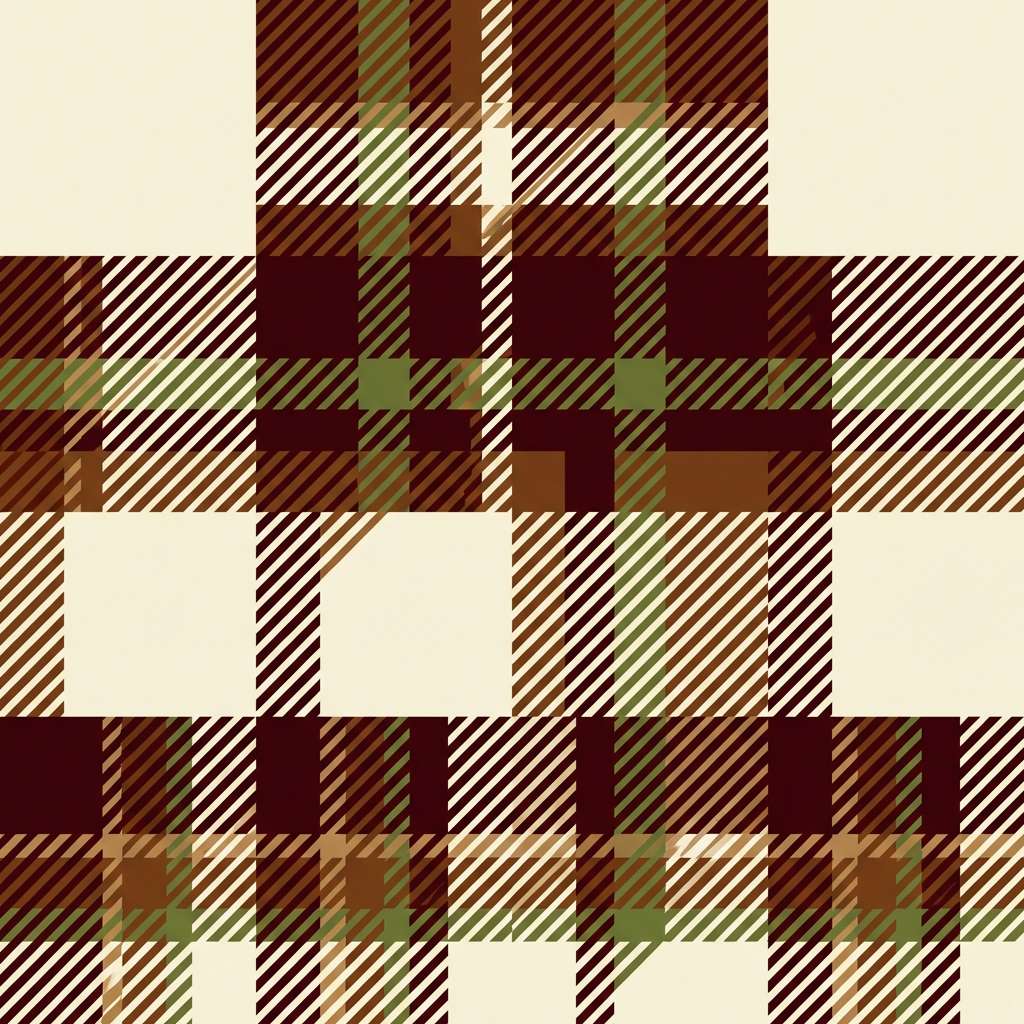
HEX: #3B1F1A #6C3A2D #A07E55 #3E4B3F #F2E6D3
Mood: rustic, cozy, fireside
Best for: textile patterns and seasonal merch
Earthy reds, mossy green, and warm tan feel like a wool throw by the fireplace. The palette is strong enough for repeating patterns without turning too loud. Use the cream as the base and build the plaid with the deeper tones in uneven stripe widths for an authentic look. Tip: keep the darkest shade to thin lines only so the pattern stays soft at a distance.
Image example of hearthside plaid generated using media.io
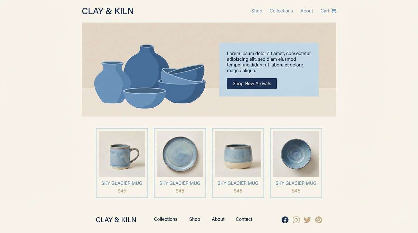
14) Porcelain Blue
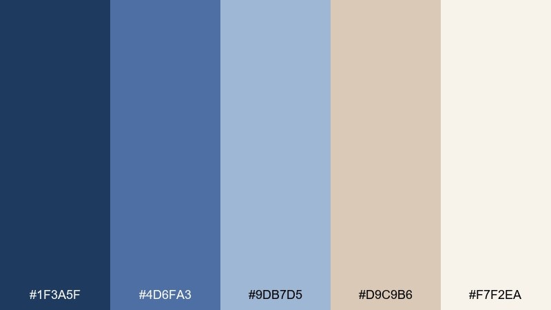
HEX: #1F3A5F #4D6FA3 #9DB7D5 #D9C9B6 #F7F2EA
Mood: airy, refined, classic
Best for: ceramics shops and lifestyle ecommerce UI
Clean porcelain blues with warm neutral accents evoke painted china and sunlit shelves. The pale blue is ideal for large surfaces, while the navy can carry navigation and buttons. Use the beige as a soft divider color instead of gray to keep everything warm and inviting. Tip: keep icon sets thin and minimal so the palette feels elegant rather than nautical.
Image example of porcelain blue generated using media.io
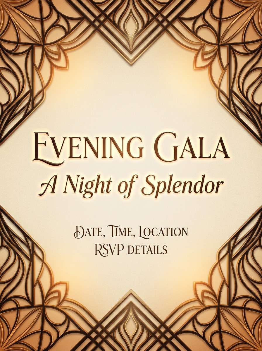
15) Carriage Lantern
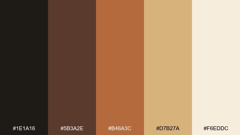
HEX: #1E1A16 #5B3A2E #B46A3C #D7B27A #F6EDDC
Mood: warm, nostalgic, evening-glow
Best for: evening gala posters and event branding
Smoky browns and amber tones look like lantern light on cobblestones at dusk. The pale cream keeps layouts readable while the copper-orange brings the energy. Use the darkest tone for the main type and let amber highlight dates, ticket tiers, or key acts. Tip: add subtle vignetting in the background to mimic warm light falloff without adding extra colors.
Image example of carriage lantern generated using media.io
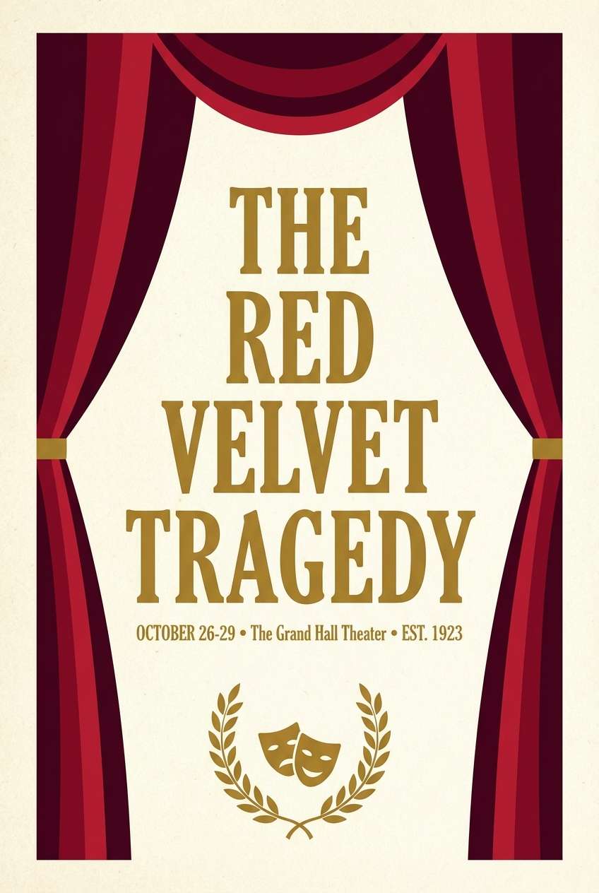
16) Opera Garnet
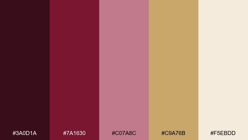
HEX: #3A0D1A #7A1630 #C07A8C #C9A76B #F5EBDD
Mood: theatrical, romantic, high-contrast
Best for: performing arts posters and ticket layouts
Garnet reds and soft rose tones feel like velvet curtains and stage lights before the first note. These victorian color combinations work especially well when you need drama without neon saturation. Use the darkest garnet for titles and the antique gold for separators, logos, or sponsor marks. Tip: keep the blush tone to supporting blocks so the design stays bold and legible from afar.
Image example of opera garnet generated using media.io
17) Lace & Lilac
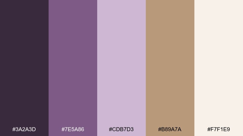
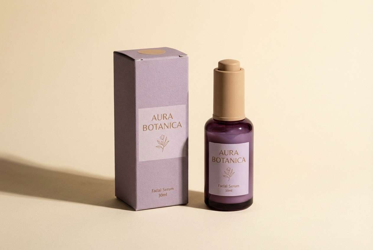
HEX: #3A2A3D #7E5A86 #CDB7D3 #B89A7A #F7F1E9
Mood: delicate, romantic, softly vintage
Best for: beauty packaging and boutique labels
Lilac haze and dusty purple feel like lace curtains and dried lavender bundles. The warm tan keeps the purples grounded and lends a boutique, handcrafted edge. Use the pale lilac for the main label field and the deep plum for product names and key benefits. Tip: pair with fine line borders and minimal icons so the palette stays elegant rather than playful.
Image example of lace & lilac generated using media.io
18) Garden Gate
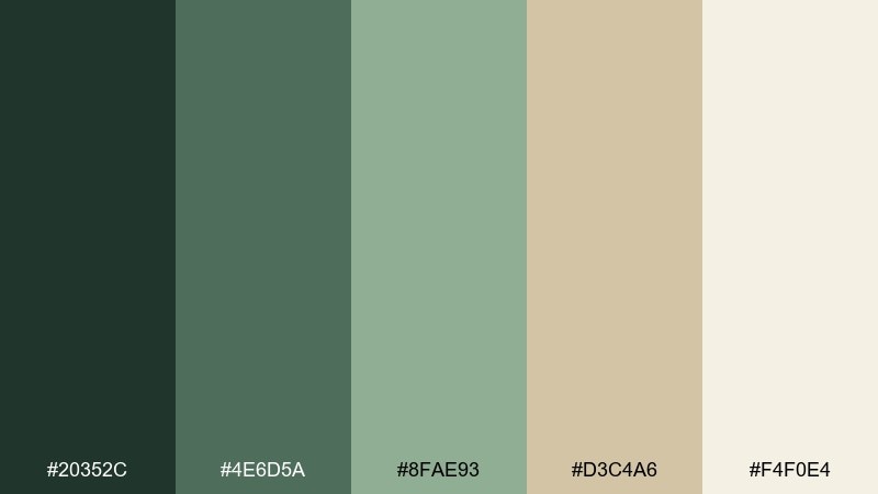
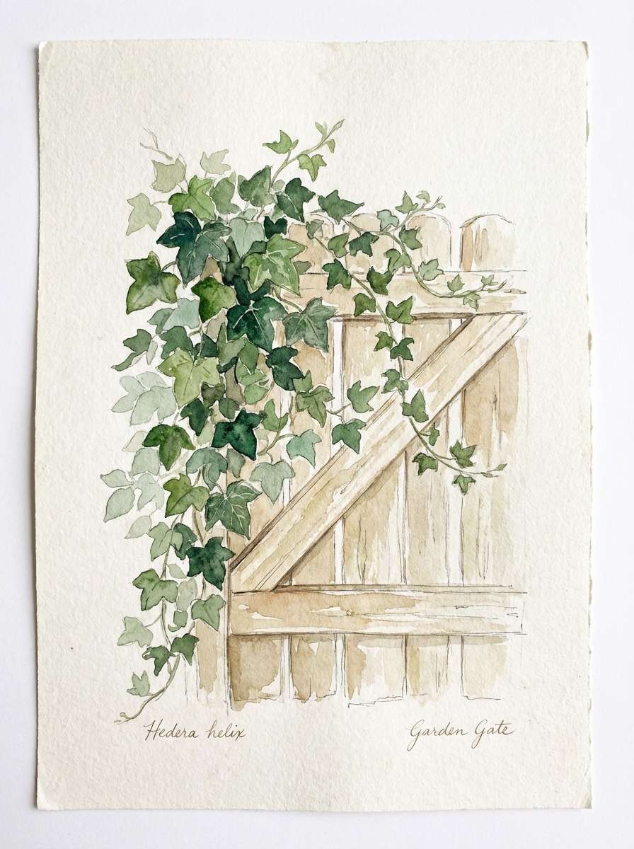
HEX: #20352C #4E6D5A #8FAE93 #D3C4A6 #F4F0E4
Mood: fresh, quaint, outdoorsy
Best for: garden brands and botanical social graphics
Layered greens and soft stone neutrals suggest ivy-covered ironwork and morning walks through a formal garden. The lighter green is perfect for backgrounds, while the deeper shades bring structure to headings and badges. Use the warm beige as a calming separator between content blocks. Tip: combine with simple leaf silhouettes and generous spacing to keep the overall feel light.
Image example of garden gate generated using media.io
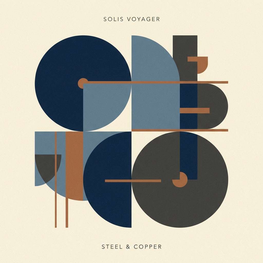
19) Midnight Railway
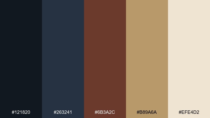
HEX: #121820 #263241 #6B3A2C #B89A6A #EFE4D2
Mood: industrial, nocturnal, nostalgic
Best for: album covers and story-driven posters
Midnight blues and soot-dark tones evoke steam, iron, and late departures under gaslight. The copper-brown adds a human warmth that keeps the palette from feeling purely cold. Use the cream as a spotlight area for titles and credits, and let the brass tone mark key details like dates or tracklists. Tip: add subtle grain and thin line art to reinforce the aged, cinematic mood.
Image example of midnight railway generated using media.io
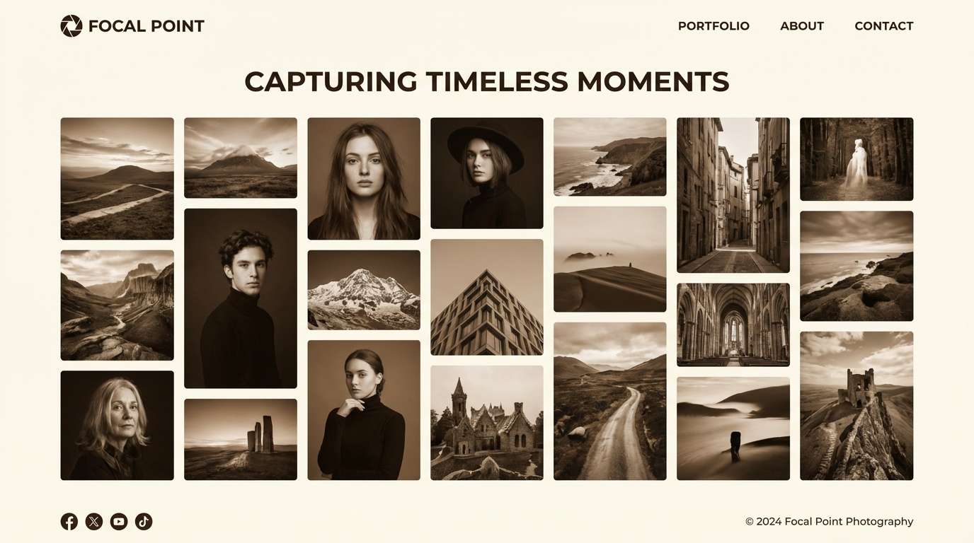
20) Sepia Portrait
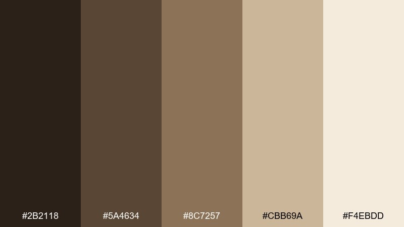
HEX: #2B2118 #5A4634 #8C7257 #CBB69A #F4EBDD
Mood: nostalgic, warm, archival
Best for: photography portfolio landing pages
Sepia browns and creamy highlights feel like a treasured portrait in a worn leather case. This victorian color palette suits photographers and storytellers who want warmth without modern saturation. Use the lightest cream for content areas and the mid-brown for UI dividers, with the darkest tone reserved for headings and navigation. Tip: keep imagery slightly desaturated so the page feels cohesive with the antique tones.
Image example of sepia portrait generated using media.io
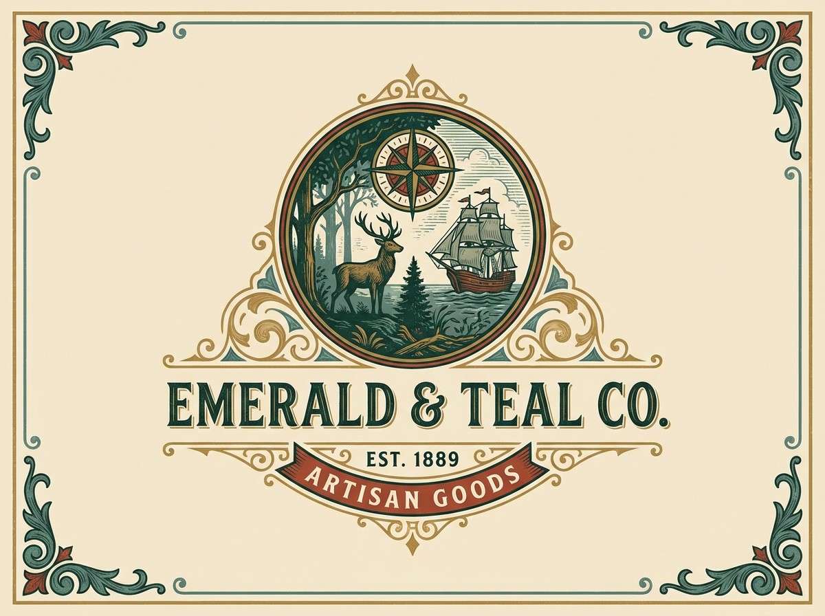
21) Tapestry Emerald
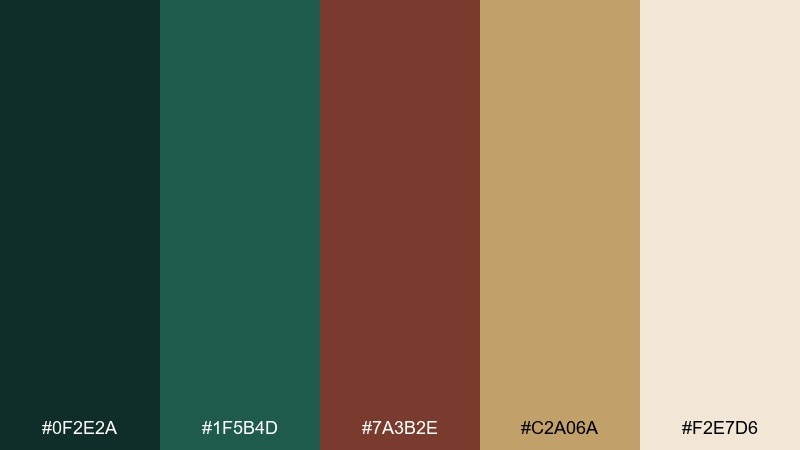
HEX: #0F2E2A #1F5B4D #7A3B2E #C2A06A #F2E7D6
Mood: regal, textured, collected
Best for: heritage brand identities and labels
Deep emerald and warm brick tones resemble woven tapestry threads and timeworn décor. The antique gold reads as a natural accent for crests, monograms, and borderwork. Use cream for breathing room and keep emerald as the dominant field color for maximum richness. Tip: pair with engraved-style illustration to amplify the heritage look without adding extra colors.
Image example of tapestry emerald generated using media.io
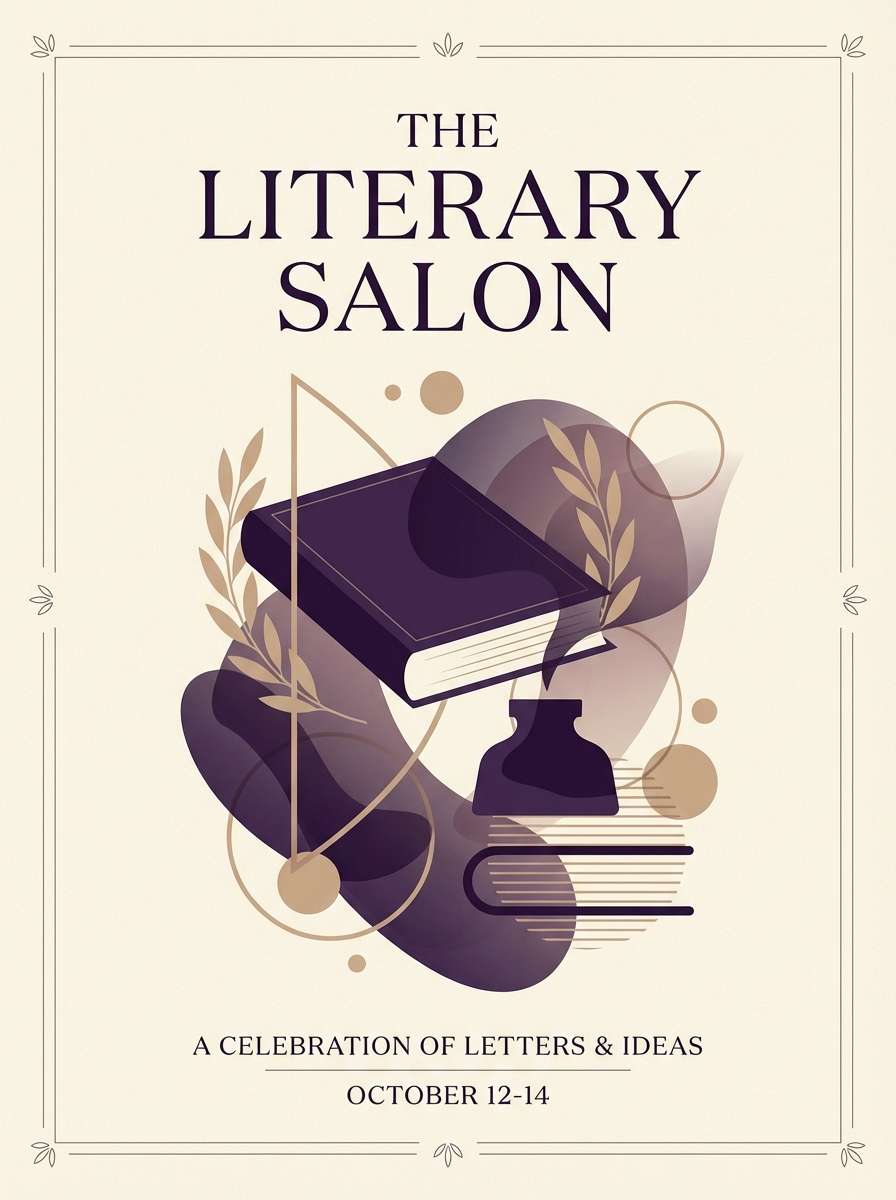
22) Mourning Violet
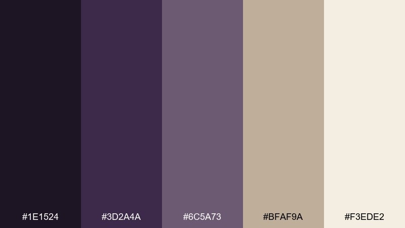
HEX: #1E1524 #3D2A4A #6C5A73 #BFAF9A #F3EDE2
Mood: somber, poetic, refined
Best for: literary posters and event programs
Dark violet and smoky mauve suggest twilight streets and ink-stained poetry pages. The warm beige softens the mood so the palette still feels welcoming on programs and posters. Use the deepest violet for titles and the mid-violet for subheads, then keep body text on cream for clarity. Tip: avoid bright white and instead use the soft cream to maintain the period atmosphere.
Image example of mourning violet generated using media.io
What Colors Go Well with Victorian?
Victorian colors pair best when you anchor them with an inky or wood-toned base (espresso brown, charcoal, ink navy) and then add one jewel-tone hero (burgundy, emerald, garnet, aubergine, teal). This keeps the look dramatic but controlled.
For highlights, lean into antique neutrals and metals: parchment cream, warm beige, linen tan, and brass/antique gold. These tones soften contrast and make Victorian palettes feel lived-in rather than harsh.
If you want a slightly more modern Victorian color scheme, introduce a cool counterweight like slate blue or blue-gray—just keep saturation muted so it still feels period-appropriate.
How to Use a Victorian Color Palette in Real Designs
Start with hierarchy. Use the deepest shade for headlines or navigation, the lightest cream for background space, and reserve metallic or warm accent colors for separators, badges, and small UI states.
Texture is the secret weapon: paper grain, subtle noise, engraved linework, and thin borders help antique tones feel authentic. Even in digital interfaces, a tiny amount of texture can prevent creams and tans from looking flat.
Keep your palette disciplined. Victorian color combinations look best when you avoid adding extra bright colors—let the chosen five do the work through scale, spacing, and typography.
Create Victorian Palette Visuals with AI
If you’re building a brand board, invite suite, or UI mockup, generating quick visual examples helps you confirm contrast and mood before production. With AI, you can iterate on the same Victorian palette across posters, packaging, and web layouts in minutes.
Reuse the prompts above, then swap subjects (menu, landing page, label, flyer) while keeping the same dominant tones. This keeps your concepts consistent and makes presentations easier.
Victorian Color Palette FAQs
-
What defines a Victorian color palette?
A Victorian color palette typically combines deep jewel tones (like burgundy, emerald, and aubergine) with antique neutrals (parchment, cream, warm beige) and metallic accents (brass or antique gold) for a rich, heritage feel. -
Are Victorian colors always dark?
No. Many Victorian color schemes use dark anchors, but they’re usually balanced with light creams and softened midtones (sage, dusty rose, misty slate) to keep designs readable and elegant. -
What are the best Victorian colors for modern UI?
Try ink navy or espresso brown for text and navigation, parchment cream for the main canvas, and brass-tan as a restrained accent for buttons and focus states. Avoid pure black and pure white if you want a more authentic antique tone. -
How do I keep a Victorian color scheme from feeling “costume” or old-fashioned?
Use generous negative space, limit ornament, and keep saturation controlled. A modern grid, clean icon style, and one metallic accent (instead of multiple bright colors) makes the palette feel contemporary while still vintage. -
What’s a good Victorian palette for weddings or invitations?
Soft romantic mixes like dusty rose, blush, cream, and cocoa brown work well for stationery. They keep contrast gentle and pair naturally with serif typography and thin borders. -
Do Victorian palettes work for branding and packaging?
Yes—especially for heritage, luxury, apothecary, and boutique brands. The combination of deep bases plus antique highlights signals quality, craft, and tradition without needing loud colors. -
Can I generate Victorian-style images using these HEX palettes?
You can’t always lock an AI image to exact HEX values, but you can get very close by stating “dominant colors” in the prompt, keeping the background cream/parchment, and repeating key color terms like “antique brass,” “deep garnet,” or “muted sage.”


