

An awesome color palette is less about one specific hue and more about a feeling: clear contrast, confident accents, and a cohesive temperature that makes layouts look intentional.
Below are curated awesome color combos for UI, branding, and print, each with HEX codes, mood notes, pairing ideas, and a quick tip you can apply right away.
In this article
Why Awesome Palettes Work So Well
Awesome palettes typically balance one or two energetic “hero” colors with calmer supports, so designs feel exciting but still readable. That push-pull is what makes them look professional instead of random.
They also rely on clear value steps (light, mid, dark). When your palette has reliable lights for backgrounds and darks for text, everything from UI components to print headlines becomes easier to design.
Finally, awesome color combinations often include a grounding neutral or deep shade. That anchor color is what lets bright accents shine without overwhelming the layout.
20+ Awesome Color Combos (with HEX Codes)
1) Sunlit Citrus
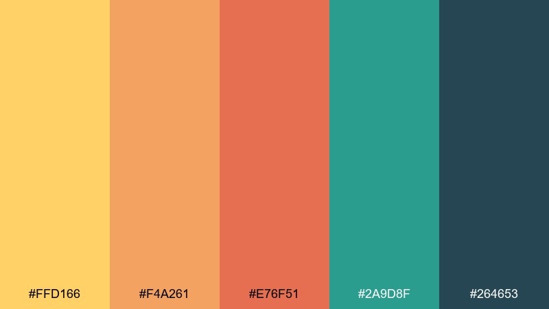
HEX: #FFD166 #F4A261 #E76F51 #2A9D8F #264653
Mood: bright, upbeat, confident
Best for: summer campaign poster
Bright and upbeat like a late-afternoon market, these tones feel energetic without turning harsh. Use the warm yellows and orange as the headline and hero shapes, then let the teal ground the layout. It works especially well for seasonal promos, events, and social graphics that need instant warmth. Tip: keep #264653 for small text and icons to preserve contrast on the lighter hues.
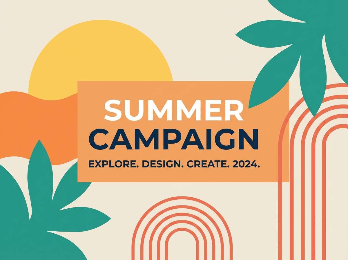
Image example of sunlit citrus generated using media.io
Media.io is an online AI studio for creating and editing video, image, and audio in your browser.

2) Ocean Loft
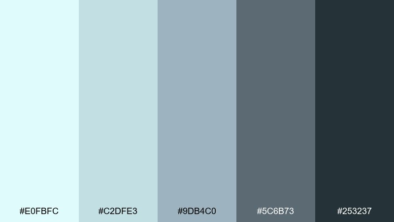
HEX: #E0FBFC #C2DFE3 #9DB4C0 #5C6B73 #253237
Mood: calm, airy, modern
Best for: saas dashboard UI
Calm and airy like morning light on water, these awesome color combos read clean and professional. Use #E0FBFC and #C2DFE3 for surfaces, #9DB4C0 for dividers, and reserve #253237 for primary text. It shines in analytics dashboards, settings screens, and data-heavy UI where clarity matters. Tip: make one accent state with #5C6B73 for hover and selected rows to keep the hierarchy subtle.
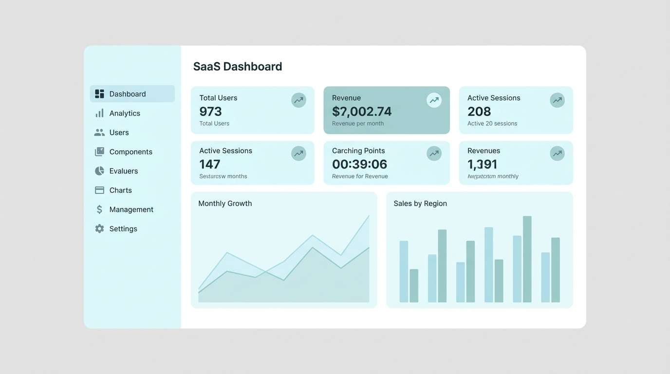
Image example of ocean loft generated using media.io
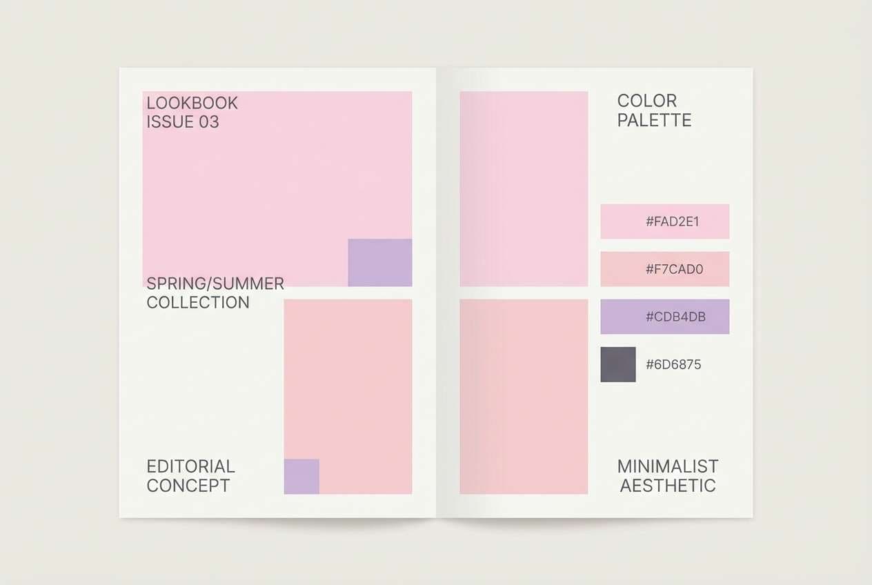
3) Blush Concrete
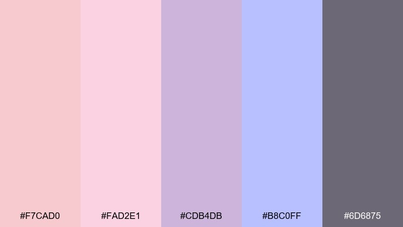
HEX: #F7CAD0 #FAD2E1 #CDB4DB #B8C0FF #6D6875
Mood: soft, stylish, editorial
Best for: beauty brand lookbook
Soft and stylish like blush makeup against cool stone, these pastels feel modern and composed. For an awesome color palette vibe without the sweetness overload, anchor layouts with #6D6875 and keep the lighter tones for spacious backgrounds. It fits beauty lookbooks, boutique catalogs, and lifestyle landing pages where elegance is the point. Tip: use #CDB4DB sparingly for section headers so the page stays airy.
Image example of blush concrete generated using media.io
4) Midnight Neon
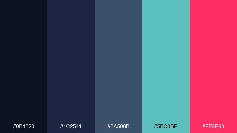
HEX: #0B1320 #1C2541 #3A506B #5BC0BE #FF2E63
Mood: electric, bold, nightlife
Best for: music festival flyer
Electric and bold like neon signs on wet pavement, these awesome color combos deliver instant nightlife energy. Let the deep blues carry the background, then punch up key info with #FF2E63 and #5BC0BE. They work best for flyers, streaming thumbnails, and announcement graphics where you want impact at a glance. Tip: keep body copy in a very light neutral and use #3A506B for secondary panels to avoid muddy contrast.
Image example of midnight neon generated using media.io

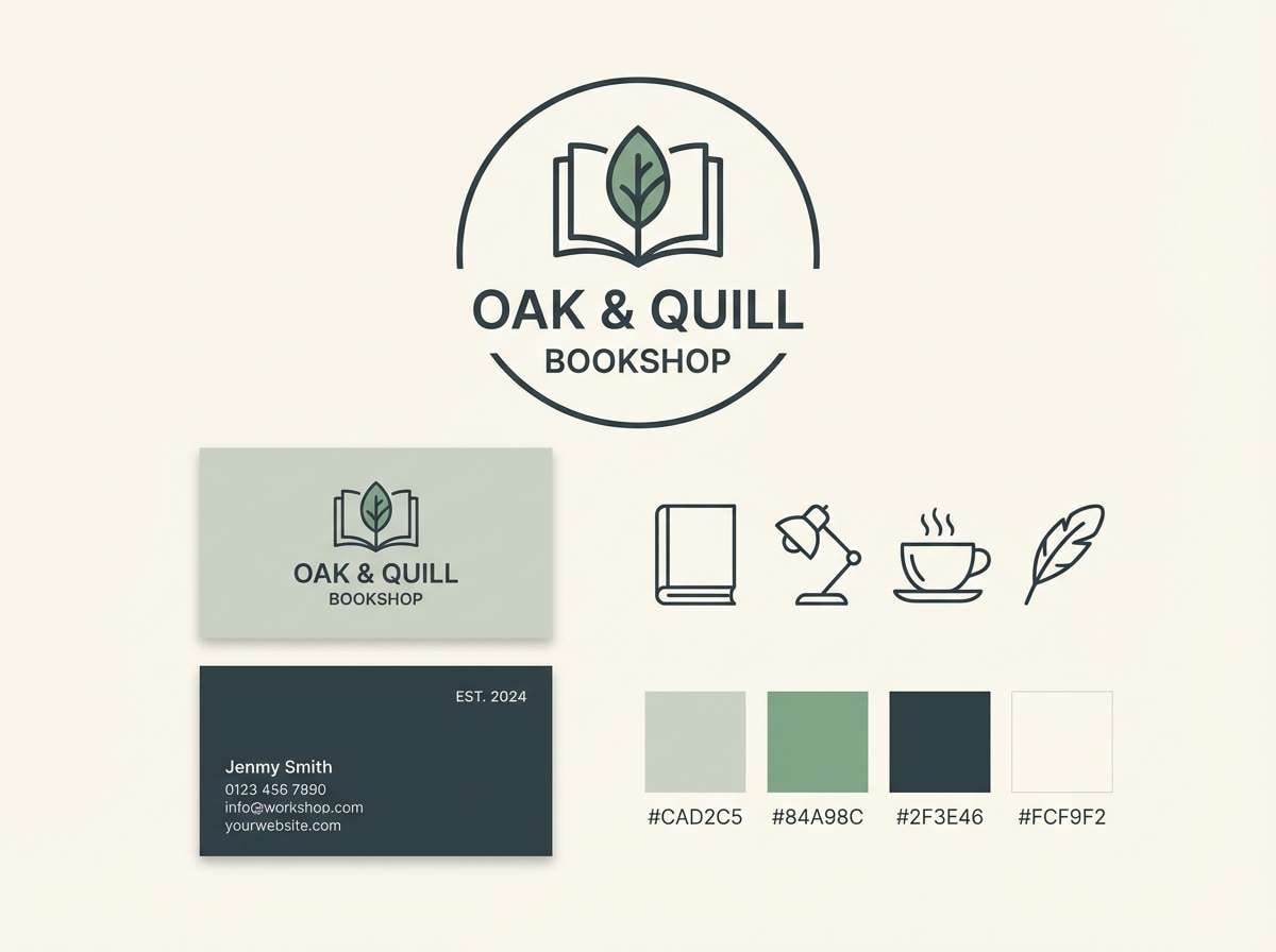
5) Forest Library
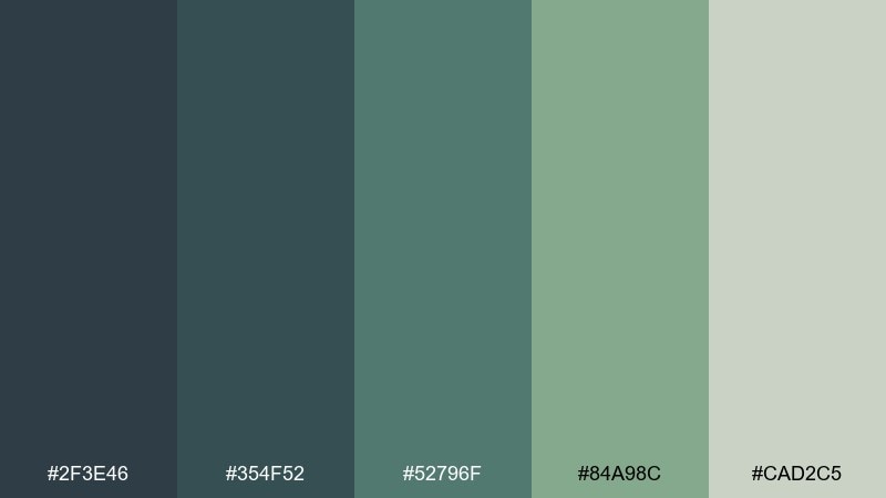
HEX: #2F3E46 #354F52 #52796F #84A98C #CAD2C5
Mood: grounded, cozy, intelligent
Best for: bookstore branding
Grounded and cozy like worn paperbacks and evergreen shade, these greens feel thoughtful and calm. Use #CAD2C5 as a warm background, then layer #52796F and #84A98C for highlights and badges. It suits bookstore branding, academic sites, and artisan packaging that needs a quiet premium tone. Tip: reserve #2F3E46 for logotypes and small text to keep everything crisp.
Image example of forest library generated using media.io
6) Desert Polaroid
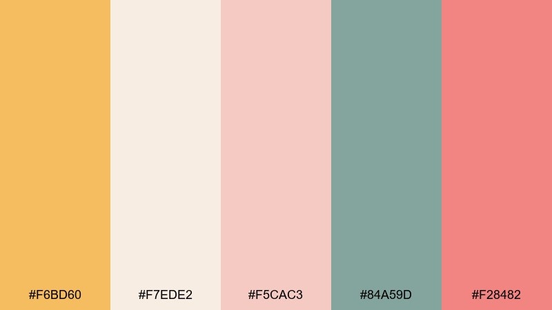
HEX: #F6BD60 #F7EDE2 #F5CAC3 #84A59D #F28482
Mood: warm, nostalgic, friendly
Best for: travel blog hero banner
Warm and nostalgic like sun-faded snapshots, these awesome color combos feel approachable and story-driven. The creamy base keeps layouts soft, while the coral and golden hues add that postcard pop. For awesome color combinations that still feel relaxed, pair the warm notes with #84A59D for buttons and links. Tip: avoid using all warms at once; let #F7EDE2 breathe as negative space so the accents feel intentional.
Image example of desert polaroid generated using media.io

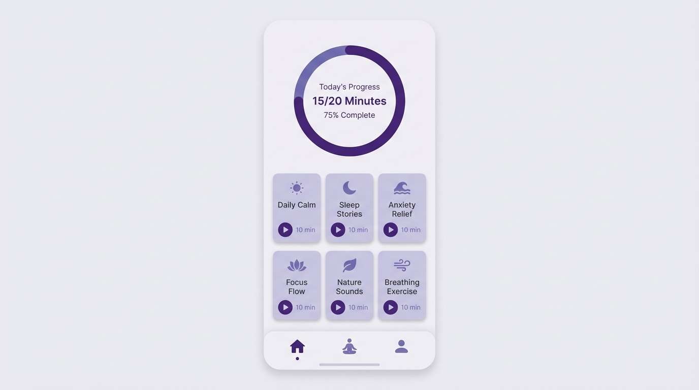
7) Icy Grape
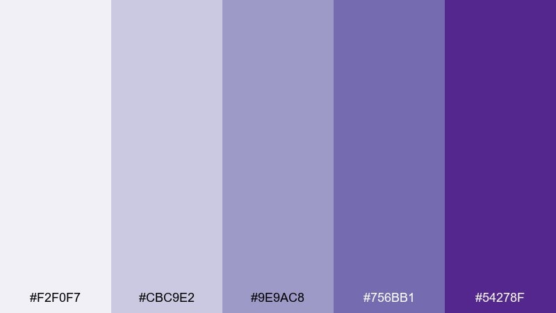
HEX: #F2F0F7 #CBC9E2 #9E9AC8 #756BB1 #54278F
Mood: cool, dreamy, refined
Best for: meditation app UI
Cool and dreamy like twilight haze, these purples bring calm without feeling dull. Use the pale lavender as the main canvas, then step through the deeper shades for states, progress rings, and focus areas. It works beautifully for wellness apps, onboarding screens, and gentle motion graphics. Tip: keep the darkest purple for active elements only so the interface stays soothing and light.
Image example of icy grape generated using media.io
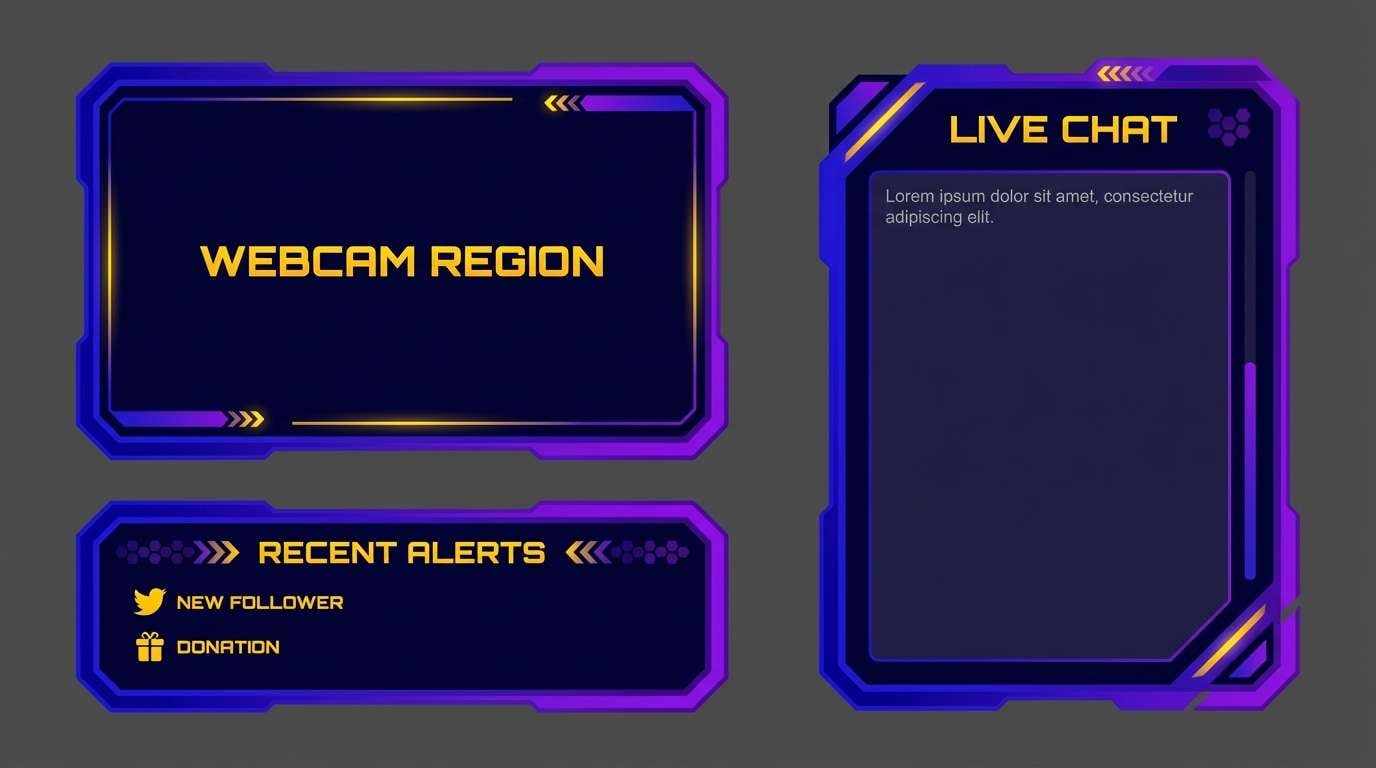
8) Retro Arcade
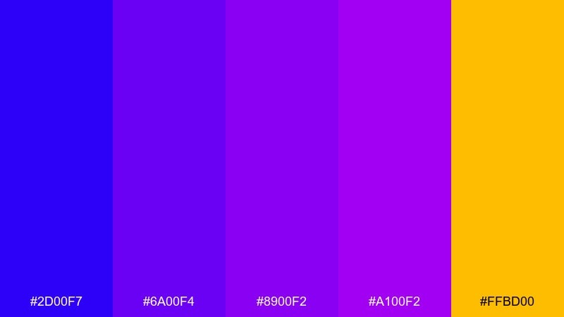
HEX: #2D00F7 #6A00F4 #8900F2 #A100F2 #FFBD00
Mood: playful, loud, high-energy
Best for: gaming stream overlay
Playful and loud like an arcade marquee, this awesome color set is built for high-energy moments. Let the purples dominate panels and gradients, then use #FFBD00 to spotlight calls to action and alerts. It excels in stream overlays, esports announcements, and bold sticker-style graphics. Tip: keep text in clean white and limit the yellow to small bursts so it reads as a highlight, not noise.
Image example of retro arcade generated using media.io
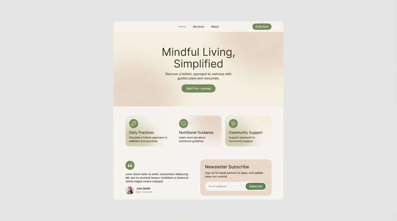
9) Sage & Sand
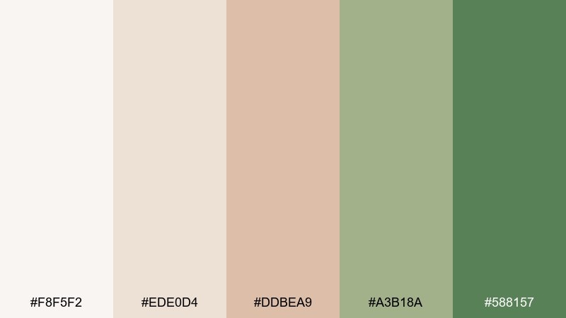
HEX: #F8F5F2 #EDE0D4 #DDBEA9 #A3B18A #588157
Mood: natural, calm, welcoming
Best for: wellness landing page
Natural and calm like linen and fresh herbs, these awesome color combos create an instant sense of ease. The sandy neutrals make a great base, while the greens add credibility and freshness for buttons, icons, and section headers. It works well for wellness sites, spas, and minimalist ecommerce where trust is key. Tip: use #588157 for primary CTAs and keep #DDBEA9 for supportive highlights so the page stays balanced.
Image example of sage & sand generated using media.io
10) Coral Tide
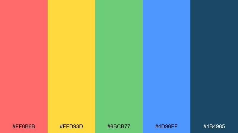
HEX: #FF6B6B #FFD93D #6BCB77 #4D96FF #1B4965
Mood: cheerful, sporty, optimistic
Best for: kids learning app UI
Cheerful and sporty like beach games in bright sun, this awesome color palette stays friendly even at high saturation. Use coral and yellow for rewards and progress moments, then lean on the blue for navigation and structure. It is a strong fit for kids learning apps, playful dashboards, and community projects. Tip: give the bright hues plenty of white space and let #1B4965 handle long-form text for readability.
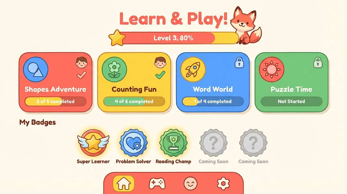
Image example of coral tide generated using media.io
11) Monochrome Punch
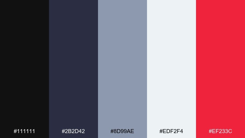
HEX: #111111 #2B2D42 #8D99AE #EDF2F4 #EF233C
Mood: sharp, urban, high-contrast
Best for: streetwear product ad
Sharp and urban like bold type on a concrete wall, these awesome color combos lean into contrast and attitude. Keep the layout mostly grayscale, then drop the red in for price, tags, or a single hero element. If you want awesome color combinations that feel modern and edgy, this is a reliable go-to for ads and launch posts. Tip: avoid using red for long text; treat it like a spotlight so the design stays premium.
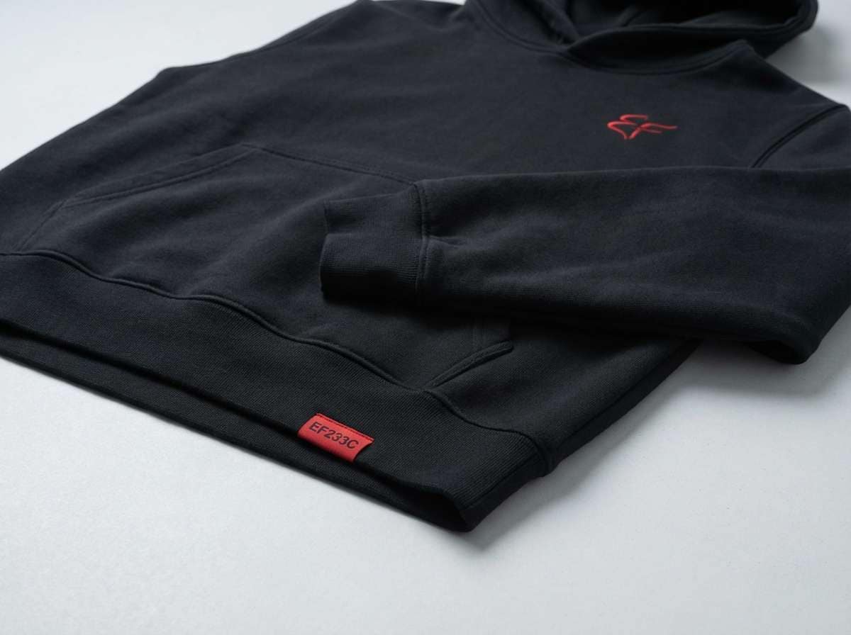
Image example of monochrome punch generated using media.io
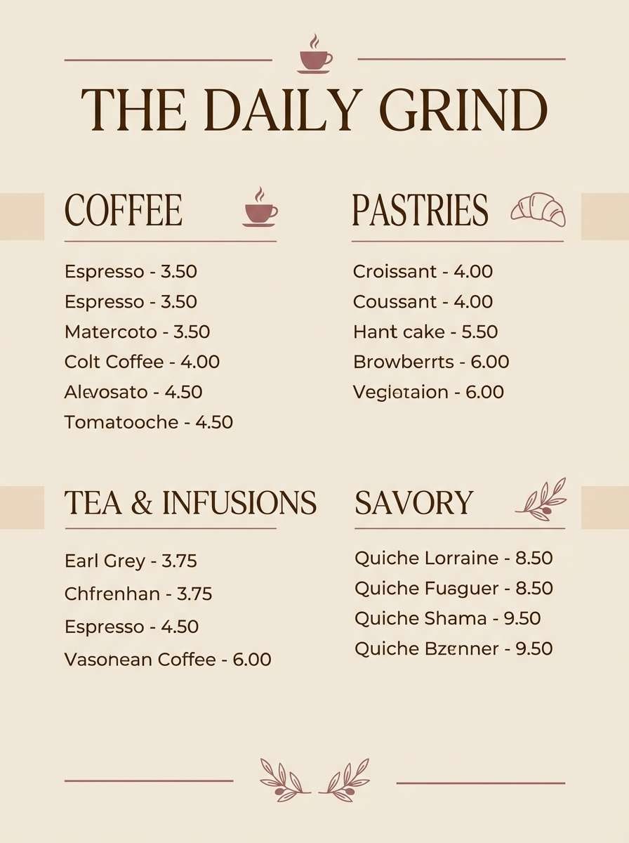
12) Lavender Latte
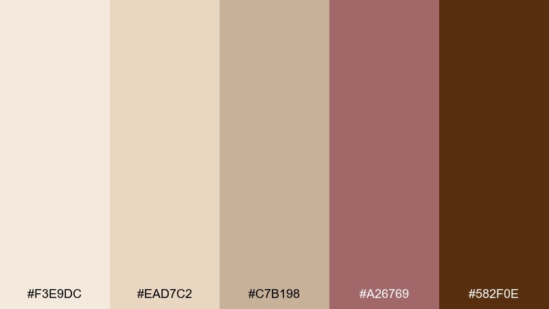
HEX: #F3E9DC #EAD7C2 #C7B198 #A26769 #582F0E
Mood: cozy, artisanal, comforting
Best for: coffee shop menu
Cozy and artisanal like steamed milk and soft pastries, these browns and mauves feel handmade. Use the creams for the menu background, bring in #A26769 for section titles, and keep #582F0E for pricing and details. It works well for cafés, bakeries, and small-batch brands that want warmth without looking rustic. Tip: add subtle texture with thin lines in #C7B198 to create structure without heavy borders.
Image example of lavender latte generated using media.io
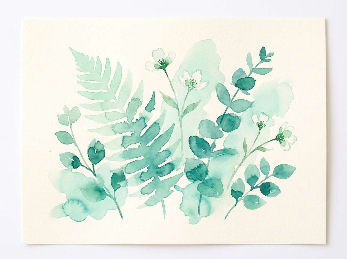
13) Aurora Pastels
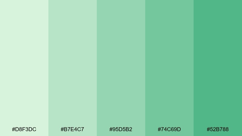
HEX: #D8F3DC #B7E4C7 #95D5B2 #74C69D #52B788
Mood: fresh, gentle, optimistic
Best for: spring botanical illustration
Fresh and gentle like new leaves after rain, these greens feel optimistic and clean. Layer the lightest tones as washes, then define stems and shadows with the deeper greens for depth. It is ideal for spring botanical illustrations, eco blog headers, and calming social posts. Tip: keep outlines soft and let value changes do the work so the artwork stays airy.
Image example of aurora pastels generated using media.io
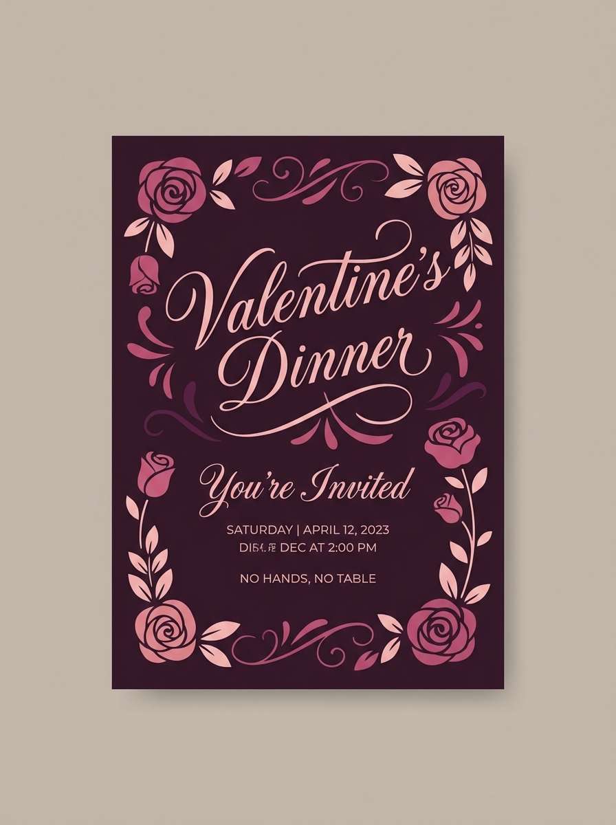
14) Cherry Blossom Night
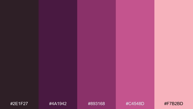
HEX: #2E1F27 #4A1942 #893168 #C4548D #F7B2BD
Mood: romantic, moody, luxe
Best for: valentine invitation
Romantic and moody like petals under city lights, this awesome color palette balances deep wine tones with a soft blush lift. Use the darkest shades for the background and frames, then bring #F7B2BD into typography or floral details. It is a strong choice for invitations, premium packaging, and beauty promos with a nighttime feel. Tip: keep only one of the mid-pinks as the main accent so the design stays refined, not busy.
Image example of cherry blossom night generated using media.io
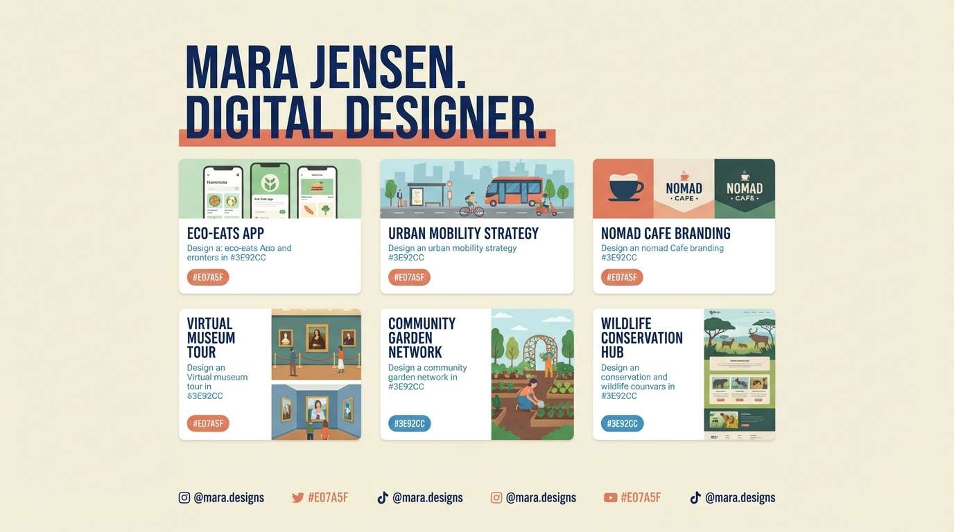
15) Cobalt Clay
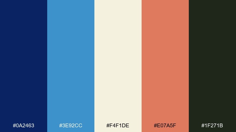
HEX: #0A2463 #3E92CC #F4F1DE #E07A5F #1F271B
Mood: creative, confident, handcrafted
Best for: portfolio website
Creative and confident like cobalt glaze on handmade ceramics, these awesome color combos feel both artistic and structured. Use #F4F1DE as your canvas, #0A2463 for headings and nav, and #E07A5F as a warm highlight for links or badges. It fits portfolios, agency sites, and case studies where you want personality without chaos. Tip: keep #1F271B for small text only to maintain a clean reading rhythm.
Image example of cobalt clay generated using media.io
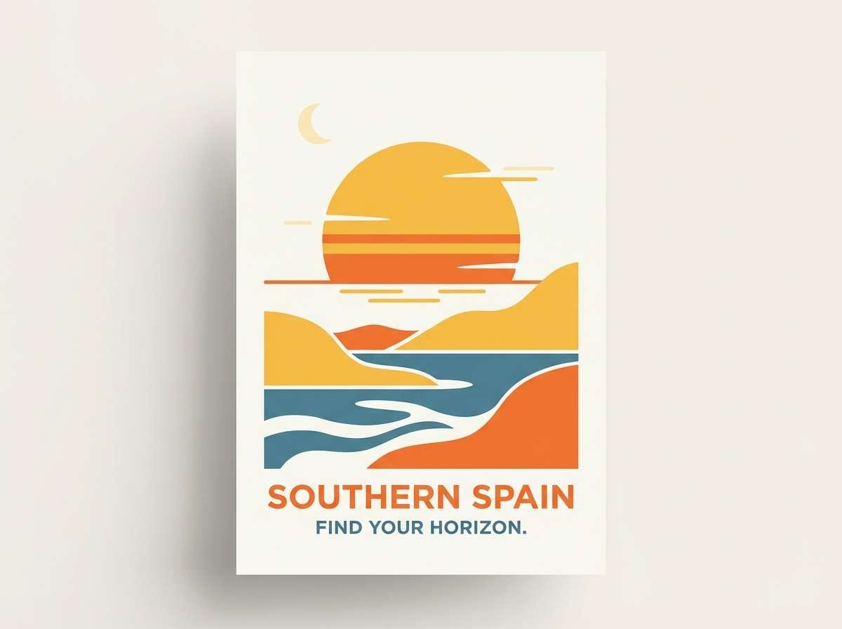
16) Golden Hour Film
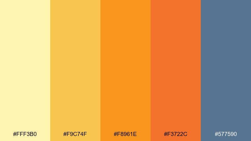
HEX: #FFF3B0 #F9C74F #F8961E #F3722C #577590
Mood: sunny, cinematic, adventurous
Best for: travel poster
Sunny and cinematic like a film still at golden hour, these awesome color combos feel optimistic and bold. Use the yellows for sky and highlight areas, then bring in #577590 for a cool counterbalance in typography and shadows. It is great for travel posters, event banners, and hero sections that need warmth with structure. Tip: try a two-color gradient from #F9C74F to #F3722C and keep the blue for small, crisp details.
Image example of golden hour film generated using media.io
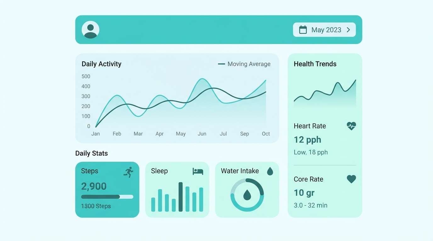
17) Mint Blueprint
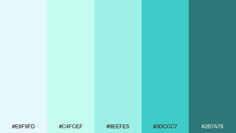
HEX: #E8F9FD #C4FCEF #9EEFE5 #3DCCC7 #2B7A78
Mood: clean, techy, refreshing
Best for: health app dashboard UI
Clean and refreshing like cool mint water, this set reads trustworthy and modern. Use the pale aqua for backgrounds and cards, then add #3DCCC7 for active states and progress indicators. It fits health dashboards, habit trackers, and productivity tools where calm clarity wins. Tip: keep #2B7A78 for headings and key numbers so they stand out without using harsh black.
Image example of mint blueprint generated using media.io
18) Terracotta Garden
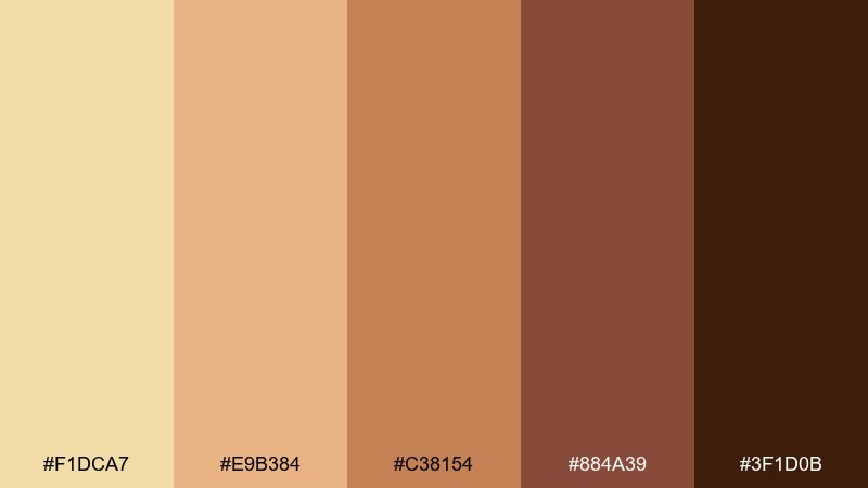
HEX: #F1DCA7 #E9B384 #C38154 #884A39 #3F1D0B
Mood: earthy, warm, organic
Best for: organic skincare packaging
Earthy and warm like clay pots and sunlit soil, these browns feel grounded and natural. Use the lighter tones for labels and background panels, then rely on #884A39 for brand marks and key claims. It is ideal for organic skincare packaging, handmade goods, and farm-to-table menus. Tip: add fine linework in #3F1D0B and keep the palette mostly matte to preserve the organic vibe.
Image example of terracotta garden generated using media.io
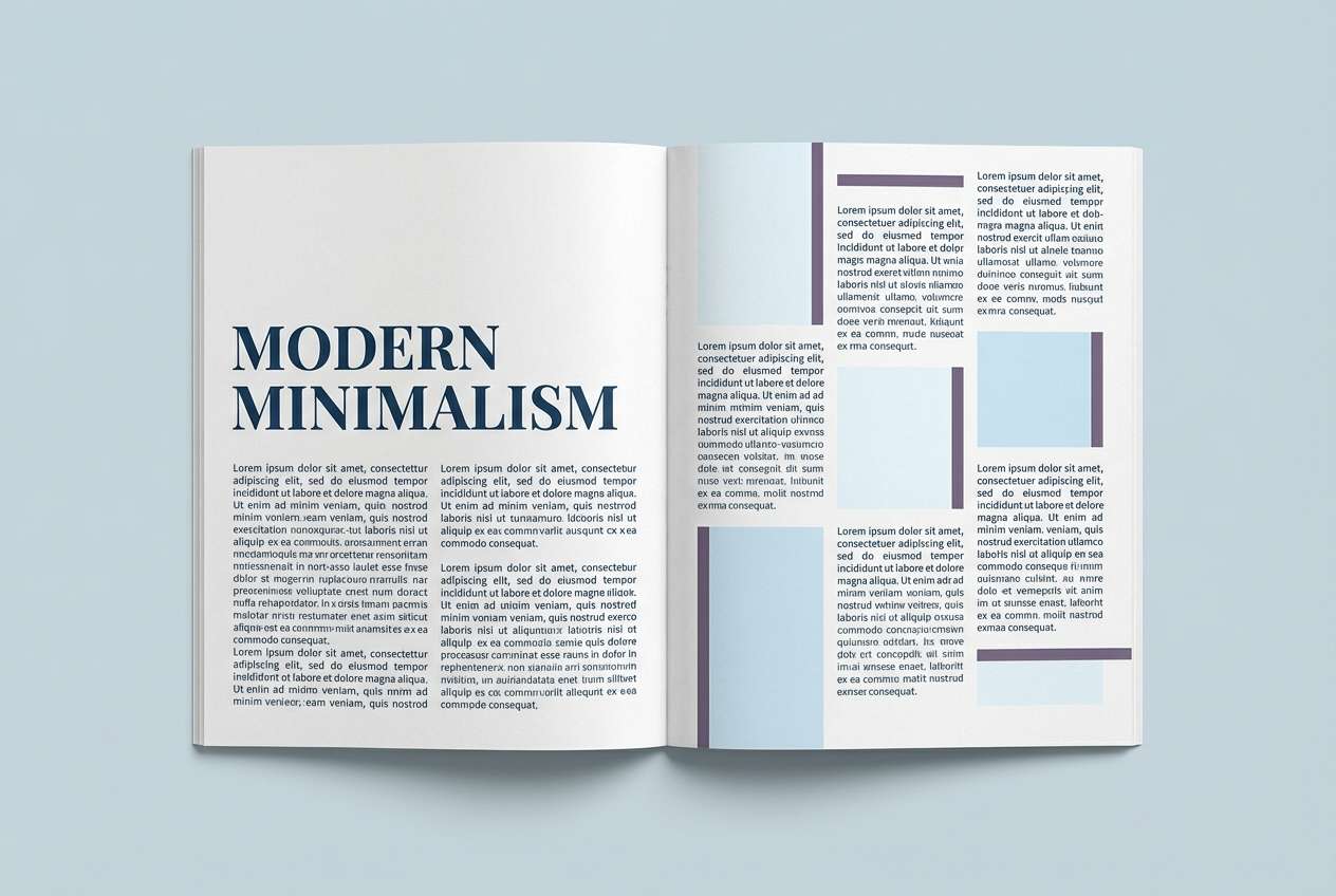
19) Stormy Lilac
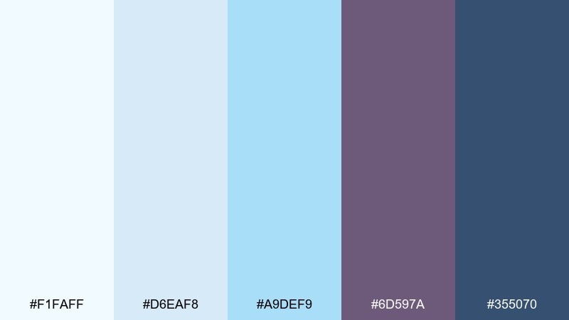
HEX: #F1FAFF #D6EAF8 #A9DEF9 #6D597A #355070
Mood: soft, thoughtful, slightly dramatic
Best for: editorial magazine layout
Soft and thoughtful like clouds over a lavender field, this awesome color mix feels calm with a hint of drama. Use the icy blues as page space, then bring in #6D597A for pull quotes and section labels. It is a great fit for editorial layouts, newsletters, and report covers that need quiet sophistication. Tip: keep #355070 for body text and rules so the lighter blues stay readable.
Image example of stormy lilac generated using media.io
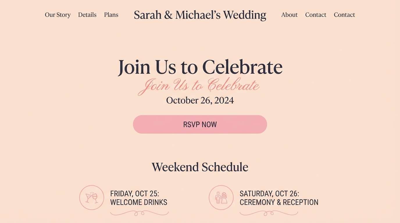
20) Peach Noir
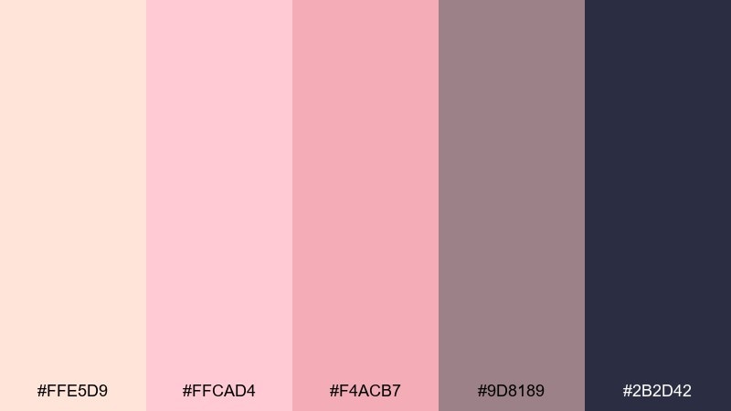
HEX: #FFE5D9 #FFCAD4 #F4ACB7 #9D8189 #2B2D42
Mood: modern, romantic, balanced
Best for: wedding website
Modern and romantic like soft peach fabric against a dark tux, this awesome color set feels elegant and balanced. Use the peaches as spacious backgrounds, then lean on #2B2D42 for typography and navigation to keep everything sharp. It works beautifully for wedding websites, RSVP flows, and minimalist invitations that still feel warm. Tip: make #F4ACB7 your single main accent so buttons and links look consistent across pages.
Image example of peach noir generated using media.io
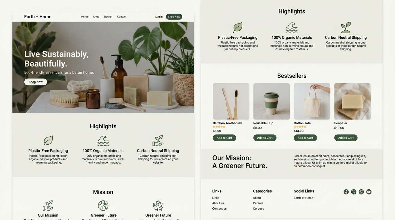
21) Graphite Bloom
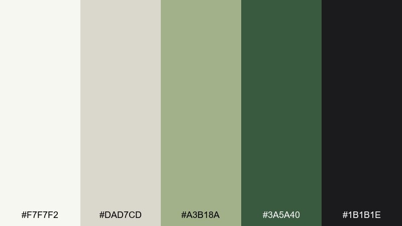
HEX: #F7F7F2 #DAD7CD #A3B18A #3A5A40 #1B1B1E
Mood: minimal, botanical, premium
Best for: eco product landing page
Minimal and botanical like pressed leaves on clean paper, these awesome color combos feel premium and quiet. The off-white and warm gray build a calm base, while the greens introduce a trustworthy eco signal. It is a strong fit for sustainable product pages, boutique newsletters, and packaging systems that favor restraint. Tip: use #1B1B1E for headlines only and let #3A5A40 handle buttons so the greens stay the hero.
Image example of graphite bloom generated using media.io
What Colors Go Well with Awesome?
“Awesome” palettes pair best with dependable neutrals: off-white, warm gray, graphite, and deep navy. These shades create breathing room so your accent colors feel deliberate, not loud.
To amplify the awesome feel, mix a warm highlight (coral, amber, terracotta) with a cool stabilizer (teal, slate blue, mint). This warm-cool balance often reads modern and energetic at the same time.
If you need extra polish, add one near-black for typography and one very light tint for backgrounds. That simple value structure makes almost any awesome color combination usable across UI and print.
How to Use Awesome Color Combos in Real Designs
Start with roles, not colors: pick a background, surface, text, and accent. In many awesome palettes, the darkest shade should carry body text, while the brightest color is reserved for CTAs and highlights.
Limit your accents to one main and one secondary. When everything is emphasized, nothing stands out; a restrained accent strategy is what makes “awesome” look premium in real layouts.
Test contrast early on key components (buttons, nav, form fields, captions). Small adjustments like moving text to the darkest hex or increasing background lightness can make the palette feel instantly more professional.
Create Awesome Palette Visuals with AI
If you want to see your awesome palette in action, generate quick mockups like posters, UI screens, packaging, or branding boards. Visualizing the palette helps you confirm contrast, hierarchy, and overall vibe before you design for real.
With Media.io’s text-to-image tool, you can paste a prompt, include your HEX colors, and iterate fast. It’s especially useful for exploring layout ideas and finding the right balance between bold accents and calm foundations.
Awesome Color Combos FAQs
-
What is an awesome color palette?
An awesome color palette is a cohesive set of colors (often including light, mid, dark, and accent tones) that creates a confident, visually pleasing look for UI, branding, or print. -
How do I choose an accent color in an awesome palette?
Pick one high-contrast color that draws attention against your background and text colors (for example, coral on navy or yellow on purple), then use it consistently for CTAs, tags, and key highlights. -
What are safe text colors for awesome color combinations?
Use a deep neutral like charcoal, graphite, or navy for body text, and reserve bright colors for short labels only. This keeps readability high while maintaining an energetic palette. -
Can I use awesome color combos for professional SaaS UI?
Yes. Choose a palette with light surfaces and clear dark text (like Ocean Loft), then keep bright accents limited to states such as active, hover, success, or call-to-action buttons. -
How many colors should an awesome palette have?
Five colors is a practical sweet spot: two lights for backgrounds, one mid-tone for borders/secondary UI, one dark for text, and one accent for emphasis. -
How can I make an awesome palette look less “too bright”?
Increase negative space, rely on neutrals for most large areas, and use saturated hues only in small doses. Also add a darker anchor color to keep the overall design grounded. -
How do I preview an awesome color combination before designing?
Generate a few concept visuals (poster, landing page, packaging, or dashboard) using a consistent prompt and your HEX codes. This quickly reveals whether contrast and balance feel right.
Next: Olivine Color Palette


