

Yellow, orange, and green is a high-energy trio that can feel sunny, fresh, and instantly optimistic. It’s a go-to when you want designs to look active, friendly, and “alive,” without relying on heavy gradients or complex effects.
Below are ready-to-use yellow orange green color palette ideas with HEX codes—made for UI, branding, print, and seasonal visuals—plus AI prompts you can use to generate matching images fast.
In this article
- Why Yellow Orange Green Palettes Work So Well
-
- citrus canopy
- sunlit grove
- mango meadow
- golden lime spritz
- harvest hike
- papaya park
- saffron fern
- tangerine trail
- lemon basil kitchen
- apricot aloe
- marigold moss
- pineapple patio
- sunrise orchard
- citrus circuit
- lime ember
- yolk and ivy
- tropic terrarium
- autumn citrus field
- zestful classroom
- lantern garden
- candlelit citron
- bright orchard ui
- What Colors Go Well with Yellow Orange Green?
- How to Use a Yellow Orange Green Color Palette in Real Designs
- Create Yellow Orange Green Palette Visuals with AI
Why Yellow Orange Green Palettes Work So Well
Yellow and orange naturally read as light, warmth, and motion—so they pull attention to what matters. Green adds balance by signaling freshness, health, and “go/confirmed,” which is why the trio performs well in both marketing and UI.
This combination also gives you a built-in hierarchy: yellow for highlights, orange for primary actions, and green for supportive states (success, navigation, tags). With one dark neutral (charcoal/navy), you can keep text and layout crisp.
Most importantly, yellow orange green palettes can flex across styles—from playful and zesty to grounded and botanical—just by shifting saturation and adding calmer supporting neutrals.
20+ Yellow Orange Green Color Palette Ideas (with HEX Codes)
1) Citrus Canopy
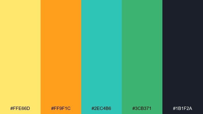
HEX: #FFE66D #FF9F1C #2EC4B6 #3CB371 #1B1F2A
Mood: bright, fresh, energetic
Best for: SaaS landing pages and feature dashboards
Bright citrus light over leafy greens makes the whole set feel upbeat and clean. Use the yellow as a highlight for key metrics, the orange for primary CTAs, and keep teal or green for success states. Pair it with plenty of white space and a dark ink-like text color for contrast. Usage tip: reserve the warm accents for no more than 10 to 15 percent of the UI to keep it crisp.
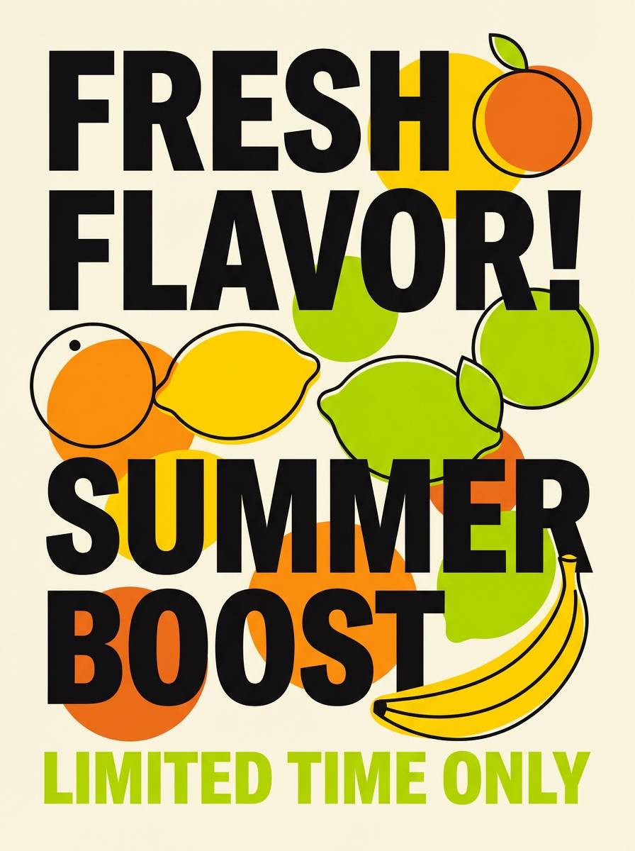
Image example of citrus canopy generated using media.io

Media.io is an online AI studio for creating and editing video, image, and audio in your browser.

2) Sunlit Grove
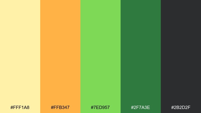
HEX: #FFF1A8 #FFB347 #7ED957 #2F7A3E #2B2D2F
Mood: natural, warm, optimistic
Best for: Eco skincare packaging and label systems
Sun-warmed leaves and ripe fruit give this mix a wholesome, outdoorsy glow. The yellow orange green color palette works especially well when you need a friendly, ingredient-forward look without feeling childish. Balance the bright notes with deep green blocks and charcoal typography for premium readability. Usage tip: print-test the light yellow on matte stock and add a thin dark outline if small text must sit on it.
Image example of sunlit grove generated using media.io
3) Mango Meadow

HEX: #FFF3B0 #FF8C42 #A7C957 #386641 #F2E8CF
Mood: romantic, sunny, garden-soft
Best for: Spring wedding invitations and RSVP cards
Soft sunshine and meadow greens create a gentle, celebratory feel that still reads modern. Let the creamy neutrals carry most of the page, then bring in mango orange for names or key details. Deep green works beautifully for body text and ornamental borders. Usage tip: keep the orange to one focal element per card so the design stays elegant.
Image example of mango meadow generated using media.io
4) Golden Lime Spritz
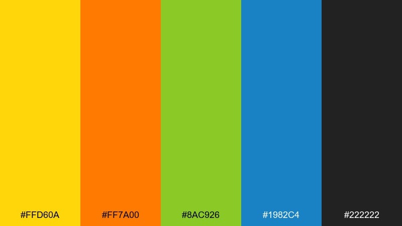
HEX: #FFD60A #FF7A00 #8AC926 #1982C4 #222222
Mood: punchy, playful, high-contrast
Best for: Food promo posters and social ads
Zesty yellow and orange pop like a fizzy drink, while the greens keep it feeling fresh instead of loud. Use the bright yellow for price bursts and the orange for limited-time callouts. A touch of blue can stabilize the layout and prevent the warm tones from overpowering. Usage tip: set headlines in black or near-black for instant readability at thumbnail size.
Image example of golden lime spritz generated using media.io
5) Harvest Hike
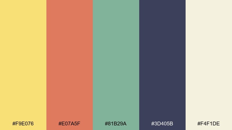
HEX: #F9E076 #E07A5F #81B29A #3D405B #F4F1DE
Mood: adventurous, earthy, friendly
Best for: Outdoor brand identity and logo kits
Trail warmth and forest calm come together with a slightly vintage twist. The muted orange reads like sun on rock, while the green feels grounded and trustworthy. Use the deep navy for logos and wordmarks to keep everything sharp across patches, tags, and web headers. Usage tip: build a one-color version in the navy first, then layer in the warm accents for premium applications.
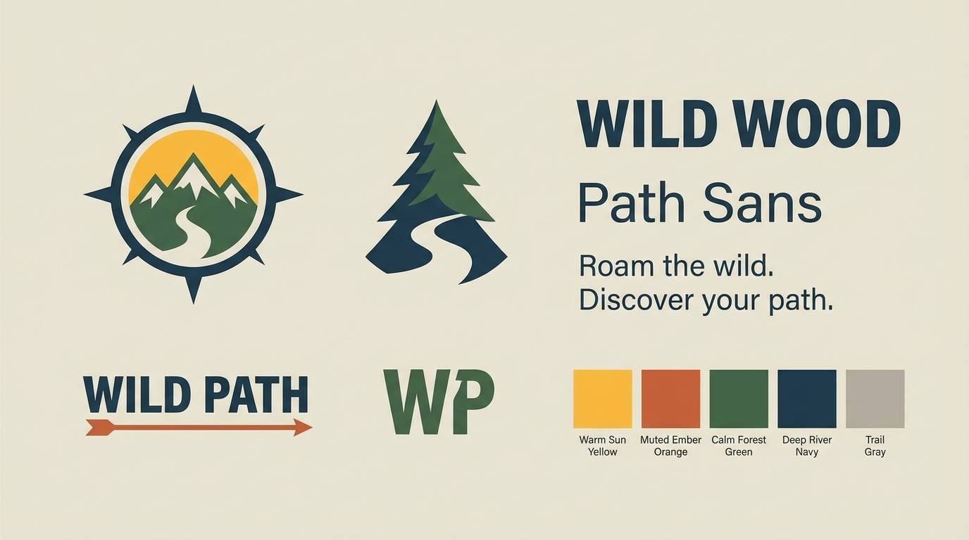
Image example of harvest hike generated using media.io
6) Papaya Park
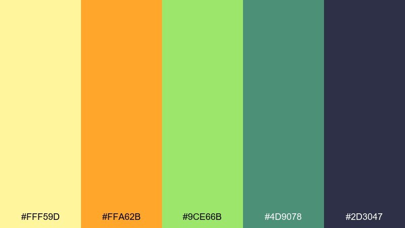
HEX: #FFF59D #FFA62B #9CE66B #4D9078 #2D3047
Mood: kid-friendly, lively, welcoming
Best for: After-school program posters and classroom handouts
Playground energy shines through with cheerful warmth and easy greens. Keep backgrounds light yellow for an inviting base, then use orange for headings and green for section labels. Dark indigo is ideal for text because it stays readable even with bright accents nearby. Usage tip: stick to simple icon shapes so the palette stays the hero, not the clip art.
Image example of papaya park generated using media.io
7) Saffron Fern
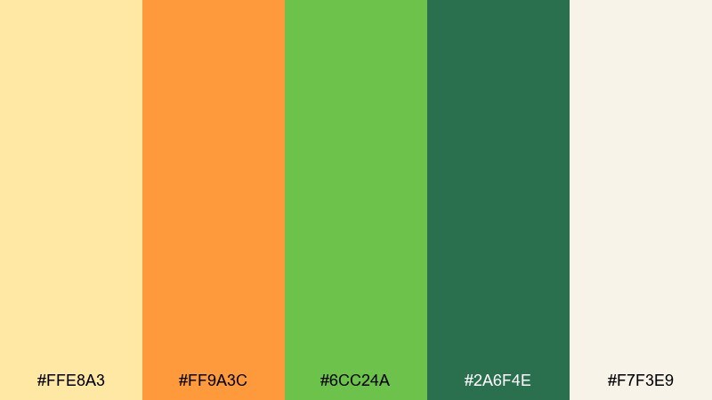
HEX: #FFE8A3 #FF9A3C #6CC24A #2A6F4E #F7F3E9
Mood: editorial, refined, botanical
Best for: Lifestyle magazine features and seasonal lookbooks
Soft saffron and fern greens feel like a curated garden story with warm afternoon light. These yellow orange green color combinations are great for pull quotes, section dividers, and small highlight labels without overwhelming photography. Use the dark green for headings and captions to keep the page grounded. Usage tip: pick one warm accent per spread and repeat it consistently to maintain a premium rhythm.
Image example of saffron fern generated using media.io
8) Tangerine Trail
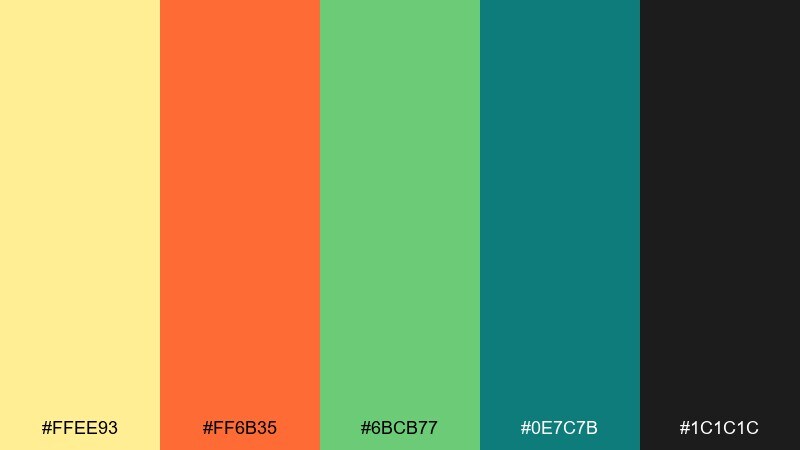
HEX: #FFEE93 #FF6B35 #6BCB77 #0E7C7B #1C1C1C
Mood: bold, sporty, action-driven
Best for: Race event flyers and signup banners
High-energy warmth meets cool green momentum, like a sunrise run through a park. Use the orange for the date and registration button, and keep green for route highlights or category tags. A deep teal works well for secondary blocks and helps separate information areas. Usage tip: boost legibility by placing small text on teal or near-black rather than on the light yellow.
Image example of tangerine trail generated using media.io

9) Lemon Basil Kitchen
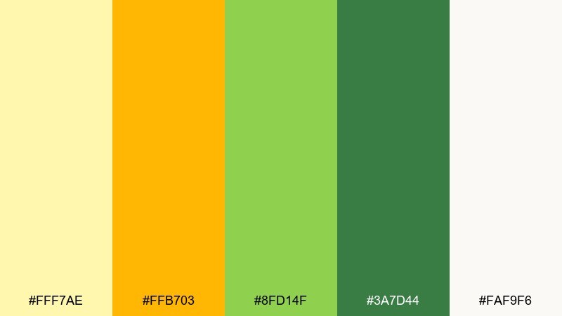
HEX: #FFF7AE #FFB703 #8FD14F #3A7D44 #FAF9F6
Mood: fresh, appetizing, clean
Best for: Restaurant menus and takeaway inserts
Herby greens and lemony light make the layout feel crisp and delicious. Use the warm yellow for section headers and the orange for chef specials or spicy markers. Deep green supports typography and helps the menu feel grounded and natural. Usage tip: keep the background close to off-white so food photos or icons do not clash with the accent colors.
Image example of lemon basil kitchen generated using media.io
10) Apricot Aloe
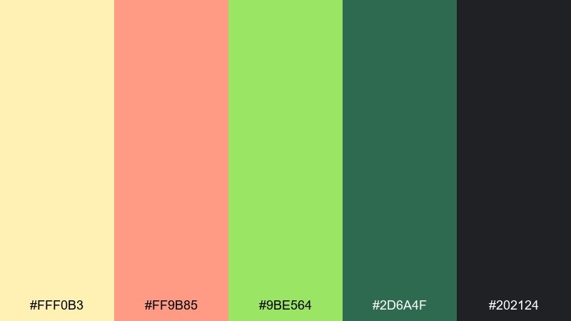
HEX: #FFF0B3 #FF9B85 #9BE564 #2D6A4F #202124
Mood: calming, modern, wellness-first
Best for: Wellness app onboarding and habit tracking UI
Gentle apricot warmth with aloe greens creates a soothing, supportive tone. Use the light yellow for backgrounds, then bring in apricot for progress highlights and friendly prompts. Dark green is perfect for primary navigation and keeps the interface feeling stable. Usage tip: make success states green, but keep warnings in apricot to avoid harsh red in a wellness context.
Image example of apricot aloe generated using media.io
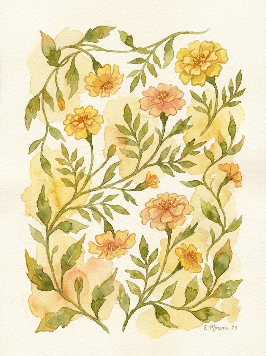
11) Marigold Moss
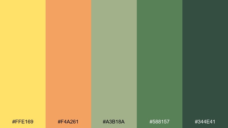
HEX: #FFE169 #F4A261 #A3B18A #588157 #344E41
Mood: earthy, botanical, grounded
Best for: Botanical art prints and journal covers
Marigold warmth and mossy depth feel like pressed leaves in a sunlit sketchbook. Use the soft orange to shade petals or borders, and let the layered greens build a natural hierarchy. The deepest green doubles as a reliable ink color for titles and small details. Usage tip: add subtle paper texture so the earthy tones feel intentional, not flat.
Image example of marigold moss generated using media.io
12) Pineapple Patio
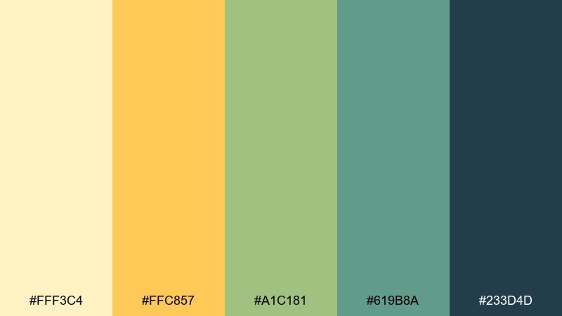
HEX: #FFF3C4 #FFC857 #A1C181 #619B8A #233D4D
Mood: sunny, relaxed, coastal-garden
Best for: Bright interior styling concepts and mood boards
A breezy patio vibe comes through with soft pineapple yellow and leafy greens. Use the warm orange sparingly in cushions, art, or small decor pieces to keep the room feeling open. Teal-green and deep blue work well for cabinets or statement furniture that anchors the space. Usage tip: repeat the orange in two or three small accents rather than one big feature wall.
Image example of pineapple patio generated using media.io

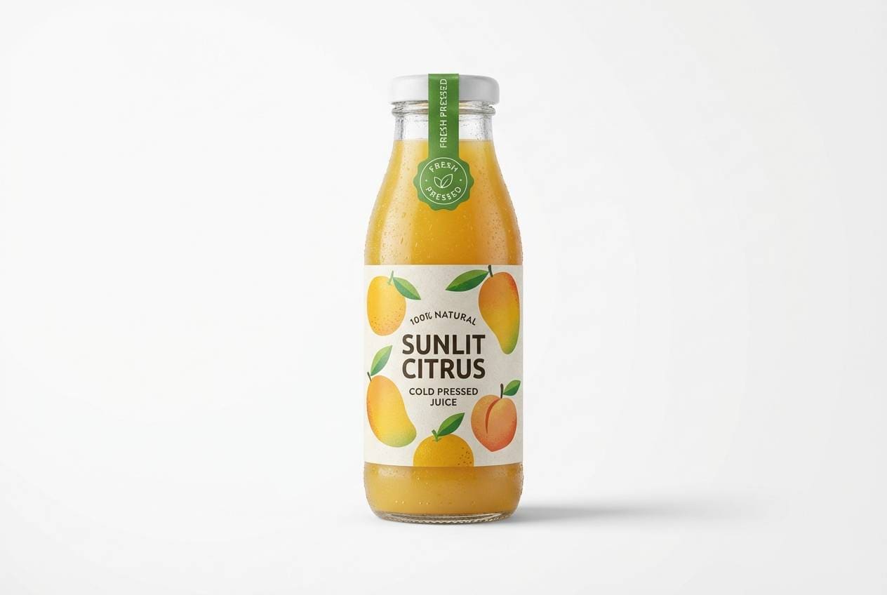
13) Sunrise Orchard
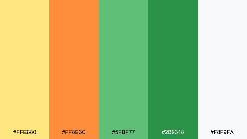
HEX: #FFE680 #FF8E3C #5FBF77 #2B9348 #F8F9FA
Mood: fresh, juicy, market-ready
Best for: Juice bottle labels and product ads
Morning light and ripe fruit tones make this set feel instantly refreshing. Let the pale background keep the label clean, then use orange for flavor cues and green for organic claims or seals. Strong green also helps the design read healthy rather than candy-like. Usage tip: add a small yellow highlight behind key claims to draw the eye without adding more graphics.
Image example of sunrise orchard generated using media.io
14) Citrus Circuit
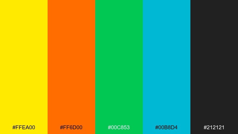
HEX: #FFEA00 #FF6D00 #00C853 #00B8D4 #212121
Mood: techy, electric, confident
Best for: Startup hero sections and marketing UI components
Neon-like warmth and clean greens feel fast, modern, and a little futuristic. Use the bright yellow as a signal color for key stats, with orange reserved for the primary action. Teal brings balance for secondary buttons and links, while charcoal keeps the whole interface readable. Usage tip: put the most saturated colors on dark backgrounds to avoid eye fatigue.
Image example of citrus circuit generated using media.io

15) Lime Ember
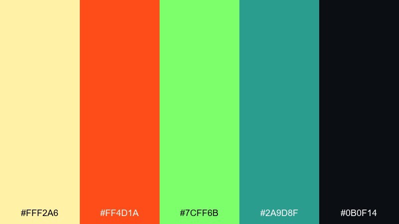
HEX: #FFF2A6 #FF4D1A #7CFF6B #2A9D8F #0B0F14
Mood: edgy, youthful, high-impact
Best for: Gaming stream overlays and alert UI panels
Hot ember orange against neon lime feels intense and playful, like arcade lights in the dark. Keep the near-black as the base so the accents glow rather than clash. Teal can be your neutral bridge for panels, timers, and secondary notifications. Usage tip: limit neon green to small indicators and outlines so it does not overpower faces or gameplay footage.
Image example of lime ember generated using media.io

16) Yolk and Ivy
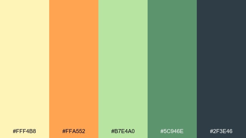
HEX: #FFF4B8 #FFA552 #B7E4A0 #5C946E #2F3E46
Mood: soft, cozy, hand-crafted
Best for: Stationery sets and small business thank-you cards
Creamy yolk tones and ivy greens feel warm, personal, and gently nostalgic. Use the orange for a small stamp mark or icon, and let the greens support borders and headings. The dark slate is perfect for readable copy and keeps the look polished. Usage tip: add a simple ivy line illustration in the light green for subtle texture.
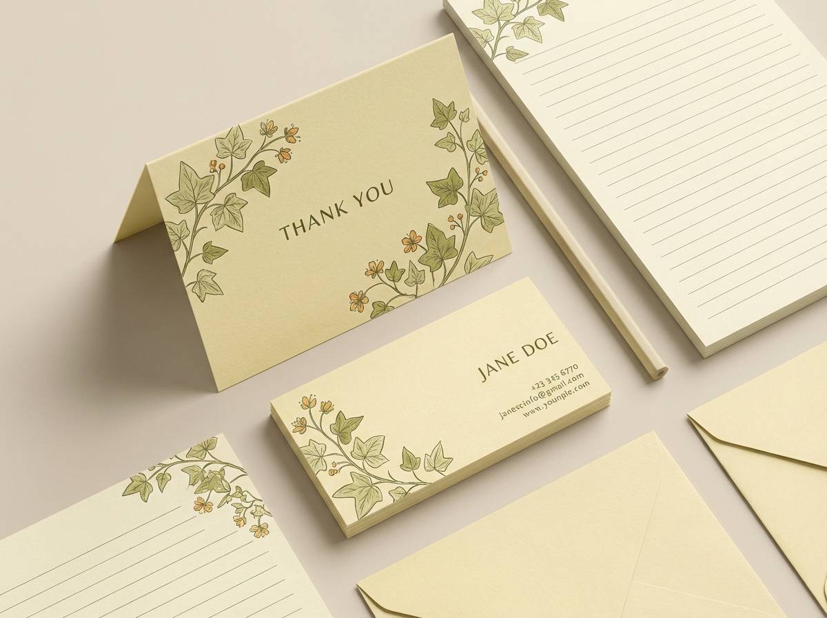
Image example of yolk and ivy generated using media.io
17) Tropic Terrarium
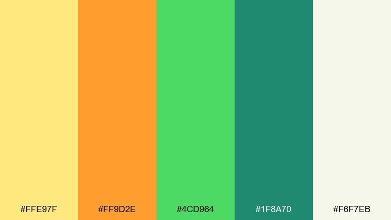
HEX: #FFE97F #FF9D2E #4CD964 #1F8A70 #F6F7EB
Mood: lush, sunny, plant-forward
Best for: Plant shop branding and storefront signage
Tropical warmth and glossy greens evoke a terrarium catching sunlight on a windowsill. Use the light yellow as a friendly background for labels and signage, then add orange for sale tags or seasonal promos. Deep teal-green gives your logo and wayfinding a strong anchor. Usage tip: choose matte finishes for signage so the bright tones do not glare outdoors.
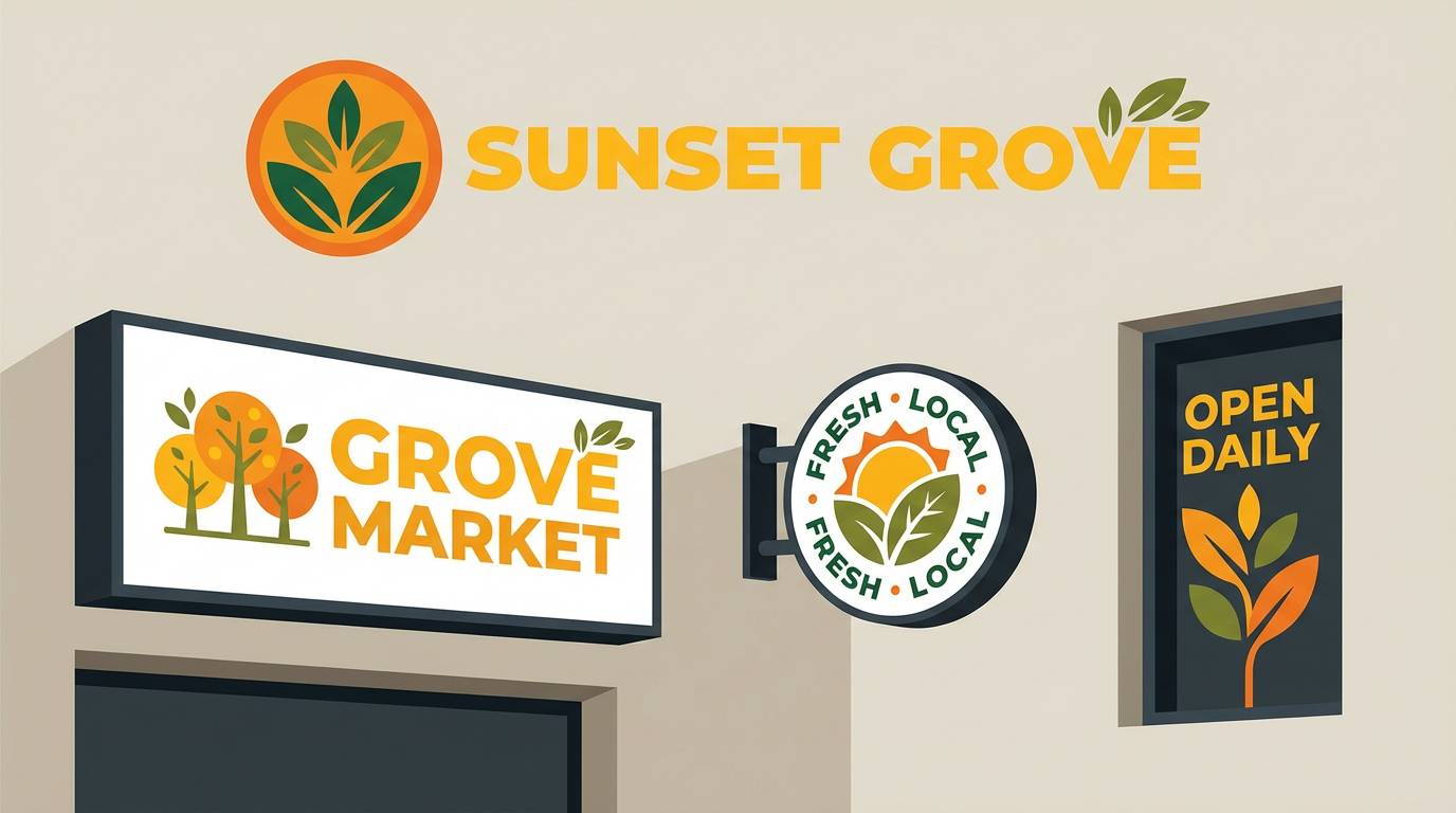
Image example of tropic terrarium generated using media.io
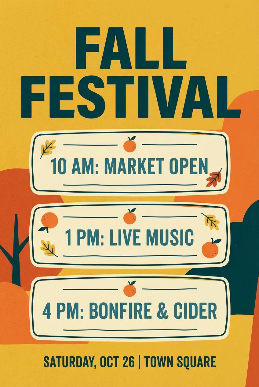
18) Autumn Citrus Field
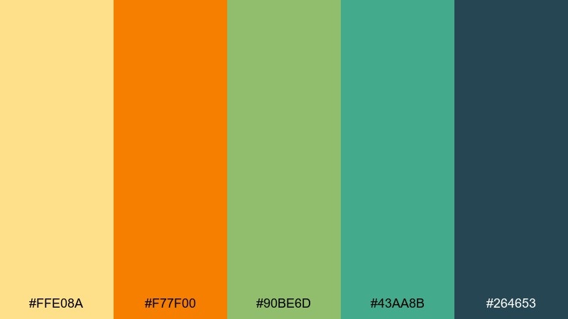
HEX: #FFE08A #F77F00 #90BE6D #43AA8B #264653
Mood: seasonal, warm, outdoorsy
Best for: Fall festival posters and event banners
Golden light and late-season greens make the palette feel festive without going full pumpkin. Use orange for the headline and ticket callouts, while greens support schedules, maps, or vendor lists. The deep blue-green keeps the layout structured and readable from a distance. Usage tip: set a solid dark footer bar for sponsors so the busy content stays organized.
Image example of autumn citrus field generated using media.io
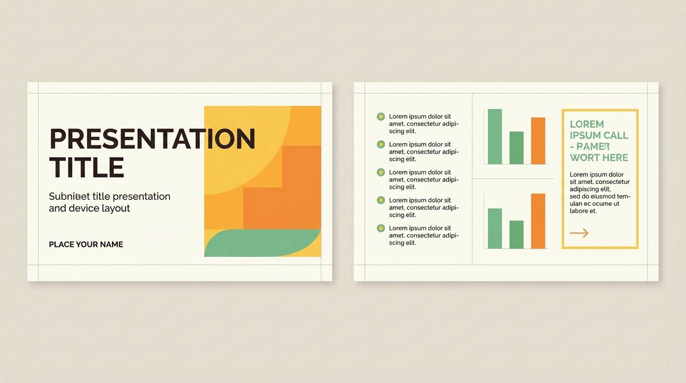
19) Zestful Classroom
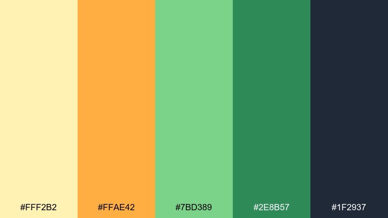
HEX: #FFF2B2 #FFAE42 #7BD389 #2E8B57 #1F2937
Mood: clear, friendly, attention-ready
Best for: Slide deck templates and educational worksheets
Bright, zesty highlights help important notes stand out while the greens keep the page calm. Use yellow for callout boxes, orange for section titles, and green for correct-answer cues or progress indicators. The deep gray is a dependable text color for long reading sections. Usage tip: keep charts mostly neutral and use the warm tones only for the key series you want students to remember.
Image example of zestful classroom generated using media.io
20) Lantern Garden
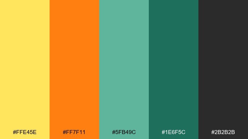
HEX: #FFE45E #FF7F11 #5FB49C #1E6F5C #2B2B2B
Mood: festive, elegant, evening-warm
Best for: Cultural event posters and community flyers
Glowing lantern warmth paired with deep garden greens feels welcoming and celebratory. Use the yellow as a luminous accent for icons or dividers, and let orange lead the headline and key date. Dark green and charcoal keep the details readable even when the design gets bold. Usage tip: place the bright elements in a consistent top-to-bottom line so the poster reads fast on a notice board.
Image example of lantern garden generated using media.io

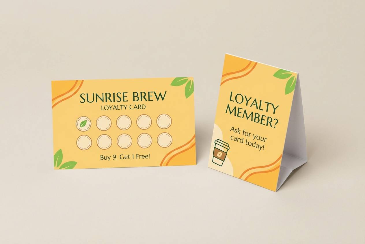
21) Candlelit Citron
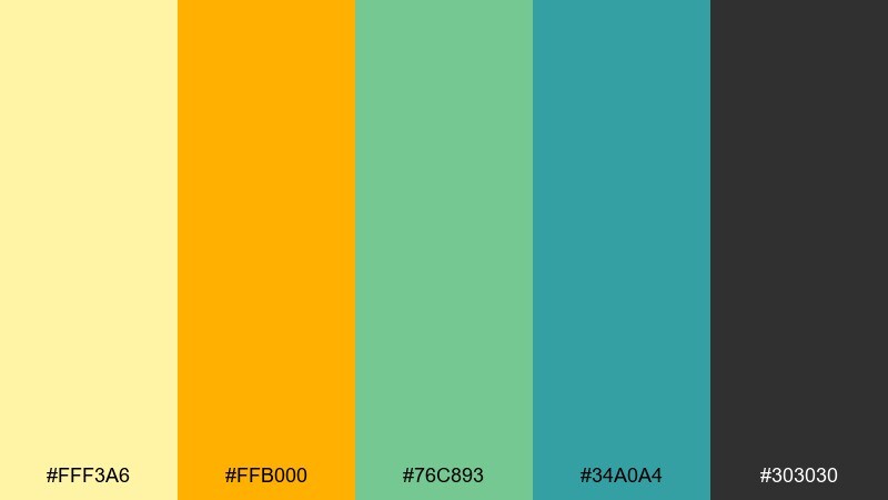
HEX: #FFF3A6 #FFB000 #76C893 #34A0A4 #303030
Mood: warm, inviting, softly modern
Best for: Cafe loyalty cards and countertop signage
Candlelit warmth with fresh greens feels cozy, like a welcoming corner table. Use the yellow for background panels and stamps, while orange draws attention to rewards and limited offers. Greens keep the brand feeling fresh and help balance sweet tones. Usage tip: print the dark text slightly heavier than usual to maintain clarity on small cards.
Image example of candlelit citron generated using media.io
22) Bright Orchard UI
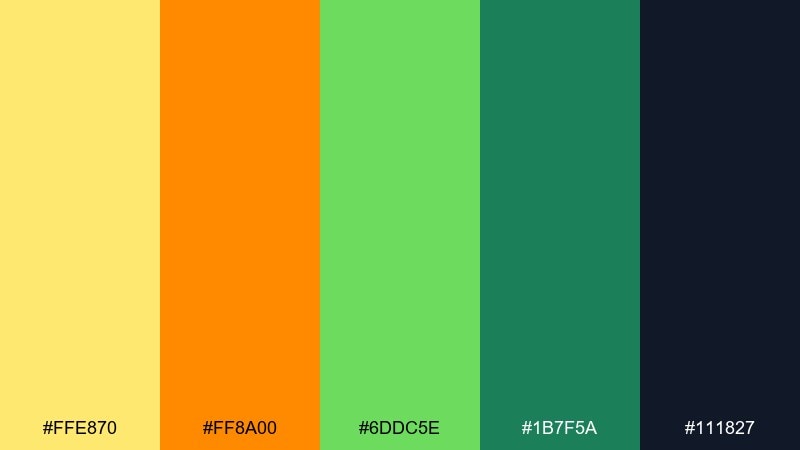
HEX: #FFE870 #FF8A00 #6DDC5E #1B7F5A #111827
Mood: confident, clean, conversion-focused
Best for: Checkout flows and pricing pages
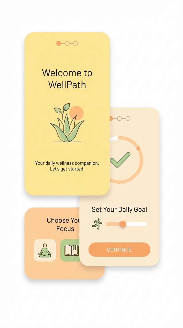
Crisp orchard brightness makes CTAs feel positive and decisive, without leaning aggressive. The yellow orange green color palette is a strong fit for pricing tables where you want one plan to stand out and trust cues to feel clear. Use orange for the primary plan button, green for security and success messaging, and keep the dark navy for copy. Usage tip: add subtle green check icons in lists, but keep the text navy to avoid a busy look.
Image example of bright orchard ui generated using media.io

What Colors Go Well with Yellow Orange Green?
Dark neutrals like charcoal, ink navy, and deep forest are the easiest match because they stabilize the brightness and improve readability. If your palette already has warm highlights, a near-black body text color will keep layouts clean and professional.
For softer looks, add warm off-whites (cream, eggshell) and desaturated greens (sage, moss) to reduce intensity. For modern contrast, a small amount of teal or cool blue can separate yellow and orange so they don’t visually “fight” on busy pages.
Metallics also pair well: muted golds enhance the sunny warmth, while brushed silver can make the scheme feel more tech-forward when used sparingly in UI icons or borders.
How to Use a Yellow Orange Green Color Palette in Real Designs
Start with a neutral foundation (white/cream or charcoal) and treat yellow/orange as accents, not background floods. This keeps the palette energetic while preventing eye fatigue—especially in dashboards, pricing pages, and content-heavy screens.
Assign roles consistently: yellow for highlights and “attention,” orange for primary CTAs and urgency, and green for positive states (success, availability, verified). Consistent roles make your UI feel more intuitive and reduce cognitive load.
In print, test yellows early—light yellows can lose contrast on matte stock. If needed, add a thin dark stroke, use a deeper shade for text, or move small copy onto a darker green/charcoal block.
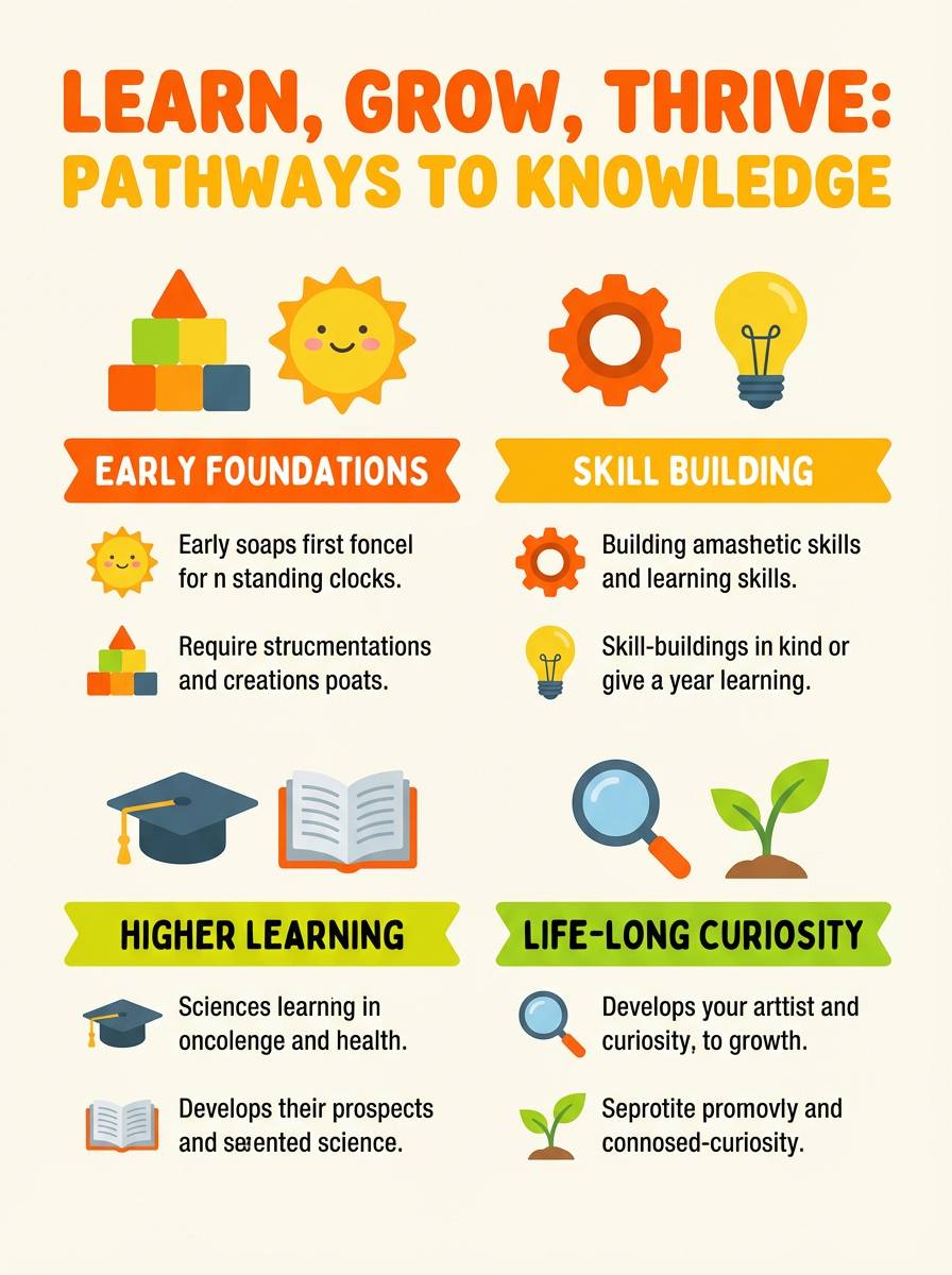
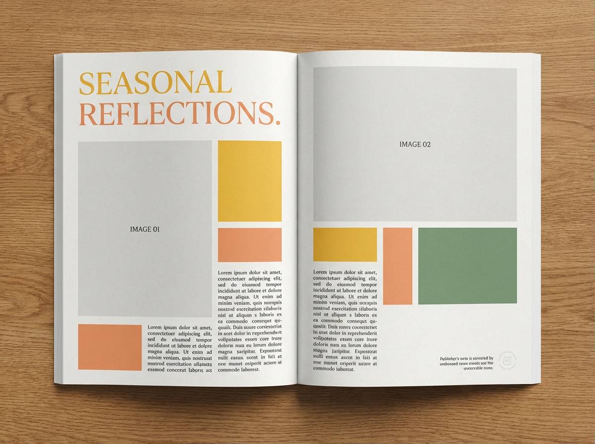
Create Yellow Orange Green Palette Visuals with AI
If you want matching imagery (posters, UI mockups, packaging scenes, mood boards), generate visuals directly from prompts that reference your yellow orange green tones. This helps keep brand color intent consistent across campaigns and platforms.
To get cleaner results, describe style first (2D UI, studio product shot, flat vector poster), then specify where each color appears (CTA orange, highlight yellow, success green), and finish with the aspect ratio already included in the prompt.
Once you like an image, reuse the same prompt structure across variations—swap the subject (menu, flyer, app screen) while keeping the palette cues consistent.
Yellow Orange Green Color Palette FAQs
-
What does a yellow orange green color palette communicate?
It typically communicates warmth, energy, and freshness—yellow/orange bring optimism and action, while green signals balance, growth, and “healthy” vibes. -
How do I keep yellow and orange from overpowering a design?
Use them as accents (highlights + CTAs) and anchor the layout with neutrals like white, cream, charcoal, or deep navy. Limiting warm tones to small UI areas often improves clarity. -
What’s the best text color for yellow orange green backgrounds?
Charcoal, near-black, deep navy, or very dark green usually provide the most reliable readability, especially on light yellow sections. -
Is yellow orange green suitable for professional branding?
Yes—choose slightly muted or earthy versions and pair them with a strong dark neutral. This keeps the palette optimistic while still feeling premium and credible. -
Which industries work best with yellow, orange, and green?
Food and beverage, wellness, eco brands, education, event marketing, and apps with “positive outcome” messaging (success/verified states) all benefit from this color trio. -
How can I use green correctly in UI with this palette?
Reserve green for success states, confirmations, and trust cues (secure, verified). Keep yellow/orange for attention and actions, so feedback states remain clear and consistent. -
Can I generate on-brand images for these palettes using AI?
Yes—use a prompt that specifies the scene style (UI mockup, poster, packaging shot) and explicitly mentions yellow/orange accents with fresh greens, then iterate while keeping the same color roles.
Next: Charcoal Color Palette


