

Yellow beige is the kind of warm neutral that instantly makes designs feel inviting, premium, and easy on the eyes. It’s soft enough for backgrounds, yet rich enough to carry brand personality when paired with darker anchors.
Below are 20 yellow beige color palette ideas with HEX codes, plus practical pairing tips for UI, interiors, print, and branding—along with AI prompts you can use to generate matching visuals.
In this article
- Why Yellow Beige Palettes Work So Well
-
- saffron sand
- honey linen
- sunlit stucco
- buttercream minimal
- desert oat
- wheatfield calm
- golden parchment
- apricot biscuit
- pale marigold stone
- straw hat neutrals
- vanilla clay
- warm canvas
- soft ghee glow
- almond sunray
- antique lace gold
- polished beige pop
- coastal dune
- quiet chamomile
- retro mustard beige
- luminous wheat
- What Colors Go Well with Yellow Beige?
- How to Use a Yellow Beige Color Palette in Real Designs
- Create Yellow Beige Palette Visuals with AI
Why Yellow Beige Palettes Work So Well
Yellow beige sits in a “warm neutral” sweet spot: it reads brighter and friendlier than gray-beige, but it’s less loud than true yellow. That makes it a reliable base color for layouts that need calm, warmth, and clarity.
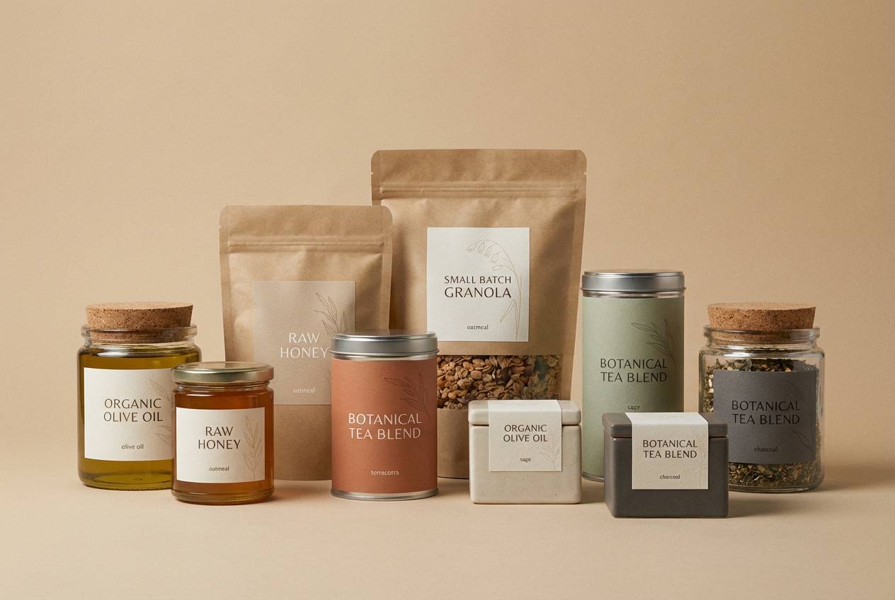
Because yellow beige has natural associations (sand, wheat, linen, parchment), it instantly communicates comfort and authenticity. It’s especially effective for lifestyle brands, wellness UI, food packaging, and editorial design where you want a human, tactile feel.
It also pairs easily: you can push it modern with charcoal or slate, botanical with muted greens, coastal with blue-grays, or cozy with cocoa browns and terracotta accents.
20+ Yellow Beige Color Palette Ideas (with HEX Codes)
1) Saffron Sand
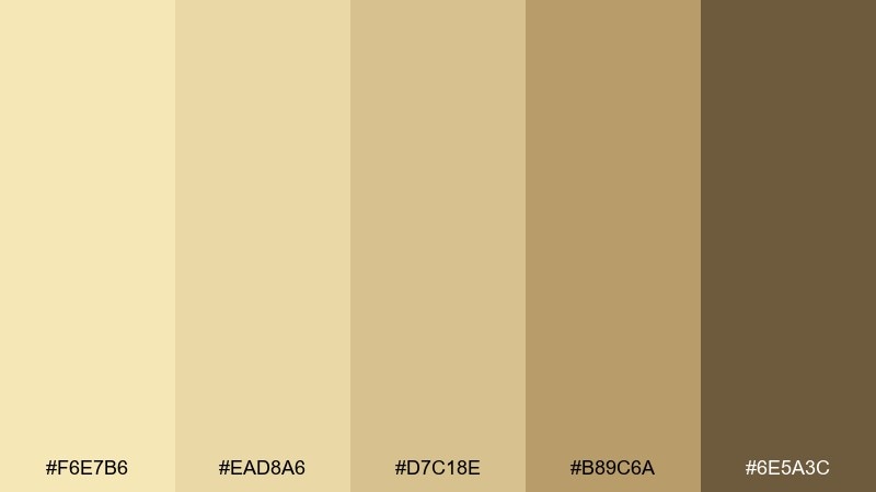
HEX: #F6E7B6 #EAD8A6 #D7C18E #B89C6A #6E5A3C
Mood: sun-warmed, grounded, artisanal
Best for: craft packaging and boutique food branding
Sun-warmed and grounded, these tones feel like baked sand, saffron threads, and worn leather. They work beautifully on labels, coffee bags, and handmade goods where you want a premium but approachable vibe. Pair with matte black type and a single deep brown accent for contrast. Usage tip: keep backgrounds light and reserve the darker shade for seals, stamps, or key callouts.
Image example of saffron sand generated using media.io
Media.io is an online AI studio for creating and editing video, image, and audio in your browser.

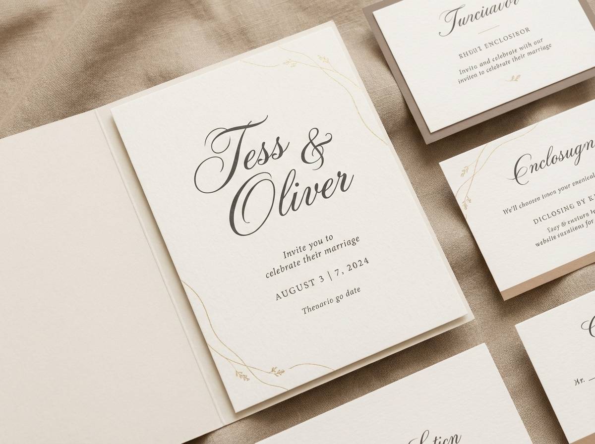
2) Honey Linen
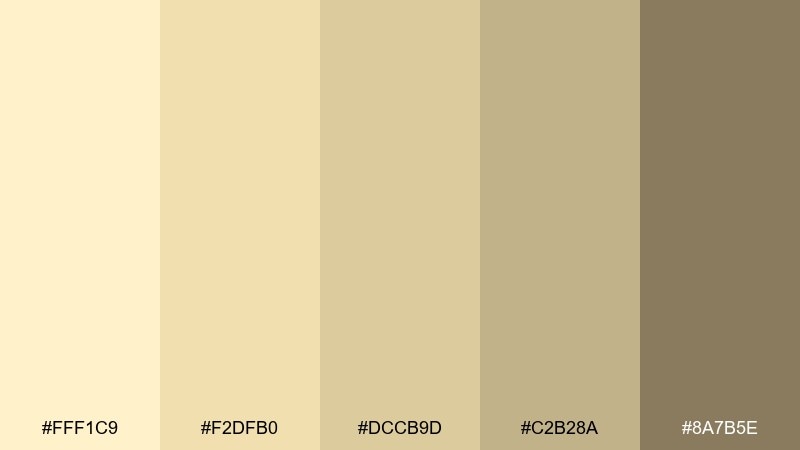
HEX: #FFF1C9 #F2DFB0 #DCCB9D #C2B28A #8A7B5E
Mood: airy, romantic, softly polished
Best for: wedding invitations and elegant stationery
Airy and romantic, the mix suggests honeyed paper, linen fabric, and candlelit warmth. It shines on invitations, RSVP cards, and menus where readability matters but the mood should stay soft. Pair with muted sage or a thin metallic gold line for subtle structure. Usage tip: use the lightest cream as the base and keep body text in the deeper taupe for crisp contrast.
Image example of honey linen generated using media.io
3) Sunlit Stucco
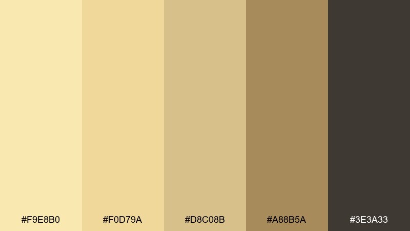
HEX: #F9E8B0 #F0D79A #D8C08B #A88B5A #3E3A33
Mood: architectural, sun-baked, modern rustic
Best for: editorial layouts and lifestyle lookbooks
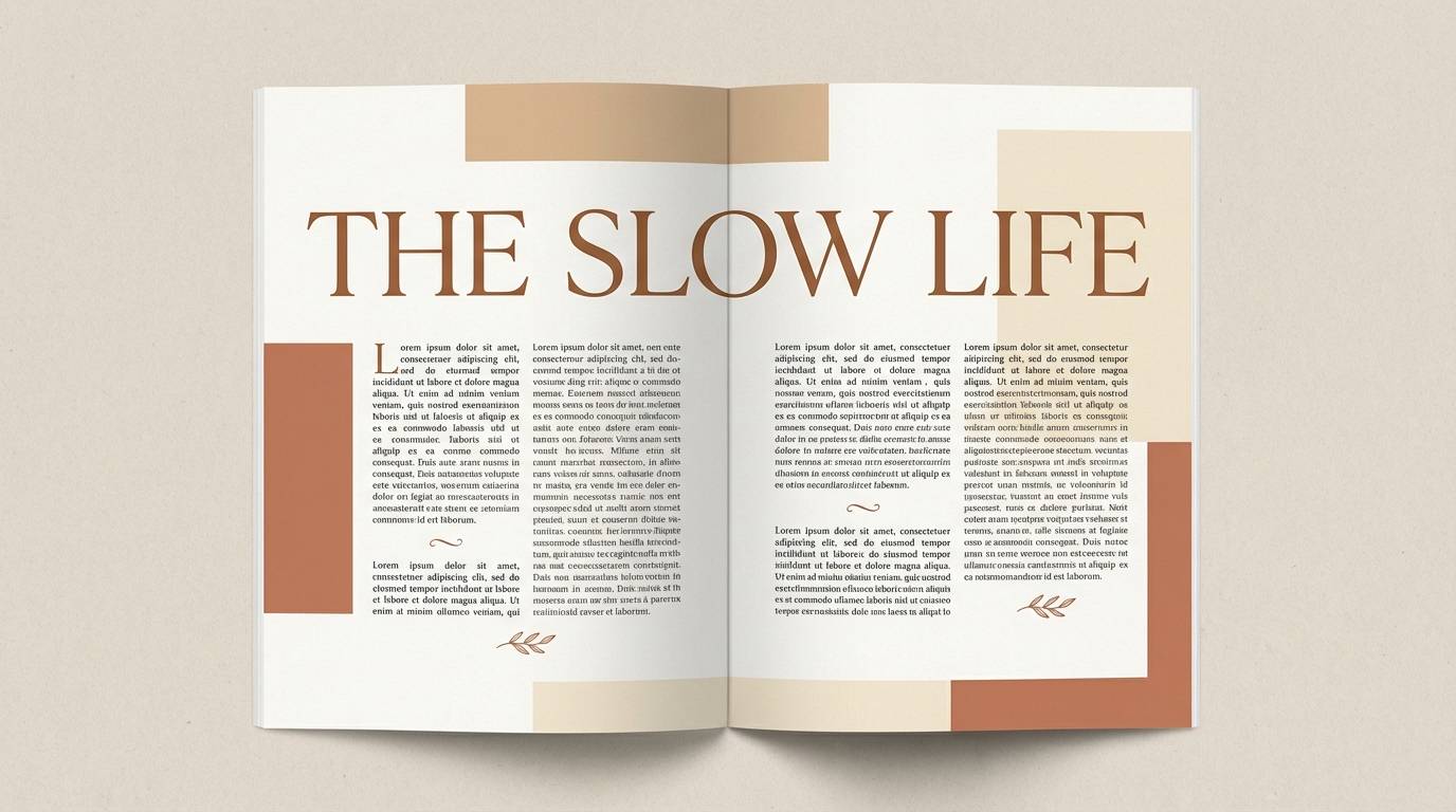
Architectural and sun-baked, it evokes stucco walls, late-afternoon light, and shadowed doorways. For a yellow beige color palette that still feels modern, lean on the charcoal as a strong anchor for headlines and captions. It suits magazine spreads, lookbooks, and long-form reads where hierarchy needs to be clear. Usage tip: keep photo borders and rules in the mid beige so pages feel cohesive without looking heavy.
Image example of sunlit stucco generated using media.io
4) Buttercream Minimal
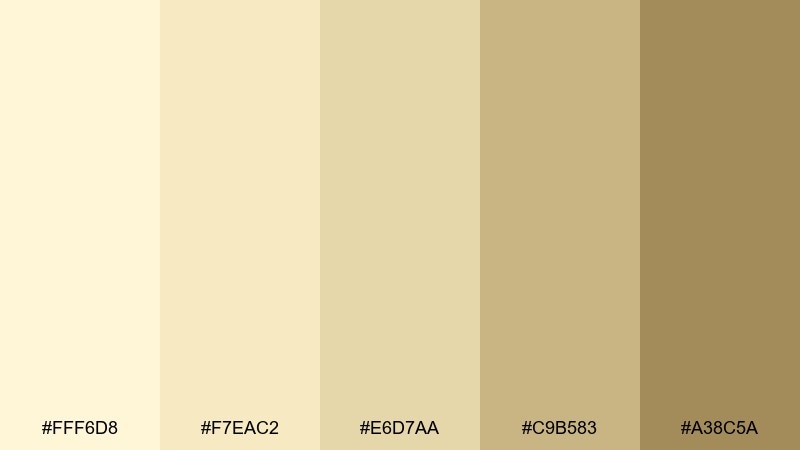
HEX: #FFF6D8 #F7EAC2 #E6D7AA #C9B583 #A38C5A
Mood: clean, soft, understated
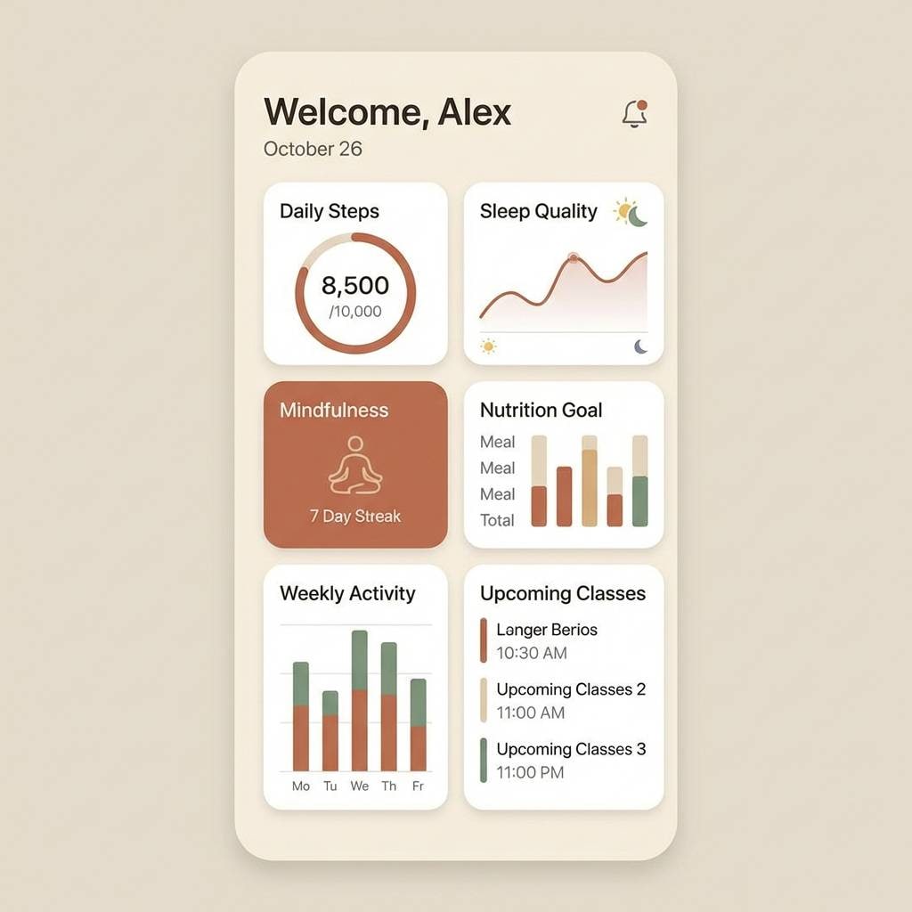
Best for: 2d ui for wellness apps and landing pages
Clean and soft, these shades feel like buttercream, warm paper, and quiet morning light. They are ideal for wellness UI, where gentle surfaces and low-stress contrast improve scanning. Pair with a cool gray icon set or a muted teal accent for buttons. Usage tip: reserve the darker beige for active states and navigation to maintain a calm visual rhythm.
Image example of buttercream minimal generated using media.io
5) Desert Oat
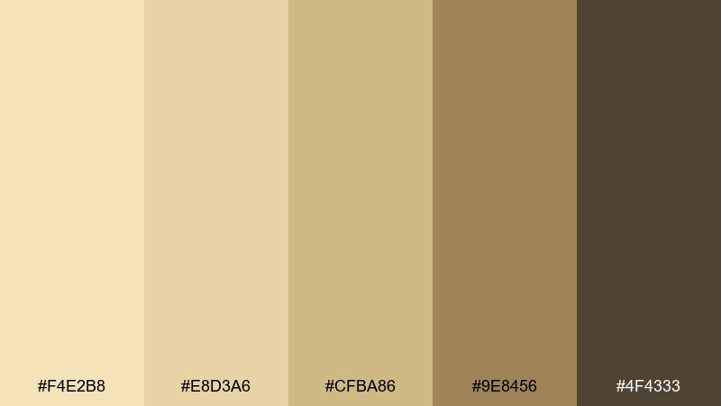
HEX: #F4E2B8 #E8D3A6 #CFBA86 #9E8456 #4F4333
Mood: earthy, cozy, natural
Best for: home decor styling and rustic interiors
Earthy and cozy, the tones bring to mind oat milk, dried grass, and sunlit clay. Use them for living rooms, bedding palettes, and decor mood boards that need warmth without going yellow. Pair with olive green plants and textured woods for an organic feel. Usage tip: repeat the mid beige across textiles to make the space look intentional rather than matchy.
Image example of desert oat generated using media.io

6) Wheatfield Calm
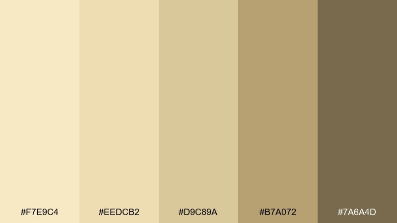
HEX: #F7E9C4 #EEDCB2 #D9C89A #B7A072 #7A6A4D
Mood: pastoral, relaxed, inviting
Best for: farm-to-table menus and cafe signage
Pastoral and relaxed, these colors feel like wheat stalks and sunlit fields at golden hour. They work well on menus and signage where you want warmth, legibility, and a handcrafted tone. Pair with a dark espresso ink for text and a small leaf-green accent for highlights. Usage tip: keep the background in the lightest shade and use the deeper beige for section headers to guide the eye.
Image example of wheatfield calm generated using media.io
7) Golden Parchment
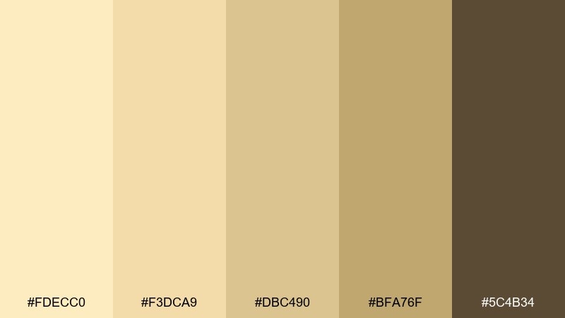
HEX: #FDECC0 #F3DCA9 #DBC490 #BFA76F #5C4B34
Mood: vintage, literary, refined
Best for: book covers and heritage branding
Vintage and literary, the mix reads like aged parchment, gilded edges, and sepia ink. It is a strong fit for book covers, museum collateral, and heritage brands that need a timeless surface. Pair with deep brown typography and subtle texture overlays for authenticity. Usage tip: add a thin border in the second-darkest shade to frame layouts without stealing attention.
Image example of golden parchment generated using media.io
8) Apricot Biscuit
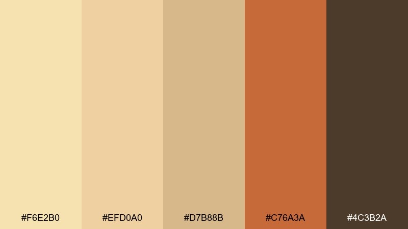
HEX: #F6E2B0 #EFD0A0 #D7B88B #C76A3A #4C3B2A
Mood: sweet, cozy, appetizing
Best for: cafe branding boards and bakery promos
Sweet and cozy, it suggests apricot jam, toasted biscuit edges, and warm café lighting. These yellow beige color combinations shine when you need a friendly neutral base with one punchy accent for energy. Pair the terracotta with cream backgrounds and use the deep cocoa for logos and small type. Usage tip: apply the accent sparingly on price tags or key CTAs so the design stays delicious, not loud.
Image example of apricot biscuit generated using media.io
9) Pale Marigold Stone
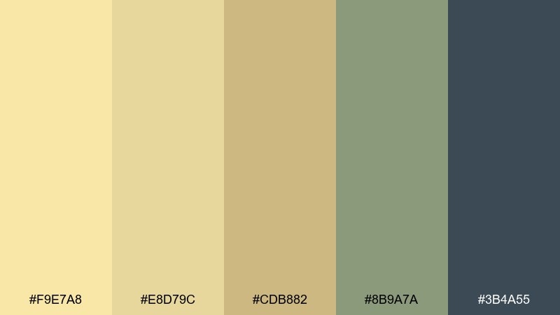
HEX: #F9E7A8 #E8D79C #CDB882 #8B9A7A #3B4A55
Mood: fresh, outdoorsy, balanced
Best for: outdoor apparel branding and hangtags
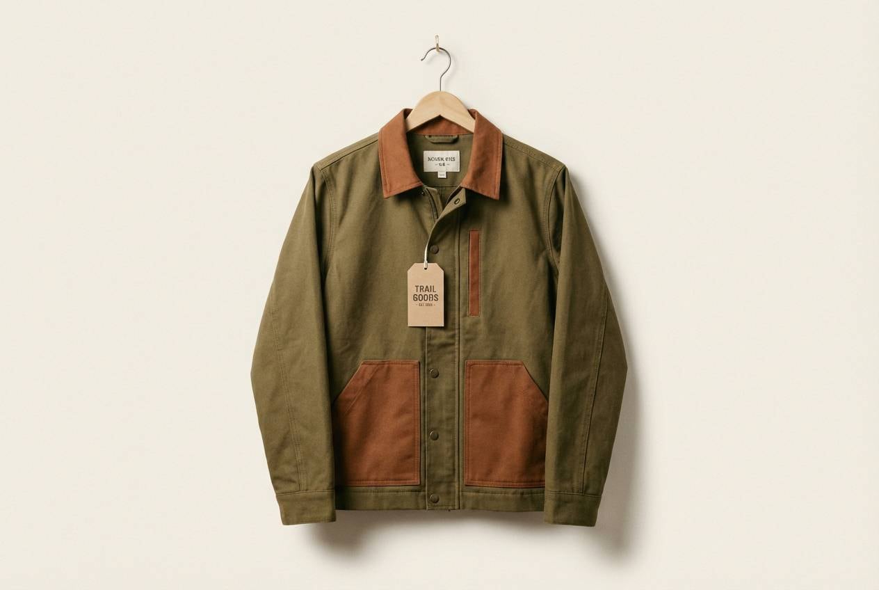
Fresh and outdoorsy, the tones feel like marigold petals against river stone and cool shade. They are great for apparel branding that wants warmth without losing a technical, modern edge. Pair with clean sans-serif type and plenty of whitespace to keep it crisp. Usage tip: use the slate blue-gray for sizing, care icons, and barcode elements to boost readability.
Image example of pale marigold stone generated using media.io
10) Straw Hat Neutrals

HEX: #F8E6B4 #EAD29A #D2BD86 #B39C63 #2F2A24
Mood: classic, sunny, confident
Best for: event posters and seasonal announcements
Classic and sunny, it evokes straw hats, sun-bleached boards, and bold ink on warm paper. It works well for posters where you need cheerful warmth but still want strong type contrast. Pair with the near-black for headlines and keep supporting copy in mid beiges for a layered look. Usage tip: add a subtle grain texture to avoid flat color fields on large formats.
Image example of straw hat neutrals generated using media.io

11) Vanilla Clay
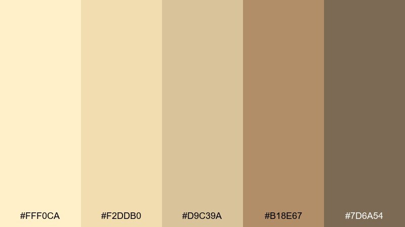
HEX: #FFF0CA #F2DDB0 #D9C39A #B18E67 #7D6A54
Mood: soft, creamy, spa-like
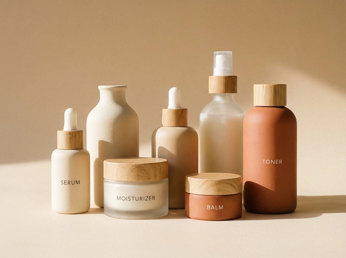
Best for: skincare packaging and product labels
Soft and spa-like, these colors feel like vanilla cream and smooth clay jars on a warm counter. They suit skincare and beauty packaging where you want gentle luxury and calm trust. Pair with a muted blush accent or minimal line art to add personality without clutter. Usage tip: print the darkest shade as small text only, and keep your main surfaces in the light creams for a clean shelf look.
Image example of vanilla clay generated using media.io
12) Warm Canvas
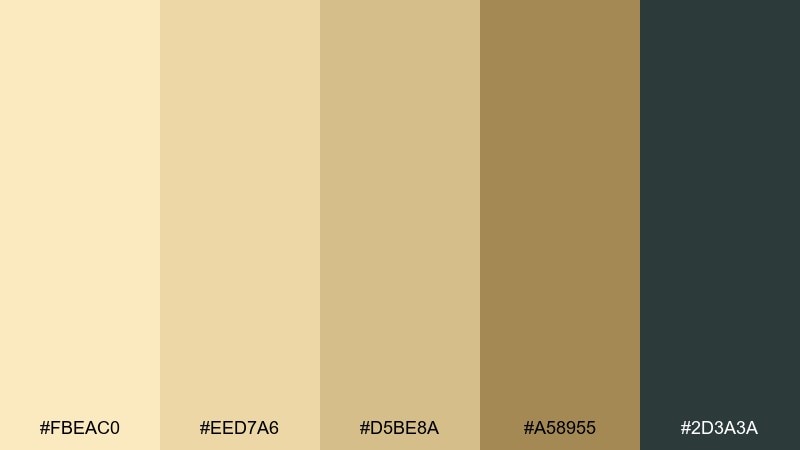
HEX: #FBEAC0 #EED7A6 #D5BE8A #A58955 #2D3A3A
Mood: modern, grounded, quietly bold
Best for: app ui and brand systems
Modern and grounded, it feels like stretched canvas with inked details and a hint of shadow. The yellow beige color scheme holds space for content, while the deep teal-gray adds a smart, contemporary edge. Use it for SaaS dashboards, portfolio sites, and brand guidelines where you need both warmth and structure. Usage tip: keep charts in the mid tones and use the darkest shade only for active controls and key metrics.
Image example of warm canvas generated using media.io
13) Soft Ghee Glow
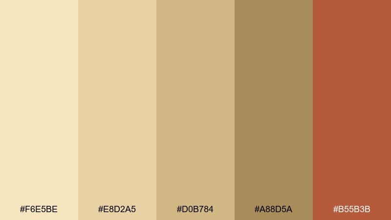
HEX: #F6E5BE #E8D2A5 #D0B784 #A88D5A #B55B3B
Mood: warm, culinary, inviting
Best for: recipe cards and food blog graphics
Warm and culinary, the palette reads like ghee gloss, toasted spices, and a terracotta pinch bowl. It is ideal for recipe cards, food blog headers, and printable kitchen guides. Pair with off-white space and a single spice accent for headings to keep things legible. Usage tip: use the terracotta shade for icons and section dividers to create a consistent rhythm across pages.
Image example of soft ghee glow generated using media.io
14) Almond Sunray
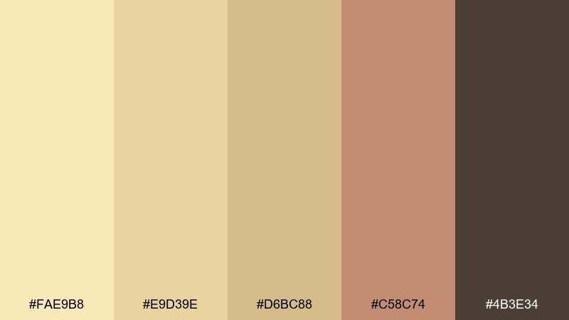
HEX: #FAE9B8 #E9D39E #D6BC88 #C58C74 #4B3E34
Mood: softly nostalgic, warm, friendly
Best for: boutique fashion promos and lookbook covers
Softly nostalgic, these tones hint at almond pastries, sun-faded fabric, and warm brick. They make a great base for fashion promos when you want warmth without overpowering photography. Pair with cocoa brown type and a muted rose accent for a gentle, editorial feel. Usage tip: keep the rose tone for small badges like new collection or limited drop.
Image example of almond sunray generated using media.io
15) Antique Lace Gold
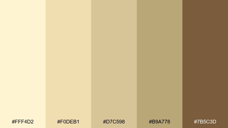
HEX: #FFF4D2 #F0DEB1 #D7C598 #B9A778 #7B5C3D
Mood: delicate, classic, elevated
Best for: bridal boutique branding and gift cards
Delicate and classic, it recalls antique lace, warm vellum, and brushed gold jewelry. It suits bridal boutiques, gift cards, and premium service brands that need a soft first impression. Pair with thin serif typography and restrained linework for elegance. Usage tip: let the mid gold-beige handle borders and details while the cream stays dominant.
Image example of antique lace gold generated using media.io
16) Polished Beige Pop
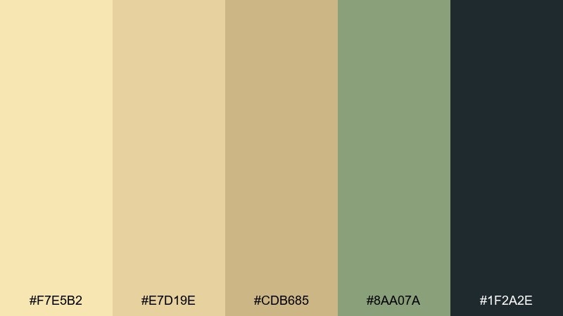
HEX: #F7E5B2 #E7D19E #CDB685 #8AA07A #1F2A2E
Mood: crisp, contemporary, confident
Best for: presentation templates and pitch decks
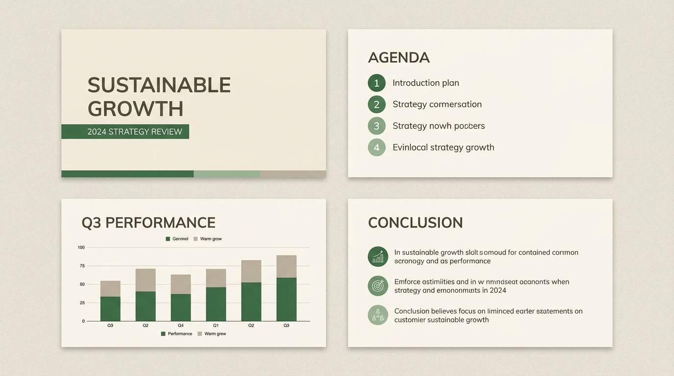
Crisp and contemporary, the tones feel like polished paper with a cool green note and inky structure. These yellow beige color combinations are especially useful in decks, where warmth can make data feel more approachable. Pair with bold typography and simple charts so the palette supports the story rather than competing with it. Usage tip: use the near-black for titles and the green for highlights like growth or positive metrics.
Image example of polished beige pop generated using media.io
17) Coastal Dune
HEX: #F3E0B6 #E6D0A3 #CDB784 #9C8A63 #3D5A6C
Mood: breezy, coastal, calm
Best for: travel blog headers and web hero sections
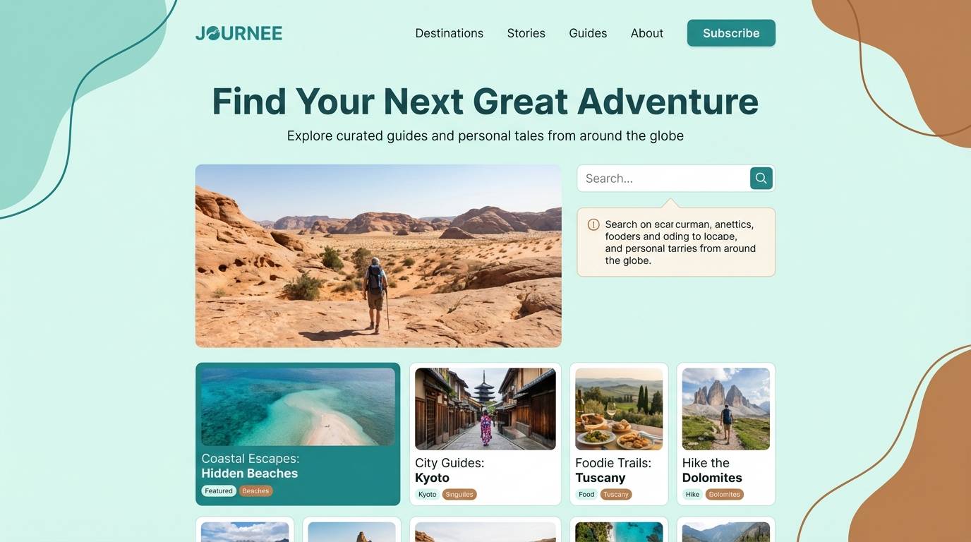
Breezy and coastal, it suggests dunes, driftwood, and a cool horizon line. Use it for travel sites and blog headers where you want warmth plus a hint of ocean air. Pair with airy photography and a simple navy-blue link style for clarity. Usage tip: keep the blue-gray for buttons and navigation so interactive elements stand out from sandy backgrounds.
Image example of coastal dune generated using media.io
18) Quiet Chamomile
HEX: #FCEFC6 #F1DEAE #D6C18B #A2A77B #6B5E45
Mood: gentle, botanical, soothing
Best for: watercolor floral prints and spring illustrations
Gentle and soothing, these shades feel like chamomile petals, soft leaves, and calm tea steam. They are perfect for botanical prints, nursery art, and spring-themed illustration work. Pair with light paper textures and fine line detailing for a handcrafted look. Usage tip: keep greens desaturated and let the creams do most of the heavy lifting for a relaxed composition.
Image example of quiet chamomile generated using media.io
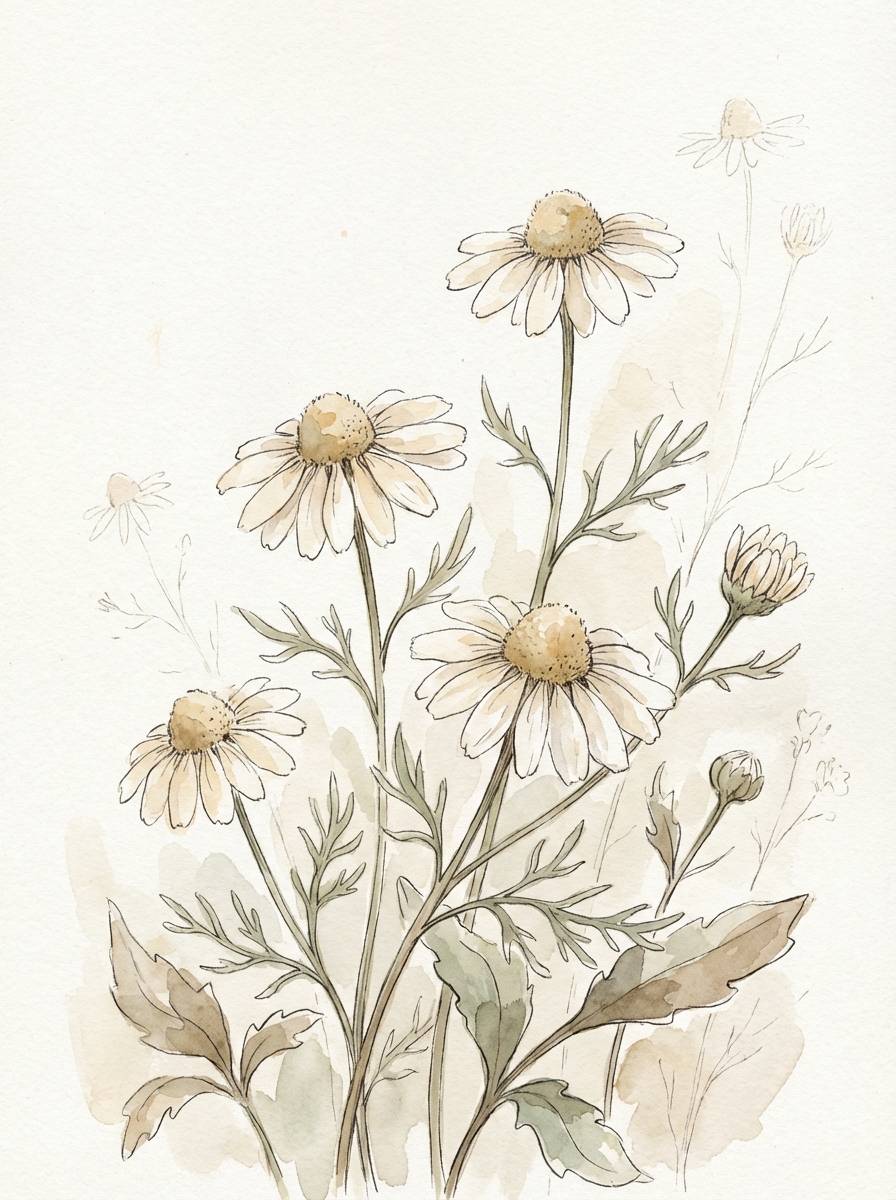
19) Retro Mustard Beige
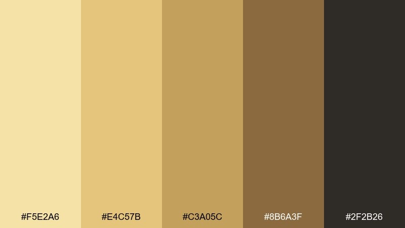
HEX: #F5E2A6 #E4C57B #C3A05C #8B6A3F #2F2B26
Mood: retro, bold, cozy
Best for: mid-century interiors and vintage-inspired branding
Retro and bold, it brings mustard upholstery, teak wood, and smoky shadows to mind. A yellow beige color palette like this looks great in mid-century spaces, especially when paired with clean geometry and warm woods. Add small hits of dusty teal or burnt orange for a period-correct accent. Usage tip: use the deepest tone for frames and hardware so the lighter colors feel brighter by comparison.
Image example of retro mustard beige generated using media.io
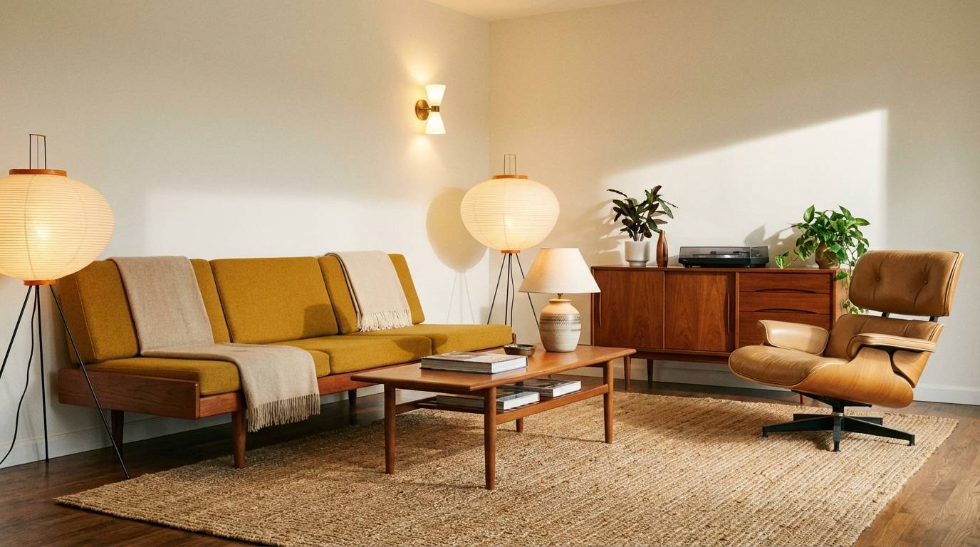
20) Luminous Wheat
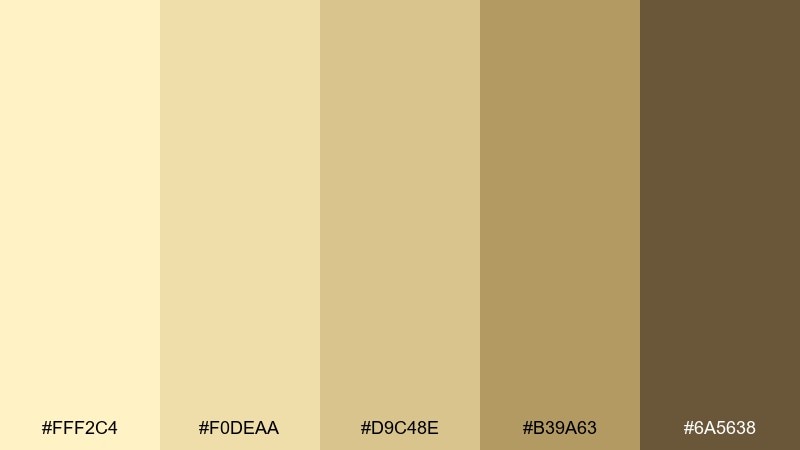
HEX: #FFF2C4 #F0DEAA #D9C48E #B39A63 #6A5638
Mood: bright, welcoming, polished
Best for: ecommerce product ads and hero imagery
Bright and welcoming, it feels like wheat fields under clear light with a polished, premium finish. Use it for ecommerce hero images where you want warmth that still reads clean on white. Pair with minimal props and a single dark accent for headlines or price. Usage tip: keep shadows soft and slightly warm so the product looks cohesive against these neutrals.
Image example of luminous wheat generated using media.io
What Colors Go Well with Yellow Beige?
Yellow beige pairs naturally with deep neutrals like cocoa brown, espresso, charcoal, and near-black—these anchors keep typography readable and make beige backgrounds look intentional rather than “washed out.”
For fresher contrast, try desaturated greens (sage, olive, eucalyptus) or blue-grays (slate, dusty navy). These cooler accents balance the warmth and help interactive UI elements stand out.
If you want more energy, add a single warm accent like terracotta, brick, or muted coral. Keep it sparse so the palette stays elegant and neutral-first.
How to Use a Yellow Beige Color Palette in Real Designs
Start by assigning roles: use the lightest cream as your base/background, mid beiges for surfaces (cards, sections, panels), and the darkest shade for text, icons, and key borders. This simple hierarchy prevents low-contrast designs.
In branding and packaging, yellow beige works best with texture cues—paper grain, linen patterns, or subtle shadows—so large areas don’t feel flat. Use one accent color for seals, CTAs, or “new” badges to guide attention.
For interiors or mood boards, repeat one mid-tone across multiple elements (walls, textiles, or decor) and let dark wood/metal provide contrast. A small green plant or slate accessory can make the whole scheme feel more modern.
Create Yellow Beige Palette Visuals with AI
If you already have HEX codes, you can quickly turn them into consistent mockups for packaging, UI screens, posters, and product ads. The key is to describe the scene clearly (style, lighting, and composition) and keep props minimal so your neutrals stay the focus.
With Media.io’s text-to-image tool, you can iterate fast: generate multiple variants, test different accents (sage, slate, terracotta), and pick the option that fits your brand tone.
When you find a look you like, reuse the same prompt structure and swap only the subject (menu, hangtag, skincare jar, landing page) to keep a cohesive visual system.
Yellow Beige Color Palette FAQs
-
What is a yellow beige color?
Yellow beige is a warm neutral that mixes beige with a subtle yellow undertone, giving it a sunlit, creamy feel compared to cooler gray-beige tones. -
Is yellow beige good for website backgrounds?
Yes—use a very light yellow beige for the main background and pair it with dark text (charcoal, espresso, near-black) to maintain accessible contrast and readability. -
What accent colors look best with yellow beige?
Muted greens (sage/olive), slate or blue-gray, terracotta, and deep browns pair especially well. Choose one accent and keep it consistent for buttons, highlights, or badges. -
How do I keep a yellow beige palette from looking dull?
Add a strong anchor (charcoal or deep brown), introduce subtle texture (grain/paper), and reserve a single higher-saturation accent for focal points like CTAs or labels. -
Does yellow beige work for minimalist UI?
It does—yellow beige can feel softer than pure white while still looking clean. Use clear hierarchy: light base, mid-tone cards, and dark navigation/active states. -
What’s the best text color on yellow beige?
Deep taupe, espresso, charcoal, or near-black usually perform best. Avoid light gray text, which can reduce contrast on warm beige backgrounds. -
Can I use yellow beige for branding and packaging?
Yes—yellow beige signals warmth and craft. It’s popular for skincare, food, wedding stationery, and heritage brands, especially when paired with premium typography and minimal layouts.
Next: Orange Red Color Palette


