Orange red sits right at the intersection of passion and appetite—hot enough to grab attention, but versatile enough to feel cozy, earthy, or modern depending on what you pair it with.
Below are orange red pairing ideas ranging from soft neutrals to bold contrasts, plus ready-to-use HEX codes and real design use cases for UI, branding, and print.
In this article
- Why Orange Red Palettes Work So Well
-
- ember citrus
- paprika sunset
- terracotta linen
- coral clay
- saffron brick
- apricot garnet
- rusted rose
- chili cream
- burnt orange noir
- cider sage
- desert poppy
- canyon spice
- tomato taffy
- copper harbor
- firelight mocha
- scarlet apricot
- persimmon fog
- pumpkin ink
- sunset claystone
- warm signal
- molten coral
- spiced apron
- What Colors Go Well with Orange Red?
- How to Use a Orange Red Color Palette in Real Designs
- Create Orange Red Palette Visuals with AI
Why Orange Red Palettes Work So Well
Orange red palettes feel instantly alive: they signal warmth, urgency, and human energy, which makes them great for CTAs, hero sections, packaging, and event graphics.
They also span a wide emotional range. Add cream or blush to soften the heat for lifestyle brands, or introduce charcoal, navy, or deep brown to make the same orange red feel premium and controlled.
Because orange red is naturally high-visibility, it pairs well with clean neutrals for readability—especially in UI where contrast and hierarchy matter.
20+ Orange Red Color Palette Ideas (with HEX Codes)
1) Ember Citrus
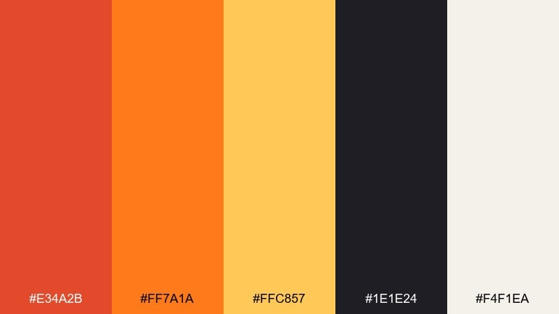
HEX: #E34A2B #FF7A1A #FFC857 #1E1E24 #F4F1EA
Mood: bold, energetic, high-contrast
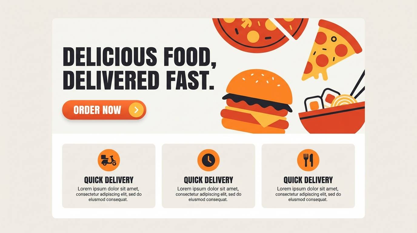
Best for: 2d landing page UI hero for a food delivery app
Bold heat and fresh citrus sparkle like a street-food neon sign at dusk. Use the bright orange as the CTA color and let the charcoal ground the layout for readability. Pair the warm highlights with creamy off-white for spacious sections and easy scanning. Tip: reserve the deepest red-orange for micro-accents like badges and active states to avoid overwhelming the page.
Image example of ember citrus generated using media.io
Media.io is an online AI studio for creating and editing video, image, and audio in your browser.

2) Paprika Sunset
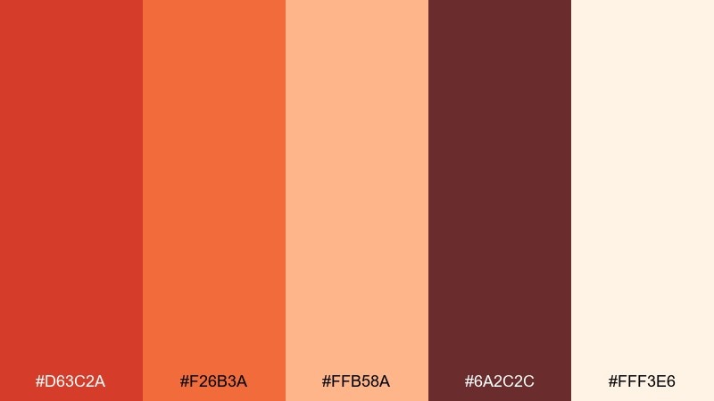
HEX: #D63C2A #F26B3A #FFB58A #6A2C2C #FFF3E6
Mood: sunset-warm, inviting, cozy
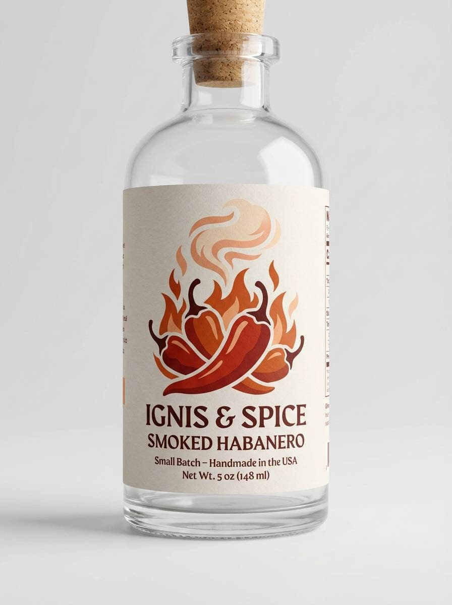
Best for: artisan hot sauce label and bottle packaging
Sunset warmth and smoky paprika tones evoke slow-cooked comfort with a kick. This orange red color palette shines on packaging when you make the deep maroon the typography base and keep the light peach for negative space. Pair it with kraft textures or matte finishes to enhance the handcrafted feel. Tip: use the brightest orange only for the flavor badge so it reads instantly on shelf.
Image example of paprika sunset generated using media.io
3) Terracotta Linen
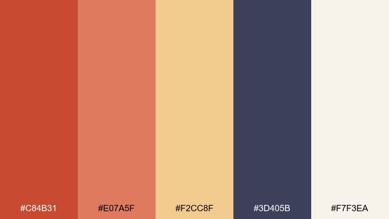
HEX: #C84B31 #E07A5F #F2CC8F #3D405B #F7F3EA
Mood: earthy, calm, Mediterranean
Best for: interior design moodboard and blog header graphic
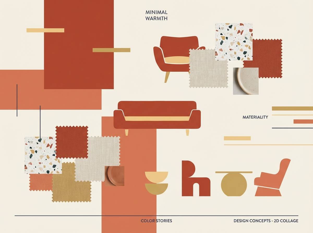
Earthy terracotta and linen neutrals feel like sunbaked clay, woven textiles, and quiet afternoons. Use the slate navy for headings and lines to keep the warm tones from looking too sweet. Pair the sand-gold with photography that has natural light and soft shadows. Tip: keep the terracotta blocks large and simple for a modern editorial look.
Image example of terracotta linen generated using media.io
4) Coral Clay
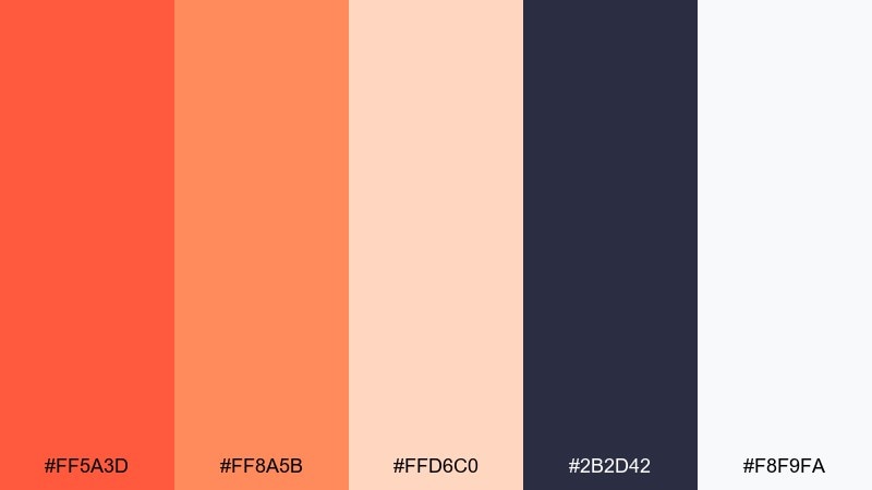
HEX: #FF5A3D #FF8A5B #FFD6C0 #2B2D42 #F8F9FA
Mood: playful, modern, friendly
Best for: beauty brand social media carousel templates
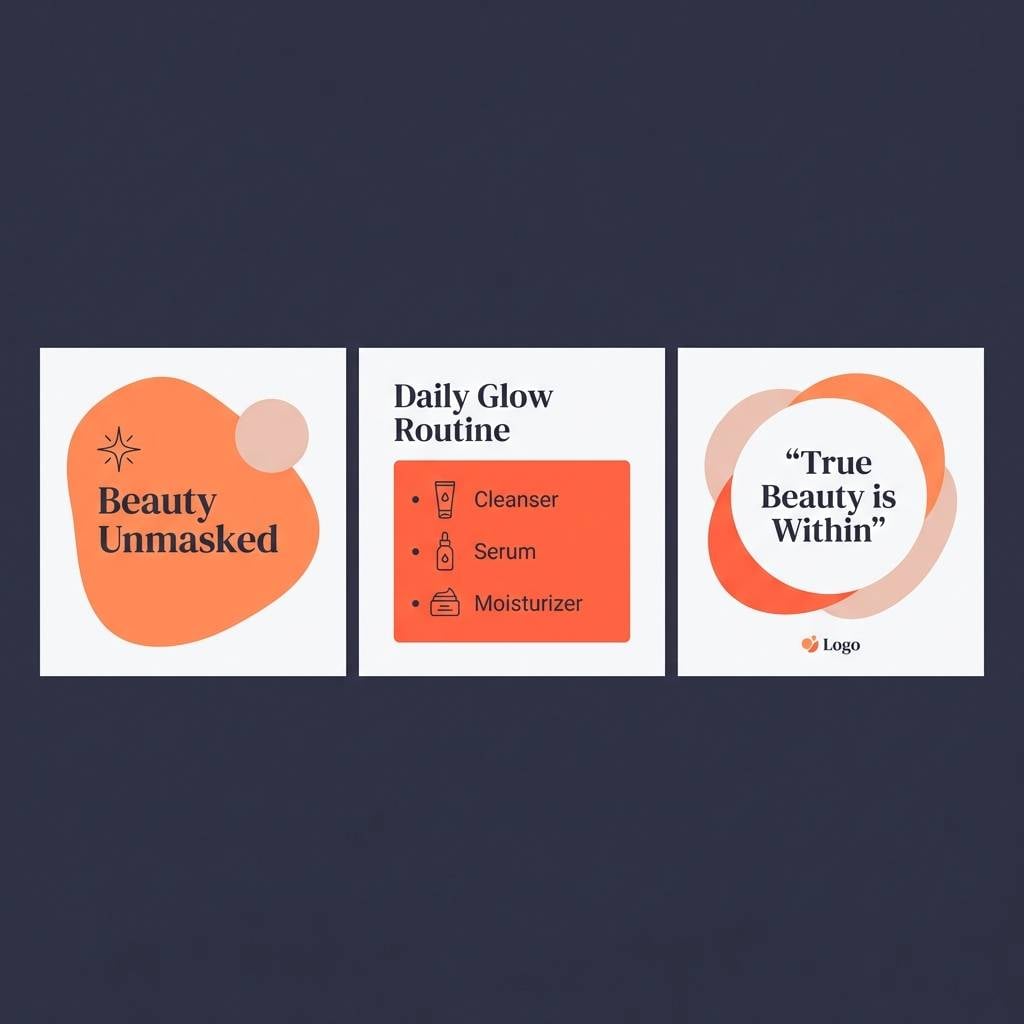
Playful coral and soft clay blush bring a fresh, optimistic glow like a peachy sunrise. Make the dark navy your text and icon color for crisp contrast on light cards. Pair the mid-coral with simple geometric shapes to keep the feed looking clean and contemporary. Tip: apply the palest blush as a consistent background so product shots stay the focus.
Image example of coral clay generated using media.io
5) Saffron Brick
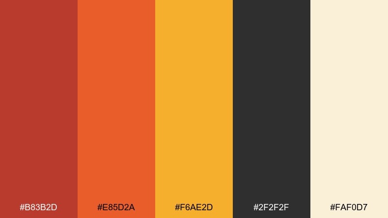
HEX: #B83B2D #E85D2A #F6AE2D #2F2F2F #FAF0D7
Mood: rustic, spirited, appetizing
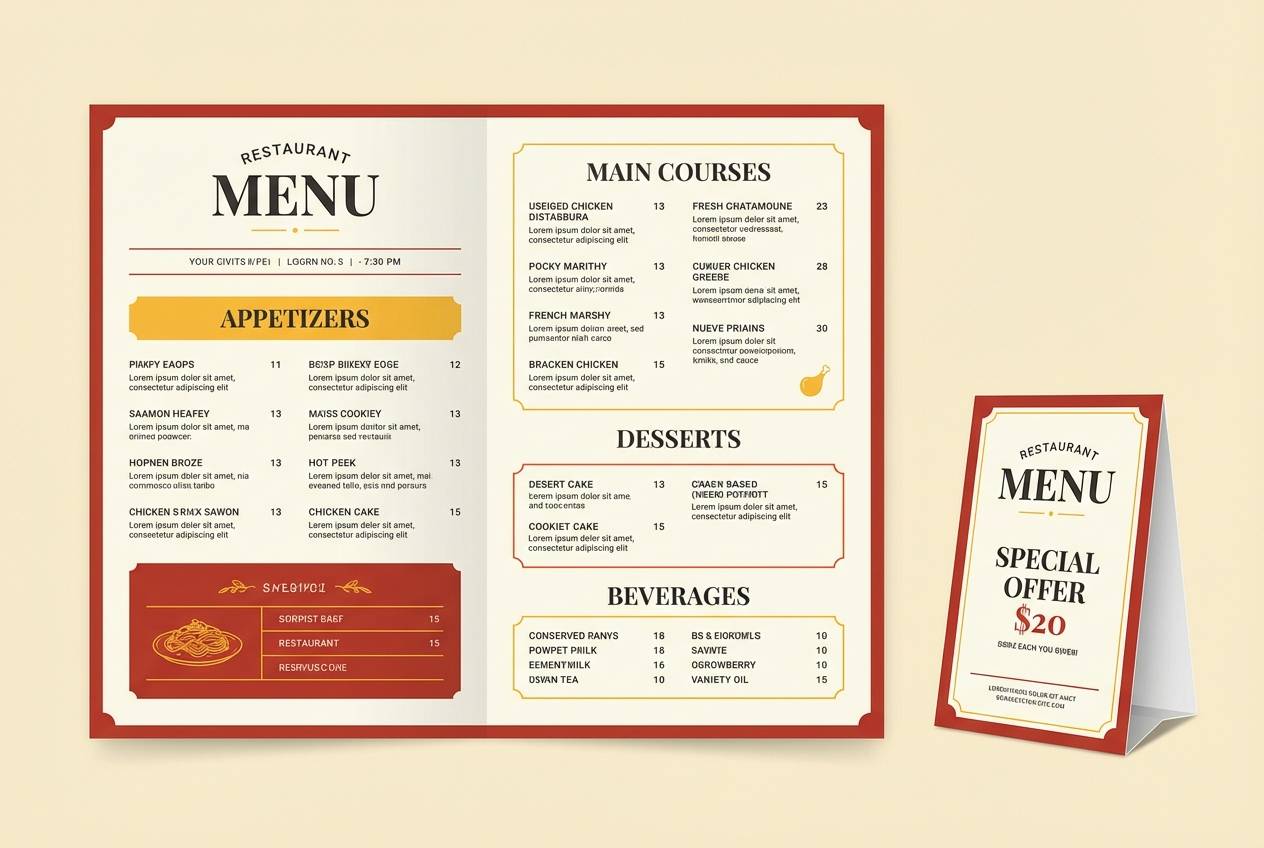
Best for: restaurant menu and table tent design
Rustic brick reds and saffron highlights feel like wood-fired ovens and golden crusts. Use the near-black for type, dividers, and pricing so the warm colors stay appetizing instead of loud. Pair the saffron with small icons to guide the eye through sections and specials. Tip: keep the cream background slightly textured for a premium bistro vibe.
Image example of saffron brick generated using media.io
6) Apricot Garnet
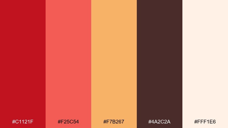
HEX: #C1121F #F25C54 #F7B267 #4A2C2A #FFF1E6
Mood: romantic, punchy, festive
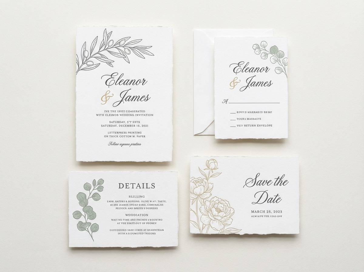
Best for: wedding RSVP card and invitation suite
Romantic apricot and garnet tones evoke candlelight, ripe fruit, and celebratory toasts. Let the deep garnet lead for names and monograms, then use apricot as a soft wash behind the text. Pair with uncoated paper and a simple serif to keep it timeless. Tip: add the golden peach as a thin border or foil-like accent for a refined finish.
Image example of apricot garnet generated using media.io
7) Rusted Rose
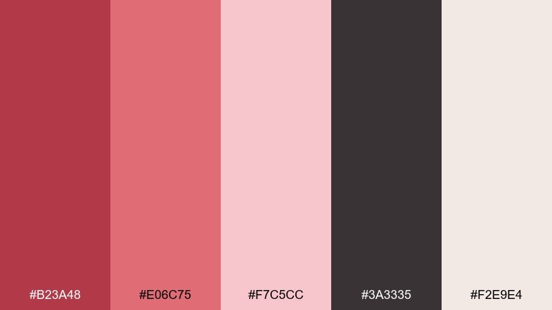
HEX: #B23A48 #E06C75 #F7C5CC #3A3335 #F2E9E4
Mood: soft, nostalgic, boutique
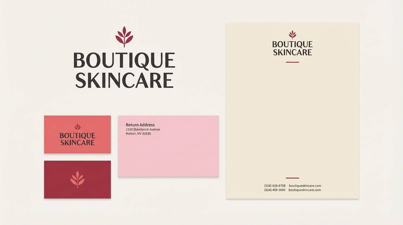
Best for: boutique skincare brand identity and logo lockup
Soft rust and dusty rose feel like vintage perfume labels and velvet upholstery. These orange red color combinations work beautifully when you keep the darkest cocoa tone for typography and linework. Pair the blush tints with minimal marks and generous spacing for a high-end look. Tip: use the mid-rose on secondary packaging to differentiate product variants without changing the system.
Image example of rusted rose generated using media.io
8) Chili Cream
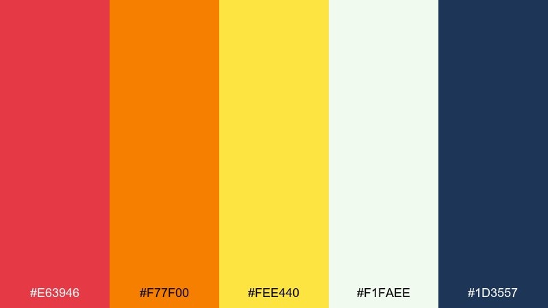
HEX: #E63946 #F77F00 #FEE440 #F1FAEE #1D3557
Mood: sporty, bright, high-impact
Best for: sports event poster on a plain background
High-impact chili red and bright spice orange feel fast, loud, and competitive. Use the navy for headings and schedules so the yellow stays a punchy accent instead of a wall of color. Pair the cream with plenty of breathing room around the main headline. Tip: set the primary CTA in orange and outline it in navy for instant legibility from a distance.
Image example of chili cream generated using media.io

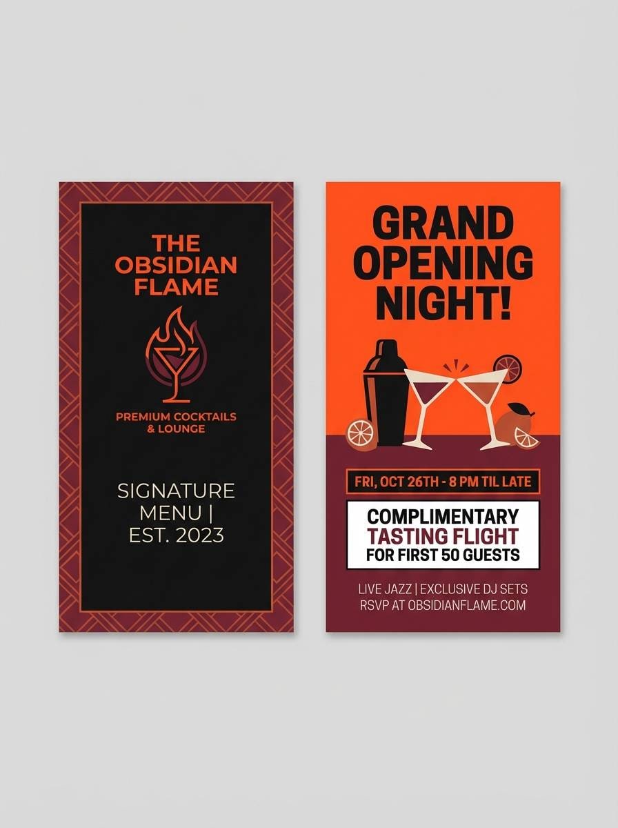
9) Burnt Orange Noir
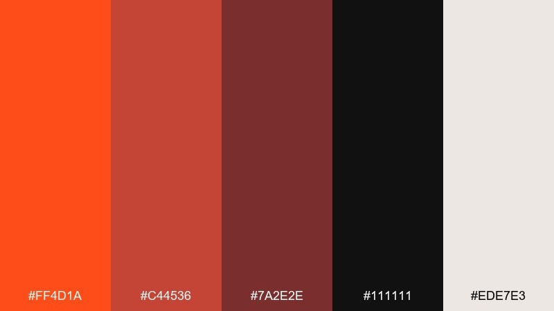
HEX: #FF4D1A #C44536 #7A2E2E #111111 #EDE7E3
Mood: dramatic, premium, nightlife
Best for: cocktail bar menu cover and promo flyer
Dramatic burnt orange against noir blacks evokes neon reflections, leather booths, and late-night cocktails. Use the bright orange sparingly for highlights like drink names or price callouts. Pair the off-white with high-contrast type to keep the design premium rather than flashy. Tip: a matte black background with spot-color orange accents will print beautifully and feel intentional.
Image example of burnt orange noir generated using media.io
10) Cider Sage
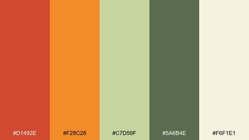
HEX: #D1492E #F28C28 #C7D59F #5A6B4E #F6F1E1
Mood: natural, autumnal, balanced
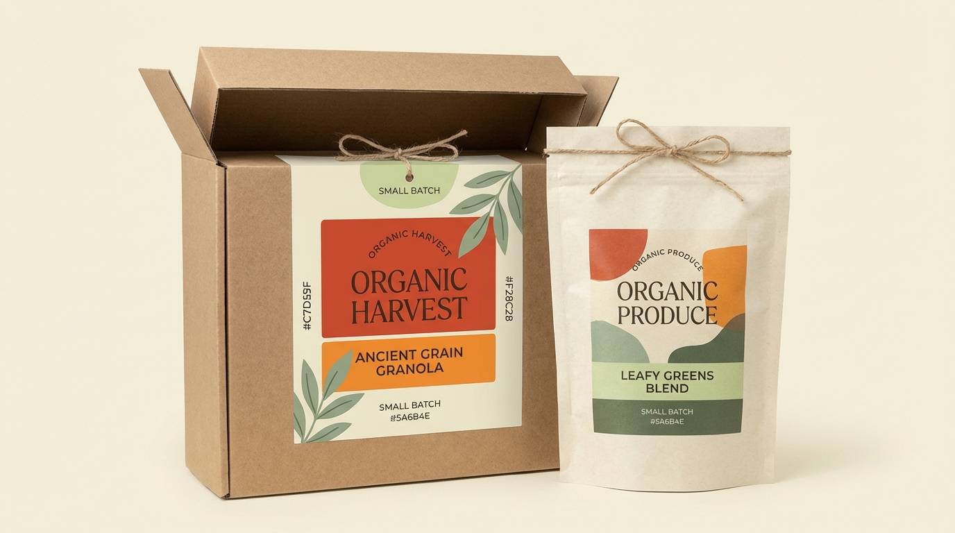
Best for: organic grocery product packaging set
Warm cider tones mixed with herbaceous sage feel like farmers markets and crisp leaves. Use sage green for panels and ingredient callouts to balance the heat of the oranges. Pair the cream base with simple icons and clear hierarchy for a clean, trustworthy look. Tip: keep the deepest green for nutrition and legal text so it stays readable without fighting the warm hues.
Image example of cider sage generated using media.io
11) Desert Poppy
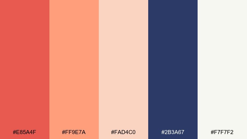
HEX: #E85A4F #FF9E7A #FAD4C0 #2B3A67 #F7F7F2
Mood: airy, warm, optimistic
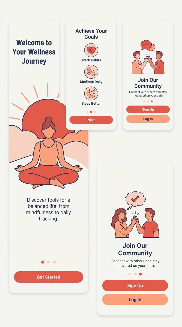
Best for: wellness app onboarding screens (2d UI)
Airy poppy tones and gentle blush evoke a calm desert sunrise with a soft breeze. Use the deep indigo for copy and icons to keep accessibility strong on pale backgrounds. Pair the coral highlight with progress indicators and primary buttons to guide new users. Tip: limit the saturated red to one action per screen so onboarding feels soothing, not urgent.
Image example of desert poppy generated using media.io
12) Canyon Spice
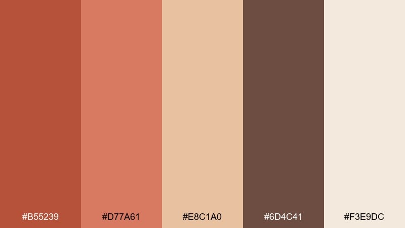
HEX: #B55239 #D77A61 #E8C1A0 #6D4C41 #F3E9DC
Mood: grounded, warm, handcrafted
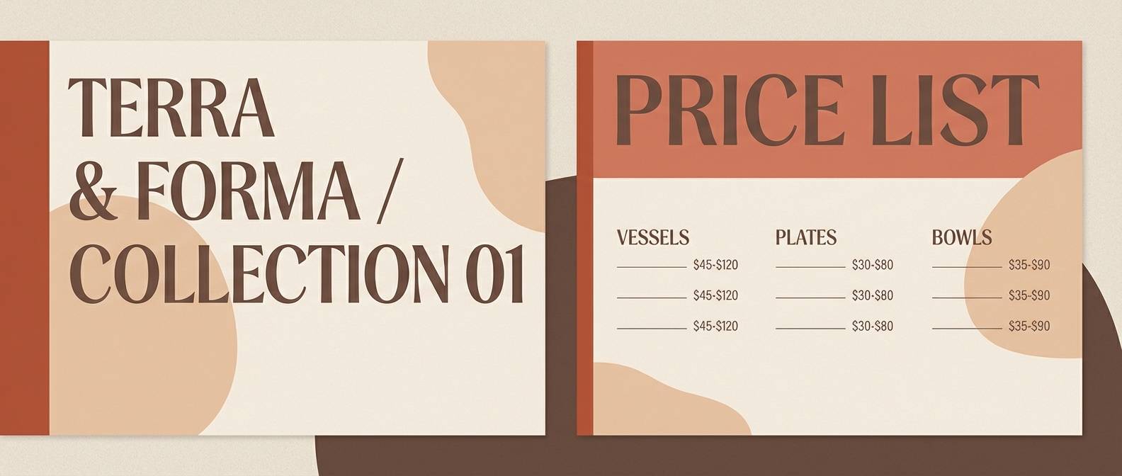
Best for: ceramics studio lookbook and price list
Canyon spice tones feel handmade and tactile, like kiln-fired clay and sanded wood. Use the darker brown for headings and item names to anchor the warm midtones. Pair the light sand with product photos that have natural shadows and muted highlights. Tip: keep backgrounds consistent and let the warmer shades appear in section headers and small stamps.
Image example of canyon spice generated using media.io
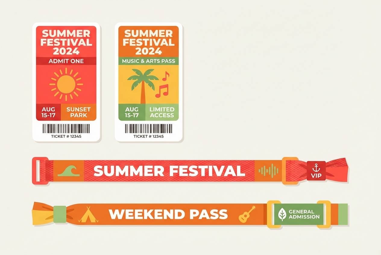
13) Tomato Taffy
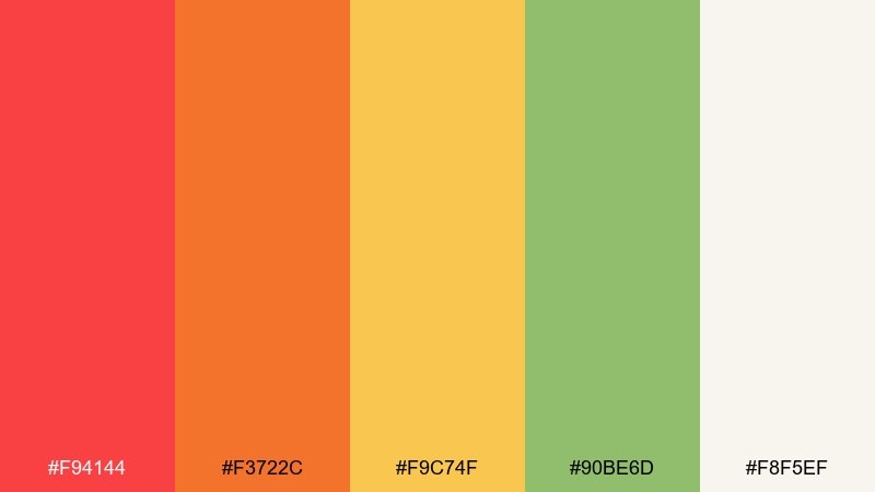
HEX: #F94144 #F3722C #F9C74F #90BE6D #F8F5EF
Mood: fun, youthful, snackable
Best for: summer festival wristband and ticket design
Juicy tomato red and taffy orange look like candy wrappers and summer pop-up stalls. Use the green as a secondary accent for category labels and quick wayfinding. Pair the cream background with bold type so the bright hues stay readable. Tip: assign one dominant color per ticket tier to keep the set cohesive and easy to sort.
Image example of tomato taffy generated using media.io
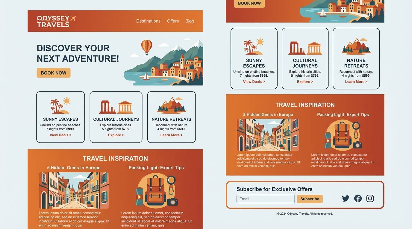
14) Copper Harbor
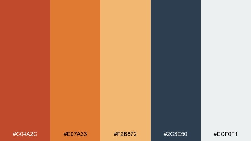
HEX: #C04A2C #E07A33 #F2B872 #2C3E50 #ECF0F1
Mood: confident, nautical, polished
Best for: travel newsletter header and content blocks
Copper warmth with a deep harbor blue feels like sunlit docks and well-worn luggage. Use the blue for body text and navigation so the warm tones can act as highlights and section markers. Pair the pale gray with plenty of white space for a crisp, email-friendly layout. Tip: keep images slightly desaturated so the copper accents remain the star.
Image example of copper harbor generated using media.io
15) Firelight Mocha
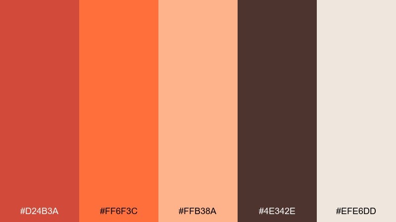
HEX: #D24B3A #FF6F3C #FFB38A #4E342E #EFE6DD
Mood: cozy, intimate, café-like
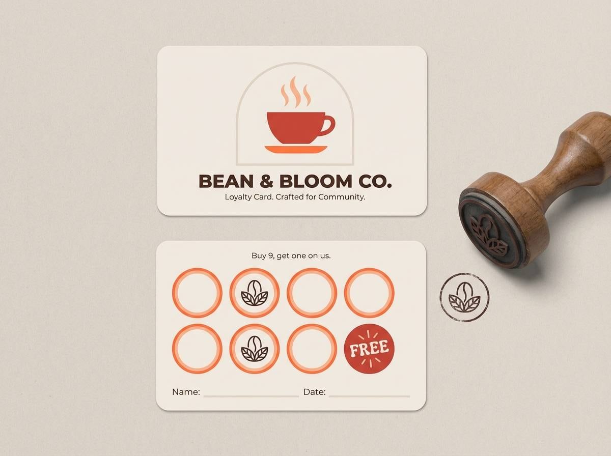
Best for: coffee shop loyalty card and stamp system
Firelight oranges and mocha browns evoke warm mugs, soft jazz, and glowing lamps. This orange red color palette works best when the mocha anchors your text and stamp marks for a handcrafted feel. Pair the pale cream as the card base to keep the warm inks readable and print-friendly. Tip: use the brightest orange only for the final reward badge so it feels special.
Image example of firelight mocha generated using media.io
16) Scarlet Apricot
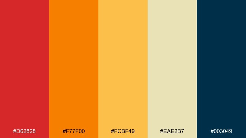
HEX: #D62828 #F77F00 #FCBF49 #EAE2B7 #003049
Mood: classic, punchy, sporty-retro
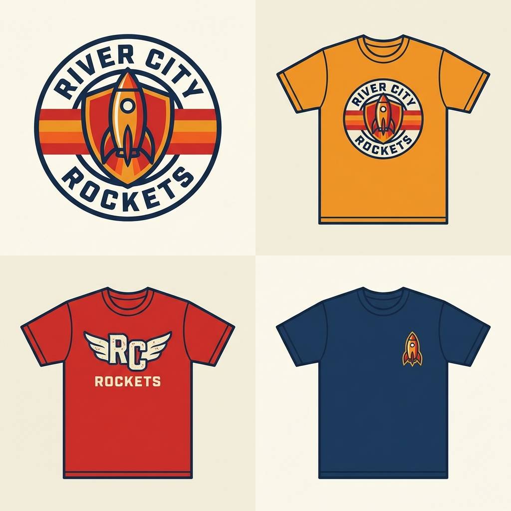
Best for: retro sports team logo and merch mockup
Punchy scarlet and apricot gold feel retro and confident, like vintage jerseys and pennants. Use the deep navy as the outline and typography color so the warm blocks pop cleanly. Pair the pale sand for secondary backgrounds and sizing labels on merch. Tip: keep the logo limited to two warm colors plus navy to stay readable at small sizes.
Image example of scarlet apricot generated using media.io
17) Persimmon Fog
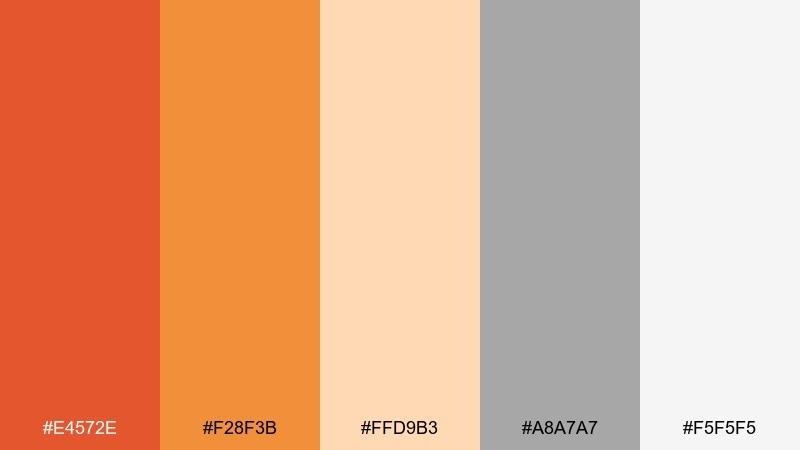
HEX: #E4572E #F28F3B #FFD9B3 #A8A7A7 #F5F5F5
Mood: soft, minimal, approachable
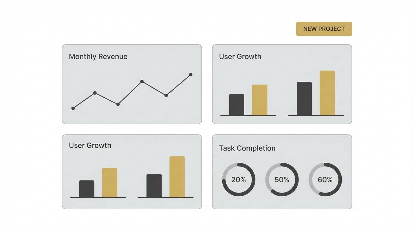
Best for: SaaS dashboard UI with light theme
Soft persimmon and warm foggy neutrals feel friendly and modern without shouting. Use the warm gray for borders and tables, then bring in orange for active states and key metrics. Pair the light peach with subtle chart fills so the data stays readable. Tip: keep contrast high by using dark text even when the accents are gentle.
Image example of persimmon fog generated using media.io
18) Pumpkin Ink
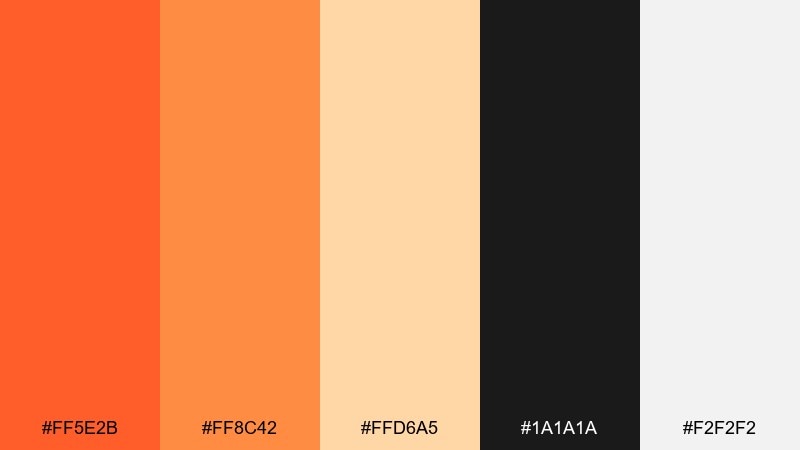
HEX: #FF5E2B #FF8C42 #FFD6A5 #1A1A1A #F2F2F2
Mood: bold, editorial, contemporary
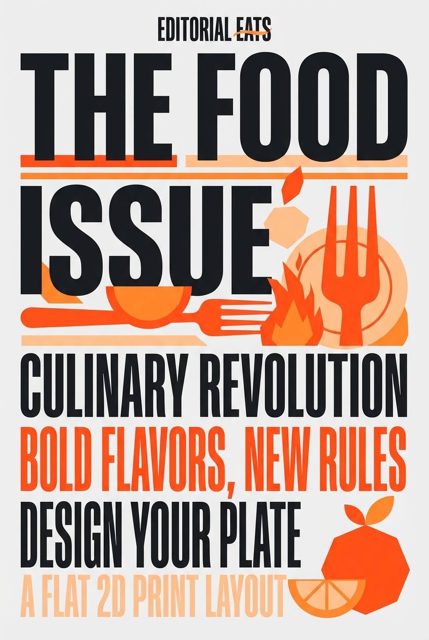
Best for: magazine cover layout for a food issue
Pumpkin warmth against inky black reads sharp and editorial, like a modern magazine rack. Use black for headlines and hierarchy, then let the orange tones punch through in callouts and cover lines. Pair the pale peach as a soft panel behind smaller text blocks. Tip: keep photography warm-toned so the oranges feel integrated rather than pasted on.
Image example of pumpkin ink generated using media.io
19) Sunset Claystone
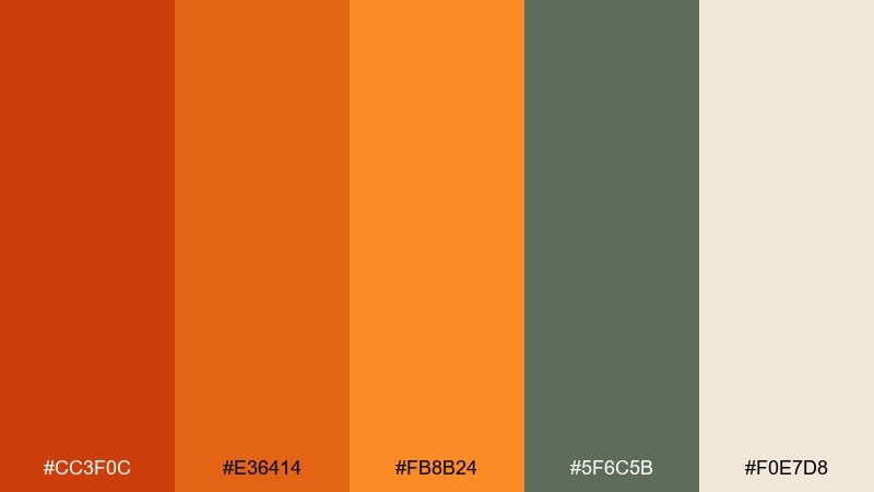
HEX: #CC3F0C #E36414 #FB8B24 #5F6C5B #F0E7D8
Mood: outdoorsy, rugged, adventurous
Best for: camping gear product ad banner
Rugged claystone oranges feel like canyon trails, campfires, and worn leather. Use the muted green as a stabilizer for secondary text and small UI-like labels within the ad. Pair the light sand as a clean background to keep the layout breathable. Tip: add the darkest orange as a thin stroke around product cutouts to boost separation without heavy shadows.
Image example of sunset claystone generated using media.io

20) Warm Signal
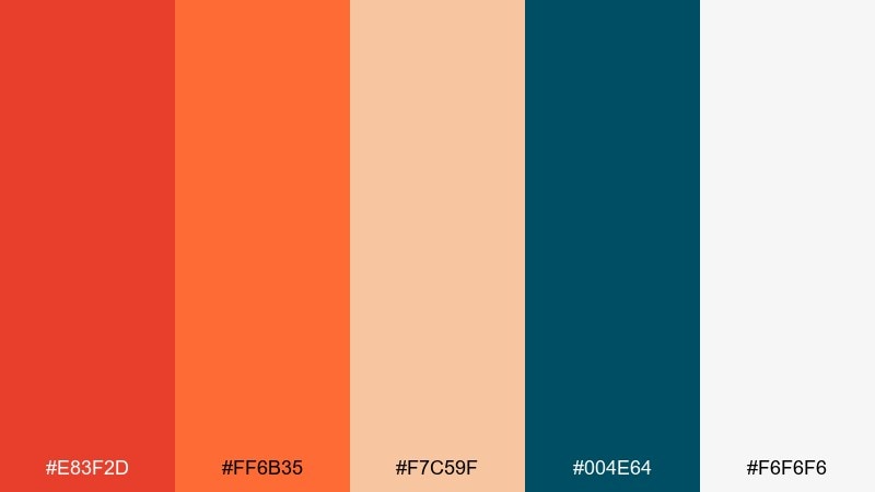
HEX: #E83F2D #FF6B35 #F7C59F #004E64 #F6F6F6
Mood: confident, modern, tech-forward
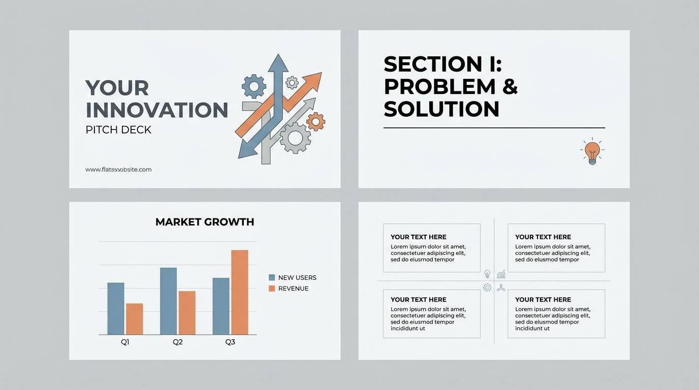
Best for: startup pitch deck cover and section dividers
Confident warm signals and cool teal contrast feel modern, sharp, and a little daring. These orange red color combinations are ideal for slides where you need quick emphasis without clutter. Pair the teal for charts, icons, and section titles, and keep the off-white as the main canvas. Tip: use the strongest orange only on one element per slide, like a key metric or punchline.
Image example of warm signal generated using media.io
21) Molten Coral
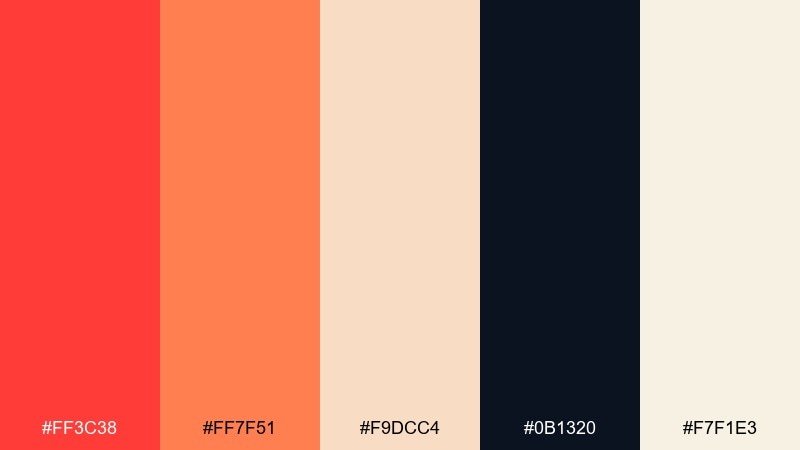
HEX: #FF3C38 #FF7F51 #F9DCC4 #0B1320 #F7F1E3
Mood: hot, trendy, nightlife-ready
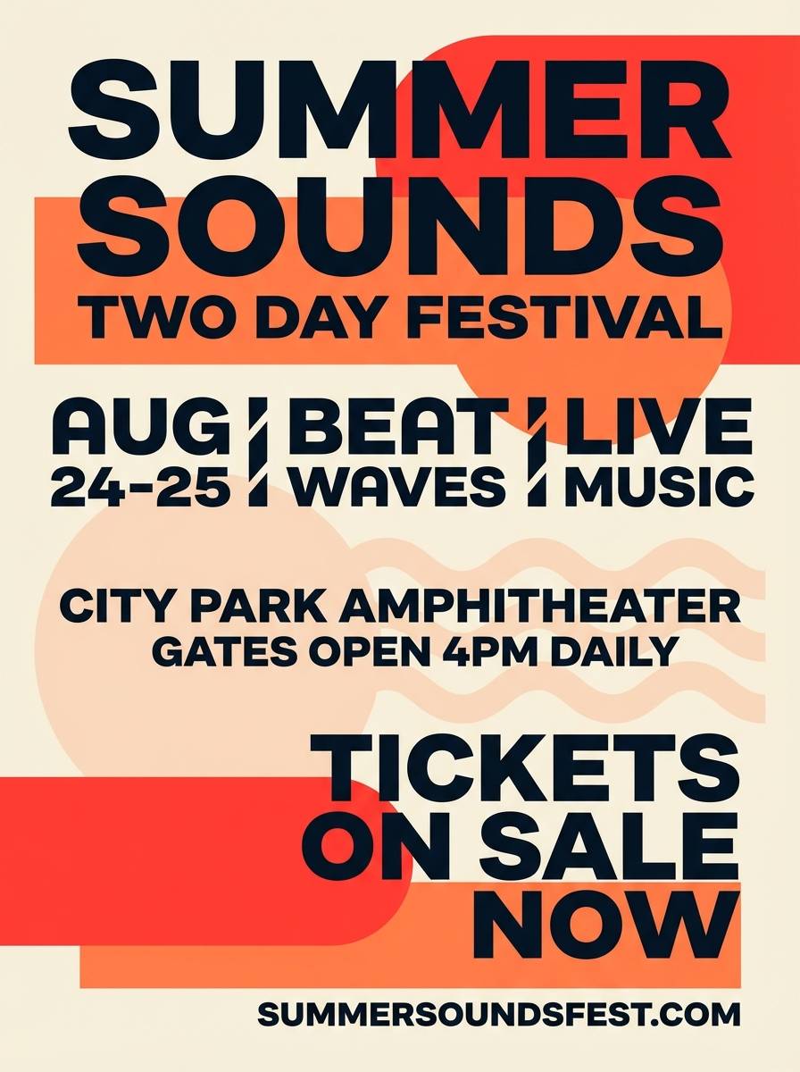
Best for: music event flyer on a plain background
Molten coral energy feels like stage lights, bass lines, and a packed dancefloor. Let the deep midnight shade carry the typography so the bright tones stay clean and high-contrast. Pair the warm cream as a buffer space around schedules and QR codes. Tip: keep gradients subtle and stick to two dominant warm colors to avoid muddy printing.
Image example of molten coral generated using media.io
22) Spiced Apron
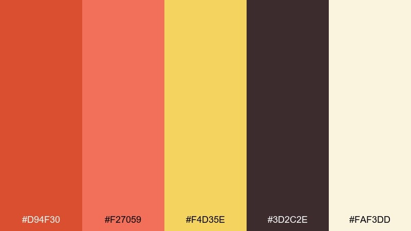
HEX: #D94F30 #F27059 #F4D35E #3D2C2E #FAF3DD
Mood: homey, cheerful, kitchen-friendly
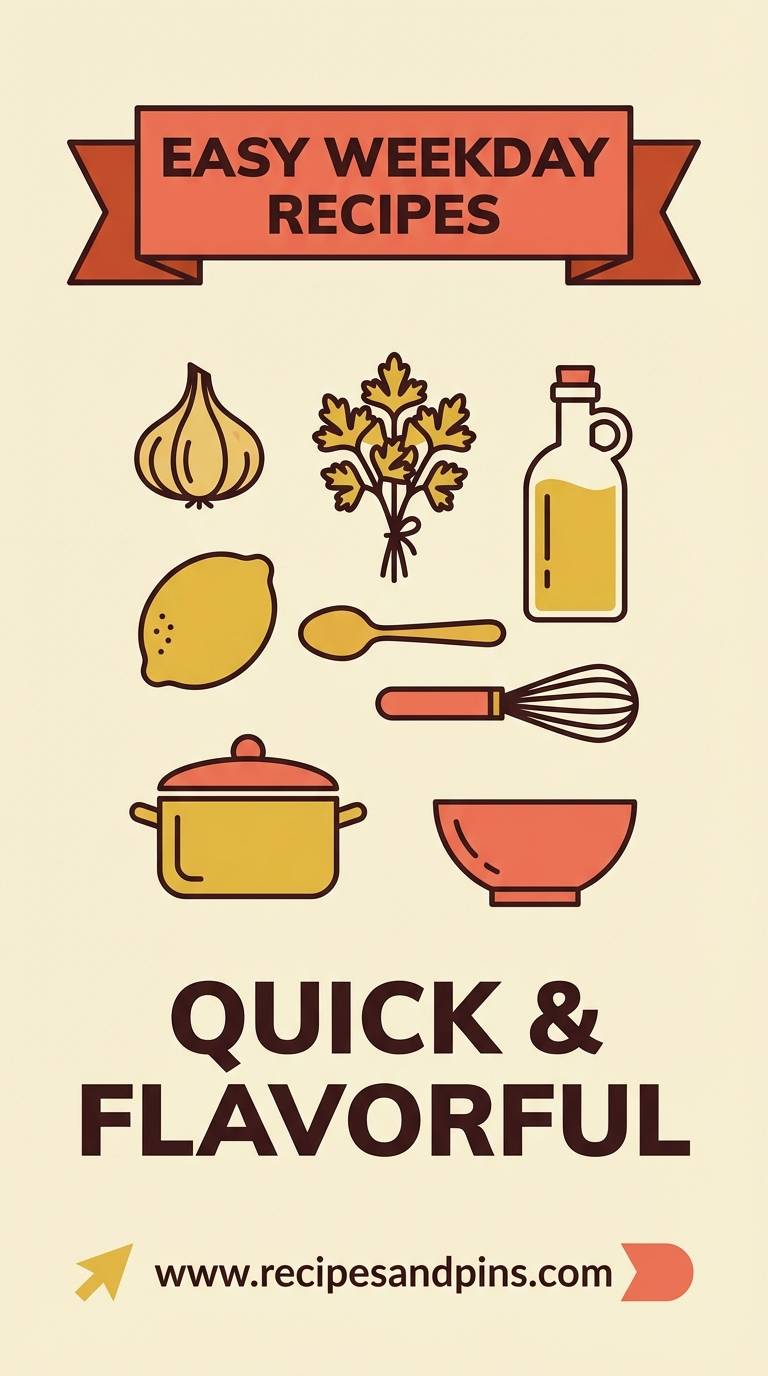
Best for: recipe blog featured image card and Pinterest pin
Cheerful spice tones feel like a busy kitchen, fresh batter, and handwritten notes. Use the dark cocoa for titles and ingredient labels to keep everything readable on light backgrounds. Pair the buttery yellow with simple icons like timers and serving sizes. Tip: keep the warm orange as a banner behind the recipe name so it stands out on feeds.
Image example of spiced apron generated using media.io
What Colors Go Well with Orange Red?
Orange red pairs especially well with deep neutrals like charcoal, near-black, espresso brown, and navy—these tones “cool down” the heat and improve readability for typography and UI elements.
For softer, lifestyle-friendly palettes, add warm whites (cream, ivory), blush/peach tints, and light sand. These create a calm background while keeping orange red as the energetic accent.
If you want a modern contrast, try muted greens (sage/olive) or teal-blue. Green balances orange red naturally, while teal creates a clean, tech-forward look that still feels bold.
How to Use a Orange Red Color Palette in Real Designs
In UI, treat orange red as a “priority” color: buttons, active states, alerts, and key metrics. Keep the rest of the interface neutral (off-white, light gray) with a dark text color for accessibility.
For branding and packaging, let a deeper red-orange carry logos and headings, and use lighter peach/cream as negative space. This keeps the palette warm but prevents it from becoming visually noisy.
In print (menus, flyers, invitations), watch ink coverage and contrast. Pair orange red with dark type and use the brightest hue for a single standout element (badge, price callout, RSVP detail).
Create Orange Red Palette Visuals with AI
If you already have HEX codes, the fastest way to validate them is to see them in context—on a poster, landing page, label, or social template. Visual mockups quickly reveal whether your contrast and balance feel right.
With Media.io, you can generate on-brand examples from a single prompt, iterate styles (flat, editorial, realistic), and keep color direction consistent across outputs.
Start with one palette above, paste the prompt style you like, and swap in your own product/use case for instant concept previews.
Orange Red Color Palette FAQs
-
What does orange red communicate in design?
Orange red communicates energy, warmth, appetite, urgency, and action. It’s a common choice for CTAs, food brands, sports posters, and campaigns that need immediate attention. -
What neutral colors work best with orange red?
Charcoal, near-black, warm gray, cream, and off-white work best. Dark neutrals improve readability, while warm light neutrals make the palette feel softer and more premium. -
Does orange red pair well with green?
Yes. Sage, olive, and muted greens balance orange red naturally and are great for organic, autumn, and “crafted” aesthetics. Use green for secondary panels, icons, or supporting UI states. -
How do I keep an orange red palette from feeling too loud?
Limit saturated orange red to one primary focal element per layout, increase negative space, and rely on deep neutrals for typography. Using tints (peach/blush) instead of more saturated secondaries also helps. -
What’s the best text color on orange red backgrounds?
Usually near-black, deep navy, or very dark brown. White can work on darker red-orange shades, but it often fails on brighter oranges—always check contrast for accessibility. -
Are orange red palettes good for SaaS and tech UI?
They can be—especially as accent systems (active states, highlights, key metrics). Pair with light neutrals and a cool counter-color like teal or navy to keep the product feeling modern and structured. -
How can I preview an orange red color scheme before designing everything?
Generate quick mockups (UI cards, posters, packaging labels) with AI using your HEX direction. This helps you test hierarchy, contrast, and overall “heat level” before committing to full production.


