

Xanadu is a muted green-gray that sits right between sage and soft stone. It’s calm, modern, and surprisingly flexible for both digital UI and warm, lived-in interiors.
Below are 20 curated xanadu color palette ideas with HEX codes—each with a practical “best for” use case and an AI-ready prompt you can reuse for mockups.
In this article
Why Xanadu Palettes Work So Well
Xanadu’s biggest strength is balance: it’s muted enough to feel sophisticated, but still green enough to read as natural and calming. That makes it a reliable “base neutral” when pure gray feels too cold.
Because it sits in a mid-value range, it pairs easily with clean off-whites for airy layouts or deep charcoals for confident contrast. It also plays well with warm accents like brass, terracotta, or rust without becoming too trendy.
In branding and UI, xanadu creates a gentle visual hierarchy—especially when you need calm, clarity, and trust. In interiors, it behaves like a modern sage that won’t overpower wood, linen, or stone textures.
20+ Xanadu Color Palette Ideas (with HEX Codes)
1) Misty Fern
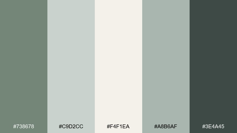
HEX: #738678 #C9D2CC #F4F1EA #A8B6AF #3E4A45
Mood: airy, calm, modern
Best for: serene living rooms and wellness spaces
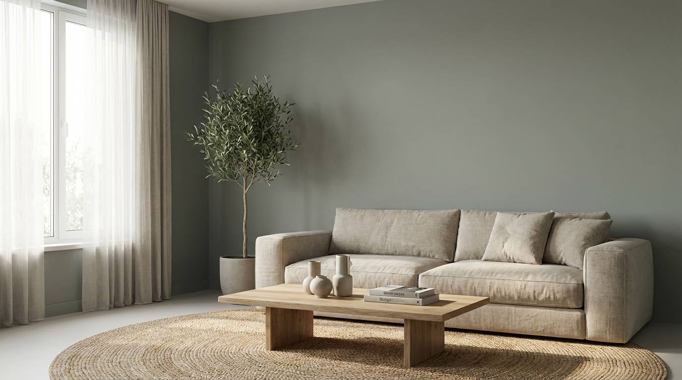
Airy and quiet like morning fog over ferns, these green-gray tones feel instantly grounding. Use it for walls, textiles, and minimalist decor where you want softness without looking washed out. Pair the darker charcoal green with warm off-white to keep contrast clean. Usage tip: repeat the mid-tone on two large surfaces (like a rug and curtains) to make the room feel cohesive.
Image example of misty fern generated using media.io
Media.io is an online AI studio for creating and editing video, image, and audio in your browser.

2) Antique Brass
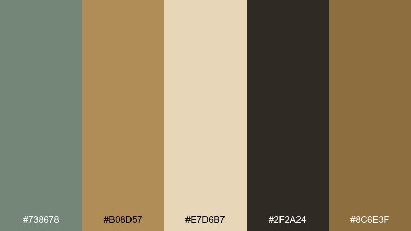
HEX: #738678 #B08D57 #E7D6B7 #2F2A24 #8C6E3F
Mood: heritage, warm, refined
Best for: premium packaging and boutique branding
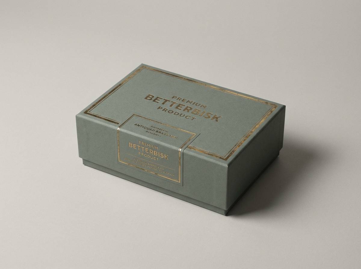
Heritage warmth comes through like aged metal and patinaed wood, with brass highlights that feel expensive. These xanadu color combinations work especially well for labels, seals, and small typography where contrast matters. Balance the deep espresso with the pale parchment to keep layouts readable. Usage tip: reserve the brass tone for logos or borders so it looks intentional, not busy.
Image example of antique brass generated using media.io
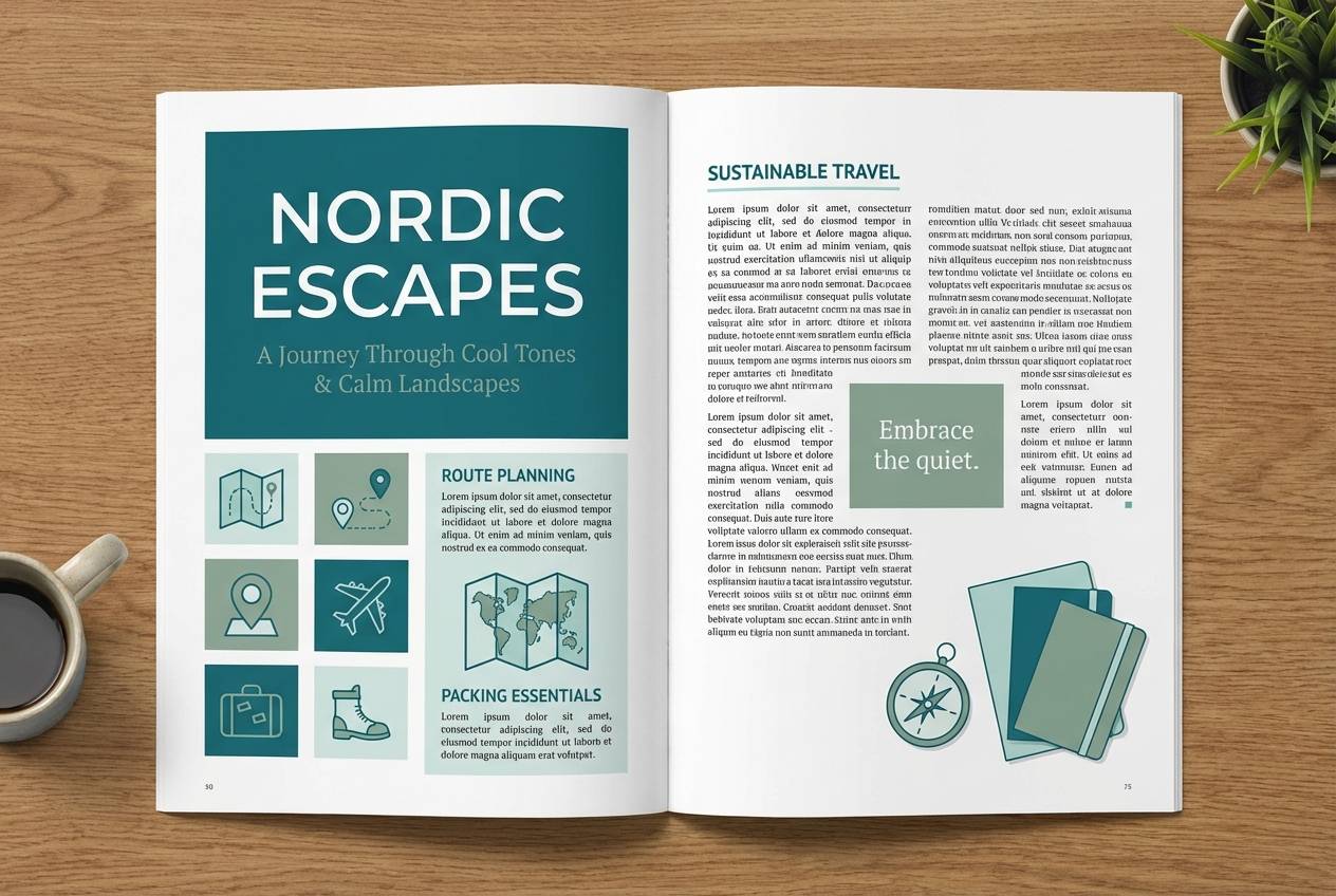
3) Harbor Sage
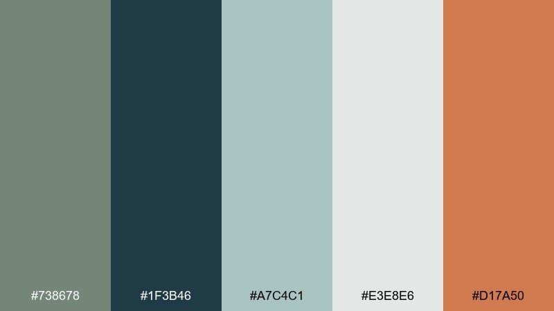
HEX: #738678 #1F3B46 #A7C4C1 #E3E8E6 #D17A50
Mood: coastal, crisp, balanced
Best for: travel editorials and lifestyle banners
Coastal and crisp, this mix evokes sea glass, harbor shadows, and sun-warmed terracotta. The cool blue-green anchors headlines while the pale misty neutrals give photos room to breathe. Add the clay accent sparingly for buttons or callouts that need a warm pop. Usage tip: keep text in the deep teal to maintain legibility over light imagery.
Image example of harbor sage generated using media.io
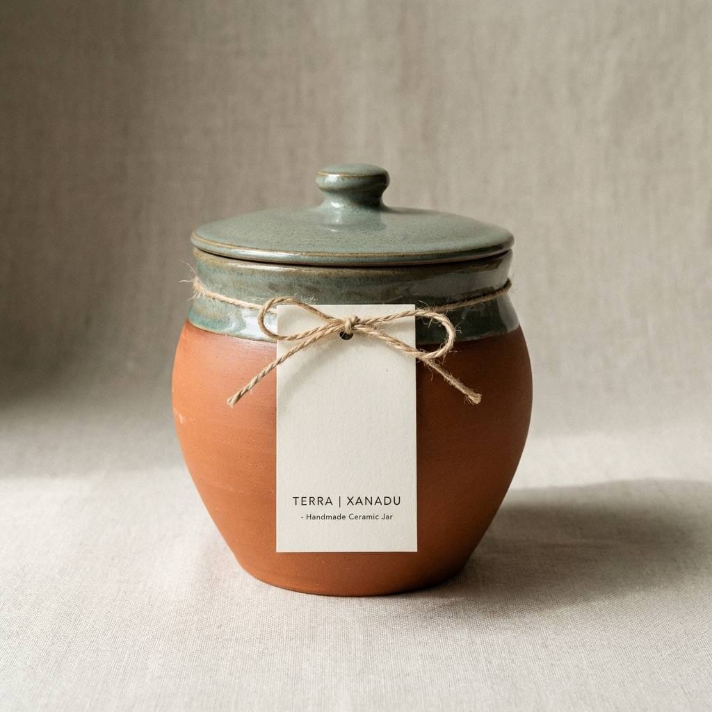
4) Clay Studio
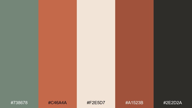
HEX: #738678 #C46A4A #F2E5D7 #A1523B #2E2D2A
Mood: handmade, earthy, bold
Best for: ceramics brands and artisan shop visuals
Handmade and earthy, these tones feel like a pottery studio with clay dust and kiln heat. The warm terracotta and cocoa shades bring energy, while the green-gray keeps it grounded and modern. Use the pale sand for backgrounds so product photos and type feel airy. Usage tip: apply the darkest brown to icons and thin lines to avoid overpowering the softer neutrals.
Image example of clay studio generated using media.io
5) Nordic Linen
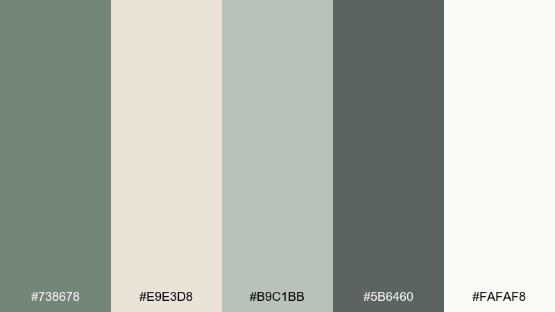
HEX: #738678 #E9E3D8 #B9C1BB #5B6460 #FAFAF8
Mood: minimal, clean, cozy
Best for: scandinavian interiors and calm web themes
Minimal and cozy like freshly washed linen, the palette stays soft without losing structure. A xanadu color palette like this shines in roomy layouts, light interiors, and calm landing pages. Pair the warm off-white with the deep gray-green for sharp type and clear navigation. Usage tip: use the mid gray-green for secondary text and dividers to keep contrast gentle.
Image example of nordic linen generated using media.io
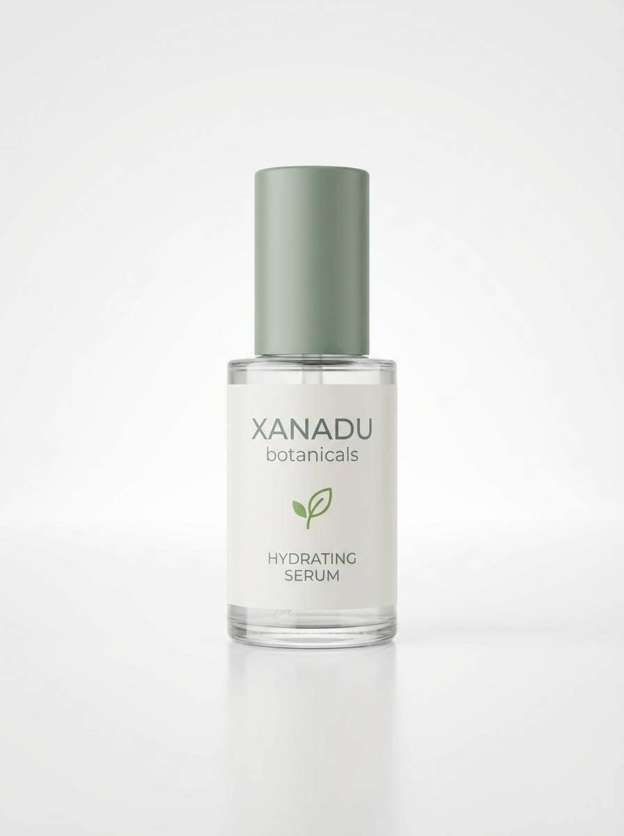
6) Glasshouse
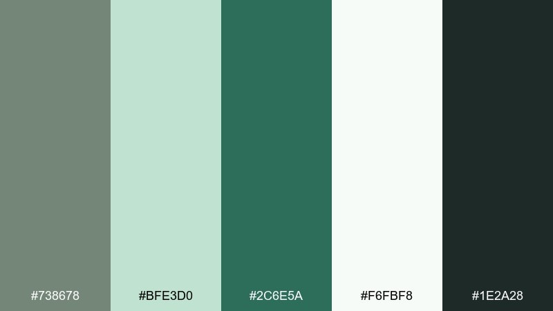
HEX: #738678 #BFE3D0 #2C6E5A #F6FBF8 #1E2A28
Mood: fresh, botanical, bright
Best for: skincare ads and eco product pages
Fresh and dewy, these greens evoke a sunlit greenhouse with glossy leaves. The bright mint lifts the muted base, while the deep evergreen brings depth for headlines and labels. Pair it with generous white space and soft gradients for a clean, modern feel. Usage tip: keep the darkest green for key calls to action so the lighter greens stay airy.
Image example of glasshouse generated using media.io
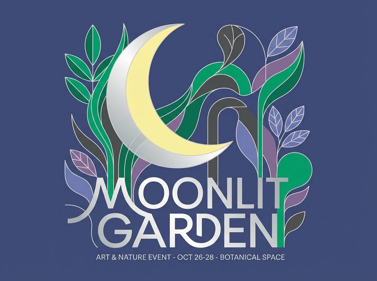
7) Moonlit Garden
HEX: #738678 #2A2F3A #6C7AA3 #C7CEDF #E8E6F1
Mood: dreamy, cool, elegant
Best for: evening event invitations and music posters
Dreamy and cool like a garden at dusk, the blue-lavender notes make the green-gray feel more cinematic. Use the inky navy for type and silhouettes, then let the pale lilac act as a soft background. These tones suit night events, gallery announcements, and refined posters that need calm drama. Usage tip: add subtle grain to backgrounds to keep the light tints from feeling flat.
Image example of moonlit garden generated using media.io
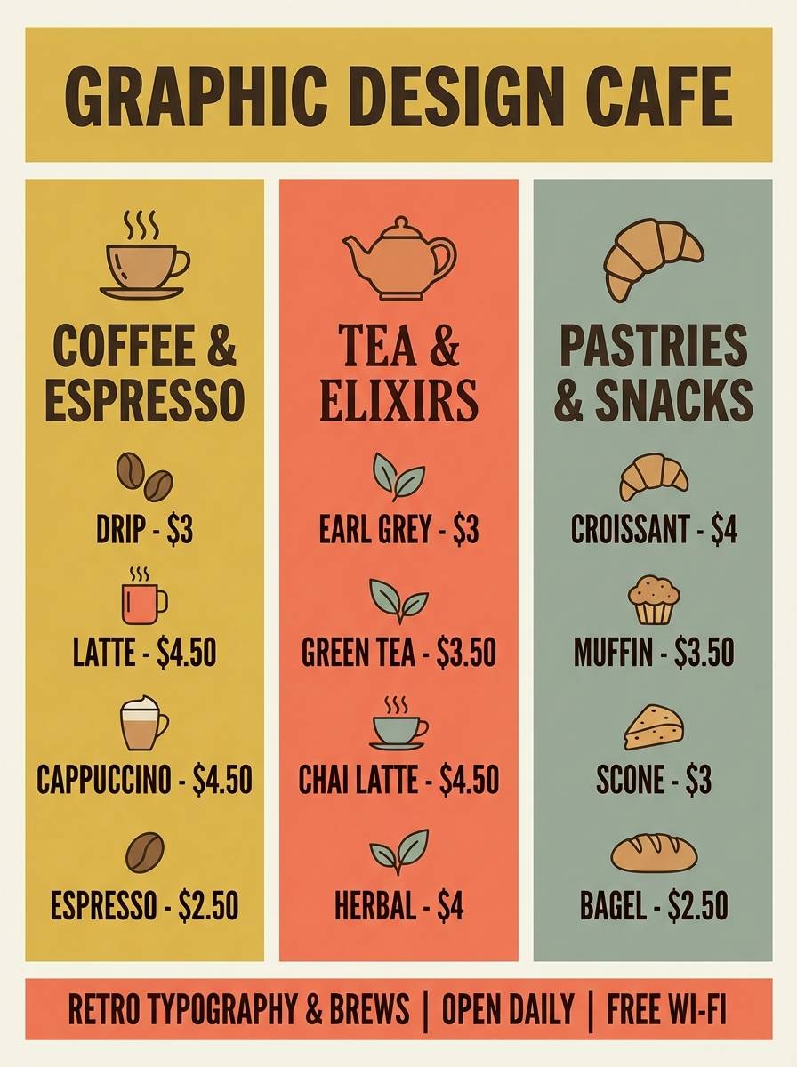
8) Retro Kitchen
HEX: #738678 #F2C14E #F7F2E8 #D86B63 #2D3A3F
Mood: playful, vintage, sunny
Best for: cafe menus and food blog graphics
Playful and sunny, it feels like a retro diner with enamel mugs and warm afternoon light. A xanadu color combination with mustard and coral adds charm without turning overly loud. Use the dark slate for headings and the creamy tint for menu backgrounds to keep everything readable. Usage tip: keep coral to small highlights like price tags, badges, or section headers.
Image example of retro kitchen generated using media.io
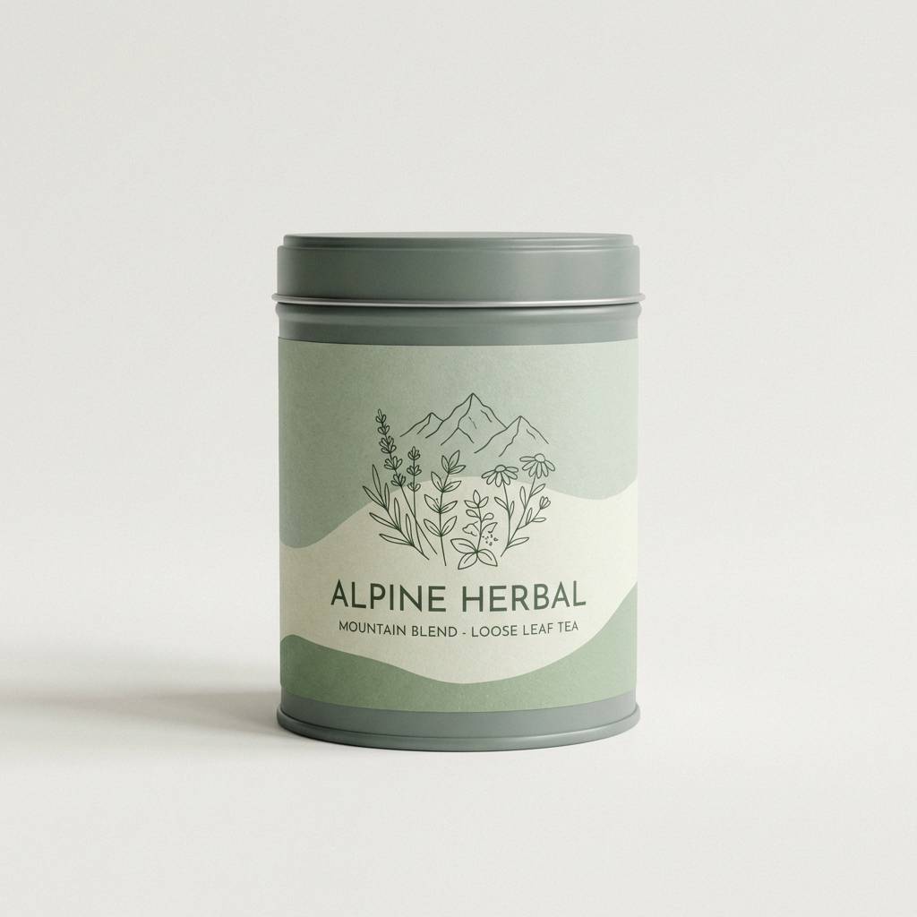
9) Alpine Tea
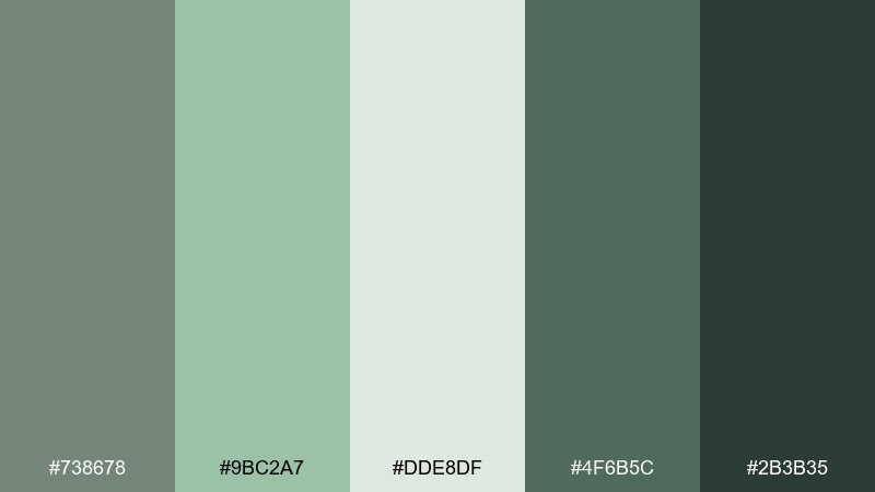
HEX: #738678 #9BC2A7 #DDE8DF #4F6B5C #2B3B35
Mood: peaceful, natural, soothing
Best for: tea packaging and meditation content
Peaceful and herbal, the tones recall steeped tea leaves and mountain air. The soft greens layer beautifully on packaging, especially with matte paper and simple line art. Pair the darkest shade with the pale mint for strong contrast on labels and ingredient lists. Usage tip: keep gradients subtle and lean on texture to maintain an organic feel.
Image example of alpine tea generated using media.io
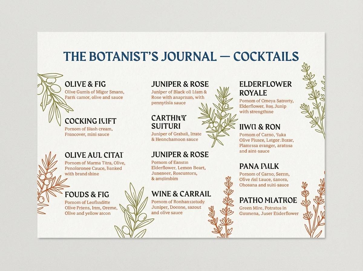
10) Urban Herbarium
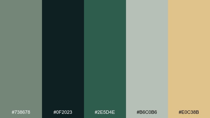
HEX: #738678 #0F2023 #2E5D4E #B6C0B6 #E0C38B
Mood: moody, modern, grounded
Best for: restaurant branding and cocktail lists
Moody and grounded, it brings to mind a dim bar with leafy notes and brass details. The near-black gives you instant sophistication, while the pale gray-green keeps layouts from feeling heavy. Add the warm gold as a highlight for prices, icons, or section dividers. Usage tip: set body text on the light gray-green instead of pure white for a softer finish.
Image example of urban herbarium generated using media.io
11) Ink and Moss
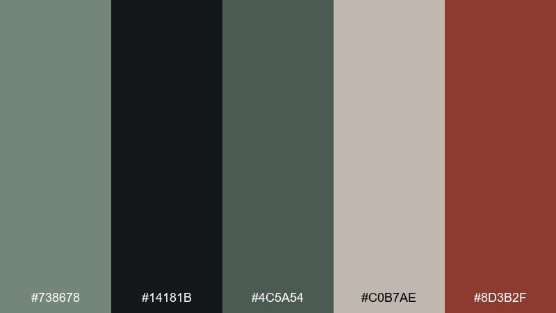
HEX: #738678 #14181B #4C5A54 #C0B7AE #8D3B2F
Mood: literary, dramatic, tactile
Best for: book covers and podcast artwork
Literary and dramatic, it feels like ink on textured paper with a hint of forest moss. The deep black-green supports bold typography, while the warm beige keeps it human and inviting. Add the rust red as a punchy accent for titles or episode numbers. Usage tip: keep the accent to one element per layout so it stays sharp and intentional.
Image example of ink and moss generated using media.io
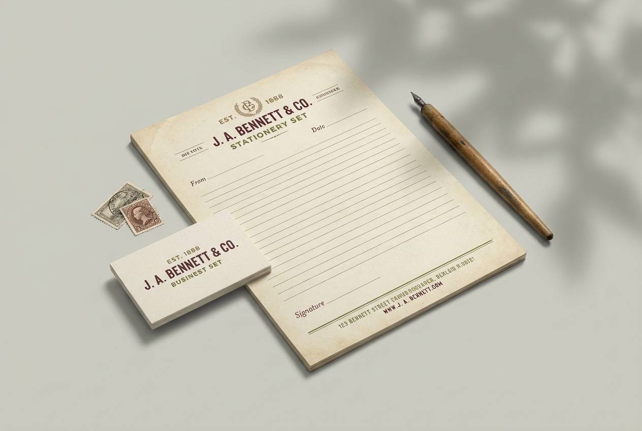
12) Vintage Ledger
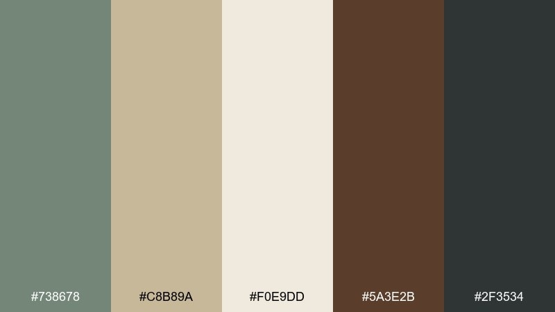
HEX: #738678 #C8B89A #F0E9DD #5A3E2B #2F3534
Mood: classic, warm, archival
Best for: heritage brands and stationery sets
Classic and archival, the colors echo old ledgers, kraft paper, and wooden desks. Use the parchment tones for backgrounds, then bring in the walnut brown for headings and borders. The green-gray works well as a modern twist that keeps the set from feeling overly sepia. Usage tip: choose a serif font and increase letter spacing for an elevated, printed look.
Image example of vintage ledger generated using media.io
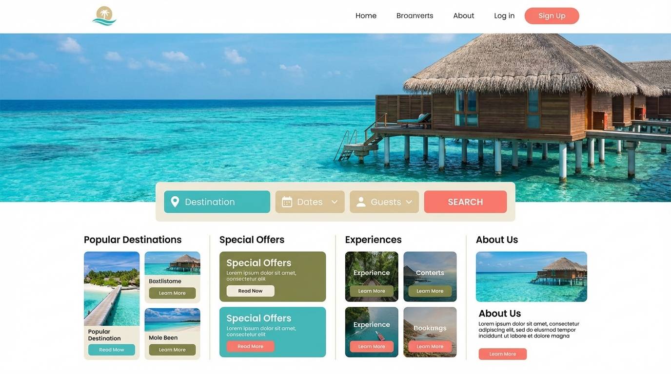
13) Coastal Drift
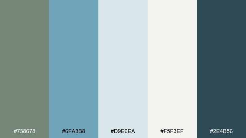
HEX: #738678 #6FA3B8 #D9E6EA #F5F3EF #2E4B56
Mood: breezy, relaxed, fresh
Best for: beach rental websites and resort brochures
Breezy and relaxed, it reads like driftwood, pale sky, and cool ocean water. The light blue-gray is perfect for large sections and hero backgrounds, while the deep teal supports nav bars and headings. Pair it with simple photography and plenty of margin to keep the vibe open. Usage tip: add thin teal rules and icons to guide scanning without clutter.
Image example of coastal drift generated using media.io
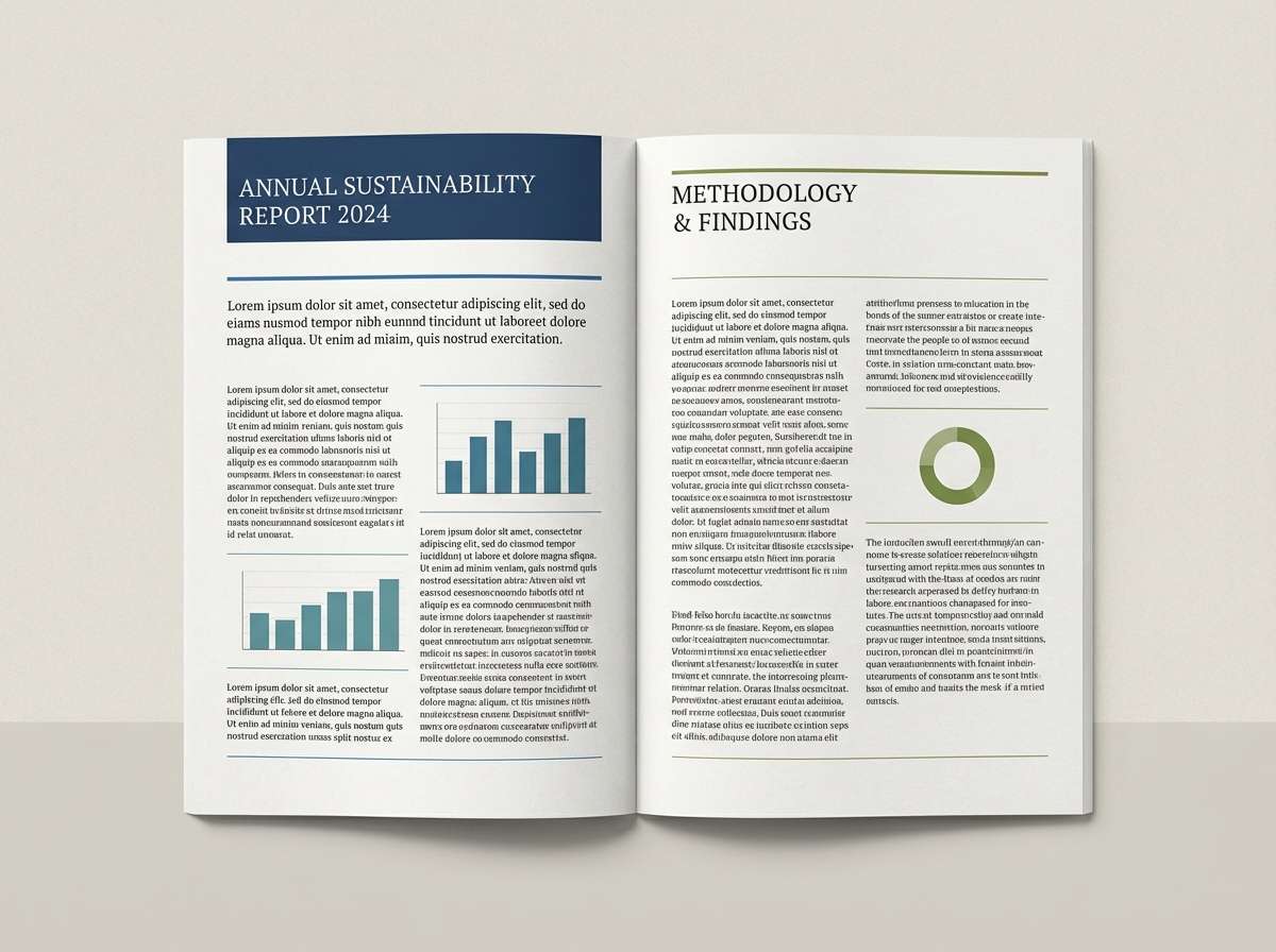
14) Quiet Library
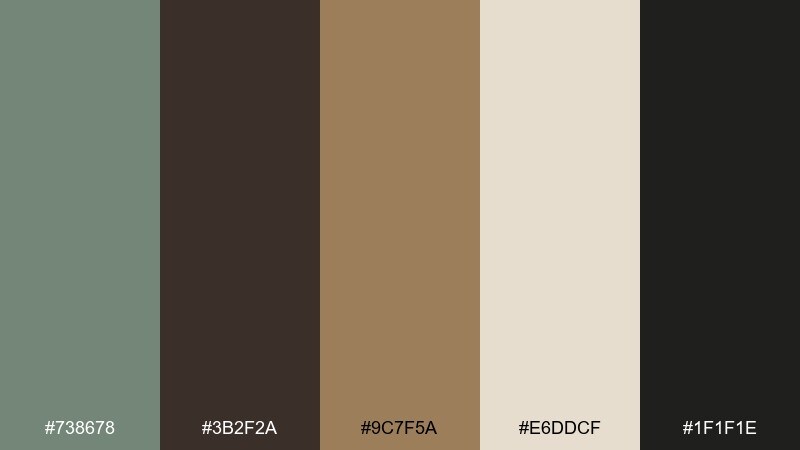
HEX: #738678 #3B2F2A #9C7F5A #E6DDCF #1F1F1E
Mood: cozy, studious, timeless
Best for: publishing brands and academic presentations
Cozy and studious, the mix suggests leather spines, warm lamplight, and hushed corners. These xanadu color combinations pair beautifully with serif typography, paper textures, and subtle rules. Use the parchment for slides or page backgrounds, then anchor with espresso for titles and footers. Usage tip: set charts in the tan and green-gray instead of bright primaries for a more credible tone.
Image example of quiet library generated using media.io
15) Desert Olive
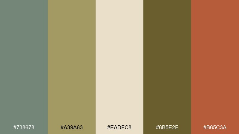
HEX: #738678 #A39A63 #EADFC8 #6B5E2E #B65C3A
Mood: sunbaked, rustic, adventurous
Best for: outdoor brands and trail guide graphics
Sunbaked and rustic, it feels like olive shrubs, dry grass, and canyon clay. Use the pale sand as a map or infographic base, then layer olive and green-gray for terrain-like depth. The rust accent is ideal for markers, badges, or key routes. Usage tip: avoid ultra-saturated icons and keep strokes slightly thicker for readability on textured backgrounds.
Image example of desert olive generated using media.io

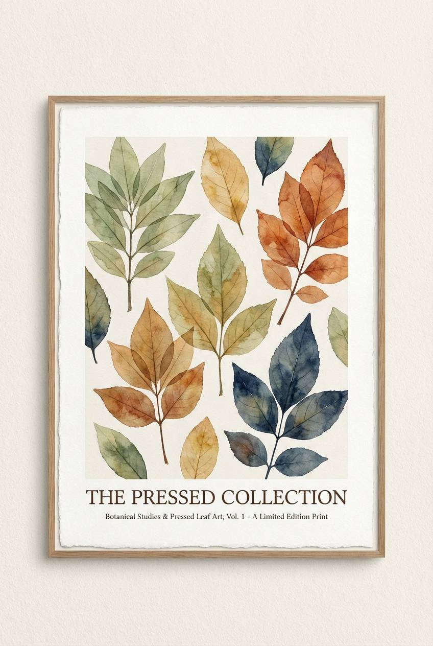
16) Botanical Press
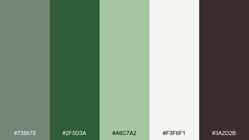
HEX: #738678 #2F5D3A #A6C7A2 #F3F6F1 #3A2D2B
Mood: natural, editorial, crisp
Best for: plant shop flyers and zine covers
Natural and editorial, it recalls pressed leaves and inked captions on creamy paper. The deep forest shade makes headlines feel confident, while the pale green tints keep the page light. Pair it with botanical illustrations, simple frames, and a restrained type scale. Usage tip: use one strong green block per page to anchor the composition.
Image example of botanical press generated using media.io
17) Minimal Dashboard
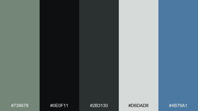
HEX: #738678 #0E0F11 #2B3130 #D6DAD8 #4B79A1
Mood: sleek, focused, tech-forward
Best for: saas analytics UI and admin panels
Sleek and focused, the dark neutrals feel like a modern control room with calm green-gray balance. A xanadu color scheme can soften heavy dark mode UIs, especially when paired with a single cool blue for highlights. Use the pale gray for cards and tables so content stays readable against the dark base. Usage tip: keep the blue only for active states and links to preserve hierarchy.
Image example of minimal dashboard generated using media.io

18) Artisan Label
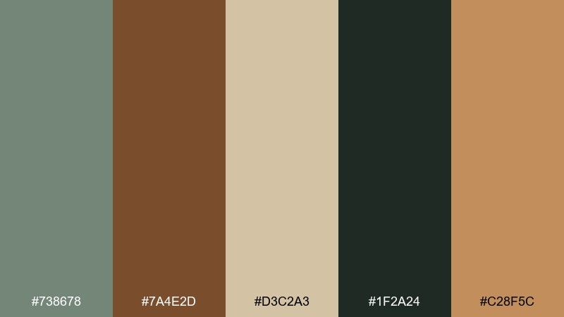
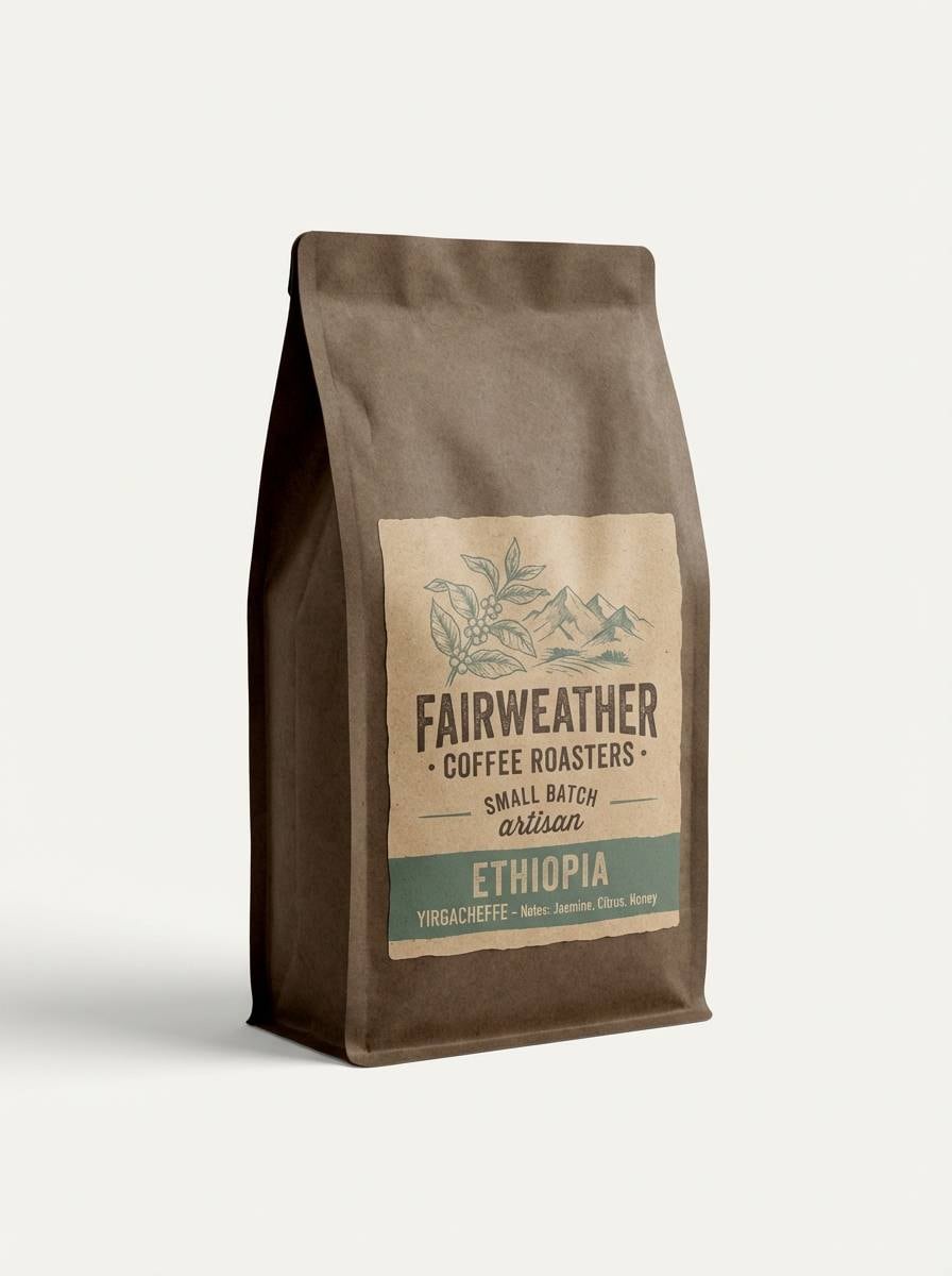
HEX: #738678 #7A4E2D #D3C2A3 #1F2A24 #C28F5C
Mood: craft, warm, authentic
Best for: coffee bags and small-batch goods
Craft-forward and warm, it feels like roasted beans, paper tags, and a hint of woodland green. The tan and caramel tones make a friendly base for illustrations and stamps, while the darker green-black adds instant contrast. Pair with textured stock and a simple badge logo for an authentic, handmade finish. Usage tip: print the darkest shade for all text to avoid muddy readability on kraft backgrounds.
Image example of artisan label generated using media.io
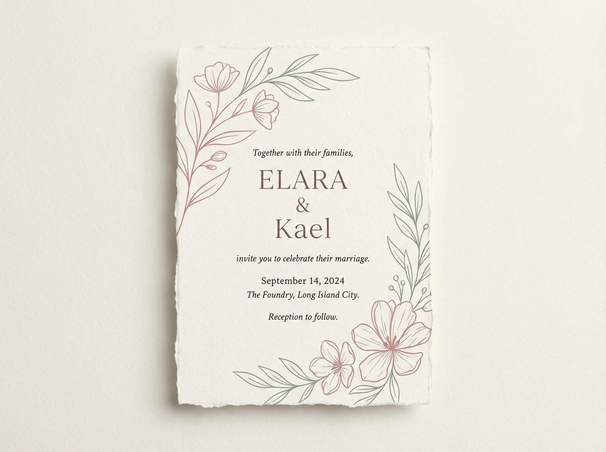
19) Wedding Greenery
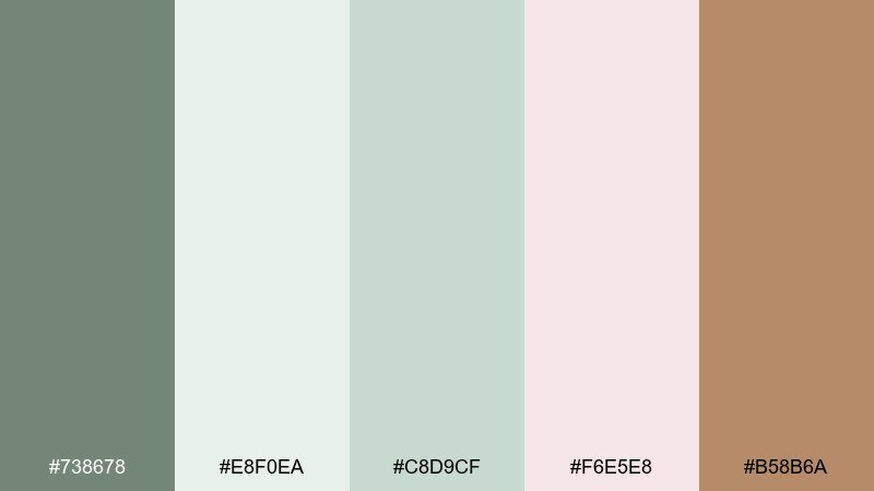
HEX: #738678 #E8F0EA #C8D9CF #F6E5E8 #B58B6A
Mood: romantic, soft, airy
Best for: wedding invitations and day-of stationery
Romantic and airy, the tones suggest eucalyptus garlands, blush petals, and warm champagne details. A xanadu color palette like this is ideal for invitations that need to feel gentle, elegant, and modern. Pair it with delicate serif type, thin line borders, and plenty of breathing room. Usage tip: keep blush to small florals or monograms so the greenery stays the star.
Image example of wedding greenery generated using media.io
20) Night Train
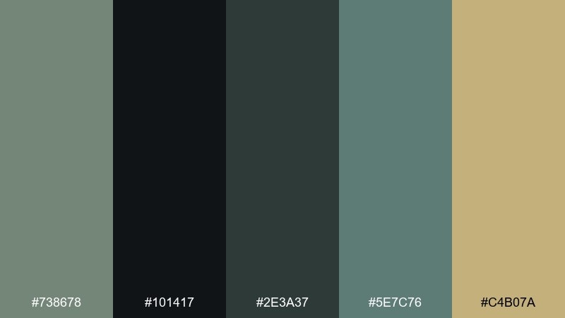
HEX: #738678 #101417 #2E3A37 #5E7C76 #C4B07A
Mood: noir, cinematic, confident
Best for: album covers and moody campaign ads
Noir and cinematic, it feels like passing lights in a night carriage with a flash of brass. The near-black and deep green-gray set a confident base for bold type and high-contrast layouts. Use the muted gold for titles, logos, or thin frames to add premium shine without literal metallic effects. Usage tip: keep backgrounds mostly dark and let the mid-tone green handle secondary panels for depth.
Image example of night train generated using media.io
What Colors Go Well with Xanadu?
Xanadu pairs beautifully with crisp neutrals like warm off-white, parchment, and pale gray-green. These keep the overall look airy while preserving that grounded, natural vibe.
For contrast, lean on deep charcoals, inky navy, or near-black greens—these make typography and UI components feel sharp. If you want warmth, add brass/gold, terracotta, clay, caramel, or rust as a controlled accent.
For a cooler direction, combine xanadu with sea-glass blues, misty blue-grays, and soft lavender tints. This shifts the mood toward coastal, editorial, or evening-elegant without losing subtlety.
How to Use a Xanadu Color Palette in Real Designs
Use xanadu as a base color for large areas: page backgrounds, wall paint, packaging fields, or UI surfaces. Then choose one deep shade for text and navigation to maintain legibility and structure.
Keep accents intentional. One warm highlight color (like brass, rust, or terracotta) is usually enough for buttons, badges, prices, or section headers—especially in clean layouts.
Texture does a lot of the heavy lifting with muted palettes. Linen, paper grain, matte finishes, and soft shadows help xanadu schemes feel premium instead of flat.
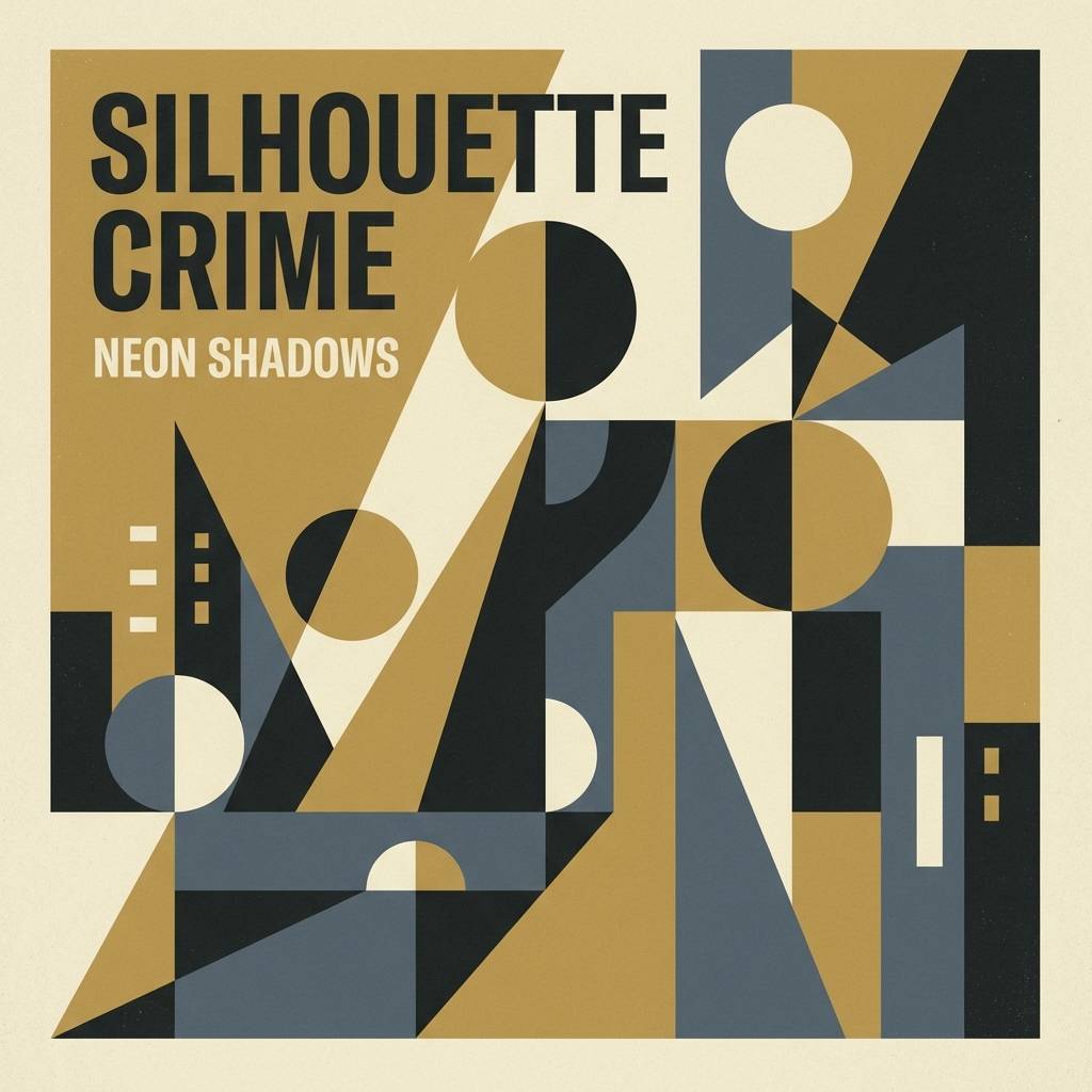
Create Xanadu Palette Visuals with AI
If you’re presenting mood boards or pitching a brand direction, generating visuals from prompts can save hours. Start with one palette, then create multiple scenes (packaging, web UI, interiors) to compare how the same colors behave across contexts.
With Media.io’s text-to-image tool, you can paste the included prompts, adjust aspect ratio, and quickly iterate styles—photorealistic, editorial, or flat graphic layouts—while staying consistent with your xanadu color scheme.
Once you get a result you like, reuse the winning prompt structure and swap only the subject (e.g., “skincare bottle” → “candle label”) to keep a cohesive design system.
Xanadu Color Palette FAQs
-
What color is xanadu?
Xanadu is a muted green-gray, often described as a soft sage-gray. It’s earthy and calm, sitting between green and neutral gray for a modern, grounded look. -
Is xanadu warm or cool?
Xanadu usually reads slightly cool because of its gray base, but it can feel warmer when paired with beige, parchment, brass, or terracotta accents. -
What are the best neutrals to pair with xanadu?
Warm off-white, parchment, linen beige, and pale gray-green work especially well. They keep the palette soft and airy without washing out the green-gray character. -
What accent colors make xanadu pop?
Brass/gold, rust, clay/terracotta, coral, and muted mustard add lively contrast. Use them sparingly for CTAs, badges, borders, or key callouts. -
Is xanadu good for UI design?
Yes—xanadu is great for calm UI themes because it’s low-saturation and easy on the eyes. Pair it with a dark charcoal for text and a single accent color (like cool blue) for active states. -
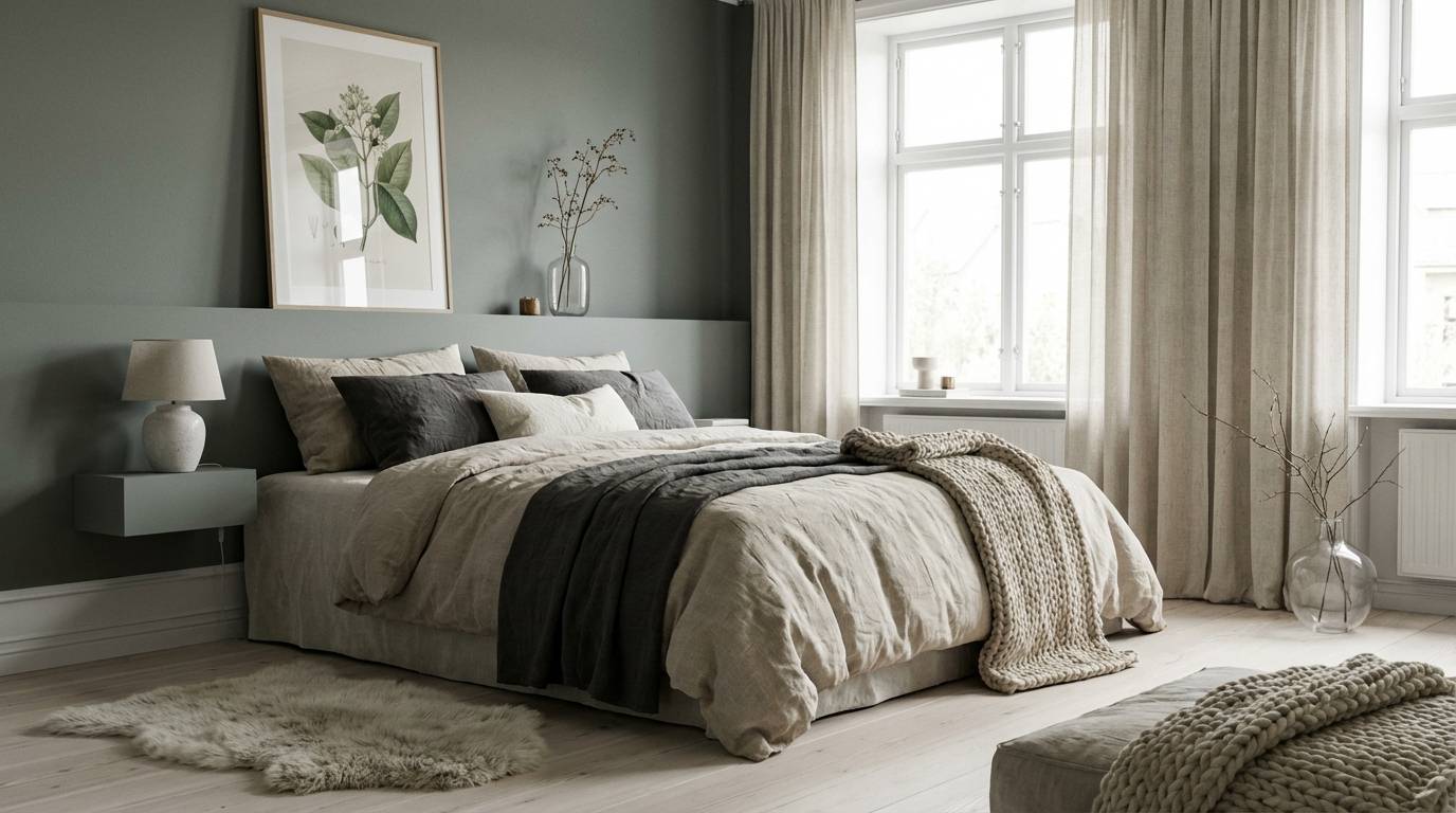
Does xanadu work for interior paint?
It works well as a wall color, especially in bedrooms, living rooms, and wellness spaces. Combine it with warm whites and natural textures (wood, linen, stone) for a balanced, modern look. -
How do I keep a xanadu palette from looking too flat?
Increase value contrast (add a deeper charcoal or near-black), introduce texture (paper grain, linen, matte finishes), and keep one clear accent color for focal points.
Next: Steampunk Color Palette


