Steampunk palettes blend vintage industry with retro-futurist storytelling—think brass gears, soot-dark shadows, sepia paper, and worn leather.
Below are steampunk color palette ideas with HEX codes you can use for posters, UI, branding, packaging, and more—plus tips to keep metallic accents crisp and readable.
In this article
- Why Steampunk Palettes Work So Well
-
- brass coal
- copper cog
- sepia workshop
- velvet engine
- airship dawn
- smoked leather
- clocktower ivy
- gearbox teal
- oxidized copper
- patent paper
- night rail
- amber lantern
- steam sapphire
- rivet rose
- foundry clay
- whiskey walnut
- monarch velvet
- foggy harbor
- tincture bottles
- brasslight minimal
- blueprint brass
- cinder blossom
- What Colors Go Well with Steampunk?
- How to Use a Steampunk Color Palette in Real Designs
- Create Steampunk Palette Visuals with AI
Why Steampunk Palettes Work So Well
A steampunk color scheme is built on believable materials—brass, copper, ink, leather, parchment, smoke—so it instantly feels tactile and “real,” even in flat UI or clean branding.
Most steampunk color combinations are naturally high-contrast: dark charcoals and espresso browns for structure, warm neutrals for readable space, and metallic golds/coppers for controlled emphasis.
They’re also flexible across genres: push blues/teals for technical retro-futurism, add greens for ivy-and-stone heritage, or lean into sepia and rust for archival storytelling.
20+ Steampunk Color Palette Ideas (with HEX Codes)
1) Brass Coal
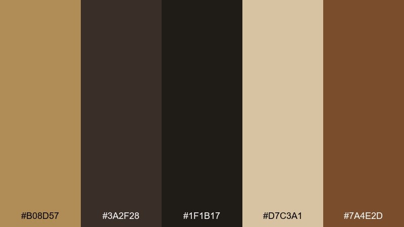
HEX: #b08d57 #3a2f28 #1f1b17 #d7c3a1 #7a4e2d
Mood: industrial, warm, rugged
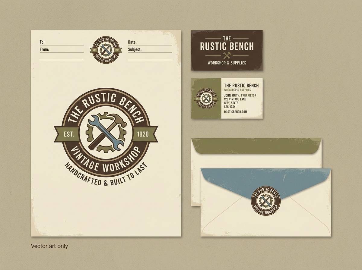
Best for: brand identity for a vintage workshop
Industrial warmth with a brass-and-soot vibe, like lamplight on gears and coal dust on leather. Use the deep charcoals for typography and structure, then bring in brass as a premium accent. The cream tone keeps layouts readable on print and web. Tip: reserve the brass for buttons, seals, or key icons to avoid a muddy look.
Image example of brass coal generated using media.io
Media.io is an online AI studio for creating and editing video, image, and audio in your browser.

2) Copper Cog
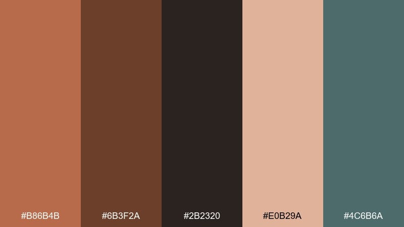
HEX: #b86b4b #6b3f2a #2b2320 #e0b29a #4c6b6a
Mood: mechanical, cozy, artisanal
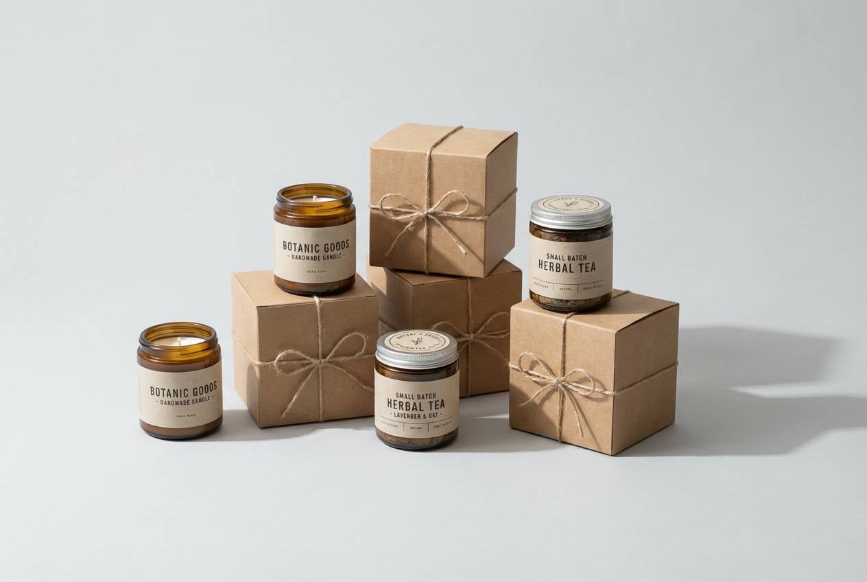
Best for: product packaging for handmade goods
Cozy metalwork tones that feel like polished copper, oiled wood, and a hint of oxidized machinery. The dark brown grounds the design while the blushy copper reads friendly and handcrafted. Add the muted teal as a small contrast note for labels or flavor variants. Tip: print the copper shade as a matte ink and mimic shine with subtle gradients only in small areas.
Image example of copper cog generated using media.io
3) Sepia Workshop
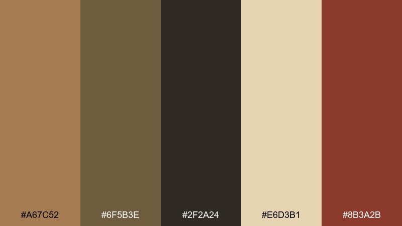
HEX: #a67c52 #6f5b3e #2f2a24 #e6d3b1 #8b3a2b
Mood: nostalgic, gritty, story-driven
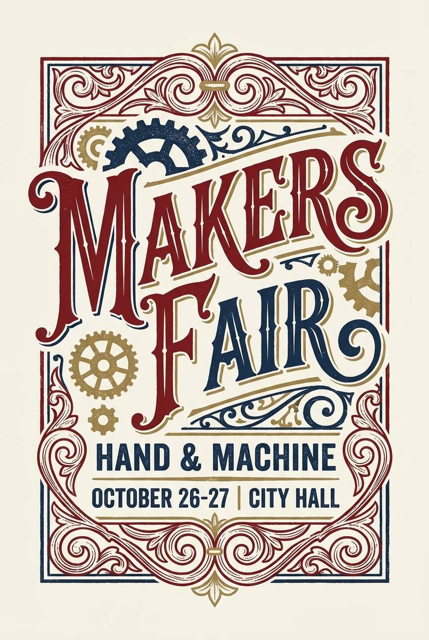
Best for: event poster for a makers fair
Nostalgic and gritty, like aged photographs pinned beside blueprints in a crowded workshop. These steampunk color combinations shine on posters where you want old-world character without sacrificing contrast. Use the parchment tone for the background, then layer dark text and a rust-red callout for dates. Tip: add thin line art in the mid-brown to suggest engravings without overwhelming the layout.
Image example of sepia workshop generated using media.io
4) Velvet Engine
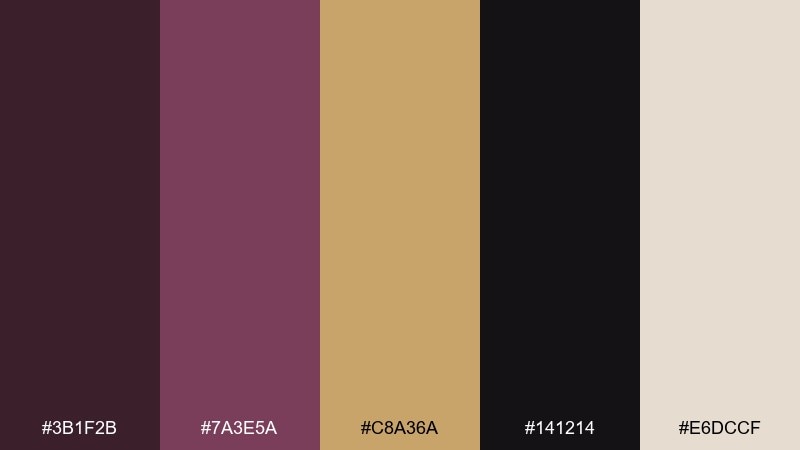
HEX: #3b1f2b #7a3e5a #c8a36a #141214 #e6dccf
Mood: dramatic, luxurious, nocturnal
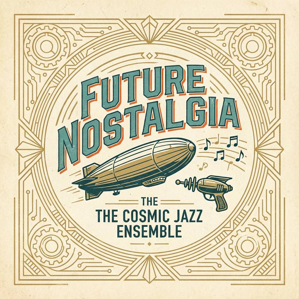
Best for: album cover design for retro-futurist music
Dramatic and plush, like velvet curtains pulled back to reveal a humming engine room. The plum and near-black build a cinematic base, while antique gold brings the spotlight. Use the warm off-white sparingly for track lists and small type so it stays elegant. Tip: keep gold accents aligned to a grid so the richness feels intentional, not random.
Image example of velvet engine generated using media.io
5) Airship Dawn
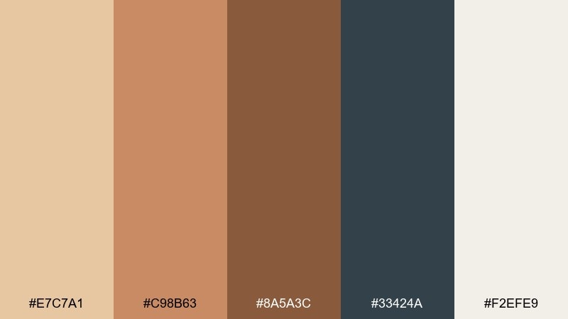
HEX: #e7c7a1 #c98b63 #8a5a3c #33424a #f2efe9
Mood: adventurous, optimistic, airy
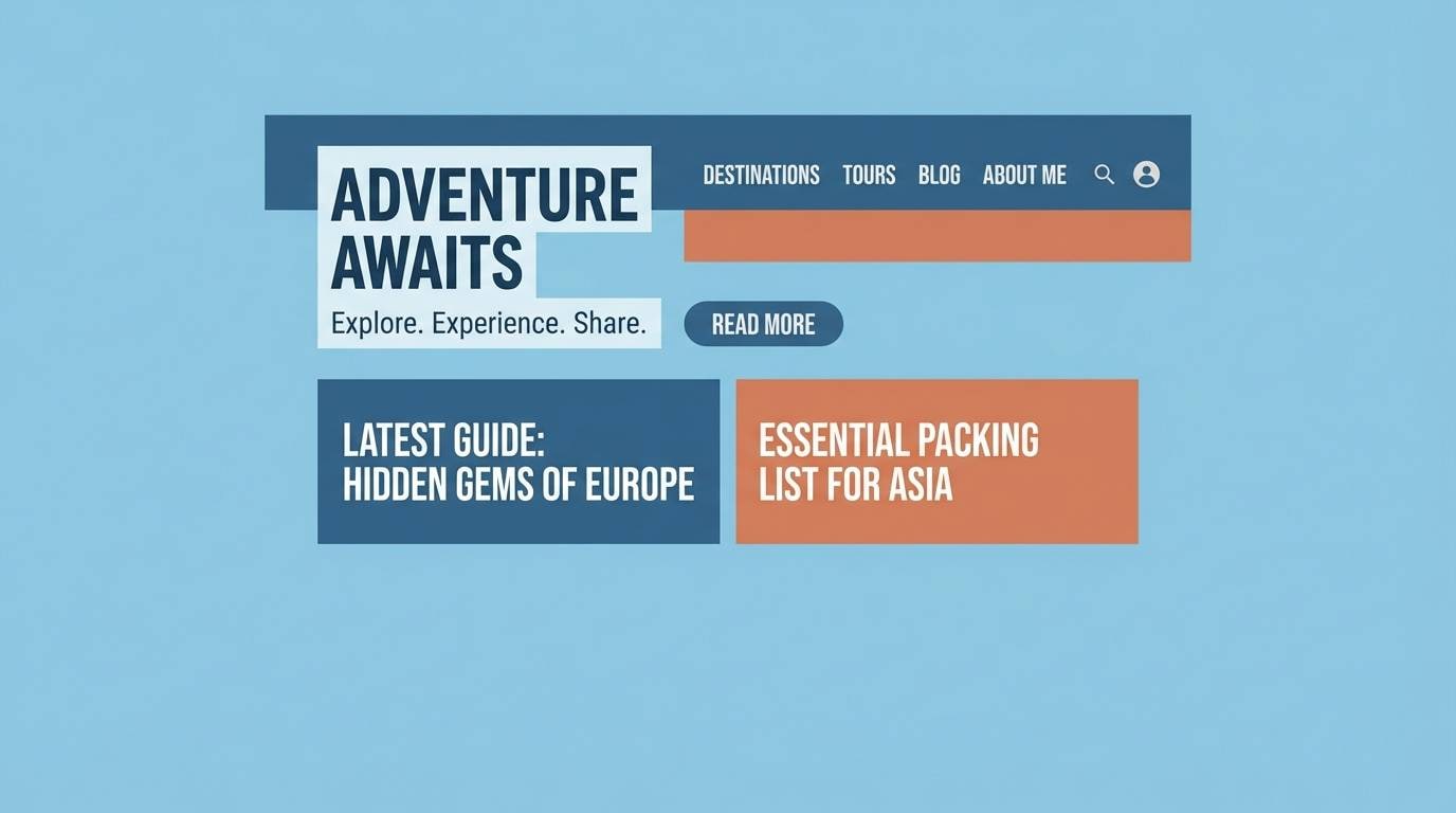
Best for: travel blog header and hero banner
Adventurous and bright, like sunrise washing over riveted hulls and canvas sails. The soft creams and sands keep the mood open, while slate blue adds structure for navigation and headings. Pair the warm browns with subtle textures like paper grain or stitched lines. Tip: use the slate for primary CTA buttons to keep them visible against warm hero photography.
Image example of airship dawn generated using media.io
6) Smoked Leather
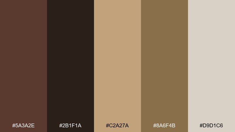
HEX: #5a3a2e #2b1f1a #c2a27a #8a6f4b #d9d1c6
Mood: moody, masculine, tactile
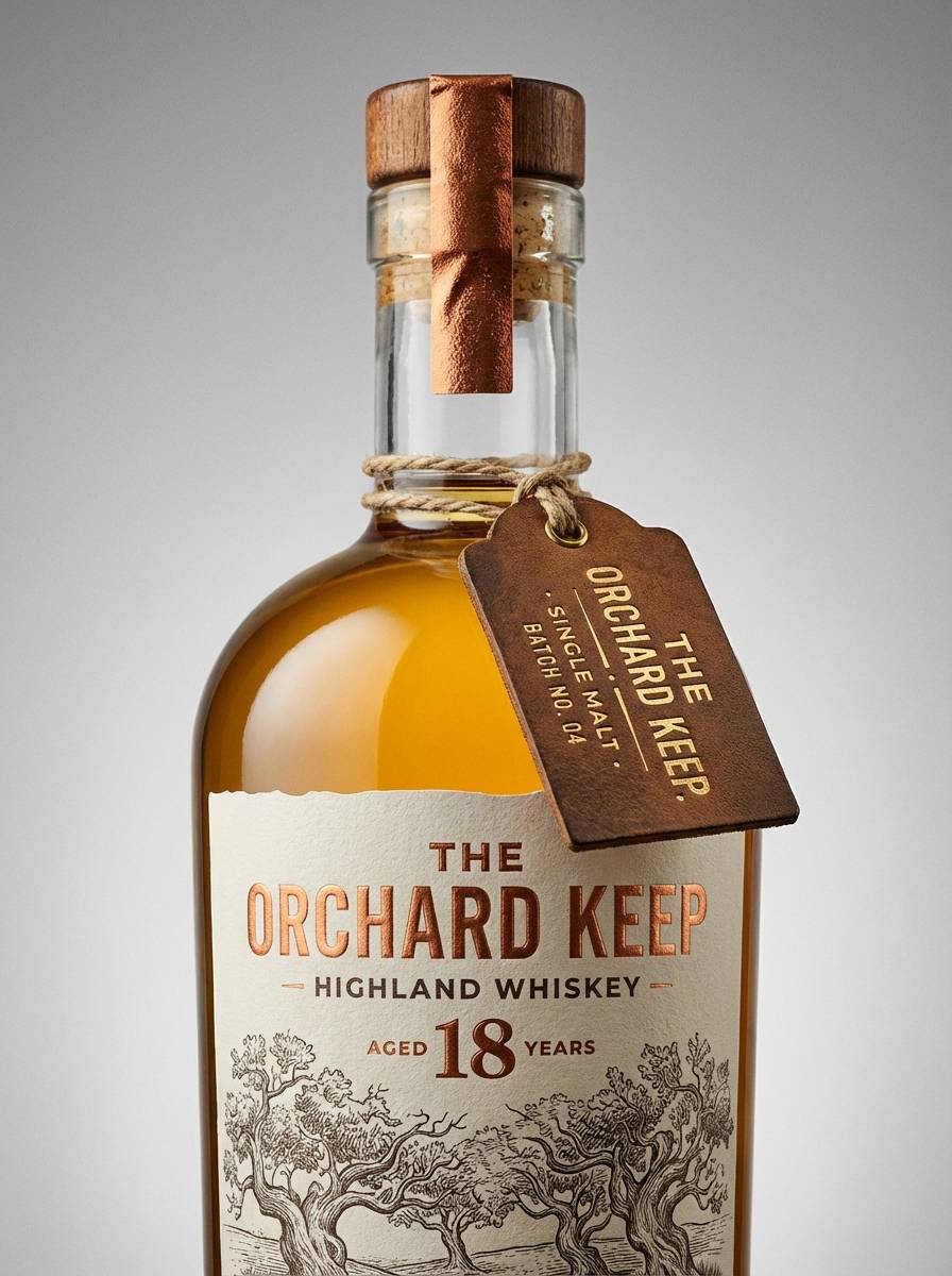
Best for: whiskey label and bottle neck tag
Moody and tactile, like worn leather, pipe smoke, and warm wood behind a bar. A steampunk color palette like this works best when you keep the light tones for breathing room and let the dark browns do the heavy lifting. Pair it with engraved serif type and simple crest icons for an authentic feel. Tip: add one small foil element in the gold-beige to create a premium focal point.
Image example of smoked leather generated using media.io
7) Clocktower Ivy
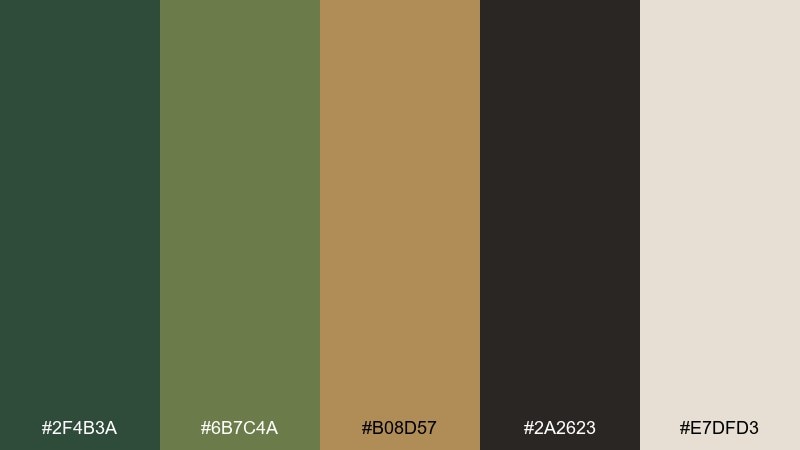
HEX: #2f4b3a #6b7c4a #b08d57 #2a2623 #e7dfd3
Mood: earthy, mysterious, heritage
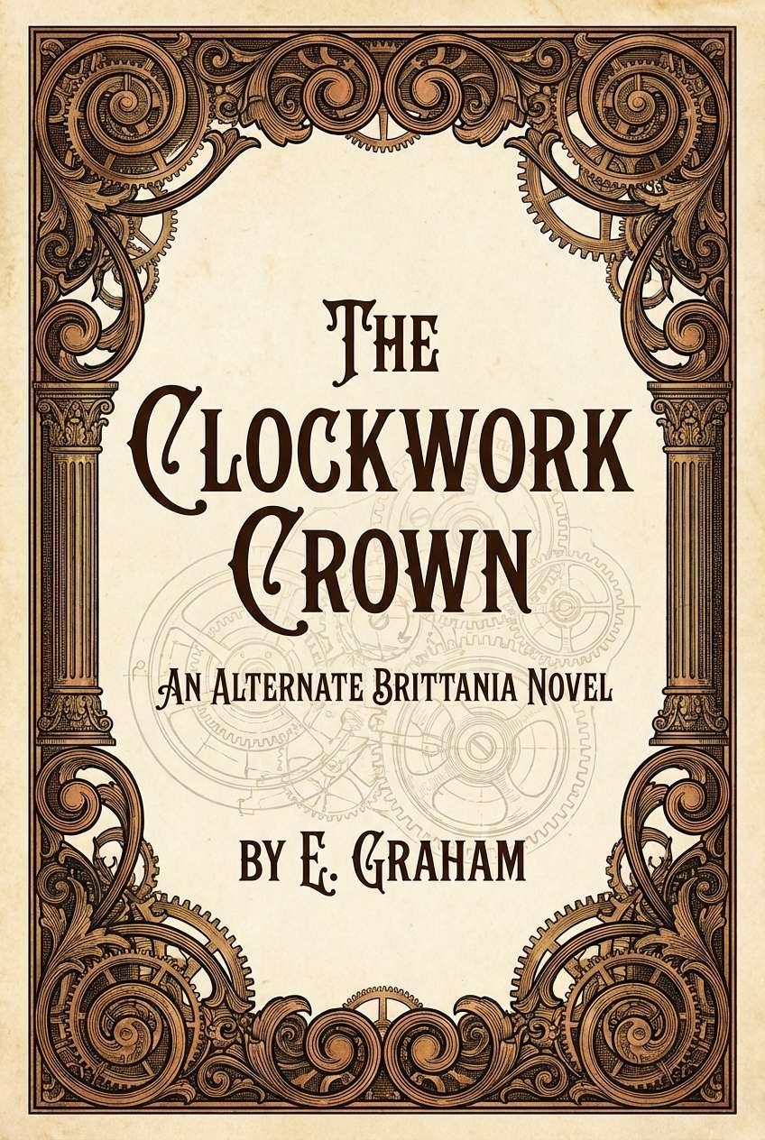
Best for: book cover for an alternate-history novel
Earthy and mysterious, like ivy climbing a clocktower while brass hands tick in the fog. The greens bring a natural counterbalance to the metal notes, keeping the palette from feeling overly industrial. Use the near-black for title contrast and the cream for subtitle clarity. Tip: add a faint gear motif in the light background tone so it reads on close inspection, not from afar.
Image example of clocktower ivy generated using media.io
8) Gearbox Teal
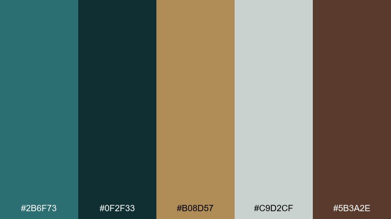
HEX: #2b6f73 #0f2f33 #b08d57 #c9d2cf #5b3a2e
Mood: technical, cool, modern-vintage
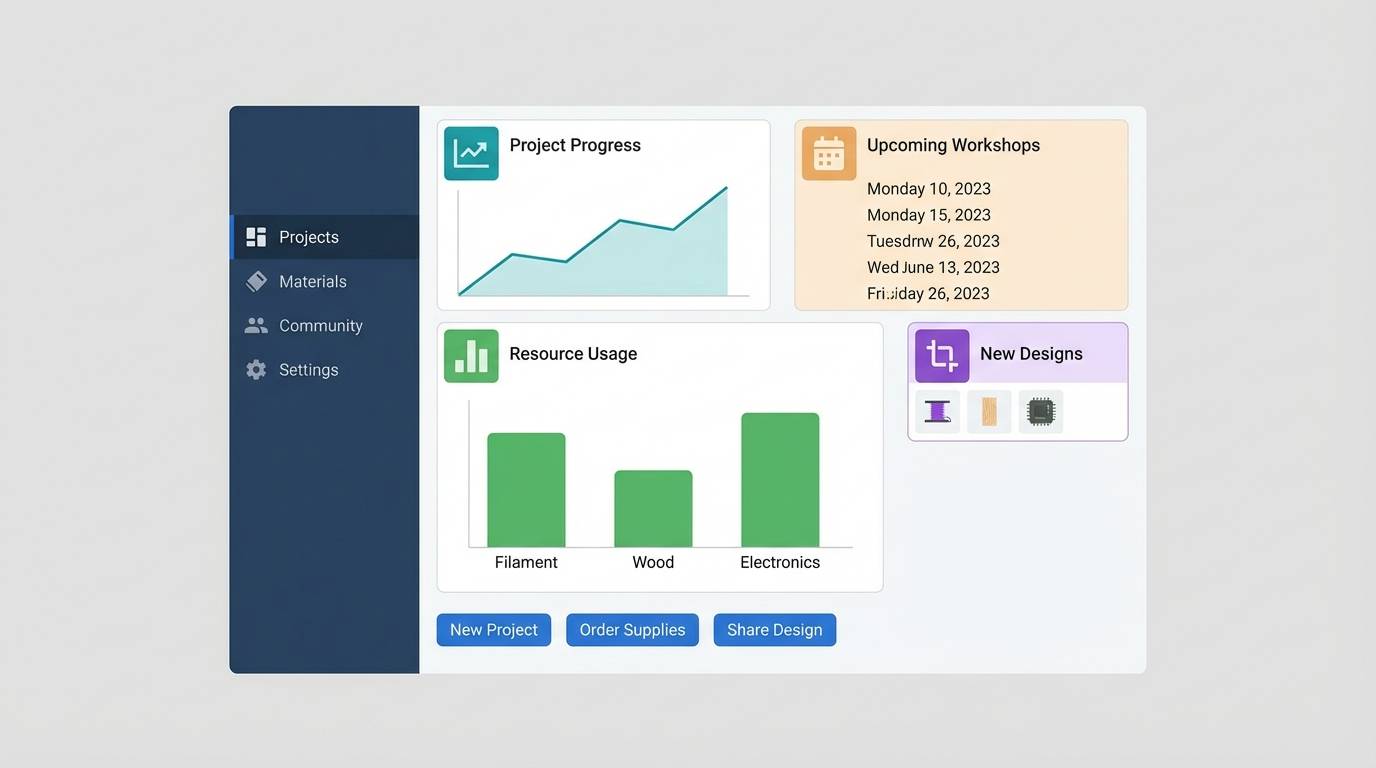
Best for: dashboard UI for a maker app
Technical and cool, like enamel dials and sea-worn metal plates. Teal and deep blue-green make a strong base for interface panels, while antique brass pops for toggles and highlights. Keep the light gray-blue for cards and spacing so the UI stays breathable. Tip: use brass only for active states to avoid confusing emphasis across the dashboard.
Image example of gearbox teal generated using media.io
9) Oxidized Copper
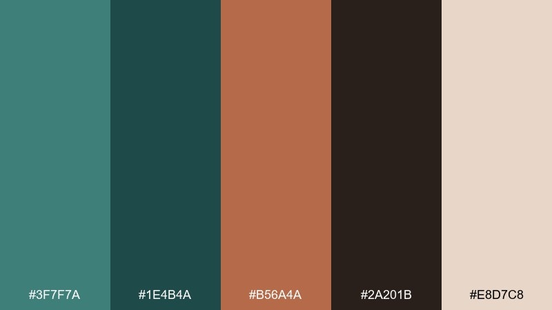
HEX: #3f7f7a #1e4b4a #b56a4a #2a201b #e8d7c8
Mood: weathered, coastal, inventive
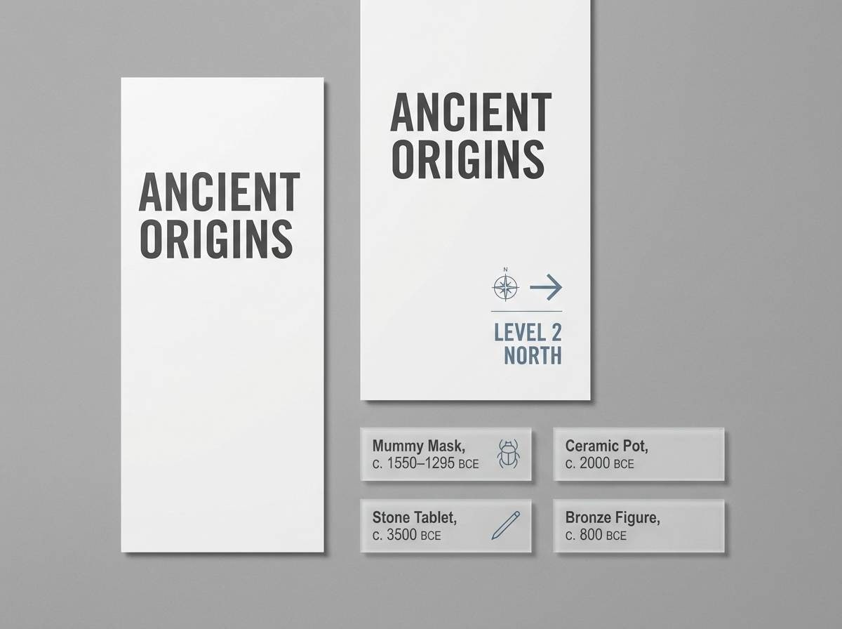
Best for: museum exhibit signage
Weathered and inventive, like copper left to age near salty air and workshop heat. The blue-green tones give you calm surfaces for panels, while copper and espresso add the historical punch. Pair with clean sans-serif type to keep the look contemporary. Tip: set body text in the darkest shade and reserve copper for section headers and arrows.
Image example of oxidized copper generated using media.io
10) Patent Paper
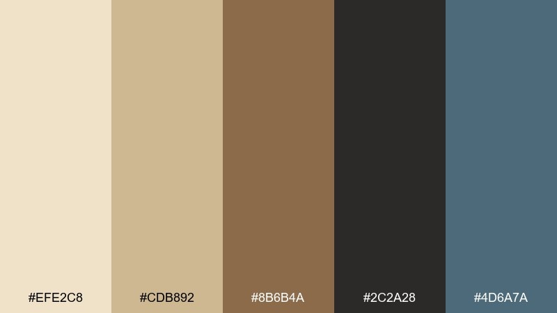
HEX: #efe2c8 #cdb892 #8b6b4a #2c2a28 #4d6a7a
Mood: archival, precise, scholarly
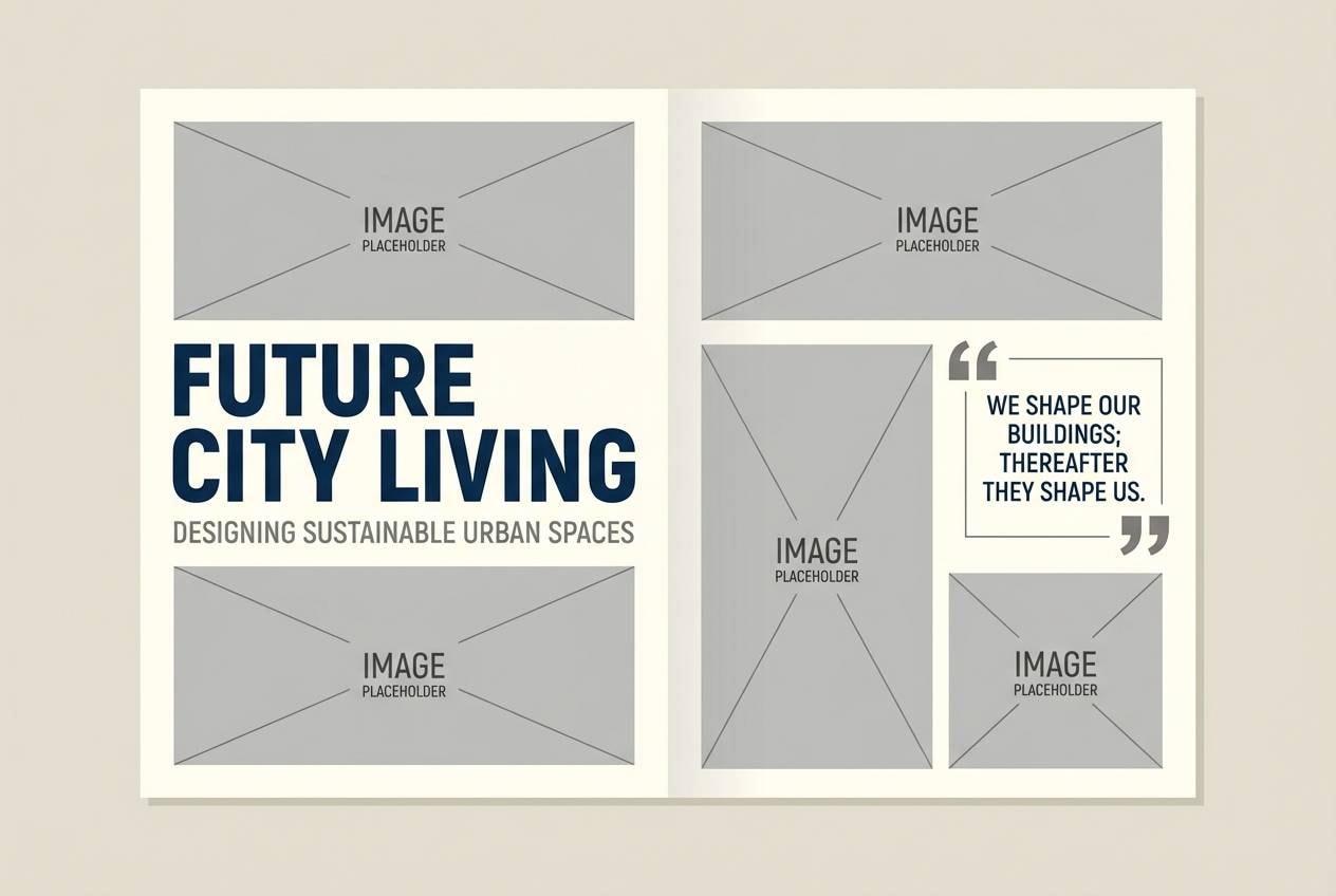
Best for: editorial layout for a design magazine
Archival and precise, like patent drawings on yellowed paper with crisp ink lines. A steampunk color scheme like this reads clean in long-form pages because the neutrals stay gentle on the eyes. Use the slate blue for pull quotes and section dividers to modernize the spread. Tip: keep margins generous and let the darkest shade handle headings and captions for consistency.
Image example of patent paper generated using media.io
11) Night Rail
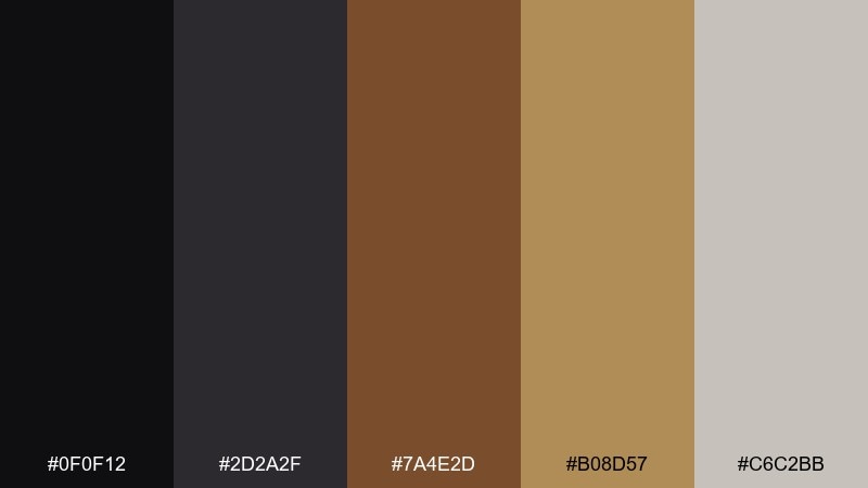
HEX: #0f0f12 #2d2a2f #7a4e2d #b08d57 #c6c2bb
Mood: cinematic, urban, shadowy
Best for: YouTube thumbnail template for a history channel
Cinematic and shadowy, like a midnight station where brass signage catches the last glow. The near-black and graphite give thumbnails strong contrast, while warm gold keeps the focal point readable at small sizes. Pair with bold condensed type and simple shapes rather than busy textures. Tip: outline key text in the light gray to prevent it from sinking into dark backgrounds.
Image example of night rail generated using media.io

12) Amber Lantern
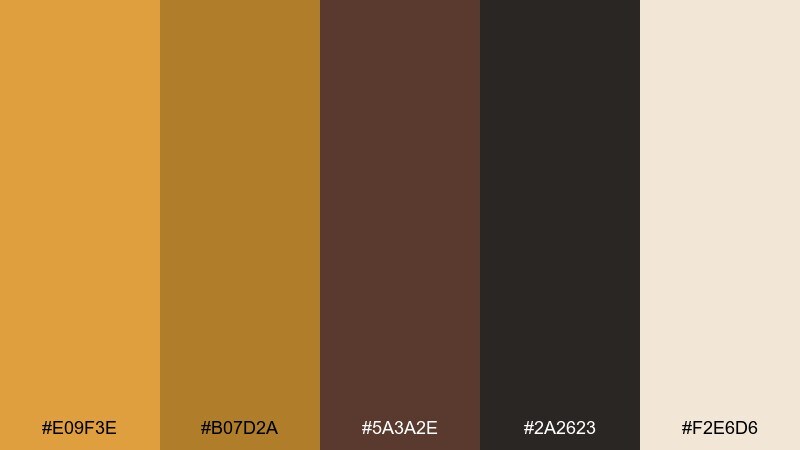
HEX: #e09f3e #b07d2a #5a3a2e #2a2623 #f2e6d6
Mood: glowing, welcoming, festive
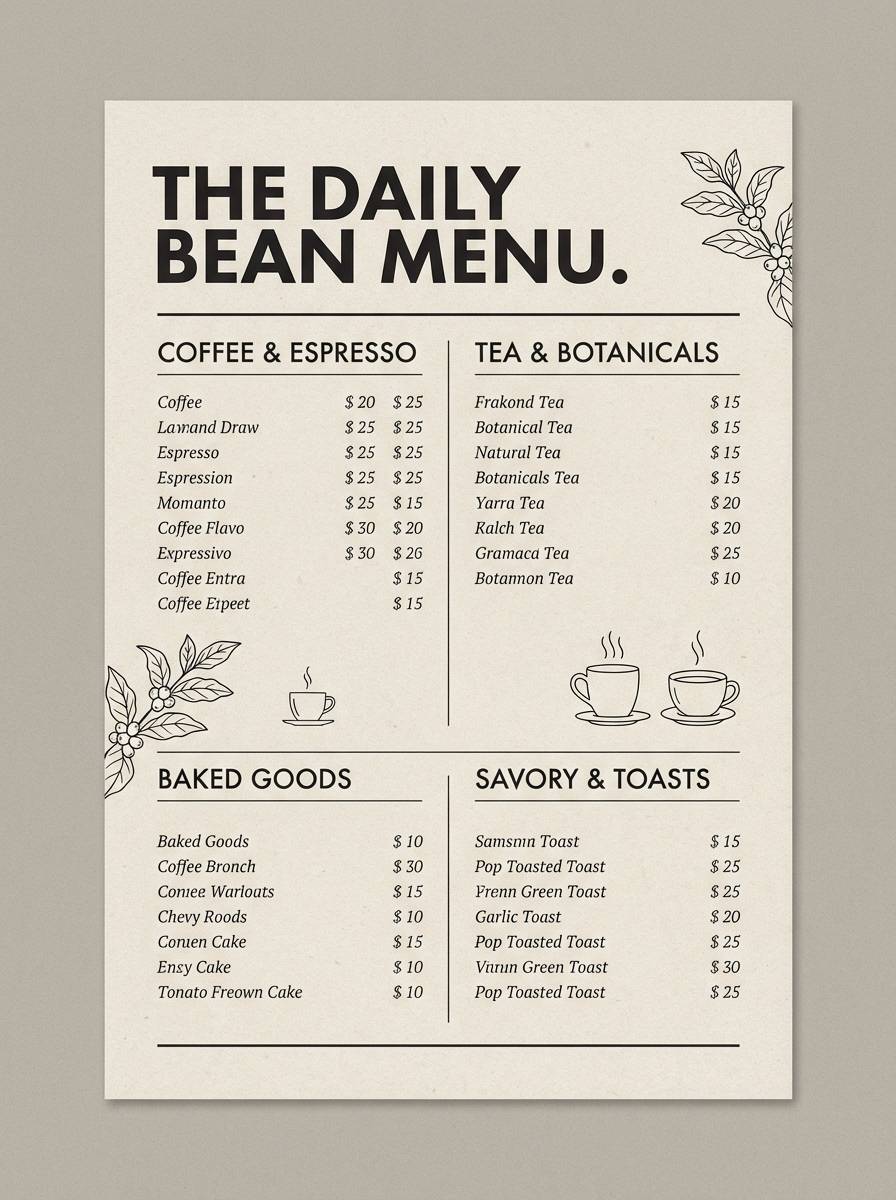
Best for: cafe menu design
Glowing and welcoming, like amber lanterns reflecting off polished wood. Use the bright amber for highlights and price callouts, then lean on the deep browns for headings and structure. The creamy tone keeps the menu light and readable without turning stark white. Tip: apply the strongest amber only to the top one or two specials so attention stays focused.
Image example of amber lantern generated using media.io
13) Steam Sapphire
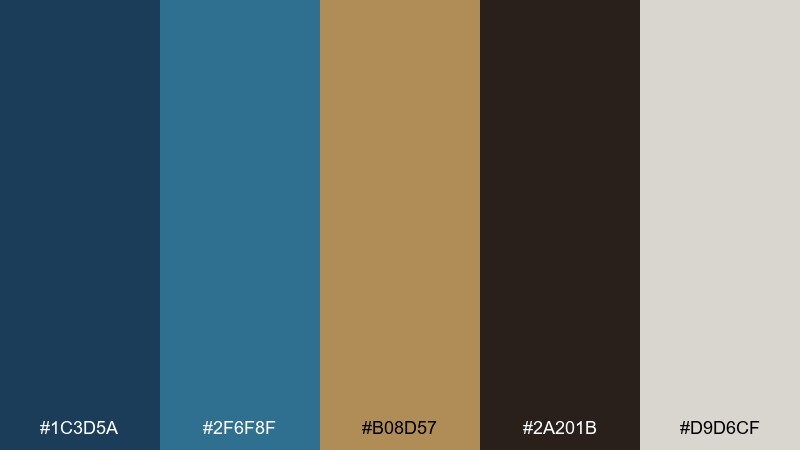
HEX: #1c3d5a #2f6f8f #b08d57 #2a201b #d9d6cf
Mood: inventive, crisp, high-contrast
Best for: app onboarding screens
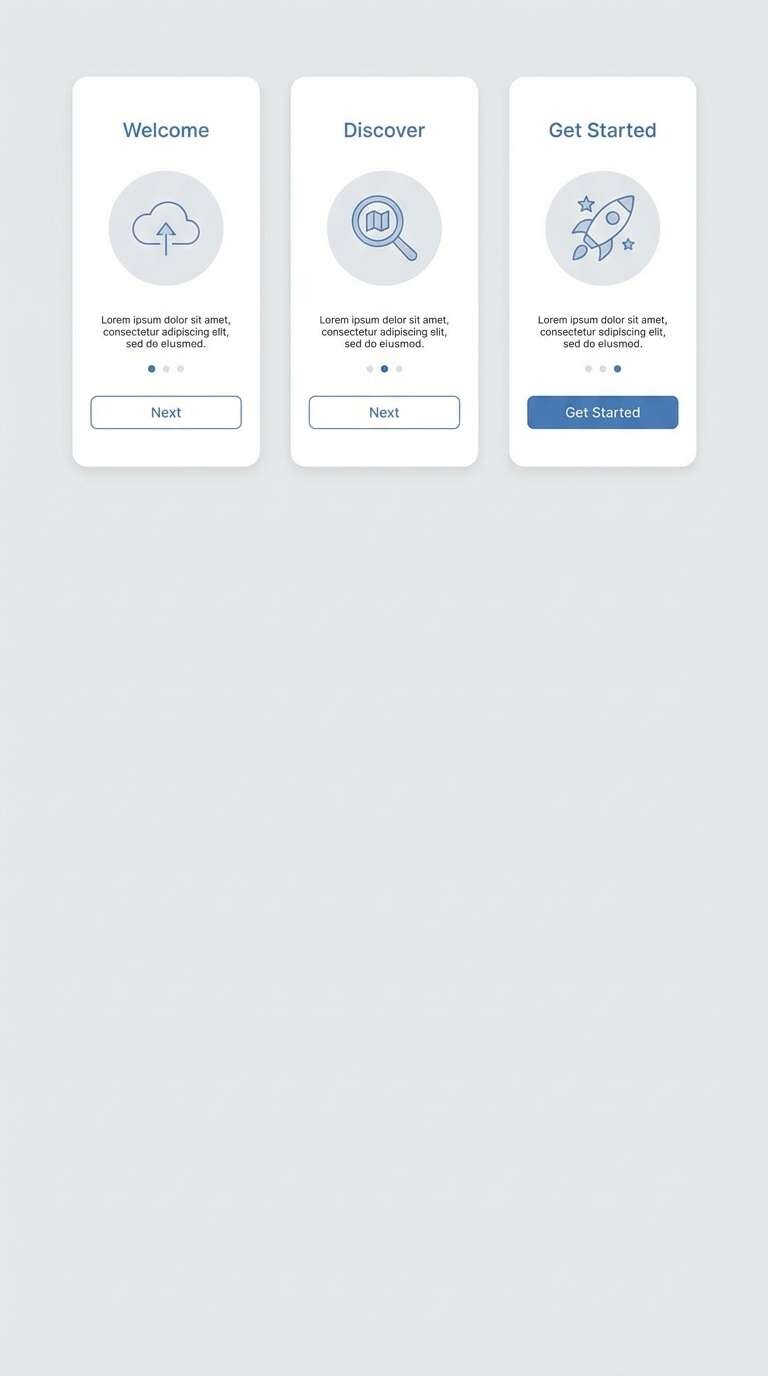
Inventive and crisp, like blue enamel gauges lit against a brass chassis. These steampunk color combinations work well for onboarding because the blues feel modern while the gold reads as a confident accent. Keep backgrounds in the pale gray and use the darkest brown only for key text. Tip: limit gradients to the blue range so the metallic accent stays clean and flat.
Image example of steam sapphire generated using media.io
14) Rivet Rose
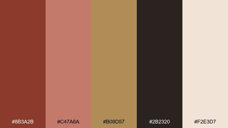
HEX: #8b3a2b #c47a6a #b08d57 #2b2320 #f2e3d7
Mood: romantic, ornate, vintage
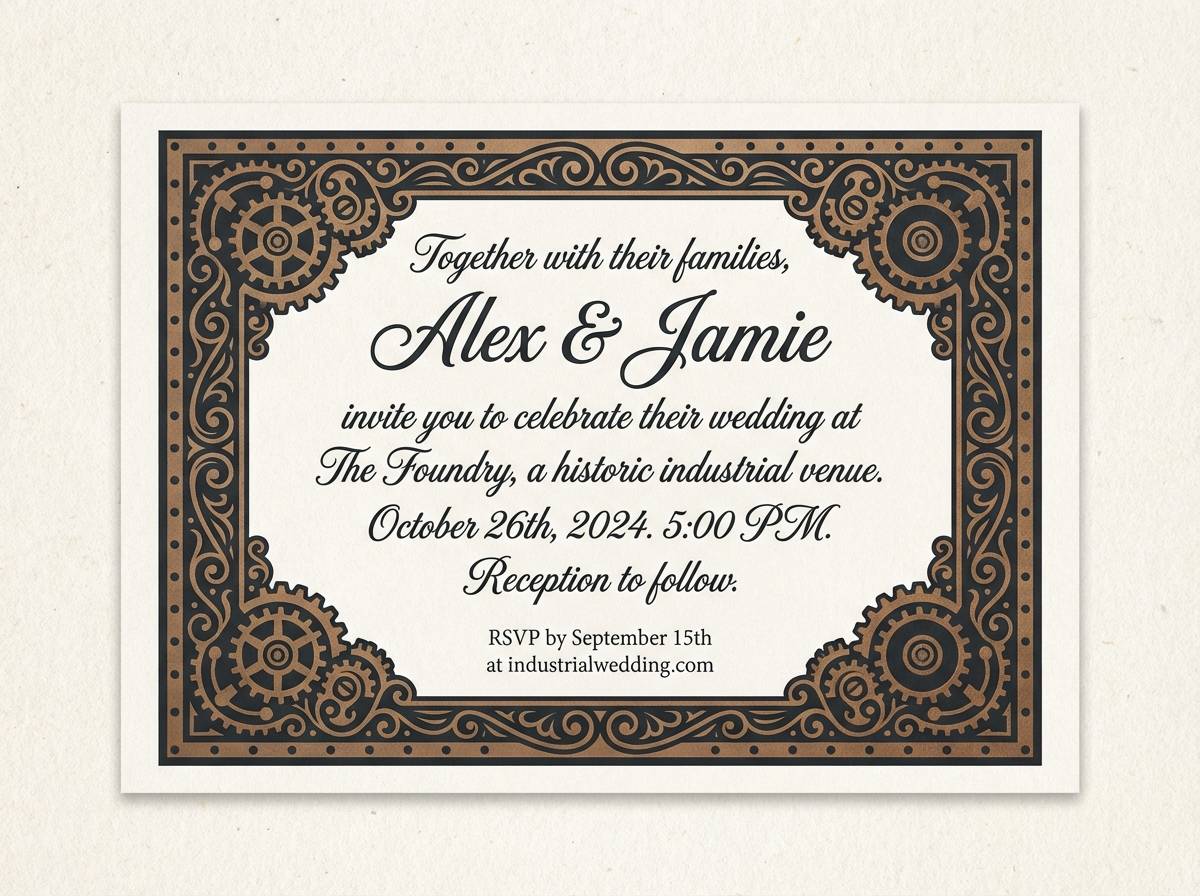
Best for: wedding invitation for an industrial venue
Romantic and ornate, like rose-tinted metalwork and engraved flourishes on a locket. A steampunk color palette with this much warmth suits invitations when you want vintage charm without going too dark. Pair the blush tone with the cream for the main card, then use espresso for text and brass for borders. Tip: keep decorative lines thin so the layout still feels airy and premium.
Image example of rivet rose generated using media.io
15) Foundry Clay
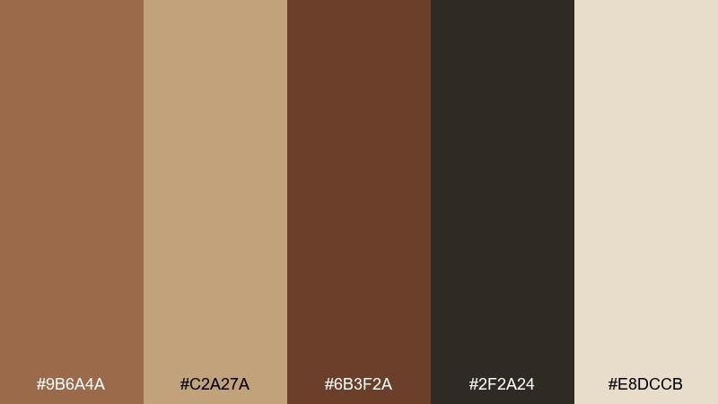
HEX: #9b6a4a #c2a27a #6b3f2a #2f2a24 #e8dccb
Mood: grounded, craft, earthy
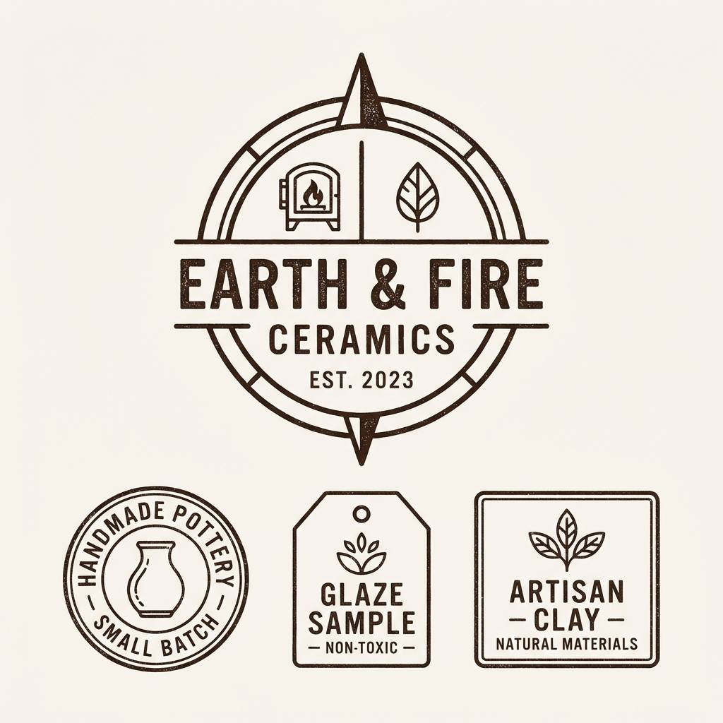
Best for: ceramic studio logo and labels
Grounded and earthy, like kiln-fired clay beside warm sand and iron tools. The mid-tones create a friendly handmade feel, while the dark brown anchors logos and stamps. Use the pale beige as label stock color and let the deeper tones do the printing. Tip: choose one hero shade for your logo mark, then keep the rest for patterns and batch codes.
Image example of foundry clay generated using media.io
16) Whiskey Walnut
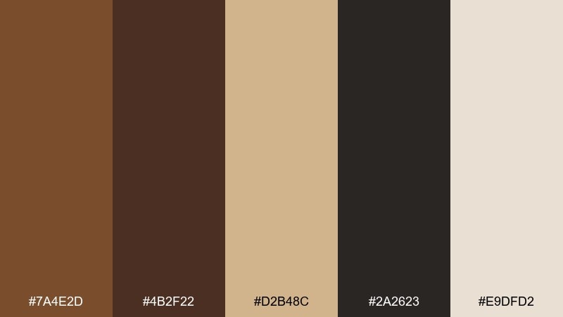
HEX: #7a4e2d #4b2f22 #d2b48c #2a2623 #e9dfd2
Mood: classic, refined, warm
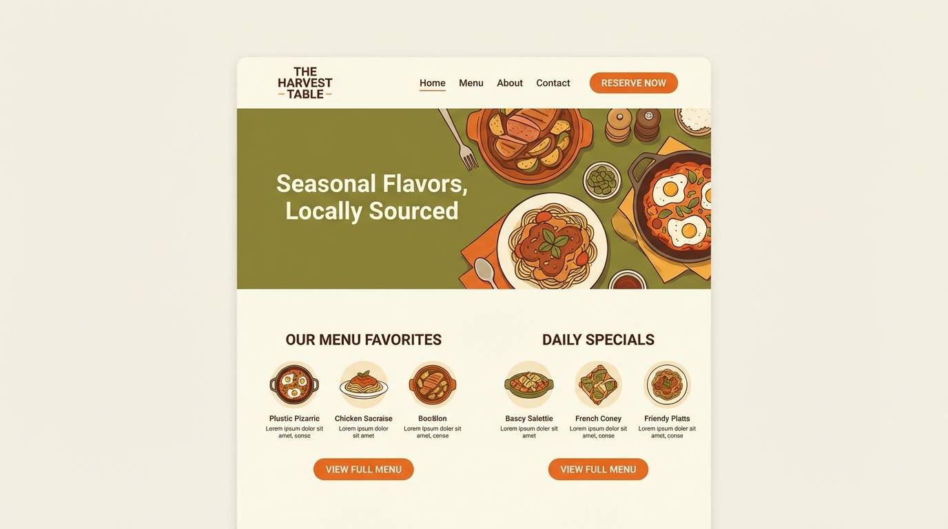
Best for: restaurant website UI theme
Classic and refined, like walnut paneling and a glass of whiskey under soft light. Use the dark tones for headers and navigation, then rely on the creamy neutral for page backgrounds. The tan shade works as a quiet accent for dividers and hover states. Tip: keep body text in the deepest brown rather than pure black to maintain the warm atmosphere.
Image example of whiskey walnut generated using media.io
17) Monarch Velvet
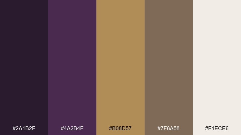
HEX: #2a1b2f #4a2b4f #b08d57 #7f6a58 #f1ece6
Mood: regal, theatrical, moody
Best for: theater playbill cover
Regal and theatrical, like a dim stage with gold trim and deep velvet drapes. The purple-browns feel dramatic without going neon, and the antique gold reads like classic theater detailing. Pair with high-contrast type and symmetrical ornament for a formal vibe. Tip: keep imagery monochrome and let the gold handle all emphasis points.
Image example of monarch velvet generated using media.io
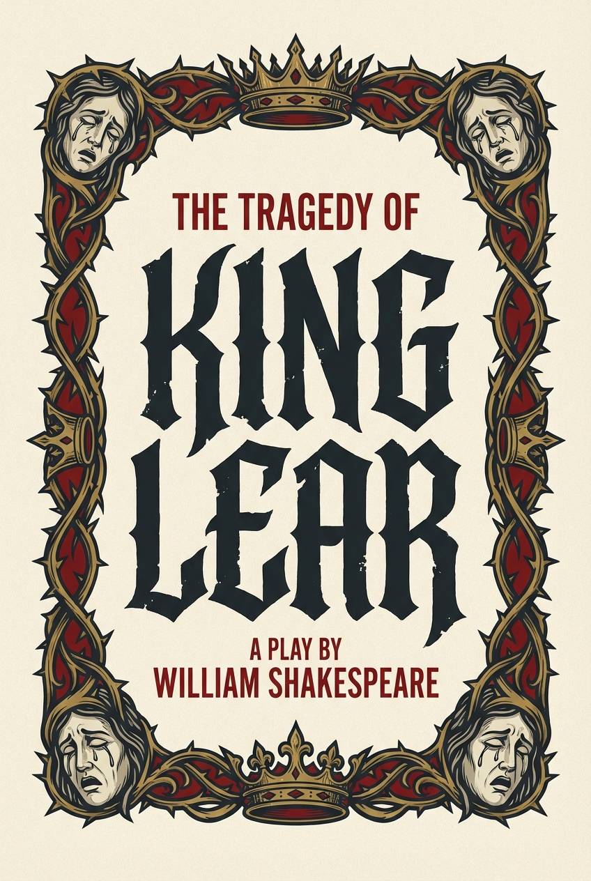
18) Foggy Harbor
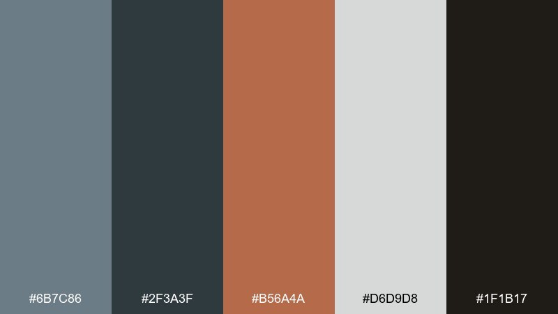
HEX: #6b7c86 #2f3a3f #b56a4a #d6d9d8 #1f1b17
Mood: misty, maritime, industrial
Best for: game UI for an exploration map
Misty and maritime, like a fogbound harbor with iron rails and copper fittings. The gray-blue set keeps UI panels calm, while the warm copper marks interactable hotspots. For readability, use the near-black for labels and the pale gray for map overlays. Tip: reserve copper for one action type, like pins or quests, so players learn the system instantly.
Image example of foggy harbor generated using media.io
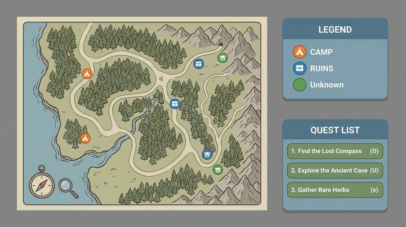
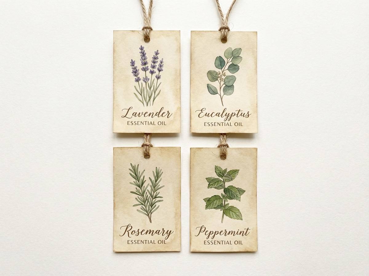
19) Tincture Bottles
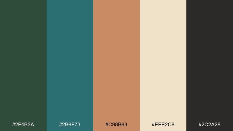
HEX: #2f4b3a #2b6f73 #c98b63 #efe2c8 #2c2a28
Mood: apothecary, curious, eclectic
Best for: botanical label set for essential oils
Apothecary and curious, like shelves of tincture bottles with handwritten tags and mossy glass. The green and teal give a botanical base, while the warm tan adds a comforting handmade note. For strong hierarchy, put text on the parchment shade and use the darkest tone for ingredient details. Tip: keep illustration lines thin and consistent so the labels feel cohesive across scents.
Image example of tincture bottles generated using media.io
20) Brasslight Minimal
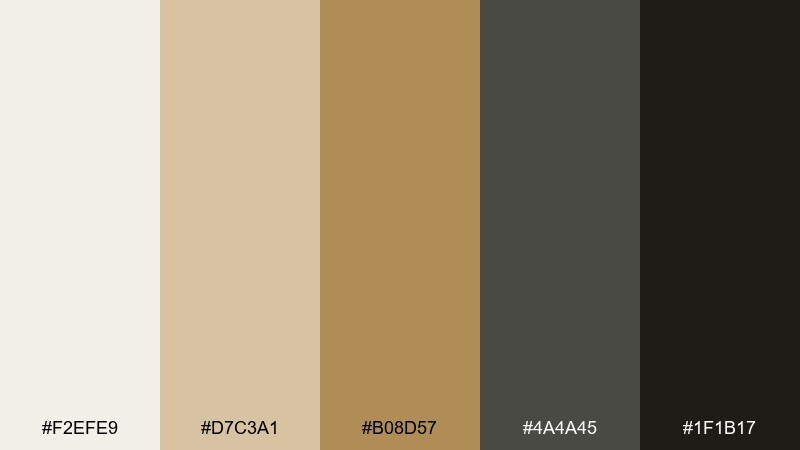
HEX: #f2efe9 #d7c3a1 #b08d57 #4a4a45 #1f1b17
Mood: minimal, premium, balanced
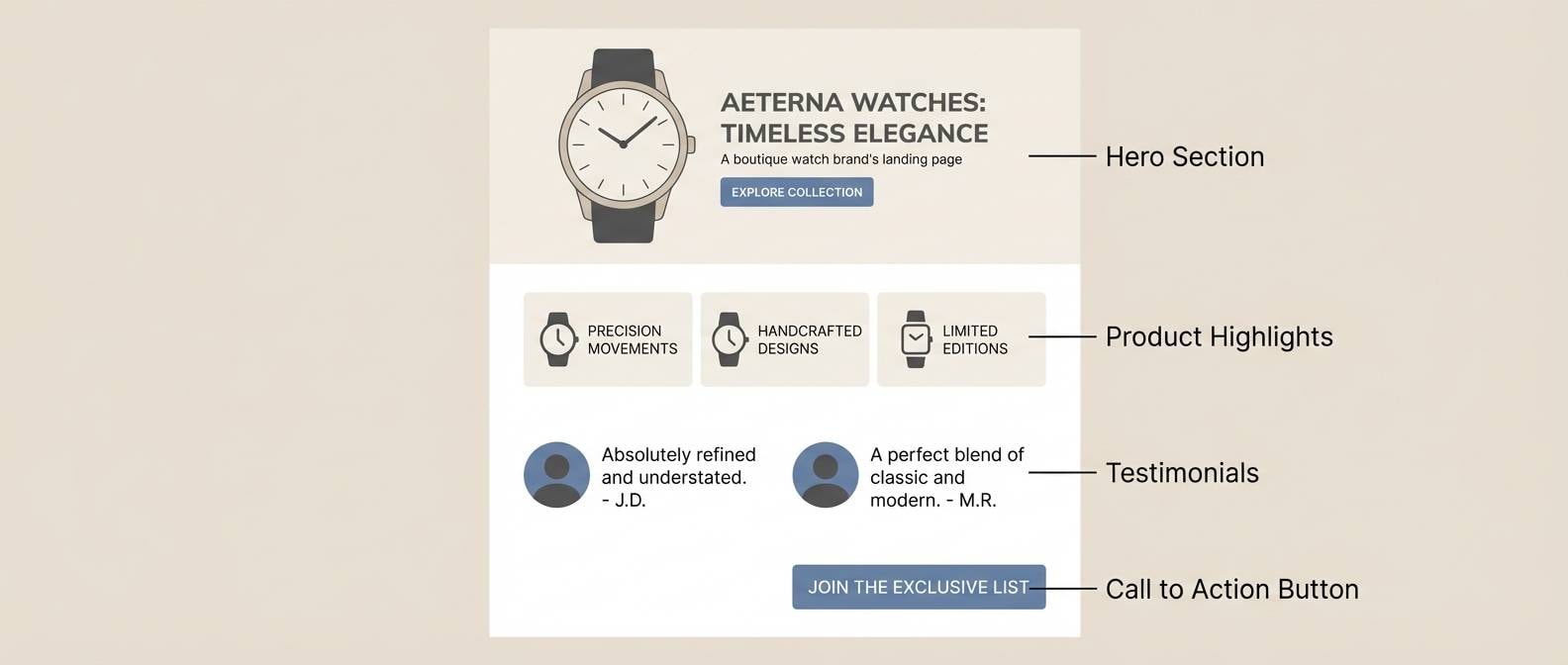
Best for: landing page for a boutique watch brand
Minimal and premium, like brushed brass under soft daylight and crisp shadows. This steampunk color combination stays modern because the neutrals do most of the work and the metal tone becomes a restrained accent. Use off-white for spacious sections, charcoal for text, and brass for only the most important CTA. Tip: add subtle hairline dividers in the light beige to keep the layout structured without visual noise.
Image example of brasslight minimal generated using media.io
21) Blueprint Brass
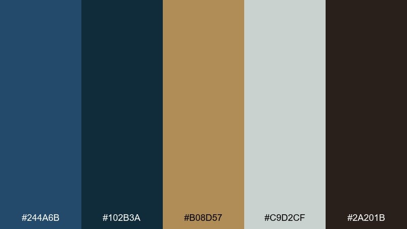
HEX: #244a6b #102b3a #b08d57 #c9d2cf #2a201b
Mood: engineered, confident, crisp
Best for: presentation slide theme for a tech talk
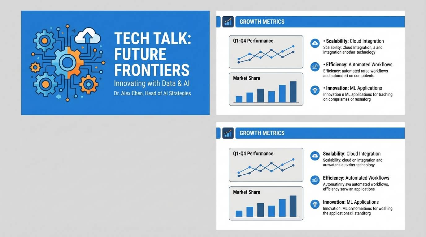
Engineered and crisp, like blueprint ink lines meeting polished brass fasteners. The deep blues create strong framing for slides, and the brass accent highlights key metrics without feeling loud. Use the cool light gray for content blocks to keep charts readable. Tip: repeat brass only on titles and one data highlight per slide to maintain clarity.
Image example of blueprint brass generated using media.io
22) Cinder Blossom
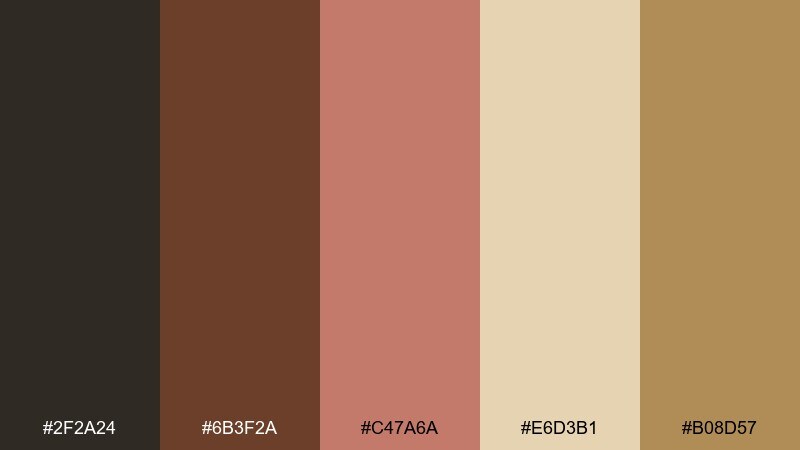
HEX: #2f2a24 #6b3f2a #c47a6a #e6d3b1 #b08d57
Mood: soft, smoky, romantic
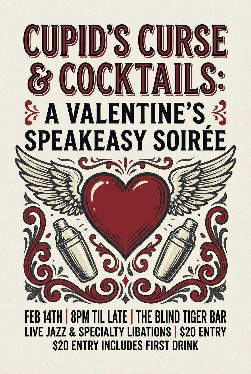
Best for: valentines day flyer for a themed bar
Soft and smoky, like warm embers under rose petals and gold filigree. The blush note keeps the mood playful, while the cinder and coffee browns make it feel mature and atmospheric. Use the parchment for background space and let gold act as a small sparkle. Tip: set the headline in the darkest shade and use blush only for secondary accents like hearts or corner flourishes.
Image example of cinder blossom generated using media.io
What Colors Go Well with Steampunk?
Steampunk pairs best with warm metallics (brass, antique gold, copper) and grounded neutrals (espresso, charcoal, parchment, warm gray). These give your design a “built from materials” feeling.
For contrast, use cool counterpoints like slate blue, deep teal, or oxidized green—just keep them slightly muted so they still feel vintage and mechanical.
If you need a modern edge, add a clean off-white for spacing and readability, and keep your darkest tone for typography and key UI labels.
How to Use a Steampunk Color Palette in Real Designs
Start with a neutral base: parchment/off-white for backgrounds or deep charcoal for dark-mode layouts. Then pick one metallic shade as the accent for CTAs, badges, and icon highlights.
Protect legibility by assigning roles: darkest tone for body text, mid-tones for borders and secondary UI, and the brightest warm tone for emphasis. This prevents the “muddy brown” problem common in steampunk palettes.
For print, keep metallics controlled and consider matte inks; for digital, mimic metal with subtle shading only in small areas (buttons, seals, ornaments), not across large blocks.
Create Steampunk Palette Visuals with AI
If you’re pitching a concept or building a moodboard, generate fast steampunk visuals from prompts—then refine with consistent HEX-based color direction.
With Media.io, you can create themed posters, UI mockups, label concepts, and cover-style graphics that match your palette, helping you iterate before production.
Try describing the design type (poster/UI/packaging), add “steampunk,” and include a few key colors (like brass + charcoal + parchment) to guide the output.
Steampunk Color Palette FAQs
-
What is a steampunk color palette?
A steampunk color palette is a set of vintage-industrial colors inspired by brass and copper metals, soot-dark shadows, sepia paper, leather browns, and muted blue/green enamel tones. -
What are the most common steampunk colors?
Brass/gold (#b08d57 range), copper/rust (#b56a4a–#b86b4b), espresso and charcoal (#2a201b–#1f1b17), and parchment/cream (#efe2c8–#f2efe9) are the most common anchors. -
How do I keep steampunk palettes from looking muddy?
Use one light neutral (parchment/off-white) for space, one very dark neutral for text, and reserve metallics for small accents like buttons, borders, or icons. Avoid using multiple mid-browns as large backgrounds. -
Do steampunk palettes work for UI design?
Yes—teal/blue “enamel” bases with brass accents (for active states) can feel modern-vintage while staying readable. Keep cards and surfaces light, and use the darkest shade for labels. -
What accent colors pair well with brass and copper?
Muted slate blue, deep teal, and oxidized green pair well because they contrast warm metals without breaking the vintage mood. Use them sparingly for navigation, tags, or secondary highlights. -
Is steampunk better with warm or cool neutrals?
Warm neutrals usually fit best (parchment, warm gray, tan) because they echo aged paper and leather. Cool grays can work if you add enough warm metal accents to keep it from feeling sterile. -
Can I generate steampunk palette mockups with AI?
Yes—use Media.io’s text-to-image to generate posters, packaging, covers, or UI concepts, and include your key HEX-inspired colors (like brass + charcoal + parchment) in the prompt for more consistent results.


