

Wine red is one of those rare colors that feels instantly premium, emotional, and grounded all at once. It can read as classic (think heritage labels and leather) or sharply modern when paired with clean neutrals and high-contrast accents.
Below are wine red color palette ideas with HEX codes you can use for branding, interiors, packaging, and UI—ranging from moody darks to bright, energetic pairings.
In this article
- Why Wine Red Palettes Work So Well
-
- cellar velvet
- merlot marble
- cranberry night
- vintage bordeaux
- rose brass
- garnet linen
- wine walnut
- plum smoke
- velvet sunset
- dark cherry soda
- aubergine ink
- sangria citrus
- rustic vineyard
- cocoa cabernet
- petal pinot
- noir teal contrast
- blush concrete
- forest merlot
- champagne brick
- minimal wine ui
- mulled berry
- ink rosewood
- What Colors Go Well with Wine Red?
- How to Use a Wine Red Color Palette in Real Designs
- Create Wine Red Palette Visuals with AI
Why Wine Red Palettes Work So Well
Wine red sits in a sweet spot between bold and timeless. It carries the strength of deep red, but with enough darkness and nuance to feel refined rather than loud.
It also pairs easily across styles: warm neutrals make it cozy and approachable, cool grays make it feel modern and architectural, and saturated accents (coral, teal, pink) turn it into a high-impact, contemporary system.
Most importantly, wine red creates instant hierarchy. A single wine-red CTA, header, or badge can anchor an entire layout while letting lighter supporting colors keep the design breathable.
20+ Wine Red Color Palette Ideas (with HEX Codes)
1) Cellar Velvet
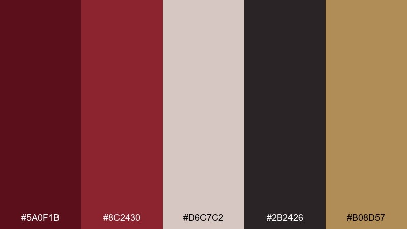
HEX: #5A0F1B #8C2430 #D6C7C2 #2B2426 #B08D57
Mood: luxurious, intimate, classic
Best for: premium branding and wine label design
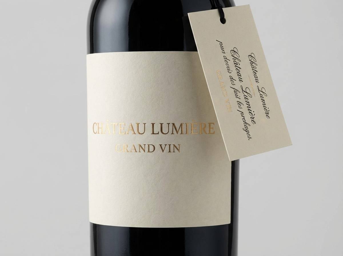
Luxurious and intimate, like a candlelit cellar lined with oak barrels. The deep wine base feels instantly premium, while warm gold and soft stone keep it readable. Use it for labels, logos, and hero sections where you want richness without heaviness. Tip: reserve the gold tone for small highlights like seals, dividers, or key CTAs.
Image example of cellar velvet generated using media.io
Media.io is an online AI studio for creating and editing video, image, and audio in your browser.

2) Merlot Marble
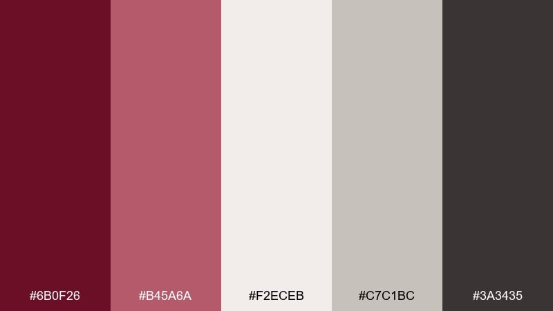
HEX: #6B0F26 #B45A6A #F2ECEB #C7C1BC #3A3435
Mood: polished, airy, upscale
Best for: beauty packaging and boutique ecommerce
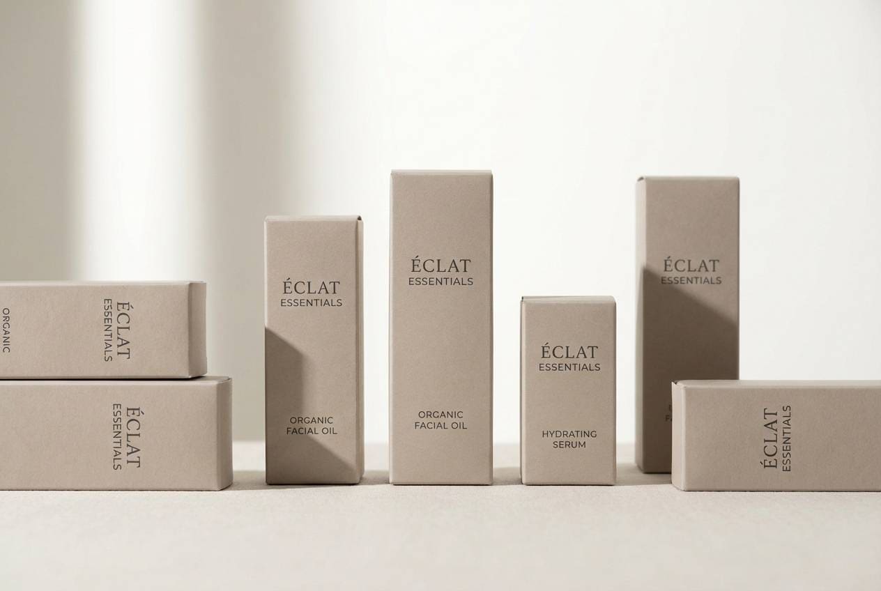
Polished and airy, like merlot poured beside pale marble. The blush midtone softens the dark red, and the cool grays make the whole set feel modern. It shines on skincare cartons, product pages, and minimalist ads. Tip: keep the darkest shade for type and borders so the pale stones stay clean.
Image example of merlot marble generated using media.io
3) Cranberry Night
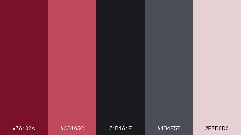
HEX: #7A102A #C04A5C #1B1A1E #4B4E57 #E7D0D3
Mood: dramatic, nocturnal, editorial
Best for: fashion editorials and event posters
Dramatic and nocturnal, like city lights reflecting off a cranberry cocktail. This wine red color palette balances inky blacks with a punchy rosy accent for high contrast. It works beautifully for fashion spreads, nightlife flyers, and bold social launches. Tip: let the pale pink act as breathing room around headlines and dates.
Image example of cranberry night generated using media.io

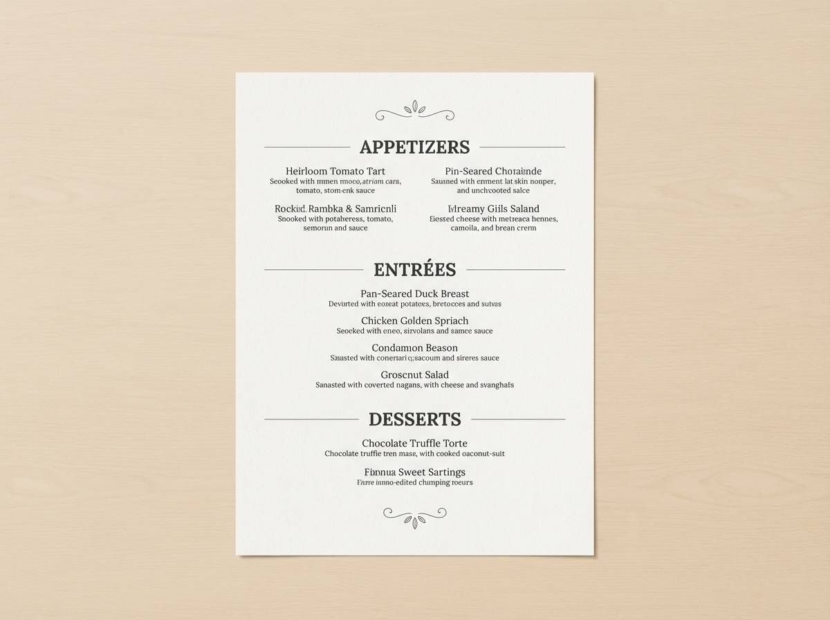
4) Vintage Bordeaux

HEX: #4E0B1A #7B1E2D #A56A5A #E6D6C8 #2E2A28
Mood: heritage, warm, refined
Best for: restaurant menus and classic hospitality
Heritage and warm, like a well-worn Bordeaux label and aged leather. The earthy tan and parchment tones keep the reds grounded and approachable. Use it for menus, tasting notes, boutique hotel collateral, or anything that needs old-world charm. Tip: print designs benefit from the parchment base with the darkest shade for body text.
Image example of vintage bordeaux generated using media.io
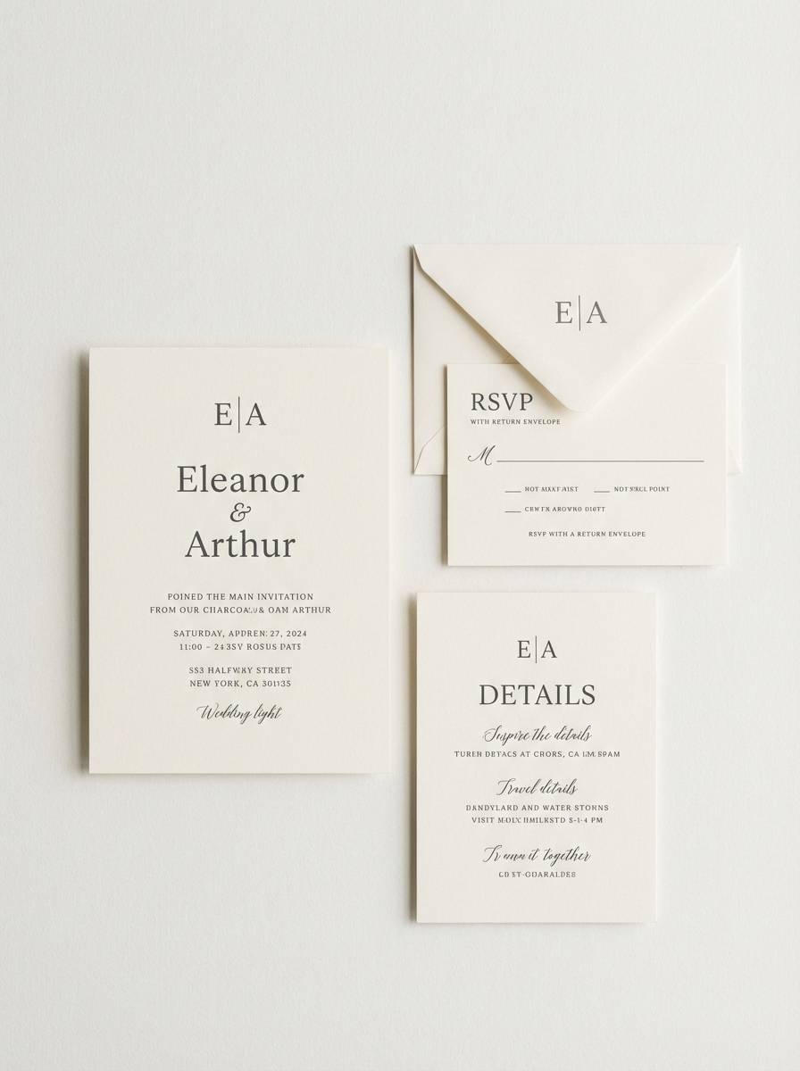
5) Rose Brass
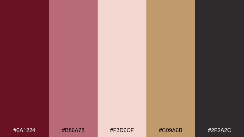
HEX: #6A1224 #B86A78 #F3D6CF #C09A6B #2F2A2C
Mood: romantic, warm, chic
Best for: wedding invitations and milestone events
Romantic and warm, like dried roses paired with brushed brass. The soft blush makes the darker red feel inviting, while brass adds a subtle celebration note. It is ideal for invitations, RSVP cards, and refined social templates. Tip: keep metallic tones minimal and use them as rules, monograms, or small icons.
Image example of rose brass generated using media.io
6) Garnet Linen
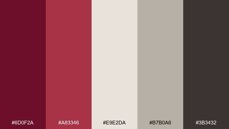
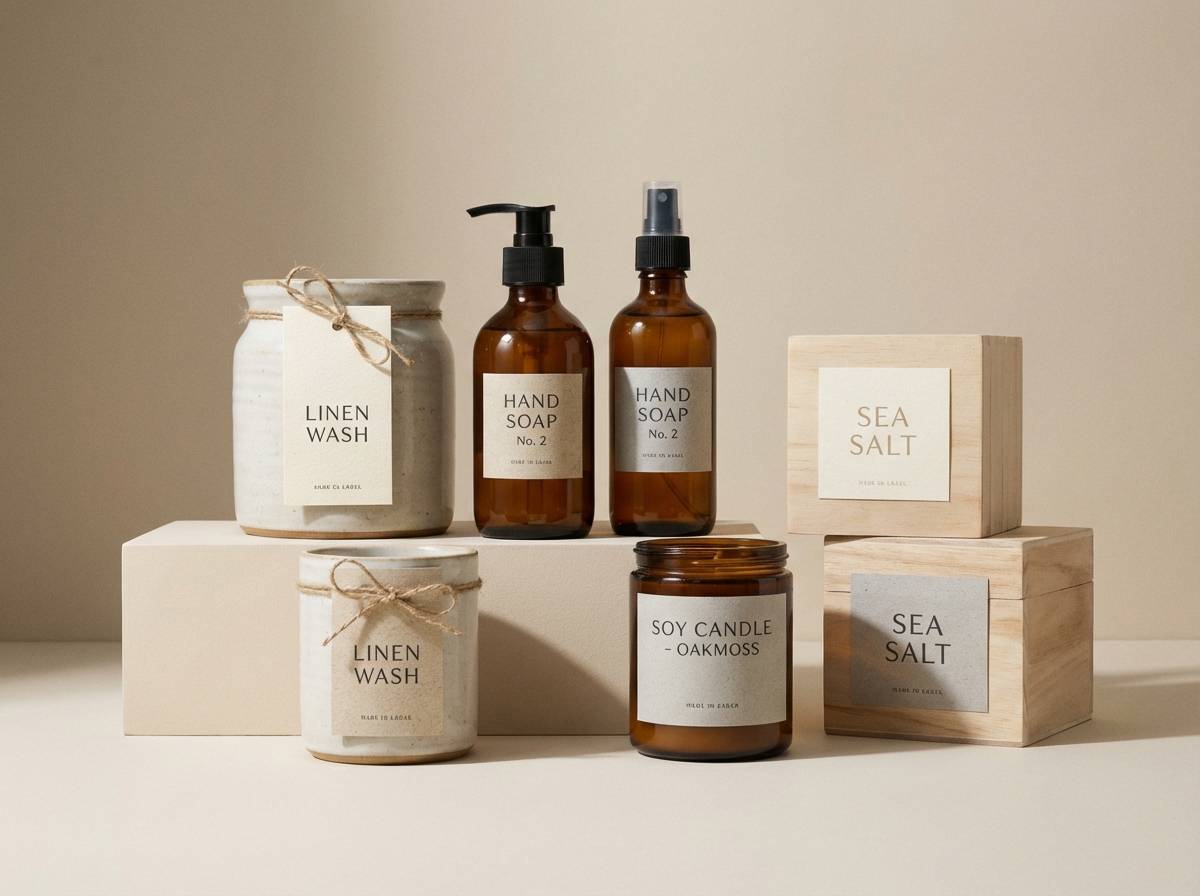
HEX: #6D0F2A #A83346 #E9E2DA #B7B0A6 #3B3432
Mood: cozy, crafted, understated
Best for: home goods branding and lifestyle blogs
Cozy and crafted, like garnet threads woven through natural linen. These wine red color combinations feel grounded thanks to warm neutrals and a deep cocoa anchor. Use them for home goods packaging, blog headers, and calm product storytelling. Tip: pair the linen tones with plenty of whitespace so the reds read as accents, not blocks.
Image example of garnet linen generated using media.io
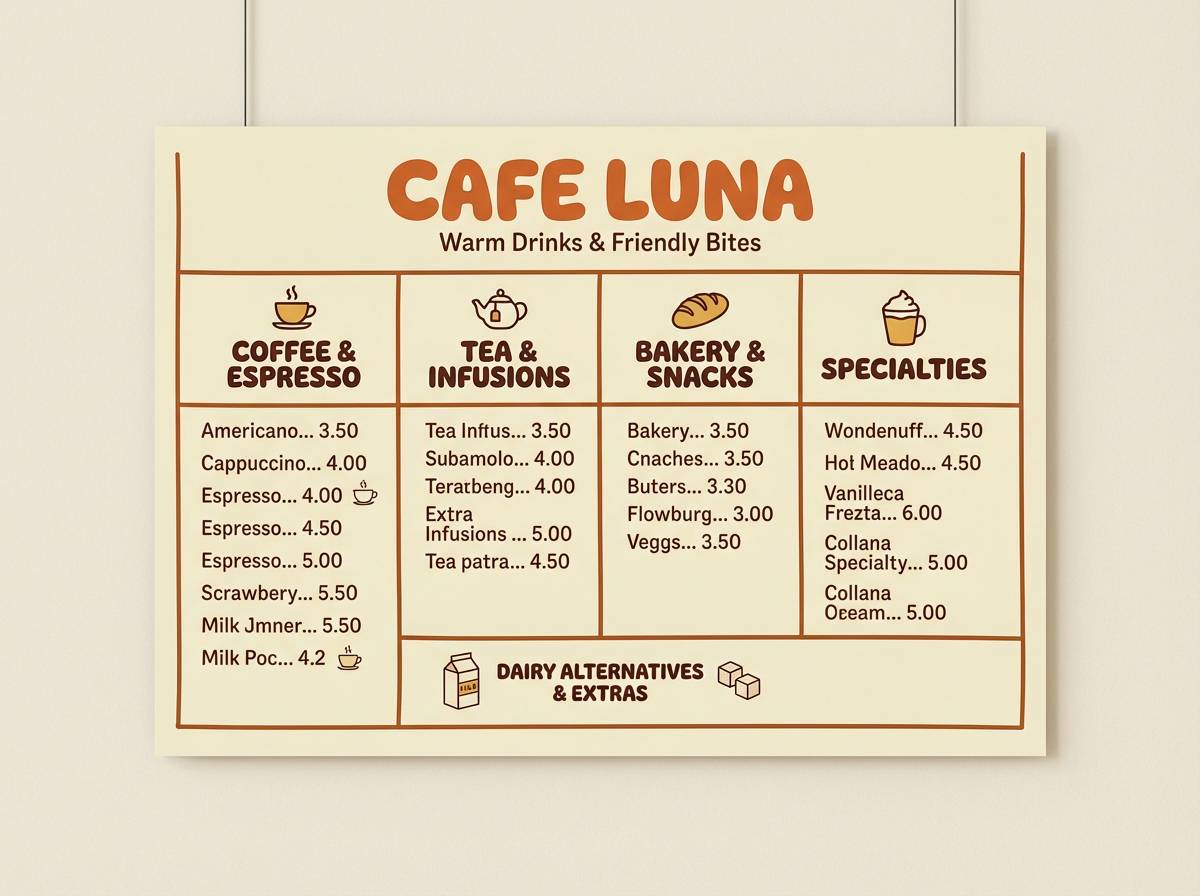
7) Wine Walnut
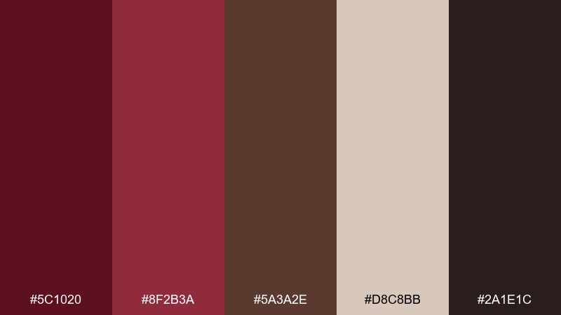
HEX: #5C1020 #8F2B3A #5A3A2E #D8C8BB #2A1E1C
Mood: rustic, hearty, inviting
Best for: cafes, bakeries, and artisan shops
Rustic and hearty, like walnut wood and a glass of red by the fire. The brown undertone makes the reds feel food-friendly and comforting rather than formal. Use it for cafe menus, bakery boxes, and artisan storefront graphics. Tip: lean on the walnut and cream for backgrounds, then drop in the red for stamps or badges.
Image example of wine walnut generated using media.io
8) Plum Smoke
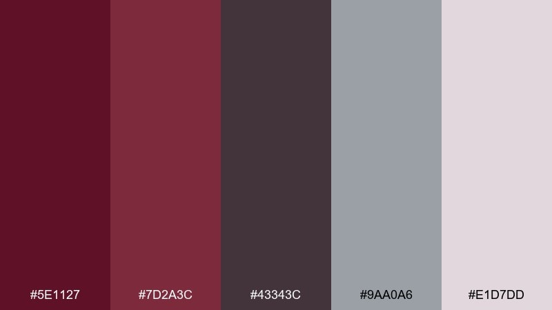
HEX: #5E1127 #7D2A3C #43343C #9AA0A6 #E1D7DD
Mood: moody, modern, calm
Best for: tech branding and product landing pages
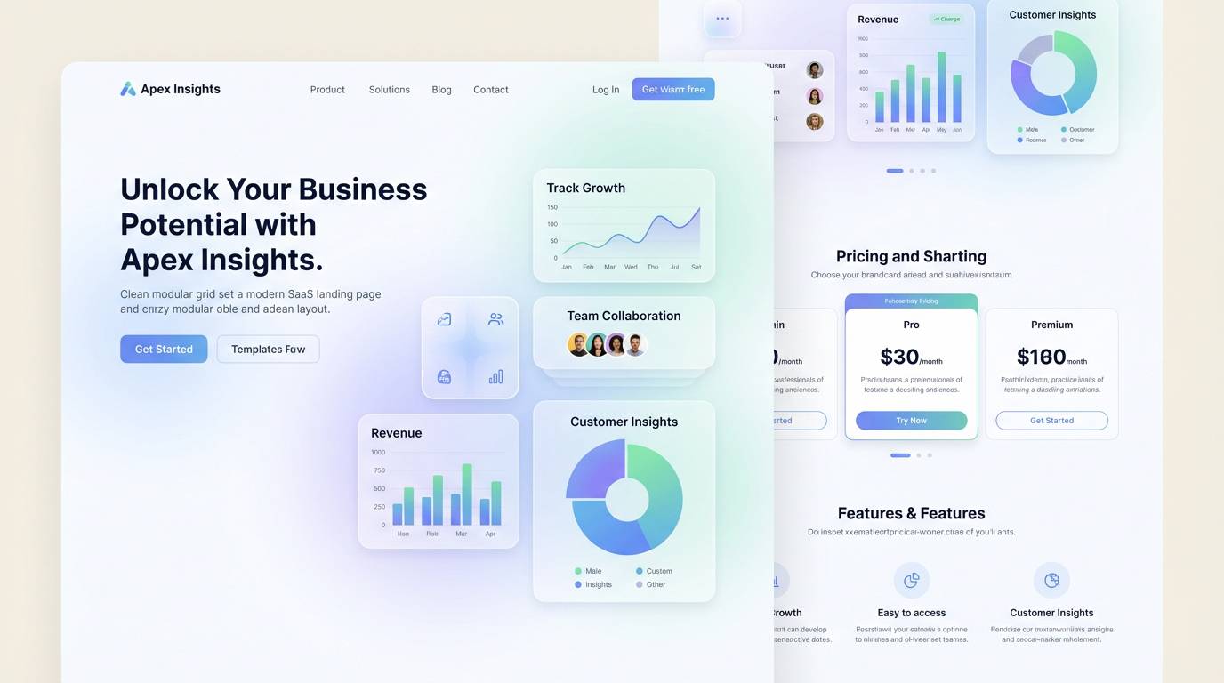
Moody and modern, like plum smoke drifting over cool steel. The slate gray adds a contemporary edge that keeps the reds from feeling too traditional. It works well for SaaS landing pages, product sections, and dark-mode adjacent layouts. Tip: use the pale mauve for cards and the deepest shade for navigation so contrast stays comfortable.
Image example of plum smoke generated using media.io
9) Velvet Sunset
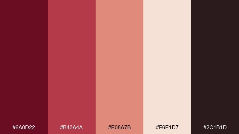
HEX: #6A0D22 #B43A4A #E08A7B #F6E1D7 #2C1B1D
Mood: glowing, romantic, lively
Best for: social campaigns and lifestyle ads
Glowing and romantic, like sunset light hitting velvet drapes. The coral warmth lifts the darker red and makes the palette feel more playful. Use it for lifestyle ads, creator templates, and seasonal promos that need energy without neon. Tip: keep backgrounds soft and push the brighter coral only on buttons or key numbers.
Image example of velvet sunset generated using media.io

10) Dark Cherry Soda
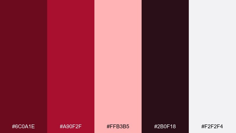
HEX: #6C0A1E #A90F2F #FFB3B5 #2B0F18 #F2F2F4
Mood: bold, pop, youthful
Best for: music promos and playful branding
Bold and poppy, like dark cherry soda with a bright fizz. The hot red and bubblegum pink create instant punch, balanced by a clean near-white. It is great for album art, merch drops, and high-energy promo graphics. Tip: use the near-white as the main canvas to keep the saturated reds from overpowering type.
Image example of dark cherry soda generated using media.io
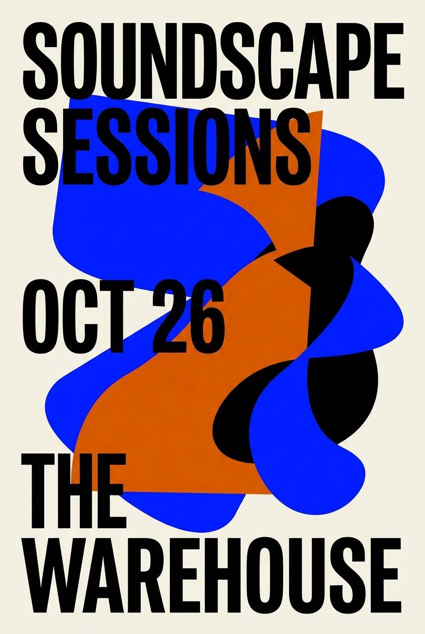
11) Aubergine Ink
HEX: #55122A #7A2440 #2A1B2E #4C5A6A #D8D2DE
Mood: mysterious, cerebral, luxe
Best for: book covers and artsy editorials
Mysterious and cerebral, like aubergine ink on textured paper. The blue-gray note adds sophistication and keeps the dark tones from blending together. Use it for book covers, cultural posters, and editorial layouts that want depth. Tip: bring in the pale lavender as generous margins so the darkest shades stay legible.
Image example of aubergine ink generated using media.io
12) Sangria Citrus
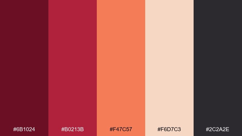
HEX: #6B1024 #B0213B #F47C57 #F6D7C3 #2C2A2E
Mood: festive, sunny, appetizing
Best for: summer promos and beverage branding
Festive and sunny, like sangria with sliced citrus floating on top. These wine red color combinations feel fresh thanks to the bright orange and creamy peach. They work especially well for beverage labels, seasonal banners, and email headers. Tip: keep the orange as a secondary accent so the red remains the primary brand anchor.
Image example of sangria citrus generated using media.io
13) Rustic Vineyard
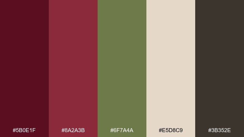
HEX: #5B0E1F #8A2A3B #6F7A4A #E5D8C9 #3B352E
Mood: earthy, pastoral, grounded
Best for: organic brands and farm-to-table menus
Earthy and pastoral, like vineyard rows after rain. The muted olive brings a natural counterpoint that makes the reds feel less formal and more farm-to-table. Use it for organic packaging, produce signage, and seasonal menu inserts. Tip: keep olive for icons and small highlights, then let the parchment tone do the heavy lifting in backgrounds.
Image example of rustic vineyard generated using media.io
14) Cocoa Cabernet
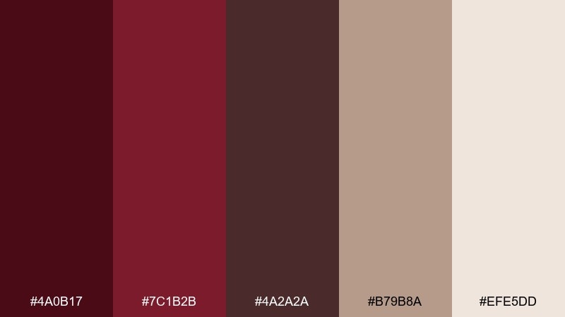
HEX: #4A0B17 #7C1B2B #4A2A2A #B79B8A #EFE5DD
Mood: decadent, warm, sophisticated
Best for: chocolate packaging and gourmet gifts
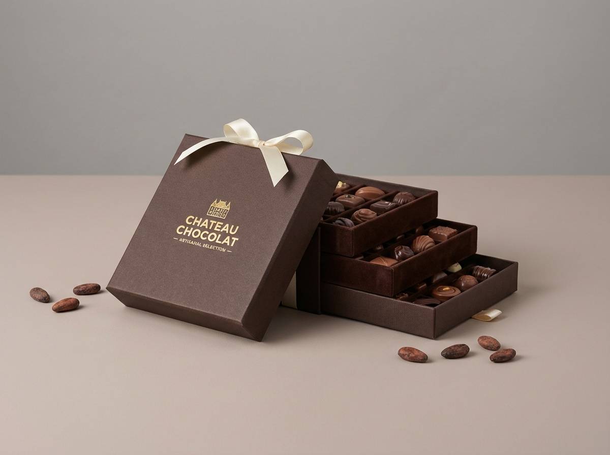
Decadent and warm, like cocoa dusted over cabernet truffles. The chocolate brown deepens the red and makes the palette feel gourmet and giftable. It is a strong fit for confectionery boxes, holiday bundles, and premium product pages. Tip: use the cream tone as your main background to keep the darker shades feeling elegant rather than heavy.
Image example of cocoa cabernet generated using media.io
15) Petal Pinot
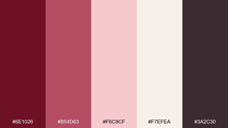
HEX: #6E1026 #B54D63 #F6C9CF #F7EFEA #3A2C30
Mood: soft, graceful, modern romantic
Best for: beauty brands and feminine UI
Soft and graceful, like pale petals scattered over pinot-stained linen. The blush layers create a gentle gradient that feels approachable and polished. Use it for beauty branding, onboarding screens, and calm lifestyle newsletters. Tip: put the deepest tone only on headings and primary buttons to keep the rest airy.
Image example of petal pinot generated using media.io
16) Noir Teal Contrast
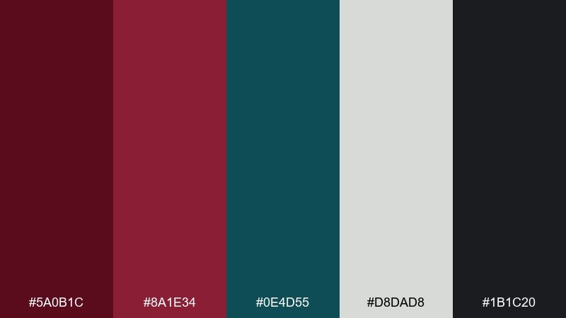
HEX: #5A0B1C #8A1E34 #0E4D55 #D8DAD8 #1B1C20
Mood: confident, modern, high-contrast
Best for: apps, dashboards, and bold rebrands
Confident and modern, like a noir lounge lit by a teal neon sign. Teal cuts through the reds for a crisp contrast that feels current and tech-forward. Use it for dashboards, startup branding, and sharp landing page accents. Tip: keep teal to interactive states and links so the deep reds remain the emotional core.
Image example of noir teal contrast generated using media.io
17) Blush Concrete
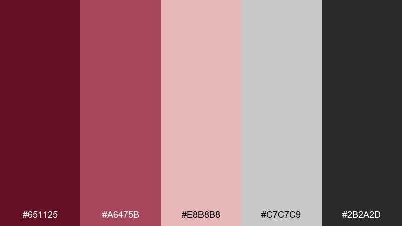
HEX: #651125 #A6475B #E8B8B8 #C7C7C9 #2B2A2D
Mood: urban, balanced, understated
Best for: architecture studios and minimalist brands
Urban and balanced, like blush paint against raw concrete. The grays keep the reds from turning too sweet, making the mix feel mature and architectural. Use it for portfolios, studio stationery, and clean product lookbooks. Tip: set large blocks in gray, then use the deep red for navigation and key labels.
Image example of blush concrete generated using media.io
18) Forest Merlot
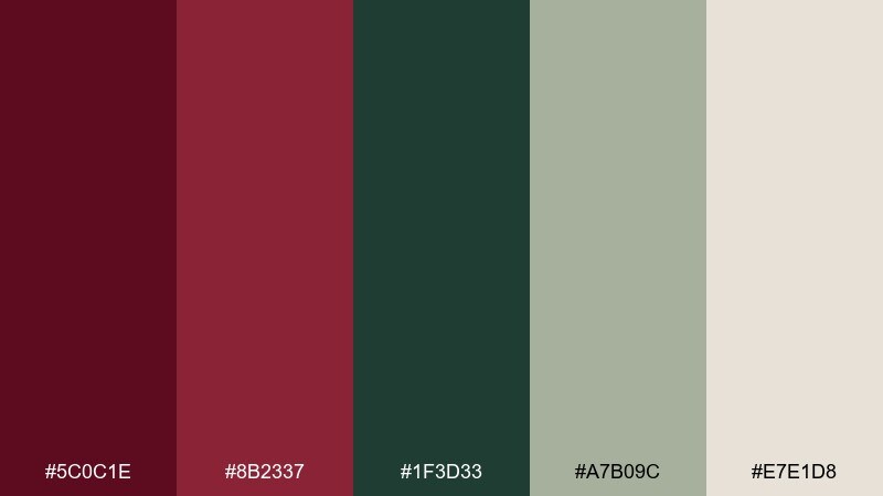
HEX: #5C0C1E #8B2337 #1F3D33 #A7B09C #E7E1D8
Mood: outdoorsy, moody, refined
Best for: outdoor brands and autumn campaigns
Outdoorsy and moody, like merlot sipped beside a pine forest. The greens add freshness and make the reds feel seasonal without leaning into holiday clichés. Use it for autumn campaigns, cabin rentals, and outdoor apparel branding. Tip: keep the light stone for backgrounds, then layer red and forest green in badges and headings.
Image example of forest merlot generated using media.io
19) Champagne Brick
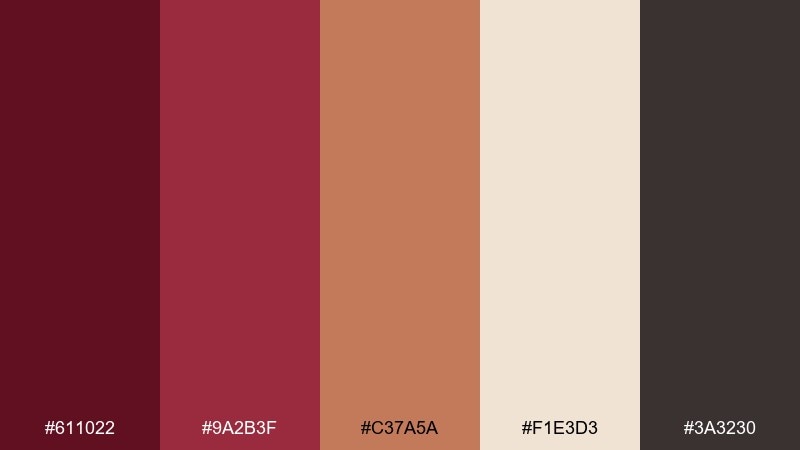
HEX: #611022 #9A2B3F #C37A5A #F1E3D3 #3A3230
Mood: celebratory, warm, elegant
Best for: holiday cards and premium announcements
Celebratory and warm, like champagne bubbles beside sunlit brick. The terracotta note bridges the reds and creams for a sophisticated, approachable glow. It is great for holiday announcements, launches, and tasteful party invites. Tip: use the cream as the main field and let the deeper shades carry borders, monograms, and dates.
Image example of champagne brick generated using media.io

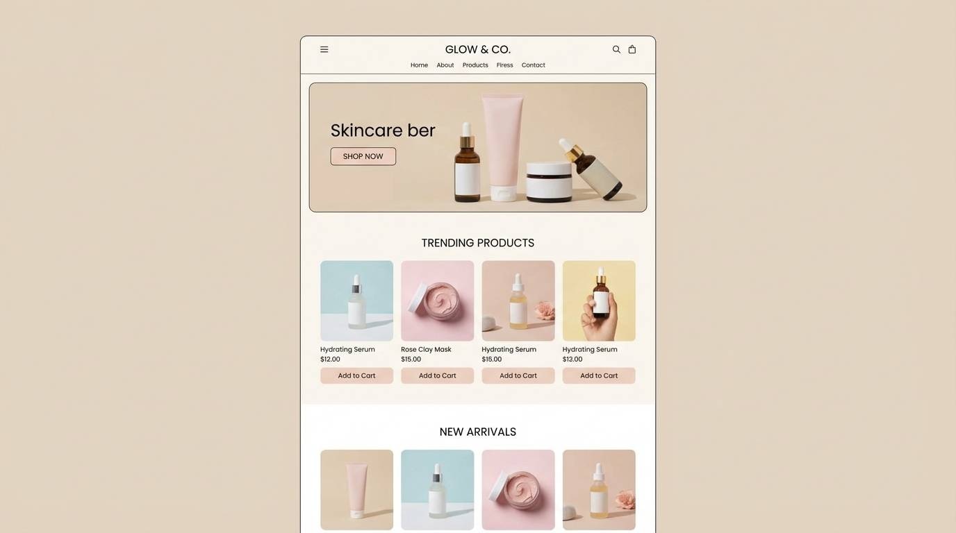
20) Minimal Wine UI
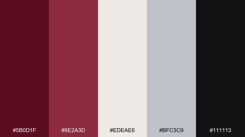
HEX: #5B0D1F #8E2A3D #EDEAE6 #BFC3C9 #111113
Mood: clean, premium, confident
Best for: finance apps and sleek web UI
Clean and premium, like a minimalist gallery with one bold wine-toned canvas. The off-white and cool gray keep the interface feeling light while the dark base adds authority. Use this set for fintech, booking flows, and crisp component libraries. Tip: apply the mid red for active states and keep the deepest shade for headers and footers.
Image example of minimal wine ui generated using media.io
21) Mulled Berry
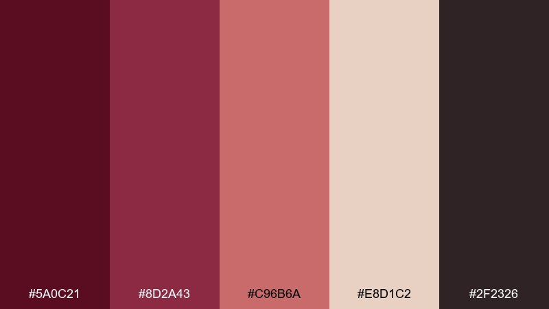
HEX: #5A0C21 #8D2A43 #C96B6A #E8D1C2 #2F2326
Mood: seasonal, comforting, rich
Best for: winter promotions and cafe specials
Seasonal and comforting, like mulled berries simmering on the stove. The rosy berry tone adds warmth without turning the palette overly pink. Use it for winter promos, cafe specials, and cozy email headers. Tip: set headlines in the darkest shade, then use the berry midtone for small stamps like limited time.
Image example of mulled berry generated using media.io

22) Ink Rosewood
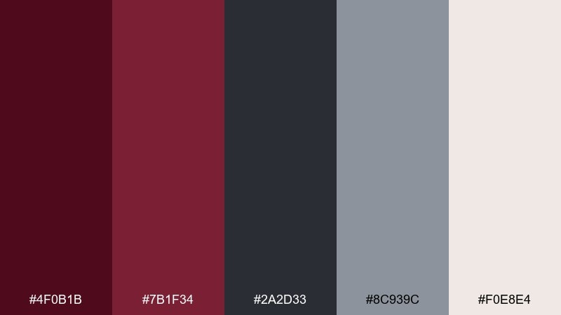
HEX: #4F0B1B #7B1F34 #2A2D33 #8C939C #F0E8E4
Mood: serious, timeless, sharp
Best for: law firms and professional services
Serious and timeless, like rosewood desks and black ink signatures. The cool grays make it feel corporate-ready while the deep red adds distinction. Use it for professional service websites, pitch decks, and stationery systems. Tip: keep the red to one element per section, such as a rule line or a single CTA.
Image example of ink rosewood generated using media.io
What Colors Go Well with Wine Red?
Wine red looks especially rich next to warm neutrals like cream, parchment, beige, and soft stone—these lighten the overall feel and make wine tones look more luxurious rather than heavy.
For modern contrast, pair wine red with cool grays, charcoal, and near-black to sharpen typography and UI structure. If you want a bolder, contemporary edge, add one bright accent like coral, blush pink, teal, or muted olive for a seasonal or tech-forward twist.
Metallics also work well when used sparingly: brass and warm gold can elevate wine red for premium branding, invites, and product packaging—just keep them to small highlights for readability.
How to Use a Wine Red Color Palette in Real Designs
Start by assigning roles: use the deepest wine shade for headers, navigation, or key brand blocks; reserve mid wine/berry shades for buttons and badges; and let light neutrals carry backgrounds so the layout stays clean.
In print (menus, invitations, packaging), wine red benefits from textured or off-white bases—parchment, cream, and linen tones keep the palette warm and readable. In digital UI, wine red works best as an accent against off-white or slate cards to avoid overly dark pages.
When adding a contrasting color (like teal or coral), treat it as a functional signal: links, hover states, price tags, or important numbers. That way wine red remains the emotional anchor while the accent improves scanning and conversion.
Create Wine Red Palette Visuals with AI
If you have HEX codes but need realistic mockups or clean marketing visuals, generate palette-based images with AI. This helps you validate the vibe (luxury, cozy, editorial, or modern) before committing to a full design system.
With Media.io, you can turn prompts into on-brand examples—labels, posters, UI mockups, invitations, and more—then iterate quickly by swapping one accent color or background tone.
Wine Red Color Palette FAQs
-
What HEX code is considered “wine red”?
Wine red doesn’t have one single HEX value, but it typically falls in deep red shades with a hint of purple or brown. Common “wine-like” anchors include #5A0F1B, #6B0F26, and #611022. -
Is wine red the same as burgundy or maroon?
They’re closely related, but not identical. Burgundy often leans slightly more purple, maroon leans more brown, and “wine red” is a broader design term that can sit between them depending on the palette. -
What colors complement wine red for modern branding?
For a modern look, pair wine red with cool grays, off-white, and near-black. Add a single crisp accent like teal (#0E4D55) or coral (#F47C57) to make the system feel current. -
How do I keep a wine red palette from looking too dark?
Use light neutrals (cream, stone, blush) as your main backgrounds and keep wine red for accents and hierarchy (buttons, headings, dividers). This keeps contrast high and the layout breathable. -
Does wine red work well for UI and apps?
Yes—especially when treated as an accent color rather than a full-page background. Pair it with off-white cards, cool grays, and a dark neutral for text to maintain accessibility and a premium feel. -
What are good wine red palettes for weddings or invitations?
Try softer blends like Rose Brass or Petal Pinot for romantic stationery. Add brass/gold as minimal highlights (monograms, thin rules, small icons) to avoid overpowering the typography. -
How can I generate wine red palette images for presentations?
Use Media.io’s text-to-image tool to create realistic examples (labels, posters, UI screens) from prompts, then iterate by swapping HEX-based accents until the visuals match your brand mood.
Next: Peach Pink Color Palette


