

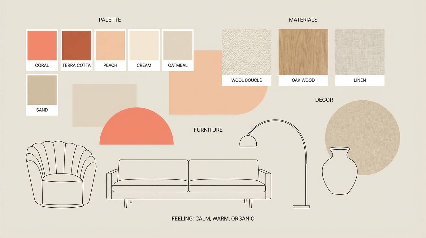
Peach pink is a warm, modern color that sits between rosy blush and soft apricot—perfect when you want designs to feel friendly, polished, and inviting.
Below are 20+ curated peach pink color palettes with HEX codes, plus practical tips for branding, UI, weddings, and cozy interiors.
In this article
- Why Peach Pink Palettes Work So Well
-
- blush apricot glow
- rosewater linen
- sunset sorbet
- petal tea time
- coral cloud neutrals
- ballet slipper minimal
- peachy app ui
- vintage powder room
- spring peony garden
- strawberry milk
- desert bloom
- champagne rosé
- cozy nursery hush
- modern bridal blush
- soft editorial peach
- retro candy shop
- terracotta blush balance
- coral pearl shine
- warm skintone blend
- evening rosé depth
- peach blossom workspace
- What Colors Go Well with Peach Pink?
- How to Use a Peach Pink Color Palette in Real Designs
- Create Peach Pink Palette Visuals with AI
Why Peach Pink Palettes Work So Well
Peach pink combines the warmth of peach with the softness of pink, so it feels welcoming without being overly loud. That balance makes it easy to use across branding, editorial layouts, and digital products.
It also flatters photography—especially skincare, food, weddings, and lifestyle imagery—because it harmonizes with natural skin tones and warm light. Pair it with creamy whites for an airy look, or add deep browns/charcoals to keep typography crisp.
Most importantly, peach pink is flexible: it can read cute and playful, calm and minimal, or premium and romantic depending on the accents you add.
20+ Peach Pink Color Palette Ideas (with HEX Codes)
1) Blush Apricot Glow
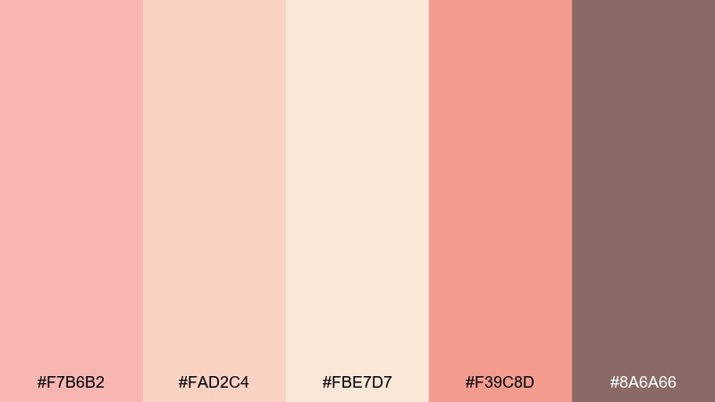
HEX: #F7B6B2 #FAD2C4 #FBE7D7 #F39C8D #8A6A66
Mood: sunlit, romantic, soft
Best for: beauty branding and product ads
Sunlit blush and apricot tones feel like golden-hour skin and fresh petals. The contrast between creamy pastels and the deeper rose keeps layouts from looking washed out. Use this peach pink color palette for skincare labels, lifestyle headers, and boutique ecommerce banners. Pair it with off-white space and a warm gray type color, then reserve the deeper rose for prices or calls to action.
Image example of blush apricot glow generated using media.io
Media.io is an online AI studio for creating and editing video, image, and audio in your browser.

2) Rosewater Linen
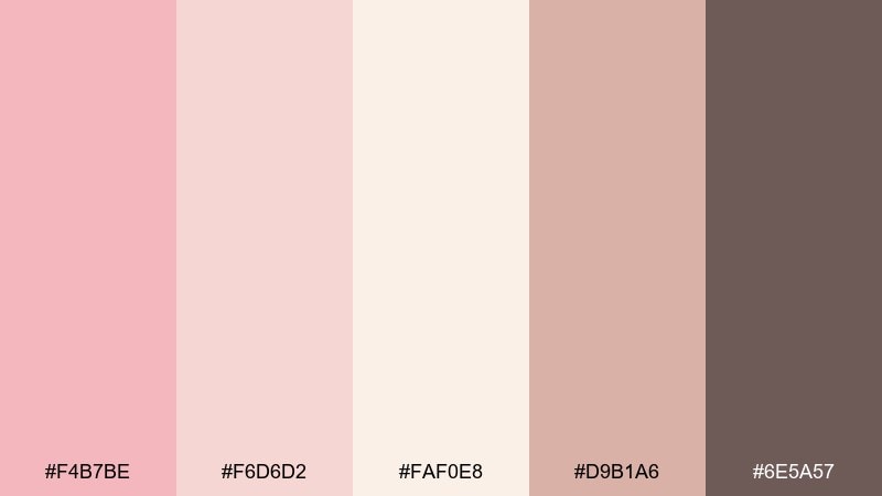
HEX: #F4B7BE #F6D6D2 #FAF0E8 #D9B1A6 #6E5A57
Mood: airy, calm, refined
Best for: wedding invitations and stationery
Airy rosewater and linen neutrals evoke handwritten vows and pressed flowers. The creamy off-white gives plenty of breathing room, while the cocoa-taupe adds legible text contrast. Works beautifully for invitations, menus, and save-the-dates with fine line icons. Tip: print the darkest tone for body text and keep pinks for borders, monograms, and small flourishes.
Image example of rosewater linen generated using media.io
3) Sunset Sorbet
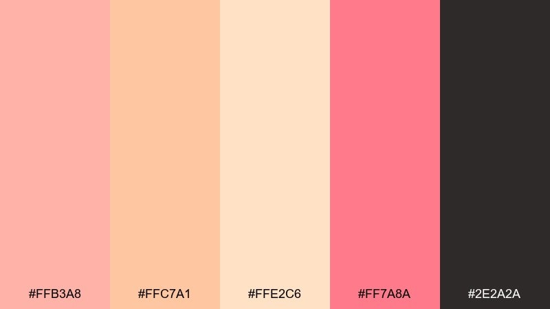
HEX: #FFB3A8 #FFC7A1 #FFE2C6 #FF7A8A #2E2A2A
Mood: playful, juicy, energetic
Best for: summer posters and social media promos
Juicy sorbet shades bring instant summer energy, like a beach sunset and fruit ice. The inky charcoal grounds the bright pinks so headlines stay punchy and readable. Use it for event posters, sale graphics, and upbeat creator thumbnails. One simple tip: keep backgrounds light and use the hot pink as a single accent for badges or key dates.
Image example of sunset sorbet generated using media.io

4) Petal Tea Time
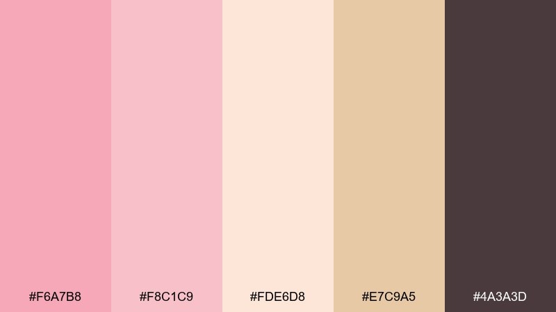
HEX: #F6A7B8 #F8C1C9 #FDE6D8 #E7C9A5 #4A3A3D
Mood: cozy, sweet, inviting
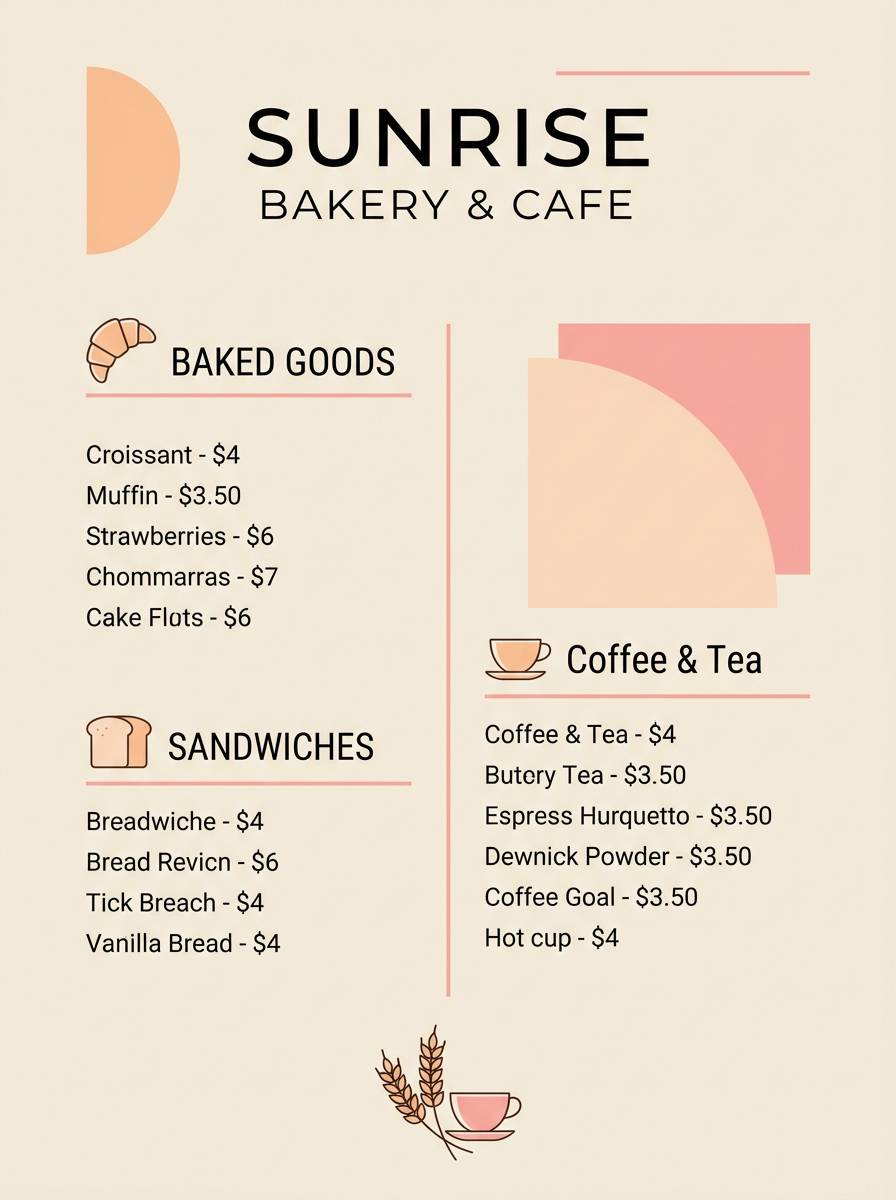
Best for: cafe menus and bakery branding
Cozy petal pinks and milky peach read like tea with a spoonful of honey. The warm beige helps food photography feel richer, while the deep plum-brown supports clear menu text. These peach pink color combinations shine on chalkboard-style menus, stickers, and loyalty cards. Tip: keep the beige as the main background and use the darker tone for prices and section headers.
Image example of petal tea time generated using media.io
5) Coral Cloud Neutrals
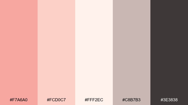
HEX: #F7A6A0 #FCD0C7 #FFF2EC #C8B7B3 #3E3838
Mood: clean, modern, comforting
Best for: interior mood boards and decor shops
Soft coral cloud tones feel like a freshly painted room with warm daylight bouncing around. The grays keep it modern and prevent the palette from skewing overly sweet. Ideal for decor mood boards, product catalogs, and home goods landing pages. Usage tip: repeat the coral in small doses across icons and separators for a cohesive, boutique look.
Image example of coral cloud neutrals generated using media.io
6) Ballet Slipper Minimal
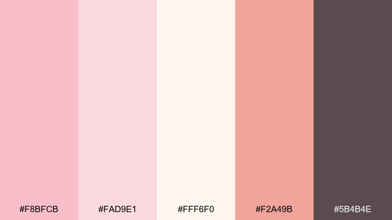
HEX: #F8BFCB #FAD9E1 #FFF6F0 #F2A49B #5B4B4E
Mood: delicate, minimal, graceful
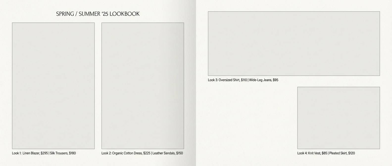
Best for: fashion lookbooks and editorial layouts
Delicate ballet slipper pinks evoke satin ribbons and softly lit dressing rooms. The near-white base keeps pages airy, while the muted coral adds just enough warmth for highlights. Use it in lookbooks, magazine spreads, and campaign one-pagers with lots of whitespace. Tip: set body text in the deep mauve and reserve coral for pull quotes and section dividers.
Image example of ballet slipper minimal generated using media.io
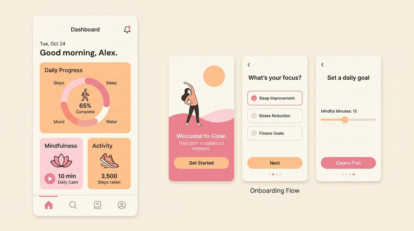
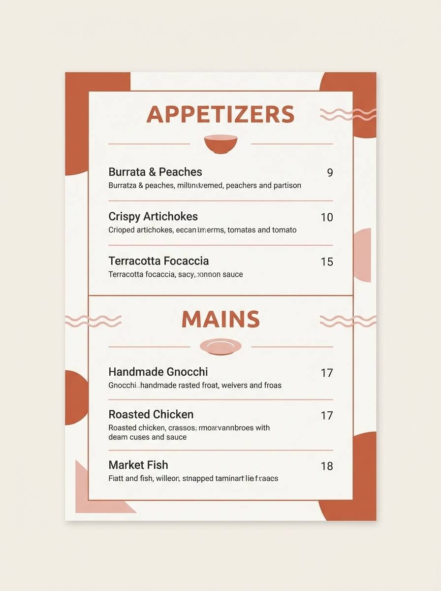
7) Peachy App UI
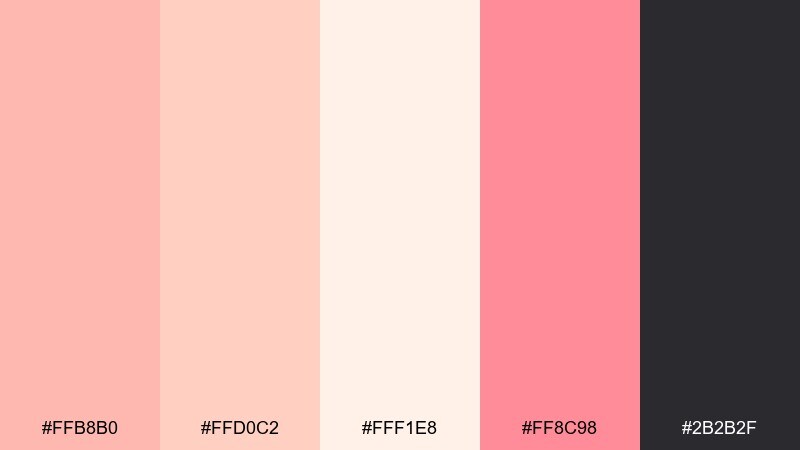
HEX: #FFB8B0 #FFD0C2 #FFF1E8 #FF8C98 #2B2B2F
Mood: friendly, bright, modern
Best for: 2D UI mockups for wellness apps
Friendly peach and pink feel approachable, like a gentle daily reset. The near-white background supports clean spacing, and the vivid accent makes primary buttons unmistakable. Great for wellness onboarding, habit trackers, and subscription upsells. Tip: keep the strong pink for one action per screen and use the softer tones for cards and states.
Image example of peachy app ui generated using media.io
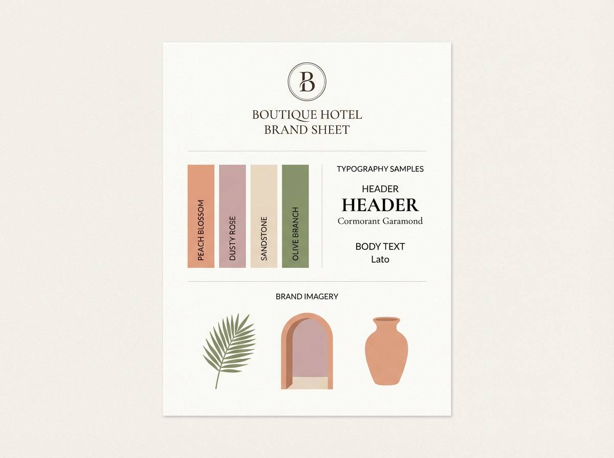
8) Vintage Powder Room
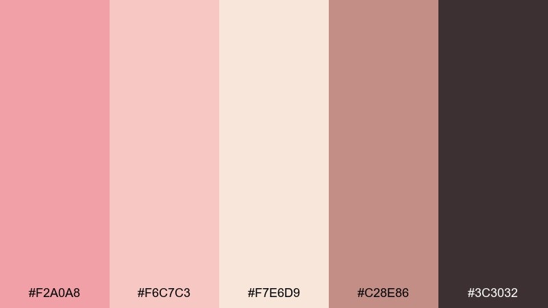
HEX: #F2A0A8 #F6C7C3 #F7E6D9 #C28E86 #3C3032
Mood: vintage, warm, elegant
Best for: boutique hotel branding and interiors
Vintage warmth comes through like a powder room mirror, rose soap, and soft lampshades. The dusty midtone adds depth so the pastels feel intentional, not childish. Use this peach pink color palette for boutique hotel marks, spa brochures, and elegant wayfinding. Tip: choose the dusty rose for backgrounds and keep the darkest tone for signage legibility.
Image example of vintage powder room generated using media.io
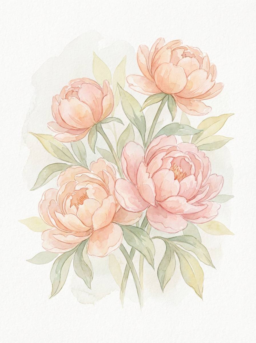
9) Spring Peony Garden
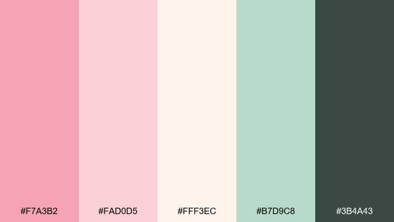
HEX: #F7A3B2 #FAD0D5 #FFF3EC #B7D9C8 #3B4A43
Mood: fresh, floral, uplifting
Best for: botanical illustrations and spring campaigns
Fresh peony pinks and a hint of leafy green evoke a garden just after rain. The green works as a natural counterbalance, making the pinks feel crisp rather than sugary. Perfect for spring launches, floral packaging, or illustrated postcards. Tip: keep the green as a small accent for stems, icons, or subtle underlines.
Image example of spring peony garden generated using media.io
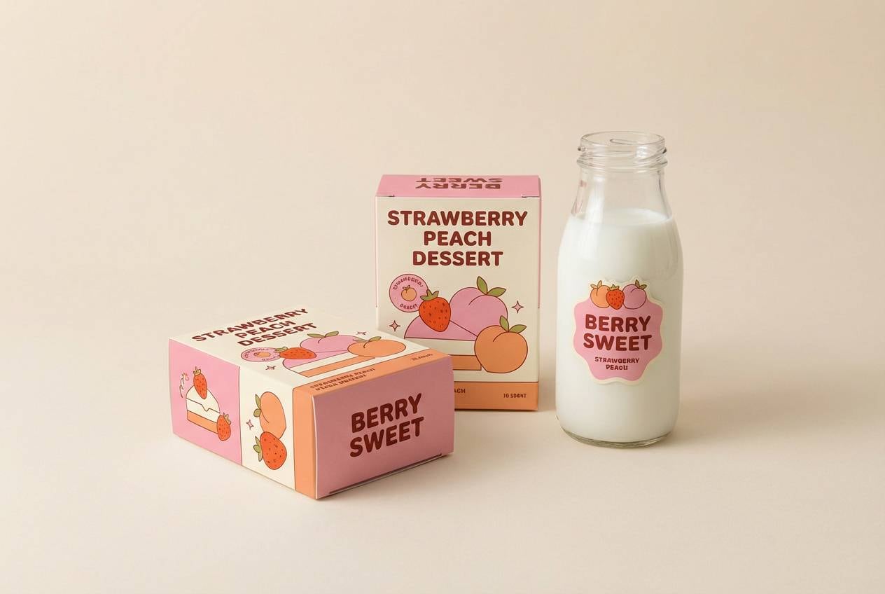
10) Strawberry Milk
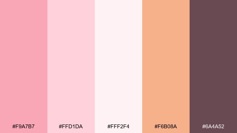
HEX: #F9A7B7 #FFD1DA #FFF2F4 #F6B08A #6A4A52
Mood: cute, creamy, youthful
Best for: dessert shops and playful packaging
Creamy strawberry milk tones feel nostalgic, like a diner treat and pastel neon glow. The warm peach keeps it from going too bubblegum, while the mauve adds grounded contrast. Great for labels, sticker packs, and sweet-themed product drops. Tip: use the lightest tone as the main field and apply the darkest tone to barcodes and ingredient text for readability.
Image example of strawberry milk generated using media.io
11) Desert Bloom
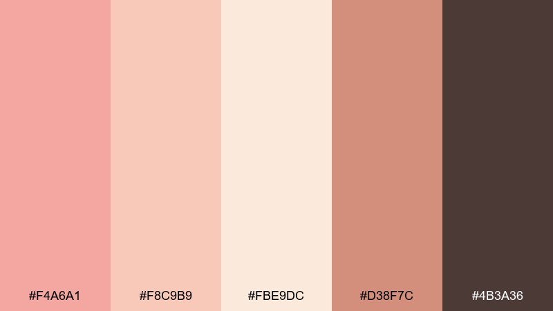
HEX: #F4A6A1 #F8C9B9 #FBE9DC #D38F7C #4B3A36
Mood: earthy, warm, grounded
Best for: ceramics brands and lifestyle photography overlays
Earthy bloom tones read like clay, dried petals, and sun-warmed stone. The deeper terracotta supports strong typography and gives the set a handcrafted feel. Use it for ceramics branding, lifestyle presets, and text overlays on neutral photos. Tip: keep terracotta for headers and use the pale peach as a soft backdrop to avoid harsh contrast.
Image example of desert bloom generated using media.io
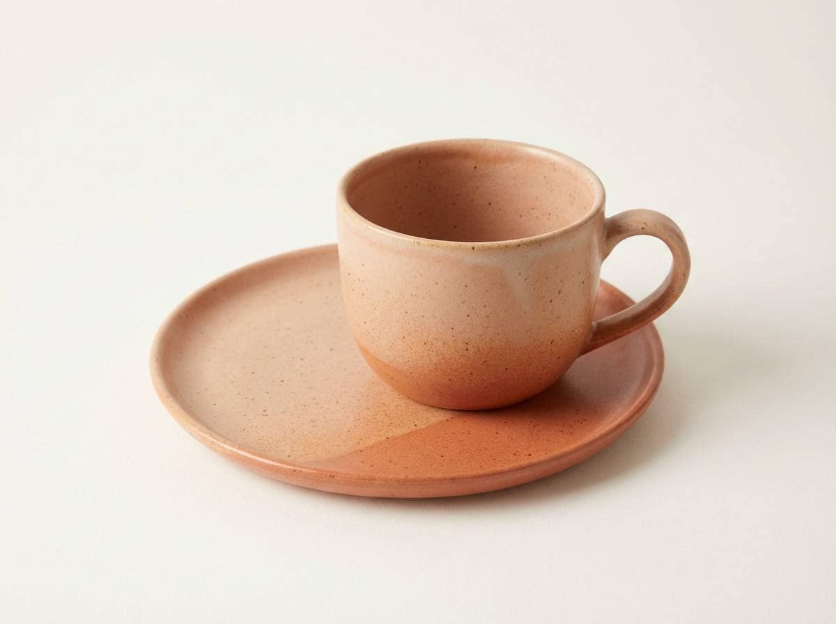
12) Champagne Rosé
HEX: #F6B1A6 #FAD5C8 #FFF5ED #E7C7B8 #2F2A2C
Mood: luxurious, soft, celebratory
Best for: beauty launches and premium packaging
Champagne rosé tones feel polished and celebratory, like satin boxes and quiet luxury. The layered neutrals create a premium look without heavy gold or black. Ideal for high-end beauty drops, gift sets, and minimalist ads. Tip: add subtle texture in the lightest shades and keep typography in the near-black to maintain a luxe finish.
Image example of champagne rosé generated using media.io
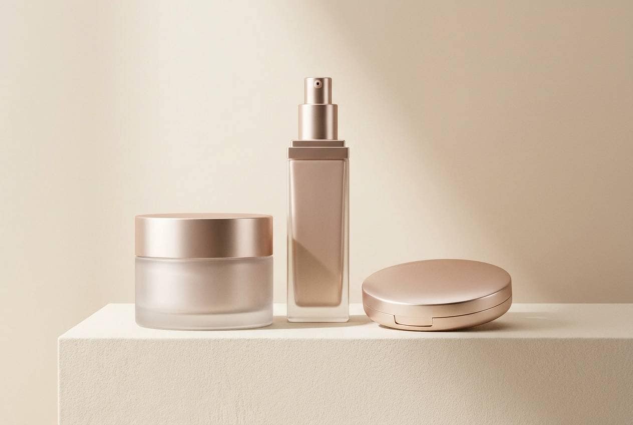
13) Cozy Nursery Hush
HEX: #F7B3BC #FAD7D2 #FFF7F2 #CFE3E6 #4A4A52
Mood: gentle, soothing, tender
Best for: nursery decor and baby shower invites
Gentle hush tones evoke soft blankets, lullabies, and a calm bedtime routine. A whisper of pale blue cools the warmth and keeps the palette balanced for long viewing. Great for nursery prints, baby shower invitations, and gentle ecommerce themes. Tip: use the blue as a tiny accent for icons or trim so the pink stays the hero without overwhelming the design.
Image example of cozy nursery hush generated using media.io
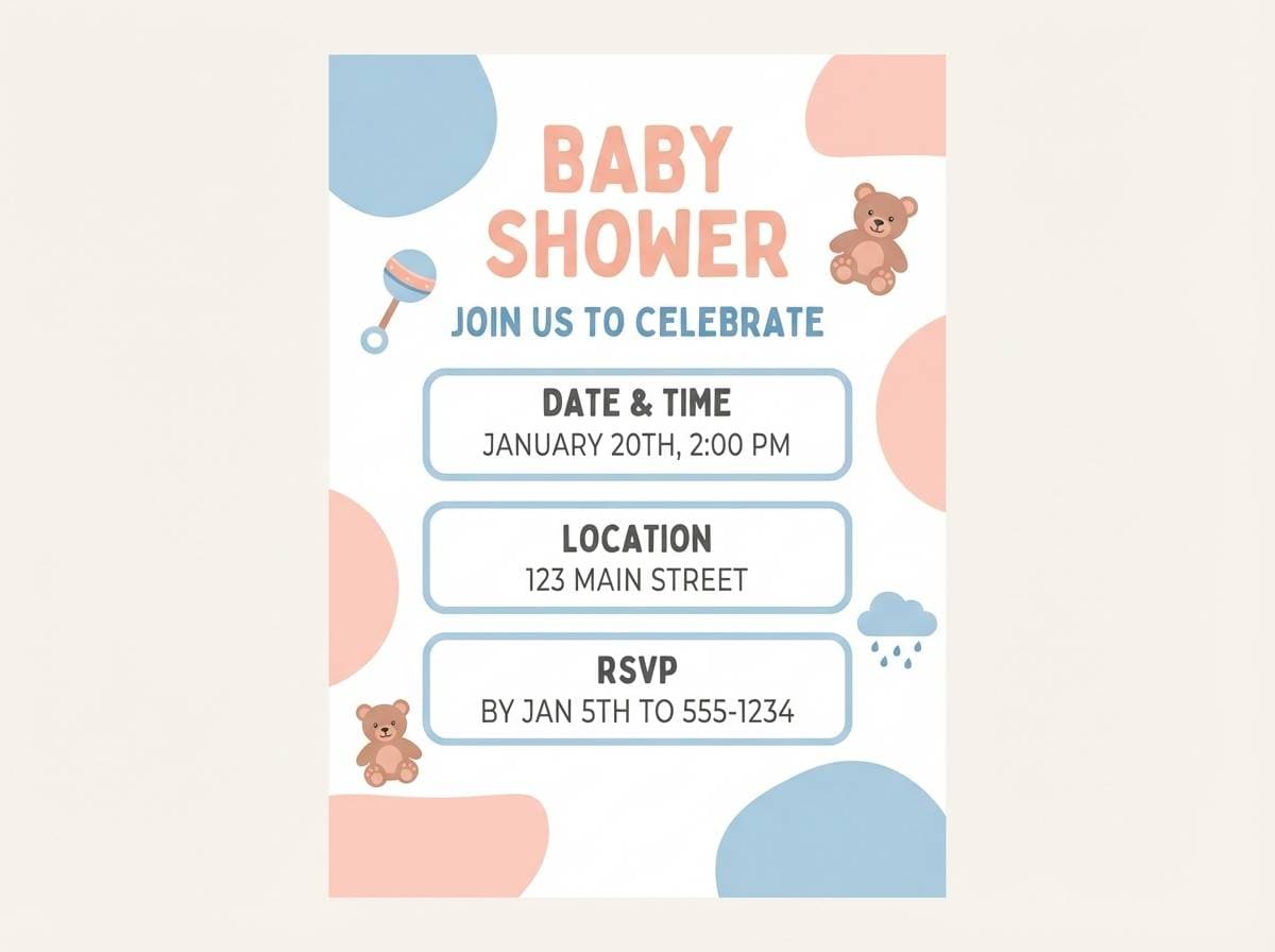
14) Modern Bridal Blush
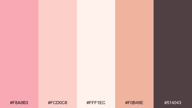
HEX: #F8A9B3 #FCD0C8 #FFF1EC #F0B49E #514043
Mood: modern, romantic, clean
Best for: bridal websites and RSVP pages
Modern bridal blush feels airy and confident, like clean florals and tailored silhouettes. The warm neutrals create a soft frame for photos, while the deeper mauve keeps navigation and links readable. A smart peach pink color combination for RSVP flows, wedding websites, and registry pages. Tip: keep buttons in the deeper shade and let the light tones handle backgrounds and sections.
Image example of modern bridal blush generated using media.io
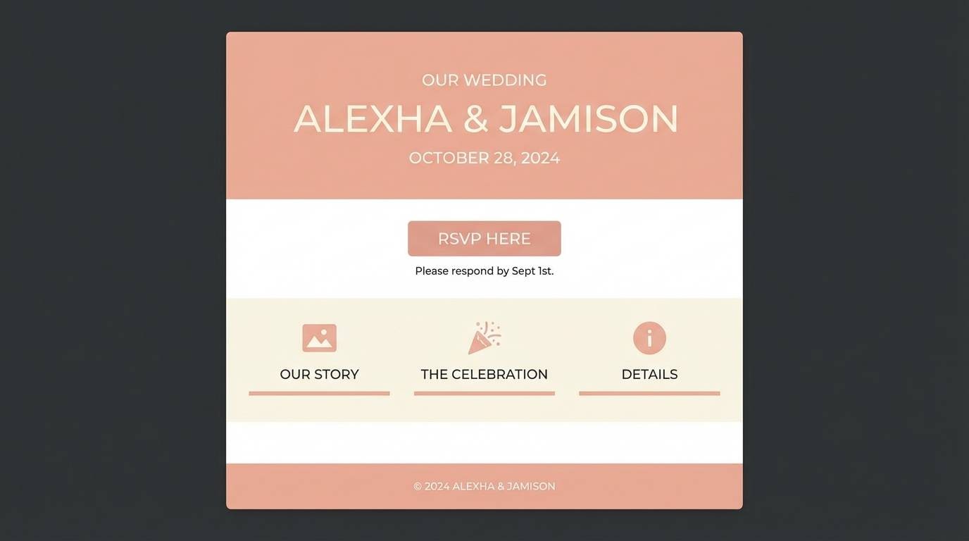
15) Soft Editorial Peach
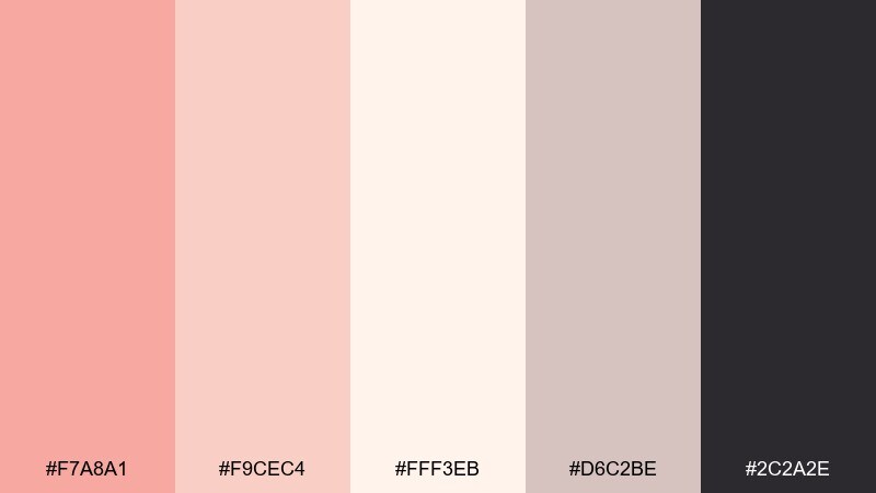
HEX: #F7A8A1 #F9CEC4 #FFF3EB #D6C2BE #2C2A2E
Mood: editorial, understated, polished
Best for: magazine features and blog headers
Understated peach and blush evoke glossy paper, calm storytelling, and curated photography. The warm gray neutral keeps the composition sophisticated and prevents pink overload. Use it for long-form blog headers, brand stories, and magazine-style layouts. Tip: keep accent color limited to pull quotes and section numbers for a refined rhythm.
Image example of soft editorial peach generated using media.io
16) Retro Candy Shop
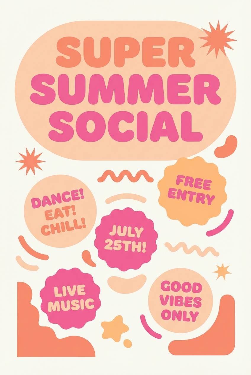
HEX: #FF9FB1 #FFC0A8 #FFE6C9 #FF5F88 #2A1F2B
Mood: bold, retro, fun
Best for: promotional flyers and sticker designs
Bold candy shades feel like retro wrappers, bubblegum, and neon signage. The deep violet-black makes the hot pink pop without muddying the warm peaches. Great for promo flyers, stickers, and playful merch drops. Tip: keep shapes chunky and use the darkest tone for outlines so the design reads clearly at small sizes.
Image example of retro candy shop generated using media.io
17) Terracotta Blush Balance
HEX: #F2A3A6 #F7C9BE #FDEDE3 #C66A5A #3A2F2E
Mood: confident, warm, artisanal
Best for: restaurant branding and menu systems
Confident warmth shows up like terracotta tiles, pink plaster, and candlelit dining. The rich clay tone adds authority and pairs well with serif typography for a crafted feel. One of the most versatile peach pink color combinations for menus, table cards, and gift vouchers. Tip: use the clay tone for navigation and headings, and keep the pale peach for generous negative space.
Image example of terracotta blush balance generated using media.io
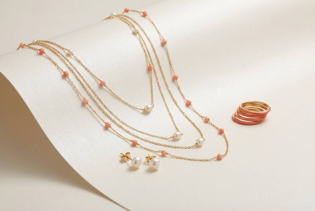
18) Coral Pearl Shine
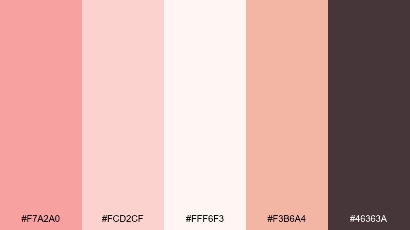
HEX: #F7A2A0 #FCD2CF #FFF6F3 #F3B6A4 #46363A
Mood: glossy, fresh, feminine
Best for: jewelry ads and boutique ecommerce
Coral pearl tones feel glossy and fresh, like polished stones and soft shimmer. The creamy white makes product photos look brighter, while the deep mauve supports high-contrast pricing and buttons. Ideal for jewelry ads, boutique ecommerce, and gift guides. Tip: keep the pinks as gradients in banners and use the darkest tone for CTA text.
Image example of coral pearl shine generated using media.io
19) Warm Skintone Blend
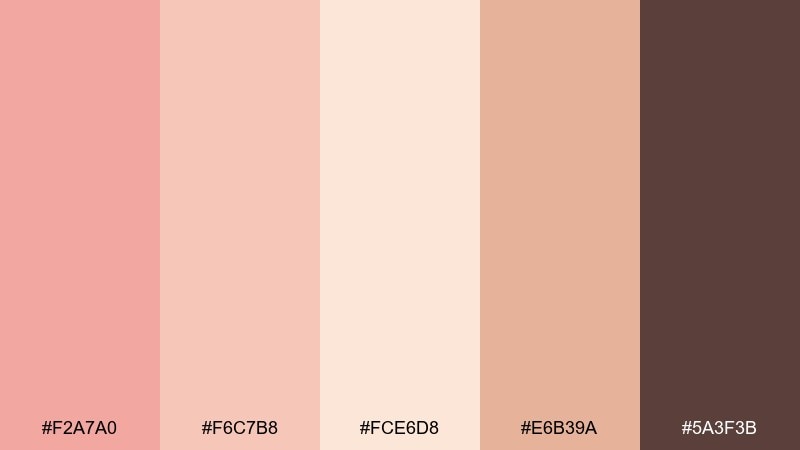
HEX: #F2A7A0 #F6C7B8 #FCE6D8 #E6B39A #5A3F3B
Mood: natural, inclusive, approachable
Best for: cosmetics shade charts and brand guides
Natural warmth reads like inclusive complexion tones and soft studio lighting. The midtone peach-beige bridges the light and deep shades, helping charts feel cohesive and calm. Great for cosmetics shade guides, brand kits, and tutorial graphics. Tip: use the darkest shade for labels and numbers, and keep backgrounds in the lightest peach for clarity.
Image example of warm skintone blend generated using media.io
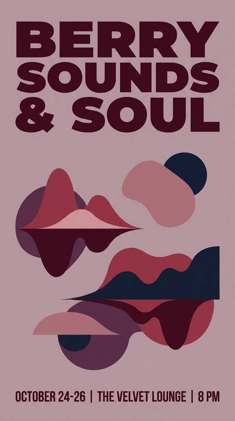
20) Evening Rosé Depth
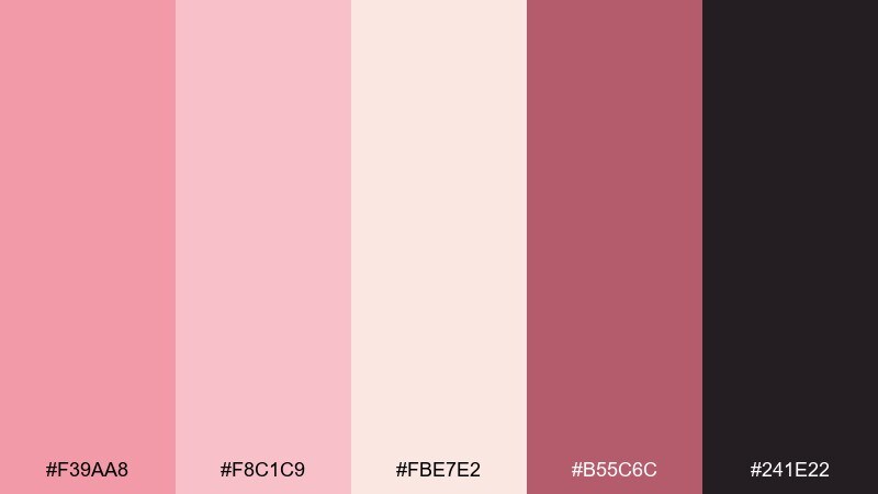
HEX: #F39AA8 #F8C1C9 #FBE7E2 #B55C6C #241E22
Mood: moody, romantic, dramatic
Best for: night event posters and album art
Moody rosé shades feel like twilight lights, velvet curtains, and a slow jazz set. The deeper berry adds drama and makes the palette work for night scenes without losing softness. Use it for album covers, evening event posters, and cinematic social graphics. Tip: push contrast by keeping the background pale and using berry for titles and key details.
Image example of evening rosé depth generated using media.io
21) Peach Blossom Workspace
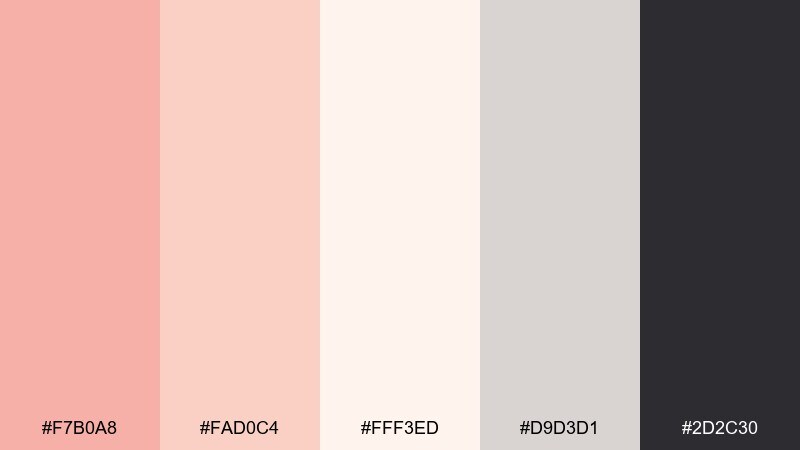
HEX: #F7B0A8 #FAD0C4 #FFF3ED #D9D3D1 #2D2C30
Mood: focused, light, contemporary
Best for: presentation templates and dashboards
Light peach blossom tones bring calm focus, like a tidy workspace in morning light. The gentle gray supports data-heavy layouts and keeps charts from clashing with warm accents. Ideal for slide decks, dashboards, and onboarding docs. Tip: apply pink only to highlights and progress states, and keep tables in neutral grays for readability.
Image example of peach blossom workspace generated using media.io
What Colors Go Well with Peach Pink?
Peach pink pairs beautifully with creamy whites, warm grays, cocoa browns, and charcoal—these neutrals keep layouts clean and ensure text stays readable. If you want a softer look, use off-white backgrounds and pick a deep mauve for typography.
For fresh contrast, add muted greens (sage, eucalyptus, dusty mint) in small doses—great for botanical brands and spring themes. For energy, lean into brighter coral accents or a pop of hot pink, but keep it limited so the palette doesn’t feel chaotic.
If you’re aiming for a premium vibe, combine peach pink with near-black type and subtle champagne-toned neutrals rather than harsh pure black-and-white.
How to Use a Peach Pink Color Palette in Real Designs
Start by assigning roles: a light peach-pink for backgrounds, a midtone for cards or sections, and one deeper shade for buttons and key highlights. This prevents “all-pastel” designs from looking flat.
For UI, keep one primary action color per screen (usually the most saturated pink) and use softer peach tones for surfaces and states. For print (menus, invitations, packaging), test legibility by using the darkest tone for body text and reserving pinks for borders, icons, and headings.
When pairing with photography, match the warmth: peach pink looks best with warm light, natural skin tones, and beige/tan props—then use the darkest color for overlays and pricing so it reads instantly.
Create Peach Pink Palette Visuals with AI
If you already have HEX codes, you can generate on-brand visuals by describing the scene, lighting, and composition—then referencing “peach pink” and your intended mood (minimal, vintage, glossy, cozy, etc.).
Try using prompts like “clean studio product ad,” “flat UI mockup,” or “wedding invitation layout” to get consistent results across campaigns and social assets.
With Media.io, you can quickly create palette-based image examples for ads, landing pages, mood boards, and design presentations—without switching tools.
Peach Pink Color Palette FAQs
-
What is the best text color to use on peach pink backgrounds?
Use a deep neutral like charcoal, near-black, or dark mauve/brown (for example, shades similar to #2E2A2A or #3A2F2E). Avoid pure black if the palette is very soft—slightly warm darks often feel more cohesive. -
Is peach pink more suitable for warm or cool branding?
Peach pink is inherently warm, so it naturally supports warm, friendly branding. You can cool it down by adding pale blue or soft sage accents, but the overall impression remains approachable and cozy. -
What colors complement peach pink for a modern UI?
Pair peach pink with near-white surfaces, warm gray dividers, and a single saturated pink/coral as the primary button. Add a dark neutral for navigation and text to keep contrast accessible. -
How do I keep peach pink from looking too “sweet” or childish?
Introduce grounding tones like taupe, cocoa, terracotta, or charcoal, and reduce saturation in large areas. Use peach pink as an accent for highlights, badges, and section headers rather than making everything pink. -
Does peach pink work for weddings and invitations?
Yes—peach pink is a popular modern wedding choice because it photographs well and feels romantic without being overly bright. Combine it with linen off-whites and a darker taupe for elegant, readable stationery. -
What’s a good contrasting accent for peach pink palettes?
Muted green (sage/eucalyptus) creates a fresh botanical contrast, while berry or deep plum adds drama for evening themes. Keep accents small so the peach-pink base remains the hero. -
Can I generate peach pink palette images for my brand quickly?
Yes—use an AI image generator and include your desired style (e.g., “studio product ad,” “flat UI mockup,” “editorial layout”) along with “peach pink” and your mood keywords. Media.io’s Text-to-Image tool is a fast way to create consistent examples for ads, presentations, and social posts.


