

A white yellow color palette is one of the easiest ways to make a design feel brighter, cleaner, and more optimistic without becoming overwhelming. White gives you space and clarity, while yellow adds warmth and attention where it matters.
Below are 20 curated white-and-yellow palette ideas with HEX codes, plus practical tips for UI, branding, and interiors—so you can use yellow as a smart accent instead of a noisy highlight.
In this article
Why White Yellow Palettes Work So Well
White and yellow naturally reinforce each other: white amplifies brightness, and yellow adds a sunny focal point that guides the eye. The result feels clean, upbeat, and immediately readable across many formats.
Because yellow can become loud at full strength, pairing it with white makes it easier to control coverage. You can keep most surfaces neutral and use yellow only for actions, highlights, or key brand moments.
Add a grounding neutral (gray, charcoal, taupe, or slate) and the palette becomes more premium and functional. This extra anchor color is often what turns “cheerful” into “confident and modern.”
20+ White Yellow Color Palette Ideas (with HEX Codes)
1) Lemon Linen
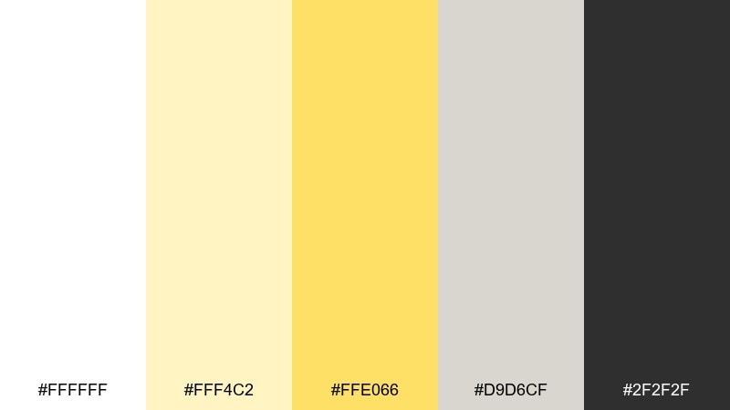
HEX: #ffffff #fff4c2 #ffe066 #d9d6cf #2f2f2f
Mood: airy, clean, upbeat
Best for: minimal brand identity
Airy whites and lemon highlights feel like fresh linen drying in warm sun. Use the bright yellow as a controlled accent on headlines, icons, or a single hero element. Ground the look with the soft greige and charcoal to keep it premium, not playful. Tip: keep the lemon at under 15 percent coverage for a crisp, editorial finish.
Image example of lemon linen generated using media.io
Media.io is an online AI studio for creating and editing video, image, and audio in your browser.

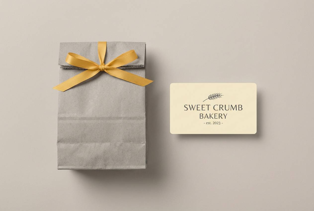
2) Buttercream Glow
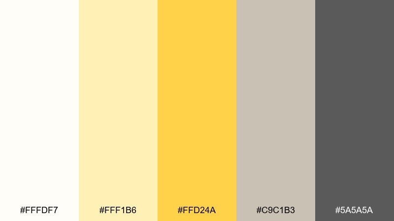
HEX: #fffdf7 #fff1b6 #ffd24a #c9c1b3 #5a5a5a
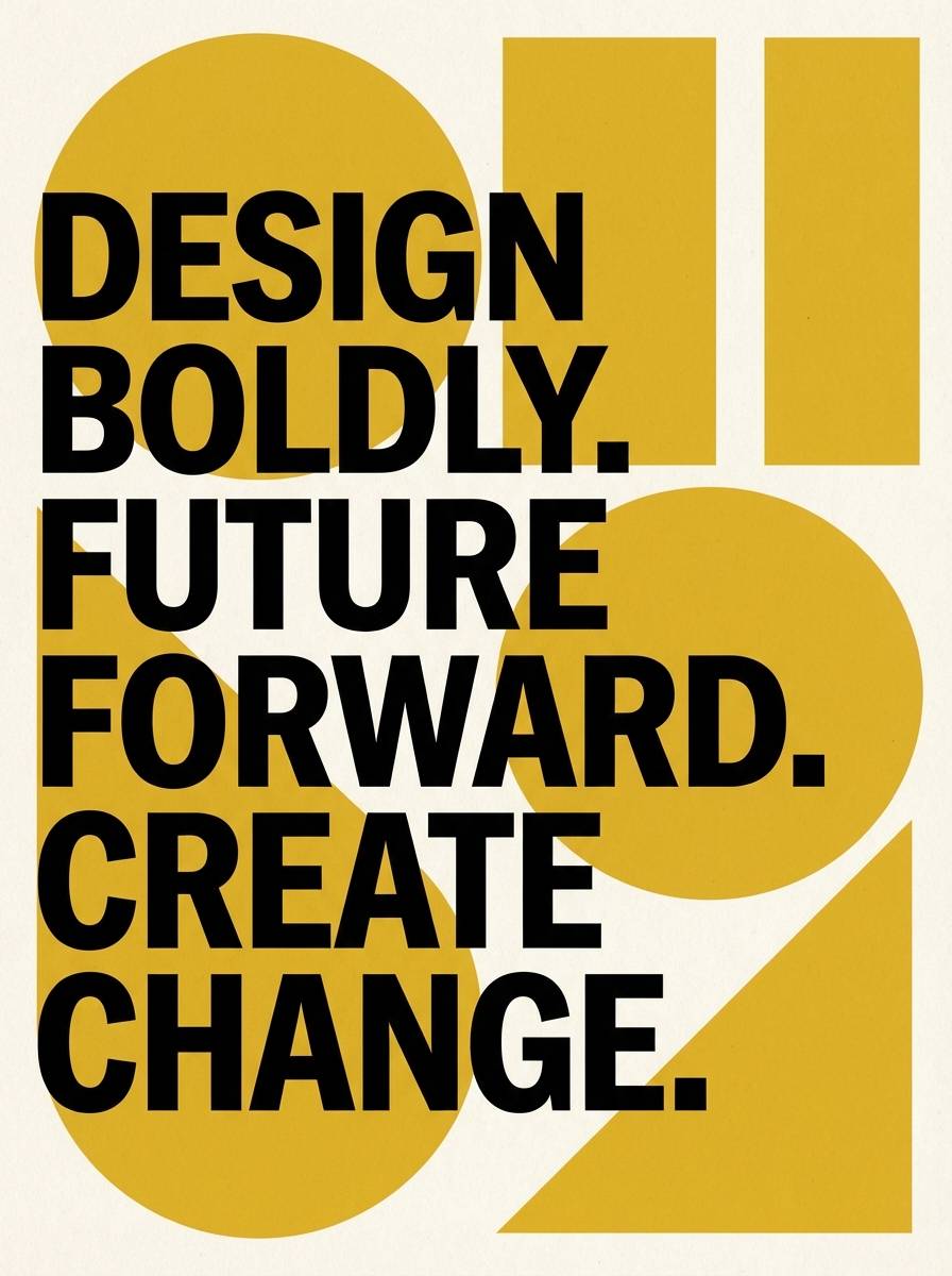
Mood: cozy, friendly, inviting
Best for: bakery packaging
Cozy buttercream tones evoke warm pastry cases and a soft morning glow. This white yellow color palette works best when the deeper golden note is reserved for logos, seals, and price bursts. Pair it with textured paper stock or matte finishes to emphasize the creamy warmth. Tip: add a tiny amount of dark gray for legibility on labels and nutrition blocks.
Image example of buttercream glow generated using media.io
3) Sunlit Minimal
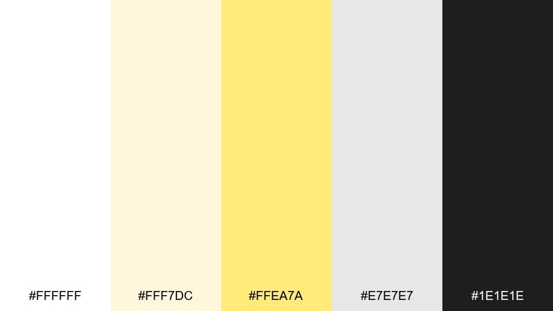
HEX: #ffffff #fff7dc #ffea7a #e7e7e7 #1e1e1e
Mood: modern, bright, uncluttered
Best for: 2d ui dashboard
Bright neutrals with a sunlit yellow accent feel modern and uncluttered. Use the off-white as the main canvas, then bring in the yellow for active states, notifications, or progress highlights. The light gray keeps sections separated without heavy borders. Tip: pair the accent with charcoal text to meet contrast needs on key UI elements.
Image example of sunlit minimal generated using media.io

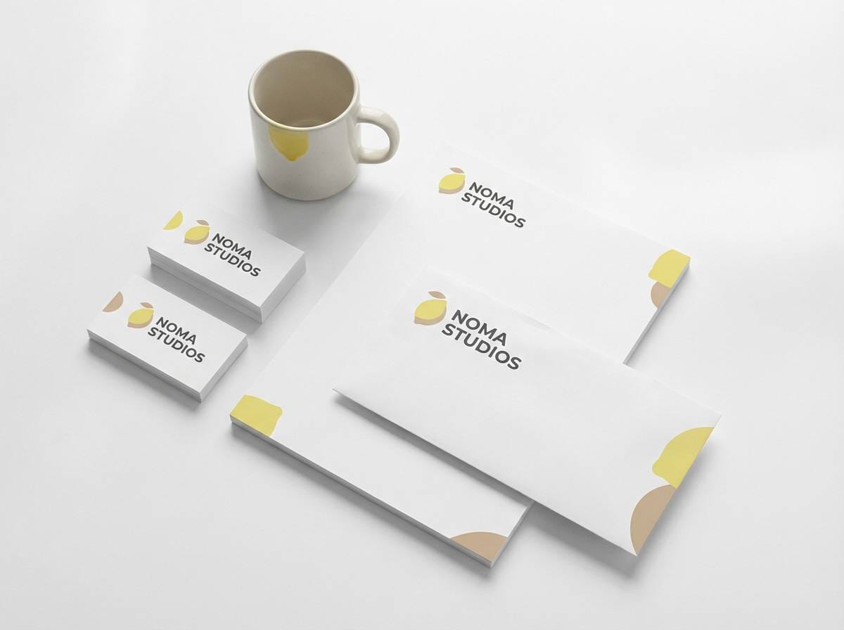
4) Daisy Studio
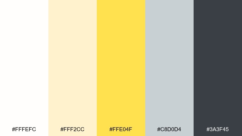
HEX: #fffefc #fff2cc #ffe04f #c8d0d4 #3a3f45
Mood: cheerful, creative, light
Best for: social media templates
Cheerful daisy tones bring a creative, friendly energy without feeling loud. Let the pale cream dominate backgrounds, then use the brighter yellow for stickers, callouts, or button shapes. The cool gray-blue adds balance so the design does not skew too warm. Tip: keep shadow colors neutral to maintain the airy studio vibe.
Image example of daisy studio generated using media.io
5) Citrus Marble
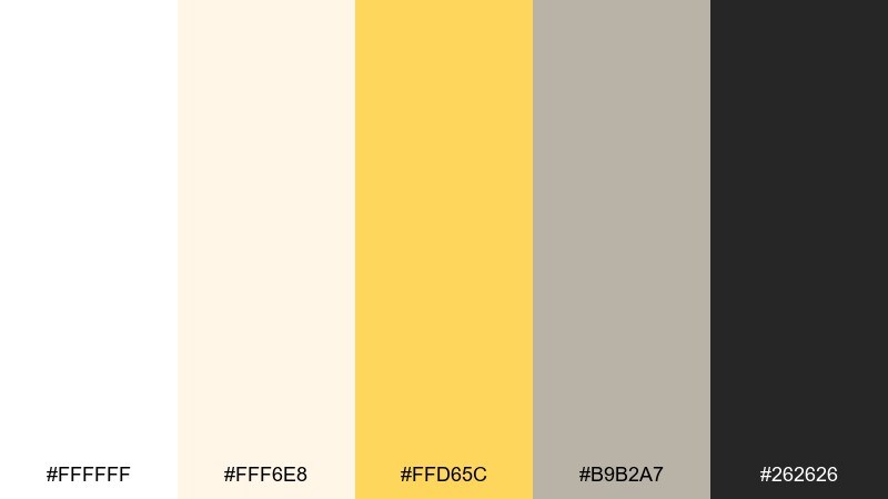
HEX: #ffffff #fff6e8 #ffd65c #b9b2a7 #262626
Mood: polished, luxe, sunny
Best for: beauty product ad
Polished whites and citrus gold feel like sunlight hitting marble countertops. Use the warm yellow as a metallic-like highlight for badges, limited edition tags, or glow effects around the product. The taupe-gray keeps the look elegant and helps photos feel less stark. Tip: add a soft gradient from cream to white to mimic real stone depth.
Image example of citrus marble generated using media.io

6) Honeyed Paper
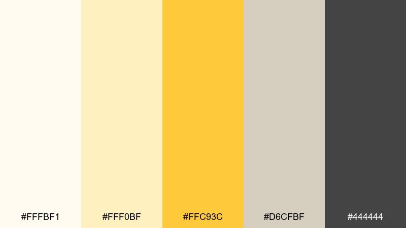
HEX: #fffbf1 #fff0bf #ffc93c #d6cfbf #444444
Mood: warm, crafted, approachable
Best for: coffee shop menu
Warm honey and paper tones suggest hand-crafted menus and friendly countertop chatter. This white yellow color scheme shines with black coffee photography, kraft textures, and simple line icons. Use the richer yellow for section headers and highlights like seasonal drinks. Tip: keep body text in dark gray, not pure black, for a softer print feel.
Image example of honeyed paper generated using media.io
7) Vanilla Pop
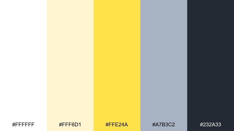
HEX: #ffffff #fff6d1 #ffe24a #a7b3c2 #232a33
Mood: fresh, youthful, energetic
Best for: app onboarding screens
Vanilla lightness with a pop of lemon feels fresh and youthful. Use the pale cream for most screens, then let the bright yellow guide attention through steps and progress dots. The muted blue-gray makes a great secondary button or illustration outline color. Tip: keep icons simple and filled, so the accent reads clearly at small sizes.
Image example of vanilla pop generated using media.io

8) Warm Chalk
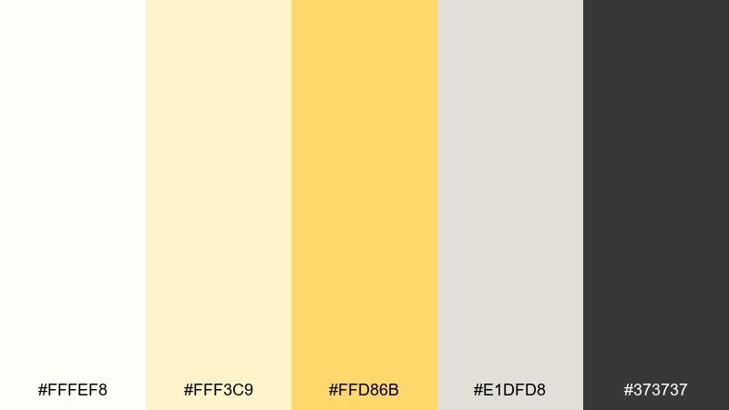
HEX: #fffef8 #fff3c9 #ffd86b #e1dfd8 #373737
Mood: soft, calm, classroom-friendly
Best for: online course slides
Soft chalky whites and warm yellow feel calm, clear, and easy to follow. Use the mid yellow to mark key takeaways, callout boxes, or section dividers without overpowering the page. The light neutral gray helps create structure for long-form slides. Tip: reserve the darkest gray for titles to maintain hierarchy and readability.
Image example of warm chalk generated using media.io
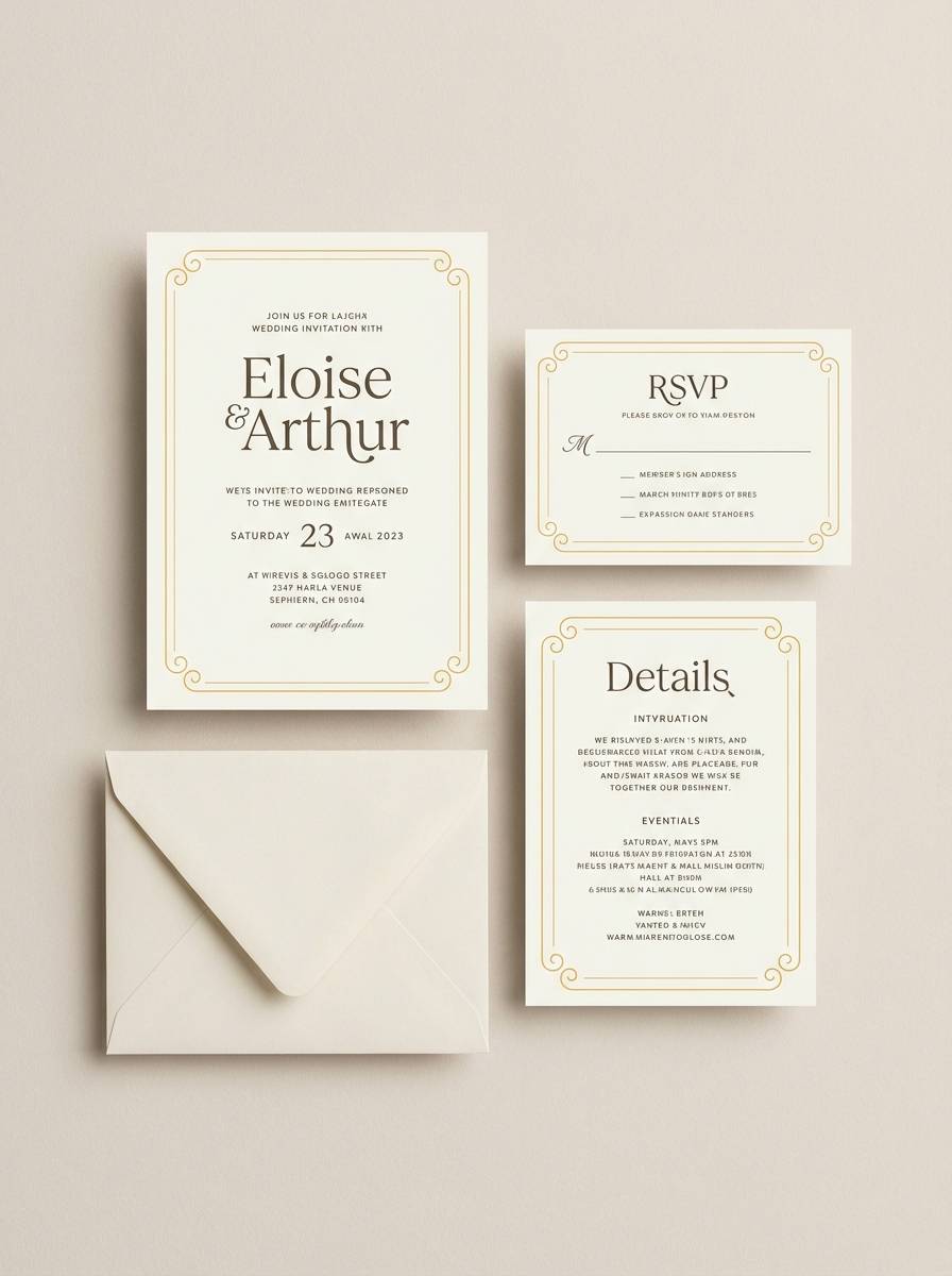
9) Golden Hour White

HEX: #ffffff #fff2d8 #ffcc4d #c7c2b8 #2b2b2b
Mood: romantic, warm, sophisticated
Best for: wedding invitation suite
Romantic golden-hour warmth feels like sun on ivory paper and soft candlelight. This white yellow color palette is ideal for invitations when you want bright elegance without heavy gold foil. Pair it with serif typography, thin rules, and gentle paper textures. Tip: keep the yellow to monograms and borders so the layout stays timeless.
Image example of golden hour white generated using media.io
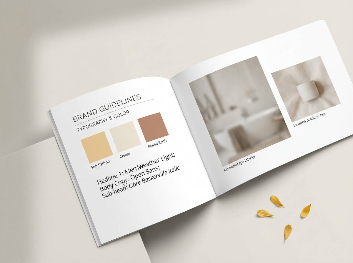
10) Soft Saffron

HEX: #fffdf9 #fff4cf #ffd36a #d9d3c7 #4a4a4a
Mood: gentle, organic, wellness
Best for: spa brand guidelines
Gentle saffron and creamy whites feel organic and restorative, like warm herbal tea. Use the soft yellow for highlight bars, section tabs, and subtle gradients rather than solid blocks. Pair with warm neutrals and minimal photography to maintain the calm. Tip: try the yellow as a 10 percent tint behind quotes and testimonials.
Image example of soft saffron generated using media.io
11) Modern Mustard
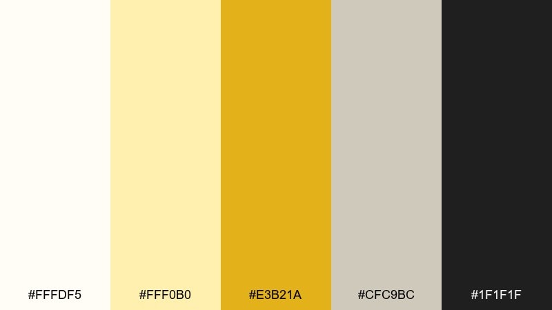
HEX: #fffdf5 #fff0b0 #e3b21a #cfc9bc #1f1f1f
Mood: bold, modern, confident
Best for: poster design
Bold mustard against creamy white feels confident and modern, like gallery posters in a bright hallway. Use the deeper yellow for large shapes or typographic blocks, then soften edges with the lighter cream. Pair with stark black type and plenty of whitespace to keep it contemporary. Tip: limit additional colors so the mustard stays the hero.
Image example of modern mustard generated using media.io
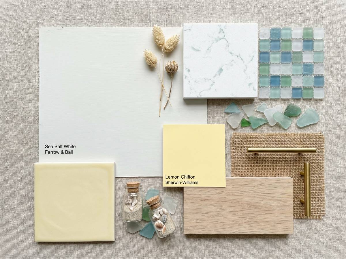
12) Eggshell Breeze

HEX: #ffffff #fff8e9 #ffe48a #c7d7d9 #2d3a3a
Mood: fresh, coastal, relaxed
Best for: kitchen interior mood board
Fresh eggshell and breezy yellow feel like a sunlit coastal kitchen. Use the pale yellow on backsplash tiles, textiles, or small decor accents, while keeping cabinets and walls in clean white. The sea-glass tint adds a cool counterbalance that prevents the room from feeling too warm. Tip: choose matte finishes for a relaxed, lived-in look.
Image example of eggshell breeze generated using media.io
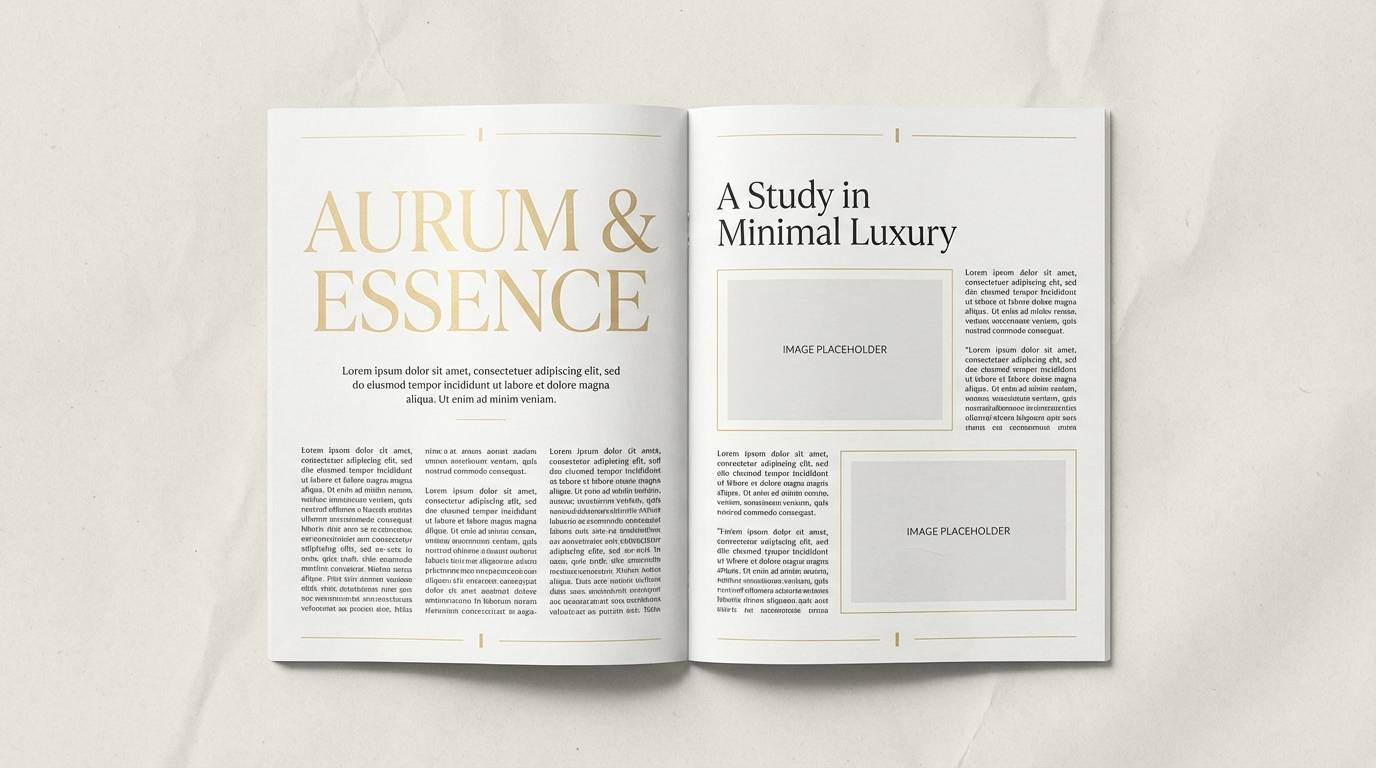
13) Pale Gold Serif

HEX: #fffefb #fff6dd #ffda5a #d5d0c6 #303030
Mood: editorial, refined, classic
Best for: magazine layout
Refined pale gold and crisp whites evoke premium editorial pages and quiet luxury. White yellow color combinations like this pair beautifully with serif headlines, thin lines, and understated photography. Use the gold tone for pull quotes, section markers, and small ornaments rather than full backgrounds. Tip: keep margins generous to let the palette breathe like print.
Image example of pale gold serif generated using media.io
14) Canary Accent
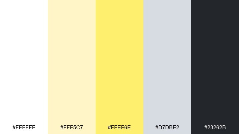
HEX: #ffffff #fff5c7 #ffef6e #d7dbe2 #23262b
Mood: playful, techy, attention-grabbing
Best for: saas landing page
Playful canary accents on clean white feel techy and high-energy, like a launch-day banner. Use the bright yellow sparingly for CTAs and micro-interactions so it reads as intentional, not noisy. The cool gray helps organize sections and makes screenshots look sharper. Tip: test the yellow on hover states with a slight darken for better depth.
Image example of canary accent generated using media.io

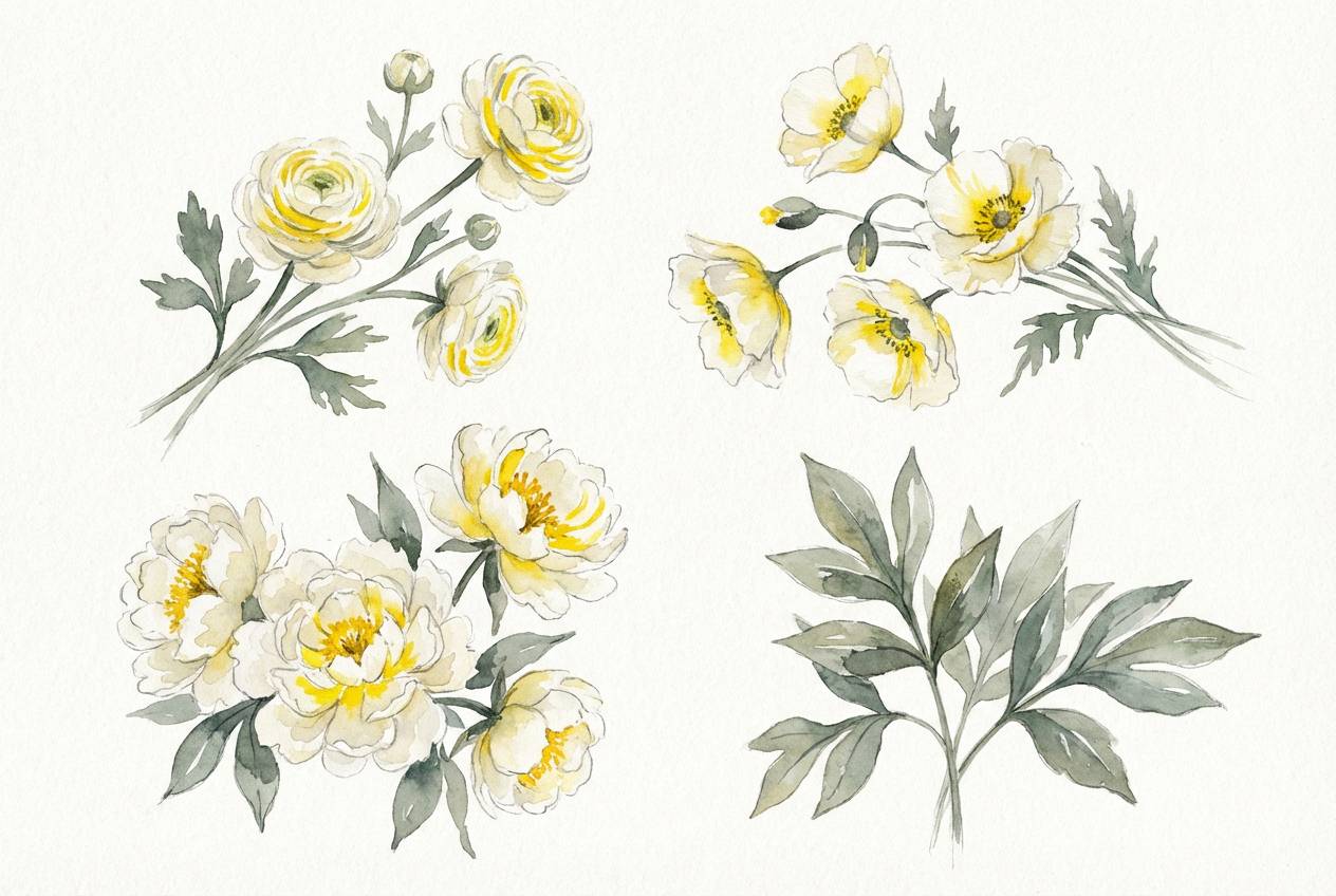
15) Spring Porcelain
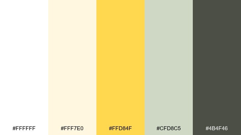
HEX: #ffffff #fff7e0 #ffd84f #cfd8c5 #4b4f46
Mood: delicate, botanical, uplifting
Best for: botanical illustration set
Delicate porcelain whites with spring yellow feel like petals, pollen, and fresh stems. Let the creamy tones wash the background while the bright yellow marks flower centers and highlights. The soft green-gray works as foliage and linework to keep the composition natural. Tip: use watercolor textures so transitions feel gentle rather than flat.
Image example of spring porcelain generated using media.io
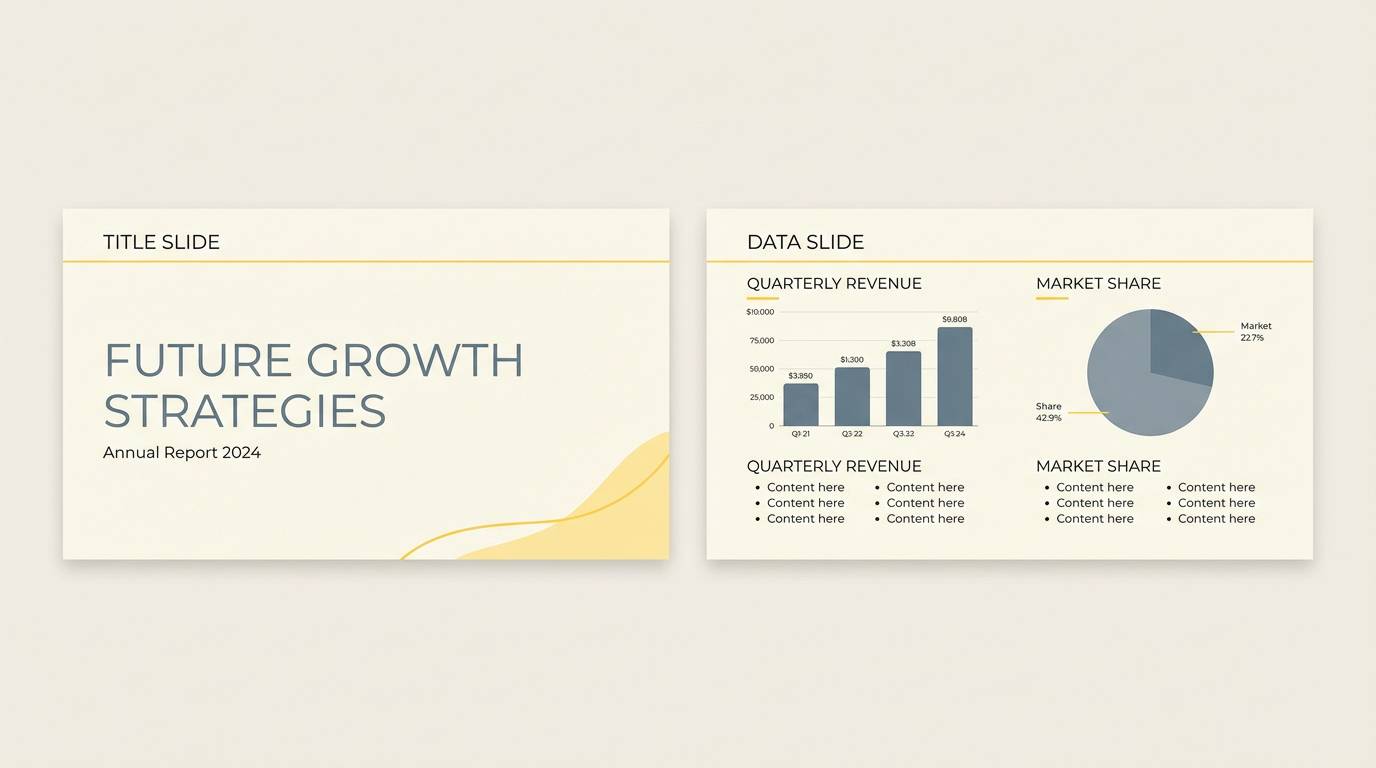
16) Warm Ivory Sun
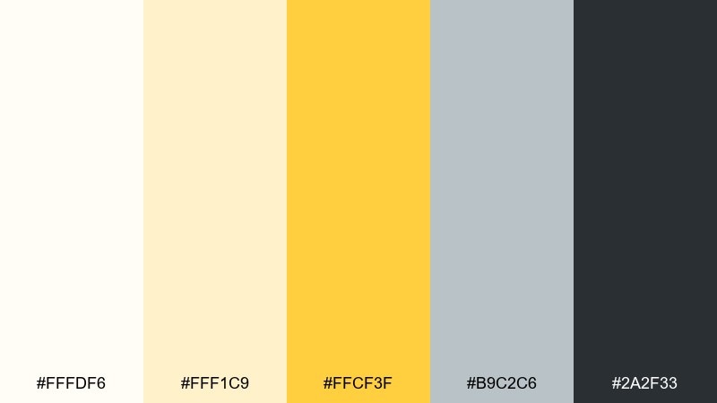
HEX: #fffdf6 #fff1c9 #ffcf3f #b9c2c6 #2a2f33
Mood: welcoming, bright, professional
Best for: corporate presentation theme
Warm ivory with a sunny yellow feels welcoming yet professional, like a bright meeting room. Use the strong yellow for section openers and key metrics, then lean on the cool gray-blue for charts and secondary labels. The dark slate keeps text crisp on both light and tinted slides. Tip: apply the yellow to just one chart series to guide attention.
Image example of warm ivory sun generated using media.io
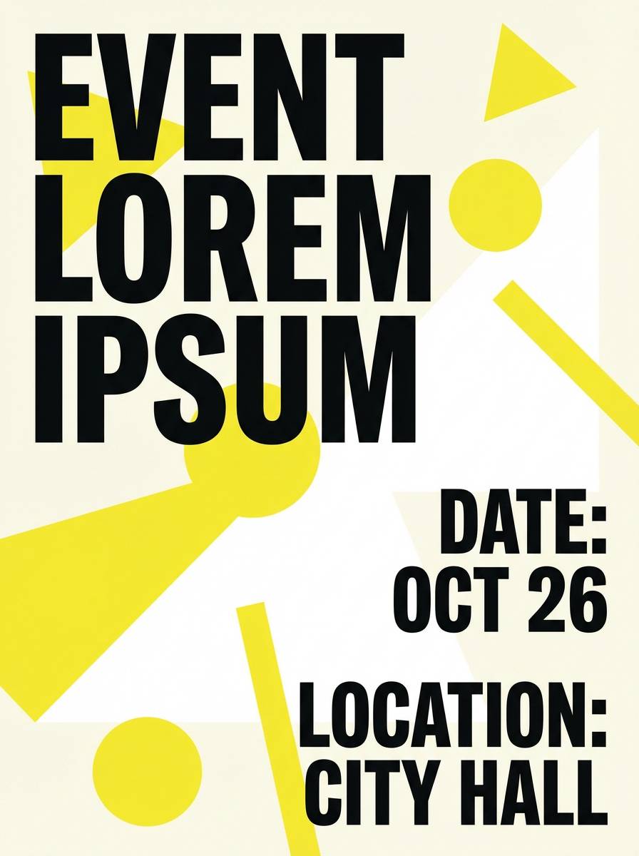
17) Bright Lemon Zest

HEX: #ffffff #fff6b8 #ffe600 #e0dfda #111111
Mood: electric, punchy, high-contrast
Best for: event flyer
Electric lemon zest brings punchy energy, like stage lights and fresh citrus peel. White yellow color combination choices like this do best with high contrast type and simple shapes. Use the pure lemon for the date or venue line so it pops at a glance, then balance with soft gray whitespace. Tip: avoid thin yellow text on white and opt for black text with yellow highlights instead.
Image example of bright lemon zest generated using media.io
18) Custard Concrete

HEX: #fffdf8 #fff2c1 #ffd15a #bfc3c7 #2c2c2c
Mood: urban, balanced, contemporary
Best for: architect portfolio website
Custard warmth against concrete gray feels urban and contemporary, like sunlight on raw surfaces. Use the yellow as a navigation highlight or project tag color, while keeping most layouts in white and cool gray. The darker neutral works well for captions and technical details. Tip: pair with grid-based spacing and thin rules to reinforce the architectural tone.
Image example of custard concrete generated using media.io

19) Solar Sand
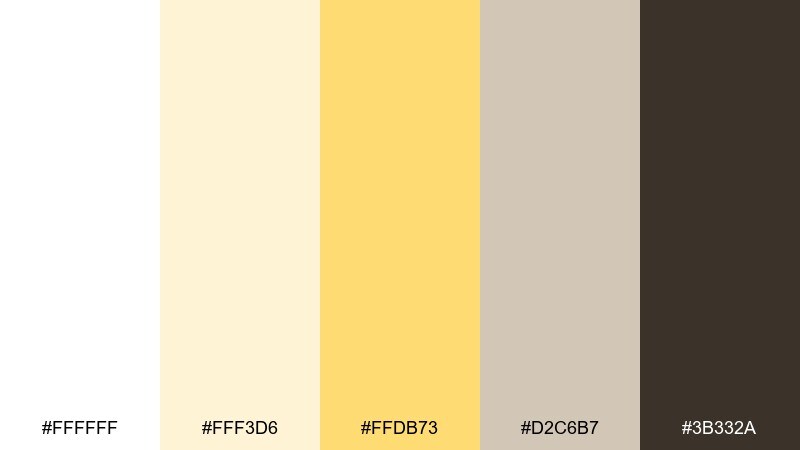
HEX: #ffffff #fff3d6 #ffdb73 #d2c6b7 #3b332a
Mood: sunny, earthy, relaxed
Best for: travel blog header
Sunny sand and mellow yellow feel like late-afternoon dunes and warm postcards. White yellow color combinations here pair nicely with natural photography, tan textures, and handwritten accents. Use the deeper brown for headings to create a grounded, sunbaked contrast. Tip: apply the sandy neutral behind text overlays so images remain readable.
Image example of solar sand generated using media.io

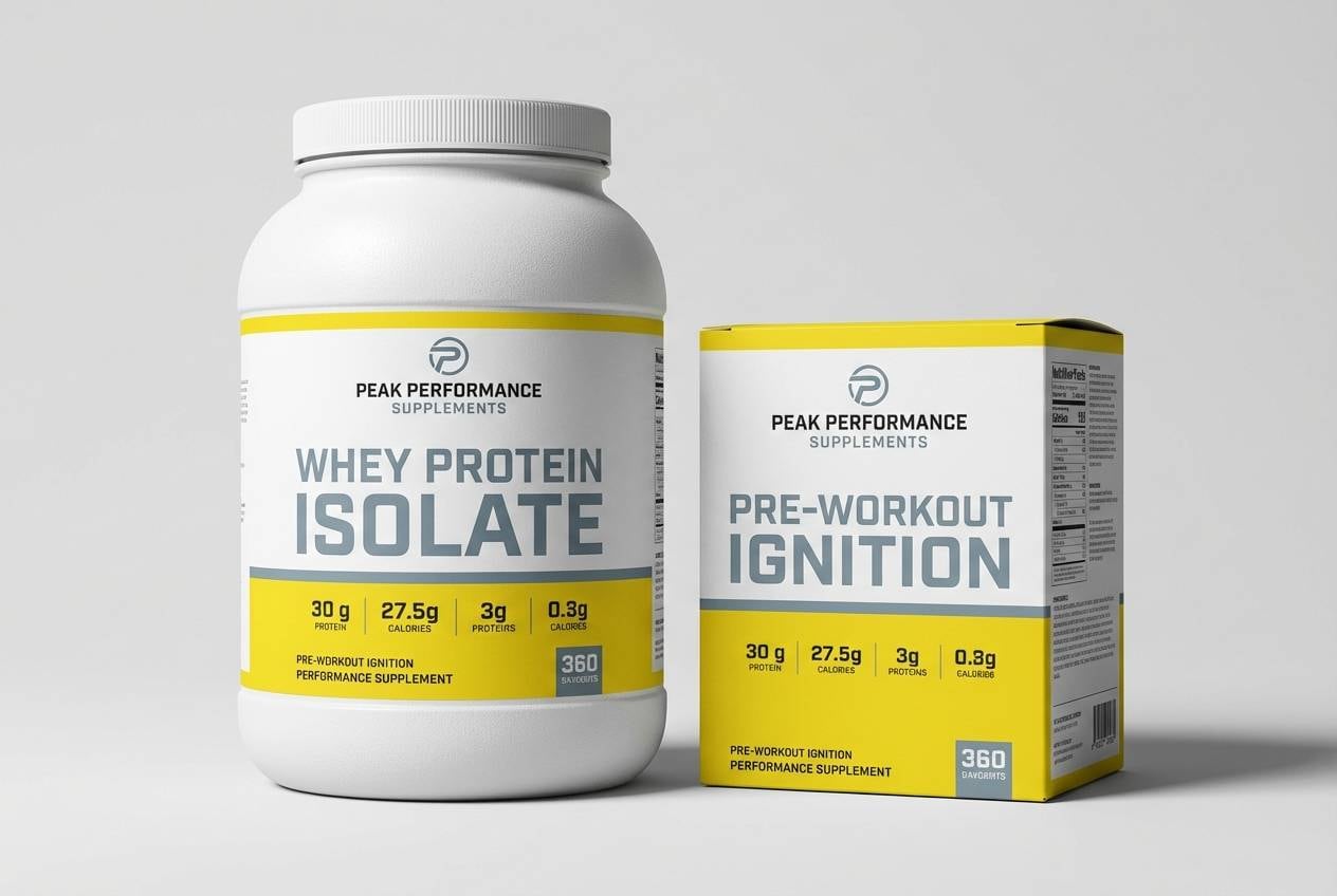
20) Glowstick Clean

HEX: #ffffff #fff8cc #ffe84d #ccd6dd #1a222b
Mood: crisp, sporty, modern
Best for: fitness product packaging
Crisp whites with glowstick yellow feel sporty and modern, like a fresh new training kit. Use the bright accent for flavor bands, dosage callouts, or performance claims while keeping the base clean. The cool steel tint supports a more technical, gym-ready impression. Tip: add spot UV on the yellow areas to make key claims stand out under light.
Image example of glowstick clean generated using media.io
What Colors Go Well with White Yellow?
White and yellow pair well with charcoal, black, and deep slate when you need sharp readability and a modern edge—especially for UI text, icons, and navigation. This also helps yellow look intentional rather than overly sweet.
For softer moods, add warm grays, taupe, greige, or creamy neutrals. These tones keep the palette cohesive and make yellow feel sunlit and natural instead of neon.
If you want a fresher balance, cool accents like blue-gray, sea-glass, or muted green work beautifully. They counter the warmth of yellow and create a calm, contemporary contrast.
How to Use a White Yellow Color Palette in Real Designs
Use white (or off-white) as your primary surface color, then apply yellow to a small number of “attention jobs”: CTAs, active states, badges, highlights, and key numbers. This keeps the system clean while still feeling energetic.
For print and packaging, avoid relying on thin yellow text on white. Instead, set type in charcoal or dark gray and use yellow as a block, underline, label, or border to maintain legibility.
In interiors, keep the largest areas white (walls, cabinetry, ceilings), then introduce yellow through textiles, art, or a single feature like tile or a painted nook. A grounding neutral (stone, wood, matte black) prevents the space from feeling overly bright.
Create White Yellow Palette Visuals with AI
If you want to preview how a white yellow color palette will look in a landing page, poster, invitation, or product ad, generating quick concept images can save hours. It’s also a great way to test “how much yellow is too much” before you commit.
With Media.io’s Text to Image, you can paste a prompt, keep your palette references nearby, and iterate through layout styles (minimal, editorial, playful, or high-contrast) in minutes.
White Yellow Color Palette FAQs
-
What does a white and yellow color palette communicate?
It typically communicates brightness, optimism, cleanliness, and clarity. White creates space and neutrality, while yellow adds warmth and draws attention to key elements. -
How do I keep yellow from overpowering a mostly white design?
Use yellow as an accent (often under 10–15% coverage) for CTAs, highlights, and key labels. Add a grounding neutral like charcoal or slate for text and structure. -
Is yellow on white accessible for UI design?
Yellow on white often fails contrast requirements, especially for small text. Use dark text on light yellow, or pair yellow accents with charcoal/black elements to keep interactive states readable. -
What’s the best neutral to pair with white and yellow?
Charcoal and deep slate are the most reliable for readability and a modern feel. For a softer look, choose warm gray, greige, or taupe to keep the palette cozy. -
Can white-yellow palettes work for luxury branding?
Yes—choose creamy whites and muted gold tones, then keep yellow limited to small ornaments, borders, or highlights. Pair with refined typography and generous whitespace to maintain a premium tone. -
Which shades of yellow are easiest to use?
Buttercream, saffron, and pale gold are generally easier because they’re less intense and work well as backgrounds or tints. Neon or pure lemon is best reserved for small, high-impact accents. -
How can I visualize a white yellow palette before designing?
Generate quick mockups with an AI image tool using prompts for your target format (landing page, packaging, poster, UI screens). This helps you test balance, contrast, and mood before final production.
Next: Denim Blue Color Palette


