

Denim blue is one of those rare hues that feels both familiar and design-forward—grounded like classic workwear, yet polished enough for modern UI.
Whether you’re building a brand system, refreshing an app interface, or styling an interior moodboard, denim blue palettes give you instant structure, contrast, and calm.
In this article
- Why Denim Blue Palettes Work So Well
-
- heritage indigo
- coastal denim
- vintage workwear
- denim and clay
- midnight stitch
- powdered denim
- urban selvedge
- denim and sage
- ink and oat
- washed chambray
- denim dusk
- denim and blush
- studio blueprint
- denim and marigold
- stormy denim
- denim and copper
- quiet library
- denim pop art
- denim minimalist
- denim and evergreen
- What Colors Go Well with Denim Blue?
- How to Use a Denim Blue Color Palette in Real Designs
- Create Denim Blue Palette Visuals with AI
Why Denim Blue Palettes Work So Well
Denim blue sits in a sweet spot between navy authority and bright-blue friendliness. It reads as dependable and wearable, which makes it a strong foundation color for design systems and branding.
Because denim blue is naturally “muted,” it pairs cleanly with both warm neutrals (oat, sand, tan) and crisp cools (gray, steel, icy blue). That flexibility helps you build contrast without turning the palette harsh.
It also carries built-in texture associations—stitching, fabric, heritage craft—which can make flat digital layouts feel more human and premium even when you’re only using solid color.
20+ Denim Blue Color Palette Ideas (with HEX Codes)
1) Heritage Indigo
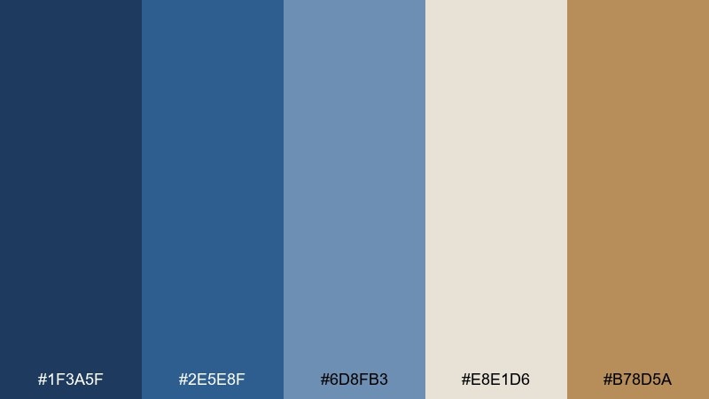
HEX: #1F3A5F #2E5E8F #6D8FB3 #E8E1D6 #B78D5A
Mood: classic, grounded, artisanal
Best for: heritage apparel branding and lookbooks
Classic and grounded like indigo-dyed denim on warm sunlit canvas. The deep blues feel trustworthy, while oat and tan keep layouts breathable and premium. Use it for fashion labels, workwear collections, or craft brands that need history without feeling dated. Pair the tan as a stitching accent and reserve the darkest blue for logos and headlines.
Image example of heritage indigo generated using media.io

Media.io is an online AI studio for creating and editing video, image, and audio in your browser.

2) Coastal Denim
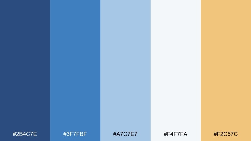
HEX: #2B4C7E #3F7FBF #A7C7E7 #F4F7FA #F2C57C
Mood: breezy, optimistic, seaside
Best for: travel blog headers and lifestyle social posts
Breezy and sunlit, like washed jeans beside ocean foam and a hint of golden sand. The pale blues give you plenty of negative space, while the warm yellow keeps the palette from feeling cold. It works well for travel, lifestyle, and creator content that needs a friendly, open tone. Use the yellow sparingly for buttons or key badges to avoid overpowering the airy blues.
Image example of coastal denim generated using media.io
3) Vintage Workwear

HEX: #1E3352 #2F5D8A #7A8FA6 #D7C9B6 #8A6A3E
Mood: rugged, dependable, nostalgic
Best for: workwear product packaging and hang tags
Rugged and dependable, like broken-in overalls and well-worn leather gloves. The navy-to-steel range gives weight to headlines, and the khaki and brown read as authentic and tactile. This denim blue color palette is a strong fit for packaging, hang tags, and labels that need an old-school edge. Tip: print the mid-blue as a large background and keep the brown for small stamps and icons.
Image example of vintage workwear generated using media.io
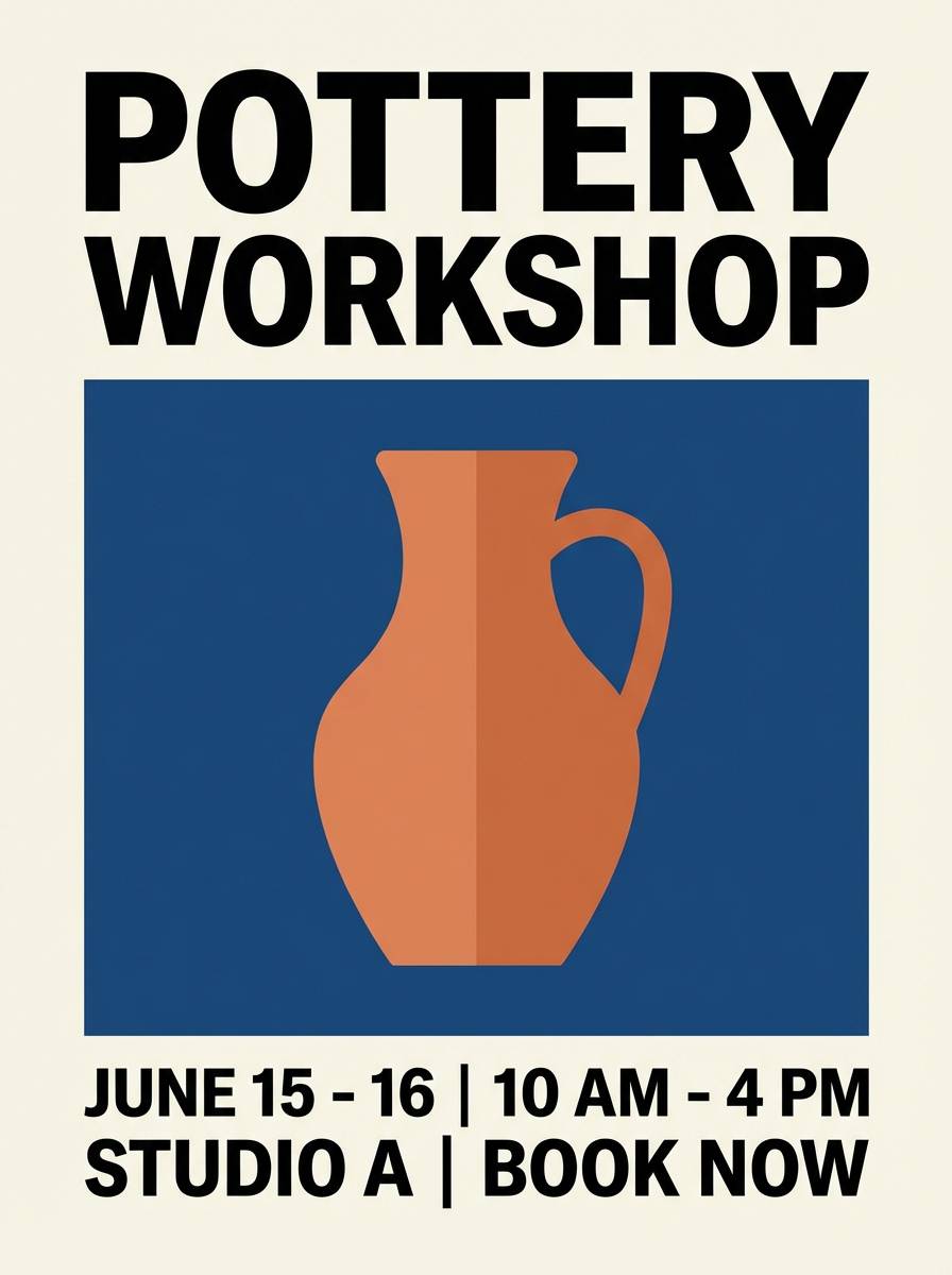
4) Denim and Clay
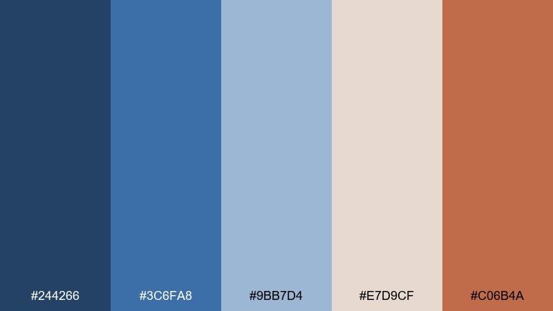
HEX: #244266 #3C6FA8 #9BB7D4 #E7D9CF #C06B4A
Mood: earthy, creative, warm-cool balance
Best for: ceramic studio websites and workshop flyers
Earthy and creative, like wet clay on a studio table beside a folded chambray apron. The soft neutrals keep it calm, while the clay orange adds handmade warmth against cool blues. These denim blue color combination choices shine on class schedules, workshop flyers, and small-business sites. Use the clay tone as a call-to-action color, and keep the light blue for backgrounds to maintain an airy feel.
Image example of denim and clay generated using media.io
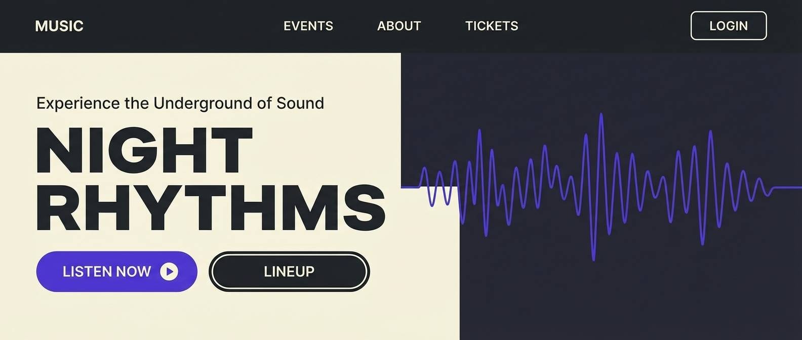
5) Midnight Stitch
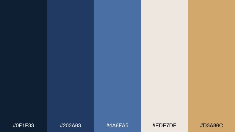
HEX: #0F1F33 #203A63 #4A6FA5 #EDE7DF #D3A86C
Mood: moody, premium, dramatic
Best for: music app landing pages and hero sections
Moody and premium, like midnight denim with subtle gold thread catching the light. The near-black navy builds drama, while the warm sand tone keeps the contrast refined rather than harsh. It works beautifully for landing pages, hero sections, and product stories that need a cinematic vibe. Tip: set large text in the off-white to improve readability on the darkest blues.
Image example of midnight stitch generated using media.io
6) Powdered Denim
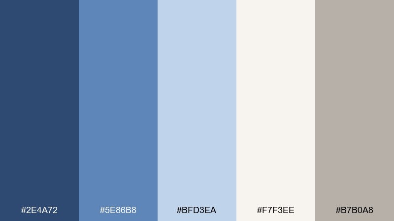
HEX: #2E4A72 #5E86B8 #BFD3EA #F7F3EE #B7B0A8
Mood: soft, clean, modern calm
Best for: wellness dashboards and minimal UI kits
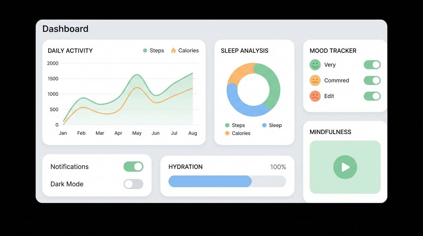
Soft and clean, like freshly laundered denim with a powdery, cloud-light finish. The grayed neutrals smooth out contrast so screens feel calm and approachable. Use this denim blue color scheme for wellness dashboards, habit trackers, or SaaS UI kits that need clarity without stark black. Keep the palest blue for cards and surfaces, and use the mid-blue for active states and links.
Image example of powdered denim generated using media.io
7) Urban Selvedge
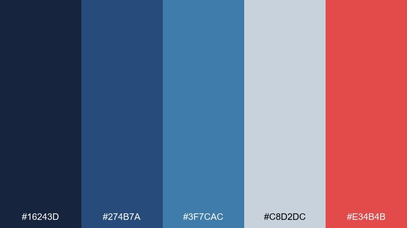
HEX: #16243D #274B7A #3F7CAC #C8D2DC #E34B4B
Mood: street-smart, bold, high-contrast
Best for: streetwear drops and promo posters
Street-smart and bold, like dark selvedge denim with a sharp red detail tag. Cool grays soften the edge just enough, while the red punches through for instant focus. Great for streetwear drops, event promos, and posters that need quick readability. Tip: keep red to one or two elements per layout so it stays special and urgent.
Image example of urban selvedge generated using media.io
8) Denim and Sage
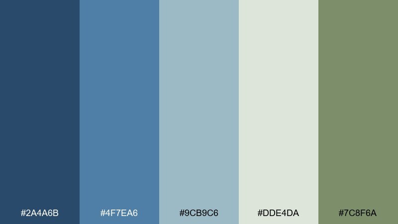
HEX: #2A4A6B #4F7EA6 #9CB9C6 #DDE4DA #7C8F6A
Mood: fresh, natural, balanced
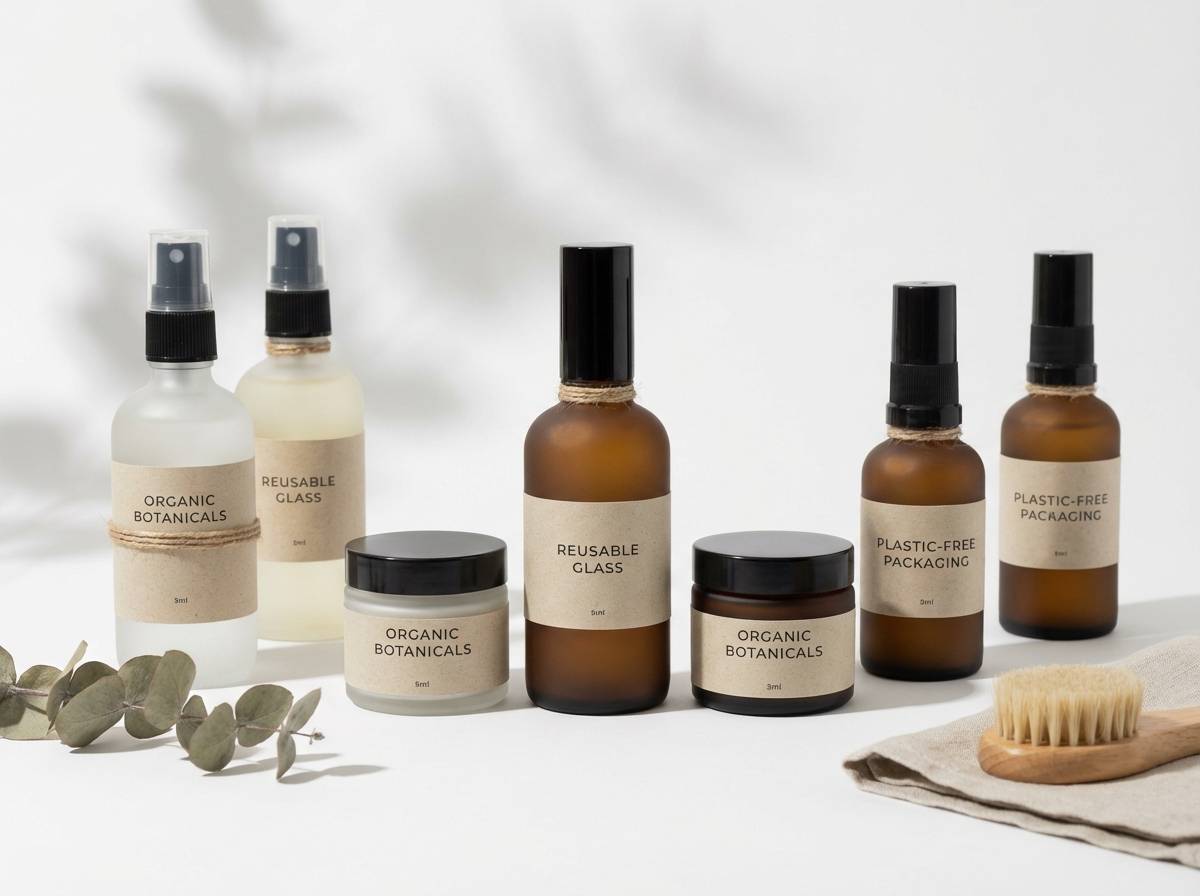
Best for: eco skincare branding and label design
Fresh and natural, like a denim shirt in a herb garden after rain. Sage greens bring an organic note to the cool blues, making the mix feel healthy and modern. Ideal for eco skincare, refill products, and any brand that wants clean trust plus warmth. Use the sage as your secondary brand color and save the deeper blue for logo locks and ingredient headers.
Image example of denim and sage generated using media.io
9) Ink and Oat
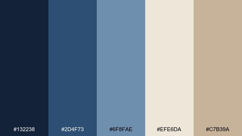
HEX: #132238 #2D4F73 #6F8FAE #EFE6DA #C7B39A
Mood: editorial, thoughtful, understated
Best for: book covers and longform blog layouts
Editorial and thoughtful, like fountain-pen ink on creamy paper with denim shadows. The oat and taupe tones keep reading experiences warm, while the blues add structure and hierarchy. It suits book covers, newsletters, and longform layouts where comfort matters. Tip: set body text in the darkest ink and use the mid-blue for pull quotes or section dividers.
Image example of ink and oat generated using media.io
10) Washed Chambray
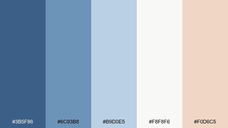
HEX: #3B5F86 #6C93B8 #B9D0E5 #F8F8F6 #F0D6C5
Mood: light, friendly, airy
Best for: baby brands and gentle ecommerce themes
Light and friendly, like chambray fabric and soft peach cotton. The gentle blues create a clean foundation, and the blushy peach adds a caring, human touch. Perfect for baby brands, stationery shops, and ecommerce themes that want softness without looking childish. Use the peach only for highlights like price tags or small icons so the page stays calm.
Image example of washed chambray generated using media.io
11) Denim Dusk
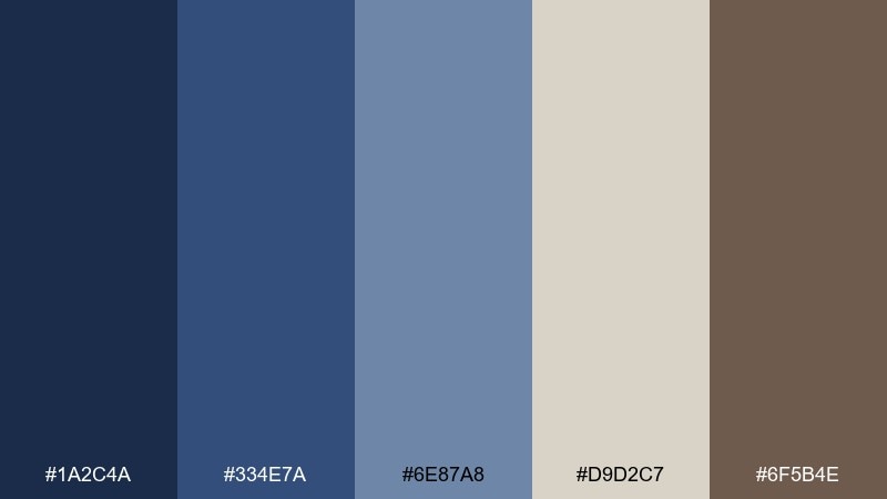
HEX: #1A2C4A #334E7A #6E87A8 #D9D2C7 #6F5B4E
Mood: cozy, evening, refined
Best for: home office interiors and moodboards
Cozy and evening-toned, like dusk settling over a quiet room with denim curtains. The taupe and brown notes add warmth so the blues feel livable and inviting. Use it for home office interiors, moodboards, or presentation decks that need a calm, steady voice. Tip: place the light neutral on large surfaces and bring in the darkest blue for trim, titles, or shelving accents.
Image example of denim dusk generated using media.io
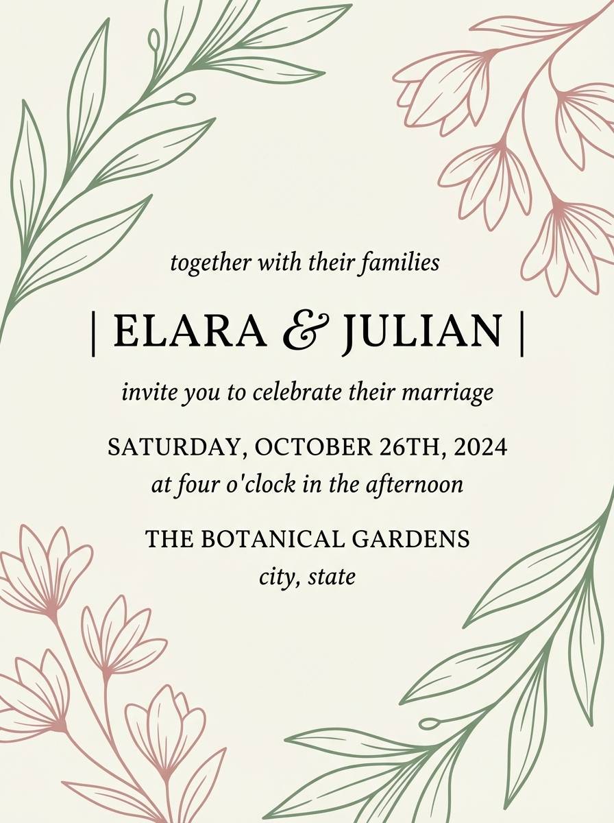
12) Denim and Blush
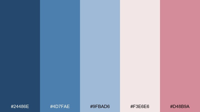
HEX: #24486E #4D7FAE #9FBAD6 #F3E6E6 #D48B9A
Mood: romantic, modern, approachable
Best for: wedding invitations and boutique brand kits
Romantic and modern, like soft blush florals tucked into a denim jacket pocket. The pinks warm up the blues for an approachable look that still feels polished. This denim blue color palette is ideal for wedding invitations, boutique branding, and social templates with a gentle, stylish tone. Tip: keep the blush background subtle and let the deeper blue handle typography for crisp contrast.
Image example of denim and blush generated using media.io
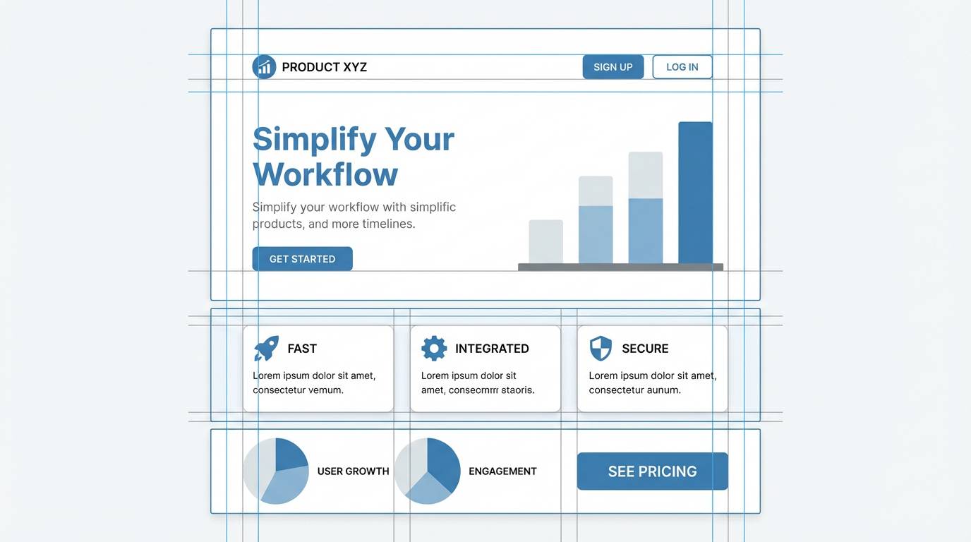
13) Studio Blueprint
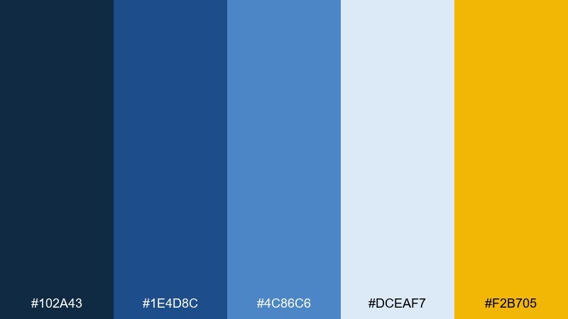
HEX: #102A43 #1E4D8C #4C86C6 #DCEAF7 #F2B705
Mood: technical, energetic, confident
Best for: startup pitch decks and product landing pages
Technical and energetic, like blueprint paper lit by a bright studio lamp. The saturated blues feel confident and product-led, while the warm yellow adds a focused spark for key moments. Great for startup decks, feature highlights, and landing pages that need clear hierarchy. Use the yellow only for primary actions and data callouts, and keep the lightest blue as your main surface color.
Image example of studio blueprint generated using media.io
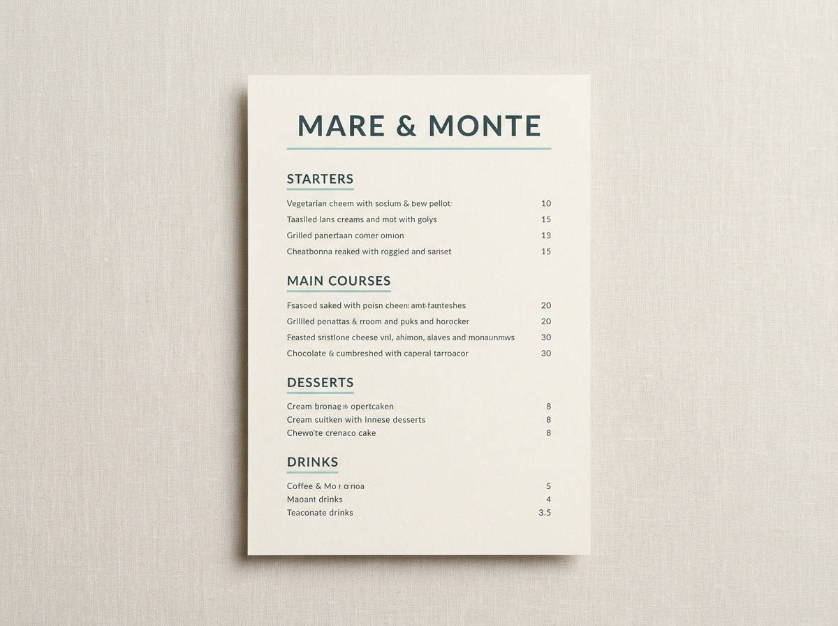
14) Denim and Marigold
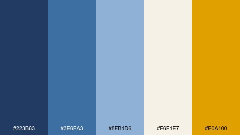
HEX: #223B63 #3E6FA3 #8FB1D6 #F6F1E7 #E0A100
Mood: cheerful, bold, sun-kissed
Best for: restaurant menus and seasonal promos
Cheerful and sun-kissed, like marigolds against a deep blue apron. The warm gold wakes up the cooler tones and makes typography feel inviting and lively. Ideal for menus, seasonal promos, and small posters that need attention without neon harshness. Tip: use marigold for section headers and icons, then keep body copy in the darker blues for legibility.
Image example of denim and marigold generated using media.io
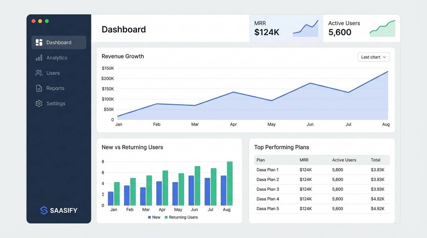
15) Stormy Denim
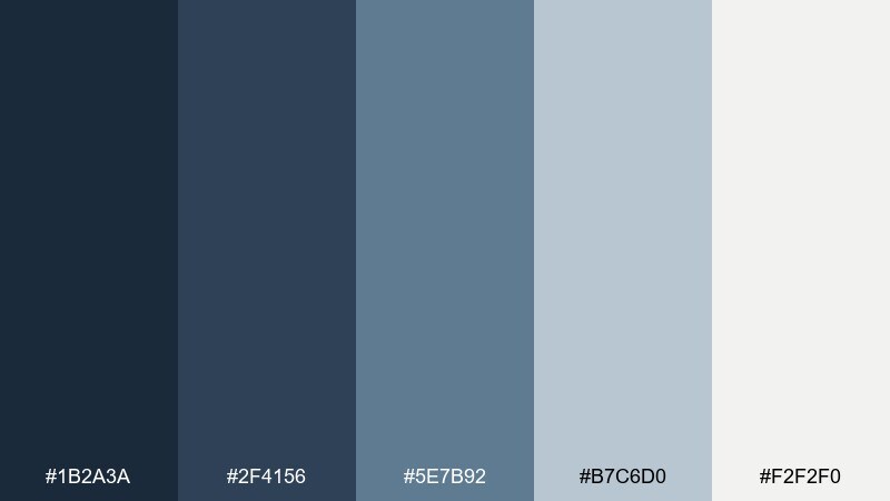
HEX: #1B2A3A #2F4156 #5E7B92 #B7C6D0 #F2F2F0
Mood: cool, stormy, minimal
Best for: finance apps and serious SaaS dashboards
Cool and stormy, like rain clouds reflected in dark denim. The slate range delivers authority, while the near-white keeps interfaces from feeling heavy. A strong choice for finance tools, analytics, and B2B dashboards where clarity and trust are non-negotiable. Tip: keep the two lightest shades for backgrounds and tables, and reserve the darkest tone for critical numbers and navigation.
Image example of stormy denim generated using media.io
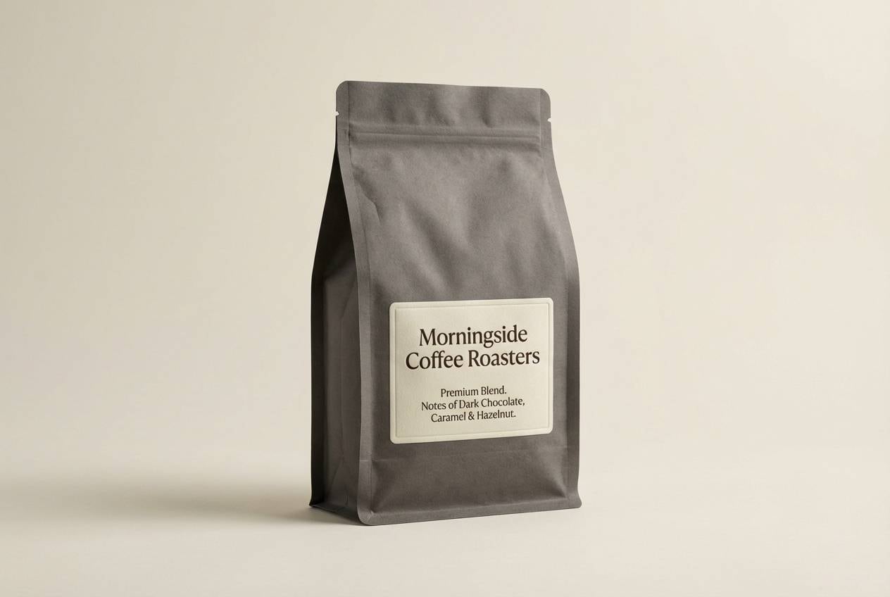
16) Denim and Copper
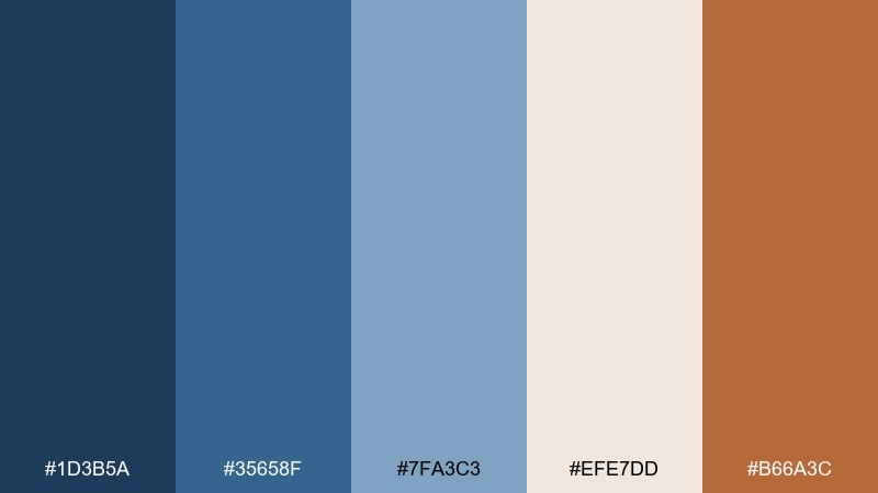
HEX: #1D3B5A #35658F #7FA3C3 #EFE7DD #B66A3C
Mood: warm industrial, crafted, upscale
Best for: coffee packaging and artisan product ads
Warm industrial and crafted, like copper hardware paired with a dark denim apron. The creamy neutral keeps the palette tasteful, while copper adds a premium, handmade signal. Use it for coffee packaging, artisan goods, and product ads that need warmth without going rustic. Tip: foil-like copper works best as a small accent, so let the mid-blue carry most large areas.
Image example of denim and copper generated using media.io
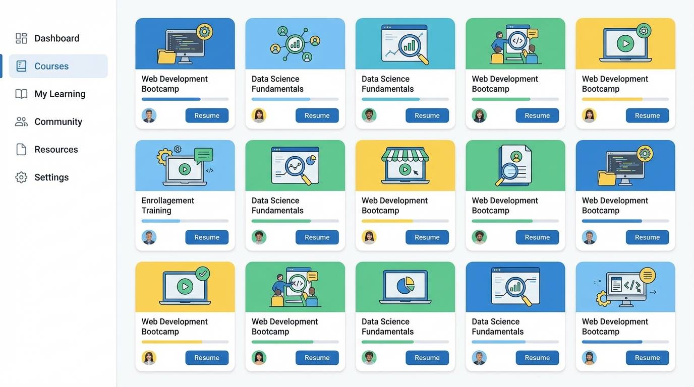
17) Quiet Library
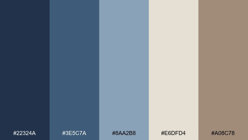
HEX: #22324A #3E5C7A #8AA2B8 #E6DFD4 #A08C78
Mood: quiet, academic, comforting
Best for: online courses and education portals
Quiet and academic, like stacked books and denim-blue shadows in a reading nook. The warm parchment neutral makes pages feel welcoming, while the muted blues organize content without shouting. Great for course platforms, libraries, and education portals that need calm credibility. Tip: use the parchment shade for content areas and the deeper blue for navigation to guide the eye.
Image example of quiet library generated using media.io
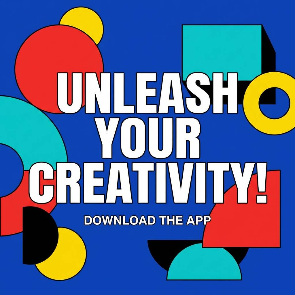
18) Denim Pop Art
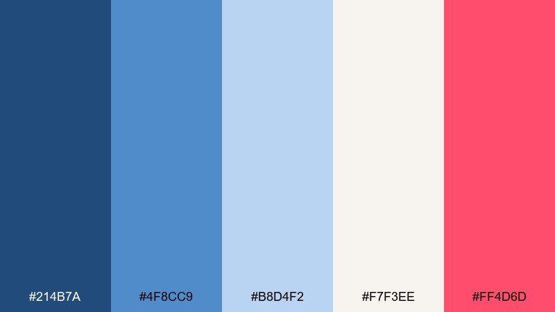
HEX: #214B7A #4F8CC9 #B8D4F2 #F7F3EE #FF4D6D
Mood: playful, punchy, modern
Best for: creator merch drops and bold social ads
Playful and punchy, like pop-art graphics splashed over crisp denim. The hot pink injects energy into cool blues, creating denim blue color combinations that feel instantly scroll-stopping. Use it for creator merch, bold social ads, and campaign graphics where you want a clear focal point. Tip: set pink against the off-white or light blue so it stays vibrant without vibrating on darker tones.
Image example of denim pop art generated using media.io
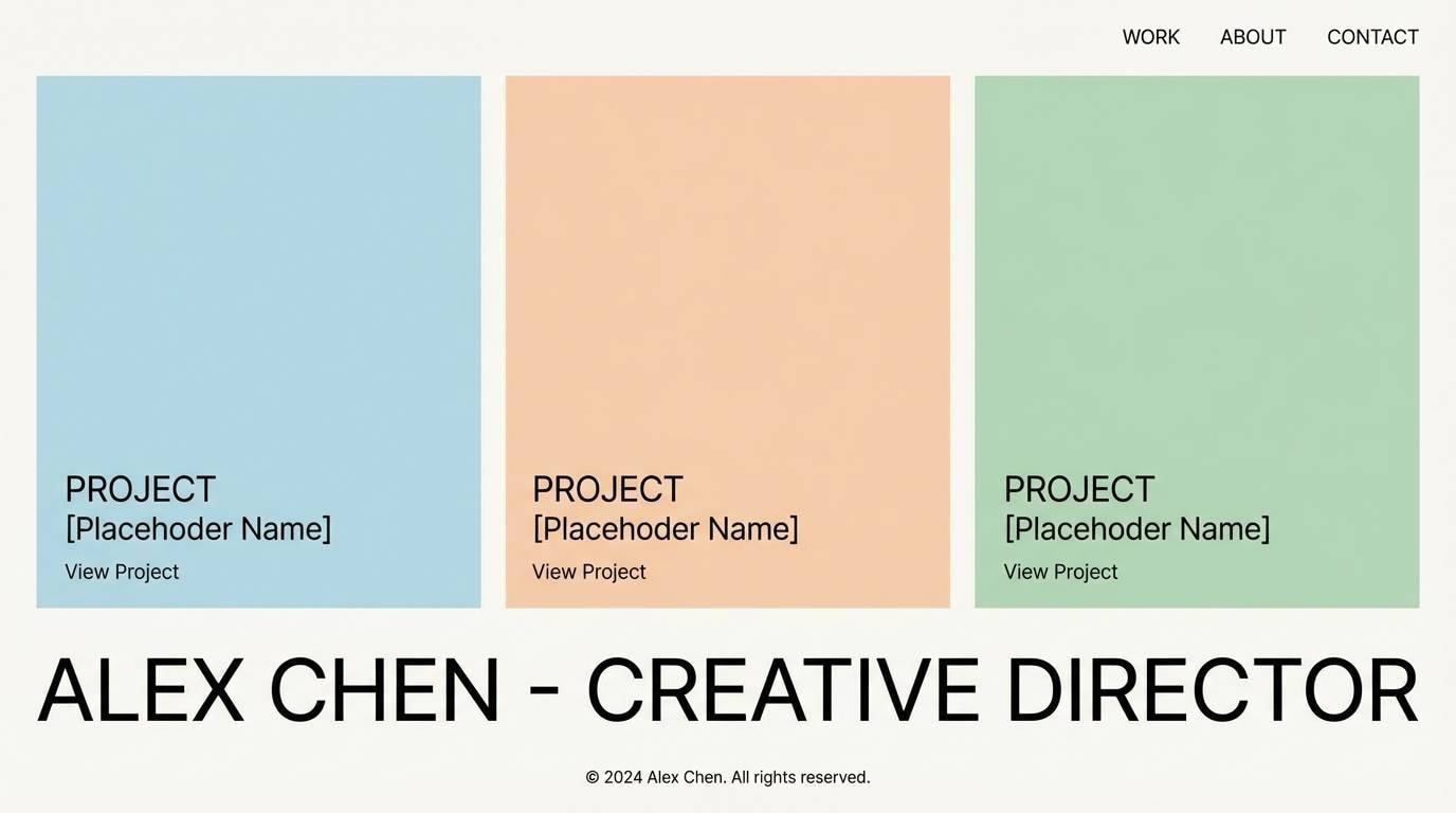
19) Denim Minimalist
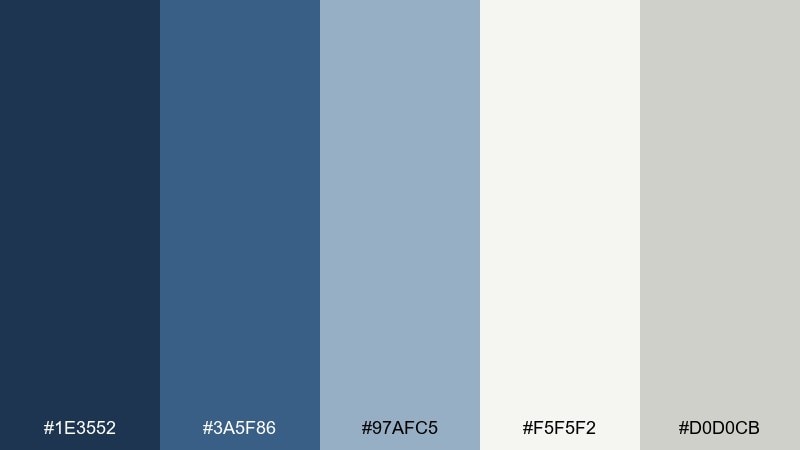
HEX: #1E3552 #3A5F86 #97AFC5 #F5F5F2 #D0D0CB
Mood: minimal, calm, contemporary
Best for: portfolio sites and architecture presentations
Minimal and calm, like a crisp denim jacket against a gallery-white wall. Subtle grays and off-white keep the look contemporary and let imagery take center stage. It is a smart choice for portfolios, architecture decks, and clean brand systems where restraint matters. Tip: use the lightest tones as your grid foundation and save the darkest blue for small, sharp typographic moments.
Image example of denim minimalist generated using media.io
20) Denim and Evergreen
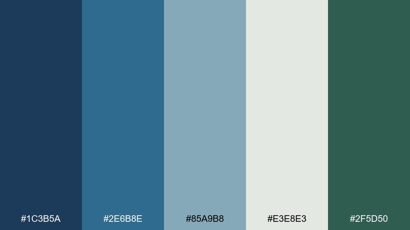
HEX: #1C3B5A #2E6B8E #85A9B8 #E3E8E3 #2F5D50
Mood: outdoorsy, steady, refreshing
Best for: outdoor brands and nature-forward illustrations
Outdoorsy and steady, like evergreen trails under a cool blue sky. The green anchors the palette in nature, while the softer blue-gray keeps it modern and relaxed. Ideal for outdoor brands, sustainability reports, and packaging that wants a fresh, trustworthy feel. Tip: use evergreen for badges and secondary buttons, and keep the light neutral for clean breathing room.
Image example of denim and evergreen generated using media.io
What Colors Go Well with Denim Blue?
Denim blue pairs effortlessly with warm neutrals like oat, beige, parchment, and sand—these tones soften the coolness of blue and make layouts feel premium and breathable.
For bolder contrast, try warm accents such as marigold, copper, clay, or a punchy pink. A small amount of warm color against denim blue creates clear focal points for buttons, badges, and hero highlights.
If you want a calm, nature-forward direction, combine denim blue with sage or evergreen. These greens keep the palette grounded and modern, especially for wellness, outdoors, and sustainability design.
How to Use a Denim Blue Color Palette in Real Designs
Start by assigning roles: use the darkest denim blue for navigation, headlines, or logo marks; mid-denims for UI states and secondary headings; and the lightest blues or off-whites for surfaces and cards.
Keep accents intentional. One warm accent (like copper, marigold, or red) is usually enough—use it for primary CTAs, price tags, or key data points so the interface stays clean.
In print or packaging, denim blues feel richer when balanced with warm paper-like neutrals. If you’re working digitally, double-check contrast for accessibility, especially when placing text on mid-blue backgrounds.
Create Denim Blue Palette Visuals with AI
If you need quick mockups (posters, brand boards, UI hero sections, or packaging scenes), you can generate on-style visuals from a simple text prompt and then iterate fast.
Use your palette’s mood words (like “heritage,” “minimal,” “stormy,” or “pop art”) directly in the prompt to steer lighting, composition, and vibe—then refine with small changes rather than rewriting everything.
With Media.io’s text-to-image tool, you can create consistent denim blue palette imagery for campaigns, pitches, and design explorations without setting up a full photoshoot.
Denim Blue Color Palette FAQs
-
What is a denim blue color palette?
A denim blue color palette is a set of coordinated colors built around denim-like blues—typically muted, slightly gray-leaning mid to deep blues—paired with neutrals and one or two accents for contrast. -
Is denim blue closer to navy or to bright blue?
Denim blue usually sits between navy and brighter blues. It keeps some of navy’s seriousness but is lighter and more approachable, making it popular for both branding and UI. -
What neutral colors look best with denim blue?
Warm neutrals like oat, beige, parchment, and sand look especially good with denim blue because they counterbalance the coolness and make designs feel calm and premium. -
What accent colors create strong contrast with denim blue?
Marigold/gold, copper/rust, clay orange, and red are high-impact accents with denim blue. For a modern, playful direction, hot pink can also work if used sparingly. -
Can I use denim blue palettes for app and SaaS UI?
Yes. Denim blue works well for dashboards because it feels trustworthy and readable. Pair it with light surfaces and grayed neutrals, and reserve saturated accents for primary actions. -
How do I keep a denim blue color scheme from feeling too cold?
Add warm neutrals (cream, oat, tan) and a small warm accent (gold, copper, blush). Also increase white space and avoid using only cool grays across large areas. -
How can I generate denim blue palette images quickly?
Use a text-to-image generator and describe the style (e.g., “heritage denim brand board” or “minimal UI mockup”) plus lighting and composition. Then iterate prompts to keep the vibe consistent across assets.
Next: Beige Color Palette


