

White and silver palettes are the definition of modern minimalism: bright, breathable backgrounds with just enough metallic depth to feel premium.
Whether you’re designing UI, branding, or interiors, these white silver color combinations help typography look crisp, product photos pop, and layouts feel structured without heavy color.
In this article
Why White Silver Palettes Work So Well
White silver tones create instant clarity. Whites keep interfaces and layouts open, while silvers add separation and hierarchy without the harshness of pure black-on-white contrast.
They also read as “premium” in many contexts: silver implies precision and craft (metal, chrome, satin finishes), making these palettes a natural fit for luxury packaging, tech branding, and editorial design.
Finally, white-and-silver schemes are flexible. You can push them cool and futuristic with graphite, warm them up with sand or cocoa notes, or add a single accent color for quick personality.
20+ White Silver Color Palette Ideas (with HEX Codes)
1) Arctic Sheen
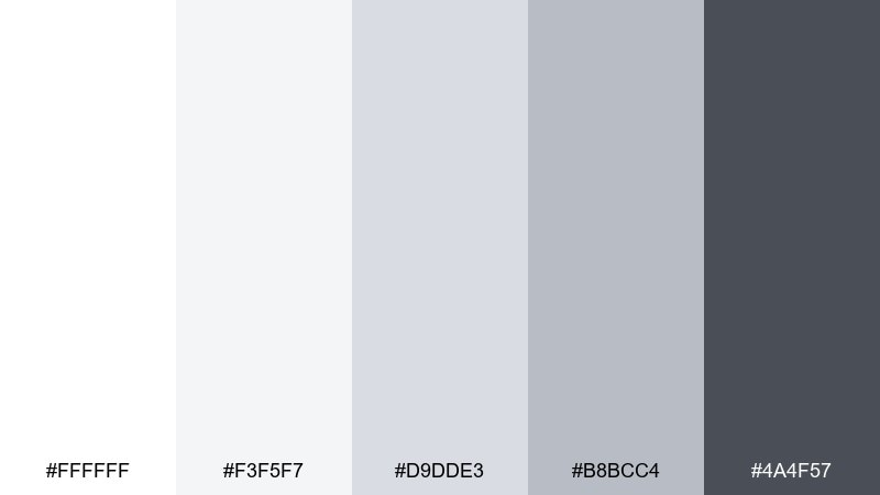
HEX: #ffffff #f3f5f7 #d9dde3 #b8bcc4 #4a4f57
Mood: crisp, modern, polished
Best for: luxury skincare packaging
Crisp and glacial, these tones feel like fresh snow with a graphite edge. They shine in premium skincare packaging, where clean whites and soft silvers signal purity and quality. Pair with charcoal typography and a satin finish for a high-end look. Usage tip: keep the darkest gray for small text and batch details so the design stays airy.
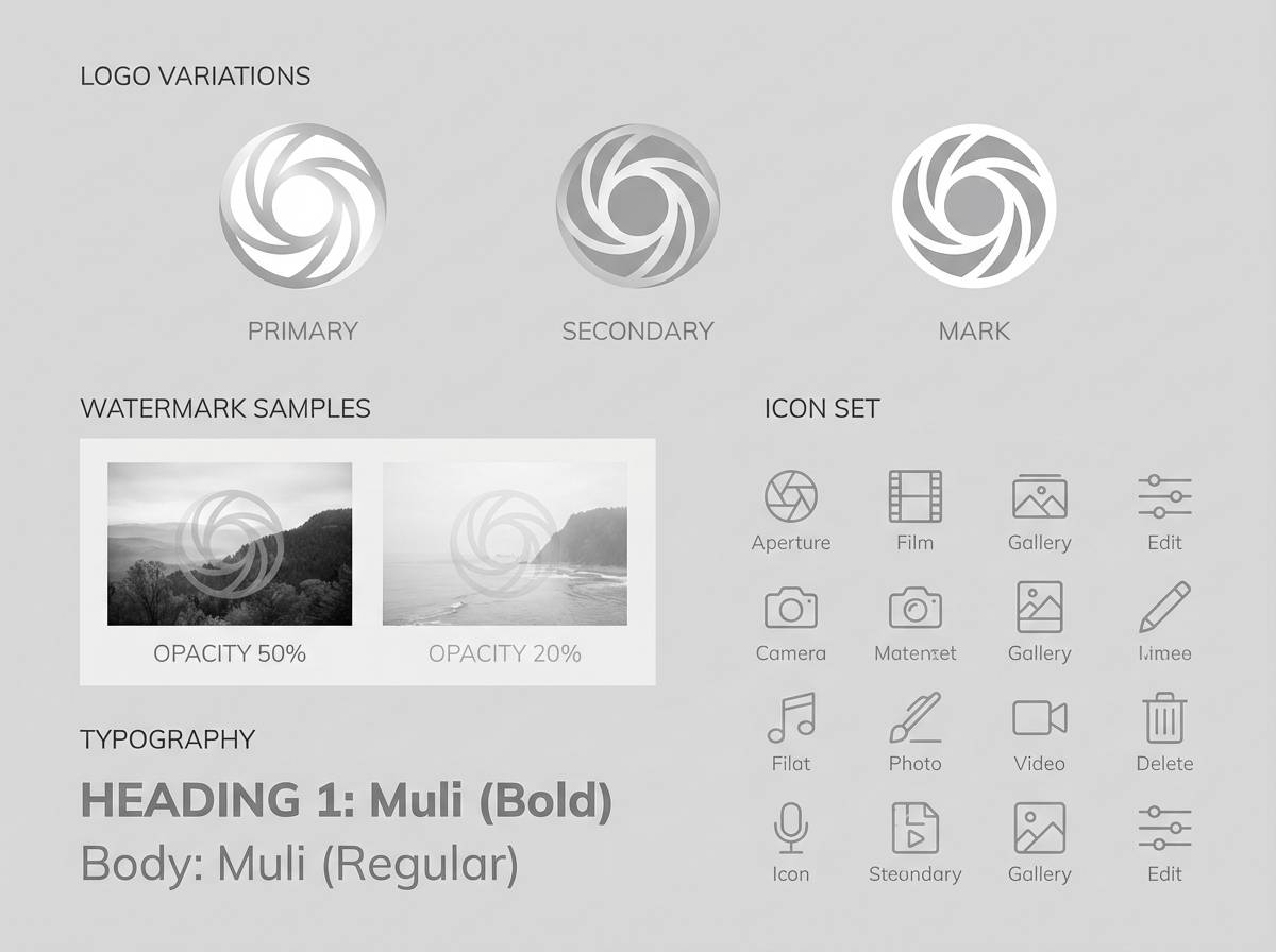
Image example of arctic sheen generated using media.io
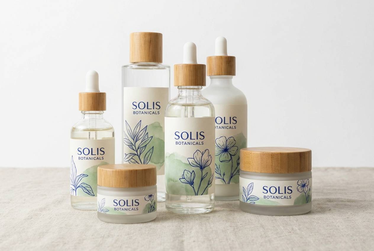
Media.io is an online AI studio for creating and editing video, image, and audio in your browser.

2) Pearl Studio
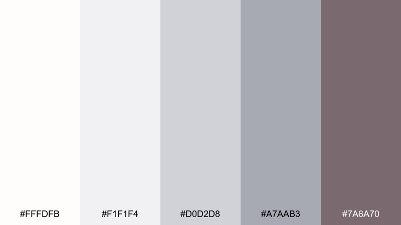
HEX: #fffdfb #f1f1f4 #d0d2d8 #a7aab3 #7a6a70
Mood: soft, editorial, refined
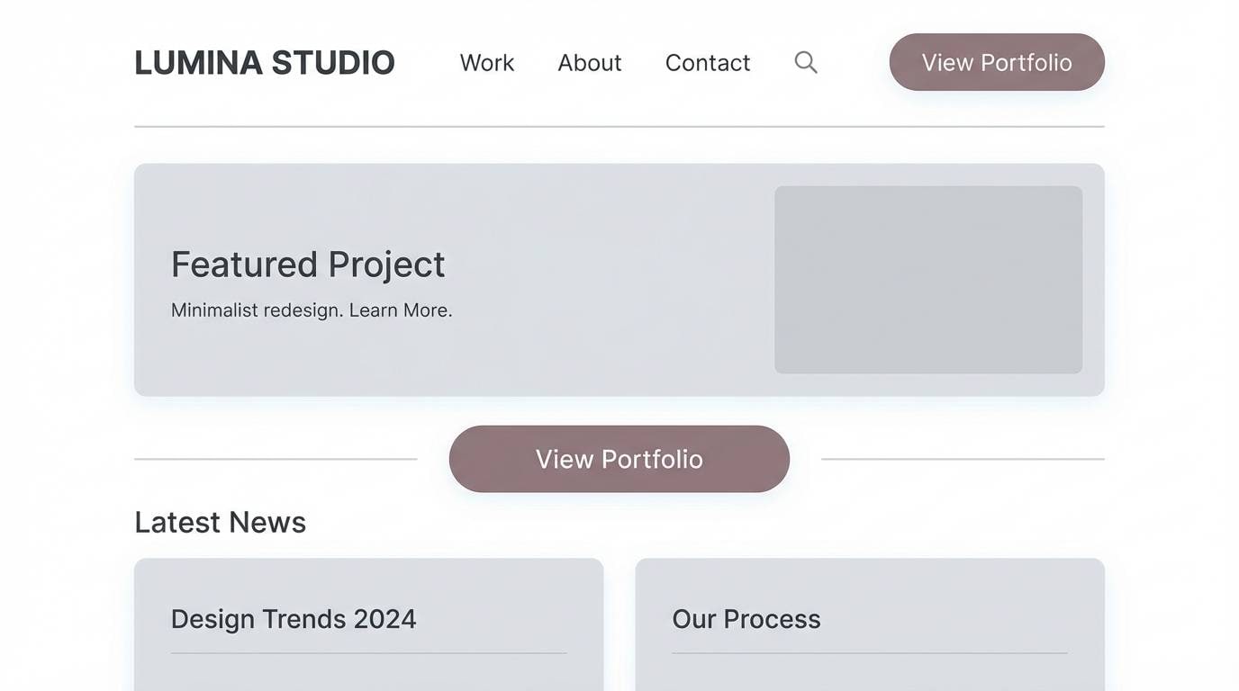
Best for: minimalist website UI
Soft pearl grays with a muted mauve shadow evoke a calm studio space at morning light. These white silver color combinations work beautifully for minimalist web UI, especially for portfolios and boutique shops. Pair with thin dividers, generous spacing, and a single accent button in the mauve-taupe tone. Usage tip: apply the mid-gray for card borders so sections stay distinct without heavy contrast.
Image example of pearl studio generated using media.io
3) Frosted Chrome
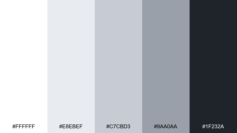
HEX: #ffffff #e8ebef #c7cbd3 #9aa0aa #1f232a
Mood: sleek, high-contrast, futuristic
Best for: tech startup branding
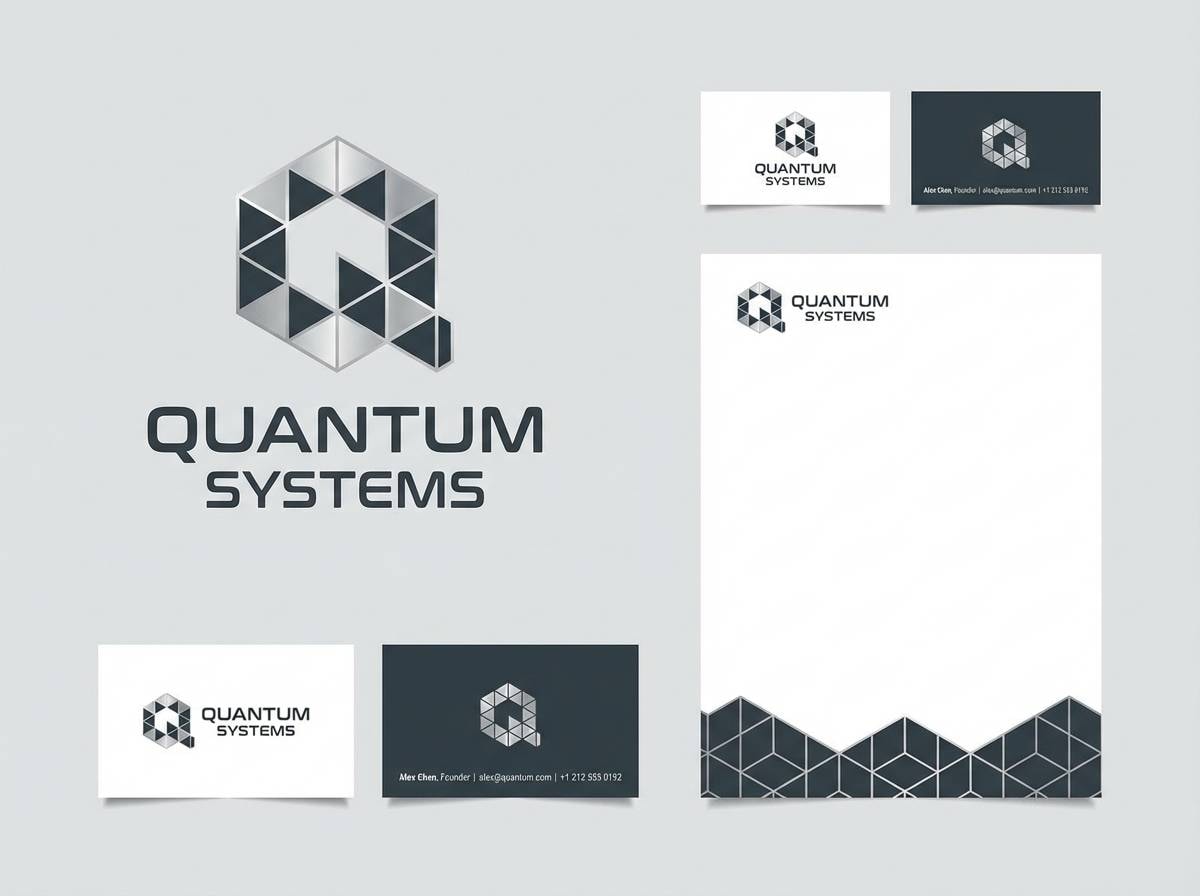
Sleek chrome-like neutrals with a deep graphite anchor feel sharp and forward-looking. The contrast is ideal for tech startup branding where clarity and confidence matter. Pair with bold sans serif type, simple geometry, and plenty of white space. Usage tip: reserve the near-black for the logo mark and headers, and let the mid-silvers handle secondary UI elements.
Image example of frosted chrome generated using media.io
4) Cloudlit Minimal
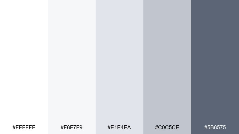
HEX: #ffffff #f6f7f9 #e1e4ea #c0c5ce #5b6575
Mood: airy, calm, structured
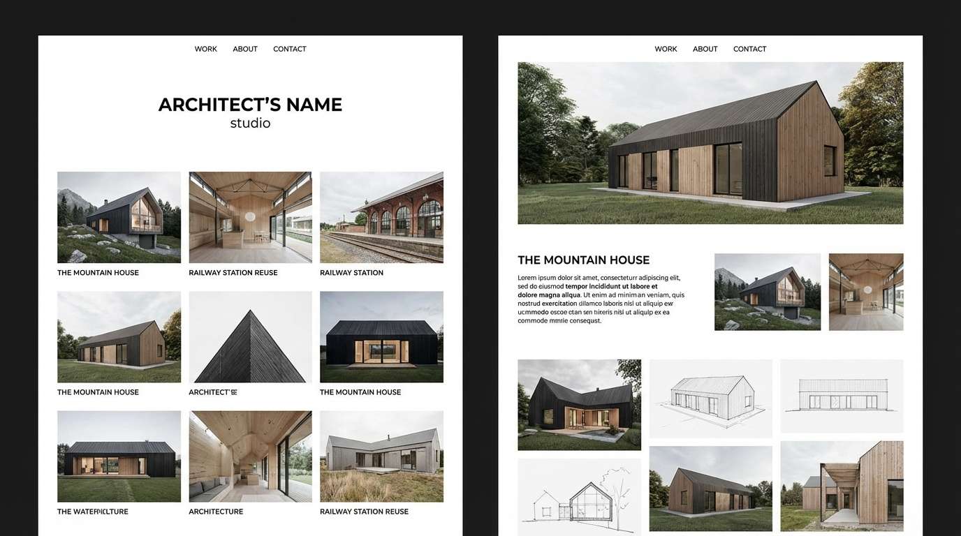
Best for: architectural portfolio website
Airy whites and foggy grays suggest daylight bouncing off concrete and glass. They suit architectural portfolio sites where photos need room to breathe and grids should feel precise. Pair with slate navigation and subtle hover states for a confident, quiet rhythm. Usage tip: set the background to off-white and use the light gray for section bands to guide scrolling.
Image example of cloudlit minimal generated using media.io
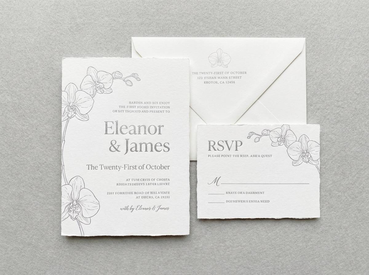
5) Winter Orchid
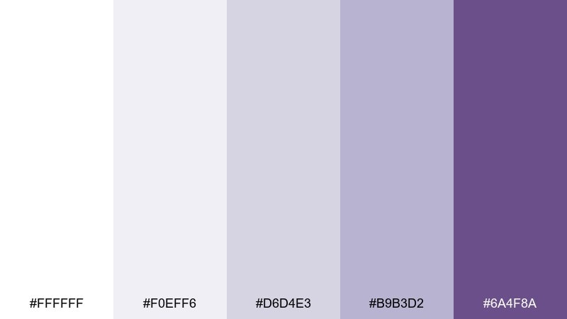
HEX: #ffffff #f0eff6 #d6d4e3 #b9b3d2 #6a4f8a
Mood: icy, romantic, elegant
Best for: wedding invitation suite
Icy lilac shadows and silvered whites feel like winter florals under candlelight. A white silver color palette like this is perfect for wedding invitations that want softness without looking pastel-heavy. Pair with silver foil type and a single orchid line illustration for cohesion. Usage tip: keep the purple as a small accent for monograms or borders so the paper still reads bright.
Image example of winter orchid generated using media.io
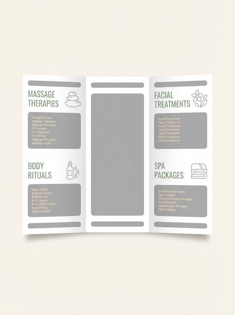
6) Silver Sage
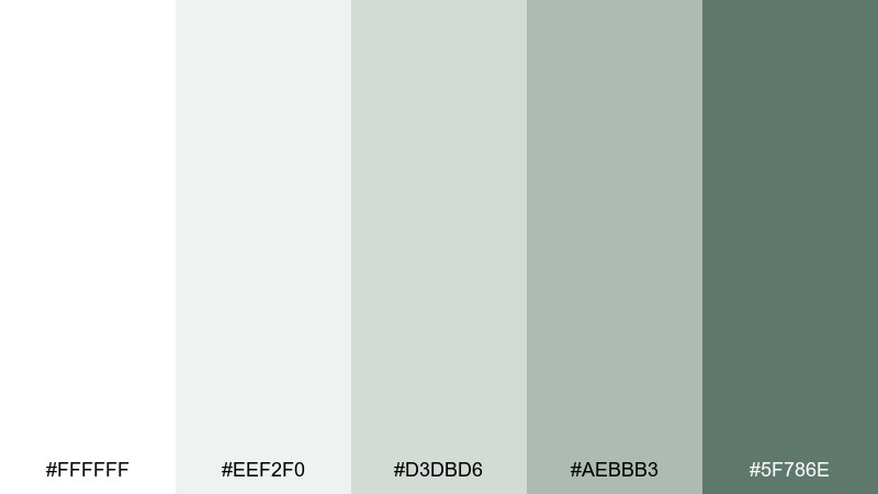
HEX: #ffffff #eef2f0 #d3dbd6 #aebbb3 #5f786e
Mood: fresh, natural, soothing
Best for: spa menu brochure
Fresh and herbal, these silvery greens feel like steam, eucalyptus, and quiet mornings. They fit spa menus and service brochures where calm readability is the priority. Pair with warm white backgrounds and minimal iconography to keep the page restful. Usage tip: use the sage midtone for section headers and treatment categories to improve scanning.
Image example of silver sage generated using media.io
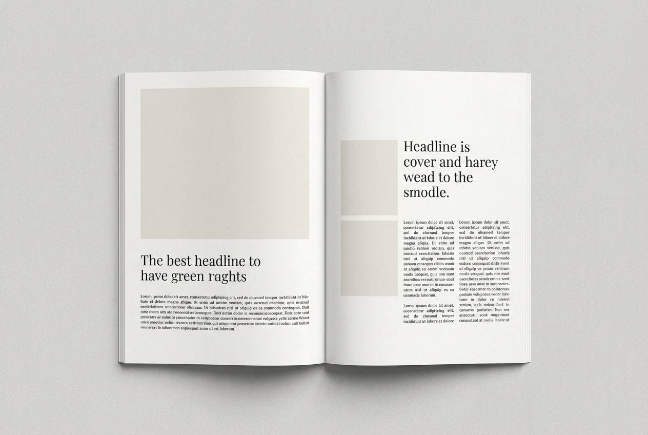
7) Marble & Ink
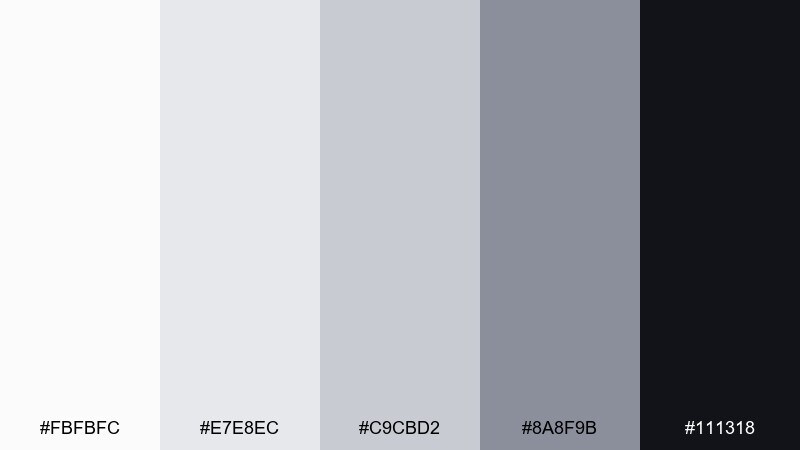
HEX: #fbfbfc #e7e8ec #c9cbd2 #8a8f9b #111318
Mood: editorial, dramatic, crisp
Best for: editorial magazine spread
Cool marble grays with inky black create a clean, gallery-like drama. They work well for editorial spreads where photography and typography need strong structure. Pair with high-contrast headlines and thin rules in the mid-gray to keep pages from feeling heavy. Usage tip: set body text in the darker gray instead of pure black for a softer, print-friendly read.
Image example of marble & ink generated using media.io
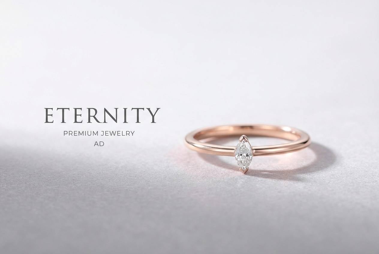
8) Lunar Blush
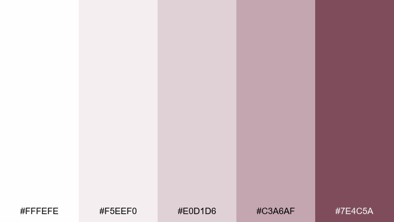
HEX: #fffefe #f5eef0 #e0d1d6 #c3a6af #7e4c5a
Mood: romantic, gentle, elevated
Best for: jewelry product ad
Gentle blush undertones against silvery whites feel like moonlight on rose gold. These hues are ideal for jewelry ads that need warmth without losing a premium, minimal vibe. Pair with thin serif type and lots of negative space to keep the sparkle believable. Usage tip: use the deepest rose tone only for a callout price or a small brand stamp.
Image example of lunar blush generated using media.io
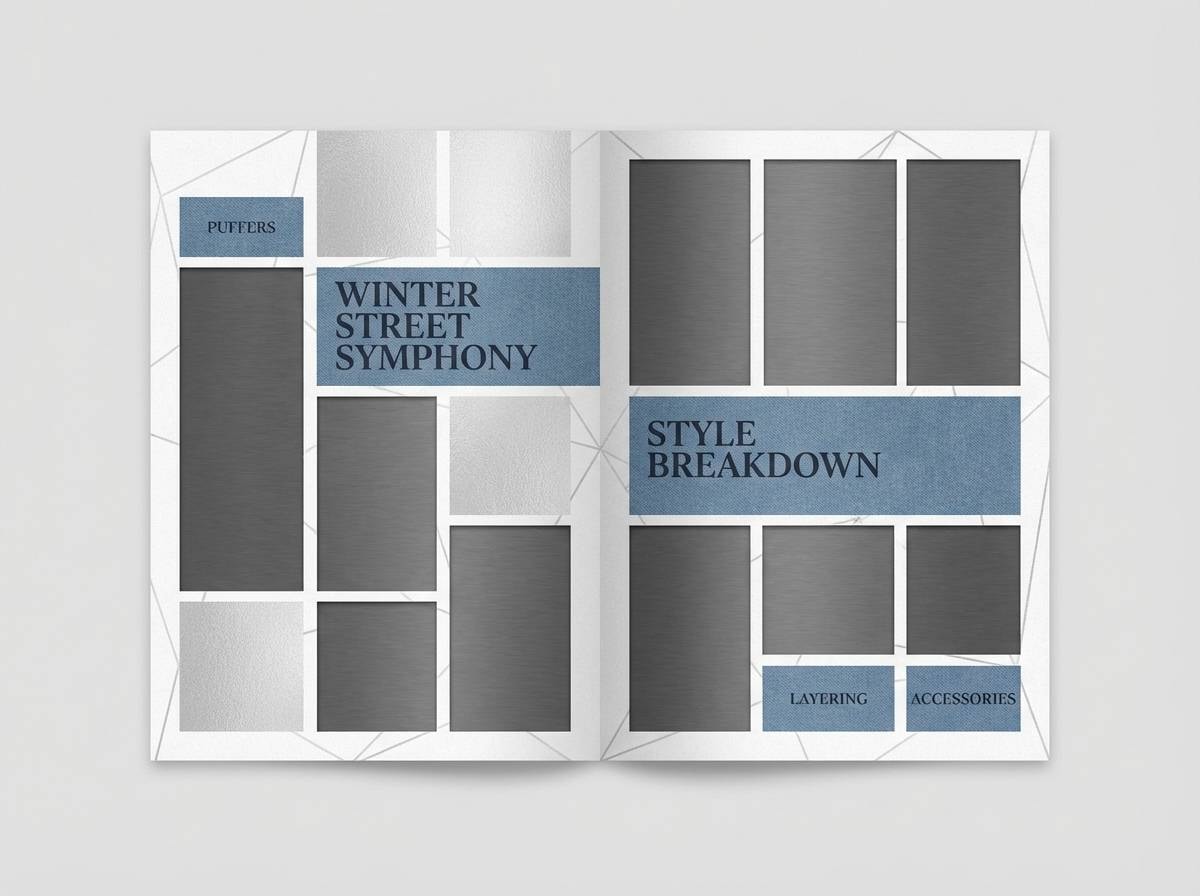
9) Glacier Denim
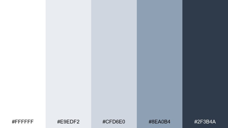
HEX: #ffffff #e9edf2 #cfd6e0 #8ea0b4 #2f3b4a
Mood: cool, confident, urban
Best for: winter fashion lookbook
Cool denim blues layered over pale silvers evoke city winter style and crisp air. They suit fashion lookbooks that want a modern, slightly moody edge. Pair with clean grids and bold photo crops so the blue feels intentional rather than decorative. Usage tip: use the darkest navy-gray for model names and page numbers to keep consistency across spreads.
Image example of glacier denim generated using media.io
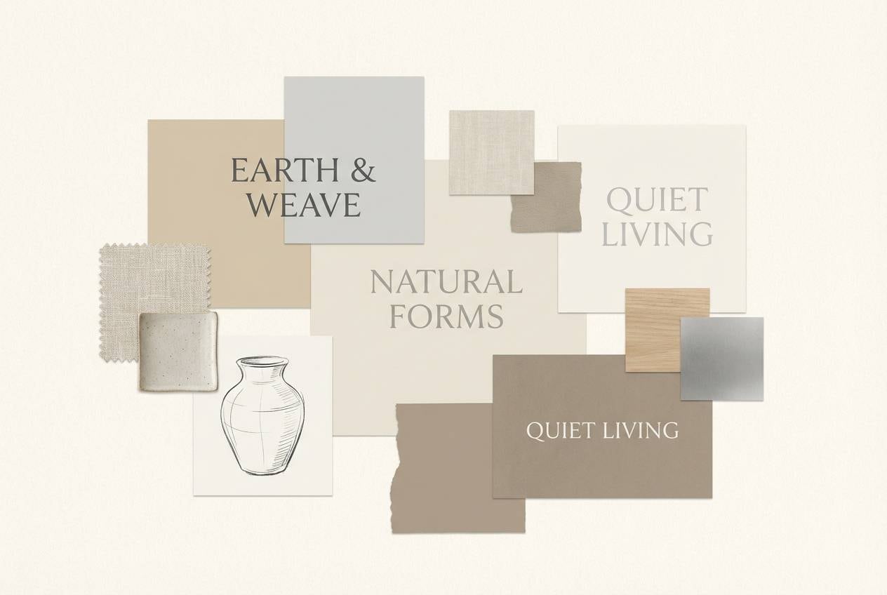
10) Metallic Sand
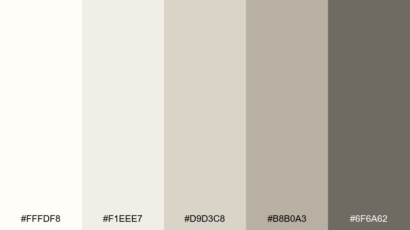
HEX: #fffdf8 #f1eee7 #d9d3c8 #b8b0a3 #6f6a62
Mood: warm, understated, organic
Best for: home decor brand styling
Warm ivory and sandy silvers feel like sunlight across brushed metal and linen. They fit home decor branding where the goal is comfort with a quiet premium finish. Pair with natural textures, soft shadows, and muted photography to keep the warmth intact. Usage tip: use the mid-tan gray for tags and labels so it reads friendly, not stark.
Image example of metallic sand generated using media.io
11) Snowbound Cocoa
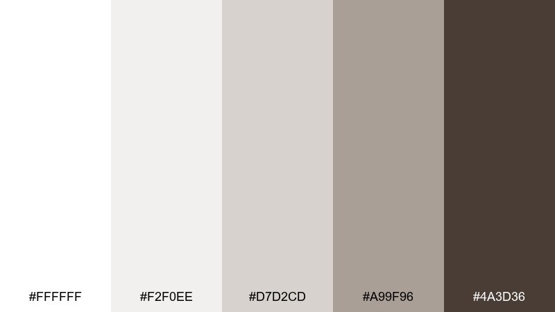
HEX: #ffffff #f2f0ee #d7d2cd #a99f96 #4a3d36
Mood: cozy, grounded, elegant
Best for: finance dashboard UI
Cozy cocoa browns softened by winter whites create a grounded, trustworthy feel. In a white silver color scheme with a warm anchor, dashboards look less clinical while staying highly legible. Pair with simple charts, rounded cards, and restrained data color to avoid clutter. Usage tip: use the cocoa tone for active states and key totals, and keep everything else in light neutrals.
Image example of snowbound cocoa generated using media.io
12) Platinum Neon
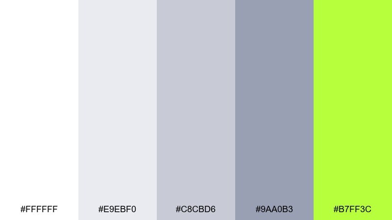
HEX: #ffffff #e9ebf0 #c8cbd6 #9aa0b3 #b7ff3c
Mood: electric, modern, high-impact
Best for: music event poster
Clean platinum neutrals with a neon jolt feel like strobe lights in a minimalist venue. They are great for music posters that need instant energy without a busy color stack. Pair with oversized type, tight tracking, and a single neon element for hierarchy. Usage tip: use the neon only on the headliner name or date so it stays punchy at a distance.
Image example of platinum neon generated using media.io
13) Quiet Sterling
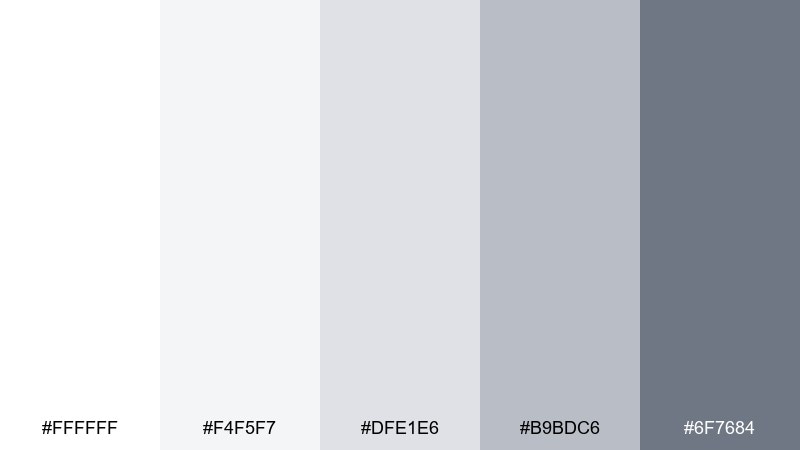
HEX: #ffffff #f4f5f7 #dfe1e6 #b9bdc6 #6f7684
Mood: neutral, calm, professional
Best for: photography watermark and brand kit
Quiet sterling grays feel like soft overcast light that never fights the image. They are ideal for photography brand kits, watermarks, and client guides where subtlety matters. Pair with a clean sans serif and plenty of spacing so marks stay discreet. Usage tip: export the watermark in the mid-gray and test it on both light and dark photos for consistent visibility.
Image example of quiet sterling generated using media.io
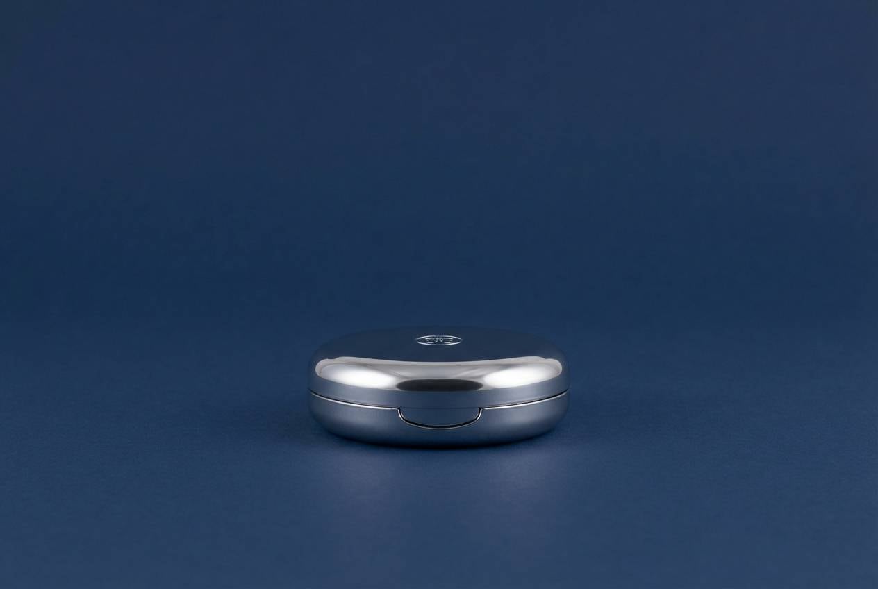
14) Opera Mirror
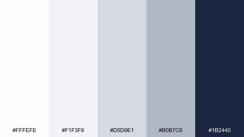
HEX: #fffefe #f1f3f6 #d5d9e1 #b0b7c6 #1b2440
Mood: dramatic, luxe, evening
Best for: cosmetic compact product shot
Mirror-bright silvers with deep midnight navy feel like an opera night dress code. These tones elevate cosmetic product shots, especially compacts and metallic finishes. Pair with glossy highlights and minimal copy so reflections look intentional. Usage tip: place the navy as the background and keep the product mostly white-silver to create instant depth.
Image example of opera mirror generated using media.io
15) Nordic Linen
HEX: #fffefc #f2f0ea #ddd8cf #bfb7aa #8a7f73
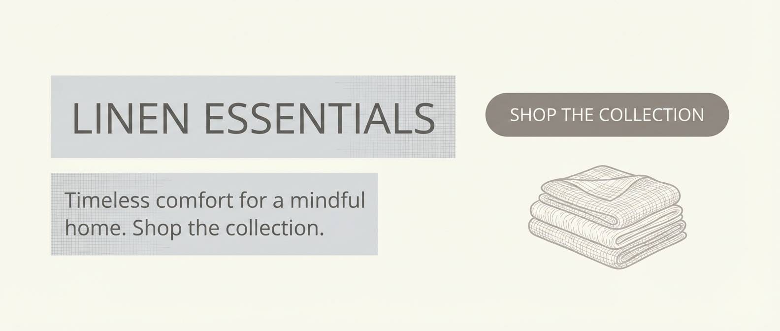
Mood: cozy, minimal, Scandinavian
Best for: linen store ecommerce banner
Creamy whites and flax-like grays evoke folded linen and quiet Nordic interiors. They fit ecommerce banners for home textiles, where softness and trust drive clicks. Pair with lifestyle photography that has neutral lighting and keep buttons in the deeper taupe-gray for clarity. Usage tip: use the light cream as the page background to prevent the whites from feeling too stark.
Image example of nordic linen generated using media.io
16) Quartz Rose
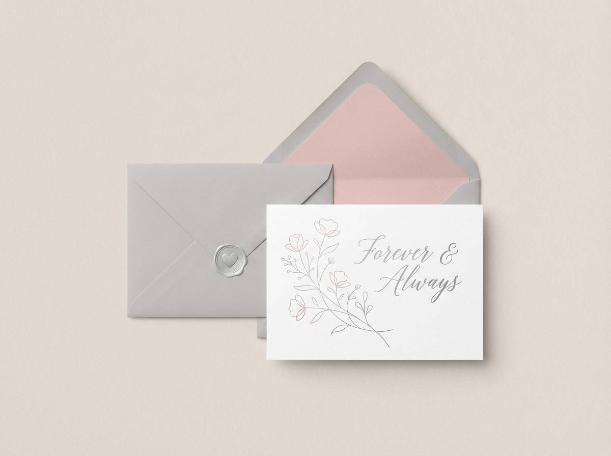
HEX: #ffffff #f6f0f2 #e3d3d8 #c7aab3 #a56a7f
Mood: soft, romantic, contemporary
Best for: romantic stationery set
Powdery rose quartz tints over milky whites feel tender and modern at once. They suit stationery sets for anniversaries, bridal showers, and boutique thank-you cards. Pair with delicate script accents and plenty of breathing room so the rose stays sophisticated. Usage tip: use the dusty rose midtone for envelope liners or edge strokes rather than filling large areas.
Image example of quartz rose generated using media.io
17) Icy Citrus
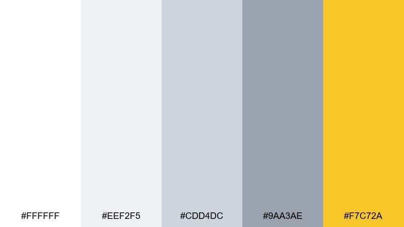
HEX: #ffffff #eef2f5 #cdd4dc #9aa3ae #f7c72a
Mood: bright, clean, optimistic
Best for: cocktail bar menu
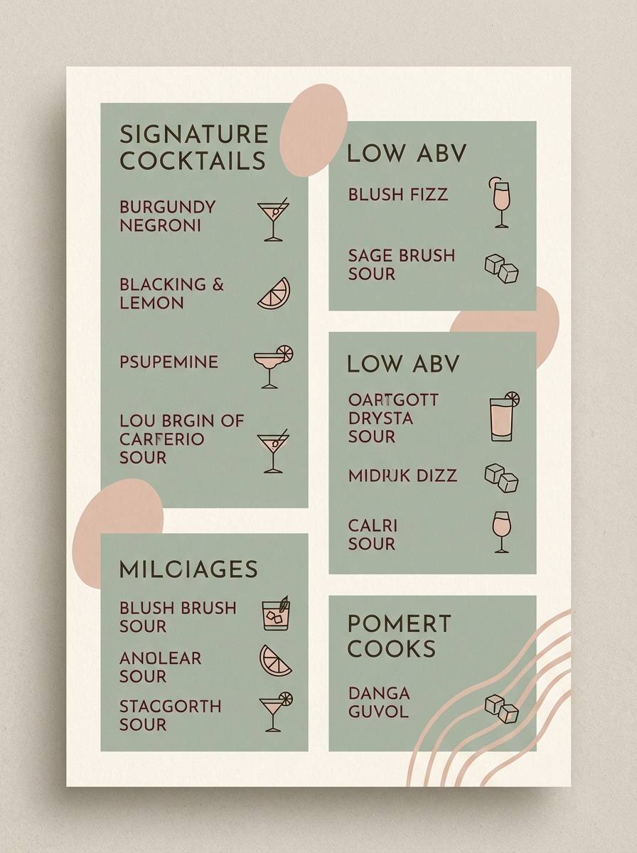
Icy grays with a citrus pop feel like sparkling soda in a frosted glass. These white silver color combinations are perfect for cocktail menus that want a clean layout with a playful highlight. Pair with simple line icons and let the yellow mark specials, seasonal notes, or section dividers. Usage tip: keep the citrus as a small accent so it reads premium rather than loud.
Image example of icy citrus generated using media.io
18) Aluminum Nightfall
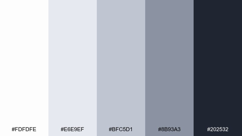
HEX: #fdfdfe #e6e9ef #bfc5d1 #8b93a3 #202532
Mood: cool, cinematic, sleek
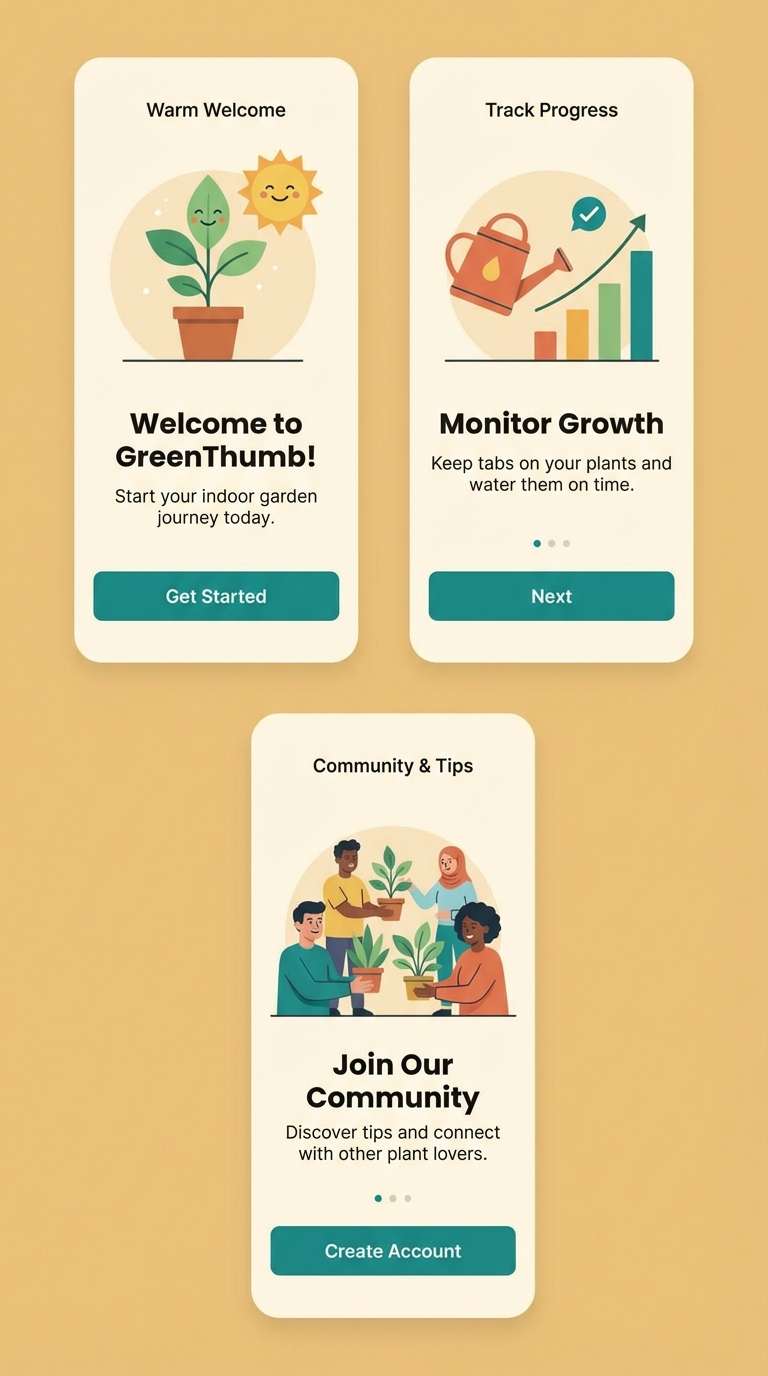
Best for: app onboarding screens
Cinematic aluminum grays fading into night create a sleek, tech-forward mood. They work well for onboarding screens where you want depth without heavy color. Pair with simple illustrations, subtle gradients, and a single strong CTA in the darkest tone. Usage tip: keep the background in the lightest gray and use nightfall only for the final screen to signal completion.
Image example of aluminum nightfall generated using media.io
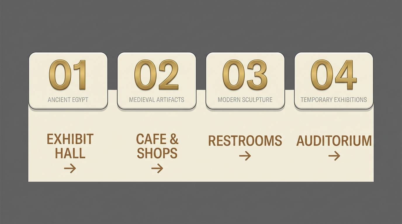
19) Museum White
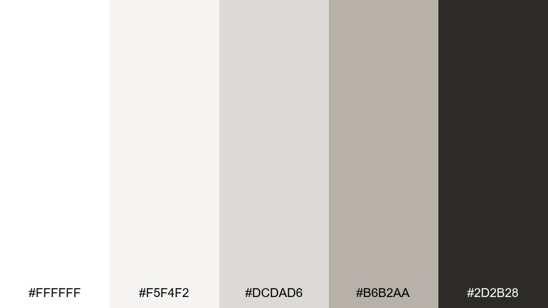
HEX: #ffffff #f5f4f2 #dcdad6 #b6b2aa #2d2b28
Mood: gallery, timeless, curated
Best for: museum exhibit signage
Clean museum whites with stone grays feel curated, quiet, and timeless. A white silver color palette like this keeps exhibit signage readable while letting artwork take the spotlight. Pair with classic serif headings and warm-neutral body text for a printed placard look. Usage tip: use the darkest tone sparingly for titles only, and let the mid-stone gray handle longer copy to reduce glare.
Image example of museum white generated using media.io
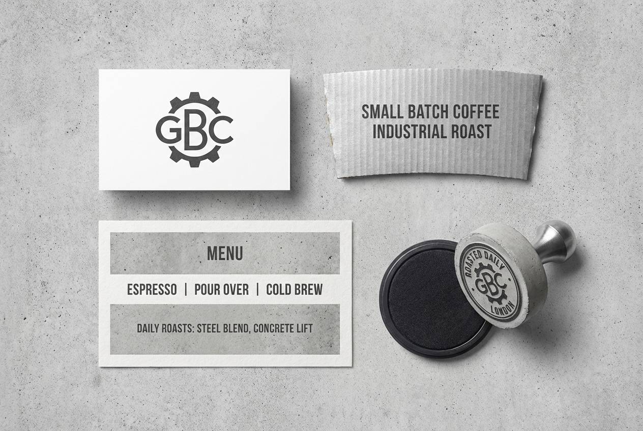
20) Polished Concrete
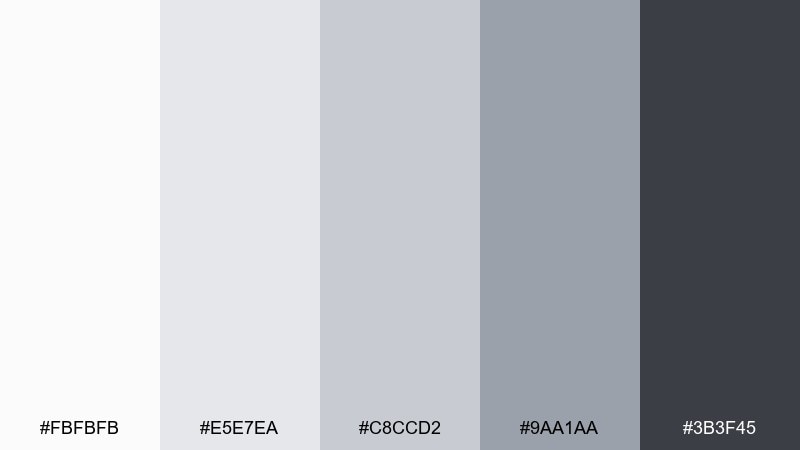
HEX: #fbfbfb #e5e7ea #c8ccd2 #9aa1aa #3b3f45
Mood: industrial, clean, modern
Best for: industrial cafe branding
Polished concrete grays feel urban, practical, and confidently minimal. They suit industrial cafe branding where you want a modern edge without going cold. Pair with bold stamps, simple icons, and textured paper stock for contrast. Usage tip: keep the darkest gray for the logo and menu headings, and let the lighter grays build the background system.
Image example of polished concrete generated using media.io
What Colors Go Well with White Silver?
White and silver pair naturally with deep neutrals like charcoal, graphite, and near-black for high readability and a crisp modern look—especially in UI, editorial layouts, and tech branding.
For warmth, add blush, rose, sand, taupe, or cocoa accents to soften the metallic feel while keeping things premium. This works especially well for beauty, jewelry, and home decor.
If you want an energetic twist, use one bright accent (like neon lime or citrus yellow) and keep it tightly controlled—think one CTA color, one poster headline, or one set of UI states.
How to Use a White Silver Color Palette in Real Designs
Start with an off-white background rather than pure white to reduce glare and make silver grays visible. Then assign roles: light silver for surfaces, mid-silver for borders/dividers, and dark graphite for type and key UI labels.
In branding and packaging, let material finishes do the work. Matte whites plus satin silver (or subtle foil) look more “luxury” than adding extra colors, and they photograph beautifully under soft light.
For interiors or print, mix textures (linen, stone, brushed metal) to prevent the palette from feeling flat. The color stays minimal while the tactile contrast adds depth.
Create White Silver Palette Visuals with AI
If you have a palette but need realistic mockups (packaging, posters, UI screens, signage), AI image generation can turn your color direction into usable visuals fast—without starting from a blank canvas.
In Media.io, you can paste a prompt, control the composition, and iterate quickly until the lighting and material feel match the silver tone you’re aiming for (chrome, pearl, concrete, or satin).
Use one of the prompts above as a template, then swap the subject (e.g., “skincare packaging” to “watch ad”) while keeping the “colors restricted to the palette” constraint for consistency.
White Silver Color Palette FAQs
-
What is a white silver color palette?
A white silver color palette is a set of whites and silver-leaning grays (often plus a dark graphite anchor) used to create clean, modern designs with subtle metallic depth. -
Does white and silver work for website UI?
Yes—white silver palettes are popular for UI because they support clear hierarchy (backgrounds, cards, dividers) while keeping layouts airy. Add a darker gray for text contrast and an accent color for CTAs. -
What accent colors pair best with white silver?
Charcoal/graphite for a sharp modern look; blush/rose for warmth and luxury; navy for dramatic depth; and a single bright accent (like lime or yellow) for high-impact highlights. -
How do I keep white silver designs from looking flat?
Use multiple gray steps for separation, add shadows subtly, and introduce texture (paper grain, linen, brushed metal). In UI, rely on spacing and borders instead of heavy fills. -
What’s the best text color on silver-white backgrounds?
Use deep charcoal or near-black for headings and important labels, and a slightly softer dark gray for body text to reduce glare while maintaining readability. -
Is white silver a good choice for luxury branding?
Yes—white and silver often signal cleanliness, precision, and premium materials. Pair with minimalist typography, controlled contrast, and high-quality finishes (matte + satin/foil) for best results. -
Can I generate white silver palette mockups with AI?
Yes—use a prompt that specifies the subject (UI, packaging, poster) and add a constraint like “colors restricted to the palette” so the output stays consistent with your white silver scheme.


