

Light green color palettes are an easy way to make designs feel calm, fresh, and approachable without looking bland. From minty pastels to sage-leaning neutrals, these tones work across branding, UI, and print.
Below are 20 curated light green palette ideas with HEX codes, plus real-use tips and AI prompts you can use to generate matching visuals in seconds.
In this article
Why Light Green Palettes Work So Well
Light green sits in a “comfort zone” for many audiences: it signals freshness, balance, and wellbeing without demanding attention the way neon greens do. That makes it a reliable base for calm branding, airy web layouts, and springtime graphics.
Because light green often has plenty of white mixed in, it plays nicely with whitespace and soft gradients. You can build gentle hierarchy using slightly deeper greens for text and UI controls while keeping backgrounds breathable.
Another advantage is versatility: light greens can lean cool (mint/seafoam) or warm (sage/celadon), so you can tune the mood while staying in the same family. This helps keep multi-page designs consistent without looking repetitive.
20+ Light Green Color Palette Ideas (with HEX Codes)
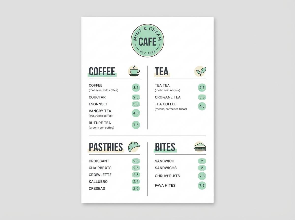
1) Mint Latte
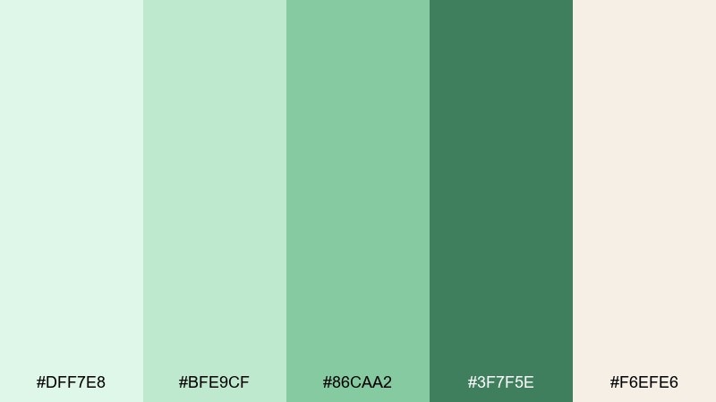
HEX: #DFF7E8 #BFE9CF #86CAA2 #3F7F5E #F6EFE6
Mood: fresh, cozy, clean
Best for: coffee shop branding and menu design
Fresh mint over warm oat foam feels calm, friendly, and quietly premium. The creamy neutral keeps the greens from reading too medicinal, while the deeper green adds legibility for type. Pair it with off-white paper textures, simple line icons, and minimal photography. Usage tip: keep the darkest green for headings and prices so the softer tones can stay airy.
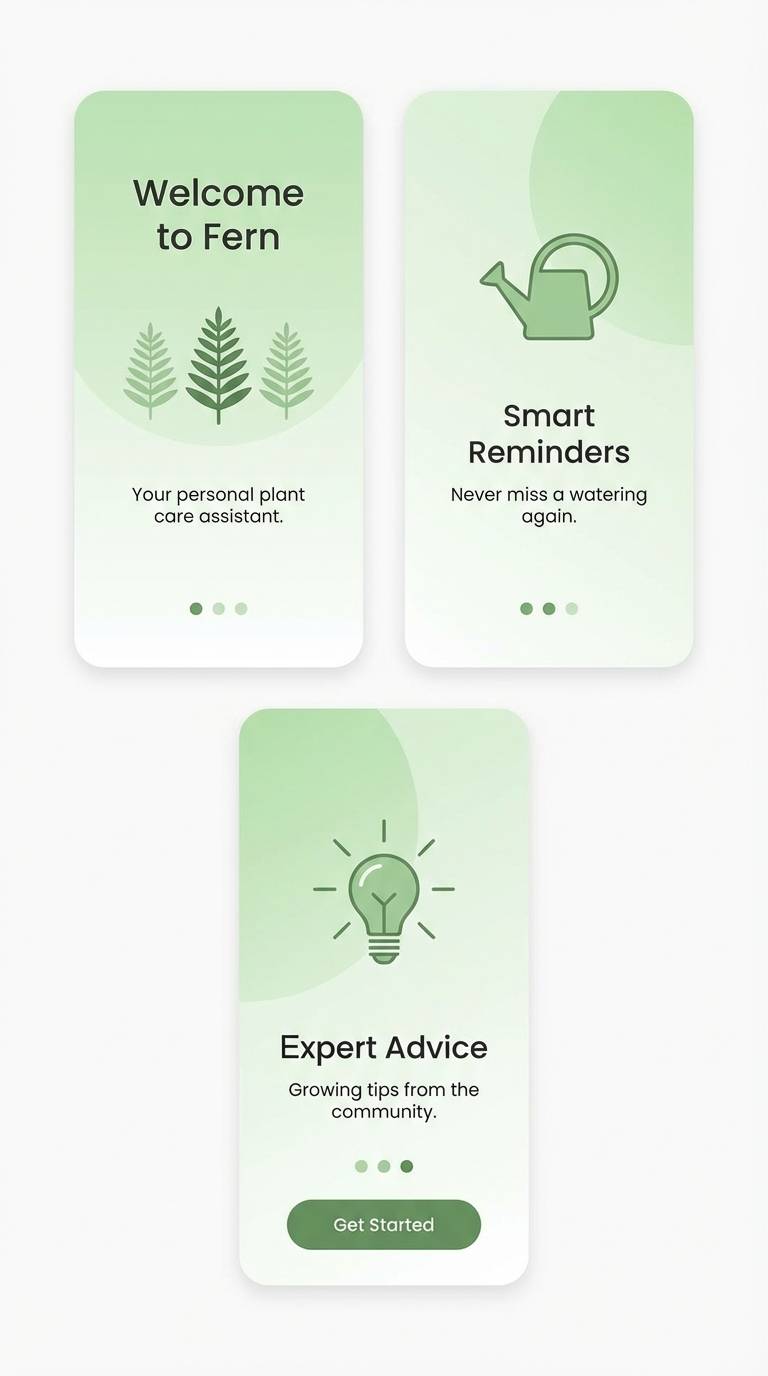
Image example of mint latte generated using media.io
Media.io is an online AI studio for creating and editing video, image, and audio in your browser.

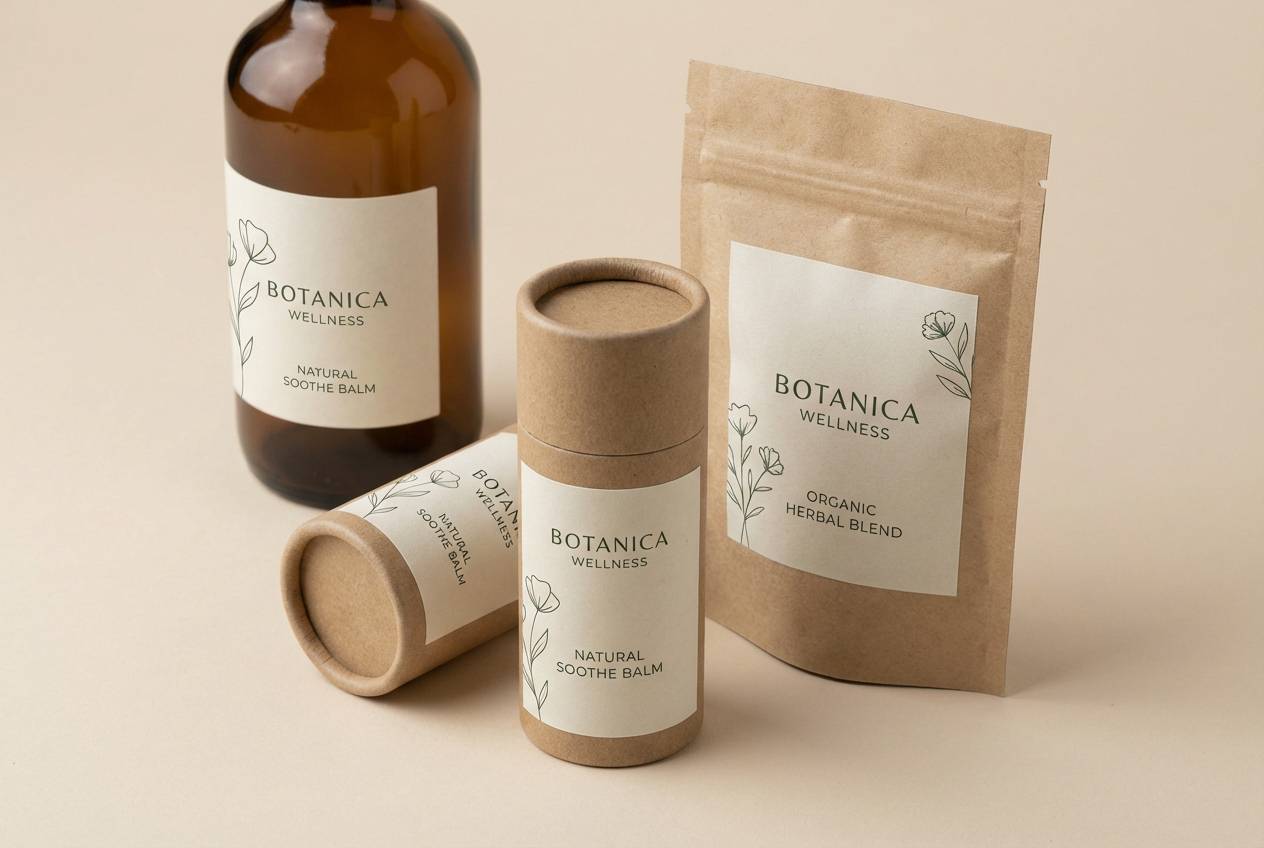
2) Aloe Clay
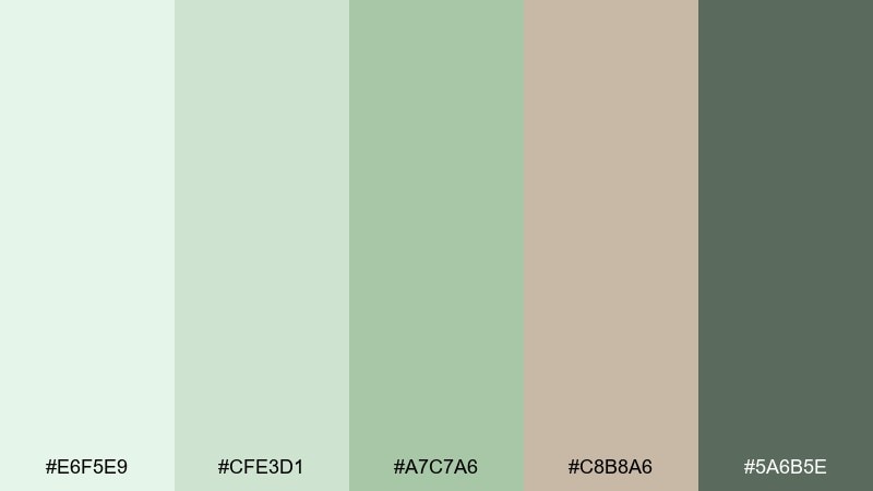
HEX: #E6F5E9 #CFE3D1 #A7C7A6 #C8B8A6 #5A6B5E
Mood: natural, grounded, gentle
Best for: wellness packaging and eco product labels
Soft aloe greens with clay-beige undertones evoke apothecary shelves and herbal calm. The muted midtones make it easy to print on kraft stock, recycled paper, or matte labels. Pair with charcoal text, botanical line art, and small copper-foil accents for warmth. Usage tip: test the beige as the main label background to keep the greens as supporting blocks and borders.
Image example of aloe clay generated using media.io
3) Citrus Spritz
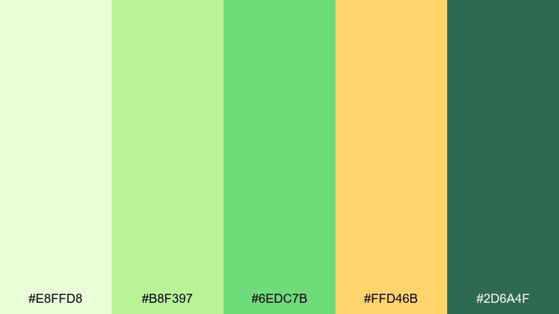
HEX: #E8FFD8 #B8F397 #6EDC7B #FFD46B #2D6A4F
Mood: zesty, upbeat, energetic
Best for: social ads for beverages and summer promos
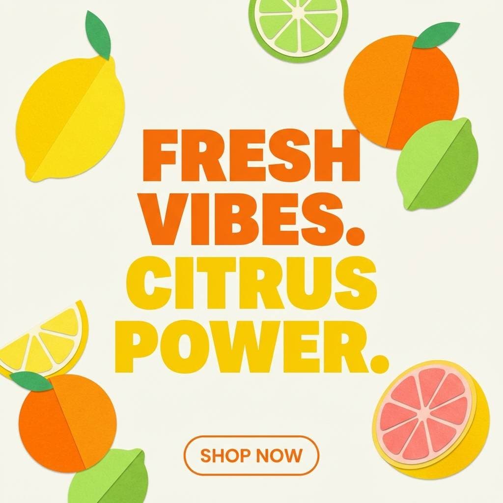
Zesty greens and sunny citrus feel like a fizzy drink in a cold glass. These light green color combinations shine when you need quick contrast without going neon. Pair the yellow with bold sans-serif headlines, and anchor layouts with the deep green for buttons and prices. Usage tip: use the brightest green sparingly as a highlight stroke or sticker shape to avoid eye fatigue.
Image example of citrus spritz generated using media.io
4) Sage Minimal
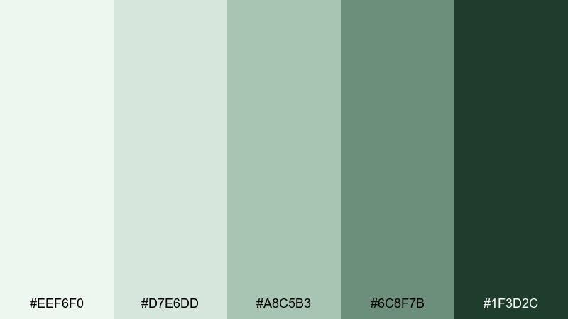
HEX: #EEF6F0 #D7E6DD #A8C5B3 #6C8F7B #1F3D2C
Mood: minimal, airy, timeless
Best for: clean SaaS marketing pages and landing headers
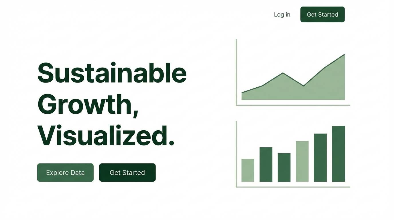
Quiet sage tones bring a restrained, modern calm that feels trustworthy. The pale green-gray base supports generous white space, while the deep forest shade gives strong contrast for CTAs and nav. Pair with warm white, subtle grain textures, and a single accent like muted gold. Usage tip: reserve the darkest shade for one primary action per section to keep the page feeling light.
Image example of sage minimal generated using media.io
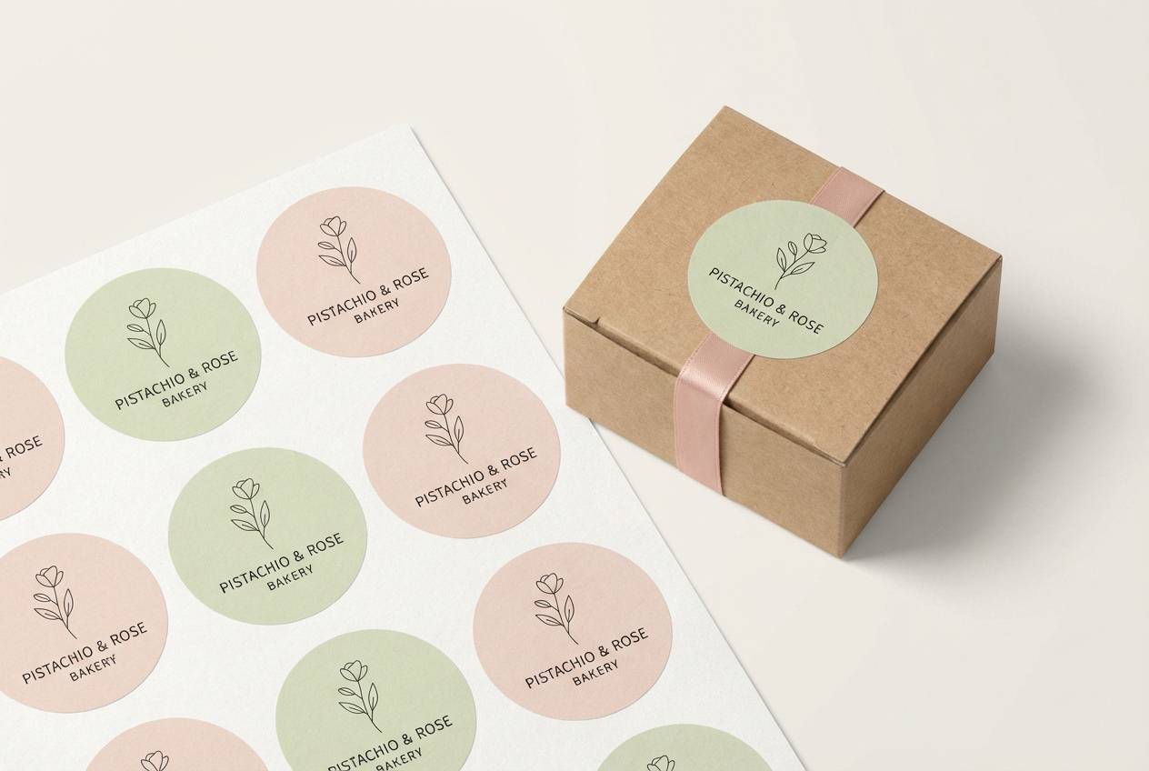
5) Pistachio Gelato
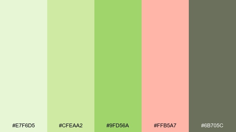
HEX: #E7F6D5 #CFEAA2 #9FD56A #FFB5A7 #6B705C
Mood: playful, sweet, soft
Best for: boutique bakery branding and packaging stickers
Creamy pistachio with a blush accent feels fun, handmade, and slightly retro. The warm gray-green keeps the sweetness from becoming childish and works well on both glossy and matte prints. Pair with rounded type, simple doodles, and a lot of negative space to keep it chic. Usage tip: make blush your limited-time flavor badge color so it pops without taking over the brand.
Image example of pistachio gelato generated using media.io
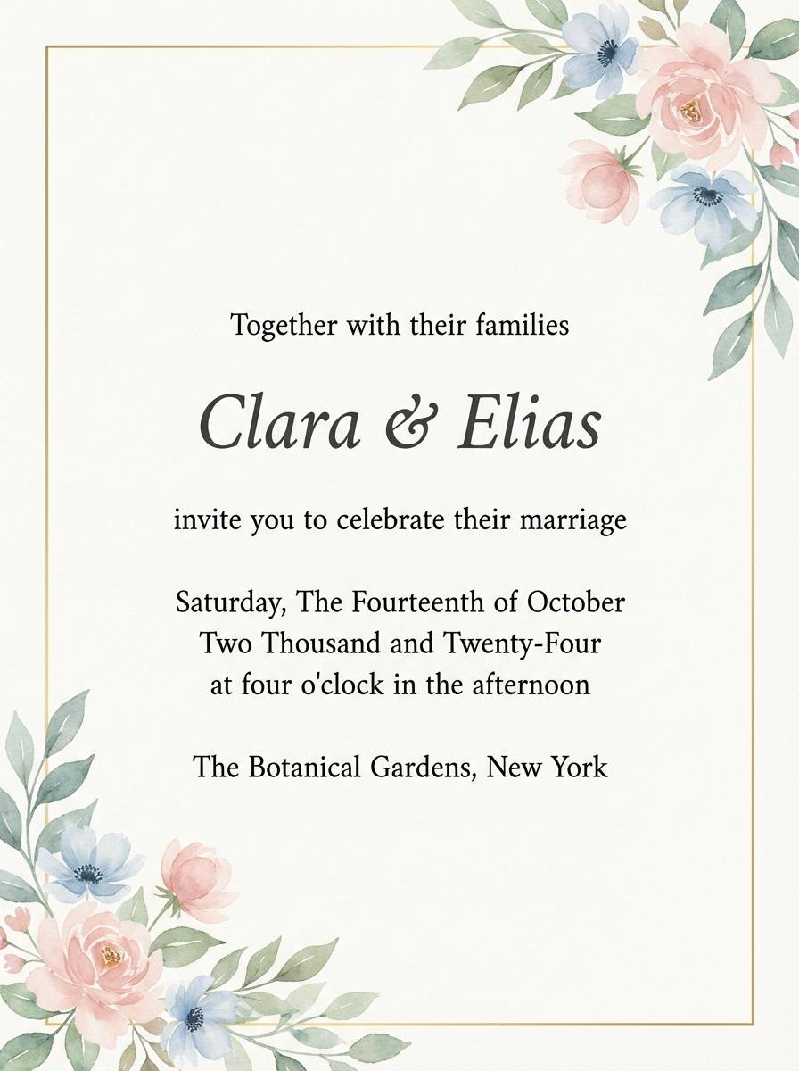
6) Dewy Blossom
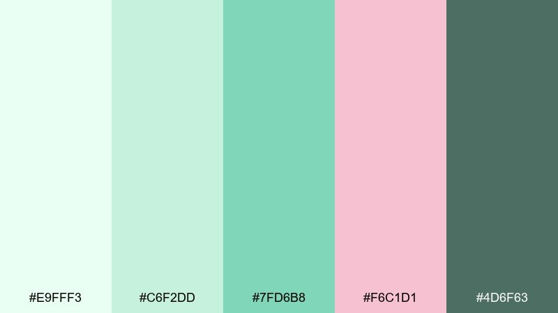
HEX: #E9FFF3 #C6F2DD #7FD6B8 #F6C1D1 #4D6F63
Mood: romantic, dewy, fresh
Best for: spring wedding invitations and RSVP cards
Dewy greens with petal pink read like early-morning florals and soft veils. As a light green color palette, it keeps invitations airy while still giving enough contrast for names and details. Pair with delicate serif type, thin borders, and watercolor flowers in matching tints. Usage tip: print the darkest green only for key text and use the pink as a subtle monogram or wax-seal motif.
Image example of dewy blossom generated using media.io
7) Garden Linen
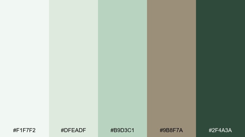
HEX: #F1F7F2 #DFEADF #B9D3C1 #9B8F7A #2F4A3A
Mood: soft, organic, homey
Best for: interior mood boards and lifestyle blogs
Linen whites and garden greens feel like sunlit curtains and potted herbs. The beige-brown note adds a natural textile warmth that works beautifully with wood, rattan, and stone. Pair with matte photography, gentle shadows, and understated icons for a calm editorial look. Usage tip: keep backgrounds near-white and use the mid green for section dividers so the layout stays breathable.
Image example of garden linen generated using media.io
8) Bamboo Breeze
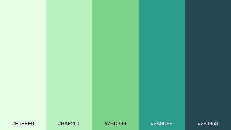
HEX: #E5FFE6 #BAF2C0 #7BD389 #2A9D8F #264653
Mood: clean, breezy, modern
Best for: botanical illustrations and spring greeting cards
Bamboo-fresh greens with teal depth evoke cool shade and crisp air. The bright leaf tones feel lively, while the deep blue-green gives structure for outlines and typography. Pair with light watercolor washes, plenty of blank space, and simple plant silhouettes. Usage tip: use the darkest shade for linework so the lighter washes stay soft and translucent.
Image example of bamboo breeze generated using media.io
9) Matcha Paper
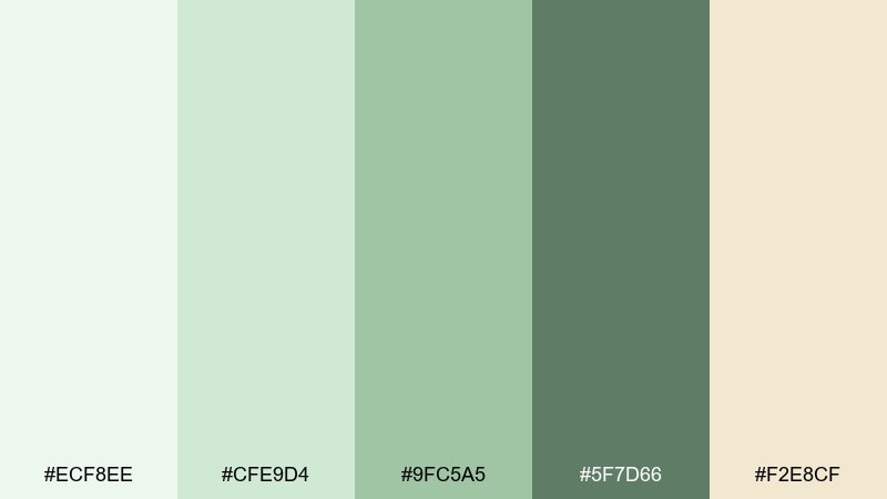
HEX: #ECF8EE #CFE9D4 #9FC5A5 #5F7D66 #F2E8CF
Mood: editorial, calm, refined
Best for: magazine spreads and wellness editorials
Matcha greens on warm paper beige feel curated, quiet, and premium. The palette supports long-form reading because contrast is gentle without being washed out. Pair with black or deep green body text, wide margins, and subtle section rules. Usage tip: let the beige act as the page background and use green for pull quotes and subheads to guide the eye.
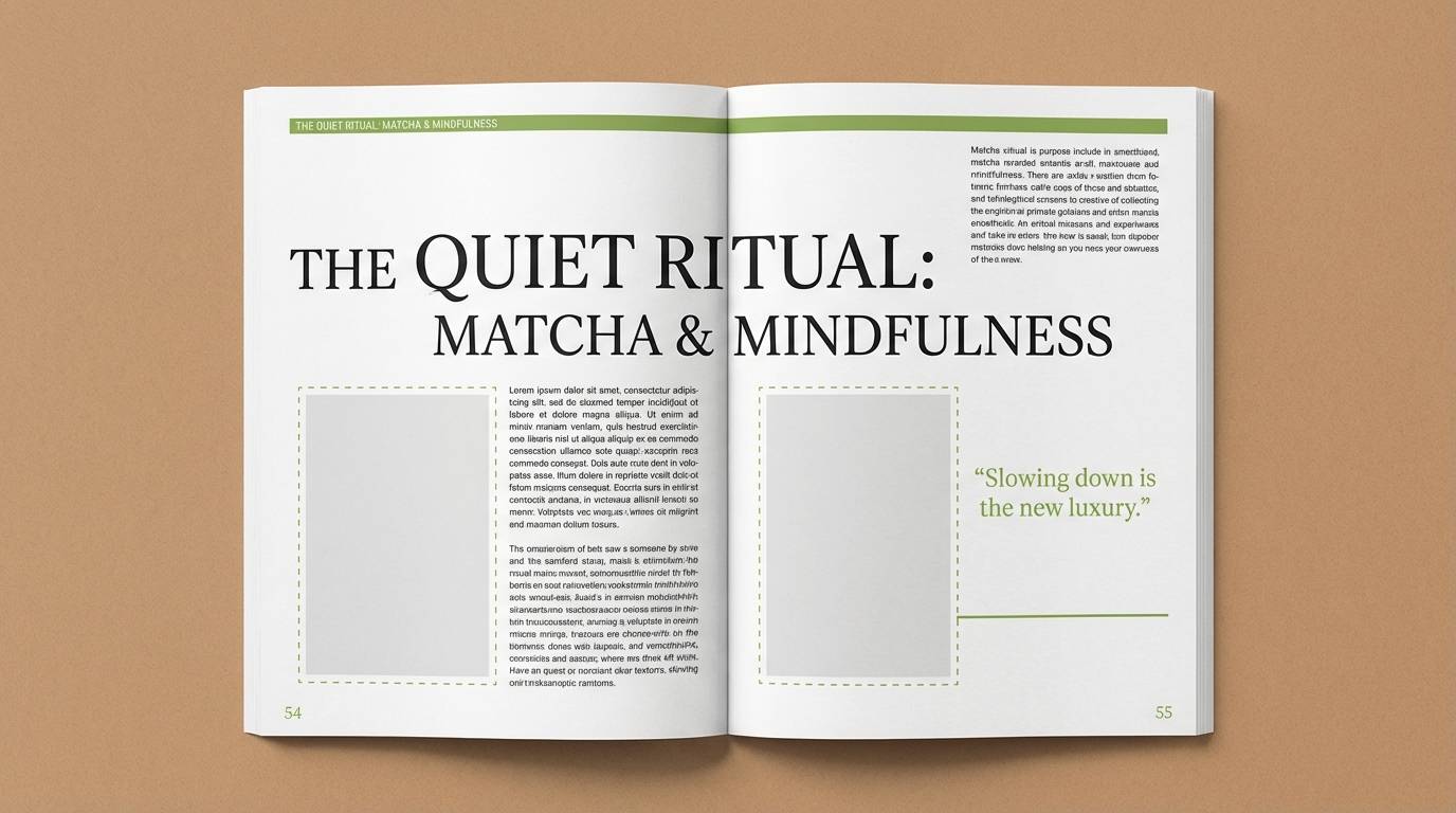
Image example of matcha paper generated using media.io
10) Seafoam UI
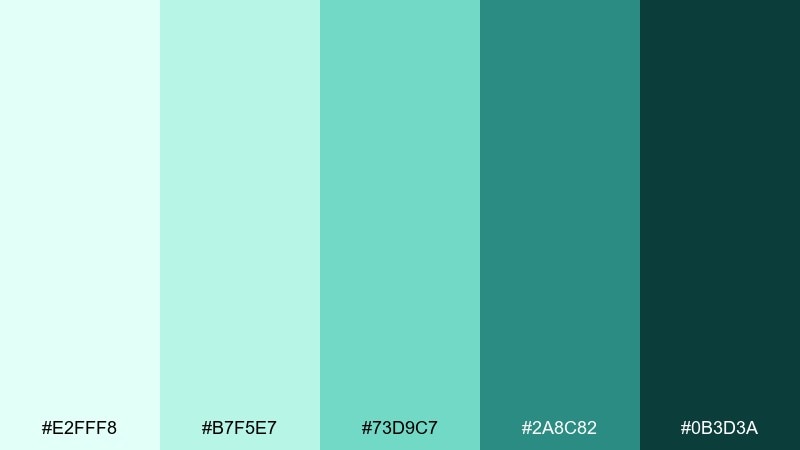
HEX: #E2FFF8 #B7F5E7 #73D9C7 #2A8C82 #0B3D3A
Mood: techy, fresh, confident
Best for: dashboard UI and analytics components
Seafoam and deep teal feel like clean data, clear water, and focused momentum. The gradient-friendly range makes charts, toggles, and states easy to differentiate without harsh neon. Pair with neutral grays, thin dividers, and a single warm accent for alerts. Usage tip: map the teal steps to UI states from hover to active so interactions stay consistent.
Image example of seafoam ui generated using media.io

11) Spring Picnic
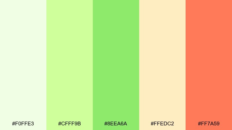
HEX: #F0FFE3 #CFFF9B #8EEA6A #FFEDC2 #FF7A59
Mood: cheerful, sunny, casual
Best for: event posters for markets and outdoor fairs
Bright lawn greens with apricot warmth evoke picnic blankets and fresh fruit. The mix balances friendly energy with enough contrast to keep headlines readable from a distance. Pair with chunky typography, simple illustrations, and rounded shapes for a welcoming look. Usage tip: place coral behind key info blocks so dates and locations stand out instantly.
Image example of spring picnic generated using media.io

12) Fern and Fog
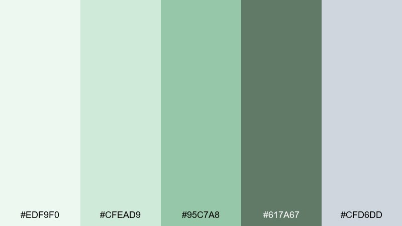
HEX: #EDF9F0 #CFEAD9 #95C7A8 #617A67 #CFD6DD
Mood: misty, modern, soothing
Best for: health app onboarding screens
Misty greens and cool fog gray feel like a quiet morning walk. A light green color combination like this works especially well for wellness flows where you want calm reassurance rather than hype. Pair with soft gradients, rounded cards, and minimal icons to keep screens uncluttered. Usage tip: use the gray for secondary text so the greens can guide progress and highlights.
Image example of fern and fog generated using media.io
13) Pear Orchard
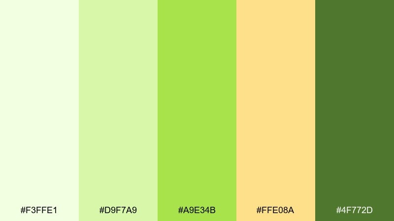
HEX: #F3FFE1 #D9F7A9 #A9E34B #FFE08A #4F772D
Mood: juicy, optimistic, lively
Best for: food blog graphics and recipe cards
Pear-bright greens and warm yellow feel juicy, sunlit, and instantly appetizing. The darker olive keeps titles and ingredient lists readable, even on light backgrounds. Pair with simple fruit illustrations, clean sans-serif type, and plenty of white margins. Usage tip: use the vivid green as a small highlight bar under headings rather than a full background wash.
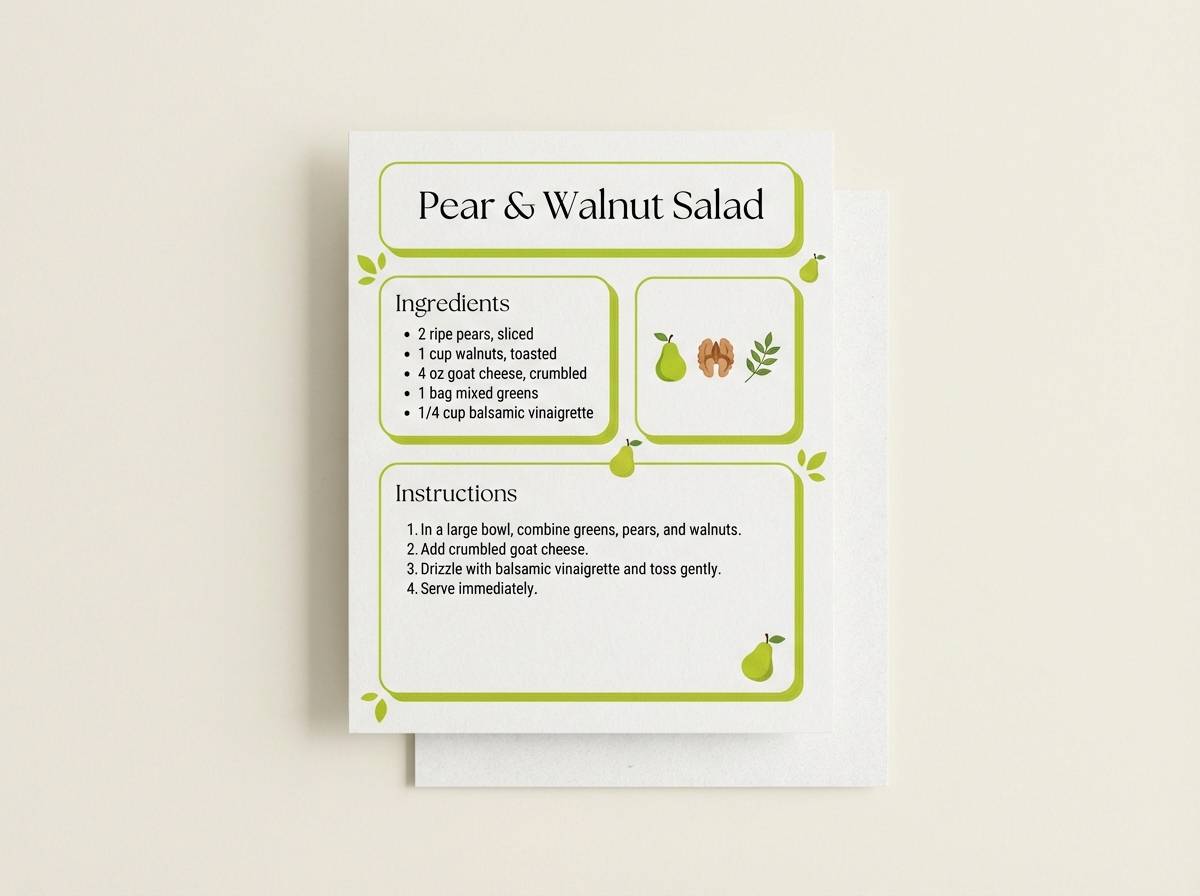
Image example of pear orchard generated using media.io
14) Celadon Studio
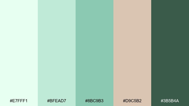
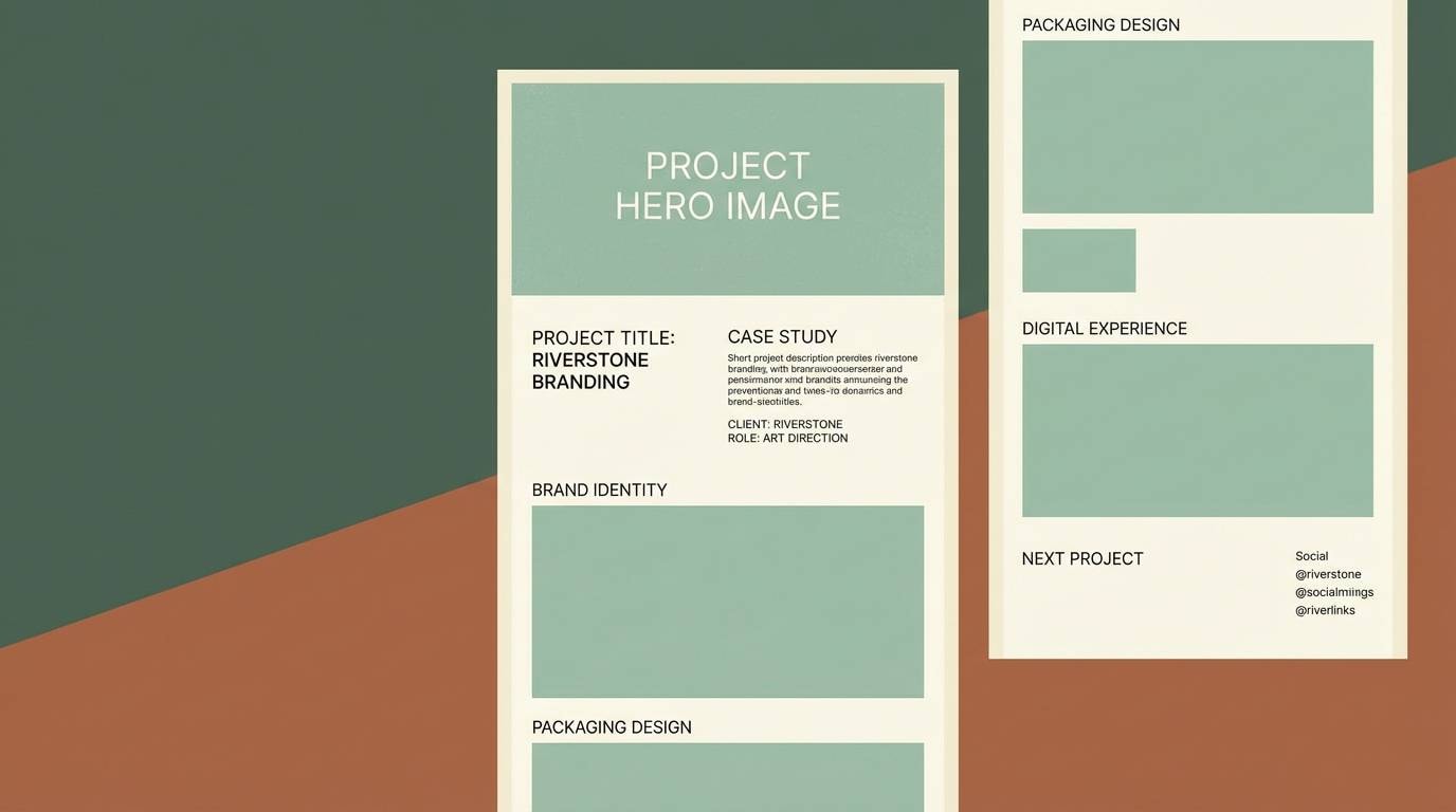
HEX: #E7FFF1 #BFEAD7 #8BC9B3 #D9C5B2 #3B5B4A
Mood: artsy, balanced, sophisticated
Best for: creative portfolio websites and case studies
Celadon greens with a clay-neutral accent feel like a quiet studio and handmade ceramics. The palette supports elegant layouts where images should lead and color simply frames the work. Pair with warm whites, subtle drop shadows, and a dark green for navigation and links. Usage tip: keep the clay tone for backgrounds behind text to improve readability over photography.
Image example of celadon studio generated using media.io
15) Soft Verdant Neon
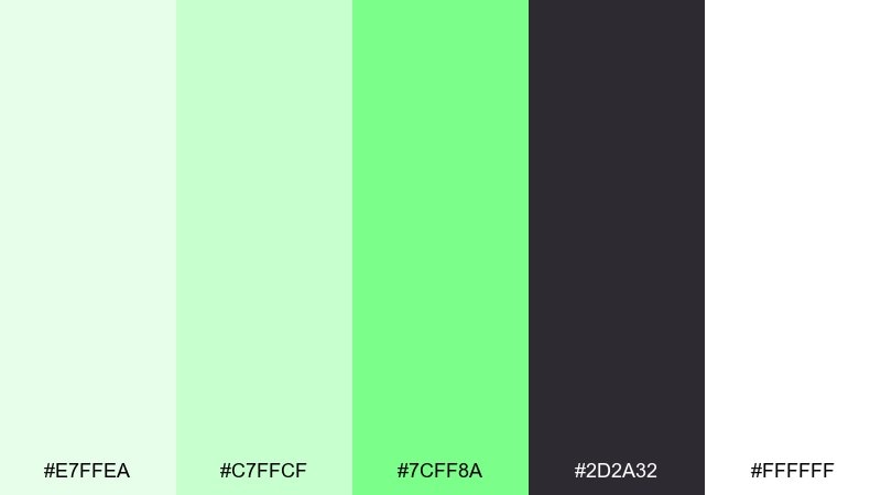
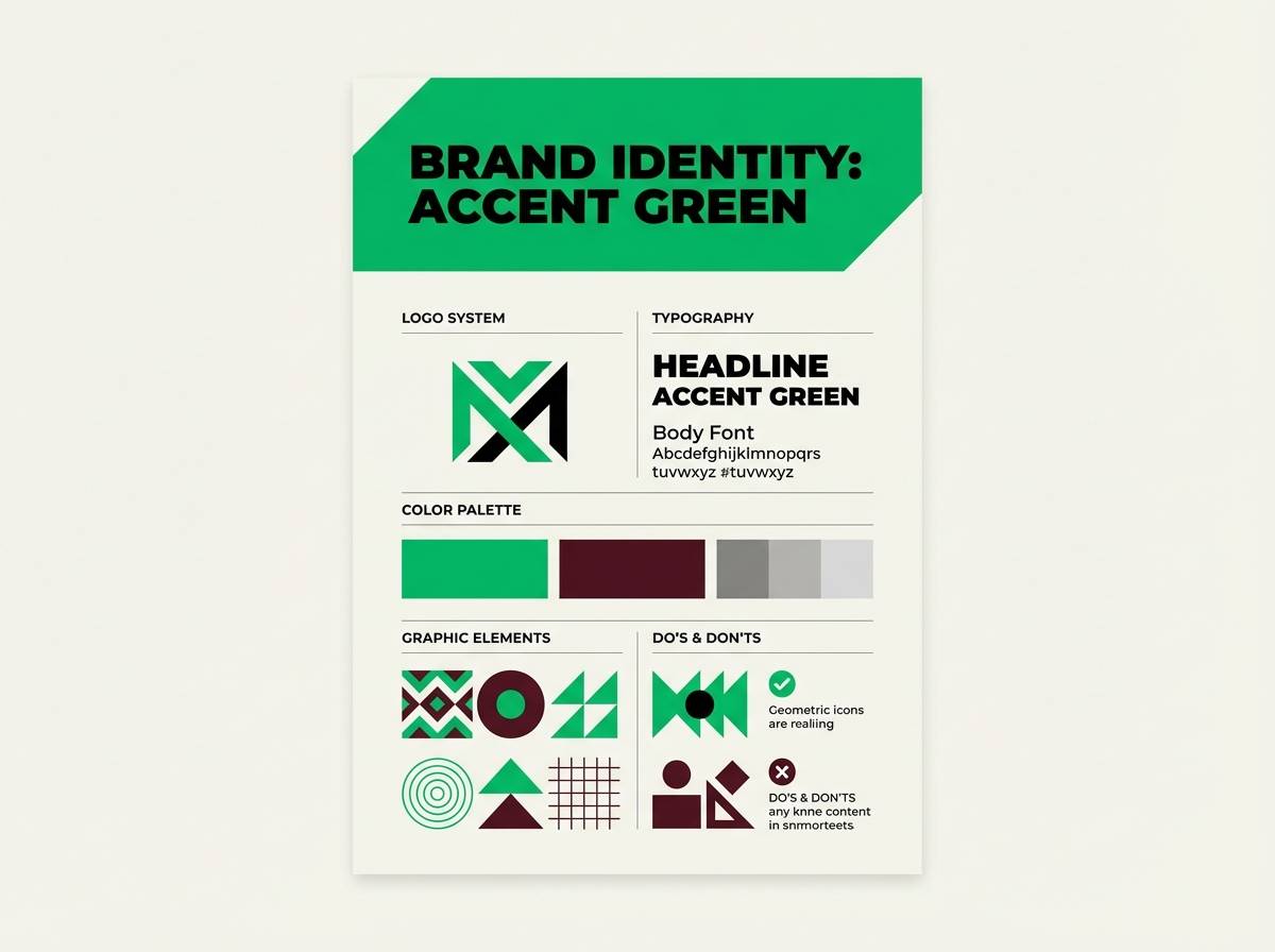
HEX: #E7FFEA #C7FFCF #7CFF8A #2D2A32 #FFFFFF
Mood: bold, youthful, high-contrast
Best for: startup branding and punchy CTA sections
Electric verdant highlights against inky charcoal feel modern, fast, and a bit rebellious. As a light green color palette, it works best when you treat the neon shade like an accent rather than a full canvas color. Pair with crisp white space, geometric shapes, and simple iconography to keep it sharp. Usage tip: restrict the brightest green to buttons and key stats so it stays special and readable.
Image example of soft verdant neon generated using media.io
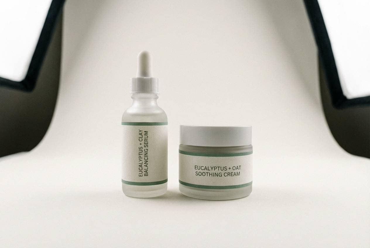
16) Eucalyptus Stone
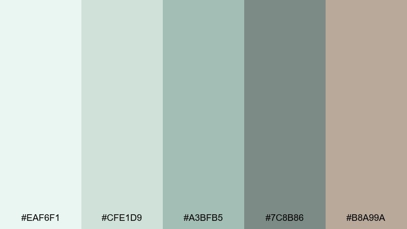
HEX: #EAF6F1 #CFE1D9 #A3BFB5 #7C8B86 #B8A99A
Mood: spa-like, muted, elegant
Best for: skincare product ads and minimalist packaging
Muted eucalyptus and stone neutrals feel like a quiet spa and clean cotton towels. The low-saturation range is flattering for product photography, especially glass, ceramic, and frosted finishes. Pair with thin type, lots of whitespace, and one darker gray-green for ingredient callouts. Usage tip: keep backgrounds on the palest tint so shadows stay soft and premium.
Image example of eucalyptus stone generated using media.io
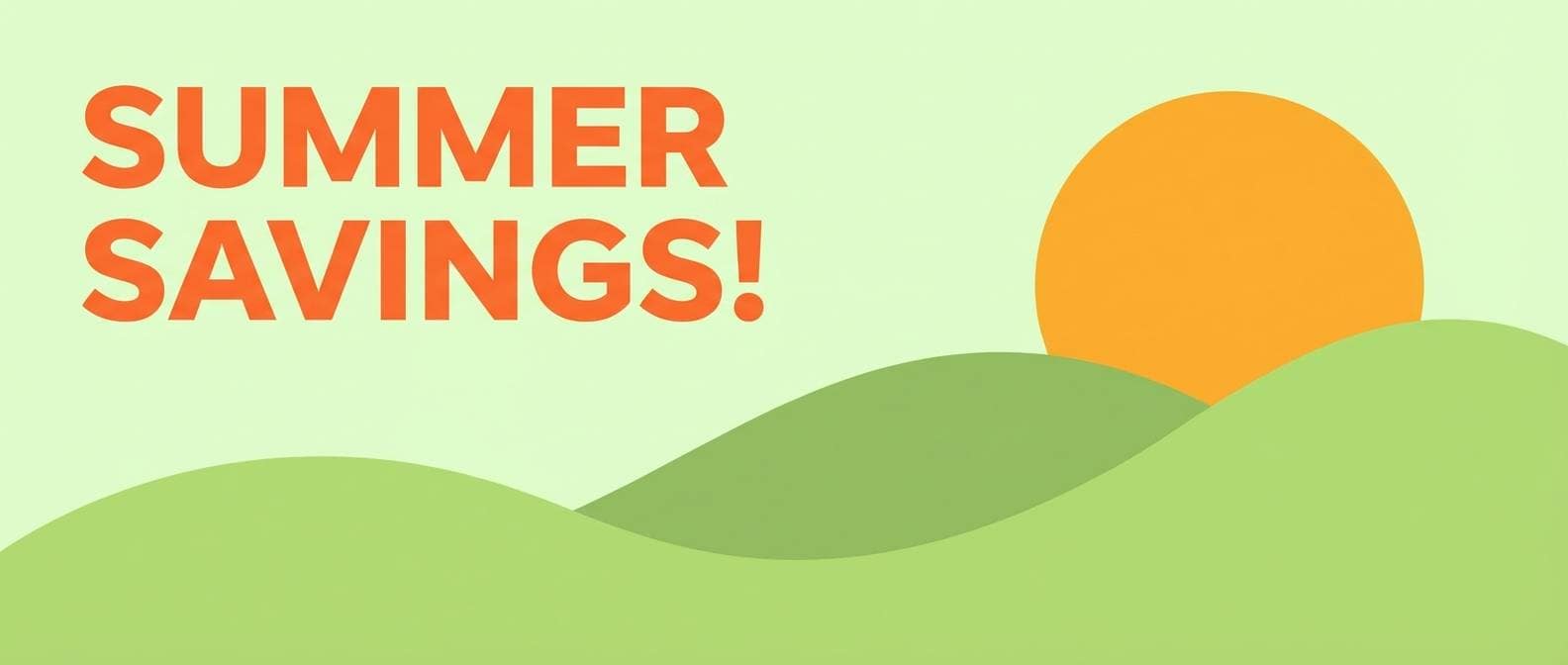
17) Honeydew Sunset
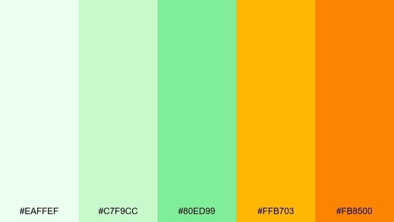
HEX: #EAFFEF #C7F9CC #80ED99 #FFB703 #FB8500
Mood: warm, summery, optimistic
Best for: travel promos and seasonal email banners
Honeydew greens with golden-orange warmth feel like late sun over fresh fields. The orange pair creates instant hierarchy for headlines and discount badges while staying friendly. Pair with bold imagery, rounded corner blocks, and a clean sans-serif for modern readability. Usage tip: use orange only for one primary highlight per banner to keep the palette from getting loud.
Image example of honeydew sunset generated using media.io
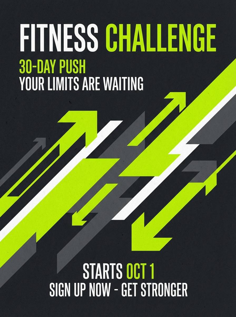
18) Lime Chalkboard
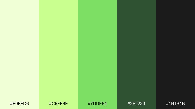
HEX: #F0FFD6 #C9FF8F #7DDF64 #2F5233 #1B1B1B
Mood: sporty, punchy, urban
Best for: gym posters and fitness challenge graphics
Sharp lime against deep green and near-black feels like chalk marks in a training studio. The contrast is strong enough for big type, timers, and high-energy slogans. Pair with condensed fonts, diagonal shapes, and subtle texture to mimic chalkboard grit. Usage tip: keep backgrounds dark and use the lightest tint for small highlights so the lime stays crisp.
Image example of lime chalkboard generated using media.io
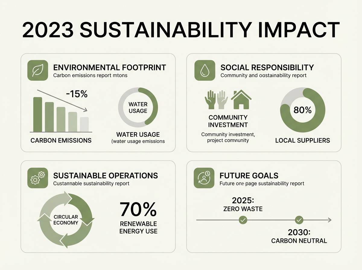
19) Willow Creek
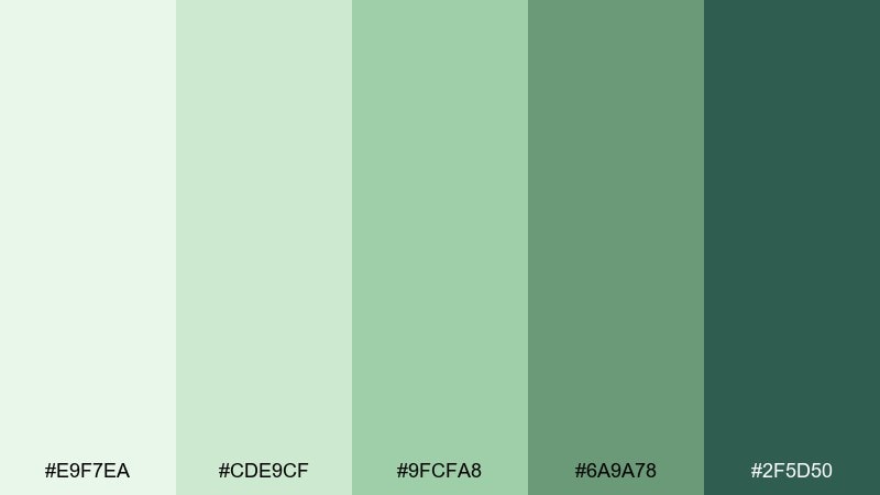
HEX: #E9F7EA #CDE9CF #9FCFA8 #6A9A78 #2F5D50
Mood: peaceful, outdoorsy, dependable
Best for: nonprofit reports and sustainability one-pagers
Willow greens feel steady and reassuring, like shaded trails near water. The stepped tones make it easy to build charts, section headers, and callout boxes without needing extra colors. Pair with warm gray text, simple infographics, and plenty of breathing room between sections. Usage tip: use the mid green for charts and reserve the darkest shade for titles to maintain a clear reading path.
Image example of willow creek generated using media.io
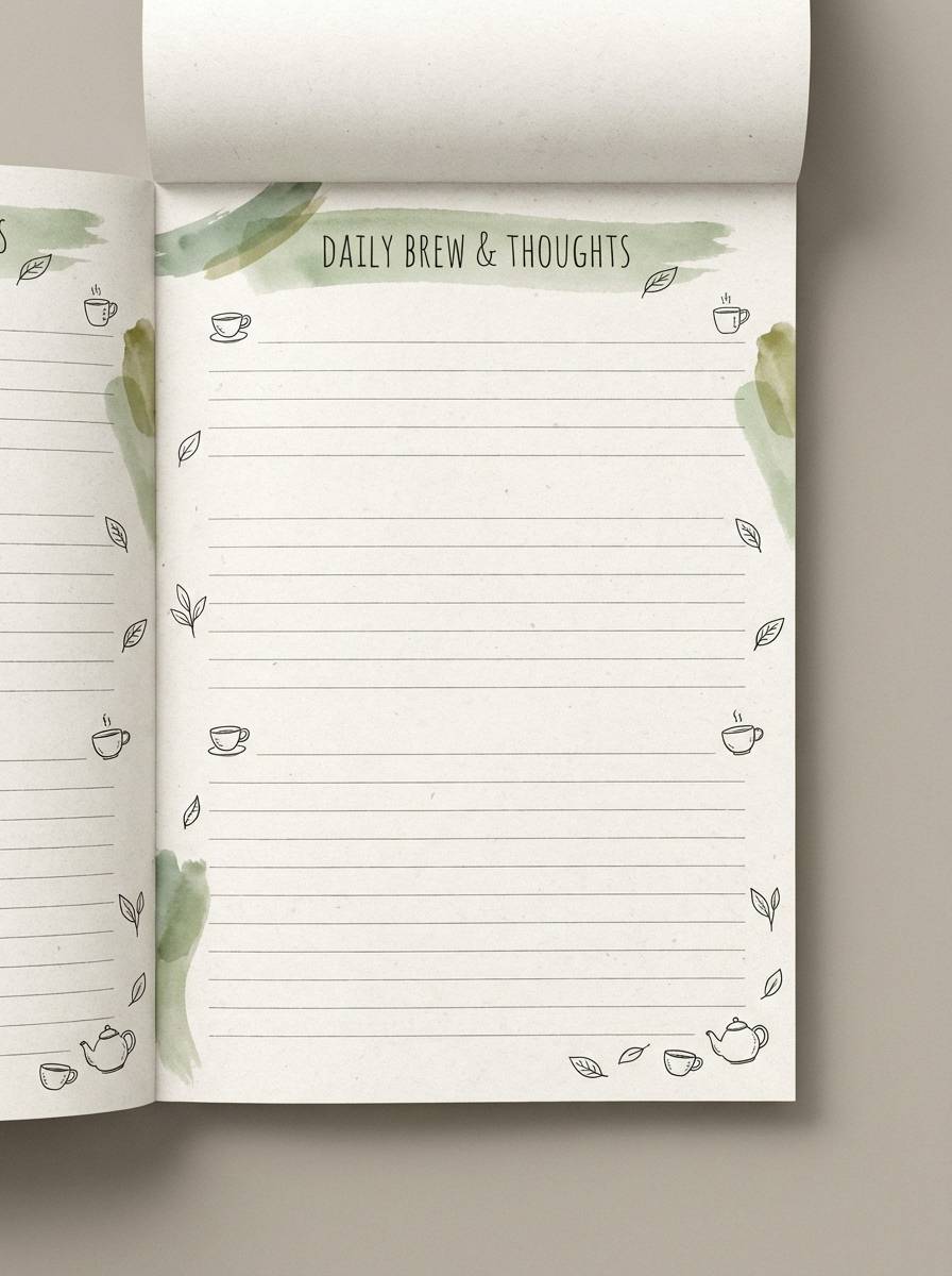
20) Green Tea Ceramic
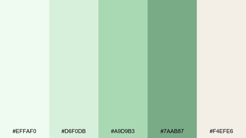
HEX: #EFFAF0 #D6F0DB #A9D9B3 #7AAB87 #F4EFE6
Mood: soft, wholesome, calming
Best for: stationery sets and journaling templates
Green tea tints with warm ceramic cream feel gentle and comforting. The palette stays readable for long writing sessions, especially when lines and headers are kept subtle. Pair with hand-drawn doodles, light paper textures, and muted gold clips or tabs. Usage tip: use the darkest green only for section titles so pages remain restful and uncluttered.
Image example of green tea ceramic generated using media.io
What Colors Go Well with Light Green?
Light green pairs beautifully with warm neutrals like cream, oat, clay beige, and soft brown—these keep the palette grounded and prevent it from feeling sterile. This is especially effective for packaging, editorial layouts, and lifestyle branding.
For clean contrast, use deep greens (forest, teal, or olive) or charcoal for typography and UI elements. This keeps readability strong while maintaining the calm “green-forward” vibe.
If you want a lively pop, try small accents of coral, blush pink, golden yellow, or orange. Use them sparingly for badges, buttons, or key info so the light greens stay soothing.
How to Use a Light Green Color Palette in Real Designs
Start by assigning roles: pick one very light green for backgrounds, a mid green for surfaces/cards, and a dark green (or charcoal) for text and primary actions. This creates consistent hierarchy without adding extra colors.
In print, muted light greens tend to look best on uncoated or textured stocks; keep large areas slightly off-white to avoid looking washed out. In digital, use subtle gradients and soft shadows to add depth while keeping the palette airy.
For branding systems, treat the brightest green as an accent color rather than a base. That helps the identity stay modern and readable across web, social, and product UI.
Create Light Green Palette Visuals with AI
If you already have HEX codes, you can turn them into on-brand images fast by generating design examples (posters, UI screens, labels, invitations) that match your palette’s mood. The easiest approach is to describe the layout and materials, then mention your color direction (mint, sage, seafoam, celadon, etc.).
Use the prompts above as templates: swap the subject (menu, ad, dashboard) while keeping the same tone keywords. You’ll get consistent outputs that look like a real campaign set.
When you find a look you like, regenerate variations for different aspect ratios and placements (hero banners, story posts, thumbnails) so the palette stays cohesive everywhere.
Light Green Color Palette FAQs
-
What does a light green color palette communicate in design?
Light green commonly signals freshness, calm, health, and balance. It’s often used for wellness, eco messaging, spring themes, and UI experiences where you want “quiet confidence” instead of high-intensity energy. -
Which text colors are most readable on light green backgrounds?
Deep forest green, dark teal, charcoal, and near-black typically provide the best readability. For long-form text, avoid mid greens on pale green backgrounds; reserve mid tones for borders, cards, and secondary UI. -
What accent colors work best with light green?
Blush pink, coral, warm yellow, and orange add friendly contrast, while clay beige and cream keep it natural. For a sharper, modern look, pair light green with white and charcoal. -
Is mint green the same as pastel green?
Mint is a specific cool, slightly blue-leaning light green, while “pastel green” is a broader category of light, desaturated greens (including mint, pistachio, honeydew, and some sage tints). -
How do I keep a light green palette from looking too “medical”?
Add warm neutrals (cream, oat, paper beige) and use deeper greens for type instead of pure black. You can also include a small warm accent (peach/coral) to shift the mood toward lifestyle rather than clinical. -
What’s a good way to use light green in UI design?
Use the palest tint as a background, mid greens for components (cards, toggles, charts), and a dark teal/green for primary actions. Keep one accent color for alerts or highlights so the interface stays consistent. -
Can I generate matching palette images without design skills?
Yes. With Media.io’s text-to-image tool, you can paste or reference your palette direction and use prompts like “minimal label,” “dashboard UI,” or “event poster” to generate cohesive visuals quickly.
Next: Green Tan Color Palette


