

White and green is a timeless pairing: white keeps layouts clean and breathable, while green adds life, freshness, and a natural sense of balance. Together, they work across modern UI, packaging, and print because they feel both minimal and welcoming.
Below are curated white green color palette ideas with HEX codes, mood notes, and practical ways to apply each scheme—plus AI prompts you can reuse to generate visuals fast.
In this article
- Why White Green Palettes Work So Well
-
- mint linen
- sage gallery
- eucalyptus mist
- aloe porcelain
- forest marble
- pistachio studio
- tea garden
- seafoam minimal
- olive notebook
- meadow ceramic
- bamboo spa
- emerald chalk
- cucumber fresh
- fern typography
- ivy wedding
- matcha latte
- glacier green
- mossy concrete
- spring circuit
- herb market
- botanical press
- garden herb packaging
- What Colors Go Well with White Green?
- How to Use a White Green Color Palette in Real Designs
- Create White Green Palette Visuals with AI
Why White Green Palettes Work So Well
White creates instant clarity: it boosts perceived space, improves scannability, and helps typography and imagery feel crisp. When you need modern simplicity without feeling cold, white is an ideal foundation.
Green adds emotion and meaning—freshness, growth, calm, health, eco values—depending on the shade. Soft sages feel refined and quiet, while vivid spring greens feel energetic and digital.
As a system, white + green is easy to scale: whites handle backgrounds and surfaces, mid greens define sections and components, and deep greens provide accessible contrast for text, icons, and CTAs.
20+ White Green Color Palette Ideas (with HEX Codes)
1) Mint Linen
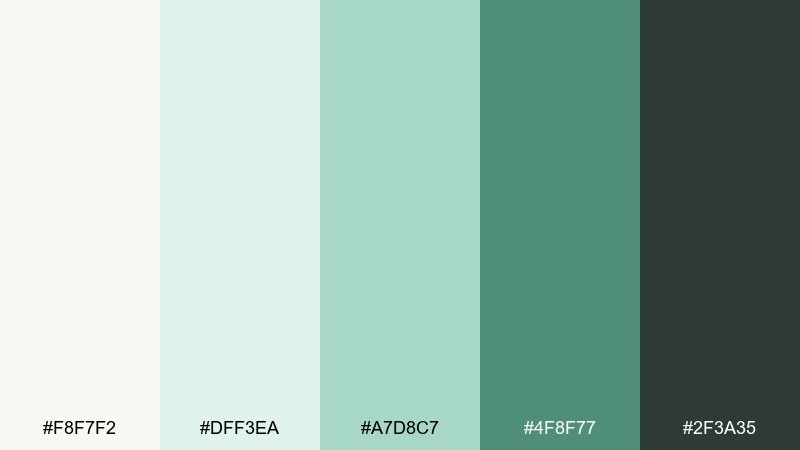
HEX: #f8f7f2 #dff3ea #a7d8c7 #4f8f77 #2f3a35
Mood: airy, calm, modern
Best for: saas dashboard ui
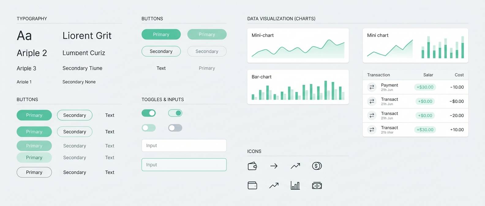
Airy mint and soft linen whites feel like morning light in a clean studio. The pale base keeps layouts open, while the deeper green anchors navigation and key states. Pair it with thin line icons, plenty of spacing, and warm gray dividers for readability. Usage tip: reserve the darkest green for primary buttons and success messages to maintain clarity.
Image example of mint linen generated using media.io

Media.io is an online AI studio for creating and editing video, image, and audio in your browser.

2) Sage Gallery
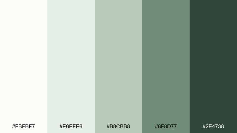
HEX: #fbfbf7 #e6efe6 #b8cbb8 #6f8d77 #2e4738
Mood: refined, quiet, curated
Best for: art portfolio website
Quiet sage tones against gallery white evoke framed prints and a calm viewing room. Use the mid sage for section backgrounds and the darker green for headers to create a museum-like hierarchy. It pairs well with serif headlines, thin borders, and plenty of negative space. Usage tip: keep images on pure white blocks so artwork colors stay true.
Image example of sage gallery generated using media.io
3) Eucalyptus Mist
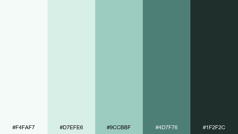
HEX: #f4faf7 #d7efe6 #9ccbbf #4d7f76 #1f2f2c
Mood: fresh, spa-like, soothing
Best for: skincare brand identity
Fresh eucalyptus mist reads clean and restorative, like steamed towels and leafy botanicals. For a white green color palette that feels premium, keep backgrounds nearly white and let the blue-green midtones carry the brand. Pair it with matte textures, minimalist packaging, and a soft black-green for type. Usage tip: use the light mint as a large field color and avoid oversaturating hero blocks.
Image example of eucalyptus mist generated using media.io
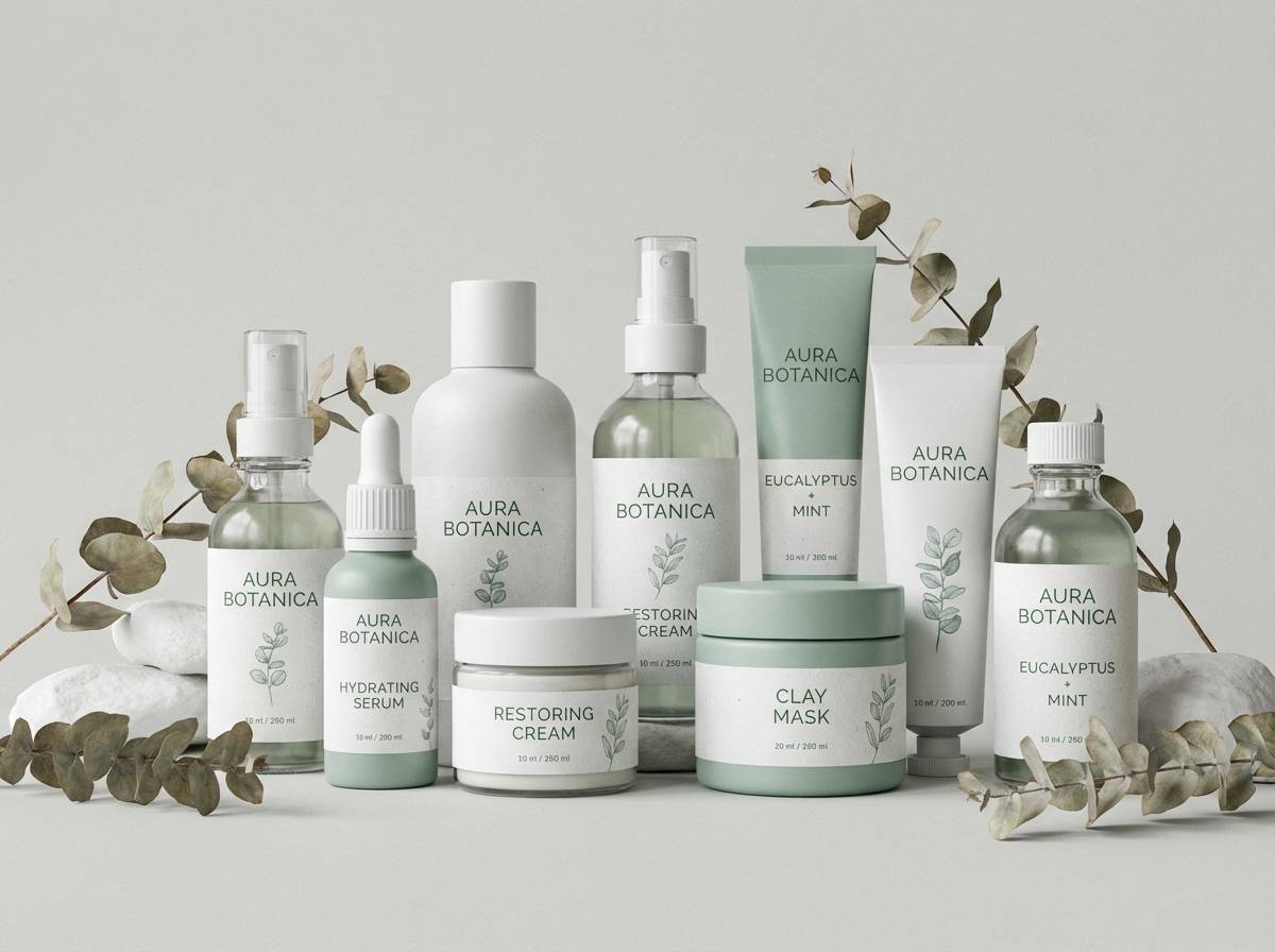
4) Aloe Porcelain
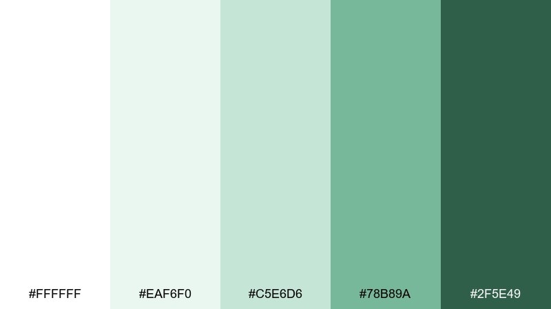
HEX: #ffffff #eaf6f0 #c5e6d6 #78b89a #2f5e49
Mood: clean, gentle, uplifting
Best for: wellness landing page
Clean porcelain white with aloe greens feels light, healthy, and optimistic. Use the pale green wash for large sections to reduce glare while keeping the page bright. It pairs nicely with rounded UI elements, soft shadows, and warm neutrals like sand for secondary accents. Usage tip: keep CTAs in the deeper green so they stand out without shouting.
Image example of aloe porcelain generated using media.io
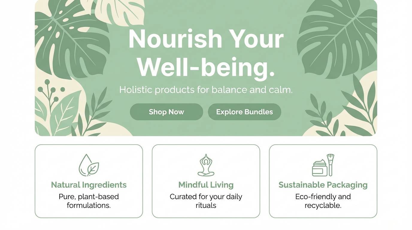
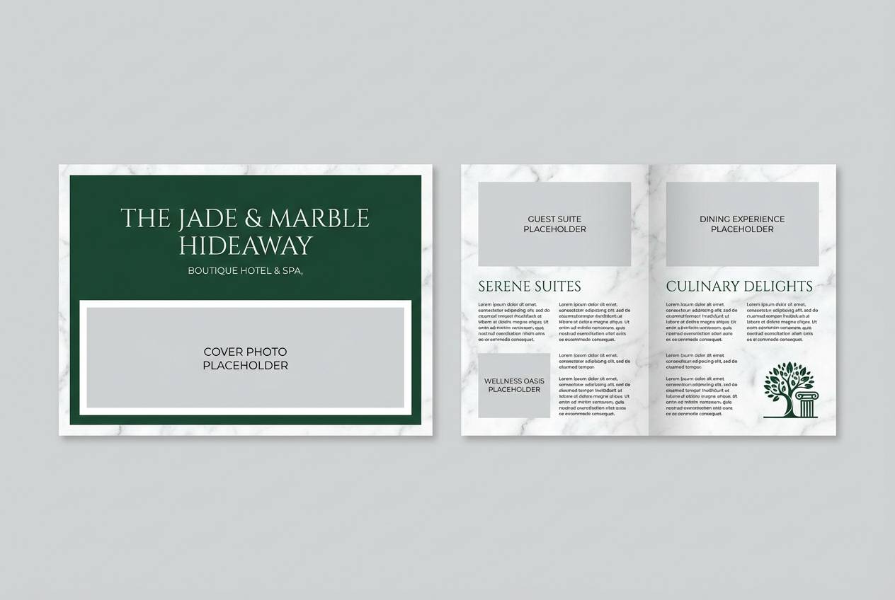
5) Forest Marble
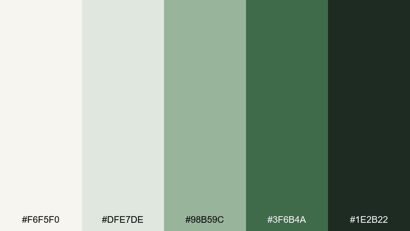
HEX: #f6f5f0 #dfe7de #98b59c #3f6b4a #1e2b22
Mood: grounded, elegant, timeless
Best for: boutique hotel brochure
Grounded forest greens against marble-like off-white evoke lobbies, stone textures, and quiet luxury. These white green color combinations work well for brochures where headings need weight and body text stays readable. Pair with gold foil details, thick paper stocks, and subtle photographic overlays. Usage tip: use the near-black green for small text and keep the mid green for large blocks only.
Image example of forest marble generated using media.io
6) Pistachio Studio
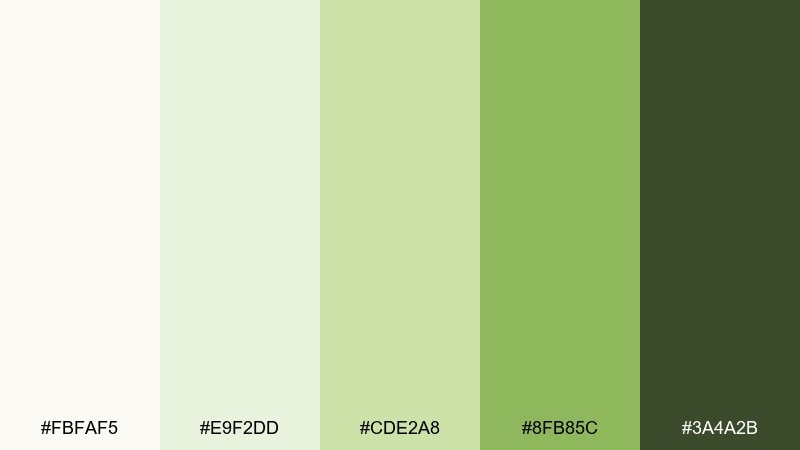
HEX: #fbfaf5 #e9f2dd #cde2a8 #8fb85c #3a4a2b
Mood: sunny, playful, approachable
Best for: cafe menu design
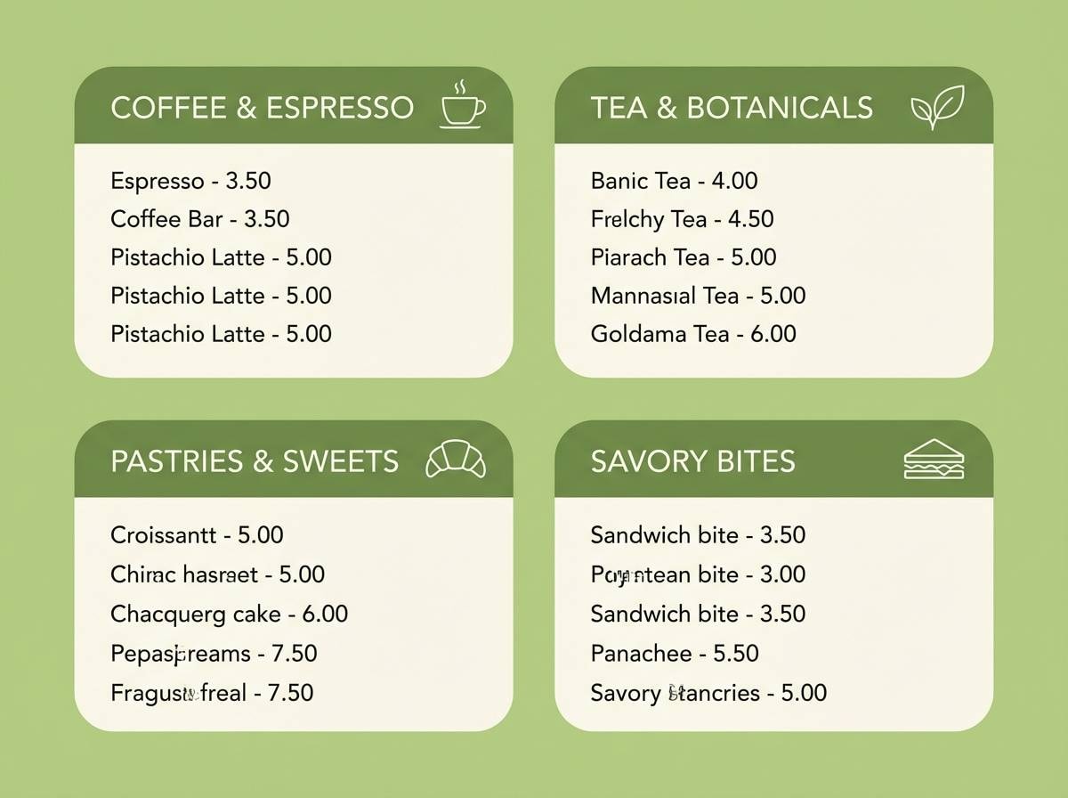
Sunny pistachio greens with creamy white feel like a bright cafe counter and fresh pastries. Use the light pistachio as a menu background and the darker olive-green for item names and prices. It pairs naturally with hand-drawn icons and warm photography. Usage tip: keep one accent color per section so the menu stays easy to scan.
Image example of pistachio studio generated using media.io
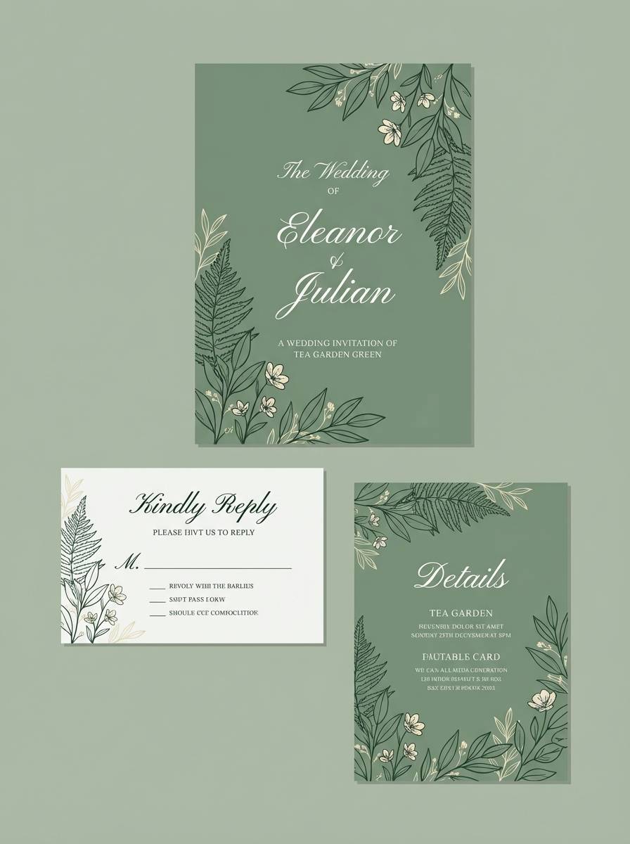
7) Tea Garden
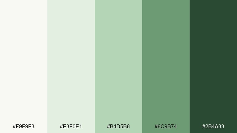
HEX: #f9f9f3 #e3f0e1 #b4d5b6 #6c9b74 #2b4a33
Mood: cozy, natural, inviting
Best for: wedding invitation suite
Cozy tea-garden greens on soft white evoke pressed leaves and handmade paper. Use the deepest green for names and headings, then keep details in a lighter sage for a gentle hierarchy. It pairs beautifully with watercolor florals and deckle-edge textures. Usage tip: print on warm white stock to avoid a stark contrast.
Image example of tea garden generated using media.io
8) Seafoam Minimal
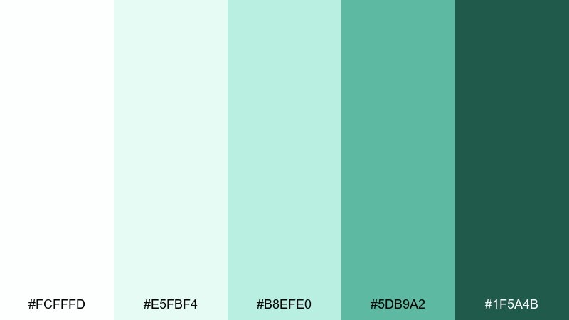
HEX: #fcfffd #e5fbf4 #b8efe0 #5db9a2 #1f5a4b
Mood: light, crisp, contemporary
Best for: mobile app onboarding screens
Crisp seafoam on bright white feels modern and breezy, like coastal air. Use the palest tone as a full-screen background and keep the saturated seafoam for illustrations and progress states. It pairs well with geometric shapes and minimal copy. Usage tip: ensure accessibility by using the dark teal-green for all small text.
Image example of seafoam minimal generated using media.io
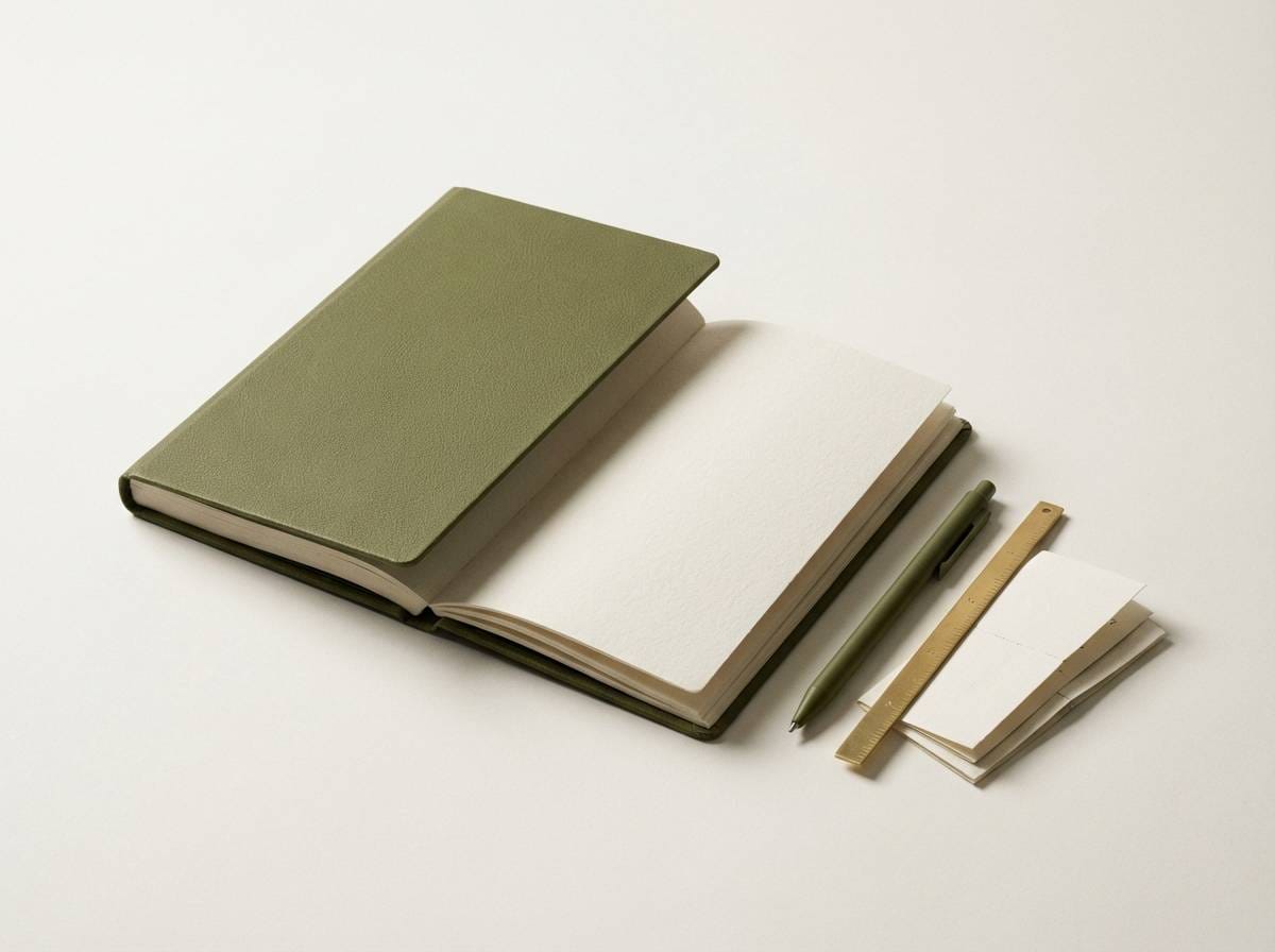
9) Olive Notebook
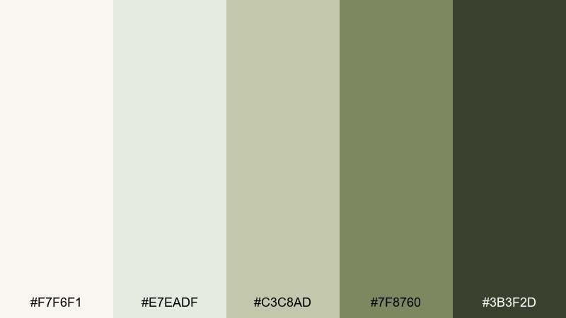
HEX: #f7f6f1 #e7eadf #c3c8ad #7f8760 #3b3f2d
Mood: academic, earthy, dependable
Best for: stationery and journal cover
Earthy olive with paper whites feels like a well-used notebook and a quiet desk. A balanced white green color combination like this works best when the light neutrals dominate and the olive acts as structure. Pair with kraft textures, simple line patterns, and muted black ink. Usage tip: add a thin border in the mid olive to make covers look more finished.
Image example of olive notebook generated using media.io
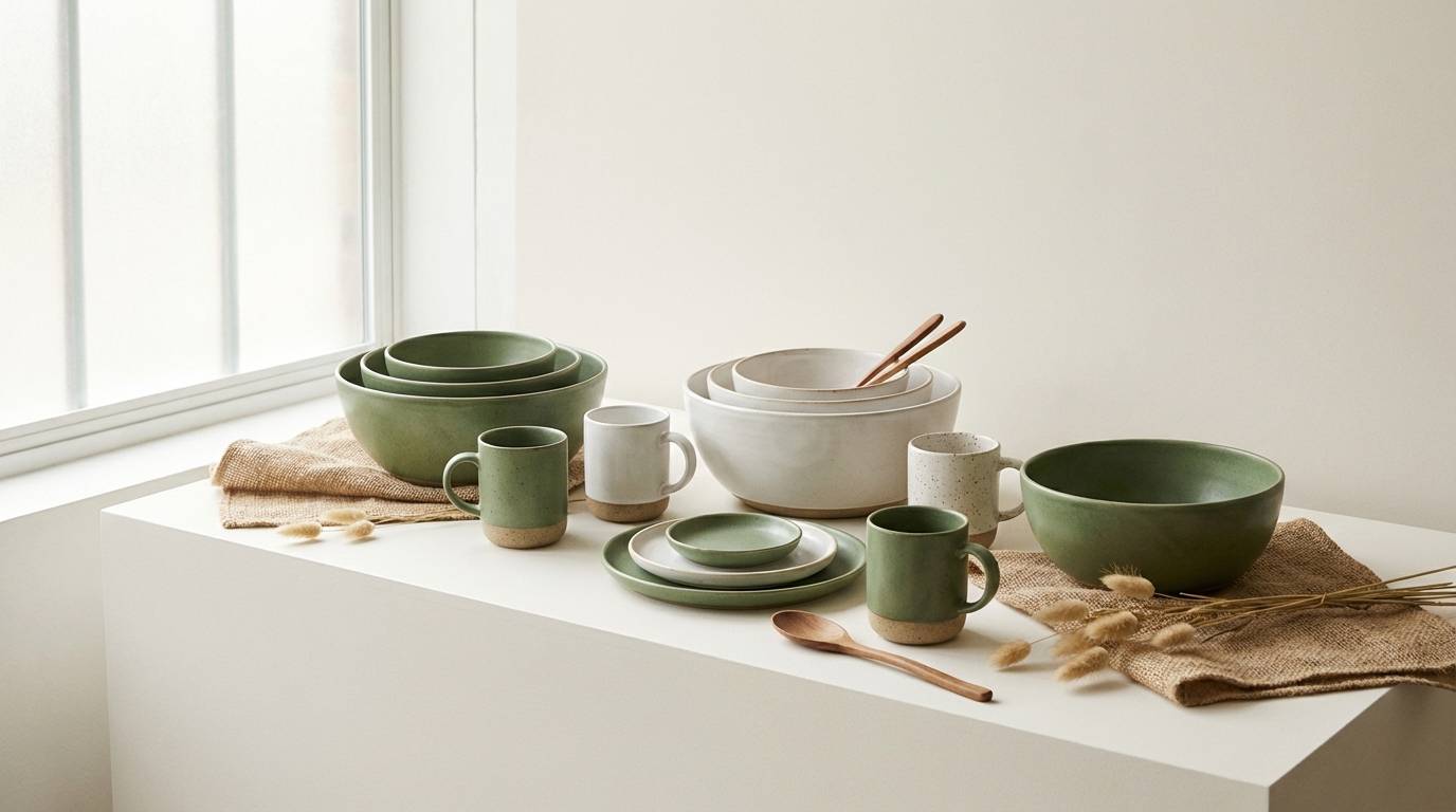
10) Meadow Ceramic
HEX: #fffdf8 #eef7e8 #cfe8c2 #86b77b #2f5a3a
Mood: homey, fresh, friendly
Best for: kitchenware product ad
Soft meadow greens on warm white evoke glazed ceramics and sunlit countertops. Use the lightest tones for the backdrop and let the medium green highlight product features or callouts. It pairs nicely with natural wood props and simple sans-serif type. Usage tip: keep reflections subtle so the palette stays gentle and not clinical.
Image example of meadow ceramic generated using media.io
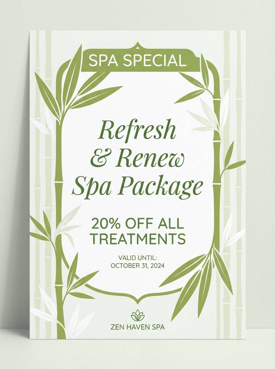
11) Bamboo Spa
HEX: #f3f8f1 #d9edd2 #a9d3a0 #5f9c63 #2b4d2f
Mood: restorative, natural, balanced
Best for: spa promotional poster
Restorative bamboo greens feel like steam, eucalyptus, and quiet rooms. Use the light green as a calming base and the deeper green for strong headlines and offer details. It pairs well with minimalist photography, thin dividers, and lots of breathing room. Usage tip: keep contrast high for pricing and dates so the promo stays readable from a distance.
Image example of bamboo spa generated using media.io
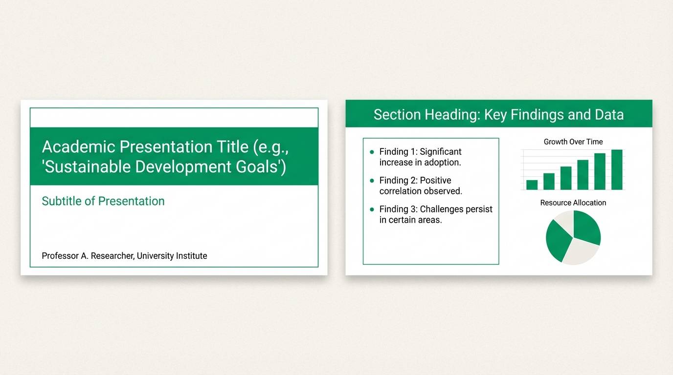
12) Emerald Chalk
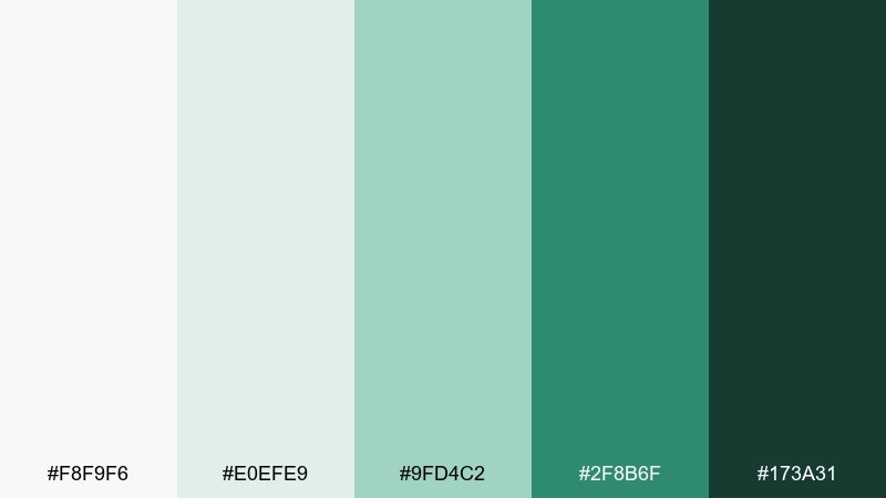
HEX: #f8f9f6 #e0efe9 #9fd4c2 #2f8b6f #173a31
Mood: confident, smart, energetic
Best for: education course slides
Confident emerald with chalky whites evokes a modern classroom and crisp whiteboards. These white green color combinations give you strong contrast for titles without feeling harsh. Pair with simple charts, rounded highlight boxes, and light gray grids for structure. Usage tip: use emerald for section headers and keep body text on near-white for long-read comfort.
Image example of emerald chalk generated using media.io
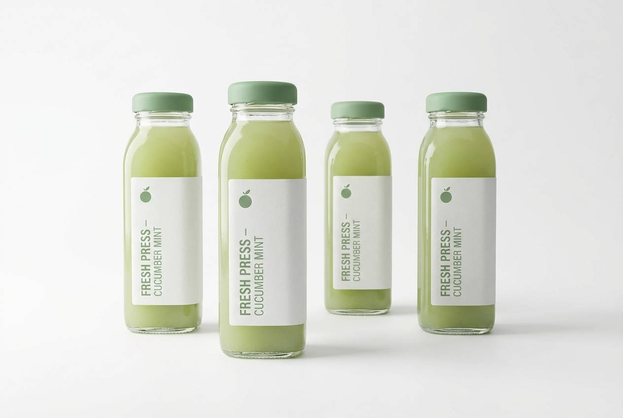
13) Cucumber Fresh
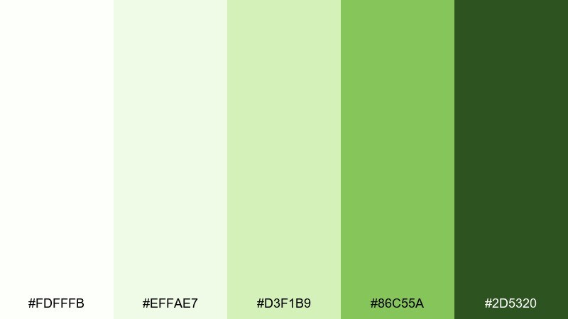
HEX: #fdfffb #effae7 #d3f1b9 #86c55a #2d5320
Mood: zesty, clean, youthful
Best for: juice bar brand kit
Zesty cucumber greens with bright white feel crisp, juicy, and young. Use the vivid green sparingly for logos, stickers, and small highlights to avoid overwhelming the eye. It pairs well with bold sans-serif typography and fruit photography with lots of light. Usage tip: add a neutral gray-green for barcode and ingredient areas to keep packaging tidy.
Image example of cucumber fresh generated using media.io
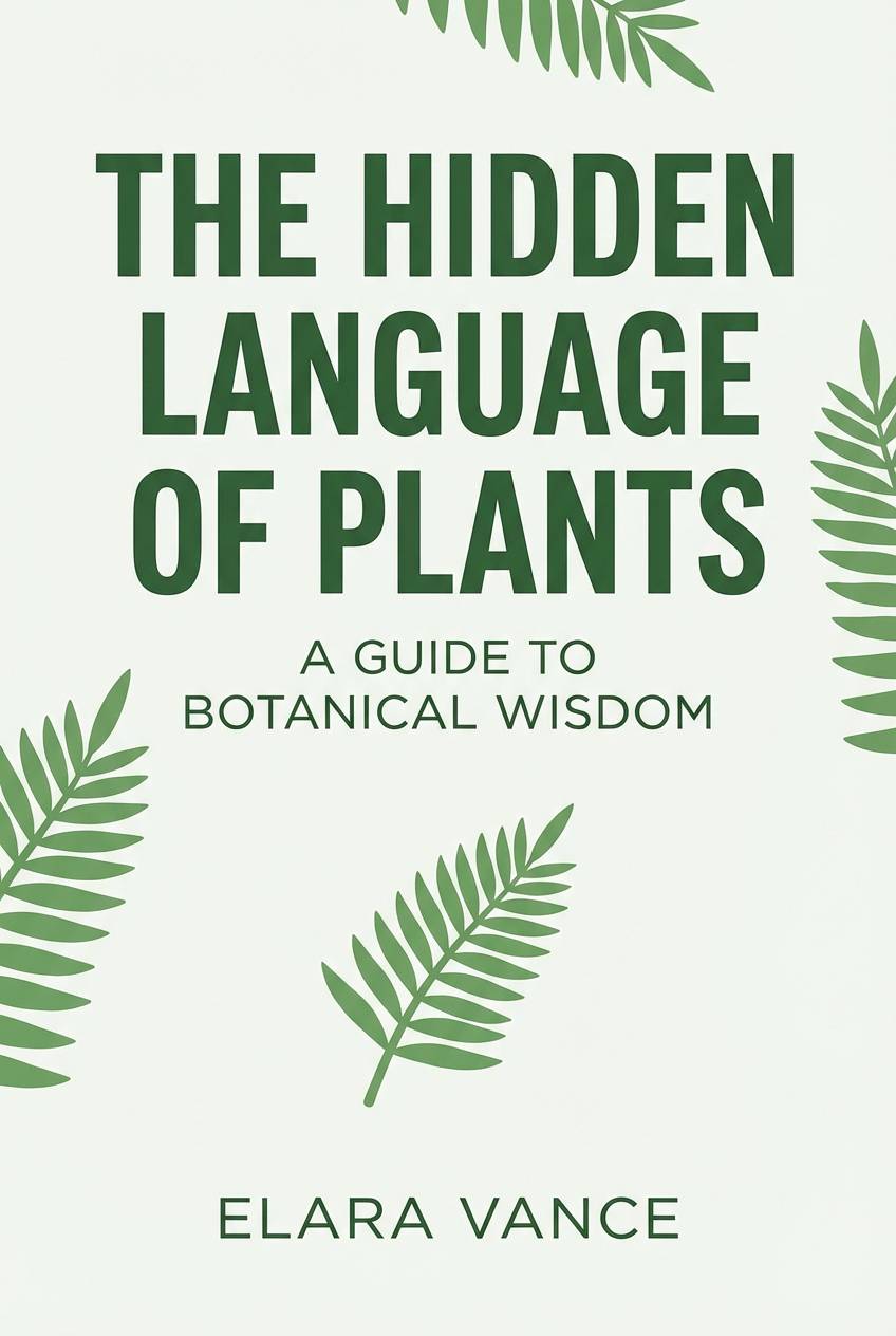
14) Fern Typography
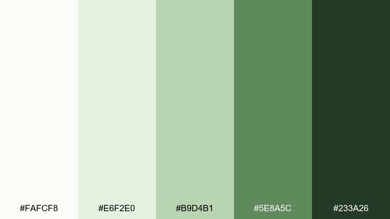
HEX: #fafcf8 #e6f2e0 #b9d4b1 #5e8a5c #233a26
Mood: literary, calm, classic
Best for: book cover design
Calm fern greens on soft white feel like quiet reading corners and botanical prints. Use the darkest green for the title and author name, then keep accents in muted sage for a cohesive look. It pairs nicely with serif typography and subtle paper grain. Usage tip: avoid pure black and let the deep green do the heavy lifting for contrast.
Image example of fern typography generated using media.io
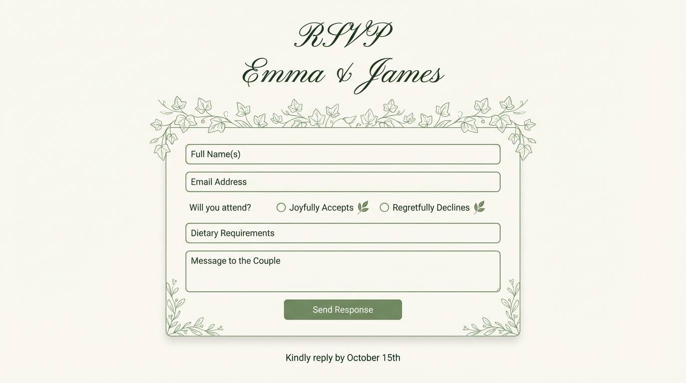
15) Ivy Wedding
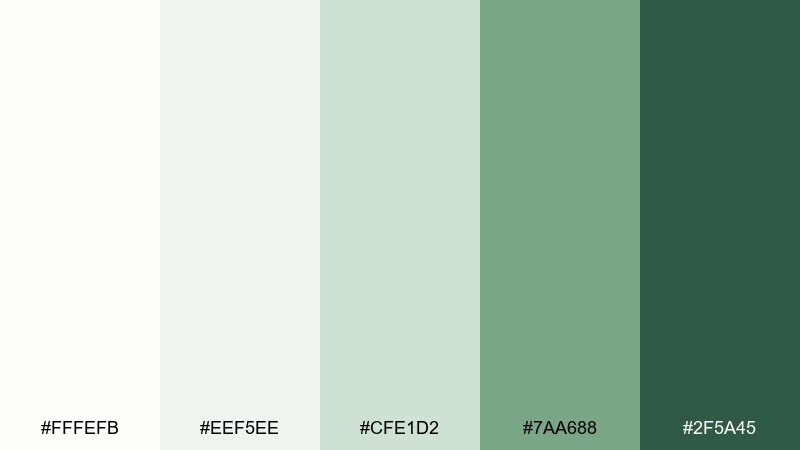
HEX: #fffefb #eef5ee #cfe1d2 #7aa688 #2f5a45
Mood: romantic, elegant, natural
Best for: wedding website and rsvp
Romantic ivy greens over warm white evoke garden vows and leafy arches. Use the palest green for page backgrounds and the mid ivy tone for buttons, separators, and RSVP highlights. It pairs beautifully with script accents and fine-line illustrations. Usage tip: keep form fields on pure white so they feel clean and easy to fill in.
Image example of ivy wedding generated using media.io
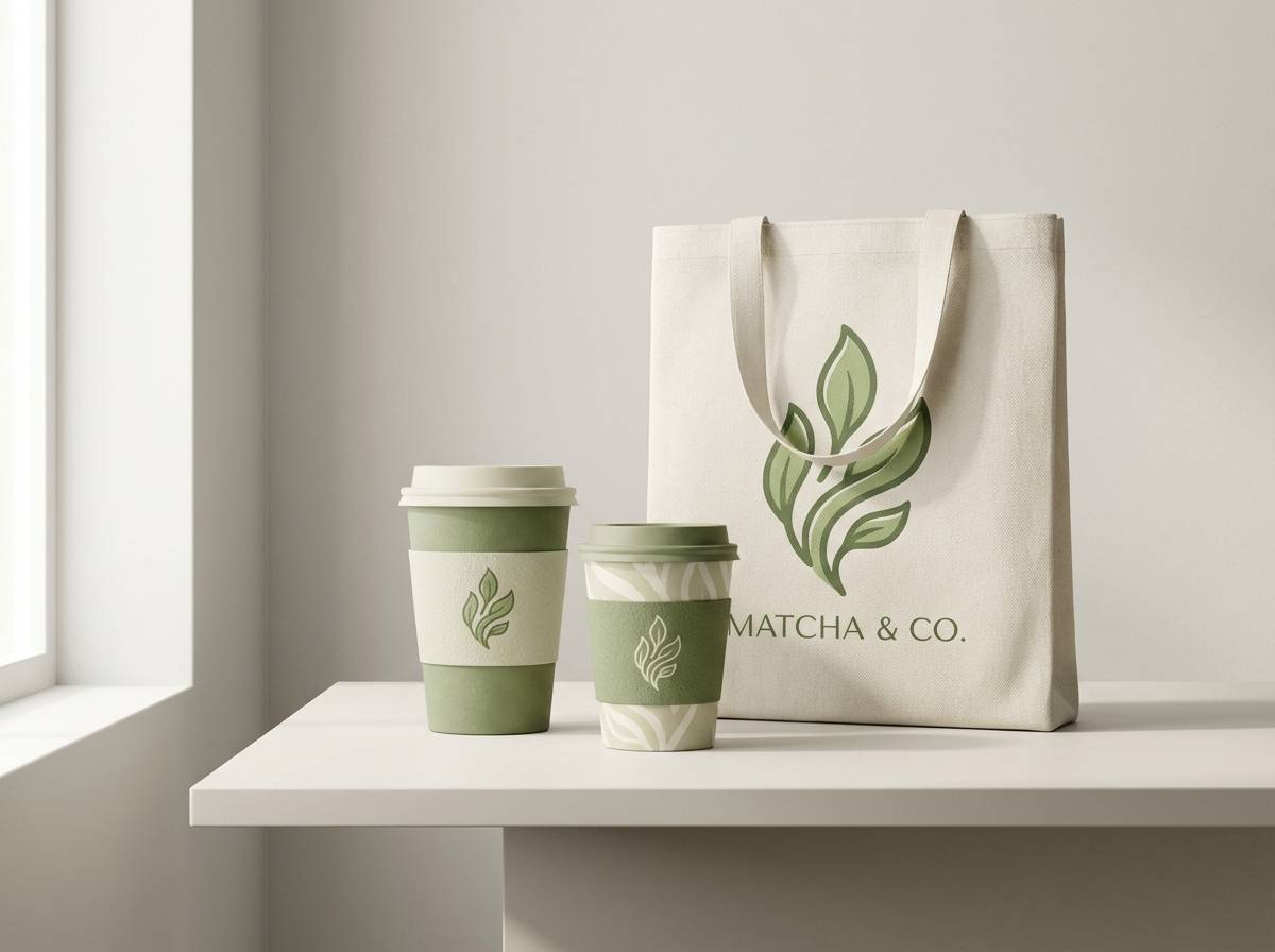
16) Matcha Latte
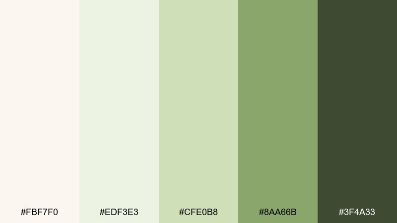
HEX: #fbf7f0 #edf3e3 #cfe0b8 #8aa66b #3f4a33
Mood: cozy, soft, contemporary
Best for: coffee shop brand refresh
Cozy matcha greens with milky whites feel like a quiet cafe and a warm cup in hand. For a white green color palette that stays modern, lean on the creamy base and use matcha tones for signage, stickers, and social templates. Pair with tan paper textures and minimalist icons to keep it approachable. Usage tip: keep the darkest tone for logotypes and small copy so it prints sharply.
Image example of matcha latte generated using media.io
17) Glacier Green
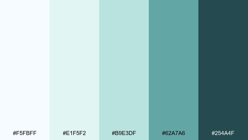
HEX: #f5fbff #e1f5f2 #b9e3df #62a7a6 #254a4f
Mood: cool, sleek, tech-forward
Best for: fintech app ui kit
Cool glacier greens with icy whites feel sleek and precise, like clean data and calm motion. Use the light tones for surfaces and the deeper teal-green for active states, charts, and alerts. It pairs well with geometric icons and a restrained type system. Usage tip: keep success and info states distinct by adjusting saturation, not adding extra colors.
Image example of glacier green generated using media.io
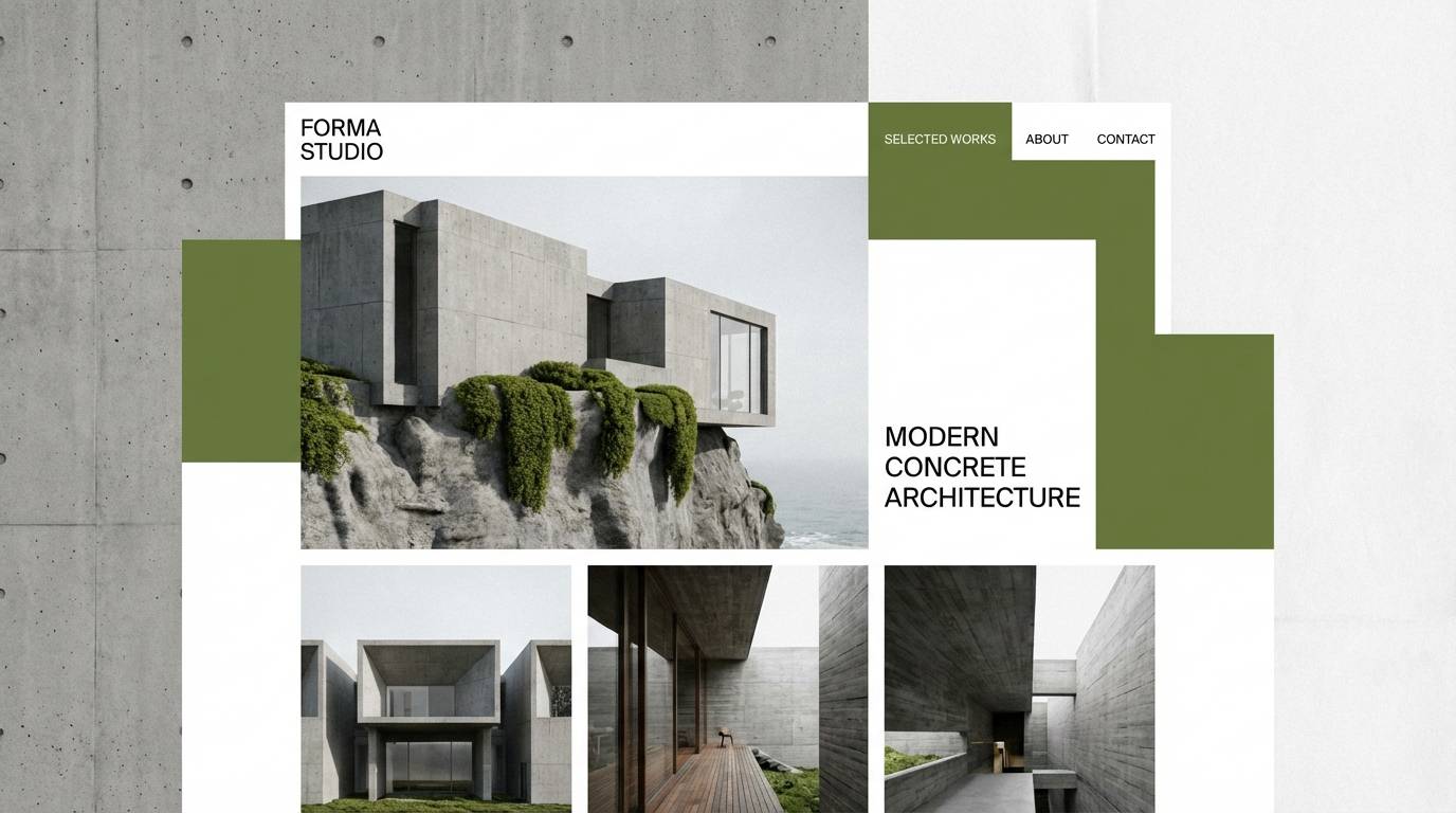
18) Mossy Concrete
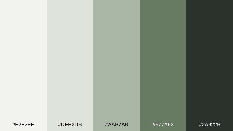
HEX: #f2f2ee #dee3db #aab7a6 #677a62 #2a322b
Mood: urban, muted, sophisticated
Best for: architecture studio website
Muted moss on concrete-like whites feels urban and architectural, with a quiet confidence. Use the pale grays as the main canvas, then apply the moss green as a subtle brand signature in links and section markers. It pairs nicely with monochrome photography and strong grid systems. Usage tip: avoid heavy shadows and let spacing and alignment do the work.
Image example of mossy concrete generated using media.io
19) Spring Circuit
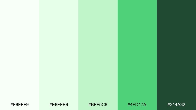
HEX: #f8fff9 #e6ffe9 #bff5c8 #4fd17a #214a32
Mood: bright, optimistic, digital
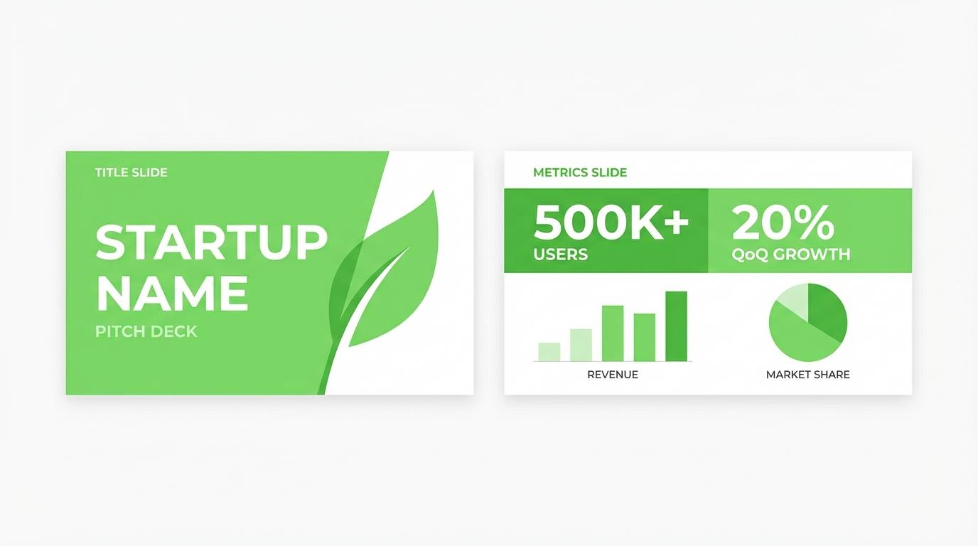
Best for: startup pitch deck slides
Bright spring greens over clean white feel energetic, like new launches and quick iterations. Use the vivid green as a highlight for KPIs, icons, and key metrics, while keeping most slides white for clarity. It pairs well with dark green headings and simple charts. Usage tip: keep gradients subtle so the deck still prints well when needed.
Image example of spring circuit generated using media.io
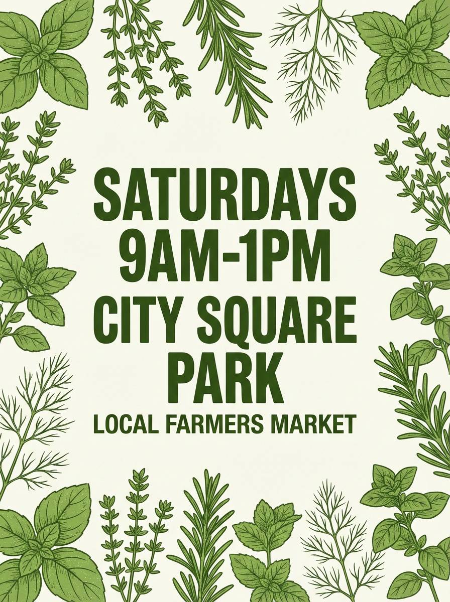
20) Herb Market
HEX: #fffef6 #edf4e3 #cfe0b0 #7f9b4a #33421e
Mood: rustic, fresh, wholesome
Best for: farmers market poster
Wholesome herb greens with warm white evoke paper sacks, fresh bundles, and handwritten signs. This white green color combination is ideal for posters that need a rustic but organized look. Pair it with stamped textures, simple illustrations, and a limited type palette to keep it friendly. Usage tip: use the darkest green for dates and location so they read instantly.
Image example of herb market generated using media.io
21) Botanical Press
HEX: #f9fbf5 #e7f1e1 #bfd6b6 #6f916f #2b3f2f
Mood: editorial, botanical, polished
Best for: magazine spread layout
Polished botanical greens on soft white feel like an editorial feature in a nature magazine. A white green color scheme like this supports long-form reading while still offering clear section breaks. Pair with serif body text, generous margins, and muted photo captions in mid green. Usage tip: keep the darkest tone for pull quotes so they pop without turning black.
Image example of botanical press generated using media.io
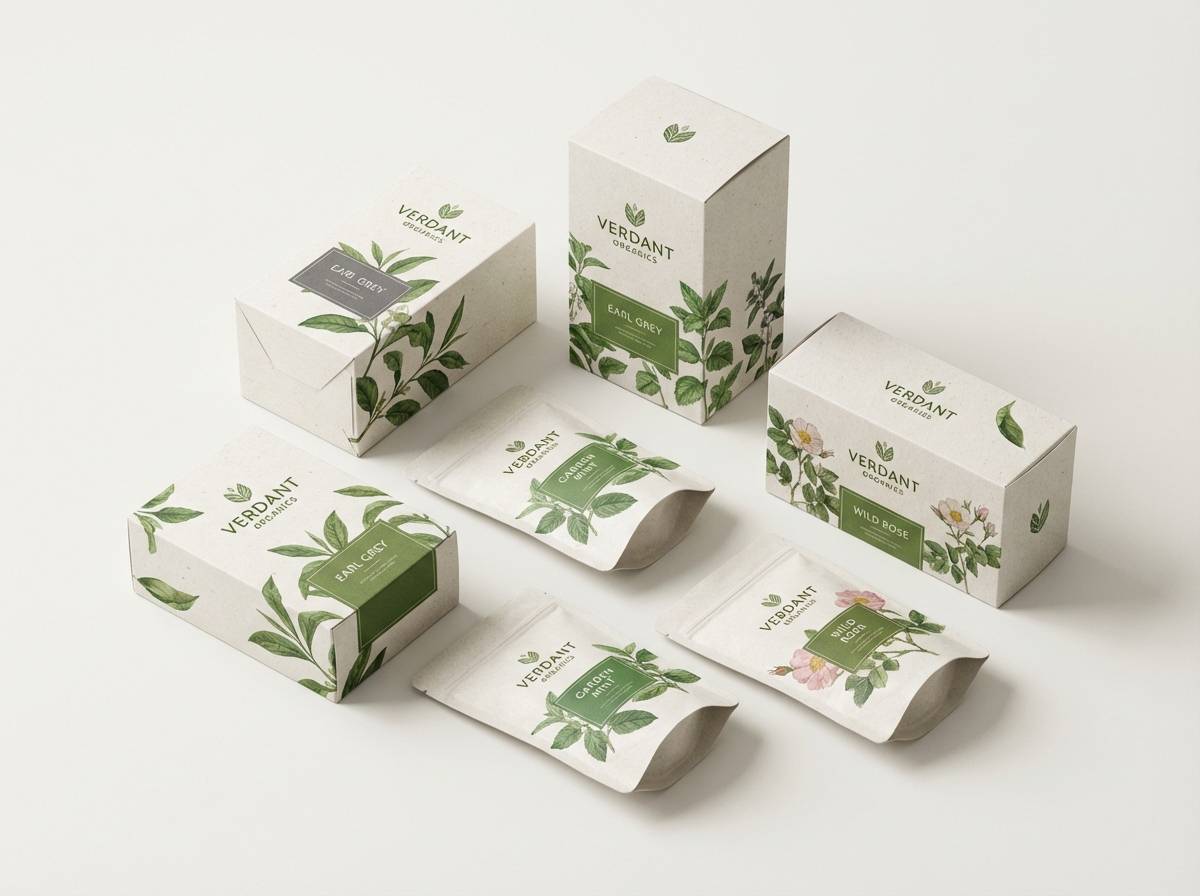
22) Garden Herb Packaging
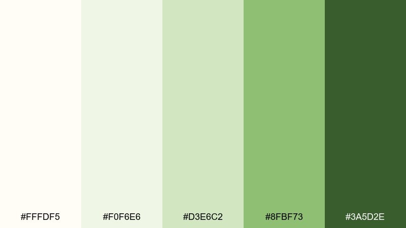
HEX: #fffdf5 #f0f6e6 #d3e6c2 #8fbf73 #3a5d2e
Mood: fresh, practical, eco-minded
Best for: organic tea packaging
Fresh garden greens with warm white feel eco-minded and honest, like pantry staples with simple labels. White green color combinations shine on packaging when you keep typography clean and let a single green carry the brand block. Pair with recycled paper textures and small botanical illustrations for authenticity. Usage tip: reserve the darkest green for regulatory text and barcodes so they stay crisp in print.
Image example of garden herb packaging generated using media.io
What Colors Go Well with White Green?
White and green pair naturally with warm neutrals like sand, cream, beige, and kraft brown—great for organic brands and packaging that should feel grounded. For a more premium look, add small accents of gold or brass (especially in print finishes).
For modern UI, gray (cool or warm) helps structure grids and separators without adding noise. Deep charcoal or near-black green works best for text because it keeps contrast high while staying on-theme.
If you need more energy, try a limited “pop” accent: coral, terracotta, or a soft peach can add friendliness; teal-blue can push the palette toward tech. Keep accent usage small (icons, highlights, badges) to preserve the calm of the base scheme.
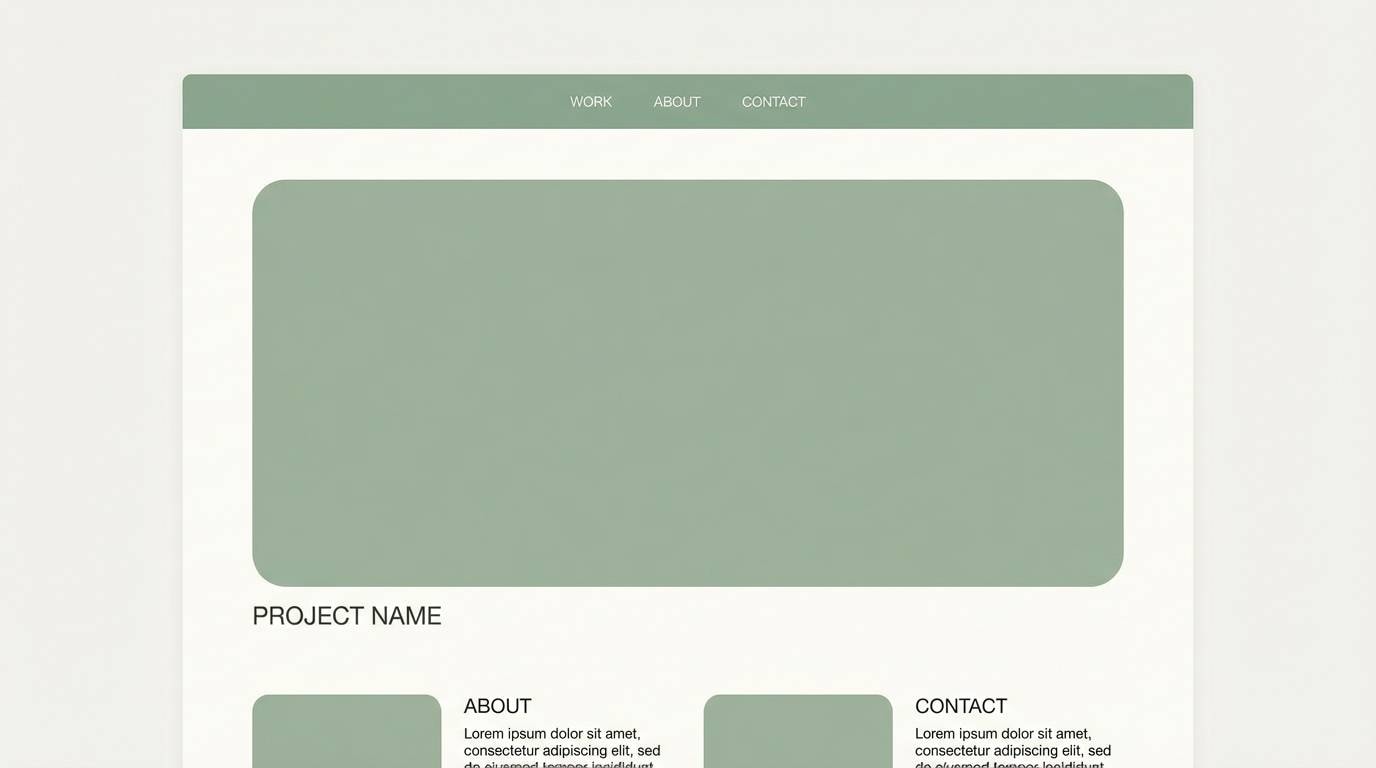
How to Use a White Green Color Palette in Real Designs
Start with proportions: let whites handle most surfaces (backgrounds, cards, margins), then use light greens for section fills and states. Save your darkest green for CTAs, active navigation, and critical labels so the interface feels organized.
For branding and print, choose one “signature” green (mid or deep) and repeat it consistently across logo locks, headings, and callouts. Match paper tone to the whites in your palette—warm whites often feel more natural than bright optical white.
Always test accessibility and readability: small text should sit on near-white with a deep green/charcoal tone. If a mid green is too light for text, keep it for backgrounds, chips, or large shapes instead.
Create White Green Palette Visuals with AI
If you want to preview a white green color scheme before designing, generate quick mockups with AI. This is especially useful for exploring different green temperatures (sage vs mint vs olive) and checking how they feel on real layouts.
Reuse the prompts above, then swap in your palette name, product type, or layout format (poster, landing page, packaging, UI kit). Keep “no device frame” or “plain background” when you want clean, editable outputs.
With Media.io, you can create palette-based images in seconds and iterate until the mood matches your brand.
White Green Color Palette FAQs
-
What does a white and green color scheme communicate?
It commonly signals freshness, health, growth, and clarity. White provides clean space and legibility, while green adds a natural, calming tone that can feel eco-minded or wellness-focused depending on the shade. -
Which green works best with white for modern UI?
Muted blue-greens and teals (like glacier or eucalyptus tones) often look most “tech-forward” on white. Use a deep teal/green for text and buttons, and reserve lighter greens for backgrounds and states. -
How do I keep white green palettes from looking too “medical”?
Shift whites toward warm off-white, use softer sages/olives instead of neon greens, and introduce gentle neutrals (warm gray, sand) in dividers and secondary elements. Texture (paper grain, matte materials) also helps. -
What’s the best text color on light green backgrounds?
Use a very dark green, deep teal, or charcoal rather than pure black for a cohesive look. Avoid mid greens for body text because contrast can drop quickly, especially on mobile screens. -
Are white and green good for print design?
Yes—especially for brochures, invitations, and eco packaging. Choose warm white stocks to avoid harsh contrast, and ensure the darkest green is rich enough to print sharply for small type. -
How many greens should I use in one design system?
Typically 2–3 is enough: one light green for surfaces, one mid green for brand presence, and one deep green for contrast and CTAs. Add neutrals before adding extra greens. -
How can I quickly preview a white green palette on real layouts?
Generate mockups with AI using a consistent prompt format (layout type + lighting + “plain background/no device frame”), then iterate by swapping green shades. Media.io makes it easy to produce multiple variations fast.
Next: Gold Brown Color Palette


