

Gold brown palettes blend warm metallic highlights with earthy neutrals, giving designs an instant sense of comfort and quality. They’re especially effective when you want “premium” without going cold or overly glossy.
Below are 20 gold brown color palette ideas with HEX codes, plus practical tips and AI prompts you can reuse for branding, UI, packaging, and interior visuals.
In this article
- Why Gold Brown Palettes Work So Well
-
- gilded walnut
- antique brass loft
- honeyed toffee
- desert gold dusk
- autumn saddle
- cocoa caramel glow
- bronze sandstone
- sepia linen
- maple mocha
- rustic goldleaf
- burnished cedar
- golden truffle
- sunlit umber
- amber clay studio
- vintage coin and leather
- wheatfield bronze
- brown sugar minimal ui
- golden bark forest
- caramel latte poster
- polished copper night
- What Colors Go Well with Gold Brown?
- How to Use a Gold Brown Color Palette in Real Designs
- Create Gold Brown Palette Visuals with AI
Why Gold Brown Palettes Work So Well
Gold brown tones sit at the intersection of “luxury” (gold/bronze highlights) and “trust” (brown’s grounded, natural feel). That combination makes them versatile for both premium branding and warm, everyday products.
They also photograph and render beautifully: creams and tans provide light, readable surfaces, while deep browns create strong contrast for typography, frames, and UI structure.
Most importantly, gold brown palettes are easy to control. You can keep the metallic note as a small accent and let the browns do the heavy lifting, avoiding designs that feel too shiny or too dark.
20+ Gold Brown Color Palette Ideas (with HEX Codes)
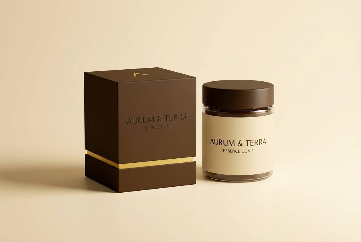
1) Gilded Walnut
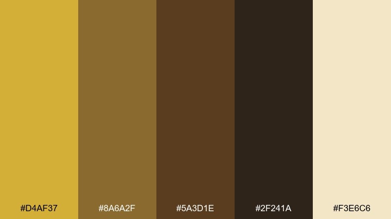
HEX: #D4AF37 #8A6A2F #5A3D1E #2F241A #F3E6C6
Mood: luxe and grounded
Best for: premium branding and product packaging
Luxe and grounded, it evokes gold leaf catching light over dark walnut wood. Use it for premium labels, jewelry branding, and elevated food packaging where warmth matters. Pair with creamy paper textures and minimal black typography for contrast. Tip: keep the gold (#D4AF37) as a highlight color, not a full background, to avoid overpowering the browns.
Image example of gilded walnut generated using media.io
Media.io is an online AI studio for creating and editing video, image, and audio in your browser.

2) Antique Brass Loft
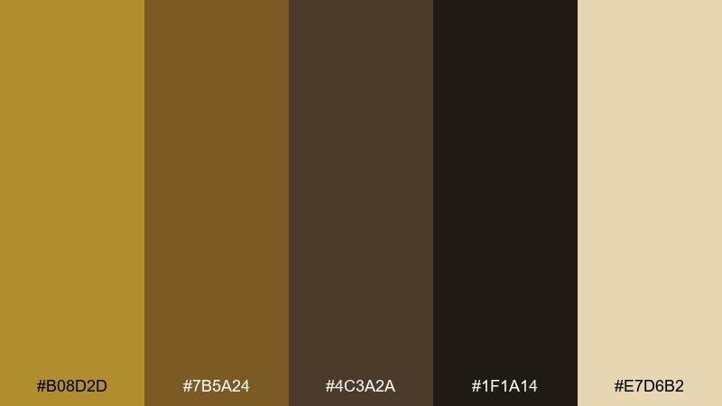
HEX: #B08D2D #7B5A24 #4C3A2A #1F1A14 #E7D6B2
Mood: industrial warmth
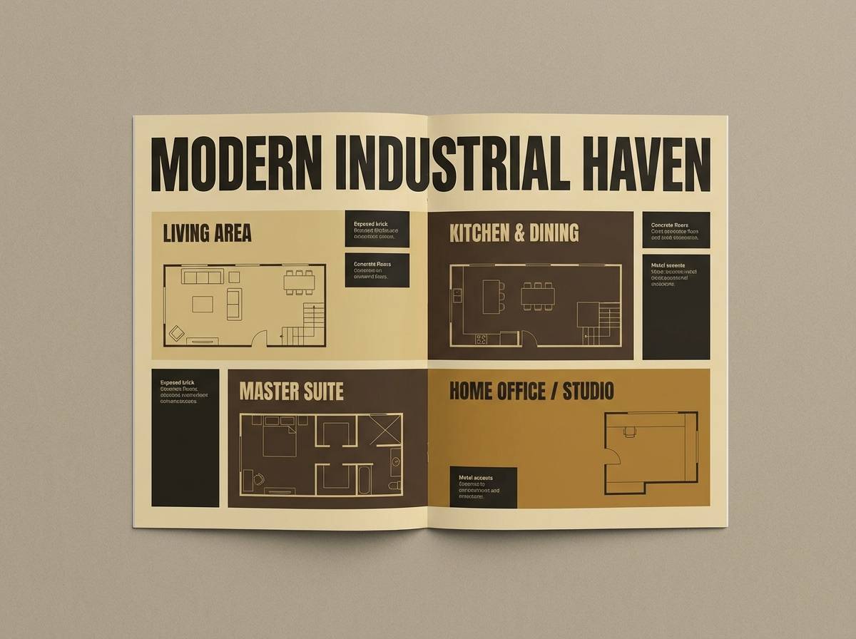
Best for: interior mood boards and real estate marketing
Industrial warmth comes through like antique brass fixtures against aged wood and shadowy corners. It works beautifully for loft-style interior mood boards, real estate brochures, and renovation branding. Pair with matte charcoal accents and lots of negative space for a modern edge. Tip: use the cream (#E7D6B2) as your main canvas and let the deeper browns carry headers and frames.
Image example of antique brass loft generated using media.io
3) Honeyed Toffee
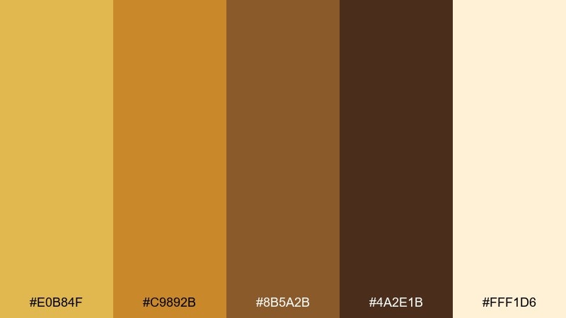
HEX: #E0B84F #C9892B #8B5A2B #4A2E1B #FFF1D6
Mood: sweet and welcoming
Best for: bakery packaging and dessert menus
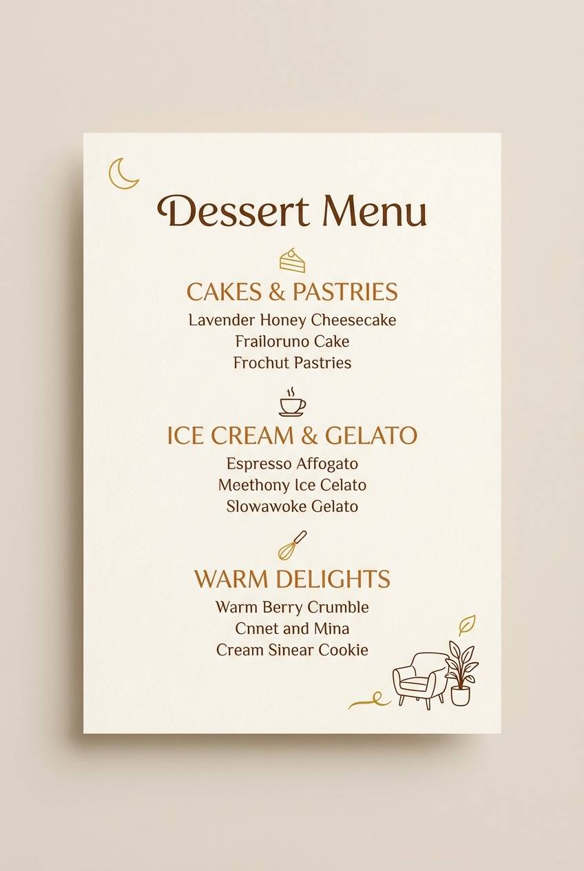
Sweet and welcoming, it feels like honey drizzle over toffee and fresh-baked crusts. These gold brown color combinations shine on dessert menus, bakery boxes, and cafe loyalty cards. Pair with off-white backgrounds and simple line icons to keep it appetizing, not heavy. Tip: reserve the darkest brown (#4A2E1B) for small text so readability stays crisp.
Image example of honeyed toffee generated using media.io
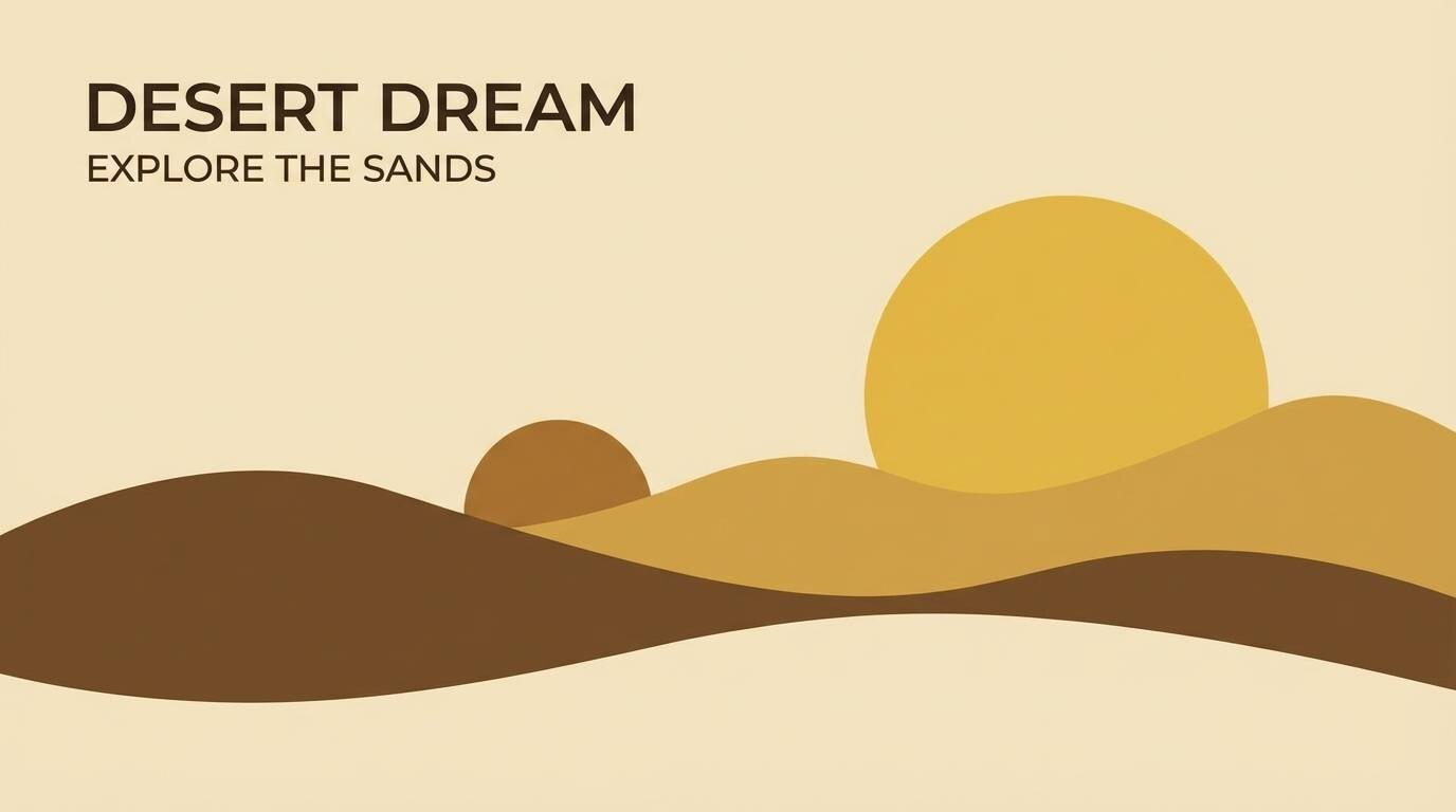
4) Desert Gold Dusk
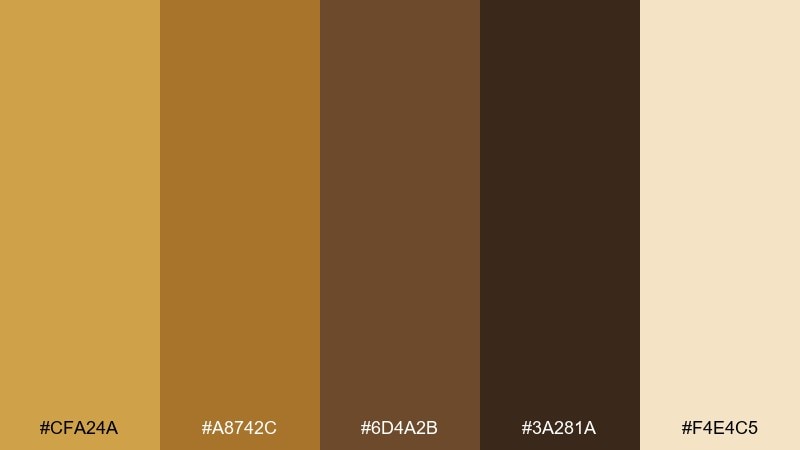
HEX: #CFA24A #A8742C #6D4A2B #3A281A #F4E4C5
Mood: sunset calm
Best for: travel posters and outdoor brand graphics
Sunset calm settles in like warm desert sand fading into dusk. It suits travel posters, outdoor brand graphics, and adventure newsletters that need a natural, inviting tone. Pair with simple geometric shapes and plenty of cream space for a modern look. Tip: use #CFA24A for badges and callouts to mimic golden-hour highlights.
Image example of desert gold dusk generated using media.io
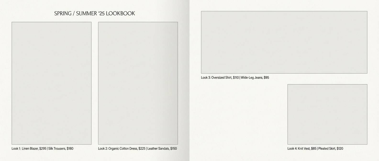
5) Autumn Saddle
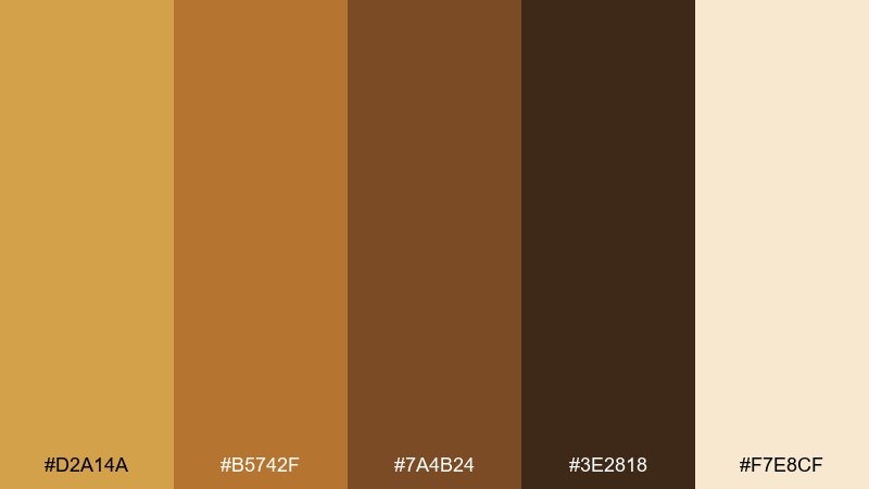
HEX: #D2A14A #B5742F #7A4B24 #3E2818 #F7E8CF
Mood: heritage and cozy
Best for: fashion lookbooks and leather goods
Heritage and cozy, it recalls a well-worn saddle, brass buckles, and soft knit layers. Use this gold brown color scheme for fashion lookbooks, leather goods, and craftsmanship-driven storytelling. Pair with serif headlines and tactile paper finishes to amplify the classic feel. Tip: keep #D2A14A as a thin rule or foil detail to avoid making spreads feel too yellow.
Image example of autumn saddle generated using media.io
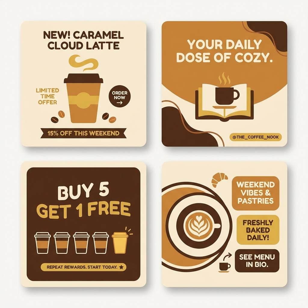
6) Cocoa Caramel Glow
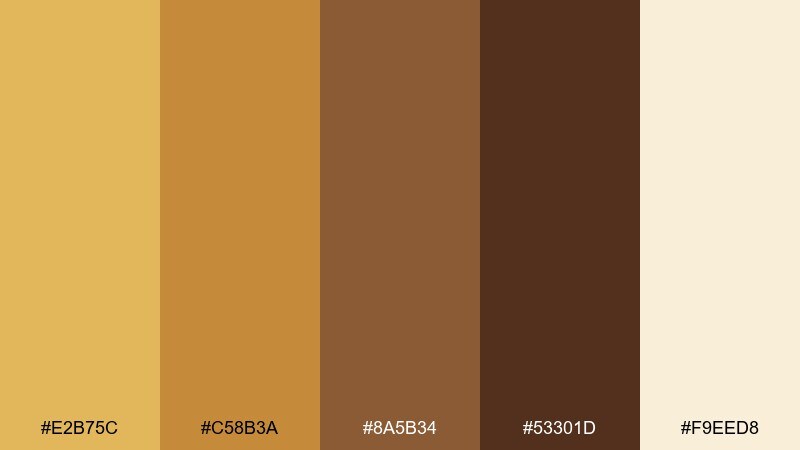
HEX: #E2B75C #C58B3A #8A5B34 #53301D #F9EED8
Mood: comforting and rich
Best for: coffee shop menus and social templates
Comforting and rich, it channels cocoa powder, caramel foam, and warm cafe lighting. It works for coffee shop menus, social templates, and seasonal promos where you want instant warmth. Pair with rounded sans fonts and soft shadow shapes for a friendly tone. Tip: build your hierarchy with #F9EED8 backgrounds, #53301D text, and #E2B75C as the accent.
Image example of cocoa caramel glow generated using media.io
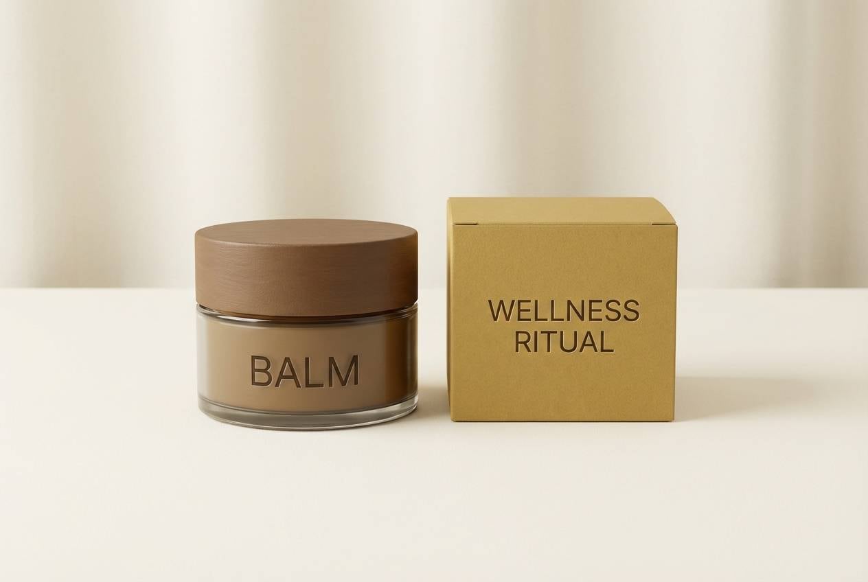
7) Bronze Sandstone
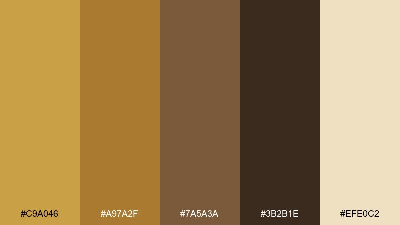
HEX: #C9A046 #A97A2F #7A5A3A #3B2B1E #EFE0C2
Mood: natural and refined
Best for: spa branding and wellness packaging
Natural and refined, it brings to mind sun-warmed sandstone and brushed bronze rituals. For spa branding, it is a gold brown color palette that feels premium without shouting. Pair with soft creams, subtle line art, and airy spacing to keep it calm. Tip: use #C9A046 sparingly for seals or icons, and lean on #EFE0C2 for most surfaces.
Image example of bronze sandstone generated using media.io
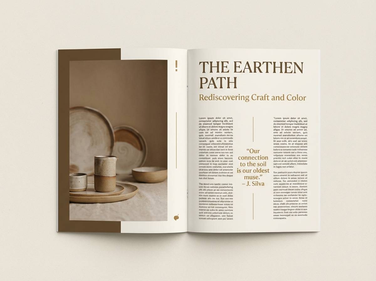
8) Sepia Linen
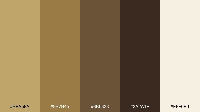
HEX: #BFA56A #9B7B45 #6B5338 #3A2A1F #F6F0E3
Mood: quiet and timeless
Best for: editorial layouts and blog themes
Quiet and timeless, it feels like sepia ink on linen paper with a soft vintage haze. It suits editorial layouts, blog themes, and long-form reading experiences where comfort matters. Pair with generous margins and subtle dividers to keep the design breathable. Tip: set body text in #3A2A1F and reserve #BFA56A for section markers.
Image example of sepia linen generated using media.io
9) Maple Mocha
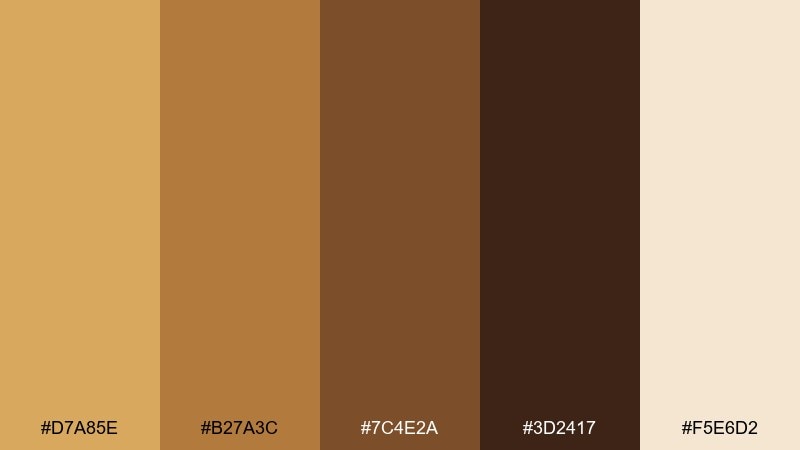
HEX: #D7A85E #B27A3C #7C4E2A #3D2417 #F5E6D2
Mood: cozy and modern
Best for: landing pages and app onboarding
Cozy and modern, it suggests maple syrup, mocha crema, and warm morning light. These gold brown color combinations can make onboarding screens feel friendly while still polished. Pair with clean iconography and a creamy background to keep the UI light. Tip: use #D7A85E for primary buttons and keep #3D2417 for headings to maintain contrast.
Image example of maple mocha generated using media.io
10) Rustic Goldleaf
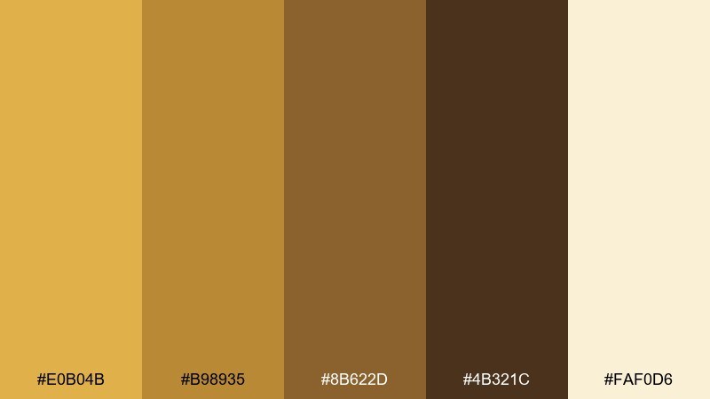
HEX: #E0B04B #B98935 #8B622D #4B321C #FAF0D6
Mood: handcrafted and warm
Best for: artisan product labels and Etsy shops
Handcrafted and warm, it feels like stamped goldleaf on recycled kraft paper. It is ideal for artisan labels, Etsy shop banners, and handmade soap branding. Pair with imperfect textures, but keep typography clean so it reads well at small sizes. Tip: use #FAF0D6 for negative space and #4B321C for type to prevent muddy contrast.
Image example of rustic goldleaf generated using media.io
11) Burnished Cedar

HEX: #C79A41 #A06B2B #6E4424 #2E1C12 #EFE2C9
Mood: outdoorsy and rugged
Best for: craft beer branding and labels
Outdoorsy and rugged, it brings cedar bark, campfire embers, and a metallic glint of a flask. It fits craft beer branding, label systems, and merch that leans bold and earthy. Pair with heavy sans fonts and simple badge shapes for instant shelf impact. Tip: keep #2E1C12 as your anchor color and let #C79A41 pop in small brand marks.
Image example of burnished cedar generated using media.io
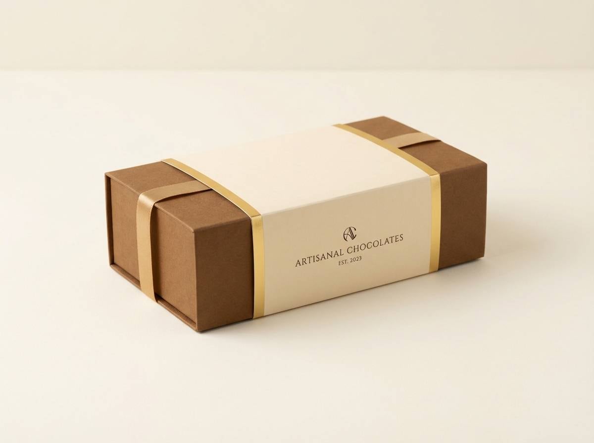
12) Golden Truffle
HEX: #D6AE52 #B7863B #7A552E #3C2416 #F7E9D1
Mood: decadent and smooth
Best for: chocolate packaging and gift sets
Decadent and smooth, it feels like truffles dusted with cocoa and wrapped in satin ribbon. A gold brown color combination like this works especially well for chocolate boxes and seasonal gift sets. Pair with minimal patterns and a single metallic accent to keep it elegant. Tip: use #F7E9D1 for the box base and #D6AE52 for foil details or seals.
Image example of golden truffle generated using media.io
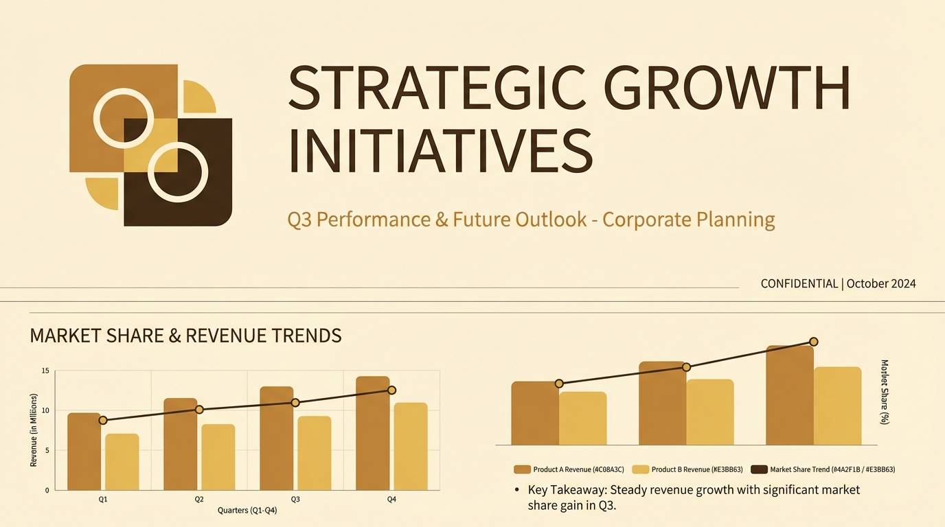
13) Sunlit Umber
HEX: #E3BB63 #C08A3C #8A5F33 #4A2F1B #FFF3DC
Mood: bright and earthy
Best for: presentation templates and decks
Bright and earthy, it looks like sunlit clay and warm umber shadows across a studio floor. It is great for presentation decks that need warmth without looking overly playful. Pair with clean charts, thin dividers, and an off-white base for clarity. Tip: keep graphs mostly in #C08A3C and #8A5F33, then highlight key numbers with #E3BB63.
Image example of sunlit umber generated using media.io
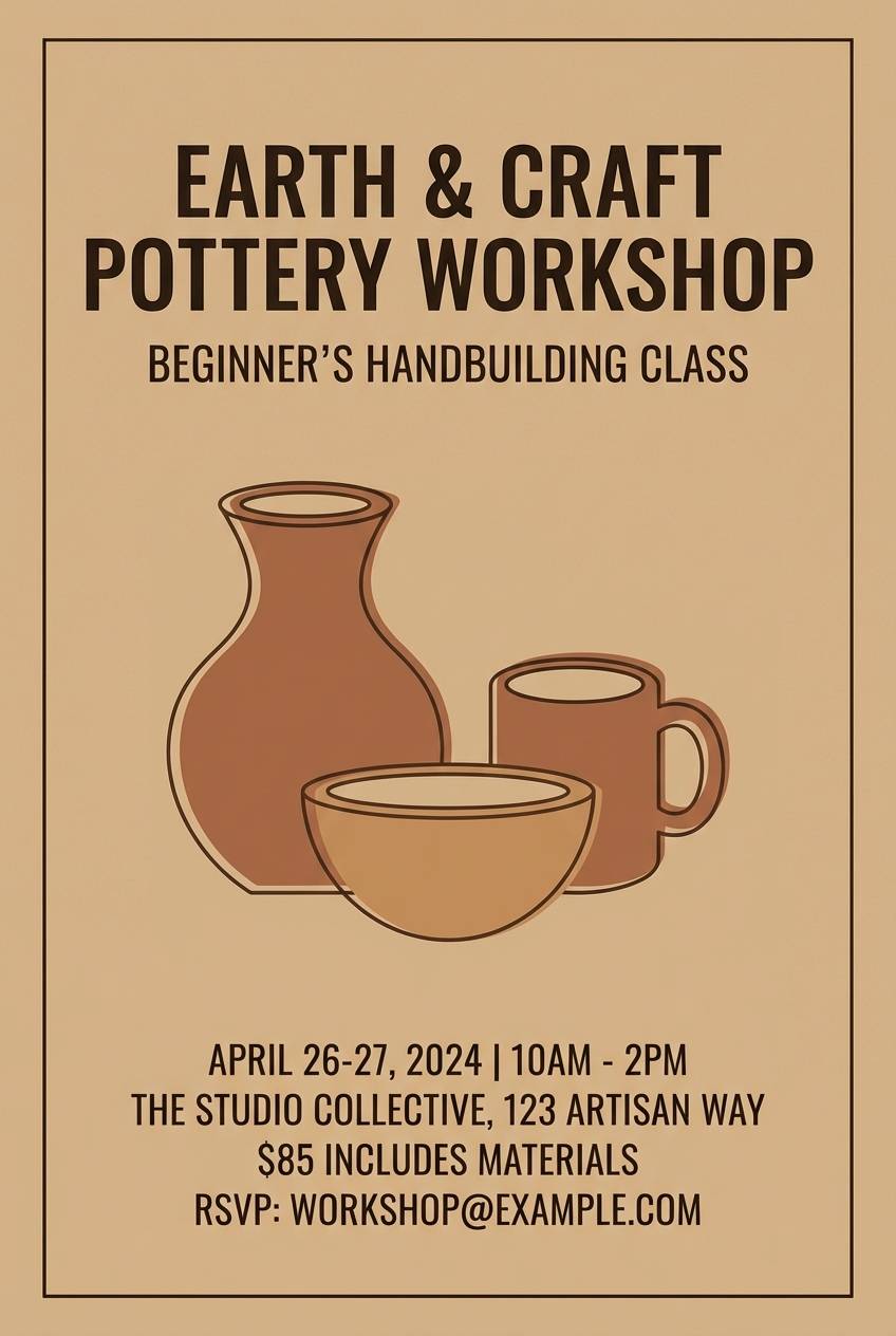
14) Amber Clay Studio
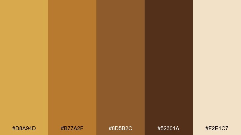
HEX: #D8A94D #B77A2F #8D5B2C #52301A #F2E1C7
Mood: creative and tactile
Best for: ceramics brands and workshop flyers
Creative and tactile, it evokes amber glaze, clay dust, and kiln heat. It fits ceramics branding, workshop flyers, and maker events where texture is part of the story. Pair with hand-drawn icons and simple blocks of color for an approachable look. Tip: place #F2E1C7 behind text areas and use #52301A for the strongest readability.
Image example of amber clay studio generated using media.io
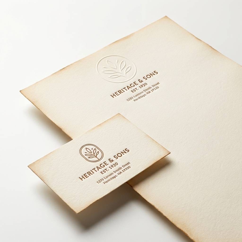
15) Vintage Coin and Leather

HEX: #C8A24A #9D7A33 #6A4C2B #2C1F16 #EDE2C8
Mood: classic and collectible
Best for: museum shops and heritage logos
Classic and collectible, it feels like a tarnished coin resting on worn leather. Use it for museum shop branding, heritage logos, and certificate-style layouts. Pair with a restrained serif and subtle border ornaments to keep it authentic. Tip: make #2C1F16 your text color and let #C8A24A appear only in emblems or stamps.
Image example of vintage coin and leather generated using media.io
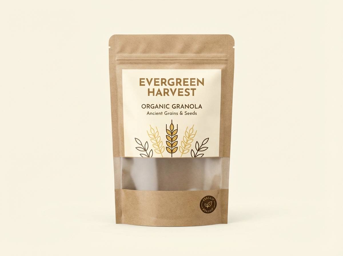
16) Wheatfield Bronze
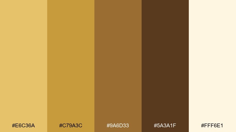
HEX: #E6C36A #C79A3C #9A6D33 #5A3A1F #FFF6E1
Mood: sunny and wholesome
Best for: organic food branding and labels
Sunny and wholesome, it suggests wheatfields, toasted grain, and bronze harvest light. It works well for organic food branding, pantry staples, and farm-to-table labels. Pair with simple illustrations and lots of cream to keep it fresh and modern. Tip: use #E6C36A to highlight key claims like organic or locally sourced, then ground the layout with #5A3A1F.
Image example of wheatfield bronze generated using media.io
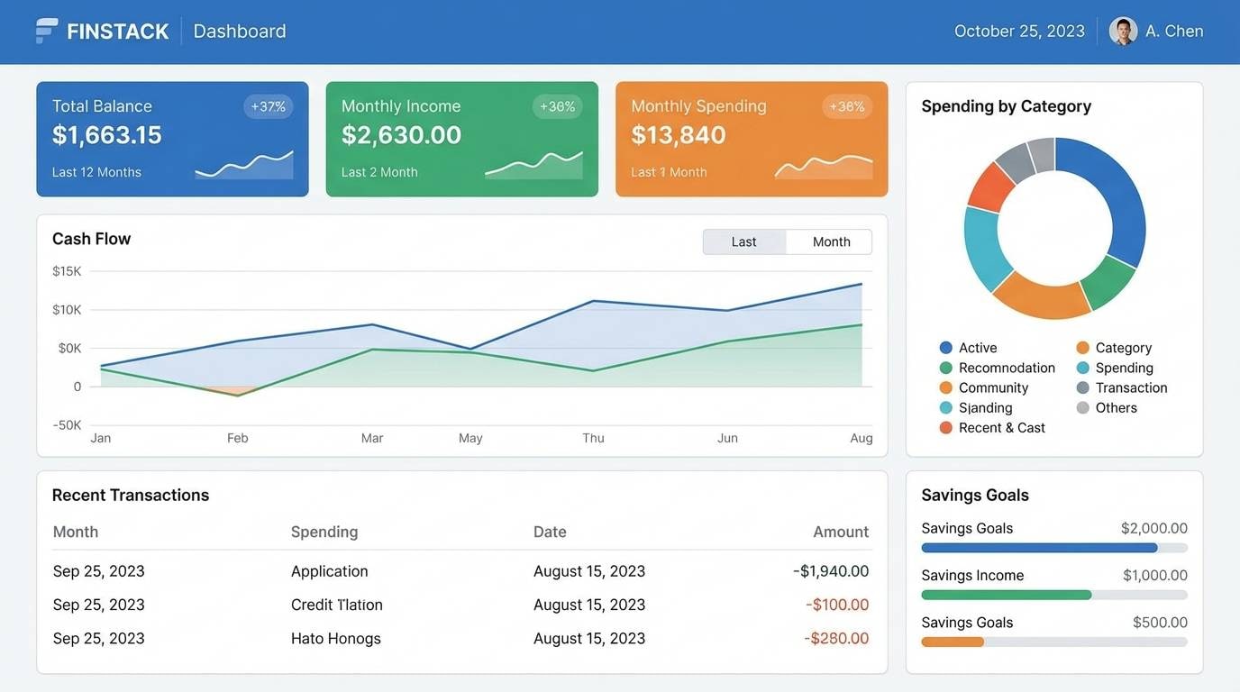
17) Brown Sugar Minimal UI
HEX: #D9B15C #B7843B #8A6236 #3B2618 #F6EBDD
Mood: clean and cozy
Best for: dashboard UI and finance apps
Clean and cozy, it reads like brown sugar crystals against creamy surfaces. It is a smart pick when you want dashboards to feel less sterile but still professional. Pair with thin lines, rounded cards, and restrained shadows to keep it modern. Tip: keep #F6EBDD as the primary background and use #3B2618 for text to hit accessibility targets.
Image example of brown sugar minimal ui generated using media.io
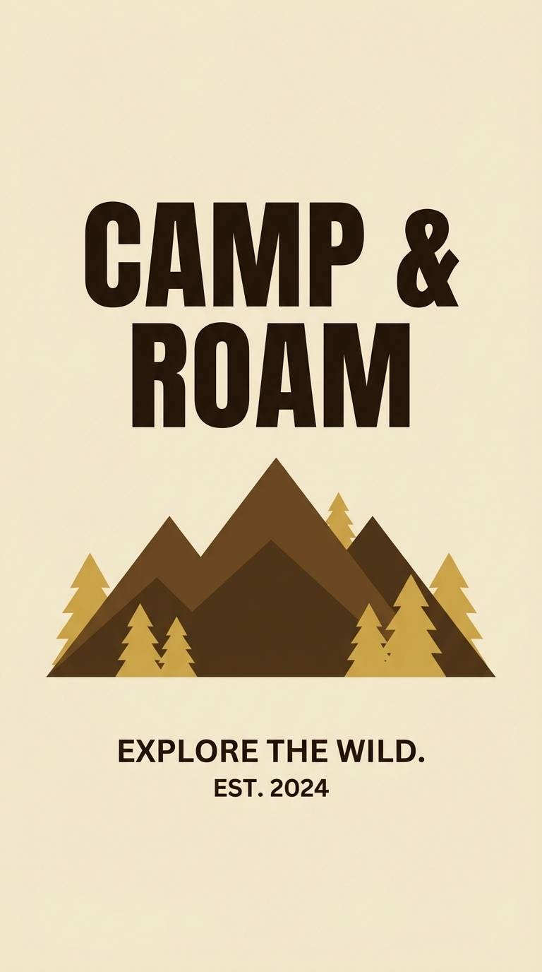
18) Golden Bark Forest
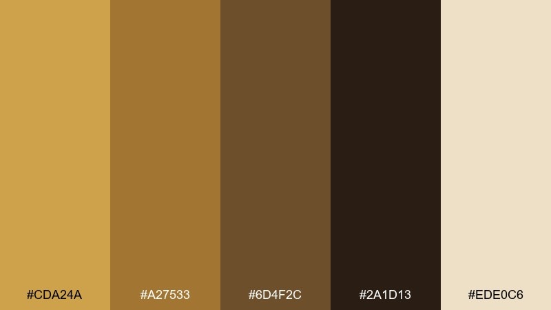
HEX: #CDA24A #A27533 #6D4F2C #2A1D13 #EDE0C6
Mood: earthy and adventurous
Best for: outdoor gear ads and camping posters
Earthy and adventurous, it feels like golden bark, trail dust, and deep forest shade. For rugged branding, this gold brown color palette delivers warmth without losing grit. Pair with bold condensed type and simple icon badges to make it readable from a distance. Tip: use #2A1D13 for text and outlines, then add #CDA24A as the highlight on calls to action.
Image example of golden bark forest generated using media.io
19) Caramel Latte Poster
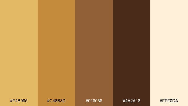
HEX: #E4B965 #C48B3D #916036 #4A2A18 #FFF0DA
Mood: inviting and upbeat
Best for: seasonal event posters and cafe promos
Inviting and upbeat, it captures caramel latte tones with a bright, creamy lift. Use it for seasonal event posters, cafe promos, and limited-time offers that should feel warm and shareable. Pair with big type, simple shapes, and a light background so the browns stay fresh. Tip: keep #E4B965 for price bursts or stickers and let #916036 carry the supporting blocks.
Image example of caramel latte poster generated using media.io

20) Polished Copper Night
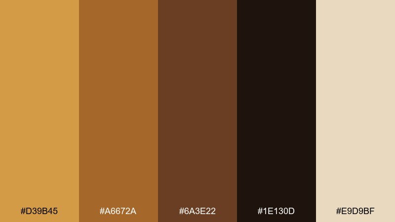
HEX: #D39B45 #A6672A #6A3E22 #1E130D #E9D9BF
Mood: dramatic and elegant
Best for: night event invitations and cocktail menus
Dramatic and elegant, it feels like polished copper glowing in low light. It is great for night event invitations, cocktail menus, and upscale lounges that want warmth with depth. Pair with plenty of dark space and refined typography for a cinematic look. Tip: use #1E130D as the base and bring in #D39B45 for headings and key details.
Image example of polished copper night generated using media.io
What Colors Go Well with Gold Brown?
Gold brown pairs naturally with creamy off-whites, warm beiges, and soft taupes because they keep the palette light and readable while preserving that cozy, premium feel.
For contrast, deep espresso, charcoal, and near-black add structure to layouts and improve legibility—especially for headers, borders, and UI text.
If you want a fresher modern edge, try muted greens (sage/olive), dusty blues, or teal accents. They balance the warmth and make gold highlights feel more intentional.
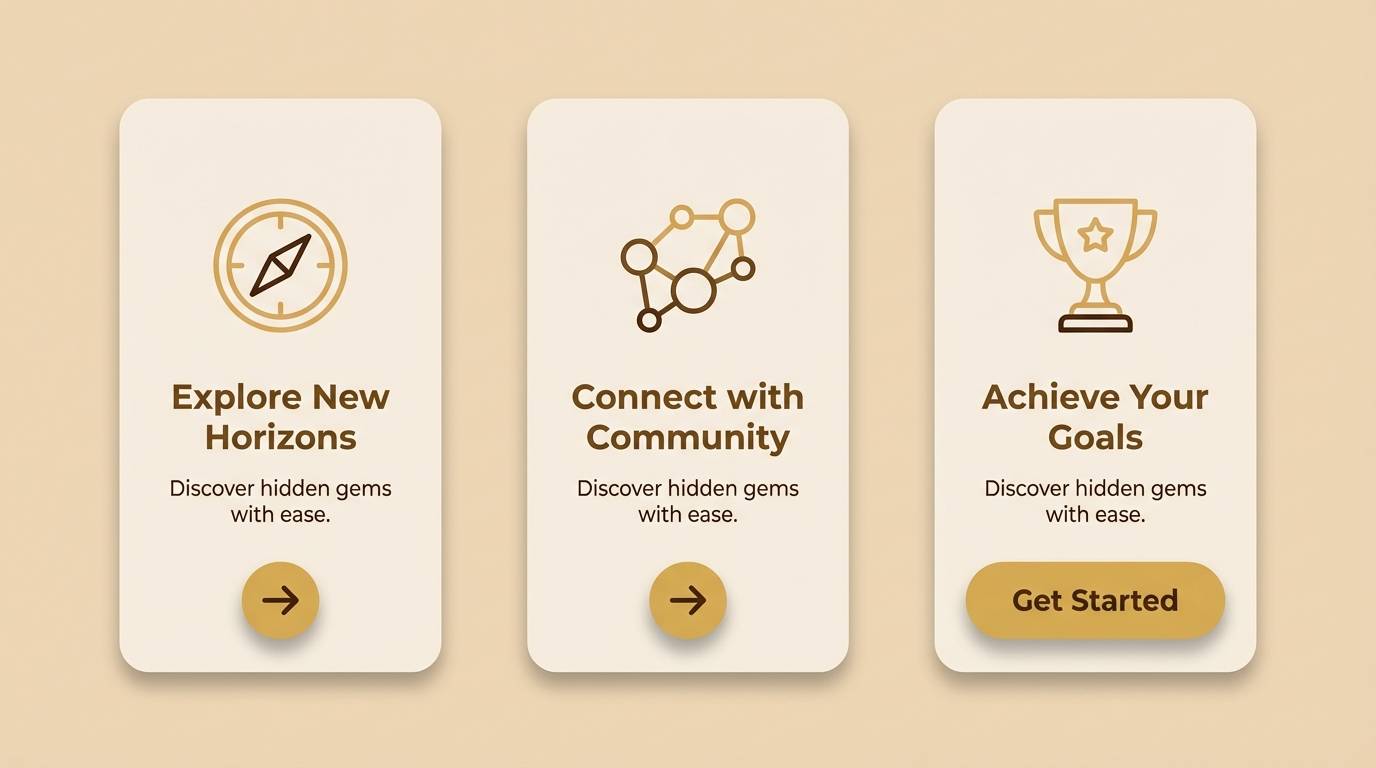
How to Use a Gold Brown Color Palette in Real Designs
Start with a light base (cream or sand) for most surfaces, then pick one dark brown as your “anchor” for type and key structure. This keeps the design from turning muddy.
Use the gold tone as a spotlight: badges, icons, thin rules, pricing bursts, or small UI highlights. When gold becomes a full background, it can feel loud and reduce readability.
To make the palette feel contemporary, pair it with clean typography, simple geometry, and plenty of negative space. Texture can help too (paper, linen, wood), but keep it subtle.
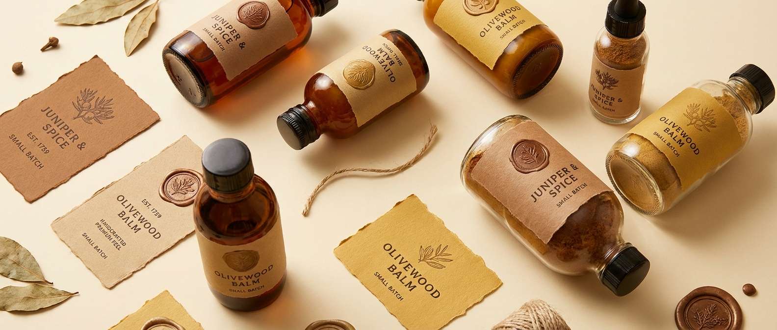
Create Gold Brown Palette Visuals with AI
If you’re building a mood board, packaging mockup, poster, or UI concept, AI can help you generate on-style visuals fast—especially when you feed it the exact HEX tones you want to feature.
Reuse the prompts above, swap in your brand’s HEX codes, and specify the layout type (menu, label, onboarding screen, brochure) for consistent outputs across a whole set.
When you like a result, generate variations by changing lighting (softbox vs. low light), materials (kraft paper vs. satin), or composition (flat lay vs. studio shot) while keeping the same palette.
Gold Brown Color Palette FAQs
-
What does a gold brown color palette communicate in branding?
Gold brown usually signals warmth, craftsmanship, and premium value. The brown tones feel grounded and trustworthy, while the gold accents add a refined “highlight” that reads as upscale. -
How do I keep gold brown designs from looking too dark?
Use a cream/off-white as the main background and reserve deep browns for text and small structural elements. Treat gold as an accent rather than a large fill to avoid heavy, muddy pages. -
What’s the best text color on gold brown backgrounds?
On lighter golds and creams, use a very dark brown (espresso) or near-black for contrast. On dark browns, use cream/off-white text and keep line weights slightly thicker for readability. -
What accent colors pair well with gold and brown?
Muted teal, sage/olive green, dusty blue, and charcoal work well. These cooler accents balance the warmth and help gold details stand out without clashing. -
Is gold brown a good palette for UI design?
Yes—especially for finance, dashboards, and lifestyle apps—when you keep backgrounds light and use dark browns for text to meet accessibility contrast. Gold works best for buttons, active states, and key metrics highlights. -
How can I make gold brown look modern instead of vintage?
Use more negative space, cleaner sans-serif typography, and flatter color blocks. Keep textures minimal and use gold as a small, precise highlight rather than an overall “metallic” look. -
Can I generate consistent gold brown mockups with AI?
Yes. Include your exact HEX codes in the prompt, specify the design type (packaging, menu, UI screens), and keep composition and lighting consistent across generations for a cohesive set.


