

A white blue gray color palette is a go-to for clean interfaces, calm branding, and modern spaces. White keeps layouts breathable, blues add clarity and trust, and grays provide structure without visual noise.
Below are 20 curated white blue gray color combinations with HEX codes, plus practical use cases and AI prompts you can reuse to generate matching visuals.
In this article
Why White Blue Gray Palettes Work So Well
White blue gray tones are naturally readable: white provides contrast space, gray supports typography and dividers, and blue draws attention without the intensity of warmer hues. That balance makes the scheme feel “designed” even with minimal elements.
Blue also carries strong trust and clarity cues, which is why it’s common in UI, healthcare, finance, and productivity tools. When paired with gray neutrals, the overall impression stays professional rather than playful.
Most importantly, these palettes scale. You can keep things ultra-minimal for clean minimalist colors, or deepen the blues and charcoals to create premium, high-contrast hero sections and headers.
20+ White Blue Gray Color Palette Ideas (with HEX Codes)
1) Arctic Minimal
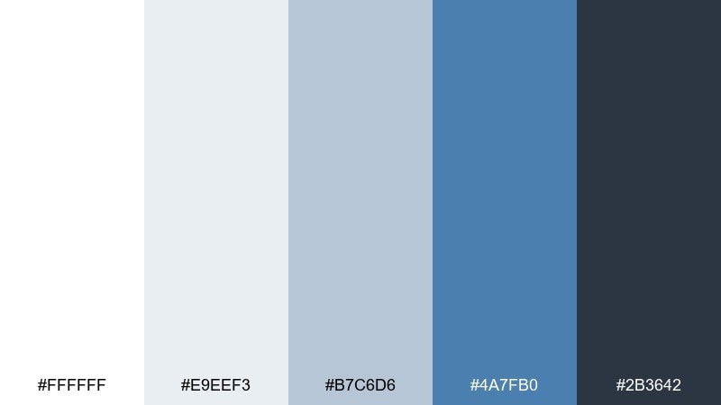
HEX: #ffffff #e9eef3 #b7c6d6 #4a7fb0 #2b3642
Mood: crisp, modern, breathable
Best for: saas dashboard ui
Crisp and modern like fresh snow under a clear sky, this mix keeps interfaces feeling light without turning sterile. Use it for dashboards, analytics screens, and admin panels where contrast and readability matter. Pair it with a single bright accent such as lime or amber for key states and alerts. Usage tip: keep the darkest gray for typography only to avoid heavy blocks.
Image example of arctic minimal generated using media.io

Media.io is an online AI studio for creating and editing video, image, and audio in your browser.

2) Coastal Fog
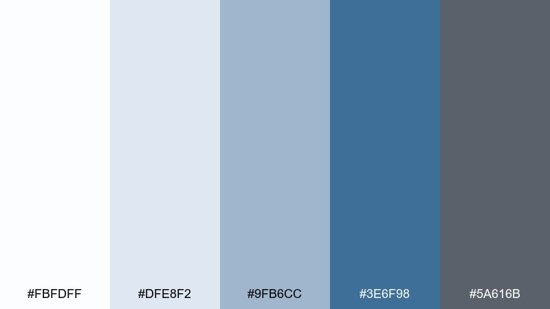
HEX: #fbfdff #dfe8f2 #9fb6cc #3e6f98 #5a616b
Mood: calm, coastal, understated
Best for: website hero and landing page
Calm coastal fog and soft horizon blues give this palette a relaxed, premium feel. It works beautifully for landing pages, portfolio sites, and consulting brands that need quiet confidence. Add warm neutrals like sand or linen in photography to prevent the blues from feeling too chilly. Usage tip: use the mid-blue for CTAs and keep backgrounds in near-white for speed and clarity.
Image example of coastal fog generated using media.io
3) Steel Harbor
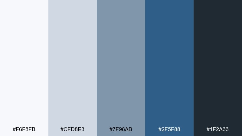
HEX: #f6f8fb #cfd8e3 #7f96ab #2f5f88 #1f2a33
Mood: industrial, steady, confident
Best for: b2b brand identity
Steady and industrial like a working harbor at dawn, these tones feel reliable and no-nonsense. For b2b identity systems, the white space keeps things professional while the deep blue adds authority. Among white blue gray color combinations, this one shines when you introduce a single metallic accent like silver foil or a subtle chrome effect. Usage tip: keep gradients minimal and let flat color blocks do the heavy lifting.
Image example of steel harbor generated using media.io
4) Nordic Office
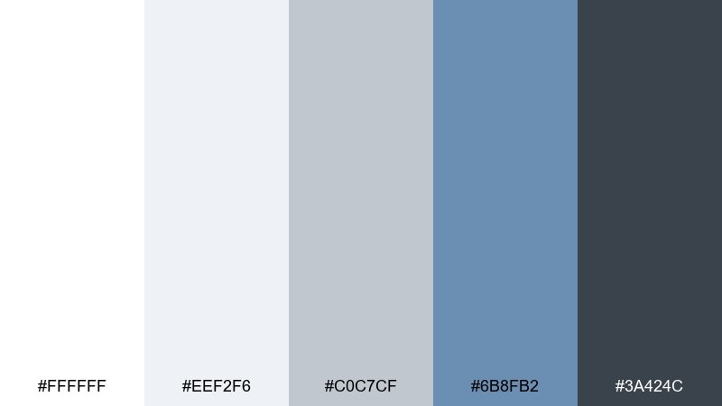
HEX: #ffffff #eef2f6 #c0c7cf #6b8fb2 #3a424c
Mood: clean, practical, organized
Best for: presentation slide deck
Clean and practical like a Nordic office, the neutrals keep content tidy while the blue supports hierarchy. Use it for slide decks, internal documentation, and investor updates where structure matters. Pair with simple iconography and plenty of spacing to keep the tone crisp. Usage tip: reserve the blue for headings and key figures, not long body text.
Image example of nordic office generated using media.io
5) Glacier UI
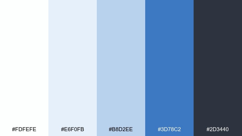
HEX: #fdfefe #e6f0fb #b8d2ee #3d78c2 #2d3440
Mood: fresh, techy, optimistic
Best for: mobile app ui screens
Fresh and techy like light bouncing off glacier ice, this set feels energetic without getting loud. It fits mobile app screens, onboarding flows, and settings pages that need friendly clarity. Pair with rounded components and subtle shadows to keep the interface approachable. Usage tip: set the darkest gray as your main text color and use the bright blue for active states only.
Image example of glacier ui generated using media.io
6) Slate Linen
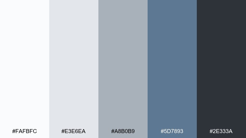
HEX: #fafbfc #e3e6ea #a8b0b9 #5d7893 #2e333a
Mood: soft, balanced, refined
Best for: editorial report layout
Soft and refined like linen against slate, these tones feel quietly premium. Use them in annual reports, long-form PDFs, and editorial layouts where readability is everything. Pair with a serif headline font and monochrome photography for a polished finish. Usage tip: keep backgrounds off-white and use the mid-gray for rules, tables, and captions.
Image example of slate linen generated using media.io
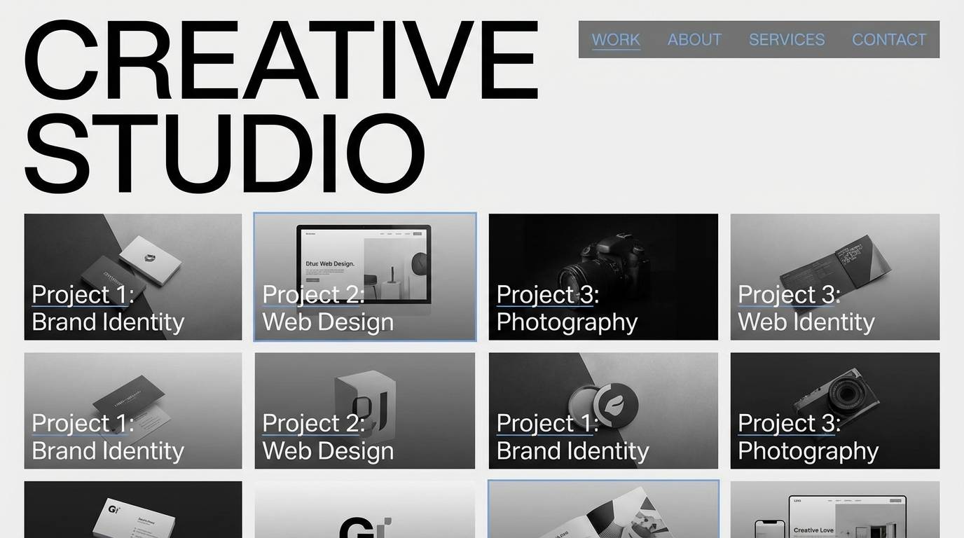
7) Rainy Skyline
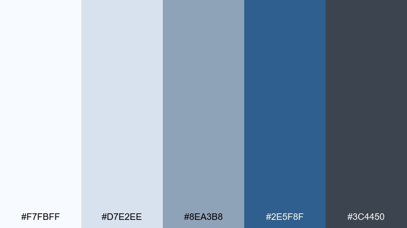
HEX: #f7fbff #d7e2ee #8ea3b8 #2e5f8f #3c4450
Mood: moody, urban, sleek
Best for: creative studio website
Moody and urban like a rainy skyline, this white blue gray color palette feels sleek and contemporary. It suits studio websites, case-study pages, and portfolios that rely on strong imagery. Pair it with bold typography and black-and-white photos for an editorial edge. Usage tip: add a thin blue underline or rule to guide the eye through long pages.
Image example of rainy skyline generated using media.io
8) Ink and Snow
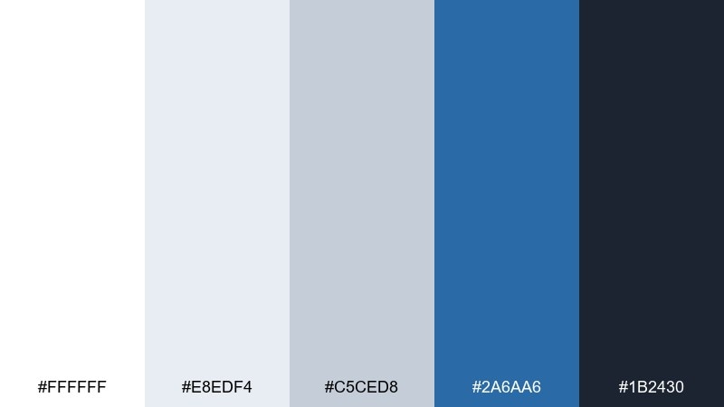
HEX: #ffffff #e8edf4 #c5ced8 #2a6aa6 #1b2430
Mood: high-contrast, sharp, focused
Best for: login and authentication ui
Sharp and focused like ink on fresh snow, this set delivers clear hierarchy and strong legibility. It is ideal for login screens, account settings, and security-heavy experiences where trust matters. Pair with simple form fields, generous padding, and minimal shadows for a clean look. Usage tip: use the darkest shade for labels and errors, and keep blue for primary actions only.
Image example of ink and snow generated using media.io
9) Cloudburst Brand
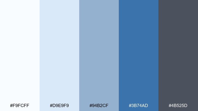
HEX: #f9fcff #d9e9f9 #94b2cf #3b74ad #4b525d
Mood: bright, trustworthy, friendly
Best for: tech service social ad
Bright and trustworthy like a clearing sky after rain, these tones feel friendly and capable. Use them for social ads, banners, and campaign graphics where you need quick readability. Pair with a warm highlight color such as coral or gold to increase click appeal. Usage tip: keep text on near-white and use the deeper blue for buttons and key benefits.
Image example of cloudburst brand generated using media.io

10) Marine Concrete
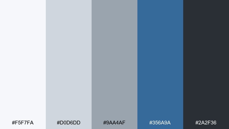
HEX: #f5f7fa #d0d6dd #9aa4af #356a9a #2a2f36
Mood: grounded, pragmatic, modern
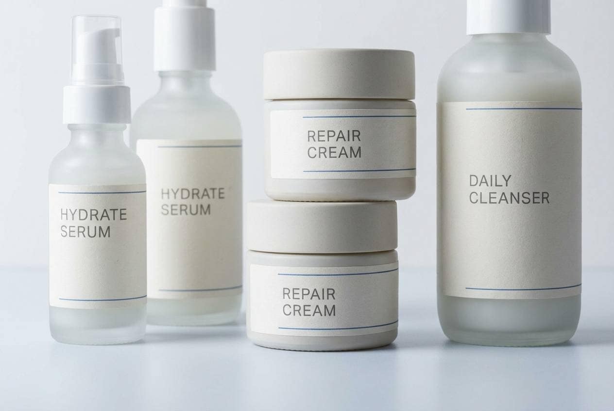
Best for: product packaging for skincare
Grounded and pragmatic like marine concrete, the cool neutrals keep everything feeling modern and clean. It works well on packaging when you want a clinical, premium vibe without looking cold. Pair with matte finishes and minimal line icons, and consider a soft-touch label to add warmth. Usage tip: put the strongest blue on a small seal or badge so it reads as quality, not noise.
Image example of marine concrete generated using media.io
11) Powdered Denim
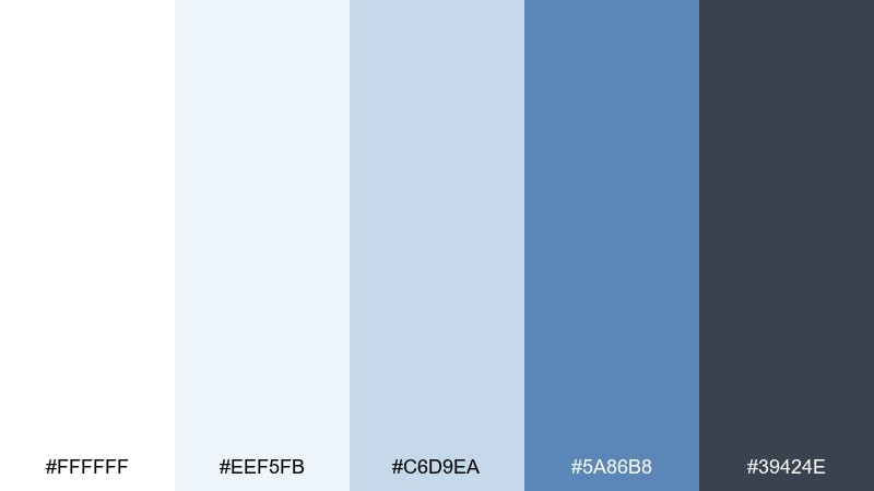
HEX: #ffffff #eef5fb #c6d9ea #5a86b8 #39424e
Mood: soft, casual, approachable
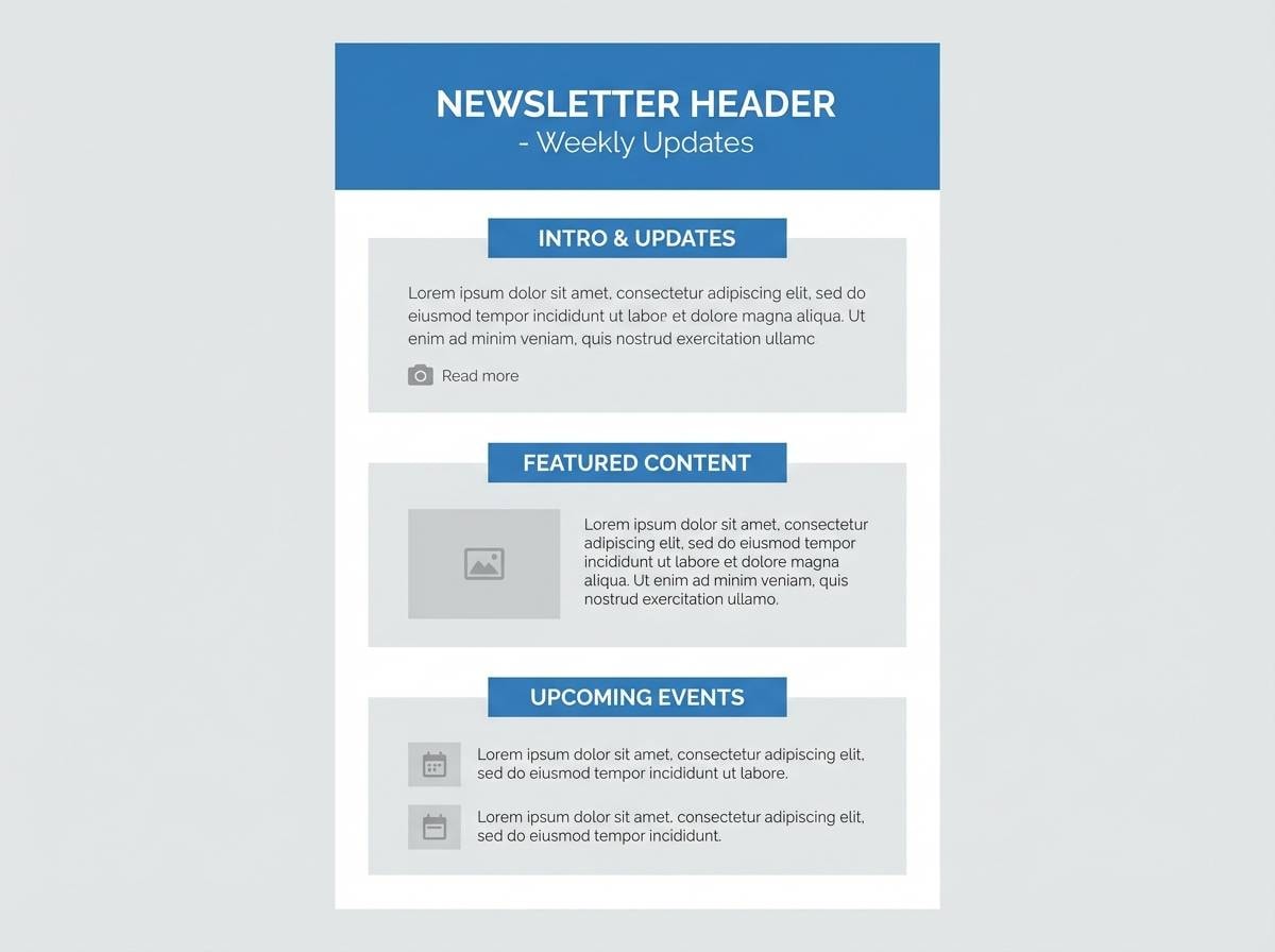
Best for: newsletter template design
Soft and approachable like worn denim and clean cotton, this mix feels friendly and easy to read. Use it for newsletters, product updates, and community announcements where clarity beats drama. Pair with rounded buttons and simple illustrations for a welcoming tone. Usage tip: keep body text in charcoal gray and use the mid-blue for section headers to guide scanning.
Image example of powdered denim generated using media.io
12) Winter Ceramic

HEX: #fbfbfd #e1e8ef #b0bccc #3f6f9e #2f3844
Mood: polished, calm, professional
Best for: healthcare clinic brochure
Polished and calm like winter ceramic, these tones feel hygienic and reassuring. As a white blue gray color scheme, it fits healthcare brochures, clinic signage, and patient portals where trust and clarity matter. Pair with plenty of whitespace and simple pictograms to keep information digestible. Usage tip: choose a warm skin-tone photo style to balance the cool palette.
Image example of winter ceramic generated using media.io
13) Silver Blueprint
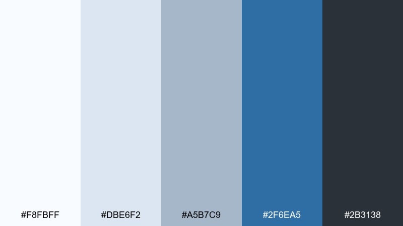
HEX: #f8fbff #dbe6f2 #a5b7c9 #2f6ea5 #2b3138
Mood: technical, precise, confident
Best for: architecture proposal deck
Technical and precise like a silver blueprint, this palette supports structured layouts and detailed diagrams. Use it for proposals, pitch decks, and spec sheets where accuracy should feel elegant. Pair with thin linework and grid-based spacing for a cohesive, engineered look. Usage tip: keep diagrams in two tones only, then reserve the deeper blue for callouts.
Image example of silver blueprint generated using media.io
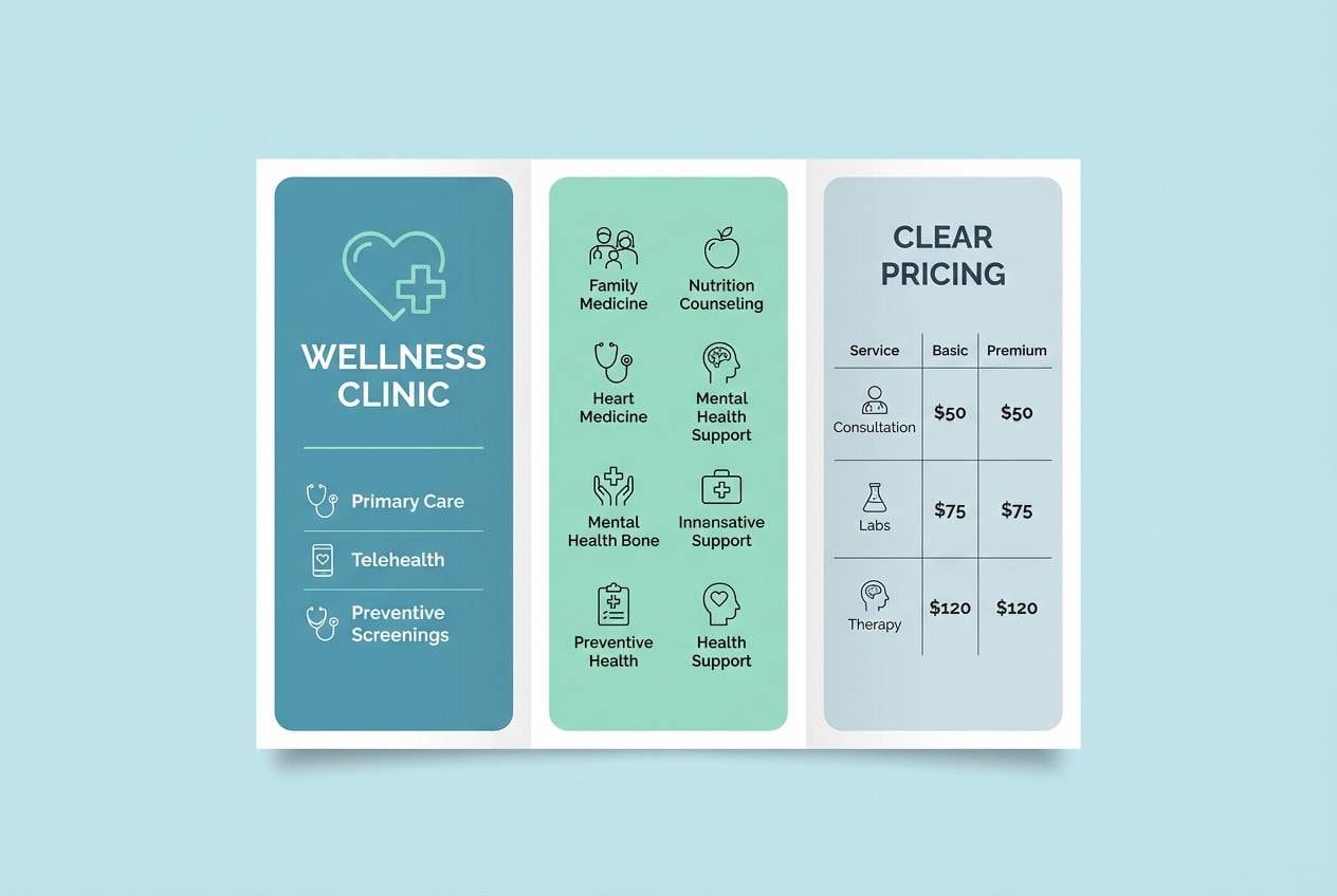
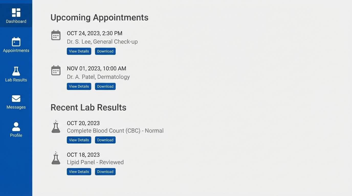
14) Crisp Clinic
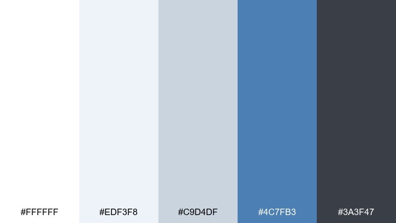
HEX: #ffffff #edf3f8 #c9d4df #4c7fb3 #3a3f47
Mood: sterile, safe, reassuring
Best for: medical portal ui
Sterile yet reassuring like a spotless exam room, these colors keep critical information easy to find. They are great for patient portals, appointment flows, and lab-result pages where calm matters. Pair with clear status colors like green and amber for results, and keep them limited to badges. Usage tip: use subtle gray borders instead of heavy card shadows for a cleaner UI.
Image example of crisp clinic generated using media.io
15) Midnight Ice
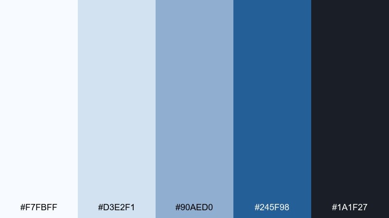
HEX: #f7fbff #d3e2f1 #90aed0 #245f98 #1a1f27
Mood: dramatic, sleek, premium
Best for: cybersecurity landing page
Dramatic and premium like midnight ice, the deep tones add seriousness while the pale blues keep it crisp. Use it for cybersecurity, fintech, or enterprise products where confidence is key. Pair with high-contrast headlines and subtle glow effects used sparingly. Usage tip: avoid large dark sections; use them as anchors for hero areas and footers.
Image example of midnight ice generated using media.io
16) Soft Graphite
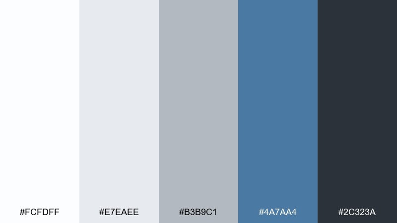
HEX: #fcfdff #e7eaee #b3b9c1 #4a7aa4 #2c323a
Mood: quiet, mature, versatile
Best for: professional resume template
Quiet and mature like soft graphite on bright paper, this palette feels polished without being flashy. It is ideal for resumes, CVs, and personal one-pagers where typography needs to carry the design. Pair with a single thin blue rule and plenty of breathing room for a modern finish. Usage tip: keep headings in blue and body copy in graphite to improve skimmability.
Image example of soft graphite generated using media.io
17) Bluejay Neutral
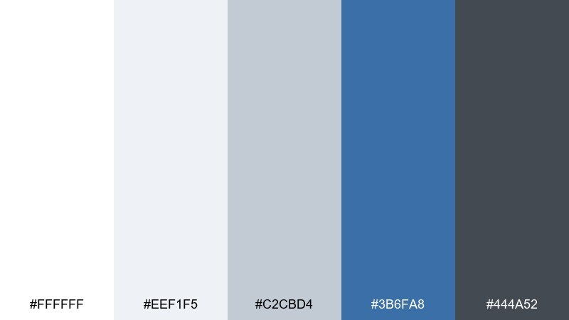
HEX: #ffffff #eef1f5 #c2cbd4 #3b6fa8 #444a52
Mood: fresh, balanced, dependable
Best for: real estate brochure
Fresh and dependable like a bluejay against winter branches, the colors feel clean and trustworthy. White blue gray color combination works especially well for real estate brochures, property listings, and neighborhood guides. Pair with warm wood or beige accents in photography to keep the overall feel inviting. Usage tip: use the blue for section tabs and map highlights so navigation feels effortless.
Image example of bluejay neutral generated using media.io

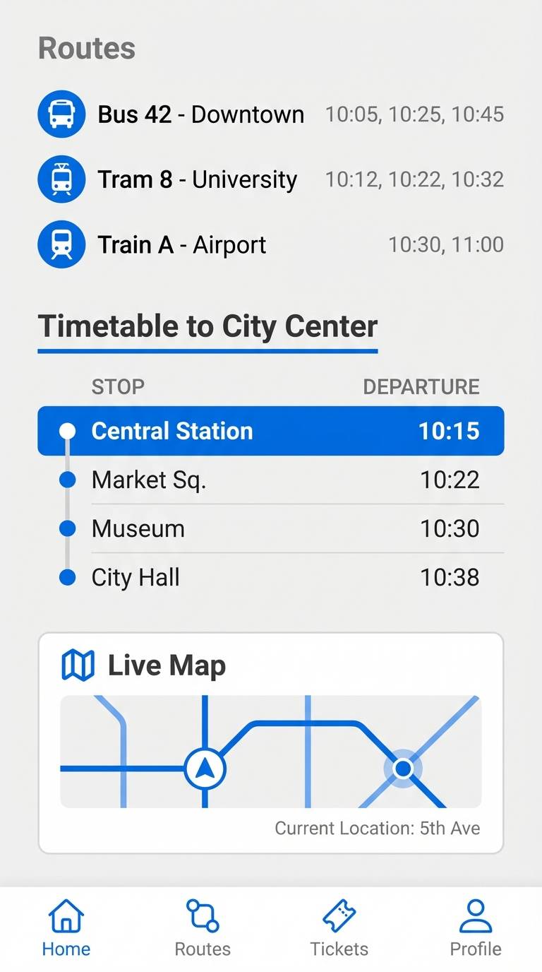
18) Frosted Metro
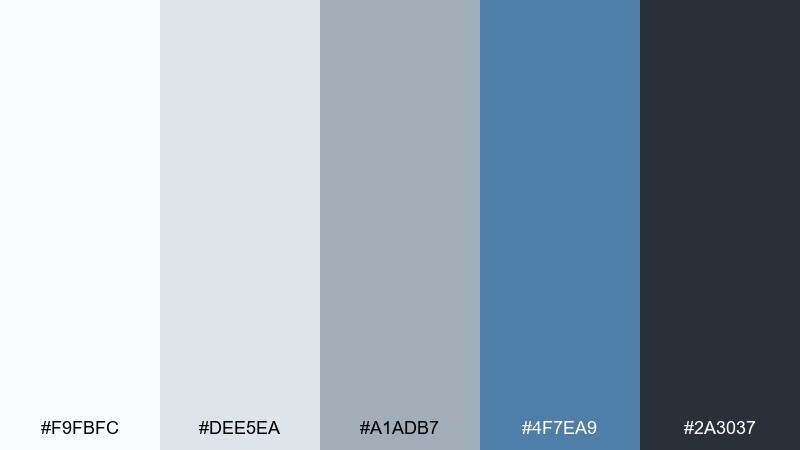
HEX: #f9fbfc #dee5ea #a1adb7 #4f7ea9 #2a3037
Mood: urban, cool, efficient
Best for: transit app ui
Urban and efficient like a frosted metro window, this set is cool, organized, and easy on the eyes. It works well for transit apps, scheduling tools, and any map-forward experience. Pair with a bright accent for route lines so critical information pops. Usage tip: keep the map base light and use dark gray for labels to avoid visual clutter.
Image example of frosted metro generated using media.io
19) Calm Observatory
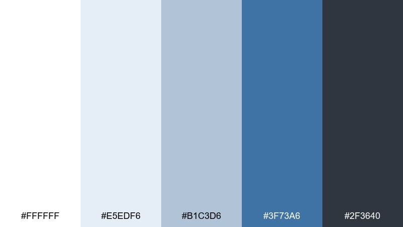
HEX: #ffffff #e5edf6 #b1c3d6 #3f73a6 #2f3640
Mood: thoughtful, quiet, sophisticated
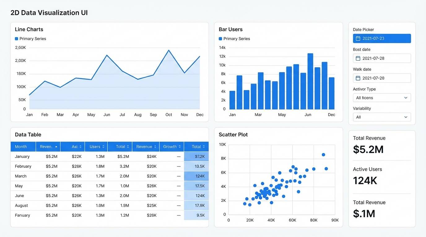
Best for: data visualization dashboard
Thoughtful and quiet like a calm observatory, the tones support focus and careful reading. Use it for data visualization dashboards, research portals, and KPI pages where clarity matters more than flair. Pair with consistent chart colors and limit saturation so trends are easy to compare. Usage tip: use light gray gridlines and reserve the strongest blue for the primary series.
Image example of calm observatory generated using media.io
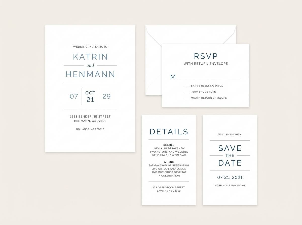
20) Paper Nautical
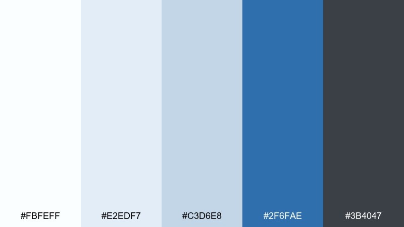
HEX: #fbfeff #e2edf7 #c3d6e8 #2f6fae #3b4047
Mood: bright, nautical, editorial
Best for: wedding invitation suite
Bright and nautical like crisp paper and sea air, this white blue gray color palette feels timeless and elegant. It is a strong choice for invitation suites, formal announcements, and minimalist stationery. Pair with textured paper effects and thin gray rules to keep the design refined. Usage tip: use blue sparingly for names or monograms and let white space do most of the work.
Image example of paper nautical generated using media.io
What Colors Go Well with White Blue Gray?
Warm accents are the easiest way to balance the coolness of blue-gray neutrals. Try coral, peach, amber, or muted gold to create a clear focal point for CTAs, badges, and highlights.
For a quieter look, pair white blue gray tones with soft neutrals like beige, sand, linen, or warm taupe in imagery and backgrounds. This keeps the palette minimal while making it feel more human.
If you want a sharper, more technical style, add black accents or a bright electric cyan in small doses. Keep saturation limited so the base palette remains clean and consistent.
How to Use a White Blue Gray Color Palette in Real Designs
Start by assigning roles: white/off-white for backgrounds, light gray for surfaces and dividers, medium gray for secondary text, blue for interactive states, and dark charcoal for primary typography. This creates instant hierarchy and reduces guesswork.
In UI, reserve the strongest blue for “action” (primary button, active tab, selected state), and keep neutrals dominant so the interface stays calm. For branding, use blue as the signature color and let grays carry layouts, grids, and packaging copy.
In interiors or presentation design, use white as the canvas, gray as the structure (frames, charts, tables), and blue as the rhythm (headings, callouts, accents). The result is modern without feeling cold.
Create White Blue Gray Palette Visuals with AI
If you want on-brand mockups fast, generate consistent visuals using the same palette and a reusable prompt format. This is especially useful for landing pages, dashboard concepts, brochures, and social ad variations.
With Media.io, you can turn your idea into polished images in minutes—then iterate by swapping “best for” contexts (app UI, brand board, brochure) while keeping the same white blue gray color scheme.
White Blue Gray Color Palette FAQs
-
What does a white blue gray color palette communicate?
It typically communicates clarity, trust, and professionalism. White adds space and cleanliness, blue signals reliability, and gray provides a neutral, structured foundation for typography and layouts. -
Is white blue gray a good color scheme for UI design?
Yes. It supports strong readability and scalable hierarchy, making it ideal for dashboards, mobile apps, authentication screens, and data-heavy interfaces where contrast and calm scanning matter. -
How do I keep a white blue gray palette from feeling cold?
Add a small warm accent (coral, peach, amber, muted gold) and use warmer photography (skin tones, wood, linen textures). Keep the accent limited so it boosts focus without breaking the minimalist feel. -
Which color should I use for primary buttons in a white blue gray scheme?
Use the deeper or brighter blue as the primary action color and keep grays for secondary buttons. This makes interactions obvious while preserving the clean neutral base. -
What text color works best on white and light gray backgrounds?
A deep charcoal or near-black gray usually reads better than pure black while staying softer. Save the darkest shade for body text and key labels, and use mid-grays for captions and secondary metadata. -
What accent colors pair best with blue-gray neutrals for branding?
Coral/peach for friendly energy, amber/gold for premium emphasis, and lime for high-visibility UI states. Choose one accent and apply it consistently to CTAs, highlights, and key markers. -
Can I use white blue gray palettes for print (brochures, reports, invitations)?
Absolutely. Off-whites reduce glare, grays improve long-form readability, and blue provides elegant structure for headings and callouts. Use paper texture or subtle rules to add refinement in print.


