

Peach coral is a warm, flattering hue that sits between soft peach and lively coral. It feels optimistic without being neon, which makes it a reliable choice for both digital UI and print.
Below are 20+ peach coral color palette ideas with HEX codes, plus practical pairing tips and AI prompts you can use to generate matching visuals for branding, weddings, and content design.
In this article
- Why Peach Coral Palettes Work So Well
-
- sunlit sorbet
- coastal coral breeze
- desert bloom
- vintage apricot rose
- modern minimal peach
- coral and sage garden
- peachy neon pop
- romantic candlelight
- coral clay studio
- tropical reef
- soft nursery peach
- editorial blush coral
- peach coral and navy classic
- sunset picnic
- coral latte neutrals
- spring botanica wash
- coral tech ui
- blush coral gradient
- warm concrete coral
- floral aisle romance
- scandi peach warmth
- evening terracotta glam
- What Colors Go Well with Peach Coral?
- How to Use a Peach Coral Color Palette in Real Designs
- Create Peach Coral Palette Visuals with AI
Why Peach Coral Palettes Work So Well
Peach coral is naturally inviting: it carries the friendliness of warm reds, but it’s softened by peach undertones, so it rarely feels aggressive. That balance makes it ideal for brands that want energy with approachability.
It also plays well with both warm and cool partners. You can push it airy with off-whites and blush tints, or sharpen it with navy, charcoal, and deep greens for strong contrast.
From a usability standpoint, peach coral works nicely as an accent color for CTAs, tags, and highlights. It draws attention quickly, especially when you give it breathing room on light neutrals or anchor it against dark bases.
20+ Peach Coral Color Palette Ideas (with HEX Codes)
1) Sunlit Sorbet
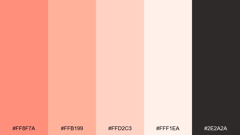
HEX: #ff8f7a #ffb199 #ffd2c3 #fff1ea #2e2a2a
Mood: fresh, bright, friendly
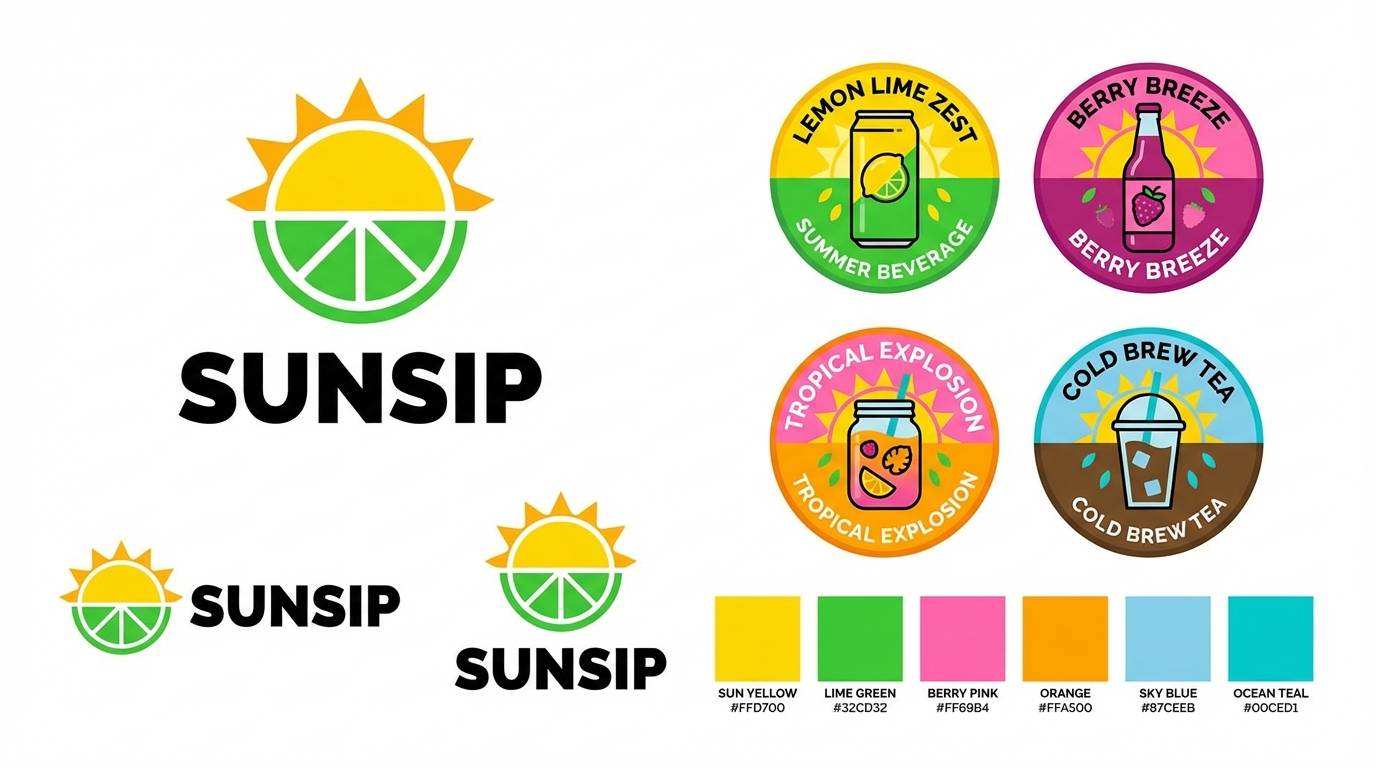
Best for: summer beverage brand identity
Fresh and bright like a citrus sorbet melting in the sun, these tones feel upbeat and approachable. Use the coral as your hero color, then let the pale blushes create breathing room for typography. Pair with charcoal for crisp contrast and legible labels. Tip: reserve the lightest tint for backgrounds so the coral pops without oversaturating the design.
Image example of sunlit sorbet generated using media.io
Media.io is an online AI studio for creating and editing video, image, and audio in your browser.

2) Coastal Coral Breeze
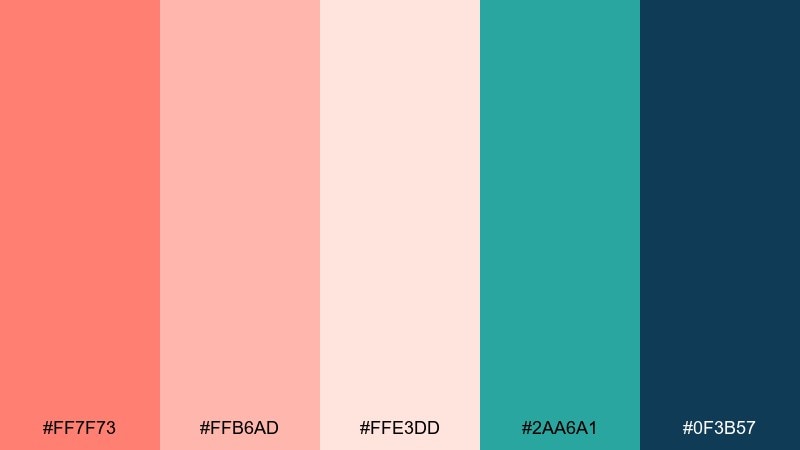
HEX: #ff7f73 #ffb6ad #ffe3dd #2aa6a1 #0f3b57
Mood: airy, coastal, relaxed
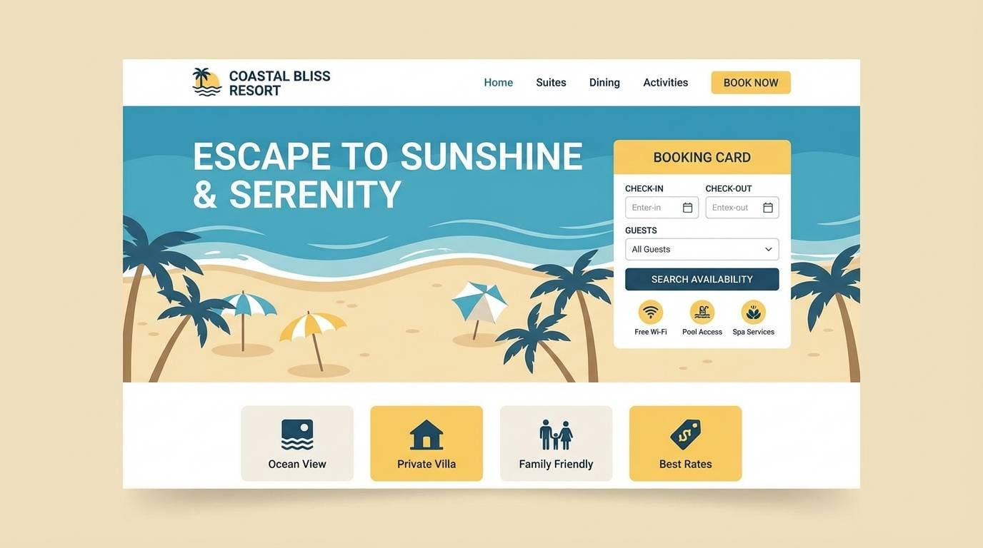
Best for: beach resort website landing page
Airy and relaxed, it evokes coral sands, sea glass, and deep ocean shadows. This peach coral color palette works beautifully when teal is used for buttons and the navy anchors headers and footers. Keep coral for highlights like promos and availability tags so it reads as warm and welcoming. Tip: use the off-white blush as the main canvas to prevent the page from feeling too loud.
Image example of coastal coral breeze generated using media.io
3) Desert Bloom
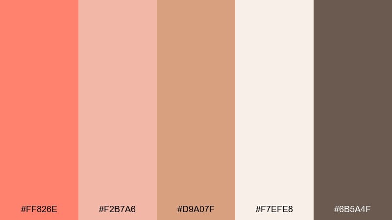
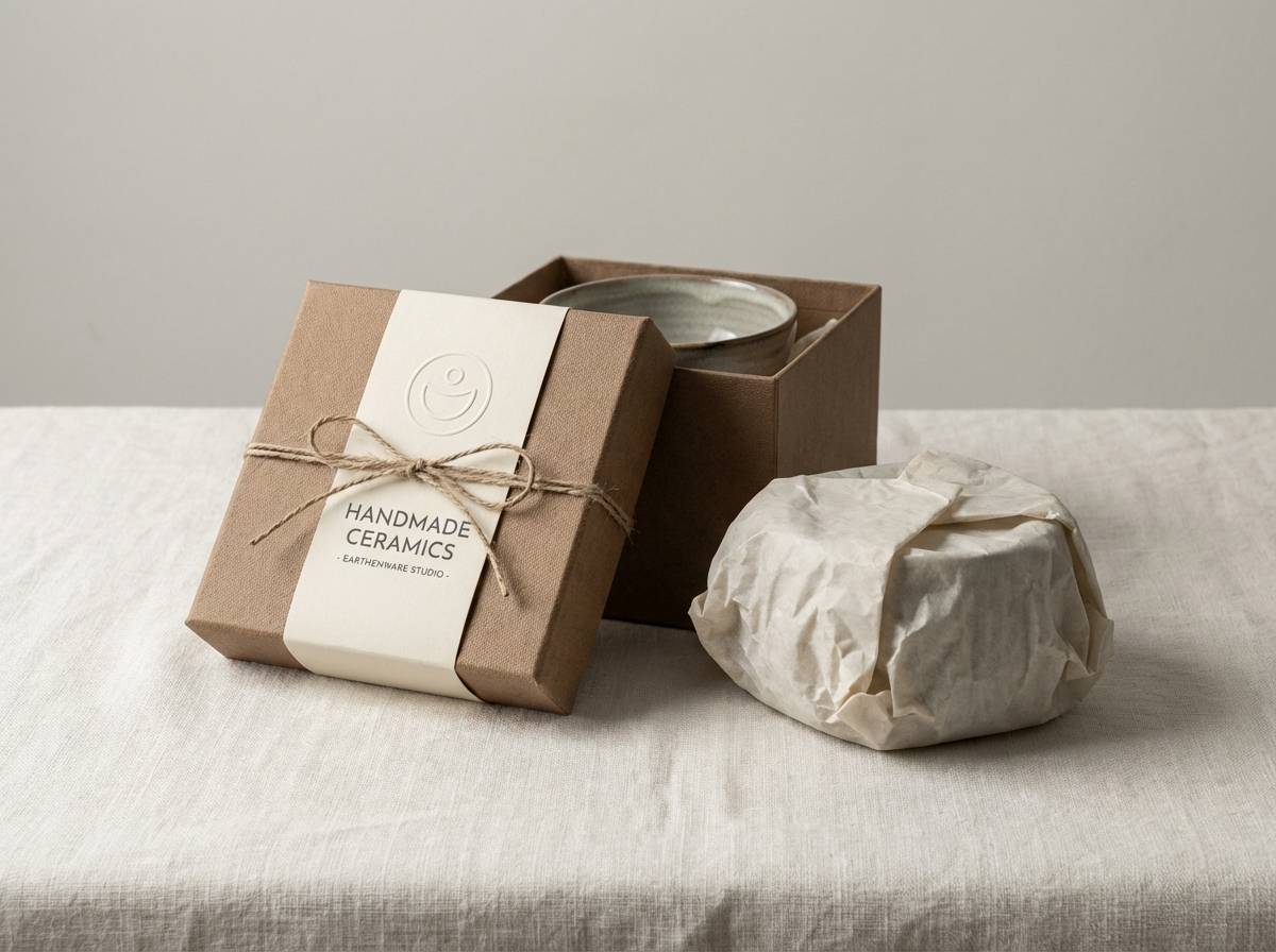
HEX: #ff826e #f2b7a6 #d9a07f #f7efe8 #6b5a4f
Mood: earthy, warm, organic
Best for: handmade ceramics packaging
Earthy warmth and sunbaked softness bring to mind sandstone, clay, and a tiny bloom after rain. Use the tan and mocha as grounding neutrals for packaging copy, with coral as the seal, sticker, or logo mark. Creamy off-white keeps everything artisanal and premium rather than rustic. Tip: choose uncoated paper and print coral slightly desaturated for a natural look.
Image example of desert bloom generated using media.io
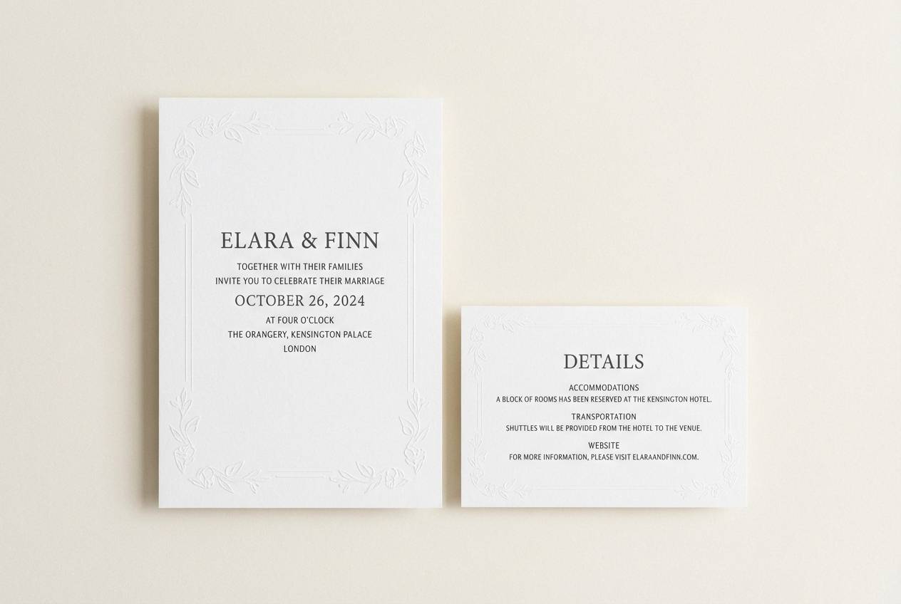
4) Vintage Apricot Rose

HEX: #ff7e79 #f6a6a6 #dba0b3 #f5e7ea #3e2b33
Mood: romantic, vintage, soft
Best for: boutique wedding invitation set
Romantic and softly nostalgic, it feels like pressed roses and faded postcards. Let the dusty mauve carry typography while coral lifts key details like names and dates. Pale blush makes a graceful background for foil or letterpress accents. Tip: keep margins generous and avoid heavy borders so the palette stays airy.
Image example of vintage apricot rose generated using media.io
5) Modern Minimal Peach
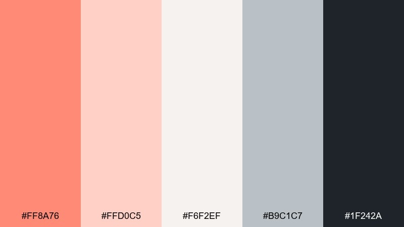
HEX: #ff8a76 #ffd0c5 #f6f2ef #b9c1c7 #1f242a
Mood: clean, modern, understated
Best for: startup pitch deck template
Clean and understated, it suggests warm light on concrete with a touch of blush. Use the near-black for titles and charts, then deploy coral sparingly for key numbers and callouts. The cool gray keeps slides feeling professional and tech-forward. Tip: limit coral to one accent element per slide to maintain a minimal rhythm.
Image example of modern minimal peach generated using media.io
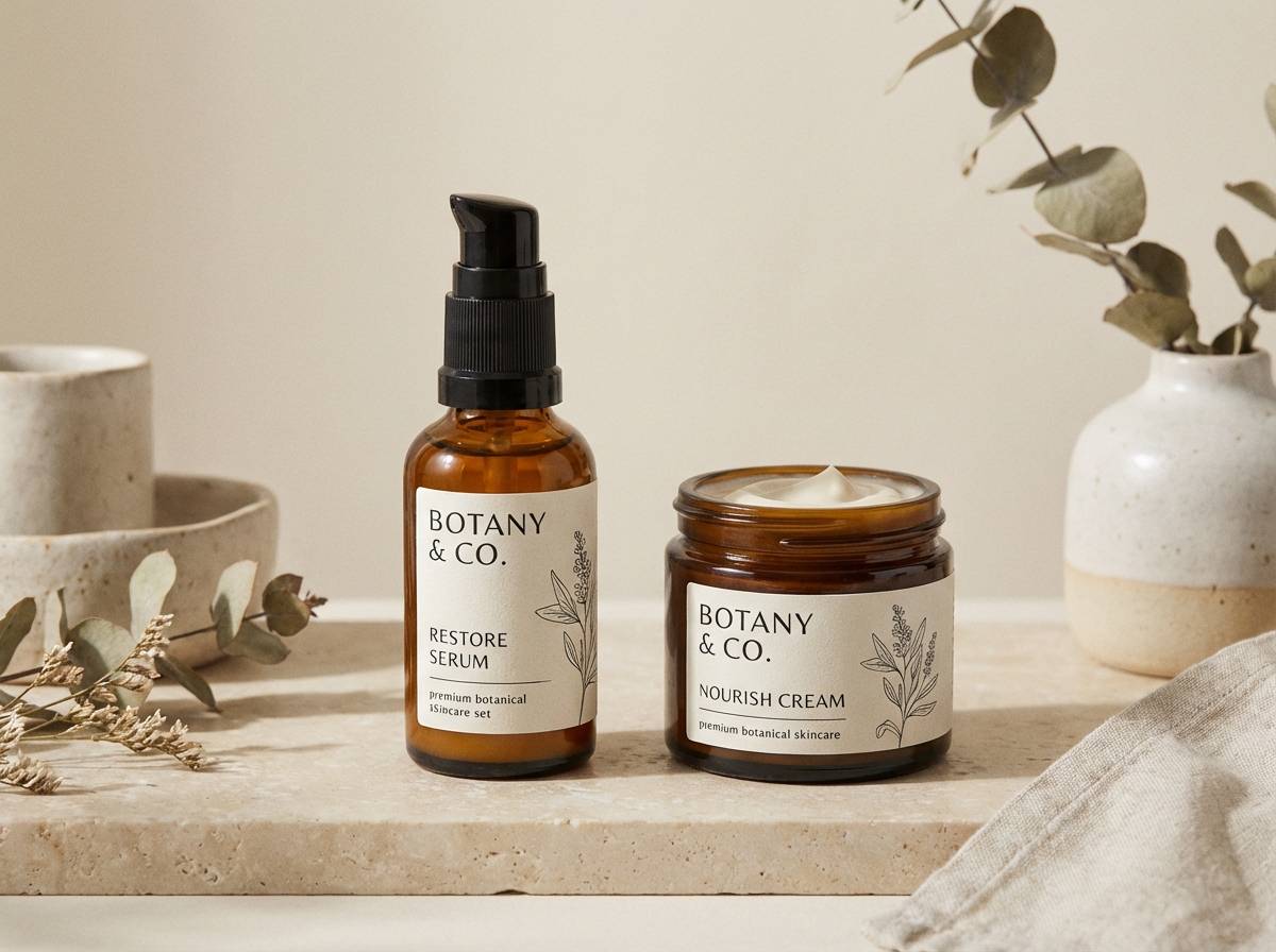
6) Coral and Sage Garden
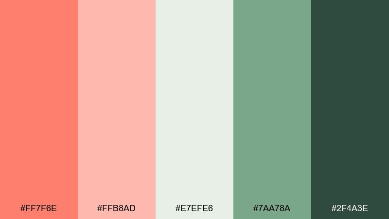
HEX: #ff7f6e #ffb8ad #e7efe6 #7aa78a #2f4a3e
Mood: natural, fresh, balanced
Best for: botanical skincare product line
Natural and balanced, it recalls a greenhouse at golden hour with soft petals against leafy greens. These peach coral color combinations shine on skincare labels when sage becomes the base and coral highlights benefits or scent notes. Keep the darkest green for ingredient text and regulatory copy. Tip: use matte finishes and a single botanical illustration so the colors feel calm, not busy.
Image example of coral and sage garden generated using media.io
7) Peachy Neon Pop
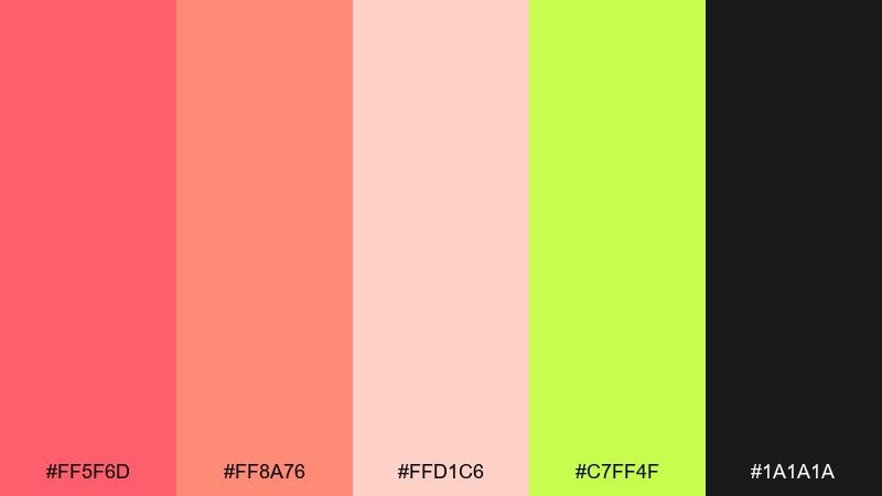
HEX: #ff5f6d #ff8a76 #ffd1c6 #c7ff4f #1a1a1a
Mood: bold, playful, energetic
Best for: music festival poster
Bold and playful, it feels like stage lights and summer nights with a punchy afterglow. Use the neon lime as a surprise accent for dates, QR codes, or lineup highlights, while coral carries the main headline. Keep backgrounds dark to let the warm tones vibrate without looking washed out. Tip: pair with a condensed sans serif and strong hierarchy for instant readability.
Image example of peachy neon pop generated using media.io

8) Romantic Candlelight
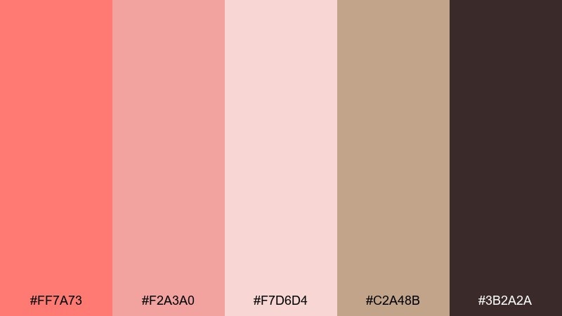
HEX: #ff7a73 #f2a3a0 #f7d6d4 #c2a48b #3b2a2a
Mood: intimate, warm, elegant
Best for: fine dining menu design
Intimate and warm, it brings to mind candlelit tables, linen napkins, and a soft rose glow. Use the deep cocoa for menu text and section headings, then add coral to highlight chef specials or tasting notes. The beige accent keeps the layout elegant and grounded. Tip: choose a refined serif and increase line spacing for a luxe, readable menu.
Image example of romantic candlelight generated using media.io
9) Coral Clay Studio
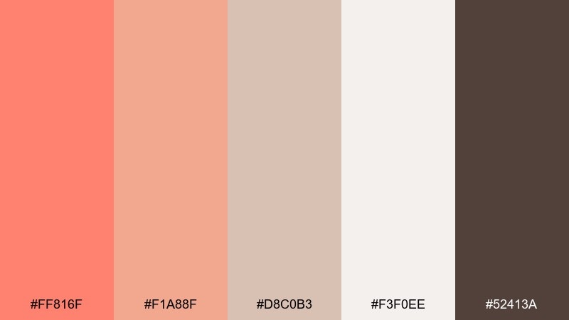
HEX: #ff816f #f1a88f #d8c0b3 #f3f0ee #52413a
Mood: artisan, cozy, grounded
Best for: craft workshop social media posts
Cozy and grounded, it feels like a pottery studio with warm clay dust and soft aprons. Use coral for hooks and call-to-action buttons, while the clay neutrals keep captions easy to read. This mix pairs nicely with hand-drawn icons and simple texture overlays. Tip: keep text blocks on the off-white so the feed stays consistent and calm.
Image example of coral clay studio generated using media.io

10) Tropical Reef
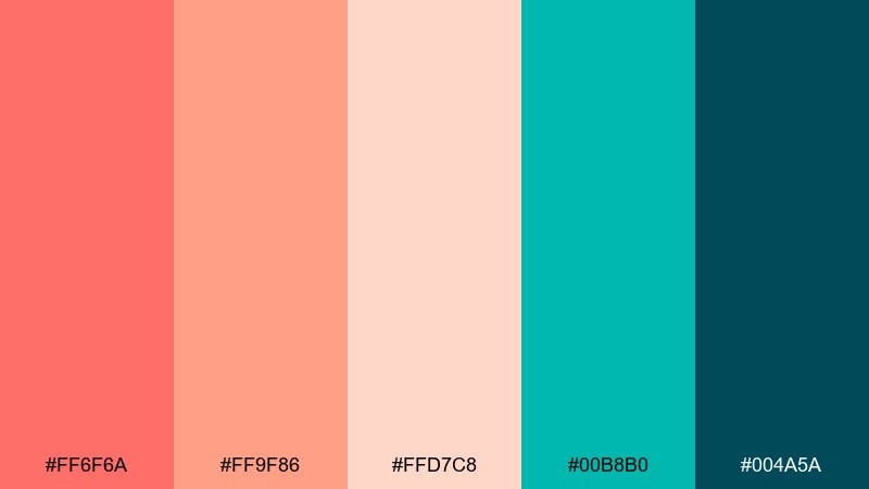
HEX: #ff6f6a #ff9f86 #ffd7c8 #00b8b0 #004a5a
Mood: vibrant, tropical, adventurous
Best for: travel agency promotional banner
Vibrant and adventurous, it channels coral reefs, turquoise water, and deep sea shadows. Let teal take the supporting role for buttons and icons, while coral drives the headline and price tags. The pale peach tint works as a soft sky-like backdrop that still feels warm. Tip: add plenty of white space around type so the colors stay punchy, not cluttered.
Image example of tropical reef generated using media.io

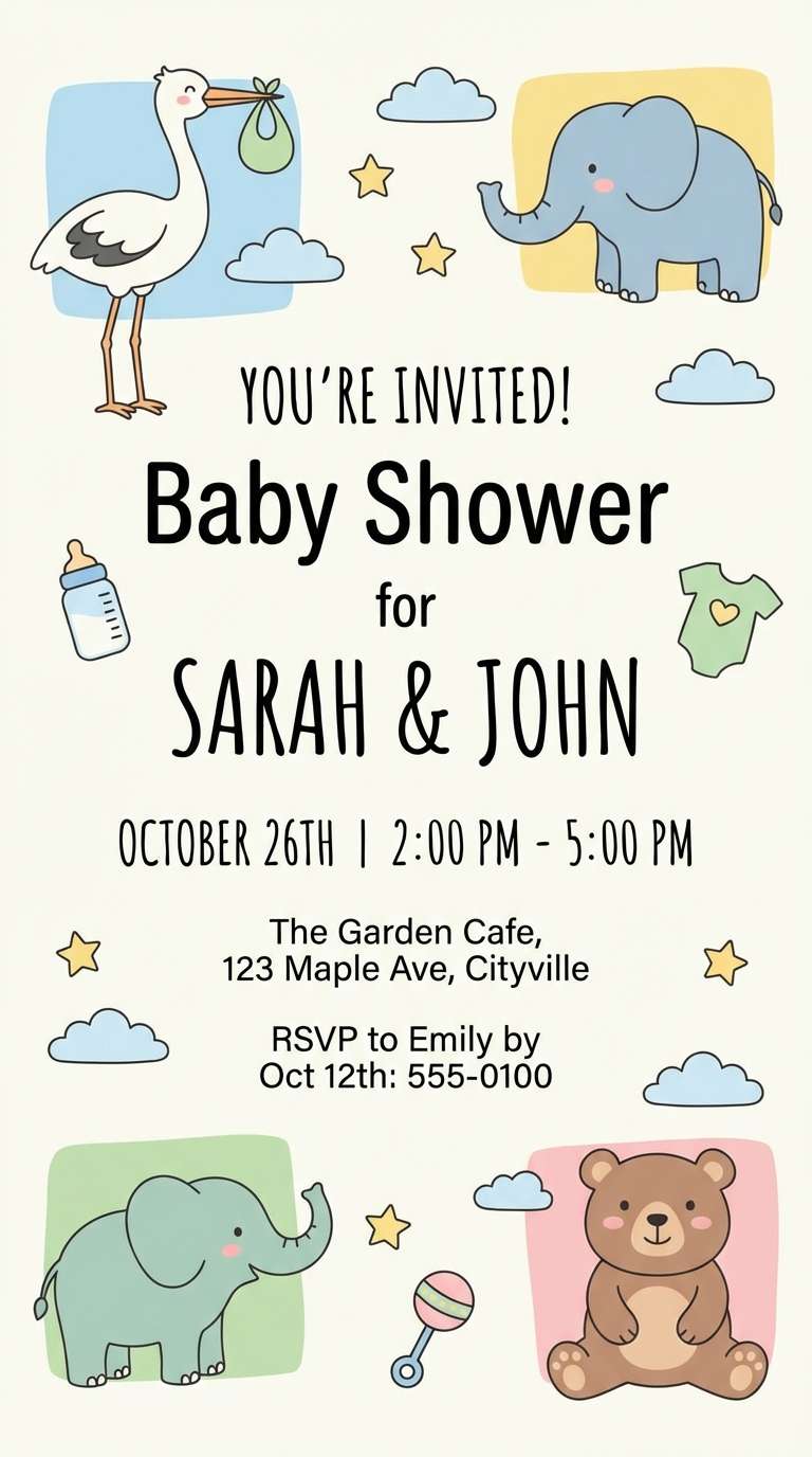
11) Soft Nursery Peach
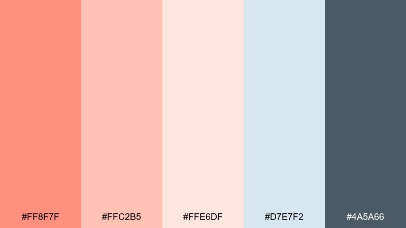
HEX: #ff8f7f #ffc2b5 #ffe6df #d7e7f2 #4a5a66
Mood: gentle, sweet, comforting
Best for: baby shower e-invite
Gentle and comforting, it suggests cotton blankets, pastel mobiles, and a quiet morning glow. Coral brings warmth without feeling loud, while the powder blue keeps the look calm and balanced. Use the slate tone for readable text and RSVP details. Tip: keep illustrations simple and rounded to match the soft mood.
Image example of soft nursery peach generated using media.io
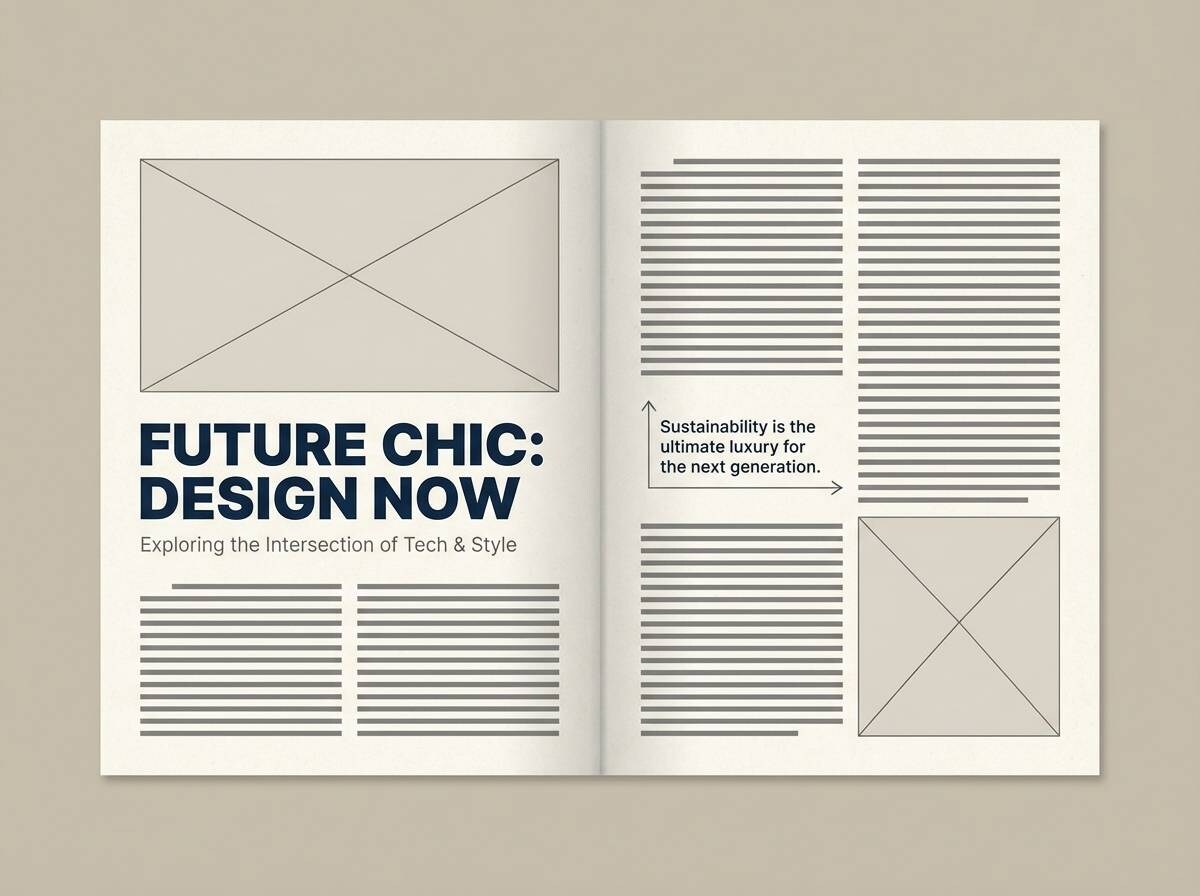
12) Editorial Blush Coral
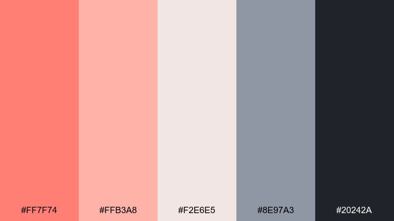
HEX: #ff7f74 #ffb3a8 #f2e6e5 #8e97a3 #20242a
Mood: polished, editorial, contemporary
Best for: magazine feature layout
Polished and contemporary, it feels like a fashion feature with clean columns and a soft blush edge. Use the dark ink for body copy and the cool gray for captions and rules. Coral is best as a pull-quote highlight or section tab, adding warmth to an otherwise sharp layout. Tip: stick to one accent per spread so the editorial tone stays premium.
Image example of editorial blush coral generated using media.io
13) Peach Coral and Navy Classic
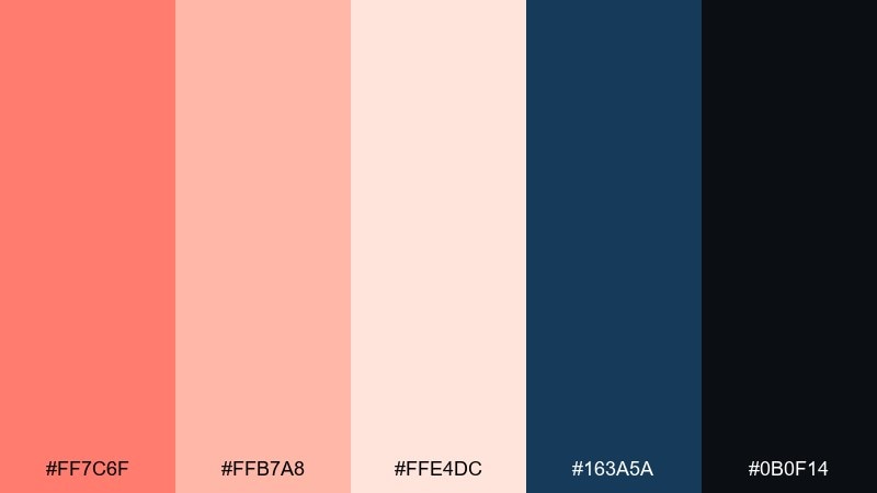
HEX: #ff7c6f #ffb7a8 #ffe4dc #163a5a #0b0f14
Mood: classic, confident, high-contrast
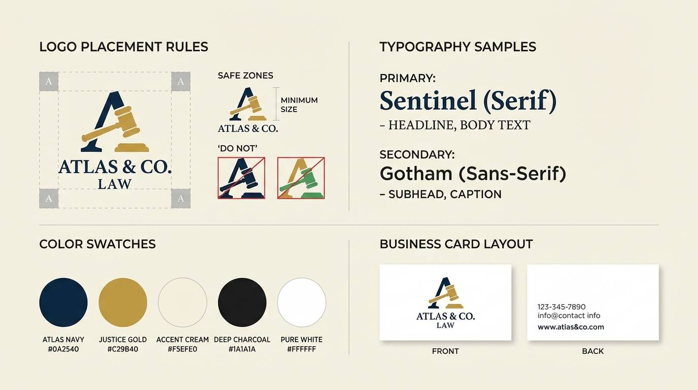
Best for: law firm rebrand accent colors
Classic and confident, it mixes warm coral with tailored navy for a polished, trustworthy feel. A peach coral color combination like this works well when navy dominates layouts and coral is reserved for highlights, icons, or section markers. The soft peach tint keeps backgrounds approachable without sacrificing formality. Tip: use coral only on key actions and links to avoid an overly playful tone.
Image example of peach coral and navy classic generated using media.io
14) Sunset Picnic
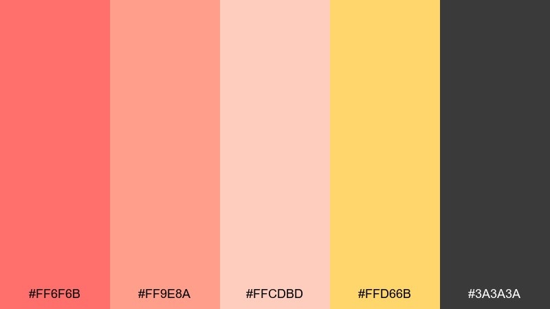
HEX: #ff6f6b #ff9e8a #ffcdbd #ffd66b #3a3a3a
Mood: cheerful, sunny, casual
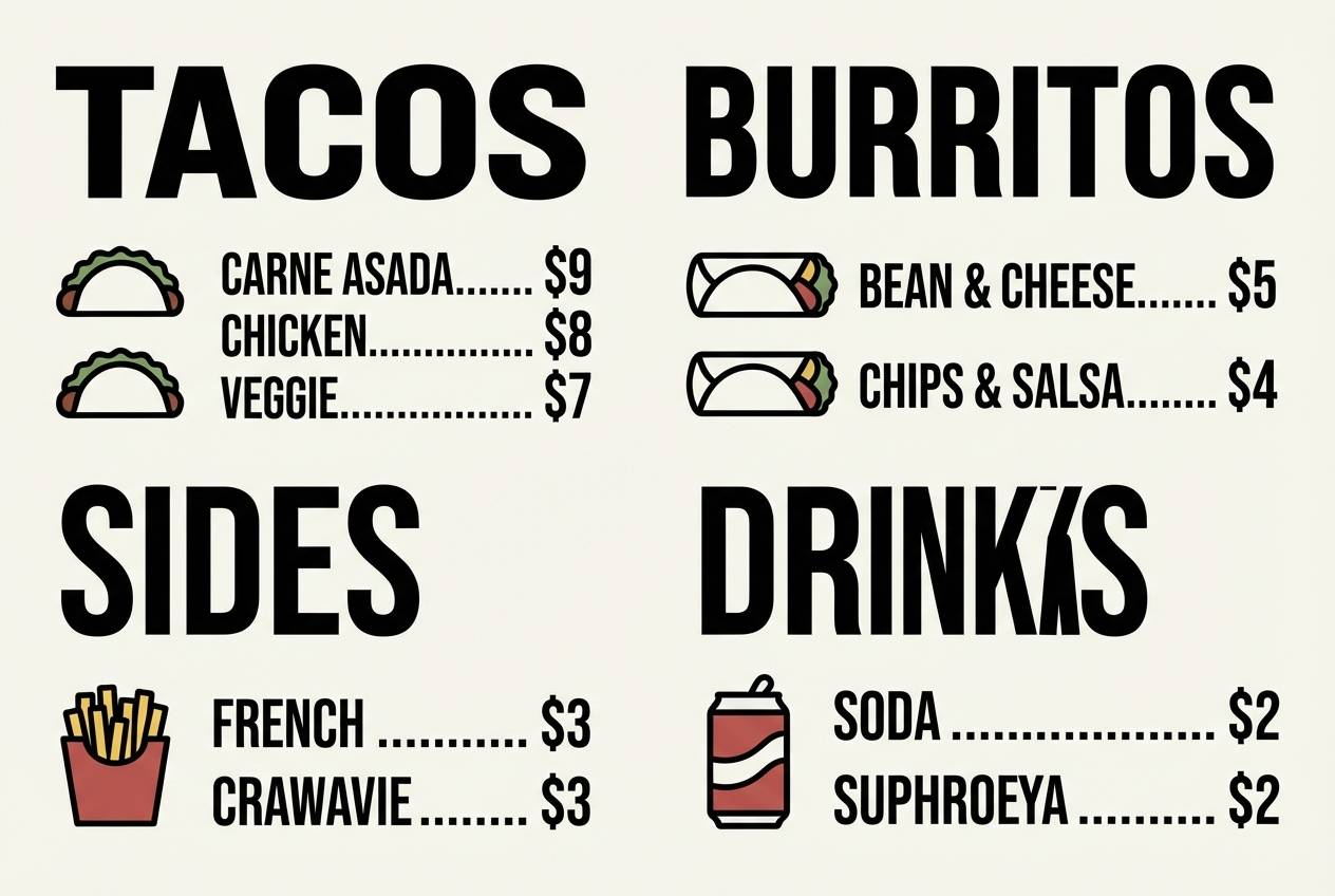
Best for: food truck menu board
Cheerful and sunny, it feels like a picnic at dusk with lemonade and warm light. Use the golden accent for pricing or category headers, while coral drives appetizing callouts like new items. Dark gray keeps text crisp and avoids the harshness of pure black. Tip: keep icons simple and thick so they remain readable from a distance.
Image example of sunset picnic generated using media.io
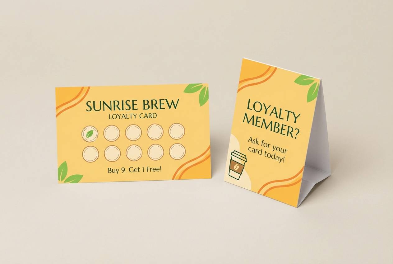
15) Coral Latte Neutrals
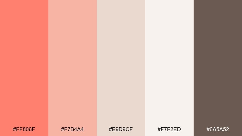
HEX: #ff806f #f7b4a4 #e9d9cf #f7f2ed #6a5a52
Mood: soft, cozy, neutral-forward
Best for: cafe loyalty card and signage
Soft and cozy, it suggests steamed milk, cinnamon dust, and a warm bakery counter. Let the latte neutrals do most of the work, then use coral for stamps, highlights, and small patterns. The deeper brown reads well for type and adds a handcrafted feel. Tip: keep coral in small doses on print so the neutrals stay the main mood.
Image example of coral latte neutrals generated using media.io
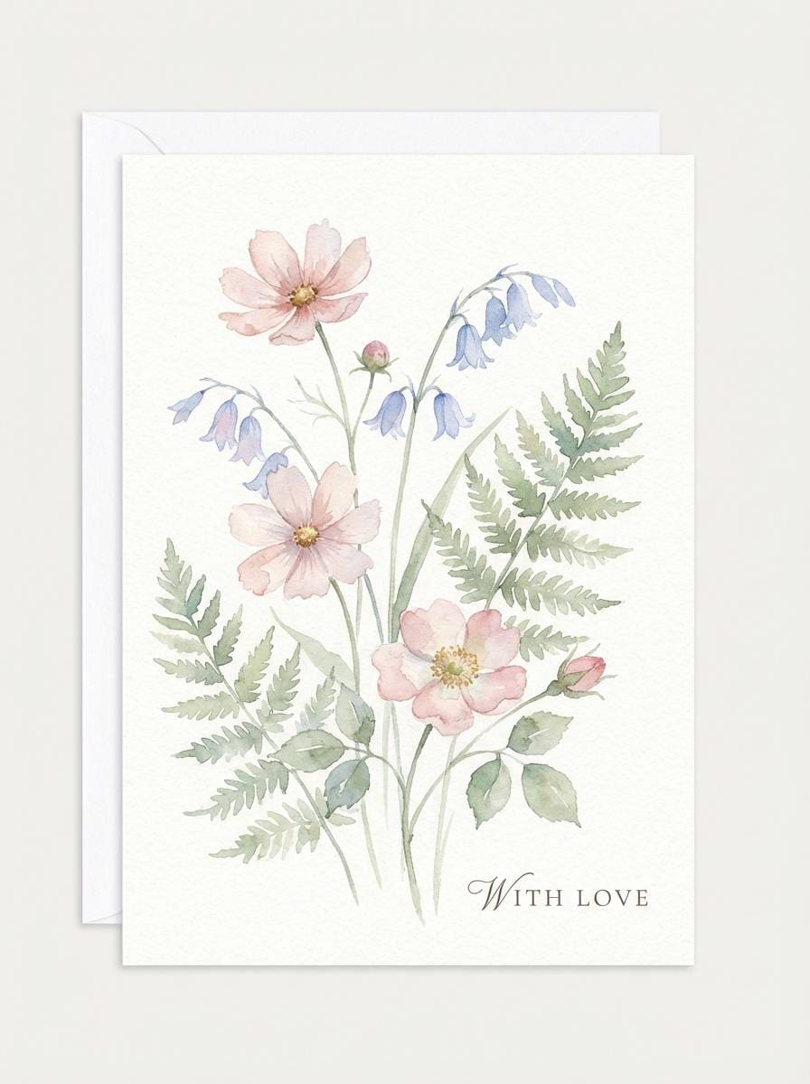
16) Spring Botanica Wash
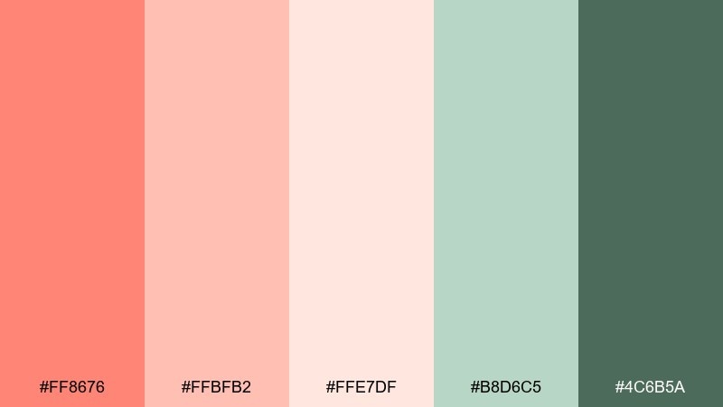
HEX: #ff8676 #ffbfb2 #ffe7df #b8d6c5 #4c6b5a
Mood: springtime, delicate, airy
Best for: watercolor botanical greeting card
Delicate and airy, it feels like fresh petals and new leaves painted in a light wash. Use coral as the bloom color and keep greens muted for stems and framing foliage. The pale peach tint gives you a naturally warm paper tone even on digital prints. Tip: add subtle grain and keep contrast low for a true watercolor look.
Image example of spring botanica wash generated using media.io
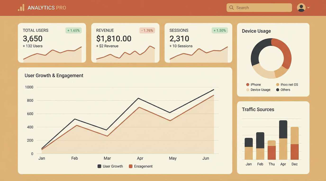
17) Coral Tech UI
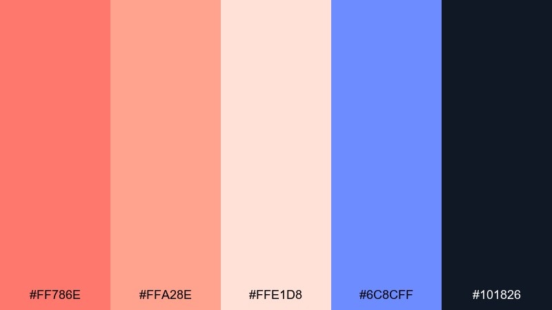
HEX: #ff786e #ffa28e #ffe1d8 #6c8cff #101826
Mood: modern, crisp, techy
Best for: analytics dashboard UI
Modern and crisp, it balances warm highlights with a deep, focused interface base. Use the navy as the main UI shell, then apply coral to primary actions and alerts so they stand out instantly. The periwinkle blue supports charts and secondary buttons without fighting the warmth. Tip: keep coral for a single button style to maintain a clear interaction pattern.
Image example of coral tech ui generated using media.io
18) Blush Coral Gradient
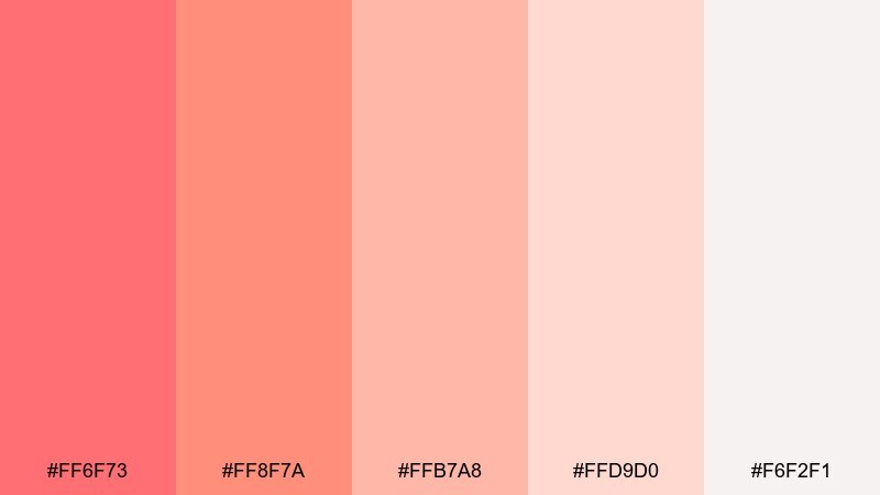
HEX: #ff6f73 #ff8f7a #ffb7a8 #ffd9d0 #f6f2f1
Mood: dreamy, smooth, soft
Best for: beauty brand Instagram story templates
Dreamy and smooth, it reads like a blush-to-peach gradient on silky fabric. Lean into tonal layering for backgrounds, then add bold coral for product names and limited-time badges. Because everything is warm, use subtle shadows or thin outlines to keep text readable. Tip: keep type in deep charcoal for contrast instead of pure black.
Image example of blush coral gradient generated using media.io
19) Warm Concrete Coral
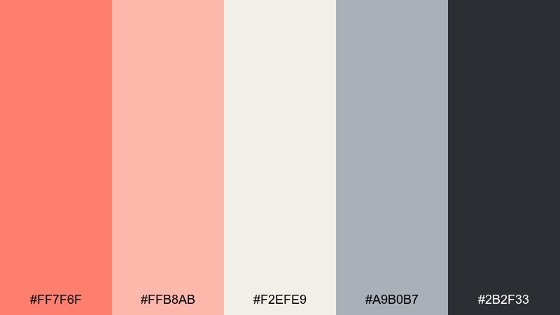
HEX: #ff7f6f #ffb8ab #f2efe9 #a9b0b7 #2b2f33
Mood: urban, calm, refined
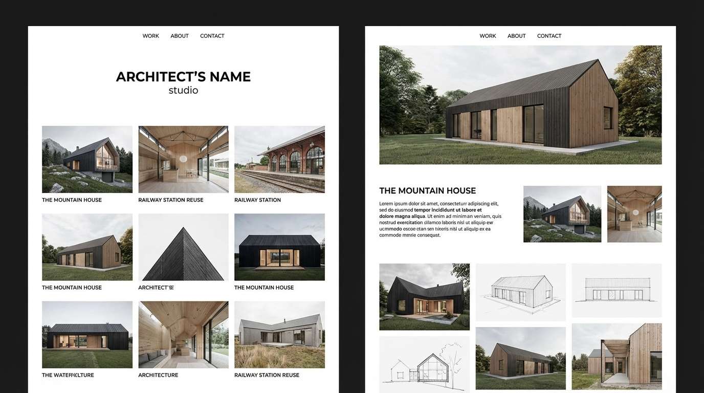
Best for: architecture studio portfolio site
Urban and refined, it suggests warm light hitting concrete with a subtle coral reflection. Use gray neutrals for grids and captions, then apply coral sparingly to links and project tags. The off-white background keeps photography looking true-to-life. Tip: keep coral accents small and consistent across pages for a coherent portfolio experience.
Image example of warm concrete coral generated using media.io
20) Floral Aisle Romance
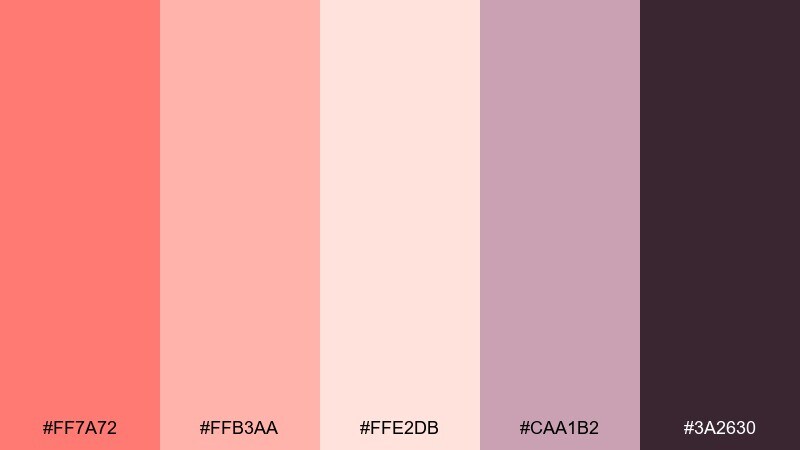
HEX: #ff7a72 #ffb3aa #ffe2db #caa1b2 #3a2630
Mood: romantic, floral, celebratory
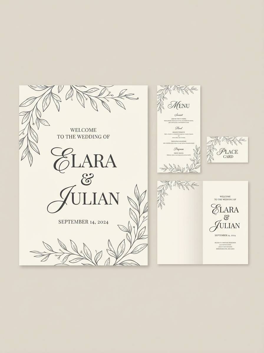
Best for: wedding welcome sign and stationery
Romantic and celebratory, it evokes a flower-lined aisle with soft blush petals and candlelit details. For a cohesive suite, keep the deepest plum for names and headings, then let coral add warmth to monograms and borders. This peach coral color palette pairs beautifully with creamy paper stocks and subtle floral line art. Tip: match ink density across pieces so coral stays consistent from sign to card.
Image example of floral aisle romance generated using media.io
21) Scandi Peach Warmth
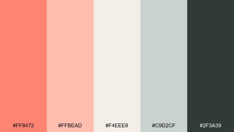
HEX: #ff8472 #ffbead #f4eee8 #c9d2cf #2f3a39
Mood: minimal, cozy, Scandinavian
Best for: living room interior mood board
Minimal yet cozy, it brings to mind Scandinavian textiles with a warm peach throw. Use the off-white and soft gray-green as the base for walls and large surfaces, then add coral in small decor accents. The deep pine tone works for frames, hardware, and type on mood boards. Tip: repeat coral twice only, like a pillow and a vase, to keep the look intentional.
Image example of scandi peach warmth generated using media.io
22) Evening Terracotta Glam
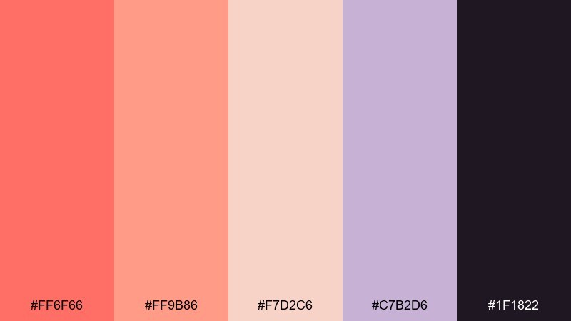
HEX: #ff6f66 #ff9b86 #f7d2c6 #c7b2d6 #1f1822
Mood: glam, moody, sophisticated
Best for: cosmetics product ad banner
Moody and sophisticated, it feels like an evening event with warm terracotta light and a velvet backdrop. Use the deep aubergine as the background for drama, then bring coral forward for the product name and key benefit. The lavender accent adds a modern, editorial twist without cooling the overall warmth. Tip: keep gradients subtle and use glossy highlights sparingly for a premium finish.
Image example of evening terracotta glam generated using media.io
What Colors Go Well with Peach Coral?
Peach coral pairs beautifully with soft neutrals like ivory, warm beige, and blush tints when you want an airy, romantic feel. These combinations are great for weddings, skincare, lifestyle content, and light UI themes.
For stronger contrast, pair peach coral with navy, charcoal, or deep plum. Dark anchors make coral look more saturated and premium, which helps when you need clear hierarchy for headings, buttons, and navigation.
To add freshness, use muted greens (sage, eucalyptus) or coastal teals. These cool partners balance coral’s warmth, making the palette feel modern and “natural” at the same time.
How to Use a Peach Coral Color Palette in Real Designs
Use peach coral as an accent first: CTAs, badges, key numbers, and small decorative shapes. When coral is treated as a highlight rather than a background, it stays readable and feels intentional.
Choose one strong dark (ink/navy/charcoal) for text, plus one light neutral for the canvas. Then apply peach coral for emphasis and add a secondary support color (teal, sage, lavender, or periwinkle) for depth in charts, icons, or illustrations.
If you’re designing for print, test coral on your chosen paper stock and finish. Uncoated or textured stocks can mute coral slightly, which often looks more natural and high-end.
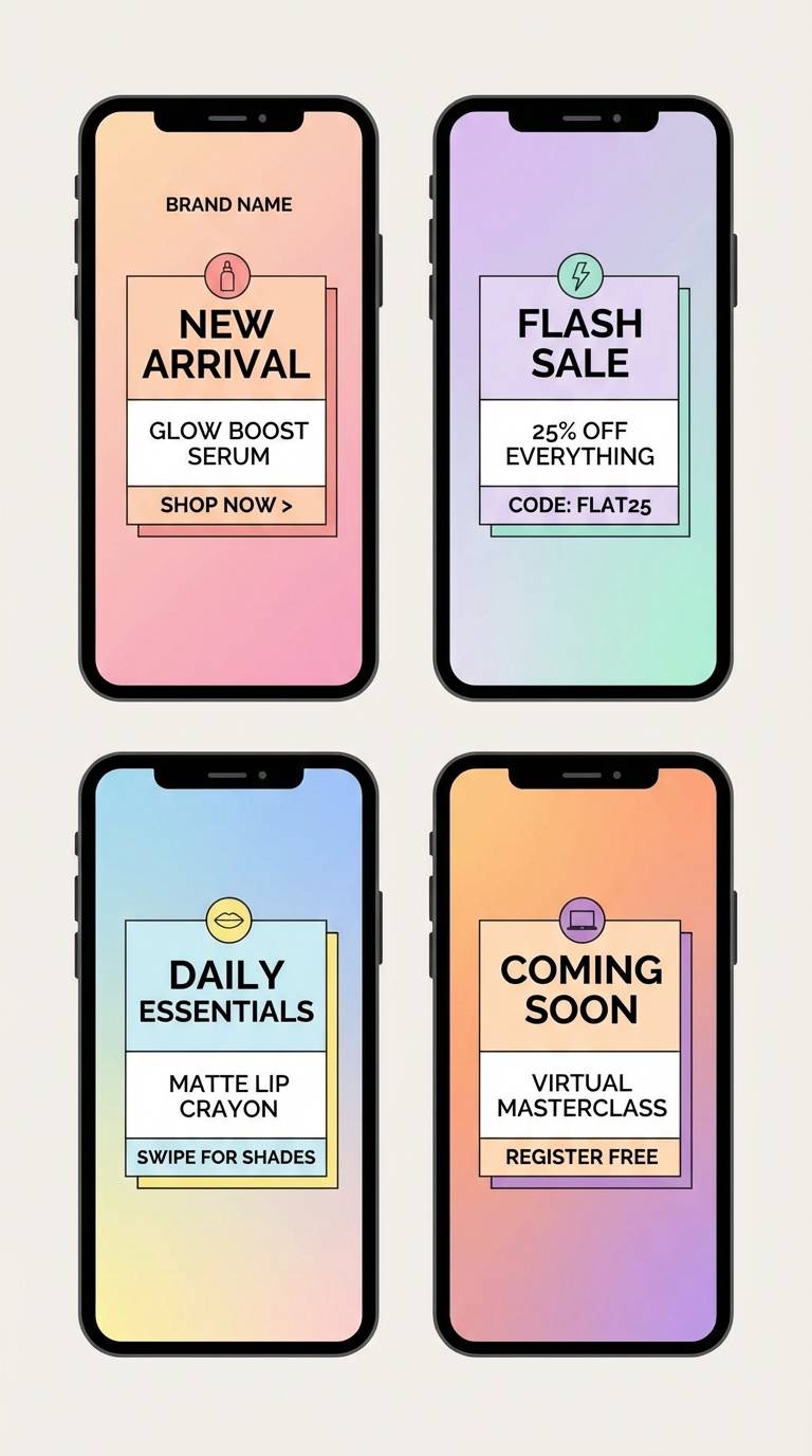
Create Peach Coral Palette Visuals with AI
If you already have HEX codes, you can generate matching visuals (posters, brand kits, UI mockups, invitation suites, mood boards) by describing your layout plus the vibe. Keep prompts specific about style (flat 2D, editorial, studio shot), spacing, and “no device frame/no props” when needed.
With Media.io’s text-to-image tool, you can quickly iterate on multiple concepts using the same peach coral palette. This makes it easy to keep colors consistent across ads, social templates, and web sections.
Peach Coral Color Palette FAQs
-
What is the difference between peach coral and coral?
Peach coral is typically softer and lighter, with more peach (orange/pink) undertones, while classic coral often reads brighter and more red-forward. Peach coral tends to feel gentler and more “pastel,” especially in UI and wedding palettes. -
Is peach coral a good brand color?
Yes—peach coral signals warmth, friendliness, and modern optimism. It works especially well for beauty, food, wellness, travel, and lifestyle brands, and it can also be used as an accent in more conservative industries when paired with navy or charcoal. -
What neutral colors look best with peach coral?
Ivory, warm off-white, oatmeal beige, latte taupe, and soft greige are strong choices. These neutrals keep peach coral looking refined and prevent the overall design from feeling too saturated. -
What color is a good contrast for peach coral text or buttons?
Deep navy, charcoal, espresso brown, and near-black create clear contrast. For accessibility, avoid using peach coral as small body text on light backgrounds; instead, use it for buttons, highlights, or large display text with a dark base. -
Does peach coral work with greens and blues?
It pairs very well with sage, eucalyptus, and muted teal for a natural, balanced look. It also works with deeper blues (navy) for a classic, high-contrast palette that feels confident and polished. -
How do I keep a peach coral palette from looking too “cute”?
Anchor it with darker, tailored colors like navy or charcoal, and use structured typography (clean sans or refined serif). Keep coral as a controlled accent (links, icons, callouts) and rely on neutrals for the main surfaces. -
Can I create matching peach coral visuals quickly for social media?
Yes. Generate a consistent set of templates by reusing the same prompt structure (layout + style + background rules) and swapping only the content elements (headline, product, CTA). This helps maintain brand consistency across posts and stories.
Next: Ginger Color Palette


