

Wheat is a warm, sunlit neutral that sits between beige and golden tan, making it easy to pair with both modern cool accents and classic earthy tones.
Below are wheat color palette ideas with HEX codes you can use for branding, UI, and interiors—ranging from soft minimal mixes to bold, high-contrast combinations.
In this article
- Why Wheat Palettes Work So Well
-
- harvest linen
- sunlit grain
- oat milk minimal
- terracotta field
- sage wheat calm
- indigo bakery night
- blush orchard
- coastal drift
- cocoa grain
- citrus wheat pop
- monochrome wheat study
- vintage library
- lilac dust
- steel and straw
- forest cabin
- rose tea
- neon poster mix
- autumn market
- zen paper ui
- midnight gallery
- What Colors Go Well with Wheat?
- How to Use a Wheat Color Palette in Real Designs
- Create Wheat Palette Visuals with AI
Why Wheat Palettes Work So Well
Wheat tones feel naturally welcoming because they carry warmth without the intensity of orange or the flatness of basic beige. That makes them a dependable “base neutral” for layouts that need to look modern yet grounded.
They also play well with contrast. Add deep browns, charcoals, navies, or forest greens and wheat instantly looks more premium and structured—perfect for clear hierarchy in UI and print.
Finally, wheat is highly versatile across mediums. It reads soft on screens, tactile in print, and cozy in interiors, especially when paired with natural textures like paper, linen, wood, and stone.
20+ Wheat Color Palette Ideas (with HEX Codes)
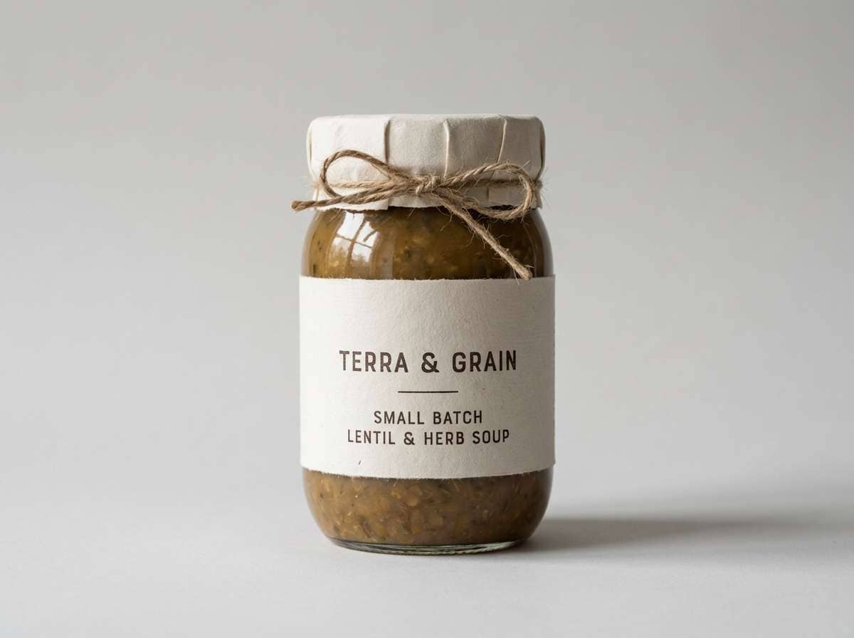
1) Harvest Linen
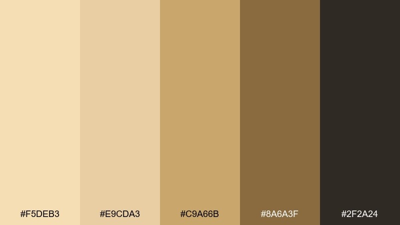
HEX: #F5DEB3 #E9CDA3 #C9A66B #8A6A3F #2F2A24
Mood: grounded, rustic, premium
Best for: artisan packaging, logos, and label systems
Grounded and rustic, this mix feels like sun-dried linen, grain sacks, and a well-worn workbench. Use it for premium, handmade branding where warmth matters but you still want contrast. Pair the deep brown with plenty of negative space so the lighter tones stay airy. Tip: print the darkest color as rich black substitute for a softer, craft look.
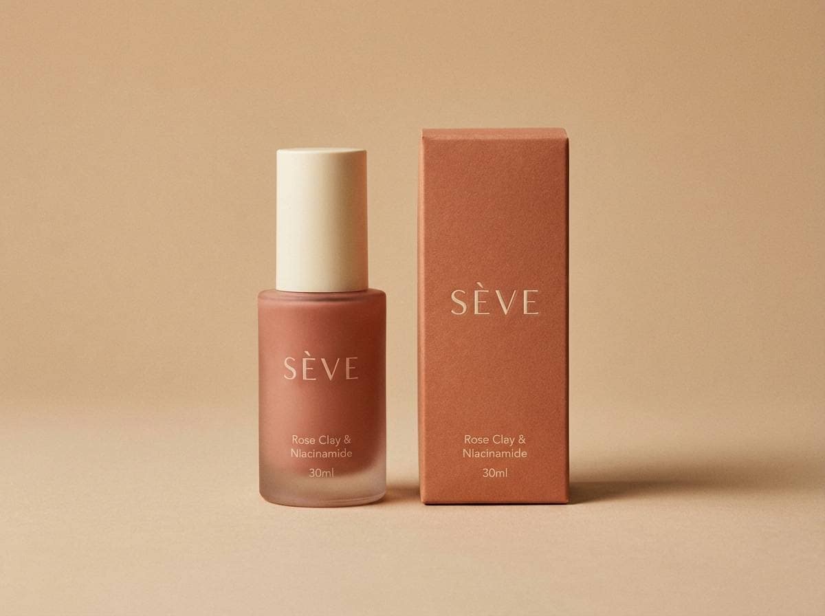
Image example of harvest linen generated using media.io
Media.io is an online AI studio for creating and editing video, image, and audio in your browser.

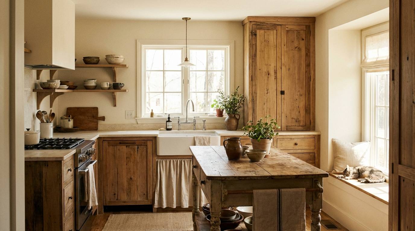
2) Sunlit Grain
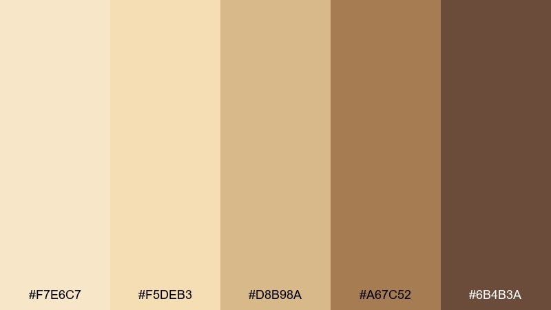
HEX: #F7E6C7 #F5DEB3 #D8B98A #A67C52 #6B4B3A
Mood: bright, welcoming, homey
Best for: cozy living rooms, kitchens, and cafe interiors
Bright and welcoming, it evokes morning light across wooden floors and fresh bread on the counter. The mid caramel tones add structure, while the darker brown anchors furniture and trim. Pair with matte black hardware or creamy white walls to keep it contemporary. Tip: repeat the lightest tone on ceilings or textiles to make spaces feel taller.
Image example of sunlit grain generated using media.io
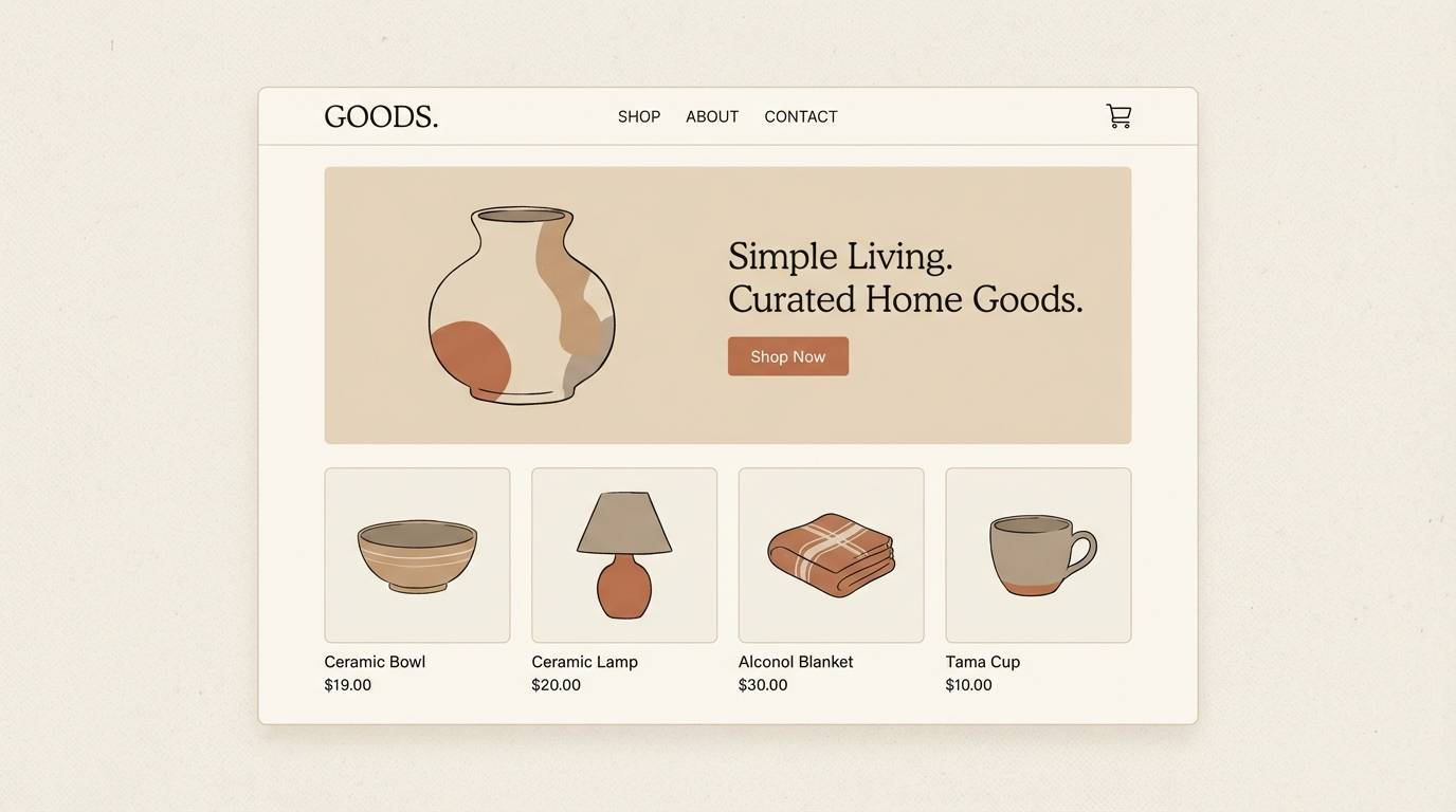
3) Oat Milk Minimal
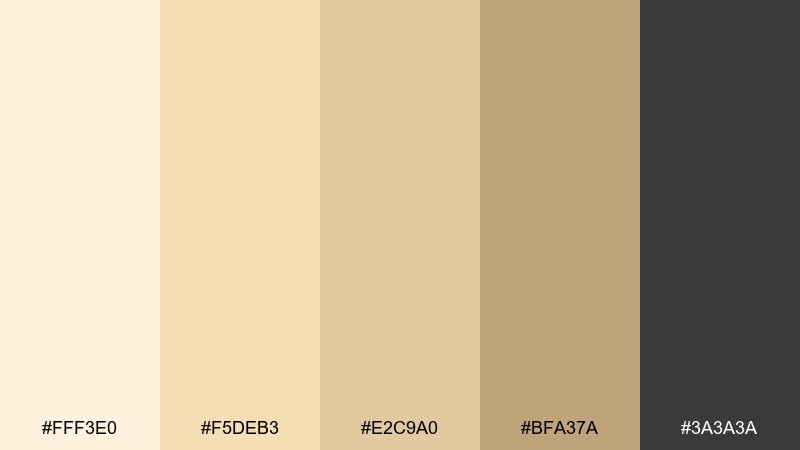
HEX: #FFF3E0 #F5DEB3 #E2C9A0 #BFA37A #3A3A3A
Mood: clean, soft, modern
Best for: minimal landing pages and ecommerce UI
Clean and soft, it feels like steamed oat milk and smooth ceramic on a calm morning. This wheat color palette works best with generous spacing, thin dividers, and restrained shadows. Pair the charcoal with the light cream for readable headings and accessible buttons. Tip: use the warm mid-tone for hover states to keep interactions subtle but clear.
Image example of oat milk minimal generated using media.io
4) Terracotta Field
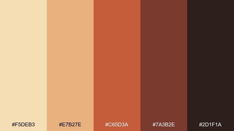
HEX: #F5DEB3 #E7B27E #C65D3A #7A3B2E #2D1F1A
Mood: earthy, bold, energetic
Best for: restaurant posters and seasonal promotions
Earthy and bold, it calls up clay pots, paprika, and late-summer markets. The terracotta and deep brick shades make headlines pop without going neon. Pair with textured paper grain and a simple sans-serif for a modern rustic feel. Tip: keep the warm reds to 20 to 30 percent of the layout so the base tones stay breathable.
Image example of terracotta field generated using media.io

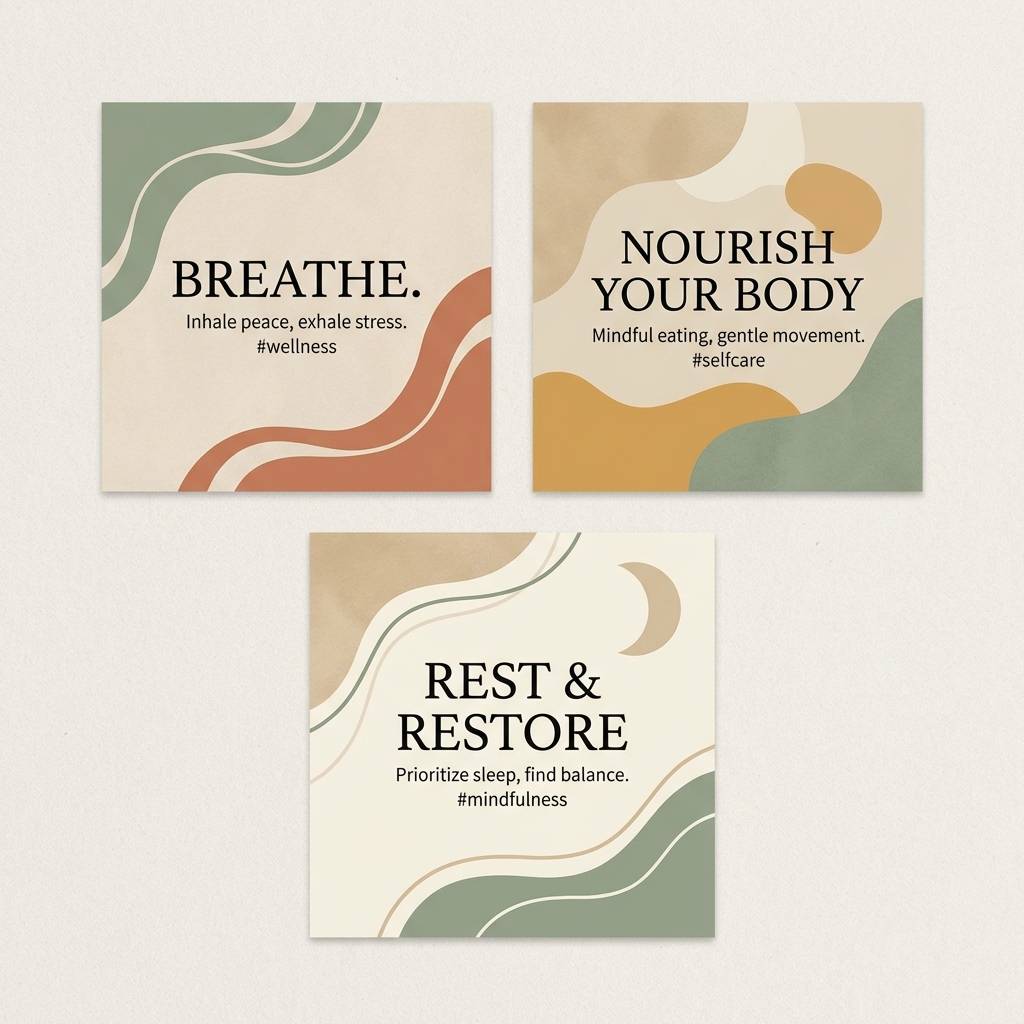
5) Sage Wheat Calm
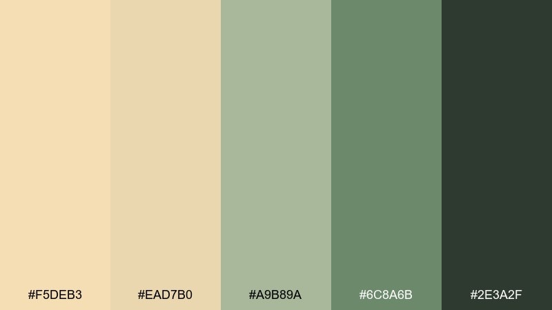
HEX: #F5DEB3 #EAD7B0 #A9B89A #6C8A6B #2E3A2F
Mood: calm, balanced, restorative
Best for: wellness branding and lifestyle social templates
Calm and restorative, it feels like dried herbs, warm tea, and quiet afternoons. The sage notes cool the warmth just enough for a balanced, nature-leaning look. Pair with off-white backgrounds and soft photography to keep everything gentle. Tip: reserve the darkest green for small type and icons so the palette stays light overall.
Image example of sage wheat calm generated using media.io
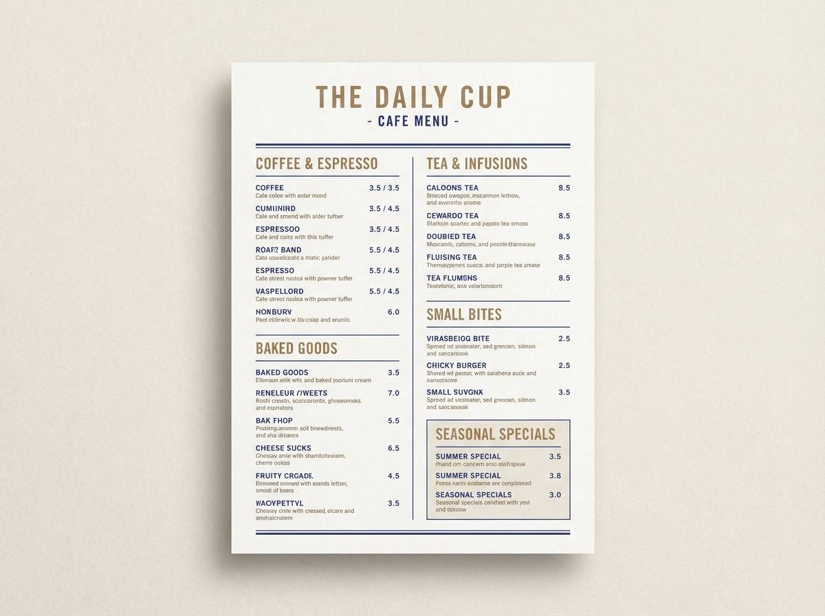
6) Indigo Bakery Night
HEX: #F5DEB3 #D9C3A1 #7F8FB3 #2F3A56 #141823
Mood: moody, refined, late-night cozy
Best for: bakery menus, storefront signage, and cafe rebrands
Moody and refined, it evokes warm pastries under evening streetlights. The indigo and near-black give the warmth a modern edge, ideal when you want cozy without looking overly vintage. Use this wheat color scheme for menus where hierarchy matters: dark headers, warm section blocks, and muted accents. Tip: add a thin line rule in the pale tone to separate categories without heavy boxes.
Image example of indigo bakery night generated using media.io
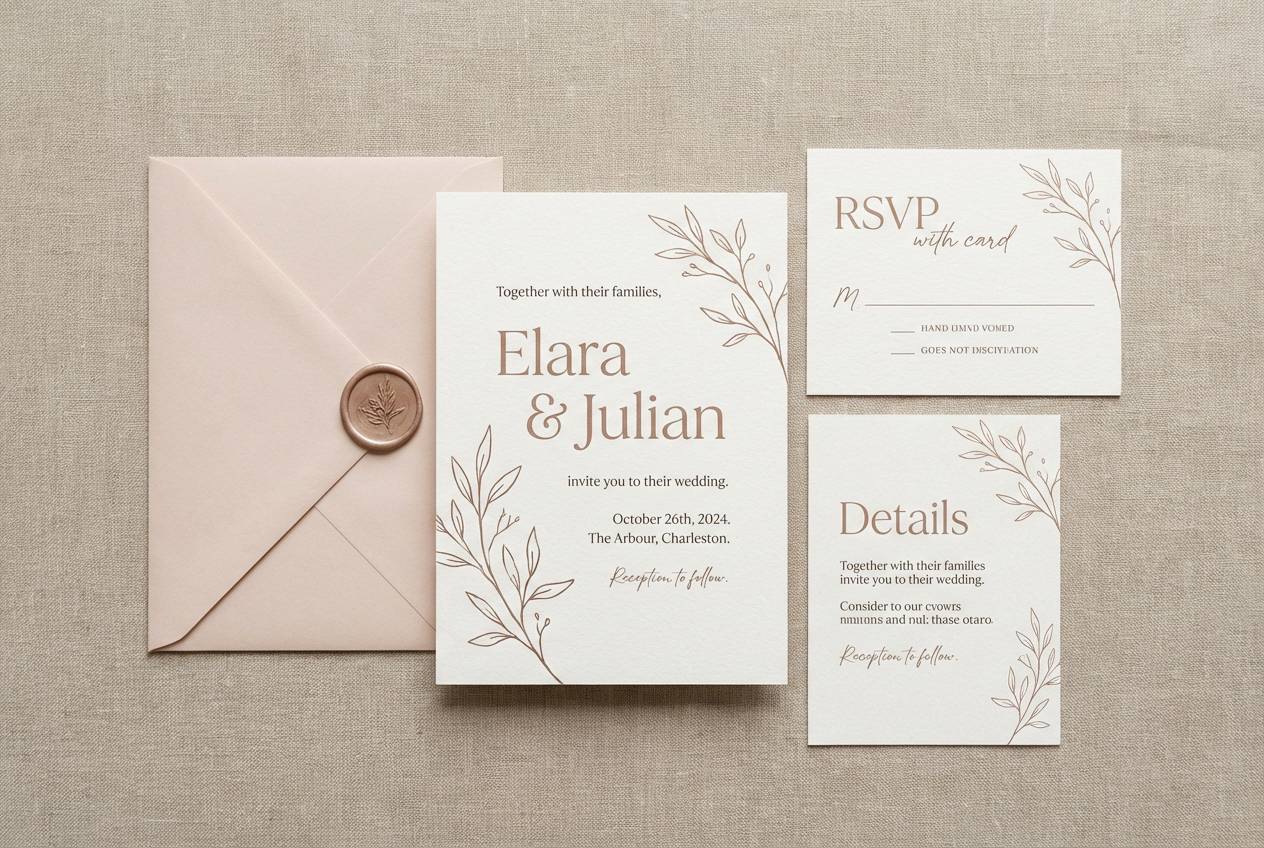
7) Blush Orchard
HEX: #F5DEB3 #F1C6B8 #D88A8A #8F4E5E #3A2730
Mood: romantic, gentle, inviting
Best for: wedding suites and boutique gift cards
Romantic and gentle, it brings to mind orchard blossoms and soft dusk skies. The blush and rose tones feel elegant when paired with warm neutrals and lots of white space. Use the deeper berry shade for names, dates, and key details to keep readability crisp. Tip: try letterpress textures or subtle grain to make the palette feel tactile.
Image example of blush orchard generated using media.io
8) Coastal Drift
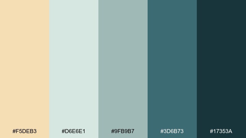
HEX: #F5DEB3 #D6E6E1 #9FB9B7 #3D6B73 #17353A
Mood: fresh, breezy, relaxed
Best for: travel brochures and resort branding
Fresh and breezy, it feels like driftwood, sea glass, and sandy paths. The cool teal range keeps the warmth from leaning too yellow and adds a relaxed coastal polish. Pair with crisp white and wide margins to maintain that airy vibe. Tip: use the darkest teal sparingly for icons and small headings so the layout stays light.
Image example of coastal drift generated using media.io
9) Cocoa Grain
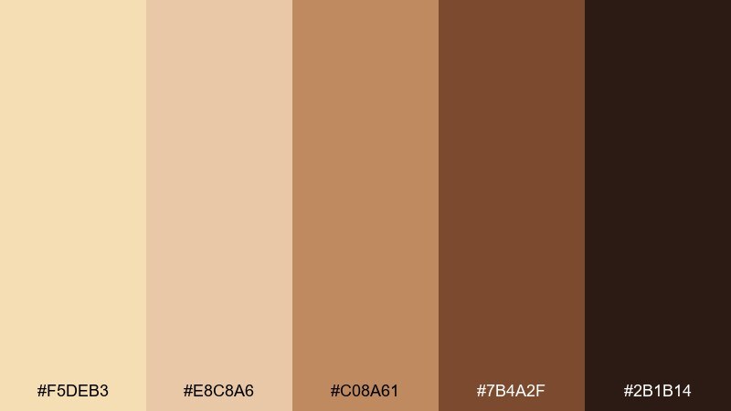
HEX: #F5DEB3 #E8C8A6 #C08A61 #7B4A2F #2B1B14
Mood: cozy, rich, appetizing
Best for: coffee packaging and cafe product ads
Cozy and rich, it evokes cacao nibs, espresso crema, and toasted crust. The warm browns bring depth for premium food visuals and readable labels. Pair with embossed finishes or matte paper to emphasize craft and quality. Tip: set the mid brown as your primary brand color and keep the darkest tone for small type only.
Image example of cocoa grain generated using media.io
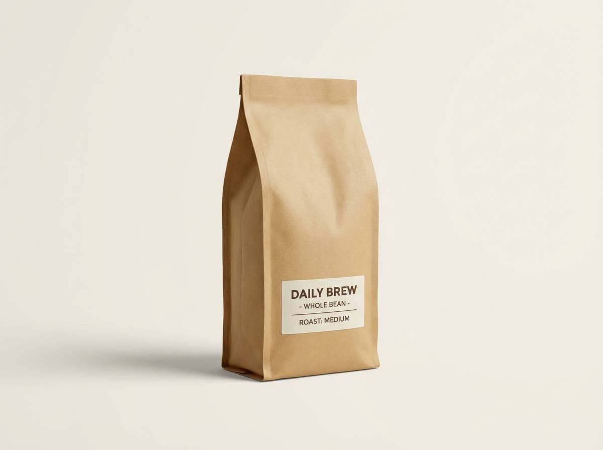
10) Citrus Wheat Pop
HEX: #F5DEB3 #FFD166 #F4A261 #2A9D8F #264653
Mood: playful, sunny, contemporary
Best for: app onboarding screens and splash pages
Playful and sunny, it feels like citrus slices on a bright cutting board. The teal and navy add clean contrast so the warm tones stay modern rather than nostalgic. Pair with rounded UI components and bold iconography for a friendly product vibe. Tip: use the lemon tone only for highlights and badges to prevent visual fatigue.
Image example of citrus wheat pop generated using media.io

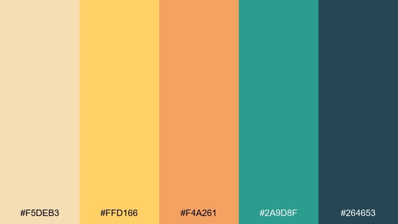
11) Monochrome Wheat Study
HEX: #FFF1D6 #F5DEB3 #E1C79A #C4A46F #8F6B3E
Mood: quiet, minimal, timeless
Best for: stationery sets and subtle brand systems
Quiet and timeless, it reads like layered paper, parchment, and soft shadows. Keeping everything within warm neutrals makes layouts feel cohesive and premium. Pair with a single dark ink color for text and let the tones do the heavy lifting. Tip: vary texture and finish (matte, uncoated, embossed) to create contrast without adding new hues.
Image example of monochrome wheat study generated using media.io
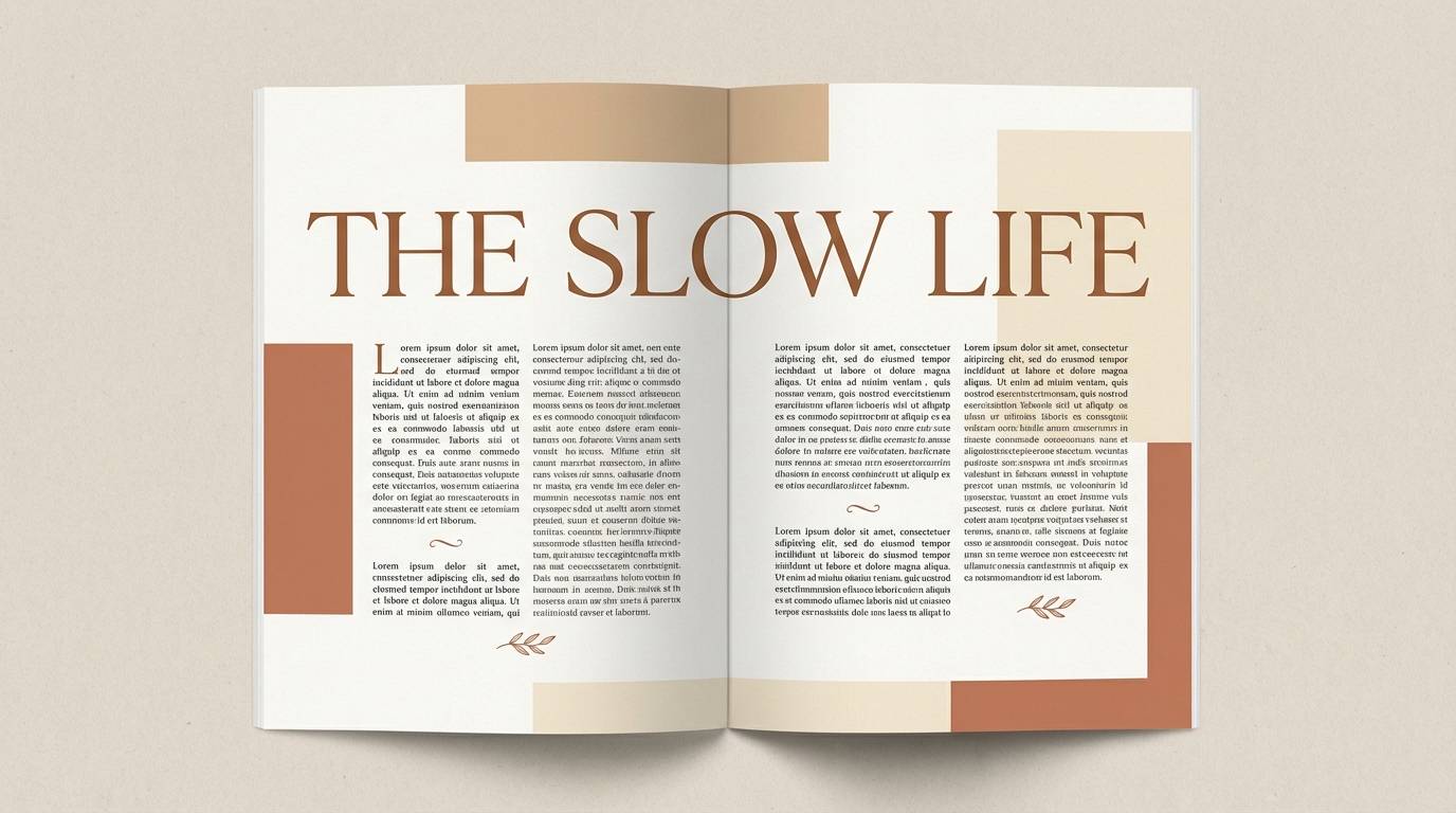
12) Vintage Library
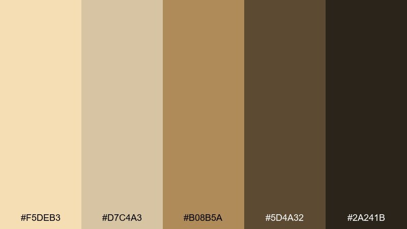
HEX: #F5DEB3 #D7C4A3 #B08B5A #5D4A32 #2A241B
Mood: classic, scholarly, warm
Best for: book covers, journals, and editorial spreads
Classic and scholarly, it suggests old maps, leather spines, and quiet reading rooms. The deeper browns give you dependable hierarchy for titles and pull quotes. Pair with serif typography and subtle ornament details for a refined finish. Tip: keep backgrounds in the lightest two tones so body text never feels heavy.
Image example of vintage library generated using media.io
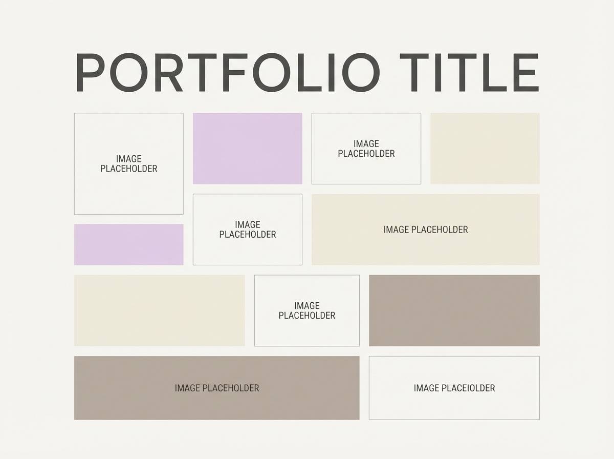
13) Lilac Dust
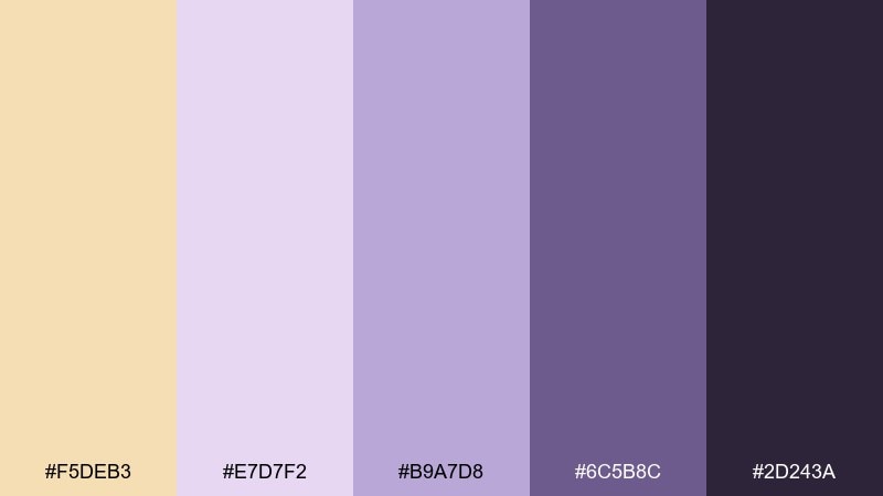
HEX: #F5DEB3 #E7D7F2 #B9A7D8 #6C5B8C #2D243A
Mood: dreamy, soft, artistic
Best for: beauty lookbooks and creative portfolios
Dreamy and soft, it feels like dried lavender and powdery studio light. The lilac range adds an artistic twist while the warm base keeps it approachable. Pair with clean grids and plenty of white to avoid turning too whimsical. Tip: use the deepest purple for small accents like bullets, links, and thin borders.
Image example of lilac dust generated using media.io
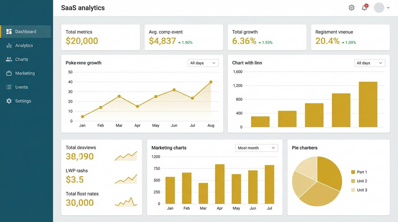
14) Steel and Straw
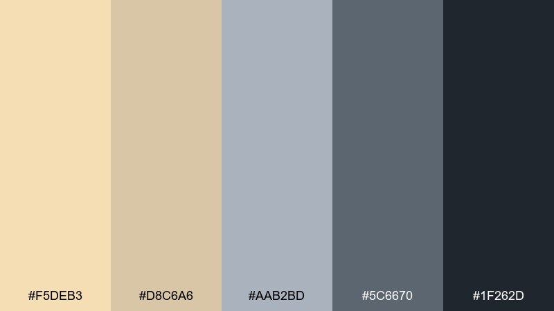
HEX: #F5DEB3 #D8C6A6 #AAB2BD #5C6670 #1F262D
Mood: professional, balanced, modern
Best for: saas dashboards and B2B UI systems
Professional and balanced, it reads like brushed metal against warm straw. The cool grays keep the look sharp, while the warm neutrals soften long sessions of reading and scanning. Pair with clear data visualization colors and keep backgrounds quiet. Tip: set the light gray for panels and use the warm tones for status highlights and empty states.
Image example of steel and straw generated using media.io
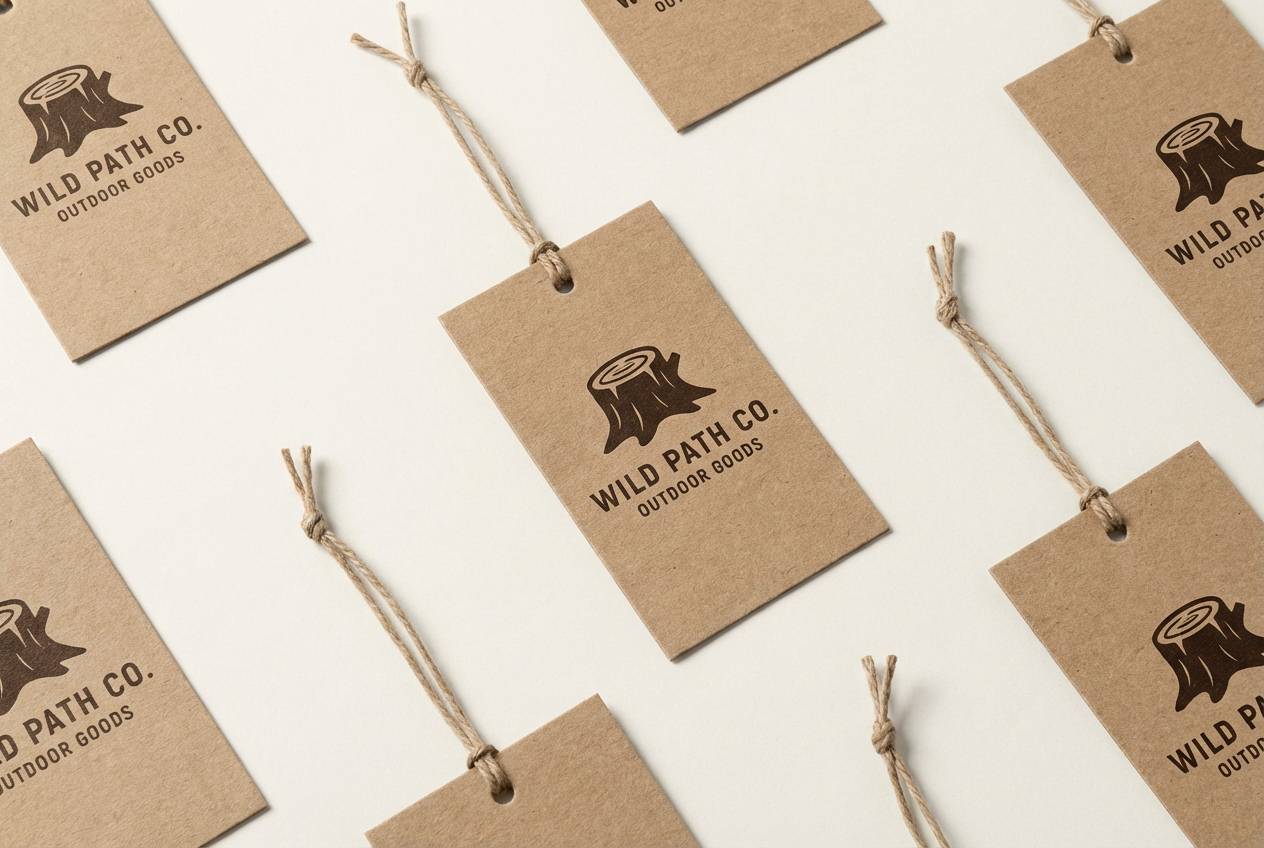
15) Forest Cabin
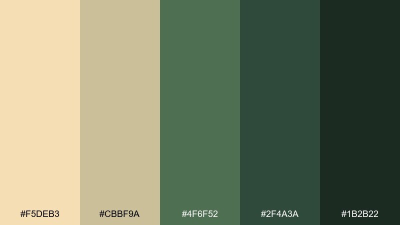
HEX: #F5DEB3 #CBBF9A #4F6F52 #2F4A3A #1B2B22
Mood: outdoorsy, sturdy, reassuring
Best for: outdoor brands, cabin rentals, and signage
Outdoorsy and sturdy, it evokes pine needles, canvas tents, and warm lamplight indoors. The greens bring a grounded nature cue, while the warm base keeps the palette welcoming. Pair with bold condensed type for signage and simple pictogram icons. Tip: use the light tones for large areas and the darkest green for wayfinding and small labels.
Image example of forest cabin generated using media.io
16) Rose Tea
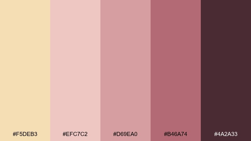
HEX: #F5DEB3 #EFC7C2 #D69EA0 #B46A74 #4A2A33
Mood: soft, luxe, romantic
Best for: beauty campaigns and skincare product ads
Soft and luxe, it feels like rose tea, satin ribbons, and warm vanity lighting. These wheat color combinations shine in beauty design where you want gentle warmth without losing sophistication. Pair with clean typography and glossy product renders for a high-end finish. Tip: keep the darkest plum for fine print and use the blush tones for gradients and glow effects.
Image example of rose tea generated using media.io
17) Neon Poster Mix
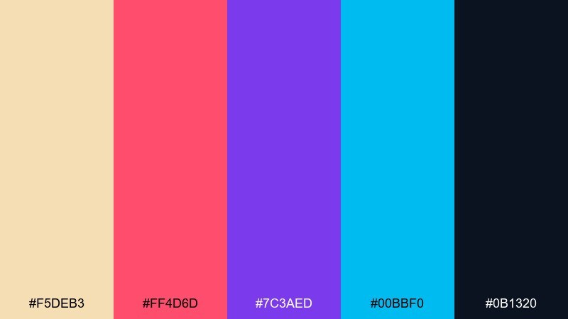
HEX: #F5DEB3 #FF4D6D #7C3AED #00BBF0 #0B1320
Mood: bold, youthful, high-contrast
Best for: music event posters and nightlife promos
Bold and youthful, it looks like neon lights cutting through a warm haze. The dark navy gives you a strong base, while the bright accents carry the energy for headlines and dates. Pair with big type, tight spacing, and simple geometric shapes for modern impact. Tip: limit the neon colors to one or two per design so the message stays readable.
Image example of neon poster mix generated using media.io

18) Autumn Market
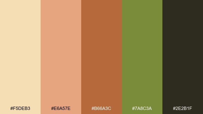
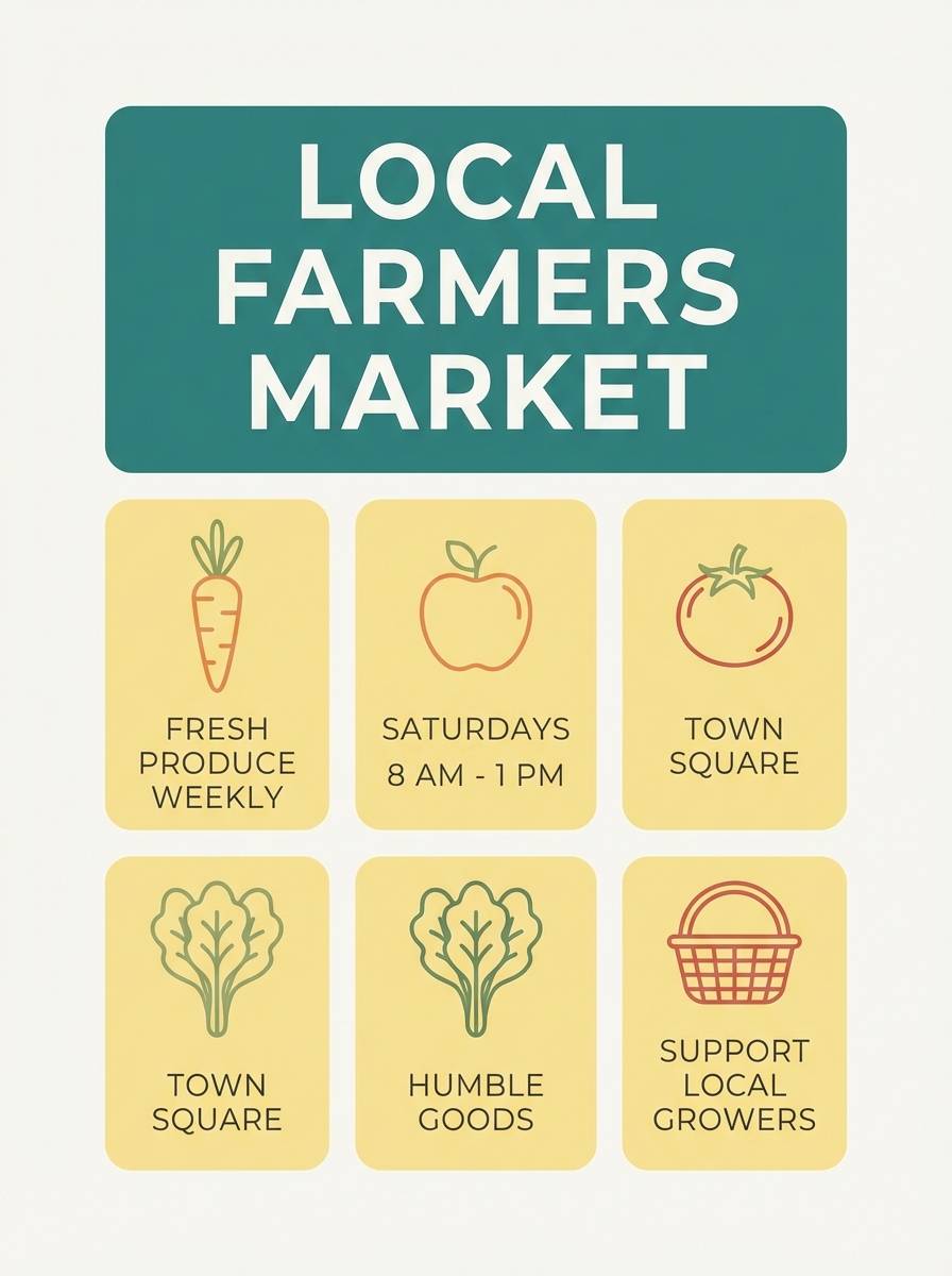
HEX: #F5DEB3 #E6A57E #B66A3C #7A8C3A #2E2B1F
Mood: seasonal, friendly, handcrafted
Best for: farmers market flyers and local event promos
Seasonal and friendly, it suggests apple crates, dried leaves, and handwritten signs. A wheat color combination like this works well for community events because it feels handmade but still clear. Pair with simple illustrations and a bold headline to make details easy to scan. Tip: use the green as a single accent for dates or location markers to add contrast without clutter.
Image example of autumn market generated using media.io
19) Zen Paper UI
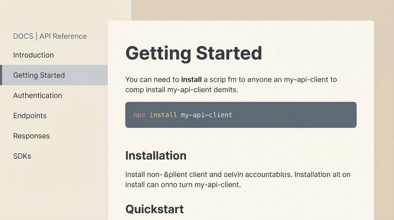
HEX: #F5DEB3 #F8F0E3 #D0D7DE #5E6B75 #0F172A
Mood: calm, structured, readable
Best for: documentation sites and knowledge-base UI
Calm and structured, it feels like smooth paper and tidy margins. The cool gray-blue tones keep documentation looking technical, while the warm base prevents a sterile feel. Pair with clear code-block styling and consistent icon weights for a polished system. Tip: reserve the darkest tone for text and primary buttons, and keep panels in the two lightest shades.
Image example of zen paper ui generated using media.io
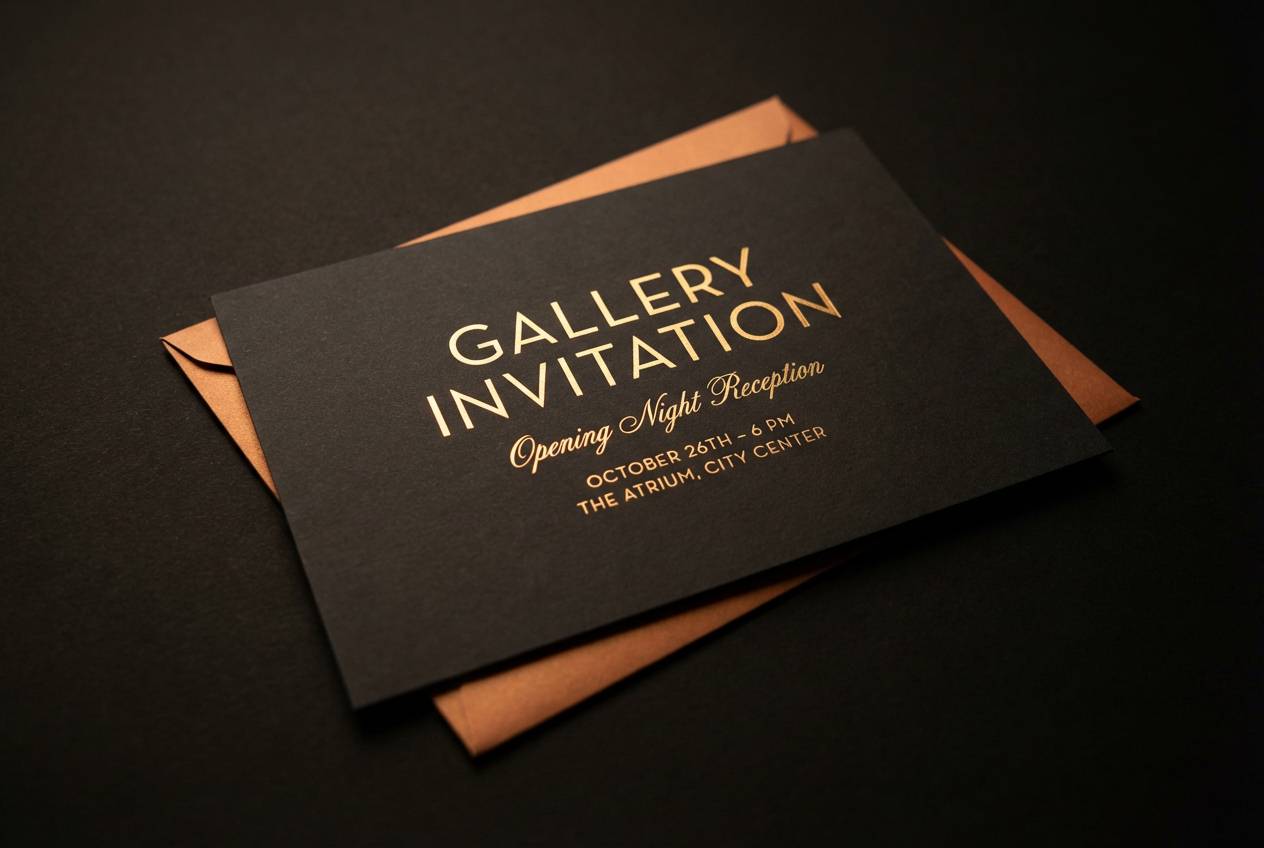
20) Midnight Gallery
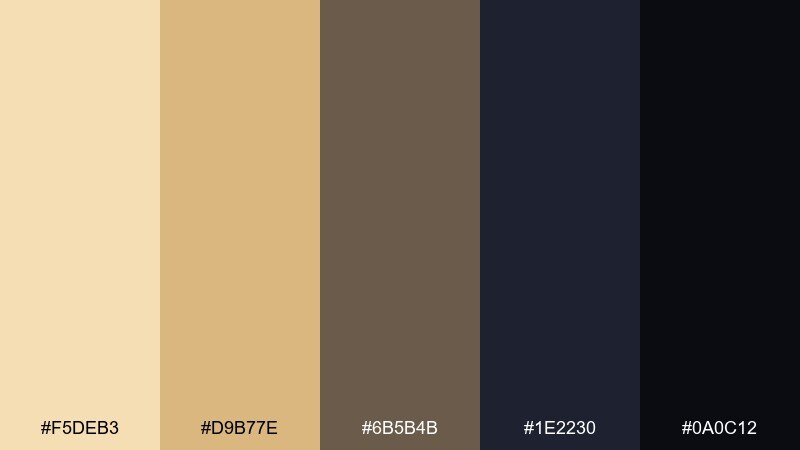
HEX: #F5DEB3 #D9B77E #6B5B4B #1E2230 #0A0C12
Mood: dramatic, curated, high-end
Best for: gallery invitations and exhibition announcements
Dramatic and curated, it resembles warm spotlights against dark walls. The near-black and deep navy make the golden tones glow, ideal for high-end cultural design. Pair with elegant typography and minimal layouts so the contrast feels intentional. Tip: add thin rules or small blocks in the mid gold to guide the eye without overpowering the page.
Image example of midnight gallery generated using media.io
What Colors Go Well with Wheat?
Wheat pairs beautifully with deeper earth tones like cocoa brown, saddle tan, and terracotta for a cohesive, organic look. This direction works especially well for food, craft, and heritage branding.
For a cleaner modern contrast, add cool hues such as slate gray, steel blue, indigo, or teal. The cool accents reduce the yellow cast and help wheat feel more contemporary in UI and editorial layouts.
If you want a softer, romantic blend, reach for blush, dusty rose, lilac, or muted berry shades. These keep the warmth but introduce a gentle color story suited to lifestyle, beauty, and wedding designs.
How to Use a Wheat Color Palette in Real Designs
Use wheat as your main background or container color, then build hierarchy with one dark anchor (charcoal, deep brown, navy, or forest green). This keeps pages readable while preserving the cozy tone.
In branding, pick a mid-tone wheat-adjacent caramel as the primary brand color, then reserve the darkest shade for typography and small UI elements. This approach prints well and feels premium on uncoated papers.
For interiors and product visuals, combine wheat with tactile materials—linen, matte ceramics, warm woods—and keep high-saturation accents limited to small areas. The result feels curated instead of busy.
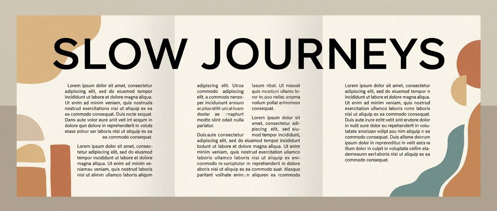
Create Wheat Palette Visuals with AI
If you already have HEX codes, you can turn them into polished mockups by generating scenes that match your use case—packaging, menus, dashboards, or social templates—then refining style and lighting.
Start with a clear subject (what you’re designing), specify materials (paper, matte plastic, ceramic), and mention your palette mood (minimal, rustic, high-contrast). Small details like “clean seamless background” or “soft diffused lighting” help keep outputs usable.
With Media.io’s text-to-image tool, you can quickly create on-brand wheat palette visuals for presentations, client options, and marketing drafts—without building everything from scratch.
Wheat Color Palette FAQs
-
What is the HEX code for wheat?
The commonly referenced wheat color HEX is #F5DEB3. It’s a warm, light tan with a soft golden undertone. -
Is wheat more yellow than beige?
Yes. Wheat typically has a stronger golden/yellow bias than standard beige, which often reads more neutral or slightly gray. -
What colors complement wheat in modern UI design?
Cool contrasts like slate gray, steel blue, indigo, navy, and teal work well. They sharpen readability and keep wheat from feeling overly vintage. -
How do I make a wheat palette look premium?
Combine wheat with deep browns or near-black for contrast, use lots of negative space, and lean on tactile finishes (matte, uncoated, embossed) rather than adding many extra hues. -
Does wheat work for text and accessibility?
Wheat is usually best as a background or surface color. For accessibility, pair it with dark text like charcoal (#3A3A3A) or near-black (#0F172A/#0A0C12) to improve contrast. -
What accent colors look good with wheat for branding?
Terracotta and brick for energy, sage and forest green for nature cues, blush and berry for romance, and teal/indigo for a refined modern edge. -
How can I generate wheat palette mockups quickly?
Use a text-to-image tool and describe the design format (menu, packaging, UI), your lighting/background preferences, and the wheat HEX palette. Then iterate prompts to refine typography space, materials, and contrast.
Next: Rose Gold Color Palette


