

Rose gold sits between blush pink and warm copper, so it can read romantic, modern, or luxe depending on what you pair it with. That flexibility is why it shows up everywhere from weddings to UI kits.
Below are 20 rose gold color palette ideas with HEX codes, plus ready-to-use prompts you can turn into visuals for invitations, branding, packaging, and digital design.
In this article
- Why Rose Gold Palettes Work So Well
-
- champagne blush
- copper pearl
- dusty rose quartz
- rose gold sage
- metallic mauve night
- blush sandstone
- peony cream
- rose gold navy edge
- apricot alloy
- smoky rosewood
- pink champagne mint
- antique rose ink
- rose gold teal contrast
- blush terracotta linen
- frosted rose glow
- rose gold plum velvet
- sunrise blush olive
- rose gold charcoal studio
- soft rose graphite
- glittering blush night sky
- What Colors Go Well with Rose Gold?
- How to Use a Rose Gold Color Palette in Real Designs
- Create Rose Gold Palette Visuals with AI
Why Rose Gold Palettes Work So Well
Rose gold works because it’s warm like copper, soft like blush, and neutral enough to behave like a “tinted metal” rather than a loud color. That makes it easy to use as an accent while still feeling special.
It also scales across mediums: on screens it reads as warm pinks and mauves, while in print it can become genuinely metallic via foil, embossing, or spot UV. You can keep the palette matte and still imply metal through contrast and small details.
Most importantly, rose gold plays well with both cool anchors (navy, charcoal, teal) and gentle neutrals (cream, pearl, taupe), giving you lots of control over mood—from minimal UI to cinematic nightlife posters.
20+ Rose Gold Color Palette Ideas (with HEX Codes)
1) Champagne Blush
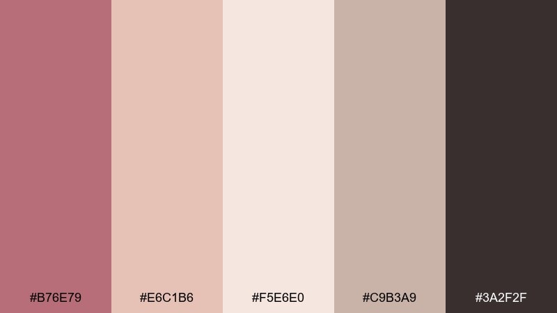
HEX: #B76E79 #E6C1B6 #F5E6E0 #C9B3A9 #3A2F2F
Mood: romantic, luminous, polished
Best for: wedding invitations
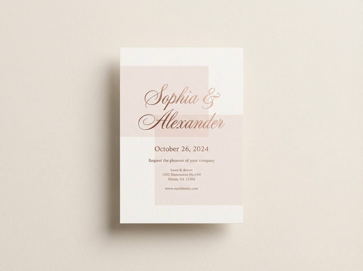
Romantic and luminous like candlelight on champagne silk, these tones feel instantly elevated. Use the deep cocoa as your type color and let the blush neutrals carry the background. It works beautifully for print invites, RSVP cards, and day-of signage with subtle foil accents. For a cohesive rose gold color palette, keep textures matte and reserve the metallic feel for small borders or monograms.
Image example of champagne blush generated using media.io
Media.io is an online AI studio for creating and editing video, image, and audio in your browser.

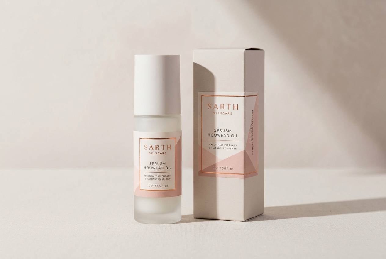
2) Copper Pearl
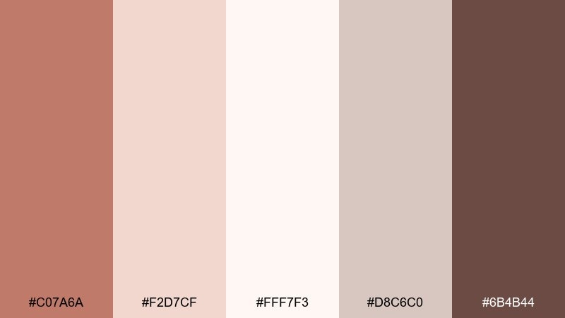
HEX: #C07A6A #F2D7CF #FFF7F3 #D8C6C0 #6B4B44
Mood: warm, refined, boutique
Best for: cosmetic packaging
Warm and refined, it reads like copper shimmer layered over creamy porcelain. These shades suit skincare cartons, lipstick tubes, and gift sets where softness still feels premium. Pair the pale pearl tones with the deep brown for high-contrast ingredients lists and barcodes. Tip: use the copper as a thin band or cap color so it looks metallic without overpowering the label.
Image example of copper pearl generated using media.io
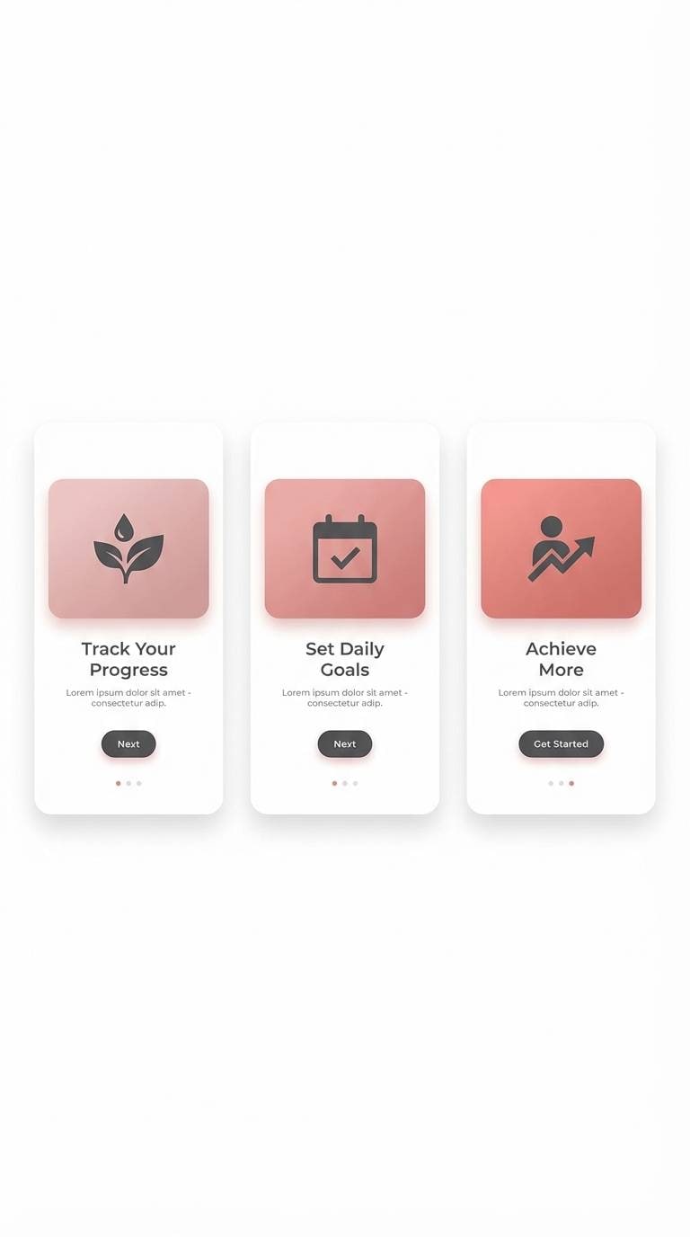
3) Dusty Rose Quartz
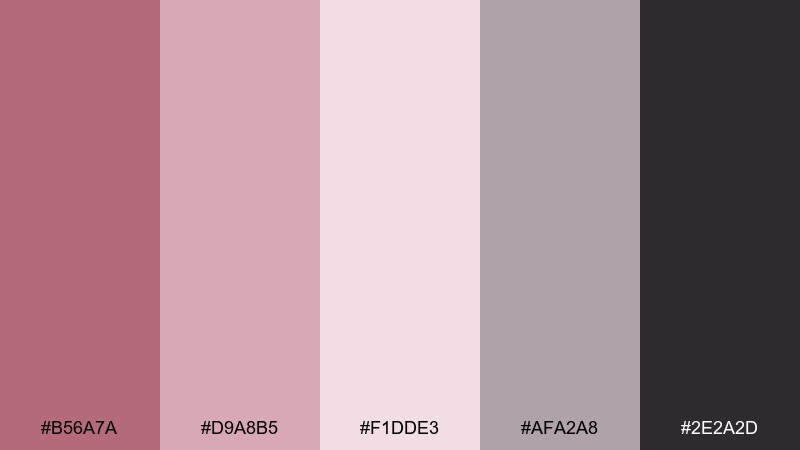
HEX: #B56A7A #D9A8B5 #F1DDE3 #AFA2A8 #2E2A2D
Mood: soft, balanced, modern
Best for: mobile app onboarding UI
Soft and balanced like frosted quartz, this mix feels calming without turning sugary. The near-black gives crisp contrast for headlines, while the dusty pinks keep screens approachable. It fits onboarding, mood tracking, and lifestyle apps where readability matters. Usage tip: set the lightest tint as the main surface color and save the mid pink for buttons and progress states.
Image example of dusty rose quartz generated using media.io
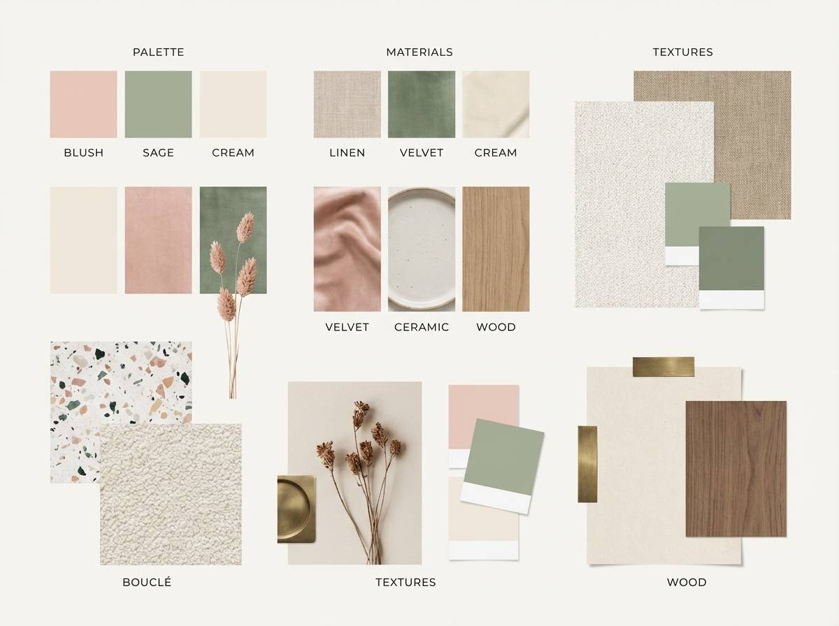
4) Rose Gold Sage
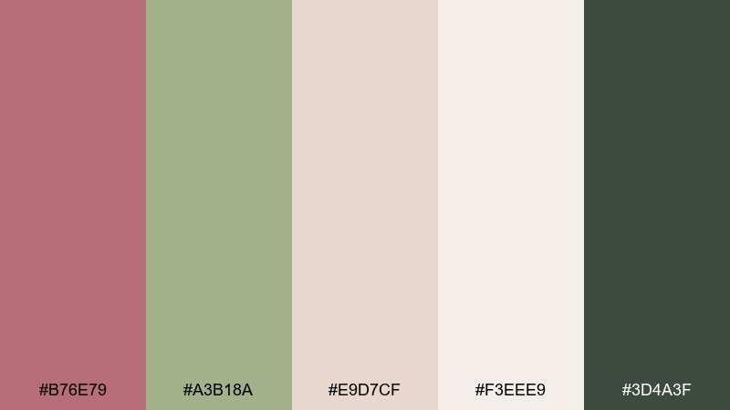
HEX: #B76E79 #A3B18A #E9D7CF #F3EEE9 #3D4A3F
Mood: fresh, botanical, grounded
Best for: home decor mood boards
Fresh and botanical, it feels like sage leaves tucked into a blush bouquet. The muted green keeps the metallic warmth from leaning too sweet, making it great for interiors and lifestyle branding. Pair the light creams with natural textures like linen, oak, and matte ceramic. Tip: use the deep green sparingly as an anchor for headings or frame lines on a mood board.
Image example of rose gold sage generated using media.io
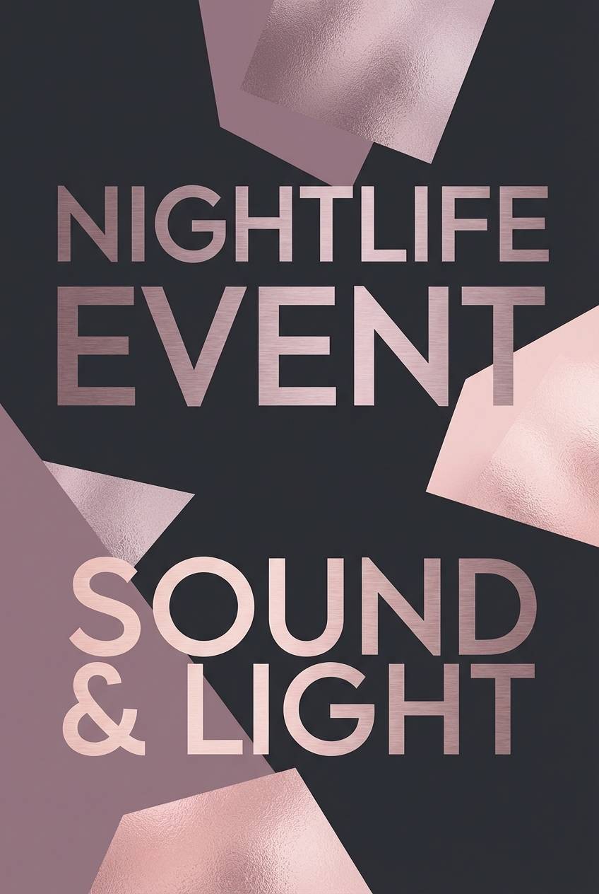
5) Metallic Mauve Night
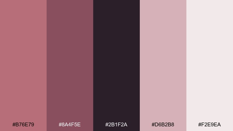
HEX: #B76E79 #8A4F5E #2B1F2A #D6B2B8 #F2E9EA
Mood: moody, glamorous, night-out
Best for: nightlife event posters
Moody and glamorous like velvet under dim lights, these hues are built for drama. Use the near-black background to make the mauves and blush highlights pop in big type. It works well for club flyers, cocktail events, and late-night pop-ups with a luxe vibe. Tip: keep effects minimal and let contrast do the heavy lifting for readability at distance.
Image example of metallic mauve night generated using media.io
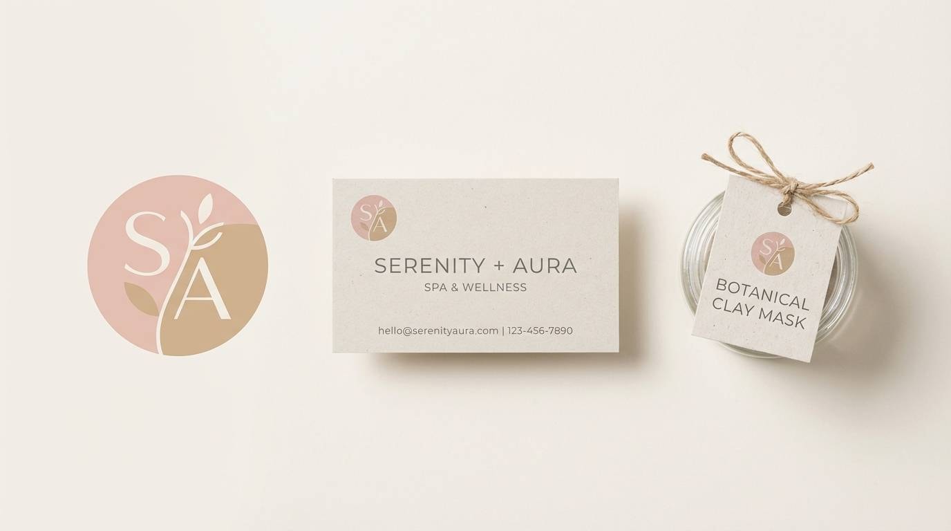
6) Blush Sandstone
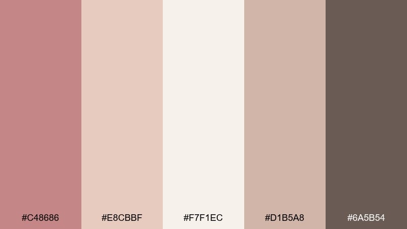
HEX: #C48686 #E8CBBF #F7F1EC #D1B5A8 #6A5B54
Mood: calm, earthy, restorative
Best for: spa branding
Calm and restorative, it evokes warm stone, clean towels, and quiet mornings. The sandy neutrals feel natural in logos, appointment cards, and serene website headers. Pair it with lots of whitespace and soft photography for an upscale wellness mood. Tip: choose the darker taupe for body text so the palette stays gentle yet accessible.
Image example of blush sandstone generated using media.io
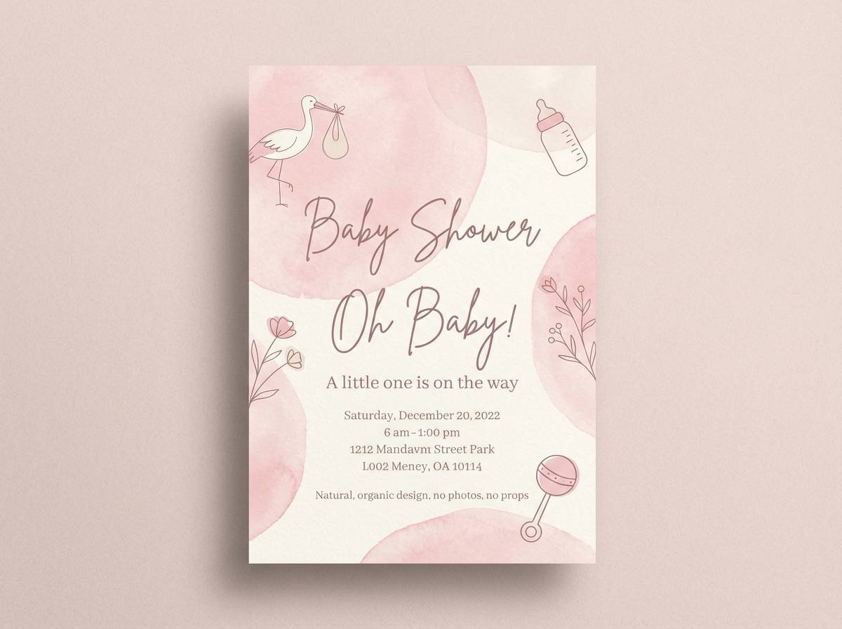
7) Peony Cream
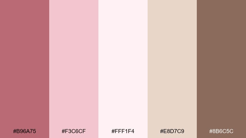
HEX: #B96A75 #F3C6CF #FFF1F4 #E8D7C9 #8B6C5C
Mood: sweet, airy, celebratory
Best for: baby shower invitations
Sweet and airy like peony petals in soft daylight, this set feels welcoming and joyful. The creamy off-whites keep pinks looking modern instead of overly candy-like. It's ideal for invitations, thank-you cards, and playful banners with hand-lettered type. Tip: use the warm brown for names and dates to keep everything legible on pale backgrounds.
Image example of peony cream generated using media.io
8) Rose Gold Navy Edge
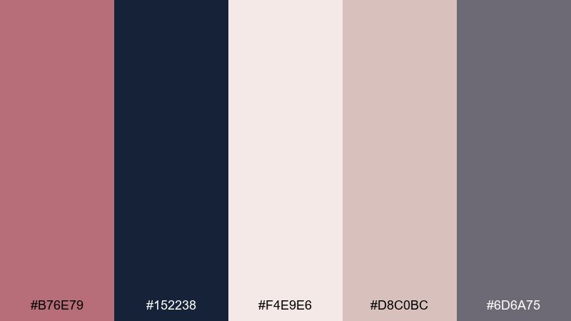
HEX: #B76E79 #152238 #F4E9E6 #D8C0BC #6D6A75
Mood: crisp, confident, upscale
Best for: corporate presentations
Crisp and confident, it feels like polished metal against a tailored navy suit. The pairing gives you rose gold color combinations that stay professional, especially on slide decks and reports. Use navy for titles and charts, then apply the blush tints to section dividers and callouts. Tip: keep the accent color ratio low, around 10 to 15 percent, for a premium look.
Image example of rose gold navy edge generated using media.io

9) Apricot Alloy
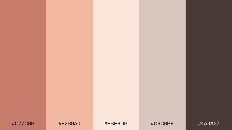
HEX: #C77C6B #F2B9A0 #FBE6DB #D9C6BF #4A3A37
Mood: sunny, handcrafted, inviting
Best for: café menu design
Sunny and handcrafted, it suggests baked apricot tart, brown sugar, and warm lighting. These colors shine on menus, loyalty cards, and small chalkboard-style prints when you want a cozy vibe. Pair the apricot tones with clean serif type and plenty of breathing room. Tip: use the deep brown for prices and headings so the warmer shades can stay decorative.
Image example of apricot alloy generated using media.io
10) Smoky Rosewood
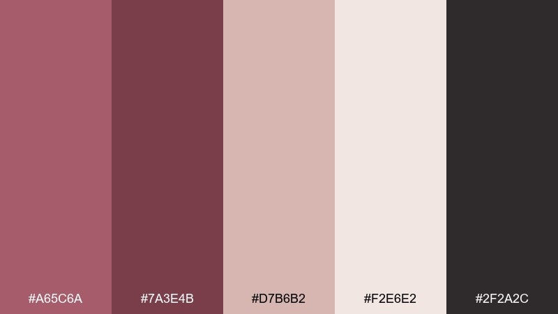
HEX: #A65C6A #7A3E4B #D7B6B2 #F2E6E2 #2F2A2C
Mood: intimate, vintage, editorial
Best for: editorial magazine layout
Intimate and vintage, it brings to mind rosewood furniture and softly worn leather. The deeper shades frame imagery beautifully, while the pale tints keep spreads airy. It's a strong fit for beauty editorials, fashion features, and longform reading layouts. Tip: use the darkest tone for pull quotes and page numbers to create rhythm across pages.
Image example of smoky rosewood generated using media.io
11) Pink Champagne Mint
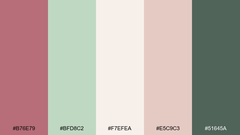
HEX: #B76E79 #BFD8C2 #F7EFEA #E5C9C3 #51645A
Mood: breezy, optimistic, modern
Best for: wellness website landing page
Breezy and optimistic, it feels like sparkling water with mint and a blush garnish. The cool green balances the warm pink so the page stays fresh, not overly romantic. Use the light cream as the main canvas, with mint for navigation highlights and blush for key CTAs. Tip: keep icons and illustrations in a single accent color to avoid visual noise.
Image example of pink champagne mint generated using media.io
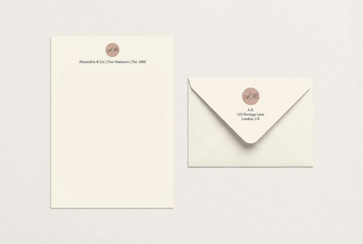
12) Antique Rose Ink
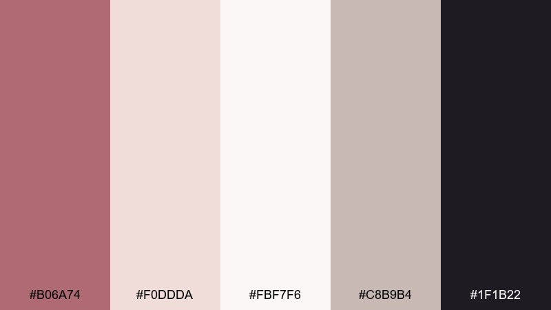
HEX: #B06A74 #F0DDDA #FBF7F6 #C8B9B4 #1F1B22
Mood: classic, elegant, literary
Best for: luxury stationery
Classic and literary, it recalls pressed petals and dark ink on cotton paper. The inky near-black makes monograms and addresses look sharp, while the pale blushes soften the overall feel. It's ideal for letterheads, envelopes, and thank-you notes with subtle embossing. Tip: print the lightest tones as paper stock or background blocks and keep ink coverage low for a premium finish.
Image example of antique rose ink generated using media.io
13) Rose Gold Teal Contrast
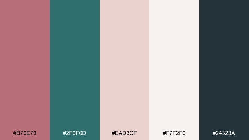
HEX: #B76E79 #2F6F6D #EAD3CF #F7F2F0 #24323A
Mood: bold, contemporary, energetic
Best for: tech brand social ads
Bold and contemporary, it feels like polished metal cut against cool sea glass. These rose gold color combinations work especially well for tech and SaaS ads where you want warmth without losing edge. Use teal for buttons and badges, keep blush tones for backgrounds, and reserve charcoal for text. Tip: limit gradients and focus on crisp shapes so the contrast stays modern.
Image example of rose gold teal contrast generated using media.io

14) Blush Terracotta Linen
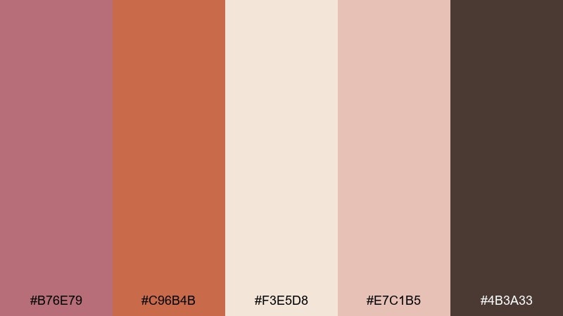
HEX: #B76E79 #C96B4B #F3E5D8 #E7C1B5 #4B3A33
Mood: rustic, tactile, boutique
Best for: boutique product labels
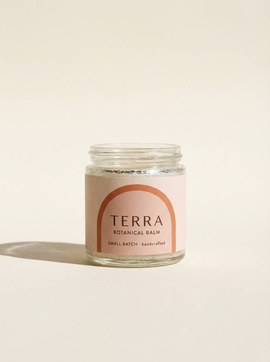
Rustic and tactile, it suggests terracotta clay, linen fabric, and warm sunlight. The earthy orange-red gives energy, while the blush and cream keep the label approachable. It's perfect for handmade goods, small-batch food jars, and artisan candles. Tip: set the background to the light cream and use terracotta only for the product name or seal for instant shelf pop.
Image example of blush terracotta linen generated using media.io
15) Frosted Rose Glow
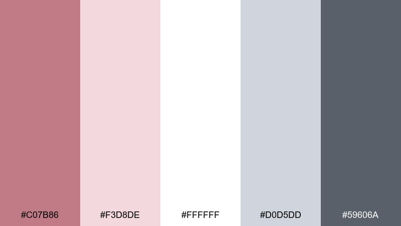
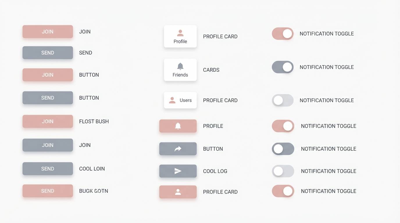
HEX: #C07B86 #F3D8DE #FFFFFF #D0D5DD #59606A
Mood: clean, airy, minimal
Best for: minimalist UI kit
Clean and airy like frosted glass with a rosy tint, this set feels modern and calm. The cool gray-blue supports the blush so layouts stay neutral and product-focused. It's great for components, dashboards, and SaaS marketing pages where subtle warmth helps. Tip: use the soft pink for active states and highlights, and keep surfaces white for maximum clarity in a rose gold color palette.
Image example of frosted rose glow generated using media.io
16) Rose Gold Plum Velvet
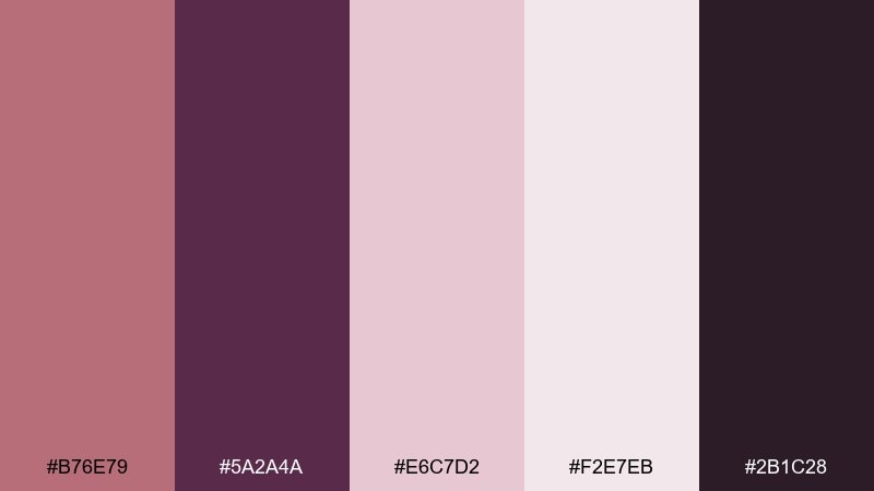
HEX: #B76E79 #5A2A4A #E6C7D2 #F2E7EB #2B1C28
Mood: dramatic, luxe, romantic
Best for: jewelry brand lookbook
Dramatic and luxe, it evokes plum velvet, dim spotlights, and warm metal shine. The deep plum and near-black create a premium frame for product photos and minimal copy. Use the pale pinks as negative space so jewelry details stay the hero. Tip: keep headings in plum and reserve rose tones for small rules, captions, or price highlights.
Image example of rose gold plum velvet generated using media.io
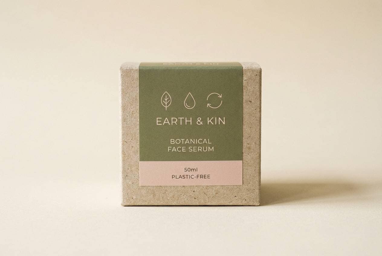
17) Sunrise Blush Olive
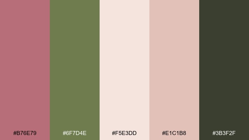
HEX: #B76E79 #6F7D4E #F5E3DD #E1C1B8 #3B3F2F
Mood: natural, warm, outdoorsy
Best for: eco packaging
Natural and warm, it feels like sunrise light on dry leaves and recycled paper. Olive and blush together read earthy and trustworthy, perfect for sustainable messaging. Use the cream and blush for background panels and keep olive for stamps, icons, and certification marks. Tip: add lots of breathing room and simple line illustrations to keep the packaging feeling honest and modern.
Image example of sunrise blush olive generated using media.io
18) Rose Gold Charcoal Studio
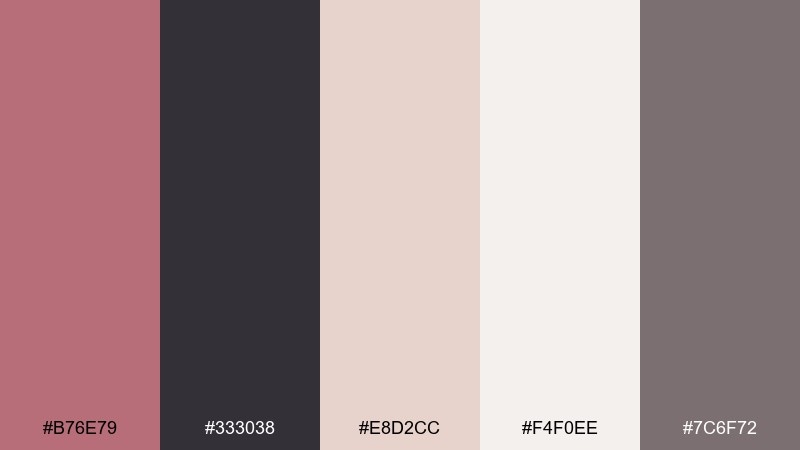
HEX: #B76E79 #333038 #E8D2CC #F4F0EE #7C6F72
Mood: modern, controlled, studio-clean
Best for: product photography backdrops
Modern and controlled, it resembles a studio sweep with a warm blush reflector. The charcoal adds structure, while the pale tints keep products from feeling heavy. These rose gold color combinations are especially useful when shooting beauty tools, accessories, or stationery with a premium angle. Tip: pick one blush as the backdrop and use charcoal only in small props or shadows to avoid muddiness.
Image example of rose gold charcoal studio generated using media.io
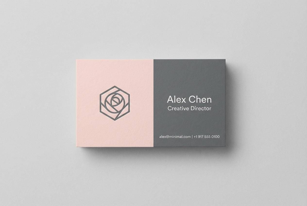
19) Soft Rose Graphite
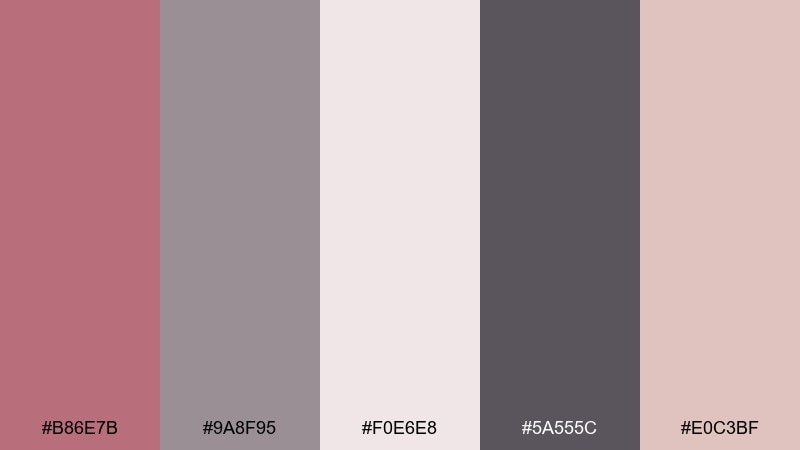
HEX: #B86E7B #9A8F95 #F0E6E8 #5A555C #E0C3BF
Mood: understated, professional, calm
Best for: business card design
Understated and professional, it feels like a tailored blazer with a soft blush lining. The graphite tones keep it serious, while the rosy accents add warmth and memorability. It's a strong choice for consultants, photographers, and boutique agencies that want subtle personality. Tip: keep one side mostly light and reserve the darker graphite for the reverse to highlight contact details.
Image example of soft rose graphite generated using media.io
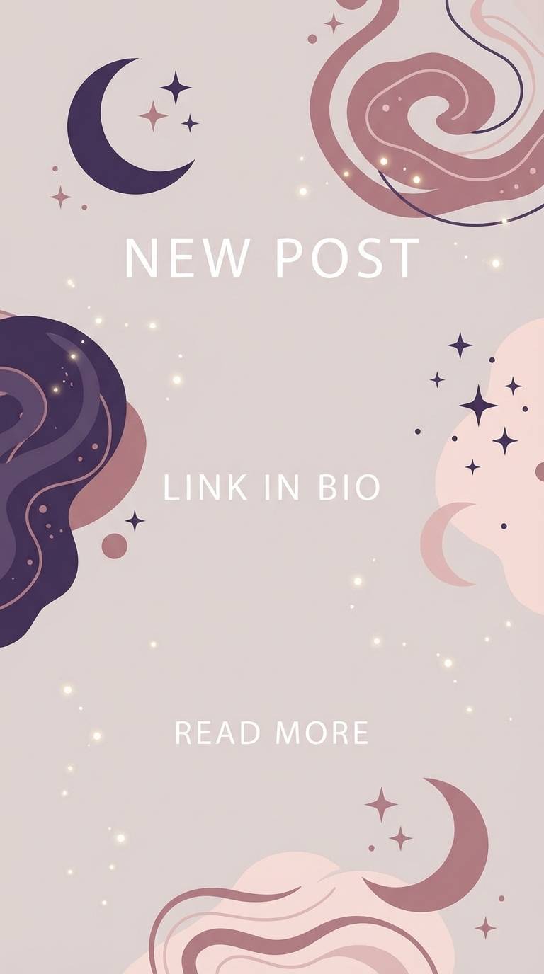
20) Glittering Blush Night Sky
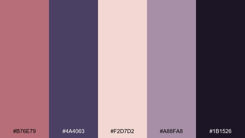
HEX: #B76E79 #4A4063 #F2D7D2 #A88FA8 #1B1526
Mood: dreamy, celestial, playful
Best for: social story templates
Dreamy and celestial, it brings to mind twilight skies with a blush glow on the horizon. The purples give depth for overlays, while the pale pinks keep stories bright and shareable. Use it for quote cards, product drops, or event reminders where you want a little magic. Tip: add subtle grain or tiny dot textures instead of heavy glitter so text stays crisp.
Image example of glittering blush night sky generated using media.io
What Colors Go Well with Rose Gold?
Rose gold pairs beautifully with soft neutrals like cream, ivory, pearl, and warm greige because they keep the overall look airy and expensive. These combinations are especially reliable for weddings, stationery, and minimalist branding.
For contrast and a more modern edge, anchor rose gold with deep tones like navy, charcoal, espresso brown, plum, or near-black. This gives you sharper hierarchy for typography and UI, while keeping the metallic warmth as the highlight.
If you want balance without going too formal, add muted greens (sage, olive, mint) or a cool accent like teal. The warm–cool split helps rose gold feel fresh instead of overly sweet.
How to Use a Rose Gold Color Palette in Real Designs
Use rose gold as an accent first: borders, icons, thin dividers, badges, or small headline highlights. When rose gold covers too much area, it can flatten into “pink,” so small, intentional placement usually looks more premium.
Choose one primary surface (often white/cream) and one dark text color (charcoal, cocoa, navy) to protect readability. Then assign one mid-tone blush for buttons or emphasis and keep the rest for supporting backgrounds.
In print, you can mimic a metallic effect with contrast and texture, or go all-in with foil/spot finishes. In digital, a subtle gradient and restrained shadow can suggest sheen without looking glossy or dated.
Create Rose Gold Palette Visuals with AI
If you already have HEX codes, you can quickly generate matching visuals by describing the layout (invite, poster, label, UI screen) and calling out rose gold, blush, cream, and your chosen contrast color. Keep prompts specific about style (minimal, editorial, boutique) and aspect ratio.
For the most consistent results, reuse one prompt structure and only swap the palette mood and design use-case. That way, you can A/B test multiple rose gold color combinations without changing the overall composition.
Create a few variations, then pick the best and refine with small changes like “more whitespace,” “higher contrast typography,” or “matte paper texture.”
Rose Gold Color Palette FAQs
-
What is the HEX code for rose gold?
A common rose gold HEX used in digital design is #B76E79. Because “rose gold” can vary from pinker to more copper-toned, you’ll also see close alternatives like warmer blush-copper mixes depending on the brand and medium. -
Does rose gold work as a main UI color?
It can, but it’s usually best as an accent (buttons, highlights, active states). Use a light neutral (white/cream) for surfaces and a dark neutral (charcoal/navy) for text, then apply rose gold sparingly to maintain contrast and accessibility. -
What colors go well with rose gold for branding?
For a premium look, pair rose gold with ivory, warm gray, and charcoal. For a fresher, modern brand, add muted green (sage or mint) or teal, and keep the overall palette soft and controlled. -
Is rose gold better with warm or cool neutrals?
Warm neutrals (ivory, beige, taupe) emphasize the romantic, luminous side of rose gold. Cool neutrals (soft grays, blue-grays) make it feel cleaner and more modern, especially for SaaS and minimalist layouts. -
How do I make rose gold look metallic in digital designs?
Use subtle gradients, gentle highlights, and controlled contrast rather than heavy shine. A small shift from a deeper mauve-copper to a pale blush highlight can suggest “metal” while still feeling modern. -
What’s a good dark text color to pair with rose gold backgrounds?
Near-black, charcoal, deep cocoa, or navy are strong choices. They keep typography crisp on blush/cream surfaces and help rose gold accents look intentional instead of blending into the background. -
Can rose gold palettes work for eco or sustainable packaging?
Yes—combine rose gold/blush with olive or sage plus recycled-paper creams. Keep the palette matte and use rose gold as a small seal, stamp, or headline accent to maintain an honest, natural feel.
Next: Moonlight Color Palette


