

Vivid color palettes are built for attention: saturated hues, sharp contrast, and punchy accents that feel modern across branding, UI, and poster design.
Below are 20 vivid color palette ideas with HEX codes, moods, and practical usage tips—so you can stay energetic without sacrificing readability.
In this article
- Why Vivid Palettes Work So Well
-
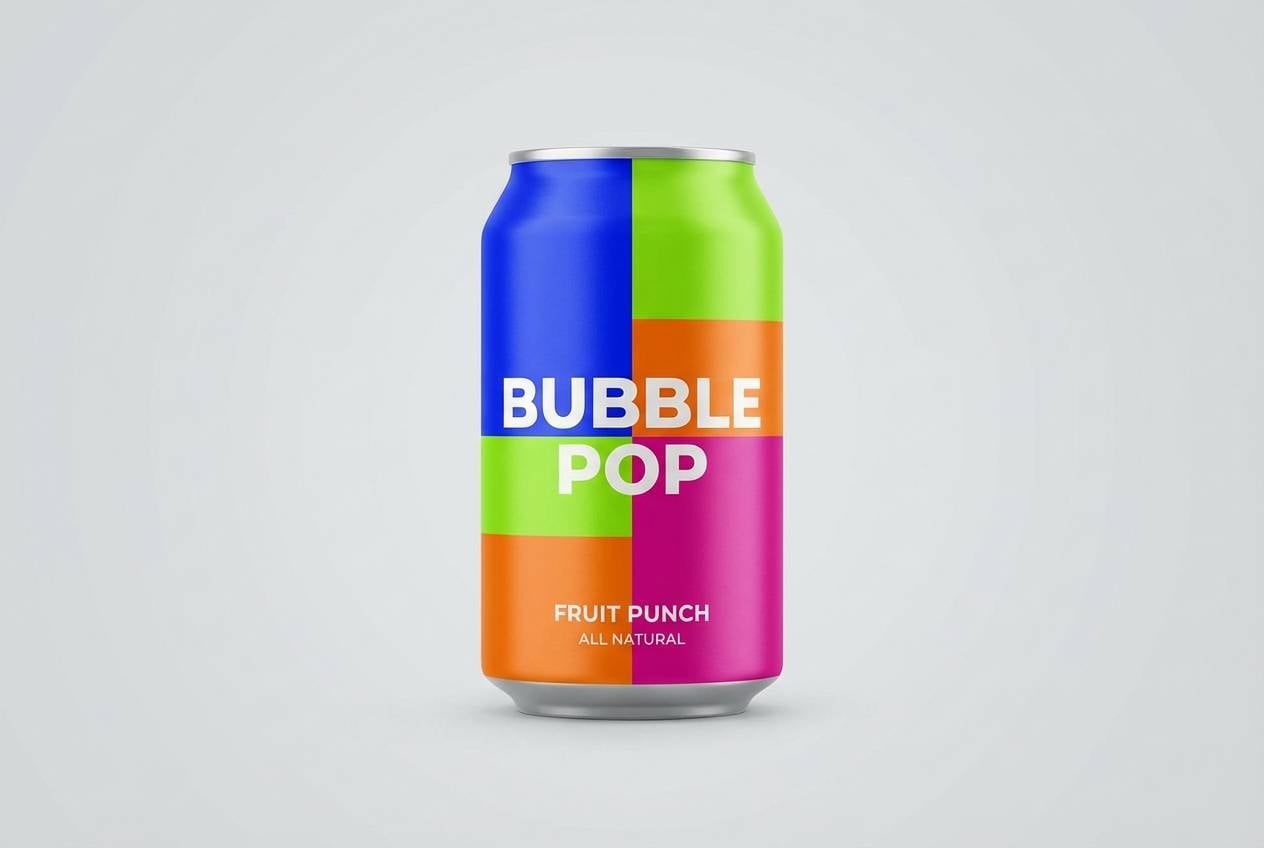
- neon citrus pop
- electric lagoon
- magenta nightlife
- tropical punch
- carnival confetti
- retro arcade glow
- sapphire ember
- sunlit coral reef
- urban graffiti
- prism festival
- cherry lime soda
- solar flare studio
- midnight teal spark
- lavender laser
- oceanic pop art
- poppy field brights
- cosmic candy
- street market spice
- alpine neon
- playful primary remix
- What Colors Go Well with Vivid?
- How to Use a Vivid Color Palette in Real Designs
- Create Vivid Palette Visuals with AI
Why Vivid Palettes Work So Well
Vivid palettes work because they deliver fast visual hierarchy—your eye instantly knows what’s primary, secondary, and interactive. That’s ideal for modern branding, mobile UI, and short-form ads where you have seconds to communicate.
They also create “memory.” High-chroma combinations are easier to recognize across touchpoints like icons, packaging, and social templates, which helps build consistent brand recall.
The key is control: use vivid hues as signals (CTAs, highlights, badges) and support them with calm neutrals or deep dark bases so typography stays readable.
20+ Vivid Color Palette Ideas (with HEX Codes)
1) Neon Citrus Pop
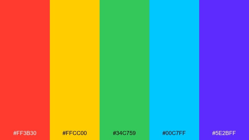
HEX: #ff3b30 #ffcc00 #34c759 #00c7ff #5e2bff
Mood: electric, playful, high-energy
Best for: app onboarding UI and promotional banners
Electric and zesty, it feels like neon signs reflected on glossy citrus peel. This vivid color palette works best when you need instant attention in onboarding screens, hero headers, and CTA sections. Pair it with clean white space or deep charcoal text areas to keep the brightness legible. Usage tip: assign one dominant hue and reserve the others for micro-accents like badges and toggles.
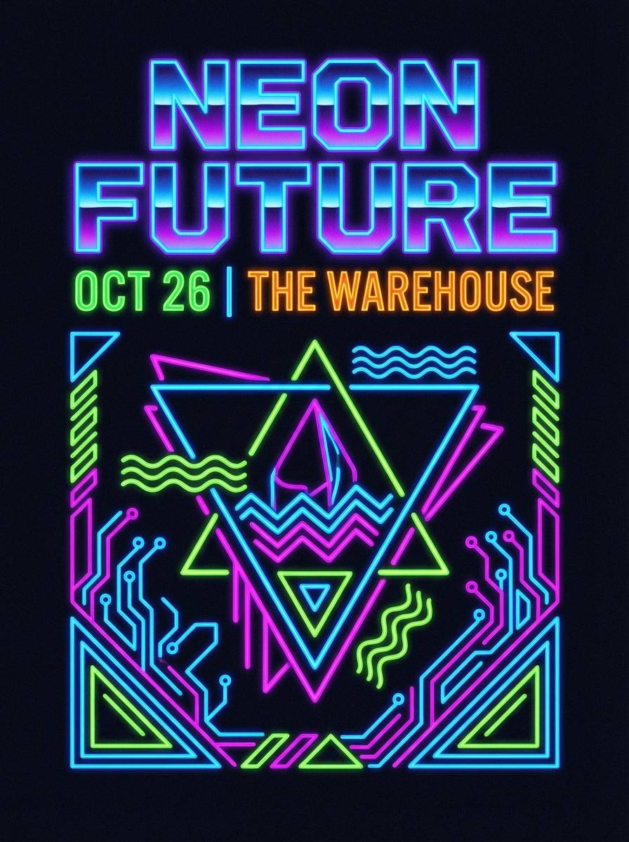
Image example of neon citrus pop generated using media.io
Media.io is an online AI studio for creating and editing video, image, and audio in your browser.

2) Electric Lagoon
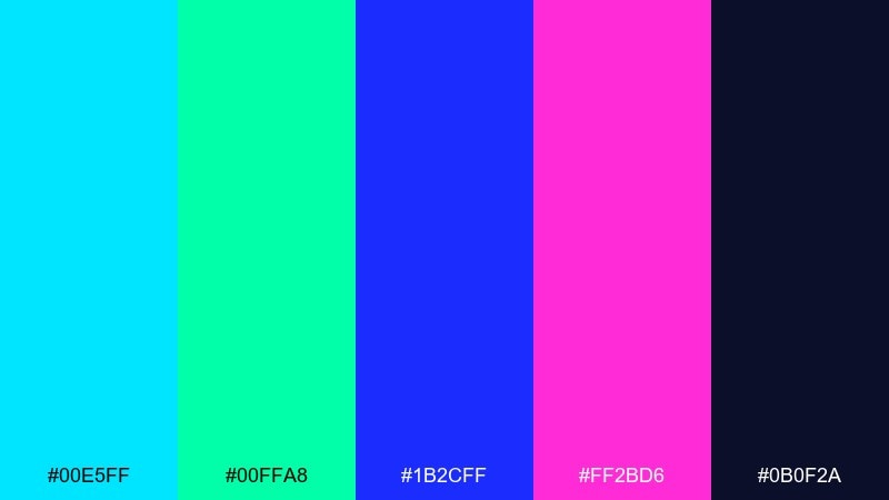
HEX: #00e5ff #00ffa8 #1b2cff #ff2bd6 #0b0f2a
Mood: futuristic, aquatic, bold
Best for: gaming brand identity and livestream overlays
Futuristic and aquatic, it evokes bioluminescent water under a midnight sky. Use it for gaming logos, stream panels, and punchy highlight moments where contrast must be immediate. Balance the hot magenta with the deep navy so your type stays crisp. Usage tip: keep gradients subtle and let neon accents carry the impact.
Image example of electric lagoon generated using media.io
3) Magenta Nightlife
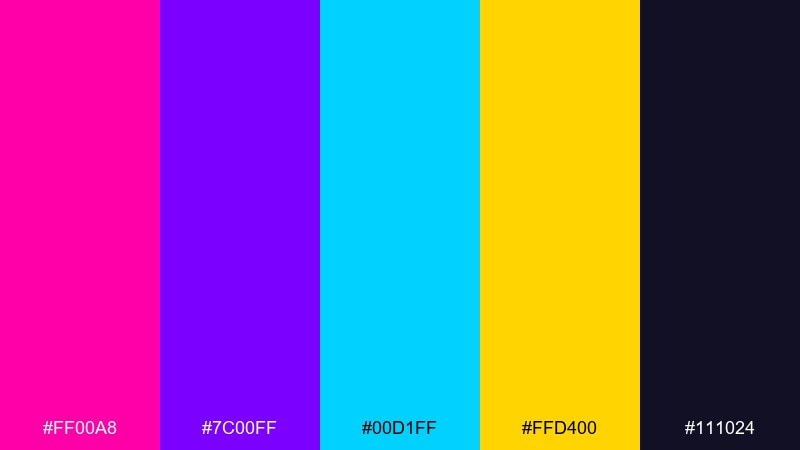
HEX: #ff00a8 #7c00ff #00d1ff #ffd400 #111024
Mood: night-out, glossy, dramatic
Best for: club event posters and DJ flyer designs
Glossy and dramatic, it brings to mind a dance floor lit by lasers and backlit haze. It shines on event posters, DJ flyers, and social tiles where you want nightlife energy without muddy shadows. Pair the bright cyan and gold with the inky base to anchor text blocks and dates. Usage tip: set the main headline in a light color and use magenta for key callouts.
Image example of magenta nightlife generated using media.io
4) Tropical Punch
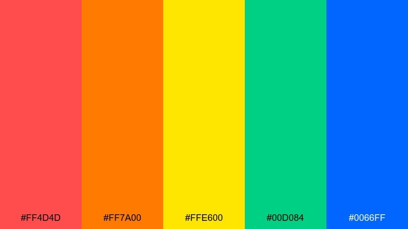
HEX: #ff4d4d #ff7a00 #ffe600 #00d084 #0066ff
Mood: sunny, juicy, upbeat
Best for: summer campaign creatives and social ads
Sunny and juicy, it feels like a tropical drink served under noon light. Use it for summer promos, limited-time offers, and scroll-stopping social ads that need warmth plus clarity. Pair the reds and oranges with the cooler blue for structure in layouts and buttons. Usage tip: keep body text dark and let the yellow act as a controlled highlight, not a full background.
Image example of tropical punch generated using media.io

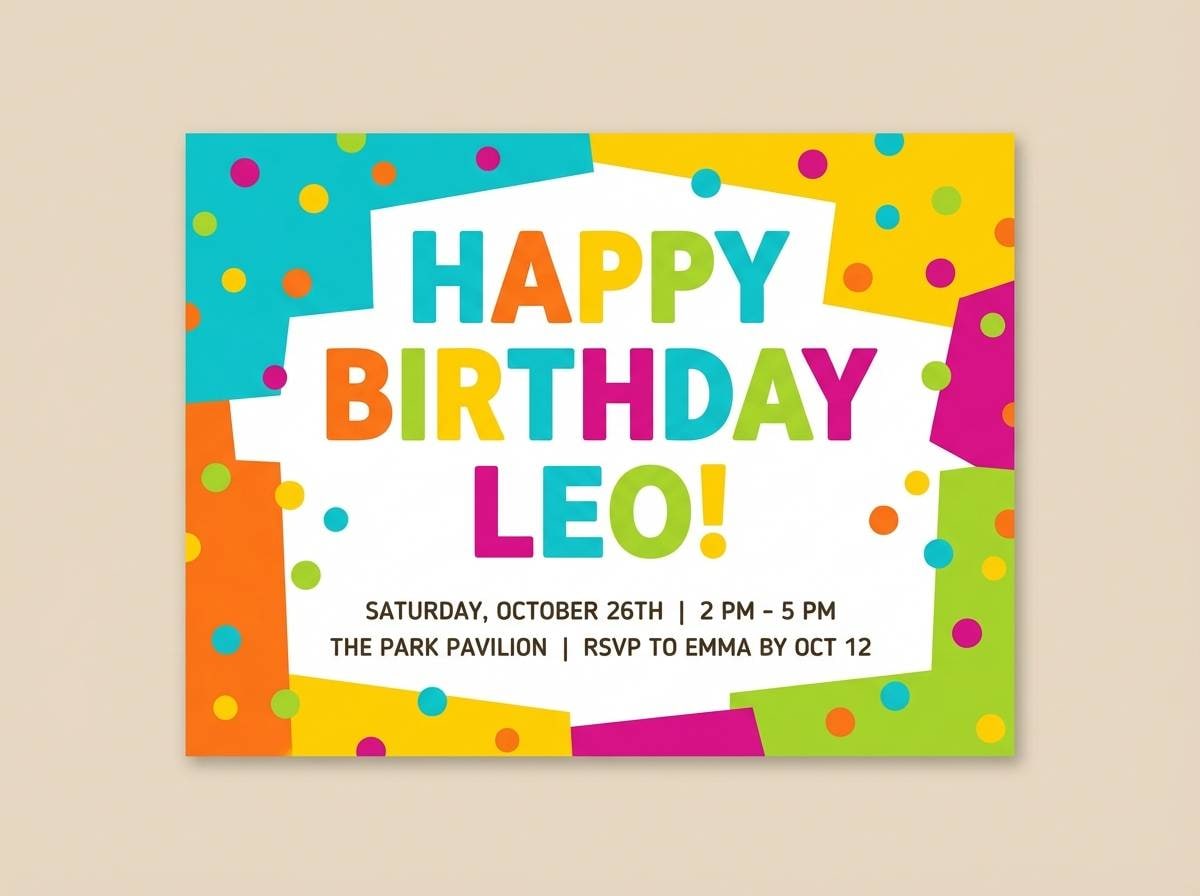
5) Carnival Confetti
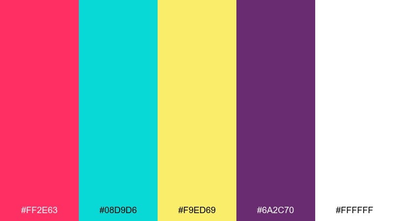
HEX: #ff2e63 #08d9d6 #f9ed69 #6a2c70 #ffffff
Mood: celebratory, friendly, bright
Best for: kids product branding and party invitations
Celebratory and friendly, it looks like confetti popping against a clean white backdrop. These vivid color combinations are perfect for kids brands, birthday invitations, and playful packaging where joy is the message. Pair the purple with generous white space to prevent the bright accents from competing. Usage tip: use the yellow sparingly for icons and stars so it reads as sparkle, not glare.
Image example of carnival confetti generated using media.io
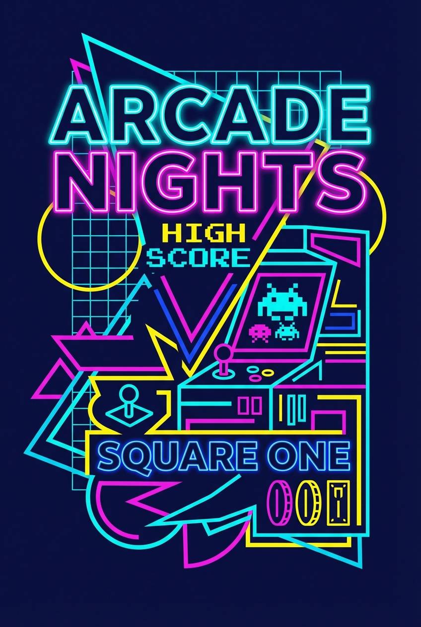
6) Retro Arcade Glow
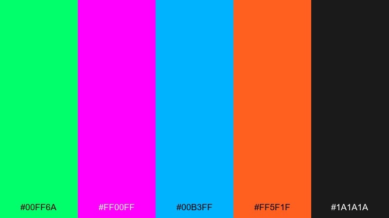
HEX: #00ff6a #ff00ff #00b3ff #ff5f1f #1a1a1a
Mood: nostalgic, punchy, neon
Best for: arcade-themed posters and merch graphics
Nostalgic and punchy, it channels arcade cabinets and pixel-lit screens. It works beautifully on posters, stickers, and merch where saturated edges and dark grounding create instant depth. Pair the neon trio with the charcoal base to keep outlines sharp and readable. Usage tip: add thin strokes or glow effects only to key shapes so the design stays clean, not noisy.
Image example of retro arcade glow generated using media.io
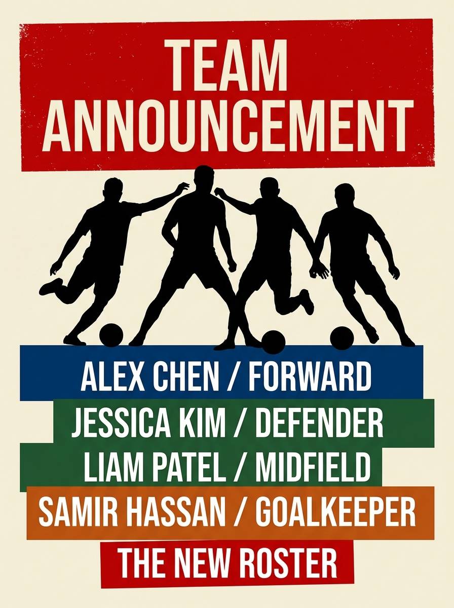
7) Sapphire Ember
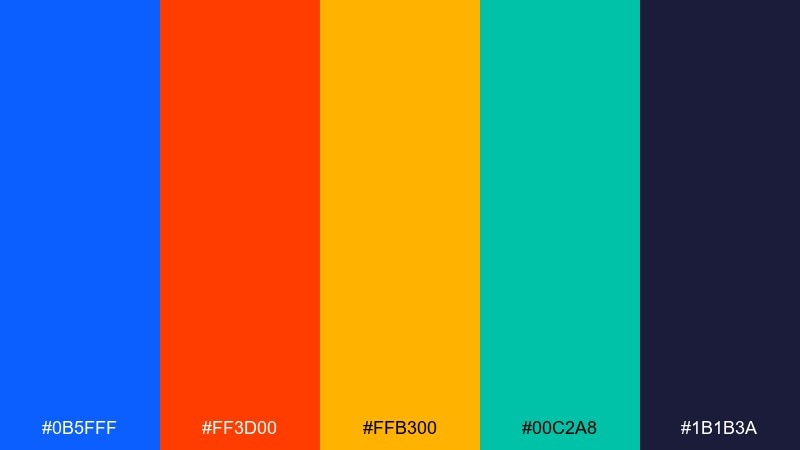
HEX: #0b5fff #ff3d00 #ffb300 #00c2a8 #1b1b3a
Mood: confident, sporty, dynamic
Best for: sports club branding and team announcements
Confident and dynamic, it feels like stadium lights cutting through dusk. Use it for sports branding, team announcements, and match-day graphics that need power without losing legibility. Pair sapphire with the deep indigo for large surfaces, then bring in ember orange for urgency and action. Usage tip: keep the teal as a secondary accent to avoid competing with the main warm highlight.
Image example of sapphire ember generated using media.io
8) Sunlit Coral Reef
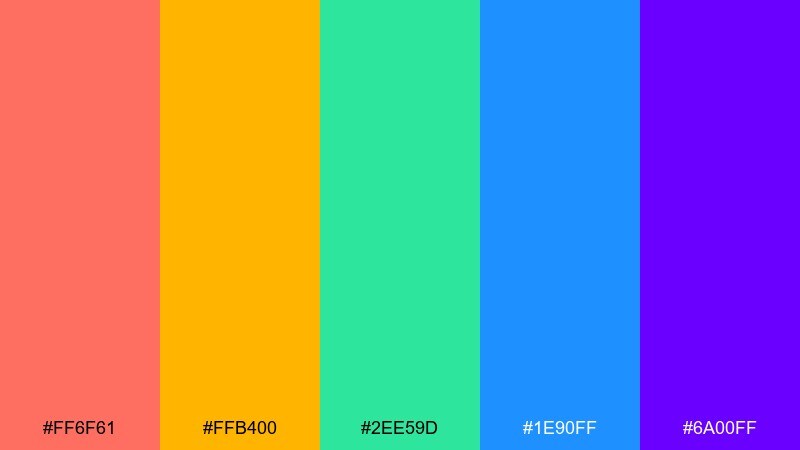
HEX: #ff6f61 #ffb400 #2ee59d #1e90ff #6a00ff
Mood: optimistic, coastal, lively
Best for: travel landing pages and resort brochures
Optimistic and coastal, it evokes coral, sun glints, and clear shallow water. It fits travel landing pages and resort brochures where you want freshness without going pastel. Pair the coral with blue for a classic sea-and-sunset balance, and keep purple for small brand moments like icons. Usage tip: use the warm yellow behind short text only, so it reads like sunlight rather than a highlighter.
Image example of sunlit coral reef generated using media.io
9) Urban Graffiti
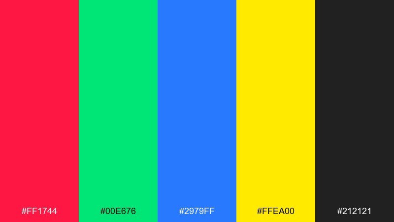
HEX: #ff1744 #00e676 #2979ff #ffea00 #212121
Mood: street, rebellious, high-contrast
Best for: streetwear lookbooks and brand promos
Street and rebellious, it feels like fresh paint against concrete. Use it for streetwear lookbooks, brand promos, and bold editorial headers that need attitude and punch. Pair the bright hues with the near-black base to frame type and keep layouts intentional. Usage tip: limit the palette to two loud colors per page and rotate the rest across sections for consistency.
Image example of urban graffiti generated using media.io
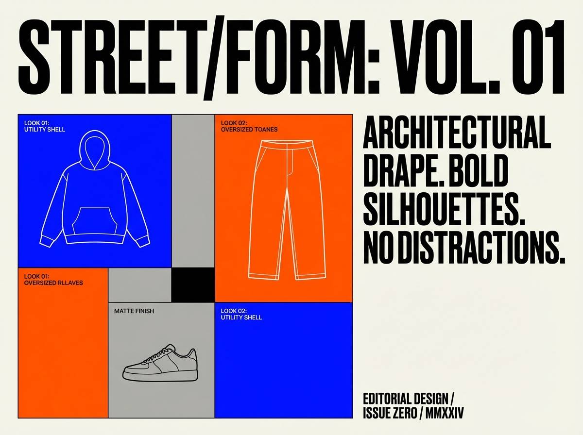
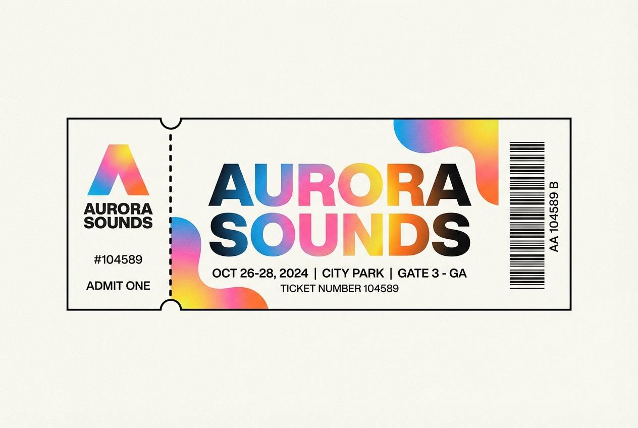
10) Prism Festival
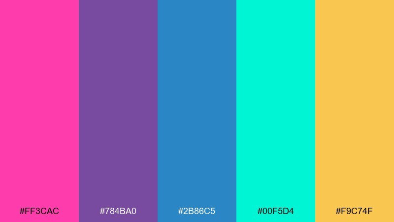
HEX: #ff3cac #784ba0 #2b86c5 #00f5d4 #f9c74f
Mood: creative, dreamy, energetic
Best for: music festival branding and wristband designs
Creative and dreamy, it reads like a prism catching stage lights mid-set. It works for festival branding, wristbands, and ticket graphics where color can carry the identity. Pair the aqua with the blue for large fields, then use pink and gold for emphasis on dates and tiers. Usage tip: keep text in a single dark tone and let gradients live only in backgrounds or ribbons.
Image example of prism festival generated using media.io
11) Cherry Lime Soda
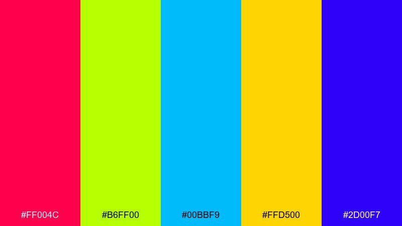
HEX: #ff004c #b6ff00 #00bbf9 #ffd500 #2d00f7
Mood: fun, fizzy, youthful
Best for: beverage packaging and pop-up ads
Fun and fizzy, it looks like bubbles rising through bright soda. Use it for beverage labels, pop-up ads, and product launches that need a youthful hit of color. Pair the lime with deep violet to create a clean hierarchy, then use cherry red for the primary call to action. Usage tip: keep backgrounds light and let the strongest colors live on logos and key flavor elements.
Image example of cherry lime soda generated using media.io
12) Solar Flare Studio
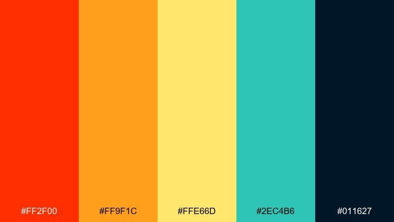
HEX: #ff2f00 #ff9f1c #ffe66d #2ec4b6 #011627
Mood: bold, modern, cinematic
Best for: creative agency websites and case study pages
Bold and cinematic, it suggests a solar flare cutting across a dark studio set. This vivid color palette is ideal for creative agency sites and case-study pages where you want polished drama with clear navigation. Pair the warm trio with deep navy sections for readability, and keep teal for interactive states like hover and focus. Usage tip: use the brightest yellow only as a spotlight element behind short numbers or key metrics.
Image example of solar flare studio generated using media.io
13) Midnight Teal Spark
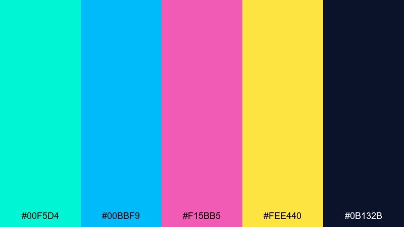
HEX: #00f5d4 #00bbf9 #f15bb5 #fee440 #0b132b
Mood: techy, sleek, upbeat
Best for: SaaS dashboards and data highlight states
Techy and sleek, it feels like LEDs blinking across a midnight control room. Use it for SaaS dashboards, charts, and notification states where color must communicate fast. Pair the deep navy with teal for structure, then reserve pink and yellow for warnings, successes, or feature highlights. Usage tip: apply the accent colors to small UI components only, and keep large panels calm and dark.
Image example of midnight teal spark generated using media.io
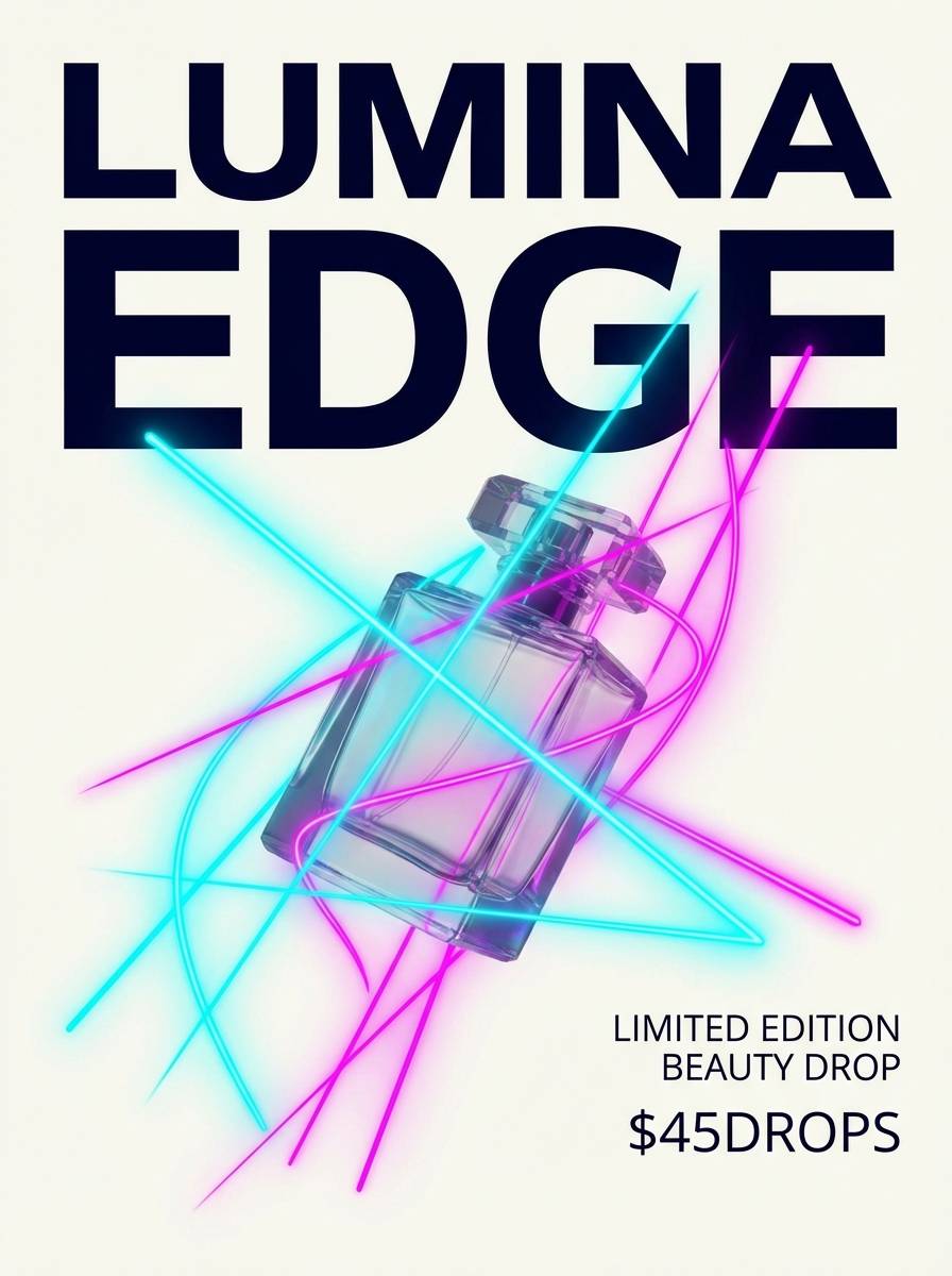
14) Lavender Laser
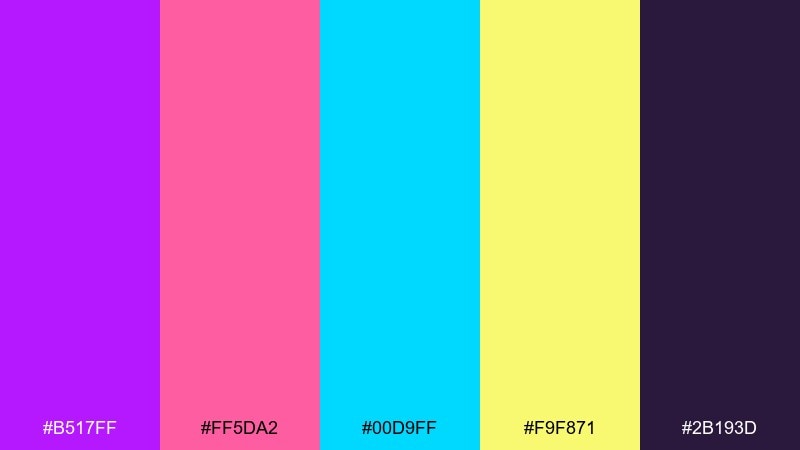
HEX: #b517ff #ff5da2 #00d9ff #f9f871 #2b193d
Mood: quirky, futuristic, stylish
Best for: beauty launch graphics and limited edition drops
Quirky and futuristic, it reads like lavender lasers slicing through velvet darkness. It suits beauty launch graphics, limited drops, and creator announcements where style matters as much as clarity. Pair the deep plum with cyan for strong contrast, and use the soft yellow as a glow accent around prices or dates. Usage tip: keep gradients confined to headers and let the rest of the layout stay flat and crisp.
Image example of lavender laser generated using media.io
15) Oceanic Pop Art
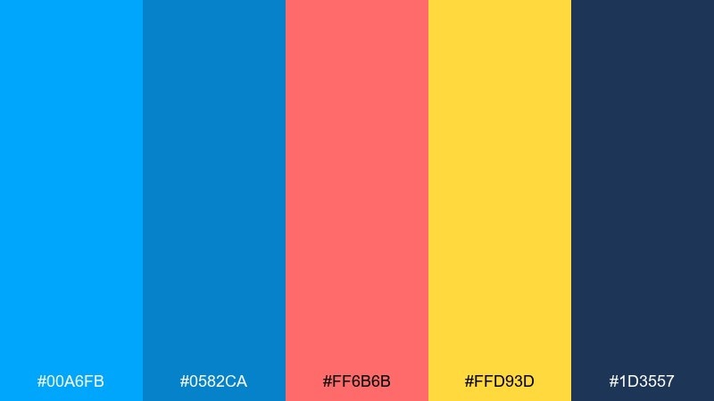
HEX: #00a6fb #0582ca #ff6b6b #ffd93d #1d3557
Mood: fresh, graphic, upbeat
Best for: illustrated explainer slides and blog headers
Fresh and graphic, it feels like pop-art waves with sunny highlights. Use it for illustrated explainer decks, blog headers, and brand illustrations that need friendly impact. Pair the blues with navy for a stable base, then use coral and yellow to guide the eye through steps. Usage tip: repeat one accent color for icons across a whole section to keep the story coherent.
Image example of oceanic pop art generated using media.io
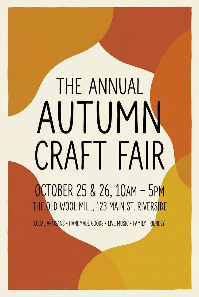
16) Poppy Field Brights
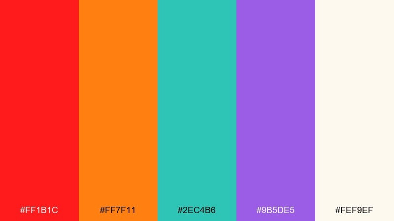
HEX: #ff1b1c #ff7f11 #2ec4b6 #9b5de5 #fef9ef
Mood: optimistic, artsy, warm
Best for: craft fair posters and handmade shop branding
Optimistic and artsy, it recalls poppies in bloom with a playful handmade touch. It works for craft fairs, maker markets, and small-shop branding where warmth should feel modern, not rustic. Pair the soft off-white with red and orange for approachable headlines, then use teal to calm the layout. Usage tip: keep purple for brand marks and secondary badges so it stays special.
Image example of poppy field brights generated using media.io
17) Cosmic Candy
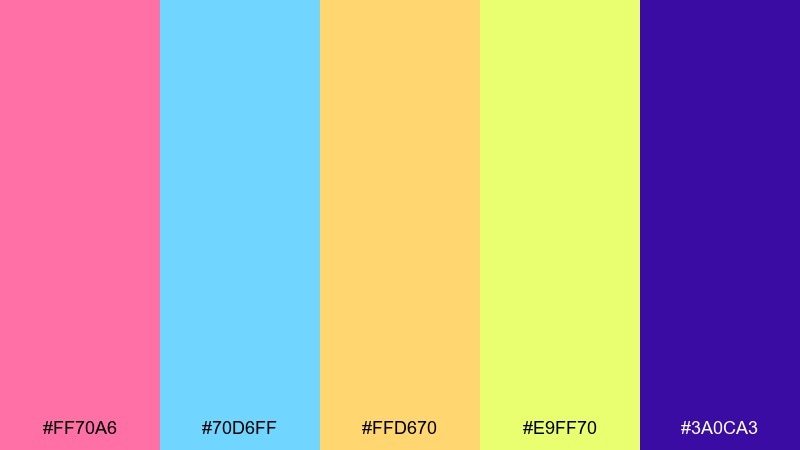
HEX: #ff70a6 #70d6ff #ffd670 #e9ff70 #3a0ca3
Mood: whimsical, dreamy, pop
Best for: creator thumbnails and playful channel branding
Whimsical and dreamy, it feels like candy clouds drifting through a violet night sky. These vivid color combinations are great for creator thumbnails, channel banners, and playful brand kits that need instant recognition. Pair violet with the pastel-bright accents for strong contrast, then keep one warm tone as the main highlight. Usage tip: make the thumbnail background dark and let the lighter colors frame faces or title text blocks.
Image example of cosmic candy generated using media.io
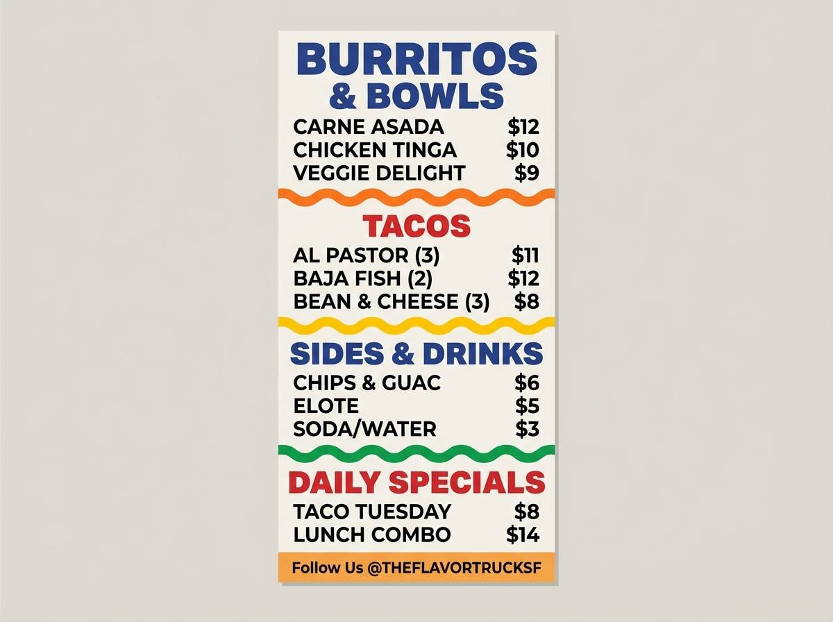
18) Street Market Spice
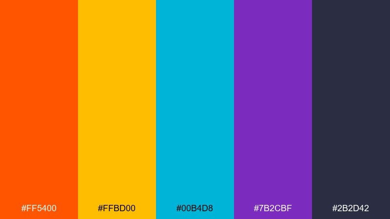
HEX: #ff5400 #ffbd00 #00b4d8 #7b2cbf #2b2d42
Mood: busy, flavorful, energetic
Best for: food truck menus and restaurant promo posters
Busy and flavorful, it brings to mind spice stalls, bright signs, and late-night bites. Use it for food truck menus and restaurant promos where you want appetite and energy in the same frame. Pair the deep slate with orange for main headings, and use cyan to separate sections like drinks and sides. Usage tip: keep menu body text in a light neutral and use color only for categories and prices.
Image example of street market spice generated using media.io
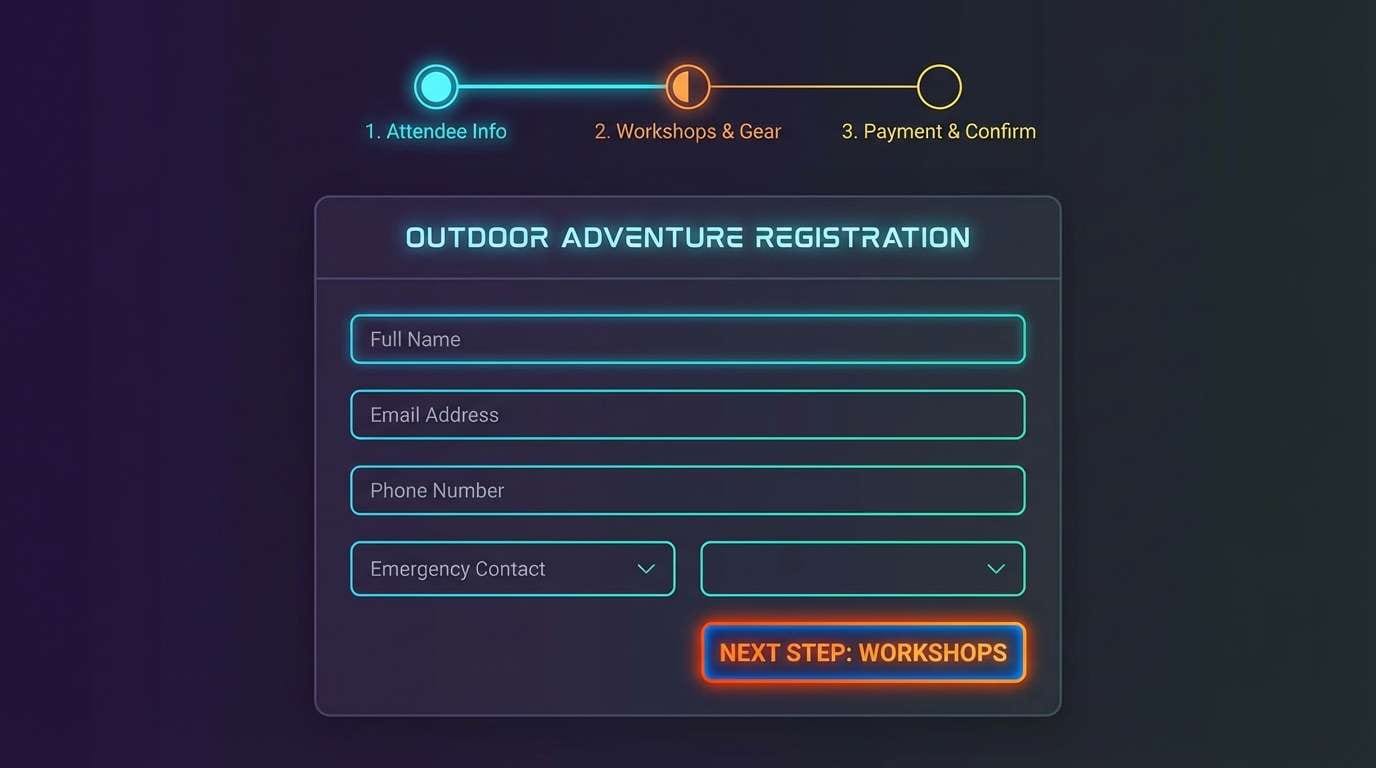
19) Alpine Neon
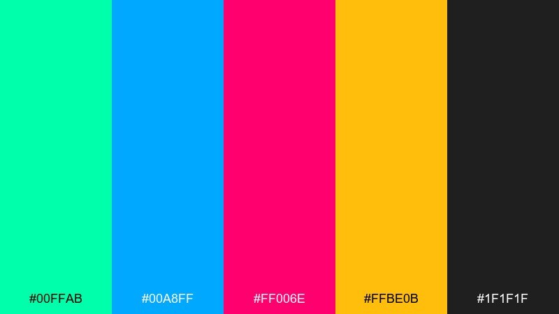
HEX: #00ffab #00a8ff #ff006e #ffbe0b #1f1f1f
Mood: fresh, sporty, adventurous
Best for: outdoor app UI and event registration pages
Fresh and adventurous, it feels like high-altitude air with neon trail markers. It fits outdoor app interfaces and registration pages where clarity matters in quick decisions. Pair the charcoal with blue for primary UI surfaces and use pink or yellow for the action path like register and join. Usage tip: keep neon accents consistent by mapping them to states such as active, selected, and alert.
Image example of alpine neon generated using media.io
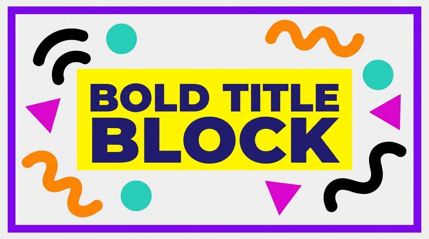
20) Playful Primary Remix
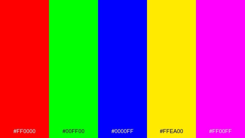
HEX: #ff0000 #00ff00 #0000ff #ffea00 #ff00ff
Mood: bold, experimental, loud
Best for: pop-art editorials and graphic tees
Bold and experimental, it echoes pop-art prints and primary paint straight from the tube. Use it for graphic tees, zines, and editorial spreads where loud color is part of the concept. Pair one primary with plenty of negative space, and let the others appear as small, deliberate hits. Usage tip: avoid long paragraphs on saturated backgrounds and keep type in black or white for clean readability.
Image example of playful primary remix generated using media.io
What Colors Go Well with Vivid?
Vivid colors pair best with stabilizers: deep navy, charcoal, near-black, and clean white. These neutrals absorb intensity and protect readability, especially for body text and dense UI areas.
For smoother contrast, add “bridge” tones like slate blue, muted teal, warm gray, or off-white. They help transitions between bright blocks and reduce visual fatigue in long layouts.
If you need extra pop, use metallic-like accents (gold/yellow highlights) sparingly—think labels, numbers, icons, and tiny separators rather than full backgrounds.
How to Use a Vivid Color Palette in Real Designs
Start with a dominant color (brand anchor), a dark/light base (for surfaces and text), and 1–2 accent colors (for interaction or emphasis). This keeps a vivid color scheme intentional instead of chaotic.
In UI, map colors to meaning: one for primary actions, one for secondary actions, and reserve the loudest hues for alerts, badges, or chart highlights. Consistent roles beat “pretty” random usage.
For posters and social creatives, use bold color blocking with clear typography. Keep long paragraphs off saturated backgrounds and rely on contrast-first type choices (black/white on solid blocks).
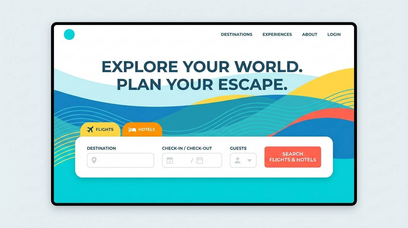
Create Vivid Palette Visuals with AI
If you already have HEX codes, you can quickly turn them into real design directions by generating mockups: onboarding screens, posters, tickets, packaging labels, or thumbnails.
With Media.io’s text-to-image tool, describe the layout (not just the colors), then iterate on composition, typography space, and contrast until the vivid palette stays readable.
For best results, mention “high contrast,” “clean typography,” and “plain background” in your prompt, then specify the aspect ratio you need for your platform.
Vivid Color Palette FAQs
-
What is a vivid color palette?
A vivid color palette uses high-saturation hues (often paired with dark or white neutrals) to create strong contrast, high energy, and fast visual hierarchy in branding, UI, and marketing designs. -
How do I keep vivid colors readable for text?
Put long text on neutral surfaces (white, off-white, charcoal, deep navy) and use vivid colors as accents. When text must sit on a vivid background, increase contrast (black/white), enlarge font size, and avoid thin weights. -
How many vivid colors should I use in one design?
Usually 1 dominant vivid color plus 1–2 accent vivid colors is enough. Add a neutral base and treat the remaining bright colors as optional micro-accents to prevent visual noise. -
What neutrals pair best with vivid color schemes?
Charcoal, near-black, deep navy, and clean white work best because they stabilize saturated hues. Warm off-whites and cool light grays can also soften contrast while keeping designs modern. -
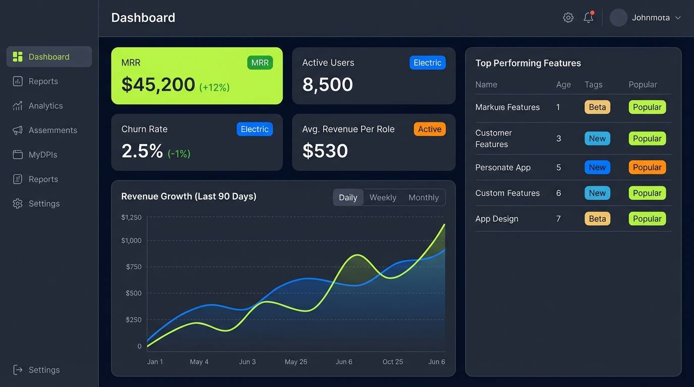
Are vivid palettes good for UI dashboards?
Yes—when used for meaning, not decoration. Keep most panels calm (dark mode or light neutrals) and reserve vivid colors for states like active, selected, warnings, success, and key chart highlights. -
What’s the difference between vivid and neon colors?
Neon is a subset of vivid: extremely high-chroma hues that feel like glowing light. Vivid palettes can include neon-like tones, but they can also be bold without looking fluorescent. -
How can I generate vivid palette mockups quickly?
Use Media.io’s AI image generator and prompt a specific deliverable (e.g., “event flyer,” “onboarding UI,” “menu board”). Include “clean typography,” “high contrast,” and a clear aspect ratio to get usable results faster.
Next: Rust Brown Color Palette


