

Rust brown is a warm, earthy hue that instantly feels grounded, handcrafted, and seasonal. It can read rustic and organic, or modern and premium depending on the neutrals and accents you pair with it.
Below are 20 curated rust brown color palette ideas with HEX codes, plus practical ways to use them for branding, UI, interiors, posters, and social graphics.
In this article
- Why Rust Brown Palettes Work So Well
-
- kiln fired neutrals
- desert adobe
- copper and sage
- vintage leather
- autumn market
- canyon sunset
- rustic minimal ui
- spiced mocha
- botanical terracotta
- clay and charcoal
- warm industrial
- sienna seaside
- cocoa blush
- harvest typography
- lodge weekend
- ceramic studio
- burnt amber luxe
- earthy wedding suite
- museum editorial
- nightfall rust
- What Colors Go Well with Rust Brown?
- How to Use a Rust Brown Color Palette in Real Designs
- Create Rust Brown Palette Visuals with AI
Why Rust Brown Palettes Work So Well
Rust brown sits in the sweet spot between terracotta and deep brown, so it carries both warmth and structure. That makes it versatile: it can feel cozy and nostalgic, or clean and modern when paired with cool grays and off-whites.
Because rust brown is naturally “material-coded” (clay, leather, wood, metal patina), it helps designs feel tactile and believable. It’s especially strong for brands that want to communicate craft, heritage, sustainability, or comfort.
It also plays well with lighting cues in imagery—golden-hour photography, studio product shots, and textured backgrounds. With the right contrast, rust becomes a confident accent color for CTAs, headings, and highlights.
20+ Rust Brown Color Palette Ideas (with HEX Codes)
1) Kiln Fired Neutrals
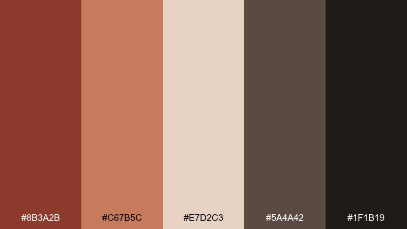
HEX: #8B3A2B #C67B5C #E7D2C3 #5A4A42 #1F1B19
Mood: earthy, grounded, artisanal
Best for: ceramic studio branding and packaging
Earthy and grounded like fresh clay pulled from a kiln, these tones feel handmade and honest. Use the warm cream as breathing room, then let the deep brown anchor headers, labels, or hero blocks. Pair well with natural textures like kraft paper, linen, and uncoated stock. Tip: keep the near-black for small type only so the palette stays warm instead of harsh.
Image example of kiln fired neutrals generated using media.io
Media.io is an online AI studio for creating and editing video, image, and audio in your browser.

2) Desert Adobe
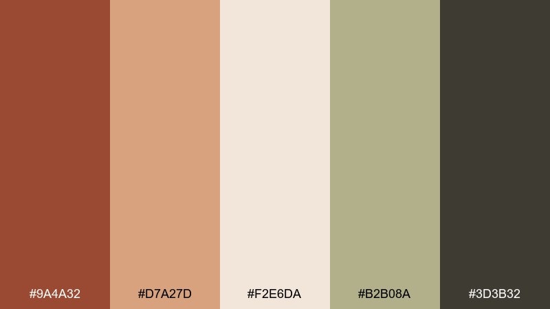
HEX: #9A4A32 #D7A27D #F2E6DA #B2B08A #3D3B32
Mood: sun-baked, calm, rustic
Best for: southwest interior mood boards
Sun-baked and calm, it recalls adobe walls, dry grasses, and shaded patios. Balance the bold rust with sandy midtones for large surfaces like walls, rugs, or tile concepts. The muted olive-sand works beautifully with blackened metal fixtures and light oak. Tip: repeat the dark charcoal in small details to keep the look cohesive without feeling heavy.
Image example of desert adobe generated using media.io
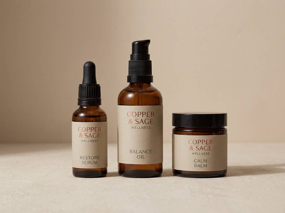
3) Copper and Sage
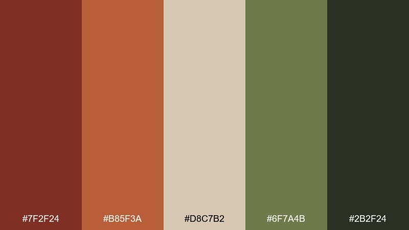
HEX: #7F2F24 #B85F3A #D8C7B2 #6F7A4B #2B2F24
Mood: botanical, refined, warm
Best for: wellness brand identity and labels
Botanical and refined, it feels like copper vessels beside crushed herbs. This rust brown color scheme shines on wellness labels, candle branding, and ingredient-forward packaging where warmth must still feel clean. Pair the sage with the creamy beige for background blocks, then use the dark green-black for typography. Tip: limit coppery orange to highlights and seals so it reads premium, not loud.
Image example of copper and sage generated using media.io
4) Vintage Leather
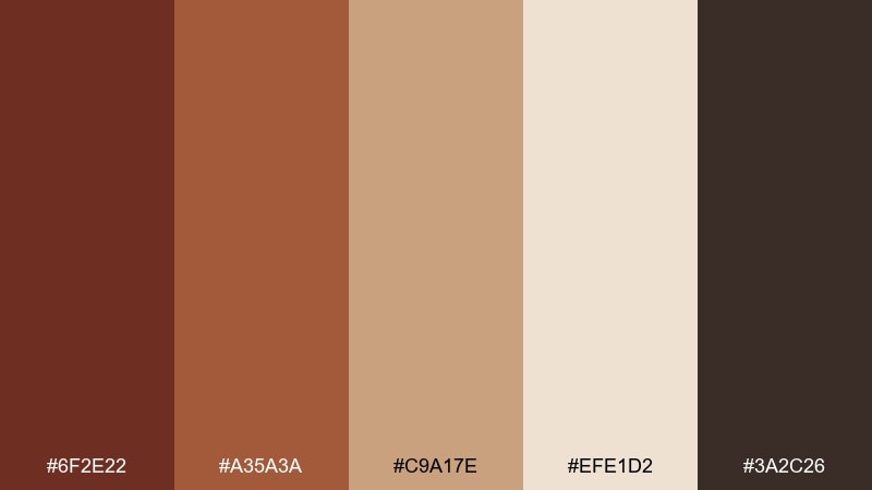
HEX: #6F2E22 #A35A3A #C9A17E #EFE1D2 #3A2C26
Mood: heritage, cozy, masculine
Best for: menswear lookbooks and retail signage
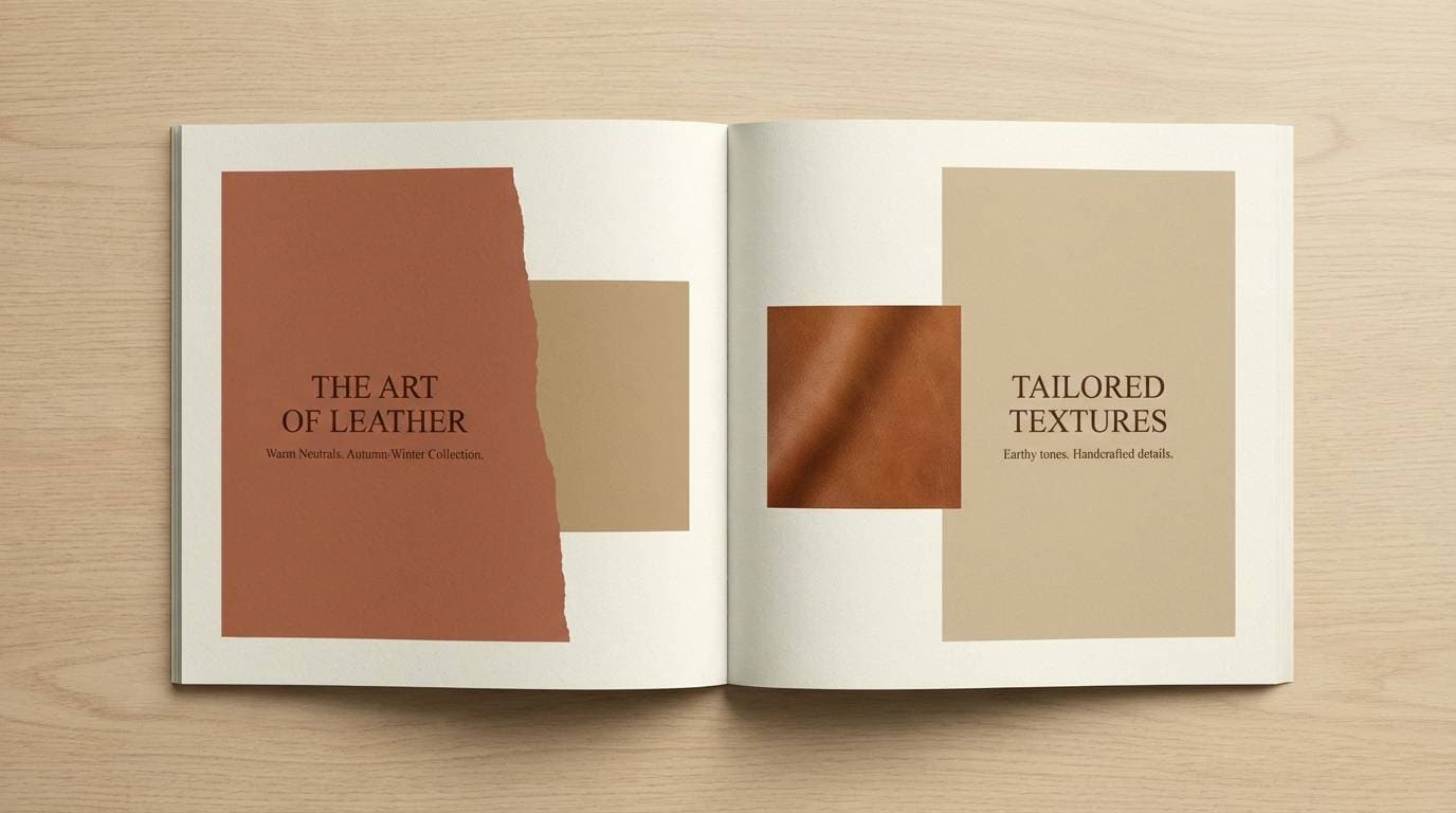
Heritage and cozy, these hues evoke worn leather, saddle stitching, and old libraries. Use the light cream for whitespace in lookbooks, then layer the caramel and tan for product callouts. It pairs naturally with serif typography, foil accents, and textured paper. Tip: keep the darkest brown for small rules and captions to avoid muddy layouts.
Image example of vintage leather generated using media.io
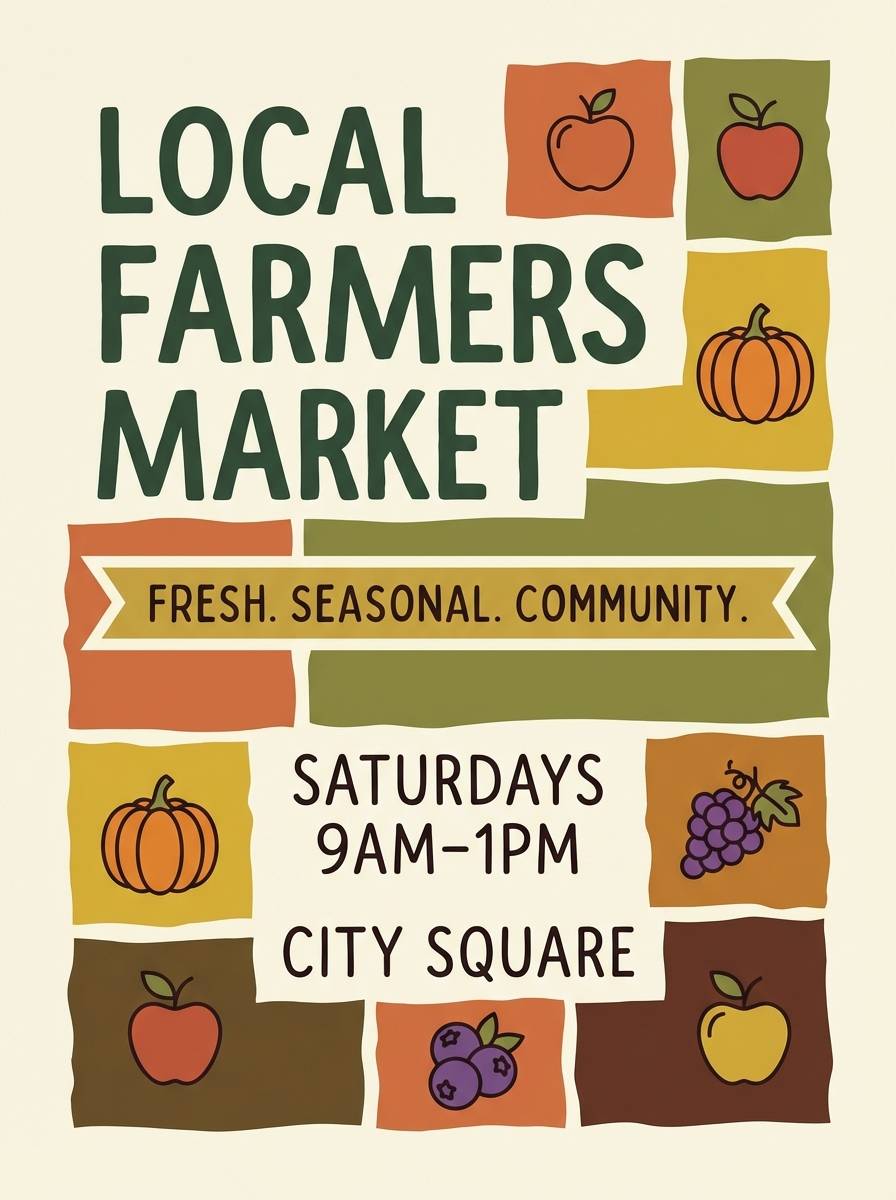
5) Autumn Market
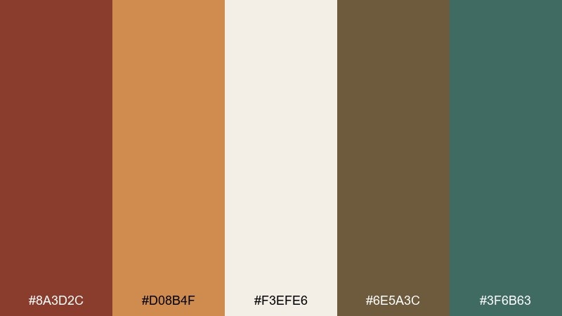
HEX: #8A3D2C #D08B4F #F3EFE6 #6E5A3C #3F6B63
Mood: seasonal, inviting, lively
Best for: farmers market posters and event promos
Seasonal and inviting, it brings to mind pumpkins, dried wheat, and wooden crates at a weekend market. These rust brown color combinations work best when the cream stays dominant and the teal is used as a fresh counterpoint. Pair with hand-drawn icons, kraft textures, and warm photography. Tip: use the golden orange for dates and prices to guide the eye fast.
Image example of autumn market generated using media.io
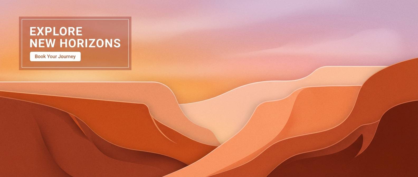
6) Canyon Sunset
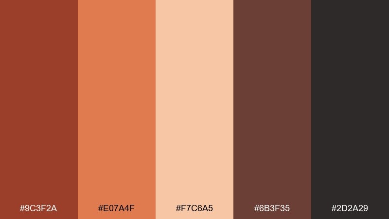
HEX: #9C3F2A #E07A4F #F7C6A5 #6B3F35 #2D2A29
Mood: dramatic, warm, adventurous
Best for: outdoor travel ads and hero banners
Dramatic and warm, it feels like canyon rock glowing at golden hour. Use the peach and terracotta for gradients in hero areas, then ground the layout with deep browns for headlines. It pairs nicely with wide landscape crops, bold sans typography, and subtle grain. Tip: reserve the near-black for CTAs so buttons pop without fighting the sunset tones.
Image example of canyon sunset generated using media.io
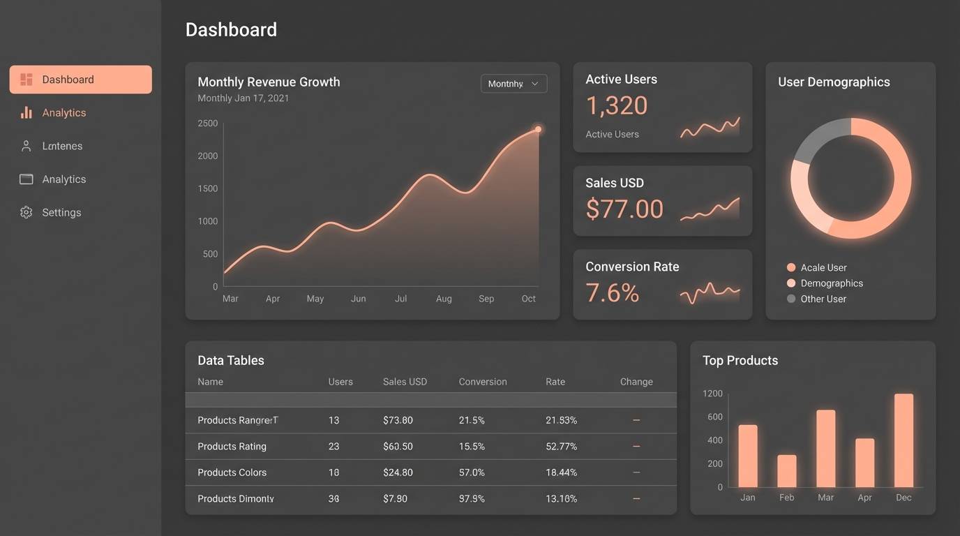
7) Rustic Minimal UI
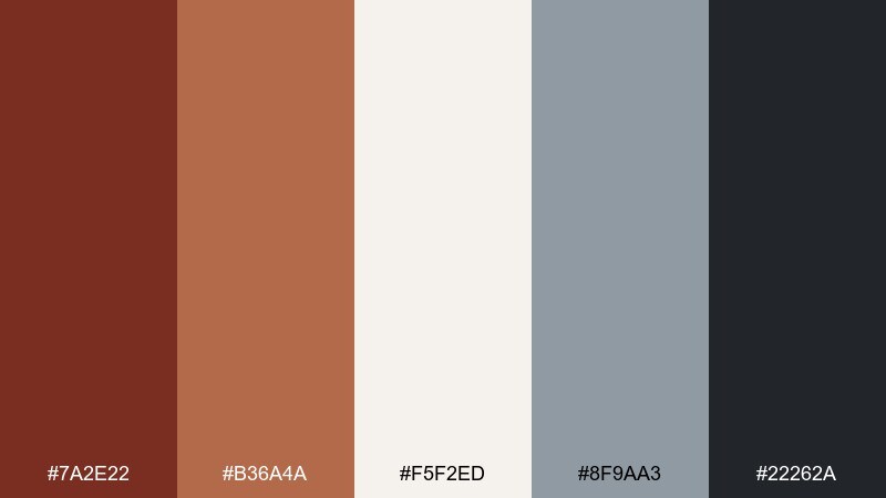
HEX: #7A2E22 #B36A4A #F5F2ED #8F9AA3 #22262A
Mood: modern, calm, confident
Best for: dashboard UI and SaaS onboarding screens
Modern and calm, it suggests warm coffee tones against cool slate, with plenty of breathing room. In a rust brown color palette like this, keep the off-white as the main canvas and let the rust act as the primary action color. The blue-gray is ideal for secondary states, dividers, and muted cards without turning the UI cold. Tip: test contrast on the slate background early so buttons remain accessible.
Image example of rustic minimal ui generated using media.io
8) Spiced Mocha
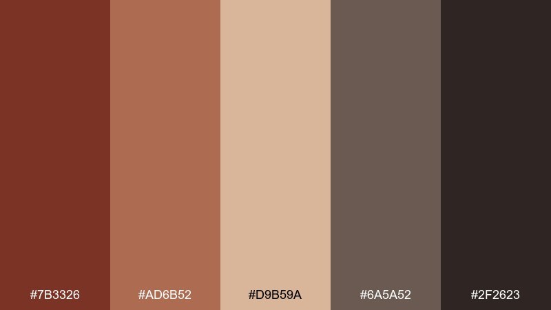
HEX: #7B3326 #AD6B52 #D9B59A #6A5A52 #2F2623
Mood: cozy, rich, cafe-like
Best for: coffee packaging and menu design
Cozy and rich, it reads like espresso crema, cocoa dust, and cinnamon sticks. The mid browns are perfect for packaging patterns, while the pale tan keeps menus legible and welcoming. Pair with simple icon sets and a single accent foil, like copper or matte black. Tip: use the darkest tone for headings only, letting body text sit on the lighter tan for comfort.
Image example of spiced mocha generated using media.io
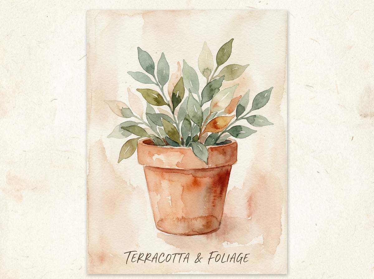
9) Botanical Terracotta
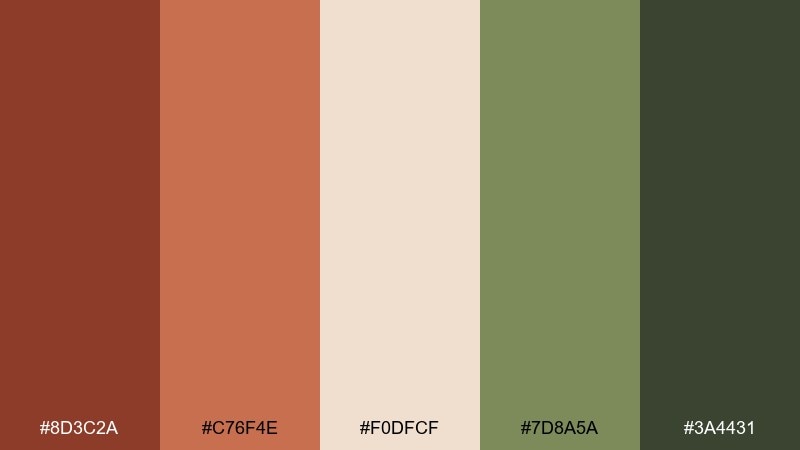
HEX: #8D3C2A #C76F4E #F0DFCF #7D8A5A #3A4431
Mood: fresh, natural, sunlit
Best for: watercolor botanical prints
Fresh and natural, it feels like terracotta pots surrounded by dusty green leaves. Use the creamy blush as paper tone, then paint with terracotta and warm coral for petals and clay textures. The olive greens keep the palette grounded and realistic without going too cool. Tip: let one green act as shadow color to avoid muddy mixing in the illustration.
Image example of botanical terracotta generated using media.io
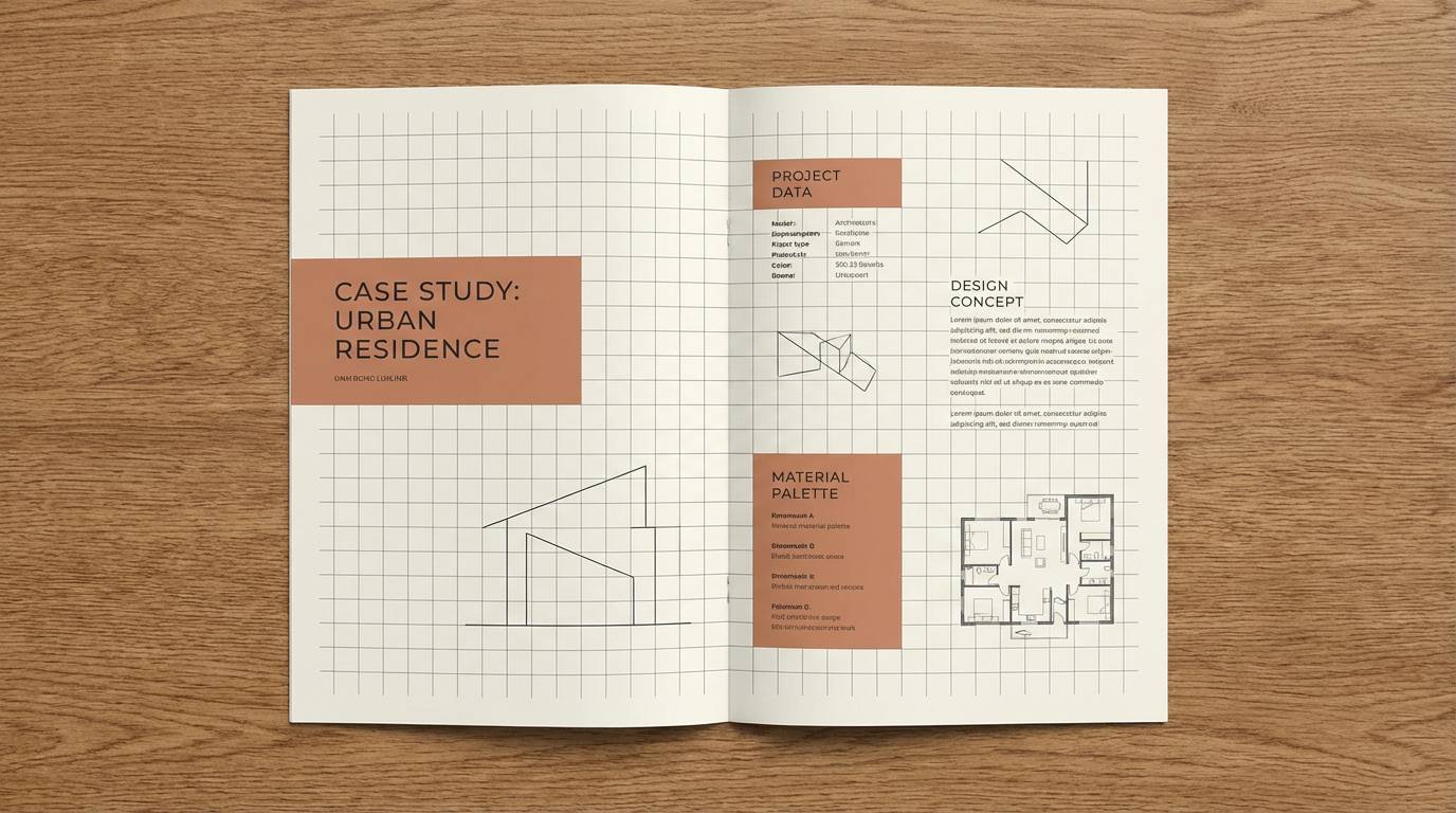
10) Clay and Charcoal
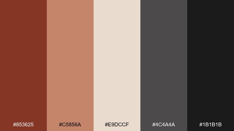
HEX: #853625 #C5856A #E9DCCF #4C4A4A #1B1B1B
Mood: urban, balanced, tactile
Best for: architectural portfolios and case studies
Urban and balanced, it mixes soft clay warmth with crisp charcoal structure. Use the cream as the primary page and bring in charcoal for grids, captions, and technical diagrams. The clay and blush tones add human warmth to otherwise minimal portfolio layouts. Tip: keep photo borders charcoal instead of black so spreads feel editorial, not severe.
Image example of clay and charcoal generated using media.io
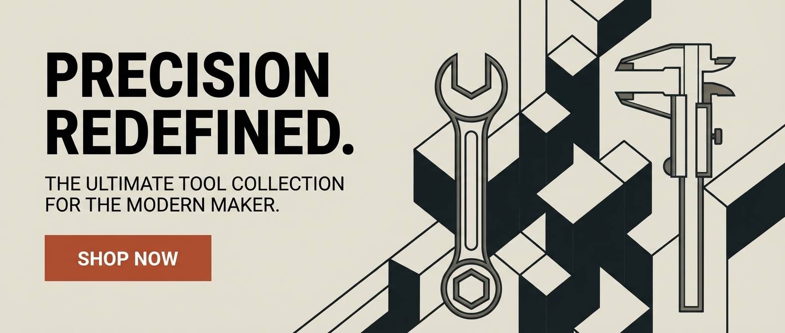
11) Warm Industrial
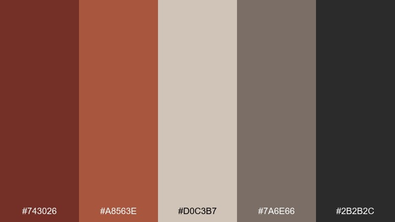
HEX: #743026 #A8563E #D0C3B7 #7A6E66 #2B2B2C
Mood: workshop, sturdy, modern
Best for: tool brand ads and landing pages
Sturdy and modern, it hints at workshop benches, oiled wood, and steel. Use the warm neutrals for large surfaces, then bring in the deep gray-black for strong typographic hierarchy. Pair with product close-ups, bold sans fonts, and simple geometric dividers. Tip: keep the rust as the only vivid accent so CTAs stay unmistakable.
Image example of warm industrial generated using media.io
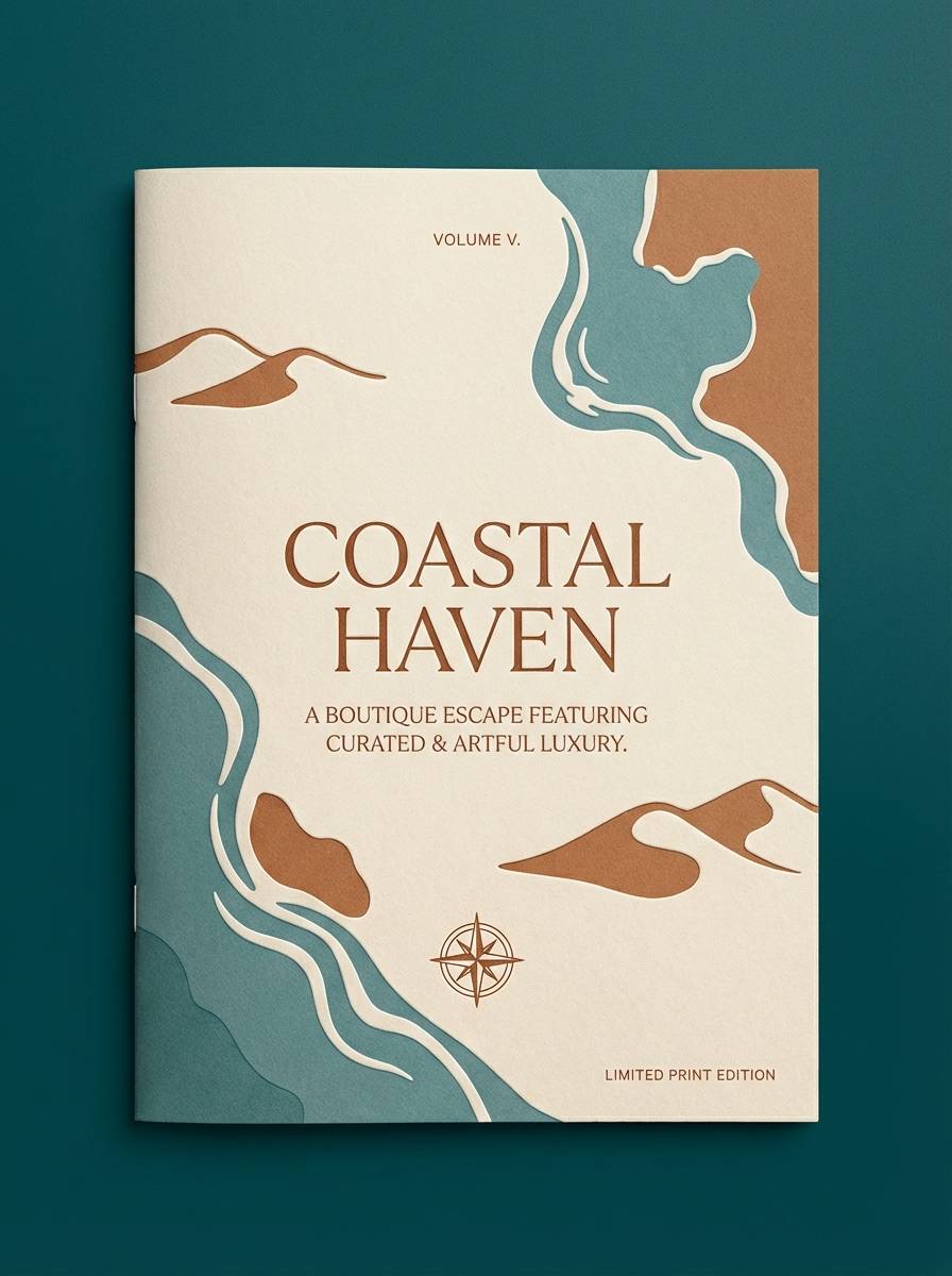
12) Sienna Seaside
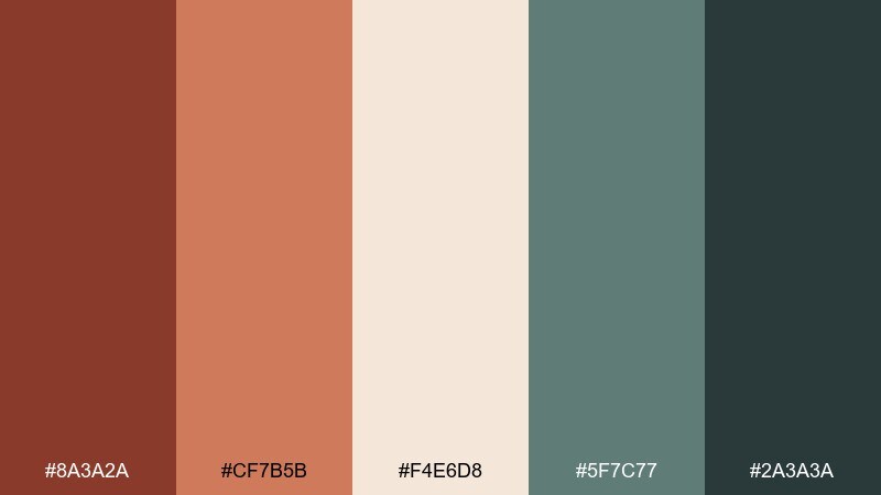
HEX: #8A3A2A #CF7B5B #F4E6D8 #5F7C77 #2A3A3A
Mood: relaxed, coastal, warm
Best for: boutique hotel brochures
Relaxed and coastal, it blends sun-warmed stone with weathered sea glass. The muted teal keeps the browns from feeling too heavy, especially in brochure grids and section headers. Pair with airy photography, plenty of margins, and subtle texture overlays. Tip: use the darkest teal for small text to soften contrast compared to pure black.
Image example of sienna seaside generated using media.io
13) Cocoa Blush
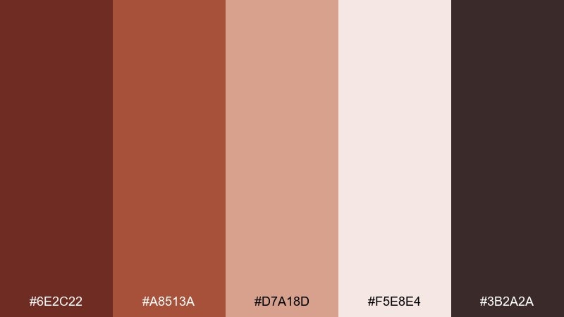
HEX: #6E2C22 #A8513A #D7A18D #F5E8E4 #3B2A2A
Mood: soft, romantic, modern
Best for: beauty product ads and social posts
Soft and romantic, it feels like cocoa and rose powder on warm skin. Use blush and cream as the backdrop for product cutouts, then add rust as the focal accent for headlines or price badges. It pairs well with minimal serif type and gentle shadowing. Tip: keep backgrounds light so the deep browns read as elegant detail instead of heaviness.
Image example of cocoa blush generated using media.io
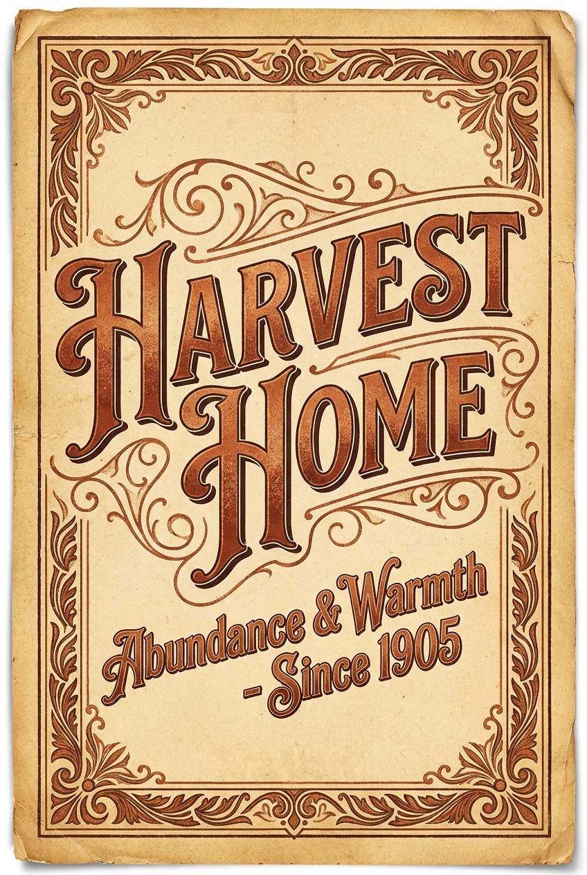
14) Harvest Typography
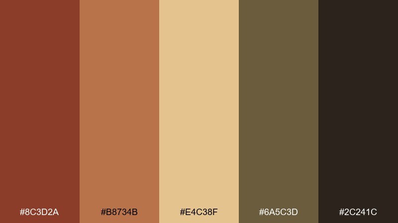
HEX: #8C3D2A #B8734B #E4C38F #6A5C3D #2C241C
Mood: folksy, bold, vintage
Best for: seasonal typography posters
Folksy and bold, it evokes hand-inked signage, harvest labels, and warm afternoon light. Use the wheat tone as the paper base, then build big type in rust and copper for a classic fall punch. The mossy brown is great for drop shadows and ornamental frames. Tip: limit the darkest brown to a single layer of outline so the type stays crisp.
Image example of harvest typography generated using media.io
15) Lodge Weekend
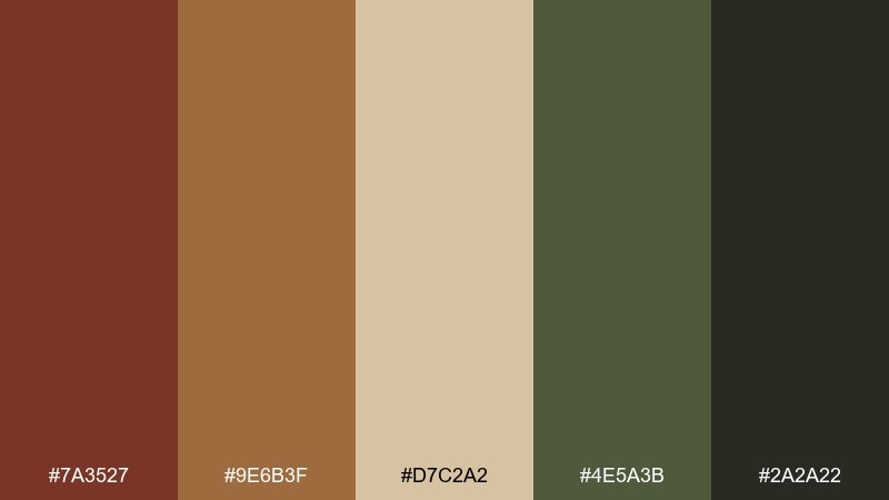
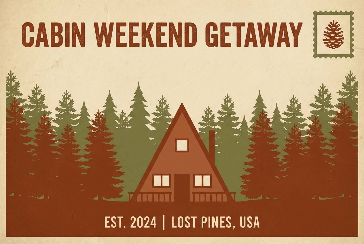
HEX: #7A3527 #9E6B3F #D7C2A2 #4E5A3B #2A2A22
Mood: outdoorsy, cozy, classic
Best for: cabin rental listings and postcards
Outdoorsy and cozy, it suggests campfire embers, pine needles, and worn canvas. Use the tan and cream for readable listing cards, then add the forest olive for secondary buttons or tags. It pairs naturally with wood textures, map motifs, and simple line illustrations. Tip: keep the near-black for small icons and separators to avoid overpowering the warmth.
Image example of lodge weekend generated using media.io
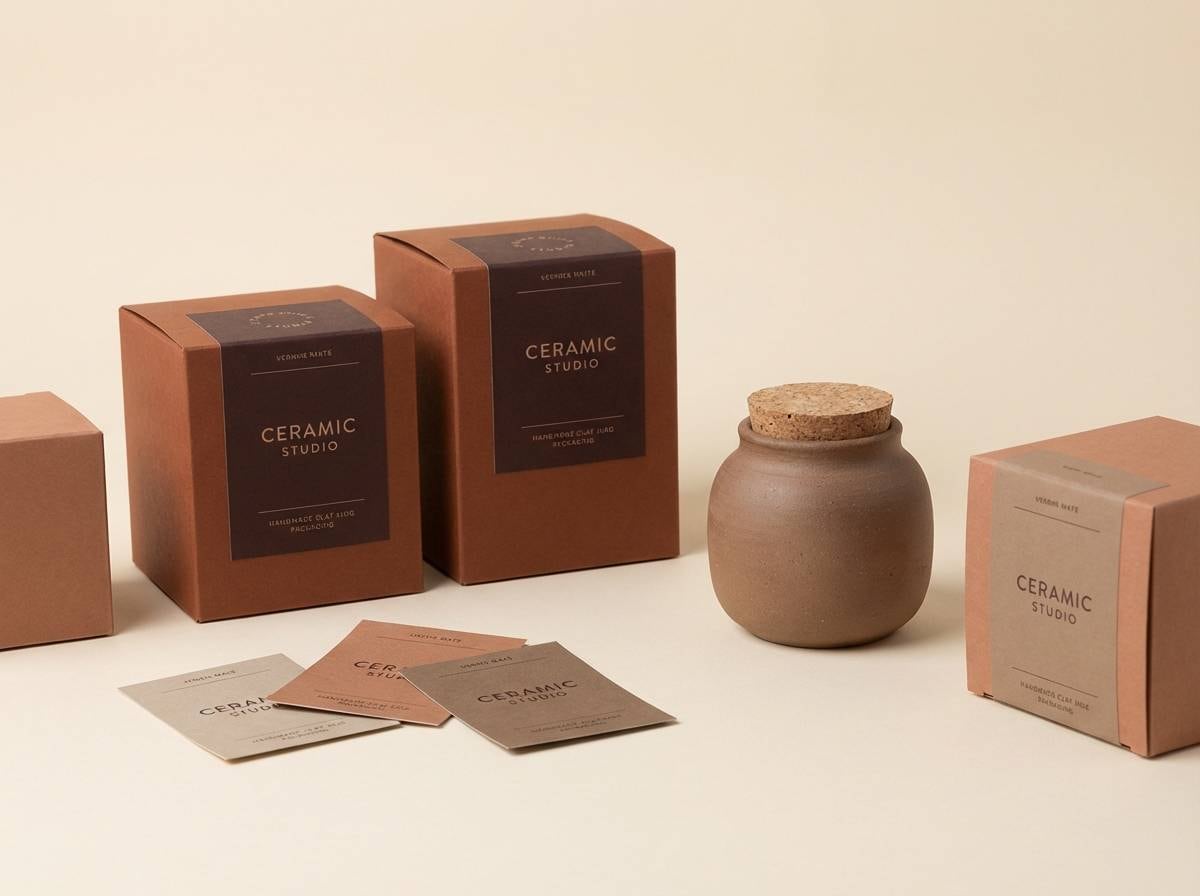
16) Ceramic Studio
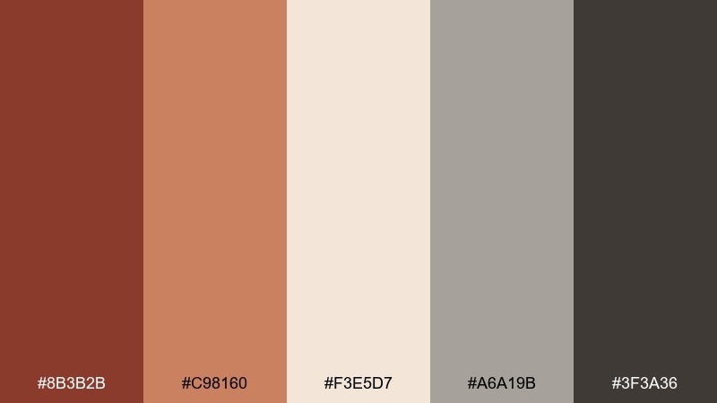
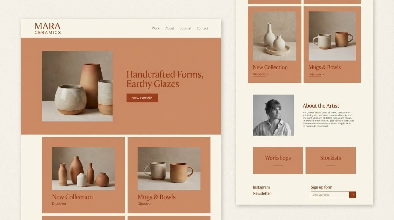
HEX: #8B3B2B #C98160 #F3E5D7 #A6A19B #3F3A36
Mood: minimal, warm, contemporary
Best for: portfolio websites for makers
Minimal and warm, it feels like a quiet studio with clay dust and stone shelves. The soft cream keeps pages bright while the gray-beige adds structure for navigation and captions. Pair with large product photography, thin dividers, and gentle shadows. Tip: use rust only for links and hover states to make interactions feel intentional.
Image example of ceramic studio generated using media.io
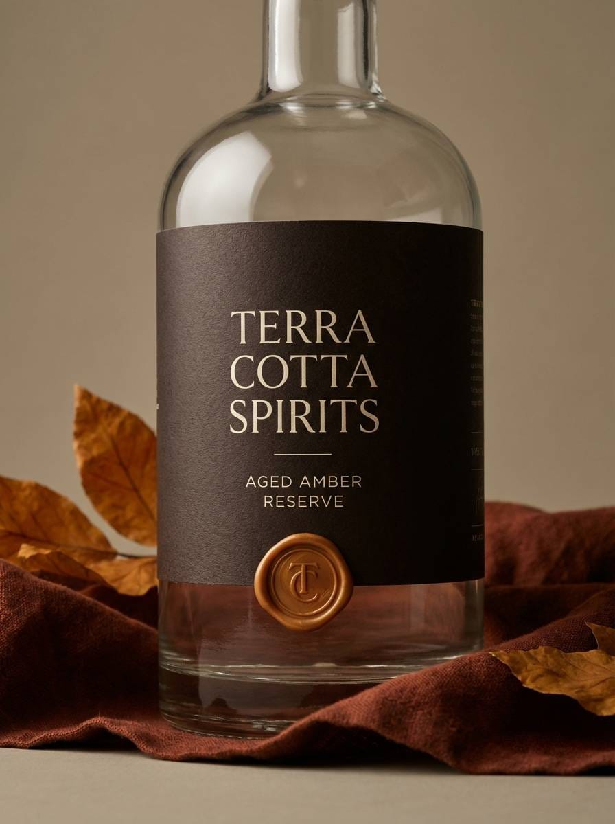
17) Burnt Amber Luxe
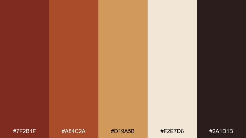
HEX: #7F2B1F #A84C2A #D19A5B #F2E7D6 #2A1D1B
Mood: luxurious, warm, dramatic
Best for: premium spirits packaging
Luxurious and dramatic, it recalls amber glass, barrel-aged notes, and low, warm light. These rust brown color combinations look especially rich with matte black details and a single metallic accent in print. Keep the cream for breathing room on labels, and use amber as the highlight color for seals or awards. Tip: use the deepest brown for fine type and linework so the design stays sharp on textured paper.
Image example of burnt amber luxe generated using media.io
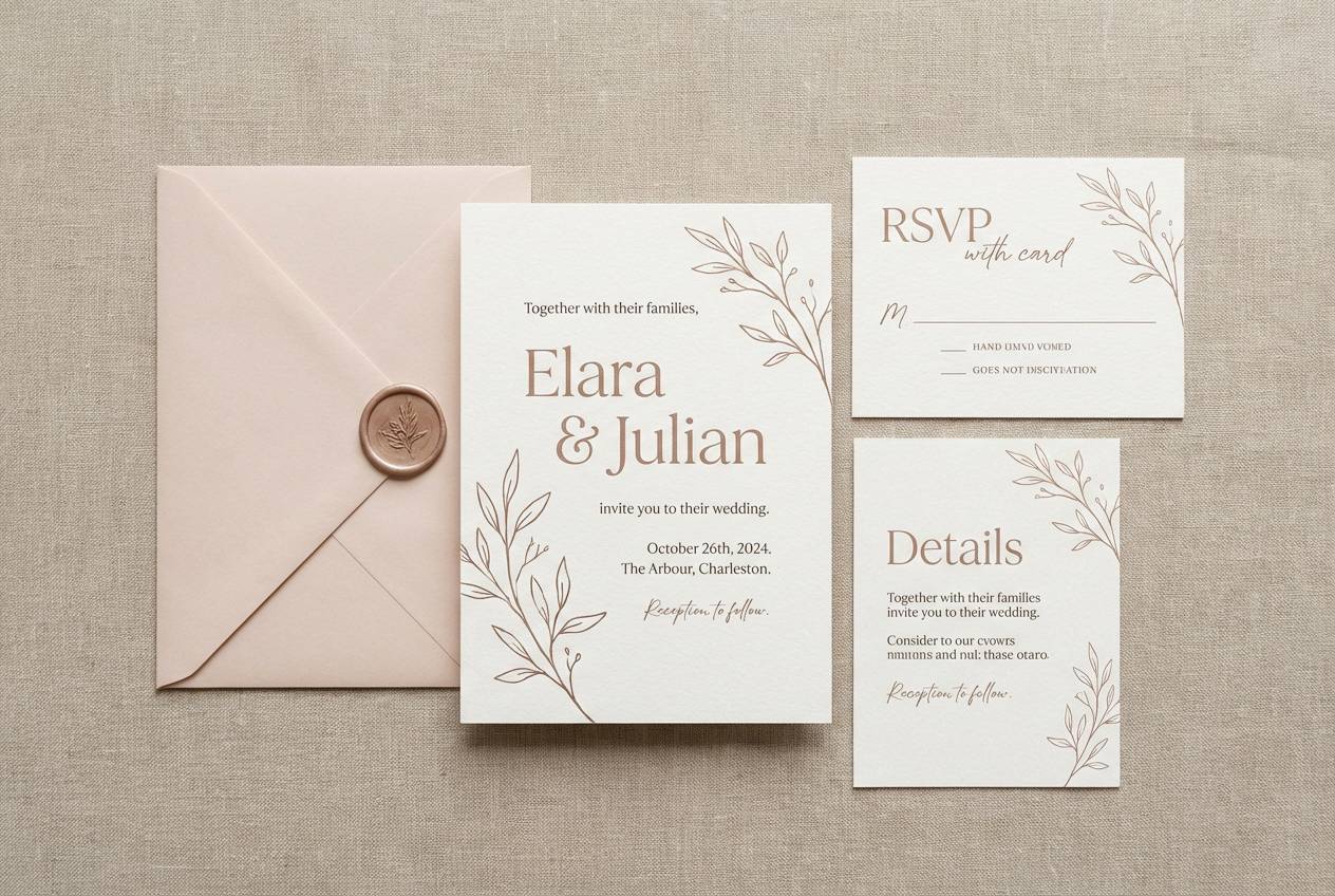
18) Earthy Wedding Suite
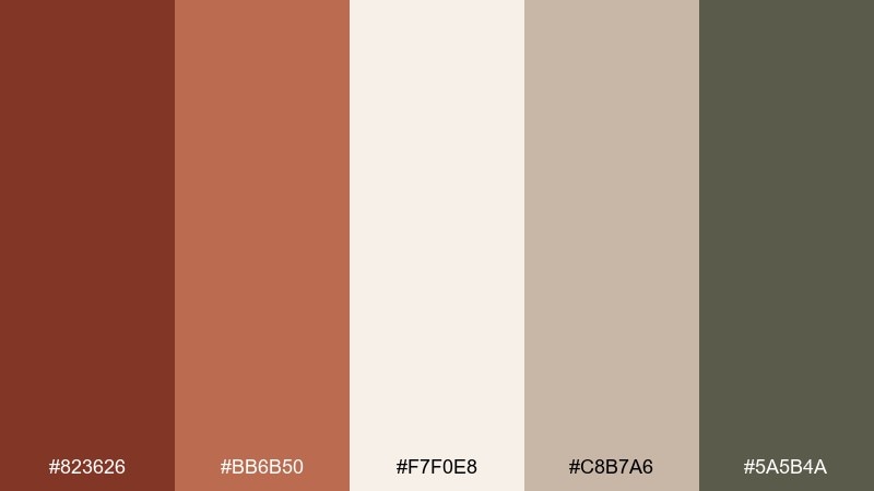
HEX: #823626 #BB6B50 #F7F0E8 #C8B7A6 #5A5B4A
Mood: romantic, earthy, elegant
Best for: wedding invitations and day-of stationery
Romantic and earthy, it feels like dried florals, linen ribbon, and candlelit dinners. Use the ivory as the main paper tone, then add rust for monograms, borders, and small motifs. The muted taupe and olive-gray help keep the suite refined and readable across multiple pieces. Tip: keep florals subtle and let typography carry the sophistication.
Image example of earthy wedding suite generated using media.io
19) Museum Editorial
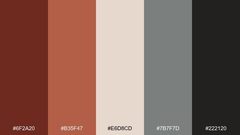
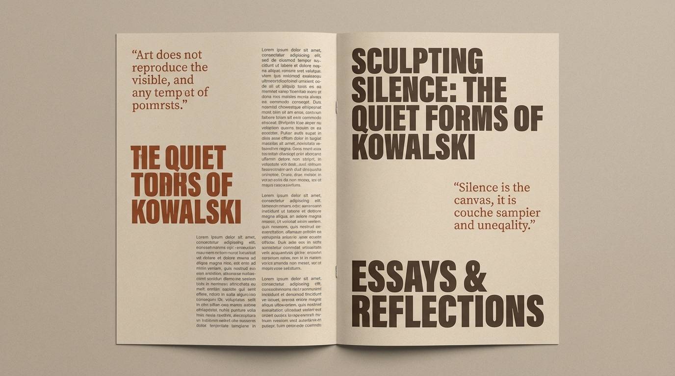
HEX: #6F2A20 #B35F47 #E6D8CD #7B7F7D #222120
Mood: curated, quiet, intellectual
Best for: exhibition catalogs and editorial layouts
Curated and quiet, it suggests gallery walls, archival paper, and understated captions. Use the warm beige as your page stock, then build hierarchy with graphite gray for body copy and rules. The muted rust works best as a chapter marker or pull-quote highlight. Tip: keep color blocks small and let whitespace do most of the work for a museum-grade feel.
Image example of museum editorial generated using media.io
20) Nightfall Rust
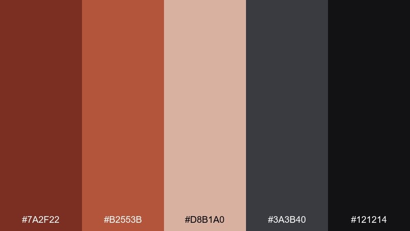
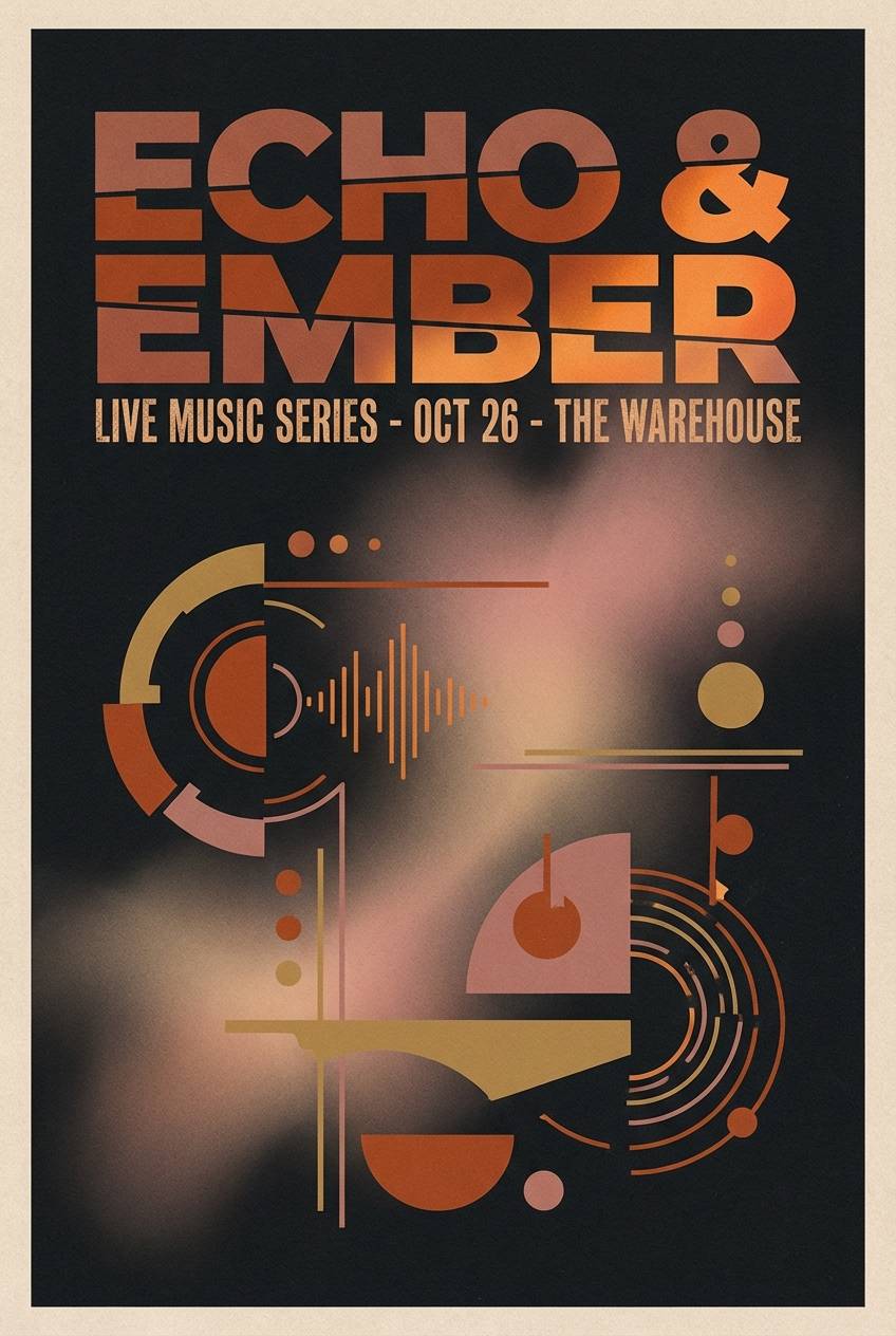
HEX: #7A2F22 #B2553B #D8B1A0 #3A3B40 #121214
Mood: moody, modern, bold
Best for: music poster series and album promos
Moody and modern, it feels like rusted metal under streetlights with a soft blush haze. Use the near-black for the background, then let rust and ember orange carry the main typography. The dusty pink is a strong tool for gradients and halftone overlays without breaking the night vibe. Tip: keep body text in the gray, not pure white, for a smoother, cinematic contrast.
Image example of nightfall rust generated using media.io
What Colors Go Well with Rust Brown?
Rust brown pairs beautifully with warm neutrals like cream, ivory, sand, and taupe—these keep layouts airy while letting rust feel rich instead of heavy. For a deeper, heritage look, add espresso, charcoal, or near-black in small doses for type and structure.
If you want fresher contrast, bring in muted greens (sage, olive drab, dusty eucalyptus) or blue-grays for a modern, balanced temperature mix. For seasonal “fall energy,” golden amber and wheat tones amplify warmth without clashing.
In digital design, prioritize accessible contrast: use off-white backgrounds with rust as the accent/CTA, and reserve very dark tones for text. This keeps the palette readable while preserving rust’s cozy character.
How to Use a Rust Brown Color Palette in Real Designs
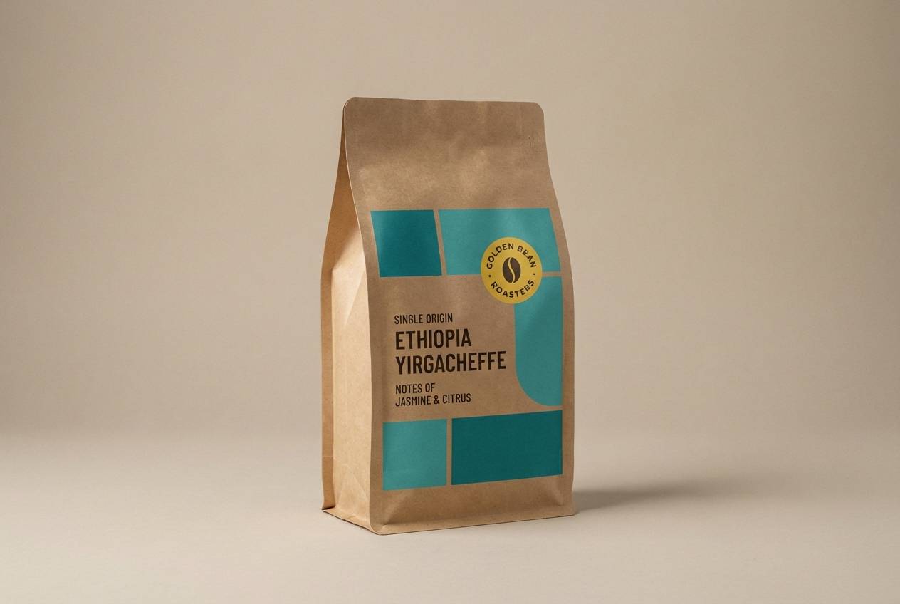
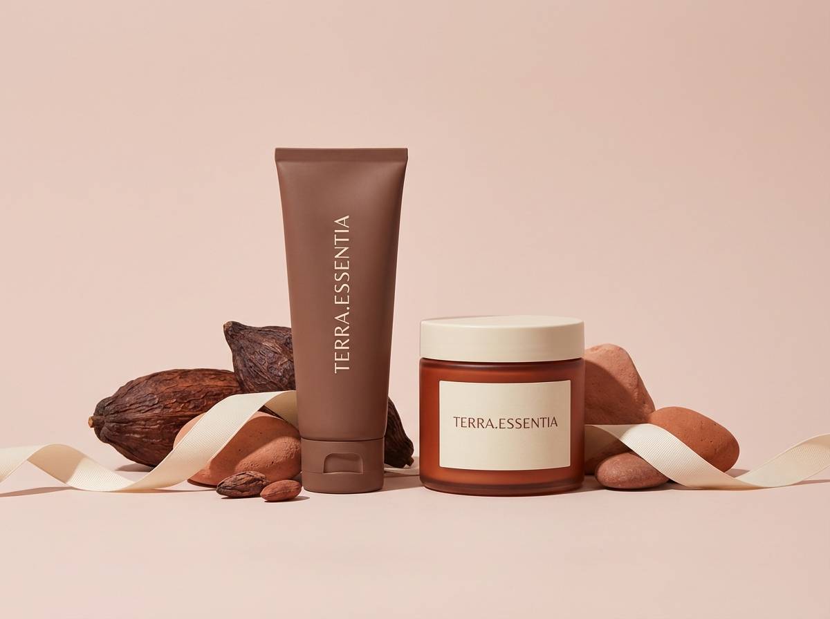
For branding and packaging, treat rust brown as your “material color”—use it on labels, seals, icons, and small blocks, then let creams and warm beiges act as the primary canvas. Texture choices (kraft paper, uncoated stock, grain overlays) make rust look intentional and premium.
For UI and dashboards, rust works best as a primary action color when the rest of the interface stays neutral and spacious. Pair it with blue-gray or graphite for secondary states, and test button/text contrast early to avoid accessibility issues.
For interiors and mood boards, rust is strongest when balanced with sandy midtones and a grounded dark. Add an olive drab accent through plants, textiles, or fixtures to keep the space warm but not overly monochrome.
Create Rust Brown Palette Visuals with AI
If you have HEX codes but need real-looking mockups, posters, or product scenes, AI can help you generate on-brand visuals fast. Start with one palette, describe the design use case (packaging, UI, invitation, editorial), then specify lighting and texture to match the mood.
For consistent results, reuse a single prompt structure and only swap the palette name or key objects. This makes it easier to compare variations while keeping layout and style stable.
Use Media.io’s text-to-image tool to generate rust brown palette visuals you can iterate on in minutes, then refine your final design direction with the best-performing outputs.
Rust Brown Color Palette FAQs
-
What is a rust brown color (in simple terms)?
Rust brown is a warm, reddish-brown tone inspired by oxidized metal, terracotta clay, and autumn leaves. It sits between brown and orange, so it feels earthy but still vibrant enough to use as an accent. -
Is rust brown the same as terracotta?
They’re close, but not identical. Terracotta is usually a bit lighter and more orange, while rust brown tends to be deeper and more brown-leaning, often reading slightly “burnt” or weathered. -
What colors complement rust brown best?
Warm neutrals (cream, ivory, beige), muted greens (sage, olive drab), and deep anchors (charcoal, espresso, near-black) complement rust brown well. Blue-gray accents can modernize it for UI and tech branding. -
How do I keep a rust brown palette from looking too dark?
Use a light neutral as the dominant background (off-white, warm cream), and keep the darkest tones for typography or small details only. Limiting heavy dark blocks prevents the design from feeling muddy. -
Can rust brown work in modern UI design?
Yes—rust brown can be a strong primary action color when paired with off-white surfaces and cool blue-gray or graphite neutrals. Always verify contrast for buttons, links, and text to maintain accessibility. -
What is a good rust brown palette for autumn marketing?
Palettes like Autumn Market, Harvest Typography, and Lodge Weekend lean into seasonal warmth with wheat, amber, and deep browns. Add a muted teal or olive accent to keep the look fresh and readable. -
How can I generate rust brown palette images for presentations or mood boards?
Use a text-to-image generator, describe the scene (packaging, poster, interior collage, UI mockup), and include cues like “warm cream background,” “rust accents,” and “soft diffused light.” Media.io makes it easy to iterate and download consistent visuals.
Next: Olive Drab Color Palette


