

Turquoise teal sits right between blue and green, so it naturally feels both refreshing and dependable. That balance makes it a go-to for modern branding, clean UI, and calming interior schemes.
Below are 20 turquoise teal color palette ideas with ready-to-copy HEX codes, plus practical pairing tips and AI image prompts you can reuse for mockups.
In this article
Why Turquoise Teal Palettes Work So Well
Turquoise teal reads as clean and energizing without feeling harsh, which is why it performs well across both light and dark layouts. It can feel coastal and relaxing, but also tech-forward when paired with slate, charcoal, or near-black.
Because it sits between blue (trust, clarity) and green (growth, wellness), it’s a flexible “bridge color” for brands that want to look modern yet human. In UI, it also makes a strong accent color for states, highlights, and primary actions.
The key is contrast control: use neutrals for the majority of surfaces, then let teal handle the brand signal. Add one warm accent (gold, coral, apricot) when you need extra hierarchy or a clear CTA.
20+ Turquoise Teal Color Palette Ideas (with HEX Codes)
1) Lagoon Mist
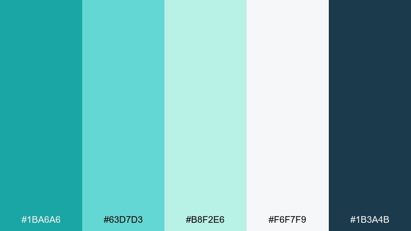
HEX: #1BA6A6 #63D7D3 #B8F2E6 #F6F7F9 #1B3A4B
Mood: airy, coastal, calming
Best for: wellness branding, spa websites, minimalist packaging
Airy and weightless, it feels like morning fog over a quiet lagoon. The soft aquas and pale mint read clean and soothing, while the deep navy adds structure for headlines and logos. Use the lightest shade as your main background and reserve navy for type to keep accessibility strong. A touch of warm metal accents (champagne or brushed brass) elevates this turquoise teal color palette without breaking the calm.
Image example of lagoon mist generated using media.io
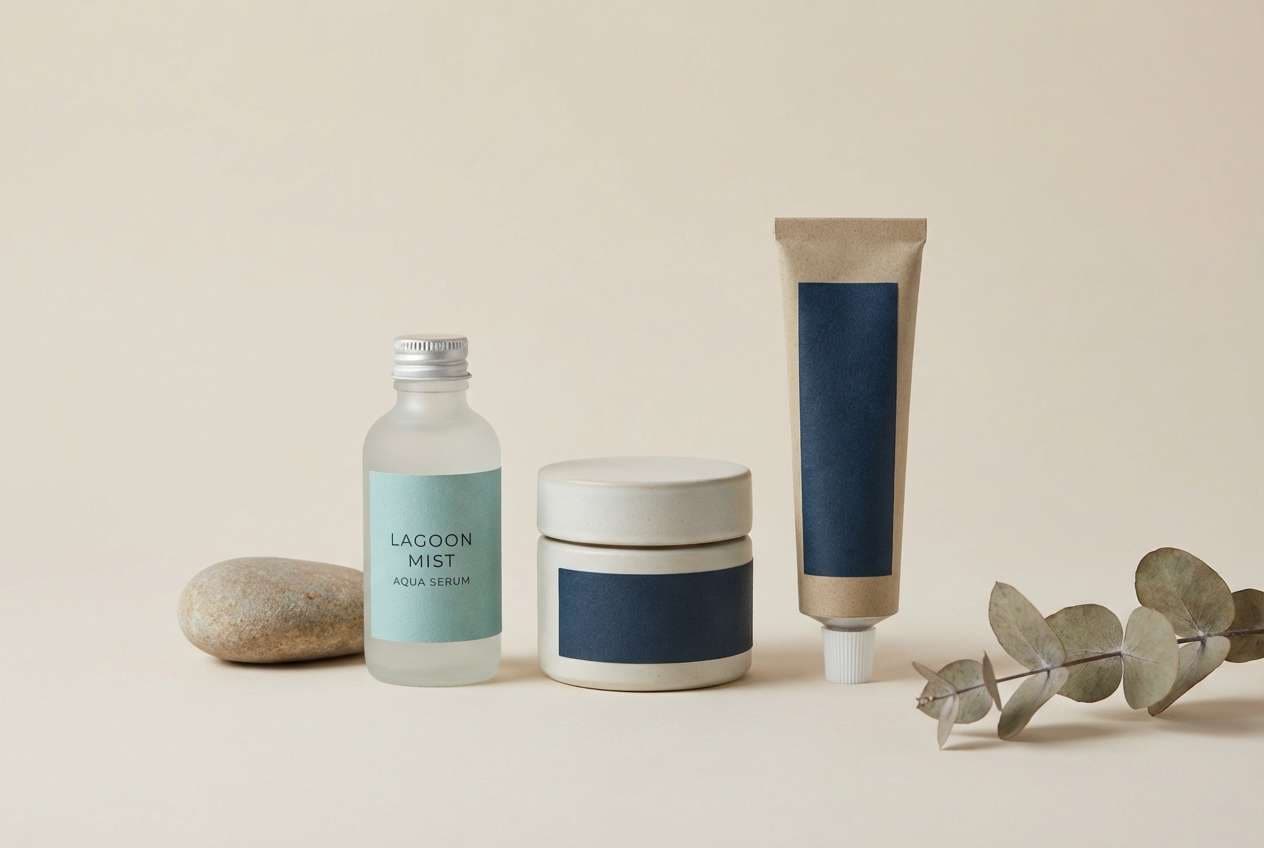
Media.io is an online AI studio for creating and editing video, image, and audio in your browser.

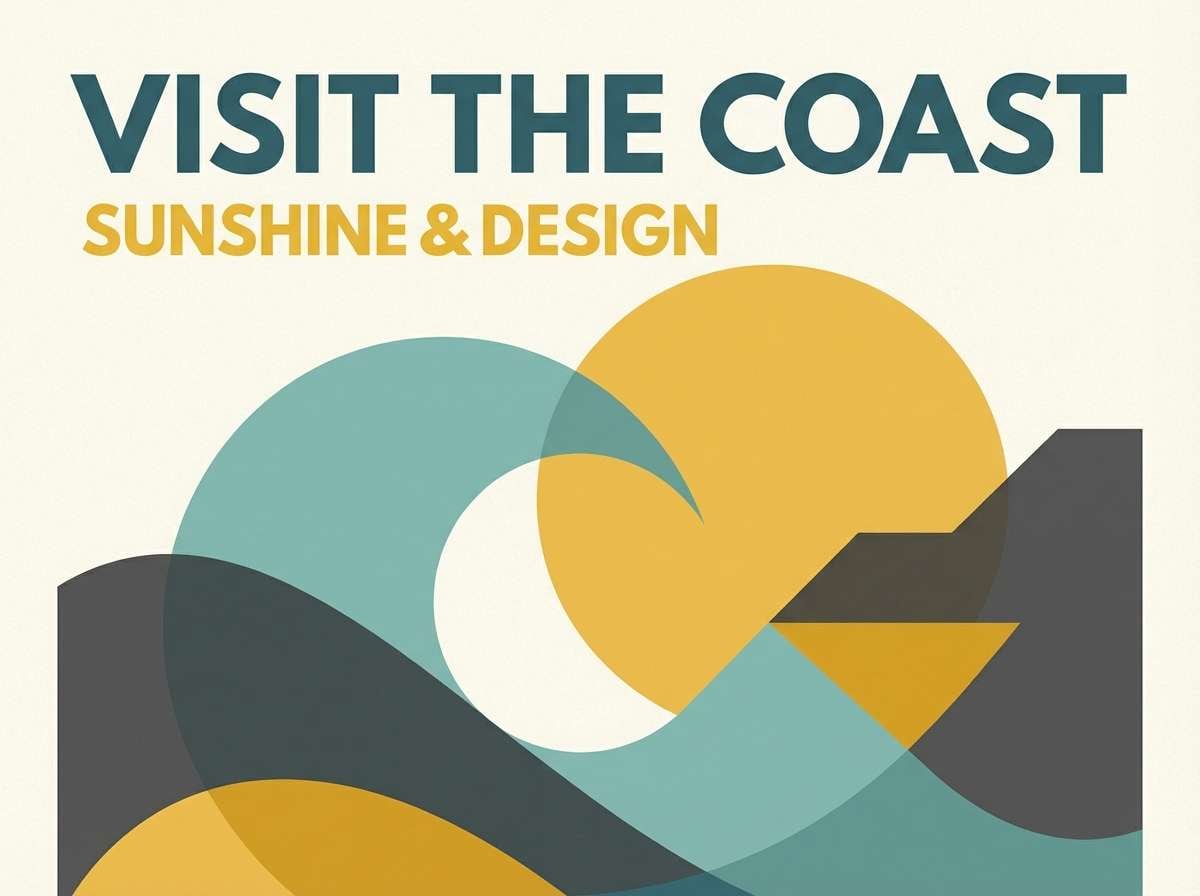
2) Coastal Jewel
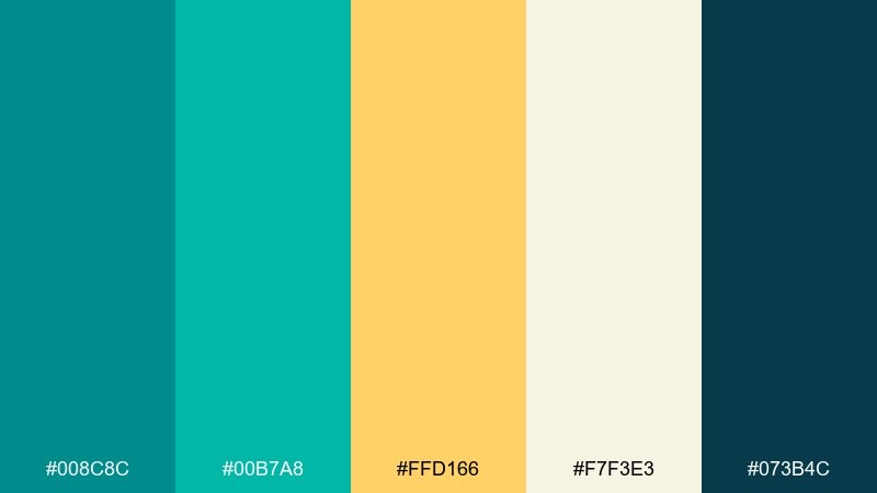
HEX: #008C8C #00B7A8 #FFD166 #F7F3E3 #073B4C
Mood: sunlit, vibrant, confident
Best for: travel ads, summer campaigns, hero banners
Sunlit and punchy, it evokes turquoise water hitting bright sand at noon. Golden yellow brings instant warmth, and the dark blue anchors layouts so the palette stays premium instead of playful. Keep teal as the dominant field color and use yellow as a sparing call-to-action highlight. Pair with crisp, geometric typography to amplify the modern, vacation-ready energy.
Image example of coastal jewel generated using media.io
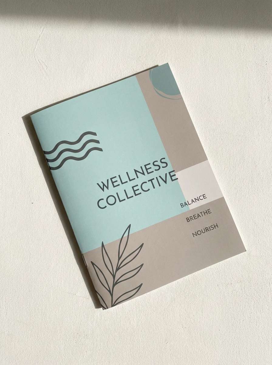
3) Spa Serenity
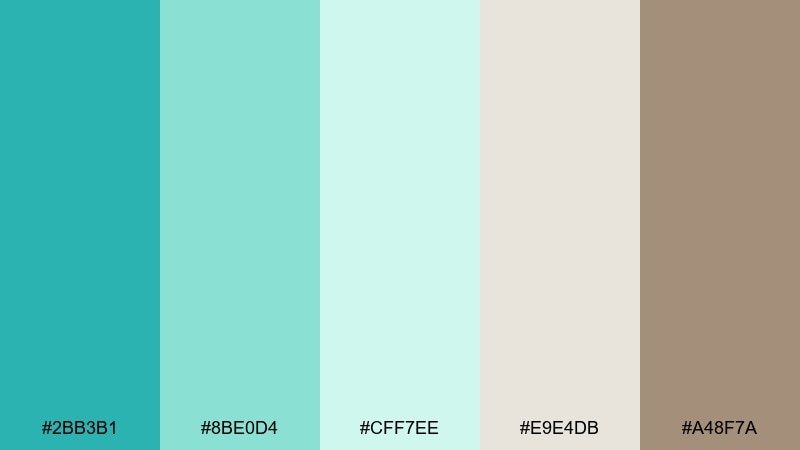
HEX: #2BB3B1 #8BE0D4 #CFF7EE #E9E4DB #A48F7A
Mood: soft, restorative, natural
Best for: yoga studios, self-care blogs, boutique hotel interiors
Soft and restorative, it brings to mind warm towels, eucalyptus steam, and pale stone. The greige and taupe keep the aquas grounded, so pages feel cozy rather than clinical. Use taupe for supporting text and dividers to avoid stark contrast against the light mint. A matte paper stock makes these tones look especially elegant on menus and brochures.
Image example of spa serenity generated using media.io
4) Retro Surf
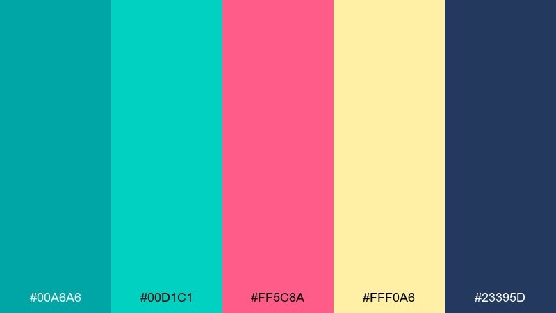
HEX: #00A6A6 #00D1C1 #FF5C8A #FFF0A6 #23395D
Mood: playful, nostalgic, energetic
Best for: event promos, creator merch, punchy social graphics
Playful and nostalgic, it channels neon surf shops and bubblegum sunsets. Hot pink and buttery yellow create the kind of contrast that stops a scroll, while navy keeps the vibe readable. For turquoise teal color combinations like this, limit pink to small bursts (icons, stickers, buttons) and let teal do the heavy lifting. Add subtle grain or halftone textures to lean into the retro mood.
Image example of retro surf generated using media.io

5) Midnight Reef
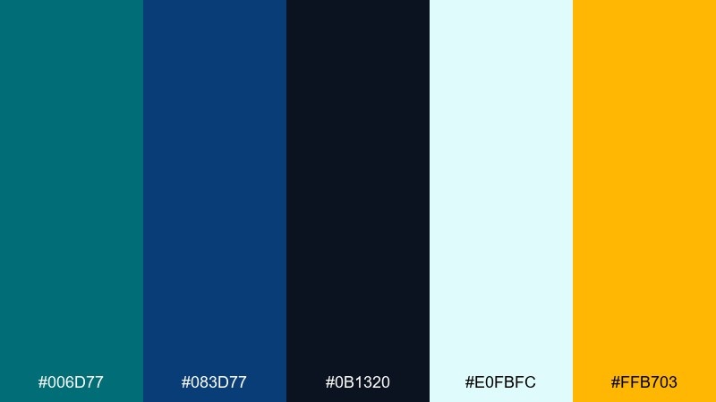
HEX: #006D77 #083D77 #0B1320 #E0FBFC #FFB703
Mood: moody, cinematic, high-contrast
Best for: tech landing pages, esports branding, dark mode UI
Moody and cinematic, it feels like diving past coral into deep water with a beam of light. The near-black base makes teal look luminous, and the warm amber works as an instant highlight for key actions. Use the pale ice tint for cards and surfaces so dark mode still feels breathable. For best results, keep gradients subtle and rely on contrast, not saturation, for hierarchy.
Image example of midnight reef generated using media.io
6) Desert Oasis
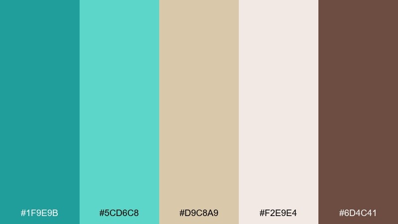
HEX: #1F9E9B #5CD6C8 #D9C8A9 #F2E9E4 #6D4C41
Mood: earthy, relaxed, boutique
Best for: interior palettes, lifestyle brands, cafe menus
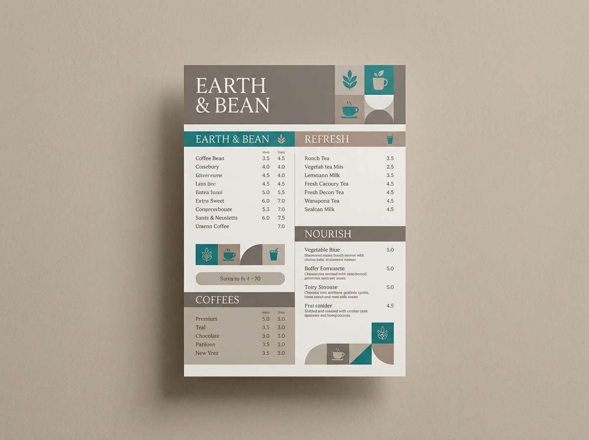
Earthy and relaxed, it suggests a cool pool beside warm sand and clay. The beige and cocoa tones soften the teals, making the overall look more artisanal than coastal. Use the sandy neutral for large areas and bring in teal on focal points like tiles, headers, or packaging labels. A natural serif font pairs beautifully with the grounded browns here.
Image example of desert oasis generated using media.io
7) Arctic Tide
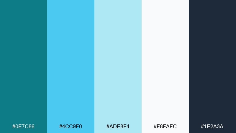
HEX: #0E7C86 #4CC9F0 #ADE8F4 #F8FAFC #1E2A3A
Mood: crisp, fresh, modern
Best for: SaaS onboarding, health apps, clean infographics
Crisp and fresh, it looks like glacial water under bright winter light. The sky blue lifts the teal into an optimistic range, while charcoal keeps text sharp. Use the off-white for generous negative space so charts and UI elements feel lightweight. Try a simple two-tone icon set (teal plus charcoal) to keep interfaces consistent.
Image example of arctic tide generated using media.io
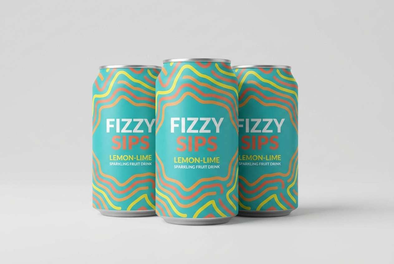
8) Tropic Punch
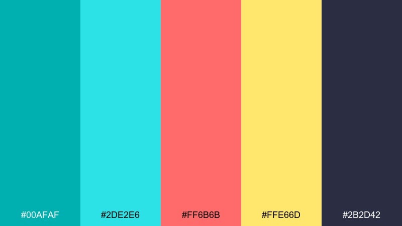
HEX: #00AFAF #2DE2E6 #FF6B6B #FFE66D #2B2D42
Mood: bright, fun, festival-ready
Best for: summer events, beverage ads, playful branding
Bright and fun, it feels like sparkling water, citrus slices, and a loud playlist. The coral red adds a friendly edge to the teals, while yellow keeps everything sunny. Use the deep slate for type to prevent the high-saturation accents from competing. A good trick is to reserve coral for one clear action element per layout.
Image example of tropic punch generated using media.io
9) Marble Aqua
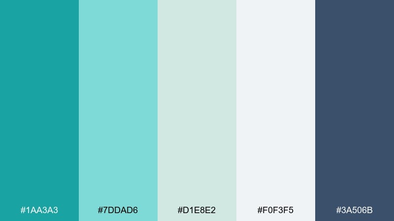
HEX: #1AA3A3 #7DDAD6 #D1E8E2 #F0F3F5 #3A506B
Mood: polished, airy, upscale
Best for: beauty brands, presentation decks, clean ecommerce
Polished and airy, it suggests water rippling over pale marble. The greyed neutrals keep the aquas sophisticated, perfect for premium product pages and slides. Use the medium teal for headings, and keep the light grey as your primary canvas for a high-end feel. Pair with minimal photography and thin line dividers to let the tones breathe.
Image example of marble aqua generated using media.io
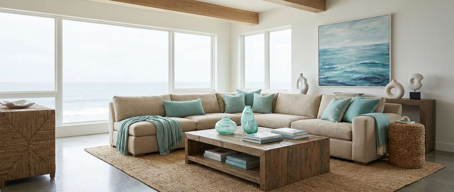
10) Sea Glass Neutrals
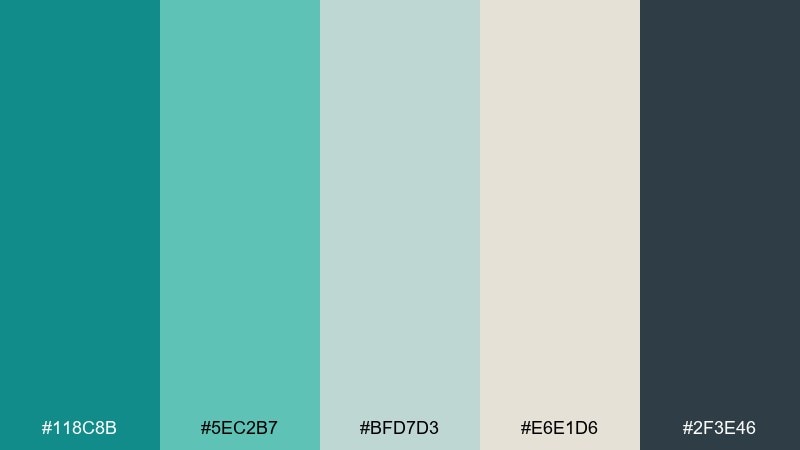
HEX: #118C8B #5EC2B7 #BFD7D3 #E6E1D6 #2F3E46
Mood: balanced, coastal, understated
Best for: home decor, blogs, calming brand systems
Balanced and understated, it recalls sea glass collected in a linen pouch. The muted greys and warm beige make the teal feel grown-up and easy to live with. Use charcoal for body text and the soft green-grey for secondary sections or footers. For interiors, these tones shine on matte walls with natural wood and woven textures.
Image example of sea glass neutrals generated using media.io
11) Coral Reef Pop
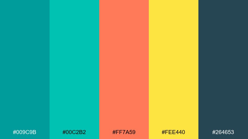
HEX: #009C9B #00C2B2 #FF7A59 #FEE440 #264653
Mood: bold, tropical, attention-grabbing
Best for: marketing banners, app promos, sale graphics
Bold and tropical, it looks like coral branches against bright water. The orange-coral and sunny yellow create lively contrast while teal stays the hero color. Use the deep blue-green for headers and pricing so your accent colors can stay playful without reducing readability. Keep backgrounds light and let the warm accents do the heavy lifting for highlights.
Image example of coral reef pop generated using media.io

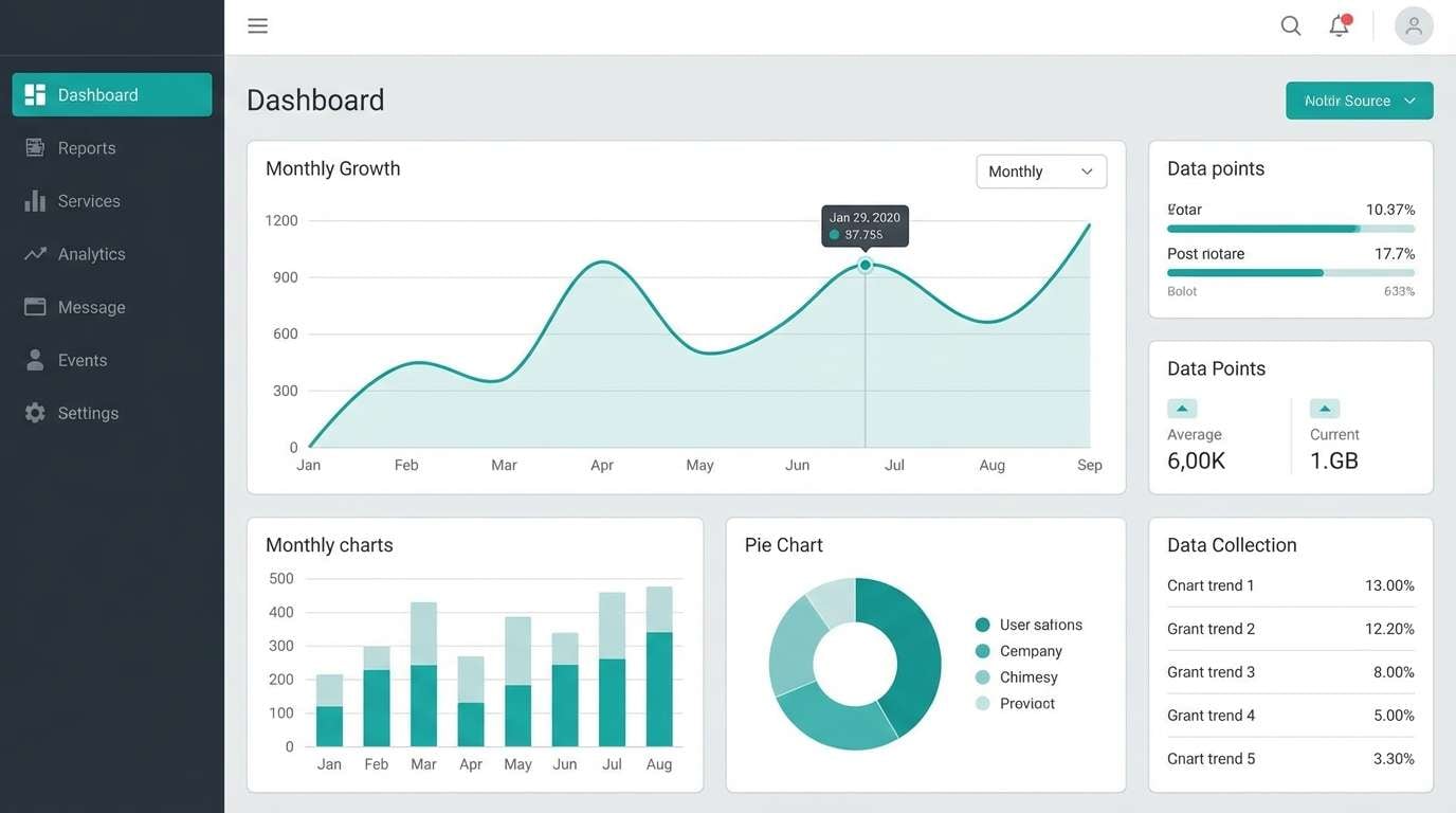
12) Industrial Harbor
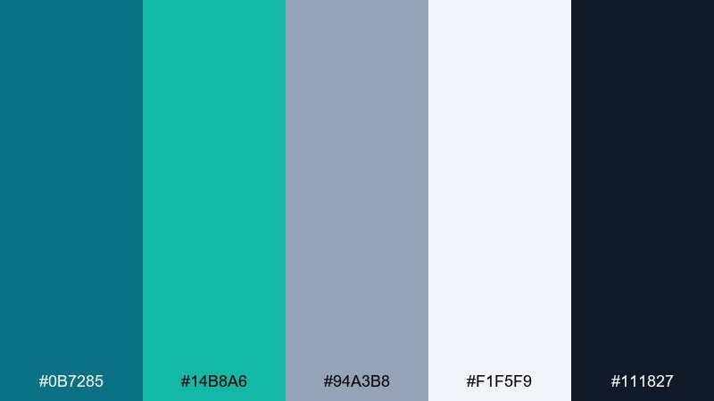
HEX: #0B7285 #14B8A6 #94A3B8 #F1F5F9 #111827
Mood: professional, urban, tech-forward
Best for: B2B SaaS, dashboards, fintech branding
Professional and urban, it feels like teal painted steel against cool concrete. The slate blues and near-black bring a serious, enterprise tone that still feels modern. Use the bright teal sparingly for states and highlights, and keep most surfaces in the pale grey for clarity. This mix works especially well with data visualizations and crisp sans-serif type.
Image example of industrial harbor generated using media.io
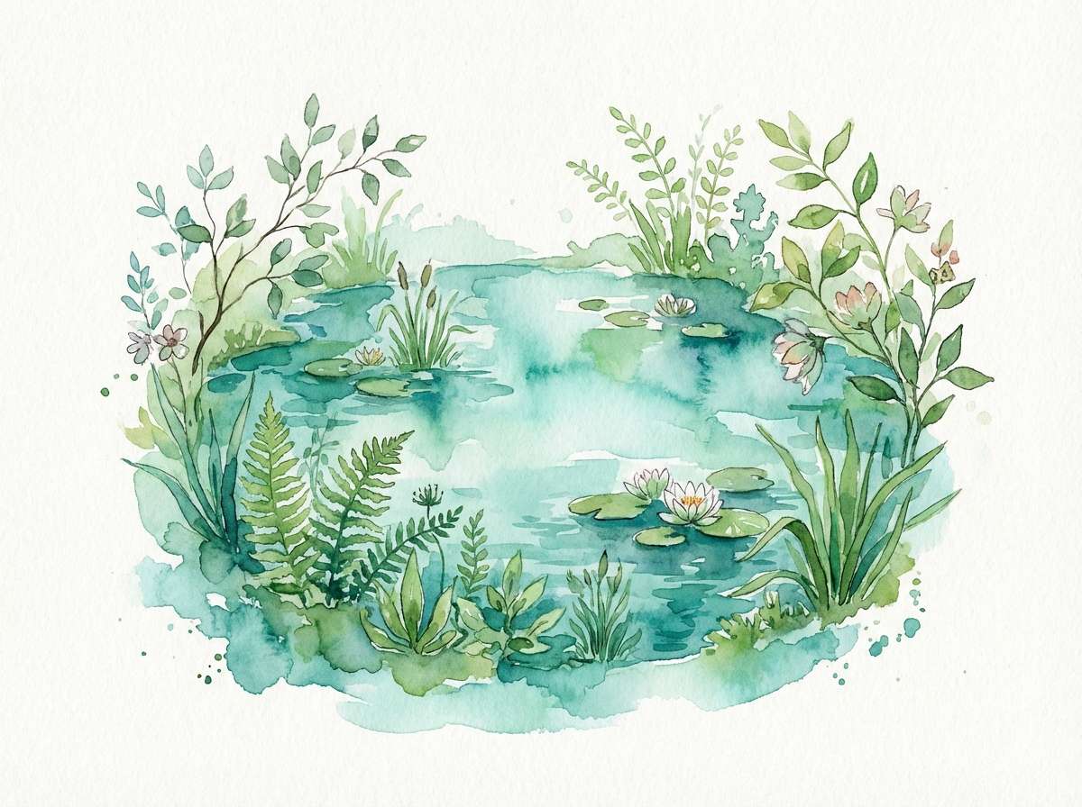
13) Botanical Pool
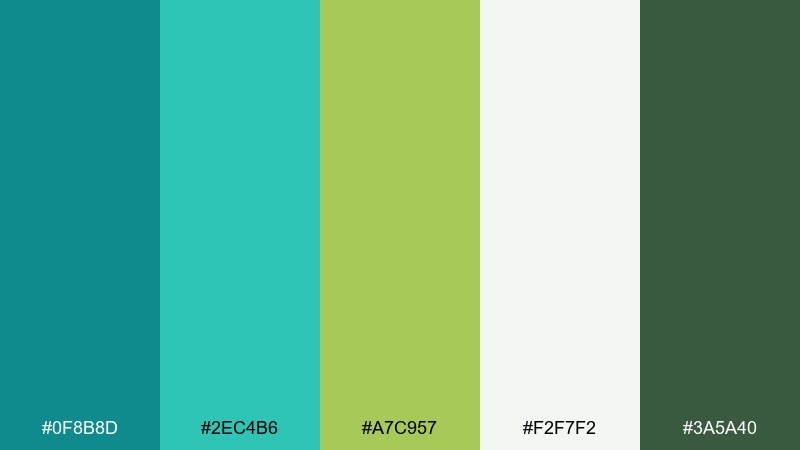
HEX: #0F8B8D #2EC4B6 #A7C957 #F2F7F2 #3A5A40
Mood: fresh, garden-inspired, lively
Best for: eco brands, garden shops, spring illustrations
Fresh and garden-inspired, it brings to mind a pool surrounded by new leaves. The leafy green adds a natural twist, making the teals feel more botanical than beachy. Use the pale minty white as your background and layer teal and green in simple shapes for a clean, eco-forward look. A subtle paper texture can make the palette feel handcrafted and warm.
Image example of botanical pool generated using media.io
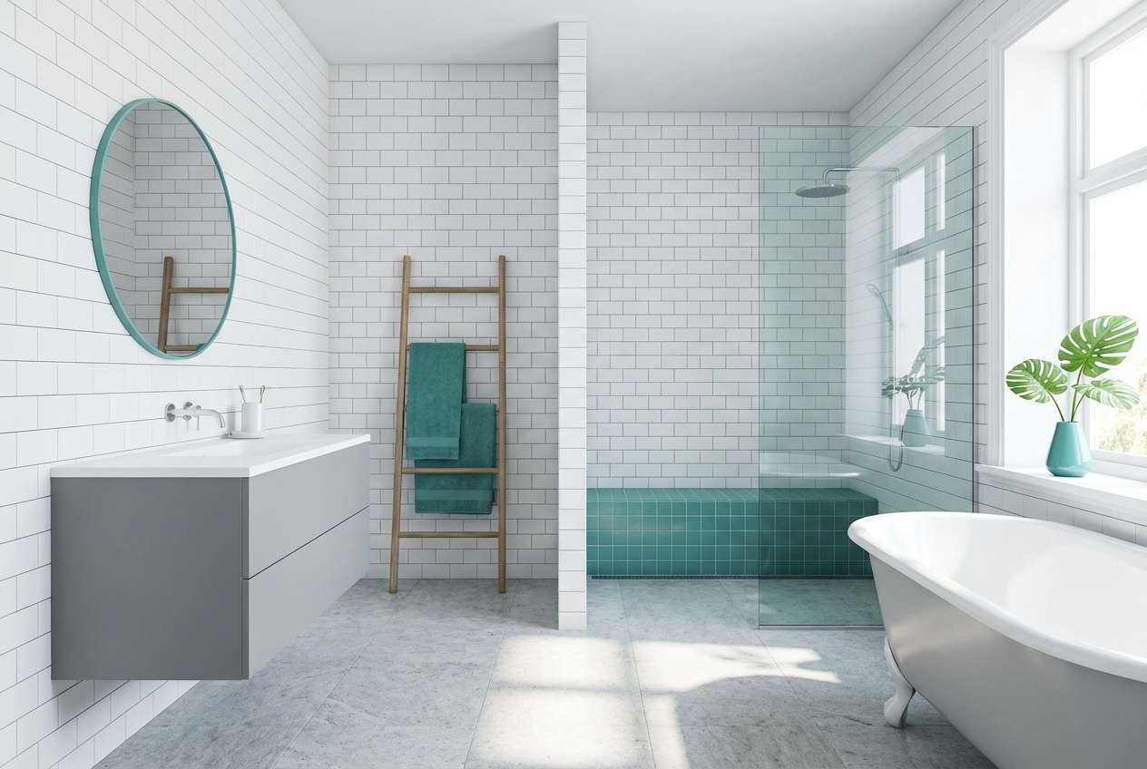
14) Nordic Bath
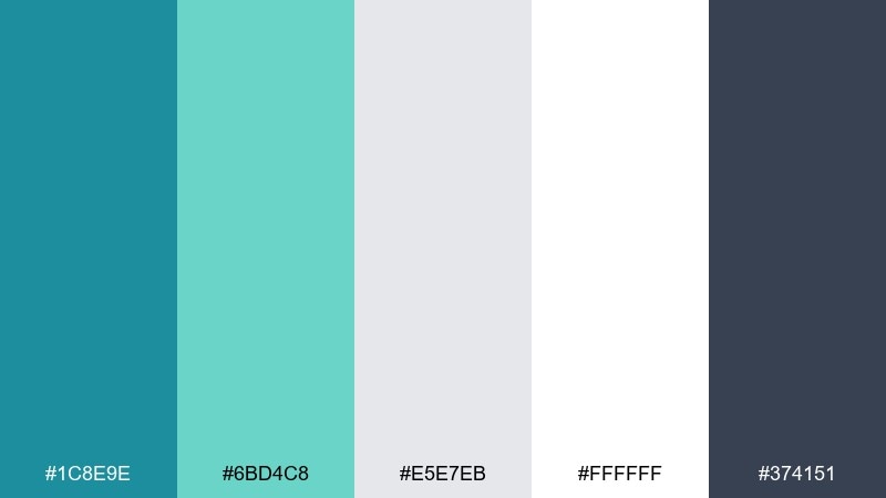
HEX: #1C8E9E #6BD4C8 #E5E7EB #FFFFFF #374151
Mood: clean, Scandinavian, soothing
Best for: bathroom design, wellness UI, minimalist branding
Clean and Scandinavian, it evokes tiled baths, steam, and bright daylight. The cool greys keep the teals crisp, creating a calm look that still feels modern. Use white generously and treat teal as an accent for buttons, towels, or feature walls. Add dark grey text for contrast and a sharper, editorial finish.
Image example of nordic bath generated using media.io
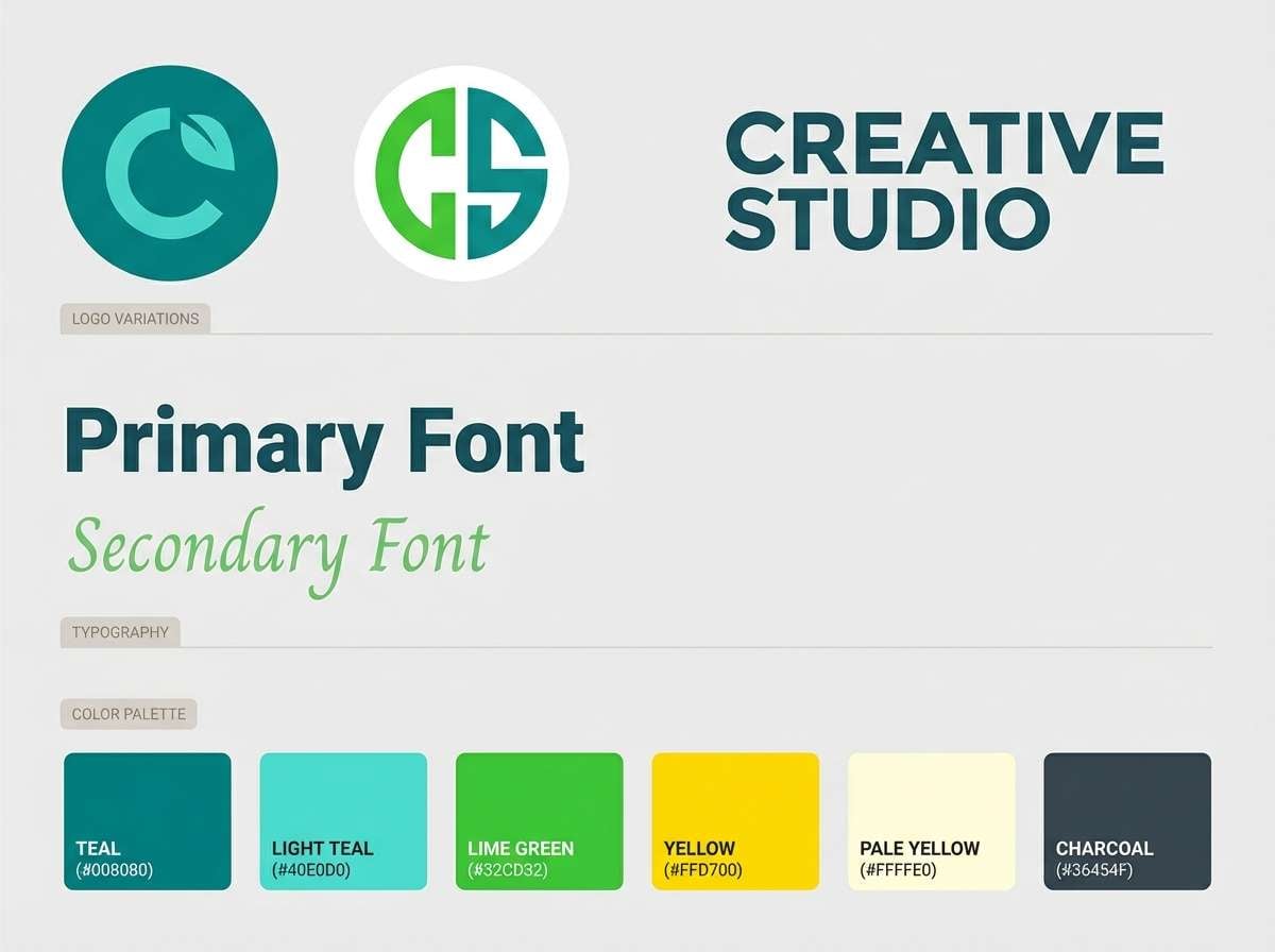
15) Minted Peacock
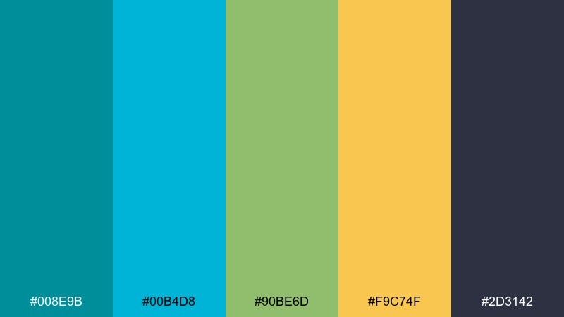
HEX: #008E9B #00B4D8 #90BE6D #F9C74F #2D3142
Mood: eclectic, confident, creative
Best for: brand boards, creative studios, portfolio sites
Eclectic and confident, it suggests peacock feathers with a modern, minty twist. The yellow adds warmth, while the deep slate keeps the overall look grown-up. Use teal for the primary brand color and let green and yellow show up as supporting highlights in patterns or icons. Keep photography slightly desaturated so the color story stays in control.
Image example of minted peacock generated using media.io
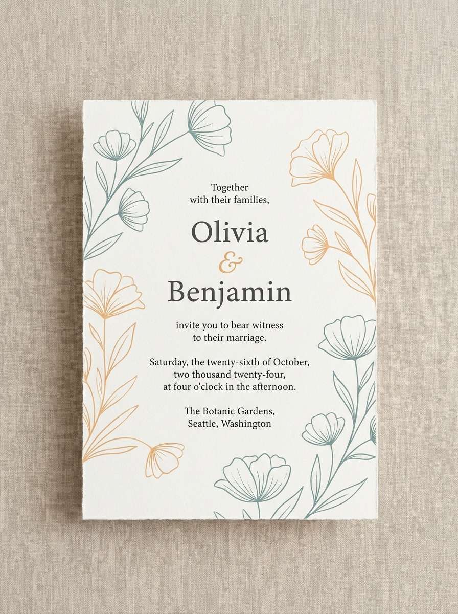
16) Sandbar Sunset
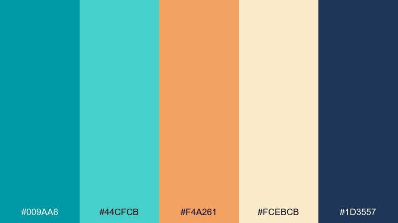
HEX: #009AA6 #44CFCB #F4A261 #FCEBCB #1D3557
Mood: warm coastal, inviting, relaxed
Best for: wedding invites, resort branding, lifestyle photography overlays
Warm and inviting, it looks like a sunset reflecting off shallow water and sand. The apricot accent softens the teal, making designs feel friendly and romantic. Use the pale cream for backgrounds and bring in navy for text to keep everything readable. For print, try uncoated paper to make the warm tones feel natural.
Image example of sandbar sunset generated using media.io
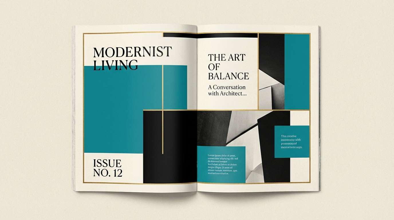
17) Celadon Ink
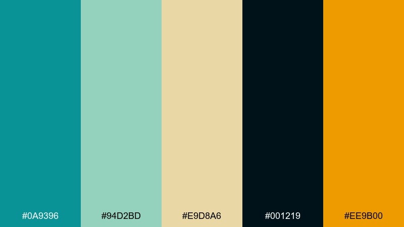
HEX: #0A9396 #94D2BD #E9D8A6 #001219 #EE9B00
Mood: artful, dramatic, premium
Best for: editorial layouts, book covers, luxury branding
Artful and dramatic, it feels like celadon glaze set against rich ink. The deep near-black gives the teals a jewel-like depth, and the warm gold adds a refined highlight. Use the dark shade for backgrounds in editorial spreads and reserve gold for rules, page numbers, or small marks. A serif headline paired with clean sans body text suits the premium contrast.
Image example of celadon ink generated using media.io
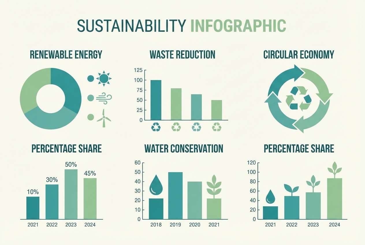
18) Glacier Lagoon
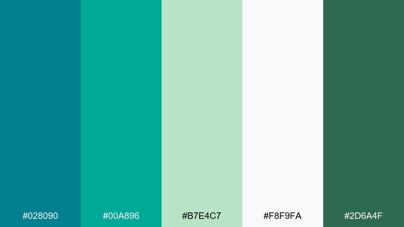
HEX: #028090 #00A896 #B7E4C7 #F8F9FA #2D6A4F
Mood: fresh, outdoorsy, optimistic
Best for: outdoor brands, sustainability sites, infographics
Fresh and outdoorsy, it recalls alpine lakes and clean air. The soft green adds a trail-ready, sustainable feel without losing the cool lagoon mood. Use teal for primary buttons and the forest green for secondary emphasis, especially on charts and icons. Keep the background near-white so the colors feel light and eco-minded.
Image example of glacier lagoon generated using media.io
19) Oceanic Minimal
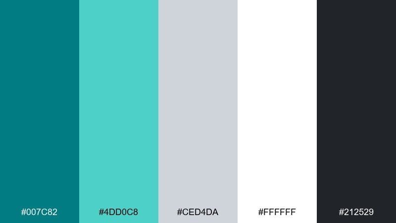
HEX: #007C82 #4DD0C8 #CED4DA #FFFFFF #212529
Mood: minimal, clean, contemporary
Best for: UI systems, corporate sites, presentations
Minimal and contemporary, it feels like calm water in a modern concrete pool. The restrained neutrals make the teals look intentional, perfect for design systems and slide decks. Use the bright aqua for interactive states and keep most UI surfaces white or very light grey. Stick to one teal tint per component to maintain a sharp, consistent hierarchy.
Image example of oceanic minimal generated using media.io
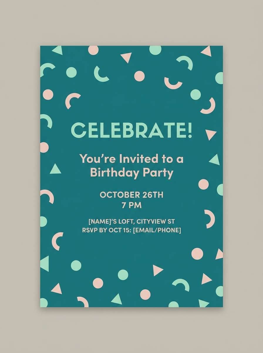
20) Party Confetti Teal
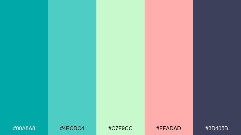
HEX: #00A8A8 #4ECDC4 #C7F9CC #FFADAD #3D405B
Mood: cheerful, modern, celebratory
Best for: birthday invites, launch graphics, playful ads
Cheerful and celebratory, it reads like confetti tossed over cool pool water. The blush and mint lighten the mood, while the deep slate keeps layouts from turning too sugary. For turquoise teal color combinations that need to feel fun but still polished, use slate for type and limit pink to small shapes or headlines. Add simple rounded icons to match the upbeat tone.
Image example of party confetti teal generated using media.io
What Colors Go Well with Turquoise Teal?
Turquoise teal pairs effortlessly with clean neutrals like white, off-white, and cool light greys for a modern, airy look. For readable typography, charcoal and deep navy are reliable anchors that keep teal from feeling too “sweet.”
If you want contrast, warm accents are your best friend: amber/gold for a premium feel, coral for friendly energy, and apricot for a softer lifestyle vibe. For nature-forward branding, add leafy greens or forest greens to push teal toward an eco, outdoorsy direction.
When in doubt, pick one dominant teal, one neutral background, one dark text color, and one warm accent. That simple structure keeps turquoise teal color combinations looking intentional across web, print, and product.
How to Use a Turquoise Teal Color Palette in Real Designs
For branding, treat turquoise teal as your primary signature color and let neutrals handle most surfaces (packaging base, website backgrounds, slide canvases). Use the darkest shade for logos, navigation, and body text so the system stays accessible and professional.
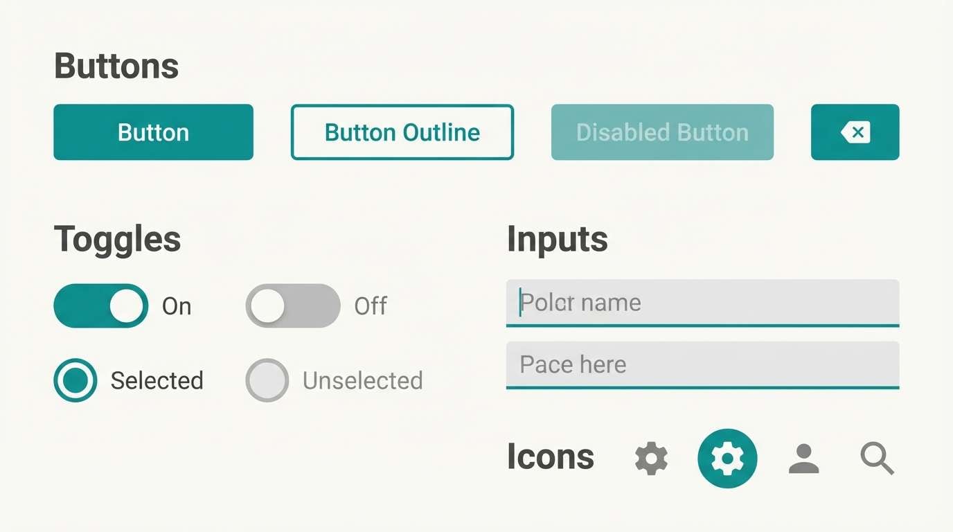
In UI, teal works best as an action and state color: buttons, toggles, links, charts, and success states. Avoid using multiple saturated teals in the same component; instead, use tints for hover/pressed states and keep contrast consistent.
For interiors, teal shines on smaller “hero” moments (tile, vanity, feature wall) balanced with warm woods, beige textiles, and matte finishes. Add one warm metal (brass/champagne) if you want the palette to feel more premium than coastal.
Create Turquoise Teal Palette Visuals with AI
If you’re pitching a client or building a moodboard, a palette is stronger with real-looking visuals. With Media.io, you can turn each palette prompt into consistent examples like packaging, posters, dashboards, or interior renders.
Start by choosing one palette above, then paste the prompt and keep the HEX colors nearby to guide your edits. Generate a few variations, then standardize typography and layout so the color story stays clear.
Once you’ve got a set you like, export images for presentations, social posts, and landing pages—without needing a full design mockup from scratch.
Turquoise Teal Color Palette FAQs
-
What is the difference between turquoise and teal?
Turquoise usually leans lighter and bluer, while teal is typically deeper and slightly greener. “Turquoise teal” sits in the middle—bright enough to feel fresh, but deep enough to work for UI accents and brand primaries. -
Is turquoise teal a good brand color?
Yes. It signals clarity, cleanliness, and approachability, and it can shift from wellness to tech depending on the neutrals and accents you pair it with (charcoal for enterprise, warm gold for premium, coral for playful). -
What colors complement turquoise teal best?
Strong complements include warm coral/orange, amber/gold, and soft apricot. For a calmer look, use warm beige, greige, and natural wood tones; for a modern look, use white plus charcoal or deep navy. -
Which text color is most readable on turquoise teal backgrounds?
In most cases, deep navy, near-black, or charcoal will be the most readable. For lighter teal tints, dark grey is usually safer than pure black; for darker teals, off-white text can work well if contrast is high. -
How do I use turquoise teal in a dark mode UI?
Use near-black or deep navy for the base, then apply teal for highlights, active states, and key data points. Add a pale ice tint for cards and surfaces so the interface doesn’t feel too heavy. -
Can I use turquoise teal for minimalist designs?
Absolutely. Keep most of the layout white or light grey, choose one main teal and one teal tint for states, and rely on spacing and typography for hierarchy rather than adding extra accent colors. -
How can I quickly generate visuals that match my turquoise teal palette?
Use an AI text-to-image workflow: generate scenes (packaging, UI, posters, interiors) with a consistent prompt style, then refine by keeping teal dominant, limiting warm accents, and standardizing lighting and typography.
Next: Tropical Color Palette


