

Tropical color palettes bring instant sunshine to a design—think ocean teals, ripe citrus, hibiscus pinks, and sandy neutrals. The right mix can feel energetic and fun while still staying clean and brand-ready.
Below are 20 tropical color palette ideas with HEX codes, plus practical guidance for branding, UI, and print so your “island colors” look polished, not chaotic.
In this article
Why Tropical Palettes Work So Well
Tropical palettes feel “alive” because they combine high-chroma hues (coral, mango, aqua) with grounding tones (navy, forest, sand). That contrast creates instant hierarchy—perfect for brands and interfaces that need clear focus.
They also map to familiar real-world cues: water, sun, fruit, flowers, and night skies. Even in abstract layouts, viewers read these combinations as warm, upbeat, and destination-inspired.
With a few smart controls—limited accents, consistent neutrals, and readable type colors—tropical color schemes can look premium and modern, not just loud.
20+ Tropical Color Palette Ideas (with HEX Codes)
1) Lagoon Breeze
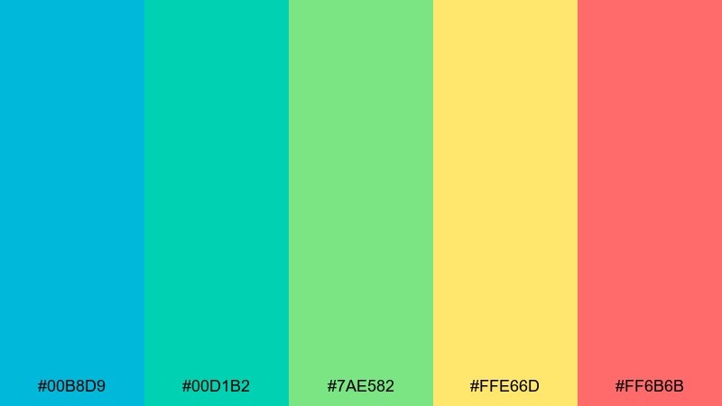
HEX: #00B8D9 #00D1B2 #7AE582 #FFE66D #FF6B6B
Mood: fresh, breezy, energetic
Best for: travel branding and social banners
Fresh ocean air and sunlit shallows come through in these crisp aqua-to-coral tones. It works beautifully for travel logos, tour promos, and upbeat social graphics where you want instant warmth. Pair it with clean white space and a modern sans serif to keep the energy controlled. Usage tip: let teal lead, then use coral only for calls to action so the layout stays readable.
Image example of lagoon breeze generated using media.io
Media.io is an online AI studio for creating and editing video, image, and audio in your browser.

2) Coral Punch
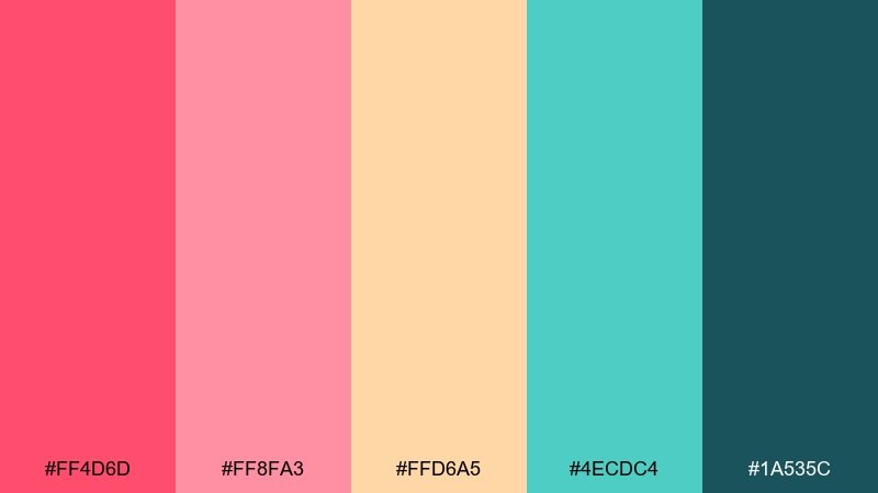
HEX: #FF4D6D #FF8FA3 #FFD6A5 #4ECDC4 #1A535C
Mood: playful, bold, sunny
Best for: summer campaign posters and event flyers
Playful heat and fruity sweetness give this mix a punchy, festival feel. It shines on posters, flyers, and promo assets where big blocks of color need to grab attention fast. Pair the coral and blush with deep teal for contrast and legibility. Usage tip: keep body text on the light peach and reserve the darkest teal for headings and dates.
Image example of coral punch generated using media.io

3) Palm Shade
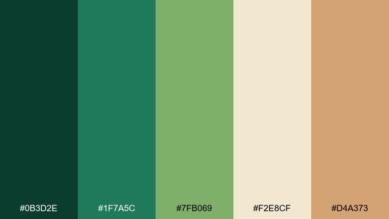
HEX: #0B3D2E #1F7A5C #7FB069 #F2E8CF #D4A373
Mood: grounded, natural, relaxed
Best for: eco packaging and wellness labels
Shaded palms and warm sand make this feel calm and quietly premium. It is ideal for eco packaging, apothecary-style labels, and wellness brands that want nature without neon. Pair the deep green with cream for generous breathing room, then use tan as a subtle accent. Usage tip: print the darkest green as spot color to avoid muddy shadows on kraft stock.
Image example of palm shade generated using media.io
4) Mango Mint
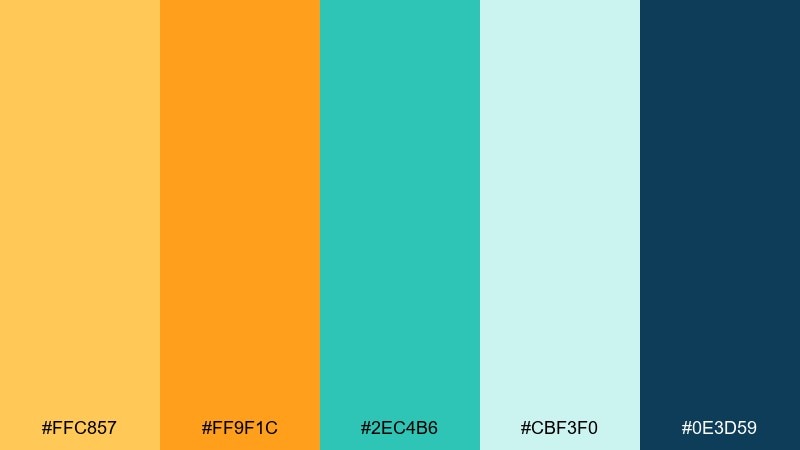
HEX: #FFC857 #FF9F1C #2EC4B6 #CBF3F0 #0E3D59
Mood: zesty, modern, uplifting
Best for: food menus and cafe identity
Zesty mango and cool mint create a lively, modern contrast that feels like a fresh drink on ice. Use it for cafe menus, smoothie bars, or food delivery branding where appetite appeal matters. Pair the bright oranges with soft aqua backgrounds to reduce glare on screens. Usage tip: keep the navy for typography and icons so the warm colors can stay playful.
Image example of mango mint generated using media.io
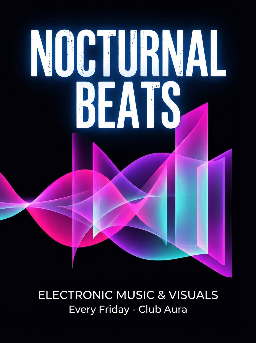
5) Hibiscus Dusk
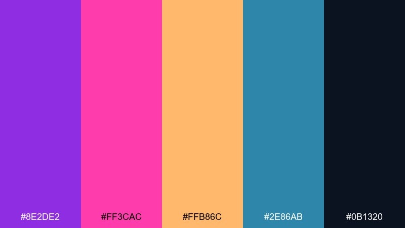
HEX: #8E2DE2 #FF3CAC #FFB86C #2E86AB #0B1320
Mood: dramatic, dreamy, nightlife
Best for: music cover art and nightlife posters
Neon hibiscus tones against deep night create a dramatic, dreamy after-sunset vibe. It works for DJ promos, music cover art, and nightlife posters where you want a glossy edge. Pair the hot magenta with the dark base for high contrast, then add peach as a highlight. Usage tip: use the blue sparingly for secondary accents so the pinks remain the star.
Image example of hibiscus dusk generated using media.io
6) Coconut Sand
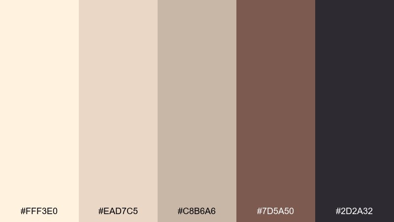
HEX: #FFF3E0 #EAD7C5 #C8B6A6 #7D5A50 #2D2A32
Mood: soft, warm, minimal
Best for: spa UI and calming website themes
Soft coconut cream and toasted sand feel serene, clean, and lightly luxurious. It fits spa websites, skincare UI, and editorial landing pages that need calm without looking bland. Pair the darker cocoa with plenty of negative space and thin rules for structure. Usage tip: use the mid taupe for cards and dividers to keep contrast accessible.
Image example of coconut sand generated using media.io
7) Reef Sunrise
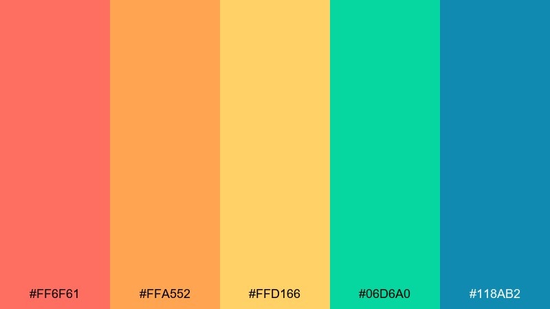
HEX: #FF6F61 #FFA552 #FFD166 #06D6A0 #118AB2
Mood: optimistic, bright, beachy
Best for: kids apparel and playful packaging
Optimistic sunrise hues meet reefy greens for a bright, beachy lift. It is a strong pick for kids apparel tags, playful packaging, and cheerful announcements. Pair the warm trio with the cooler blues to keep the overall look balanced. Usage tip: use the green as a grounding stripe or border so the oranges do not overpower the layout.
Image example of reef sunrise generated using media.io
8) Seafoam Citrus
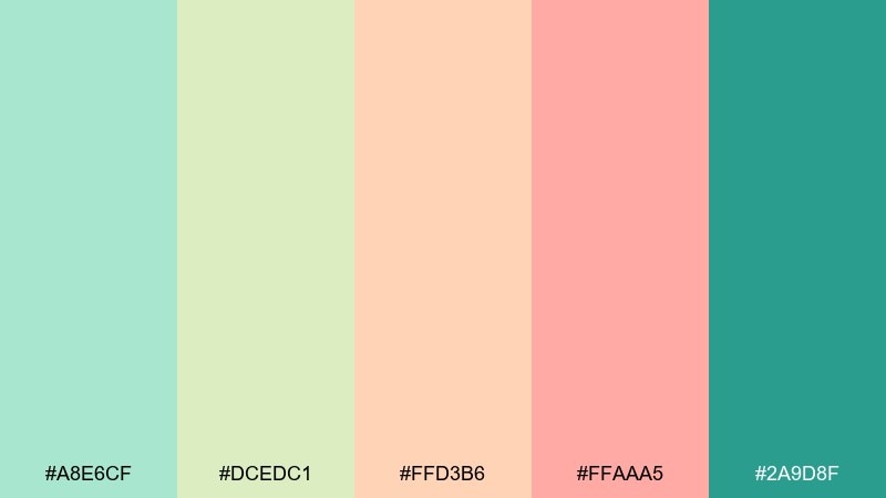
HEX: #A8E6CF #DCEDC1 #FFD3B6 #FFAAA5 #2A9D8F
Mood: light, friendly, refreshing
Best for: wellness blogs and email templates
Light seafoam and citrus pastels feel friendly, airy, and easy to read. They suit wellness blogs, newsletters, and onboarding emails where softness matters more than drama. Pair the warm blush with the deep teal for buttons and links to keep hierarchy clear. Usage tip: keep large backgrounds on the palest mint to prevent color cast on photos.
Image example of seafoam citrus generated using media.io
9) Orchid Island
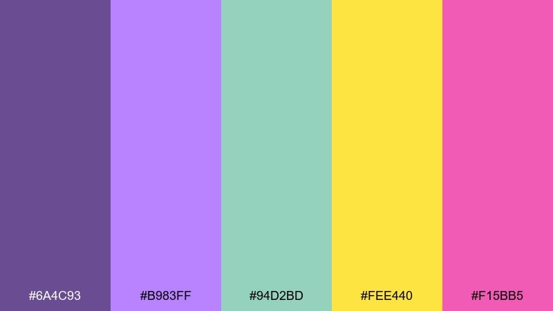
HEX: #6A4C93 #B983FF #94D2BD #FEE440 #F15BB5
Mood: whimsical, vibrant, creative
Best for: beauty branding and social reels covers
Whimsical orchid purples with bright sunshine yellow feel expressive and fashion-forward. These tropical color combinations work well for beauty branding, creator merch, and reel covers where contrast needs to pop at thumbnail size. Pair the yellow with the deeper purple to anchor headlines and keep the mint as a quiet buffer. Usage tip: limit the hot pink to badges and highlights so it reads intentional, not noisy.
Image example of orchid island generated using media.io
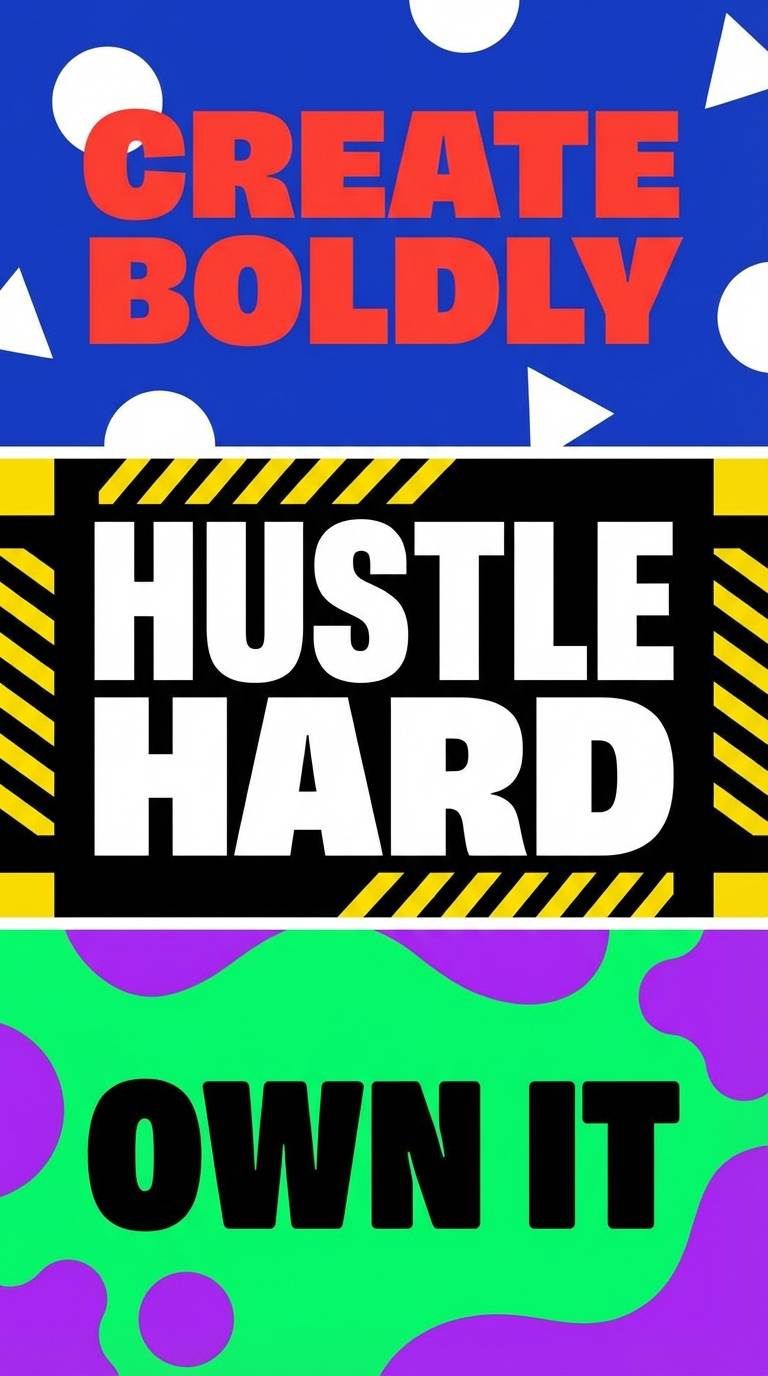
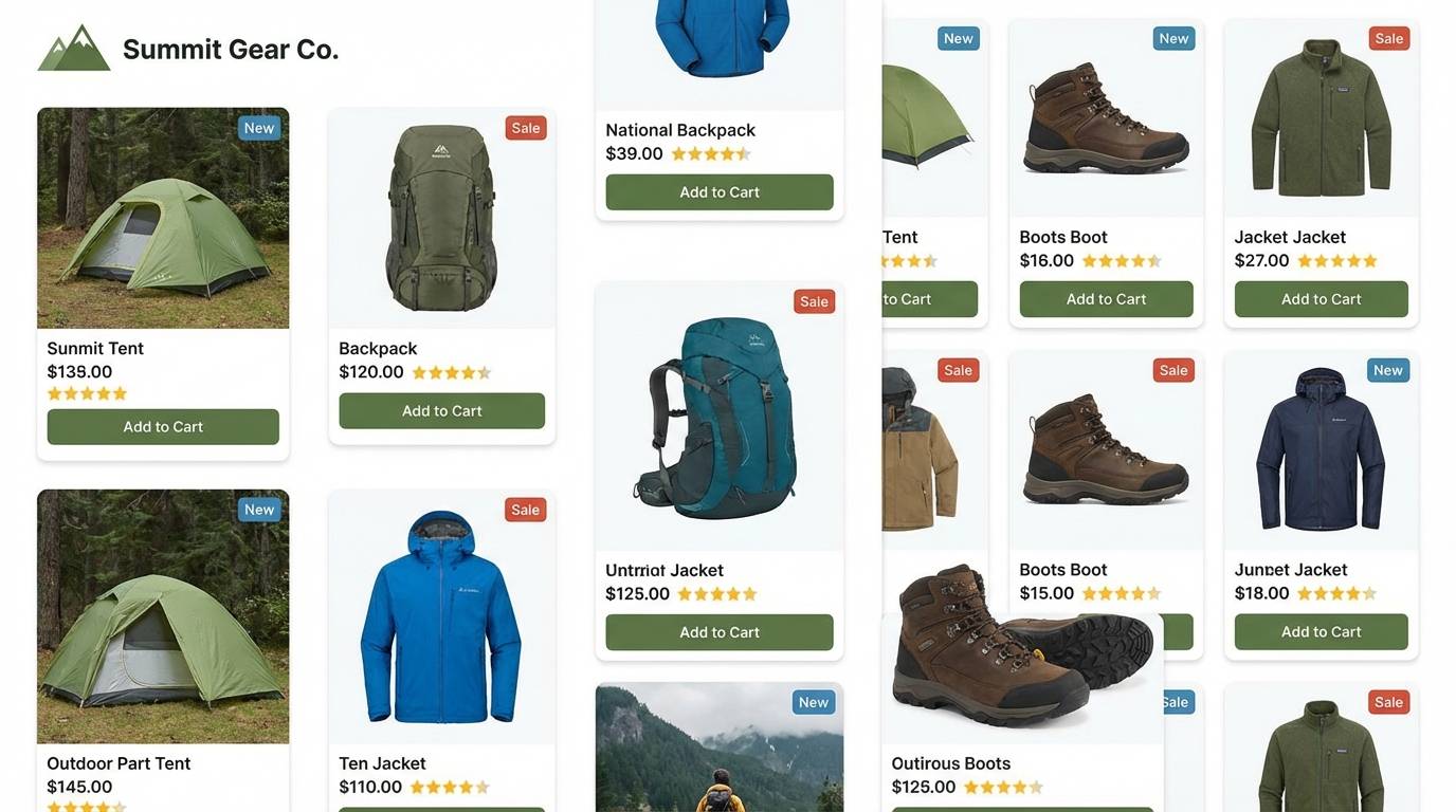
10) Rainforest Pop
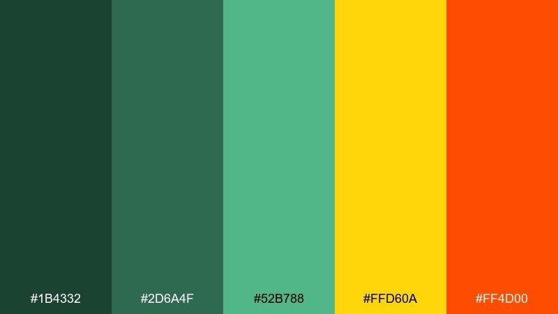
HEX: #1B4332 #2D6A4F #52B788 #FFD60A #FF4D00
Mood: adventurous, punchy, outdoorsy
Best for: outdoor gear ads and product pages
Dense rainforest greens with electric yellow and ember orange feel adventurous and bold. It suits outdoor gear ads, hiking product pages, and athletic drops that need punch without going full neon. Pair the warm accents with lots of dark green to keep the tone rugged. Usage tip: use yellow for price tags and key features, and keep orange for the single primary button.
Image example of rainforest pop generated using media.io
11) Flamingo Bay
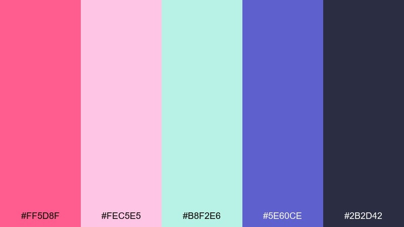
HEX: #FF5D8F #FEC5E5 #B8F2E6 #5E60CE #2B2D42
Mood: flirty, glossy, modern
Best for: fashion lookbooks and app onboarding
Flamingo pink with cool lilac and sea-glass mint gives a glossy, modern resort vibe. It is great for fashion lookbooks, beauty apps, and playful onboarding screens that still feel polished. Pair the deep charcoal for type and use the lilac to soften section headers. Usage tip: keep gradients subtle and reserve the brightest pink for a single focal element per screen.
Image example of flamingo bay generated using media.io
12) Banana Leaf
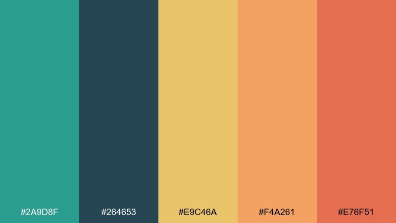
HEX: #2A9D8F #264653 #E9C46A #F4A261 #E76F51
Mood: rustic, sunny, confident
Best for: restaurant branding and signage
Banana-leaf green and sun-baked oranges feel rustic, sunny, and confident. They work for restaurant logos, wayfinding signage, and menu systems that need warmth with structure. Pair the deep blue-green with the yellow for a strong header combination. Usage tip: keep the orange as an accent stripe so printed signage stays high contrast from a distance.
Image example of banana leaf generated using media.io
13) Papaya Sorbet
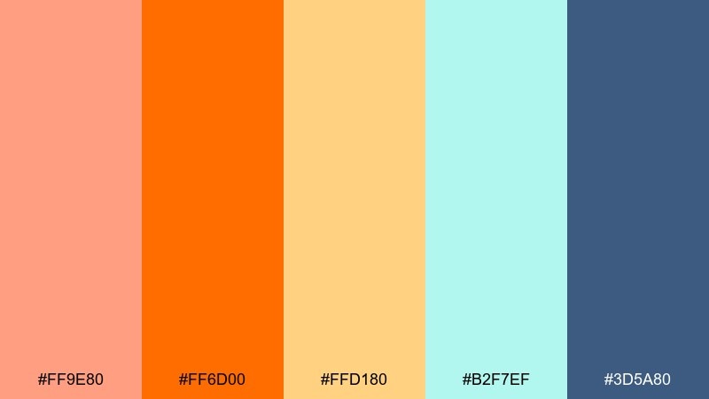
HEX: #FF9E80 #FF6D00 #FFD180 #B2F7EF #3D5A80
Mood: sweet, lively, welcoming
Best for: bakery packaging and promo cards
Sweet papaya and creamy citrus feel lively, welcoming, and a little nostalgic. This tropical color palette is perfect for bakery packaging, promo cards, and seasonal product drops. Pair the warm oranges with the soft aqua to cool things down and avoid an overly sugary look. Usage tip: put the darkest blue behind white type for ingredient lists and small print.
Image example of papaya sorbet generated using media.io
14) Ocean Market
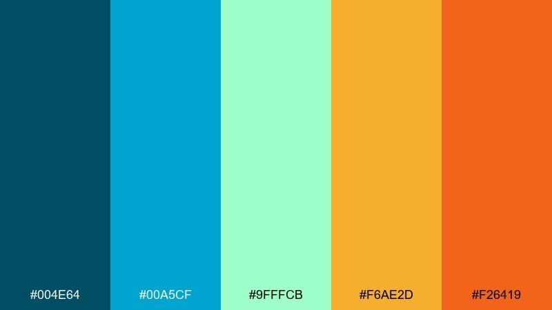
HEX: #004E64 #00A5CF #9FFFCB #F6AE2D #F26419
Mood: lively, clean, coastal
Best for: seafood labels and market posters
Clean ocean blues with golden and tangerine accents feel like a bustling coastal market. It fits seafood labels, farmers market posters, and food stall signage where freshness is the message. Pair the pale mint with bold cyan for backgrounds and panels, then punch in orange for prices. Usage tip: keep the darkest blue for typography so product names stay sharp on busy layouts.
Image example of ocean market generated using media.io
15) Tiki Night
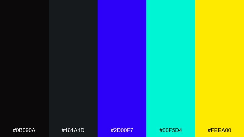
HEX: #0B090A #161A1D #2D00F7 #00F5D4 #FEEA00
Mood: electric, edgy, nightlife
Best for: stream overlays and gaming banners
Electric neon on deep charcoal feels like a late-night tiki bar with modern LED lights. Use it for stream overlays, gaming banners, and bold announcement graphics where glow-like contrast matters. Pair the turquoise with black for the primary UI elements and use yellow for alerts. Usage tip: keep the purple as a secondary glow so it does not fight the turquoise for attention.
Image example of tiki night generated using media.io
16) Sandbar Neutrals
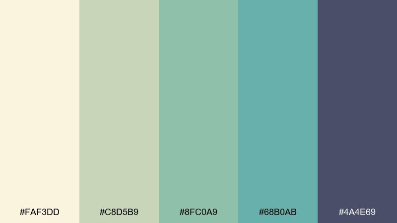
HEX: #FAF3DD #C8D5B9 #8FC0A9 #68B0AB #4A4E69
Mood: calm, airy, understated
Best for: minimal branding and stationery
Airy sand and sea-glass neutrals feel calm, understated, and quietly stylish. They are ideal for minimal branding, stationery, and portfolio sites that want color without loudness. Pair the slate tone with cream for elegant typography contrast. Usage tip: use the muted teal family for subtle section breaks instead of heavy lines.
Image example of sandbar neutrals generated using media.io
17) Pineapple Tide
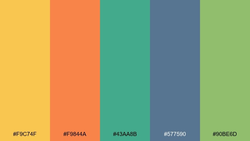
HEX: #F9C74F #F9844A #43AA8B #577590 #90BE6D
Mood: sporty, upbeat, sunny
Best for: fitness apps and summer challenges
Sunny pineapple yellow with ocean blue and fresh greens feels sporty and upbeat. These tropical color combinations are great for fitness apps, summer challenges, and community events that need friendly energy. Pair the blue with yellow for key screens, then use green for progress states and success messages. Usage tip: keep orange for a single action style so users instantly recognize the primary button.
Image example of pineapple tide generated using media.io
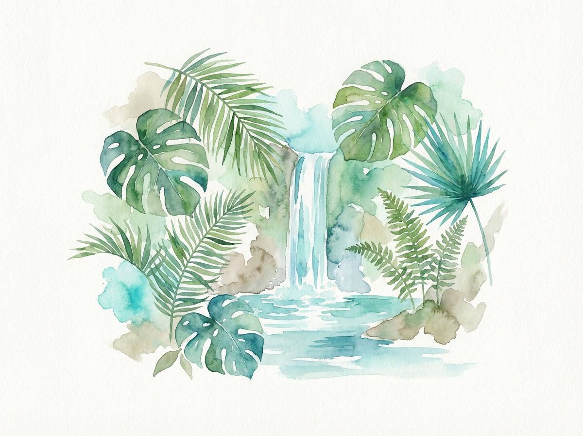
18) Jade Waterfall
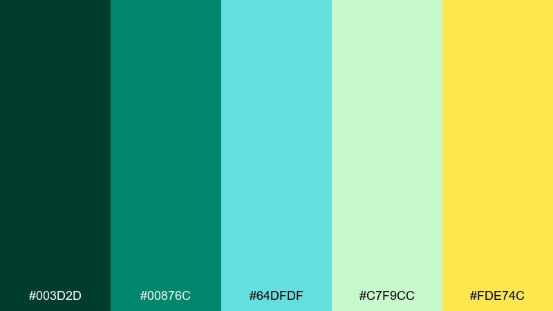
HEX: #003D2D #00876C #64DFDF #C7F9CC #FDE74C
Mood: cool, rejuvenating, natural
Best for: botanical illustrations and eco posters
Cool jade water and misty greens evoke a rejuvenating hike to a hidden waterfall. It suits botanical illustration sets, eco posters, and nature-led editorial graphics. Pair the deepest green with pale mint for clean contrast, then add the yellow as a small sunlit highlight. Usage tip: keep gradients out of the greens in print and use flat fills to avoid banding.
Image example of jade waterfall generated using media.io
19) Sunset Cabana
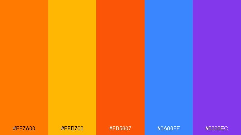
HEX: #FF7A00 #FFB703 #FB5607 #3A86FF #8338EC
Mood: glowing, festive, confident
Best for: festival tickets and bold landing pages
Glowing sunset oranges with electric blue and violet feel festive and high-impact. Use it for festival tickets, bold landing pages, and hero sections that need instant drama. Pair orange with violet for striking headlines and keep blue for secondary buttons and links. Usage tip: set backgrounds in a single warm tone and let the cool colors handle hierarchy.
Image example of sunset cabana generated using media.io
20) Blue Lagoon
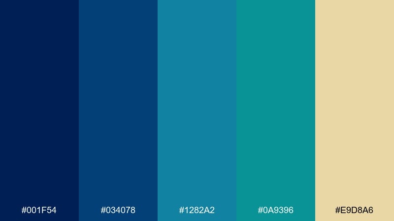
HEX: #001F54 #034078 #1282A2 #0A9396 #E9D8A6
Mood: cool, premium, serene
Best for: hotel websites and editorial layouts
Deep lagoon blues with a sandy highlight feel premium, serene, and well-traveled. This tropical color palette works for boutique hotel websites, magazine-style layouts, and high-end itineraries. Pair the darkest navy with the pale sand for strong typographic contrast, and use the teals for navigation and links. Usage tip: keep imagery slightly desaturated so the blues in the UI remain the focal point.
Image example of blue lagoon generated using media.io
What Colors Go Well with Tropical?
Tropical schemes pair best with strong anchors: deep navy, charcoal, or rainforest green keeps bright color pairings readable and mature. This is especially helpful when you’re combining coral and teal or stacking multiple summer color combinations.
Soft neutrals—coconut cream, warm sand, taupe—also work well because they reduce visual noise while preserving the “beachy tones” feel. Use them as backgrounds, cards, and whitespace buffers.
For extra polish, add one “signal color” (like sunshine yellow) and keep it limited to highlights, badges, and calls to action.
How to Use a Tropical Color Palette in Real Designs
Start with roles, not swatches: pick 1 primary, 1 secondary, 1 accent, plus 1–2 neutrals for backgrounds and type. Tropical palettes feel best when the brightest hue is treated as an accent instead of a constant background.
For UI color ideas, reserve the darkest tone for text and iconography, then use teal/mint for surfaces and coral/orange for primary actions. Check contrast early so buttons and small labels stay accessible.
For print design colors, test on the intended stock (white, uncoated, kraft). Tropical brights can shift in CMYK, so consider spot colors for deep greens/navies and keep gradients minimal.
Create Tropical Palette Visuals with AI
If you want to preview how island colors look in a real layout, generate quick mockups: posters, brand boards, UI screens, packaging labels, and social covers. Seeing the palette in context helps you spot contrast issues before you commit.
With Media.io Text-to-Image, you can paste a prompt (like the examples above), specify a clean style, and iterate fast until the vibe feels sunny yet polished.
Once you like the direction, keep your HEX color codes consistent across assets to maintain brand recognition from web to print.
Tropical Color Palette FAQs
-
What is a tropical color palette?
A tropical color palette is a set of colors inspired by beaches, oceans, tropical flowers, and fruits—often mixing teals, aquas, corals, mango/orange, sunny yellow, and grounding neutrals like sand or navy. -
Which tropical colors work best for branding?
For branding, pair one vibrant hero color (teal or coral) with a dark anchor (navy/charcoal) and a light neutral (cream/sand). This keeps the look energetic while staying readable across logos, packaging, and web UI. -
How do I keep tropical color combinations from looking too loud?
Limit your brightest hues to accents, expand whitespace, and use neutrals for large surfaces. A good rule is 60/30/10: neutral background, secondary support color, then a small portion of high-saturation accents. -
Do coral and teal go together?
Yes—coral and teal are a classic tropical pairing because they sit on opposite sides of warm/cool contrast. Use teal for larger areas and coral for CTAs or highlights to preserve balance. -
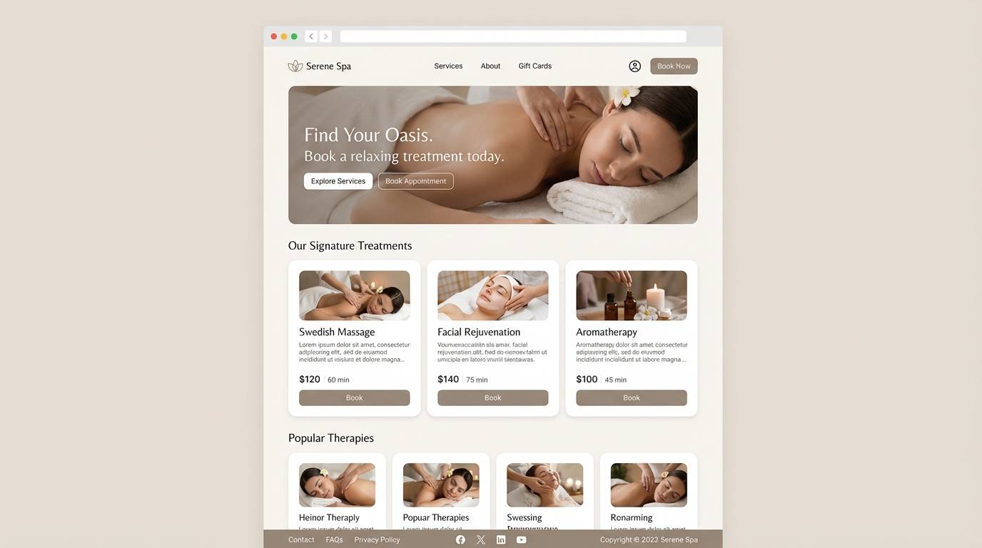
What tropical palette is best for UI design?
Palettes with a strong dark type color and softer mid-tones work best for UI—try Coconut Sand, Mango Mint, or Blue Lagoon. Keep bright oranges/pinks for buttons and status states, not body text. -
How should I prepare tropical colors for print?
Convert HEX to CMYK carefully, print a proof, and watch for shifts in bright teal and hot pink. If accuracy is critical, use spot colors for deep greens/navies and avoid heavy gradients that may band. -
Can I generate tropical palette mockups with AI?
Yes. Use Media.io Text-to-Image to generate brand boards, posters, packaging scenes, or UI mockups with your chosen tropical palette, then iterate prompts until the saturation and contrast feel right.


