

Turquoise green sits in the sweet spot between refreshing blue and lively green, so it reads clean, modern, and optimistic across both digital and print.
Below are 20 turquoise green color palette ideas with HEX codes, mood notes, and practical pairing tips for branding, UI, and decor.
In this article
- Why Turquoise Green Palettes Work So Well
-
- lagoon mint
- coral reef pop
- coastal sage
- botanical aqua
- retro poolside
- glacier teal
- seafoam neutral
- emerald turquoise luxe
- tropical smoothie
- modern clinic calm
- artisan ceramic
- urban signage
- nordic lake
- sunset harbor
- digital neon tide
- wedding eucalyptus
- museum exhibit
- yoga studio zen
- kids ocean play
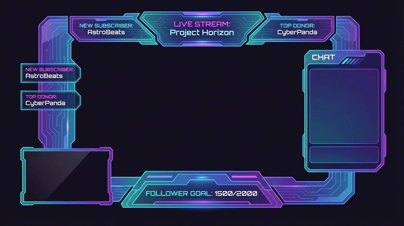
- minimal finance ui
- What Colors Go Well with Turquoise Green?
- How to Use a Turquoise Green Color Palette in Real Designs
- Create Turquoise Green Palette Visuals with AI
Why Turquoise Green Palettes Work So Well
Turquoise green feels instantly “fresh” because it borrows the cleanliness of blue and the vitality of green. That balance makes it versatile: calm enough for wellness and medical UI, yet energetic enough for campaigns and playful products.
It also performs well in modern design systems because it can act as a primary brand hue or a focused accent. With the right neutrals (warm off-whites or cool grays), turquoise green stays readable and premium rather than overly tropical.
Most importantly, turquoise green supports strong contrast strategies. Pair it with deep slate, navy, or near-black for accessible typography and crisp components, then reserve the brightest aqua tones for CTAs and key states.
20+ Turquoise Green Color Palette Ideas (with HEX Codes)
1) Lagoon Mint
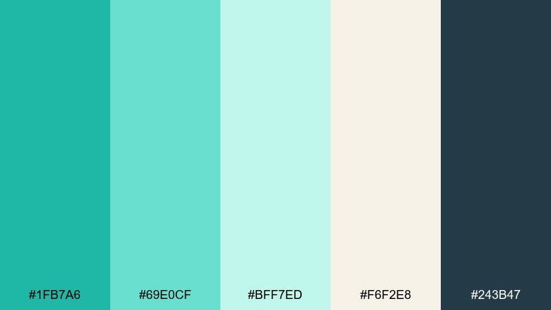
HEX: #1FB7A6 #69E0CF #BFF7ED #F6F2E8 #243B47
Mood: fresh, airy, coastal
Best for: wellness branding, landing pages, bathroom decor
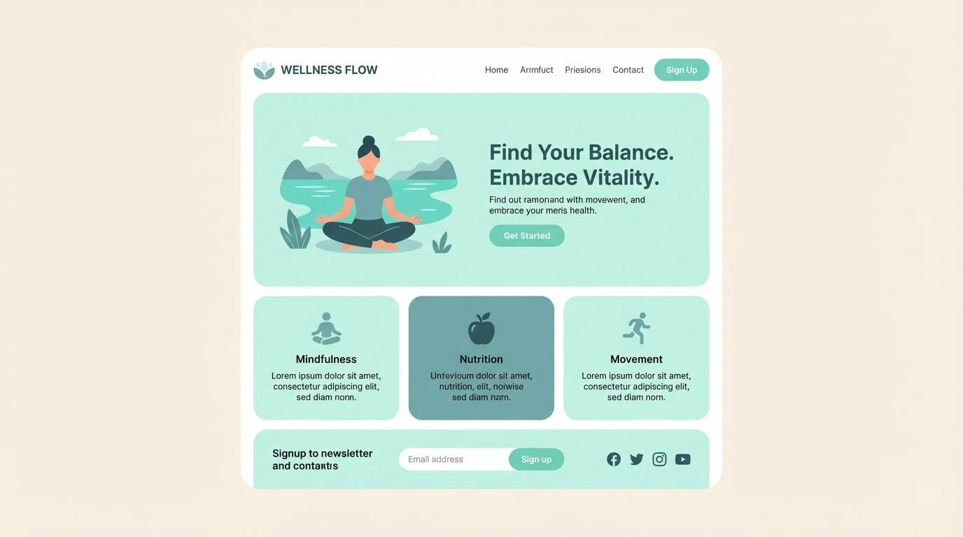
Fresh and airy like a quiet lagoon at sunrise, these tones feel clean without turning icy. The turquoise green color palette reads best when you let the off-white lead and use the deep slate for type and contrast. Pair it with pale wood textures or brushed steel for a modern spa vibe. Usage tip: keep the mint highlight to buttons, icons, or towels so the look stays calm and premium.
Image example of lagoon mint generated using media.io
Media.io is an online AI studio for creating and editing video, image, and audio in your browser.

2) Coral Reef Pop
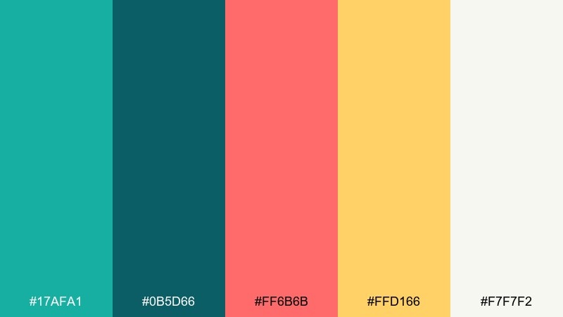
HEX: #17AFA1 #0B5D66 #FF6B6B #FFD166 #F7F7F2
Mood: playful, vibrant, summery
Best for: event posters, social ads, summer campaigns
Playful and sunlit, this mix evokes coral reefs, pool floats, and bright midday energy. These turquoise green color combinations work best when teal anchors the layout and coral becomes the attention grabber. Pair with simple sans-serif typography and plenty of breathing room so the warm accents feel intentional, not loud. Usage tip: limit coral to one primary CTA or headline to keep contrast sharp.
Image example of coral reef pop generated using media.io
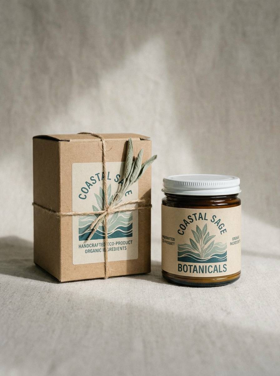
3) Coastal Sage
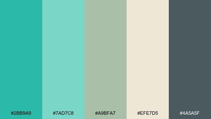
HEX: #2BB9A9 #7AD7C8 #A9BFA7 #EFE7D5 #4A5A5F
Mood: relaxed, natural, breezy
Best for: interiors, lifestyle blogs, eco product labels
Relaxed and natural, these hues feel like sea glass beside dune grass. The muted sage softens the aqua so the overall look stays grounded and lived-in. Pair with kraft paper, linen textures, and charcoal typography for an organic finish. Usage tip: use the warm beige as your main background to prevent the teal from overpowering the space.
Image example of coastal sage generated using media.io
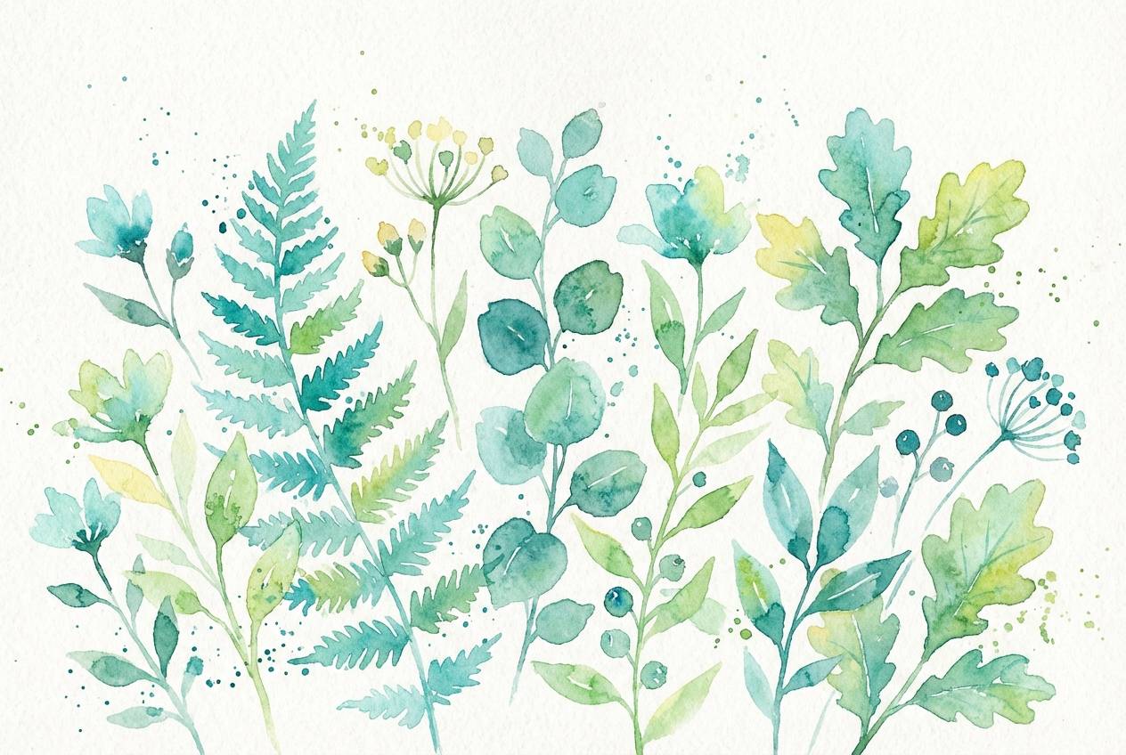
4) Botanical Aqua
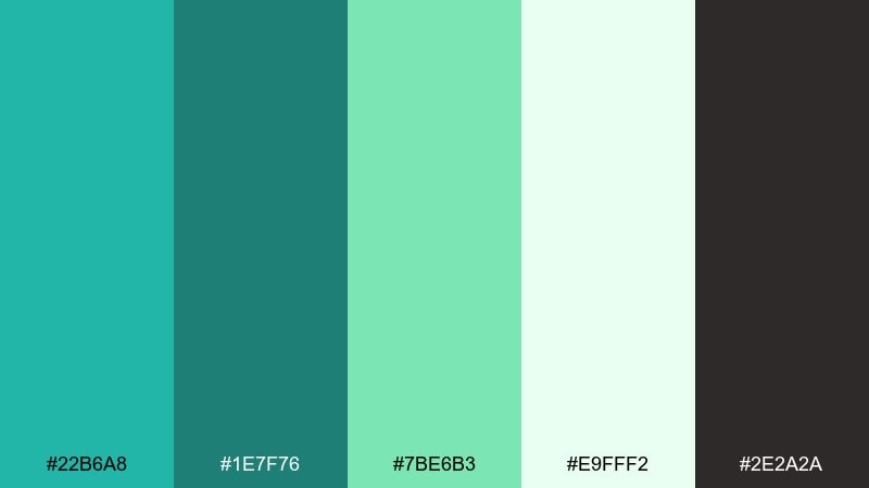
HEX: #22B6A8 #1E7F76 #7BE6B3 #E9FFF2 #2E2A2A
Mood: lush, refreshing, botanical
Best for: spring illustrations, skincare visuals, garden content
Lush and refreshing, this set calls to mind wet leaves, herbal steam, and greenhouse light. The bright green adds a lively lift that keeps the aqua from feeling too aquatic. Pair with soft paper textures and deep near-black text for crisp legibility. Usage tip: reserve the vivid green for leaf details or small highlights so it reads as botanical, not neon.
Image example of botanical aqua generated using media.io
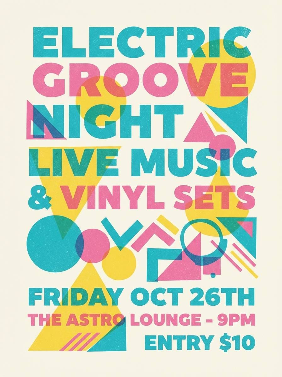
5) Retro Poolside
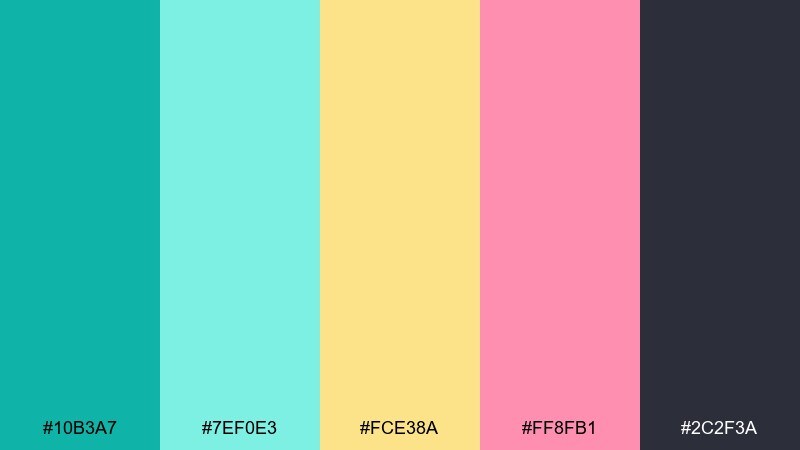
HEX: #10B3A7 #7EF0E3 #FCE38A #FF8FB1 #2C2F3A
Mood: retro, fun, upbeat
Best for: music flyers, merch, playful app themes
Retro and upbeat, these colors feel like pool tiles, soft neon signs, and summer playlists. The dark ink shade gives you a strong base for headlines and icons. Pair with rounded typography and simple geometric shapes for a throwback graphic vibe. Usage tip: use the buttery yellow as a background block behind key text for instant readability.
Image example of retro poolside generated using media.io
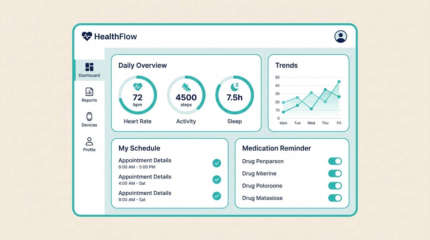
6) Glacier Teal
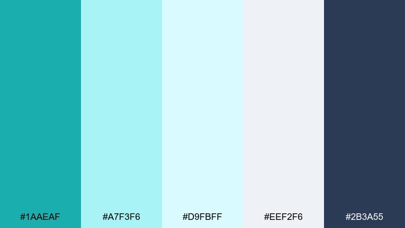
HEX: #1AAEAF #A7F3F6 #D9FBFF #EEF2F6 #2B3A55
Mood: cool, crisp, minimal
Best for: health tech UI, data dashboards, SaaS sites
Cool and crisp, this range feels like glacial water and clean air. The pale blues keep screens light while the navy brings trustworthy contrast for navigation and charts. Pair with thin-line icons and generous spacing for a modern, clinical clarity. Usage tip: keep the brightest teal for primary buttons and status highlights so it stays purposeful.
Image example of glacier teal generated using media.io
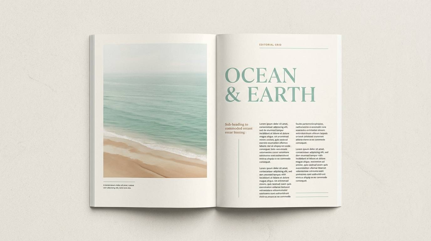
7) Seafoam Neutral
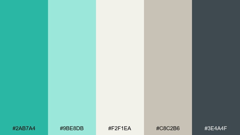
HEX: #2AB7A4 #9BE8DB #F2F1EA #C8C2B6 #3E4A4F
Mood: soft, balanced, understated
Best for: editorial layouts, boutiques, minimalist interiors
Soft and balanced, these tones evoke seafoam on sand and a calm, curated storefront. The warm neutrals prevent the green-blue from feeling cold, making it easy to use across print and web. Pair with serif headlines and matte textures for a quiet luxury feel. Usage tip: let the off-white dominate and use teal sparingly for links, dividers, and small brand marks.
Image example of seafoam neutral generated using media.io
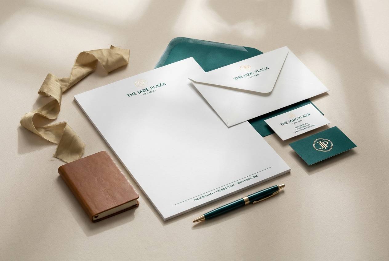
8) Emerald Turquoise Luxe
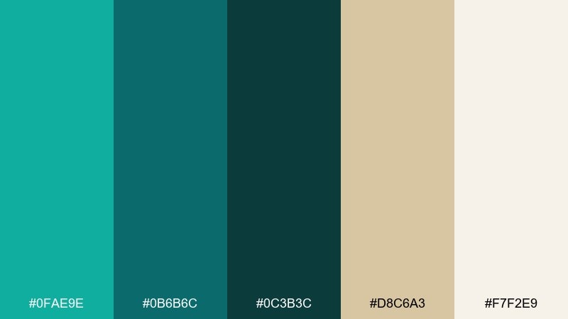
HEX: #0FAE9E #0B6B6C #0C3B3C #D8C6A3 #F7F2E9
Mood: luxurious, moody, elegant
Best for: premium branding, hotel materials, wine bars
Luxurious and moody, this palette feels like a velvet lounge with teal glassware and warm brass. Deep greens create drama, while the champagne tone adds a refined glow for accents and rules. Pair with gold foil finishes, high-contrast photography, and tight typography for a boutique look. Usage tip: use the darkest shade for headers and reserve metallic accents for logos and key separators.
Image example of emerald turquoise luxe generated using media.io
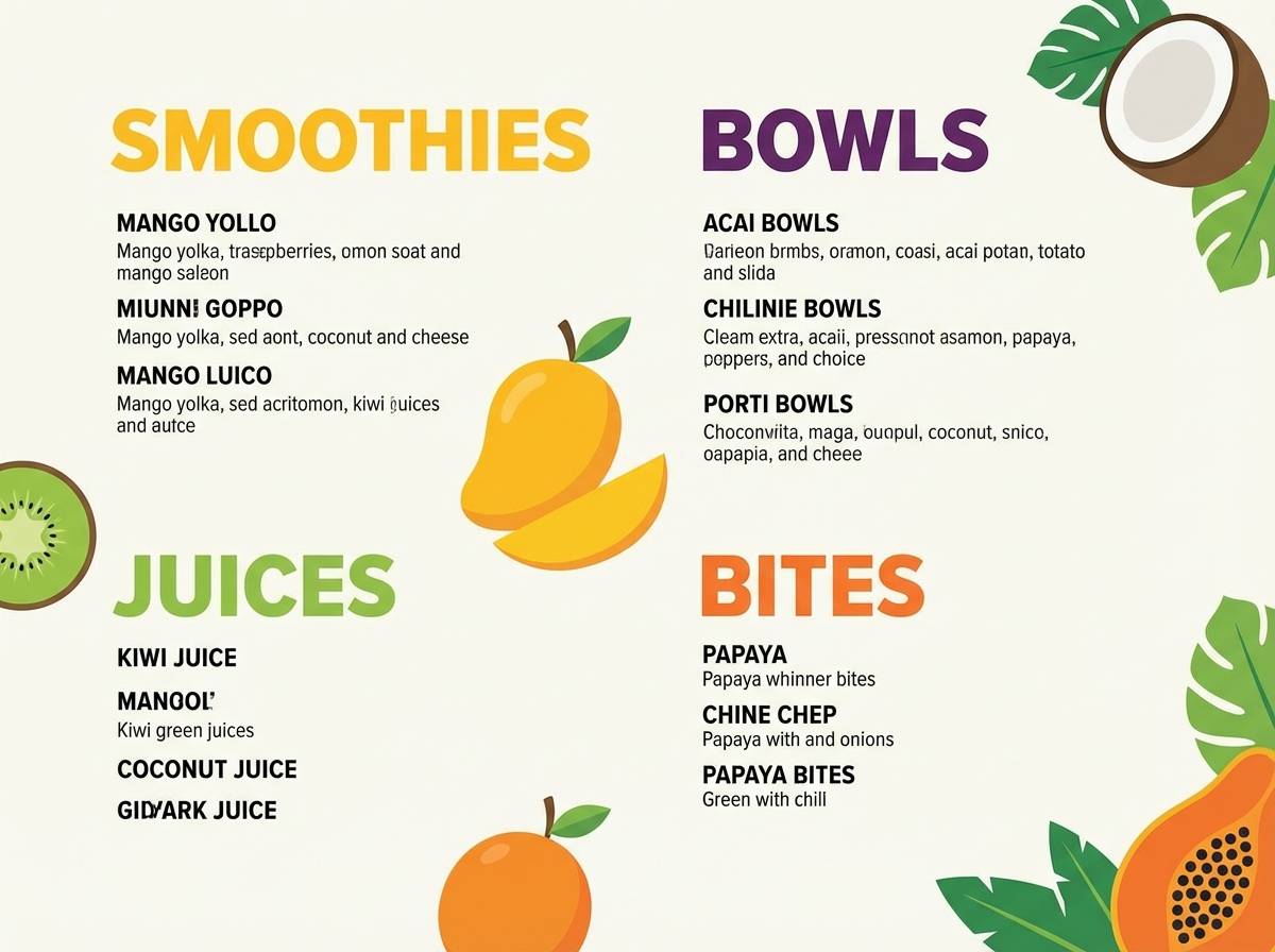
9) Tropical Smoothie
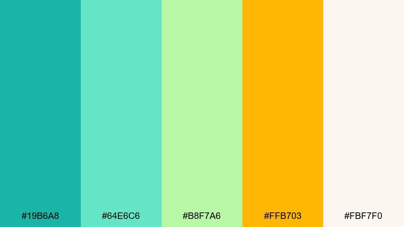
HEX: #19B6A8 #64E6C6 #B8F7A6 #FFB703 #FBF7F0
Mood: bright, juicy, upbeat
Best for: cafe menus, beverage branding, summer promos
Bright and juicy, this mix feels like a fruit smoothie served next to turquoise water. The lime tint adds a playful twist that looks great in illustrations and food photography overlays. Pair with warm whites and a single bold headline font to keep it punchy but readable. Usage tip: use the orange as a price callout or badge color for instant scanning.
Image example of tropical smoothie generated using media.io
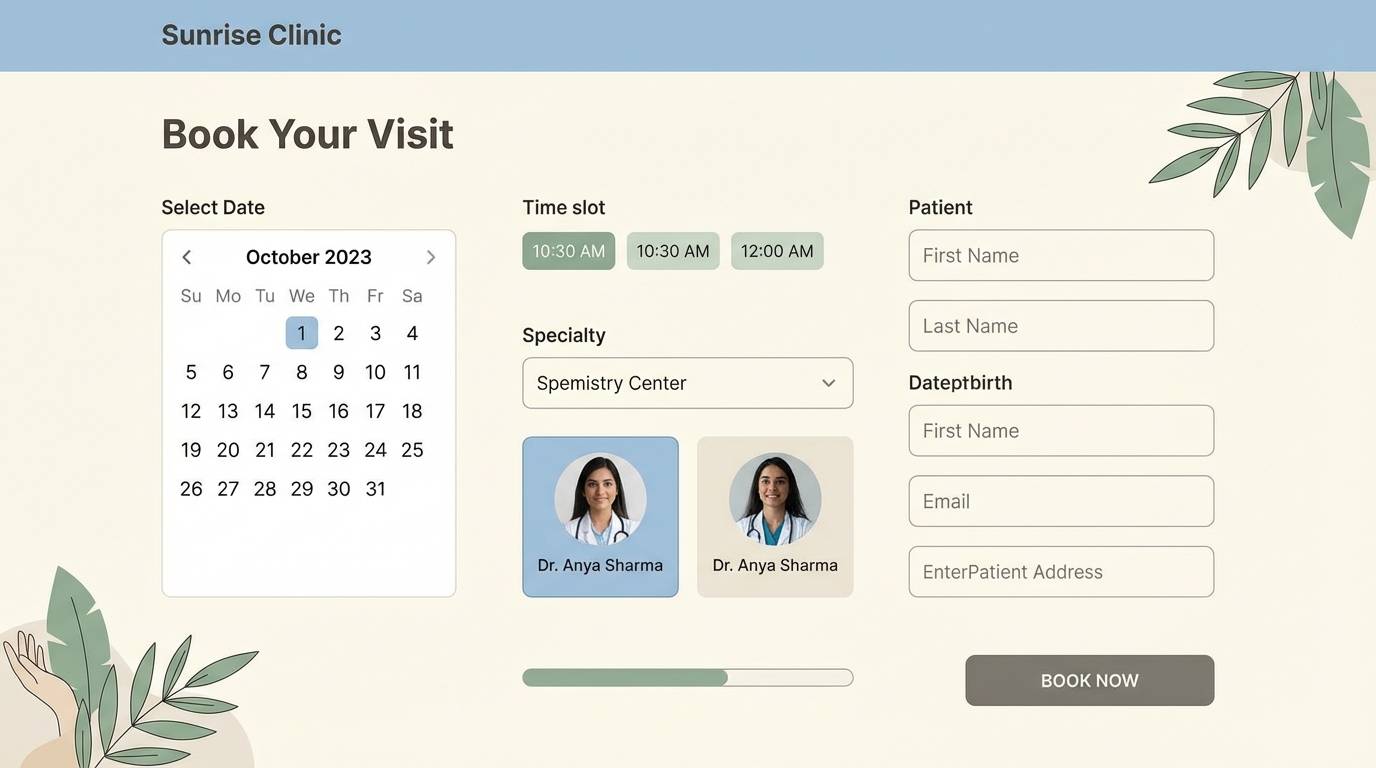
10) Modern Clinic Calm
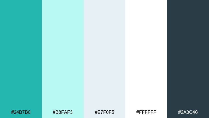
HEX: #24B7B0 #B8FAF3 #E7F0F5 #FFFFFF #2A3C46
Mood: clean, reassuring, professional
Best for: medical clinics, appointment apps, signage
Clean and reassuring, these tones suggest sterile light, clear water, and calm professionalism. The bright white keeps the interface feeling open, while the deep slate supports accessible text contrast. Pair with simple iconography and rounded components for a friendly clinical look. Usage tip: keep the aqua as a supporting accent and rely on the slate for primary labels and form fields.
Image example of modern clinic calm generated using media.io
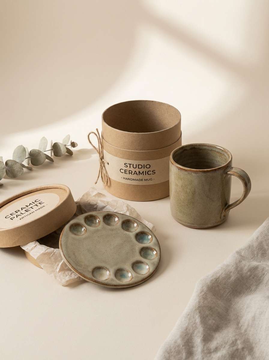
11) Artisan Ceramic
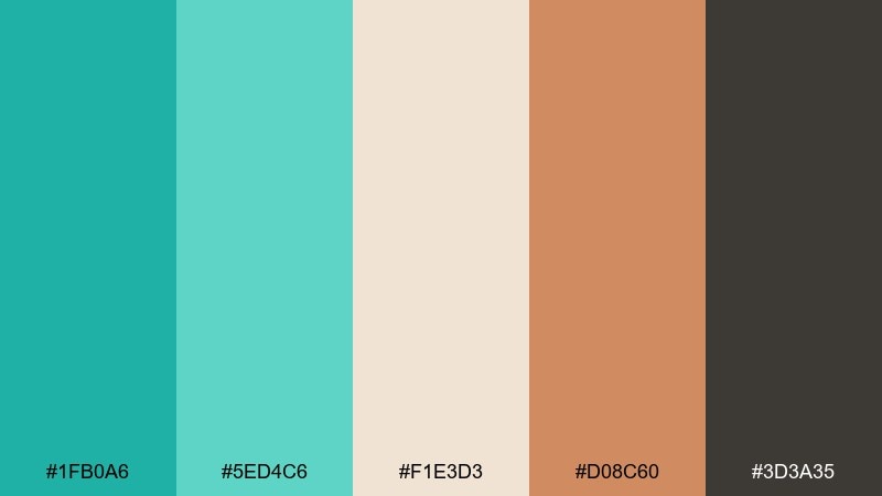
HEX: #1FB0A6 #5ED4C6 #F1E3D3 #D08C60 #3D3A35
Mood: handcrafted, warm, earthy
Best for: ceramics shops, craft fairs, maker portfolios
Handcrafted and warm, this blend feels like glazed pottery on a sunlit shelf. The clay accent brings a cozy counterbalance to the cool teal, making the look more human and tactile. Pair with textured backgrounds, kraft paper, and simple product photography. Usage tip: use the clay tone for call-to-action buttons or stickers so it pops without feeling harsh.
Image example of artisan ceramic generated using media.io
12) Urban Signage
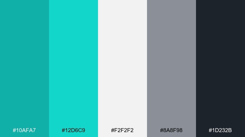
HEX: #10AFA7 #12D6C9 #F2F2F2 #8A8F98 #1D232B
Mood: bold, modern, high-contrast
Best for: wayfinding, tech branding, streetwear graphics
Bold and modern, these tones feel like neon reflections on wet pavement. Crisp gray and near-black keep the layout sharp, while the bright teal cuts through clutter for instant recognition. Pair with condensed type and strong grid alignment for an urban, utility-first look. Usage tip: use teal only for directional elements and key labels so it reads as signage, not decoration.
Image example of urban signage generated using media.io

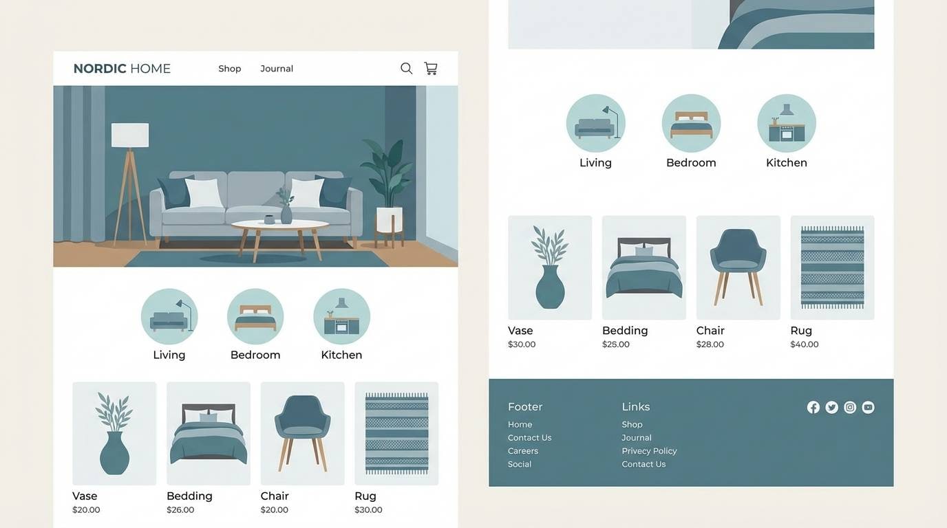
13) Nordic Lake
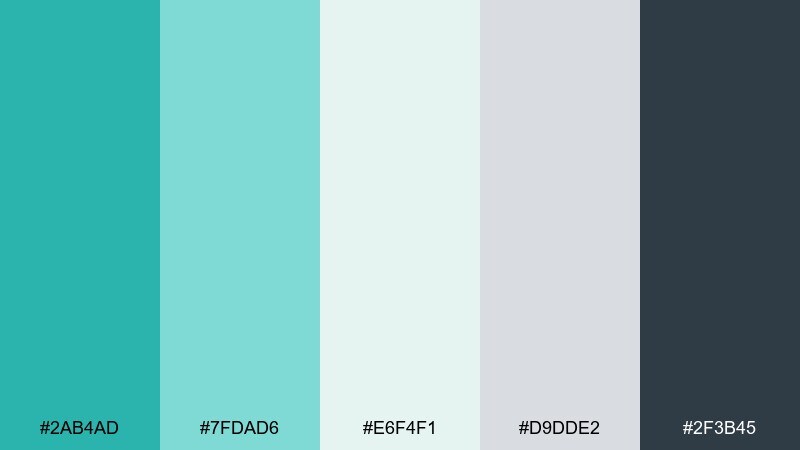
HEX: #2AB4AD #7FDAD6 #E6F4F1 #D9DDE2 #2F3B45
Mood: scandinavian, calm, airy
Best for: home decor sites, minimalist brands, blogs
Scandinavian and calm, this set evokes a glassy lake framed by pale stone and fog. The gentle grays make the turquoise read sophisticated rather than tropical. Pair with clean photography, subtle shadows, and lots of negative space. Usage tip: keep saturation low in supporting visuals so the teal stays the hero accent.
Image example of nordic lake generated using media.io
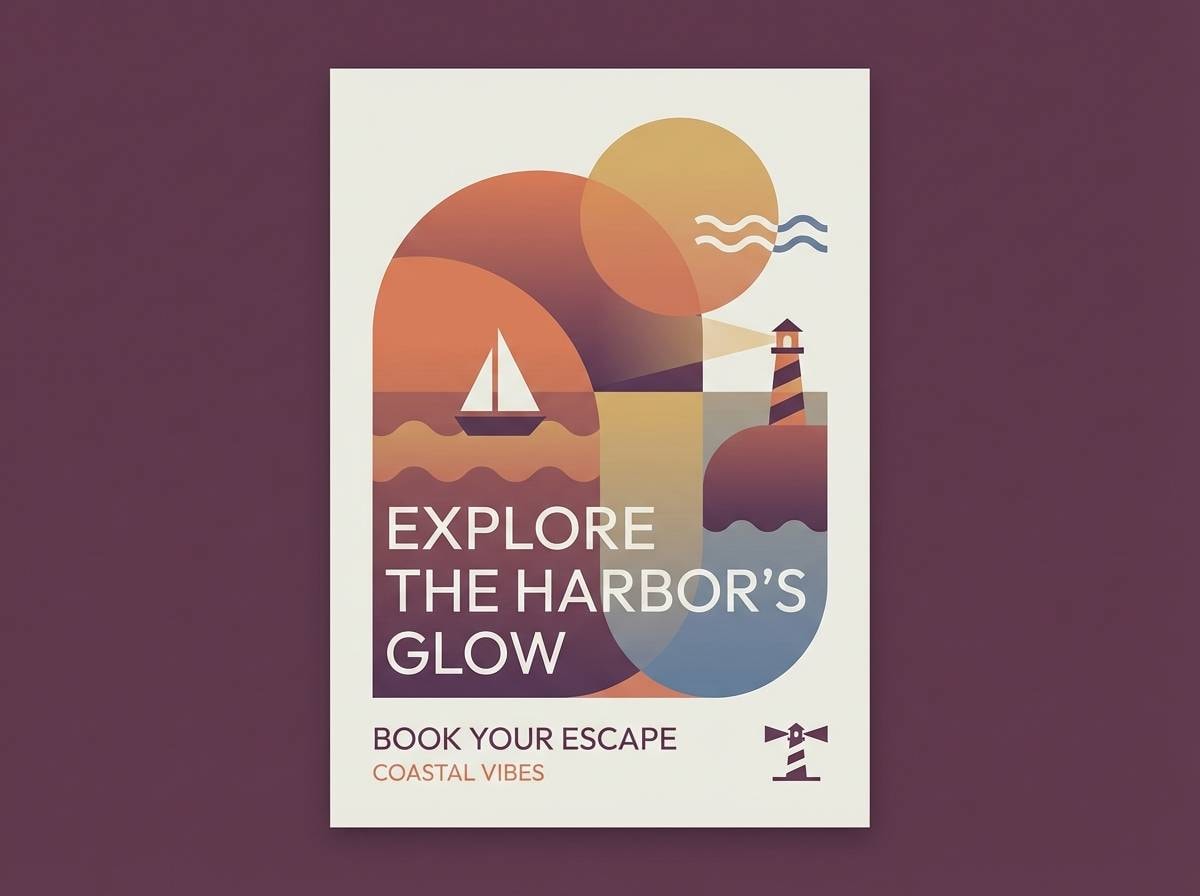
14) Sunset Harbor
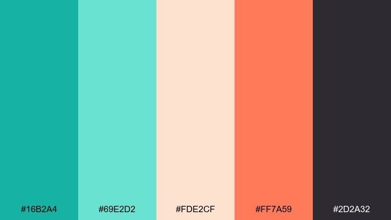
HEX: #16B2A4 #69E2D2 #FDE2CF #FF7A59 #2D2A32
Mood: romantic, warm, coastal
Best for: travel brands, resort promos, lifestyle graphics
Romantic and warm, these colors feel like a harbor at golden hour with teal water and peachy skies. The coral-orange adds friendly energy that pairs well with travel photography. Pair with soft gradients and rounded badges for a welcoming, vacation-ready look. Usage tip: use the dark plum for headings and overlays so text remains readable on bright imagery.
Image example of sunset harbor generated using media.io
15) Digital Neon Tide
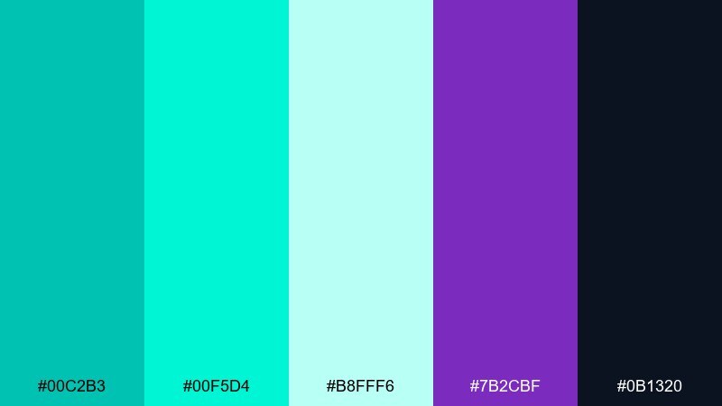
HEX: #00C2B3 #00F5D4 #B8FFF6 #7B2CBF #0B1320
Mood: futuristic, energetic, edgy
Best for: gaming overlays, music visuals, tech launches
Futuristic and energetic, this mix looks like neon tide lines under blacklight. The purple adds a sharp counterpoint that makes the teal feel more electric. Pair with dark backgrounds, glow effects, and bold display type to amplify the vibe. Usage tip: keep glow to small accents and outlines so the design stays crisp, not hazy.
Image example of digital neon tide generated using media.io
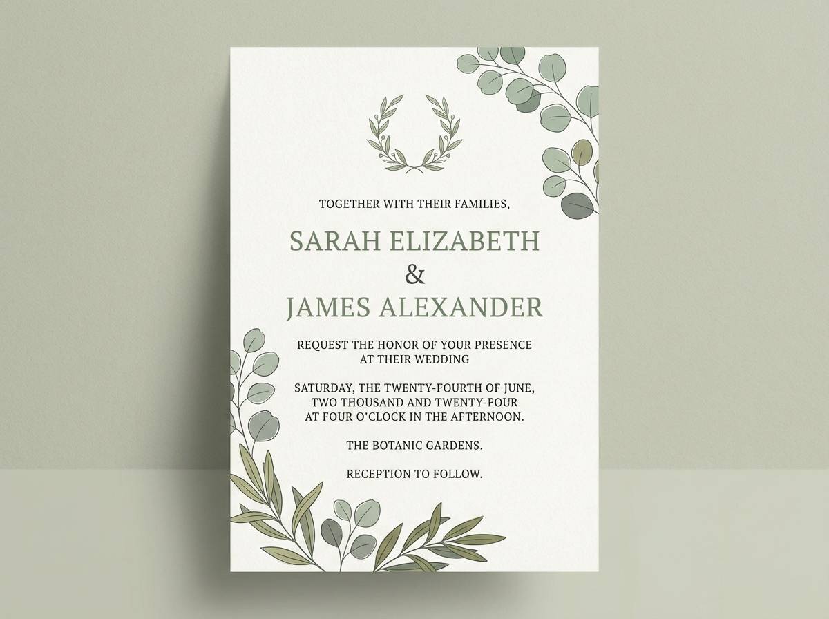
16) Wedding Eucalyptus

HEX: #25B7A6 #86DCCF #EAF6F3 #F7EFE5 #6B5E5E
Mood: soft, romantic, elegant
Best for: wedding invitations, stationery, floral brands
Soft and romantic, these tones suggest eucalyptus sprigs, sheer fabric, and candlelit calm. The warm cream keeps the greens gentle and flattering for print. Pair with fine line illustrations and modern serif typography for an elevated look. Usage tip: print teal elements slightly lighter than screen to maintain that airy, pastel feel.
Image example of wedding eucalyptus generated using media.io
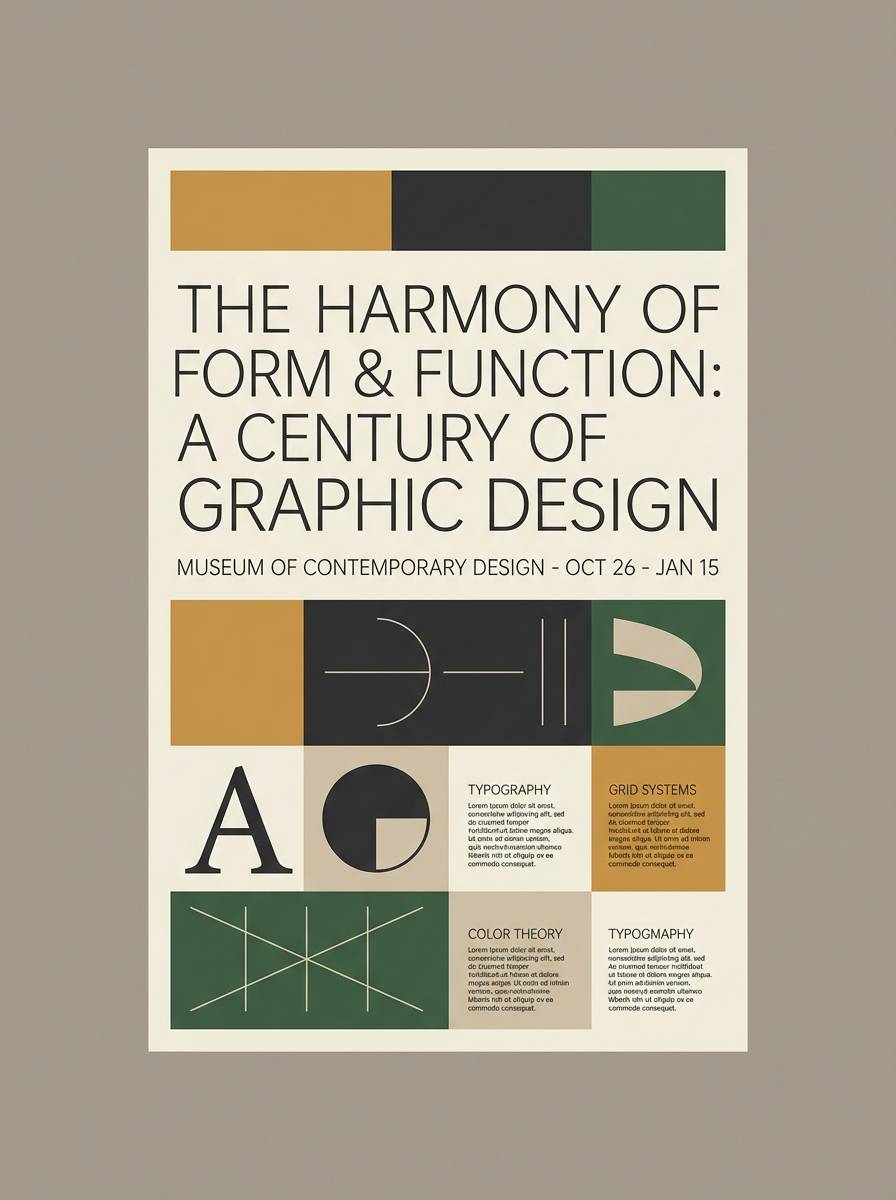
17) Museum Exhibit
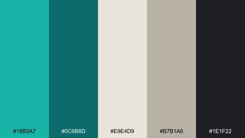
HEX: #18B3A7 #0C6B6D #E9E4D9 #B7B1A6 #1E1F22
Mood: curated, timeless, intellectual
Best for: exhibit posters, cultural programs, catalogs
Curated and timeless, this set feels like cool gallery walls with dark plaques and subtle teal lighting. The neutrals support long-form reading while the teal provides a refined wayfinding accent. Pair with high-quality photography and restrained typography for a museum-grade finish. Usage tip: use teal for section headers and icons to guide the eye without stealing focus from artwork.
Image example of museum exhibit generated using media.io
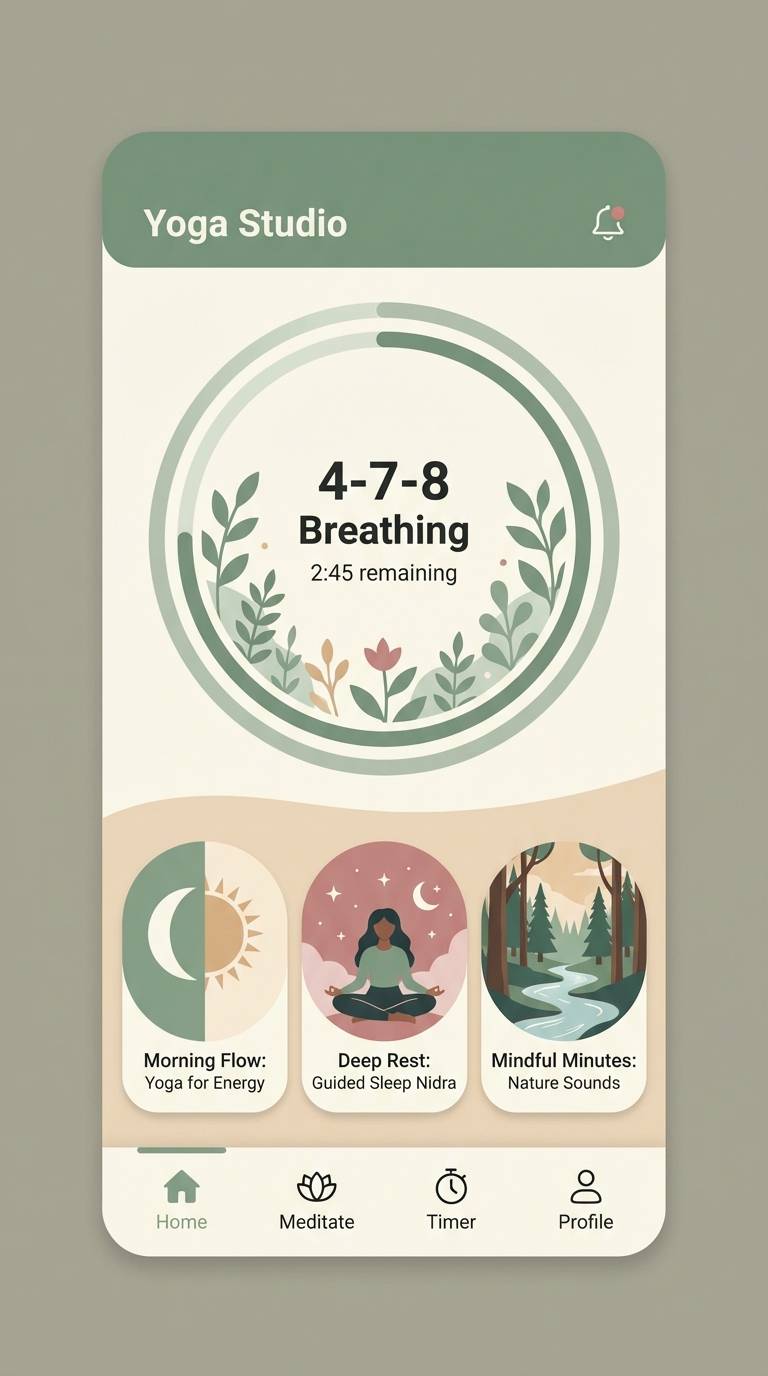
18) Yoga Studio Zen
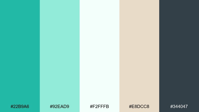
HEX: #22B9A6 #92EAD9 #F2FFFB #E8DCC8 #344047
Mood: zen, soothing, mindful
Best for: yoga studios, meditation apps, retreat brochures
Zen and soothing, these colors evoke quiet breathing, soft mats, and a bright studio with plants. The beige adds warmth so the teal reads calming instead of clinical. Pair with airy photography and simple line icons for a mindful brand presence. Usage tip: keep contrast high for app text by relying on the deep slate for labels and captions.
Image example of yoga studio zen generated using media.io
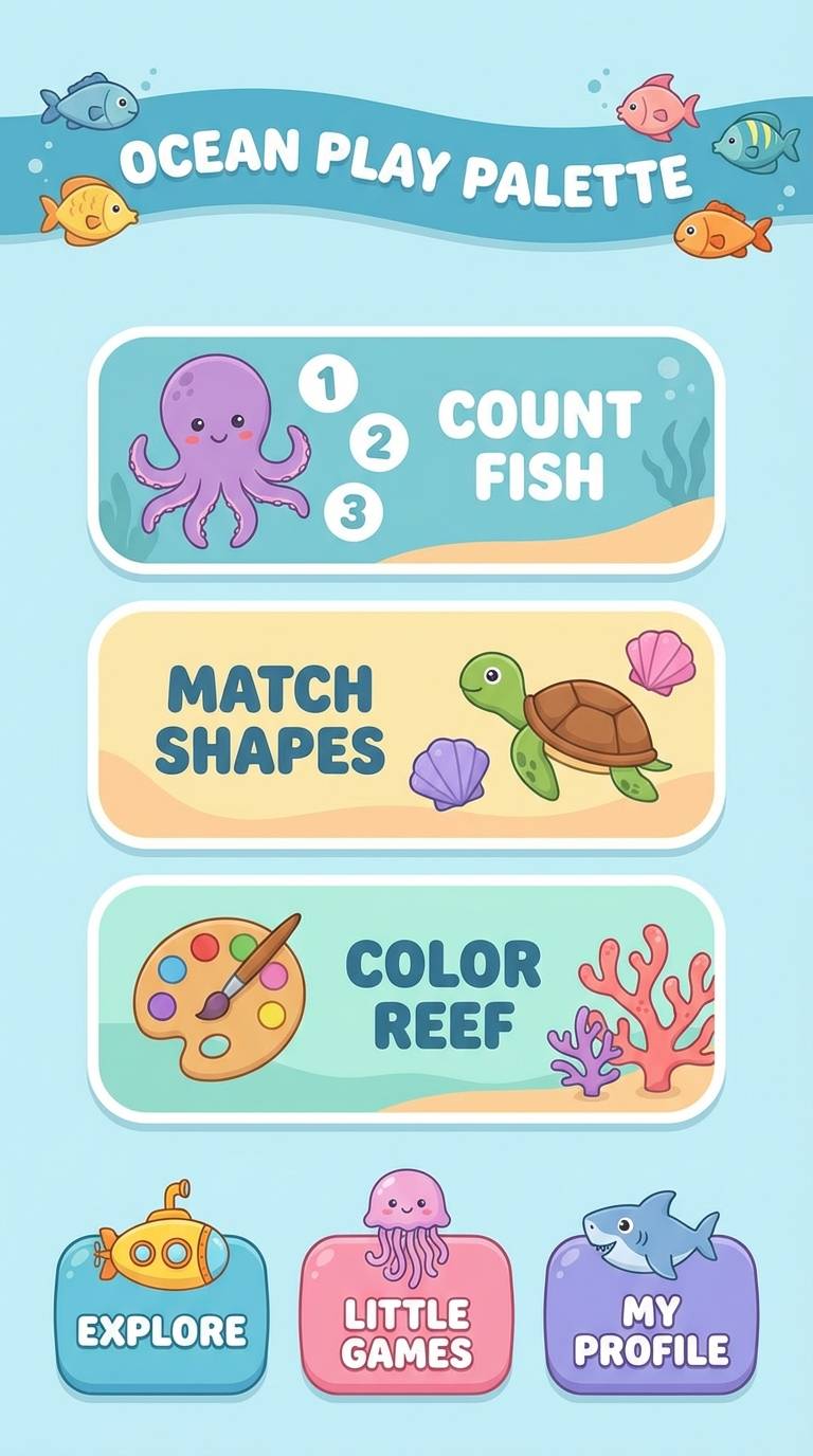
19) Kids Ocean Play
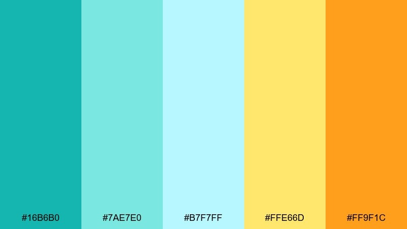
HEX: #16B6B0 #7AE7E0 #B7F7FF #FFE66D #FF9F1C
Mood: cheerful, friendly, energetic
Best for: kids apps, learning games, classroom posters
Cheerful and friendly, these tones feel like cartoon waves, beach toys, and sunshine. The warm yellows make the cool aqua more approachable for younger audiences. Pair with chunky icons, big type, and simple shapes to keep it playful and readable. Usage tip: use orange for rewards and progress moments so achievements stand out instantly.
Image example of kids ocean play generated using media.io
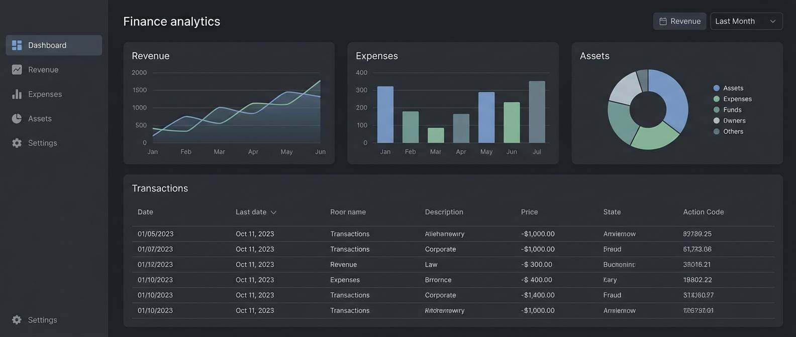
20) Minimal Finance UI
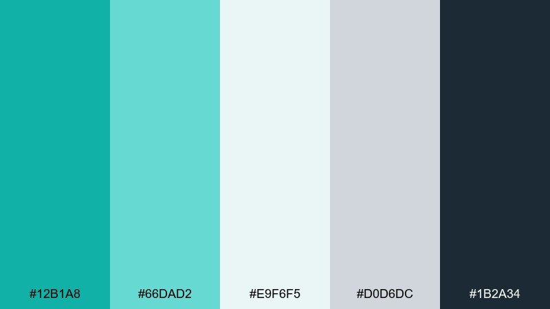
HEX: #12B1A8 #66DAD2 #E9F6F5 #D0D6DC #1B2A34
Mood: trustworthy, modern, clear
Best for: finance apps, analytics tools, dashboards
Trustworthy and modern, this set suggests clarity, order, and calm decision-making. The cool neutrals keep charts and tables readable, while the teal adds a confident highlight for key metrics. Pair with a strict grid, subtle dividers, and consistent icon strokes for a polished product feel. Usage tip: use teal for positive deltas and reserve the darkest shade for primary navigation and totals.
Image example of minimal finance ui generated using media.io
What Colors Go Well with Turquoise Green?
Turquoise green pairs naturally with warm neutrals like cream, sand, and champagne because those tones reduce the “coolness” and make the palette feel more inviting. This is a reliable approach for interiors, wellness, and lifestyle branding.
For sharp, modern contrast, use deep slate, charcoal, navy, or near-black as your typographic foundation. This keeps accessibility strong while letting turquoise green act as a clean accent for buttons, links, and highlights.
If you want more energy, add a warm counter-color like coral, peach, or golden yellow. Keep those accents limited to focal points (CTAs, badges, key illustrations) so the design stays balanced.
How to Use a Turquoise Green Color Palette in Real Designs
Start with roles, not just colors: pick a background neutral, a primary text color, and one turquoise green as the main brand/CTA hue. Then choose one lighter tint for hover states and one deeper teal for active states or emphasis.
In UI, turquoise green works best when it’s intentional: use it for interactive elements, status indicators, and key metrics rather than for large paragraphs or dense blocks. In print, slightly soften saturation to avoid overly bright results on paper.
To keep the look cohesive, match materials and imagery to the palette’s temperature. Coastal palettes look great with pale wood and linen; luxe palettes benefit from brass, dark stone, and high-contrast photography.
Create Turquoise Green Palette Visuals with AI
If you’re pitching a brand direction or building a mood board, generating quick palette-based visuals helps stakeholders “see” the concept immediately. With the right prompt, you can create UI mockups, posters, packaging scenes, or invitation previews that match your HEX choices.
Use your palette name plus the intended output (e.g., “dashboard UI,” “wedding invite,” “eco packaging”) and add constraints like “plain background” or “flat vector” for consistent results. Then refine by specifying where turquoise green should appear (buttons, headings, accents) to control balance.
Create, compare, and iterate fast—then export your favorites for presentations, social posts, or design handoff.
Turquoise Green Color Palette FAQs
-
What vibe does turquoise green usually communicate?
Turquoise green typically signals freshness, clarity, and calm energy. Depending on the supporting neutrals, it can feel coastal and relaxed, clinical and minimal, or playful and summery. -
Is turquoise green closer to teal or mint?
Turquoise green sits between teal (deeper, bluer, often more muted) and mint (lighter, softer, more pastel). The exact direction depends on saturation and how much blue vs. green is present. -
What are safe neutral pairings for turquoise green?
Warm off-whites, creams, sand, and light beiges make turquoise green feel inviting; cool grays and soft whites make it feel modern and clean. For text, charcoal, deep slate, and navy are reliable choices. -
How do I keep turquoise green from feeling too “tropical” in branding?
Lower the saturation, add grays or sage tones, and use structured typography and spacing. Pairing turquoise green with stone-like neutrals or deep slate quickly shifts it toward a sophisticated, modern look. -
What accent colors create strong contrast with turquoise green?
Coral, peach, and orange bring warm contrast; golden yellow adds bright, friendly energy; purple can create a bold, futuristic edge. Use accents sparingly for CTAs and focal points. -
Does turquoise green work well for UI accessibility?
Yes—when used as an accent against light backgrounds and combined with a dark text color for labels. Avoid using turquoise green as small body text on white; instead use it for buttons, icons, and highlights with sufficient contrast. -
What’s the best way to preview a turquoise green palette before designing?
Generate a few realistic use cases (landing page, packaging shot, poster, or app screen) using the palette as a constraint. Seeing the colors in context helps you validate contrast, mood, and balance faster.


