

Turquoise blue sits right in the sweet spot between ocean-calm and modern energy, making it a reliable anchor for branding, UI, and print. It reads fresh, clean, and confident—without feeling sterile.
Below are 20+ turquoise blue palette combos with HEX codes, plus practical ways to apply them in real layouts and generate matching visuals fast with Media.io.
In this article
- Why Turquoise Blue Palettes Work So Well
-
- coastal lagoon
- tropical breeze
- sea glass neutrals
- retro poolside
- arctic mint
- desert oasis
- ocean depths
- coral reef pop
- skyline aqua
- spa serenity
- citrus surf
- midnight turquoise
- cloudy bay
- botanical aqua
- vintage postcard
- modern marina
- powder blue mist
- festival boardwalk
- tech neon aqua
- wedding tide
- harbor minimal
- calm clinic
- What Colors Go Well with Turquoise Blue?
- How to Use a Turquoise Blue Color Palette in Real Designs
- Create Turquoise Blue Palette Visuals with AI
Why Turquoise Blue Palettes Work So Well
Turquoise blue naturally communicates clarity, freshness, and approachability. It’s cool enough to feel modern and technical, yet lively enough to stay friendly for consumer brands.
It also pairs easily across temperatures: warm accents (peach, coral, orange) add momentum, while cool supports (teal, navy, slate) keep layouts structured and legible.
From a practical design standpoint, turquoise blue offers strong range: light seafoam backgrounds, mid-tone brand blocks, and deep teals for navigation and typography—so you can build a complete system without introducing extra hues.
20+ Turquoise Blue Color Palette Ideas (with HEX Codes)
1) Coastal Lagoon
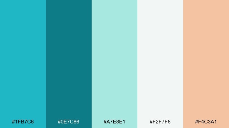
HEX: #1FB7C6 #0E7C86 #A7E8E1 #F2F7F6 #F4C3A1
Mood: breezy, coastal, clean
Best for: travel landing page UI
Breezy lagoon water and sun-warmed sand set a fresh, welcoming tone. Use the deeper teal for headings and navigation, then let the pale seafoam and off-white carry the background. The peach accent works best as a sparing call-to-action color so it feels like a sunset highlight. Keep contrast high by pairing the darkest teal with the light neutrals for readability.
Image example of coastal lagoon generated using media.io
Media.io is an online AI studio for creating and editing video, image, and audio in your browser.

2) Tropical Breeze
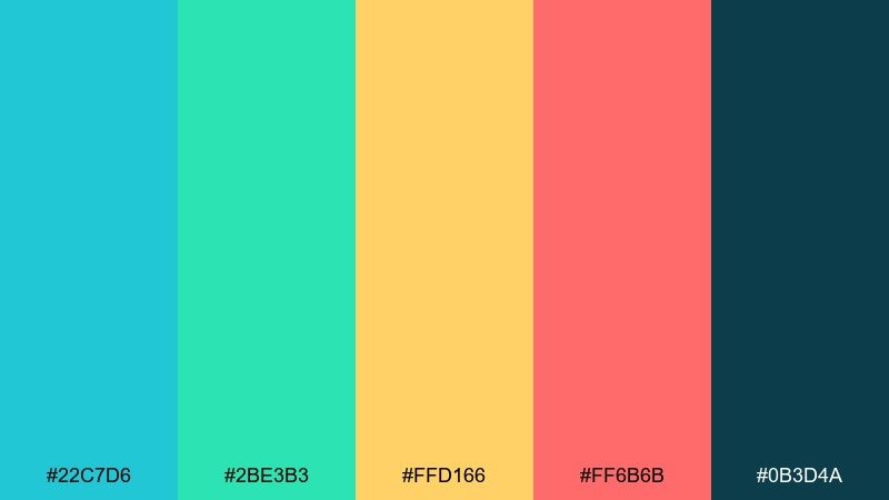
HEX: #22C7D6 #2BE3B3 #FFD166 #FF6B6B #0B3D4A
Mood: playful, tropical, energetic
Best for: summer promo poster
Playful surf colors and juicy fruit tones make the design feel instantly summery. Let the turquoise and mint do the heavy lifting, then use the yellow and coral-like red as punchy highlights for prices or dates. The deep blue-green anchors typography so the bright accents do not overwhelm. For best results, keep the background simple and let large blocks of color carry the message.
Image example of tropical breeze generated using media.io

3) Sea Glass Neutrals
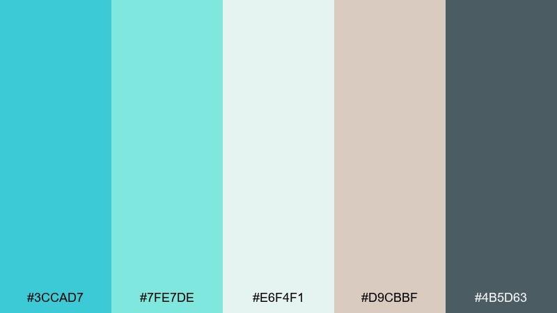
HEX: #3CCAD7 #7FE7DE #E6F4F1 #D9CBBF #4B5D63
Mood: soft, airy, refined
Best for: wellness brand identity
Soft sea-glass tones feel calm, airy, and quietly premium. Use the pale aqua and misty off-white for large fields, then bring in the warm beige to keep the look human and not too clinical. The slate gray is ideal for logo text and fine print because it stays gentle while remaining legible. Try matte paper stocks or subtle grain to enhance the tranquil finish.
Image example of sea glass neutrals generated using media.io
4) Retro Poolside
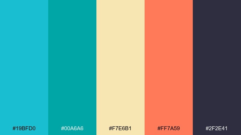
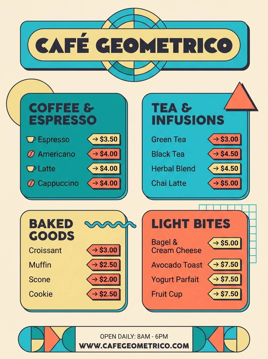
HEX: #19BFD0 #00A6A6 #F7E6B1 #FF7A59 #2F2E41
Mood: retro, sunny, bold
Best for: cafe menu design
Retro pool tiles and sun-faded umbrellas give this mix a cheerful, throwback vibe. These turquoise blue color combinations shine on menus when paired with creamy yellows for backgrounds and warm orange for highlights. Use the charcoal for body text so the bright colors can stay large and graphic without hurting legibility. A good tip is to reserve orange for only one or two callouts per section to keep it classy.
Image example of retro poolside generated using media.io
5) Arctic Mint
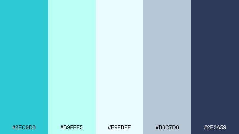
HEX: #2EC9D3 #B9FFF5 #E9FBFF #B6C7D6 #2E3A59
Mood: crisp, modern, icy
Best for: SaaS dashboard UI
Crisp, icy tones evoke clean air and streamlined interfaces. Use the deep navy for navigation and data labels, then layer mint and near-white for cards and content areas. The steel blue works nicely for secondary borders and chart lines without looking heavy. Keep one dominant accent, like the brighter aqua, for primary actions and key metrics.
Image example of arctic mint generated using media.io
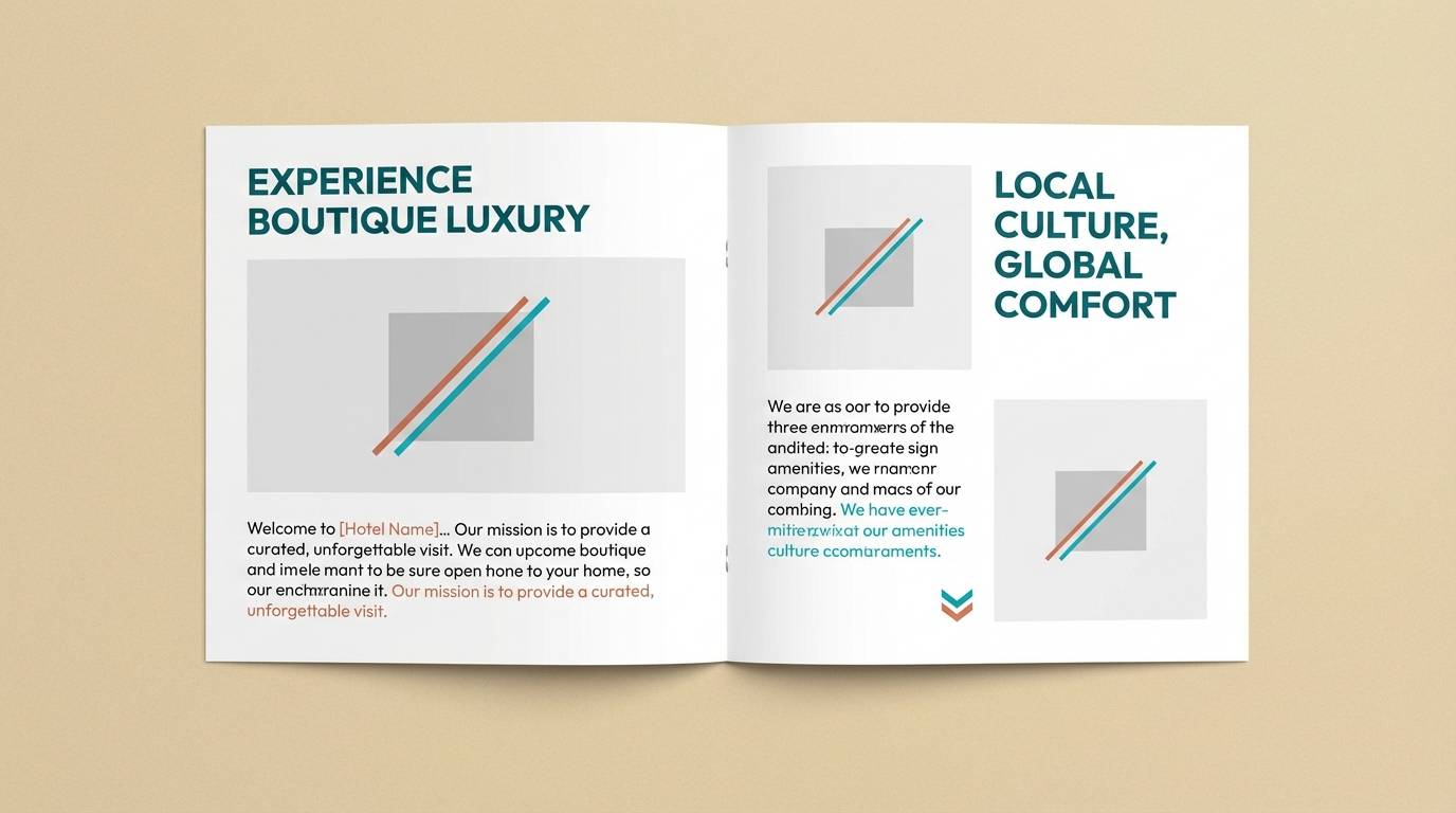
6) Desert Oasis
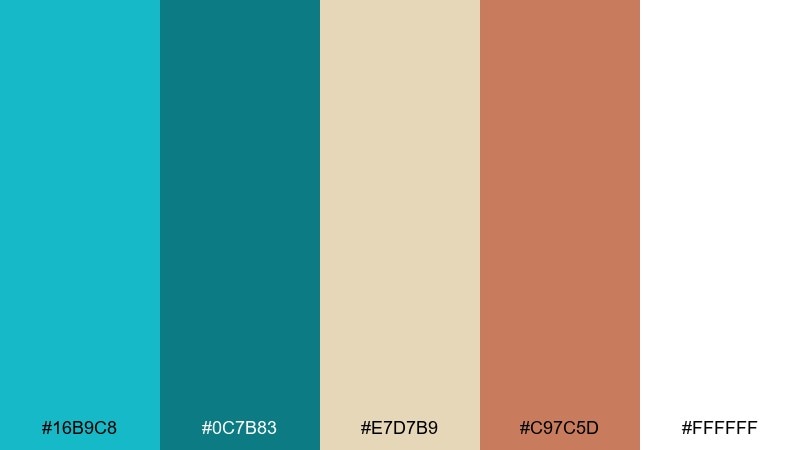
HEX: #16B9C8 #0C7B83 #E7D7B9 #C97C5D #FFFFFF
Mood: earthy, sunlit, balanced
Best for: boutique hotel brochure
Sunlit sand and cool water create a balanced, getaway feel. Pair the turquoise tones with the warm clay accent for headings, icons, or room highlights so the layout feels grounded. Cream and white keep photography airy while the deeper teal supports small text. Use generous margins and simple line icons to keep the brochure relaxed and upscale.
Image example of desert oasis generated using media.io
7) Ocean Depths
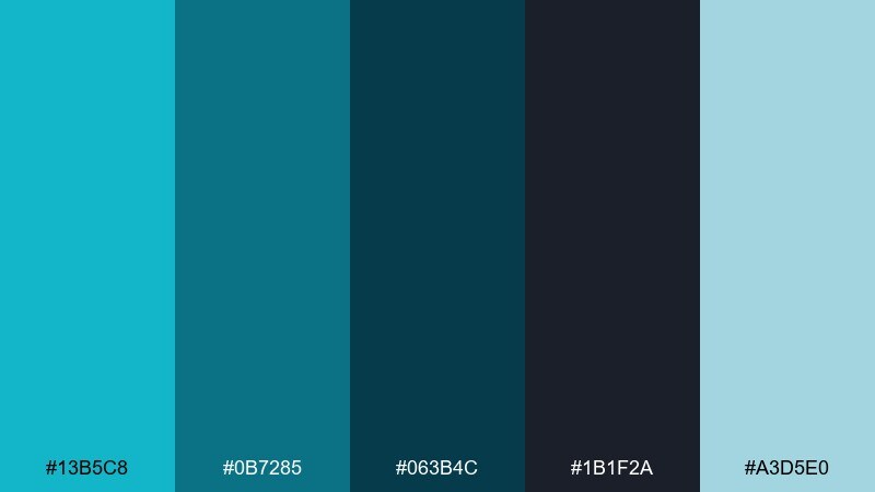
HEX: #13B5C8 #0B7285 #063B4C #1B1F2A #A3D5E0
Mood: moody, cinematic, premium
Best for: tech conference website hero
Moody ocean depth and night-sky darkness make the palette feel cinematic and premium. Use the near-black for the hero background, then bring in aqua gradients for light and motion. The pale blue works as a soft highlight for badges and subtle glows without turning neon. For accessibility, set key headlines in the lightest tone and keep body text high-contrast.
Image example of ocean depths generated using media.io

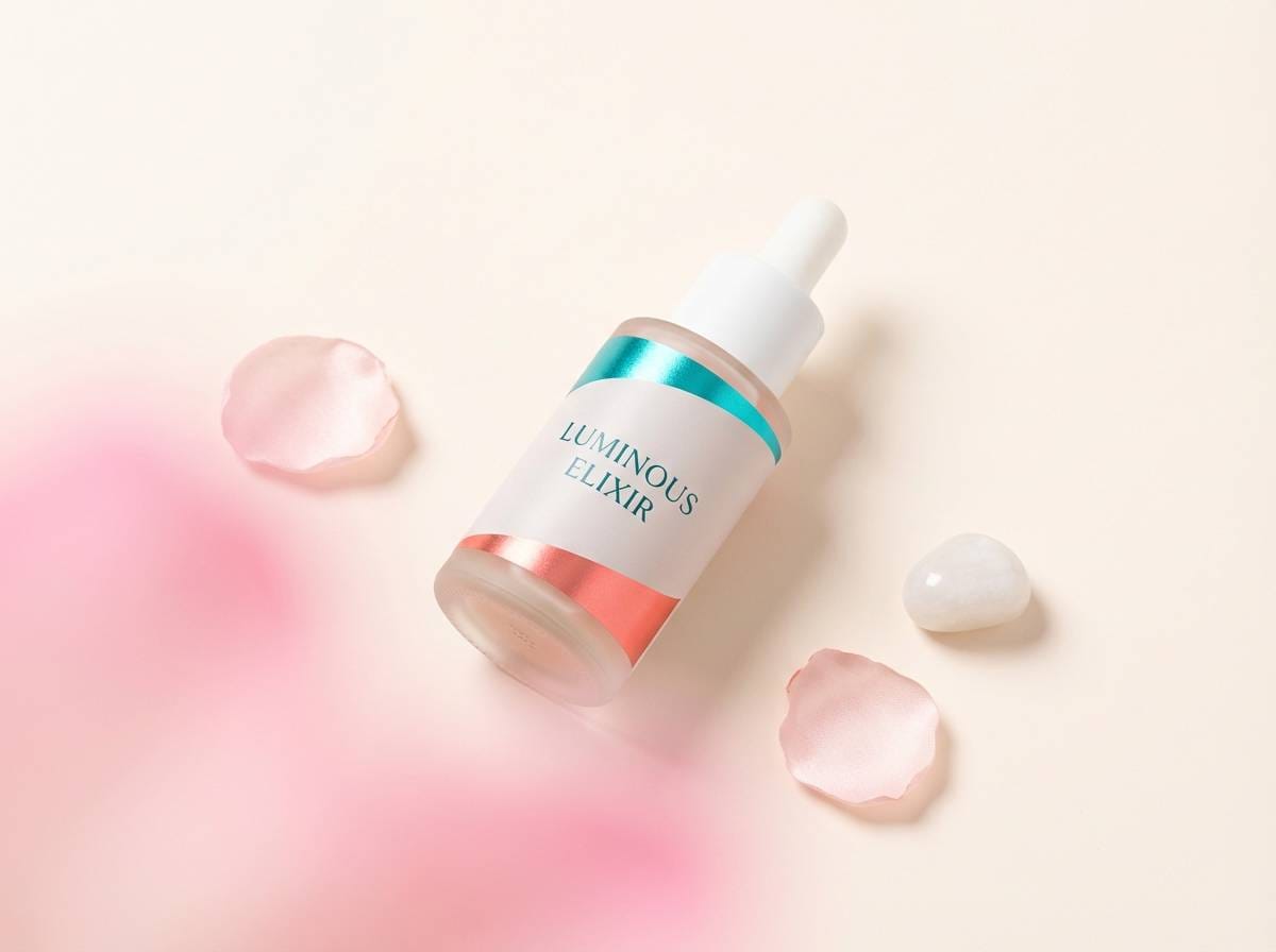
8) Coral Reef Pop
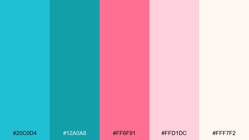
HEX: #20C0D4 #12A0A8 #FF6F91 #FFD1DC #FFF7F2
Mood: bright, friendly, youthful
Best for: beauty product ad
Bright reef colors feel bubbly, friendly, and social-ready. Let the creamy blush and off-white handle backgrounds, then use the turquoise for brand blocks and the pink for a single standout element like a badge or button. Keep the deeper teal for fine print and ingredient lists so it stays polished. A soft shadow and plenty of whitespace will keep it modern instead of candy-like.
Image example of coral reef pop generated using media.io
9) Skyline Aqua
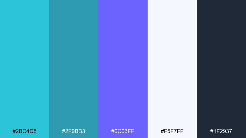
HEX: #2BC4D8 #2F9BB3 #6C63FF #F5F7FF #1F2937
Mood: urban, crisp, contemporary
Best for: startup pitch deck slides
Urban aqua with a violet edge feels crisp, contemporary, and slightly futuristic. Use the soft near-white for slide backgrounds and the charcoal for text to keep charts clean. Aqua works well for section headers and callouts, while the violet is perfect for one emphasis color across the deck. Keep icon fills consistent and avoid extra colors so the story stays focused.
Image example of skyline aqua generated using media.io
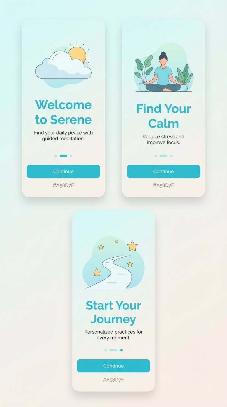
10) Spa Serenity
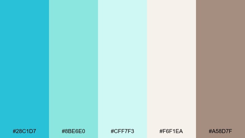
HEX: #28C1D7 #8BE6E0 #CFF7F3 #F6F1EA #A58D7F
Mood: soothing, gentle, restorative
Best for: meditation app onboarding
Soothing water tones and warm linen neutrals create a restorative, slow-breath mood. This turquoise blue color palette works beautifully for onboarding screens where calm is part of the product promise. Pair the minty shades with the soft beige background, then use the taupe for secondary text and icons. One practical tip is to keep the brightest aqua for a single primary button state to avoid visual tension.
Image example of spa serenity generated using media.io
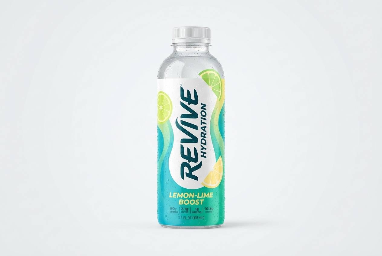
11) Citrus Surf
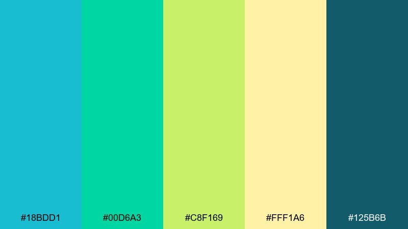
HEX: #18BDD1 #00D6A3 #C8F169 #FFF1A6 #125B6B
Mood: fresh, sporty, upbeat
Best for: sports drink packaging
Fresh surf tones with citrus highlights feel sporty and upbeat. Use the darker teal for the brand name and nutritional text, then push the aqua and mint as the main label colors. Lime and pale yellow work best as flavor cues and small bursts near the product name. To keep it from looking neon, balance with plenty of clean negative space.
Image example of citrus surf generated using media.io
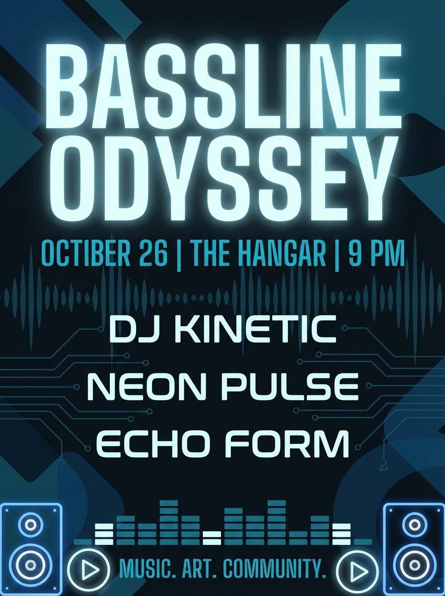
12) Midnight Turquoise
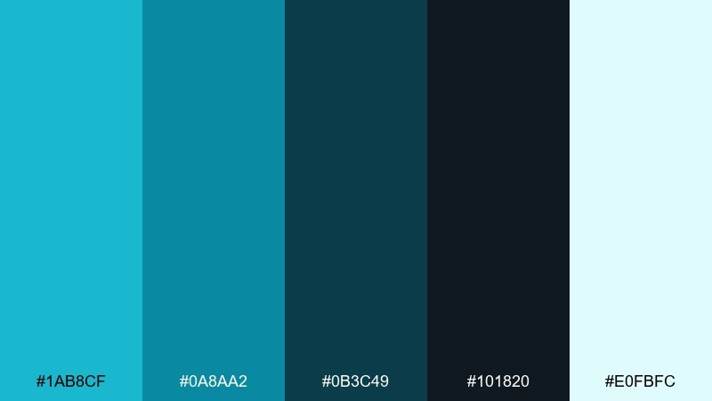
HEX: #1AB8CF #0A8AA2 #0B3C49 #101820 #E0FBFC
Mood: sleek, dramatic, high-contrast
Best for: music event flyer
Sleek midnight tones with electric aqua highlights feel dramatic and club-ready. Set the background in the near-black, then bring in the bright turquoise for the event title and key details. The pale ice tone works for secondary info like venue and time without getting lost. Use a single glow effect on the headline and keep the rest flat for a modern finish.
Image example of midnight turquoise generated using media.io
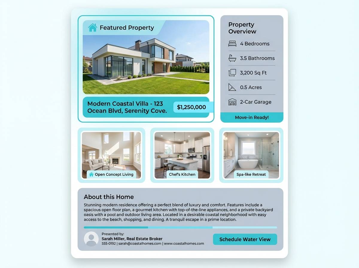
13) Cloudy Bay
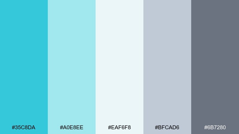
HEX: #35C8DA #A0E8EE #EAF6F8 #BFCAD6 #6B7280
Mood: light, coastal, understated
Best for: real estate listing template
Light coastal air and soft cloud cover give this mix an understated, trustworthy feel. Use the pale blue-white as the main canvas, then apply turquoise sparingly for section dividers and highlights. The gray tones keep headings and captions crisp and professional. A helpful tip is to keep photos warm or neutral so the cool accents read fresh rather than cold.
Image example of cloudy bay generated using media.io
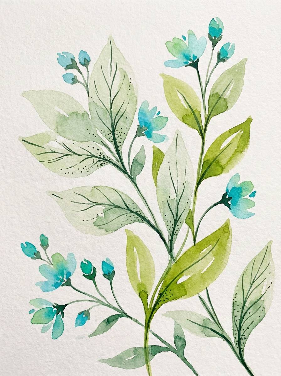
14) Botanical Aqua
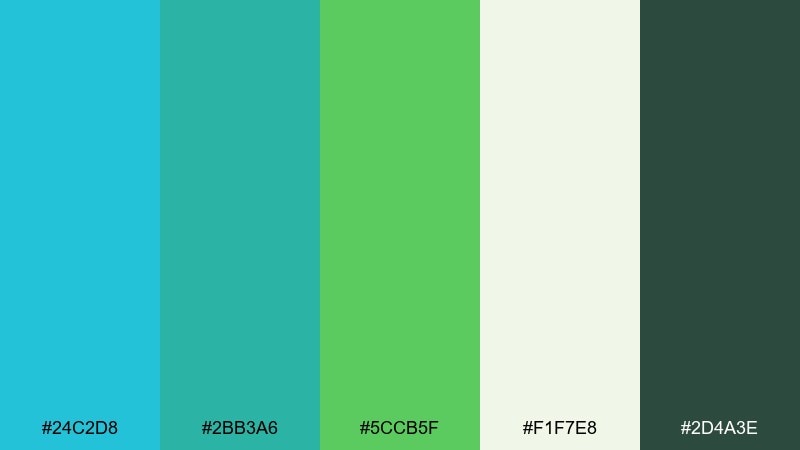
HEX: #24C2D8 #2BB3A6 #5CCB5F #F1F7E8 #2D4A3E
Mood: lush, natural, refreshing
Best for: spring botanical illustration
Lush garden greens with clean aqua feel like a bright greenhouse after rain. Use the creamy botanical white as the paper tone, then layer watercolor leaves in green with aqua stems and accents. The deep forest shade is perfect for thin outlines and typography. Keep washes translucent so the palette stays fresh and not heavy.
Image example of botanical aqua generated using media.io
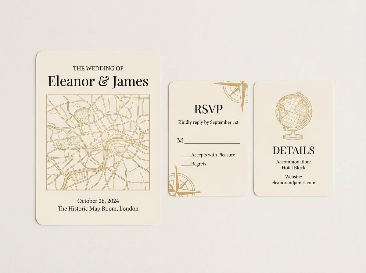
15) Vintage Postcard
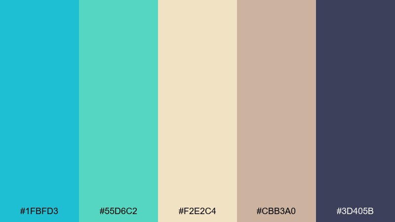
HEX: #1FBFD3 #55D6C2 #F2E2C4 #CBB3A0 #3D405B
Mood: nostalgic, warm, travel-inspired
Best for: wedding invitation suite
Nostalgic travel vibes come through in sun-kissed neutrals and cool ocean ink. Use the cream and tan as your paper base, then bring in turquoise for a delicate border or monogram detail. The muted navy adds formality for names and dates without turning harsh. Consider letterpress or textured stock to reinforce the vintage feel.
Image example of vintage postcard generated using media.io
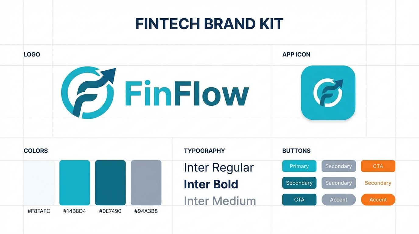
16) Modern Marina
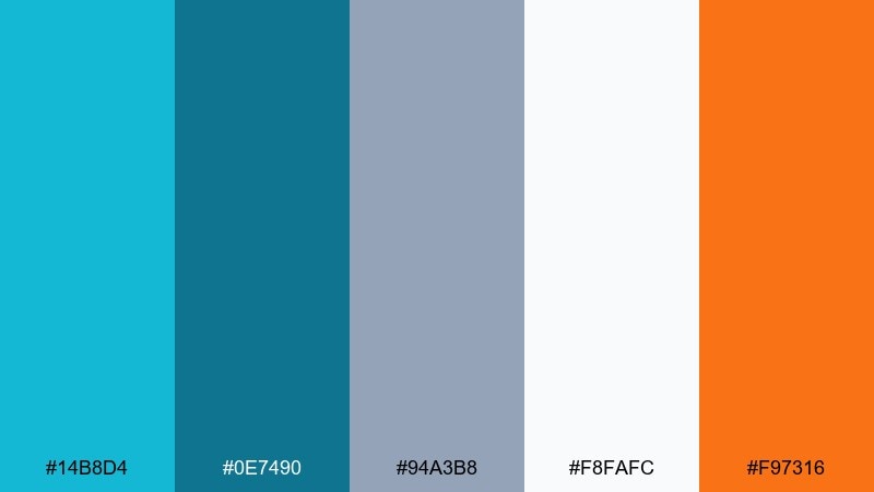
HEX: #14B8D4 #0E7490 #94A3B8 #F8FAFC #F97316
Mood: modern, nautical, confident
Best for: brand kit for a fintech app
Modern marina tones feel confident and clean, like polished metal and clear water. The turquoise and deep teal make a sharp core pairing, while the cool gray and near-white keep layouts disciplined. A small hit of orange adds momentum for CTAs and key numbers. Use consistent spacing and simple icons so the color contrast can do the storytelling.
Image example of modern marina generated using media.io
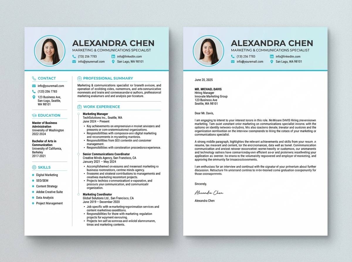
17) Powder Blue Mist
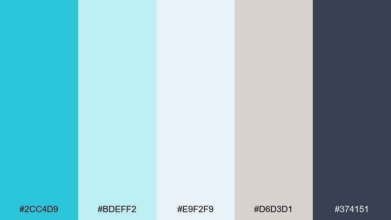
HEX: #2CC4D9 #BDEFF2 #E9F2F9 #D6D3D1 #374151
Mood: soft, minimal, professional
Best for: resume and cover letter template
Soft misty blues create a polished, minimal look that feels calm and competent. Use the near-white and pale aqua as the page base, then reserve the brighter turquoise for section headers and subtle lines. The charcoal is ideal for body text and keeps everything readable in print. A useful tip is to keep decorative elements thin and consistent so the document stays ATS-friendly.
Image example of powder blue mist generated using media.io
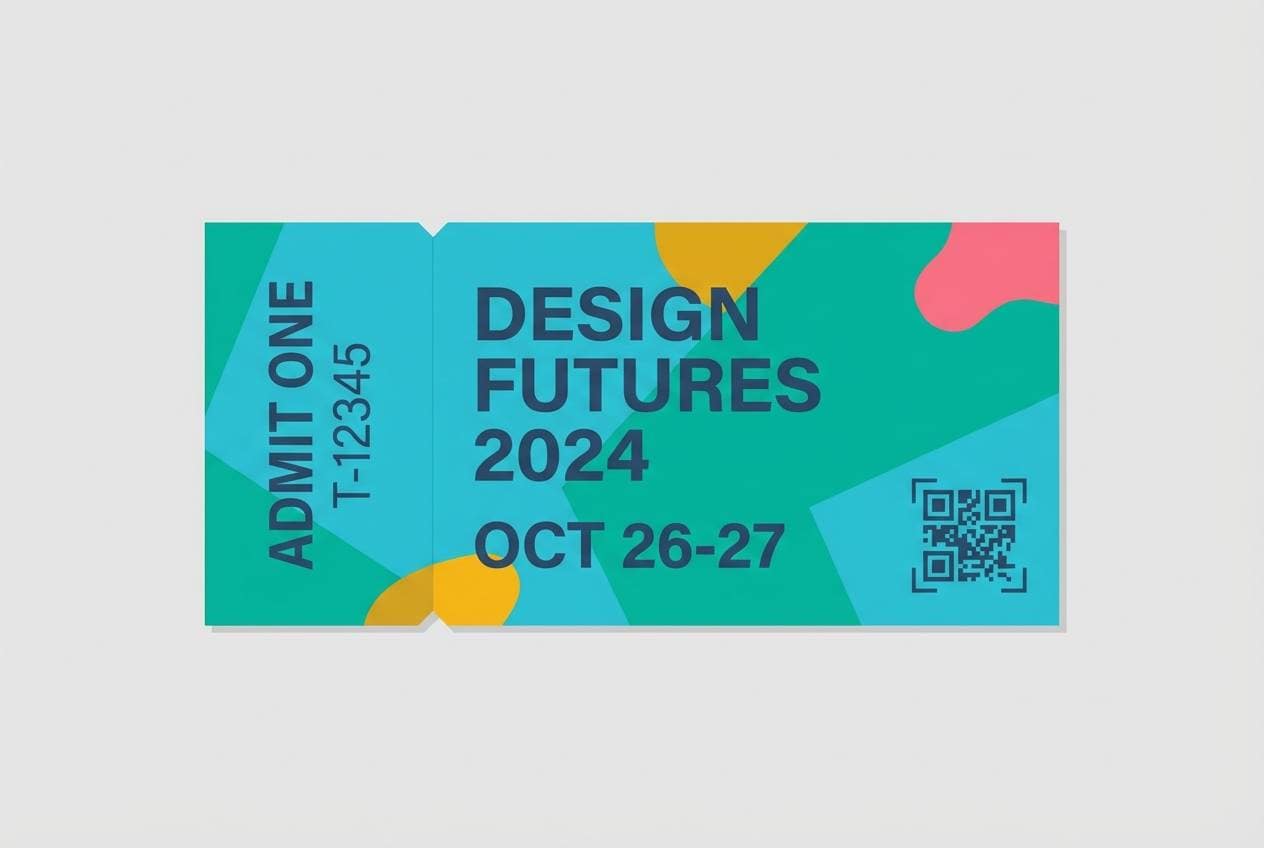
18) Festival Boardwalk
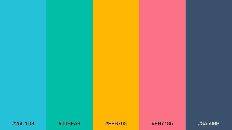
HEX: #25C1D8 #00BFA6 #FFB703 #FB7185 #3A506B
Mood: festive, bold, upbeat
Best for: event ticket design
Festive boardwalk colors feel loud in the best way, like lights, music, and summer nights. These turquoise blue color combinations work well when aqua and teal lead, with yellow and pink reserved for stamps, QR highlights, or VIP tags. The steel navy keeps critical details legible and adds structure. Use clear hierarchy and limit gradients so scanning remains fast at the door.
Image example of festival boardwalk generated using media.io
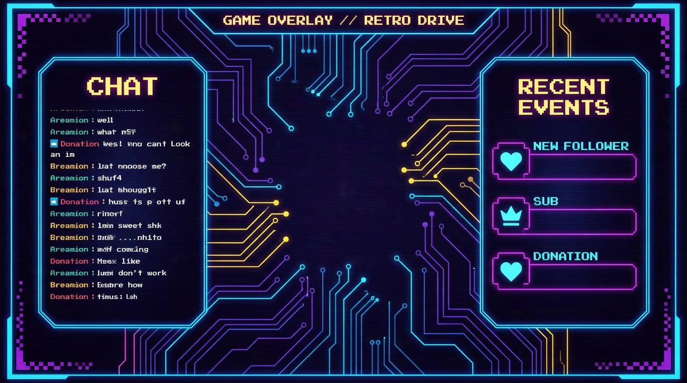
19) Tech Neon Aqua
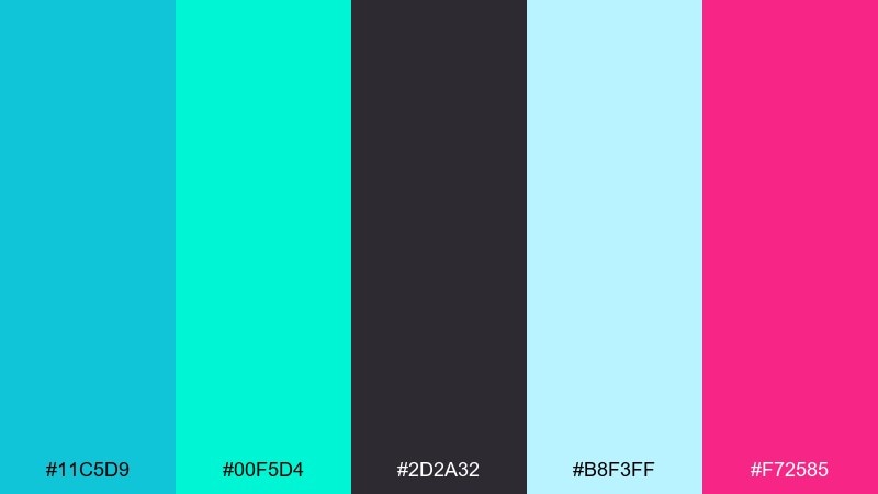
HEX: #11C5D9 #00F5D4 #2D2A32 #B8F3FF #F72585
Mood: neon, futuristic, punchy
Best for: gaming stream overlay UI
Neon aqua with a hot magenta accent feels futuristic and high-energy. Use the dark charcoal as the canvas so the bright tones can glow without overwhelming the screen. Keep magenta for alerts and subscriber callouts, while aqua handles frames and labels. A smart usage tip is to keep large areas in dark tones to reduce eye fatigue during long streams.
Image example of tech neon aqua generated using media.io
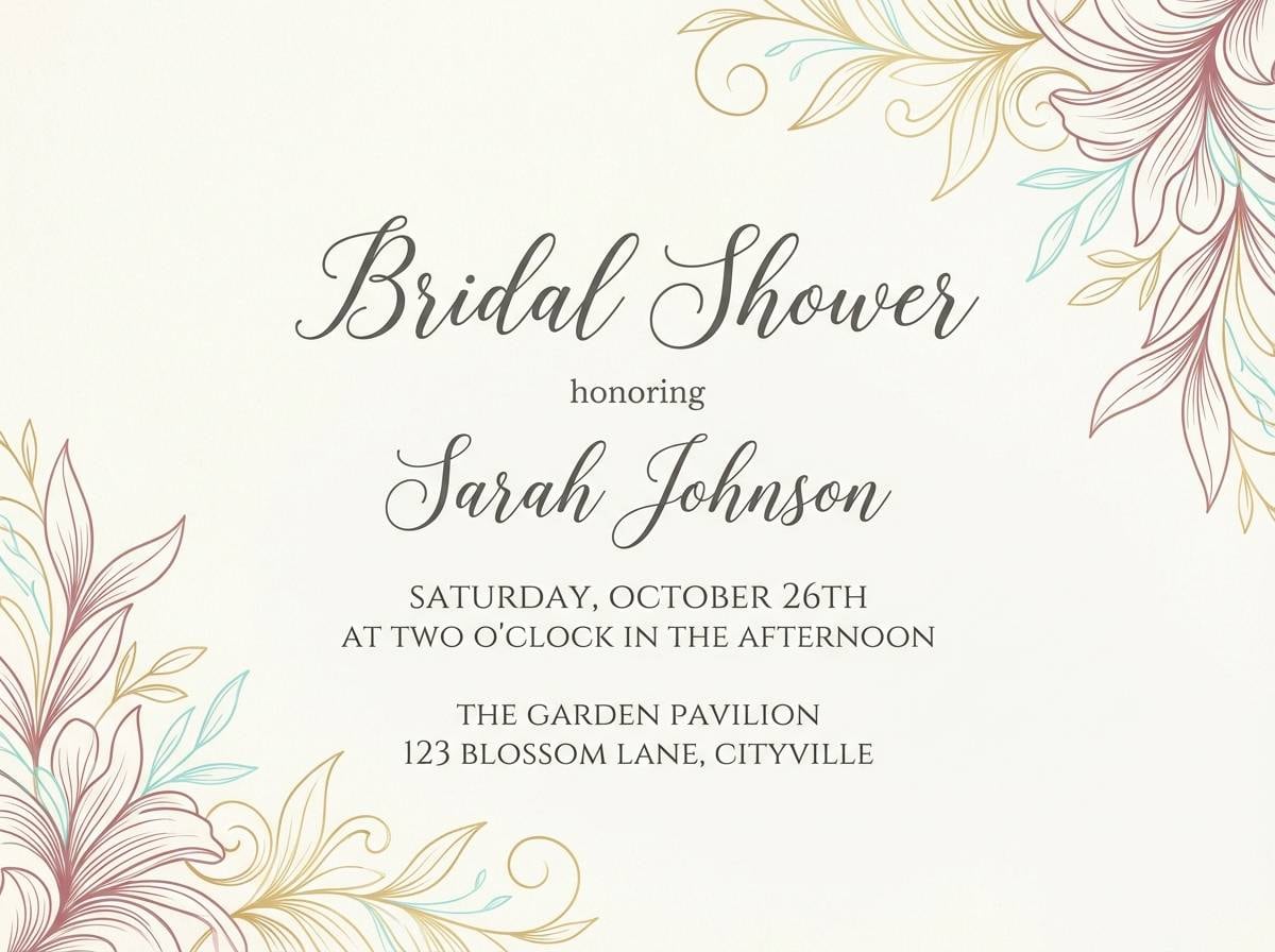
20) Wedding Tide
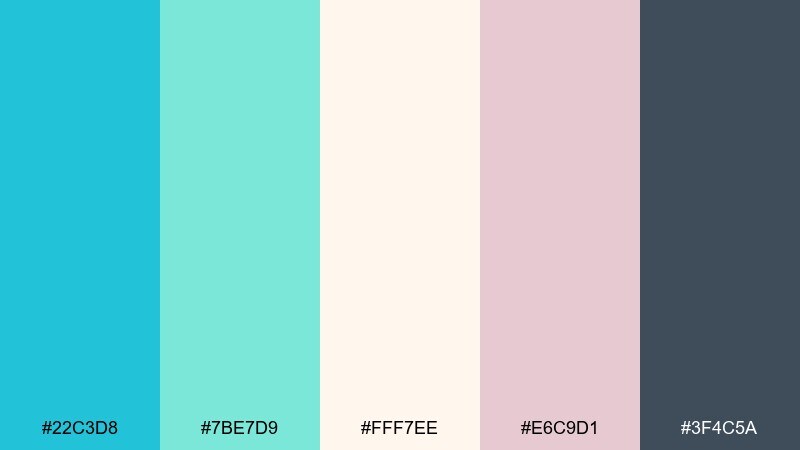
HEX: #22C3D8 #7BE7D9 #FFF7EE #E6C9D1 #3F4C5A
Mood: romantic, airy, elegant
Best for: bridal shower invitation
Airy tide tones and soft blush create a romantic, coastal elegance. The warm ivory makes an inviting base, while turquoise adds freshness in borders, icons, or a monogram. Blush works best as a gentle accent rather than a full background to keep the invitation refined. Pair with a dark slate for names and details, and keep florals minimal and line-based.
Image example of wedding tide generated using media.io
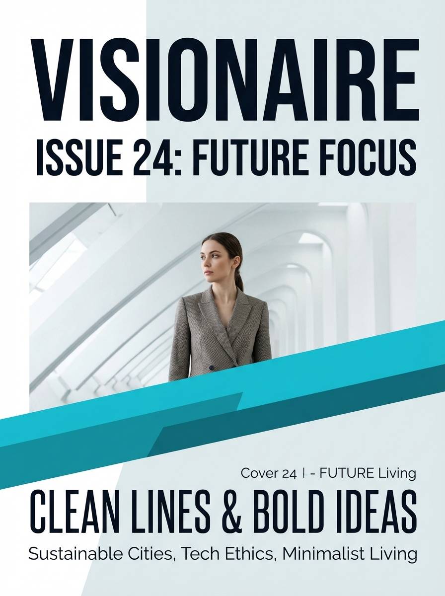
21) Harbor Minimal
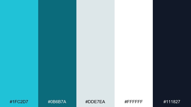
HEX: #1FC2D7 #0B6B7A #DDE7EA #FFFFFF #111827
Mood: minimal, crisp, editorial
Best for: magazine layout cover
Crisp harbor tones feel minimal and editorial, like clean type on bright paper. Use white and light gray as the dominant space, then set turquoise for a single strong masthead or accent band. Deep ink black should carry body text and small details for maximum clarity. Keep the cover restrained by using one bold type family and limiting accent shapes.
Image example of harbor minimal generated using media.io
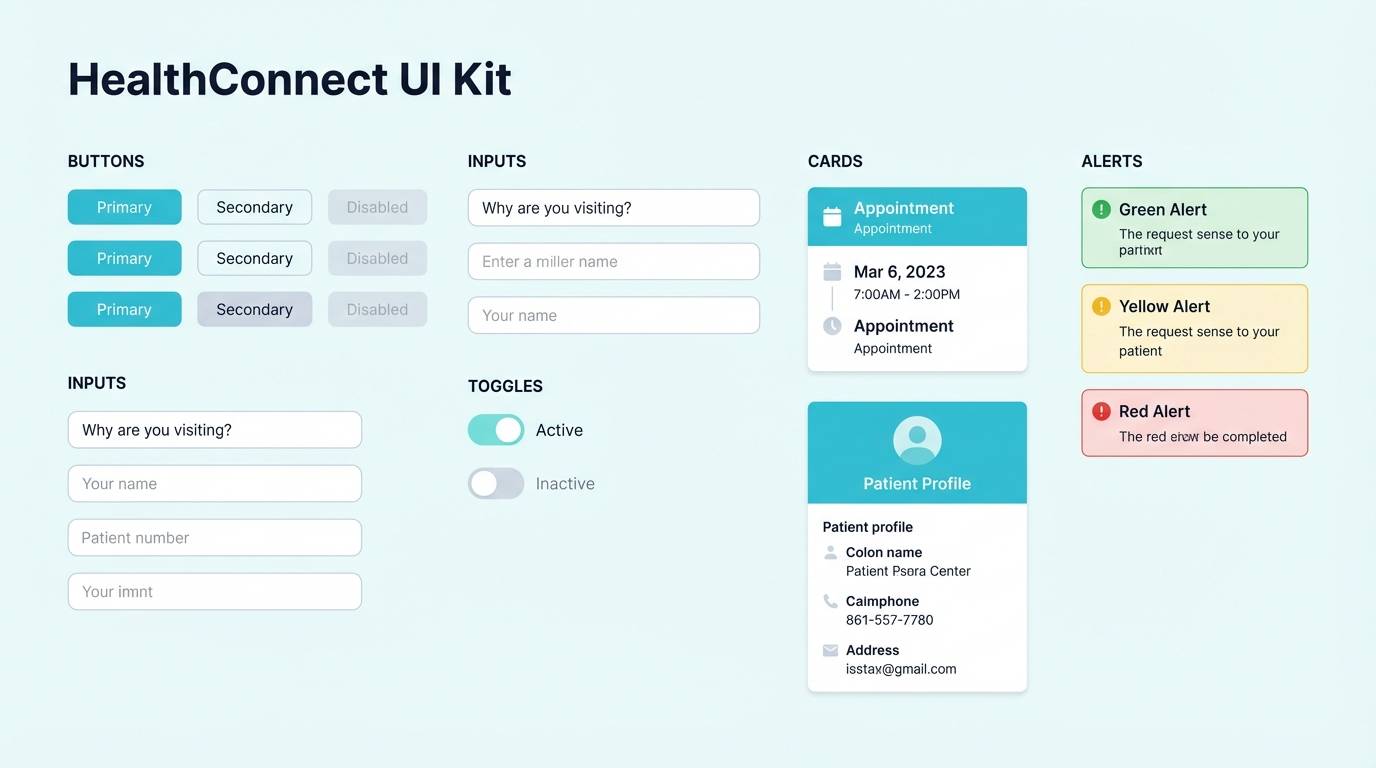
22) Calm Clinic
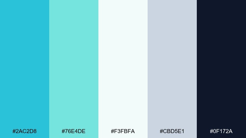
HEX: #2AC2D8 #76E4DE #F3FBFA #CBD5E1 #0F172A
Mood: calm, clinical, trustworthy
Best for: healthcare app UI kit
Calm clinical tones communicate cleanliness and trust without feeling cold. Build the UI on the soft off-white, then use aqua for primary actions and supportive highlights. The slate neutrals keep forms and dividers tidy, while the deep navy ensures text stays readable. For a consistent turquoise blue color scheme, keep secondary buttons in the lighter mint and avoid adding extra accent colors.
Image example of calm clinic generated using media.io
What Colors Go Well with Turquoise Blue?
Turquoise blue pairs beautifully with warm accents like peach, coral, terracotta, and orange when you want energy and approachability. These oppositional (warm vs. cool) pairings are great for CTAs, badges, and price highlights.
For a calmer, more “premium” direction, combine turquoise blue with cool supports like teal, navy, slate, and blue-gray. This creates strong hierarchy for headings, navigation, and data-heavy UI.
If you need a neutral base, off-whites, cream, sand, and light gray keep turquoise feeling airy and modern—especially for print, editorial layouts, and product pages.
How to Use a Turquoise Blue Color Palette in Real Designs
Start by assigning roles: a light neutral for the background, a mid turquoise for brand blocks and UI highlights, and a deep teal/navy for text. This simple structure keeps your design readable and scalable across screens.
Use warm accents sparingly for emphasis only—buttons, important numbers, or one key label per section. Too many warm hits can make turquoise feel noisy instead of clean.
For accessibility, check contrast for text on turquoise backgrounds (especially mid-tones). When in doubt, put body text on off-white and reserve turquoise for accents, icons, and headers.
Create Turquoise Blue Palette Visuals with AI
If you already have HEX codes, you can turn them into on-brand mockups (posters, UI screens, packaging, or invitations) by describing the layout and plugging in your colors. This helps you validate the palette before committing to a full design system.
In Media.io, try generating multiple variations from the same prompt: change the aspect ratio for the platform (16:9 for web heroes, 9:16 for stories, 3:4 for posters) and keep the palette consistent for cohesive results.
Once you like a direction, reuse the winning prompt as a template—swap only the product type or layout while keeping the turquoise blue color scheme the same.
Turquoise Blue Color Palette FAQs
-
What is a turquoise blue color palette?
A turquoise blue color palette is a set of coordinated colors built around turquoise blue (a blue-green hue). It typically includes light tints for backgrounds, deeper teals/navies for contrast, and one warm accent (like coral or orange) for emphasis. -
Is turquoise blue better for backgrounds or accents?
It can work for both, but mid-tone turquoise is usually strongest as an accent (buttons, highlights, icons). For large backgrounds, lighter seafoam tints or off-whites help avoid glare and keep text readable. -
What colors complement turquoise blue the most?
Warm complements like coral, peach, terracotta, and orange create vibrant contrast. For a calmer look, pair turquoise with navy, slate gray, cool white, and blue-gray. -
How do I keep turquoise from looking too “tropical”?
Use more neutrals (white, gray, beige) and add a deep anchor color like navy or charcoal. Limit saturated accents and keep layouts minimal to shift the vibe from beachy to modern. -
What’s a good typography color for turquoise blue designs?
Deep navy, charcoal, and near-black are the most reliable for readability. For dark turquoise backgrounds, use off-white or very pale aqua for headlines and key UI labels. -
Do turquoise blue palettes print well?
Yes, especially when you balance turquoise with warm neutrals (cream, sand) and avoid overly neon greens. For print, test proofs to ensure turquoise doesn’t shift too green or dull in CMYK. -
Can I generate turquoise blue design mockups with AI?
Yes. With Media.io text-to-image, you can describe the design (UI, poster, packaging, invitation) and include your turquoise blue HEX codes in the prompt to keep outputs palette-accurate.
Next: Teal Coral Color Palette


