

Teal coral is a high-contrast duo that feels instantly coastal: teal brings cool clarity, while coral adds warmth and energy. Together, they create palettes that look modern, friendly, and easy to read across digital and print.
Below are 20+ ready-to-use teal coral color palette ideas with HEX codes, plus real design-use tips and AI prompts you can reuse for fast mockups.
In this article
- Why Teal Coral Palettes Work So Well
-
- reef sunrise
- seaglass blush
- tropical aperitif
- coastal modern
- retro pool party
- coral harbor
- minimal spa calm
- coral circuit
- lagoon latte
- sunset boardwalk
- marine clay
- botanical reef
- aqua terracotta
- nordic coastline
- candy coral pop
- quiet tide
- office chic coral
- ocean picnic
- night market glow
- coral metrics
- freshwater coral
- coral whisper
- What Colors Go Well with Teal Coral?
- How to Use a Teal Coral Color Palette in Real Designs
- Create Teal Coral Palette Visuals with AI
Why Teal Coral Palettes Work So Well
Teal and coral sit on opposite temperature sides, so they naturally create lively contrast: teal reads calm and trustworthy, while coral signals friendliness, urgency, and warmth. This balance makes the combo versatile for both brand identity and interface design.
Teal coral color palettes also perform well in accessibility-focused layouts. With the right dark neutral for text (charcoal, navy, ink), you can keep readability strong while still enjoying a colorful, contemporary look.
Finally, teal coral feels “location-aware”: it can lean coastal, tropical, retro, or editorial depending on the supporting neutrals and accent hues. That makes it an easy base for seasonal campaigns and modern refreshes.
20+ Teal Coral Color Palette Ideas (with HEX Codes)
1) Reef Sunrise
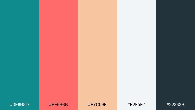
HEX: #0F8B8D #FF6B6B #F7C59F #F2F5F7 #22333B
Mood: fresh, uplifting, coastal
Best for: travel website hero and CTA buttons
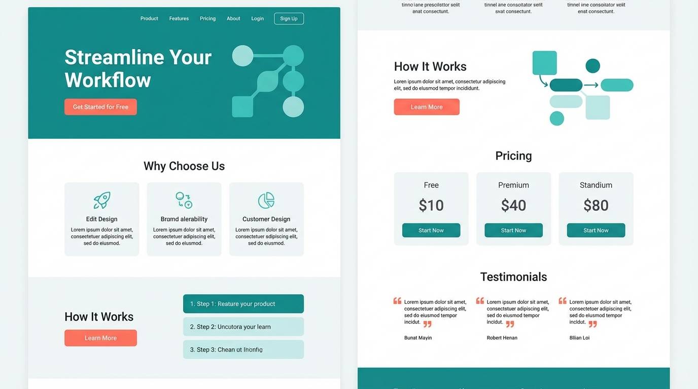
Fresh sunrise energy with a breezy coastline feel, where bright coral pops against calm teal. Use it for travel and lifestyle pages that need warmth without losing clarity. Pair with crisp whites and deep charcoal for strong legibility. Tip: reserve coral for CTAs and highlights, and let teal carry large background areas.
Image example of reef sunrise generated using media.io
Media.io is an online AI studio for creating and editing video, image, and audio in your browser.

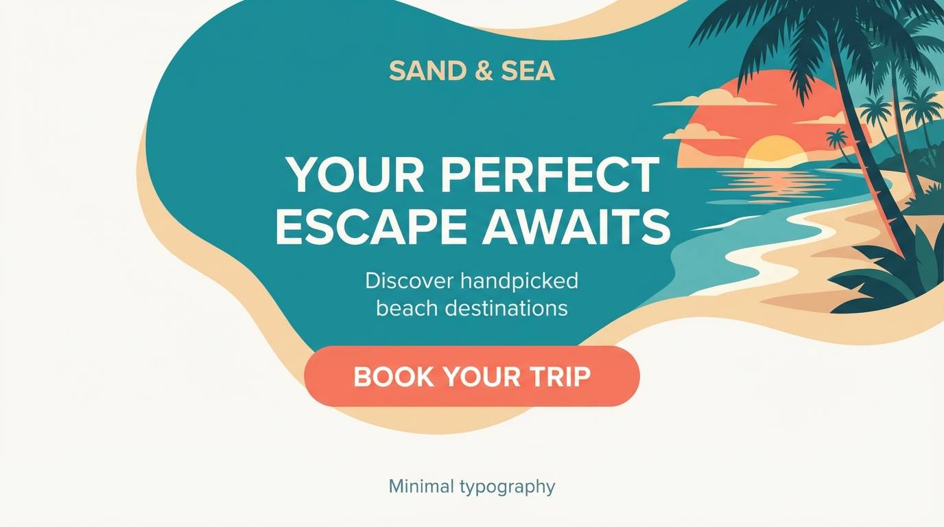
2) Seaglass Blush
HEX: #2CB1A6 #FF7F8A #BFE7E3 #FFF4EE #4A4A4A
Mood: soft, airy, romantic
Best for: wedding invitation suite
Airy seaglass tones meet a gentle blush-coral glow, creating a romantic, light-as-paper mood. It shines on invitations, save-the-dates, and RSVP cards where you want softness with a modern edge. Pair with warm ivory stock and simple gray type for a refined finish. Tip: use the palest cream as the main background and keep coral to names and key details.
Image example of seaglass blush generated using media.io
3) Tropical Aperitif
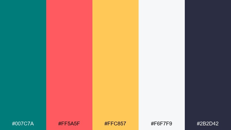
HEX: #007C7A #FF5A5F #FFC857 #F6F7F9 #2B2D42
Mood: energetic, sunny, bold
Best for: cocktail bar poster
Sunny and punchy like a tropical drink at golden hour, with coral and citrus lifting deep teal. It works brilliantly for posters, menus, and social promos that need instant appetite appeal. Pair with bright neutrals and tight typography to avoid visual noise. Tip: keep yellow as a secondary accent so coral stays the main attention color.
Image example of tropical aperitif generated using media.io

4) Coastal Modern
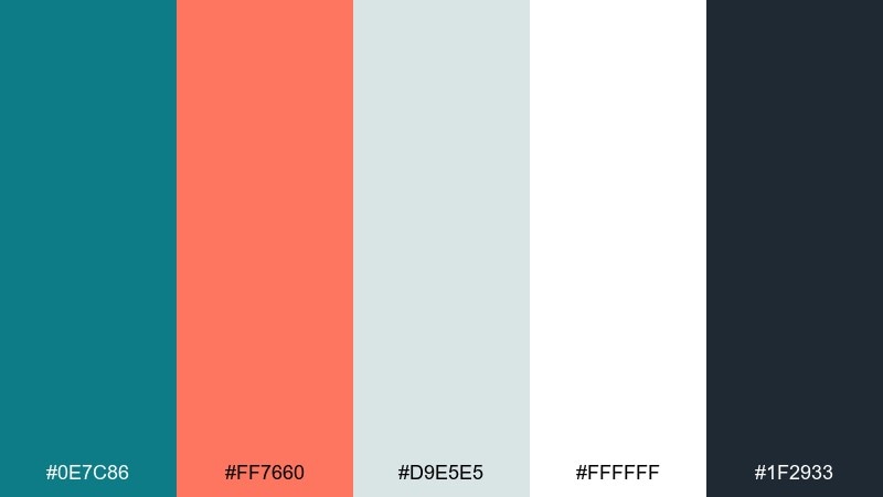
HEX: #0E7C86 #FF7660 #D9E5E5 #FFFFFF #1F2933
Mood: clean, modern, confident
Best for: SaaS landing page UI
Clean coastal clarity with confident contrast, balancing cool teal against a warm coral spark. This teal coral color scheme fits SaaS landing pages where you need calm structure and clear actions. Pair with lots of white space and a dark ink tone for headings. Tip: use coral only for one primary button style to keep the UI feeling premium.
Image example of coastal modern generated using media.io
5) Retro Pool Party
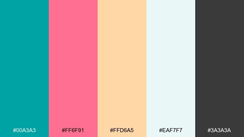
HEX: #00A3A3 #FF6F91 #FFD6A5 #EAF7F7 #3A3A3A
Mood: playful, nostalgic, bright
Best for: summer event flyer
Playful and nostalgic like pool tiles and neon signs, with candy coral on top of bright aqua-teal. It is ideal for summer event flyers, music nights, and upbeat community announcements. Pair with rounded type and simple icon shapes to amplify the retro vibe. Tip: limit the peach tone to background blocks so coral can headline the date and location.
Image example of retro pool party generated using media.io

6) Coral Harbor
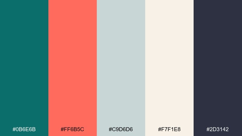
HEX: #0B6E6B #FF6B5C #C9D6D6 #F7F1E8 #2D3142
Mood: grounded, nautical, timeless
Best for: restaurant menu design
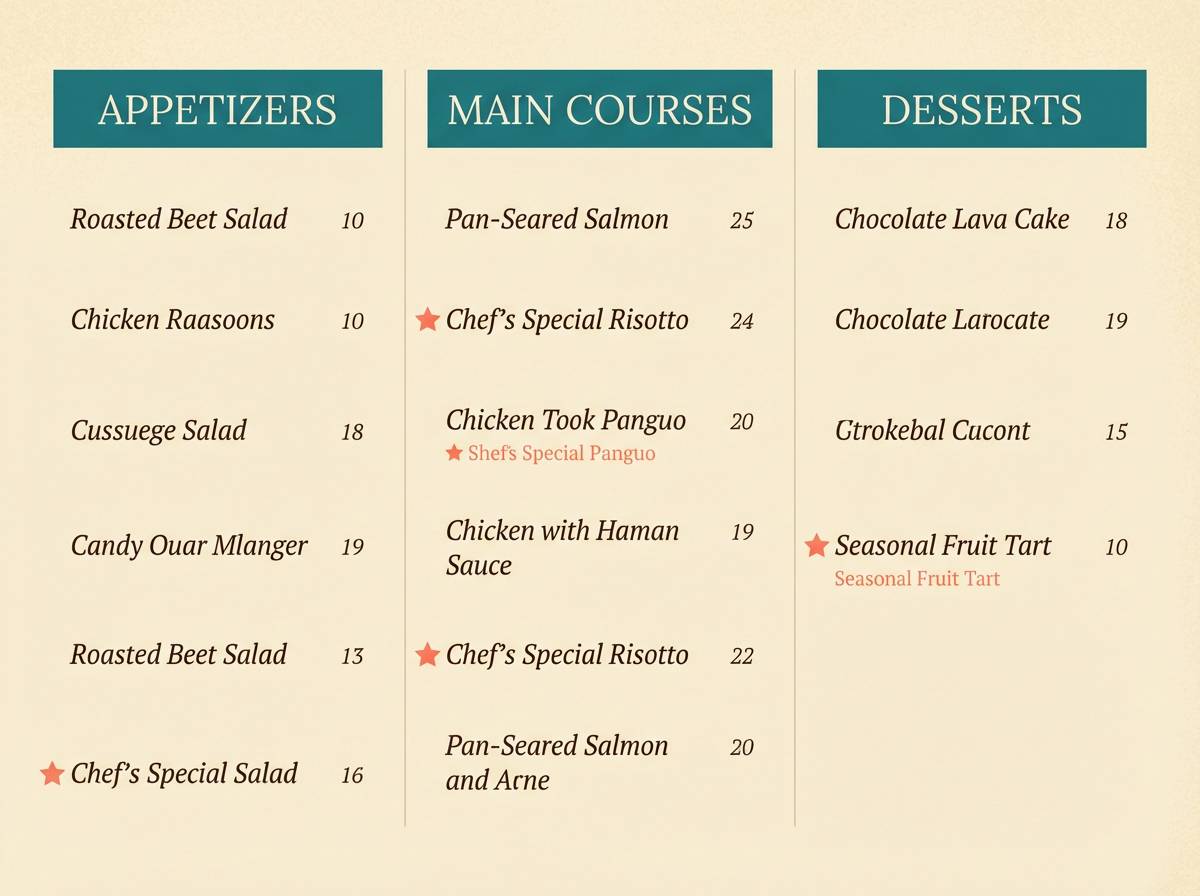
Grounded and nautical like weathered docks and painted buoys, with coral warmth cutting through deep teal. It works beautifully for restaurant menus, café branding, and signage where you want cozy clarity. Pair with warm paper textures or creamy backgrounds and keep the darkest ink for body text. Tip: use teal for section headers and coral for price callouts to guide scanning.
Image example of coral harbor generated using media.io
7) Minimal Spa Calm
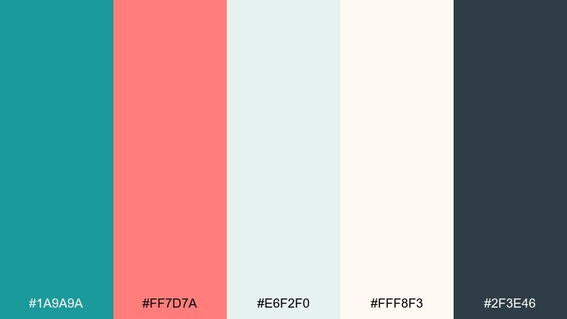
HEX: #1A9A9A #FF7D7A #E6F2F0 #FFF8F3 #2F3E46
Mood: calm, clean, restorative
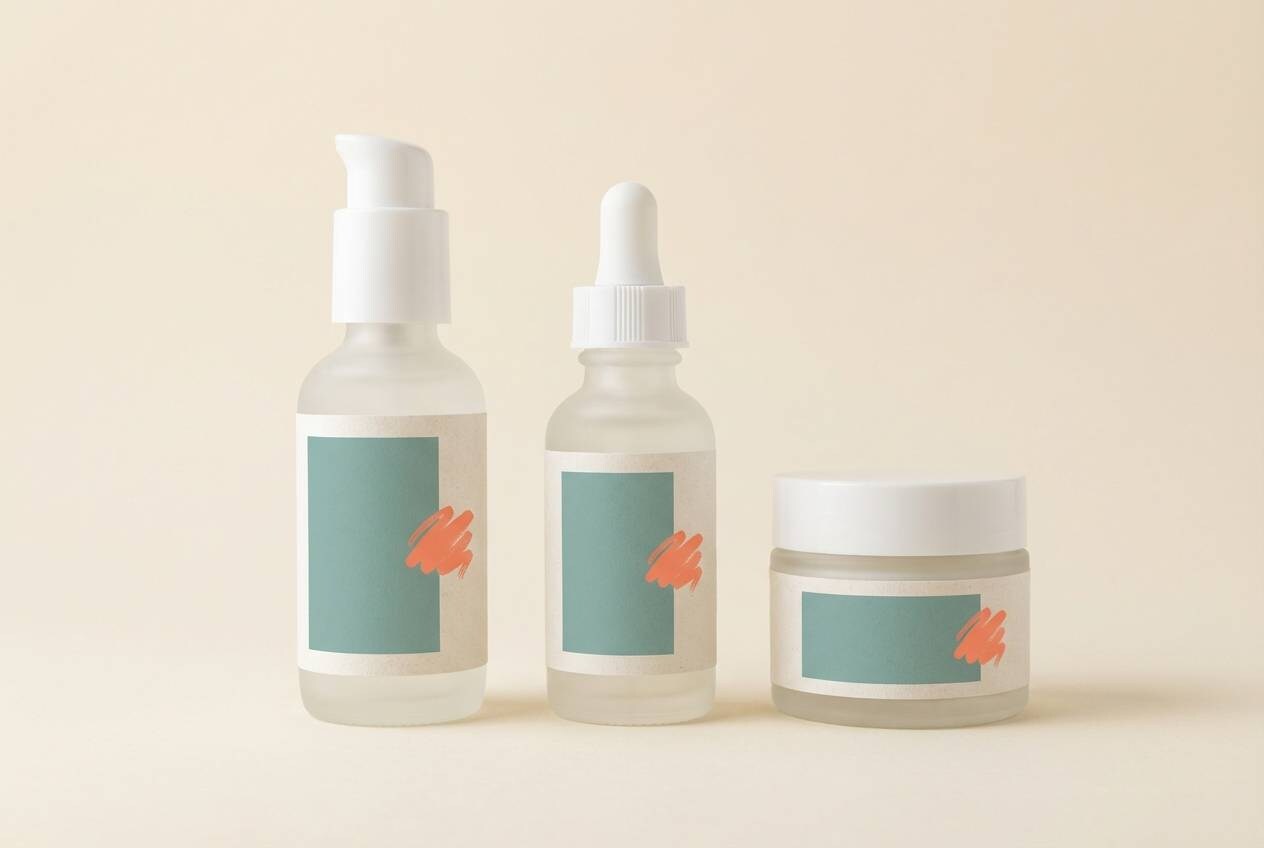
Best for: skincare product packaging
Restorative and clean like a quiet spa morning, with soft coral warmth balancing refreshing teal. It is a natural fit for skincare packaging, labels, and minimalist product ads. Pair with matte off-white and simple sans-serif type to keep it clinical but friendly. Tip: put coral on small seals or benefit icons, and keep teal as the dominant brand color.
Image example of minimal spa calm generated using media.io
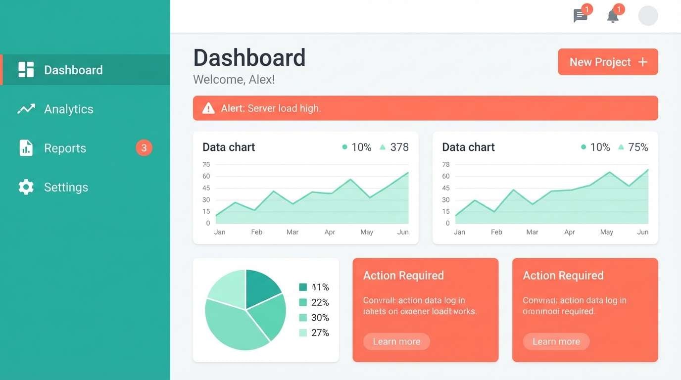
8) Coral Circuit
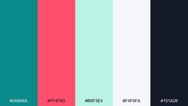
HEX: #0A8A8A #FF4F6D #B9F3E4 #F4F6FA #151A28
Mood: techy, sleek, high-contrast
Best for: app dashboard UI
Sleek and electric like modern dashboards, with coral signaling action against a cool teal base. These teal coral color combinations work well for analytics UI where status and hierarchy matter. Pair with near-white surfaces and a dark navy for charts and labels. Tip: use coral only for alerts or primary metrics so it stays meaningful, not decorative.
Image example of coral circuit generated using media.io
9) Lagoon Latte
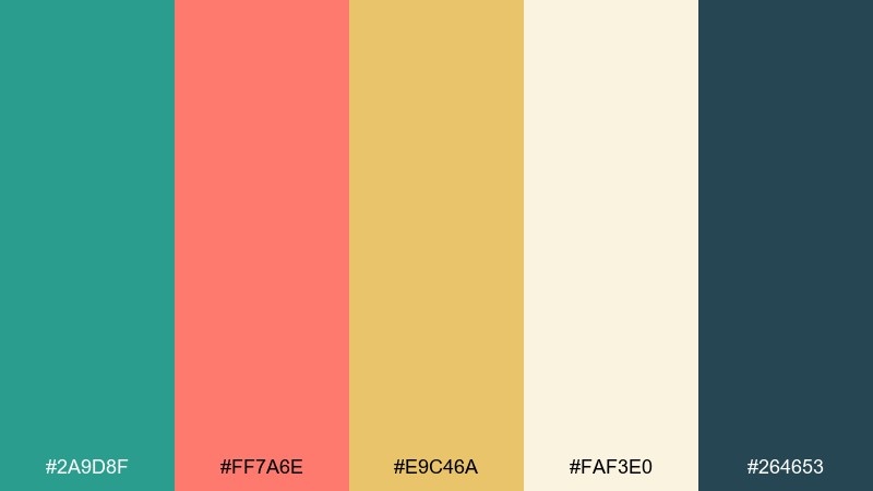
HEX: #2A9D8F #FF7A6E #E9C46A #FAF3E0 #264653
Mood: warm, relaxed, approachable
Best for: coffee shop brand identity
Warm and relaxed like a café by the water, blending lagoon teal with a friendly coral. It is great for coffee branding, loyalty cards, and takeout packaging where you want comfort and freshness together. Pair with creamy backgrounds and muted yellow for subtle warmth. Tip: keep the dark blue-green for typography to maintain readability on light stocks.
Image example of lagoon latte generated using media.io

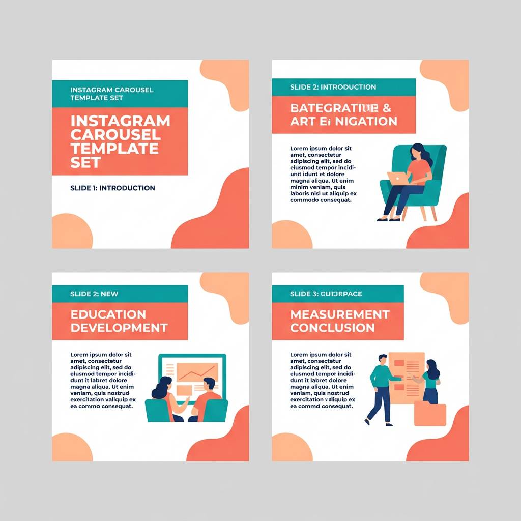
10) Sunset Boardwalk
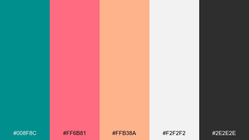
HEX: #008F8C #FF6B81 #FFB38A #F2F2F2 #2E2E2E
Mood: cheerful, social, lively
Best for: Instagram carousel templates
Cheerful and social like a boardwalk at sunset, where coral and peach feel friendly next to crisp teal. It suits carousel templates, creator kits, and promotional posts that need fast readability. Pair with plenty of white space and strong black-gray text to avoid pastel washout. Tip: repeat one teal shape across slides to create a cohesive series look.
Image example of sunset boardwalk generated using media.io
11) Marine Clay
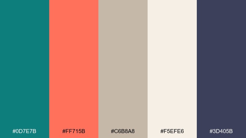
HEX: #0D7E7B #FF715B #C6B8A8 #F5EFE6 #3D405B
Mood: earthy, artisan, balanced
Best for: handmade ceramics product ad
Earthy and artisan like sea-washed clay, combining grounded neutrals with a bright coral accent. It is a strong choice for handmade product ads where texture and authenticity matter. Pair with warm beige backgrounds and deep slate text to keep it calm. Tip: let coral mark the price or a limited drop tag, not the entire headline.
Image example of marine clay generated using media.io
12) Botanical Reef
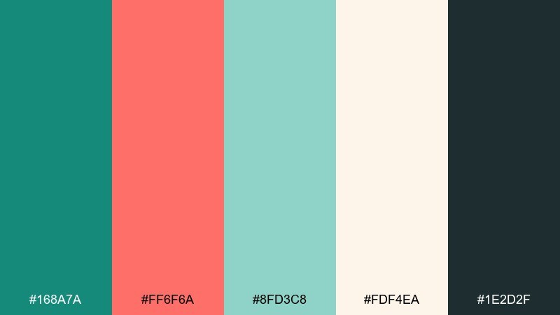
HEX: #168A7A #FF6F6A #8FD3C8 #FDF4EA #1E2D2F
Mood: fresh, botanical, handcrafted
Best for: watercolor botanical illustration
Fresh and botanical like garden leaves beside coral blooms, with teal acting as the cool shade. It is perfect for illustrated prints, stationery, and packaging that leans handmade. Pair with warm cream paper tones and keep the darkest ink for delicate outlines. Tip: paint coral blooms in small clusters so the composition stays airy and natural.
Image example of botanical reef generated using media.io
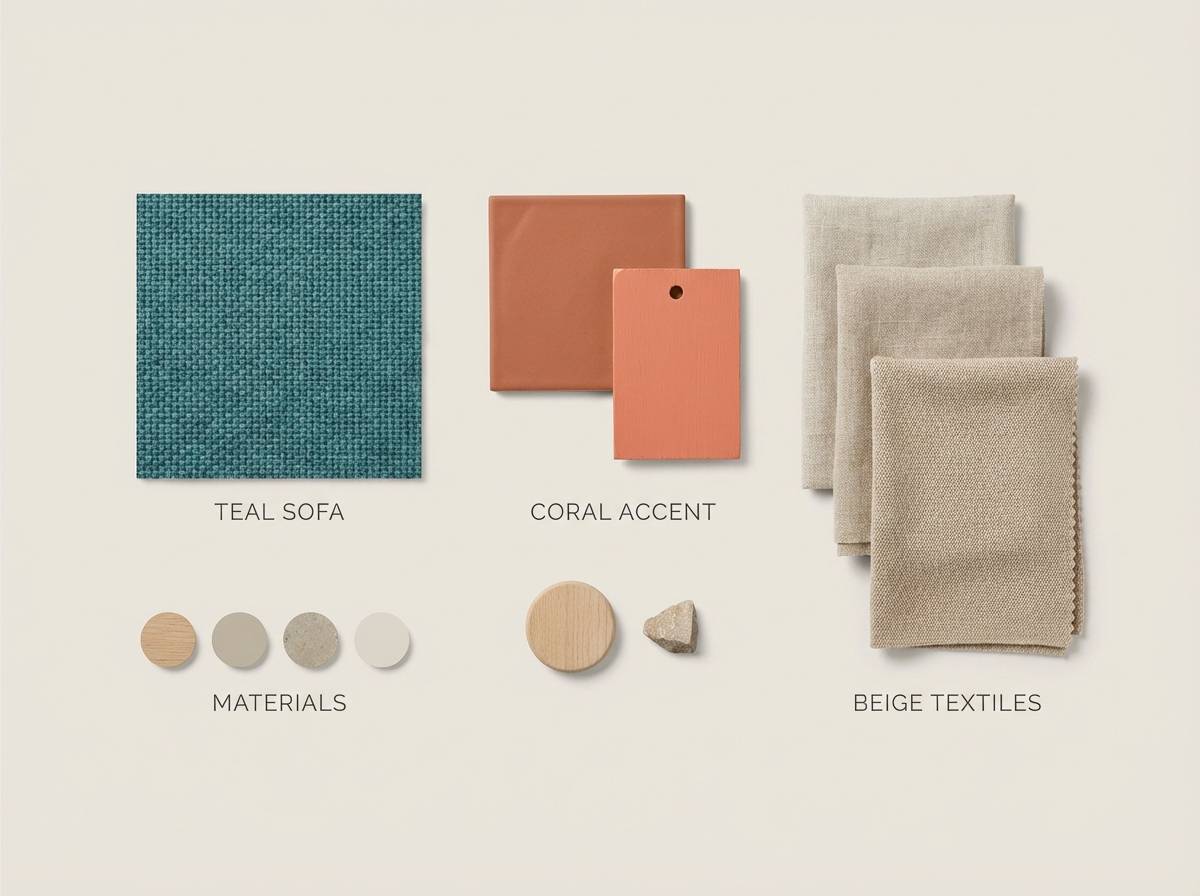
13) Aqua Terracotta
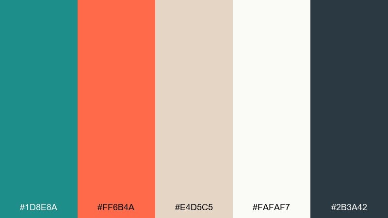
HEX: #1D8E8A #FF6B4A #E4D5C5 #FAFAF7 #2B3A42
Mood: modern, sunbaked, stylish
Best for: living room accent styling guide
Modern and sunbaked like terracotta pots near a pool, mixing warm coral-orange with cool teal. It works well for interior mood boards, accent walls, and decor guides that feel contemporary but inviting. Pair with creamy off-white and sandy neutrals to keep the space breathable. Tip: use teal for larger blocks like rugs or sofas and coral for smaller decor accents.
Image example of aqua terracotta generated using media.io
14) Nordic Coastline
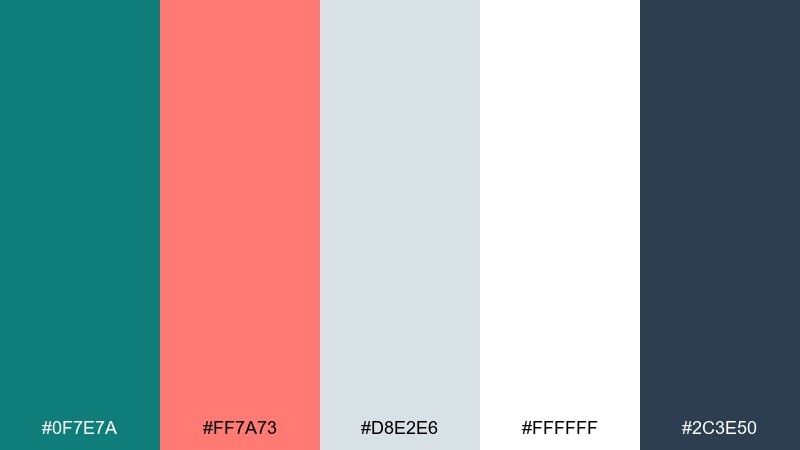
HEX: #0F7E7A #FF7A73 #D8E2E6 #FFFFFF #2C3E50
Mood: minimal, cool, editorial
Best for: magazine feature layout
Minimal and cool like a Nordic shoreline, with coral adding just enough human warmth. It suits editorial layouts, lookbooks, and thought-leadership PDFs where whitespace is part of the style. Pair with pale gray grids and deep blue-gray headings to keep it crisp. Tip: treat coral like a highlighter for pull quotes, not a background fill.
Image example of nordic coastline generated using media.io
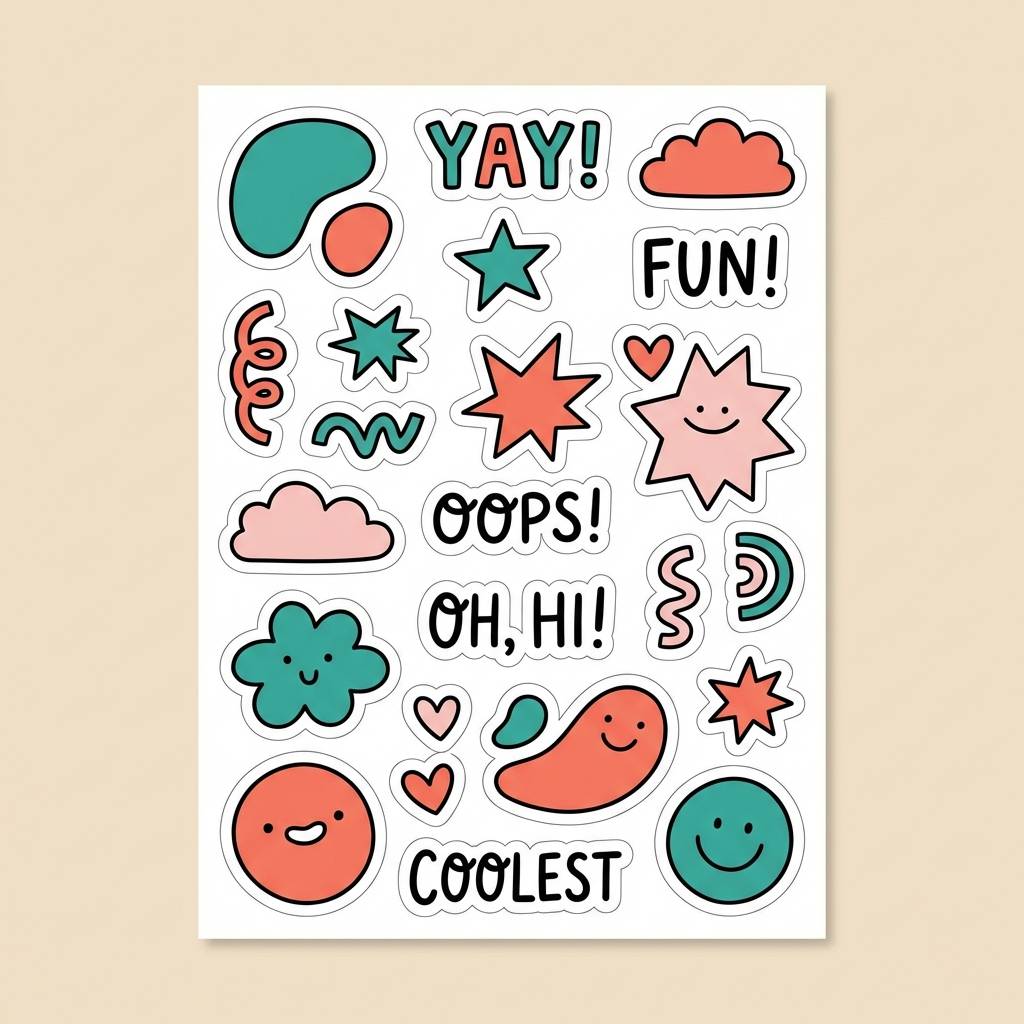
15) Candy Coral Pop
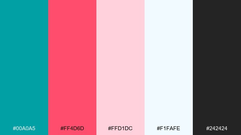
HEX: #00A0A5 #FF4D6D #FFD1DC #F1FAFE #242424
Mood: fun, pop, youthful
Best for: kids brand sticker sheet
Fun and pop-forward like candy wrappers, where bright coral steals the spotlight against clean teal. It is great for sticker sheets, kids brands, and playful merch designs. Pair with lots of white or pale ice blue so the saturated tones do not feel heavy. Tip: outline shapes in dark gray for print clarity and better cut lines.
Image example of candy coral pop generated using media.io
16) Quiet Tide
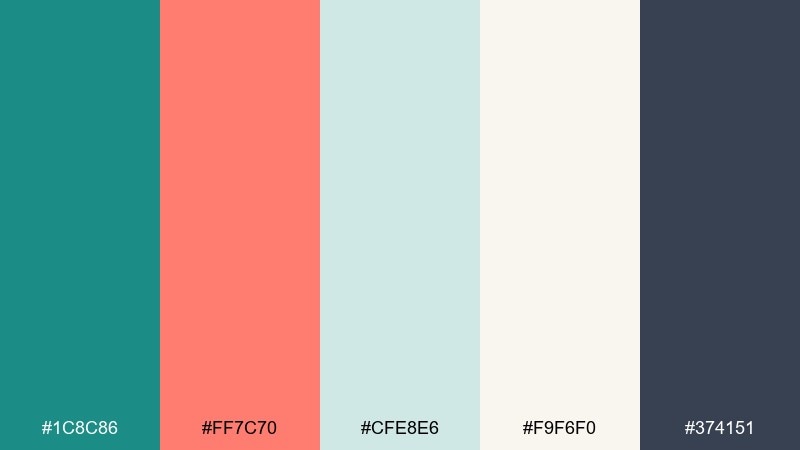
HEX: #1C8C86 #FF7C70 #CFE8E6 #F9F6F0 #374151
Mood: quiet, friendly, trustworthy
Best for: health clinic brochure
Quiet and reassuring like a gentle tide, with softened teal and a warm coral note. It fits healthcare brochures and patient-facing materials where calm clarity matters. Pair with warm off-white and a single dark neutral for headings to avoid harsh contrast. Tip: use coral only for section dividers and appointment callouts to keep the tone professional.
Image example of quiet tide generated using media.io
17) Office Chic Coral
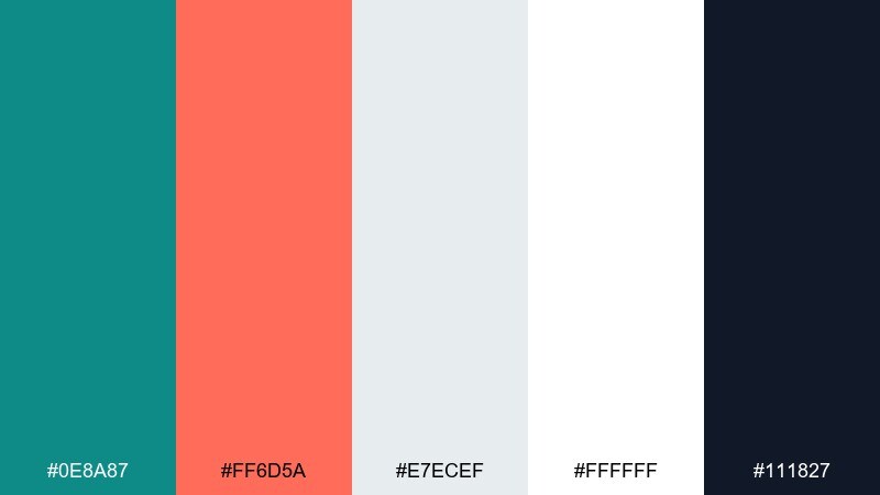
HEX: #0E8A87 #FF6D5A #E7ECEF #FFFFFF #111827
Mood: polished, modern, professional
Best for: LinkedIn banner and post kit
Polished and modern like a crisp blazer with a bright pocket square, where coral adds personality to steady teal. It is ideal for professional social kits, business newsletters, and personal brand assets. Pair with clean whites and near-black type to keep it sharp. Tip: repeat coral as a small corner motif to make a consistent, recognizable template set.
Image example of office chic coral generated using media.io

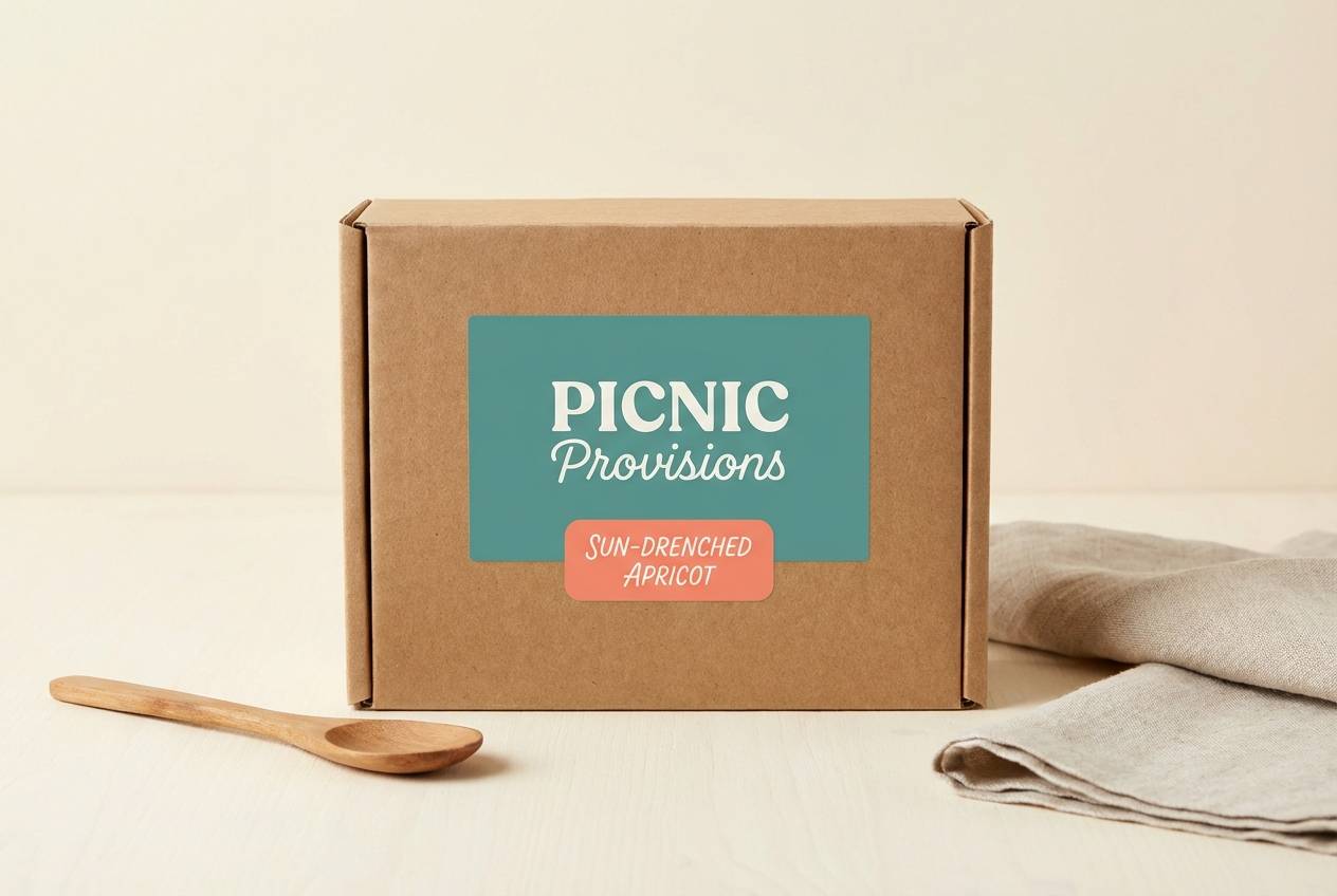
18) Ocean Picnic
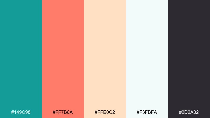
HEX: #149C98 #FF7B6A #FFE0C2 #F3FBFA #2D2A32
Mood: casual, cheerful, outdoorsy
Best for: picnic food packaging label
Casual and cheerful like a seaside picnic, with coral warmth and a breezy teal base. It works nicely on food labels, wraps, and small packaging where you want handmade charm. Pair with soft cream backgrounds and keep the darkest tone for ingredients and barcode areas. Tip: use teal as the main label field and coral for flavor naming to aid shelf scanning.
Image example of ocean picnic generated using media.io
19) Night Market Glow
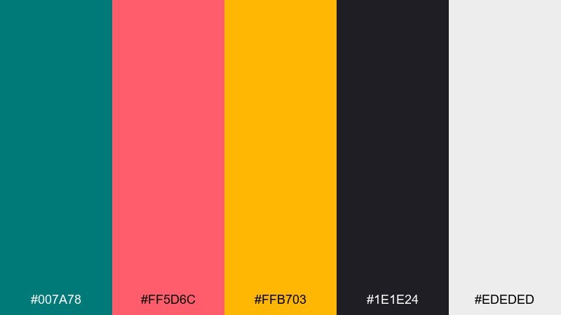
HEX: #007A78 #FF5D6C #FFB703 #1E1E24 #EDEDED
Mood: vibrant, urban, dramatic
Best for: street food festival poster
Vibrant and dramatic like a night market sign, with coral and amber glowing against deep teal and charcoal. It is made for posters and festival promos that need big contrast and quick impact. Pair with light gray type blocks so details stay readable on dark backgrounds. Tip: keep coral for the main title and use amber only as a secondary glow accent.
Image example of night market glow generated using media.io

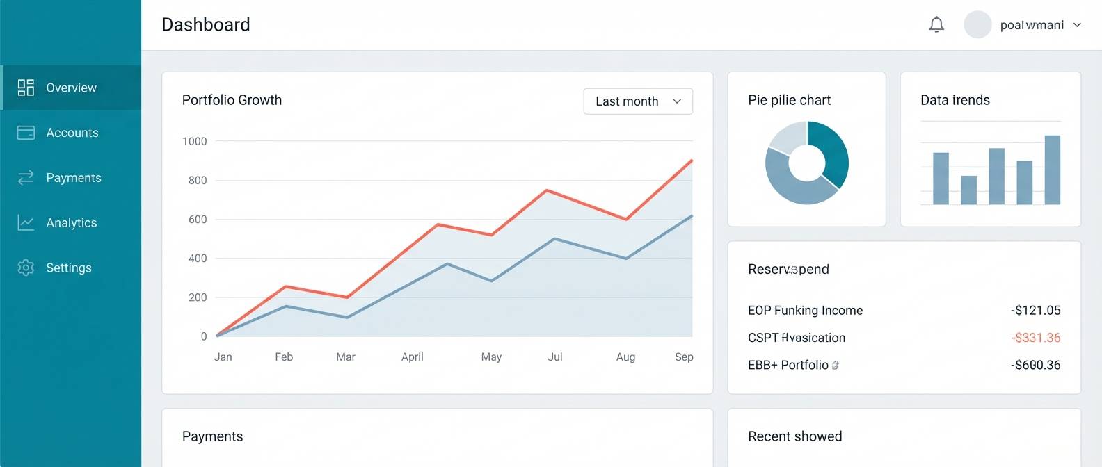
20) Coral Metrics
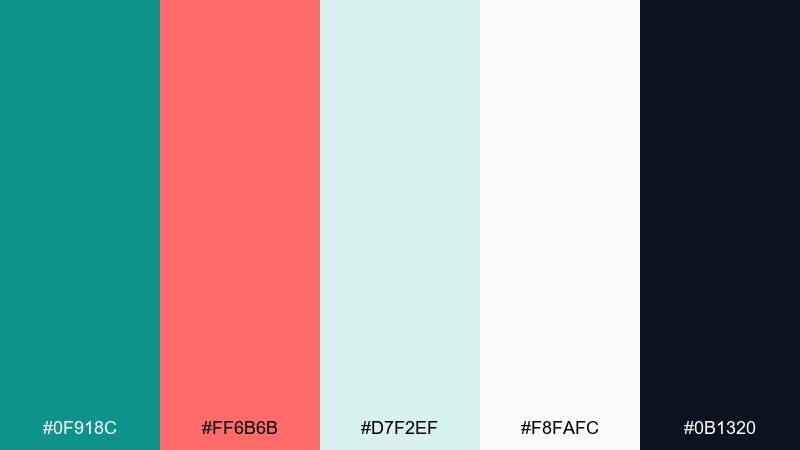
HEX: #0F918C #FF6B6B #D7F2EF #F8FAFC #0B1320
Mood: clear, data-driven, modern
Best for: fintech dashboard charts
Clear and data-driven like a well-lit control room, with coral acting as the attention marker on calm teal. Use it when you need a teal coral color combination that makes charts, toggles, and key KPIs pop without feeling loud. Pair with pale surfaces and a deep near-black for axes and labels. Tip: assign coral to one metric category only, so users learn the color meaning fast.
Image example of coral metrics generated using media.io
21) Freshwater Coral
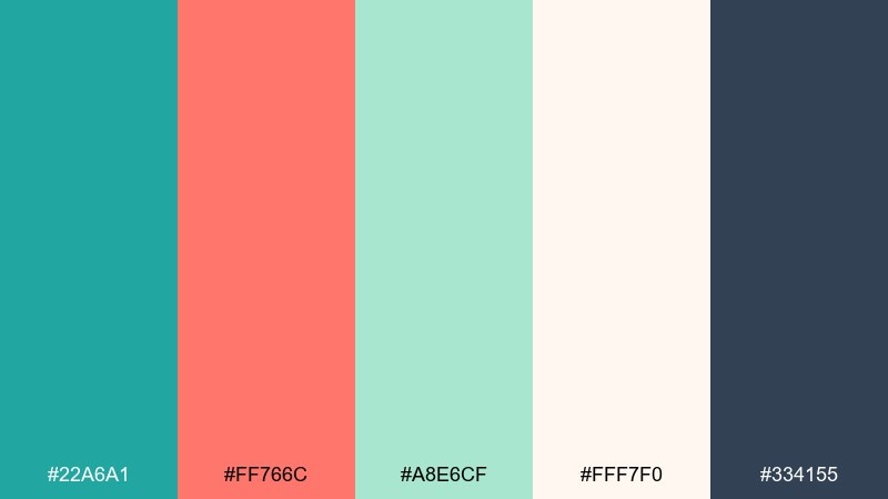
HEX: #22A6A1 #FF766C #A8E6CF #FFF7F0 #334155
Mood: bright, clean, optimistic
Best for: wellness app onboarding screens
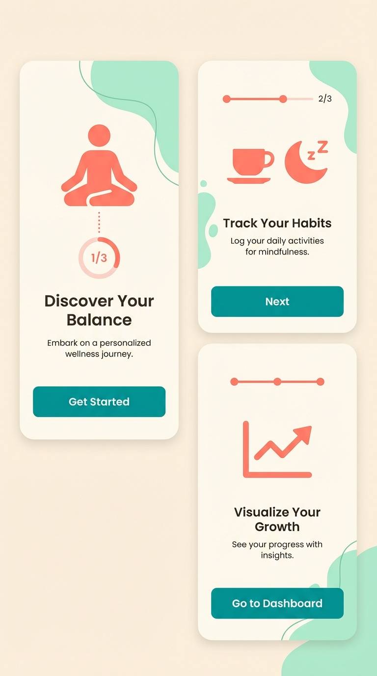
Bright and optimistic like clear water over coral sand, with minty lightness supporting teal and coral. These teal coral color combinations are great for onboarding flows where friendliness and clarity matter. Pair with plenty of soft cream background and keep text in the deep slate tone for accessibility. Tip: use coral for the active step indicator and teal for the primary navigation pattern.
Image example of freshwater coral generated using media.io
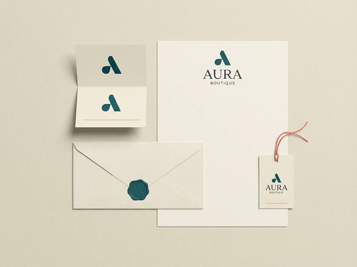
22) Coral Whisper
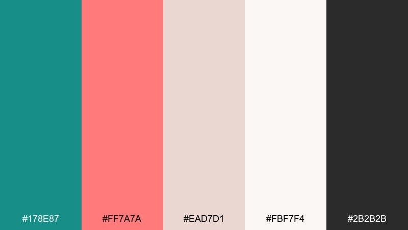
HEX: #178E87 #FF7A7A #EAD7D1 #FBF7F4 #2B2B2B
Mood: gentle, elegant, understated
Best for: boutique branding and logo lockup
Gentle and elegant like soft fabric and handwritten notes, with coral whispering warmth beside calm teal. This teal coral color palette is a good fit for boutiques, salons, and small brands that want charm without loud saturation. Pair with creamy backgrounds and keep the darkest neutral for logo text and fine lines. Tip: test the coral on uncoated stock to ensure it stays warm rather than neon.
Image example of coral whisper generated using media.io
What Colors Go Well with Teal Coral?
Neutrals are the easiest match: white, warm ivory, and light gray keep teal coral feeling airy, while charcoal, ink, or deep navy provide readable contrast for typography and UI labels.
For extra warmth, add sand, beige, peach, or muted gold—these lean coastal and approachable. For a cooler, cleaner direction, pair teal coral with mint, pale aqua, or steel blue for a more “cold-modern” vibe.
If you need drama, anchor the palette with near-black or deep slate and let coral become the single attention color. This approach works especially well for dashboards, posters, and hero sections.
How to Use a Teal Coral Color Palette in Real Designs
Start with roles: use teal as the primary brand field (backgrounds, nav, large shapes) and reserve coral for high-meaning elements like CTAs, badges, prices, or key highlights. This keeps coral impactful instead of decorative noise.
In UI, check contrast early: place body text in charcoal/ink, and test coral buttons against white or very light surfaces. In print, consider stock and finish—coral can shift warmer on uncoated paper, while teal may deepen on matte laminates.
For cohesive systems, repeat one teal shape or rule line across assets (slides, carousels, brochures), and use coral consistently for the same type of callout. Users quickly learn what the color means.
Create Teal Coral Palette Visuals with AI
If you already have HEX codes, you can generate fast mockups to validate layout, contrast, and mood before you design in depth. This is especially helpful for picking the “right” coral intensity (soft blush vs. vibrant punch) and how it behaves next to teal.
With Media.io’s text-to-image, try prompts like “SaaS landing UI mockup,” “wedding invitation suite,” or “packaging label,” then specify teal as the main brand color and coral as the accent. Iterate by changing lighting, paper texture, and layout density.
Once you like a direction, export a few variations and compare them side-by-side for readability and brand fit.
Teal Coral Color Palette FAQs
-
What does a teal coral color palette communicate?
Teal coral typically communicates calm confidence (teal) plus friendly energy and warmth (coral). The mix often feels coastal, modern, and approachable—great for brands that want to look both trustworthy and lively. -
Is teal coral a good palette for websites and UI design?
Yes—teal works well for large areas like headers, sidebars, and backgrounds, while coral is ideal for primary CTAs, alerts, or key highlights. Add a dark neutral for text to maintain strong readability and hierarchy. -
How do I keep teal coral from looking too “beachy”?
Reduce sandy/peach accents and introduce cooler supports like light gray, steel blue, or crisp white. Use charcoal or deep navy typography and keep coral limited to small, purposeful UI or brand moments. -
What neutral colors pair best with teal and coral?
Warm ivory and cream soften the combo for print and lifestyle aesthetics, while light gray and near-white keep it clean for digital. For text and contrast, choose charcoal, ink, or deep slate. -
How should I assign roles to teal vs. coral in a brand system?
Use teal as the primary brand color (dominant surfaces, large blocks, supporting graphics) and coral as an accent (buttons, prices, tags, icons). This keeps coral meaningful and prevents a visually noisy layout. -
Can teal coral work for professional or corporate designs?
Yes—choose a slightly muted teal and a less neon coral, then anchor the system with white space and near-black typography. Palettes like “Office Chic Coral” are designed specifically to look polished and business-friendly. -
How can I preview teal coral palettes quickly before designing?
Generate mockups with a text-to-image tool using your palette’s mood and use case (e.g., “dashboard UI,” “menu layout,” “packaging label”). This helps you test contrast, color balance, and overall tone in minutes.
Next: Cold Color Palette


