

Purple and turquoise is a high-impact pairing that blends creative energy (purple) with freshness and clarity (turquoise). It’s a go-to palette for modern branding, UI design, print layouts, and decor when you want contrast that still feels cohesive.
Below are 20+ curated purple turquoise color palette ideas with HEX codes, plus practical pairing tips and AI prompts you can reuse to generate matching visuals.
In this article
- Why Purple Turquoise Palettes Work So Well
-
- neon lagoon
- amethyst tide
- orchid reef
- velvet aqua
- galaxy pool
- lilac lagoon mist
- mardi gras surf
- frosted jewel
- electric carnival
- serene spa
- twilight mermaid
- pastel nebula
- urban nightlife
- desert oasis
- aurora gradient
- botanical gemstone
- royal lagoon luxe
- retro arcade
- minimal ink & sea
- sunset coral pop
- crystal aquarium
- deep sea velvet
- prism candy
- museum modern
- opal skyline
- What Colors Go Well with Purple Turquoise?
- How to Use a Purple Turquoise Color Palette in Real Designs
- Create Purple Turquoise Palette Visuals with AI
Why Purple Turquoise Palettes Work So Well
Purple turquoise color combinations balance warmth and coolness in a way that feels both expressive and clean. Purple brings depth, imagination, and a premium tone, while turquoise adds brightness, clarity, and a modern “tech-fresh” feel.
This pairing is also naturally high-contrast, which helps with visual hierarchy in UI design and print design. When you anchor the palette with a deep navy/charcoal and soften it with off-whites, the brights stay readable instead of overwhelming.
Most importantly, purple and turquoise can shift mood easily—from dreamy pastels to neon nightlife—so you can keep brand consistency while adapting to campaigns, seasons, and different content formats.
20+ Purple Turquoise Color Palette Ideas (with HEX Codes)
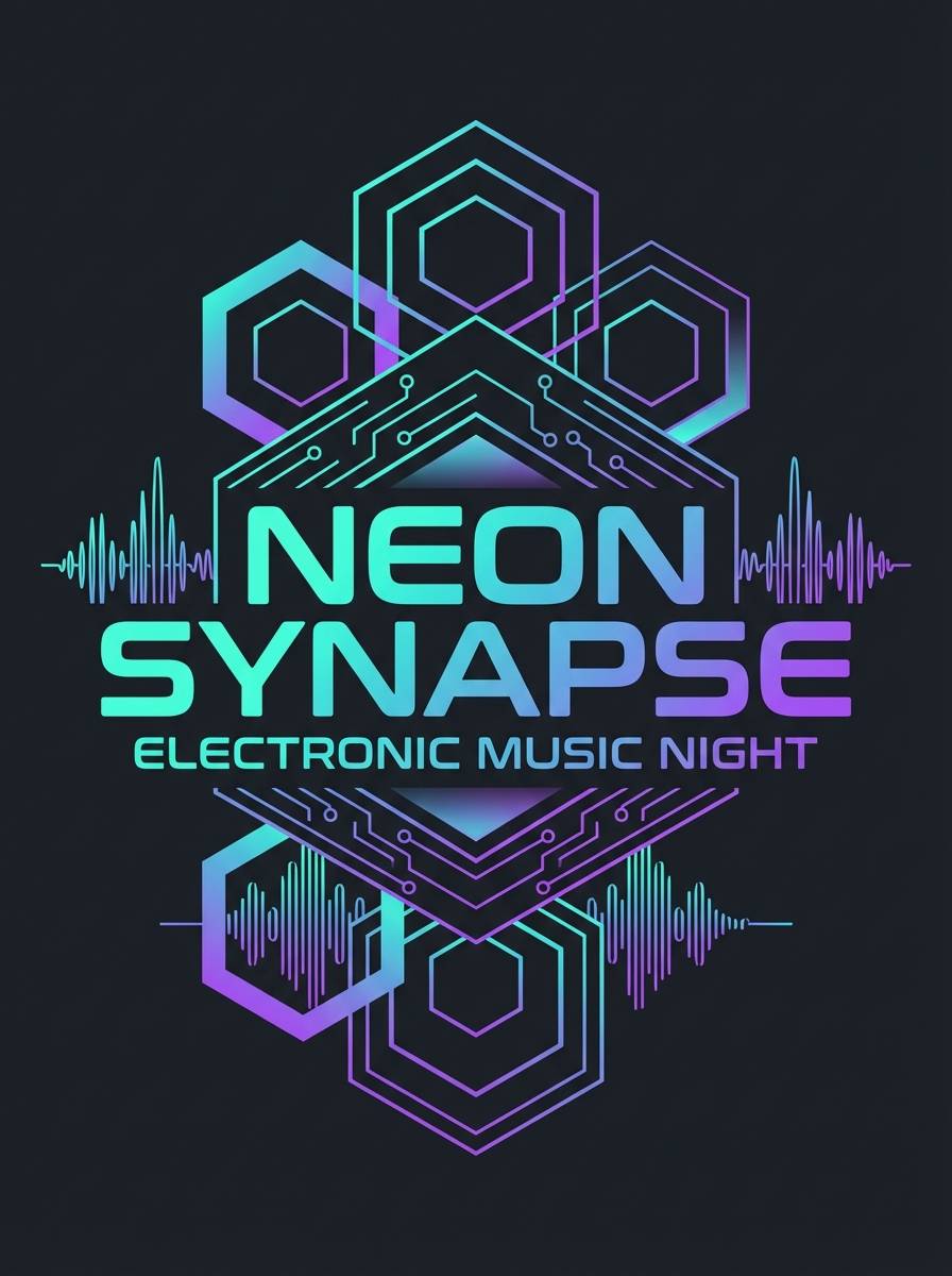
1) Neon Lagoon
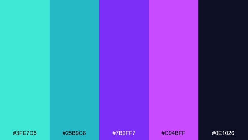
HEX: #3FE7D5 #25B9C6 #7B2FF7 #C94BFF #0E1026
Mood: electric, playful, futuristic
Best for: music event poster graphics
Electric lagoon energy with a nightclub glow, where neon turquoise meets punchy violet on a deep night base. It shines in bold headlines, gradients, and high-contrast poster layouts. Pair it with black or very dark navy to keep the brights clean and readable. Usage tip: reserve the brightest turquoise for calls to action so the eye lands instantly.
Image example of neon lagoon generated using media.io
Media.io is an online AI studio for creating and editing video, image, and audio in your browser.

2) Amethyst Tide
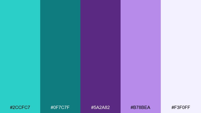
HEX: #2CCFC7 #0F7C7F #5A2A82 #B78BEA #F3F0FF
Mood: calm, upscale, coastal
Best for: wellness brand identity
A calm shoreline feel with cool tidewater tones and soft amethyst light. It works beautifully for wellness and skincare branding where you want fresh, clean color without looking clinical. Pair with warm white and subtle texture to keep it premium and approachable. Usage tip: use the deeper teal for logos and the lighter lavender as supporting background blocks.
Image example of amethyst tide generated using media.io
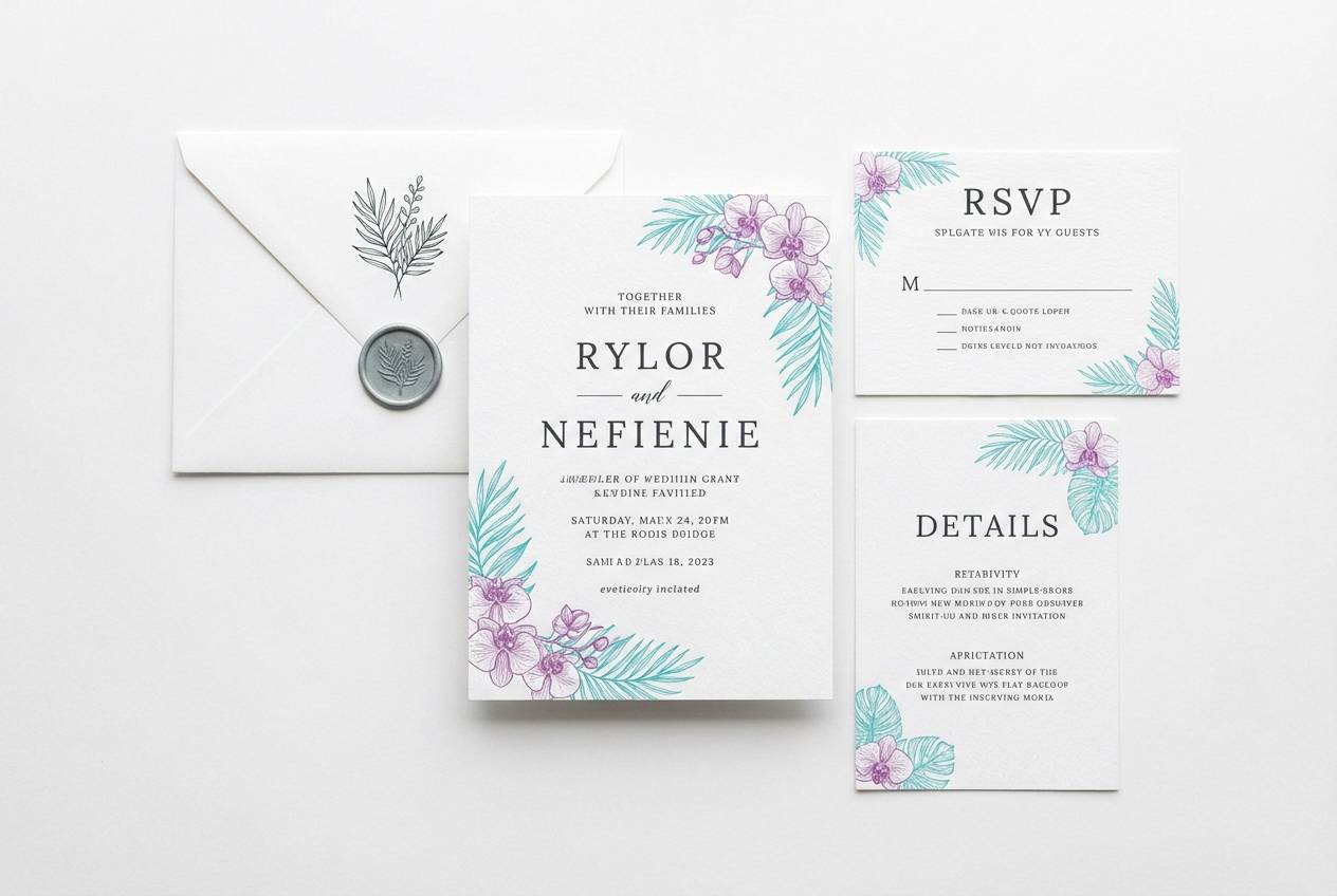
3) Orchid Reef
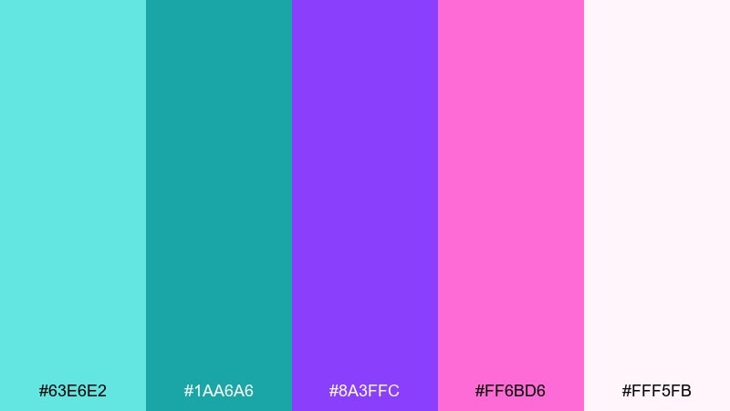
HEX: #63E6E2 #1AA6A6 #8A3FFC #FF6BD6 #FFF5FB
Mood: tropical, lively, romantic
Best for: summer wedding invitation suite
Tropical reef sparkle with orchid petals floating over clear aqua water. This purple turquoise color palette fits summer wedding stationery when you want romance without going overly pastel. Pair it with plenty of white space and thin typography for a refined look. Usage tip: keep the hot pink as a small accent for monograms or envelope liners.
Image example of orchid reef generated using media.io
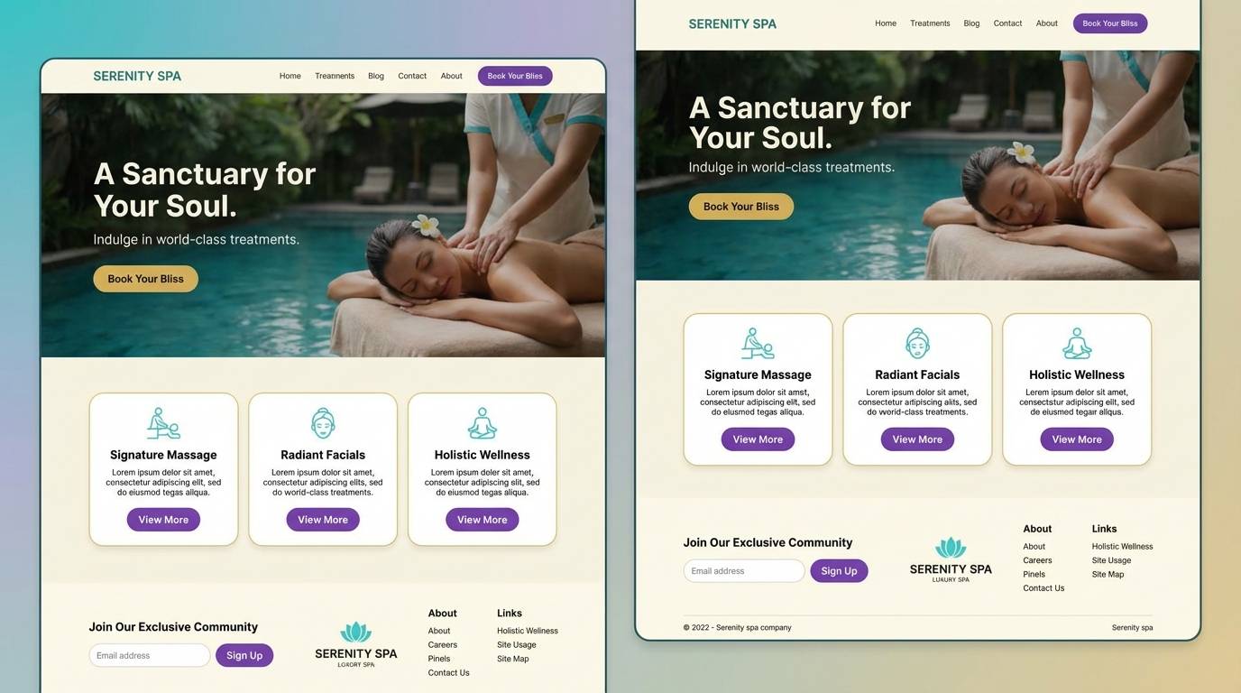
4) Velvet Aqua
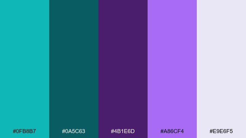
HEX: #0FB8B7 #0A5C63 #4B1E6D #A86CF4 #E9E6F5
Mood: moody, smooth, sophisticated
Best for: luxury spa landing page UI
Velvety shadows and cool water tones create a smooth, high-end atmosphere. It is ideal for spa or boutique hotel UI where contrast needs to feel soft, not harsh. Pair with light lavender-gray backgrounds and use the deep teal for navigation elements. Usage tip: apply the violet as a hover state or highlight color to add subtle motion cues.
Image example of velvet aqua generated using media.io
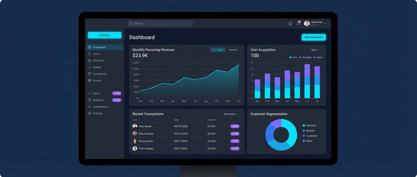
5) Galaxy Pool
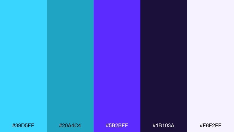
HEX: #39D5FF #20A4C4 #5B2BFF #1B103A #F6F2FF
Mood: cosmic, sleek, techy
Best for: SaaS dashboard UI theme
Cosmic depth with a bright pool-blue highlight, like starlight on water. These purple turquoise color combinations feel modern for SaaS dashboards, especially when paired with dark mode surfaces. Pair with soft off-white for charts and keep spacing generous so the colors do not compete. Usage tip: use the cyan for primary buttons and the purple for data highlights and badges.
Image example of galaxy pool generated using media.io
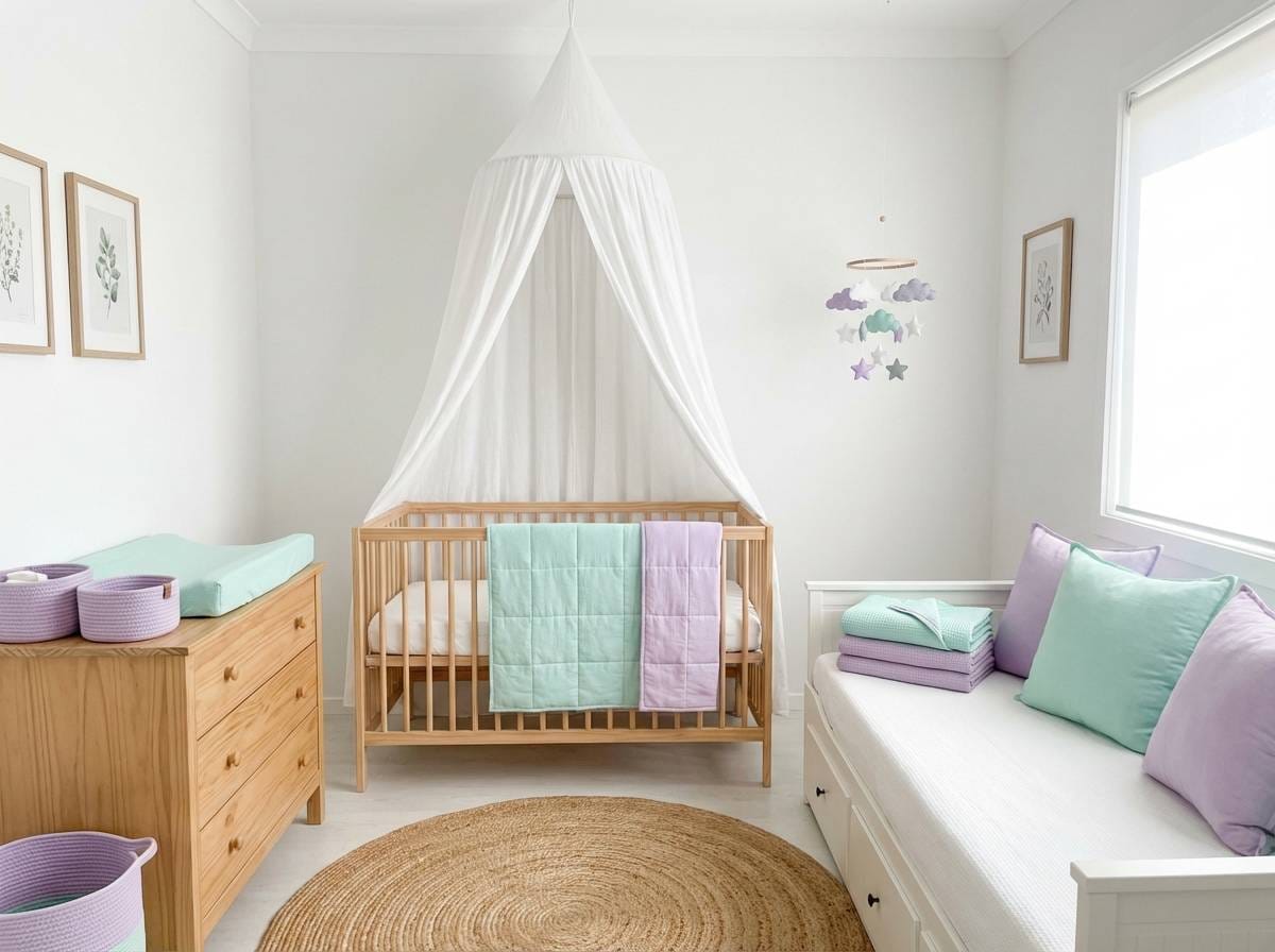
6) Lilac Lagoon Mist
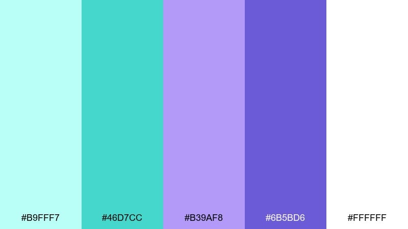
HEX: #B9FFF7 #46D7CC #B39AF8 #6B5BD6 #FFFFFF
Mood: airy, gentle, refreshing
Best for: nursery room decor styling
A light misty morning palette that feels like sea air and soft lilac clouds. It suits nurseries and calming home decor where you want color that stays quiet and sweet. Pair with natural wood, linen, and matte white to keep it soothing. Usage tip: repeat the mint tone in small accessories to create cohesion without painting every surface.
Image example of lilac lagoon mist generated using media.io
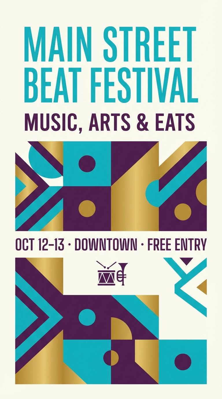
7) Mardi Gras Surf
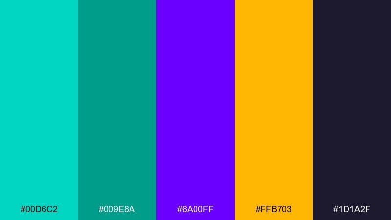
HEX: #00D6C2 #009E8A #6A00FF #FFB703 #1D1A2F
Mood: festive, bold, energetic
Best for: street festival flyer design
Festival sparkle with surfy turquoise, rich purple, and a burst of gold. It is perfect for flyers and social graphics when you need loud color that still feels coordinated. Pair with dark charcoal text blocks for readability and use gold as a limited accent. Usage tip: keep type mostly white or near-white over the darker purple for crisp contrast.
Image example of mardi gras surf generated using media.io
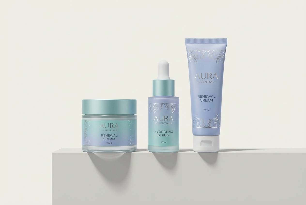
8) Frosted Jewel
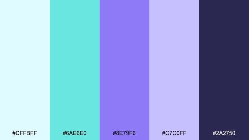
HEX: #DFFBFF #6AE6E0 #8E79F6 #C7C0FF #2A2750
Mood: cool, polished, wintery
Best for: beauty product packaging
Frosted glass vibes with jewel-like turquoise and soft periwinkle on a deep ink base. It works well for beauty packaging that needs to look clean, cool, and slightly glamorous. Pair with silver foil or glossy varnish to elevate the icy mood. Usage tip: place the darkest shade behind the logo to make pastel elements pop.
Image example of frosted jewel generated using media.io
9) Electric Carnival
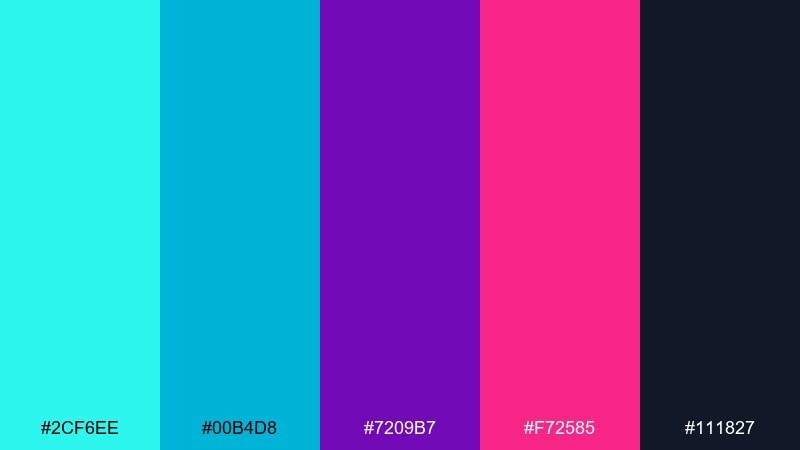
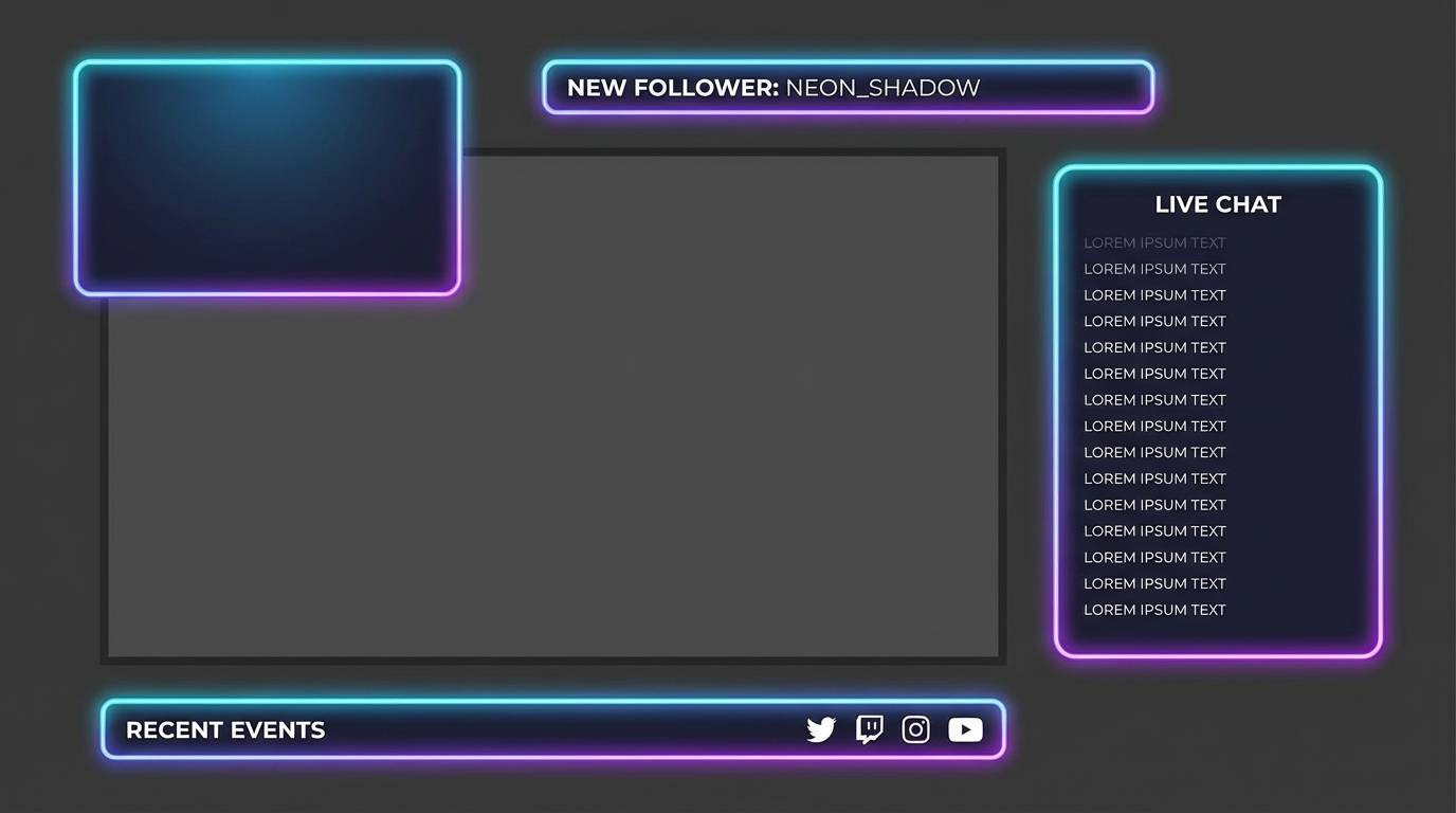
HEX: #2CF6EE #00B4D8 #7209B7 #F72585 #111827
Mood: punchy, youthful, high-contrast
Best for: gaming stream overlay graphics
High-contrast carnival lights with bright aqua, neon magenta, and deep purple. It is a strong fit for streaming overlays, esports branding, and punchy social templates. Pair with near-black backgrounds and keep gradients simple so the layout stays readable. Usage tip: use the magenta sparingly for alerts and badges to avoid visual fatigue.
Image example of electric carnival generated using media.io
10) Serene Spa
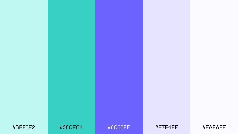
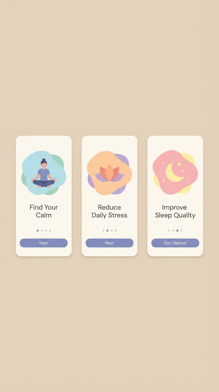
HEX: #BFF8F2 #38CFC4 #6C63FF #E7E4FF #FAFAFF
Mood: soft, clean, restorative
Best for: meditation app onboarding UI
Soft water tones and gentle violet create a restorative, slow-breath feeling. It is great for onboarding screens where you want calm guidance and clear hierarchy. Pair with lots of white space, rounded cards, and light shadows for a friendly tone. Usage tip: keep saturation low across most screens and save the mid-turquoise for primary actions.
Image example of serene spa generated using media.io
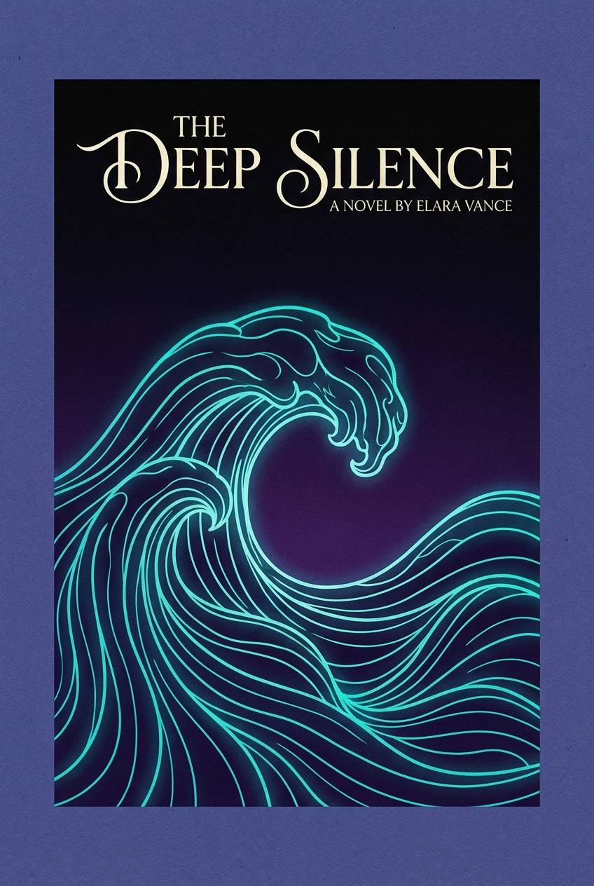
11) Twilight Mermaid
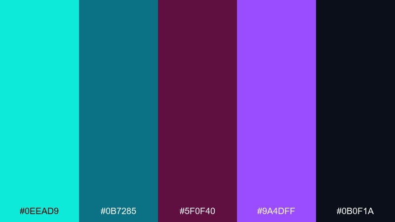
HEX: #0EEAD9 #0B7285 #5F0F40 #9A4DFF #0B0F1A
Mood: mysterious, dramatic, oceanic
Best for: book cover design
A twilight ocean mood with luminous turquoise cutting through deep, inky purples. It is well suited to fantasy or romance book covers that need drama and a hint of magic. Pair with metallic typography or a pale cream title to keep it legible. Usage tip: place turquoise as a rim light or wave motif so it feels like a true glow, not a block of color.
Image example of twilight mermaid generated using media.io
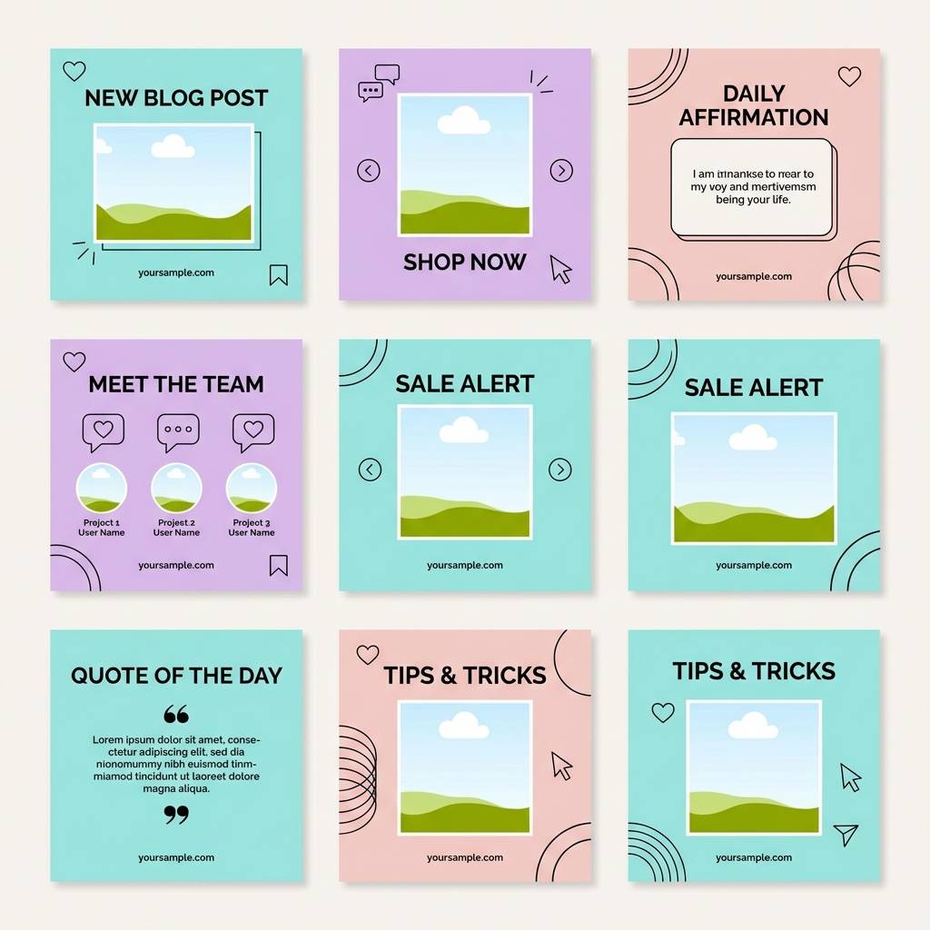
12) Pastel Nebula
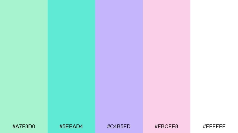
HEX: #A7F3D0 #5EEAD4 #C4B5FD #FBCFE8 #FFFFFF
Mood: dreamy, sweet, modern pastel
Best for: social media template set
Dreamy nebula pastels with minty turquoise and cloud-soft purple, warmed by a blush accent. It works for lifestyle creators and small shops that want a friendly, modern feed. Pair with simple sans-serif type and thin line icons to avoid clutter. Usage tip: use the blush shade only for key emphasis, like price tags or short highlights.
Image example of pastel nebula generated using media.io
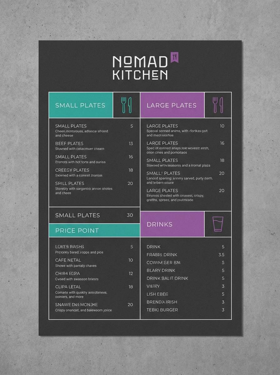
13) Urban Nightlife
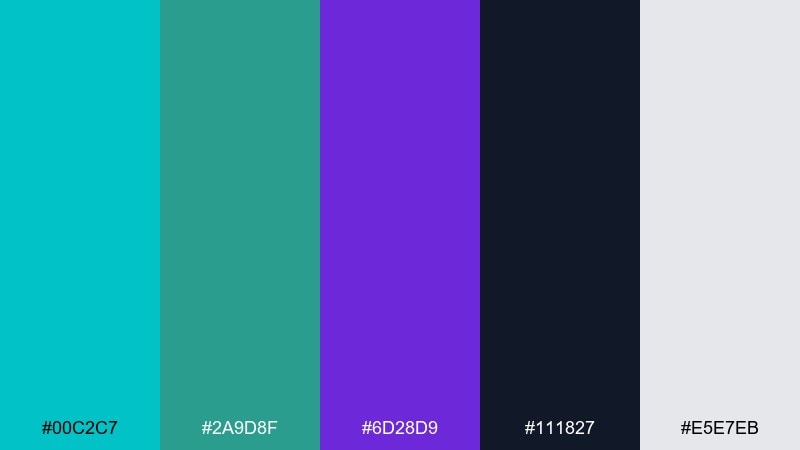
HEX: #00C2C7 #2A9D8F #6D28D9 #111827 #E5E7EB
Mood: modern, edgy, city-cool
Best for: restaurant menu design
City-night edge with cool teal lights and a confident purple accent against charcoal. It is a strong choice for modern restaurant menus, especially for cocktails or late-night concepts. Pair with off-white paper tones and clean grids to keep it readable. Usage tip: use purple only for section headers so the menu stays calm and premium.
Image example of urban nightlife generated using media.io
14) Desert Oasis
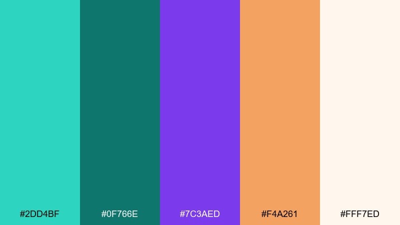
HEX: #2DD4BF #0F766E #7C3AED #F4A261 #FFF7ED
Mood: warm-meets-cool, welcoming, travel-inspired
Best for: travel blog header design
An oasis feel where cool turquoise water meets sun-warmed sand and violet dusk. It is great for travel headers and hero banners that need contrast without feeling cold. Pair with creamy neutrals and use the warm accent for small highlights like buttons or tags. Usage tip: keep photos lightly desaturated so the palette remains the star.
Image example of desert oasis generated using media.io

15) Aurora Gradient
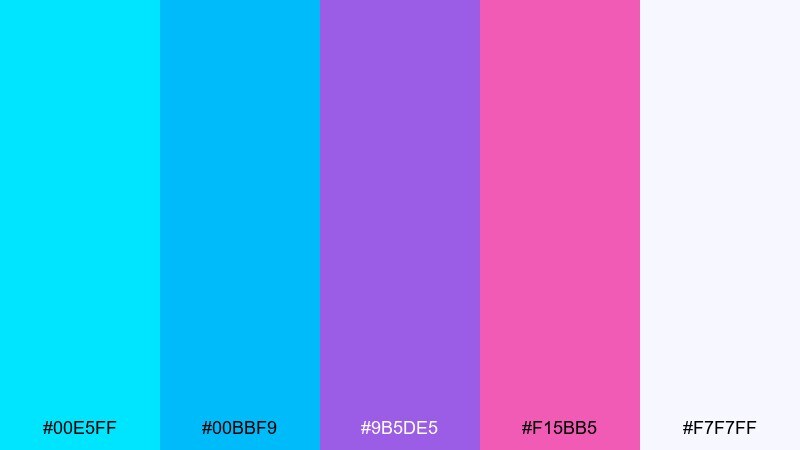
HEX: #00E5FF #00BBF9 #9B5DE5 #F15BB5 #F7F7FF
Mood: glowy, optimistic, trendy
Best for: startup pitch deck slides
Aurora-like glow with a smooth shift from sky cyan into optimistic purple and a touch of pink. It fits pitch decks where you want energy, clarity, and a modern tech vibe. Pair with white slides and dark text blocks, using color mainly for charts and section dividers. Usage tip: use gradient bars consistently across slides to unify the deck.
Image example of aurora gradient generated using media.io
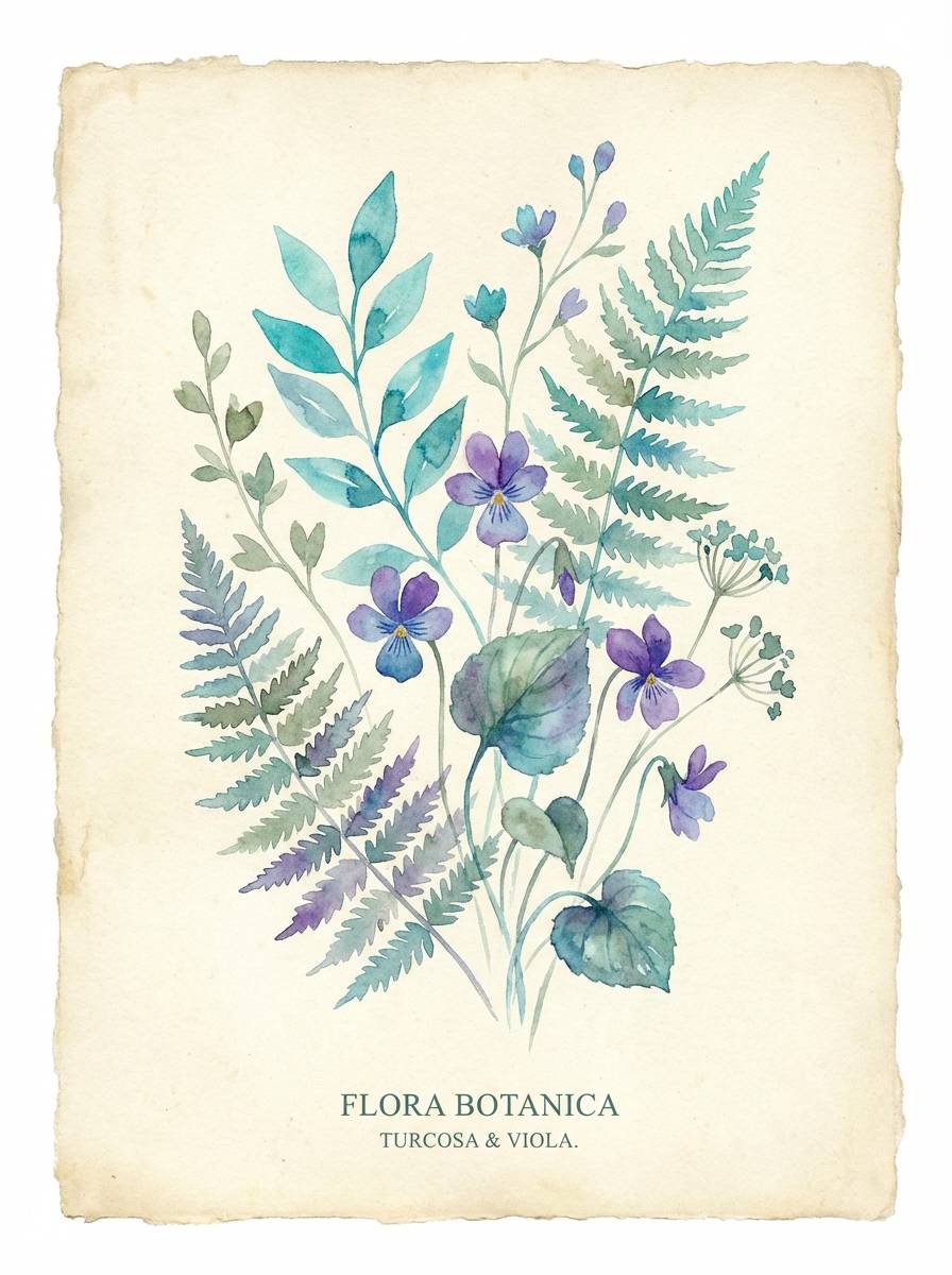
16) Botanical Gemstone
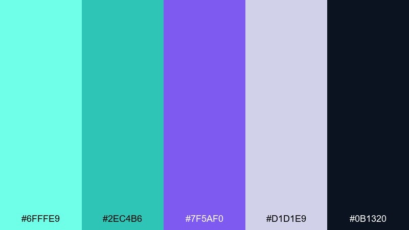
HEX: #6FFFE9 #2EC4B6 #7F5AF0 #D1D1E9 #0B1320
Mood: fresh, natural, refined
Best for: botanical illustration poster
Fresh botanical energy with gemstone turquoise and a refined purple accent, grounded by deep ink. It is ideal for illustrated posters, herb labels, or nature-themed prints that need a modern twist. Pair with soft gray-lavender negative space and fine line work for detail. Usage tip: keep outlines in the dark ink tone so the greens and purples stay crisp.
Image example of botanical gemstone generated using media.io
17) Royal Lagoon Luxe
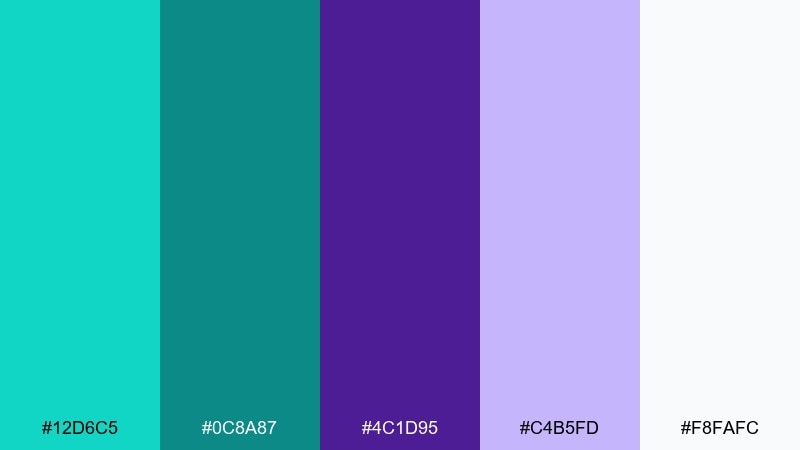
HEX: #12D6C5 #0C8A87 #4C1D95 #C4B5FD #F8FAFC
Mood: luxurious, confident, modern classic
Best for: premium jewelry product ad
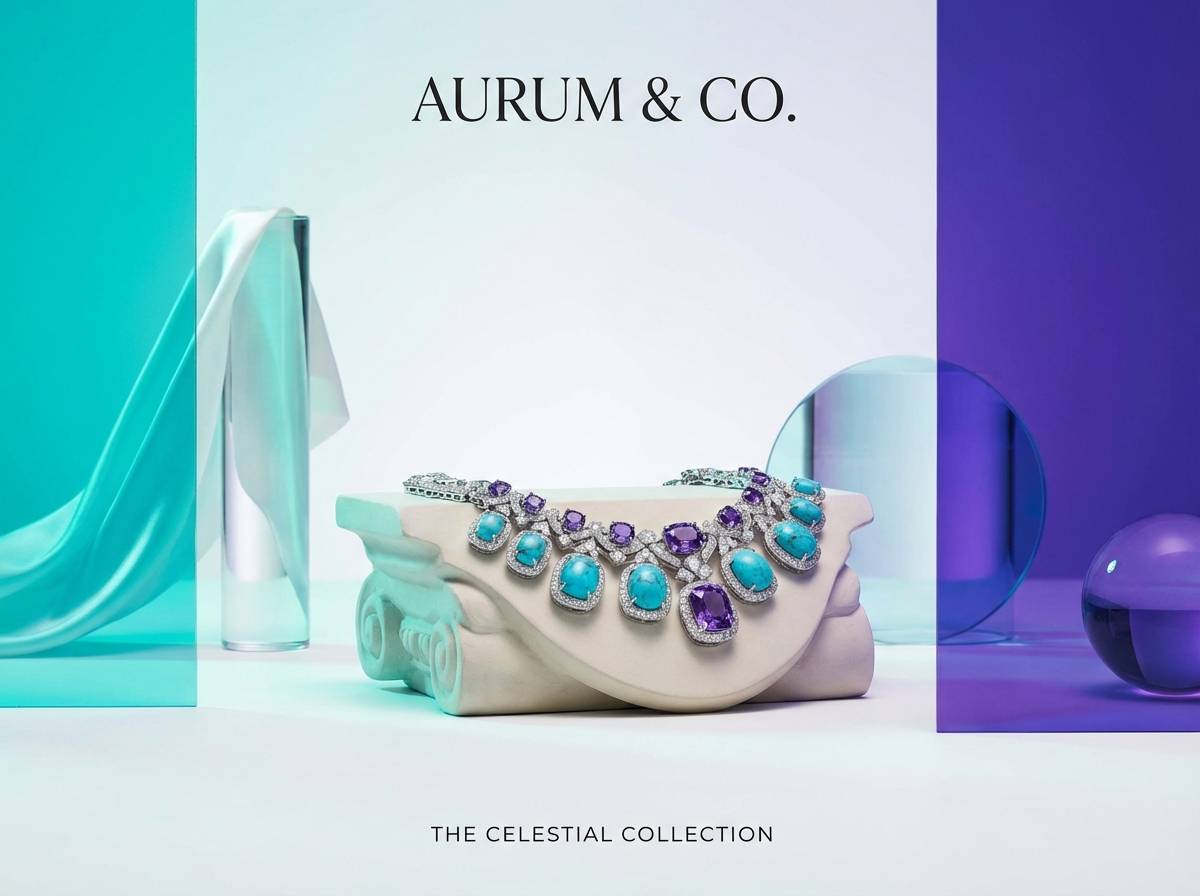
A luxe lagoon mood with rich royal purple balanced by polished turquoise and soft lavender highlights. This purple turquoise color palette is strong for premium ads where you want elegance without leaning too traditional. Pair with clean whites and subtle metallics, letting one hero color lead per layout. Usage tip: set the product on a light background and use purple as a shadowy frame for depth.
Image example of royal lagoon luxe generated using media.io
18) Retro Arcade
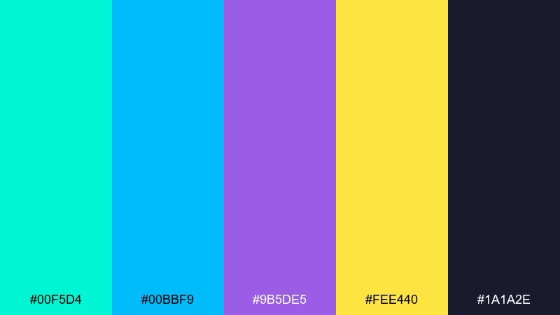
HEX: #00F5D4 #00BBF9 #9B5DE5 #FEE440 #1A1A2E
Mood: retro, fun, nostalgic
Best for: arcade-themed logo and stickers
Retro arcade vibes with bright cyan, playful purple, and a pixel-pop yellow accent. These purple turquoise color combinations feel instantly fun for logos, sticker packs, and merch graphics. Pair with dark navy backgrounds and chunky display type to sell the nostalgia. Usage tip: keep yellow limited to spark points like stars, coins, or outline strokes.
Image example of retro arcade generated using media.io
19) Minimal Ink & Sea
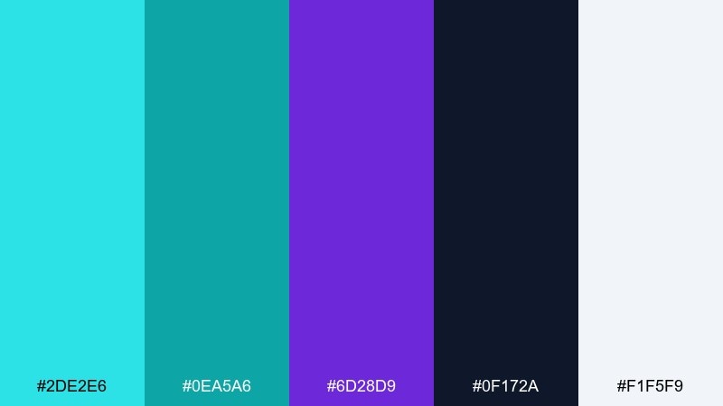
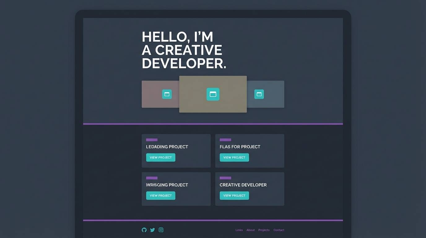
HEX: #2DE2E6 #0EA5A6 #6D28D9 #0F172A #F1F5F9
Mood: clean, sharp, contemporary
Best for: portfolio website UI
Clean ink-and-sea contrast with crisp turquoise on deep slate and a controlled purple accent. It is excellent for portfolios where content should feel modern and easy to scan. Pair with lots of neutral space and consistent spacing to keep the interface calm. Usage tip: use turquoise for interactive elements and keep purple for small emphasis like tags or active states.
Image example of minimal ink & sea generated using media.io
20) Sunset Coral Pop
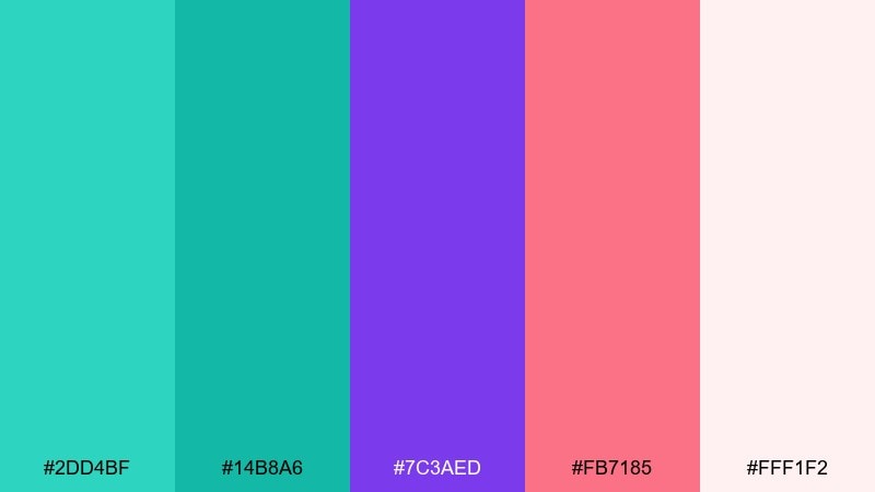
HEX: #2DD4BF #14B8A6 #7C3AED #FB7185 #FFF1F2
Mood: cheerful, bright, social
Best for: product launch Instagram carousel
A sunset pop with coral warmth layered over cool turquoise and confident purple. It is made for social carousels where you want upbeat color and fast readability. Pair with creamy blush backgrounds and bold headings to keep each slide clean. Usage tip: alternate turquoise and purple as section headers to create a rhythm across the carousel.
Image example of sunset coral pop generated using media.io
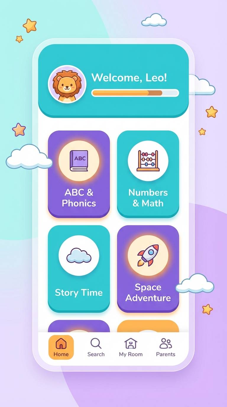
21) Crystal Aquarium
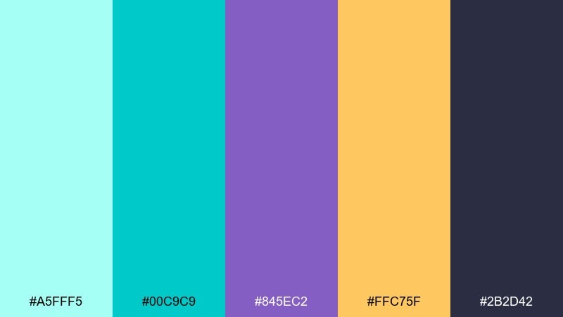
HEX: #A5FFF5 #00C9C9 #845EC2 #FFC75F #2B2D42
Mood: bright, clear, playful luxe
Best for: children education app UI
Crystal-clear aquarium tones with sparkling turquoise and a friendly purple anchor. It is great for kids education UI because it feels lively while staying structured. Pair with simple icons and rounded shapes to keep it approachable. Usage tip: reserve the warm accent for rewards and progress states so it feels special.
Image example of crystal aquarium generated using media.io
22) Deep Sea Velvet
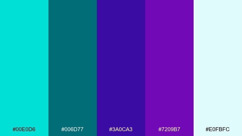
HEX: #00E0D6 #006D77 #3A0CA3 #7209B7 #E0FBFC
Mood: dramatic, elegant, immersive
Best for: theater ticket design
Deep-sea velvet drama with saturated purples and a luminous turquoise highlight. It works for theater tickets and cultural event materials where you want richness and a sense of occasion. Pair with pale aqua text on darker areas and keep decorative elements minimal. Usage tip: add a subtle pattern in the teal range to create depth without distracting from the details.
Image example of deep sea velvet generated using media.io
23) Prism Candy
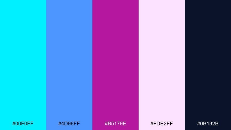
HEX: #00F0FF #4D96FF #B5179E #FDE2FF #0B132B
Mood: sweet, glossy, playful modern
Best for: Y2K-inspired merch design
Glossy prism candy energy with bright aqua, electric blue, and candy purple on a dark base. It is perfect for Y2K merch graphics, sticker drops, and playful streetwear. Pair with high-shine effects sparingly so the design stays readable. Usage tip: keep the darkest navy as the main canvas and let the pastels float as highlights.
Image example of prism candy generated using media.io

24) Museum Modern
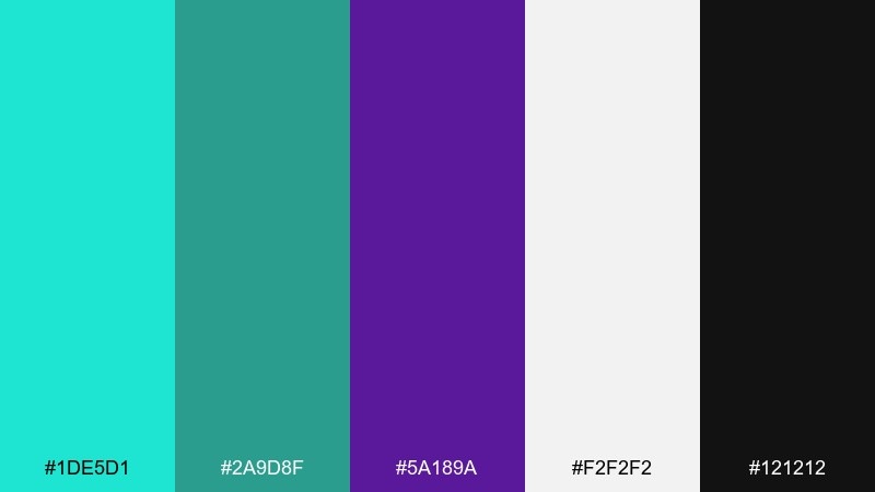
HEX: #1DE5D1 #2A9D8F #5A189A #F2F2F2 #121212
Mood: editorial, curated, gallery-cool
Best for: magazine spread layout
Gallery-cool contrast with a crisp turquoise accent and a deep purple focal tone. It is ideal for editorial layouts that need a curated, modern edge with strong hierarchy. Pair with black and soft gray, letting color appear in pull quotes and small graphic rules. Usage tip: use turquoise as a consistent navigational cue, like page numbers or section markers.
Image example of museum modern generated using media.io
25) Opal Skyline
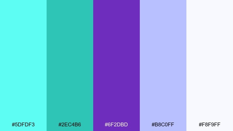
HEX: #5DFDF3 #2EC4B6 #6F2DBD #B8C0FF #F8F9FF
Mood: fresh, airy, optimistic
Best for: conference badge and lanyard design
An opal-skyline feel with bright, airy turquoise and soft purple that reads clean from a distance. This purple turquoise color palette works nicely for conference badges where clarity and friendliness matter. Pair with white backgrounds and a bold, simple icon system for fast scanning. Usage tip: keep attendee names in dark text and use color mainly for roles, tracks, or ribbon accents.
Image example of opal skyline generated using media.io
What Colors Go Well with Purple Turquoise?
Neutrals make purple and turquoise easier to use: crisp white, warm off-white, light gray, charcoal, and deep navy help control contrast and keep layouts readable. In UI, these neutrals also create clear surfaces for cards, charts, and typography.
Warm accents add balance when the scheme feels too cool. Coral, peach, gold, and sand tones work especially well for travel, lifestyle, and event designs—use them sparingly as highlight colors so purple and turquoise stay the lead.
If you want a more natural direction, try muted greens (sage, pine) and ink tones. They keep the palette grounded while still letting turquoise feel “watery” and purple feel “floral” or “cosmic,” depending on your styling.
How to Use a Purple Turquoise Color Palette in Real Designs
Start by choosing a role for each color: one primary (often turquoise for CTAs), one secondary (purple for emphasis), one dark anchor (navy/charcoal), and one light background. This prevents the design from looking neon-heavy or visually noisy.
For branding and print, keep turquoise for freshness and “attention moments,” while purple builds personality in headings, badges, and supporting shapes. In interiors, soften both with matte finishes, light textiles, and natural wood so the contrast feels calming instead of loud.
When using gradients, blend turquoise into purple across large areas (hero banners, posters) and keep text on solid, high-contrast blocks. That way you get the modern look without sacrificing legibility.
Create Purple Turquoise Palette Visuals with AI
If you already have HEX codes, the fastest way to test the vibe is to generate a few mock visuals: a landing page hero, product packaging, poster, or social template. Seeing the colors on real layouts instantly reveals whether your contrast and saturation are working.
Reuse the prompts under each palette to produce consistent concepts, then iterate by changing only one variable at a time (style, aspect ratio, or subject). This keeps your results aligned with your purple turquoise scheme.
Purple Turquoise Color Palette FAQs
-
What does a purple turquoise color palette communicate?
It typically communicates creativity and imagination (purple) paired with freshness and clarity (turquoise). Together, they can feel futuristic, premium, playful, or calming depending on how dark or pastel your supporting colors are. -
Are purple and turquoise complementary colors?
Not strictly on the traditional color wheel, but they create a strong, pleasing contrast because they sit far apart in temperature and perceived energy. Adding a dark anchor (navy/charcoal) makes the pairing feel even more intentional and readable. -
How do I keep teal-purple pairing from looking too neon?
Lower saturation on one side (often the purple), add soft off-whites, and use a deep neutral base. Keep bright turquoise for small CTAs or highlights rather than large backgrounds. -
Which background color is best for purple and turquoise designs?
For bold looks, use near-black, deep navy, or charcoal to make turquoise and purple glow. For soft looks, use warm white or very light lavender-gray to keep the palette airy. -
What fonts work well with purple turquoise palettes in UI?
Clean sans-serif families with strong legibility (especially at small sizes) work best. Use weight and spacing for hierarchy, and let color be an accent rather than the
Next: Pine Green Color Palette


