

Teal, green, and blue sit close together on the color wheel, so they blend naturally while still giving you enough contrast for clear hierarchy. The result is a versatile look that can feel coastal and light, or deep and premium.
Below are 20 teal green blue color palette ideas with HEX codes, plus practical tips for branding, UI, and print—along with AI-generated example prompts you can recreate in seconds.
In this article
- Why Teal Green Blue Palettes Work So Well
-
- lagoon breeze
- deep sea modern
- coastal mint
- nordic fjord
- tropical surf
- glacier bay
- peacock accent
- rainy harbor
- oceanic minimal
- spa retreat
- mountain lake
- retro pool party
- emerald tide
- blue steel office
- botanical conservatory
- midnight aquarium
- artisan ceramic
- clean tech dashboard
- wedding eucalyptus
- kids science poster
- What Colors Go Well with Teal Green Blue?
- How to Use a Teal Green Blue Color Palette in Real Designs
- Create Teal Green Blue Palette Visuals with AI
Why Teal Green Blue Palettes Work So Well
Teal green blue palettes feel “safe” and modern because they borrow the trust and clarity of blue, then add the freshness of green. That mix makes them a strong default for brands that want to look clean, calm, and competent.
They’re also flexible across mediums: in UI, deeper teals can anchor navigation and typography, while lighter aquas create breathable backgrounds. In print, the same hues can read crisp and premium—especially when balanced with warm off-whites or paper-like neutrals.
Most importantly, teal-to-blue gradients and tints create natural depth without needing extra colors. When you keep one bright accent limited to key actions, the design stays polished rather than busy.
20+ Teal Green Blue Color Palette Ideas (with HEX Codes)
1) Lagoon Breeze
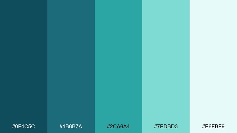
HEX: #0F4C5C #1B6B7A #2CA6A4 #7EDBD3 #E6FBF9
Mood: fresh, coastal, calming
Best for: travel branding, wellness websites, beach resort brochures
Fresh lagoon air and sunlit water come to mind, with cool depth balanced by airy highlights. Use it for travel brands, spa promos, or landing pages that need instant calm. Pair with warm sand neutrals or a small coral accent for contrast. Tip: keep the lightest tint as your main background to make the deeper teal and blue feel crisp.
Image example of lagoon breeze generated using media.io
Media.io is an online AI studio for creating and editing video, image, and audio in your browser.

2) Deep Sea Modern
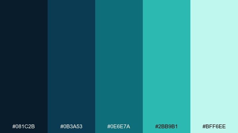
HEX: #081C2B #0B3A53 #0E6E7A #2BB9B1 #BFF6EE
Mood: moody, sleek, premium
Best for: tech branding, fintech dashboards, premium product sites
Moody deep-water tones feel cinematic and modern, like a night dive with glints of light. The dark base supports premium interfaces, while the bright aqua lifts key UI states. Pair with silver gray and restrained gradients to keep it polished. Tip: reserve the brightest mint for only one action color to avoid a neon look.
Image example of deep sea modern generated using media.io
3) Coastal Mint
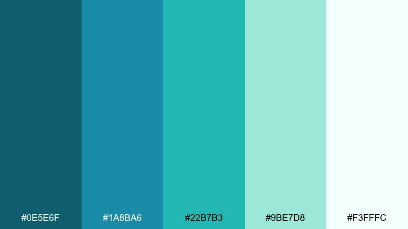
HEX: #0E5E6F #1A8BA6 #22B7B3 #9BE7D8 #F3FFFC
Mood: bright, breezy, optimistic
Best for: summer campaigns, skincare packaging, social templates
Bright surf and minty seafoam give it an upbeat, clean-energy feel. This teal green blue color palette works especially well for skincare, seasonal launches, and cheerful social creatives. Pair with soft peach, oat, or white to keep the vibe light and friendly. Tip: print designs look best when the mid-teal is used for headlines instead of the darkest shade.
Image example of coastal mint generated using media.io
4) Nordic Fjord
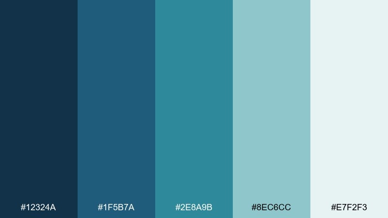
HEX: #12324A #1F5B7A #2E8A9B #8EC6CC #E7F2F3
Mood: clean, airy, understated
Best for: editorial layouts, architecture portfolios, corporate decks
Cool fjord blues and softened teal mists feel quiet, spacious, and refined. Use it in editorial pages or portfolios where images need room to breathe. Pair with off-white paper tones and charcoal text for a Scandinavian finish. Tip: keep the light gray-blue as your grid and rule-line color for a subtle, pro layout.
Image example of nordic fjord generated using media.io
5) Tropical Surf
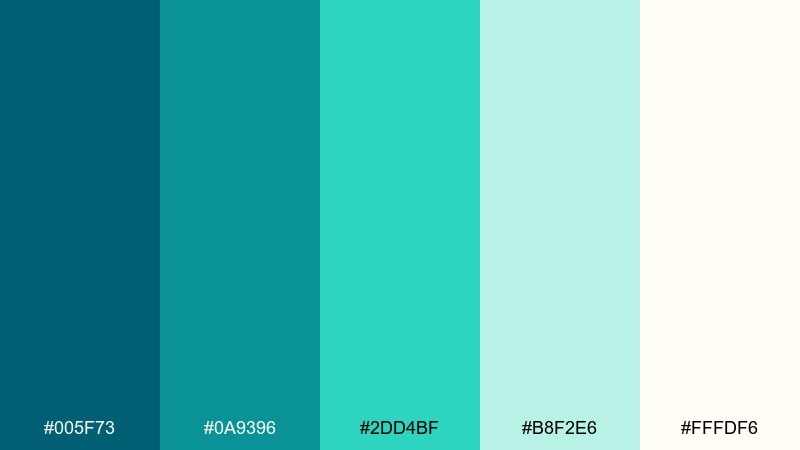
HEX: #005F73 #0A9396 #2DD4BF #B8F2E6 #FFFDF6
Mood: playful, sunny, energetic
Best for: event posters, resort promos, summer email headers
Sunny surf energy shows up in the punchy teal and bright, foamy highlights. It is ideal for event graphics, resort promotions, and upbeat email headers. Pair with a warm yellow or tangerine accent to amplify the tropical feel. Tip: use big color blocks and simple type so the saturated teal does not fight your message.
Image example of tropical surf generated using media.io
6) Glacier Bay
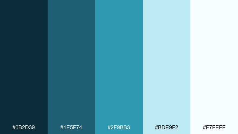
HEX: #0B2D39 #1E5F74 #2F9BB3 #BDE9F2 #F7FEFF
Mood: crisp, icy, tranquil
Best for: healthcare sites, sustainability reports, data storytelling
Crisp glacial air and pale ice water make these tones feel reassuring and clear. They suit healthcare, sustainability reporting, and data stories where trust matters. Pair with slate gray and generous white space for a clean, credible read. Tip: use the pale blue as chart backgrounds to reduce visual noise.
Image example of glacier bay generated using media.io
7) Peacock Accent
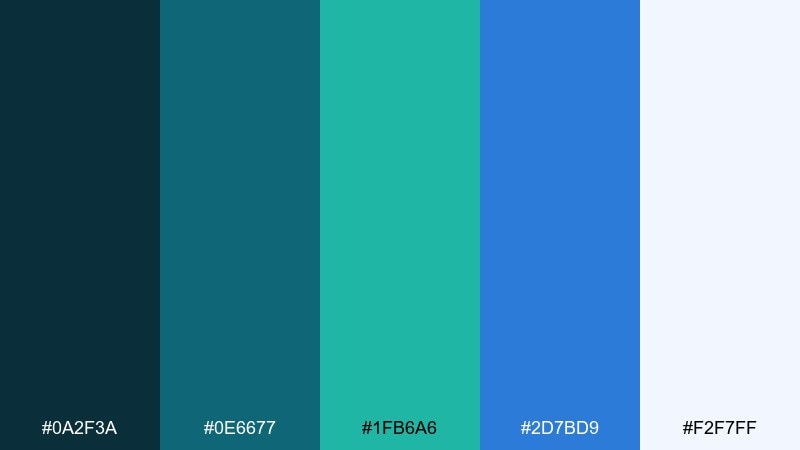
HEX: #0A2F3A #0E6677 #1FB6A6 #2D7BD9 #F2F7FF
Mood: bold, creative, high-contrast
Best for: creative studios, app splash screens, bold brand systems
Bold peacock shimmer and jewel-like contrast give it a confident, creative edge. These teal green blue color combinations shine when you need a standout accent without going neon. Pair with soft white and a touch of ink black for sharp hierarchy. Tip: use the bright blue only for key highlights like badges, links, or one primary button.
Image example of peacock accent generated using media.io
8) Rainy Harbor
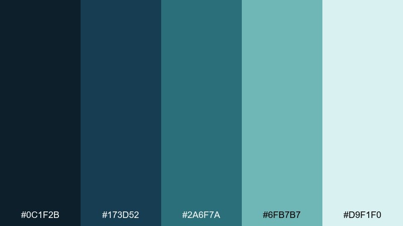
HEX: #0C1F2B #173D52 #2A6F7A #6FB7B7 #D9F1F0
Mood: grounded, contemplative, calm
Best for: book covers, podcasts, documentary thumbnails
Rain over a quiet harbor feels steady and contemplative, with softened teal light against deep blues. It is a strong fit for book covers, podcasts, and documentary-style visuals. Pair with warm parchment or muted brass to keep it human and not too cold. Tip: add subtle texture or grain to the mid-tones to prevent flatness on large areas.
Image example of rainy harbor generated using media.io
9) Oceanic Minimal
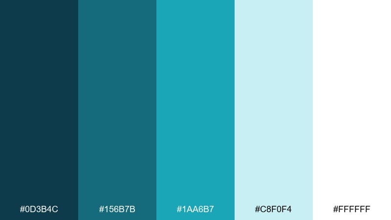
HEX: #0D3B4C #156B7B #1AA6B7 #C8F0F4 #FFFFFF
Mood: minimal, clean, refreshing
Best for: SaaS landing pages, UI kits, minimalist branding
Clean ocean tones with a bright white base feel modern, open, and easy to scan. Use it for SaaS landing pages and UI kits where clarity beats decoration. Pair with cool grays and simple line icons to keep the look lightweight. Tip: keep your borders and dividers in the palest blue so sections separate without harsh contrast.
Image example of oceanic minimal generated using media.io
10) Spa Retreat

HEX: #0E3A43 #1E6F74 #4FB6AE #BFECE6 #F6FFFD
Mood: soothing, clean, gentle
Best for: wellness branding, massage menus, meditation apps
Soothing steam and cool water cues make this mix feel gentle and restorative. It works beautifully for wellness brands, service menus, and meditation flows. Pair with warm beige, light wood tones, and soft serif type for a spa-like calm. Tip: use the palest tint for large panels and reserve the darkest shade for text and icons.
Image example of spa retreat generated using media.io
11) Mountain Lake
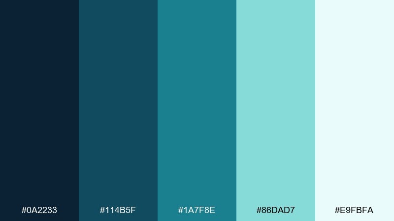
HEX: #0A2233 #114B5F #1A7F8E #86DAD7 #E9FBFA
Mood: adventurous, fresh, outdoorsy
Best for: outdoor brands, hiking apps, campground signage
A clear mountain lake look brings outdoorsy freshness with enough depth to feel rugged. Use it for adventure brands, trail apps, and signage that needs high readability. Pair with stone gray and a small pine-green touch for a natural extension. Tip: when printing, slightly thicken type in the mid-teal to avoid fading on matte stock.
Image example of mountain lake generated using media.io
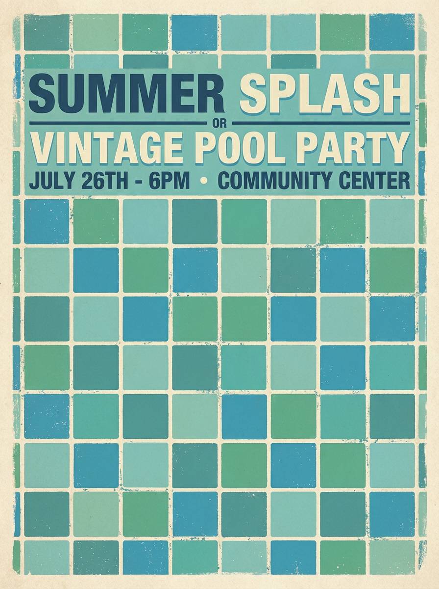
12) Retro Pool Party
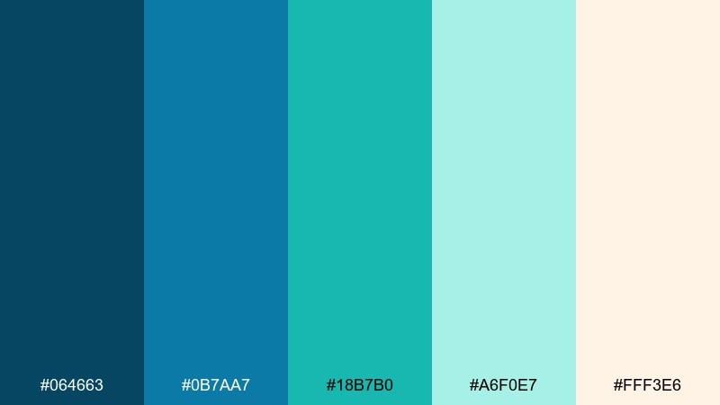
HEX: #064663 #0B7AA7 #18B7B0 #A6F0E7 #FFF3E6
Mood: fun, nostalgic, vibrant
Best for: summer flyers, retro social posts, beverage ads
Retro pool tiles and sparkling water give it a playful, nostalgic pop. This teal green blue color palette is perfect for summer flyers, punchy social posts, and bright beverage ads. Pair with creamy off-white and a small watermelon-pink accent for a vintage twist. Tip: use chunky type and simple shapes so the vibe stays bold rather than busy.
Image example of retro pool party generated using media.io
13) Emerald Tide
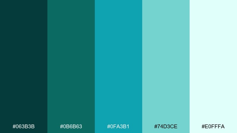
HEX: #063B3B #0B6B63 #0FA3B1 #74D3CE #E0FFFA
Mood: lush, confident, nature-forward
Best for: eco brands, organic products, sustainability packaging
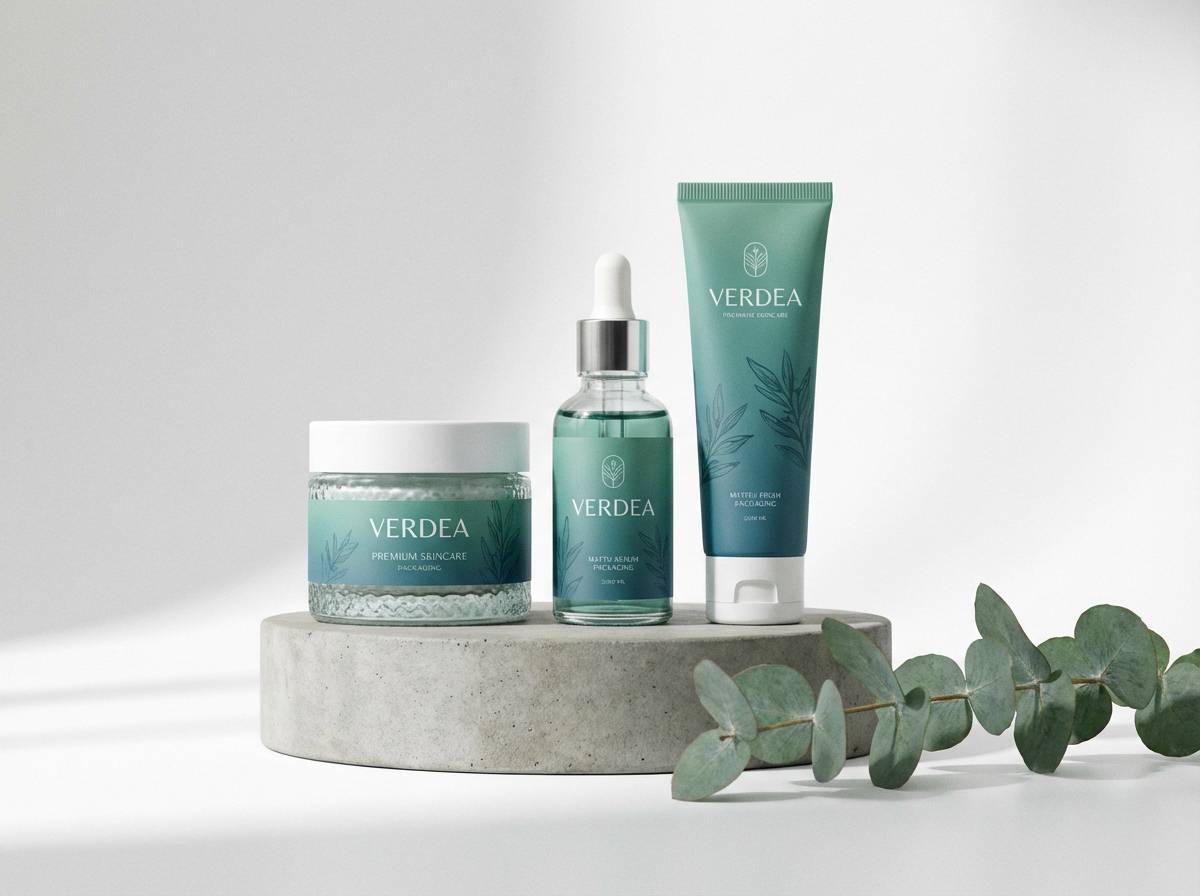
Lush emerald undertones and tidal blues feel alive, natural, and confident. Use it for eco-focused brands and organic product packaging that needs to signal freshness. Pair with kraft brown, soft cream, and minimal black for a grounded look. Tip: if you add photography, choose images with real greens so the palette feels intentional, not mismatched.
Image example of emerald tide generated using media.io
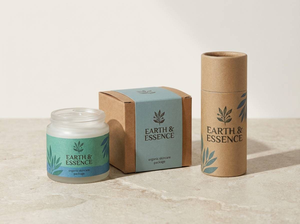
14) Blue Steel Office
HEX: #0B1F2A #1B3B5A #2B6E8A #59B3C1 #E7F6FA
Mood: professional, structured, modern
Best for: business reports, B2B websites, pitch decks
Blue steel structure with a clean teal lift feels professional and quietly modern. These teal green blue color combinations fit B2B sites and reports where credibility is the goal. Pair with graphite gray and a restrained accent color like amber for emphasis. Tip: keep gradients subtle and use flat fills for charts to maintain a corporate tone.
Image example of blue steel office generated using media.io
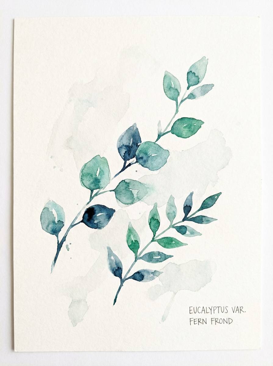
15) Botanical Conservatory
HEX: #0C3C4C #145E63 #1F9D8A #7AD9C9 #E9FFF8
Mood: fresh, botanical, uplifting
Best for: spring illustrations, garden event invites, plant shop branding
Fresh greenhouse light and dew on leaves make these tones feel uplifting and botanical. They are great for spring visuals, garden events, and plant-forward branding. Pair with soft clay, cream, or muted terracotta to warm up the cool side. Tip: watercolor textures look best when you let the light mint breathe as untouched paper.
Image example of botanical conservatory generated using media.io
16) Midnight Aquarium
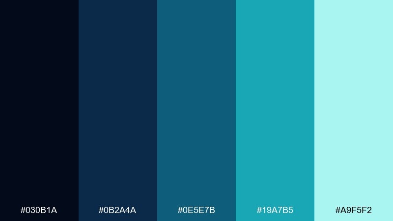
HEX: #030B1A #0B2A4A #0E5E7B #19A7B5 #A9F5F2
Mood: dramatic, luminous, immersive
Best for: music visuals, cinematic posters, dark-mode apps
Midnight glass and luminous water highlights create a dramatic, immersive mood. Use it for music visuals, cinematic posters, or dark-mode experiences with a glow effect. Pair with minimal white text and one soft gradient to suggest depth without clutter. Tip: add subtle light beams or vignette to keep the darkest shades from feeling flat.
Image example of midnight aquarium generated using media.io
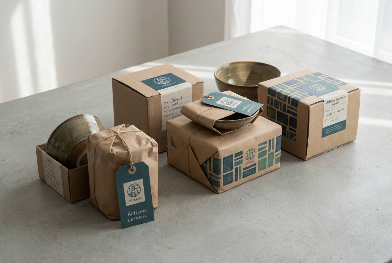
17) Artisan Ceramic
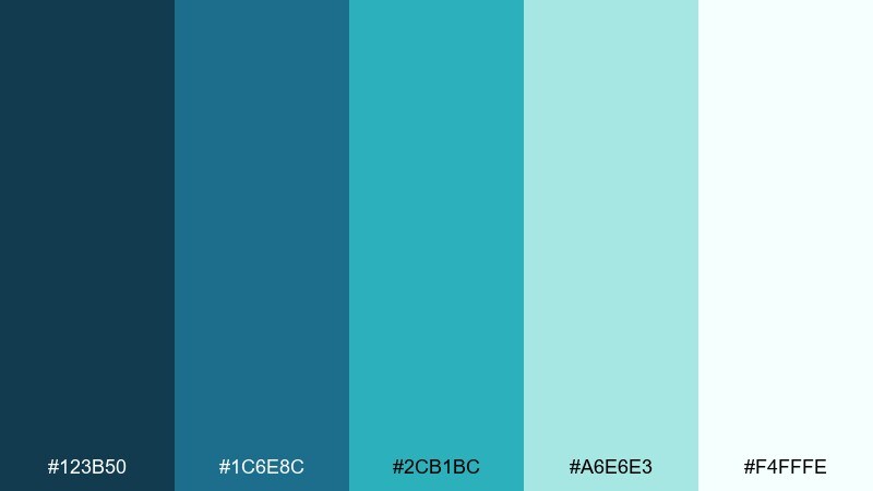
HEX: #123B50 #1C6E8C #2CB1BC #A6E6E3 #F4FFFE
Mood: handmade, airy, tasteful
Best for: ceramics branding, Etsy banners, lifestyle lookbooks
Hand-glazed ceramic blues and watery teals feel handmade yet polished. It is a natural match for artisan branding, small shops, and lifestyle lookbooks. Pair with warm ivory and a touch of ink for a craft-forward, premium feel. Tip: use the mid-teal on patterns like dots or waves, then keep the rest of the layout quiet.
Image example of artisan ceramic generated using media.io
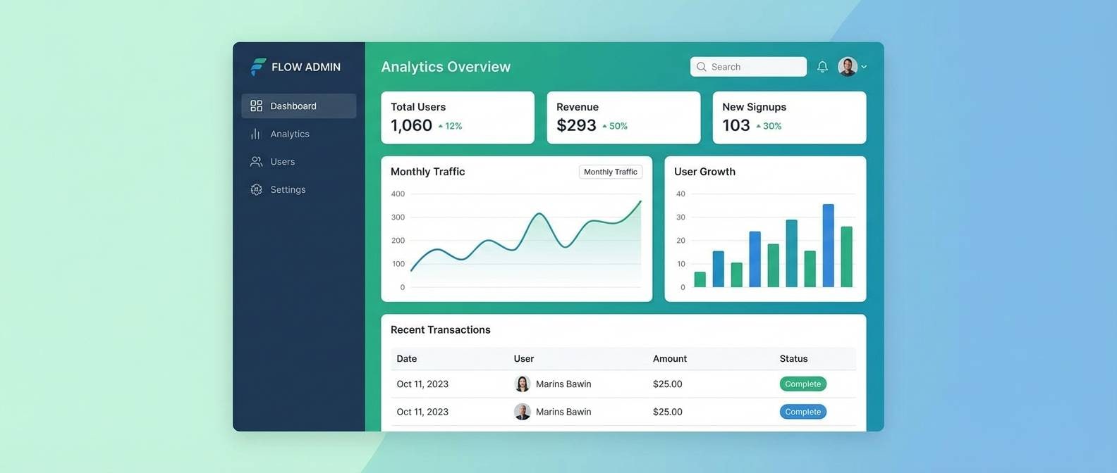
18) Clean Tech Dashboard
HEX: #071A2B #0B3D5C #0E8AA6 #33C7C3 #E3FFFB
Mood: sharp, efficient, futuristic
Best for: analytics UI, admin panels, product onboarding
Sharp tech depth with bright aqua signals feels efficient and futuristic. As a teal green blue color scheme, it is ideal for analytics dashboards where hierarchy must be instant. Pair with neutral grays and clear spacing to keep data readable. Tip: limit the brightest accent to key metrics and active states so the interface stays calm.
Image example of clean tech dashboard generated using media.io
19) Wedding Eucalyptus
HEX: #0F3D46 #1F6F78 #4DB6AC #BFEAE2 #FFF8F2
Mood: romantic, soft, elegant
Best for: wedding invitations, venue signage, floral branding
Soft eucalyptus greens and watery blues feel romantic and airy, like a coastal ceremony. It works well for invitations, menus, and signage where elegance should stay understated. Pair with warm ivory paper tones and subtle gold foil accents for a premium finish. Tip: keep body text in the deepest shade to avoid readability issues on textured stock.
Image example of wedding eucalyptus generated using media.io
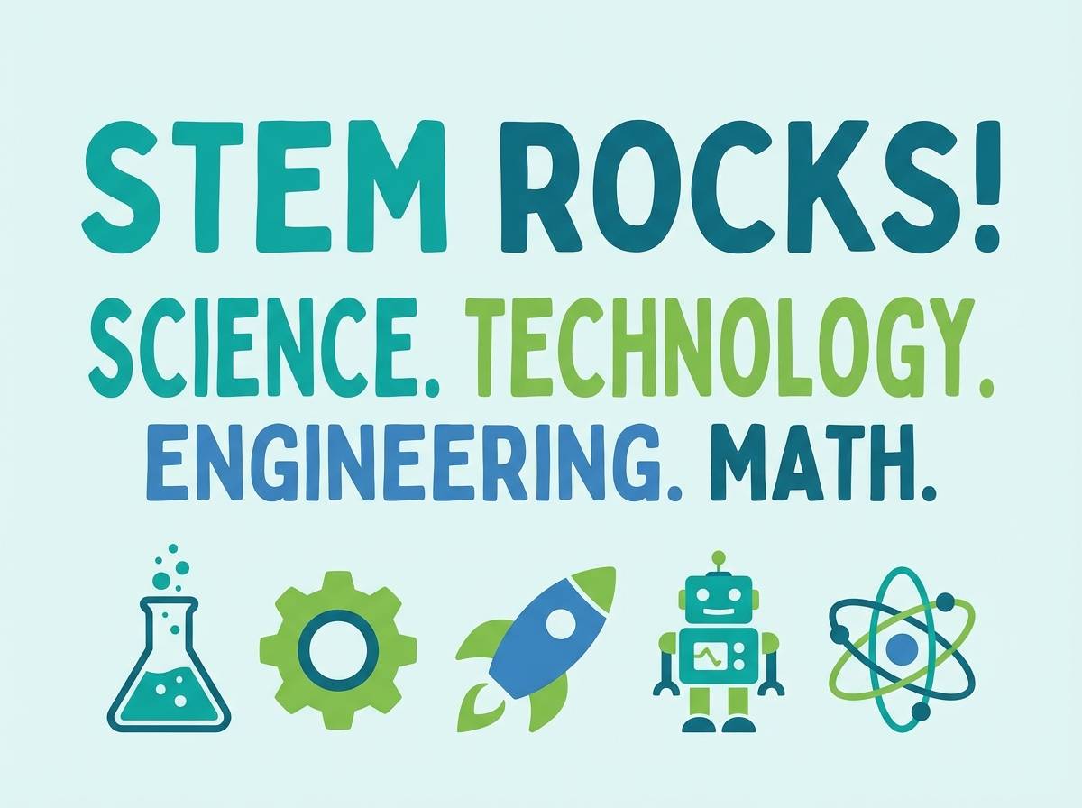
20) Kids Science Poster
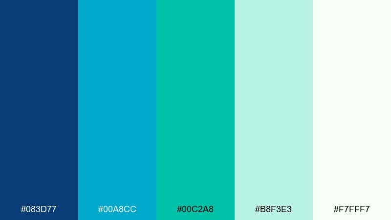
HEX: #083D77 #00A8CC #00C2A8 #B8F3E3 #F7FFF7
Mood: bright, curious, friendly
Best for: classroom posters, kids apps, STEM worksheets
Bright, curious tones feel like a science museum tank lit up for kids. These teal green blue color combinations are great for classroom posters and playful STEM worksheets. Pair with sunny yellow or tangerine to add friendly contrast for icons and callouts. Tip: use thick outlines and simple shapes so the colors stay readable from a distance.
Image example of kids science poster generated using media.io
What Colors Go Well with Teal Green Blue?
Warm neutrals are the easiest match: ivory, sand, oat, and kraft brown soften teal green blue and keep the overall look human. For text, charcoal or near-black usually reads cleaner than pure black on cool palettes.
If you need contrast, choose one warm accent and keep it limited—coral, tangerine, amber, or soft blush all pop against teal without clashing. For a more premium direction, pair these hues with silver gray, slate, and restrained gradients.
When you want a nature-forward feel, add subtle supporting greens (sage, eucalyptus, pine) but avoid adding too many similar cool hues. One extra supporting color is usually enough to maintain clarity.
How to Use a Teal Green Blue Color Palette in Real Designs
Start with roles, not just colors: pick one darkest shade for text and navigation, one mid-tone for panels/cards, one bright tone for highlights, and one very light tint for backgrounds. This keeps your UI or layout consistent even if you swap palette options later.
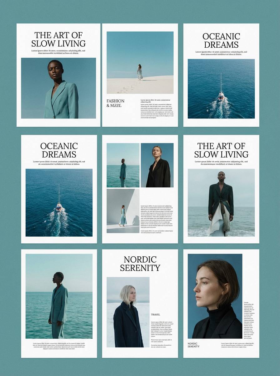
In branding, teal and blue often signal trust and wellness—great for healthcare, travel, and SaaS. To avoid a “generic tech” look, add a warm paper neutral, a tactile texture (grain, watercolor, subtle noise), or a distinctive typography pairing.
For print, test mid-teals on your chosen stock: matte paper can dull saturated hues. If readability is critical, use the deepest shade for body text and reserve bright aquas for callouts, rules, and icons.
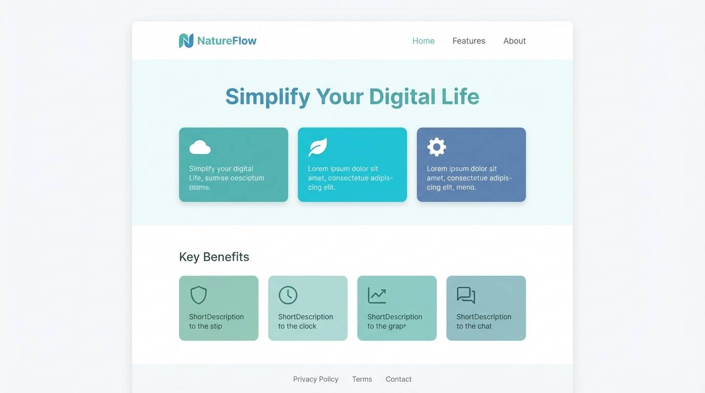
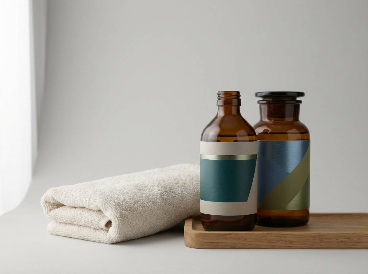
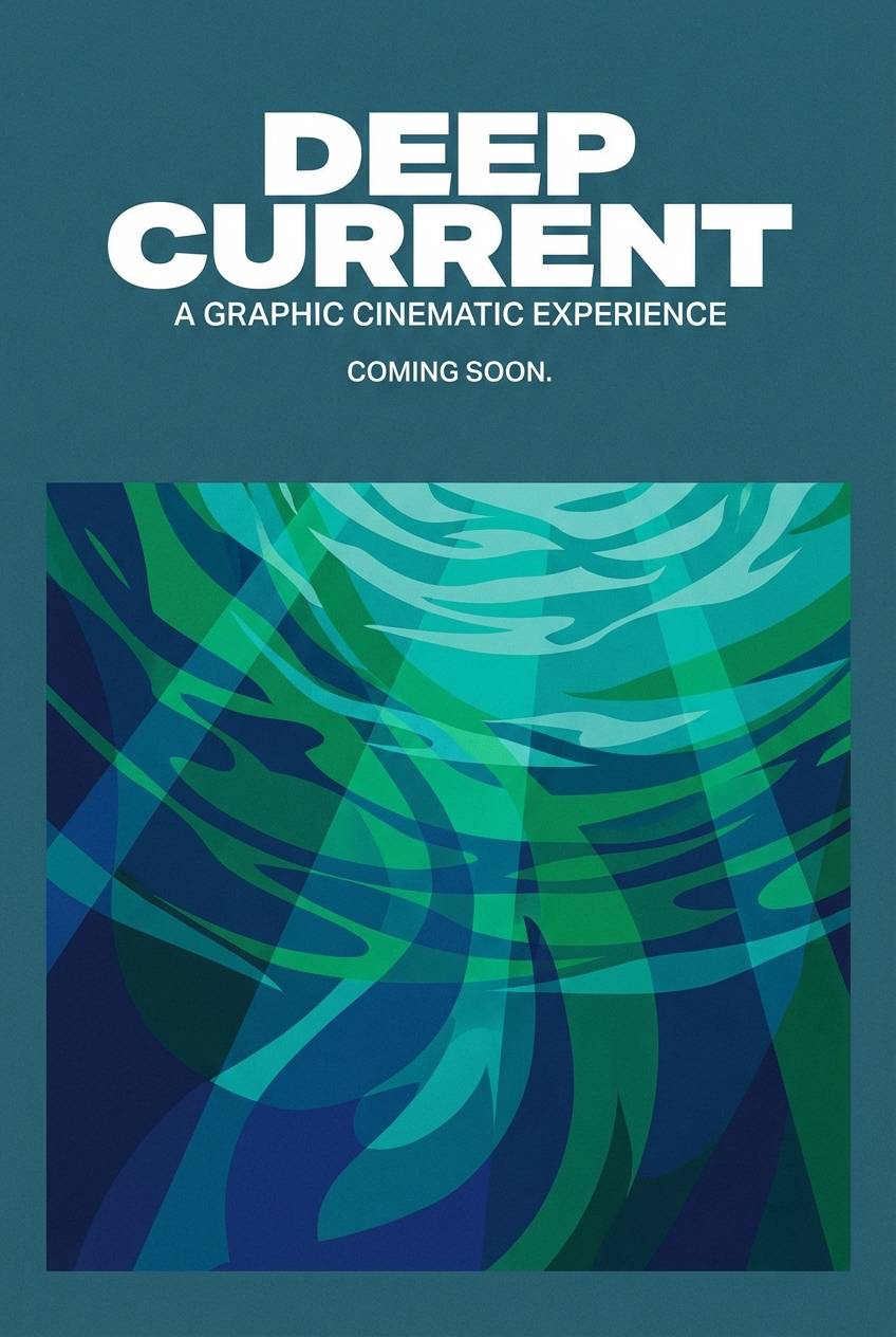
Create Teal Green Blue Palette Visuals with AI
If you want fast concept images (posters, UI mockups, packaging, or social templates), AI generation is a great way to explore how teal green blue color combinations behave in real compositions. You can iterate on lighting, texture, and layout without rebuilding designs from scratch.
Try using one palette’s HEX set as a constraint, then specify style cues like “minimal,” “editorial grid,” or “dark mode dashboard.” Small prompt tweaks—like adding “lots of negative space” or “subtle grain”—often make the result feel more professional.
When you find a direction you like, generate a few variations for different formats (16:9, 1:1, 9:16) so your color system stays consistent across web, social, and print assets.
Teal Green Blue Color Palette FAQs
-
What does a teal green blue color palette communicate in branding?
It commonly signals trust, calm, cleanliness, and modernity. Blue adds reliability, green adds freshness, and teal bridges them with a contemporary “wellness/tech” feel. -
How do I pick a CTA button color in a teal-and-blue UI?
Use one brightest shade as the primary action color (often the aqua/bright teal), and keep other interactive elements slightly muted. This prevents the interface from looking neon and preserves a clear visual hierarchy. -
What neutrals pair best with teal green blue palettes?
Warm whites (ivory), sand, oat, and light taupe balance cool tones and make layouts feel more inviting. For text, charcoal and slate gray usually look smoother than pure black. -
Can teal green blue palettes work for print designs?
Yes, but test on your paper stock. Matte stock can reduce saturation, so consider using deeper shades for headlines and body text, and lighter tints for backgrounds and rules. -
How can I make teal green blue feel less “generic tech”?
Add a warm accent (coral, amber, blush) sparingly, introduce texture (grain, watercolor wash), and choose distinctive typography. These choices add personality while keeping the palette’s calm clarity. -
What’s the safest background color choice in a teal green blue scheme?
Use the lightest tint (near-white mint or icy blue) as the main background, then layer mid-tones for cards/sections. This keeps contrast strong and reduces eye strain. -
How do I generate matching palette visuals with AI?
Choose a palette, describe the design type (UI dashboard, poster, packaging), and include style cues (minimal, editorial grid, dark mode) plus the aspect ratio. Generate a few variants and keep the brightest accent reserved for focal points.


