

Blue, green, and pink is a surprisingly versatile color trio: it can read coastal and calming, crisp and modern, or bold and nightlife-ready depending on saturation and contrast.
Below are 20 ready-to-use blue green pink color palettes with HEX codes, plus practical guidance for UI, branding, posters, and packaging.
In this article
- Why Blue Green Pink Palettes Work So Well
-
- lagoon blush
- minty bubblegum
- coral reef pop
- seafoam studio
- candy coastline
- neon garden party
- pastel aquarium
- tropical sorbet
- modern mermaid
- clean clinic fresh
- retro poolside
- sakura harbor
- pebble and petal
- oceanic candy
- art school mix
- soft spa day
- playroom splash
- streetwear punch
- gallery calm
- sunset tide
- What Colors Go Well with Blue Green Pink?
- How to Use a Blue Green Pink Color Palette in Real Designs
- Create Blue Green Pink Palette Visuals with AI
Why Blue Green Pink Palettes Work So Well
Blue and green sit close on the color wheel, so they naturally feel harmonious and “stable” in layouts. Pink then acts as the energetic contrast that draws attention without needing harsh neutrals or heavy shadows.
This trio also maps well to common UI and brand roles: blue for trust and structure, green/teal for positive states and freshness, and pink for highlights like badges, secondary CTAs, and micro-interactions.
Because you can push it pastel, mid-tone, or neon, a blue green pink palette adapts across industries—from wellness and skincare to SaaS, events, and streetwear.
20+ Blue Green Pink Color Palette Ideas (with HEX Codes)
1) Lagoon Blush
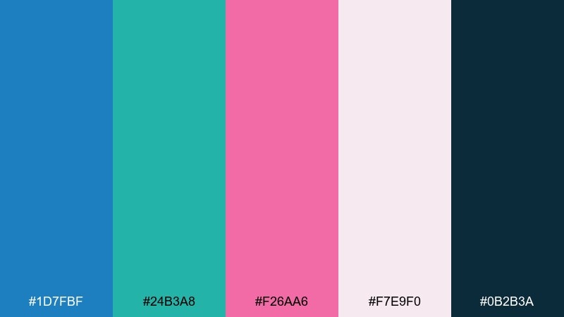
HEX: #1d7fbf #24b3a8 #f26aa6 #f7e9f0 #0b2b3a
Mood: fresh, coastal, uplifting
Best for: beauty branding and social templates
Fresh coastal energy comes through like clear water and a rosy sunset. Use the deep navy as your type color, then let teal and pink carry buttons, badges, and highlights. It works beautifully on clean layouts with plenty of white space and soft gradients. Tip: keep pink for small accents so the teal stays crisp and modern.
Image example of lagoon blush generated using media.io
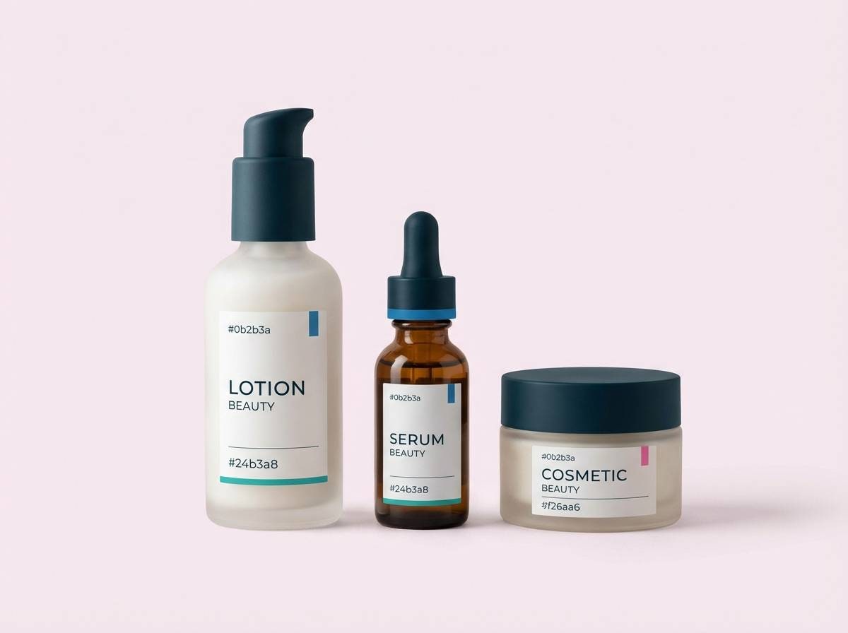
Media.io is an online AI studio for creating and editing video, image, and audio in your browser.

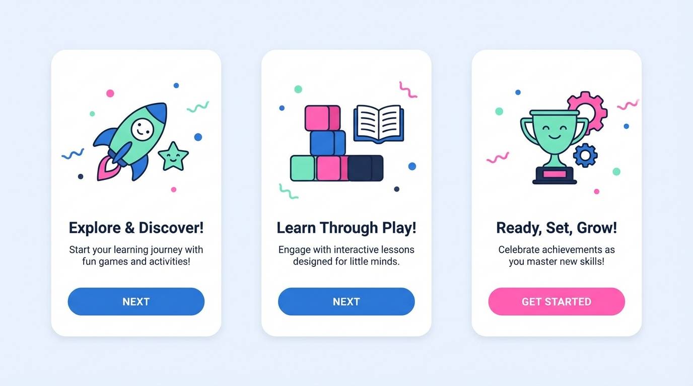
2) Minty Bubblegum
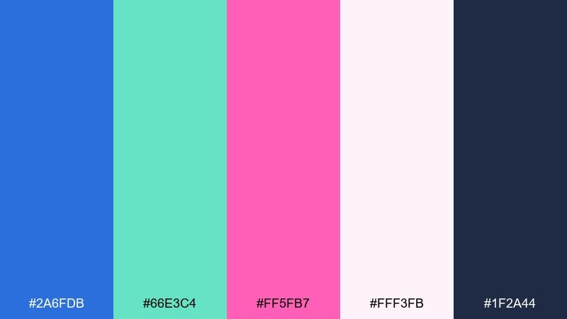
HEX: #2a6fdb #66e3c4 #ff5fb7 #fff3fb #1f2a44
Mood: playful, glossy, upbeat
Best for: kids app UI and onboarding screens
Playful and glossy like candy wrappers and summer stickers. Build the UI around the airy near-white background, then use the bright blue for primary actions and mint for success states. Pink shines for micro-interactions such as toggles, hearts, and progress markers. Tip: keep text in the inky slate so the interface stays readable on pastel blocks.
Image example of minty bubblegum generated using media.io
3) Coral Reef Pop
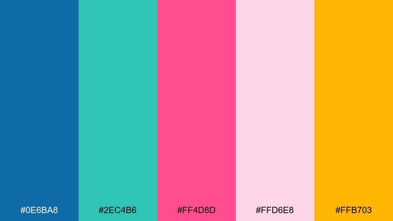
HEX: #0e6ba8 #2ec4b6 #ff4d8d #ffd6e8 #ffb703
Mood: bright, tropical, energetic
Best for: event posters and pop-up promos
Bright tropical pop feels like coral reefs, sunlit water, and loud music. This blue green pink color palette loves big shapes and strong typography, with the golden accent reserved for callouts and dates. Pair it with chunky sans-serifs and simple icons to avoid visual clutter. Tip: print on an off-white stock to keep the neon edge without oversaturation.
Image example of coral reef pop generated using media.io
4) Seafoam Studio
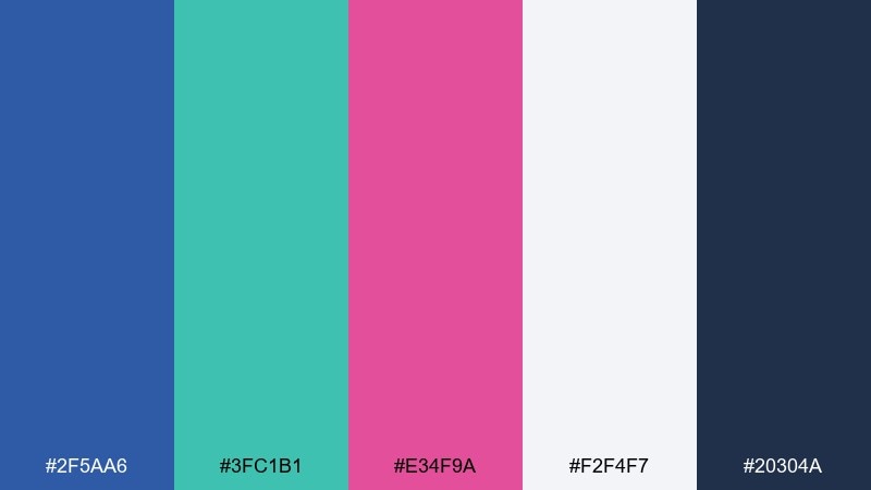
HEX: #2f5aa6 #3fc1b1 #e34f9a #f2f4f7 #20304a
Mood: polished, creative, calm
Best for: portfolio sites and agency decks
Polished and calm, like a design studio with daylight and tidy desks. Use the cool light gray as your main canvas, then lean on teal for section headers and blue for navigation. The magenta brings personality when used as a single standout accent per page. Tip: keep gradients subtle and let clean spacing do most of the work.
Image example of seafoam studio generated using media.io
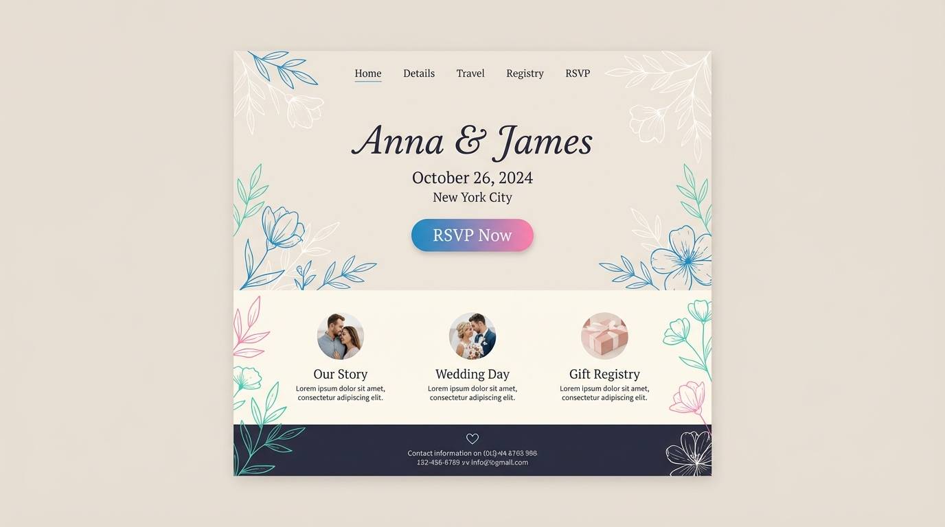
5) Candy Coastline
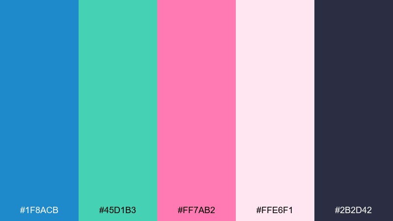
HEX: #1f8acb #45d1b3 #ff7ab2 #ffe6f1 #2b2d42
Mood: light, friendly, approachable
Best for: wedding websites and RSVP pages
Light and friendly, like sea glass beside soft candy pastels. The airy blush background makes room for elegant type, while blue and teal handle structure such as menus and dividers. Pink is perfect for RSVP buttons, monograms, and small floral accents. Tip: add a touch of charcoal for names and dates to keep everything crisp.
Image example of candy coastline generated using media.io
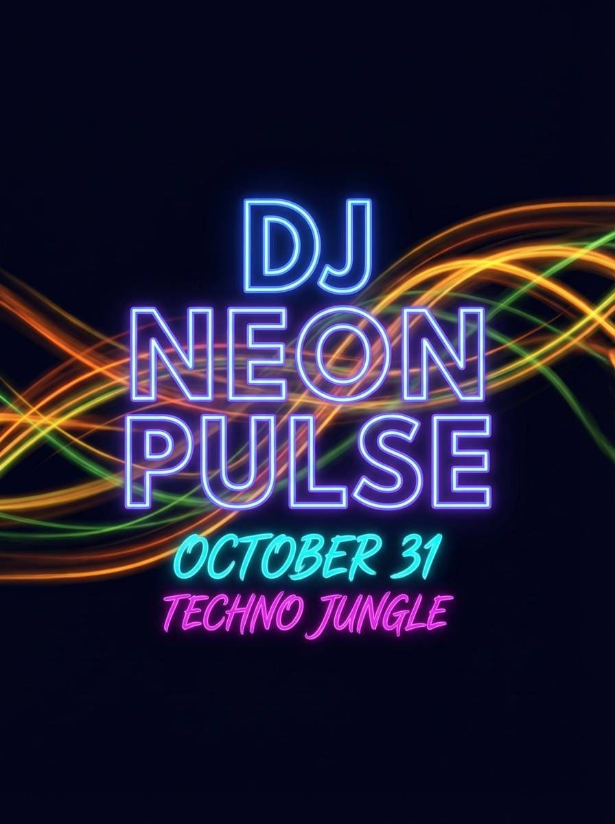
6) Neon Garden Party
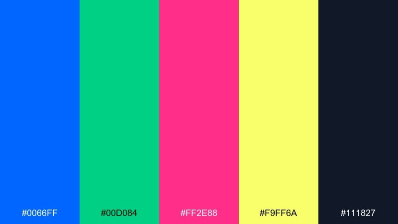
HEX: #0066ff #00d084 #ff2e88 #f9ff6a #111827
Mood: bold, nightlife, high-impact
Best for: street posters and DJ flyers
Bold nightlife energy hits like neon signs against a midnight sky. These blue green pink color combinations are strongest when you keep the background dark and let one neon lead the hierarchy. Use lime as a sparing highlight for times, QR codes, or limited offers. Tip: add a soft glow effect only to headlines, not every element, to avoid visual noise.
Image example of neon garden party generated using media.io
7) Pastel Aquarium
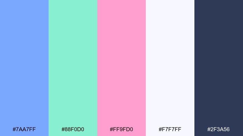
HEX: #7aa7ff #88f0d0 #ff9fd0 #f7f7ff #2f3a56
Mood: soft, dreamy, airy
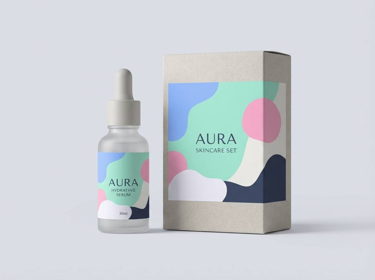
Best for: skincare packaging and labels
Soft and dreamy like bubbles drifting through clear water. The pale background keeps the palette feeling weightless, while the darker slate is ideal for ingredients and fine print. Use the pastel blue for the brand block and reserve pink for a single signature badge or scent indicator. Tip: pair with matte finishes to keep the look gentle and premium.
Image example of pastel aquarium generated using media.io
8) Tropical Sorbet
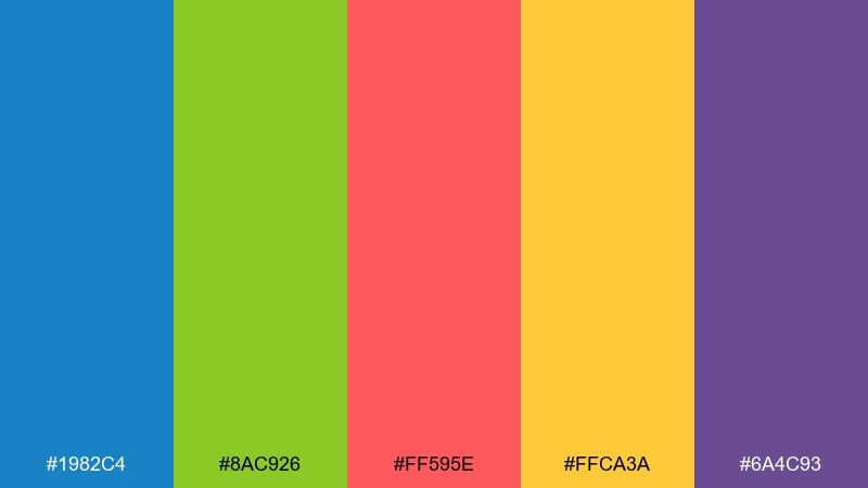
HEX: #1982c4 #8ac926 #ff595e #ffca3a #6a4c93
Mood: summery, fun, adventurous
Best for: travel ads and seasonal campaigns
Summery and adventurous, like fruit sorbet melting in the heat. Let the bright blue anchor the layout, then sprinkle in green and warm accents for destinations, price tags, and icons. The coral-red works well for urgent CTAs without looking aggressive. Tip: keep backgrounds simple so the multicolor energy reads as intentional, not chaotic.
Image example of tropical sorbet generated using media.io

9) Modern Mermaid
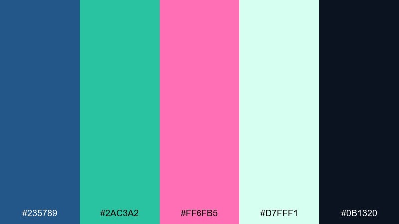
HEX: #235789 #2ac3a2 #ff6fb5 #d7fff1 #0b1320
Mood: sleek, oceanic, modern
Best for: SaaS landing pages and feature sections
Sleek oceanic vibes feel modern, clean, and slightly mysterious. Use the near-black for hero headlines, then bring in teal for feature highlights and charts. Pink makes an excellent secondary CTA and a strong accent for badges like new or beta. Tip: try subtle wave-like background shapes at very low opacity to add depth without distracting.
Image example of modern mermaid generated using media.io
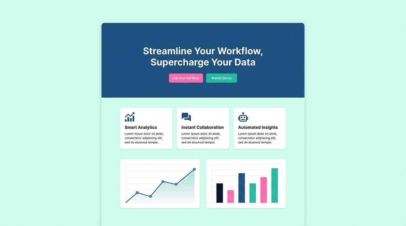
10) Clean Clinic Fresh
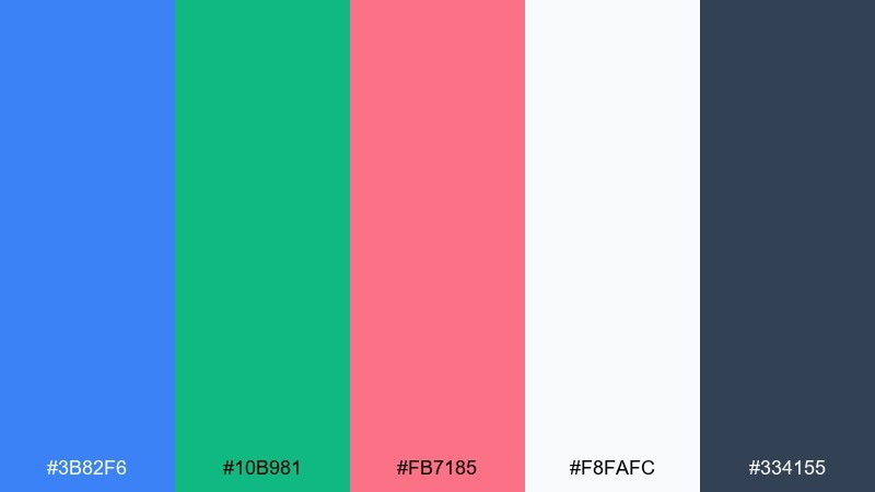
HEX: #3b82f6 #10b981 #fb7185 #f8fafc #334155
Mood: clean, trustworthy, calming
Best for: health dashboards and appointment pages
Clean and calming, like a bright clinic with fresh linens and clear signage. This blue green pink color scheme works best with lots of white space, where blue supports navigation and teal signals success or completed steps. Use the soft pink for gentle alerts, highlights, or personalization moments. Tip: limit pink to one component style so the interface stays clinical and reassuring.
Image example of clean clinic fresh generated using media.io
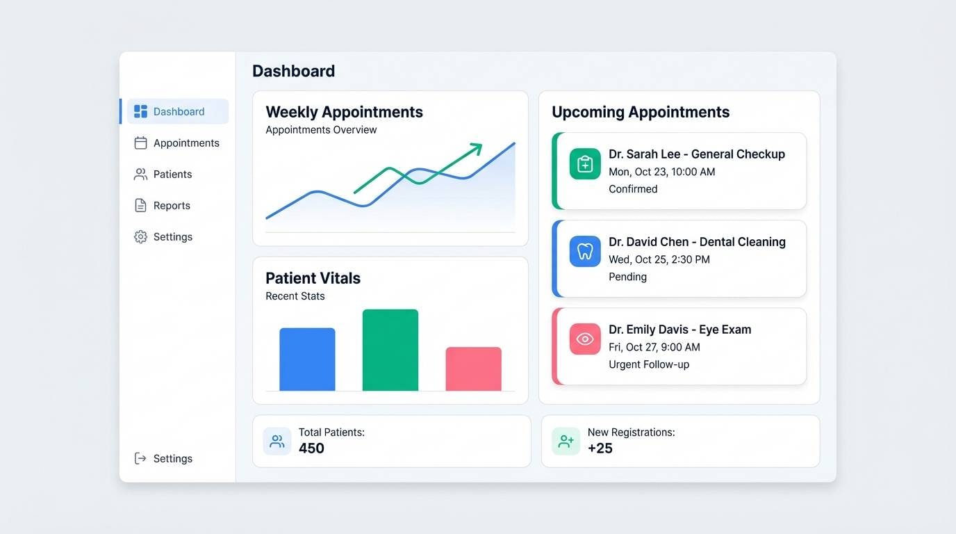
11) Retro Poolside
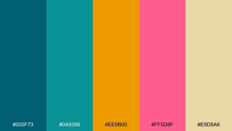
HEX: #005f73 #0a9396 #ee9b00 #ff5d8f #e9d8a6
Mood: retro, sunny, relaxed
Best for: summer menus and cafe signage
Retro sunshine vibes bring to mind pool tiles, striped umbrellas, and chilled drinks. Teal tones can handle the main blocks and borders, while the warm sand color keeps everything friendly. Use the pink as a punchy accent for specials or limited-time items. Tip: pair with rounded typography to lean into the vintage feel.
Image example of retro poolside generated using media.io
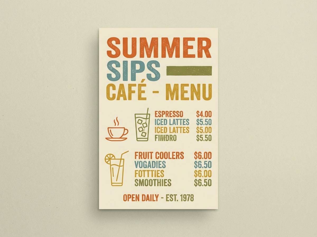
12) Sakura Harbor
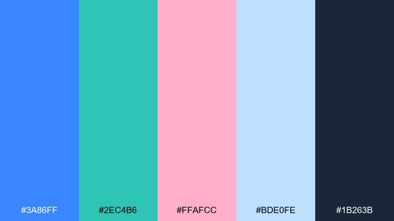
HEX: #3a86ff #2ec4b6 #ffafcc #bde0fe #1b263b
Mood: gentle, romantic, breezy
Best for: spring editorial layouts and lookbooks
Gentle and breezy, like cherry blossoms drifting over a bright waterfront. The pale sky blue creates soft columns and margins, while the deep navy keeps body copy readable. Add teal for rules, icons, and pull quotes, then let pink live in small highlights and captions. Tip: use lots of negative space and thin lines for an airy magazine feel.
Image example of sakura harbor generated using media.io
13) Pebble and Petal
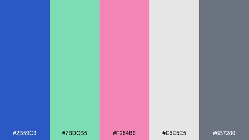
HEX: #2b59c3 #7bdcb5 #f284b6 #e5e5e5 #6b7280
Mood: soft, grounded, modern
Best for: interior mood boards and home decor shops
Soft and grounded, like smooth pebbles with a single bright petal on top. The gentle gray helps the colors feel grown-up, making it ideal for home-focused brands. Use blue for structure, mint for freshness, and pink as a small styling detail like labels or tags. Tip: mix in natural textures such as linen or light oak to keep the palette warm.
Image example of pebble and petal generated using media.io

14) Oceanic Candy
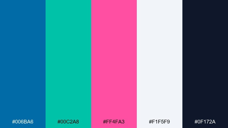
HEX: #006ba6 #00c2a8 #ff4fa3 #f1f5f9 #0f172a
Mood: crisp, modern, high-contrast
Best for: tech branding and app icon systems
Crisp modern contrast feels like cold ocean air with a bright candy twist. The near-white background keeps it sharp, while the deep navy makes text and icons punchy. Use teal for system states and charts, and keep pink as a signature brand highlight across icons. Tip: stick to flat fills for icons so the palette reads clean at small sizes.
Image example of oceanic candy generated using media.io
15) Art School Mix
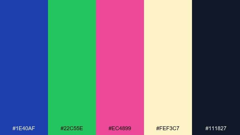
HEX: #1e40af #22c55e #ec4899 #fef3c7 #111827
Mood: creative, bold, hands-on
Best for: workshop flyers and class schedules
Creative and bold, like paint swatches taped to a studio wall. This blue green pink color palette plays well with warm paper tones, making the layout feel less digital and more handmade. Use green for categories, blue for structure, and pink for key moments like signup or early-bird. Tip: choose one playful display font and keep everything else simple for clarity.
Image example of art school mix generated using media.io

16) Soft Spa Day
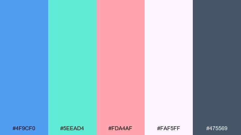
HEX: #4f9cf0 #5eead4 #fda4af #faf5ff #475569
Mood: soothing, delicate, restful
Best for: wellness newsletters and landing pages
Soothing and delicate, like warm steam, cool water, and a blush towel. The lavender-white base keeps sections gentle, while blue and teal guide the eye through headings and buttons. Pink works best as a subtle highlight for quotes, testimonials, or small icons. Tip: use thin dividers and soft shadows rather than heavy borders.
Image example of soft spa day generated using media.io
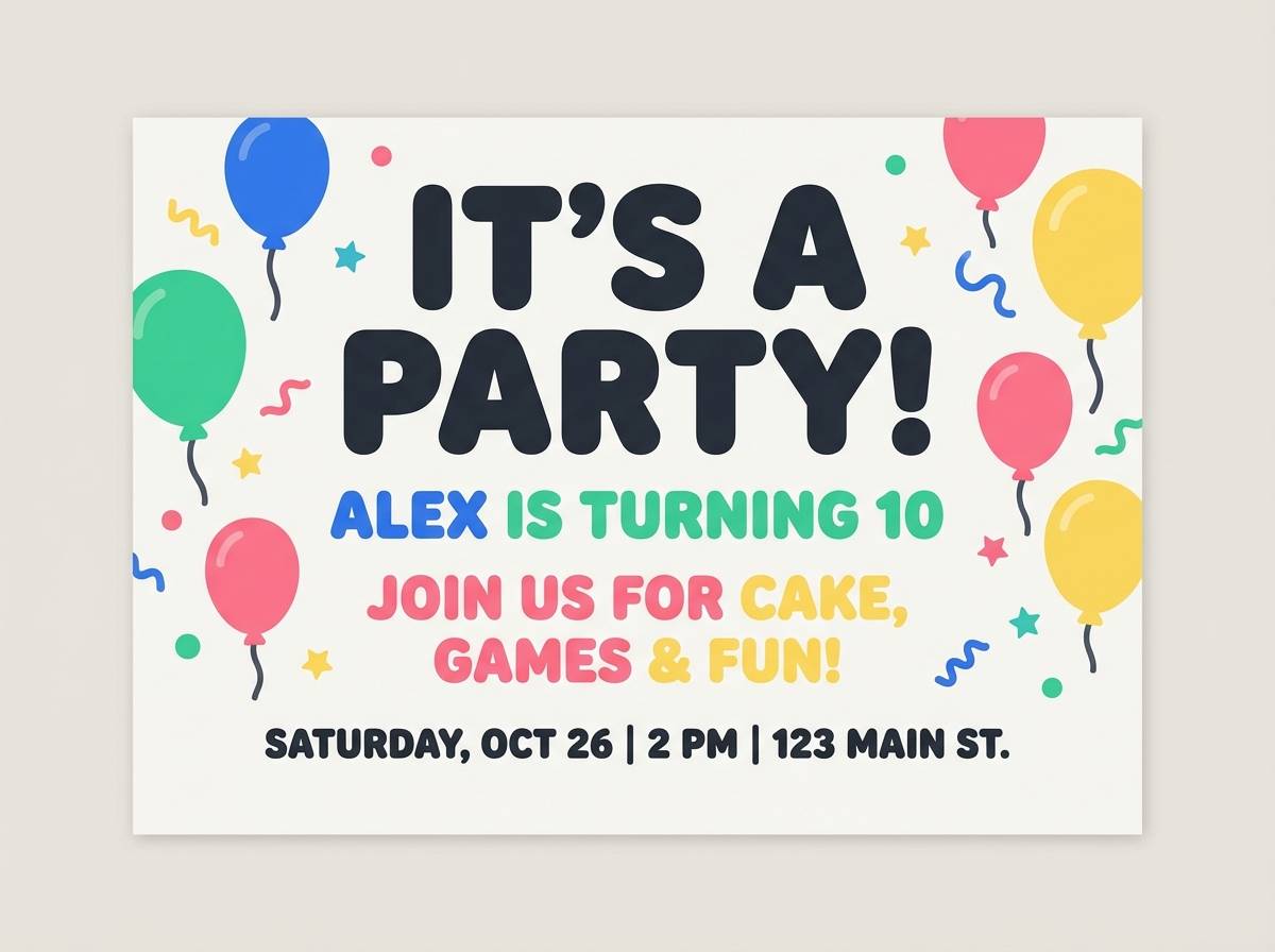
17) Playroom Splash
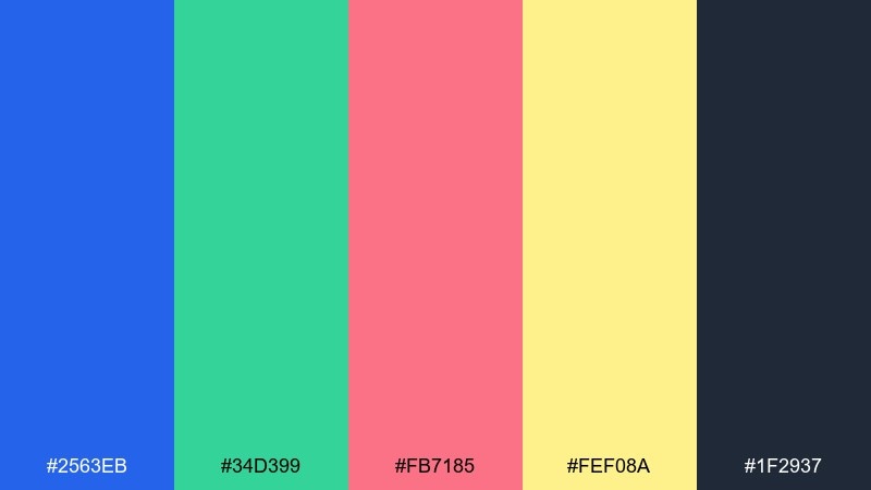
HEX: #2563eb #34d399 #fb7185 #fef08a #1f2937
Mood: cheerful, bright, kid-friendly
Best for: birthday invitations and party signage
Cheerful and bright, like building blocks scattered across a sunny playroom. Use the strong blue for the main headline and keep the mint for supporting shapes and icons. Pink adds sweetness for names and highlights, while the pale yellow is great for confetti-like details. Tip: print with thick strokes and large type so it reads well from across the room.
Image example of playroom splash generated using media.io
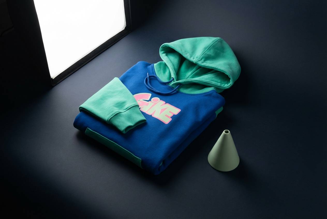
18) Streetwear Punch
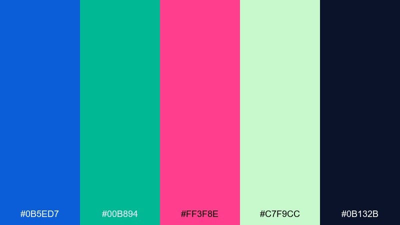
HEX: #0b5ed7 #00b894 #ff3f8e #c7f9cc #0b132b
Mood: confident, urban, edgy
Best for: apparel drops and product ads
Confident and urban, like bold graphics on a night street. These blue green pink color combinations look best with heavy contrast: deep navy background, sharp blue type, and a single hit of hot pink. The mint can soften secondary details like sizing, shipping, or small taglines. Tip: keep the layout minimal and let one oversized graphic element carry the vibe.
Image example of streetwear punch generated using media.io
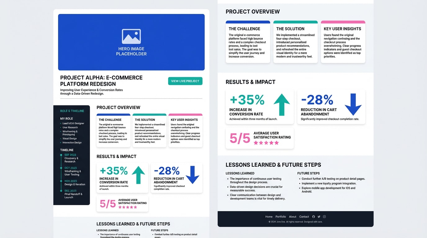
19) Gallery Calm
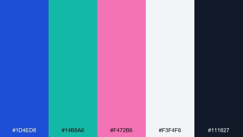
HEX: #1d4ed8 #14b8a6 #f472b6 #f3f4f6 #111827
Mood: calm, curated, contemporary
Best for: creative portfolios and case studies
Calm and curated, like a contemporary gallery with one bold artwork on the wall. The light gray background keeps the tone professional, while blue and teal create a confident information hierarchy. Pink is best used as a deliberate marker for links, hover states, or featured projects. Tip: pair with large imagery and short captions for a clean, editorial feel.
Image example of gallery calm generated using media.io
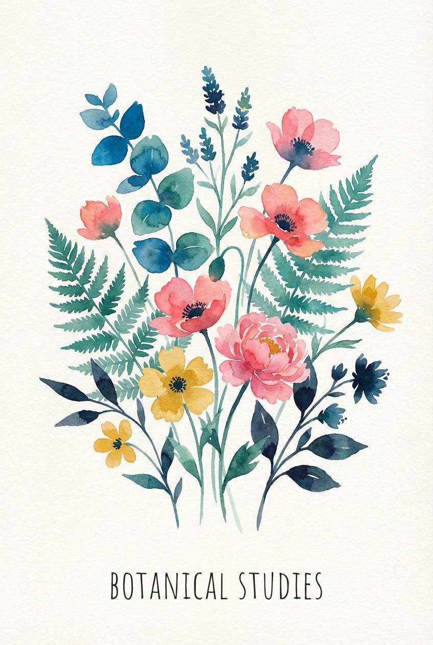
20) Sunset Tide
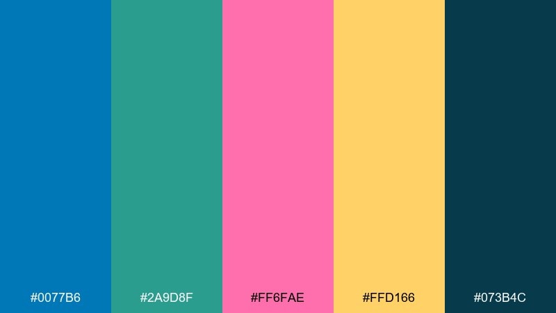
HEX: #0077b6 #2a9d8f #ff6fae #ffd166 #073b4c
Mood: warm, optimistic, beachy
Best for: botanical posters and spring illustrations
Warm and optimistic, like the last light over ocean waves. Keep the deep teal-blue for outlines and type, then let the lighter teal fill leaves and stems. Pink and golden accents work beautifully for flowers, fruit, and small decorative marks. Tip: use watercolor textures and soft edges so the palette feels organic rather than flat.
Image example of sunset tide generated using media.io
What Colors Go Well with Blue Green Pink?
Neutrals are your best stabilizers: off-white, light gray, charcoal, and deep navy make the blue-green base feel clean while letting pink stay intentional. For typography, darker slate/ink tones typically outperform pure black on bright or pastel backgrounds.
If you want extra warmth, add sand, butter yellow, or soft gold to balance the coolness of teal and blue. For extra punch, a small amount of lime or sunny yellow can create high-impact callouts—just keep it limited so it doesn’t compete with pink.
For an elevated look, pair the palette with natural textures (paper, linen, light wood) or subtle gradients; this keeps the trio from feeling “too digital” when used in print or packaging.
How to Use a Blue Green Pink Color Palette in Real Designs
Start with role assignment: pick one “structure” color (usually blue), one “state” color (green/teal for success, completion, confirmation), and reserve pink for accents like secondary CTAs, highlights, and hover states. This avoids the common issue of everything looking equally loud.
Control saturation and spacing. Pastel versions benefit from generous white space and thin dividers; neon versions benefit from dark backgrounds and fewer elements per screen. In print, consider off-white stocks and matte finishes to reduce oversaturation and glare.
Maintain accessibility by checking contrast, especially when placing pink text on light backgrounds or teal text on white. When in doubt, keep body text in deep navy/slate and use the bright colors for shapes, icons, and UI controls.
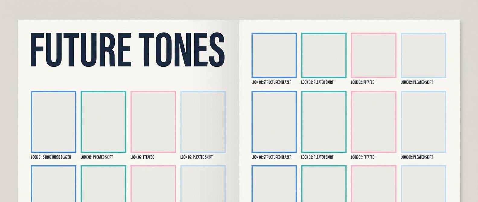
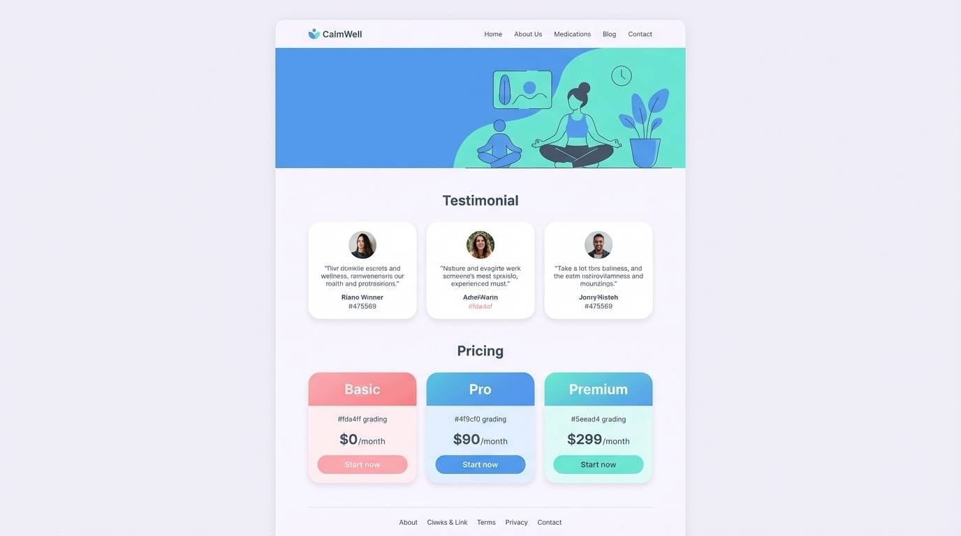
Create Blue Green Pink Palette Visuals with AI
If you’re pitching a brand direction or building a UI mood board, generating quick palette-matched visuals can help stakeholders “see” the concept immediately. The fastest approach is to describe the scene, set a clean composition, and reference your palette through accents, labels, or background blocks.
To keep results consistent, reuse a single prompt structure and only swap the subject (poster, packaging, landing page, icon set). Export a few variations, then select the one with the best hierarchy and contrast for your use case.
Blue Green Pink Color Palette FAQs
-
What vibe does a blue green pink palette usually create?
It typically feels fresh and modern: blue adds trust and structure, green/teal signals clarity and positivity, and pink brings a playful or premium accent depending on how saturated it is. -
Is blue green pink a good combination for UI design?
Yes. Use blue for primary navigation and primary CTAs, teal/green for success states and supportive UI elements, and keep pink for secondary CTAs, badges, or micro-interactions so the interface stays readable. -
How do I keep teal and pink from clashing?
Control contrast and hierarchy: choose one as the “lead” accent and reduce the other’s usage area. Anchoring with a deep navy/slate text color also makes both accents feel intentional. -
What neutrals work best with blue green pink?
Off-white, cool light gray, charcoal, and deep navy are the easiest pairings. They stabilize the palette and improve legibility across web and print. -
Can I use blue green pink for professional branding?
Yes—choose mid or muted tones and add plenty of whitespace. Palettes like Seafoam Studio, Gallery Calm, or Oceanic Candy are especially suited for agencies, portfolios, and tech brands. -
What’s a simple rule for assigning colors in a brand system?
Pick one base (background + text), one primary brand color (often blue), one functional color (teal/green), and one signature accent (pink). Then standardize where pink appears (links, badges, or secondary buttons). -
How can I generate matching images for a palette quickly?
Use a consistent text-to-image prompt template and specify “colors matched to the palette,” then iterate with 3–6 variations. This is ideal for mock posters, packaging shots, landing pages, and icon sets.


