

Teal and gold is a modern classic: teal brings calm confidence, while gold adds warmth, prestige, and a polished highlight.
Below are 20 teal gold color palette ideas (with HEX codes) you can use for branding, UI, packaging, and invitations—centered around rich teal tones like #0f766e.
In this article
- Why Teal Gold Palettes Work So Well
-
- gilded lagoon
- art deco marina
- midnight brass
- seaside souvenir
- museum velvet
- champagne teal ui
- tropical resort
- antique map
- winter evergreen gold
- minimal stone and shine
- botanical foil
- coastal wedding suite
- tech dashboard luxe
- vintage jewelry box
- sunrise on copperleaf
- calm classroom
- luxury skincare studio
- editorial teal accent
- festival poster pop
- night sky gala
- What Colors Go Well with Teal Gold?
- How to Use a Teal Gold Color Palette in Real Designs
- Create Teal Gold Palette Visuals with AI
Why Teal Gold Palettes Work So Well
Teal sits between blue and green, so it can feel both reliable (blue) and fresh (green). That balance makes it versatile across premium brands, modern interfaces, and celebratory print pieces.
Gold is the perfect counterweight: it adds warmth and an instantly “intentional” focal point. Used sparingly, gold reads as metal, foil, or sunlight—so teal stays rich and sophisticated rather than loud.
Together, teal and gold create clear hierarchy: teal carries structure (navigation, blocks, headers), while gold highlights the moments that matter (CTAs, badges, borders, and key typography).
20+ Teal Gold Color Palette Ideas (with HEX Codes)
1) Gilded Lagoon
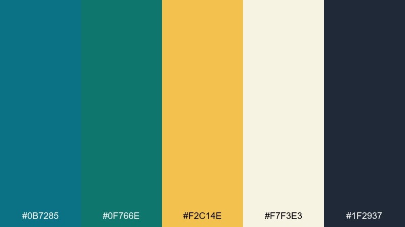
HEX: #0b7285 #0f766e #f2c14e #f7f3e3 #1f2937
Mood: polished, coastal, upscale
Best for: hotel branding, premium wellness studios, stationery
Polished and coastal, this mix feels like deep lagoon water catching late-afternoon light. Use the warm gold as a selective accent for seals, dividers, or icon fills while keeping the cream as your breathing room. Charcoal grounds the layout so teal stays rich instead of loud. Tip: reserve gold for one hierarchy level, such as buttons or headings, to keep it looking premium.
Image example of gilded lagoon generated using media.io
Media.io is an online AI studio for creating and editing video, image, and audio in your browser.

2) Art Deco Marina
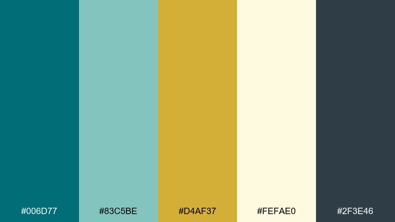
HEX: #006d77 #83c5be #d4af37 #fefae0 #2f3e46
Mood: retro, elegant, architectural
Best for: art deco interiors, event identities, boutique signage
Retro elegance comes through like a marina at dusk with polished brass rails. The pale teal keeps the look airy, while the darker teal holds structure in borders and frames. Pair it with geometric patterns, thin linework, and symmetrical spacing for a true deco feel. Tip: use the gold only on the sharpest shapes or trim so it reads like metal, not yellow paint.
Image example of art deco marina generated using media.io
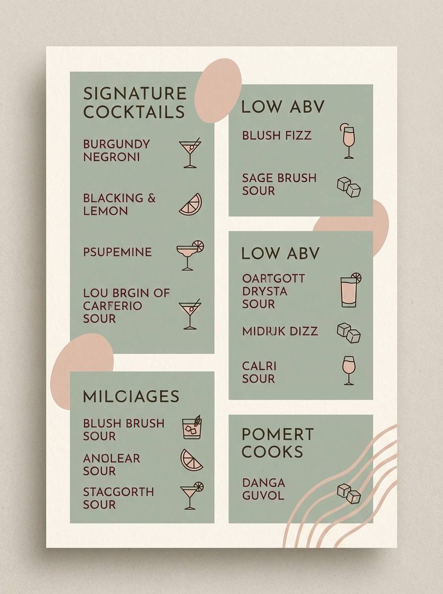
3) Midnight Brass
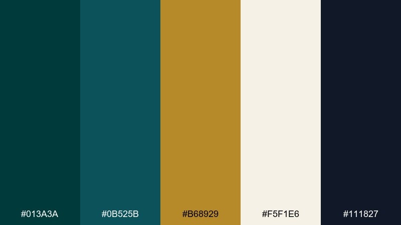
HEX: #013a3a #0b525b #b68929 #f5f1e6 #111827
Mood: moody, intimate, sophisticated
Best for: cocktail bar menus, night event posters, album art
Moody and intimate, it reads like a late-night lounge with brass lamps and dark wood. These teal gold color combinations shine when the gold is treated like a spotlight against near-black and deep green-blue tones. Cream keeps typography readable without breaking the nocturnal vibe. Tip: print gold as a slightly muted bronze for menus to avoid glare under warm lighting.
Image example of midnight brass generated using media.io
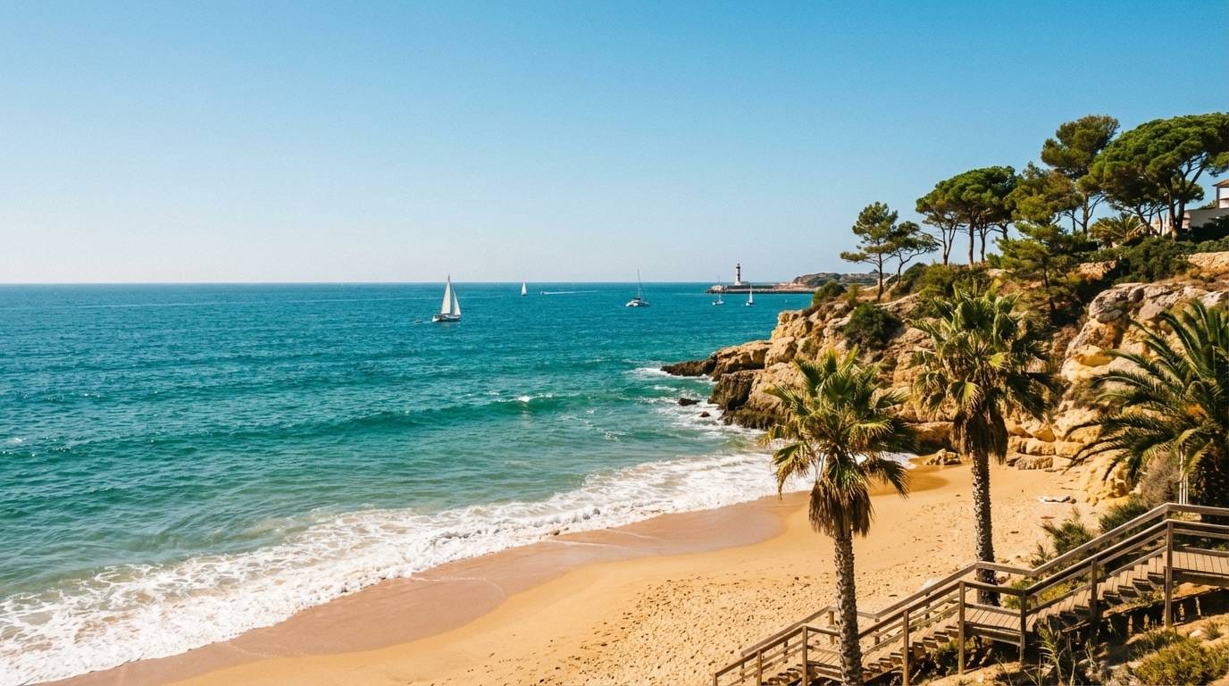
4) Seaside Souvenir
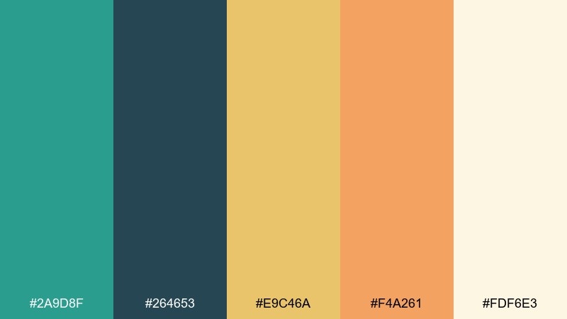
HEX: #2a9d8f #264653 #e9c46a #f4a261 #fdf6e3
Mood: sunny, friendly, travel-ready
Best for: travel content, lifestyle blogs, summer promos
Sunny and friendly, it feels like postcards, salt air, and golden sand. The darker blue-green supports text and logos, while the lighter teal keeps everything upbeat. Pair it with warm photography, rounded typefaces, and simple icon sets for an approachable look. Tip: keep orange as a secondary pop so the gold stays the main warm highlight.
Image example of seaside souvenir generated using media.io
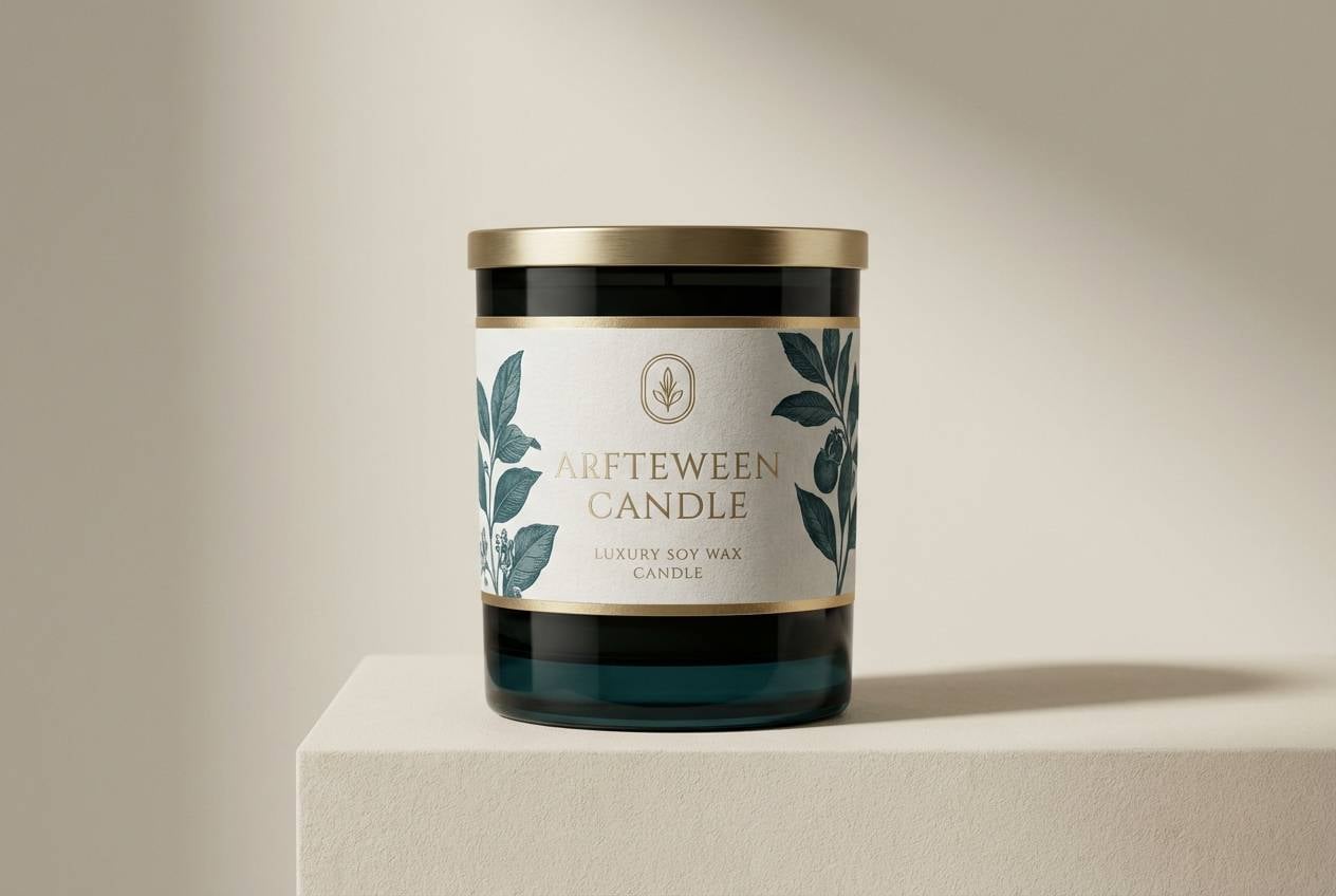
5) Museum Velvet
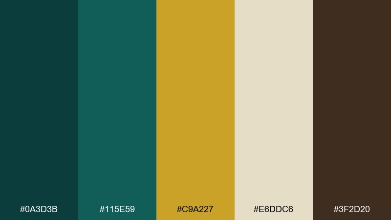
HEX: #0a3d3b #115e59 #c9a227 #e6ddc6 #3f2d20
Mood: curated, warm, timeless
Best for: exhibition branding, heritage packaging, book covers
Curated and timeless, it evokes velvet ropes, framed artifacts, and warm gallery lighting. The brown adds an unexpected antique note that makes teal feel more historic than tropical. Pair it with serif typography, textured paper, or subtle grain for depth. Tip: use the cream for large margins so the darker tones feel intentional, not heavy.
Image example of museum velvet generated using media.io
6) Champagne Teal UI
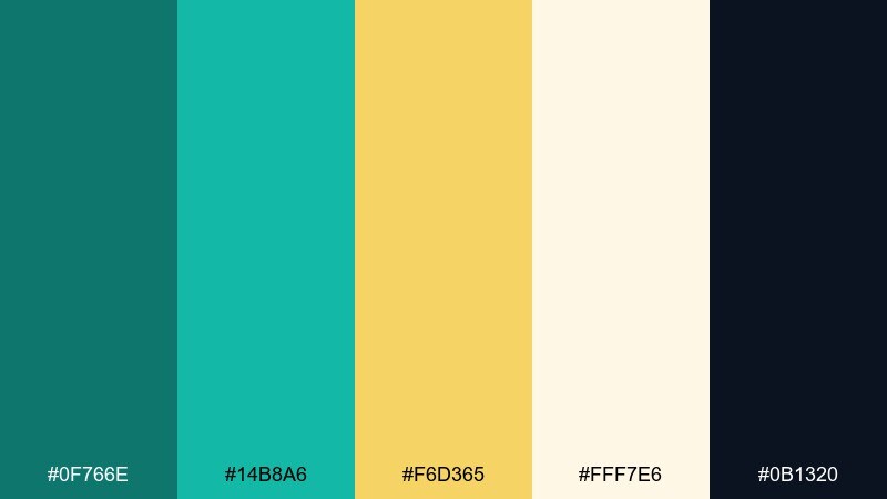
HEX: #0f766e #14b8a6 #f6d365 #fff7e6 #0b1320
Mood: clean, modern, optimistic
Best for: fintech dashboards, mobile web apps, SaaS UI
Clean and optimistic, it feels like crisp data cards with a celebratory sparkle. This teal gold color scheme works best when teal defines navigation and states, while the champagne gold highlights key metrics or badges. The soft off-white reduces contrast fatigue on long sessions. Tip: keep the darkest tone for text and icons only, not large background blocks, to maintain clarity.
Image example of champagne teal ui generated using media.io
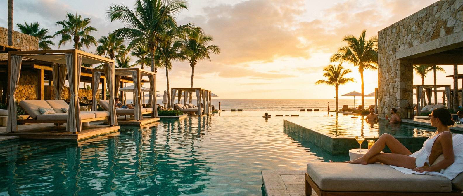
7) Tropical Resort
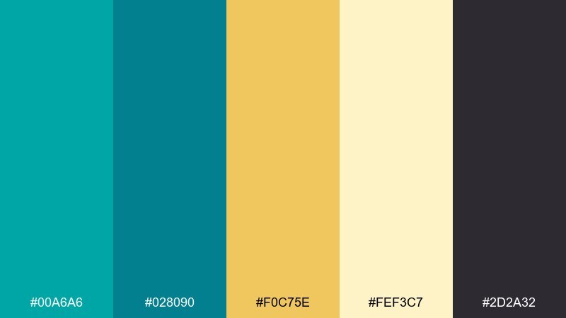
HEX: #00a6a6 #028090 #f0c75e #fef3c7 #2d2a32
Mood: vacation, bright, breezy
Best for: resort websites, travel ads, poolside menus
Bright and breezy, it brings to mind turquoise pools and sunlit cabanas. The creamy tint softens the contrast so the palette feels relaxed rather than neon. Pair it with airy photography, plenty of whitespace, and light sans-serif type for a modern travel look. Tip: use the dark charcoal sparingly for headlines and CTA text to keep the vibe sunny.
Image example of tropical resort generated using media.io
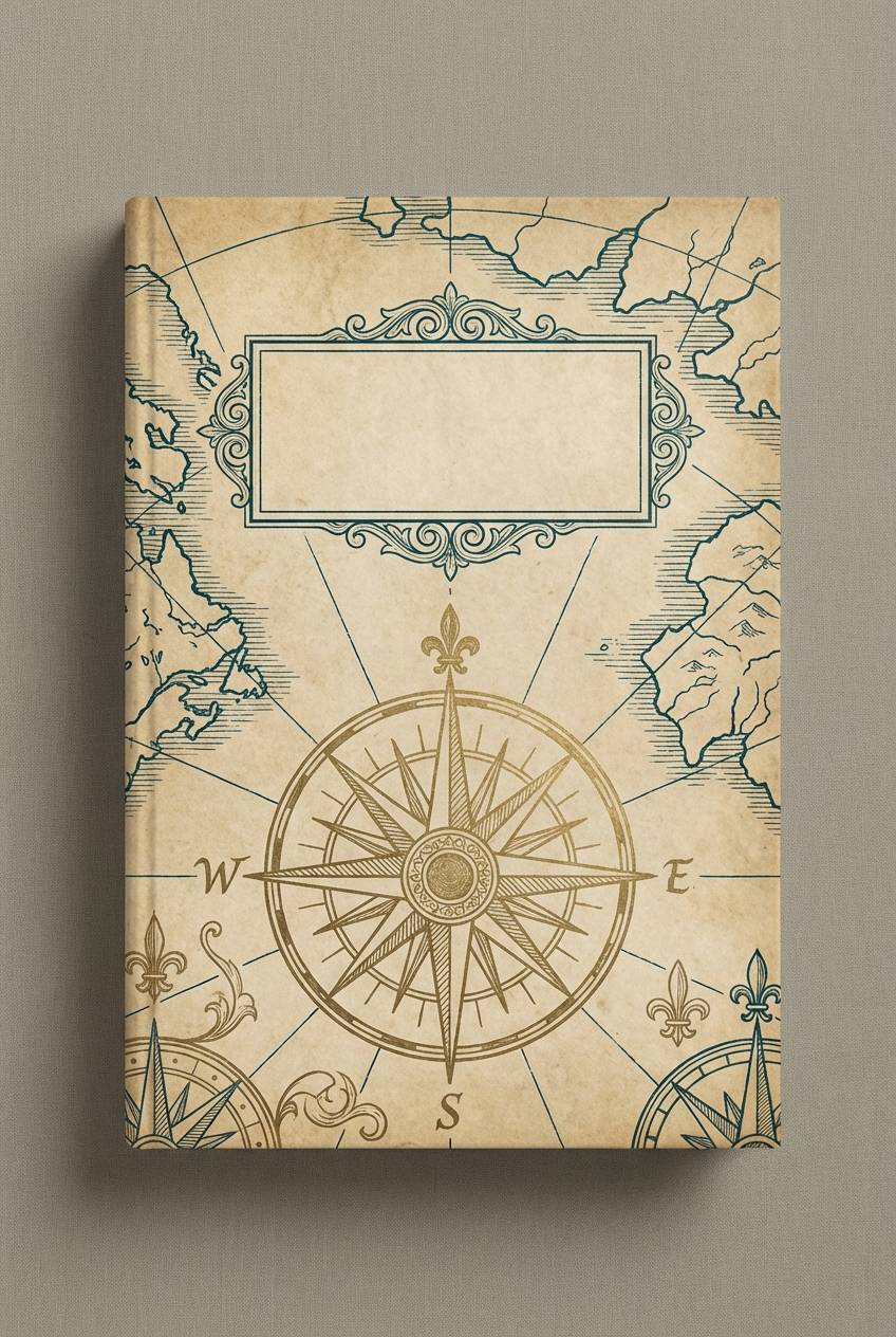
8) Antique Map
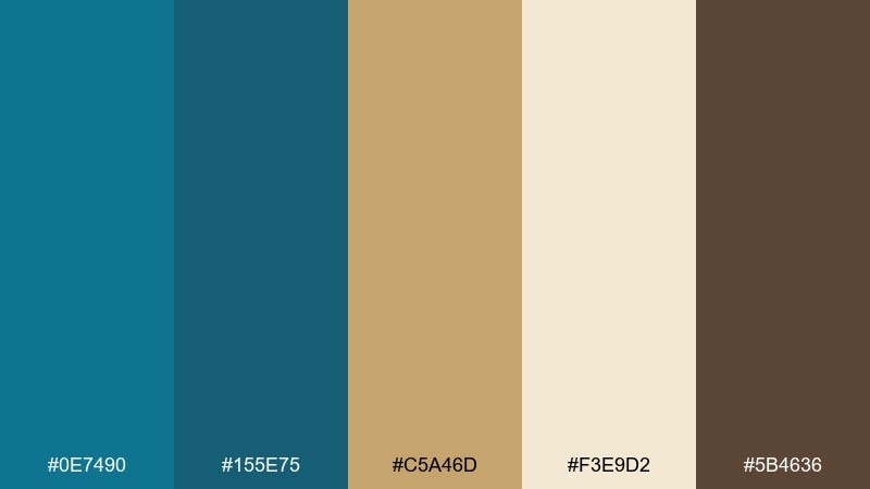
HEX: #0e7490 #155e75 #c5a46d #f3e9d2 #5b4636
Mood: vintage, exploratory, tactile
Best for: book cover design, journal covers, craft labels
Vintage and exploratory, it feels like compass ink on aged paper. The tan-gold acts more like parchment than metal, making the teal tones read as classic inks. Pair it with textured backgrounds, hand-drawn icons, and subtle drop shadows. Tip: keep the darkest teal for titles and spine text to preserve legibility at small sizes.
Image example of antique map generated using media.io
9) Winter Evergreen Gold
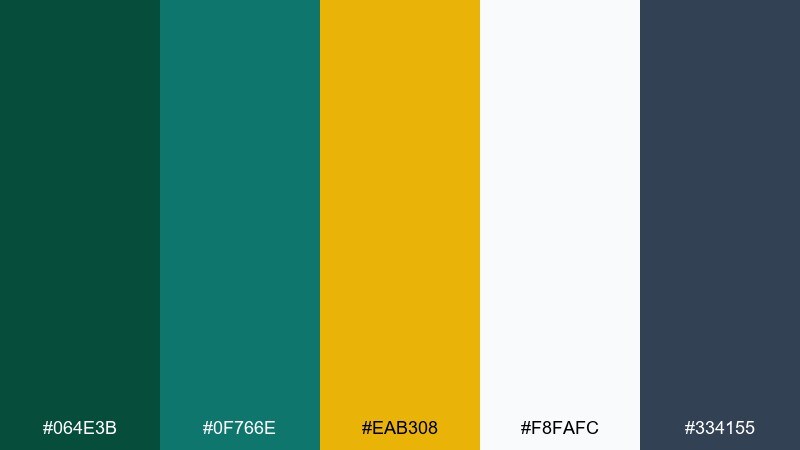
HEX: #064e3b #0f766e #eab308 #f8fafc #334155
Mood: festive, fresh, crisp
Best for: holiday campaigns, seasonal packaging, greeting cards
Festive yet crisp, it suggests evergreen branches with warm string lights. The icy off-white keeps everything bright and printable, especially for small-format cards. Pair it with pine textures, minimal snow motifs, and clean typography for a modern seasonal look. Tip: use gold as tiny spark details so the greens stay the hero.
Image example of winter evergreen gold generated using media.io

10) Minimal Stone and Shine
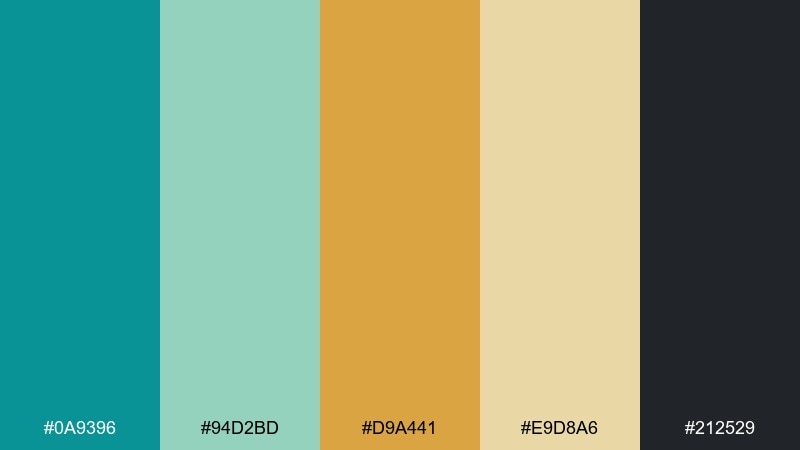
HEX: #0a9396 #94d2bd #d9a441 #e9d8a6 #212529
Mood: minimal, calm, design-forward
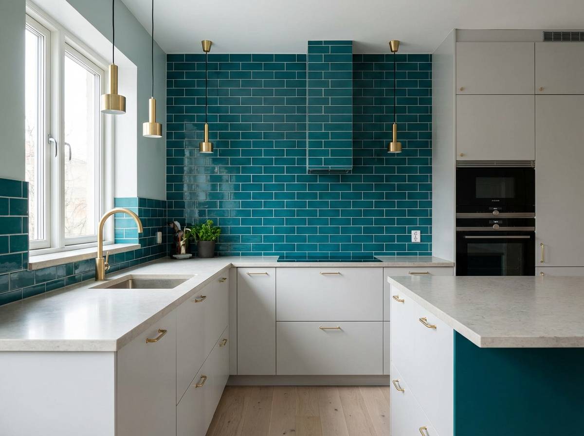
Best for: kitchen decor, architectural brochures, modern product sites
Minimal and calm, it feels like stone surfaces with a brushed-metal gleam. The sage-teal softens the stronger teal so large areas stay soothing. Pair it with natural textures like terrazzo, linen, or light oak for an elevated neutral direction. Tip: keep the gold tone matte in print to match the understated mood.
Image example of minimal stone and shine generated using media.io
11) Botanical Foil
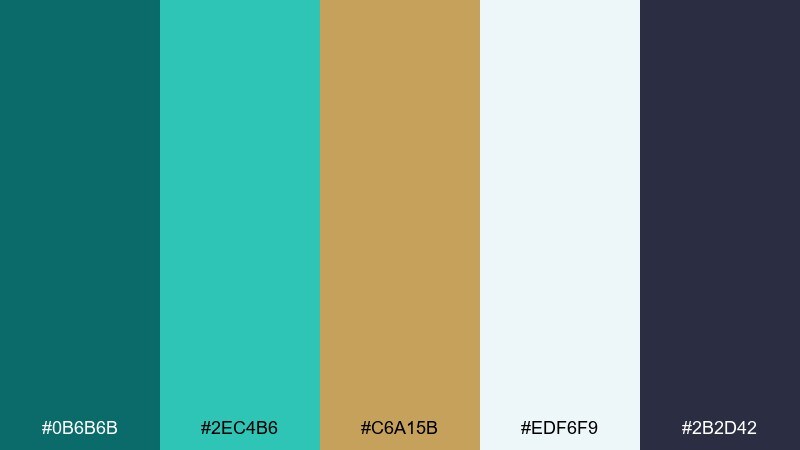
HEX: #0b6b6b #2ec4b6 #c6a15b #edf6f9 #2b2d42
Mood: fresh, artisan, airy
Best for: botanical prints, spa gift sets, spring launches
Fresh and artisan, it reads like watercolor leaves with a touch of foil. The light aqua adds lift so designs feel springy instead of heavy. Pair it with botanical line art, soft gradients, and uncoated paper textures for a crafted look. Tip: apply the gold only to small veins or borders to mimic metallic leafing.
Image example of botanical foil generated using media.io
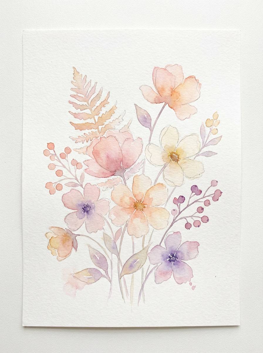
12) Coastal Wedding Suite
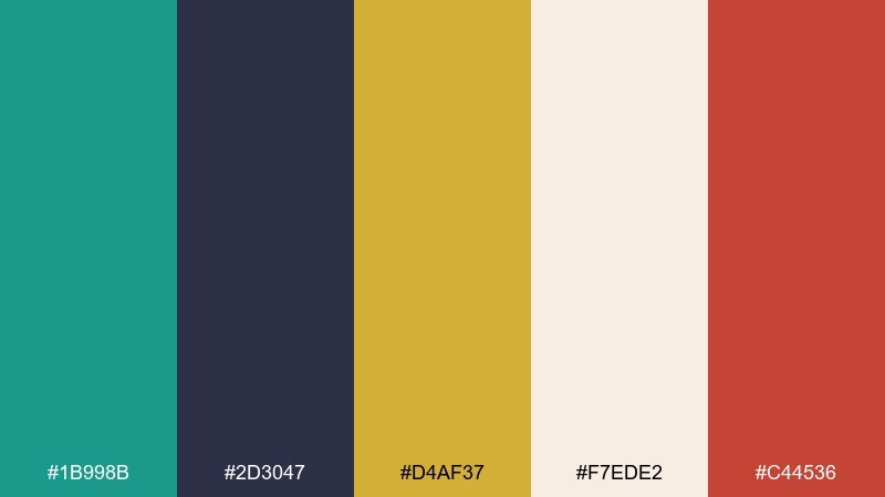
HEX: #1b998b #2d3047 #d4af37 #f7ede2 #c44536
Mood: romantic, coastal, celebratory
Best for: wedding invitations, save-the-dates, reception signage
Romantic and coastal, it feels like sea glass paired with classic gold jewelry. The navy-like tone adds formality, while the soft blush keeps the suite welcoming and personal. These teal gold color combinations shine on thick stock with simple layout grids and generous spacing. Tip: use the red-coral as a tiny seal or monogram detail, not a main block color.
Image example of coastal wedding suite generated using media.io
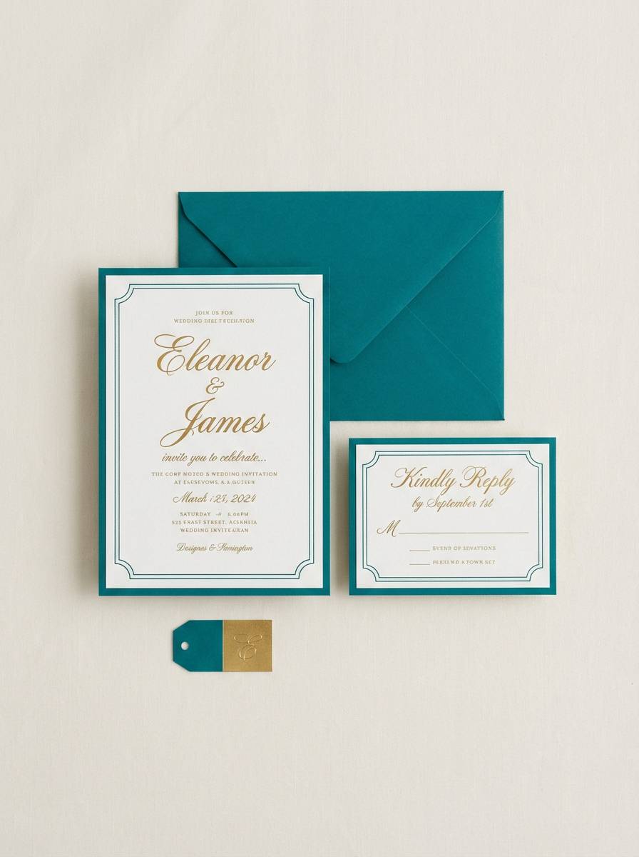
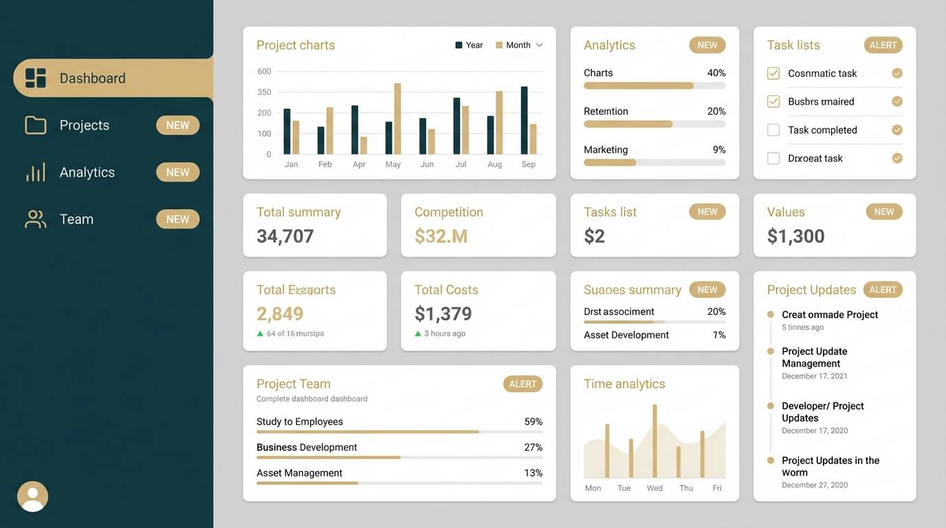
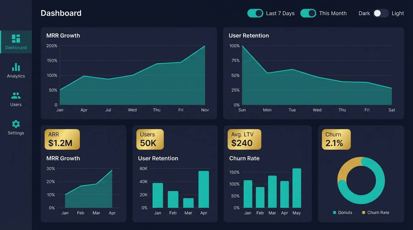
13) Tech Dashboard Luxe
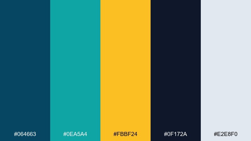
HEX: #064663 #0ea5a4 #fbbf24 #0f172a #e2e8f0
Mood: confident, high-contrast, premium tech
Best for: SaaS dashboards, analytics tools, pitch decks
Confident and premium, it looks like glowing charts on a midnight workspace. The bright teal works well for active states and data lines, while gold highlights the KPIs you want remembered. Pair it with subtle shadows, rounded cards, and tight typographic hierarchy to keep the interface crisp. Tip: keep gold accents under 10 percent of the UI to avoid a gamified feel.
Image example of tech dashboard luxe generated using media.io
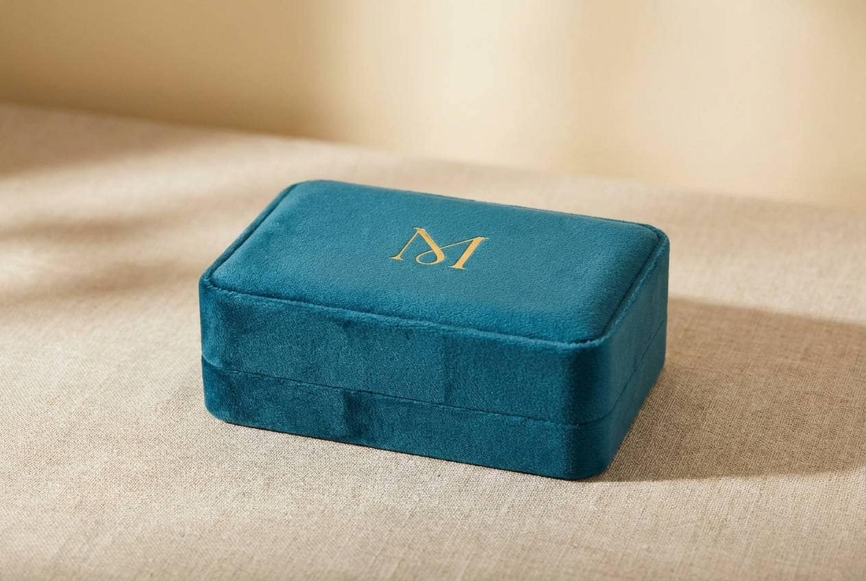
14) Vintage Jewelry Box
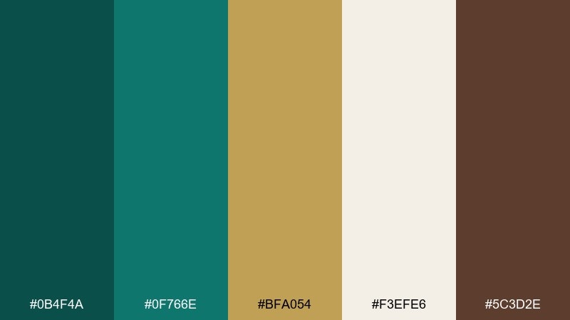
HEX: #0b4f4a #0f766e #bfa054 #f3efe6 #5c3d2e
Mood: nostalgic, intimate, handcrafted
Best for: jewelry branding, artisan shops, gift packaging
Nostalgic and intimate, it suggests a velvet jewelry box opened under warm light. The earthy brown makes the gold feel antique, not flashy, and it pairs beautifully with textured paper and embossing. Use the cream for label backgrounds so product names stay clear and elegant. Tip: add a fine teal border line to packaging to sharpen the handcrafted look.
Image example of vintage jewelry box generated using media.io
15) Sunrise on Copperleaf
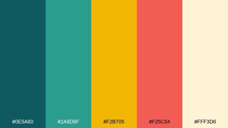
HEX: #0e5a60 #2a9d8f #f2b705 #f25c54 #fff3d6
Mood: energetic, playful, warm
Best for: summer event posters, pop-up markets, social ads
Energetic and warm, it feels like sunrise reflecting off leaves and painted storefronts. The coral adds a lively counterpoint that keeps the teal from feeling too formal. Pair it with bold headlines, layered shapes, and simple patterns for a modern poster vibe. Tip: use the cream as a text panel so the bright colors can stay saturated without sacrificing readability.
Image example of sunrise on copperleaf generated using media.io
16) Calm Classroom
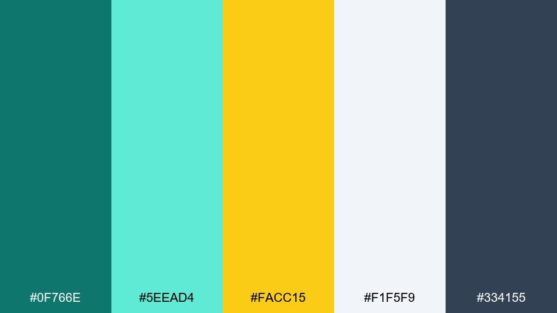
HEX: #0f766e #5eead4 #facc15 #f1f5f9 #334155
Mood: friendly, clear, reassuring
Best for: presentation slides, e-learning UI, classroom posters
Friendly and reassuring, it feels like clean whiteboards with a sunny highlight. The soft aqua keeps layouts light for long reading, while teal provides structure for headers and navigation. Pair it with simple icons and generous line spacing for accessibility. Tip: use the yellow as a callout marker for definitions or key takeaways, not as a full background.
Image example of calm classroom generated using media.io
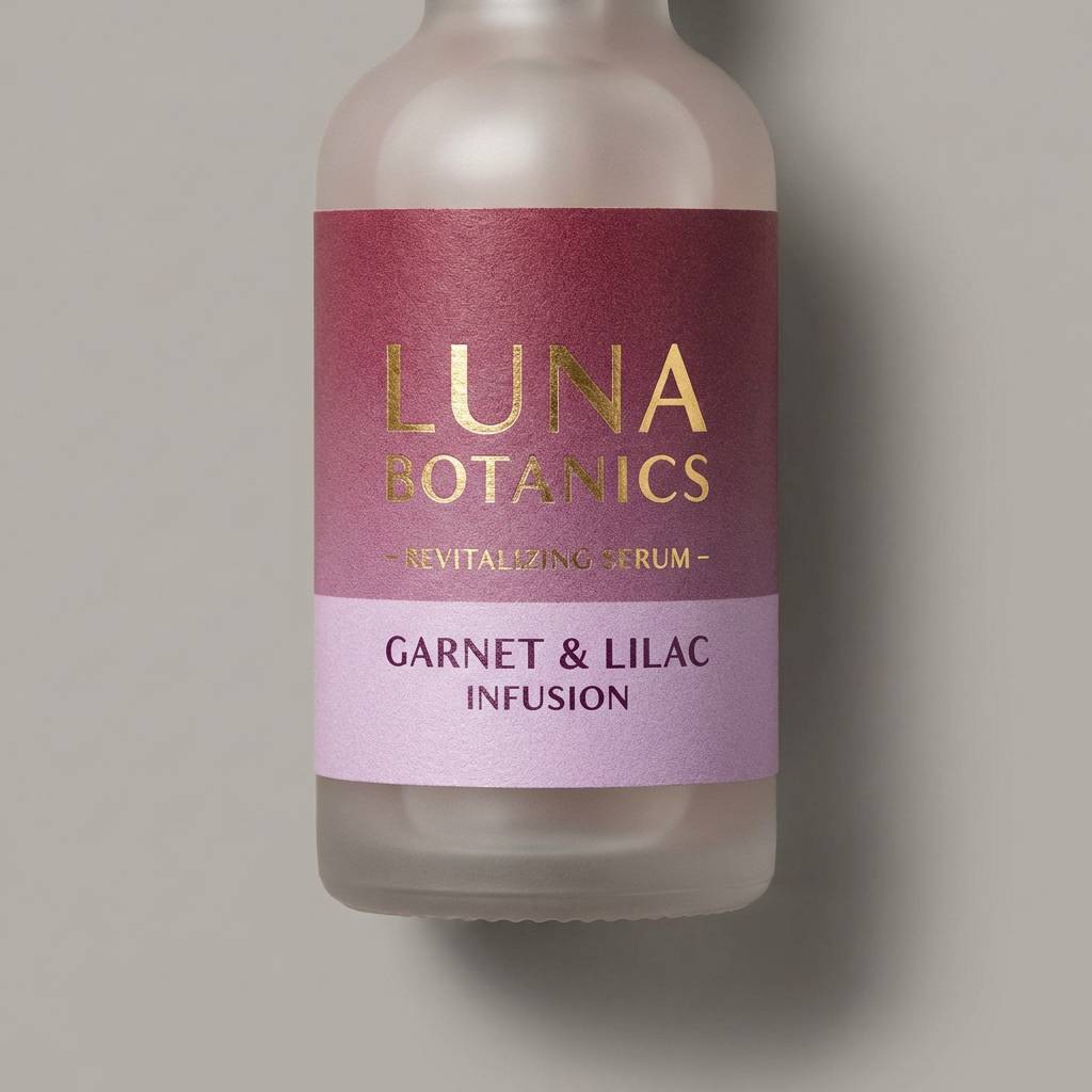
17) Luxury Skincare Studio
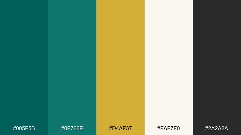
HEX: #005f5b #0f766e #d4af37 #faf7f0 #2a2a2a
Mood: luxury, serene, glossy
Best for: skincare packaging, beauty ads, spa websites
Luxury and serene, it evokes a quiet spa room with glossy bottles and warm metallic caps. The teal gold color palette looks especially high-end when the gold appears as foil, embossing, or metallic ink against the soft cream. Pair it with minimalist typography and plenty of negative space for a clean premium finish. Tip: set product names in charcoal instead of teal to keep the hierarchy calm and legible.
Image example of luxury skincare studio generated using media.io
18) Editorial Teal Accent
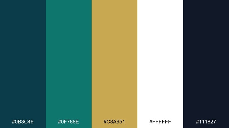
HEX: #0b3c49 #0f766e #c8a951 #ffffff #111827
Mood: editorial, crisp, refined
Best for: magazines, reports, lookbooks
Crisp and refined, it feels like an editorial spread with sharp headlines and subtle rules. The palette stays readable because white dominates, with teal used for sectioning and gold for premium micro-details. Pair it with strong typographic contrast, thin lines, and clean photo margins. Tip: keep gold to separators and small icons so it reads as an accent, not a highlighter.
Image example of editorial teal accent generated using media.io
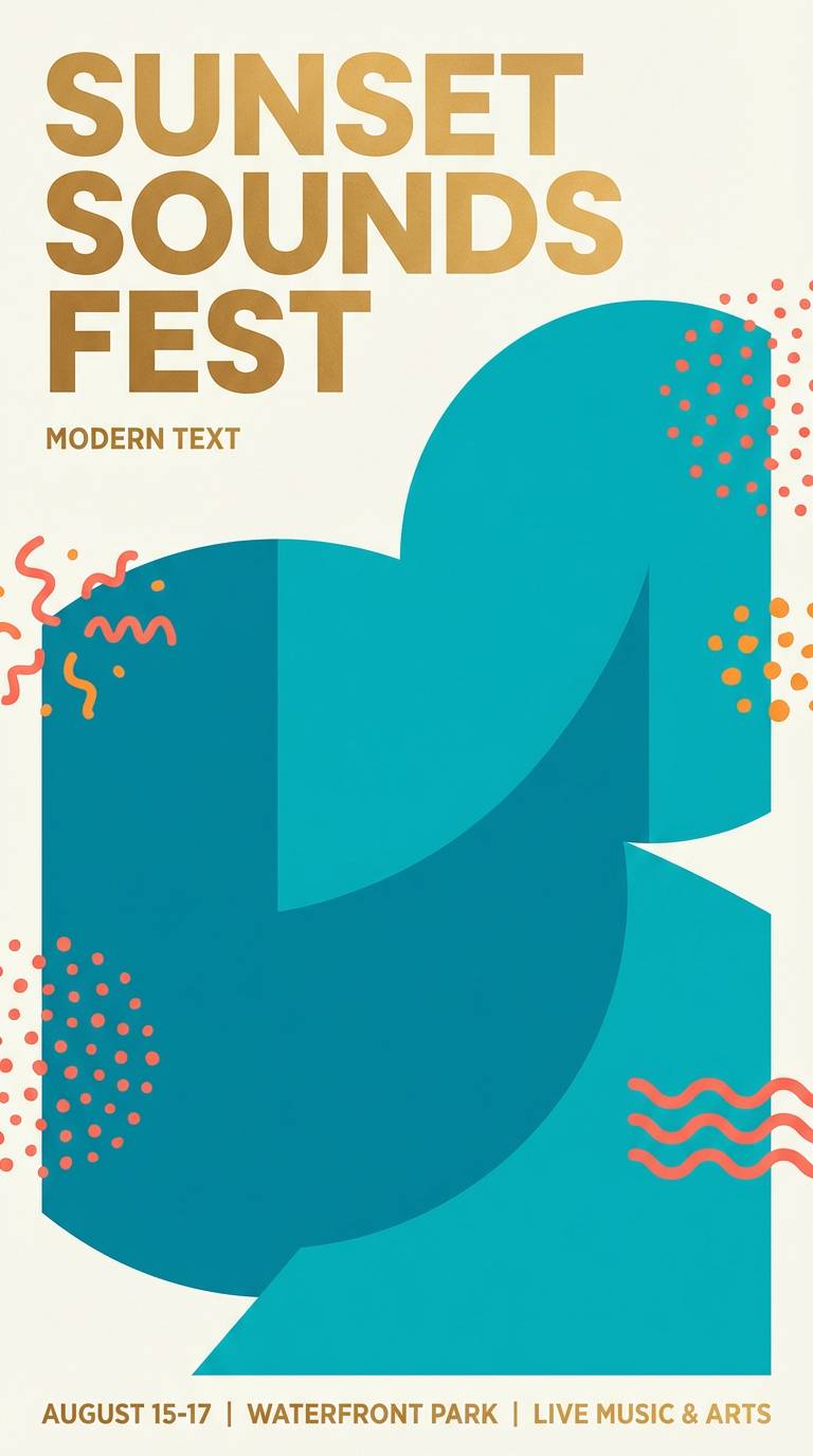
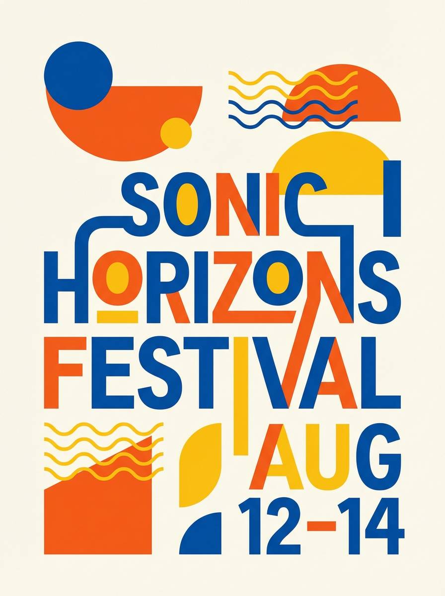
19) Festival Poster Pop
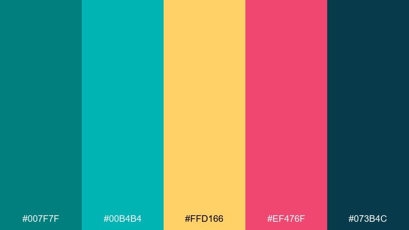
HEX: #007f7f #00b4b4 #ffd166 #ef476f #073b4c
Mood: bold, youthful, energetic
Best for: music festival flyers, nightlife promos, merch graphics
Bold and youthful, it hits like neon signage against a deep night sky. Bright teal builds the main shapes while gold brings the headline forward with instant visibility. Pair it with condensed type, big geometry, and playful gradients for maximum impact. Tip: keep the pink to one or two focal elements so the design still feels cohesive.
Image example of festival poster pop generated using media.io
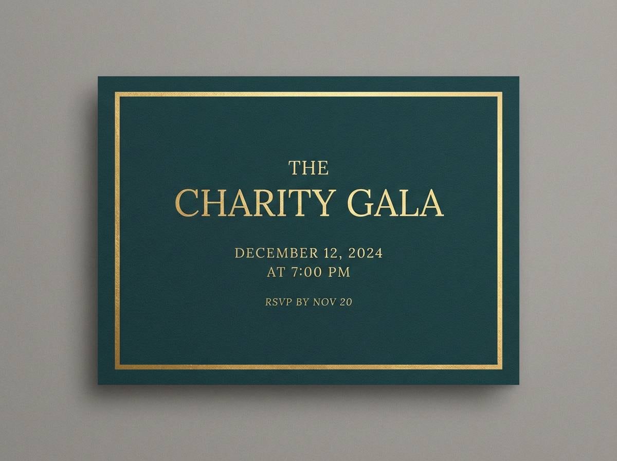
20) Night Sky Gala
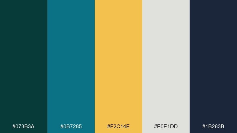
HEX: #073b3a #0b7285 #f2c14e #e0e1dd #1b263b
Mood: formal, dramatic, celebratory
Best for: gala dinner invites, charity events, formal announcements
Formal and dramatic, it feels like a midnight gala with candlelight glinting off glassware. The deep navy and dark teal create a luxurious stage for gold typography and borders. Pair it with elegant serif fonts, high contrast spacing, and subtle texture for a black-tie finish. Tip: use the light gray as a secondary paper tone for RSVP cards to keep the set cohesive.
Image example of night sky gala generated using media.io
What Colors Go Well with Teal Gold?
Neutrals are your safest foundation: ivory/cream keeps teal breathable, while charcoal and navy make gold look more metallic and premium. For modern UI, off-whites reduce eye strain while still letting teal define structure.
Warm companions like coral, terracotta, and soft orange add energy without fighting gold—especially when teal is dominant and the warm tones are used as small pops.
For a more natural direction, try sage, forest green, and parchment tan. These shift the palette toward heritage, botanical, or craft aesthetics while keeping the teal-gold contrast intact.
How to Use a Teal Gold Color Palette in Real Designs
Use teal as your primary system color: headers, navigation, backgrounds, and large shapes. Then treat gold as a “signal”—buttons, badges, separators, icons, and the one detail you want people to notice first.
Keep gold coverage low to maintain a luxury feel. In print, gold works best as foil, embossing, or a muted metallic ink; on screens, choose slightly softer golds to avoid looking like highlighter yellow.
Balance contrast with smart typography: dark charcoal for body text, teal for section titles, and gold for micro-emphasis. This keeps readability high while still delivering that modern teal-gold punch.
Create Teal Gold Palette Visuals with AI
If you already have HEX codes, the fastest way to test a palette is to generate realistic mockups—like packaging, invitations, dashboards, or brand moodboards—before you commit to production.
With Media.io, you can turn a simple prompt into on-brand visuals and iterate quickly (swap teal depth, adjust gold warmth, or try different paper/metal textures) until it feels right.
Teal Gold Color Palette FAQs
-
What HEX code is a good “main teal” for teal and gold designs?
#0f766e is a strong modern teal that stays saturated without looking neon. It works well for navigation, headings, and brand blocks, with gold used as a smaller accent. -
How do I keep gold from looking yellow in a teal gold color scheme?
Reduce brightness slightly and pair it with deep neutrals (navy/charcoal) so it reads as metal. Also limit gold to highlights (under ~10–15% of the layout) rather than large fills. -
Is teal and gold a good color palette for luxury branding?
Yes—teal suggests confidence and calm, while gold signals prestige. The key is using plenty of whitespace/cream and treating gold like foil (small, intentional accents). -
What background color works best with teal and gold?
For bright, modern looks use off-white/cream. For dramatic luxury, use navy or near-black so gold pops and teal looks deeper. -
Which fonts pair well with a teal gold palette?
For premium or editorial styles, use a high-contrast serif for headlines with a clean sans-serif for body text. For modern UI, stick to a neutral sans-serif and let color carry the hierarchy. -
Can I use teal and gold for weddings or invitations?
Absolutely—teal feels romantic and distinctive, and gold reads as celebratory. Use soft blush/cream as support colors and reserve gold for names, borders, and monograms. -
How can I preview teal gold color combinations before designing?
Generate quick mockups (menus, packaging, UI screens, posters) using Media.io’s text-to-image tool. It’s an easy way to test teal depth, gold warmth, and contrast in realistic scenes.


