

Cold color palettes lean on blues, teals, blue-greens, and cool grays to create a crisp, modern feeling. They’re a go-to for UI, branding, and print layouts where clarity and calm matter.
Below are 20 cold color palette ideas with HEX codes, plus real-world usage tips and AI prompts you can reuse to generate matching visuals fast.
In this article
Why Cold Palettes Work So Well
Cold color schemes feel clean and controlled because they naturally suggest air, water, glass, and metal. That association makes them ideal for modern interfaces, data-heavy screens, and brands that want a calm, confident tone.
Cool tones also help organize hierarchy: light icy tints create spacious backgrounds, mid tones carry interactive states, and deep navies deliver readable contrast for type and critical UI elements.
In print and branding, cold palettes can look premium and minimalist when paired with white space and a single accent. The key is balancing contrast so designs don’t feel flat or overly sterile.
20+ Cold Color Palette Ideas (with HEX Codes)
1) Arctic Mist
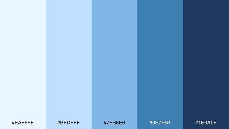
HEX: #EAF6FF #BFDFFF #7FB6E6 #3E7FB1 #1E3A5F
Mood: crisp, airy, clean
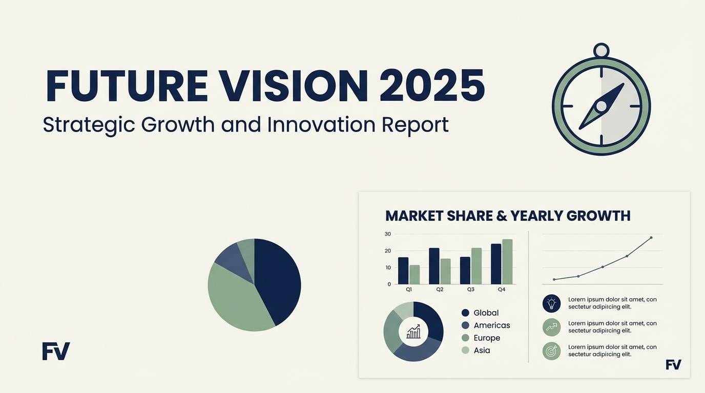
Best for: saas dashboard ui
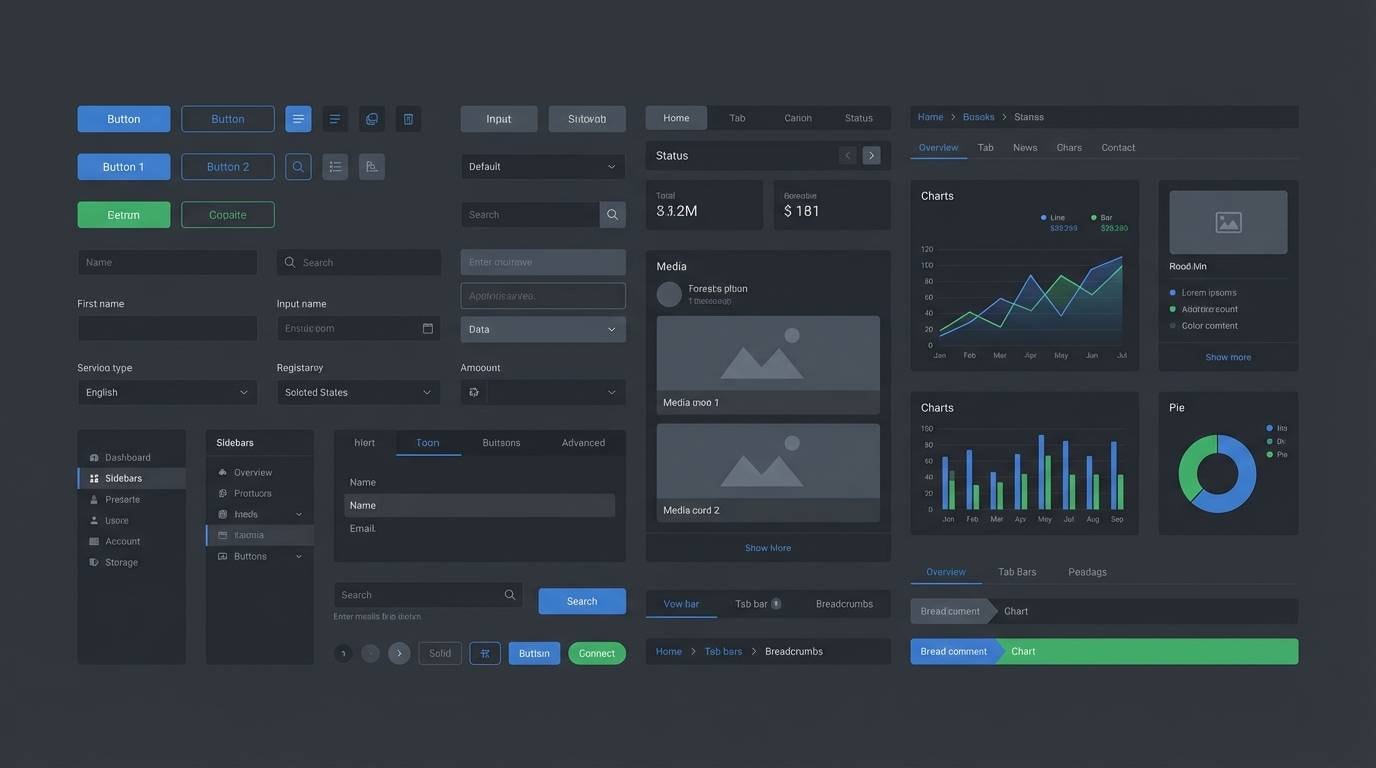
Crisp and airy like morning fog over ice, these blues feel clean and technical. It works beautifully for analytics dashboards, fintech interfaces, and data-heavy layouts. Pair it with white space and a single dark navy for readable hierarchy. Usage tip: reserve the deepest shade for key CTAs and chart labels to keep contrast consistent.
Image example of arctic mist generated using media.io

Media.io is an online AI studio for creating and editing video, image, and audio in your browser.

2) Glacier Bay
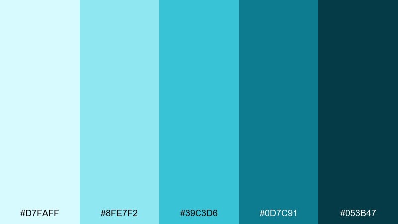
HEX: #D7FAFF #8FE7F2 #39C3D6 #0D7C91 #053B47
Mood: fresh, aquatic, confident
Best for: brand identity for wellness
Fresh and aquatic, it evokes glacial water and clear breathing space. The tones suit wellness brands, skincare, and mindful apps that want calm authority. Pair with warm neutrals like sand or oatmeal to soften the coolness without losing clarity. Usage tip: use the mid teal for logos and keep the darkest shade for headers and small text.
Image example of glacier bay generated using media.io
3) Frosted Denim
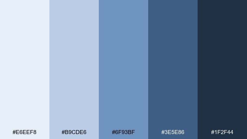
HEX: #E6EEF8 #B9CDE6 #6F93BF #3E5E86 #1F2F44
Mood: reliable, modern, structured
Best for: corporate presentation slides
Reliable and structured, it feels like worn denim cooled by winter air. These cold color combinations are a safe choice for corporate decks, investor updates, and professional reports. Pair with a muted silver gray for dividers and plenty of white for breathing room. Usage tip: use the lightest blue for slide backgrounds and the mid blue for data highlights.
Image example of frosted denim generated using media.io
4) Winter Pine
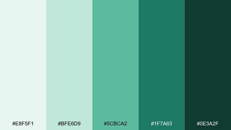
HEX: #E8F5F1 #BFE6D9 #5CBCA2 #1F7A63 #0E3A2F
Mood: evergreen, grounded, refreshing
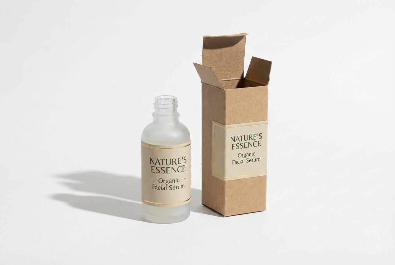
Best for: eco product packaging
Grounded and refreshing like evergreen needles after snow, these greens read natural without going muddy. They fit eco packaging, refill products, and sustainable retail labels. Pair with uncoated paper textures and a quiet charcoal for typography. Usage tip: keep the darkest green for ingredient lists so small print stays sharp.
Image example of winter pine generated using media.io
5) Polar Orchid
HEX: #F2F0FF #D6D0FF #A79BEE #6B5ACD #2E2A66
Mood: dreamy, cool, elegant
Best for: beauty editorial layout
Dreamy and cool, it brings to mind twilight petals and soft studio lights. The purples work well for beauty editorials, fragrance launches, and high-end lookbooks. Pair with icy gray photography and thin serif headlines for a refined feel. Usage tip: use the mid violet for pull quotes and keep body copy in the deepest shade for legibility.
Image example of polar orchid generated using media.io
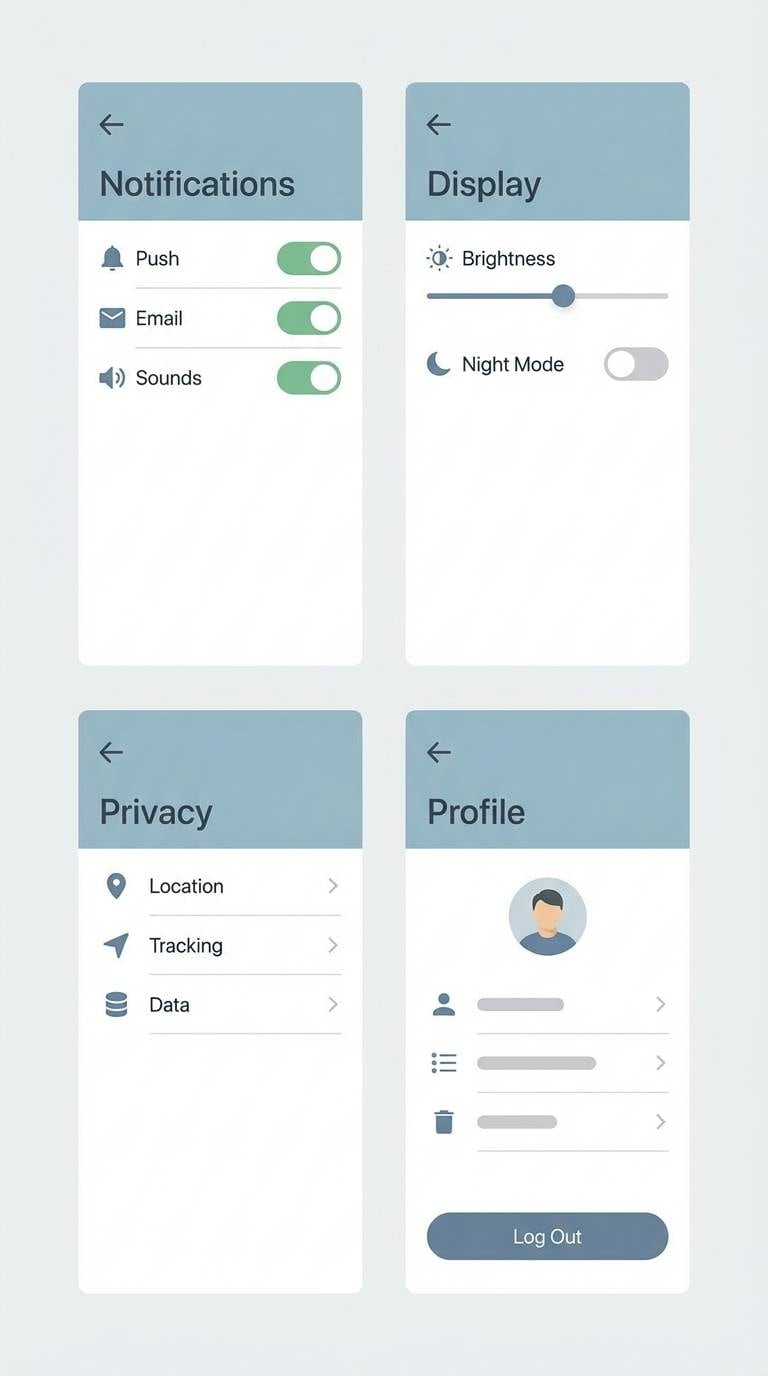
6) Steel River
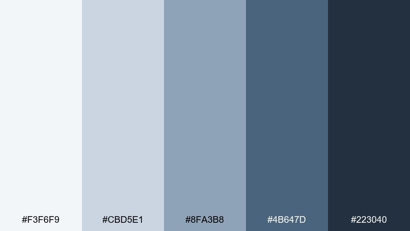
HEX: #F3F6F9 #CBD5E1 #8FA3B8 #4B647D #223040
Mood: calm, industrial, minimal
Best for: app settings screens
Calm and industrial, it feels like a river under steel skies. The cool grays are ideal for settings screens, admin tools, and utility-first products. Pair with one saturated accent (cyan or lime) for toggles and status badges. Usage tip: keep backgrounds near-white and use the darkest tone only for primary text.
Image example of steel river generated using media.io
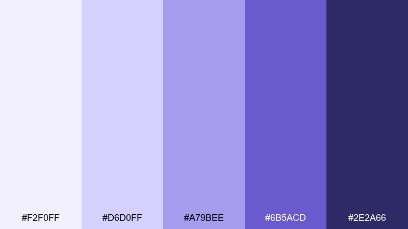
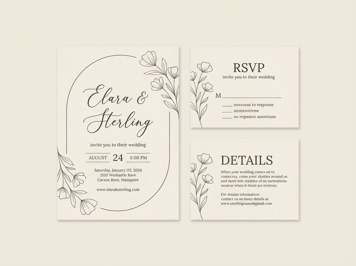
7) Snowy Lavender
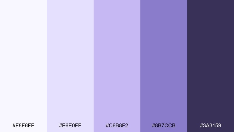
HEX: #F8F6FF #E6E0FF #C6B8F2 #8B7CCB #3A3159
Mood: soft, cozy, understated
Best for: wedding invitation suite
Soft and cozy like lavender fields dusted with snow, these tones feel romantic but modern. As a cold color combination, it suits wedding suites, baby announcements, and gentle event branding. Pair with matte white stock and a cool gray for envelopes or RSVP cards. Usage tip: print the light tones with extra ink density so they do not wash out.
Image example of snowy lavender generated using media.io
8) Icy Citrus
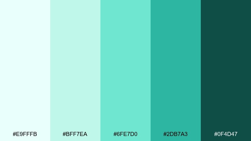
HEX: #E9FFFB #BFF7EA #6FE7D0 #2DB7A3 #0F4D47
Mood: bright, energetic, clean
Best for: summer beverage poster
Bright and energetic, it suggests sparkling water with a cool citrus twist. These cold color combinations pop on posters, menu boards, and social ads that need instant freshness. Pair with bold black type and a touch of off-white so the greens stay luminous. Usage tip: limit the brightest mint to small bursts like price tags or corner badges.
Image example of icy citrus generated using media.io
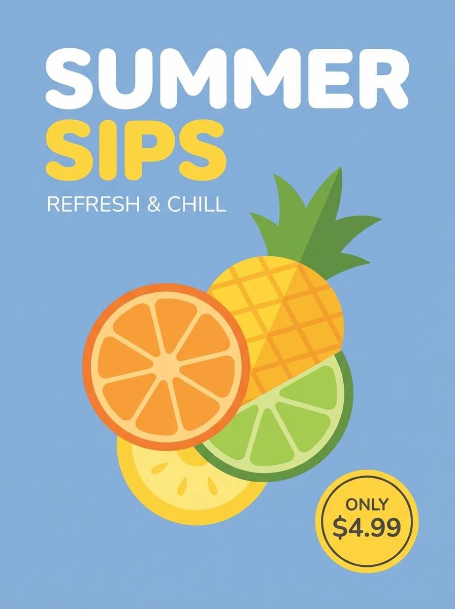
9) Northern Lights
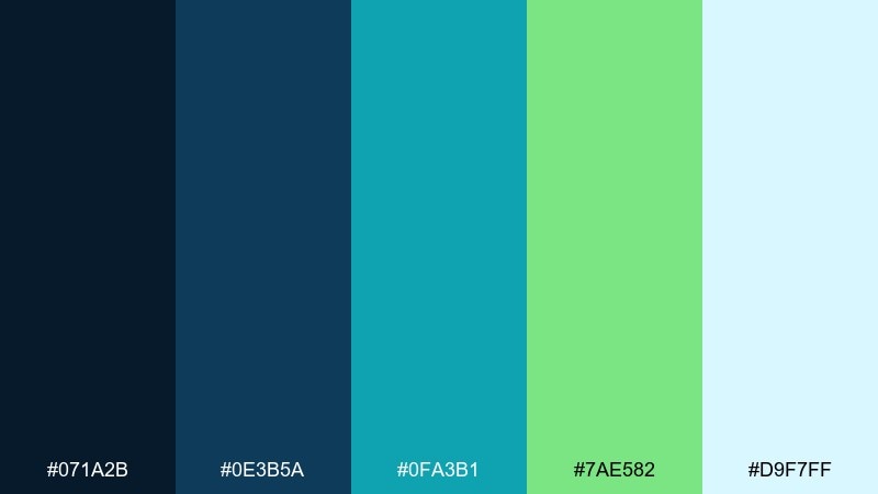
HEX: #071A2B #0E3B5A #0FA3B1 #7AE582 #D9F7FF
Mood: electric, adventurous, cinematic
Best for: gaming stream overlay
Electric and cinematic, it echoes aurora streaks across a dark sky. The contrast is perfect for gaming overlays, Twitch panels, and neon-styled hero banners. Pair with condensed sans fonts and subtle gradients to keep the glow effect controlled. Usage tip: keep the navy as the main canvas and use the green only for live indicators and highlights.
Image example of northern lights generated using media.io
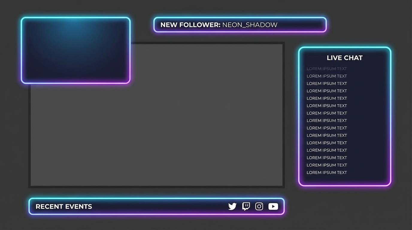
10) Deep Sea Glass
HEX: #E6FBFF #A9E5F2 #4FB8CC #1A6D80 #0B2F3A
Mood: cool, refined, oceanic
Best for: tech landing page
Cool and refined, it feels like sea glass polished by deep water. The blues and teals are strong for tech landing pages, SaaS headers, and feature sections. Pair with crisp white cards and a restrained accent icon set to avoid visual noise. Usage tip: use the mid teal for links and keep buttons either very light or very dark for clear states.
Image example of deep sea glass generated using media.io

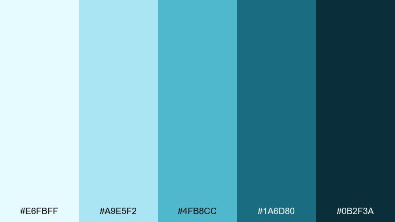
11) Blue Hour
HEX: #0B1026 #1B2A4A #2F4F7A #6B8FBF #E7F0FF
Mood: moody, premium, focused
Best for: luxury watch ad
Moody and premium, it captures the quiet depth of the blue hour before night. These tones fit luxury ads, product hero shots, and high-contrast branding. Pair with minimal copy, metallic accents, and generous negative space for a high-end feel. Usage tip: keep the lightest tint as a subtle rim light or background gradient rather than a flat fill.
Image example of blue hour generated using media.io

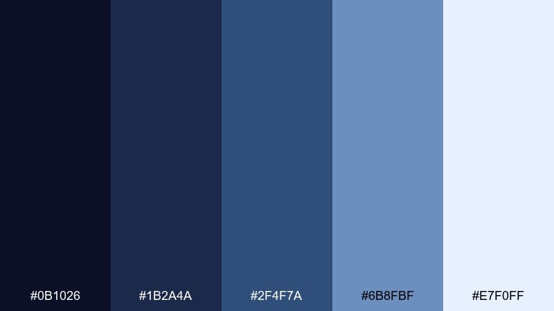
12) Slate Harbor
HEX: #F2F4F7 #D1D7DE #9AA6B2 #566575 #2B3440
Mood: steady, professional, balanced
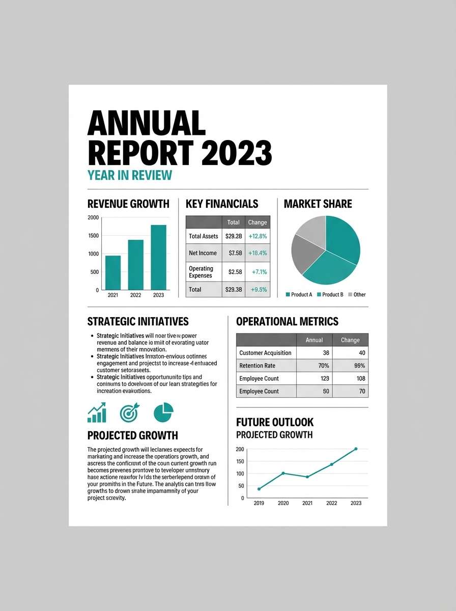
Best for: annual report layout
Steady and professional, it resembles harbor stone and overcast water. Cold color combinations like these are ideal for annual reports, case studies, and B2B PDFs. Pair with one muted blue accent and clean grid typography to keep pages readable. Usage tip: use the medium slate for rules and tables so the layout feels structured without heavy lines.
Image example of slate harbor generated using media.io
13) Crystal Sky
HEX: #F4FBFF #D6F1FF #9FD9FF #4FA6E8 #1F4E79
Mood: uplifting, open, modern
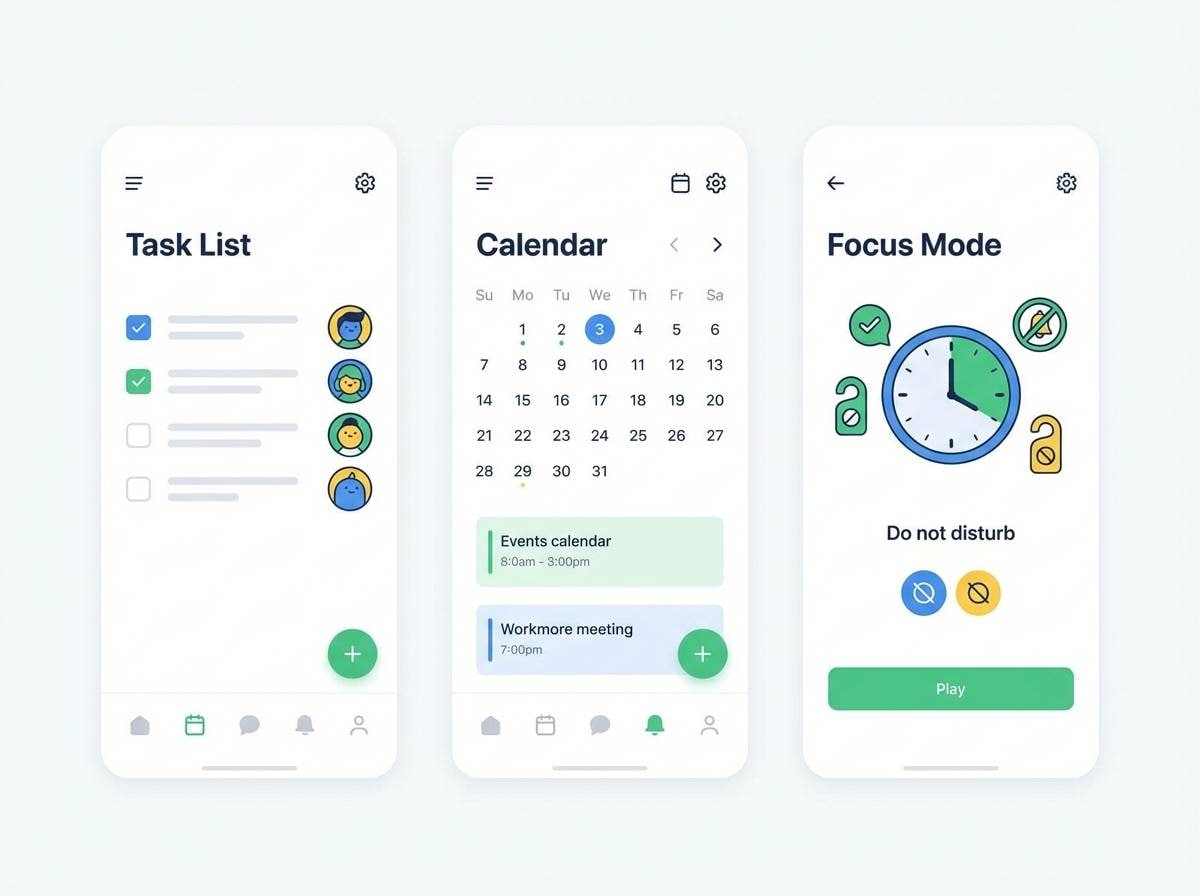
Best for: education app onboarding
Uplifting and open, it reads like a clear sky after snowfall. The light-to-deep blues support friendly onboarding screens and learning apps where clarity matters. Pair with rounded icons and soft illustrations for a welcoming tone. Usage tip: keep the brightest blue for progress states and success messages, not for long text blocks.
Image example of crystal sky generated using media.io

14) Cool Concrete
HEX: #F7F7F8 #D9DDE2 #AAB3BF #6C7785 #2E333A
Mood: urban, neutral, minimal
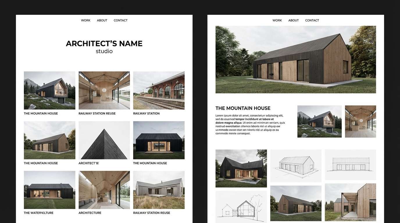
Best for: architecture portfolio site
Urban and minimal, it mirrors concrete, steel, and soft shadows. The neutral grays let photography and layouts take the lead on portfolios and studio websites. Pair with a single cool accent like icy blue for links and hover states. Usage tip: apply the darkest gray sparingly to avoid making the design feel heavy.
Image example of cool concrete generated using media.io
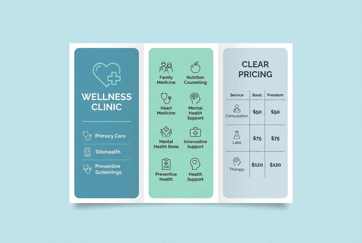
15) Mint Shadow
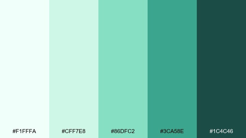
HEX: #F1FFFA #CFF7E8 #86DFC2 #3CA58E #1C4C46
Mood: clean, soothing, friendly
Best for: healthcare clinic brochure
Clean and soothing, it suggests sterile freshness softened by mint leaves. As a cold color palette, it works for healthcare brochures, clinic websites, and patient-friendly forms. Pair with warm gray body text and simple line icons to keep the tone approachable. Usage tip: use the darker teal for section headers so the light tints can stay airy.
Image example of mint shadow generated using media.io
16) Alpine Dusk
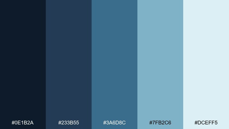
HEX: #0E1B2A #233B55 #3A6D8C #7FB2C6 #DCEFF5
Mood: outdoorsy, calm, rugged
Best for: travel blog header
Outdoorsy and calm, it evokes mountain lakes at dusk and cool air on the trail. The blues fit travel blog headers, itinerary graphics, and photo-led storytelling. Pair with natural textures like paper grain and a muted tan for captions if you want contrast without warmth overload. Usage tip: keep the darkest shade for navigation so it stays readable over images.
Image example of alpine dusk generated using media.io

17) Ink and Ice
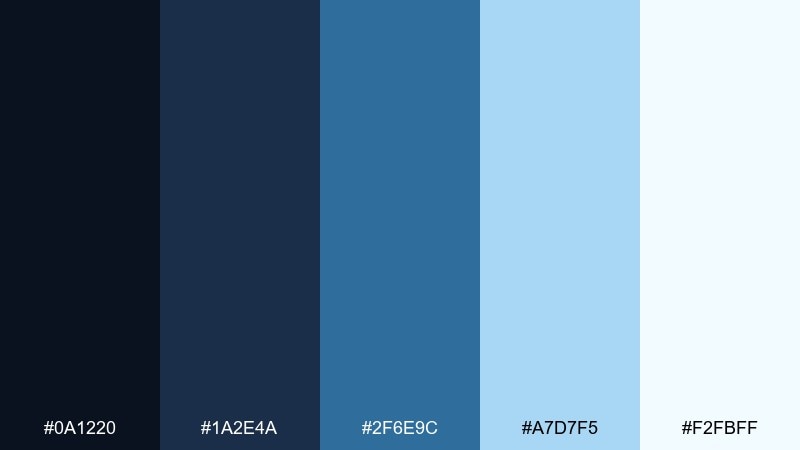
HEX: #0A1220 #1A2E4A #2F6E9C #A7D7F5 #F2FBFF
Mood: sharp, high-contrast, modern
Best for: dark mode ui kit
Sharp and high-contrast, it feels like ink lines on frosted glass. The mix is excellent for dark mode UI kits, code editors, and accessibility-first interfaces. Pair with neutral grays for secondary text and keep bright blue for interactive states. Usage tip: test contrast at small sizes and avoid using the lightest tint for thin icons.
Image example of ink and ice generated using media.io
18) Silver Spruce
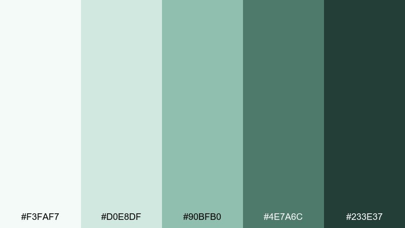
HEX: #F3FAF7 #D0E8DF #90BFB0 #4E7A6C #233E37
Mood: natural, cool, sophisticated
Best for: outdoor brand logo system
Natural and cool, it recalls spruce branches with a silvery sheen. The greens and blue-grays fit outdoor brands, premium coffee labels, and minimalist merch. Pair with off-white and dark charcoal to keep the palette sophisticated instead of sporty. Usage tip: use the medium green for secondary logo marks and badges to build consistency.
Image example of silver spruce generated using media.io
19) Periwinkle Drift
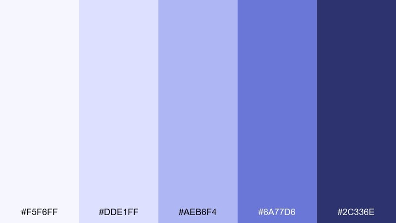
HEX: #F5F6FF #DDE1FF #AEB6F4 #6A77D6 #2C336E
Mood: gentle, creative, techy
Best for: productivity app illustrations
Gentle and creative, it looks like periwinkle clouds drifting across a winter sky. The violets are great for productivity apps, onboarding illustrations, and playful yet mature brands. Pair with soft gray linework and a small pop of lime for micro-interactions if needed. Usage tip: keep the mid periwinkle consistent across illustration shadows so the set feels unified.
Image example of periwinkle drift generated using media.io
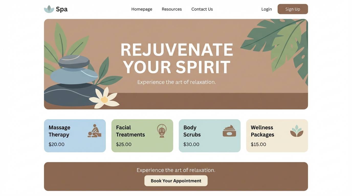
20) Ocean Fog
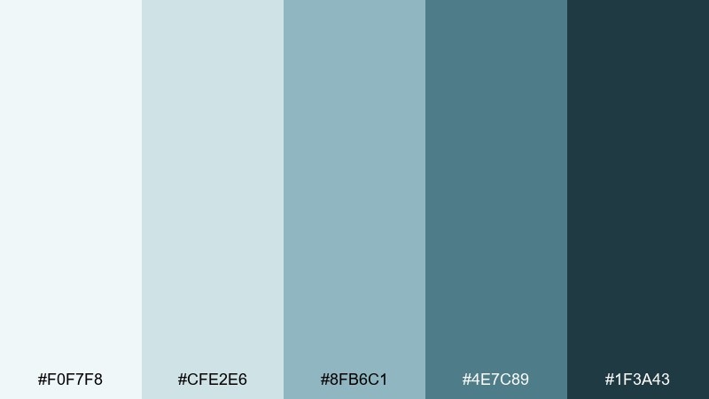
HEX: #F0F7F8 #CFE2E6 #8FB6C1 #4E7C89 #1F3A43
Mood: quiet, coastal, mature
Best for: spa website redesign
Quiet and coastal, it feels like fog rolling in over a cold shoreline. As a cold color palette, it fits spas, boutique hotels, and calm service brands that want a mature look. Pair with warm beige accents in photography and keep typography airy with generous line spacing. Usage tip: use the muted teal for buttons and reserve the darkest tone for footer and navigation.
Image example of ocean fog generated using media.io
What Colors Go Well with Cold?
Cold tones pair especially well with clean neutrals like white, off-white, and cool grays because they preserve the palette’s clarity. This is the safest route for UI, product pages, and editorial layouts where readability is non-negotiable.
To avoid a sterile look, add a controlled warm counterpoint: sand, oatmeal, light tan, or a muted gold accent. Even small warm touches (badges, icons, dividers) can make cool palettes feel more human.
For bolder contrast, use near-black navy or charcoal for typography and structure, then reserve one saturated cool accent (cyan, mint, or teal) for interaction states and key highlights.
How to Use a Cold Color Palette in Real Designs
Start with roles, not swatches: pick one light tint for backgrounds, one mid tone for UI elements, and one deep shade for text and navigation. This keeps the system consistent across screens and prevents “random blue” drift.
Watch contrast carefully, especially with icy pastels. If your palette is very light, use darker type colors and test small text, thin icons, and disabled states to ensure accessibility.
In print, cool tints can wash out on uncoated stock. Increase ink density slightly, and rely on deep cool shades for small typography like ingredient lists, captions, and footnotes.
Create Cold Palette Visuals with AI
If you already have HEX codes, you can generate matching mockups and graphics by describing the layout (UI, poster, packaging) and the mood (crisp, minimal, oceanic). Keep prompts specific about style (2D/flat vs realistic) and composition (plain background, no hands) to get cleaner results.
For consistency, reuse the same prompt structure across assets and only swap the subject (dashboard, brand board, brochure). Then adjust one variable at a time—lighting, typography, or accent color—so your visual system stays cohesive.
Cold Color Palette FAQs
-
What is a cold color palette?
A cold (cool) color palette is a set of hues dominated by blues, teals, blue-greens, cool purples, and cool grays. These colors tend to feel crisp, calm, and modern compared to warm palettes. -
What emotions do cold colors communicate in design?
Cold colors commonly suggest clarity, trust, calm, and professionalism. Dark navies can feel premium and focused, while icy tints feel airy and clean. -
Are cold color schemes good for websites and UI?
Yes—cold palettes are popular for SaaS, fintech, and productivity apps because they support clean hierarchy and readable contrast. Use deep shades for text and CTAs, and keep backgrounds light and spacious. -
How do you keep a cold palette from looking too sterile?
Add one warm neutral accent (sand, oatmeal, muted gold) or use softer cool tints instead of pure saturated blues. Texture (paper grain, subtle gradients) also helps add warmth without changing the palette’s identity. -
What’s the best accent color for a cold palette?
Bright cyan, mint, or lime work well for modern UI accents, while muted gold or beige adds a more premium, editorial contrast. The best choice depends on whether you want a techy or sophisticated feel. -
Do cold colors print well?
They can, but very light icy tints may print faint on uncoated paper. For print, keep small text in deep cool shades and consider boosting tint density so pale colors don’t wash out. -
How can I generate images that match my cold color palette?
Use an AI image generator and describe the subject plus the style (flat UI, realistic studio shot) and the cold mood (icy, clean, oceanic). Reuse the same prompt framework across assets for consistent results.
Next: Teal Gold Color Palette


