

Teal and brown is one of those rare pairings that feels both fresh and familiar: teal brings clean, watery coolness, while brown adds earthy warmth and stability.
If you’re building a brand, designing an interface, or styling a room, a teal brown color palette helps you land in that sweet spot between modern and grounded.
In this article
- Why Teal Brown Palettes Work So Well
-
- coastal teal wood
- forest cabin
- copper harbor
- vintage map
- espresso lagoon
- desert oasis
- deep sea leather
- teal denim and mocha
- botanical study
- art deco foyer
- autumn riverbank
- minimal workspace
- rustic kitchen
- spa stone
- night market neon
- heritage poster
- modern museum
- wedding eucalyptus
- coffeehouse branding
- stormy coastline
- What Colors Go Well with Teal Brown?
- How to Use a Teal Brown Color Palette in Real Designs
- Create Teal Brown Palette Visuals with AI
Why Teal Brown Palettes Work So Well
Teal and brown work because they naturally balance temperature: teal cools things down, while brown warms them up. That contrast creates clarity without feeling harsh, especially compared to black-and-white-only schemes.
Psychologically, teal reads as calm, clean, and reliable, while brown feels handcrafted, organic, and steady. Together, they can look premium and approachable at the same time.
Design-wise, the pairing offers easy hierarchy: teal makes great headings, buttons, and icons, while brown excels for supportive typography, dividers, and grounding surfaces like backgrounds and frames.
20+ Teal Brown Color Palette Ideas (with HEX Codes)
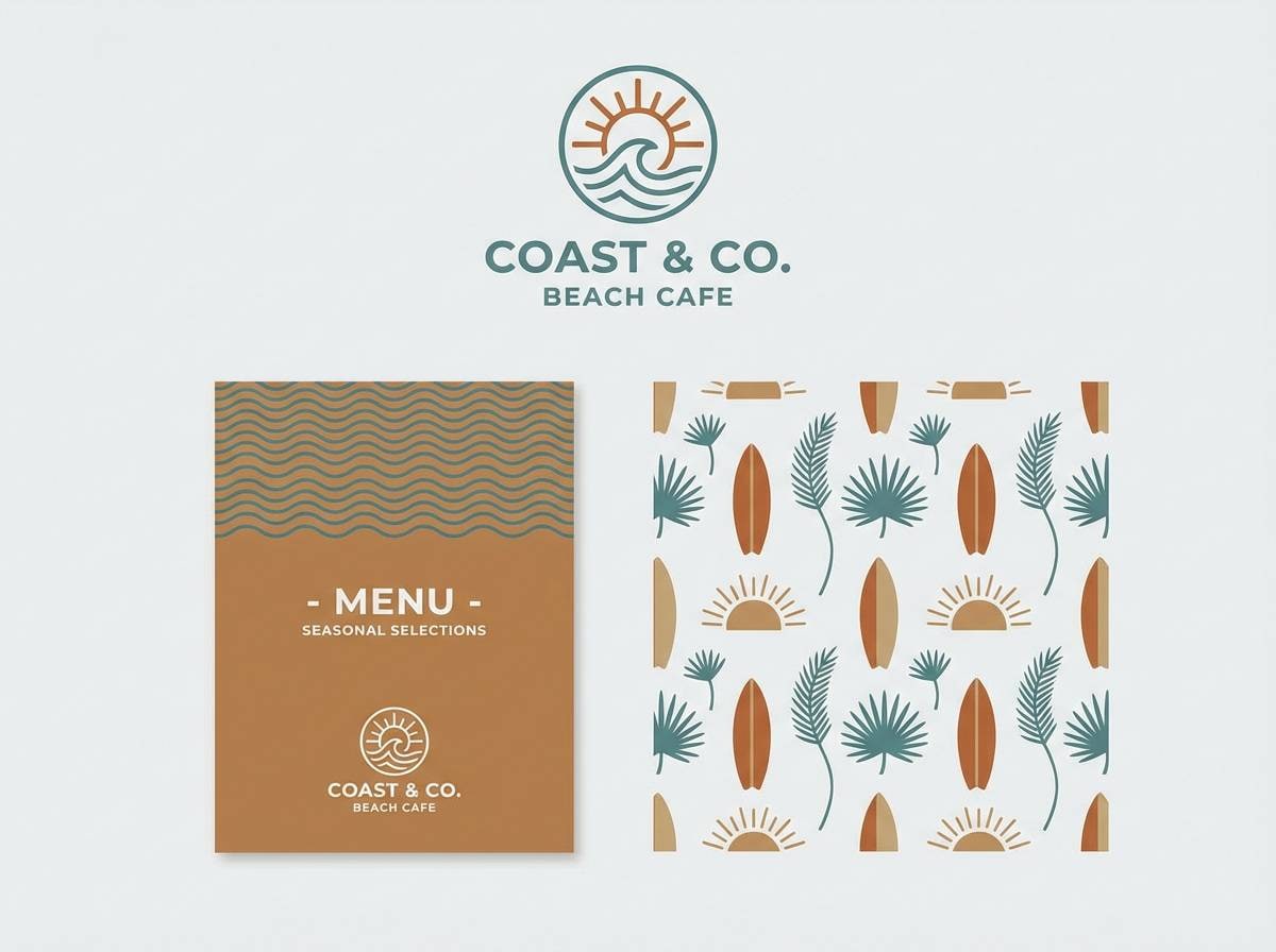
1) Coastal Teal Wood
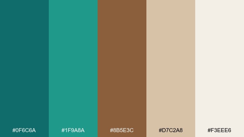
HEX: #0F6C6A #1F9A8A #8B5E3C #D7C2A8 #F3EEE6
Mood: airy, grounded, coastal
Best for: beach cafe branding and menus
Airy shoreline calm meets sun-warmed driftwood in these tones. Use the lighter creams for breathing room, then anchor layouts with the mocha wood and deep teal. It works especially well for cafe menus, tote bags, and signage where you want fresh but not loud. Tip: keep teal for headings and icons, and reserve brown for dividers and price blocks to improve readability.
Image example of coastal teal wood generated using media.io
Media.io is an online AI studio for creating and editing video, image, and audio in your browser.

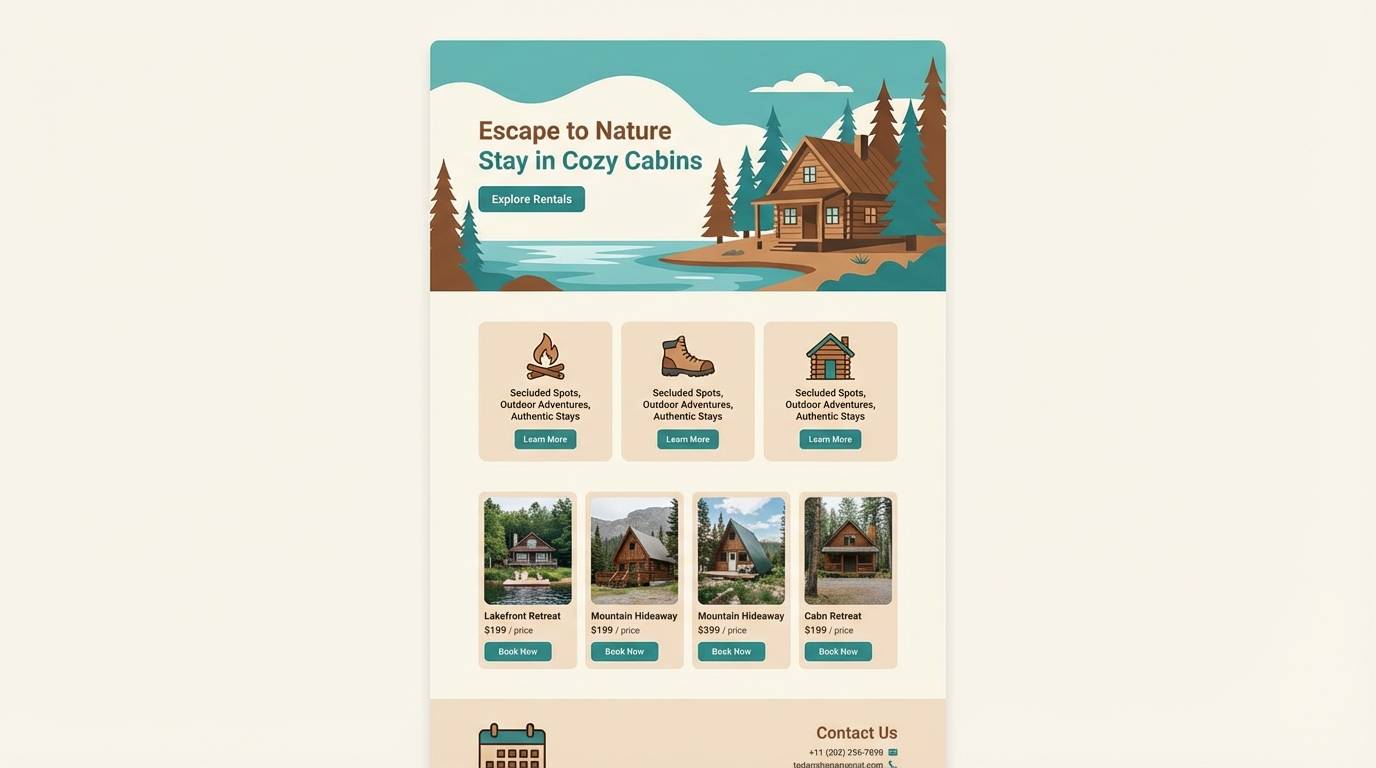
2) Forest Cabin
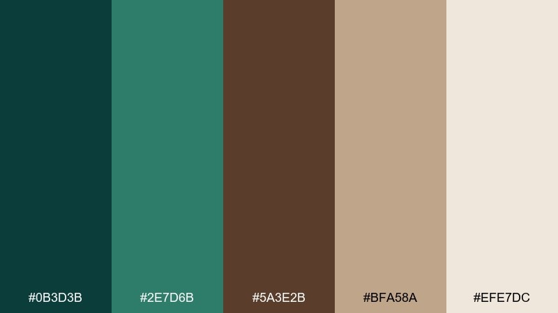
HEX: #0B3D3B #2E7D6B #5A3E2B #BFA58A #EFE7DC
Mood: cozy, natural, outdoorsy
Best for: cabin rental website UI
Cozy evergreens and cedar walls set a calm, welcoming tone. Pair the deep pine teal with cream backgrounds for a warm, readable interface, then use the mid teal for buttons and active states. The lighter tan is great for cards and subtle borders without looking gray. Tip: keep contrast high by using the darkest teal for body text on the warm creams.
Image example of forest cabin generated using media.io
3) Copper Harbor
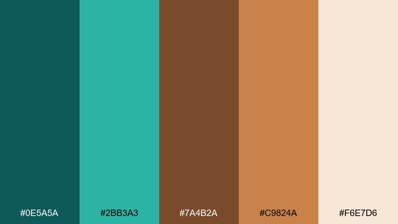
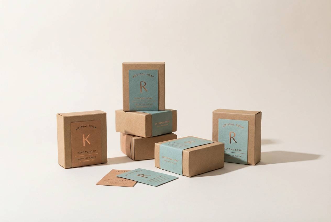
HEX: #0E5A5A #2BB3A3 #7A4B2A #C9824A #F6E7D6
Mood: lively, warm, nautical
Best for: product packaging for artisanal soap
Lively harbor water and copper hardware bring a bright, handcrafted energy. These teal brown color combinations shine on packaging when you balance the vivid aqua against the toasted browns. Use the copper-orange as a small accent for seals, stamps, or scent labels. Tip: print the darkest teal as your main ink and let the cream act as natural negative space.
Image example of copper harbor generated using media.io
4) Vintage Map
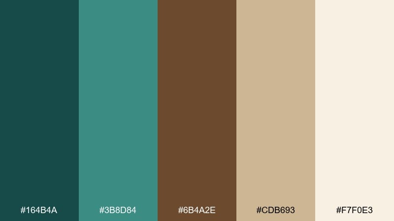
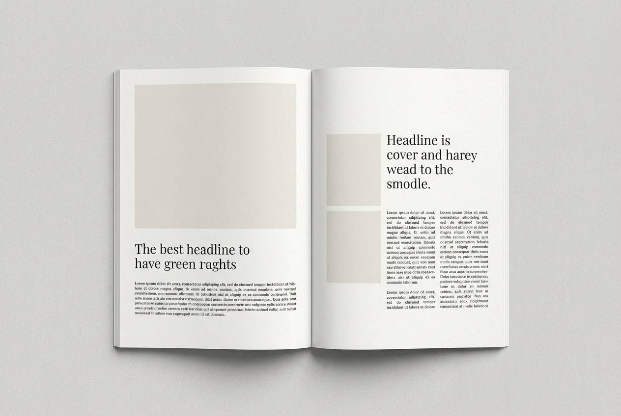
HEX: #164B4A #3B8D84 #6B4A2E #CDB693 #F7F0E3
Mood: nostalgic, academic, refined
Best for: editorial magazine spread
Nostalgic paper grain and inked coastlines give these tones a collected, bookish feel. The warm parchment and sand hues keep long reads comfortable, while teal adds structure for section headers and pull quotes. Brown works beautifully for rules, captions, and footnote styling. Tip: use teal sparingly as a navigation color so the spread still feels archival.
Image example of vintage map generated using media.io
5) Espresso Lagoon
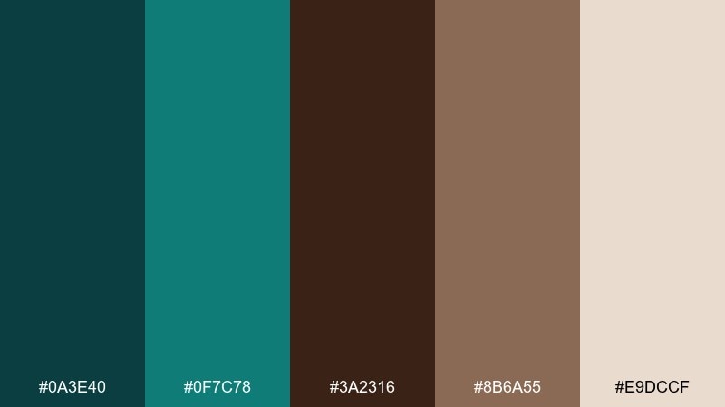
HEX: #0A3E40 #0F7C78 #3A2316 #8B6A55 #E9DCCF
Mood: moody, premium, intimate
Best for: coffee shop logo and loyalty card
Moody lagoon depth meets dark espresso for a premium, late-night vibe. A teal brown color palette like this works best when you let the near-black coffee tone lead and use teal as a crisp contrast. The soft beige lifts everything so the design never feels heavy. Tip: foil-stamp teal details on matte brown stock for a subtle, upscale finish.
Image example of espresso lagoon generated using media.io
6) Desert Oasis
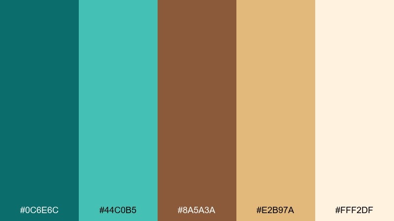
HEX: #0C6E6C #44C0B5 #8A5A3A #E2B97A #FFF2DF
Mood: bright, sunny, adventurous
Best for: travel poster design
Sunny dunes and a cool oasis sparkle in this high-energy mix. Keep the pale cream as your base, then layer teal gradients for sky or water shapes and bring in the browns for type and silhouettes. It fits travel posters, event promos, and social graphics that need warmth without losing freshness. Tip: add the golden sand as a limited highlight color for dates and callouts.
Image example of desert oasis generated using media.io

7) Deep Sea Leather
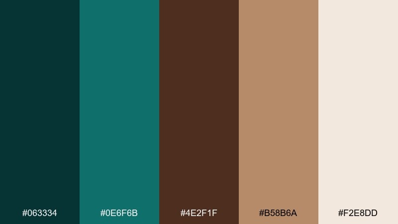
HEX: #063334 #0E6F6B #4E2F1F #B58B6A #F2E8DD
Mood: luxury, masculine, timeless
Best for: watch product ad layout
Deep sea shadow and worn leather create a timeless, tailored mood. Use the dark teal as the hero background and let tan leather tones carry the product story and callouts. The pale cream keeps typography crisp and premium. Tip: pair with minimal serif headlines and plenty of spacing to reinforce the luxury feel.
Image example of deep sea leather generated using media.io

8) Teal Denim and Mocha
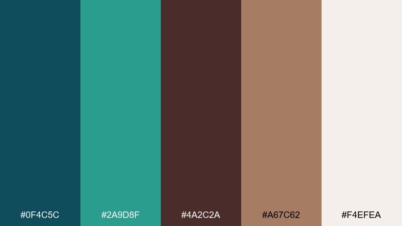
HEX: #0F4C5C #2A9D8F #4A2C2A #A67C62 #F4EFEA
Mood: casual, modern, approachable
Best for: fashion lookbook layout
Casual denim cool meets mocha warmth for an everyday-modern vibe. The teal shades work well for section headers and price tags, while browns keep the typography grounded and friendly. Use the warm tan for background blocks behind product details to avoid harsh contrast. Tip: keep photography slightly desaturated so the palette stays the hero.
Image example of teal denim and mocha generated using media.io
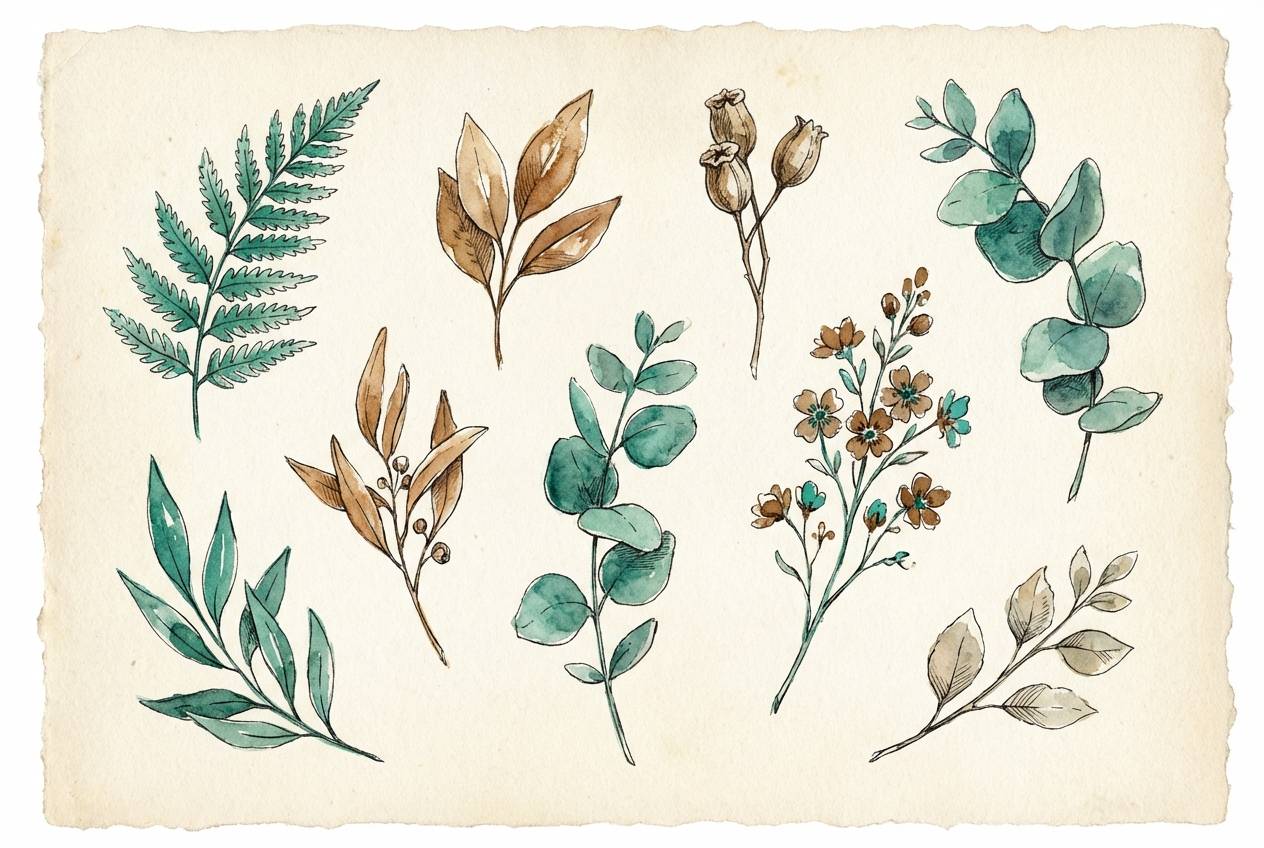
9) Botanical Study
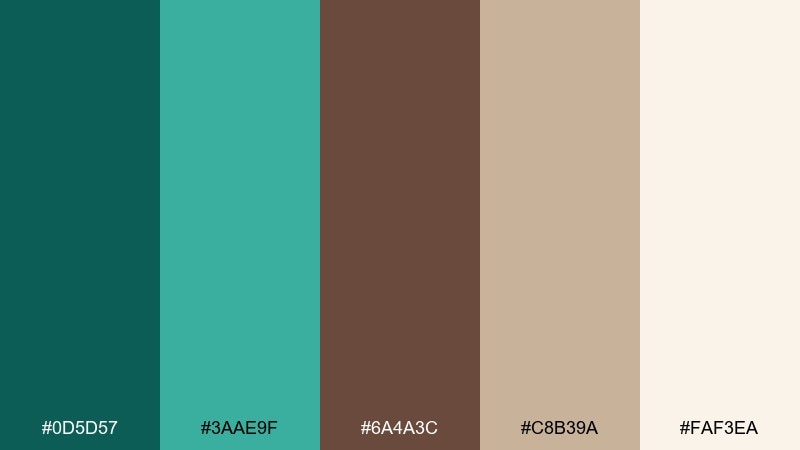
HEX: #0D5D57 #3AAE9F #6A4A3C #C8B39A #FAF3EA
Mood: fresh, organic, calming
Best for: botanical illustration set
Fresh greenhouse air and pressed-paper textures make this palette feel naturally calming. Teal reads like healthy leaves, while the browns add a dried-herb warmth that suits labels and notes. Keep the light cream as your paper tone and use tan for soft shadows. Tip: add fine linework in the darkest teal to keep watercolor elements crisp.
Image example of botanical study generated using media.io
10) Art Deco Foyer
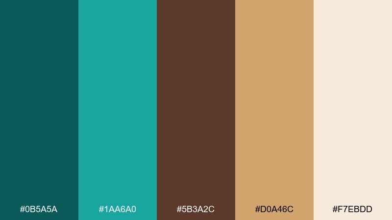
HEX: #0B5A5A #1AA6A0 #5B3A2C #D0A46C #F7EBDD
Mood: glam, structured, confident
Best for: event invitation design
Glam geometric lines and polished brass warmth give this set an art-deco edge. These teal brown color combinations look best when you treat gold as the accent and keep teal as the main block color. Brown adds vintage depth for borders, monograms, and small ornaments. Tip: use symmetrical layouts and thin rules to lean into the deco structure.
Image example of art deco foyer generated using media.io

11) Autumn Riverbank
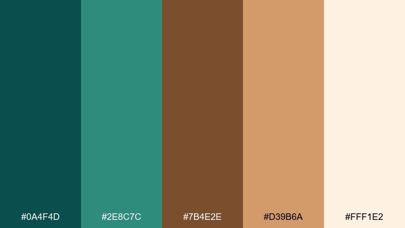
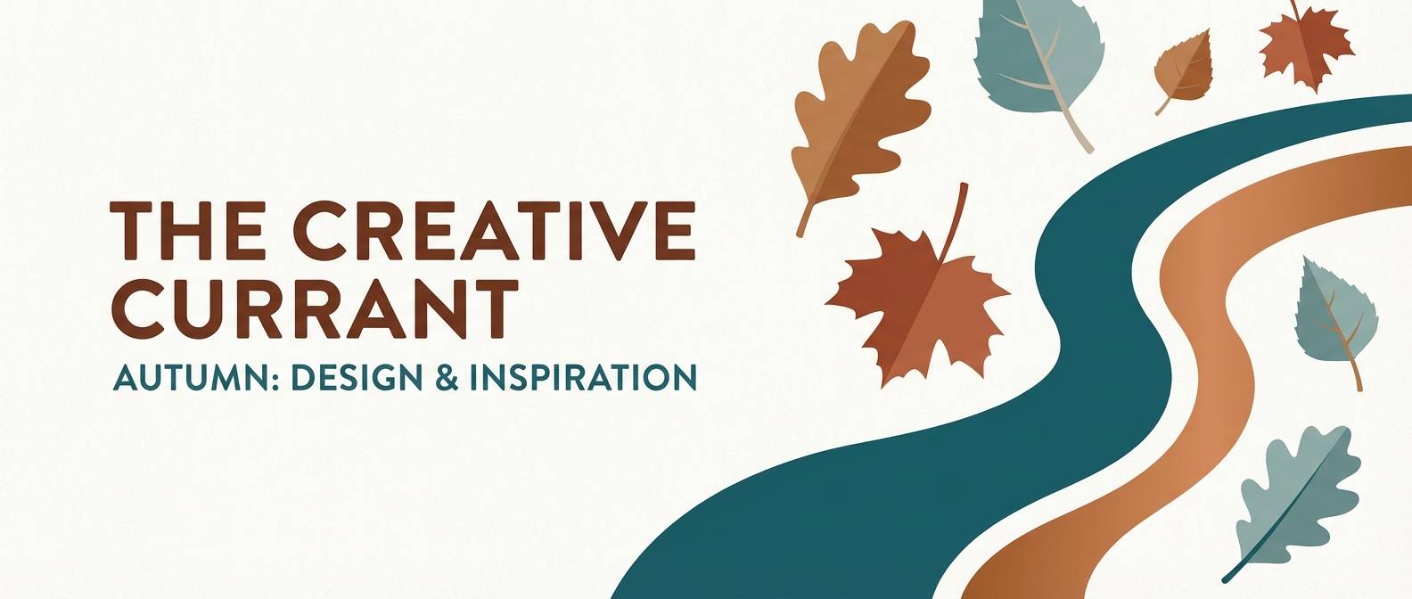
HEX: #0A4F4D #2E8C7C #7B4E2E #D39B6A #FFF1E2
Mood: seasonal, cozy, storybook
Best for: fall blog header graphics
Crisp river air and fallen leaves bring a cozy, storybook mood. Use teal for water and shadows, then warm the layout with leaf-brown and pumpkin-tan for highlights. The creamy off-white keeps headers bright and easy to scan. Tip: add subtle grain on backgrounds to make the seasonal colors feel tactile.
Image example of autumn riverbank generated using media.io
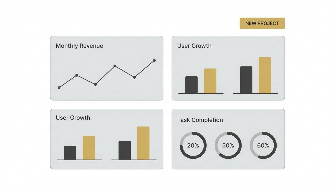
12) Minimal Workspace
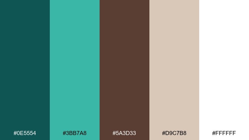
HEX: #0E5554 #3BB7A8 #5A3D33 #D9C7B8 #FFFFFF
Mood: clean, focused, professional
Best for: SaaS dashboard UI
Clean focus and calm productivity come through in the balanced contrast. A teal brown color palette like this helps dashboards feel friendly without losing seriousness, especially when white space does the heavy lifting. Use teal for primary actions, mocha for secondary labels, and the light beige for panels. Tip: keep charts to two accent colors and use tints for additional series.
Image example of minimal workspace generated using media.io
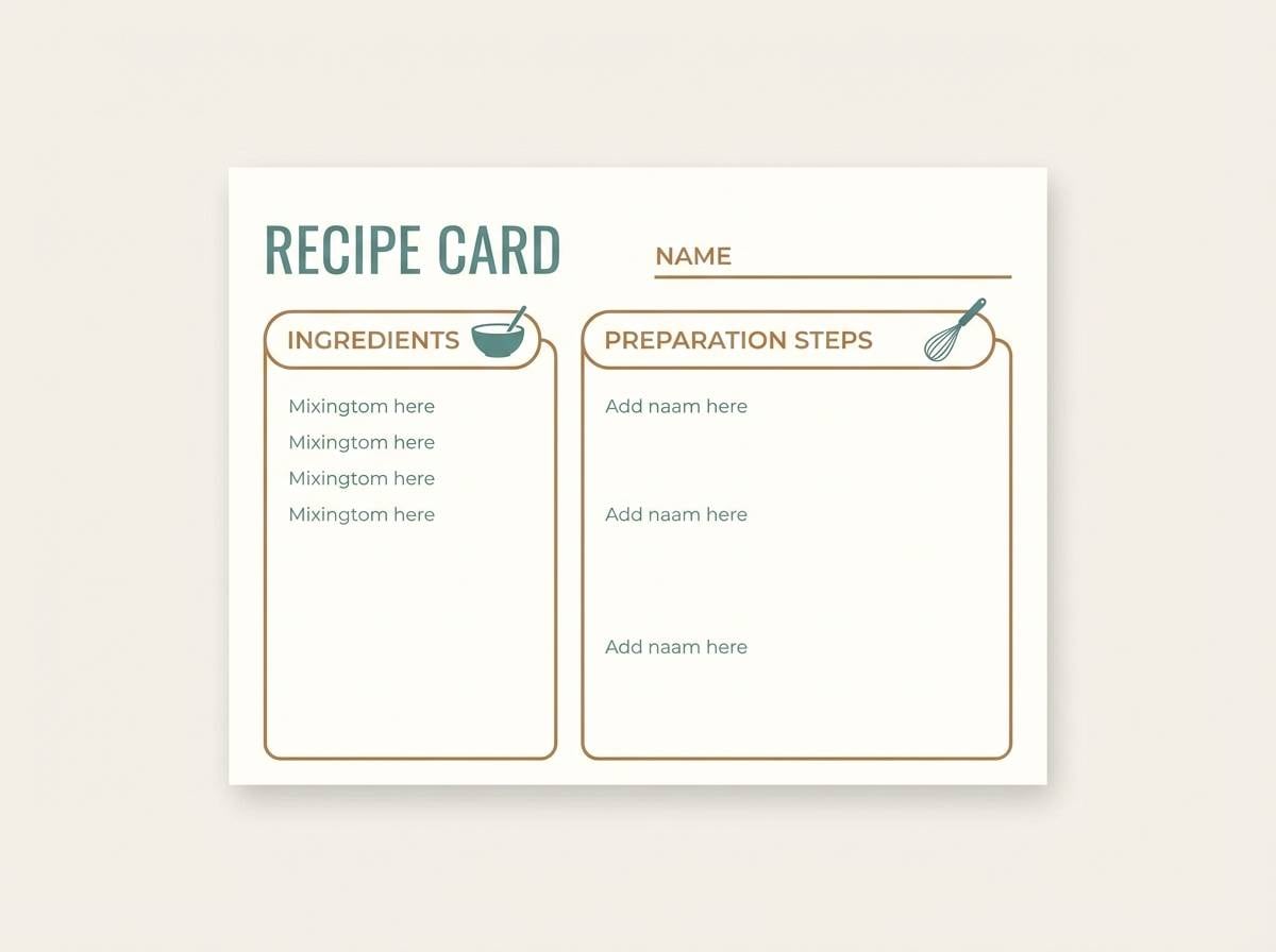
13) Rustic Kitchen
HEX: #0C4A4A #2F9187 #6B3F2A #CFA88A #F5ECE2
Mood: homey, warm, inviting
Best for: recipe card template
Homey warmth and vintage cookware vibes make this set instantly inviting. Use the creamy base for readability, then add teal for section titles and icons like time and servings. The rustic browns are perfect for ingredient dividers and header bars that feel handcrafted. Tip: choose a slightly rounded typeface to match the friendly kitchen tone.
Image example of rustic kitchen generated using media.io
14) Spa Stone
HEX: #0E6A66 #67C9BF #7A5A47 #D8CBBE #F8F5F1
Mood: serene, soft, restorative
Best for: wellness landing page
Serene mineral tones and cool water notes create a restorative mood. Use the soft aqua-teal for large background sections, and bring in warm taupe-brown for buttons and key messages. The gentle beige reads like smooth stone, ideal for calming layouts. Tip: keep imagery light and airy, and reserve the darkest teal for headlines only.
Image example of spa stone generated using media.io
15) Night Market Neon
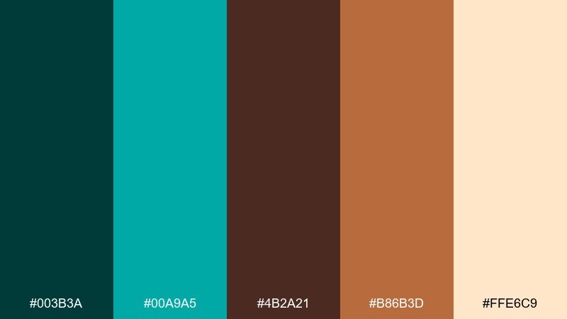
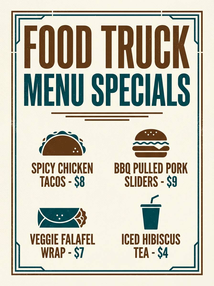
HEX: #003B3A #00A9A5 #4B2A21 #B86B3D #FFE6C9
Mood: bold, energetic, urban
Best for: food truck poster
Bold night energy and neon signage make these colors feel lively and urban. Put the bright teal on dark backgrounds for instant glow, then use the warm brown and spice-orange for menu highlights and pricing. The pale cream keeps text readable and balances the intensity. Tip: limit neon teal to one or two elements per layout so it stays punchy.
Image example of night market neon generated using media.io
16) Heritage Poster
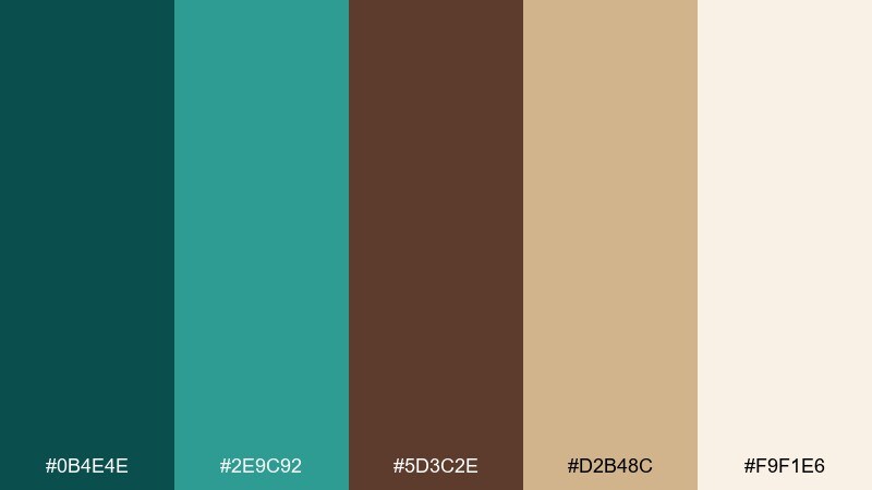
HEX: #0B4E4E #2E9C92 #5D3C2E #D2B48C #F9F1E6
Mood: classic, cultural, crafted
Best for: museum exhibit poster
Classic craft and heritage print vibes give this palette a timeless presence. A teal brown color combination like this suits museum posters where you want warmth, clarity, and a sense of history. Use tan as your background to mimic aged paper, then set teal for titles and brown for body copy. Tip: add subtle texture behind solids to avoid a flat, overly digital look.
Image example of heritage poster generated using media.io
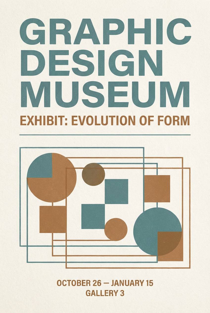
17) Modern Museum
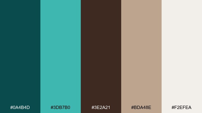
HEX: #0A4B4D #3DB7B0 #3E2A21 #BDA48E #F2EFEA
Mood: modern, curated, quiet
Best for: gallery website UI
Curated calm and quiet modernism define these refined tones. Let the pale neutral act like gallery walls, then use teal for navigation, hover states, and small directional cues. The deep espresso-brown gives sophistication to typography and captions without turning harsh. Tip: keep imagery framed with generous margins so the colors feel intentional, not decorative.
Image example of modern museum generated using media.io
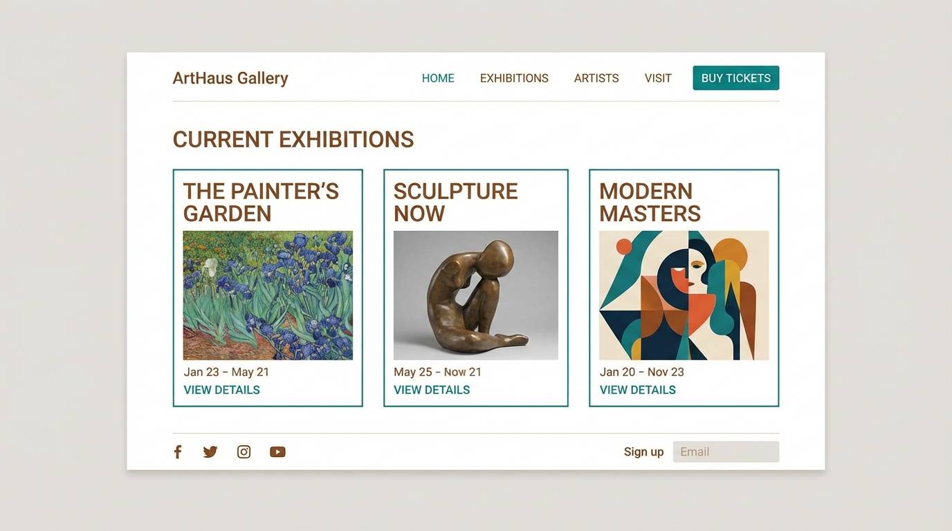
18) Wedding Eucalyptus
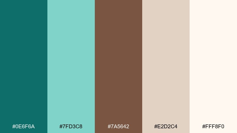
HEX: #0E6F6A #7FD3C8 #7A5642 #E2D2C4 #FFF8F0
Mood: romantic, soft, natural
Best for: wedding invitation suite
Soft eucalyptus greens and warm wood notes feel romantic without being overly sweet. Use the cream and blush-beige as your paper base, then apply teal for monograms and small botanical details. Brown works best for names and venue lines, keeping the suite grounded and readable. Tip: choose thin strokes for foliage and keep teal to one shade for a cohesive set.
Image example of wedding eucalyptus generated using media.io
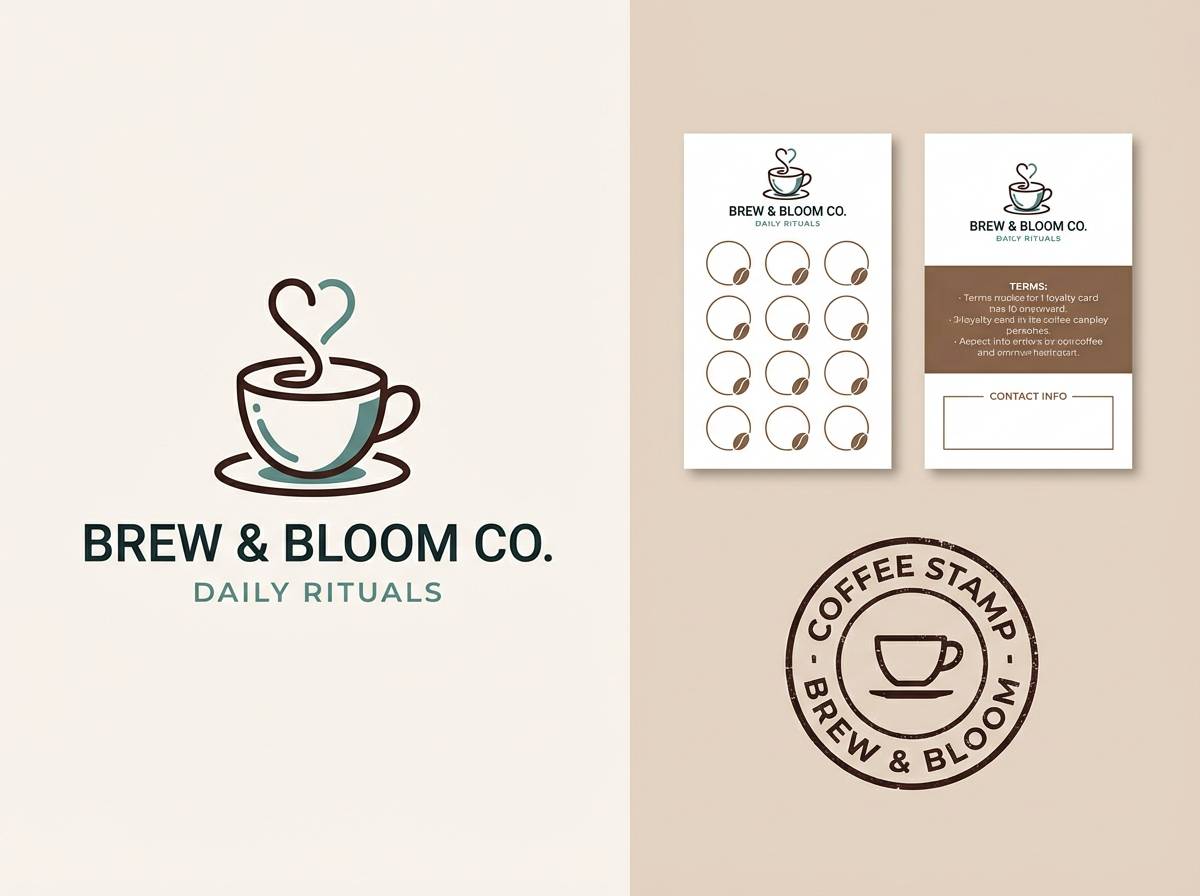
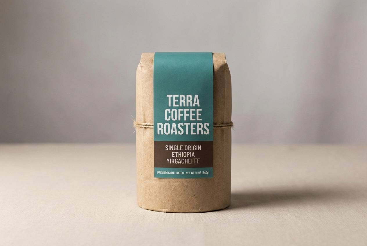
19) Coffeehouse Branding
HEX: #083C3B #1E8E85 #4A2D1F #A77B5B #F0E4D6
Mood: rich, friendly, artisanal
Best for: coffee bag packaging and label
Rich roast aroma and a friendly neighborhood feel come through instantly. A teal brown color palette like this plays well on kraft materials, where teal adds a modern twist to classic coffee tones. Use the lighter tan for tasting notes and the darkest brown for origin and roast level. Tip: keep label hierarchy simple and bold so it reads clearly from a distance.
Image example of coffeehouse branding generated using media.io
20) Stormy Coastline
HEX: #062D2E #0F6A67 #5C3E2E #BFA38C #EDE7DF
Mood: dramatic, grounded, cinematic
Best for: YouTube thumbnail template
Cinematic storm clouds over a rugged shoreline make this mix feel dramatic and grounded. Use the dark teal as a strong backdrop, then pop titles in the pale neutral for instant contrast. Warm browns add a human, earthy note that keeps the design from feeling too cold. Tip: apply a subtle vignette in the darkest tone so text stays centered and legible.
Image example of stormy coastline generated using media.io

What Colors Go Well with Teal Brown?
Soft neutrals are the easiest add-ons: ivory, cream, warm beige, and parchment help teal stay crisp while keeping brown from feeling too heavy. They also create generous negative space for layouts, packaging, and UI.
For accents, metallics like brass or copper push the scheme toward premium and vintage, while a muted sand or caramel can add warmth without competing with teal. If you need extra contrast, near-black espresso or deep charcoal works better than pure black for a more natural finish.
For a fresher, more contemporary look, try pairing teal brown with desaturated greens (sage/eucalyptus) or a soft blush-beige. These keep the palette organic while widening your range for backgrounds, highlights, and secondary components.
How to Use a Teal Brown Color Palette in Real Designs
Start with roles, not equal mixing: choose one main color (often teal for modern energy or brown for heritage warmth), then assign the other as a supporting contrast for structure, typography, and UI states. This avoids a “muddy” look.
Use light neutrals to separate teal and brown blocks—especially in web and print—so the palette feels intentional and readable. In interiors, that can be walls and textiles; in branding, it can be paper tone, margins, or card backgrounds.
Keep saturation consistent across your teal and brown picks: pair vivid teal with toasted browns and creamy whites, or pair deep muted teal with taupe and leather tones. Consistency is what makes the palette feel designed rather than accidental.
Create Teal Brown Palette Visuals with AI
If you already have HEX codes, the fastest way to test them is to generate a few visuals: posters, packaging, UI mockups, and social templates. Seeing teal and brown “in context” makes it easier to decide which shade should lead and which should support.
Media.io lets you turn palette ideas into on-brand images quickly, so you can explore variations (more coastal, more vintage, more luxe) without rebuilding everything from scratch. Reuse prompts, swap HEX-inspired descriptors, and iterate until the balance feels right.
Once you like a direction, generate a small set of consistent assets—hero image, thumbnail, and a simple pattern—so your teal brown color scheme looks unified across channels.
Teal Brown Color Palette FAQs
-
What does a teal and brown color palette communicate?
It blends calm clarity (teal) with grounded warmth (brown), so it often feels trustworthy, natural, and quietly premium—great for brands that want to be modern but not sterile. -
Is teal and brown a good combination for branding?
Yes. Teal is distinctive and readable for logos and UI accents, while brown adds craft and authenticity. Together they work well for cafes, wellness, outdoors, heritage, and artisanal products. -
How do I keep teal and brown from looking dull or muddy?
Use a light neutral (cream/ivory/white) as breathing room, keep one color dominant, and avoid using mid-tone teal and mid-tone brown in equal large areas without separation. -
What background color works best with a teal brown color scheme?
Warm off-whites like parchment, cream, or light beige. They preserve warmth, improve readability, and help teal accents pop without the harshness of pure white. -
Can I use teal brown palettes in UI and dashboards?
Absolutely. Use teal for primary actions and focus states, brown for secondary text or UI framing, and rely on neutral panels for layout clarity and contrast. -
What accent colors pair well with teal and brown?
Brass/copper/gold for a luxe or vintage feel, sand/caramel for warmth, and deep espresso or charcoal for stronger contrast. Soft sage can also widen the palette while staying organic. -
How can I generate teal brown design mockups quickly?
Use an AI image generator like Media.io to create packaging, posters, or UI-style visuals from prompts, then iterate by adjusting teal brightness, brown depth, and neutral background tone.


