

Tawny is a warm, orange-brown neutral that sits between tan, terracotta, and caramel. It brings instant warmth and a grounded, natural feel to digital and print designs.
Below are 20 tawny color palette ideas with HEX codes, plus practical use tips and AI prompts you can reuse for your own visuals.
In this article
- Why Tawny Palettes Work So Well
-
- cedar spice
- sienna linen
- copper dusk
- desert adobe
- maple hearth
- rustic orchard
- terracotta mist
- golden tobacco
- canyon clay
- caramel ink
- warm minimal ui
- autumn invite
- cafe packaging
- vintage editorial
- botanical harvest
- sunset leather
- clay and seafoam
- spiced chocolate
- festival poster
- modern rustic interior
- What Colors Go Well with Tawny?
- How to Use a Tawny Color Palette in Real Designs
- Create Tawny Palette Visuals with AI
Why Tawny Palettes Work So Well
Tawny palettes feel human and familiar because they echo real materials like wood, leather, clay, and sunlit stone. That “natural” association helps designs come across as trustworthy, crafted, and warm.
They also balance easily: tawny brings warmth, while charcoal, slate, or blue-gray can add structure and readability. This makes tawny especially useful for branding systems that need both personality and clarity.
Finally, tawny adapts to multiple aesthetics—from modern minimal UI to rustic packaging—simply by shifting the supporting neutrals (cream and taupe) or adding a cool accent (sage, teal, or navy).
20+ Tawny Color Palette Ideas (with HEX Codes)
1) Cedar Spice
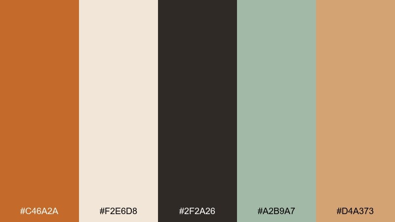
HEX: #C46A2A #F2E6D8 #2F2A26 #A2B9A7 #D4A373
Mood: grounded, outdoorsy, artisan
Best for: rustic brand identity and product labels
Grounded and outdoorsy, this mix feels like cedar planks, warm spices, and sunlit canvas. It works beautifully for craft brands, farm-to-table packaging, and heritage logos where warmth matters. Pair the tawny core with deep charcoal for type, then let sage soften the edges. Usage tip: keep the light cream as your dominant background to avoid a heavy look.
Image example of cedar spice generated using media.io
Media.io is an online AI studio for creating and editing video, image, and audio in your browser.

2) Sienna Linen
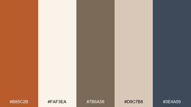
HEX: #B85C2B #FAF3EA #7B6A58 #D9C7B8 #3E4A59
Mood: calm, airy, refined
Best for: lifestyle blogs and minimalist websites
Calm and airy, these tones evoke linen curtains, soft morning light, and a tidy studio desk. The warm sienna reads welcoming without feeling loud, especially against the pale off-white. Add the slate blue-gray for navigation and footers to keep the layout crisp. Usage tip: reserve the taupe for secondary text and dividers so the page stays light.
Image example of sienna linen generated using media.io
3) Copper Dusk
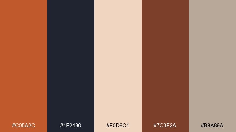
HEX: #C05A2C #1F2430 #F0D6C1 #7C3F2A #B8A89A
Mood: moody, cinematic, bold
Best for: album art, gaming graphics, and hero banners
Moody and cinematic, this palette feels like copper glow fading into a midnight skyline. It is one of those tawny color combinations that instantly adds drama to hero sections and cover art. Let the deep navy carry backgrounds while the warm copper hits headlines and buttons. Usage tip: keep highlights in the pale peach to preserve contrast and readability.
Image example of copper dusk generated using media.io
4) Desert Adobe
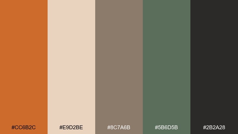
HEX: #CC6B2C #E9D2BE #8C7A6B #5B6D5B #2B2A28
Mood: sunbaked, earthy, natural
Best for: southwest interiors and travel content
Sunbaked and earthy, these tones bring to mind adobe walls, dry grasses, and late-afternoon heat. The muted greens keep the warmth from turning overly orange, making it great for travel guides and interior mood boards. Pair the charcoal with the sand tone for strong, modern captions. Usage tip: use the warm tan for large surfaces and the darker browns for small, grounding details.
Image example of desert adobe generated using media.io
5) Maple Hearth
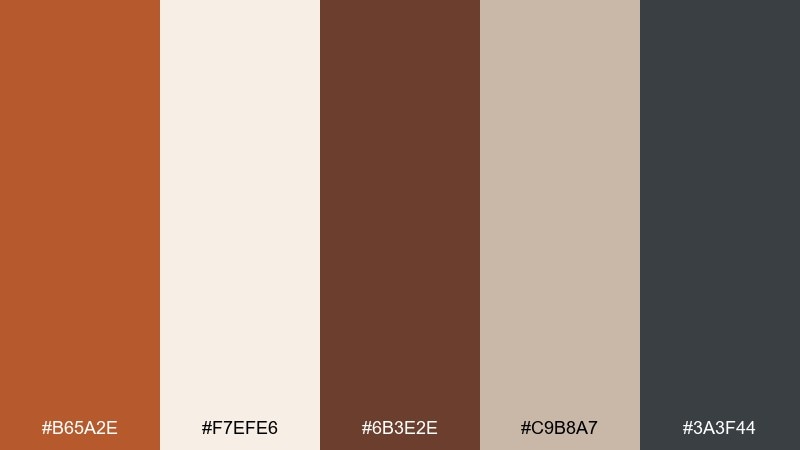
HEX: #B65A2E #F7EFE6 #6B3E2E #C9B8A7 #3A3F44
Mood: cozy, homey, classic
Best for: cookbooks, cafes, and seasonal campaigns
Cozy and homey, this set feels like maple syrup, toasted bread, and a crackling hearth. It shines in menus, recipe cards, and cafe branding where comfort is the message. Balance the warm browns with the cool gray for modern type and icons. Usage tip: keep the deepest brown for headings only, so your layouts do not look too dense.
Image example of maple hearth generated using media.io
6) Rustic Orchard
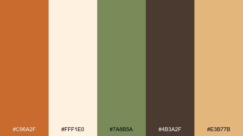
HEX: #C96A2F #FFF1E0 #7A8B5A #4B3A2F #E3B77B
Mood: fresh, harvest, inviting
Best for: farm markets and food packaging
Fresh and inviting, these colors suggest orchard walks, apple skins, and harvest light. The warm core pairs naturally with leafy green, creating a tawny color combination that suits organic foods and farmers market signage. Use the creamy off-white for clean labels and the golden accent for callouts like new or seasonal. Usage tip: print tests matter here, so check that the green stays muted rather than neon.
Image example of rustic orchard generated using media.io
7) Terracotta Mist
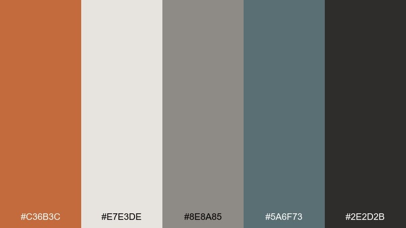
HEX: #C36B3C #E7E3DE #8E8A85 #5A6F73 #2E2D2B
Mood: soft, modern, understated
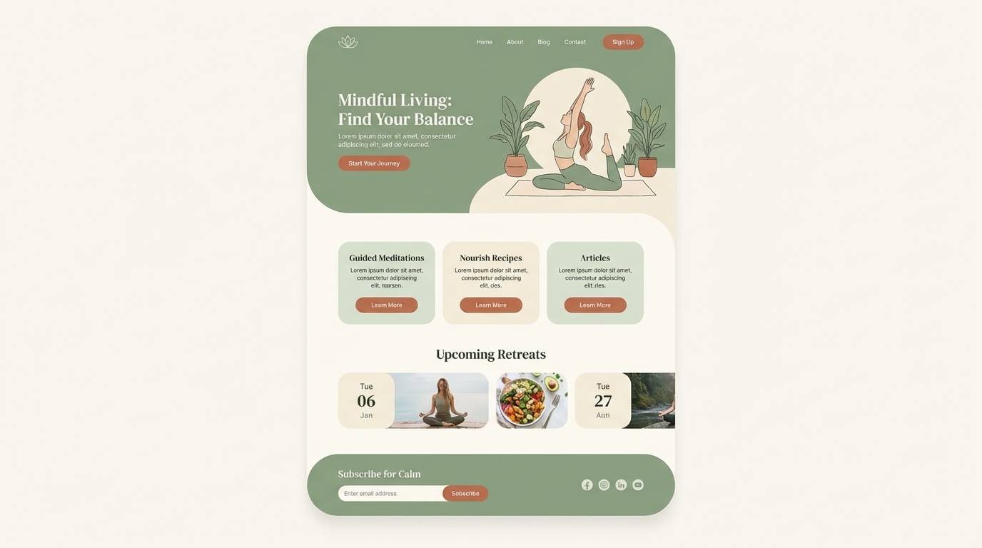
Best for: wellness apps and calm landing pages
Soft and modern, this blend feels like terracotta warmed by fog and cool stone. It is ideal for wellness brands that need warmth without the loudness of bright orange. Pair the muted teal with the warm clay tone for subtle highlights and section breaks. Usage tip: use the near-black sparingly for key text to keep the overall mood gentle.
Image example of terracotta mist generated using media.io
8) Golden Tobacco
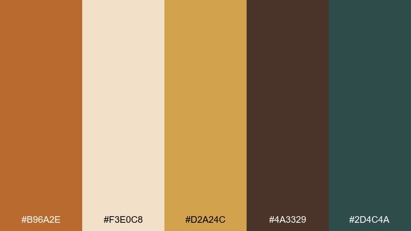
HEX: #B96A2E #F3E0C8 #D2A24C #4A3329 #2D4C4A
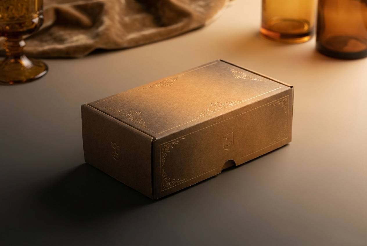
Mood: vintage, luxe, warm
Best for: premium packaging and bar menus
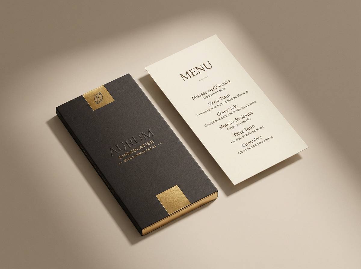
Vintage and luxe, these tones call up aged leather, polished brass, and an old speakeasy bar. The golden accent adds a premium spark that works well for cocktail menus and upscale product boxes. Anchor layouts with the deep brown, then use teal as a surprising, elegant counterpoint. Usage tip: keep gold to small trims and icons so it reads like foil, not flat yellow.
Image example of golden tobacco generated using media.io
9) Canyon Clay
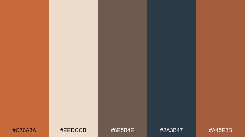
HEX: #C76A3A #EEDCCB #6E5B4E #2A3B47 #A45E3B
Mood: adventurous, rugged, balanced
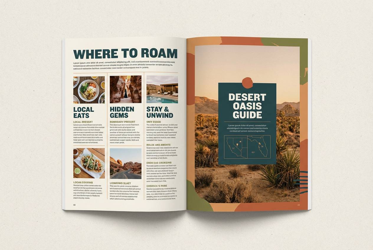
Best for: outdoor brands and travel guides
Adventurous and rugged, this palette looks like canyon ridges against a clear, darkening sky. It supports outdoorsy branding where you want warm earth plus a confident cool anchor. Use the navy-teal for headers and the lighter sand for long-form reading comfort. Usage tip: double up the two clay tones for gradients to add depth without extra colors.
Image example of canyon clay generated using media.io
10) Caramel Ink
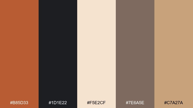
HEX: #B85D33 #1D1E22 #F5E2CF #7E6A5E #C7A27A
Mood: sleek, warm, high-contrast
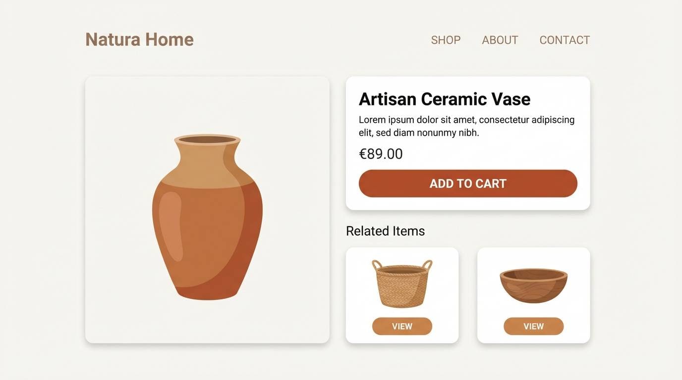
Best for: ecommerce and product landing pages
Sleek and warm, these colors feel like caramel drizzled over dark roast coffee. The near-black makes the warm tones pop, perfect for product pages that need strong hierarchy. Pair the pale cream with caramel for sections and cards, then use taupe for secondary UI elements. Usage tip: keep buttons in the tawny shade and reserve black for text to maintain clarity.
Image example of caramel ink generated using media.io
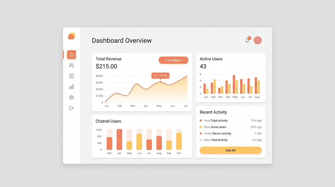
11) Warm Minimal UI
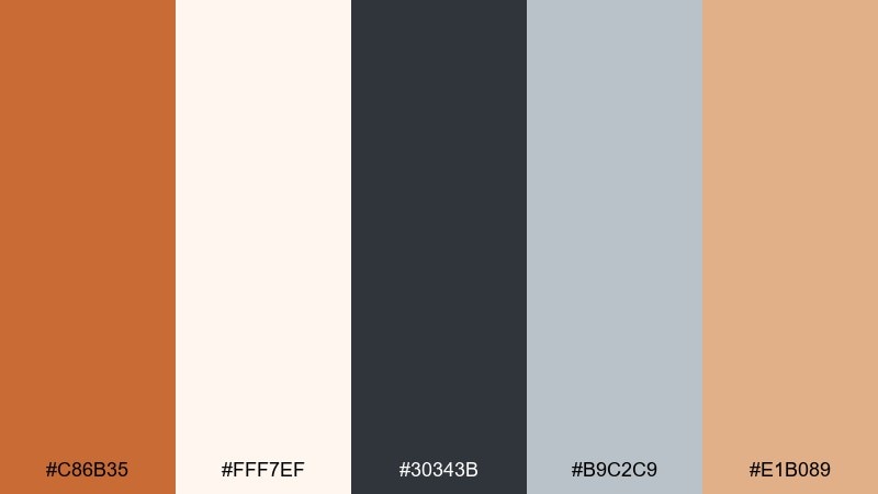
HEX: #C86B35 #FFF7EF #30343B #B9C2C9 #E1B089
Mood: clean, friendly, modern
Best for: SaaS dashboards and mobile-first web apps
Clean and friendly, these tones suggest a well-lit workspace with warm wood and soft paper. As a tawny color palette for UI, it keeps interfaces approachable while still feeling modern and sharp. Use the off-white for main surfaces, charcoal for text, and the warm accent for primary actions. Usage tip: apply the pale peach to hover states and subtle highlights so the experience feels responsive, not busy.
Image example of warm minimal ui generated using media.io
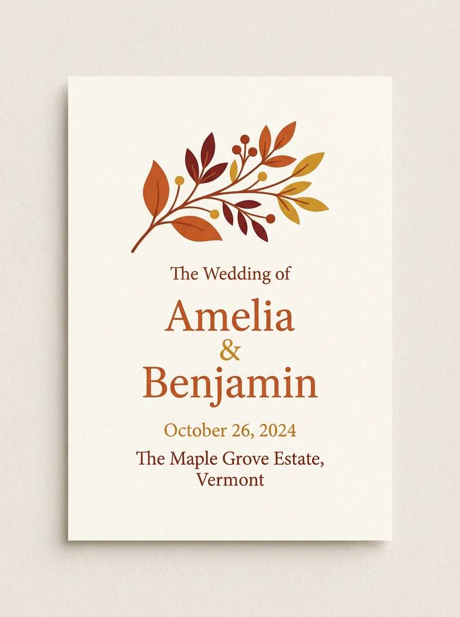
12) Autumn Invite
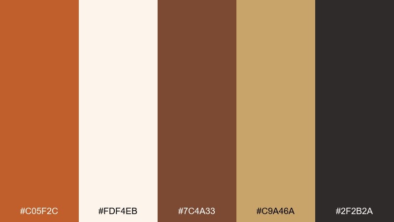
HEX: #C05F2C #FDF4EB #7C4A33 #C9A46A #2F2B2A
Mood: romantic, seasonal, elegant
Best for: fall weddings and event invitations
Romantic and seasonal, this set feels like dried florals, candlelight, and crisp evenings. The warm orange-brown and gold create an elegant mood without looking too rustic. Pair the cream background with the deep brown for typography, then use gold for borders and monograms. Usage tip: add plenty of negative space so the darker tones stay refined and not heavy.
Image example of autumn invite generated using media.io
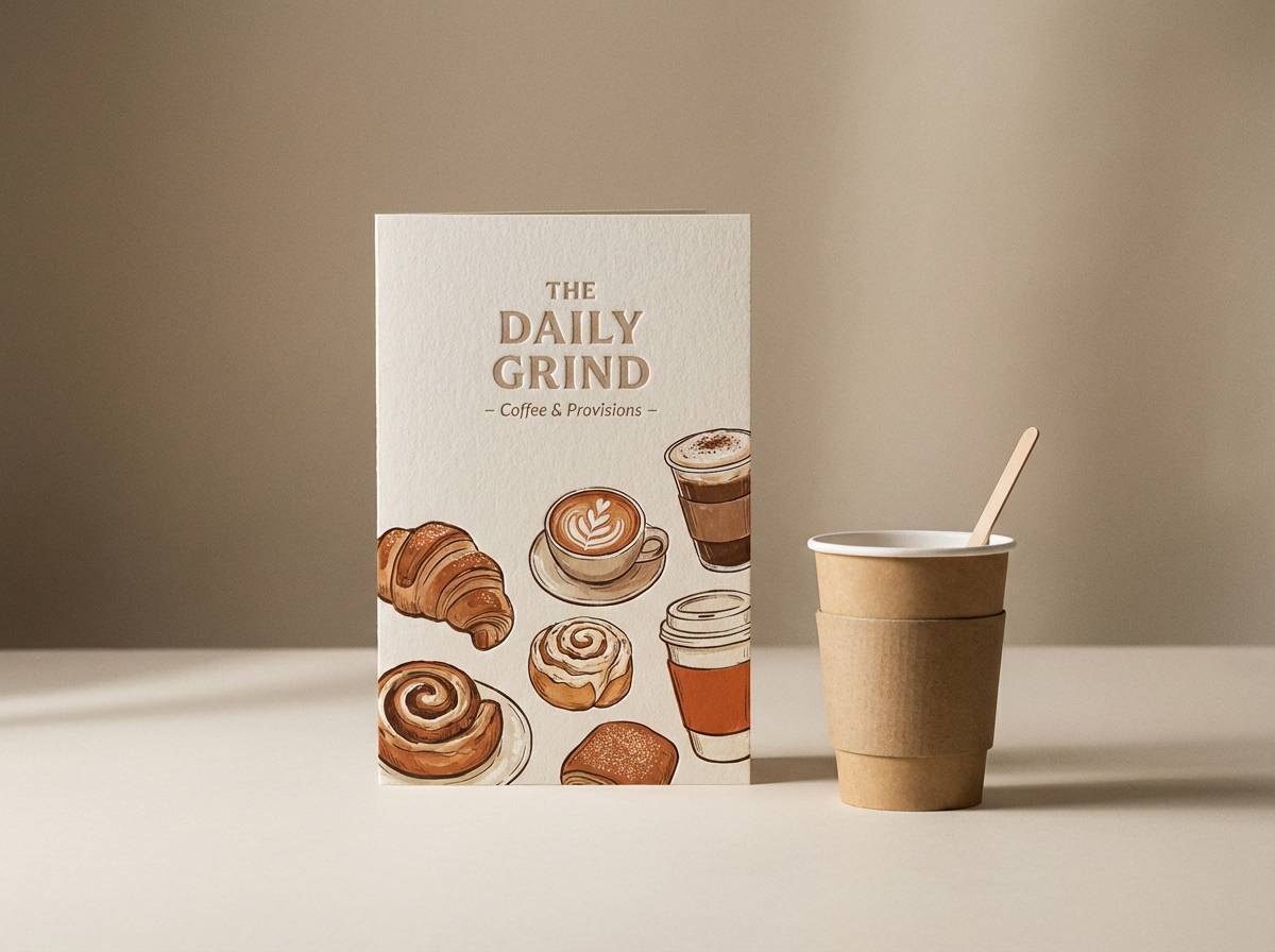
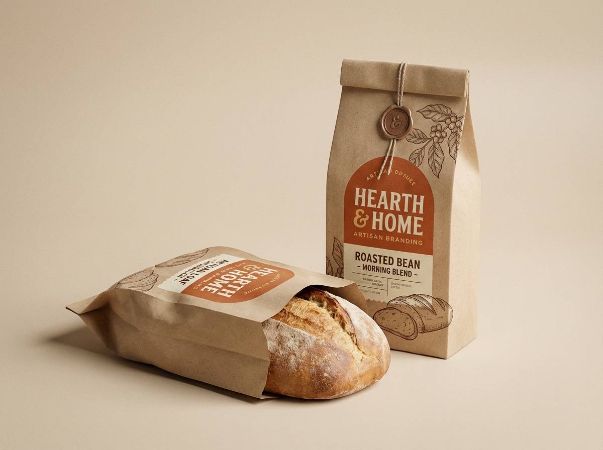
13) Cafe Packaging
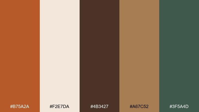
HEX: #B75A2A #F2E7DA #4B3427 #A67C52 #3F5A4D
Mood: artisan, cozy, organic
Best for: coffee bags and bakery packaging
Artisan and cozy, these colors evoke a small cafe with wood shelves and fresh pastries. The deep brown and creamy beige give packaging an instant handcrafted feel, while the green adds a natural note. Pair the tawny tone with beige for the main label, and use dark brown for stamps and ingredient text. Usage tip: keep the green minimal, like a small seal or icon, to avoid competing with the warm core.
Image example of cafe packaging generated using media.io
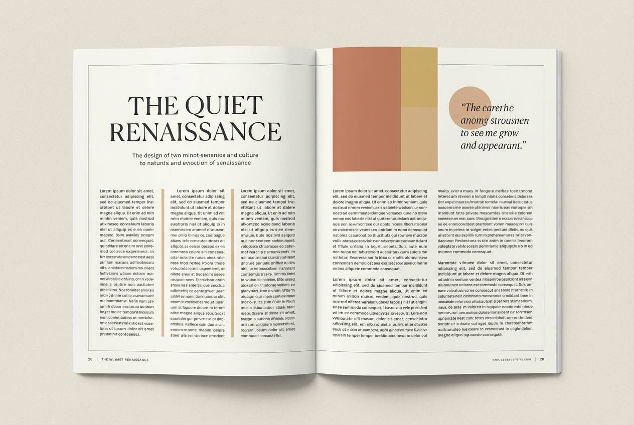
14) Vintage Editorial
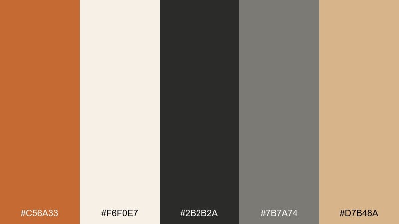
HEX: #C56A33 #F6F0E7 #2B2B2A #7B7A74 #D7B48A
Mood: timeless, editorial, polished
Best for: magazines, lookbooks, and long-form reads
Timeless and polished, this set recalls book pages, ink, and warm studio lighting. It is great for editorial layouts where readability and tone need to work together. Pair the warm accent with charcoal headlines, then keep body text on the soft paper white. Usage tip: use the light gray for rules and captions to create structure without harsh contrast.
Image example of vintage editorial generated using media.io
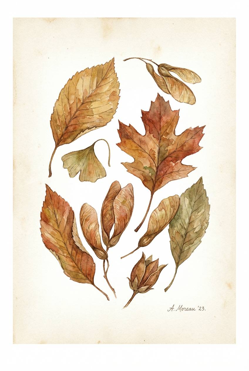
15) Botanical Harvest
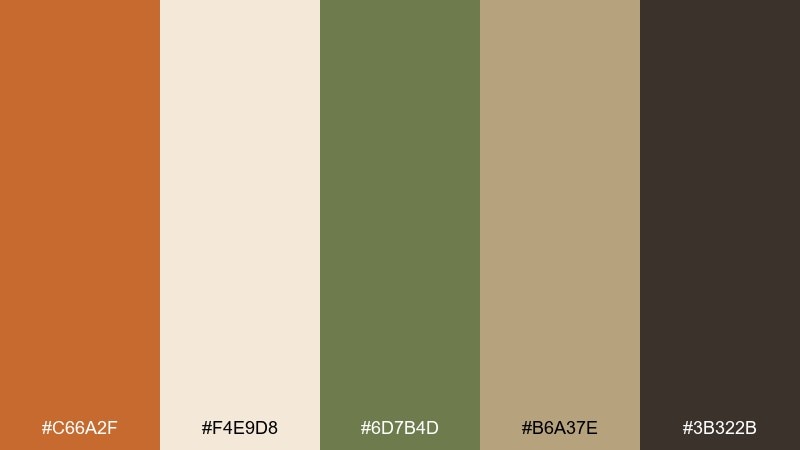
HEX: #C66A2F #F4E9D8 #6D7B4D #B6A37E #3B322B
Mood: natural, wholesome, hand-painted
Best for: botanical illustrations and eco brands
Natural and wholesome, these tones feel like pressed leaves, seed pods, and clay pots on a windowsill. The muted olive keeps the warmth grounded, making it perfect for eco packaging and botanical prints. Pair the creamy base with dark brown line work for a hand-drawn look. Usage tip: try watercolor textures in the warm tan to add organic variation without changing the palette.
Image example of botanical harvest generated using media.io
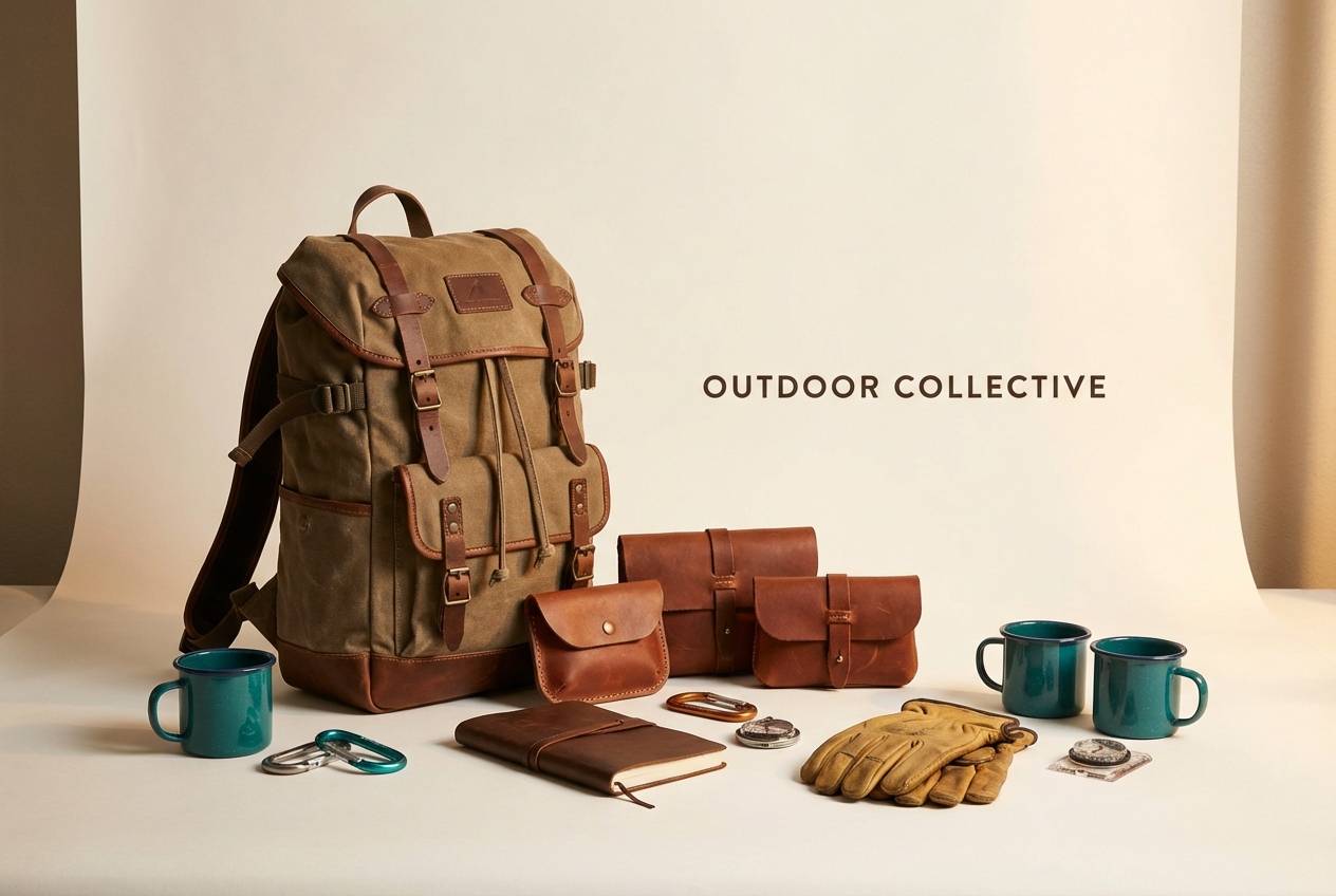
16) Sunset Leather
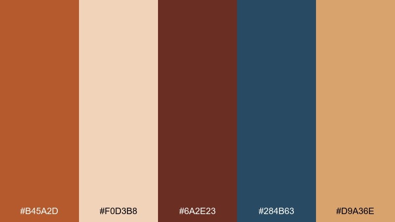
HEX: #B45A2D #F0D3B8 #6A2E23 #284B63 #D9A36E
Mood: adventurous, premium, rugged
Best for: outdoor gear ads and lifestyle branding
Adventurous and premium, this set reads like worn leather at sunset with a cool ocean breeze in the distance. It suits lifestyle brands that want rugged warmth plus a confident blue accent. Pair the warm shades with the deep teal for layouts that feel balanced and trustworthy. Usage tip: use the light peach for breathable whitespace, especially around product shots and headlines.
Image example of sunset leather generated using media.io
17) Clay and Seafoam
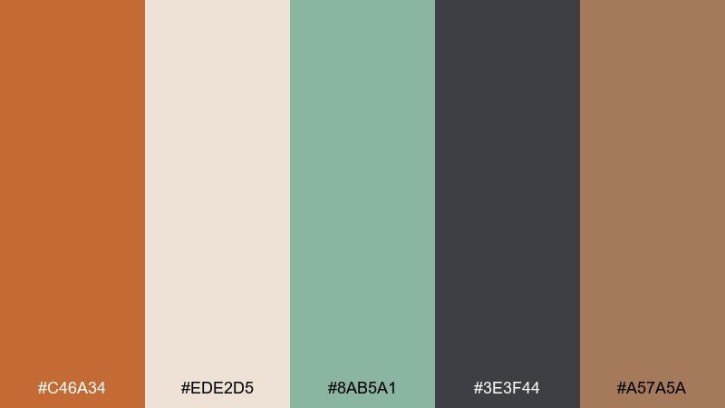
HEX: #C46A34 #EDE2D5 #8AB5A1 #3E3F44 #A57A5A
Mood: fresh, balanced, contemporary
Best for: modern home brands and social templates
Fresh and balanced, these tones feel like clay pottery beside a seafoam shoreline. The cool green lifts the warm browns, giving you an easy contemporary contrast. Pair charcoal text with the pale neutral background for clean posts and carousels. Usage tip: reserve seafoam for accents like icons and highlights so it stays crisp and modern.
Image example of clay and seafoam generated using media.io
18) Spiced Chocolate
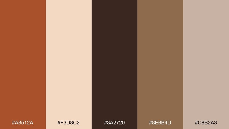
HEX: #A8512A #F3D8C2 #3A2720 #8E6B4D #C8B2A3
Mood: rich, cozy, indulgent
Best for: chocolate brands and dessert menus
Rich and indulgent, these colors suggest spiced cocoa, warm pastries, and a cozy corner booth. The deep chocolate brown makes the warm hues feel more luxurious and less orange. Pair the pale blush-beige with dark text for menus, then use the tawny accent for prices or featured items. Usage tip: add subtle grain or paper texture to amplify the handcrafted vibe.
Image example of spiced chocolate generated using media.io
19) Festival Poster
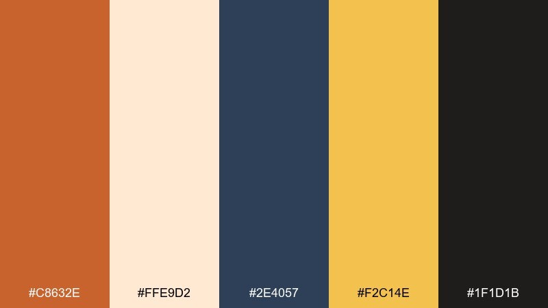
HEX: #C8632E #FFE9D2 #2E4057 #F2C14E #1F1D1B
Mood: energetic, playful, bold
Best for: event posters and promo graphics
Energetic and bold, this palette feels like street lights, live music, and late-night buzz. These tawny color combinations work especially well with strong navy blocks and bright golden highlights. Keep the warm cream as your background for legibility, then punch up the layout with the gold for badges and dates. Usage tip: use the near-black for small details only, so the poster stays lively and not heavy.
Image example of festival poster generated using media.io

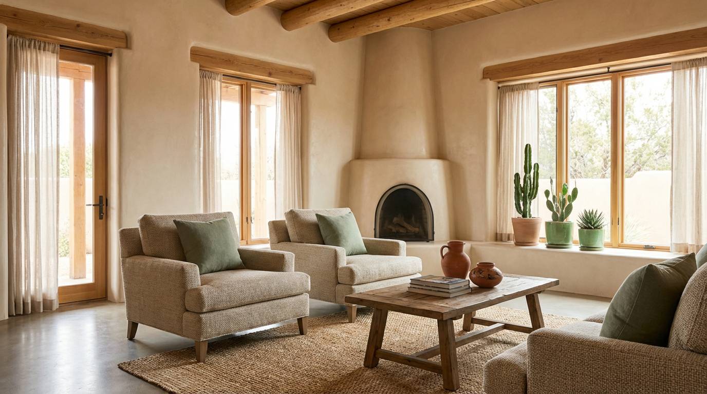
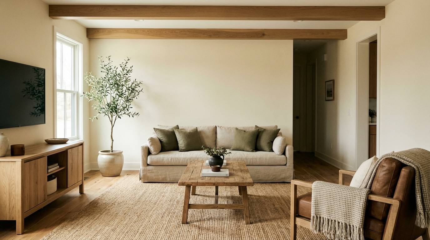
20) Modern Rustic Interior
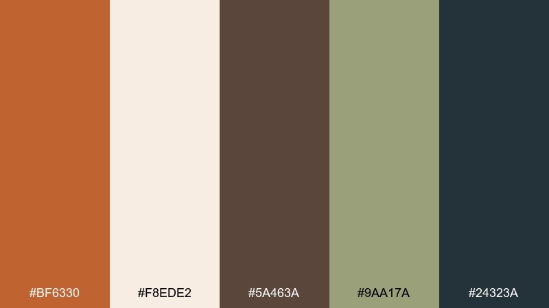
HEX: #BF6330 #F8EDE2 #5A463A #9AA17A #24323A
Mood: welcoming, modern rustic, calm
Best for: interior design mood boards and real estate staging
Welcoming and calm, these tones bring to mind warm plaster walls, natural wood, and leafy shadows. The muted olive adds a lived-in touch that keeps the warmth from feeling too monochrome. Pair the light neutral with deep blue-gray for a modern edge in titles and key details. Usage tip: repeat the tawny shade in small decor elements, like cushions or frames, to tie the room together.
Image example of modern rustic interior generated using media.io
What Colors Go Well with Tawny?
Tawny pairs naturally with light neutrals like cream, off-white, and sand because they preserve its warmth without making designs feel heavy. These combinations are reliable for backgrounds, editorial layouts, and packaging.
For contrast and readability, add dark anchors such as charcoal, near-black, espresso brown, or blue-gray. If you want a fresher, more modern edge, try muted greens (sage/olive) or cool accents like teal and deep navy.
Metallic-like accents also work well: warm gold or brass tones can make tawny feel premium, especially when used sparingly for icons, borders, or small callouts.
How to Use a Tawny Color Palette in Real Designs
Start with role-based color planning: use a light neutral as the primary background, charcoal or deep brown for text, and tawny as your main brand accent (buttons, highlights, key illustrations). This keeps accessibility and hierarchy consistent.
In branding, tawny shines on paper textures, kraft packaging, and product labels, where it reinforces a handcrafted or heritage message. For web and UI, pair tawny with cool grays or slate nav bars to prevent the layout from skewing too warm.
For depth, layer tawny with nearby earth tones (clay, caramel, terracotta) as gradients or subtle shadows, then reserve your coolest accent (teal/olive) for “attention” moments like badges and active states.
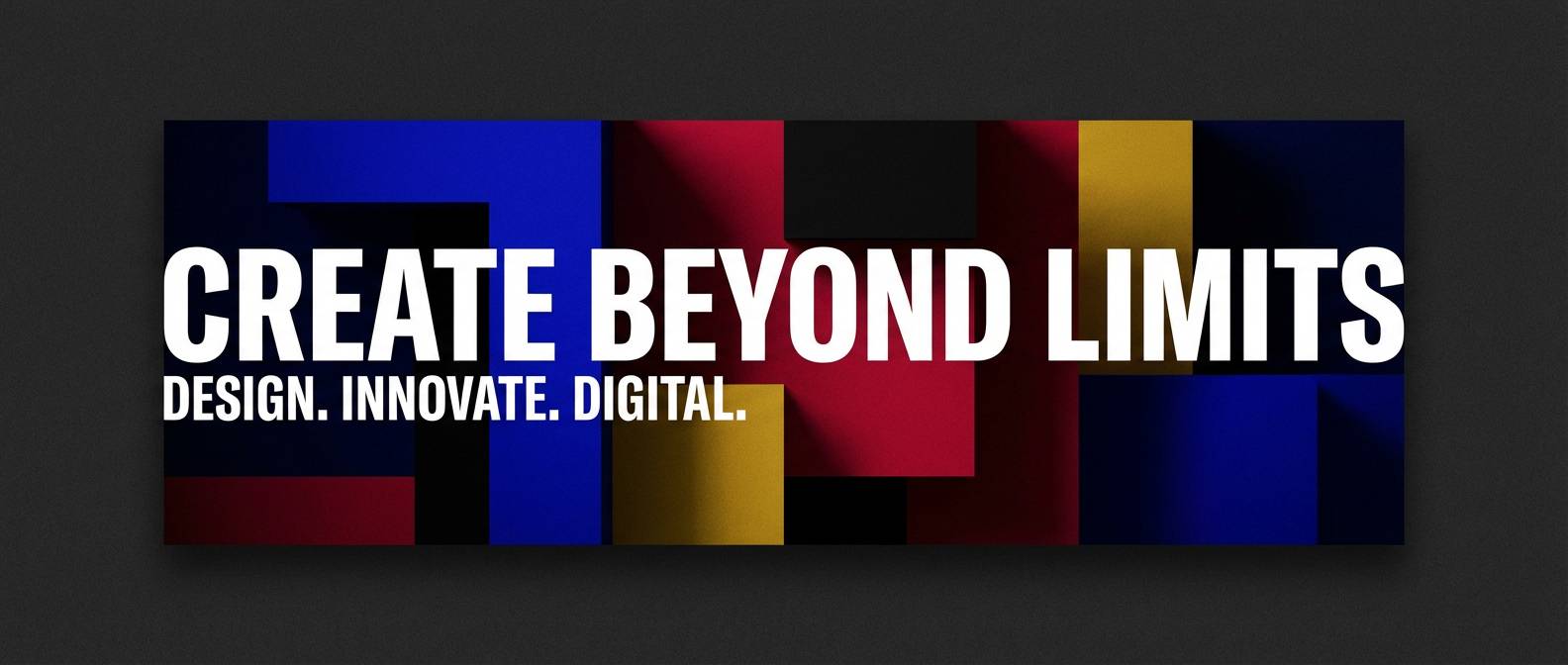
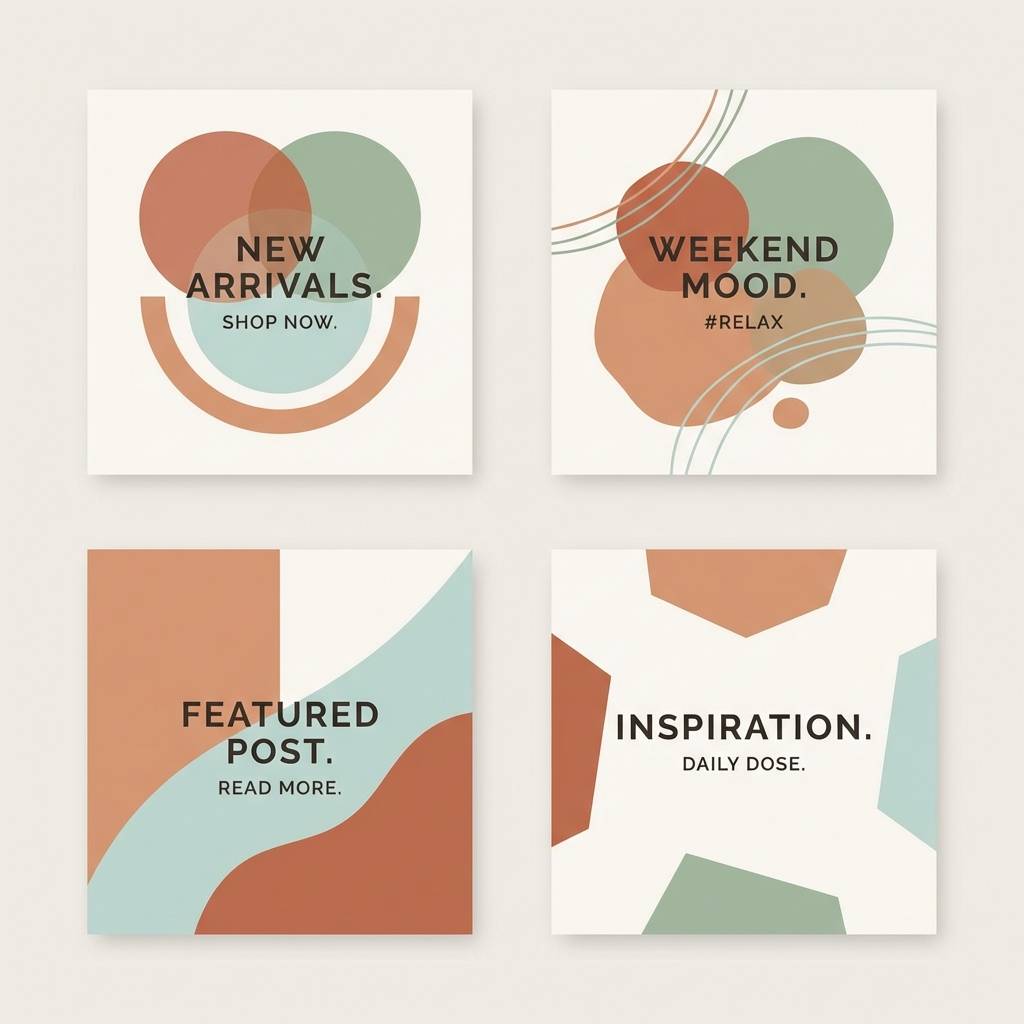
Create Tawny Palette Visuals with AI
If you want to see how a tawny palette looks in real scenes—labels, hero banners, interiors, or UI mockups—generate quick concept images from text prompts. This is an easy way to validate mood, contrast, and overall brand direction before production.
Reuse the prompts under each palette above and adjust the subject (packaging, landing page, poster) while keeping the same warm-neutral styling. You can also iterate on lighting (soft daylight vs. cinematic) to shift the feel without changing your core colors.
When your visuals look right, export them for mood boards, stakeholder reviews, or as references for final design work.
Tawny Color Palette FAQs
-
What is the HEX code for tawny?
Tawny is a range rather than one single value, but it commonly sits around warm orange-brown tones similar to #C46A2A–#CC6B2C. Pick the exact tawny HEX based on your lighting (more copper) or neutrality (more tan). -
Is tawny more brown or orange?
Tawny is typically brown-leaning orange (or orange-leaning brown). If you increase red/orange it becomes more terracotta; if you reduce saturation it moves toward tan and warm taupe. -
What colors complement tawny best?
Deep navy, charcoal, and blue-gray add strong contrast, while sage/olive greens provide a natural counterbalance. Cream and sand keep the palette airy and usable for backgrounds. -
How do I make tawny work in a modern UI?
Use off-white or very light warm neutrals for surfaces, charcoal for text, and reserve tawny for primary actions (buttons, toggles, key icons). Add a cool gray-blue for navigation so the interface stays crisp. -
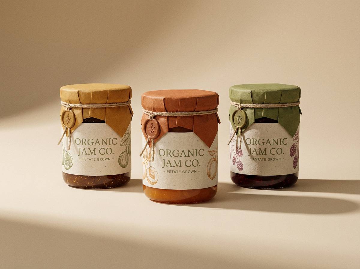
Does tawny print well on packaging?
Yes, tawny is very print-friendly, especially on uncoated stocks and kraft materials. Always run print tests because warm browns can shift depending on paper whiteness and ink saturation. -
How can I keep a tawny palette from looking too “autumn”?
Pair tawny with cool accents like slate, teal, or blue-gray, and reduce the use of gold/yellow. More negative space and cleaner neutrals will push the look from seasonal to contemporary. -
Can I generate tawny palette mockups from prompts?
Yes. Use a text-to-image tool to generate scenes like labels, UI layouts, or interiors, then iterate on the prompt style (minimal, cinematic, watercolor) while keeping the same HEX-driven color direction.
Next: Ash Grey Color Palette


